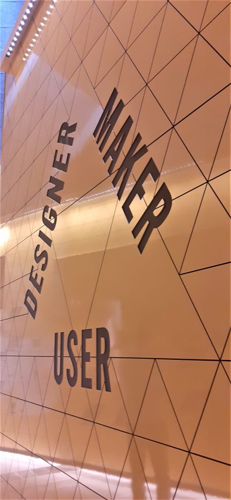
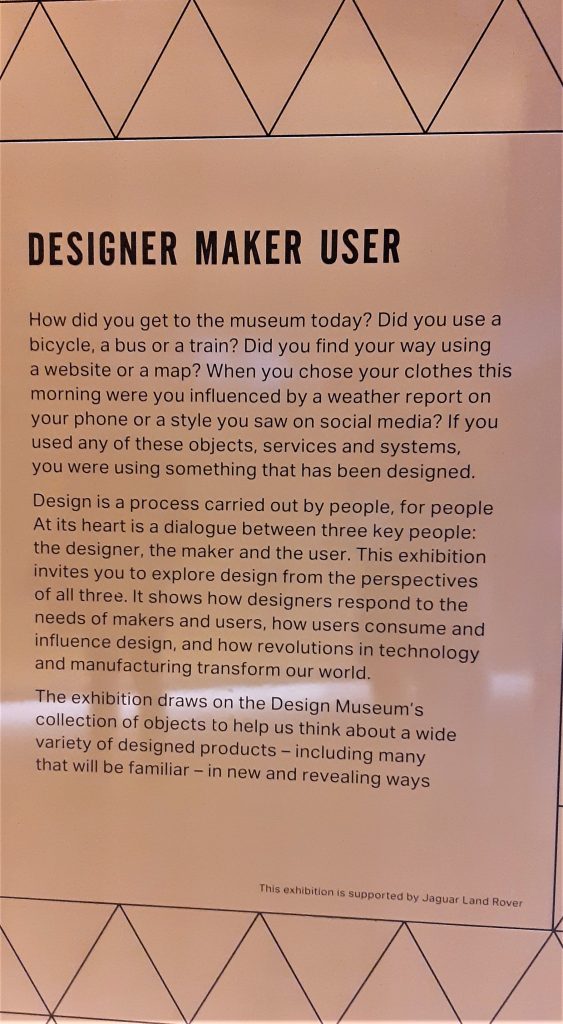
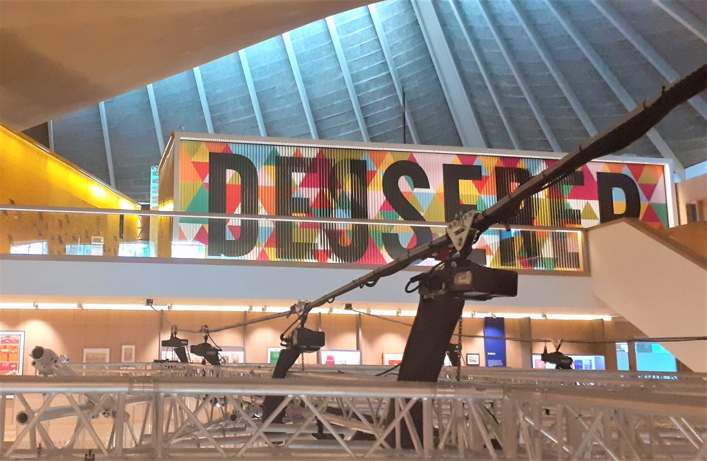
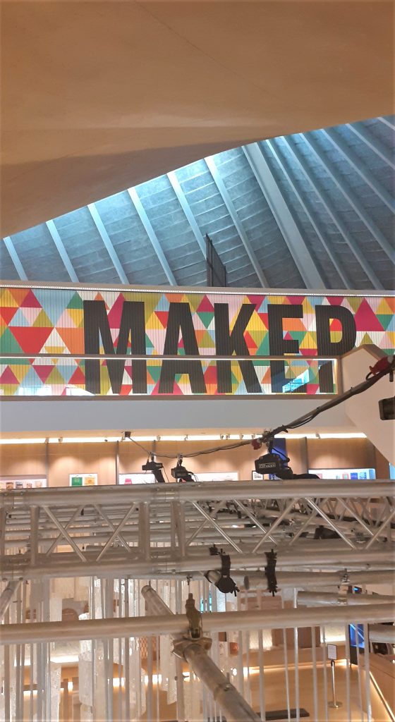
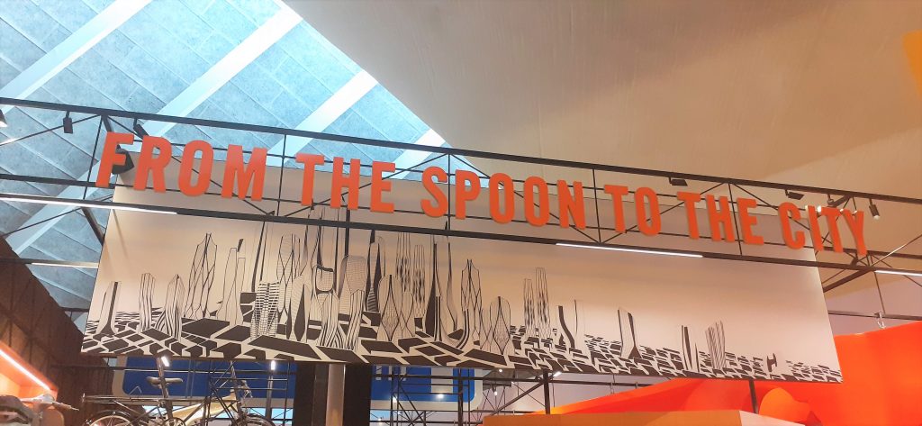
Designer Maker User.
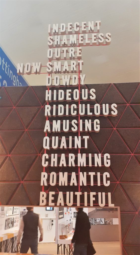
The name of the exhibition is displayed on a large board. The letters are written on slats which rotate to display the next word. I first thought this was a digital screen, but seeing it closer up I saw that the words were printed on a material like plywood.
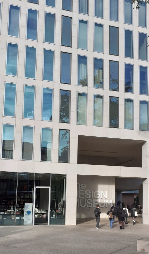
The soft lighting and wood interior within the design museum creates a friendly warmth throughout the building. After the rush of London, I felt relaxed.
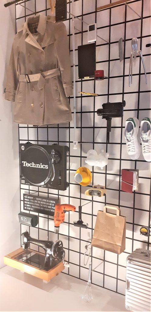
Shoes. guitar. Sewing machine. Suitcase. Walkman. Bottle opener. Bike lock. Mug. Typewriter. Jeans. Slinky. Skateboard. Flip-flops. Camera. Violin. Gameboy. Bible.
I was surprised at the arrangement of objects and the assortment on display. The objects were placed quite closely together which felt slightly disconcerting because there appeared to be no connection between each object. My first thought is that these objects have come from many different people and places. Perhaps there was no other way to introduce this exhibition that shows us such a wide variety of design.
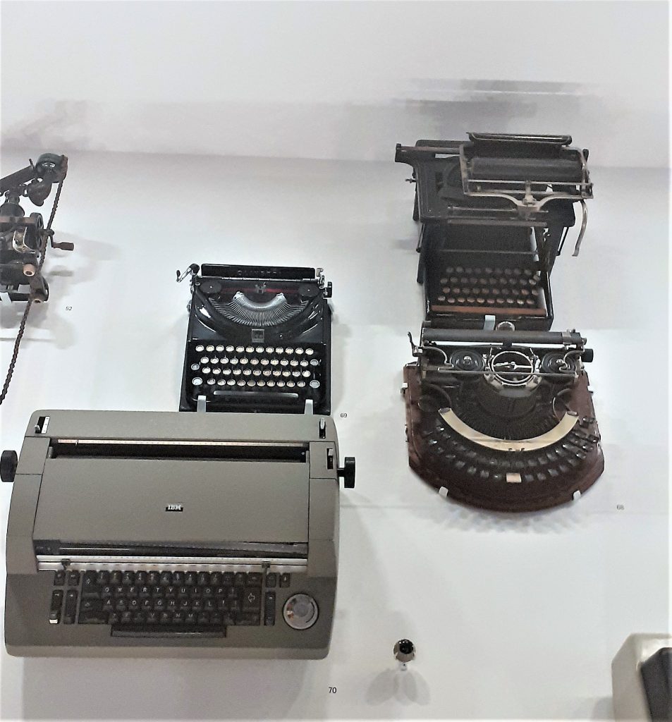
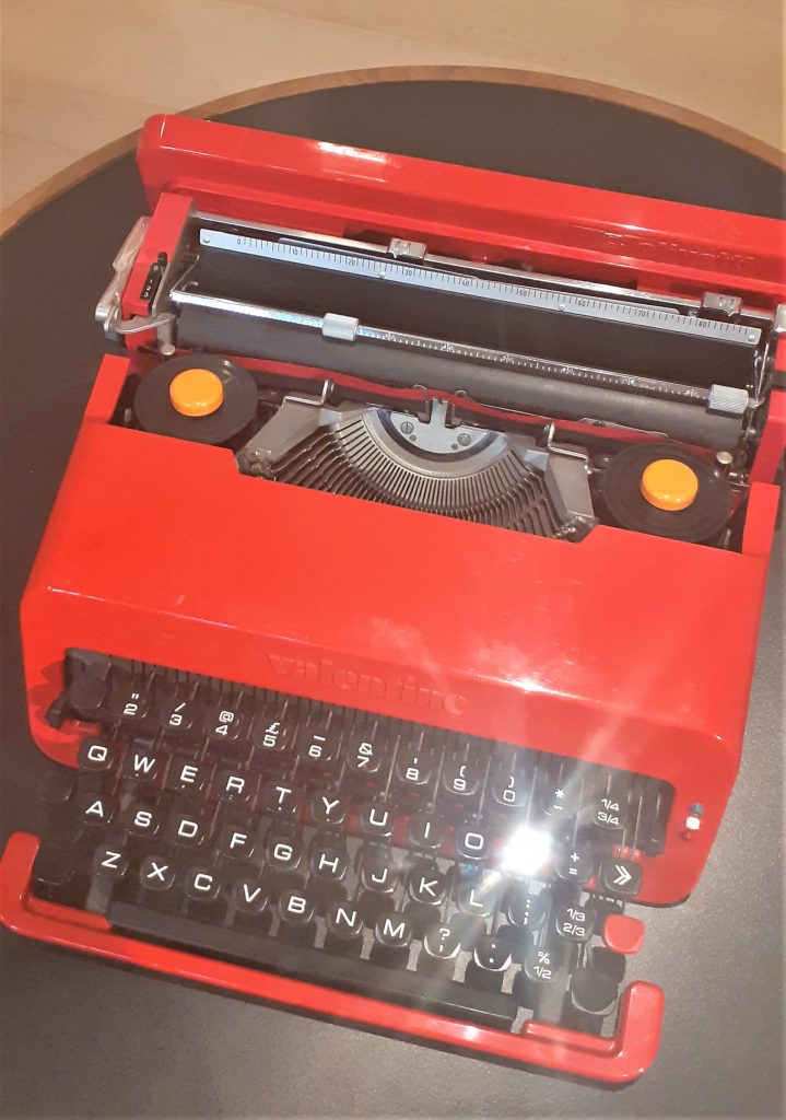
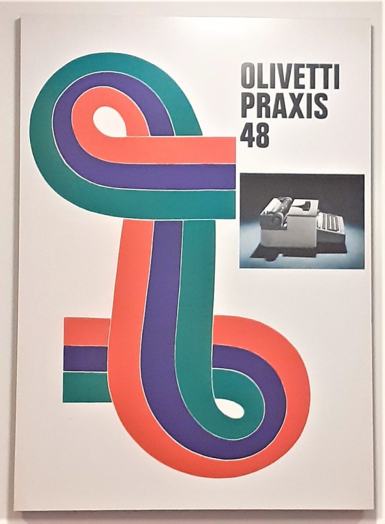
Olivetti Praxis 48 typewriter poster, 1967, Designed by Giovanni Pintori.
It was really nice to see the poster behind the physical object of the typewriter. In my head I could put the 2 together and imagine the time they came from.
Here the designer has played with scale to created a surprising image where the egg is as large as the typewriter. Seeing the typewriter at this angle is another unusual element to this poster.
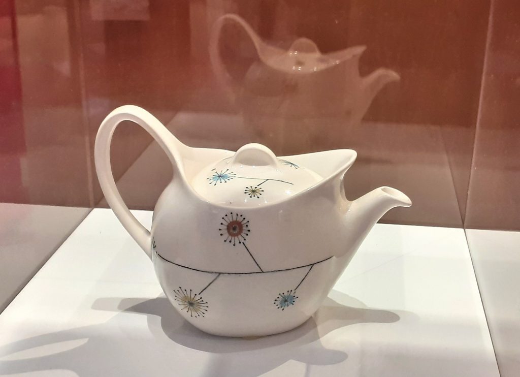
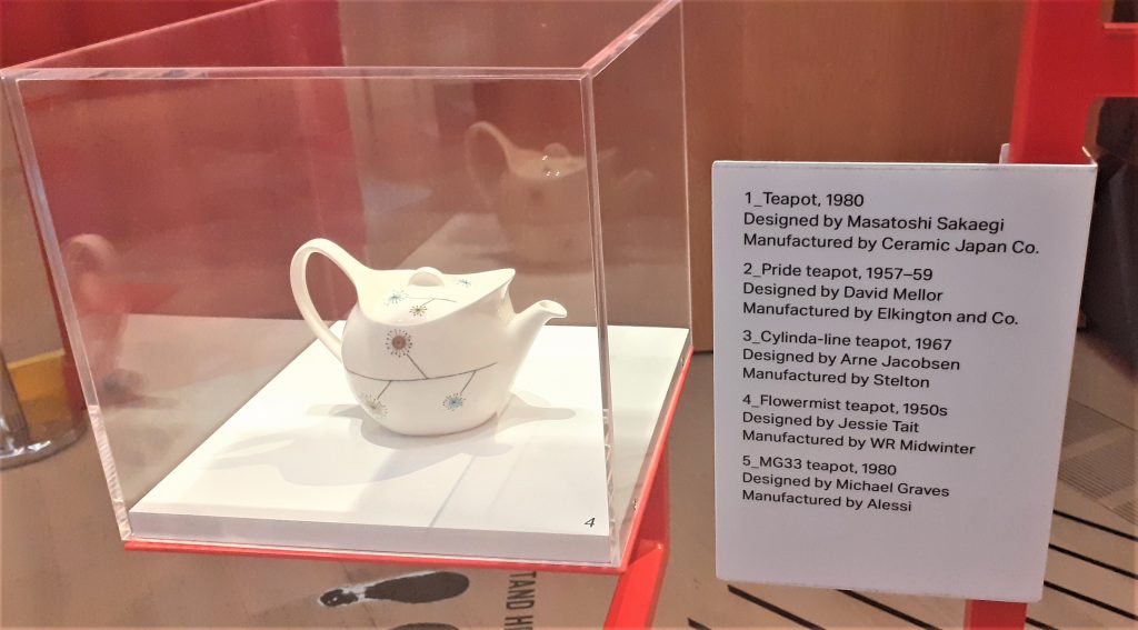
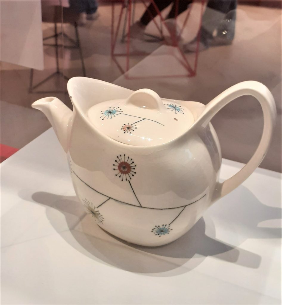
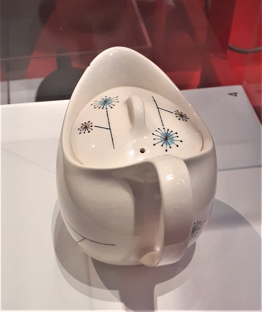
I loved this unique teapot as soon as I saw it. This is the kind of item I would be tempted to buy. It is delicate, pretty and functional. The way the teapot was displayed allowed me to view it from all angles. The light directed onto it acted as a spotlight, drawing me to the object. The shadow created on the side of the pot highlighted the shape of the design.
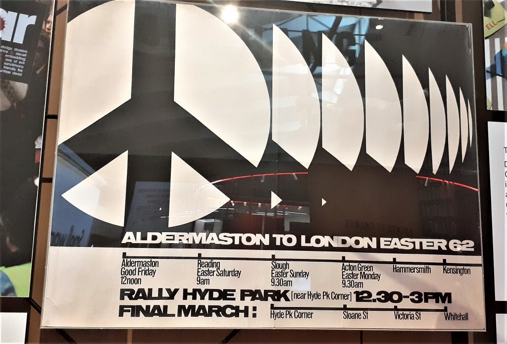
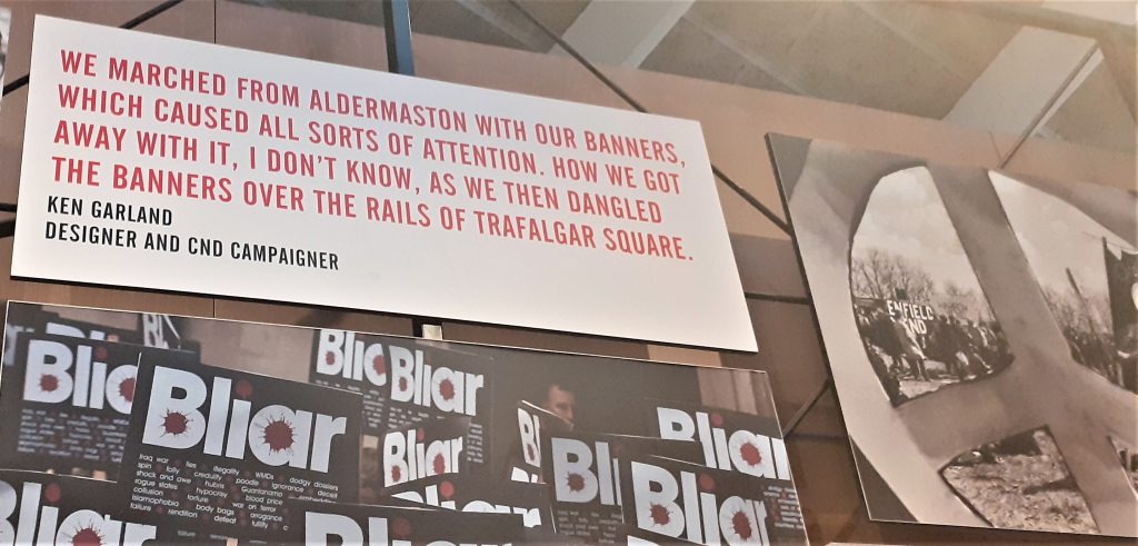
I really like the use of repetition in this poster and the black and white design. The lack of colour helps the shapes to stand out. The line at the bottom of the poster gives us a visual representation of the route of the march.
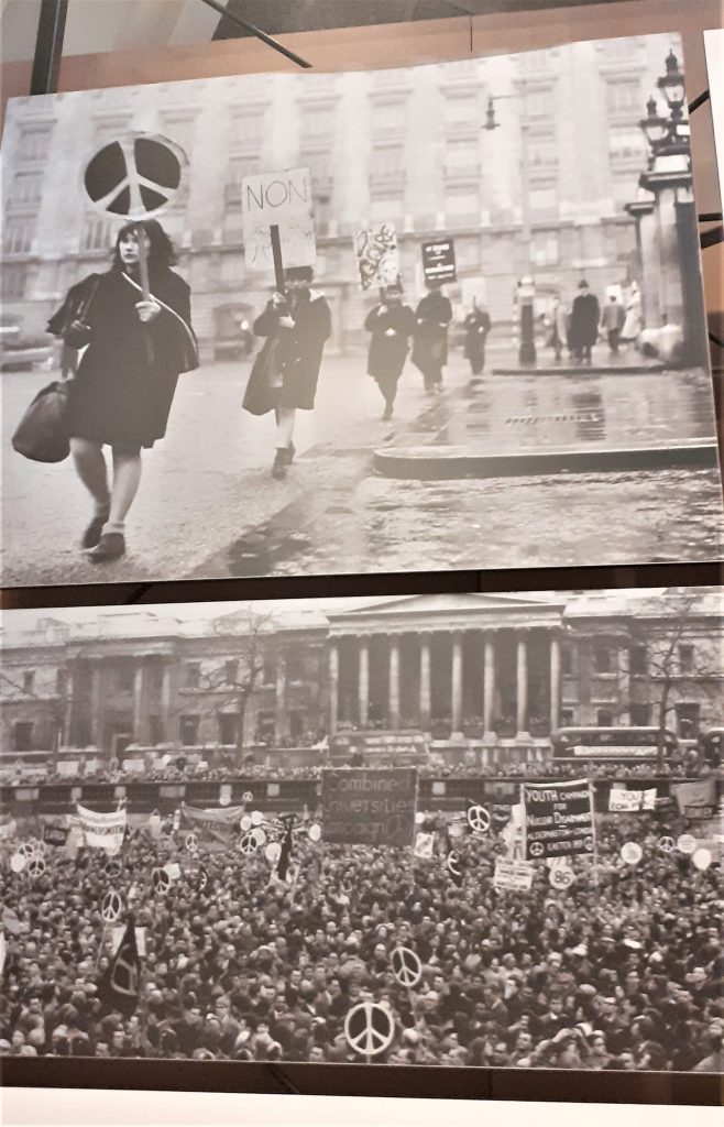
Displaying photos of the protests next to the poster gives us context for the object.
Wall of time. This wall displayed clocks, watches, a filafax, and other objects to organise a person and mark time. In the top right-hand side, I saw the Ball Wall Clock. This object immediately intrigued me.
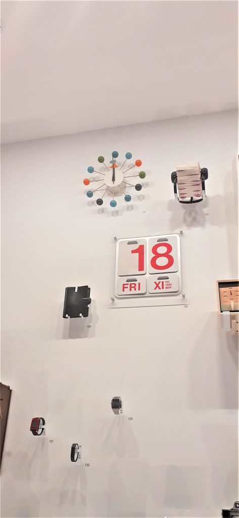
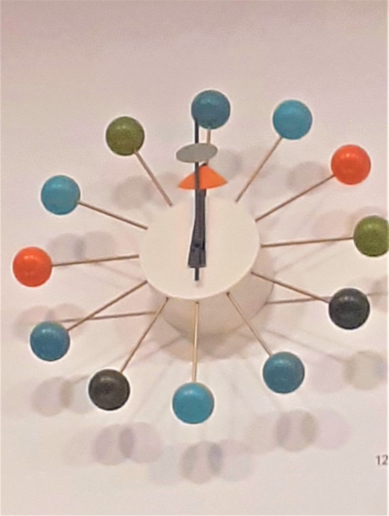
I first felt awestruck. Then joyfully impressed. I could not relate this design to anything I have seen before. I guessed that the object was old. I have always struggled to read clock faces and numbers in general. I usually dislike any clock that does not have numbers on it. I like I would struggle to use this clock if it were mine. But the cheerful quality of the design overrides this for me.
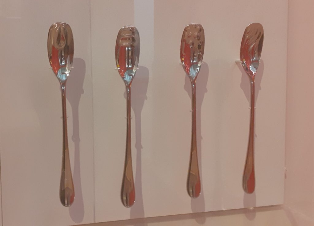
The story behind these tasting spoons interested me. At first they appear to be identical. The design looks the same in all four spoons, except they function slightly differently because they give a person a slightly different experience depending on the material used.
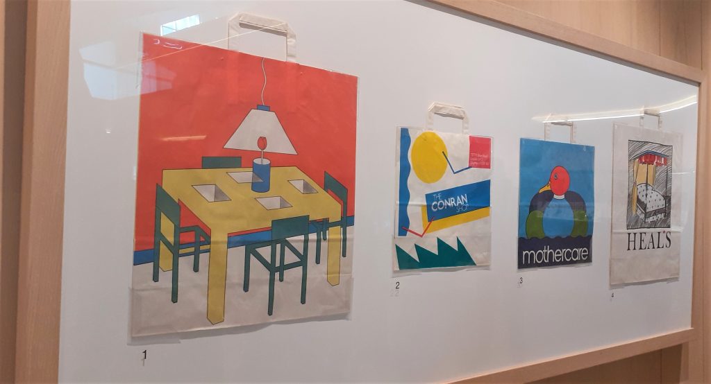
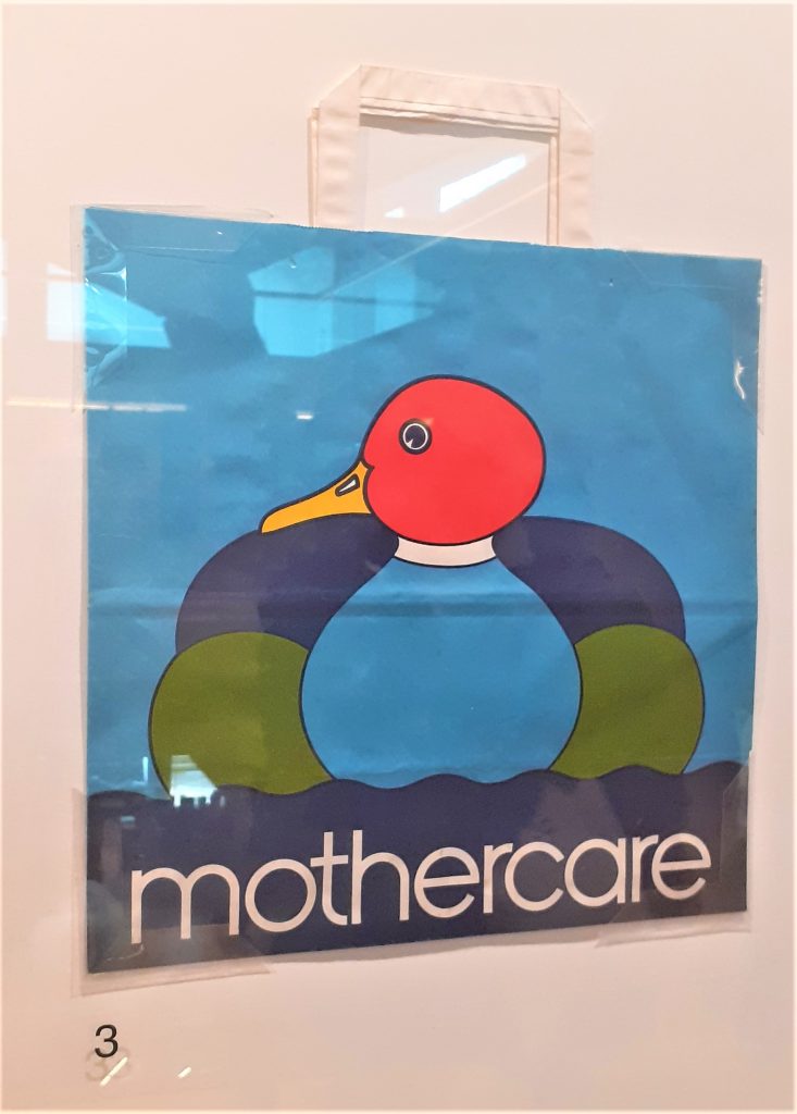
I was surprised to see the thickness of the plastic bag. The colours are bold and bright. Plastic bags are no longer made in this way. Because of the thickness of the material, I imagine that this bag is durable. The simplicity of this design is very effective and the red of the duck’s head is eye-catching.
I picked up this pamphlet for families at the exhibition: