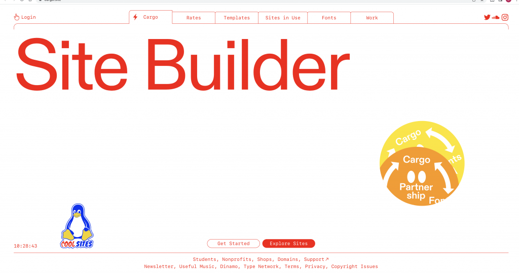
In the past, I have experimented with several website builders as well as coding a website with HTML coding on a previous college course. In today’s workshop, we started with the platform Cargo and followed our tutor’s instructions to start to get to grips with how the builder works. This would allow me to later customise this template and build a website that is bespoke to me.
Portfolio websites
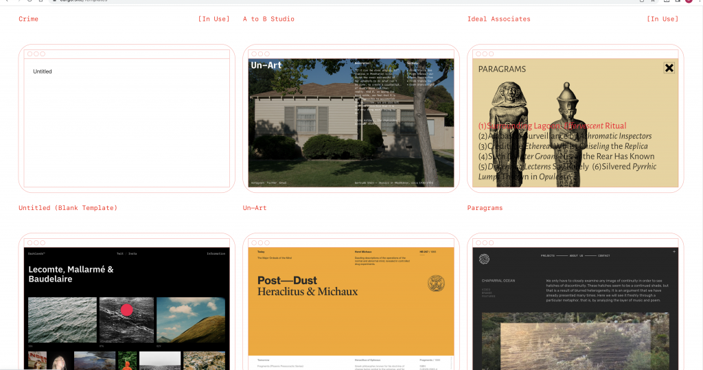
Websites that showcase creative work can all be presented differently. It’s good to have a look at these examples to see what is possible to create. I can look at designers I admire, industries and agencies.
When thinking about this website, I see the website as a frame. The focus should be on the work itself and ought to be interesting to look at overall. It needs to be functional and user-friendly. It doesn’t need to be complicated.
HTML (the Hypertext Markup Language) and CSS (Cascading Style Sheets) are two of the core technologies for building Web pages.
https://www.w3.org/standards/webdesign/htmlcss
Websites are responding to codes, HTML being the structure of the sire and CSS is the way it looks, such as image, colour etc.
HTML contains all the content: files, writings etc. In the past, this was very tiring for web designers to stylise as they had to write the code again and again. A combination of the 2 are now used: HTML & CSS.
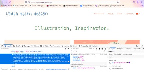
We can view this coding on any webpage by right clicking on the page and clicking ‘Inspect’. We can then alter elements of the page to see how it would look. Below, we can see the webpage once we have selected ‘inspect’. The HTML code is shown at the top and the style sheet is under this.
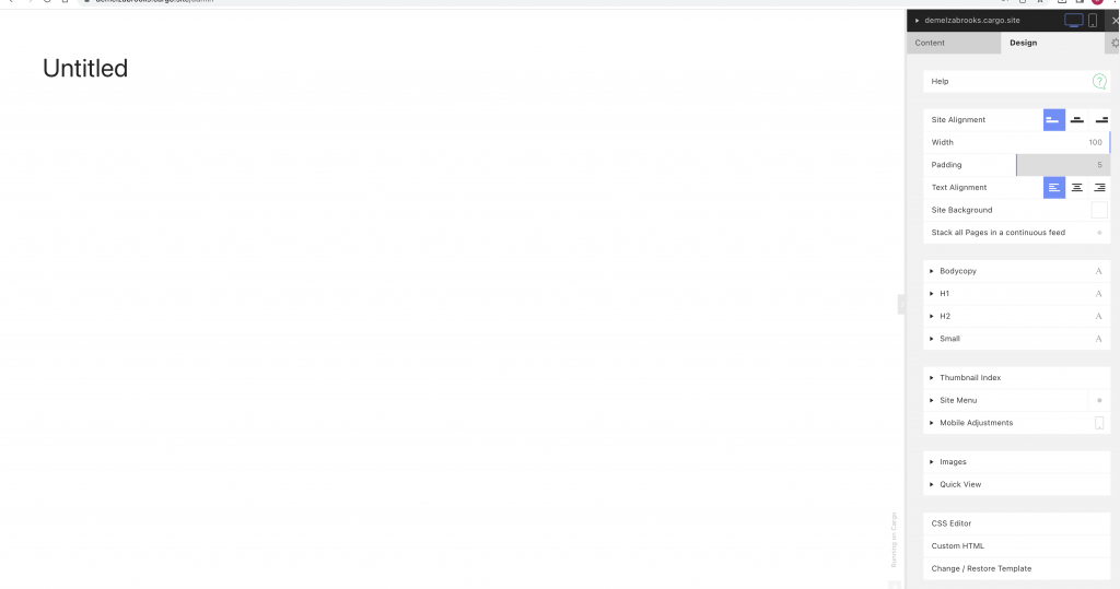
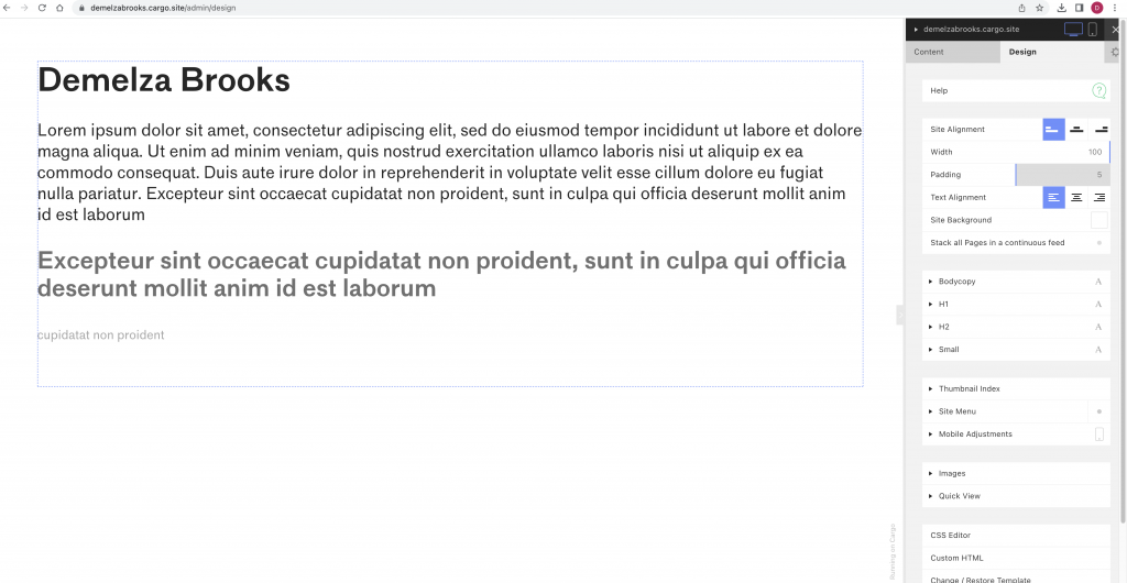
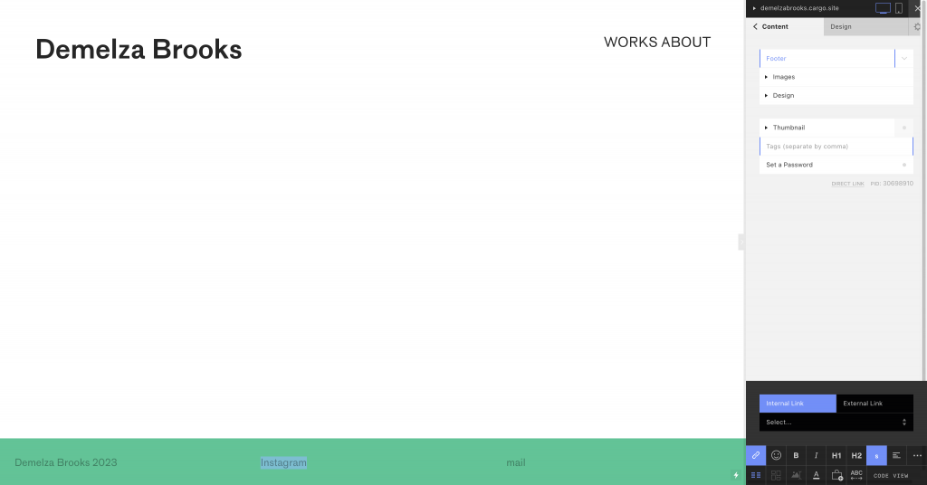
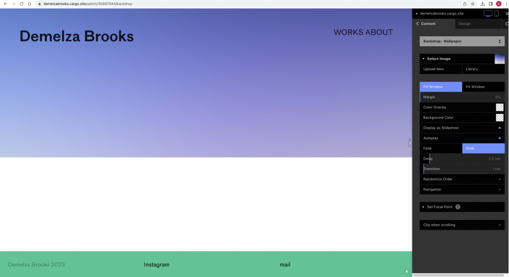
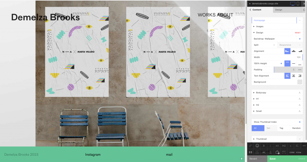
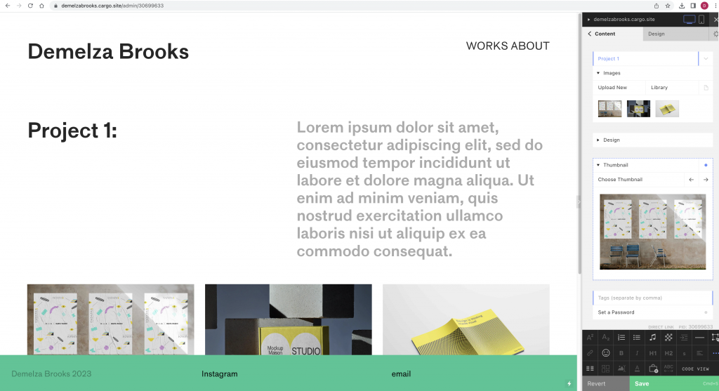
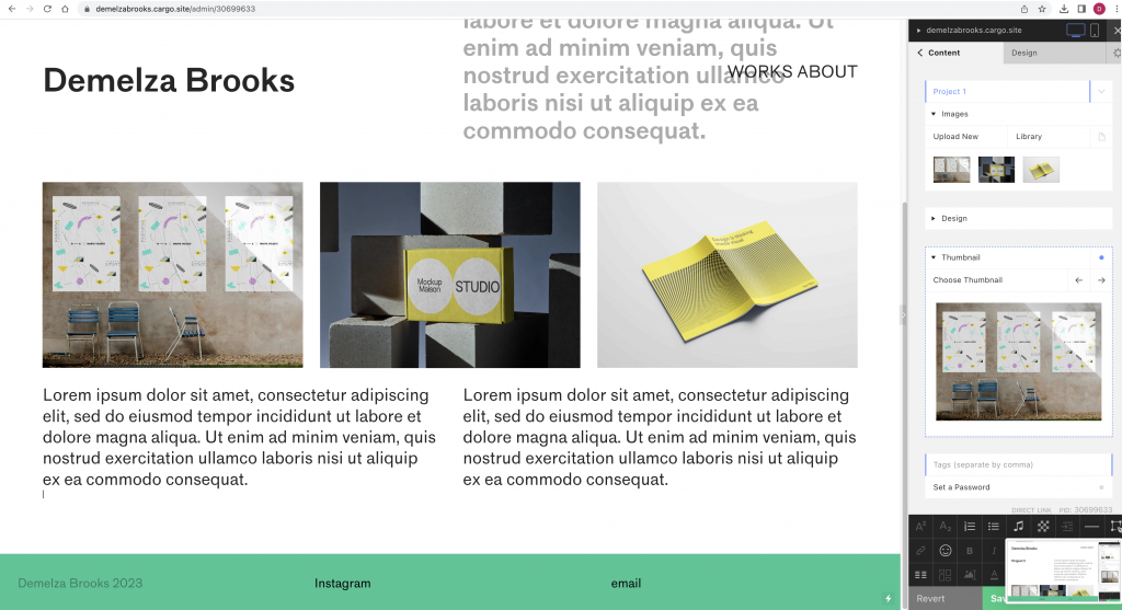
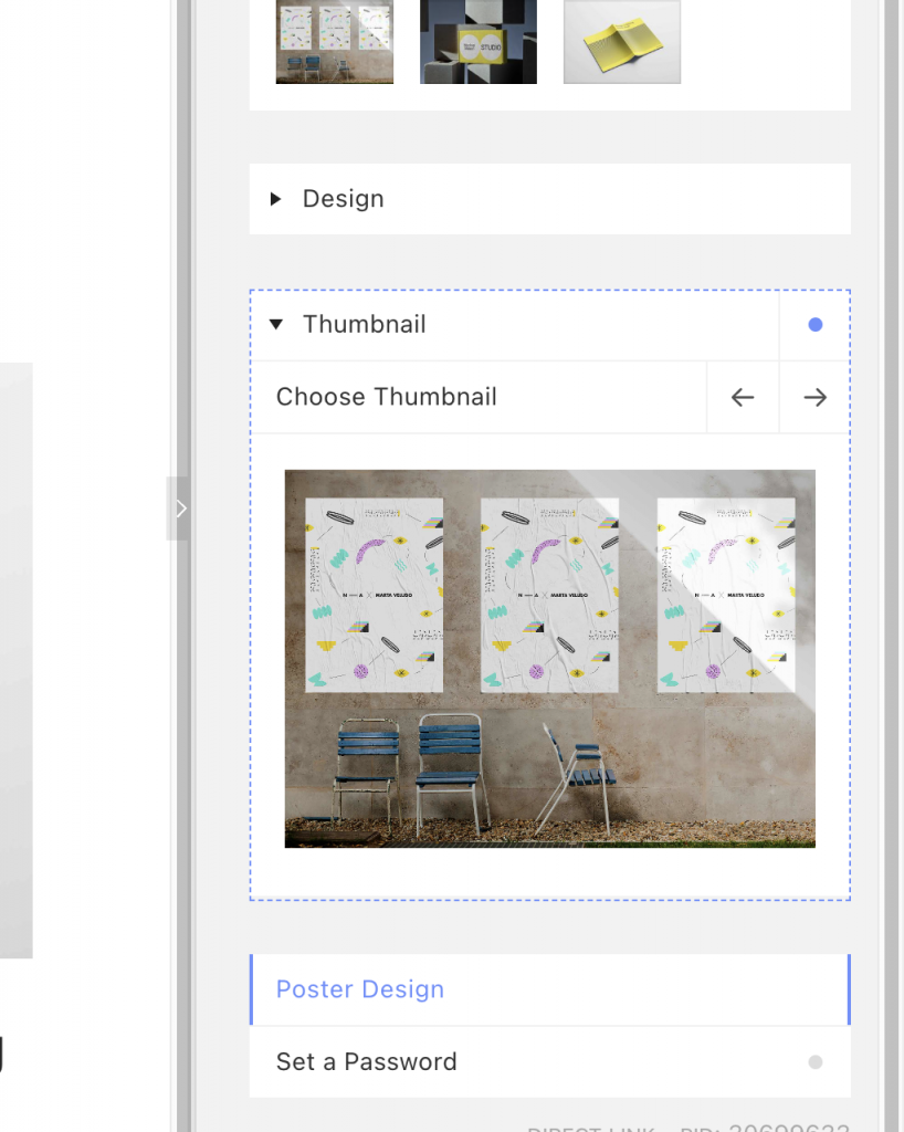
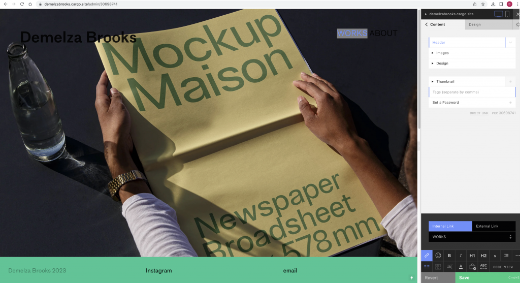
Selecting the untitled, blank template.This template works as a blank canvas for us to work on. The design tab contains the options to set different styles for headings, body copy and smaller type.By selecting the footer, I can choose what goes inside it. I can select a number of columns to place the text in. I can change the colour of the footer background and the text itself. I can choose for this footer to appear on every page of the website.I can choose to fill the window with the backdrop wallpaper.I can create separate projects and choose a thumbnail image for these separate projects. This thumbnail image will appear on the picture gallery.I added internal links and external links within the site by selecting the text then selecting what I want the work to link to.
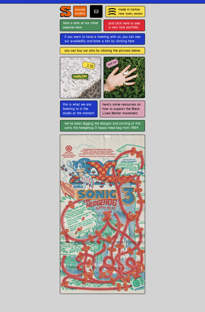
There is no set standard when it comes to a designer’s website. Avoid trends. Below is Snootie Studios website. The use of a grid makes the information easy to understand and navigate:
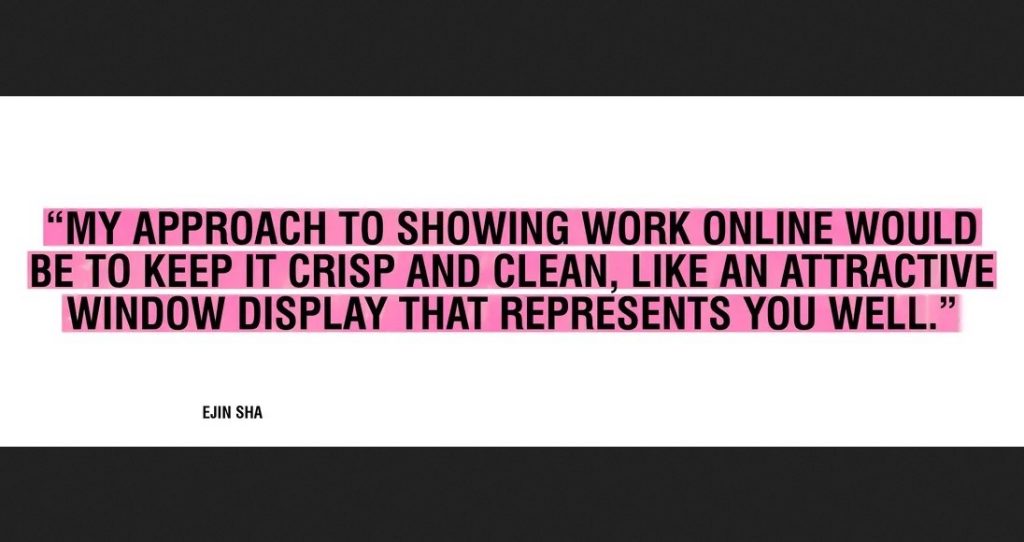
Your website is your presense, its the first point of contact people will have for you. We need to consider navigation- keeping it simple, nice and clean.
…And like a shop window, the content is changing constantly.
Make sure you present it in a clear way, use large images and make sure there’s not too much graphic noise around the work.
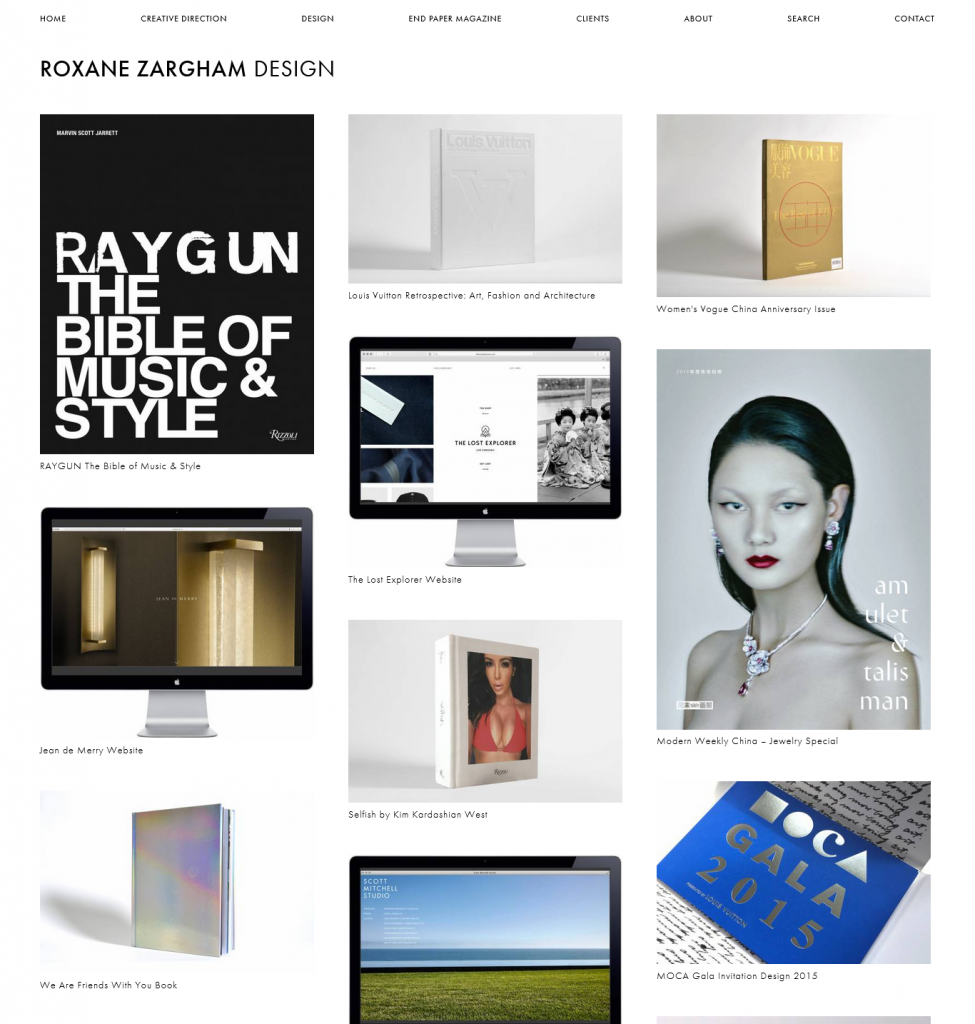
Roxane Zargham’s web portfolio is an example of a very clean layout. The absence of background colour/ unnecessary information helps the viewer navigate the work in this portfolio. Her work has also been photographed in a studio using a white background. Treating each piece in the same way unites the separate projects as being part of the same design identity.
She uses the rule of thirds to divide the work into 3 columns. This gives a sense of balance to the overall page layout:
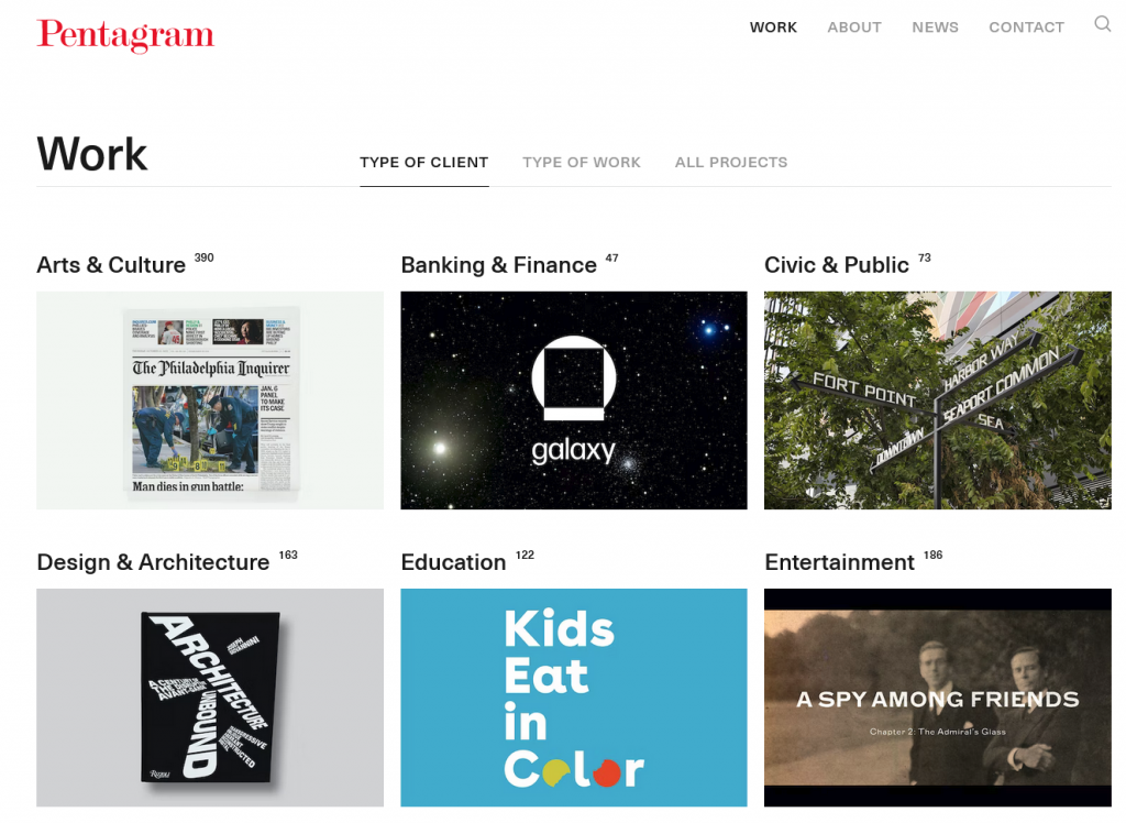
Be selective- it needs to represent what you want to achieve, what you want to work with. This could mean working on a self initiated project. (You want to show you have experimented with different things- analogue, digital.) For example, on the website portfolio of Bounce (a graphic design studio in Oxford), they have included a variety of projects together. I like that I can view the scope of their work on one page:
It’s important to write a description, since work needs to tell a story. Where to start? Puting the work I want to showcase into 1 folder, allows me to be organised. If I write 200 words for each project, then I have this information ready for when I want to post the work to my website for example.
Art direction and image production (creating the content for your website) can be the most time-consuming part of putting together an online portfolio. (We will be exploring this in a photography workshop next week). We spoke about the things to consider when photographing work.
Photographing work
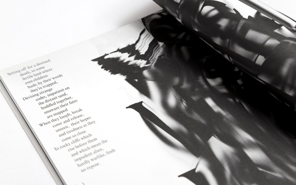
One possibility is to frame the work in a real life context. An example of this is this project from Tomo tomo Studio. They have decided to photograph the book in an old building, isince the subject reflects an antique theme. The work also constrasts with the blue in the background. It is a nice idea to contrast the colours of the work and its background, since this allows the work to stand out.
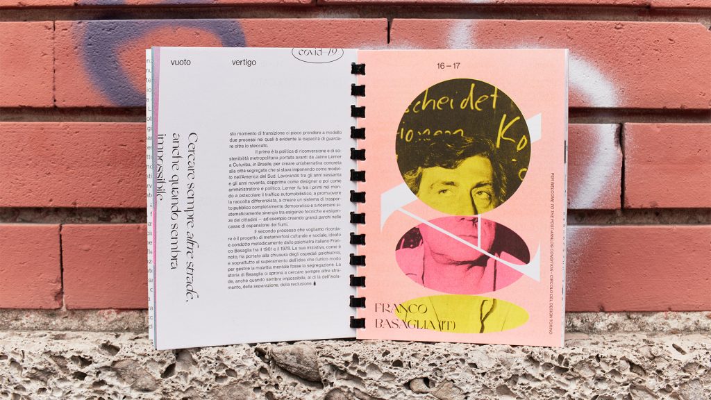
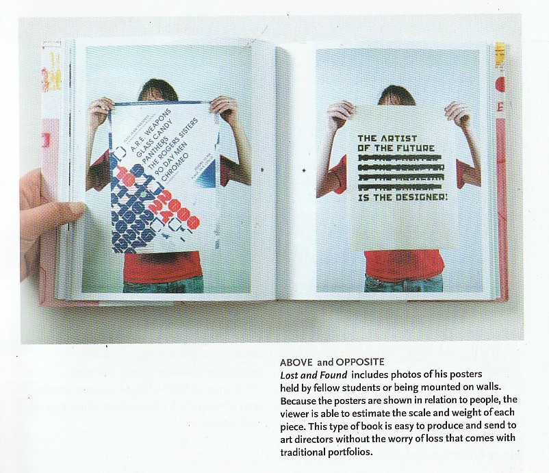
(Below) Another example of an interesting setting, is this fanzine that has been photographed in an urban landscape. Since the zine is about the city, it is appropriate to capture it outdoors against the brick wall backdrop. This is an alternative to photographing the work indoors and artificially lit. Both are appropraite for different works.
Spread from the issue ‘Vertigo’ by Orizzontale
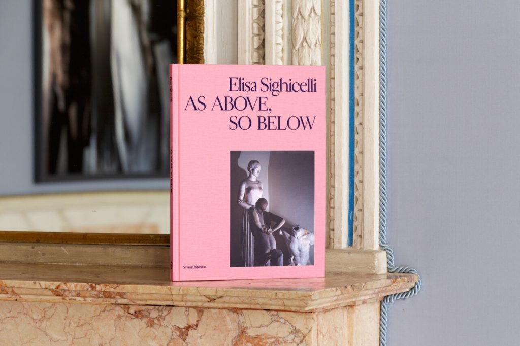
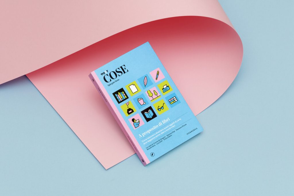
Coloured paper has been placed in background and creates a sense of harmony in the overall image. The colour has been dictated by the work itself:
Cose. Spiegate bene from Tomo Tomo studio
Including a wooden background places the book in a real world setting, allowing the viewer to picture the physicality of the book and to imagine it infront of them. Including the hands gives us a sense of the scale. (below)
We can also use props and other materials alongside the work. For example, if the project is about music, we could place cables in background. We could include props that feature within the work, and place them next to the work also.
Thinking creatively, we can use any material to add interesting background effect. For example, using coloured acetate in the background to filter the light through.
P.O.V.
We can play with different points of view when photographing our work. Choosing a different angle presents interesting aspects of the work and can even create surreal, abstract imagery of an everyday object. For a book that has complicated folding, we can use photography to show the complexity of the book binding.
Suspending the book with fishing wire and photographing it can be a fun way to display the work.
Details can be zoomed in on. Where there might be reflective materials for example, we can photograph the way the light catches the foil on a book cover. The tactile/print quality of the work can be showcased with photography. Use of shadows can emphasise the physicality of the piece.
We could even take a video of the work to show the handling of it. Stop motion can be a fun way to display the work.
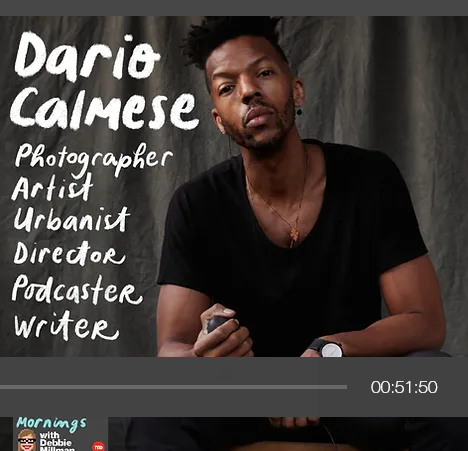
An abundance of identities
Listening to the Design Matters podcast, this episode features Dario Calmese. The discussion is based around the fact that ‘we all have multiple identities’ and that choosing 1 career path may be limiting ourselves. Calmese is described on his website as ‘sitting at the nexus of art, fashion and academia, Dario is an artist, urbanist, director and brand consultant currently based in New York City.’ His curiosity was encrouaged by his parents and he was able to explore many different skills from a young age.
‘Each medium allows for a certain type of communication’
‘Fascinated by what is possible’
About identity:
Identity isn’t necessarily who you are but the things you hold. You are the vessel that holds these identitys. identity is something that comes from the outside, people are telling you how you are seen vs you defining it for yourself.
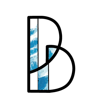
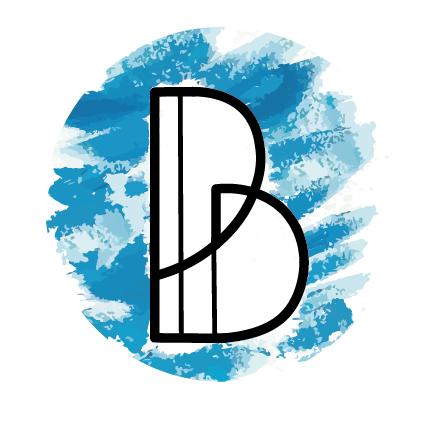
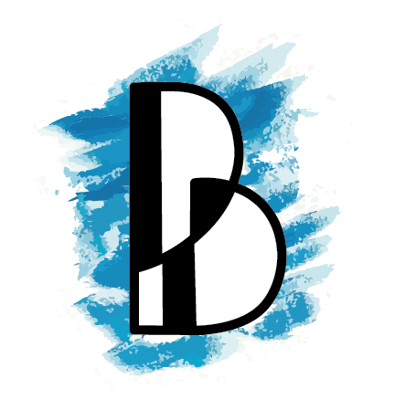
I looked at the book Logo by Michael Evamy. I was more drawn to the painterly textures within the logos in the book:
I was inspired by these textures when refining my logotype:
We use cookies on our website to give you the most relevant experience by remembering your preferences and repeat visits. By clicking “Accept All”, you consent to the use of ALL the cookies. However, you may visit "Cookie Settings" to provide a controlled consent.
This website uses cookies to improve your experience while you navigate through the website. Out of these, the cookies that are categorized as necessary are stored on your browser as they are essential for the working of basic functionalities of the website. We also use third-party cookies that help us analyze and understand how you use this website. These cookies will be stored in your browser only with your consent. You also have the option to opt-out of these cookies. But opting out of some of these cookies may affect your browsing experience.
Necessary cookies are absolutely essential for the website to function properly. These cookies ensure basic functionalities and security features of the website, anonymously.
Cookie
Duration
Description
cookielawinfo-checkbox-analytics
11 months
This cookie is set by GDPR Cookie Consent plugin. The cookie is used to store the user consent for the cookies in the category "Analytics".
cookielawinfo-checkbox-functional
11 months
The cookie is set by GDPR cookie consent to record the user consent for the cookies in the category "Functional".
cookielawinfo-checkbox-necessary
11 months
This cookie is set by GDPR Cookie Consent plugin. The cookies is used to store the user consent for the cookies in the category "Necessary".
cookielawinfo-checkbox-others
11 months
This cookie is set by GDPR Cookie Consent plugin. The cookie is used to store the user consent for the cookies in the category "Other.
cookielawinfo-checkbox-performance
11 months
This cookie is set by GDPR Cookie Consent plugin. The cookie is used to store the user consent for the cookies in the category "Performance".
viewed_cookie_policy
11 months
The cookie is set by the GDPR Cookie Consent plugin and is used to store whether or not user has consented to the use of cookies. It does not store any personal data.
Functional cookies help to perform certain functionalities like sharing the content of the website on social media platforms, collect feedbacks, and other third-party features.
Performance cookies are used to understand and analyze the key performance indexes of the website which helps in delivering a better user experience for the visitors.
Analytical cookies are used to understand how visitors interact with the website. These cookies help provide information on metrics the number of visitors, bounce rate, traffic source, etc.
Advertisement cookies are used to provide visitors with relevant ads and marketing campaigns. These cookies track visitors across websites and collect information to provide customized ads.