Group work- Project 4

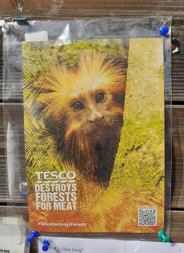
I walked past this poster on the way to campus this morning. The cute monkey image drew me into the poster. I followed the QR code to this webpage:

https://www.greenpeace.org.uk/take-action/forests/#:~:text=Forests%20are%20our%20life%20support,to%20burn%20them%20for%20profit.

Action pack. These posters focus on the animal affected by Tesco’s actions.

We met as a group to discuss the first task of the brief- the poster. Out of the 4 group members, only half of us could be on campus. We worked around this by setting up a zoom meeting and this worked just as well.

The main focus if thus meeting was the Project 4 brief.

The aims of the brief:

  • Write 3 options for the tagline.
  • Choose one of the headlines and put together a poster using this headline and an image. Use 2 colours, 1 for the text and 1 for the image. Could also use greyscale, bitmap or filters.
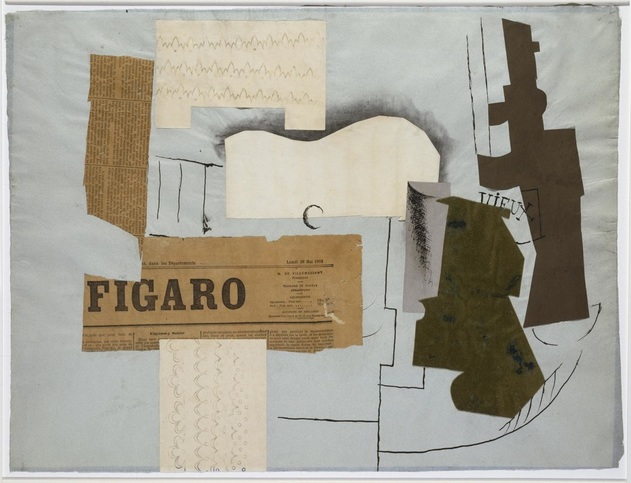
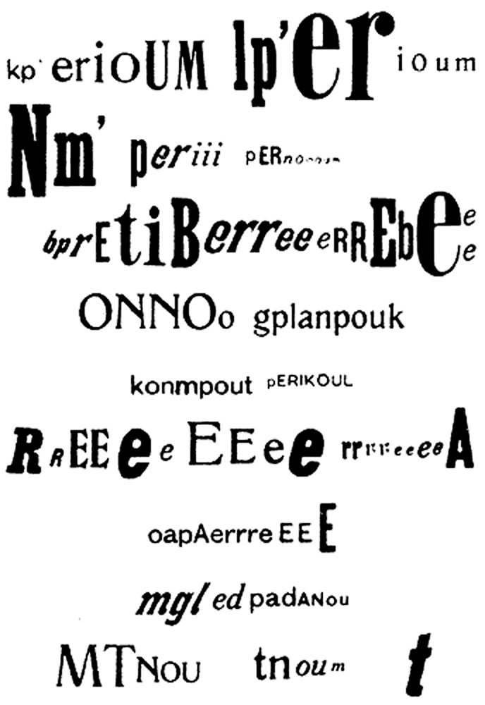
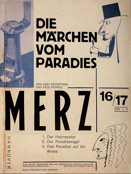
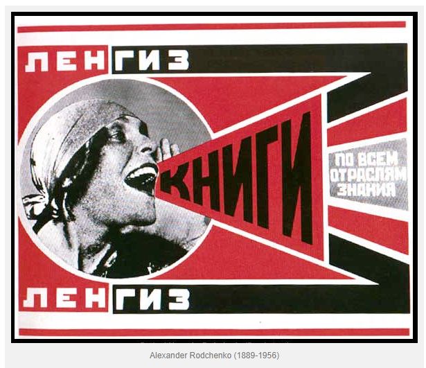
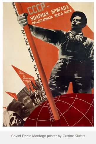
  • For the 2nd poster, choose more than 1 image and create a photo montage. (Mixing bit and pieces of photos to make a new composition, similar to a collage) An example could be Dada or Constructivist compositions.
  • The 3rd poster asks us to use illustration skills. We could use silhouettes, icons, or work with size/scale in a surrealist way. Can use metaphor, such as with (the global warming postyer). Can use up to 5 colours, for example, 1 colour for the background.

Meeting notes:

Colours

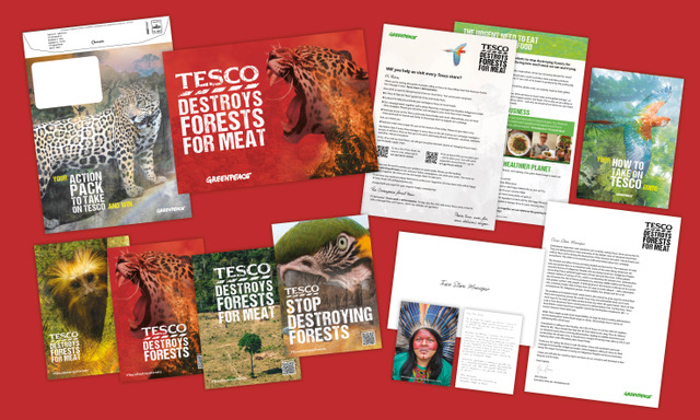
We decided that red should be used in our campaign, since this relates to danger AND the Tesco brand at the same time.

The other colours we considered were black, white, blue and green. Green relates to the nature that is being destroyed. White backgrounds are used often for Tesco posters.

A combination of red, pink and white could symbolise danger and meat.

Taglines

Tesco must go (rhyme), Tesco Kills Trees, Tell Tesco Trees Matter, Don’t Eat Tesco Meat, Tesco Meat Kills Trees

After sharing our ideas with our lecturer, she suggested:

Focus on the animals, not the meat or dairy (Be Wary Tesco Dairy)

Typeface

The typeface used by Tesco is an altered version of Newtext Bold and a humanist sans serif typeface. We want to use this in the poster. We could also include a destroyed text effect.

On the other hand, the poster doesn’t need to reflect the Tesco brand. This method of subverting the brand could be reserved for the guerilla strategy.

Guerilla Marketing Strategy

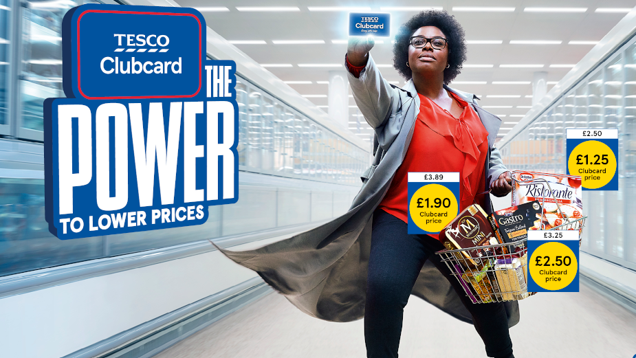
Clubcard tags. Where the price is placed:

Tesco clubcard. The group shared image in a shared drive.

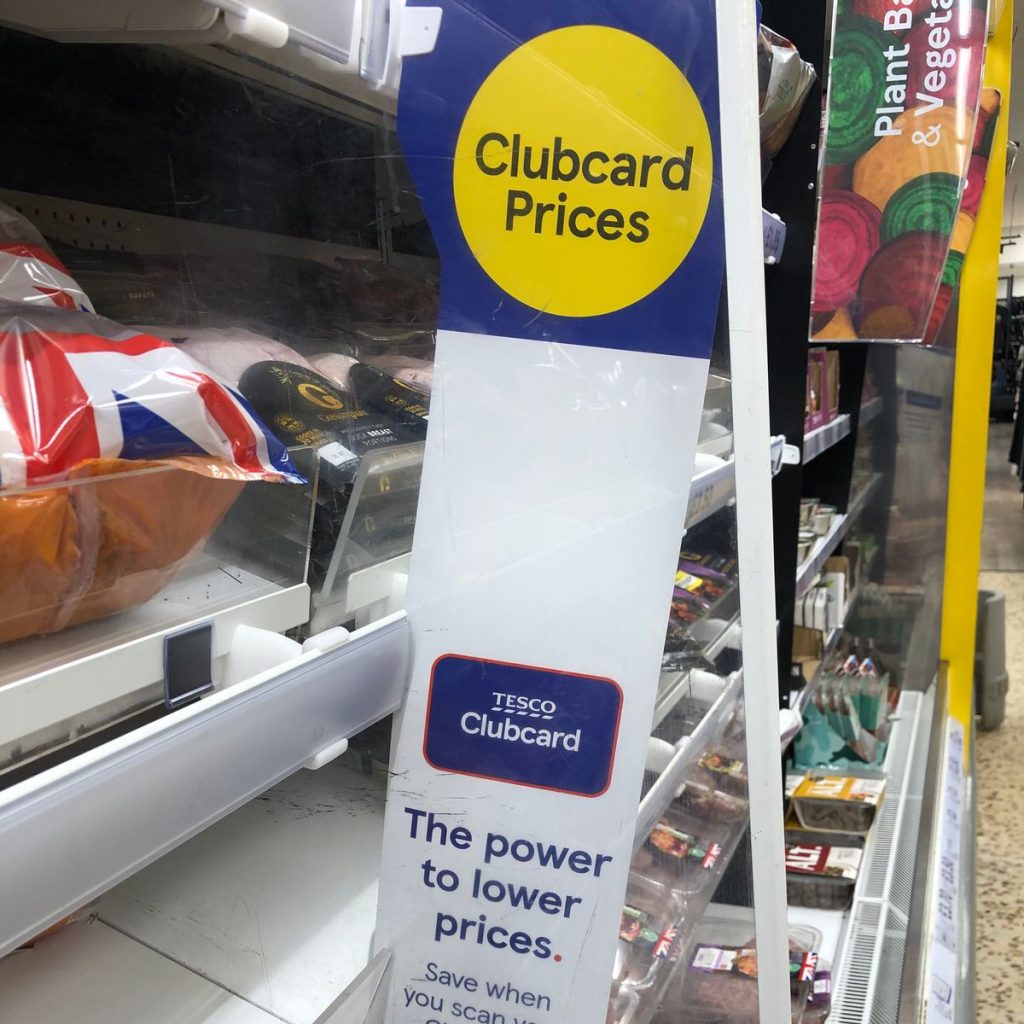
We could use the yellow icon. ‘The power to lower prices’ could be subverted to ‘The power to stop deforestation’. This could put a positive spin on the poster and ask consumers to do something good. The prices on the right could state the facts we want to get across to the consumer.

Tesco Clubcard campaign, 2020 by MediaCom

Every little helps> Every little consequence/ suffering.

Prices that take you back

‘Tesco Finest’ > not the finest way of producing meat.

(Whatever you’re buying, the forest pays the price) Knock-on-effect damage (medicine comes from rainforest, effect on indigenous communities, animal habitat loss). These facts could be displayed as in the poster below. For example ‘Every tree killed, Every living forest…’

Tesco Love Every Mouthful campaign
Posters

1 poster focusing on meat, 1 for dairy?

Poster 1: Red and white. Maybe using a white background and tagline written in ‘meat font’.

Poster 2: A Tesco in the forest

Poster 3: The tree and meat

The shape of the meat could reflect a geographical structure. For example, the shape of the Amazon.

Our plan for the week is to design at least 1 poster each. We will then meet up and discuss which we feel are more effective.

Language & Type (part 1)

History of Typography

In the 19th century there was a reduction in price of printing material. This enabled people to read, which allowed a democracy. (You can’t have a modern democracy if people can’t read). This reduction in price, lead to several things:

A rise in advertising- they saw posters competing in public. A visual noise shown in the painting by John Orlando Pary of a London street scene:

Both artists and writers saw this and were inspired. They turned to each other’s craft to enhance their work. Artists used words within their work, such as the collages by Picasso and Braque. Symbolist poetry came from writers reading the newspaper and seeing a contrast in the words about a variety of subjects.

Bottle of Vieux Marc, Glass, Guitar, and Newspaper – collage by Picasso https://www.weinerelementary.org/picasso-and-collage.html
Modernsim & Post-Modernism

“From the end of the 19th century, modernism was shaped by the industrialisation and urbanisation of western society. It marked a departure from the rural and provincial towards cosmopolitan, rejecting or overthrowing traditional values and styles as functionality and progress became key concerns as part of an attempt to move beyond the external physical representation of reality as depicted by cubism and the bauhaus.”

Around the 1st World War, the western world was politically heated. Dadaism and the Constructivists came out of this time. Dadaists opposed the traditional beliefs of a pro-war society.

The optophonetic of Dadaist poet Raoul Hausmann, presented by Cecile Bargues http://www.diptyqueparis-memento.com/en/dada-optophonetic/
Cover of Merz, Kurt Schwitters, 1925

During the communist revolution, the art movements within this were the Futurists in Italy and the Vorticists in Britain. Their work represented the breaking up of the old world.

https://visualartsdepartment.wordpress.com/modernism/

“Constructivism began as a Soviet youth movement. The Russian Revolution of 1917 involved many Russian artists, who combined political propaganda and commercial advertising in support of the new communist revolution.”

Blast

“Bless all English eyes” BLAST manifesto by the Vorticists. The harsh typography states a list of things the Vorticists were against (‘Blast’) and what they supported (‘Blessed’).

In the 1920’s, rules were written by Modernists and new typefaces were invented. This occurred at the rise of Fascism. Herbert Bayer was a designer who came up with the ‘Universal’ typeface, that he planned to be used by everyone, in a way of re-writing tradition. By changing what the world looks like, people are introduced to the new as it surrounds them in everyday life. This typeface at the time was extremely new and surprising.

Universal, 1925, Herbert Bayer

“Bayer’s Universal typeface was developed at the Bauhaus and is a reduction of Roman forms to simple geometric shapes. The circular form features heavily, and you can see how each character is closely based on the others.”The Fundamentals of Creative Design by Gavin Ambrose and Paul Harris

Radio design by Dieter Rams. His work was described as ‘quiet simplicity’. He was a pioneer of the Modernist movement and worked for Braun.

Jan Tschichold

Poster, Buster Keaton in “Der General”, 1927
Internal spread from brochure Merken Sie sich bitte: Die Reklamemesse, 1927

“New Typography uses white space to create visual intervals in an asymmetrical layout. An underlying grid unifies the page. Personal expression is rejected in favor of order and clarity. The predominant graphic design style in the world by the 1970s, the Swiss style is recognizable by its strong reliance on typography, usually sans serif type in flush left alignment.”

Late Modernism occurred in the economic boom in the 1950’s. Wim Crouwel’s posters from 1960’s-1980’s have a similar appearance to design now:

1967s New Alphabet Typeface. https://speckyboy.com/icons-graphic-design-wim-crouwel/
Wim Crouwel Leger Poster, 1957.

Matt Willey- contemporary designer

The New York Times magazine
NYT Olympics
Post-Modernism

“Post-Modernism developed following the Second World War and questions the very notion that there is a reliable reality through deconstructing authority and the established order of things by engaging the idea of fragmentation, incoherence and the plain ridiculous.

Post-Modernism returned to earlier ideas of adornment and decoration, celebrating expression and personal intuition in favour of formula and structure.”

Fuse magazine, founded by Neville Brody and John Wozencroft

An example of Post-Modernism, the designers expressed their imagination across the pages. Sometimes readability was compromised, as form reigned over function. The magazine was produced at the time when computer technology allowed designers to experiment with new tools.

Fuse 2, Runes: Edition Poster design by Neville Brody, 1991 https://www.amazon.co.uk/FUSE-1-20-TASCHEN/dp/3836525011
https://thefontfontyeahs.wordpress.com/2012/09/19/fuse-1-20/

Automation is a phrase that is used to describe the transition from the old skilled job (for example, of typography) to the present digital age where the digital design tools are available to anyone.

Gilbert, Type with Pride https://www.typewithpride.com/

“On 31 March, 2017, Gilbert Baker the creator of the iconic Rainbow Flag sadly passed away. Mr. Baker was both an LGBTQ activist and artist, and was known for helping friends create banners for protests and marches. To honor the memory of Gilbert Baker, NewFest and NYC Pride partnered with Fontself to create a free font inspired by the design language of the iconic Rainbow Flag, the font was named ‘Gilbert’ after Mr. Baker.” This is one of the world’s first coloured fonts.

“The colour combinations are blended on letters to represent the ‘open and fluid communities’ that make up LGBTQ.” (from The Fundamentals of Typography 3rd edition)

Postmodern design:

Eye Magazine, Issue 102

London Design Museum- Designer Maker User

Objects in a shop display, Kensington.
The exterior of The Design Museum.
Posters for exhibitions at the design museum.

Designer Maker User.

The name of the exhibition is displayed on a large board. The letters are written on slats which rotate to display the next word. I first thought this was a digital screen, but seeing it closer up I saw that the words were printed on a material like plywood.

The soft lighting and wood interior within the design museum creates a friendly warmth throughout the building. After the rush of London, I felt relaxed.

The first objects I came across on the top floor of the museum.

Shoes. guitar. Sewing machine. Suitcase. Walkman. Bottle opener. Bike lock. Mug. Typewriter. Jeans. Slinky. Skateboard. Flip-flops. Camera. Violin. Gameboy. Bible.

I was surprised at the arrangement of objects and the assortment on display. The objects were placed quite closely together which felt slightly disconcerting because there appeared to be no connection between each object. My first thought is that these objects have come from many different people and places. Perhaps there was no other way to introduce this exhibition that shows us such a wide variety of design.

The typewriters hanging on the wall was an interesting sight. I have never seen a typewriter displayed from a wall in this way. The way they were shown as a collection was satisfying to see. I found them beautiful. As a child, I was always drawn to my mum’s blue typewriter and wanted one myself. Seeing these typewriters brought that feeling back.
Valentine typewriter, 1970. Designed by Ettore Sottsass and Perry King.

Olivetti Praxis 48 typewriter poster, 1967, Designed by Giovanni Pintori.

It was really nice to see the poster behind the physical object of the typewriter. In my head I could put the 2 together and imagine the time they came from.

Olivetti Lettera 32 typewriter poster, 1968-69. Designed by Walter Ballmer.

Here the designer has played with scale to created a surprising image where the egg is as large as the typewriter. Seeing the typewriter at this angle is another unusual element to this poster.

One classmate made the point that the older technology was new to our parent’s generation.
Flowermist teapot, 1950’s, designed by Jessie Tait.

I loved this unique teapot as soon as I saw it. This is the kind of item I would be tempted to buy. It is delicate, pretty and functional. The way the teapot was displayed allowed me to view it from all angles. The light directed onto it acted as a spotlight, drawing me to the object. The shadow created on the side of the pot highlighted the shape of the design.

The way the teapots are displayed together is interesting. The frame they sit on is asymmetrical. It reminded me of a teapot tree out of a fantasy story. They appear to be floating due to the transparent cases.
Logos on the wall of the exhibition, showing us how the design has changed over the years.
Seeing my hometown of Reading on the poster made this historical object feel more real to me. I could imagine the people marching in the street, rather than if the poster had been about somewhere I do not know.

I really like the use of repetition in this poster and the black and white design. The lack of colour helps the shapes to stand out. The line at the bottom of the poster gives us a visual representation of the route of the march.

Displaying photos of the protests next to the poster gives us context for the object.

Wall of time. This wall displayed clocks, watches, a filafax, and other objects to organise a person and mark time. In the top right-hand side, I saw the Ball Wall Clock. This object immediately intrigued me.

I first felt awestruck. Then joyfully impressed. I could not relate this design to anything I have seen before. I guessed that the object was old. I have always struggled to read clock faces and numbers in general. I usually dislike any clock that does not have numbers on it. I like I would struggle to use this clock if it were mine. But the cheerful quality of the design overrides this for me.

The story behind these tasting spoons interested me. At first they appear to be identical. The design looks the same in all four spoons, except they function slightly differently because they give a person a slightly different experience depending on the material used.

Shopping bag for Mothercare, 1980’s.

I was surprised to see the thickness of the plastic bag. The colours are bold and bright. Plastic bags are no longer made in this way. Because of the thickness of the material, I imagine that this bag is durable. The simplicity of this design is very effective and the red of the duck’s head is eye-catching.

The list of words at the centre of the exhibition could describe design or objects.

I picked up this pamphlet for families at the exhibition:

I really like these illustrations.
Map of the exhibition.