The purpose of today’s lecture was to get us thinking first about the images we choose to present in the presentation and secondly, the order we place them in. To practice piecing together a presentation using InDesign, I chose to focus on my shoe as my object.
I took photos that showed off the aspects of the shoe I have experience since buying them last weekend: They are tall, they are comfortable to stand in, they can be unstable to walk fast in, the straps can be adjusted. Photographing the shoe on the carpet puts it in the context we would expect from a shoe, which is that it interacts with the ground we walk on.
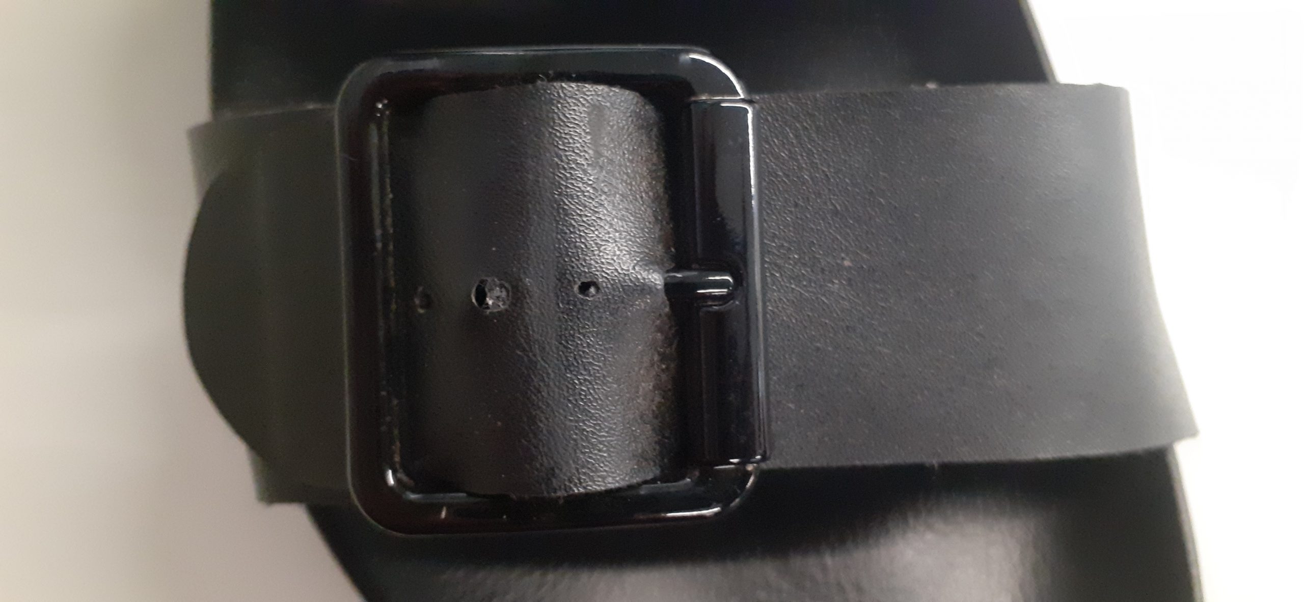
I then needed to choose 6 of these photos and decide on the best order to present them in. I chose the ‘selling view’ because it shows the entire shoe. I came to realise, this was the exact reason I should not choose that picture to be placed first. Throughout the lecture, I saw that it was more important to leave some mystery for the viewer. If all the information is given away in the first slide, it leaves nothing to be revealed. Instead, it is important to grip the viewer. This is why I rearranged the image of the detail to start the presentation.
Luisa asked us to write 1 word to go with each picture. This was my original order and name for the images.
- (selling) view
- (wearing) it
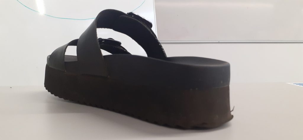
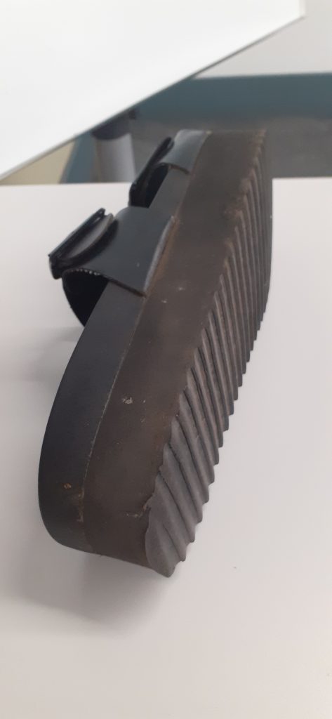
- seeing the (side)
- it’s (comfortable)
- detail of the (buckle)
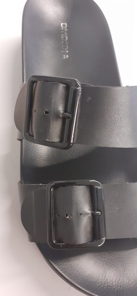
- view from (above)
I approached this task by naming exactly what was in the picture. However, I found that it was more interesting to approach the words creatively. For example, picking out one detail within the image or maybe the material the object is made of. We worked as a group to brainstorm words that relate to each image.
The ‘selling’ and ‘wearing’ slides work together, because the viewer can compare seeing the shoe with and without the foot, since the shoe is placed in a similar position.
The ‘comfortable’ and ‘selling’ slides make sense together because they are both in portrait orientation.
The photos I rejected:
Ball wall clock presentation
The essays by Roland Barthes introduced me to the idea of personifying an object. Often we give objects human qualities, and that is why we become attached to them.
In terms of my presentation, I want to consider the clock in this way? If it was a person, would it be friendly?
What makes a presentation visually ineffective?
Firstly, a presentation is to be seen from afar. There is no point to include graphs or images cannot be seen on the board from the back of the classroom.
Do not include pixelated images. Sometimes an image can become pixelated after you export it to a PDF.
Hierarchy is important. The viewer needs to be directed to the most important information on a page. We can do this by underlining words and adding titles. A text heavy slide is off-putting.
Other presentation tips…
It is a bad idea to be repetitive in a presentation. If an image says the same thing as another image, it is best to remove it. You do not want to bore the audience!
I could drawn my object if I feel it would help to tell the story.
Be playful, anticipate what is going to be in the next slide.
Not all the images need to contain the object. A photo of the building tells as much a story about my experience of the object.
I could include an image of the clock selling on a website. This is part of the story of the object’s value.
I can show the object in different contexts, for example in the museum or in a catalogue. This shows how the object appears in our world.
The final picture has to surprise the viewer and sumarise the object.