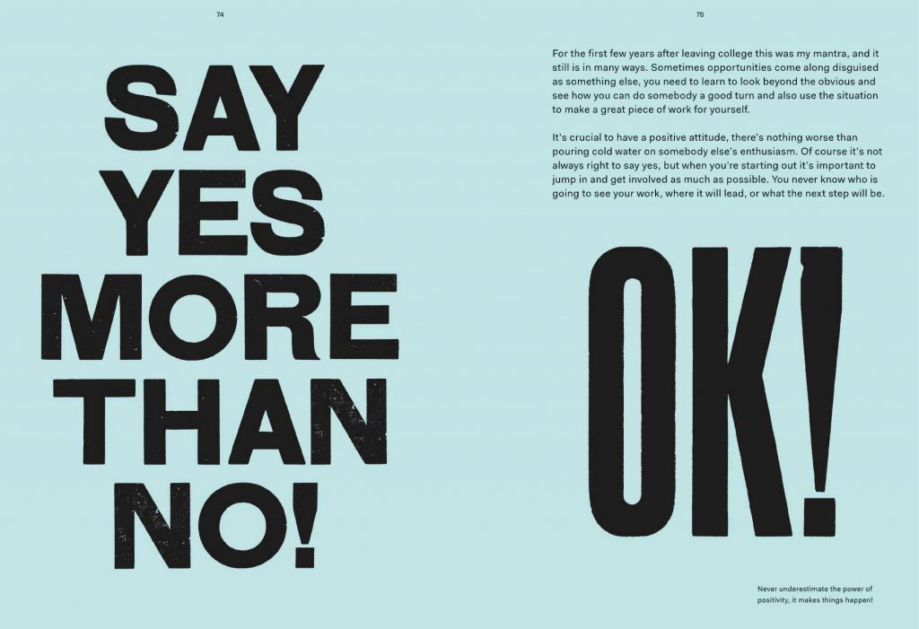
Type is essential for effective communication.
Type can:
deliver a concept or express an opinion.
The way text is displayed will add meaning to the words themselves.
By changing layout, spacing, punctuation etc, we can portray a certain message. For example, the boldness of ‘Kindness’ in the sign below, suggests that kindness can be bold and robust. The height of the word ‘Strength’ illustrates strength itself.
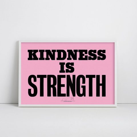
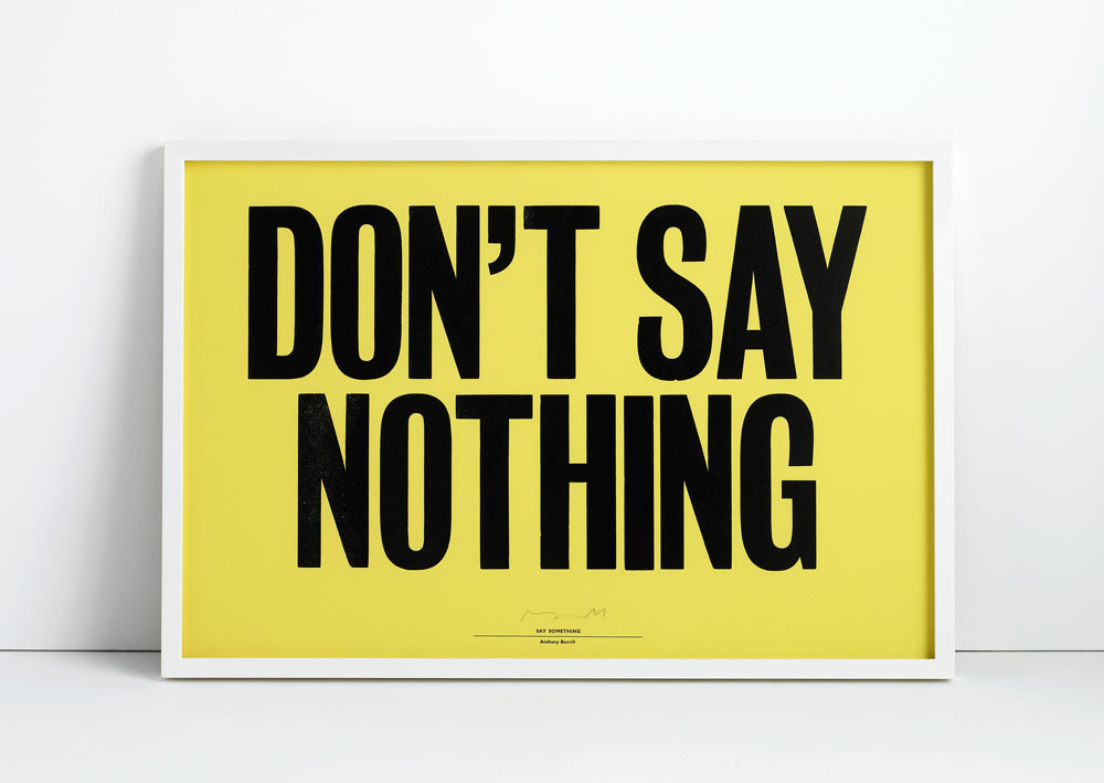
British graphic designer, Anthony Burrill is well known for his prints which often contain bold statements that are punchy and effective.
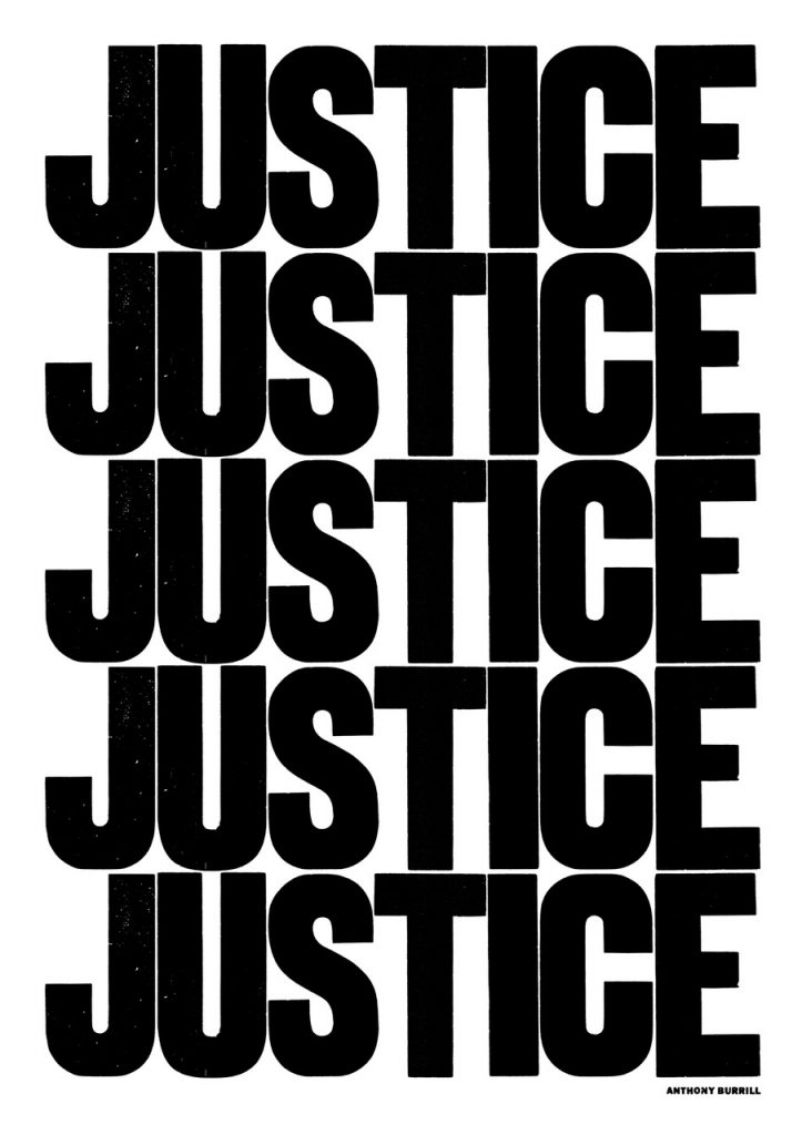
By repeating the word ‘Justice’, Burrill is making a statement about the importance of justice. When people are passionate and certain about something, they repeat the sentiment. This is further emphasised by the black and white. When something is in ‘black’ and ‘white’, metaphorically it means there are no doubts about it. Here Burrill is using this in the literal way.
Words are powerful.
They invoke emotion, feelings and ideas. They are powerful because of their ability to encapsulate a concept.
Words can be transmitted from person to person, often in an instant format. This is why memes are powerful. Because of the speed they can be shared and the way they need to be understood quickly, means they are also put together in a way that is simple and concise.
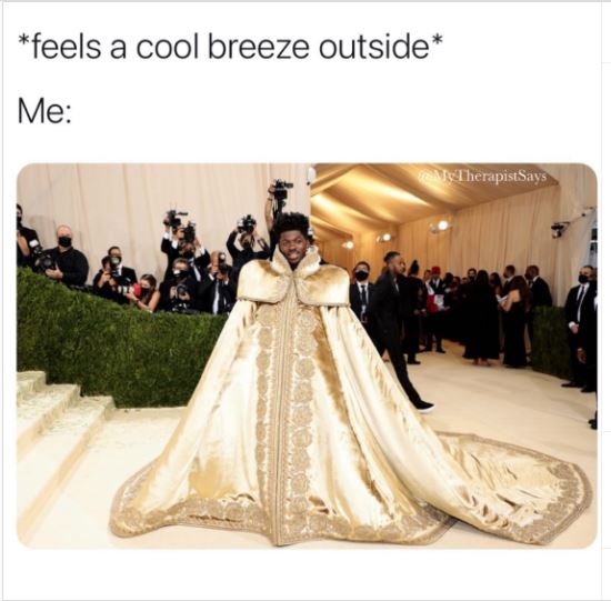
In a small space, a lot of meaning can be packed. This includes imagery and experiences. Stories can be packed into a few words.
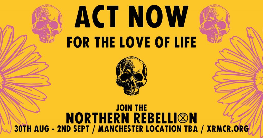
Extinction Rebellion
Extinction Rebellion are a movement set up to tackle the climate change problem.
They use guerilla marketing strategies to get their message across, for example civil civil disobedience and demonstrations. They create a disruption, sometimes spreading flyers where they aren’t allowed to.
They use bold, big statements in uppercase type. The typeface they use is similar to Futura, but with rounded edges. Sometimes images function as letters, i.e. skulls.
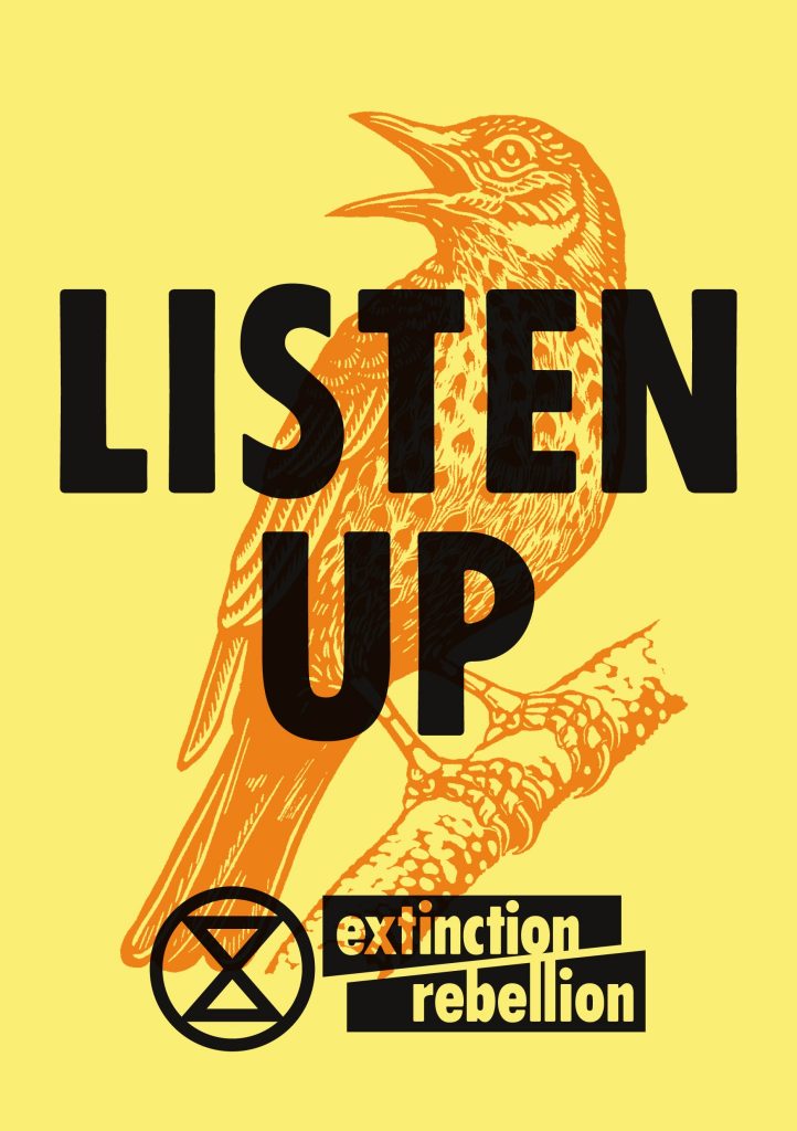
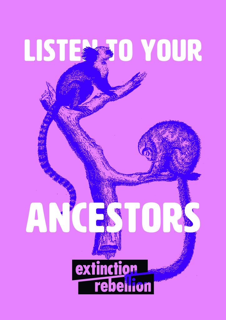
Their symbol is an abstracted hourglass. This emphasizes time running out and the circle is a symbol of the Earth.
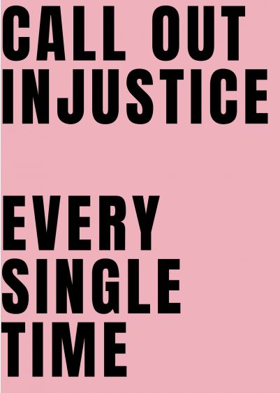
Black Lives Matter poster (left)
This poster was designed by the anti-racist advocate Sophie Williams. She puts her message outside in the street for the public to see.
She uses repetition, different angles and spacing to add emphasis to her message.
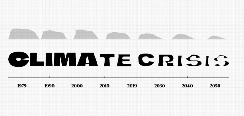
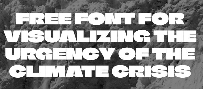
Climate Crisis font by Helsingin Sanomat. This is an example of variable font.
Helsingin Sanomat, abbreviated HS and colloquially known as Hesari, is the largest subscription newspaper in Finland and the Nordic countries, owned by Sanoma.
Variable fonts are an evolution of the OpenType font specification that enables many different variations of a typeface to be incorporated into a single file, rather than having a separate font file for every width, weight, or style.
The typeface is based on real arctic sea ice data and gives us a visual representation of the loss of sea ice on Earth.
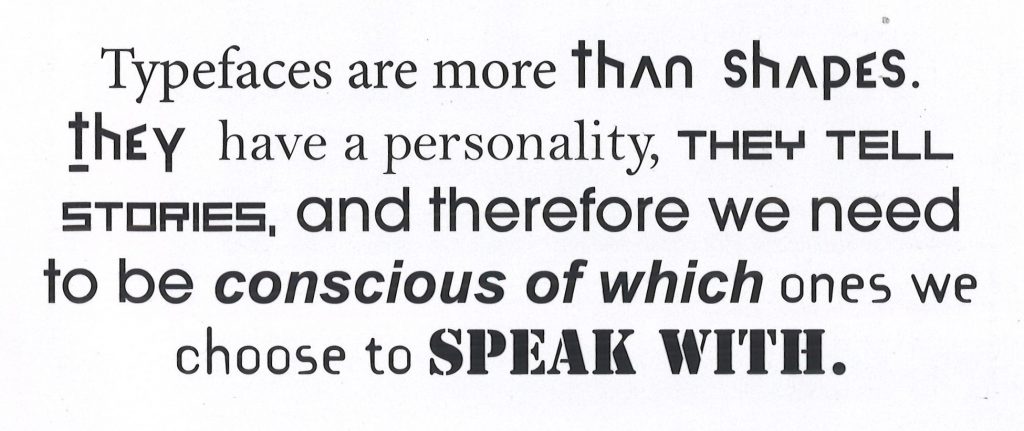
Typefaces tell stories. Sad, complex, pretentious…
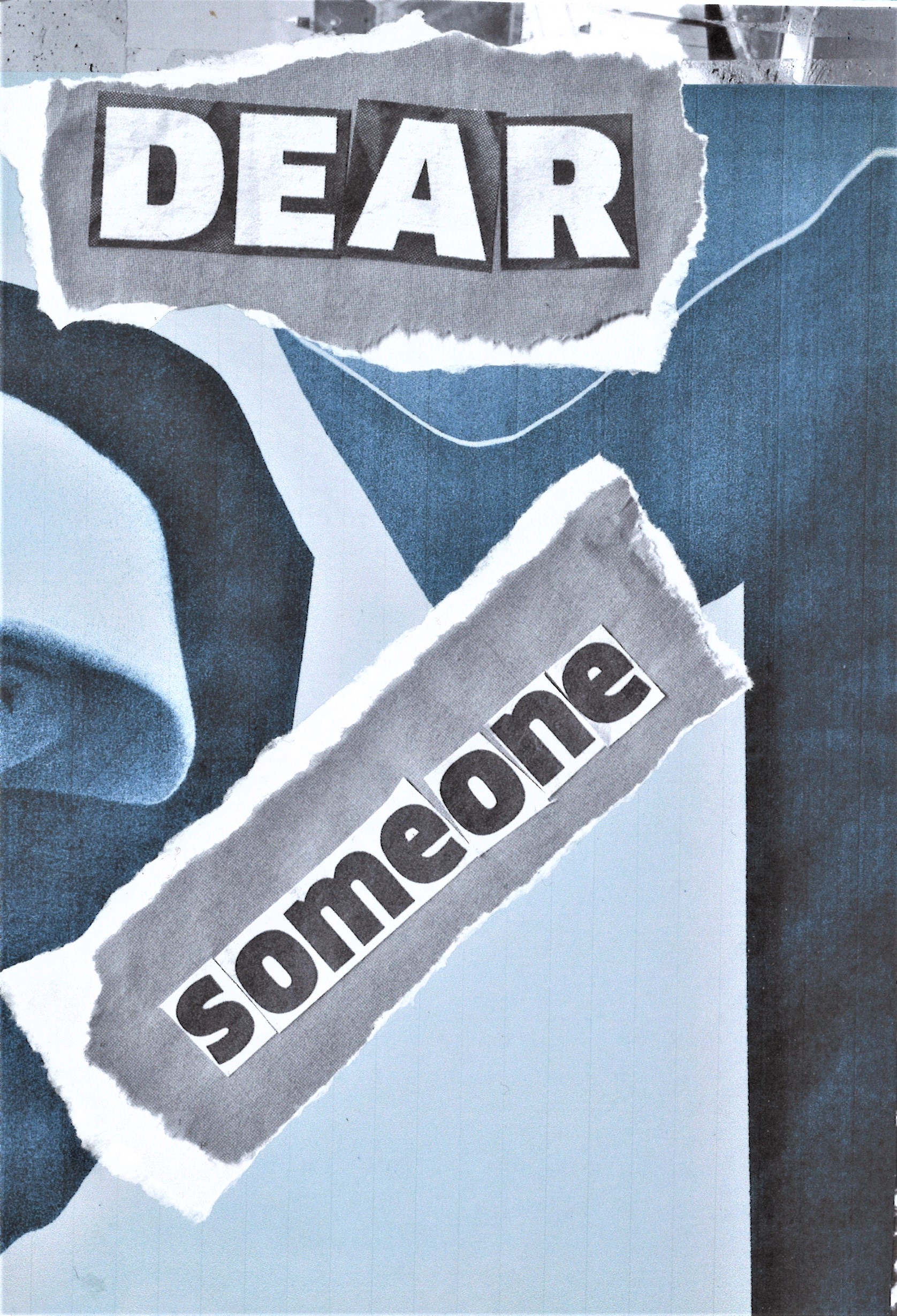
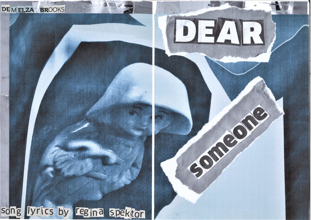
Sa Soriano
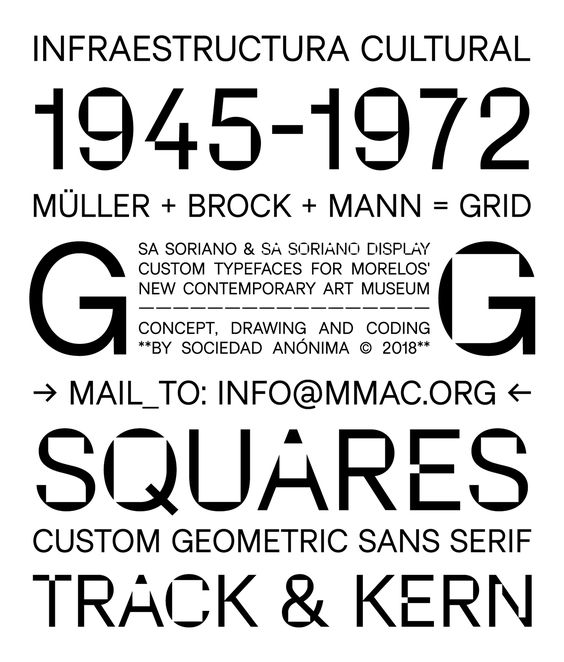
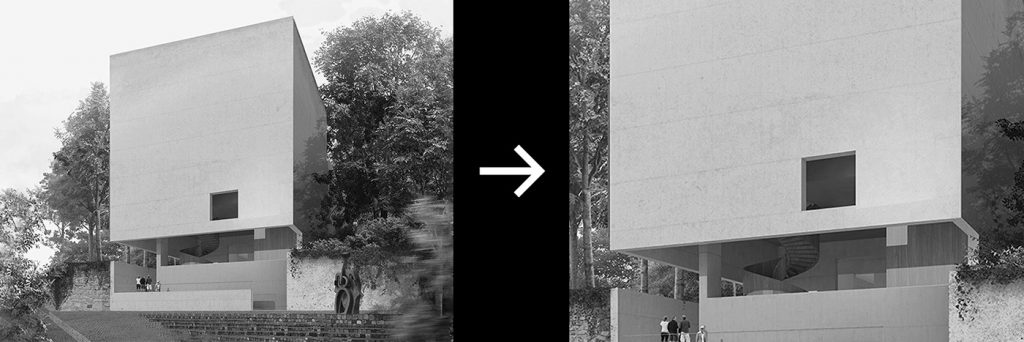
‘For the Museo Morelense de Arte Contemporáneo Juan Soriano (MMAC), we designed a sans-serif typeface with a display character, inspired by features of the museum’s architecture. The specific reference is the windows and openings drawn on large-scale plans, gestures that were replicated in the typography through cuts and gaps, alluding to positive-negative, interior-exterior, window, landscape space.’
This is an example of form follows function.
The content can lead what the type looks like, or the type can follow the content of the project.
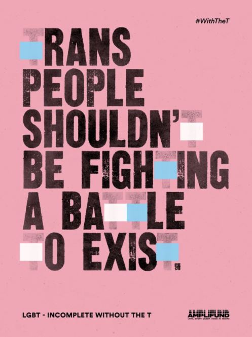
Incomplete without the T campaign, Grey London. With the aim of raising visibility of trans issues, Grey London came up with the idea of removing the letter “T” from a range of different texts to highlight the erasure of a letter from “any word, in any language”. This means reducing or removing both the comprehension and the unity behind it – “and the same is true when you remove the T from LGBTQ+,” states the magazine.
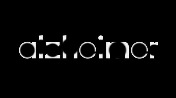
Studio Dunbar
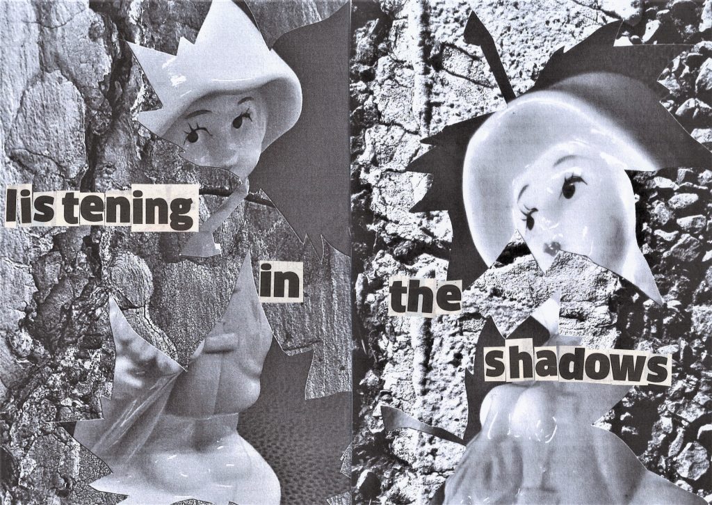
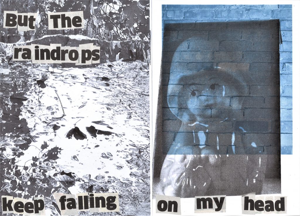
Erasing parts of the word ‘Alzheimer’, represents how the memory is erased in people with Alzheimer’s disease. It also simulates the frustration experienced by people with memory loss, by giving us the experience of reading the word with difficulty.
Pentagram- Maholy Nagy Foundation
This is an example of analogical techniques being used to create type.
Maholy Nagy was an artist from the Bauhaus. He worked with experimental photography and was one of the first people to experiment with photograms.
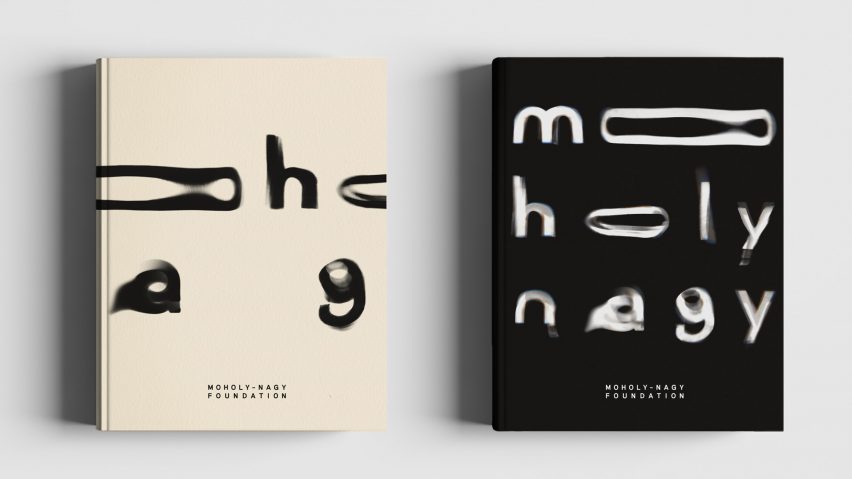
For this book cover design, Pentagram have used water to give the type a wavy effect.
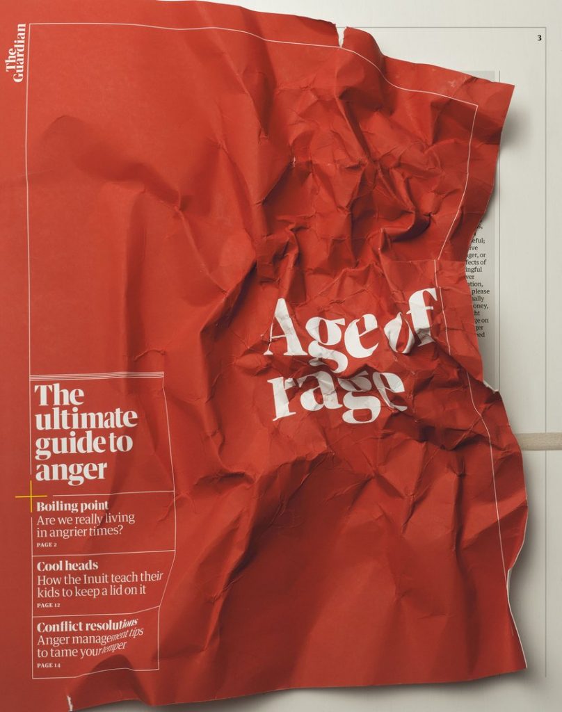
Age of rage– The Guardian’s guide to anger. This is another example of design that uses analogical techniques.
Linguistic tricks
Linguistic tricks can make a phrase more memorable. They can be used when writing headlines.
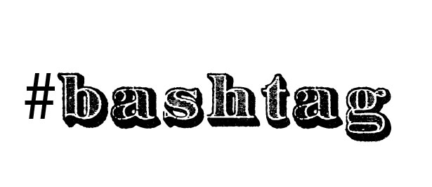
Examples of Portmanteu:
Examples in English include chortle (from chuckle and snort), smog (from smoke and fog), brunch (from breakfast and lunch), mockumentary (from mock and documentary), and spork (from spoon and fork). A portmanteau is a suitcase that opens into halves.
(combining 2 words to create 1 new word)
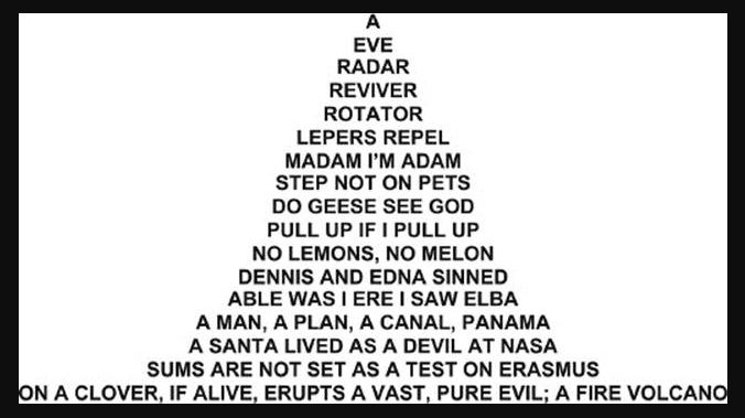
A Palindrome is a word that reads the same backwards and forwards, for example:
Alliteration makes a phrase more memorable. It is often used in brands and advertising, for example:
Rhymes
Neologism are new phrases that have been recently made up because their use has become popular, for example:
‘Google it’
‘Tweet about it’
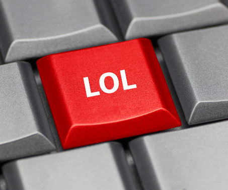
Acronym
Denotation is the literal meaning for example, a cross.
Connotation is about our associations. In relation to a cross, it would be Christianity, hospitals. etc.
Project 2- Group work
Using the skills we learnt from this week’s lecture, we designed expressive type around an article about deforestation. We were placed into groups and needed to each design this heading. ‘We Need Trees’ works as a heading because it is snappy and uses rhyme.
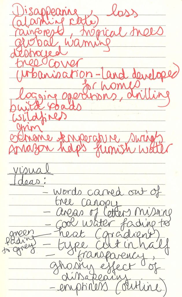
I first read the article carefully, underlining key words. I then scribbled my ideas in my notebook, focusing on the key themes.
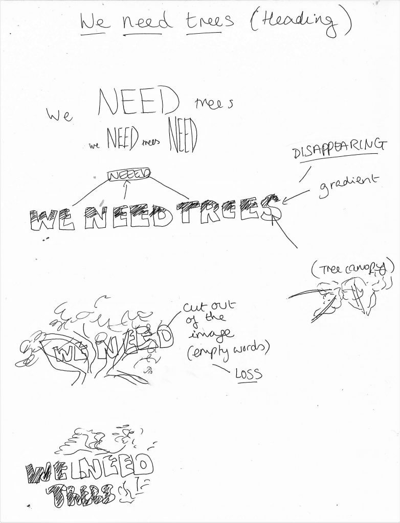
I sketched visual ideas for the heading:
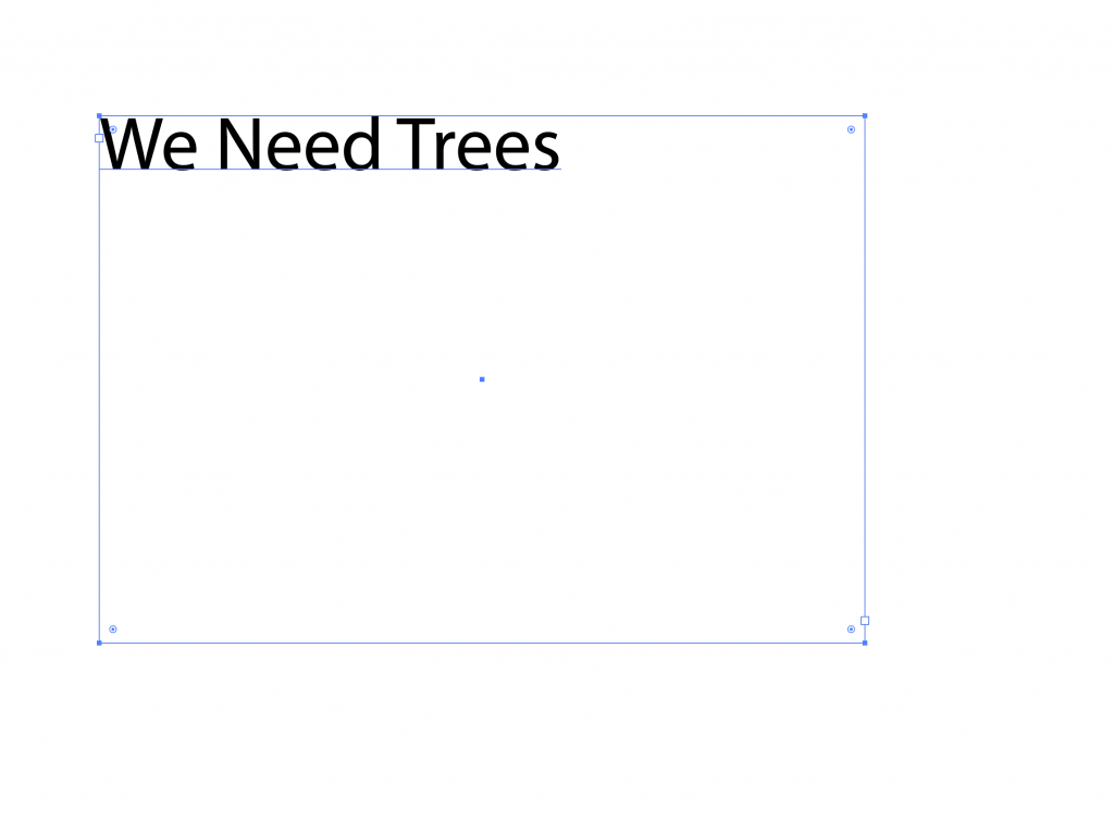
I designed the heading in Illustrator. I typed the heading into a text box and changed the font to ‘Impact’ :
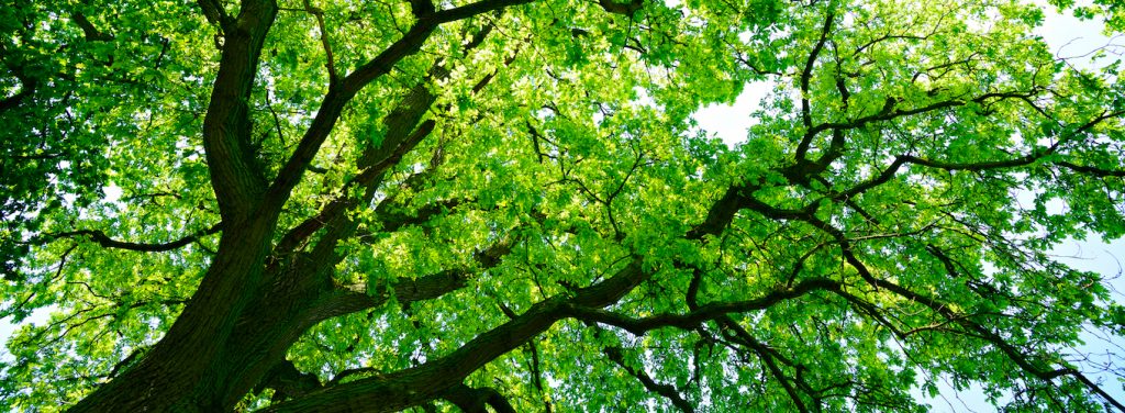
I used this photo of a tree canopy. (below) I bitmapped the photo by opening it in photoshop, converting it to greyscale and then selecting bitmap> diffusion dither.
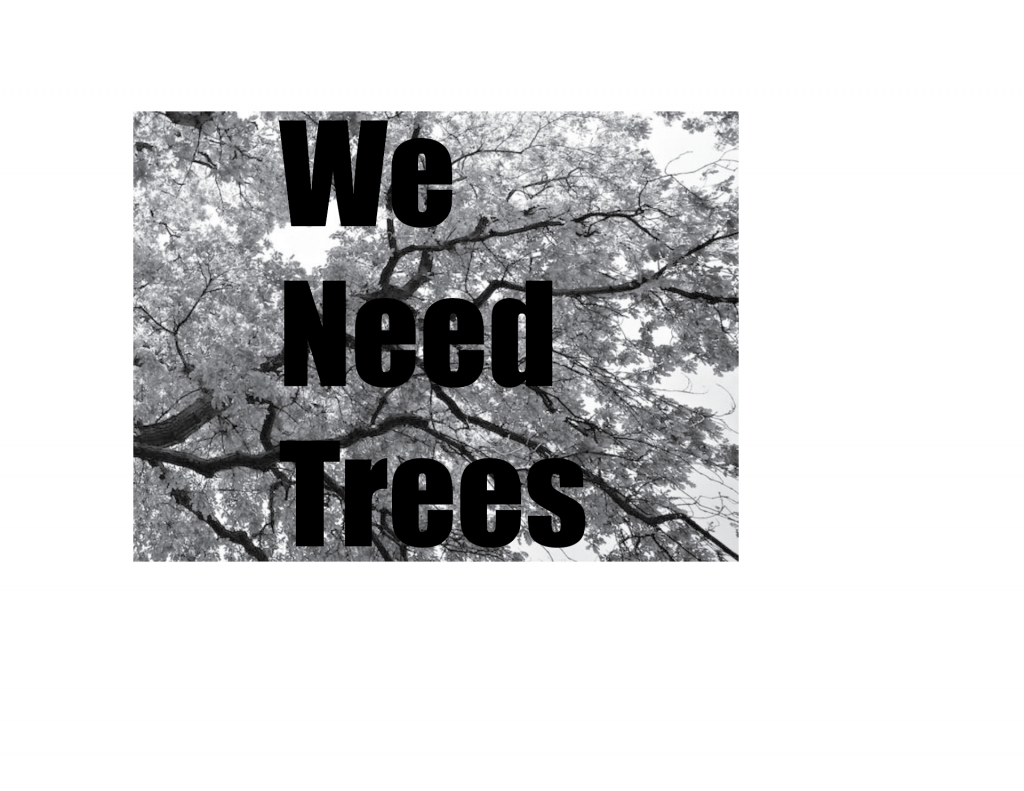
I placed the group’s designs into InDesign and exported the document as a PDF. This would allow us to present it to the class easily in the next lecture.
Below designs by:
1)Ben 2) Ben 3) Ben 4) Holly 5) Demelza 6) Demelza 7) Demelza