& studied Illustration at Chelsea College of Arts.
Before this year, I had never heard of summer schools- universities opening over the summer to run short courses. So instead of a holiday, I wanted to learn something I’m interested in. I chose to sign up for the Illustration short course with UAL (University of Arts London) and spent a week of July at Chelsea College of Arts, located in Pimlico and opposite the Tate. It was an adventure for me and my first time navigating London’s underground alone.
What made me want to sign up?
I wanted to grasp the basics of what an illustrator’s job involves, and even if illustrators are still needed in today’s world. The in-person course appealed to me more than the online option.
How was it?
My interest was captured and held for the entire week’s classes. It was exactly as described, a taster or introduction where our wonderful tutor Alessandra, ran through the many aspects of illustration. Alessandra has a nurturing and thorough approach which helped the course to flow. I had all my questions answered over the course of the week.
The MFA show was also open at Chelsea College campus at the time of my visit. The great thing about staying in London, there is so much art to see.
Is illustration still needed in today’s world?
Yes!
It is a competitive industry, but I noticed that every one of my classmates had a unique approach to their image making, so I can see a space for everyone in terms of style.
We focused on analogue techniques, experimenting with a variety of materials. I learnt that many illustrators will paint or draw by hand, before scanning and editing their work to prepare it for
Alessandra emphasised throughout the week, the need to follow your own personal passions and interests, focusing on what inspires you and why.
What have I taken from the course?
I feel free to ‘colour outside the lines’, to form a character from a figure drawing. To create a mood around a subject. Being mindful of the overall impact of a drawing or painting.
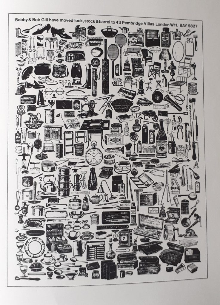
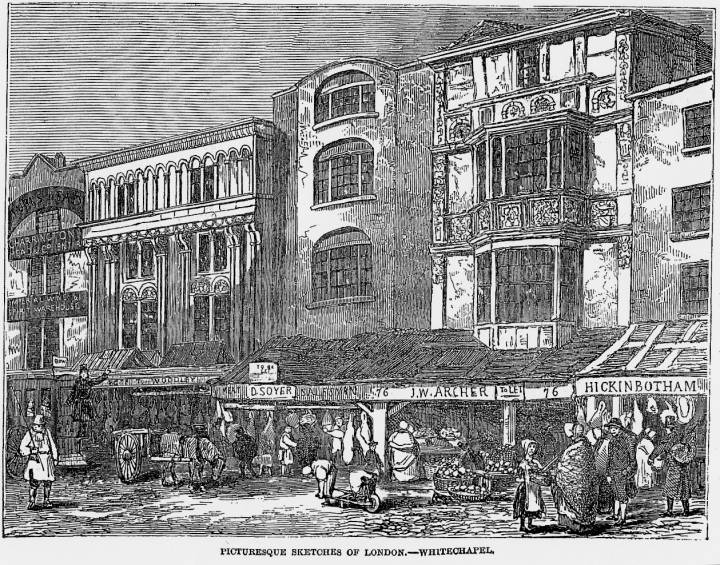
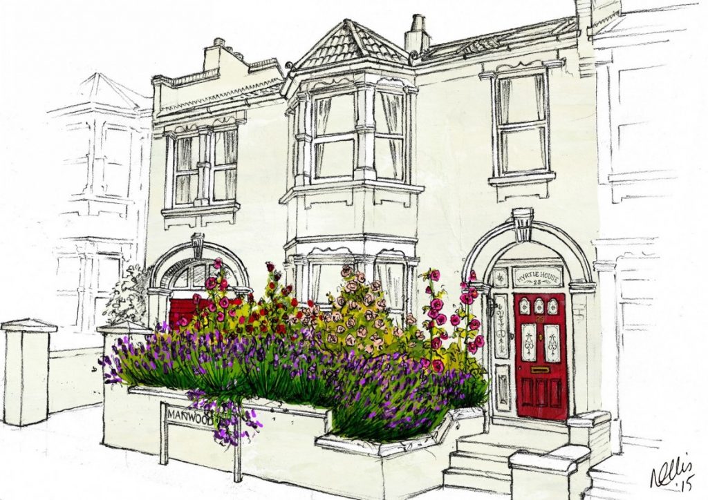
In my previous art education, I have been taught to accurately draw exactly what I see. This is good practice of course, but it can be restrictive. Illustration is about expressing the subject using imagination and the artist’s individual flavour. In the past, accurate drawing was vital because photography wasn’t available. The job of the illustrator was to inform the viewer. The images below compare the change in the role of the illustrator:
- Victorian illustration of Whitechapel, London
- Contemporary illustration of a house in London
Both illustrate the same subject but with a different purpose and about 150 years apart:
(above, 2.) “Heavens to Betsy Illustrations offer a different approach to a more traditional portrait. They are all about telling a story and capturing a moment in time, with the most everyday subjects often being the ones to treasure the most. Each illustration is drawn by hand in pencil, using your chosen photograph as reference. Once the drawing is complete, the illustration is worked on digitally to create the Heavens to Betsy signature style. If you have opted for colour, this is created with a carefully selected array of hand painted backgrounds and textures, that are customised specifically to your order. Every detail and colour is applied separately and shaded by hand, which gives the unique and hand made quality to each artwork.”
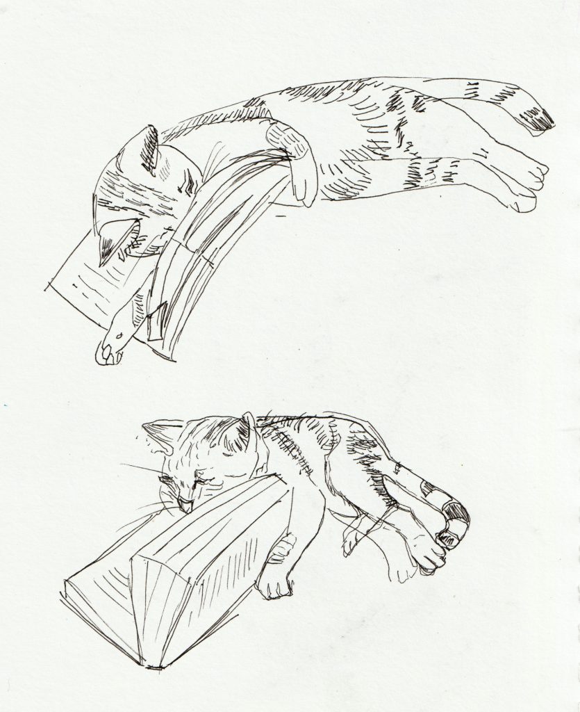
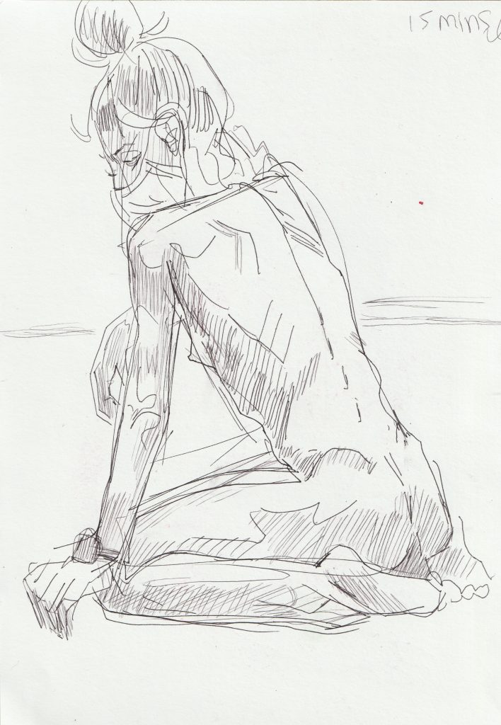
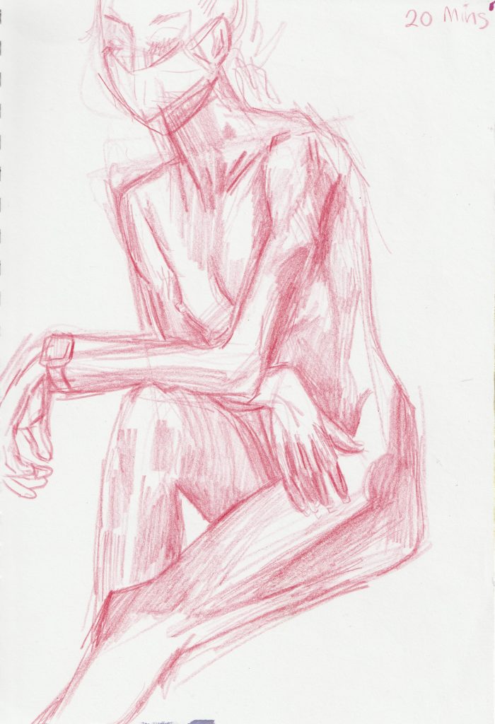
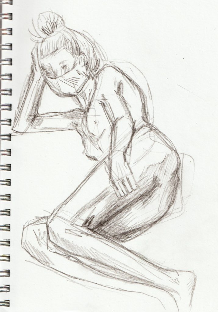
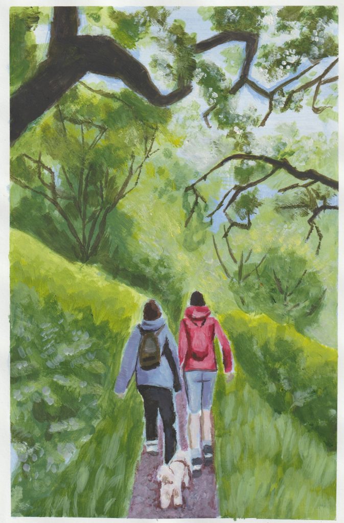
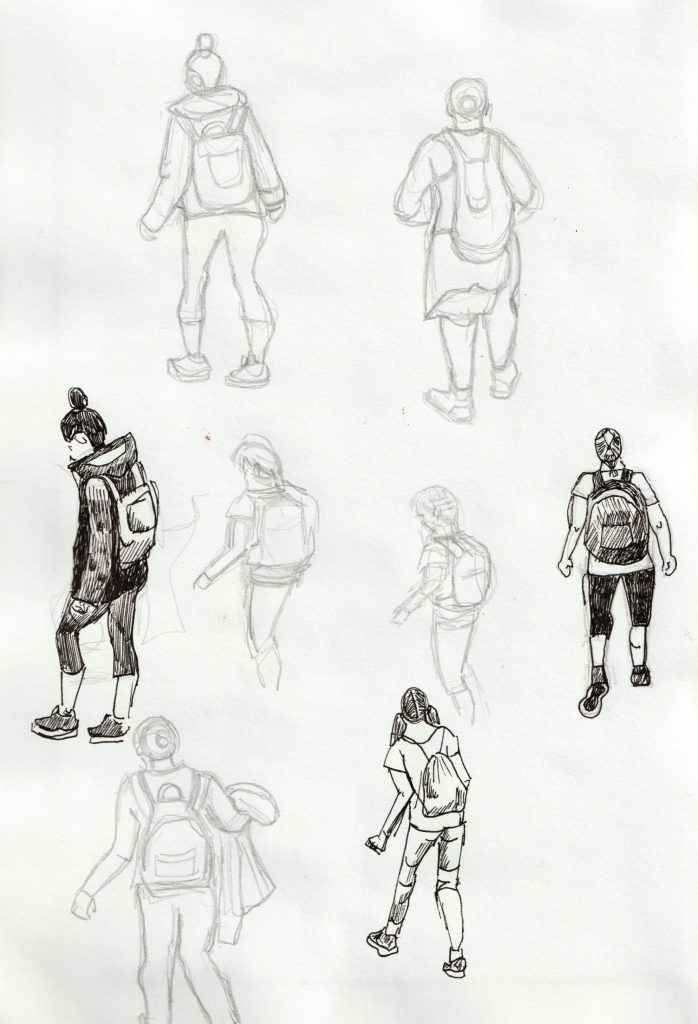
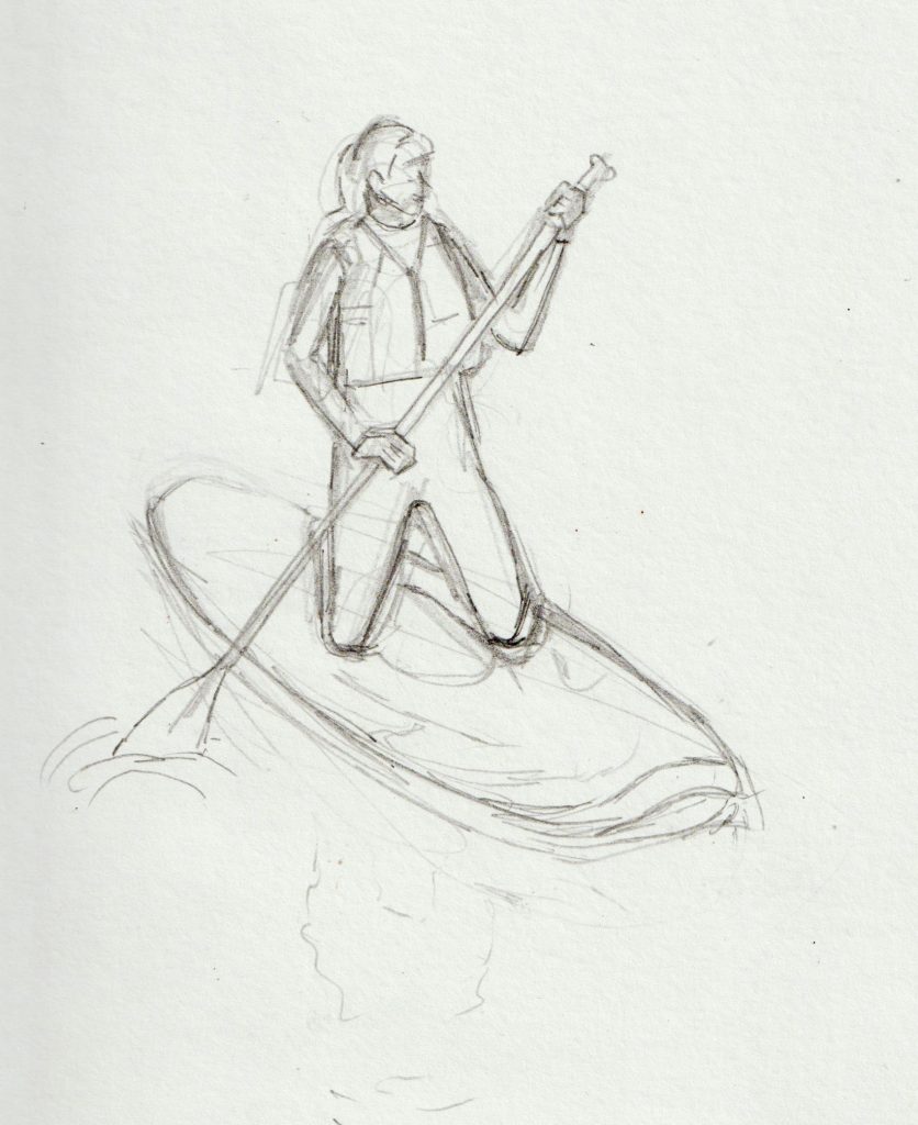
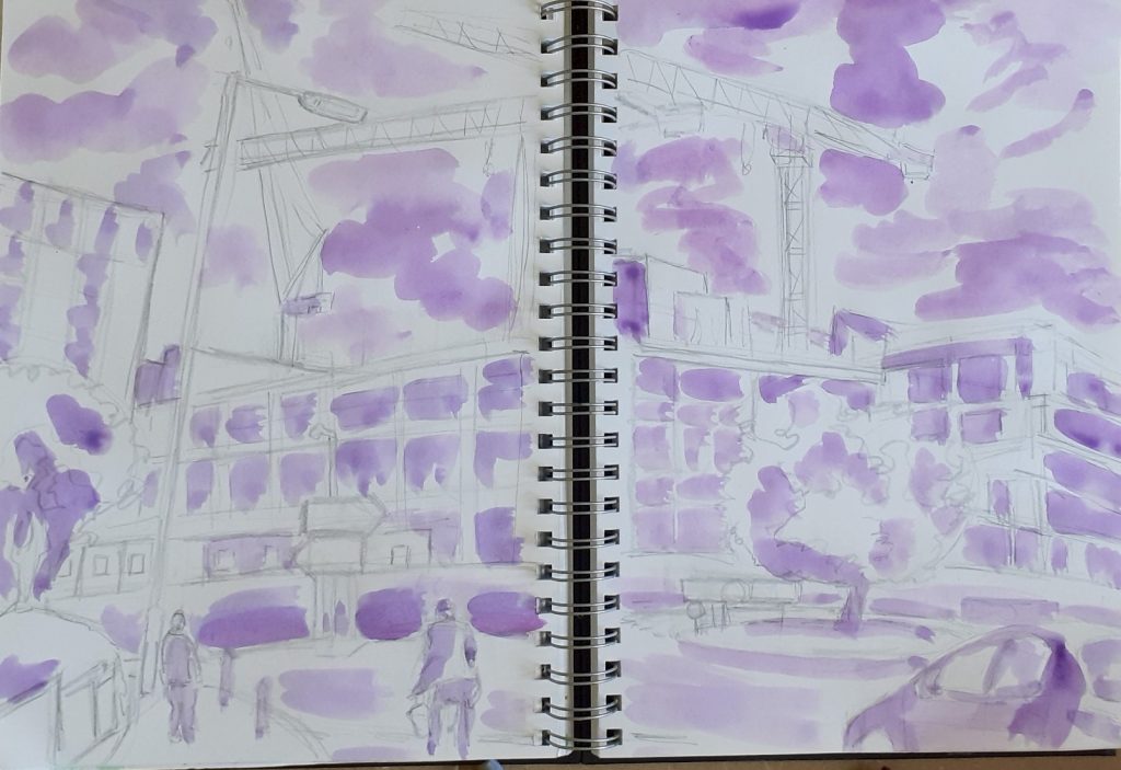
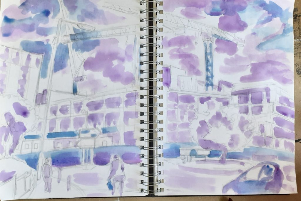
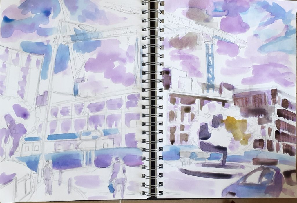
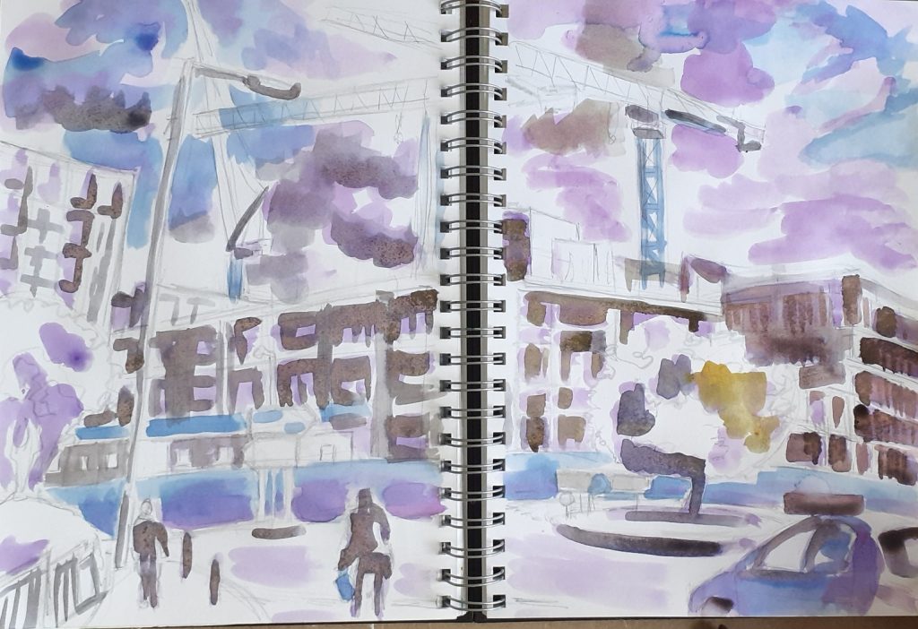
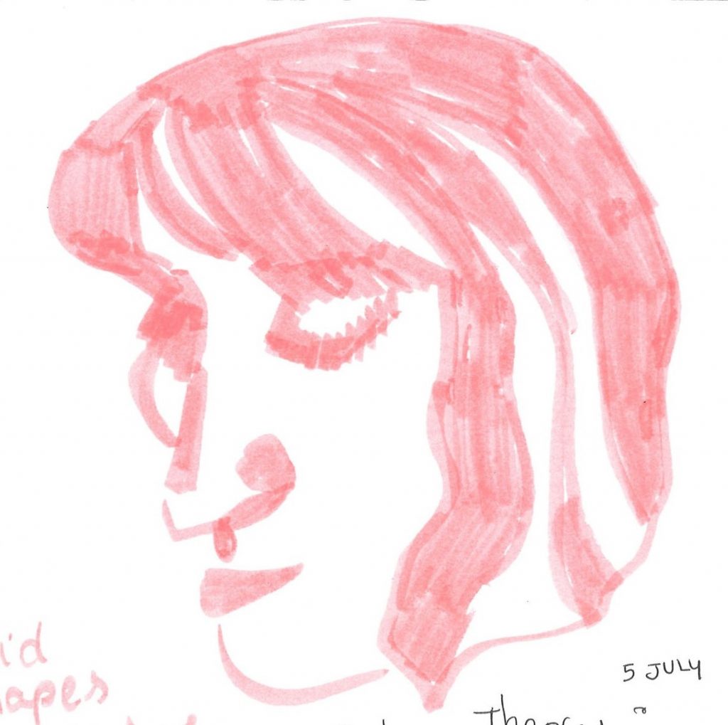
Coursework in my sketchbook
Contextual reference:
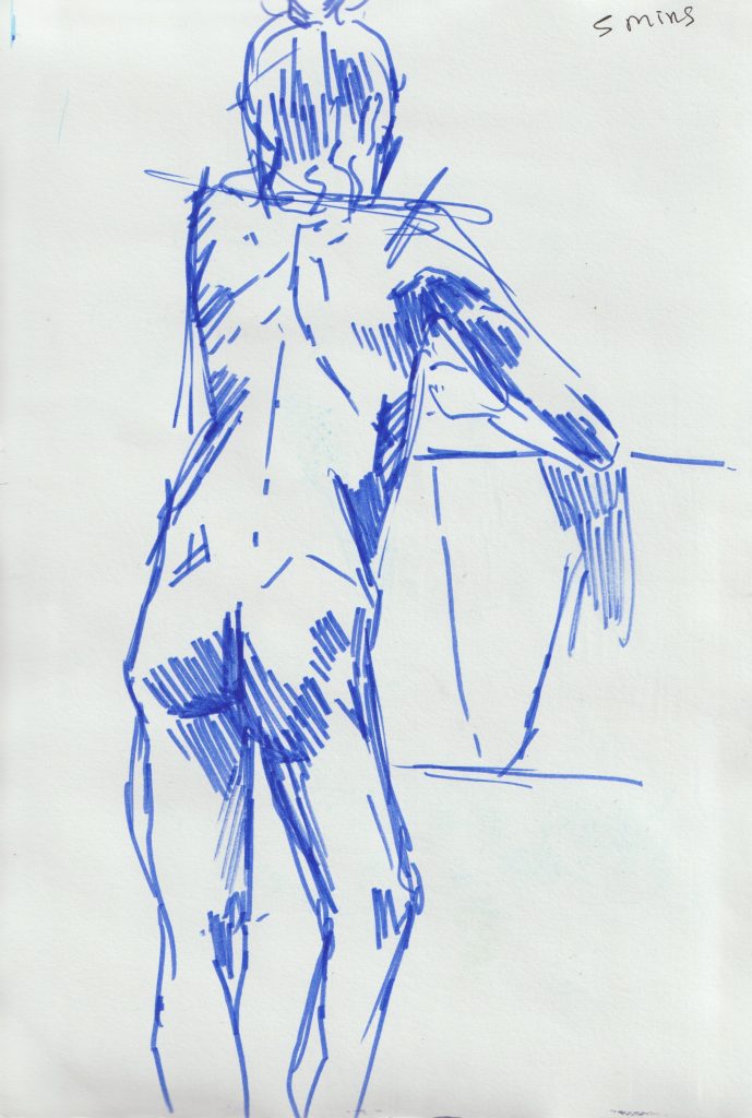
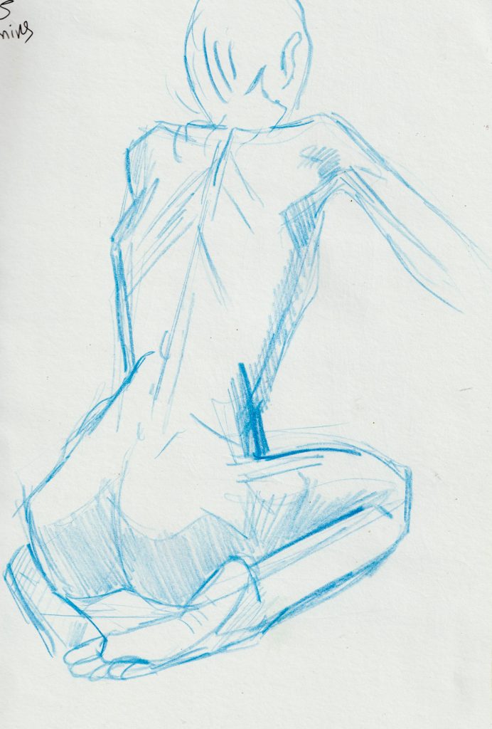
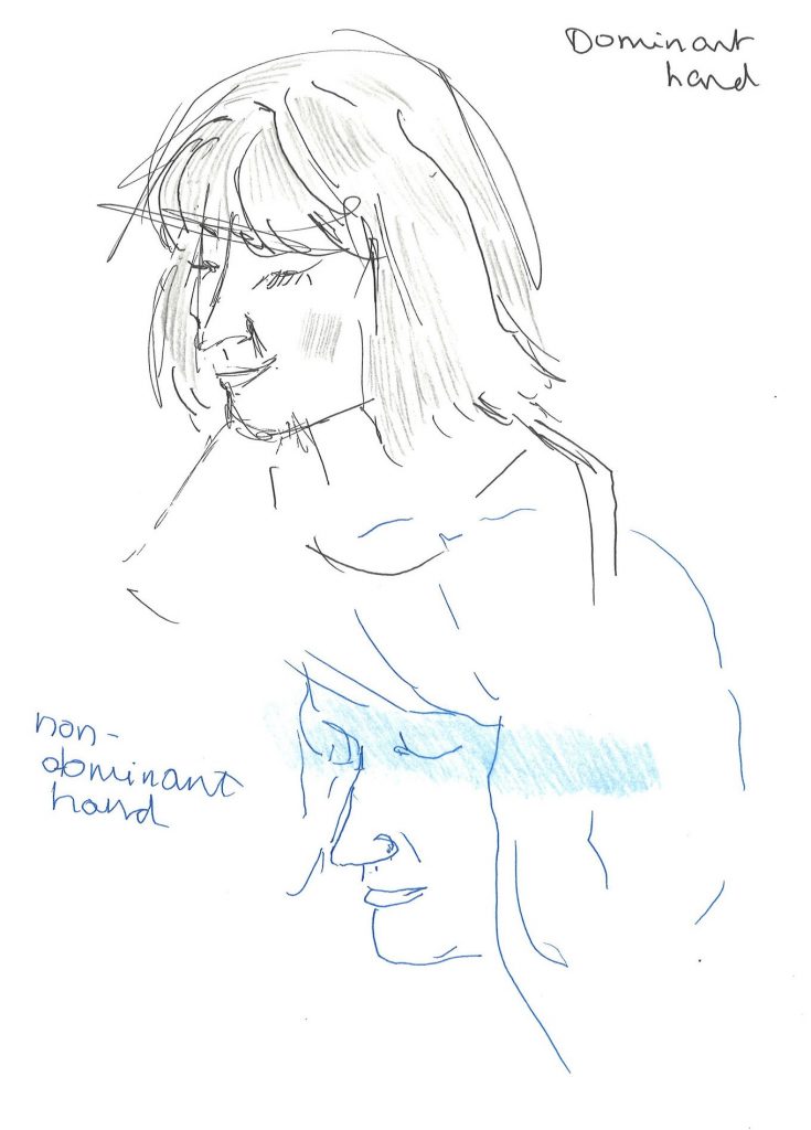
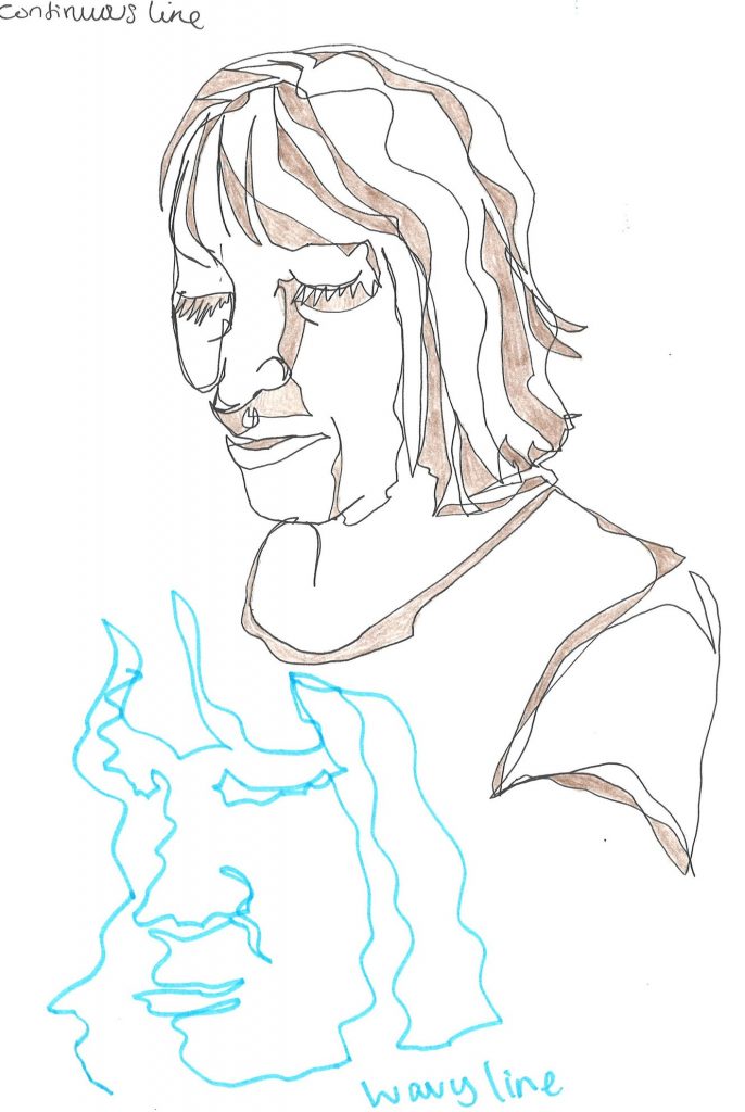
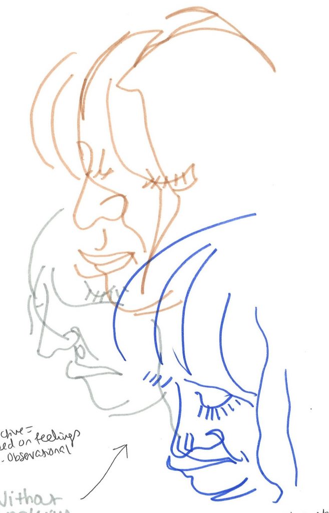
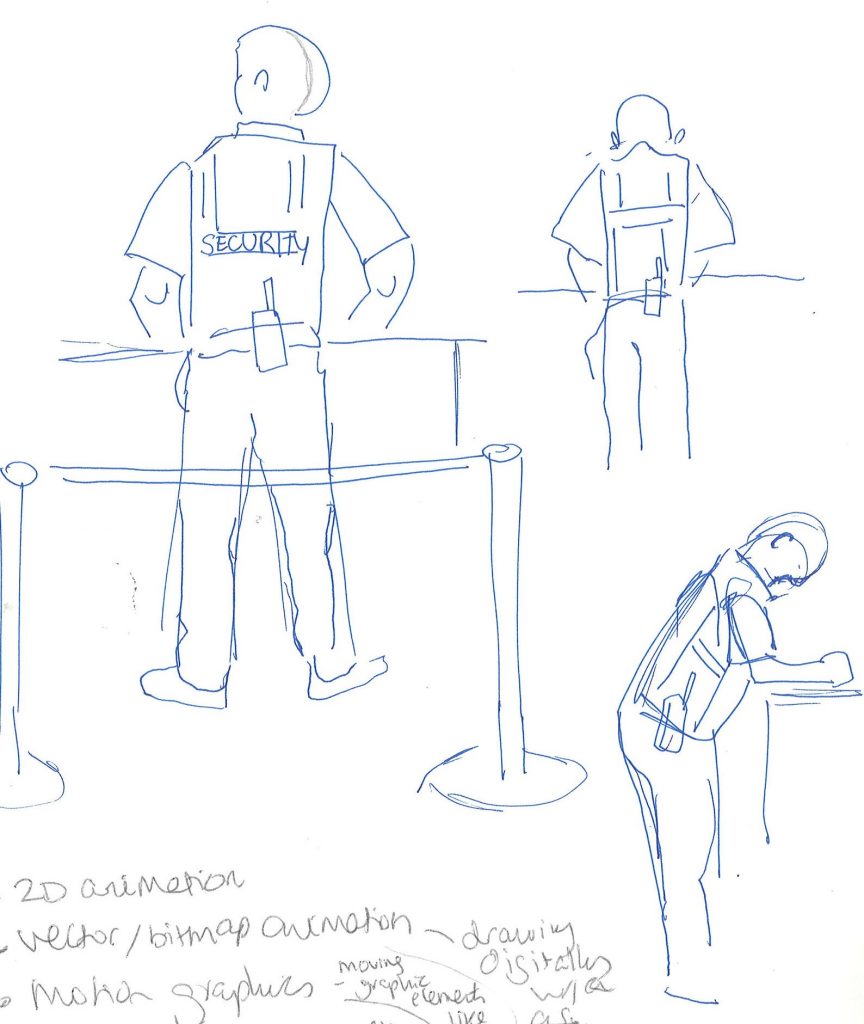
Drawing exercises
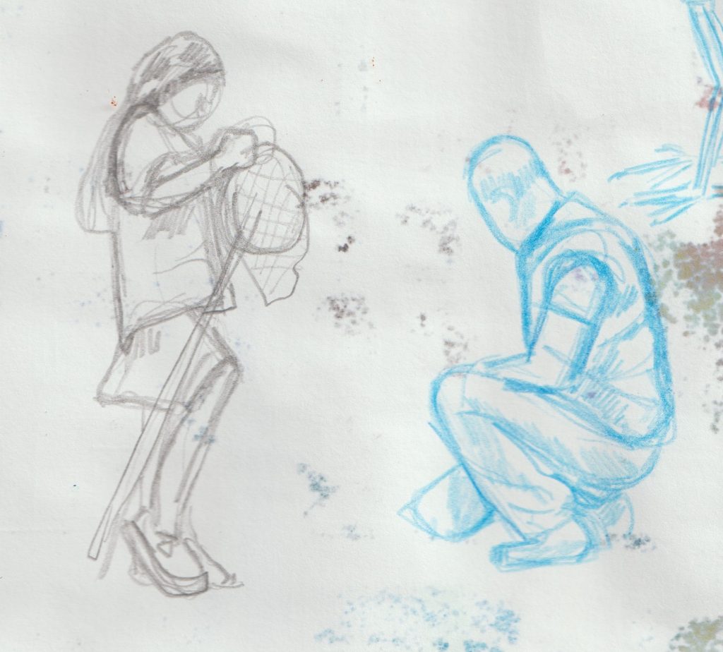
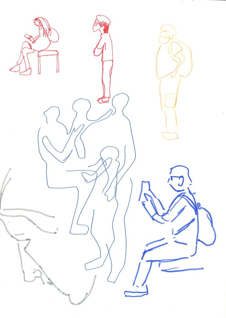
On day 1 of the course, we were instructed to draw a classmate, using experimental techniques. These exercises are intended to loosen up and connect your hand and brain. I often use some of these techniques when approaching a new subject or a subject that’s difficult to draw.
Colour theory
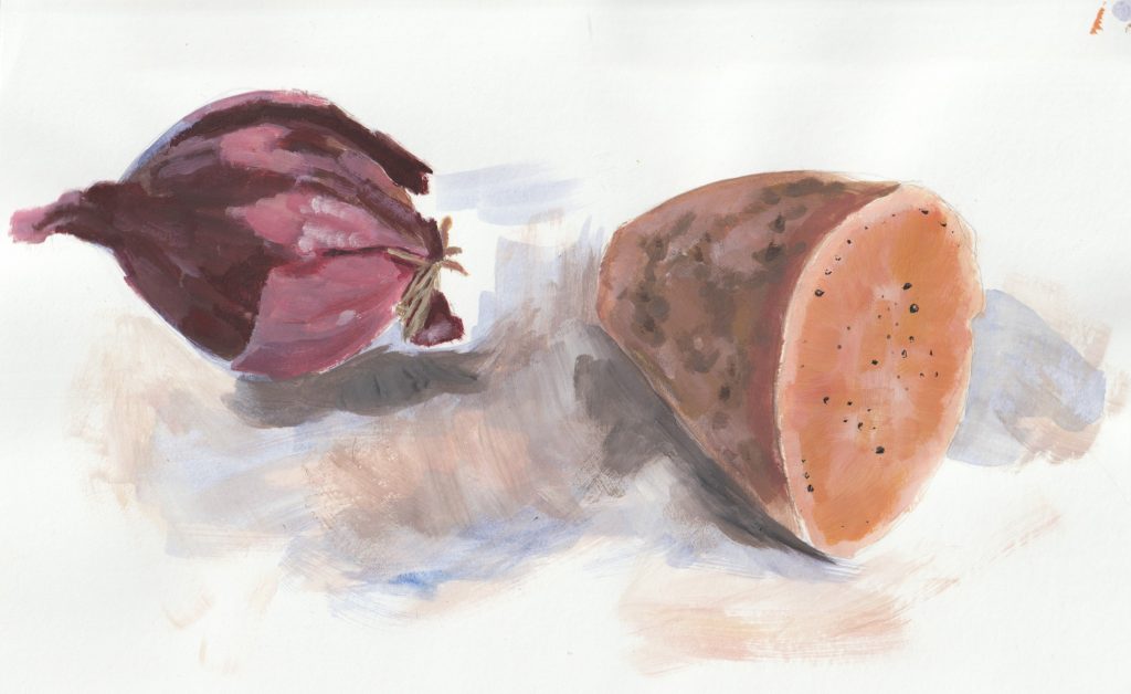
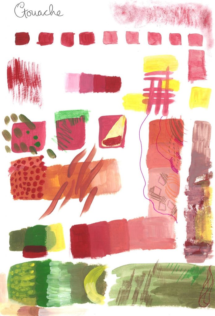
I began by experimenting with gouache. I have only recently began working with gouache, so this was a nice exercise for me.
On this sketchbook page (below), I experimented with
- adding gradually more water to the paint to see the various transparencies
- painting ‘dry brush’, which creates texture by adding no water
- increasing the amount of white paint used with red
- layering the strokes
- using a pencil over the dry paint
- using a pen over the dry paint
- colour mixing
We were then asked to consider the emotional effect of colour. This is because colour, as well as line/texture, create the overall mood of an illustration. A successful illustration will draw on the correct colour associations to express the required message.
Everyone has a different perception of colour and what they might associate each colour with. For example, I used bright blue to express childhood, because in my childhood I saw a lot of bright-coloured plastic, such as bucket and spades, super-soakers and other toys. This wouldn’t be the case for someone who grew up in times before the plastic boom.
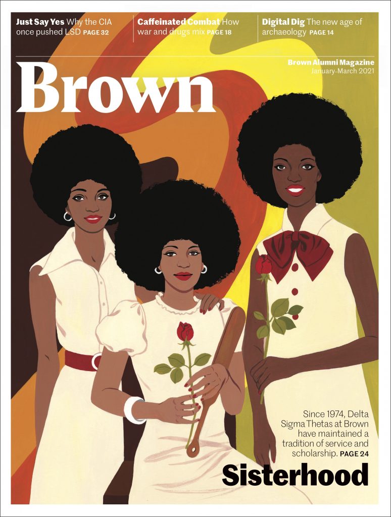
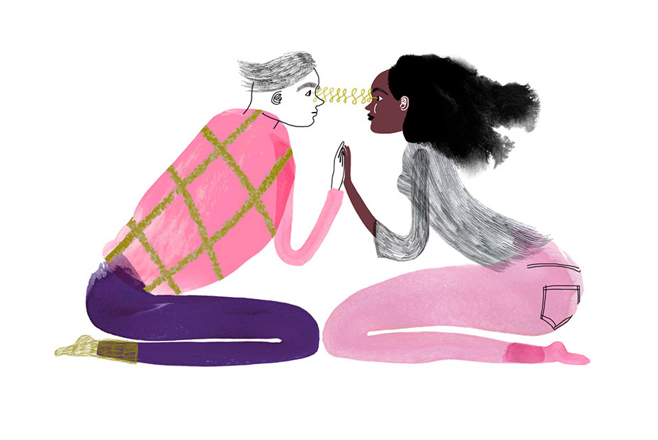
The colour palette in this image and the afros on the women, instantly says ‘1970’s’ to me. This would be the case for anyone familiar with that era. Even if you didn’t know about the 1970’s, the colours are still warm and earthly which have a calming effect on the viewer. This is emphasised by the curved lines used.
Colour associations are not universal, but the people of your target audience will likely makes the intended association. For example, in our culture, bright colours are used for expressing happiness. Generally yellow has the effect of joy and energy when used in interior design. The walls of a workplace have been painted yellow for this reason.
Our task was to come up with a limited colour palette that would express the topics suggested by our tutor. Alessandra specified that we were to choose the colours we personally would think of when we thought of these topics, rather than guessing what the colours ‘should be’. I used gouache for this exercise:
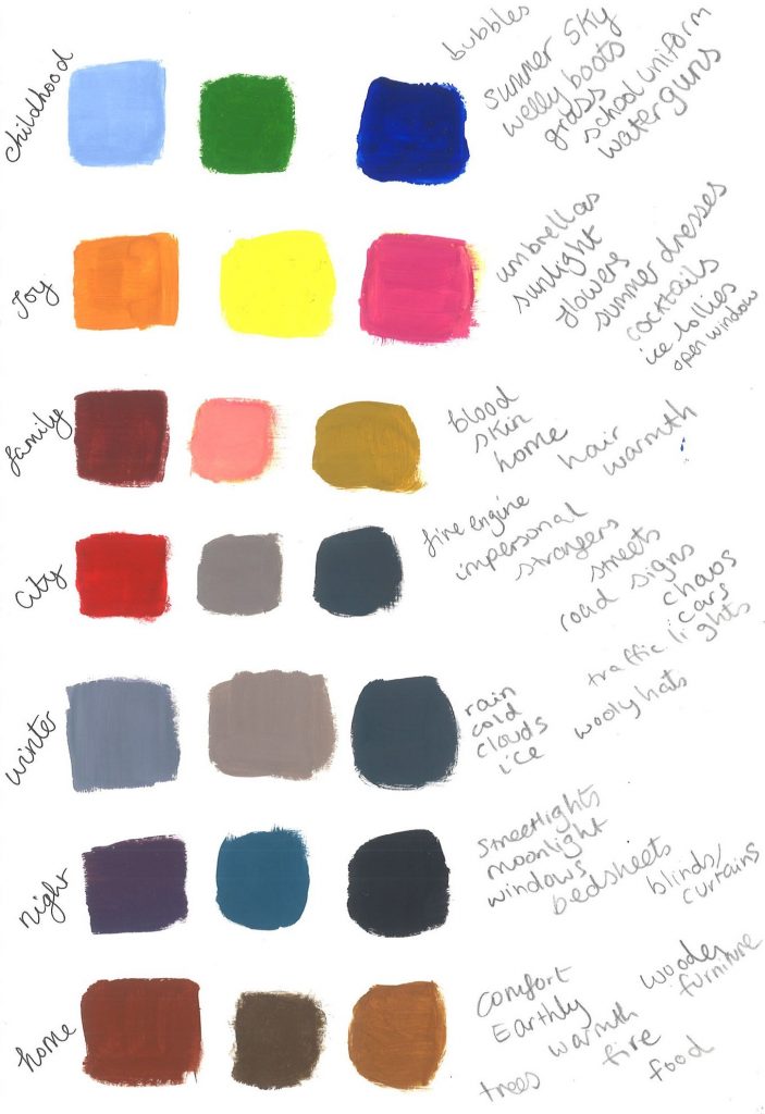
We then jotted down some words we associated with that topic. (above, right)
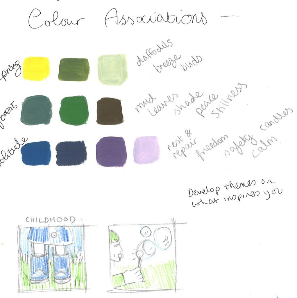
(left) ‘spring’, ‘forest’, ‘solitude’.
We were then asked to complete an illustration based on one of these topics and using the limited colour palette we came up with.
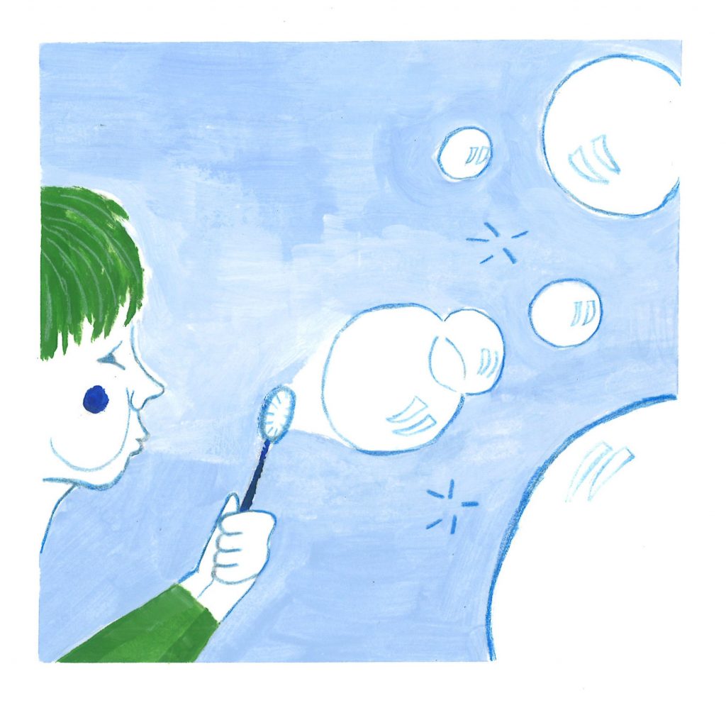
(left, bottom) thumbnail sketches on my chosen topic, ‘childhood’.
Editorial illustration
Contextual references:
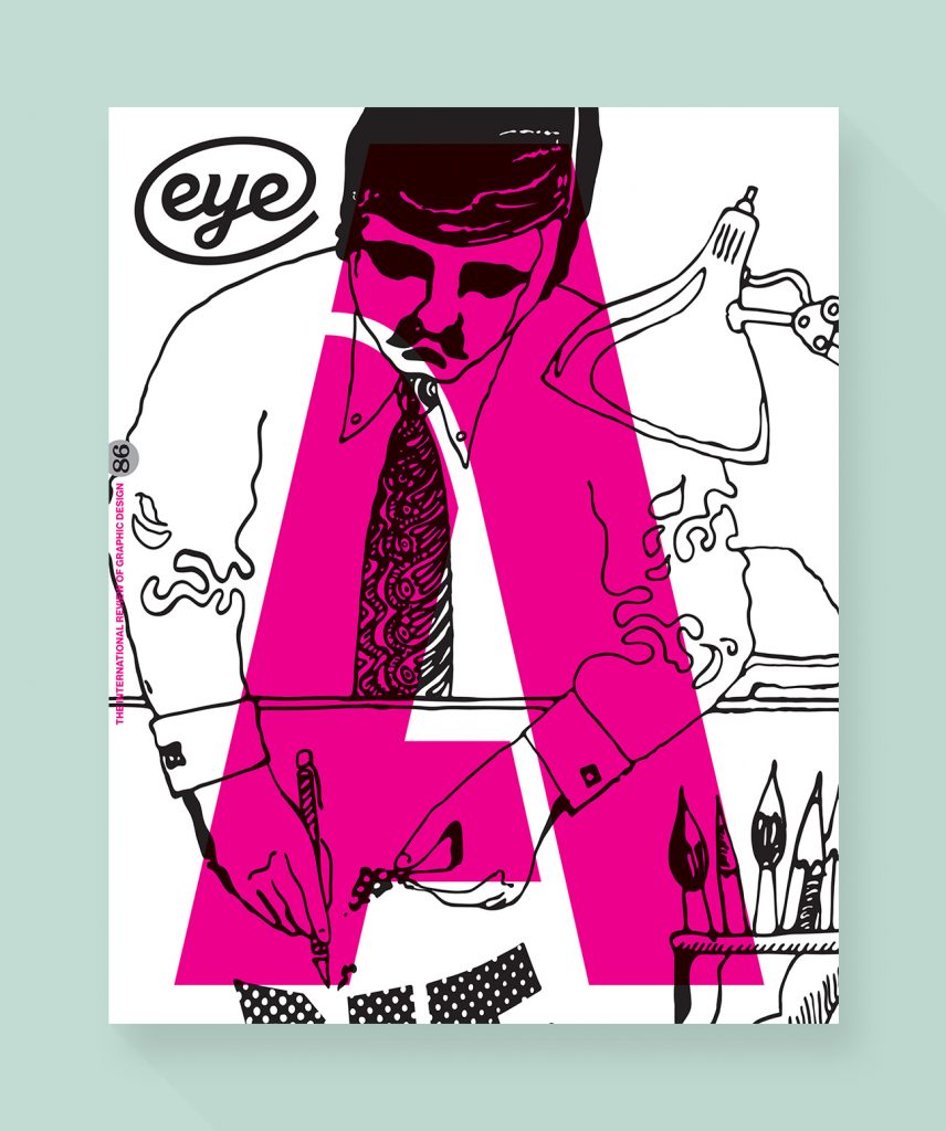
Eye magazine cover
The focus for this day was on editorial illustration (image-making to accompany a magazine article for example). We were asked to illustrate an article in groups of 3. Our group was given an article about The Pussyhat. I enjoyed the teamwork and collecting our ideas together. The task:
- read the article and highlight key words
- mind-map as a group
- sketch some thumbnails (right)
- complete a main illustration and a spot illustration
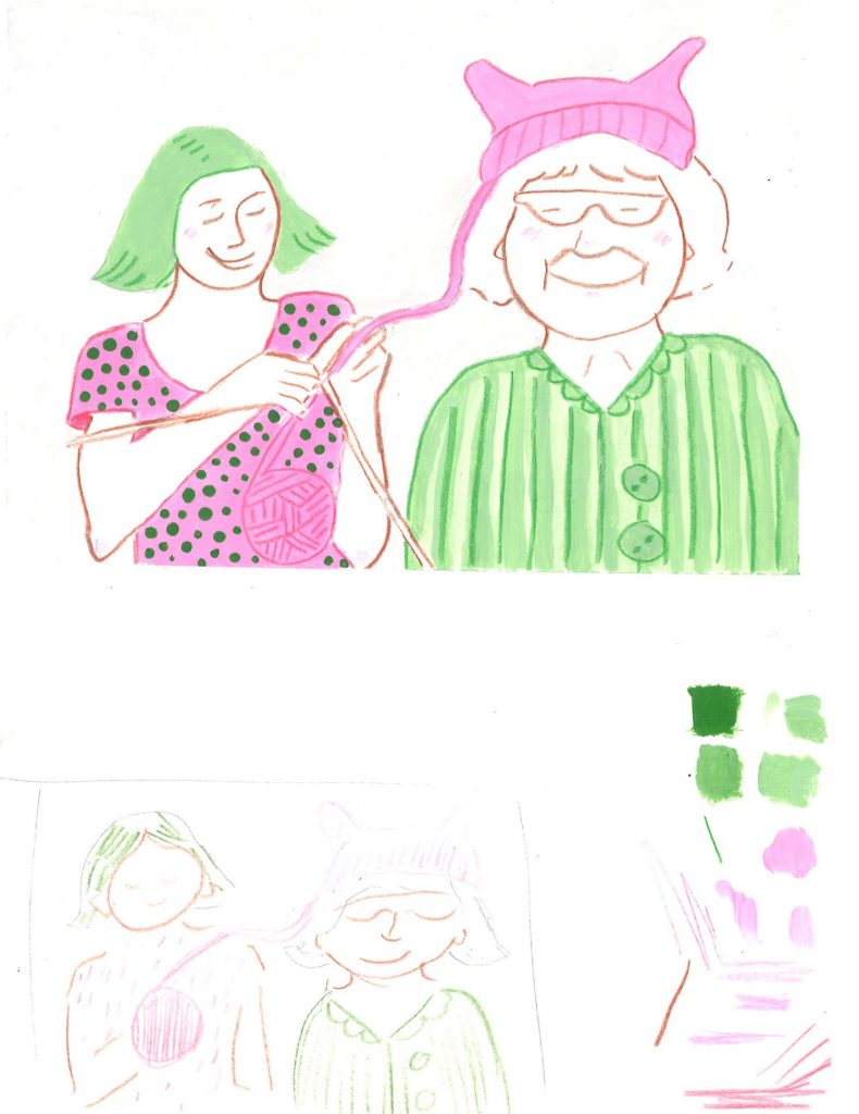
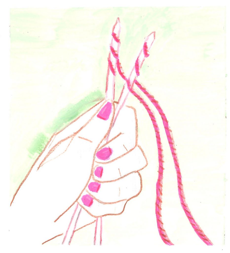
- I wanted to focus on the way the pussyhat movement brought together generations of women. I then flipped the stereotype of the older lady doing the knitting and wanted to show that she has handed the skill to the younger generation.
- I limited the colour palette to keep it simple. Pink was going to be in the palette because of the topic. I added patterns to the illustration to make it more interesting.
The spot illustration is the smaller image you will see on a magazine spread. This is a supporting image and will usually feature an element of the main illustration. (2 examples below)
Contextual references:
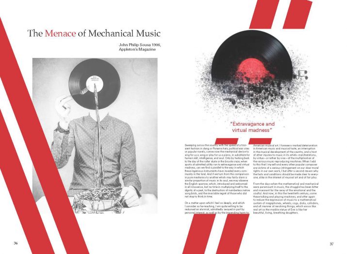
- The record has been taken from the left page and used for the spot illustration above the text on the right page)
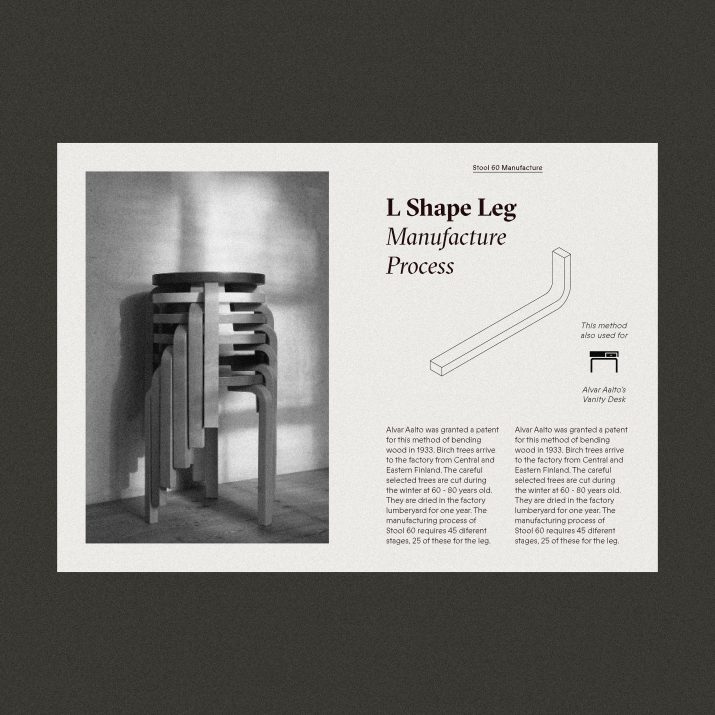
- Leg of the chair taken for the spot illustration
My concept for the spot illustration was of the hand holding the knitting needles. I felt that the pink thread and nails would symbolise women and the position of the hand expresses somebody standing up in protest.
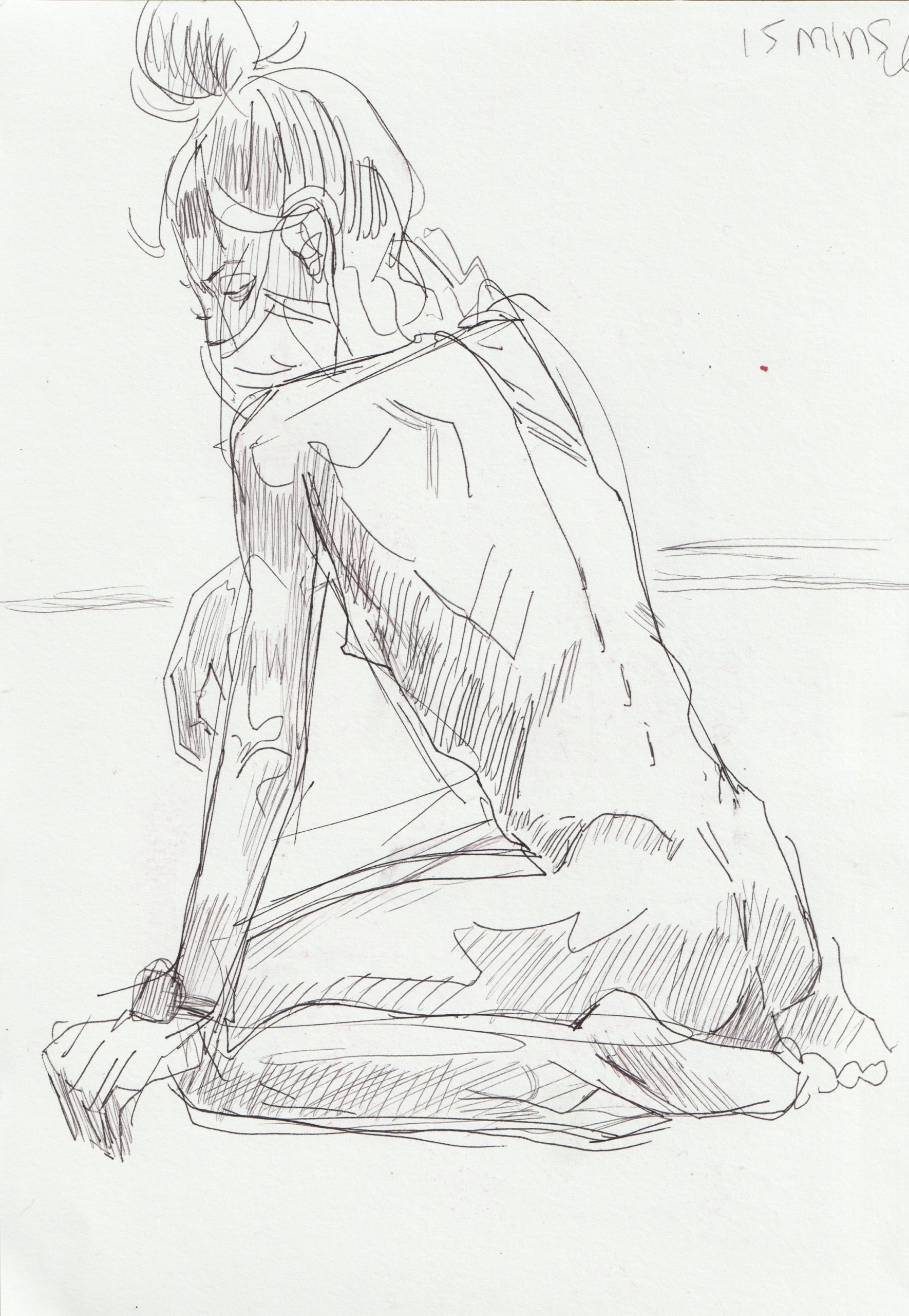
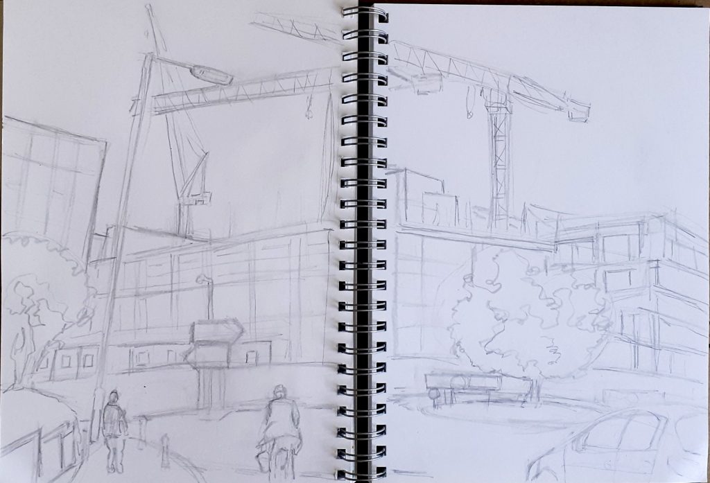
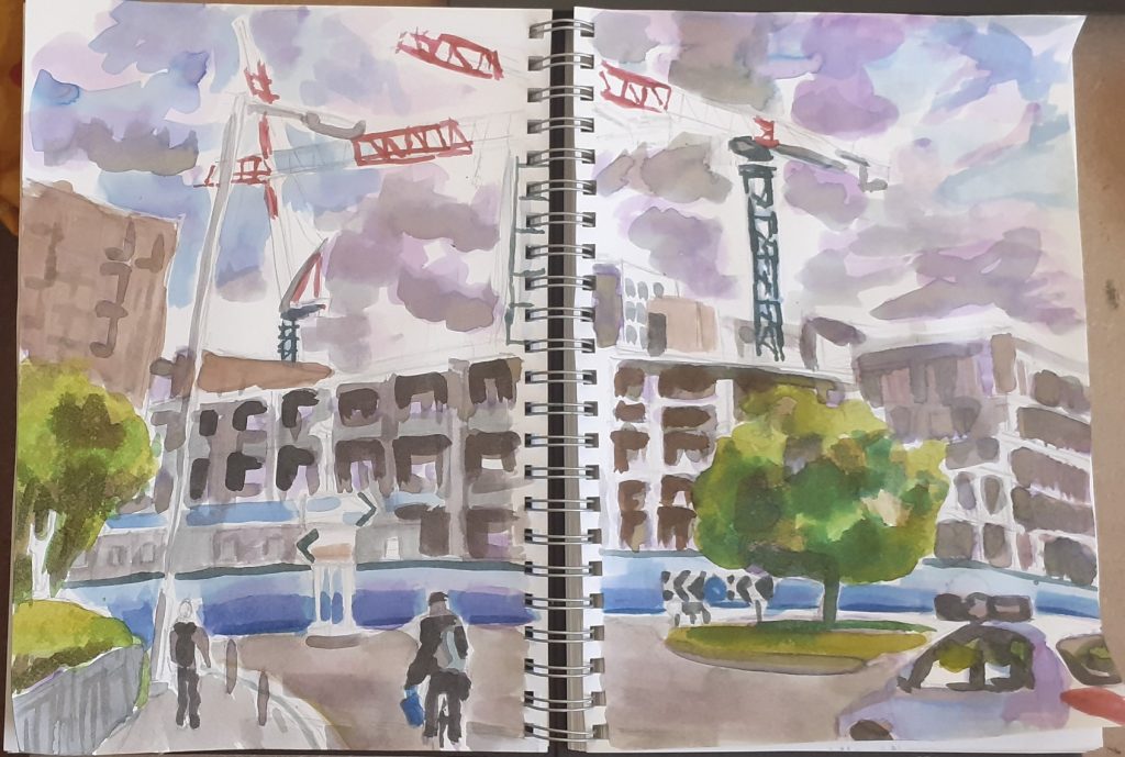
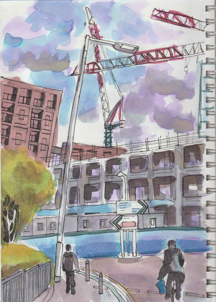
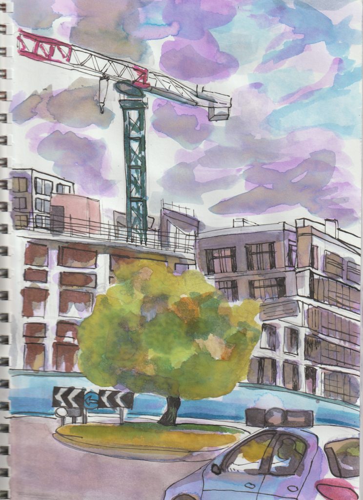
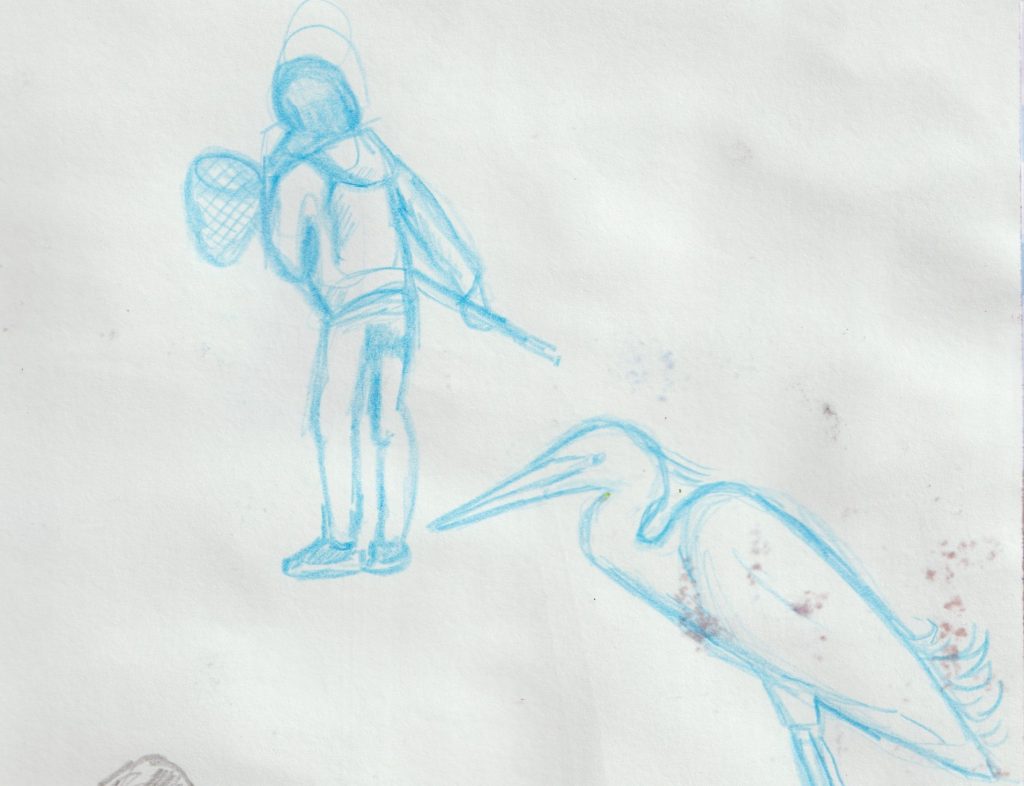
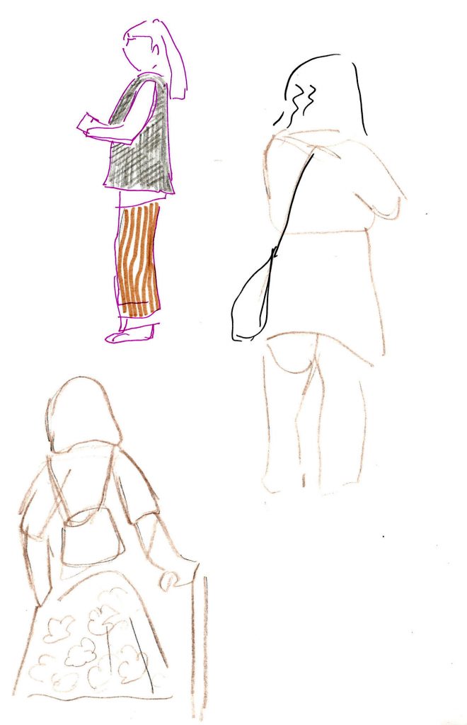
Sketching at The Tate Britain
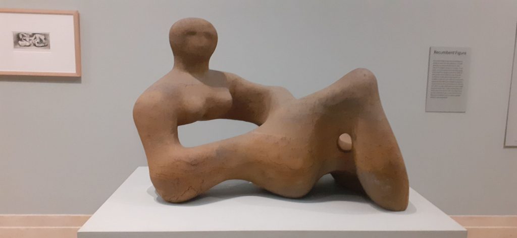
Situated opposite the Tate gallery, it made sense for us to walk across the road from Chelsea College of Arts and incorporate this visit into our coursework.
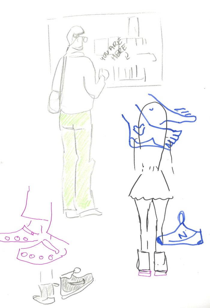
The aim of this exercise was to record whatever caught our interest. This was going to be different for each individual. Our tutor suggested using pens/ materials other than an erasable graphite pencil. This would encourage boldness in our drawings. She also advised us to be mindful of each page spread as a whole and how the page interacts with the page next to it. The subject could be the artwork on display, the building itself, or the people walking around. There was no limits.
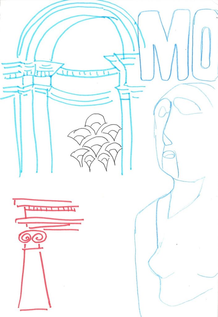
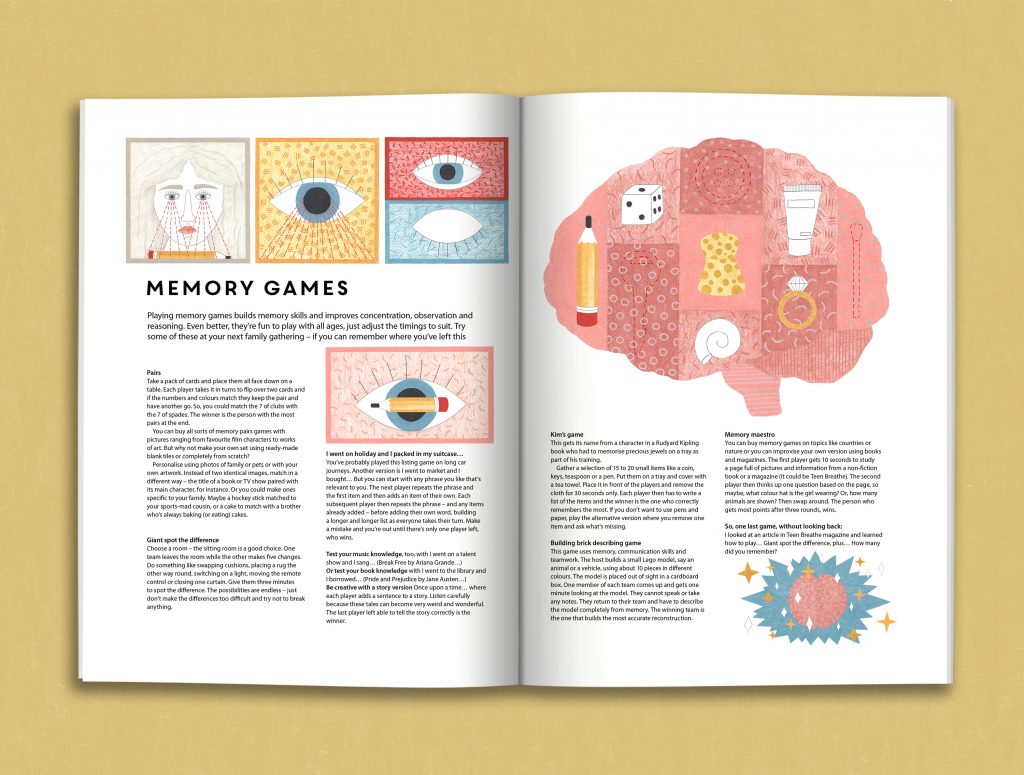
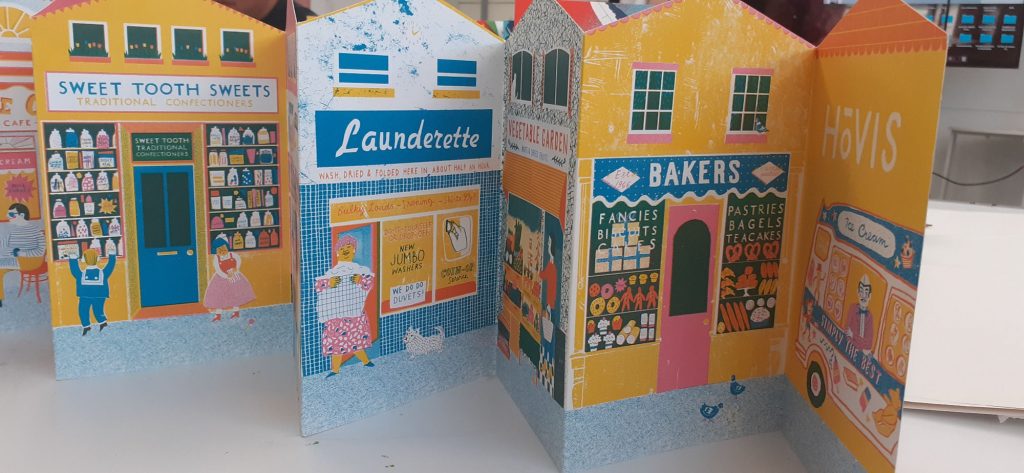
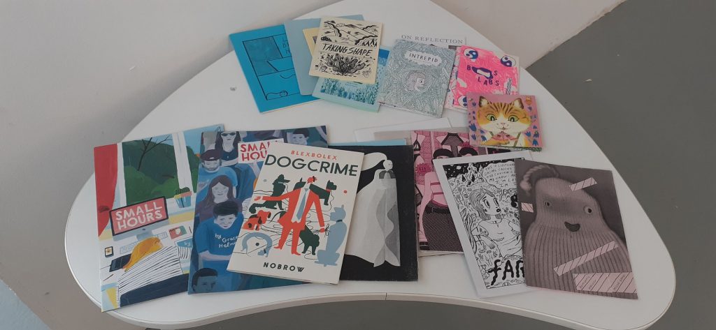
We then applied these drawings to a group zine about our visit to the Tate. We looked at examples of zines for inspiration:
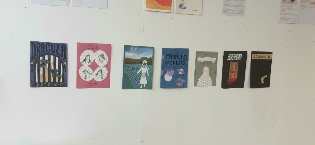
Book cover illustration:
Day 5
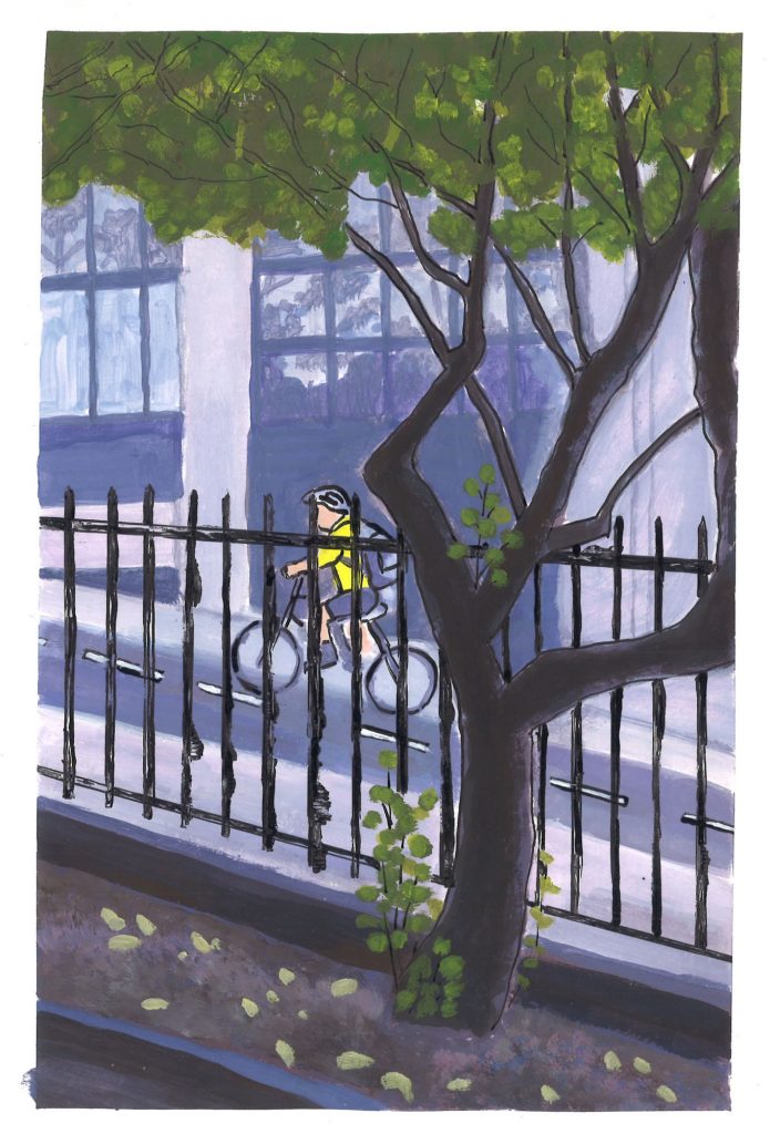
On the final day of the course, we produced a stop animation video. As a group we voted on the theme city. My only contribution was the bare/winter tree on the right (below). The rest of the work was from the rest of the class.
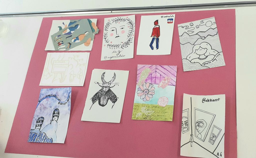
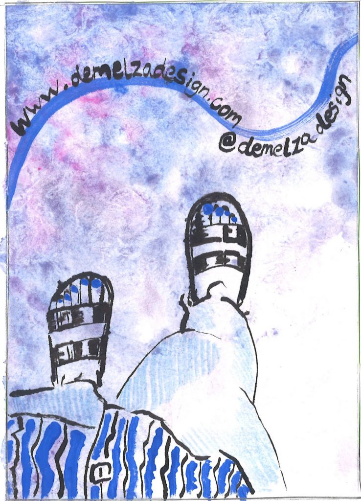
For our final task of the day and the course, we were asked to consider what we’ve noticed about our own individual style and approach to illustration. I found my own work to be generally quite calm and peaceful. We then came up with a business card design in the form of a postcard.
These were our designs placed together on the table: