Sustainable campaigns & animated GIF

Sustainable campaigns- group presentations

Watching the class’ group presentations, gave me new ideas for how a sustainable campaign can be presented.

Notes:

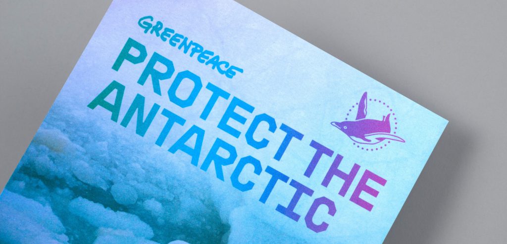
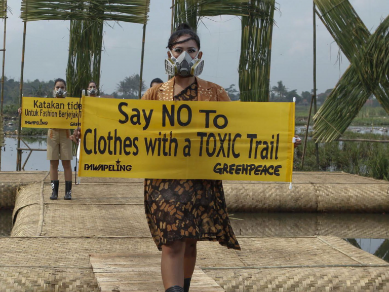
  • Greenpeace- Detox (guerilla marketing) The use of props gets across the message instantly.
  • Mental health awareness week- get outdoors
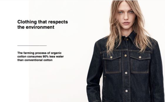
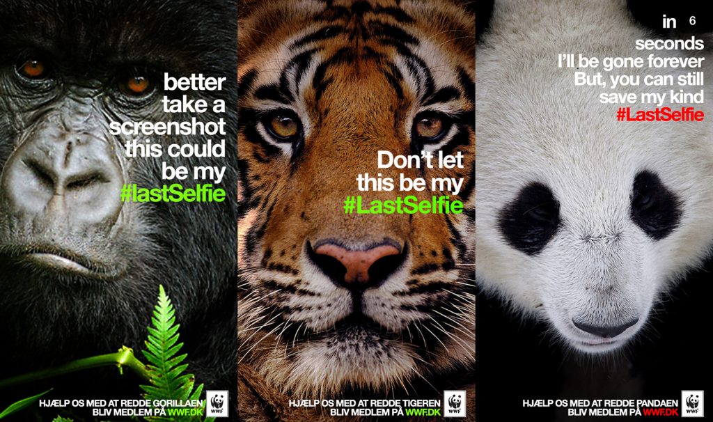
  • WWF focuses on 4 animals. I noticed the importance of focusing onto specific aspects of an issue. If these posters tried to cover every animal affected, it would be less punchy.
  • Ocean agency- coral
  • Reimagine by Landrover- electric cars
  • ‘Tomorrow starts tonight’ IKEA – Mother London Creative group (healthy lifestyle)
  • Use of metaphor. Transform by swapping context:
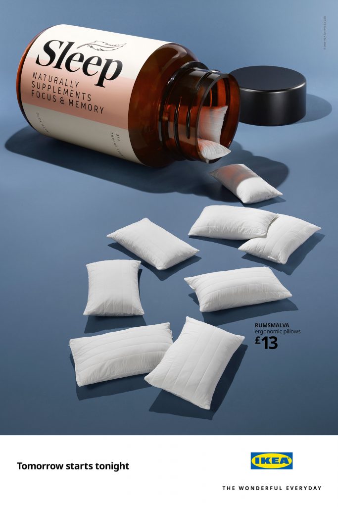
  • ‘steps’ IKEA also Mother London
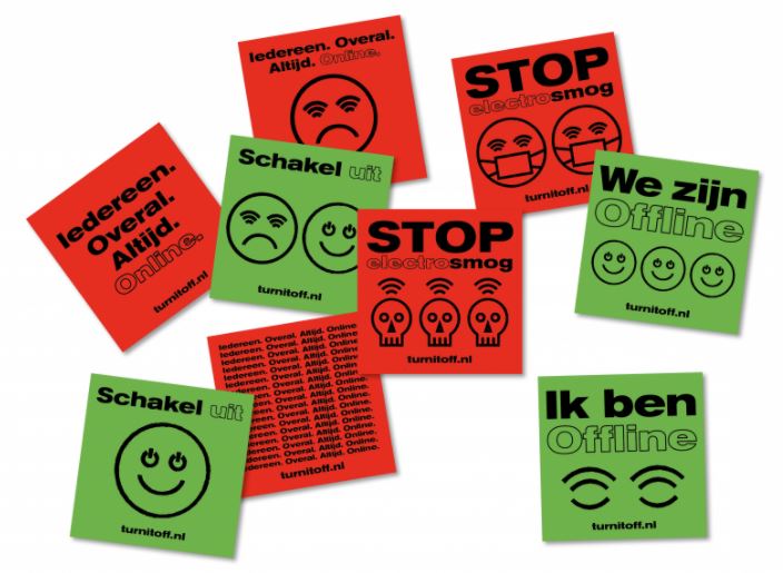
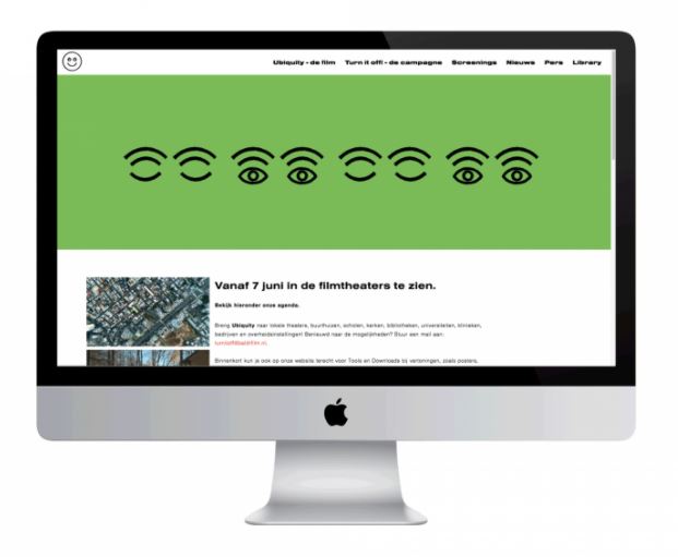
  • Use of icons- Kiehl’s- formulating a better future- use of colour (green for sustainability)
  • HS2 Rebellion – use of photos from the construction site! This sends a powerful message because we are seeing the actual site of the destruction with our eyes. In terms of the Tesco/Greenpeace campaign we could use this strategy to demonstrate the effect Tesco are having on rainforests.
  • They also use cartoon illustrations to represent the destruction taking place and its potential effect on communities.
  • Texture in the font. Illustration and handmade signs. Different designs for different audiences. Designed for the location or for online.
  • Wild East UK- bold letters:
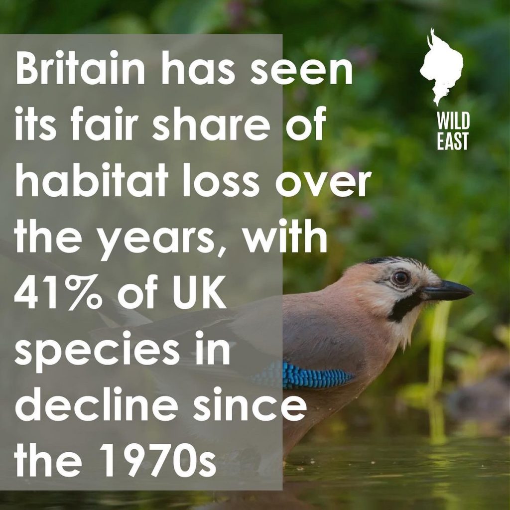
  • Not looking at the whole problem- by zooming into specific animals
  • Find your way- mindgrowing.org
  • Use of sketches- play on words , colours blue and green relate to Earth. (taking into account the implications behind colour choices.)
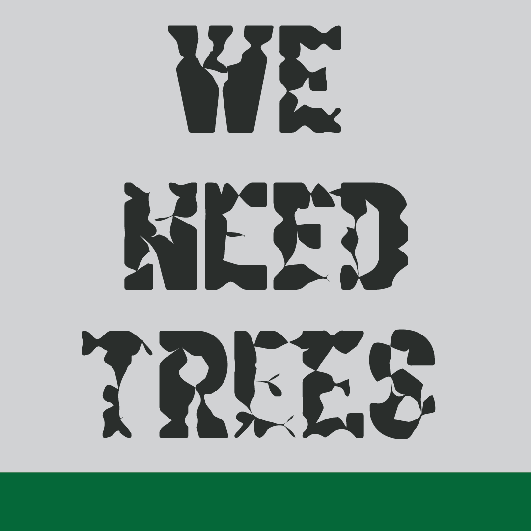
  • Quirky/ chunky font=relaxed. Focusing on 1 word instead of the whole title.
  • Design company the lovers
  • Attacking the viewer- questioning their humanity ‘are you a robot?’ targeted at the digital era. (Greenpeace)
  • Nature is speaking- using a different voice for each aspect of nature e.g. ocean, ice, mountains.
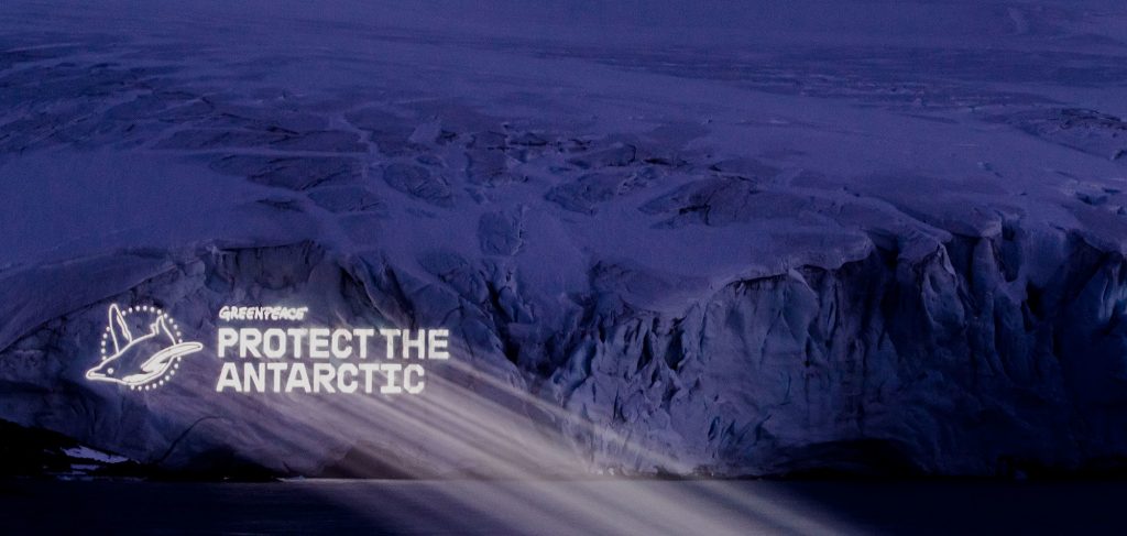
  • Extinction Rebellion- photo of house submerged. House designed and built by them to suggest rising sea levels. Strategic placement.
  • Greenpeace and Extinction Rebellion both use shock factor.

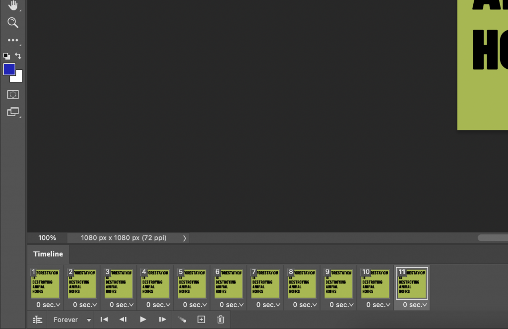
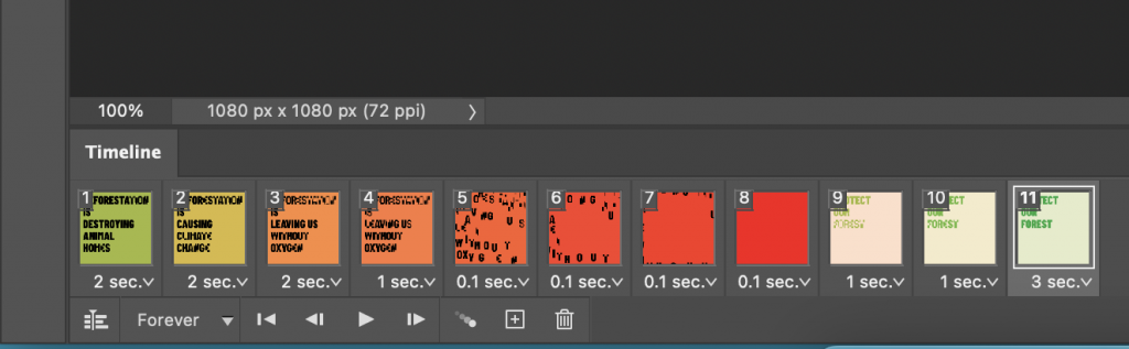
Animated GIF workshop

Working in PNG is best for animated GIFs.

We would use Illustrator to create the slides and PhotoShop to animate the separate slides, exporting them into a GIF.

  1. Export for screens
  2. Window > timeline > create frame animation
  3. Clicking the plus adds new frames.
  4. Allow enough time to read the text. e.g. 2 seconds.
  5. Press play to see the animation.
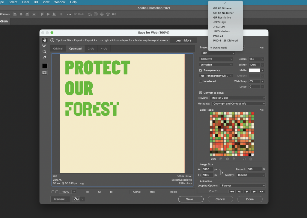
  6. Mp4 file plays on Instagram- can’t upload a GIF on Instagram.
  7. GIF file> export > save for web
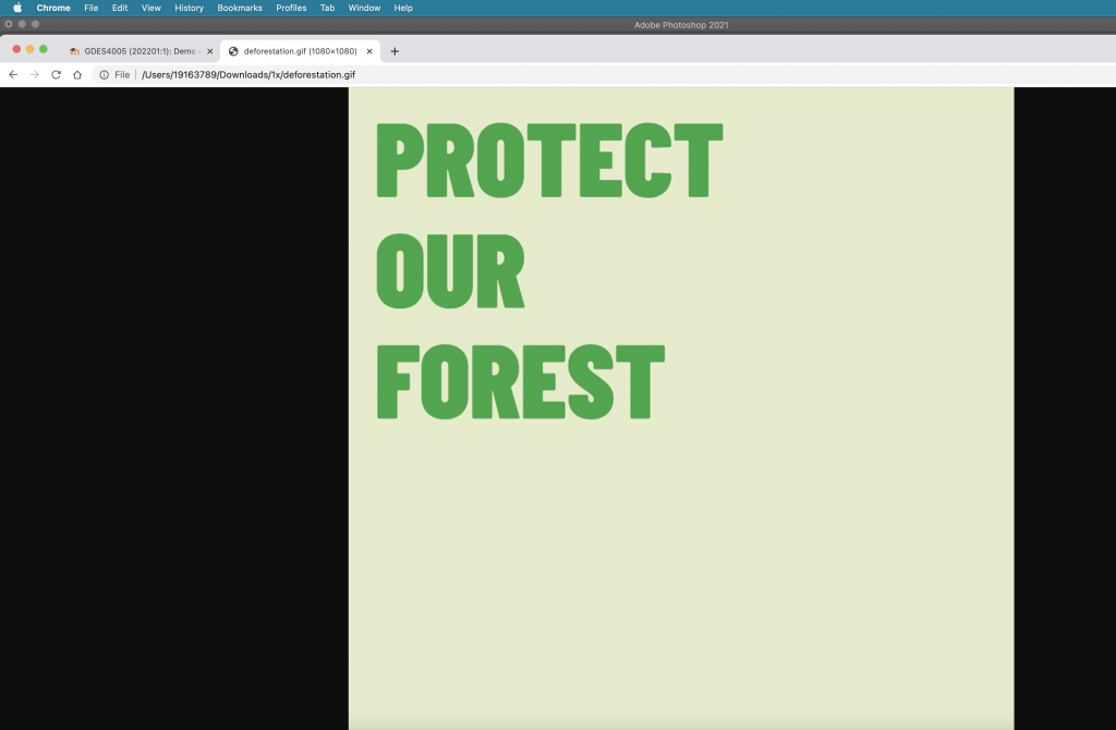
  8. Opening the GIF in a new tab, allowed me to view the GIF full page.
The timeline appears at the bottom of the photoshop screen. By clicking the small arrows, I can change the time each slide appears on the screen.
The layers can be viewed in this right-hand window. We needed to click on/off the eyes to hide the layers we didn’t need.
The play button allows me to see a preview of the animation.
The save for web window.
Opening the GIF in a new tab of the browser.

Project 3 – short animation- group work

  • The task for next week is to create a short animation. We are in the same groups as for the expressive type exercise. The aim of the project is to make the GIF extracting key points from the article on deforestation.
  • We must first define the problem (intro), highlight the causes and then conclude the issue. (The CTA of the article).
  • The type must be easy to read and understand, since the purpose is for it to be on social media.
  • We should refer to the demo to get an idea of what helps an animation to flow and be legible.
  • The animation could be longer than 11 frames e.g. 20 secs in total.
  • Don’t overcomplicate it! Stick to just 1 font. Use a font with high legibility- could be from google fonts. Typography style- use the type manipulation that we used in Project 2.
  • Simple, punchy is best.
  • Need to communicate the idea of deforestation. This can be done with the graphics as well as the actual words.
  • Stick to short phrases. Extract some data from the article. Could make the numbers bigger. Some slides could show just one word. Using colours to stress the message. 1080px x 1080px. (size of insta post)
  • present on 28 Feb
  • 1 GIF for the group.
  • Just typography- no images.

Ideas from group discussion:

  1. Ben- forming the script from the text
  2. Demelza- putting these into individual slides with Illustrator
  3. Holly- animating the slides

We considered the use of:

  • Bold to thinner type
  • Bright colours to dull
  • Last phrase blurs into blank page
  • Could disintegrate at the end
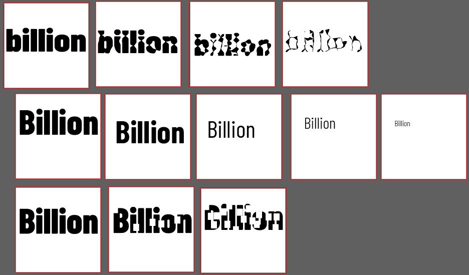
  • look at google fonts, send them the options
  • Barlow condensed
  • Could use 3 colours- bright green- to muddy green- to black
  • Keep it simple, use just 1 effect.
On Illustrator, I made a few examples of how we could animate the effect of disappearing or loss. I then consulted the group, to see which effect everyone liked the most. We all agreed on using the pucker tool (top line)

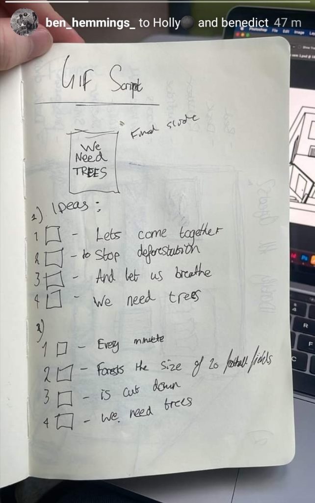
Ben sent his script for the animation.

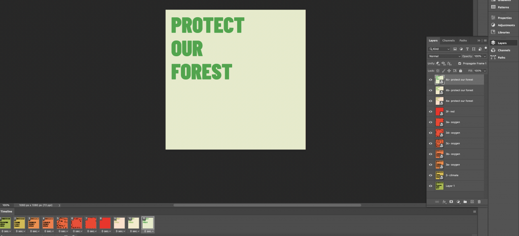
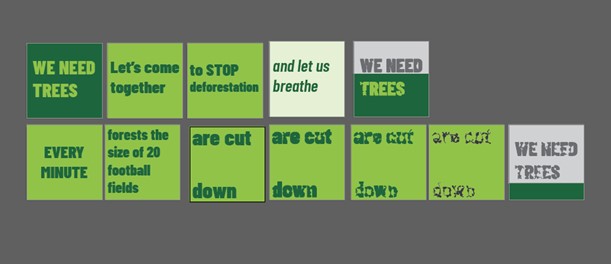
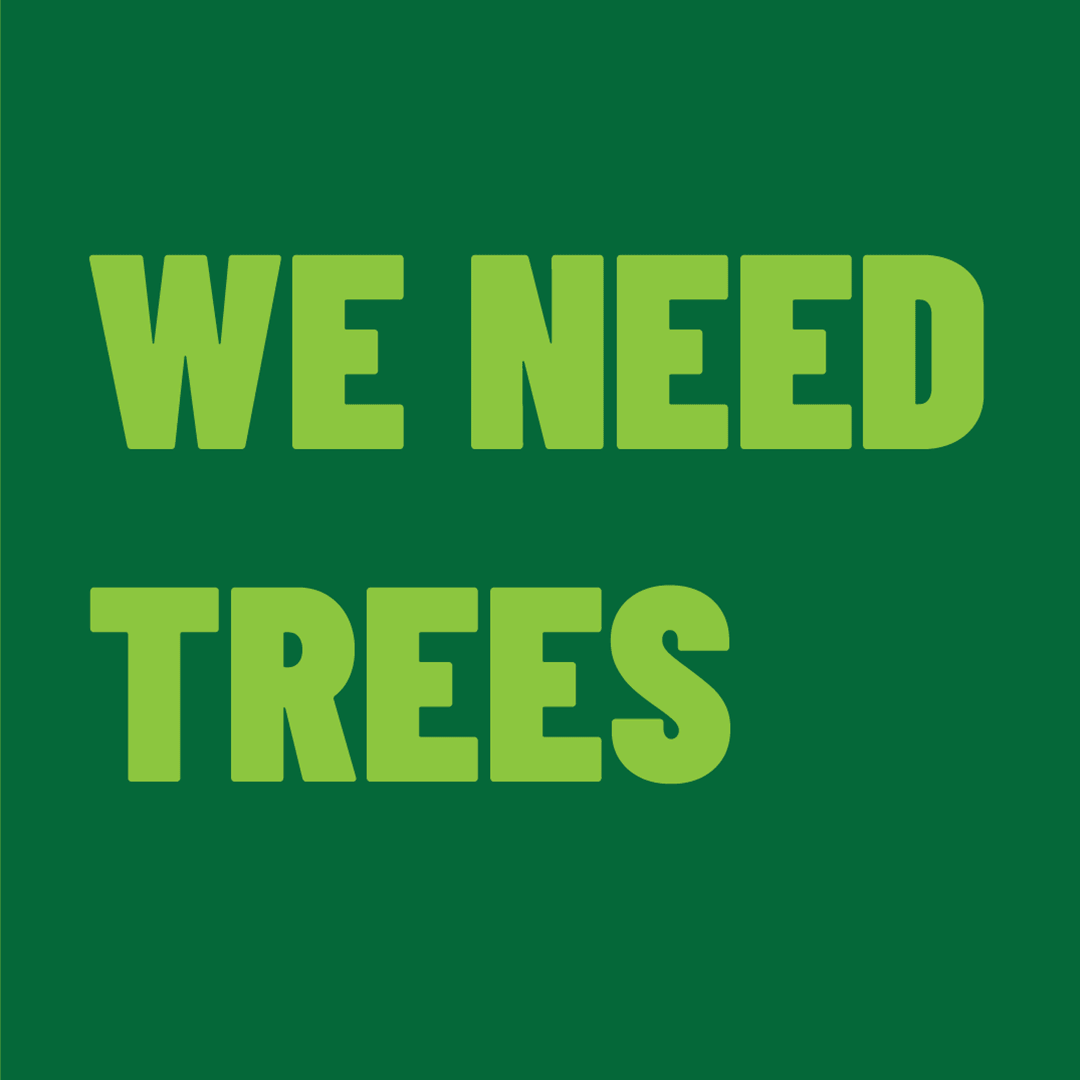
I transformed the words into slides, on illustrator. (below) I liked the rhyme and rhythm he has used.

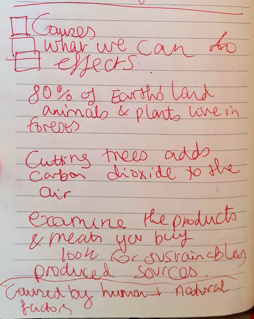
From reading the brief, I saw that the GIF needed to include the causes, effects and solution for deforestation.

I therefore, needed to script the rest of the GIF myself, because of time restrictions. (left)

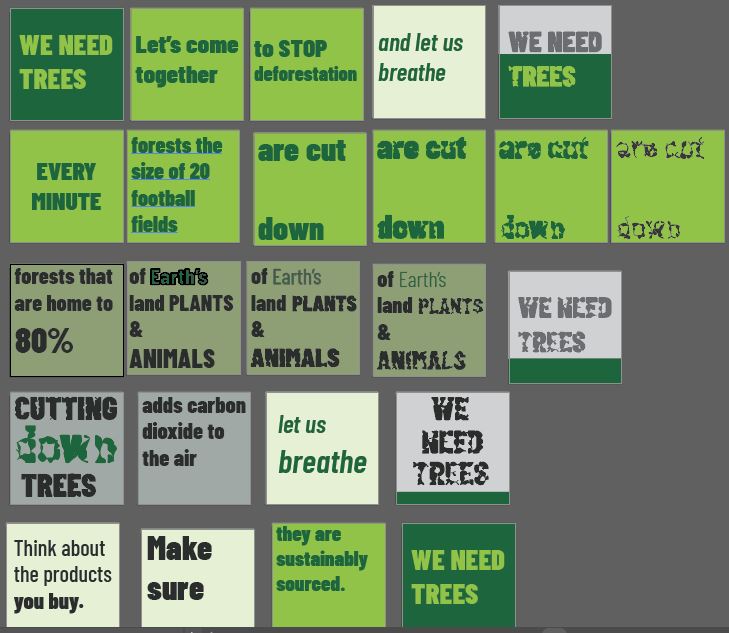
I sent the PNG files of the slides to Holly and the illustrator file to the rest of the group. I invited the group members to change anything they didn’t like before the animation stage.

I shared with the group, the plan for the slides. This would allow Holly to be able to work from the plan with the PNG images.

Feedback for the animated GIF

  • The transitions are a bit too fast
  • The gap in ‘are cut down’ is not immediately obvious
  • Too many effects overall e.g. the black outlines on the word ‘Earth’s’

Visualising Sustainability

Design plays a fundamental role in sustainability because it is the design that determines which resources are employed and how they are used.

Sustain: an ability to sustain over time, endure. for example, over a number of years. Sustainable development: without impacting too much on future generations. For example, preserving the environment.

In business, a sustainable business plan is (not just about the environment) but can be about making sure the business is using their resources economically.

What Is Sustainability?
The most common definition of sustainability comes from the 1987 Brundtland Commission report for the United Nations. It defines the concept as “meeting the needs of the present without compromising the ability of future generations to meet their own needs.”

https://www.investopedia.com/terms/s/sustainability.asp

How are human rights sustainable?

Human rights create conditions essential for sustainable development. The 2030 Agenda recognizes that inclusive and participative economies, and societies in which government is accountable, achieve better outcomes for all people, leaving no one behind. 

Civil, cultural, economic, political and social rights and the right to development build on each other and advance together. 

https://www.ohchr.org/EN/AboutUs/ManagementPlan/Pages/sustainable-development.aspx

https://scadmanor.com/greenwashing-the-brain/

“Don’t be misled by pretty pictures or use of earth-friendly colors on product labels. MacDonalds or Coca-Cola might have green color on their logo, that doesn’t make them eco-friendly!” https://easyecotips.com/learn-how-to-avoid-greenwashing/

https://cuesonline.org/2021/10/28/green-or-greenwashing/

In everyday life there is an element of greenwashing. There is a gap between the things we know and what we do. For example, we know that reusable alternatives are the greener option but need to put the knowledge into action.

Campaigns & Case Studies

Turn it off!

Campaign supporting Ubiquity, documentary by Bregtje van der Haak

Using the language of the online world – emoticons – we designed a simple, but bold visual language, which draws attention to the downside of staying connected all the time.

De Designpolitie
https://www.designpolitie.nl/projects/turn-it-off/

The use of green and red immediately suggest traffic lights and the action of stop and go/ on and off. The strength of the colour carries the message, so the designer is able to use black lights and keep the design simple. The emoticon graphics suggest the original faces made from type.

These will be familiar to people from a certain generation, which suggests to be that this could be the target audience. The bold typeface presents a clear message to the viewer. ‘Schakel Uit’ being Dutch for ‘Turn Off’ in the above designs, is paired with the green. Off which is often a negative word, is contrasted with the positive green.

The banner below is hard to miss due to its clarity and bold simplicity:

LEVI’S WATER> LESS

MY00 Agency, Johnny Lighthands, USA & U.K.

Levi’s developed a sustainable range of jeans to decrease their huge carbon footprint. They wanted to bring their message to people through educational posters and comic strips. They achieved this by using illustrations of water-conserving creatures drawn by Illustrator Johnny Lighthands.

Lighthands’ hand-drawn style gives the campaign a light-hearted touch while getting the message across. The style is rememberable and the characters are lovable. Levi jeans have a reputation for being traditionally well-made and ‘cool’. These drawings challenge the serious reputation of Levi’s. The off-white colour of the ground in these posters suggest natural materials.

Zara- Join Life

I really like the lack of colour in Zara’s graphic design for their Join Life campaign. It looks neat and stylish while also giving the impression of minimal wastage.

https://www.zara.com/uk/en/sustainability-innovation-mkt4823.html?v1=1965796
An image from the campaign for Zara’s eco-conscious Join Life collection.
https://www.carmenbusquets.com/journal/post/fast-fashion-amp-sustainability-will-zara-owners-pledges-mean-real-action
https://www.forbes.com/sites/patrickmoorhead/2021/04/21/amazon-delivers-on-its-sustainability-commitments-and-then-some/?sh=12d5229a299d

The cheerful animations on Amazon’s website are light and joyful. The illustration encapsulates the entire process of the items shifting through Amazon’s process. It is interesting as an animation because of the moving parts featured in the image.

Greenpeace –Protect the Antarctic, The Lovers

‘A global movement to protect the Antarctic’

The agency, The Lovers, decided on colours and simple graphic design, inspired by the landscape and light of the Antarctic. They chose the penguin symbol to represent the wildlife affected by climate change. Their message was translated into many languages to reach a wider audience. This is important because the issue affects every person on the planet and is affected by every country.

The chosen typeface was inspired by naval/maritime fonts.