Design plays a fundamental role in sustainability because it is the design that determines which resources are employed and how they are used.
Sustain: an ability to sustain over time, endure. for example, over a number of years. Sustainable development: without impacting too much on future generations. For example, preserving the environment.
In business, a sustainable business plan is (not just about the environment) but can be about making sure the business is using their resources economically.
What Is Sustainability?
https://www.investopedia.com/terms/s/sustainability.asp
The most common definition of sustainability comes from the 1987 Brundtland Commission report for the United Nations. It defines the concept as “meeting the needs of the present without compromising the ability of future generations to meet their own needs.”
How are human rights sustainable?
Human rights create conditions essential for sustainable development. The 2030 Agenda recognizes that inclusive and participative economies, and societies in which government is accountable, achieve better outcomes for all people, leaving no one behind.
Civil, cultural, economic, political and social rights and the right to development build on each other and advance together.
https://www.ohchr.org/EN/AboutUs/ManagementPlan/Pages/sustainable-development.aspx
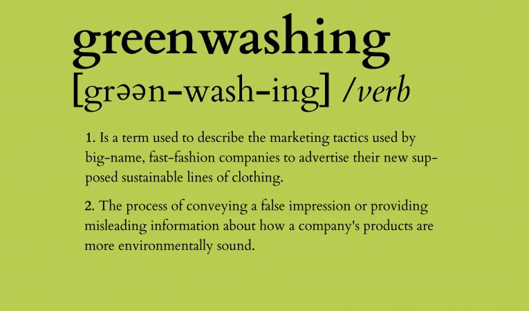
“Don’t be misled by pretty pictures or use of earth-friendly colors on product labels. MacDonalds or Coca-Cola might have green color on their logo, that doesn’t make them eco-friendly!” https://easyecotips.com/learn-how-to-avoid-greenwashing/
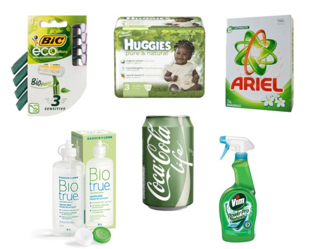
In everyday life there is an element of greenwashing. There is a gap between the things we know and what we do. For example, we know that reusable alternatives are the greener option but need to put the knowledge into action.
Campaigns & Case Studies
Turn it off!
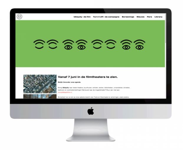
Campaign supporting Ubiquity, documentary by Bregtje van der Haak
Using the language of the online world – emoticons – we designed a simple, but bold visual language, which draws attention to the downside of staying connected all the time.
De Designpolitie
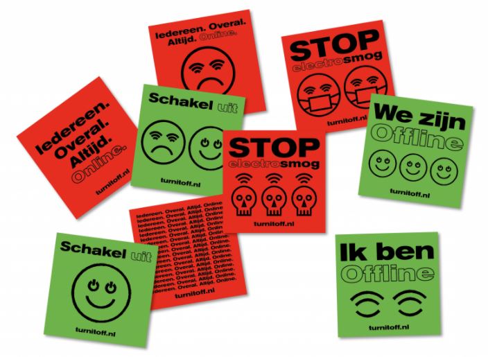
The use of green and red immediately suggest traffic lights and the action of stop and go/ on and off. The strength of the colour carries the message, so the designer is able to use black lights and keep the design simple. The emoticon graphics suggest the original faces made from type.
These will be familiar to people from a certain generation, which suggests to be that this could be the target audience. The bold typeface presents a clear message to the viewer. ‘Schakel Uit’ being Dutch for ‘Turn Off’ in the above designs, is paired with the green. Off which is often a negative word, is contrasted with the positive green.
The banner below is hard to miss due to its clarity and bold simplicity:
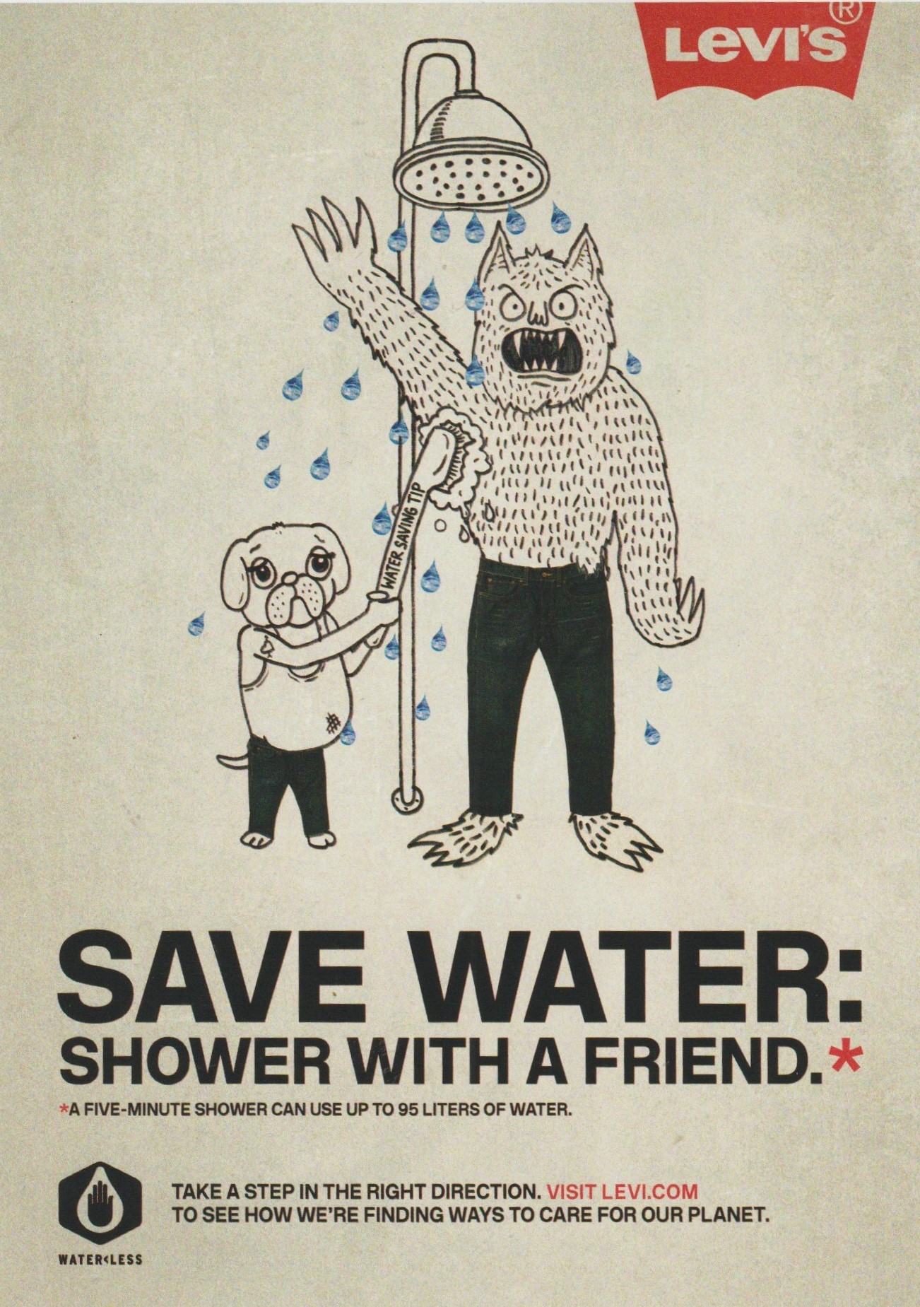
LEVI’S WATER> LESS
MY00 Agency, Johnny Lighthands, USA & U.K.
Levi’s developed a sustainable range of jeans to decrease their huge carbon footprint. They wanted to bring their message to people through educational posters and comic strips. They achieved this by using illustrations of water-conserving creatures drawn by Illustrator Johnny Lighthands.
Lighthands’ hand-drawn style gives the campaign a light-hearted touch while getting the message across. The style is rememberable and the characters are lovable. Levi jeans have a reputation for being traditionally well-made and ‘cool’. These drawings challenge the serious reputation of Levi’s. The off-white colour of the ground in these posters suggest natural materials.
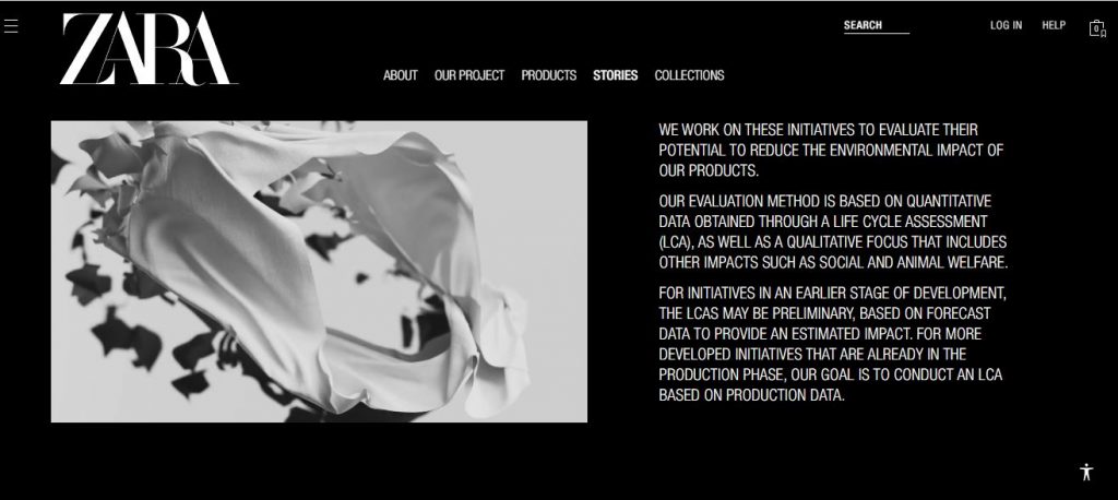
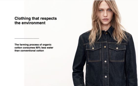
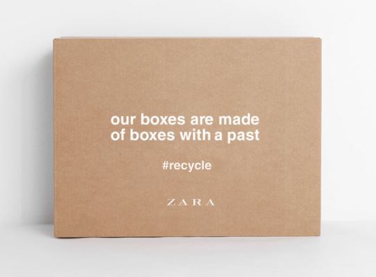
Zara- Join Life
I really like the lack of colour in Zara’s graphic design for their Join Life campaign. It looks neat and stylish while also giving the impression of minimal wastage.
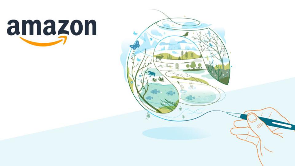
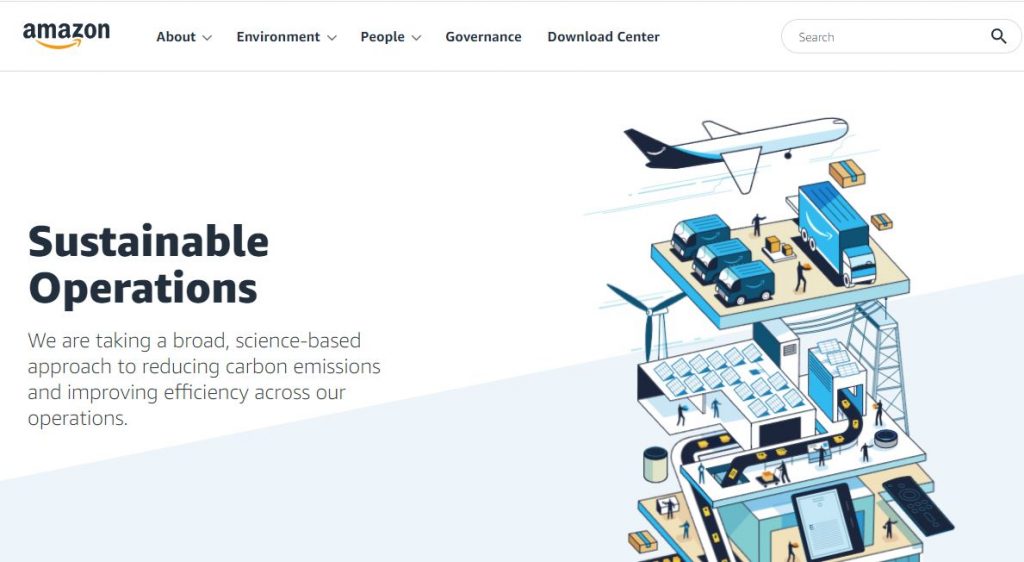
The cheerful animations on Amazon’s website are light and joyful. The illustration encapsulates the entire process of the items shifting through Amazon’s process. It is interesting as an animation because of the moving parts featured in the image.
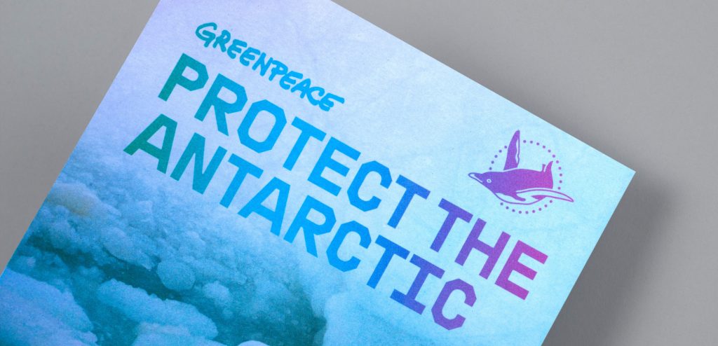
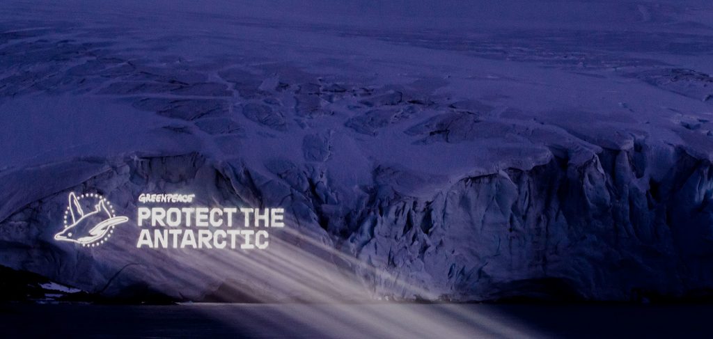
Greenpeace –Protect the Antarctic, The Lovers
‘A global movement to protect the Antarctic’
The agency, The Lovers, decided on colours and simple graphic design, inspired by the landscape and light of the Antarctic. They chose the penguin symbol to represent the wildlife affected by climate change. Their message was translated into many languages to reach a wider audience. This is important because the issue affects every person on the planet and is affected by every country.
The chosen typeface was inspired by naval/maritime fonts.