Project #4 Drawing with a grid

Project #3 Invited us to think about getting an idea onto paper: how we could visualise an object – in this case my leaf – and produce a visual record. Paper and pencil is one way, and it works for many cirumstances. For example, a straight-forward illustration for a story or educating people about leaf anatomy.

Project #4 required me to think in a different way. This time, I needed to translate my object onto a grid. This brings to mind the pixelated animations in early video games.

These animations were in no way impressive, back then and to the modern eye. But they worked because they simplified the objects and in most cases, this was enough for the imagination to make up the rest. The resemblance wasn’t always perfect.

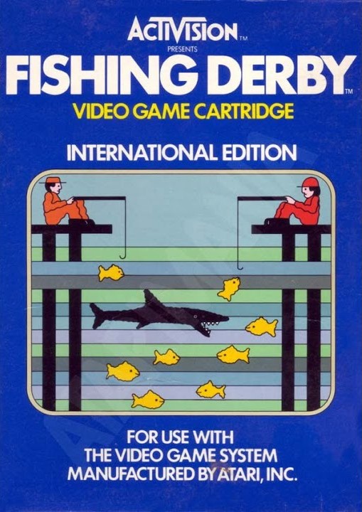
An example of these early graphics is the game Fishing Derby, released in 1980 for the Atari console. The cover illustration shows us the narrative of the game. Below, you can see the actual gameplay, where this story is translated into this primitive animation. Simplified, yes, but it works. I can understand what every shape is supposed to represent.

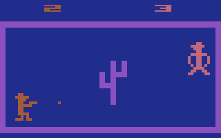
Screenshot from Outlaw. Another Atari game, this one realeased in 1976. These graphics are really successful in my opinion. The cowboy hats and guns represent cowboys, but incase you weren’t sure, the image of the cactus tells us the location and combines with our association of cowboys.

link here

While in a vintage toy rabbit hole, I came across the Lite Brite toy. I remember this toy in my distant memories, but never knew the name of it. The toy allows you to use lightbulbs to create pictures.

Secondary Research

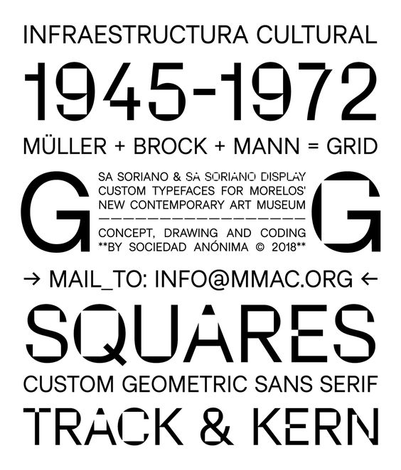
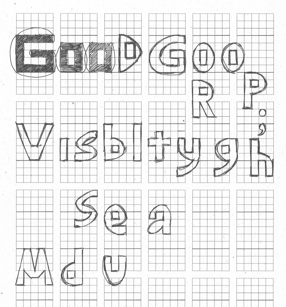
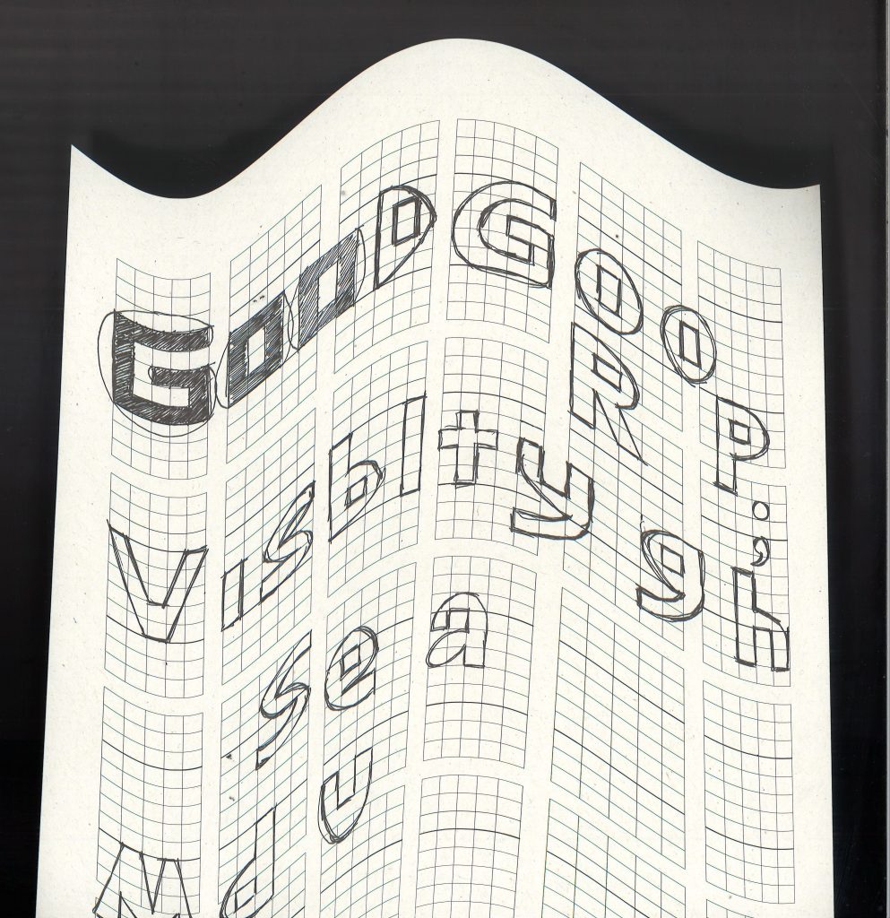
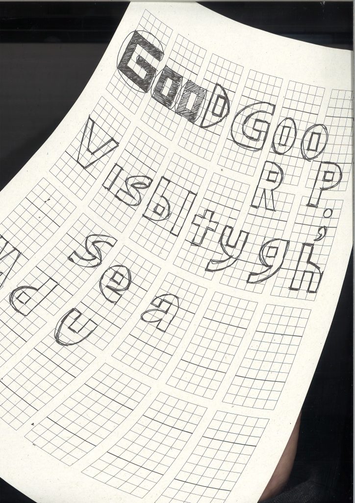
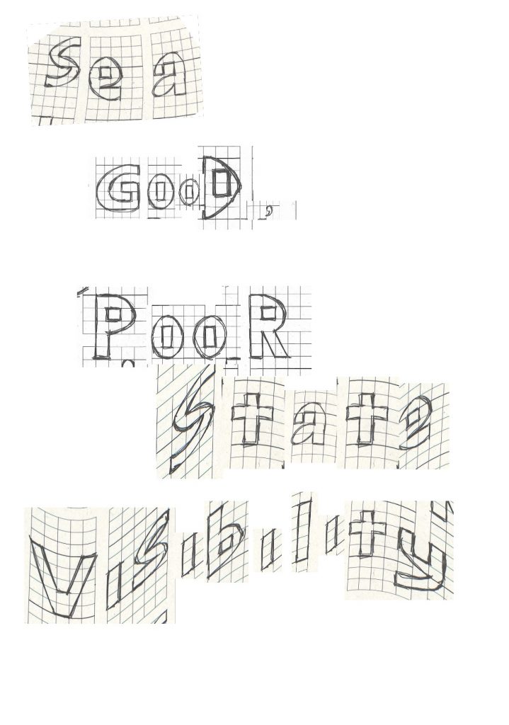
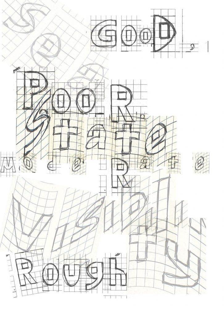
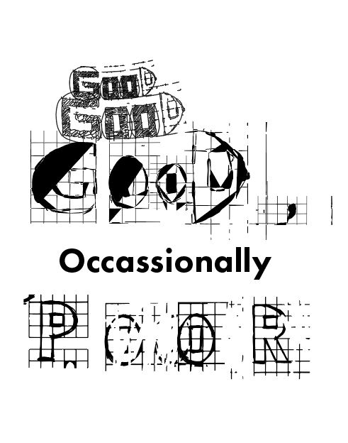
I wondered how I could simplify a shape and still make it readable. I began to explore how designers apply similar methods to type.

I looked at type that has been constructed using a grid and appears with this pixel style.

Rosetta

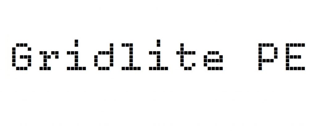
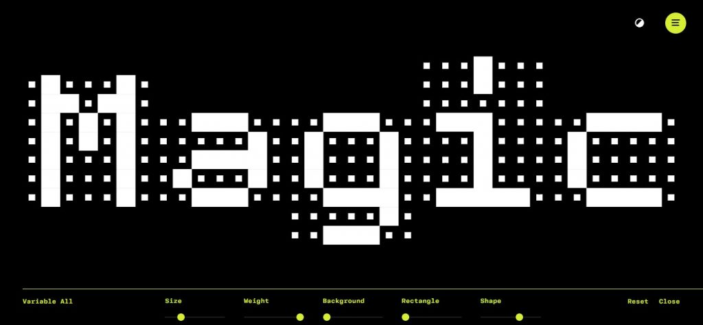
The design studio Rosetta have come up with Gridlite PE. This is a typeface that utilises a grid structure.

‘Gridlite, an experiment with a modular negative space, is a simplified and monospaced variable font ready to be animated, typed, scaled up, scaled down, rounded, or otherwise deformed. It sports variable axes to control the size of the elements, their shape, and the background.’

I can envision this type being adapted to a physical mosaic, using tiles for example to spell the words. The grid structure means it can be easily drawn up and converted into other uses. I like the clarity and neatness of this type (below).

Rosetta – Gridlite PE (rosettatype.com)

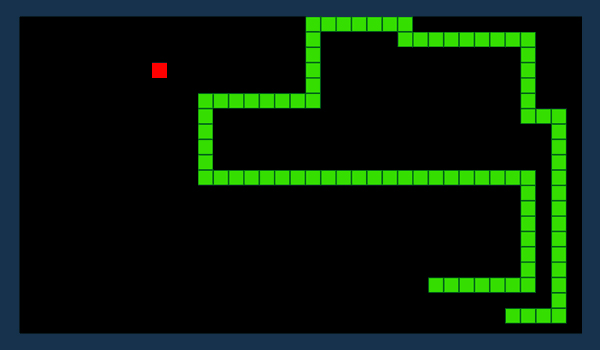
The type reminds me of the computer game ‘Snake’ (below). Maybe because of this association, I see the type as moving.

‘Snake’
This image has an empty alt attribute; its file name is magic-1024x473.jpg
‘Magic’ variable of Gridlite PE by Rosetta.
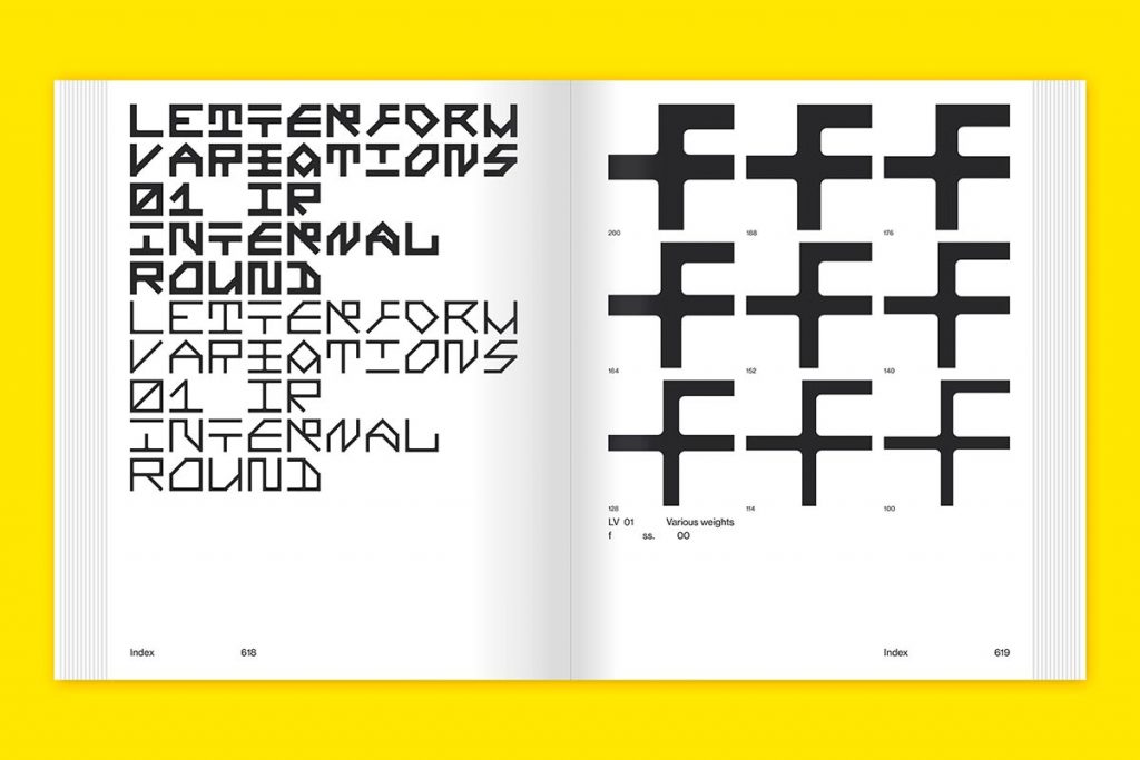
Nigel Cottier – Letterform Variations

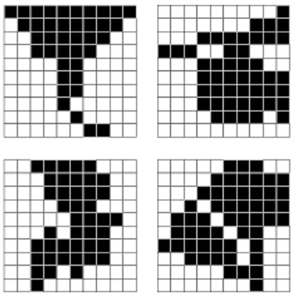
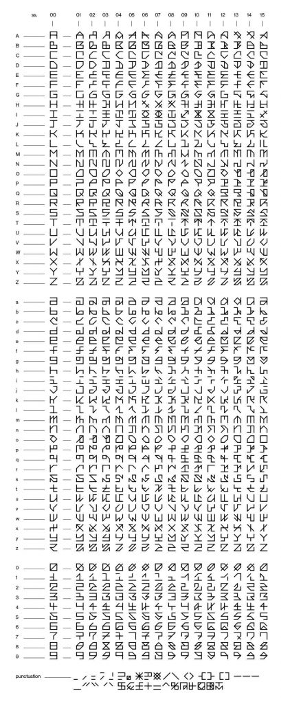
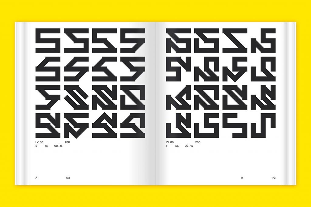
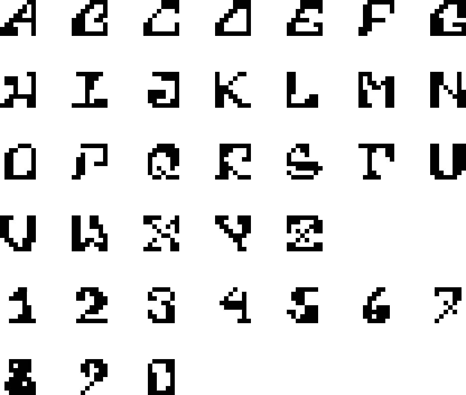
In the book Letterform Variations, Cottier explores different ways of forming letters of the alphabet. He uses the grid system and other shapes to form the letters. In table below, we can see the 16 variations of forming a given letter. By starting with the simplest form on the left column, he abstracts the shape further, pushing what can be recognisable as that given letter.

For the ‘H’, he plays with rotation as well. I would not have considered rotating the letter, since we write from left to right and top to bottom in a typical page of text.

For the ‘I’, he even leaves a gap in the letterform. The ‘I’ is still recognisable despite this gap.

I find the numerals easier to decipher at a glance. I’m not sure why this is.

This image has an empty alt attribute; its file name is LV01L-409x1024.jpg
https://letterformvariations.com/book/
This image has an empty alt attribute; its file name is Slanted-Publishers-NigelCottier-LetterformVariations04-1024x683.jpg
https://www.slanted.de/product/letterform-variations/
This image has an empty alt attribute; its file name is Slanted-Publishers-NigelCottier-LetterformVariations16-1024x683.jpg
https://www.slanted.de/product/letterform-variations/
Wim Crouwel

Crouwel was an experimental graphic designer, born in 1928. He was a leading figure in modern Dutch design.

Typography must be visually orderly for the purpose of good readability.

Wim Crouwel

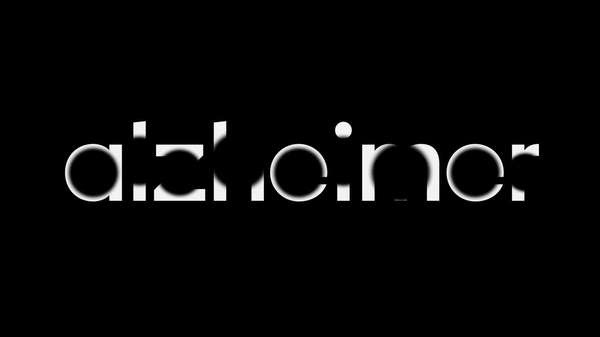
He designed ‘new alphabet’ which was considered not useful for everyday use because of its low legibility. His typefaces were designed to be used for a computer display, since the grid use meant that these typefaces could be applied to a computer pixel by pixel.

New alphabet typeface by Wim Crouwel
This image has an empty alt attribute; its file name is 1968-vormgevers-679x1024.jpg
Vormgevers Designculture • Wim Crouwel

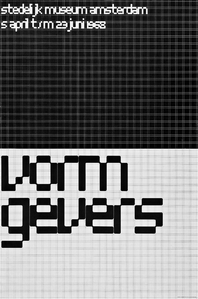
The above poster for an exhibition in 1968, makes use of the grid to compose each letter. I like the cut-out corners and the way they are rounded. The result is playful and futuristic.

Other simplified/ modular typefaces

I looked at more typefaces that could be described as modular fonts. This means the letters have been broken down into smaller parts.

A modular typeface is an alphabet constructed out of a limited number of shapes or modules. Modular describes any letter assembled from a limited palette of distinct elements, repeated, flipped and flopped but not scaled. Typically these elements are geometric and simple in shape—square pixels on a digital display or modernist circles, squares, and lines.

Typography 01

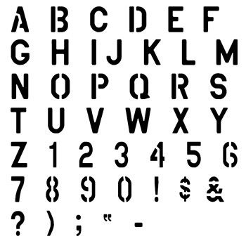
I was also reminded of the plastic alphabet stencils used in school. The letters are broken apart from necessity. Only the letters with a central cut-out area are constructed from 2 parts.

This image has an empty alt attribute; its file name is mercury-blob.jpg
This image has an empty alt attribute; its file name is mercury-blob-normal-lower.jpg
TT Mercury Blob Normal Lower font

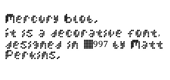
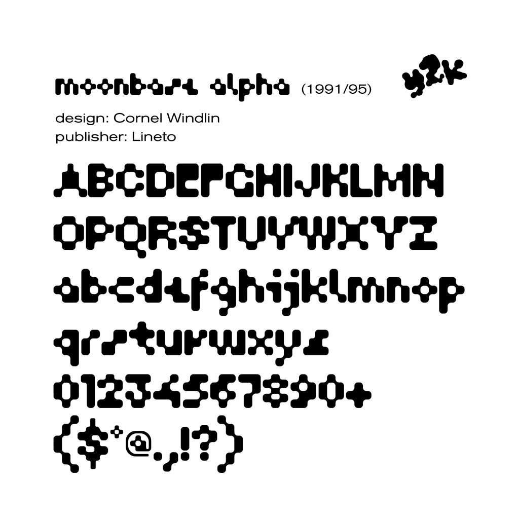
I find the above and below fonts (Mercury blob and Moonbase alpha) easier to read from further away! This is probobly because the pixels merge optically, giving them a more solid appearance at a distance.

This image has an empty alt attribute; its file name is D1YquqhV4AYFz_T-1024x1024.jpg
Moonbase Aplha typeface by Cornel Windin
Modular type designed by Deviantart user Final-Ressurection

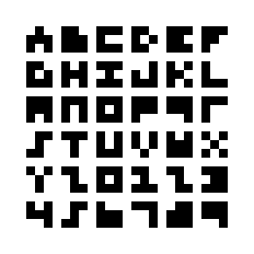
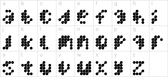
Modular typography- addictedtotype

This design uses a 3 x 3 grid to construct the alphabet. I find some of the letters more legible than others. For example, I only recognise the ‘M’, in the context of the rest of the alphabet. If I had seen this shape alone, I’m not sure I would have read it as an ‘M’, or even as a letter.

Primary Research

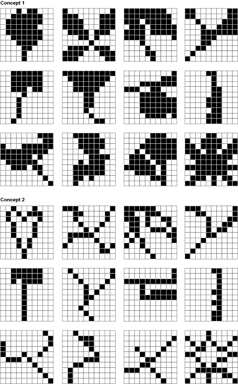
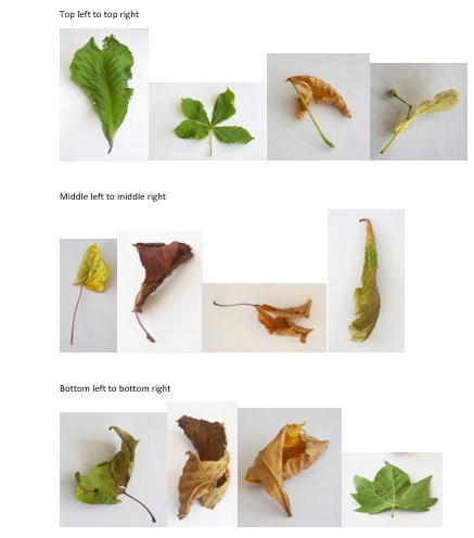
The task was now to translate my objects (the 12 leaves) into grid drawings. I worked mainly from the photographs of the objects. The main reason for this it that the leaves began to wilt very quickly after I brought them home, changing their shape.

I’ve placed the photos into the formation of the grid, to enable me to compare the objects to their pixelated counterparts.

This image has an empty alt attribute; its file name is for-the-blog-3.jpg

I worked on 2 concepts per each of the grid types. One grid being made up of round parts and the other being square parts. I used the concept 1 (below) to come up with a more filled-out version of the shape. The 2nd concept was then the simpler version, using less dots to construct the shape.

This image has an empty alt attribute; its file name is B_Project-4-9x9-circles-grid.jpg

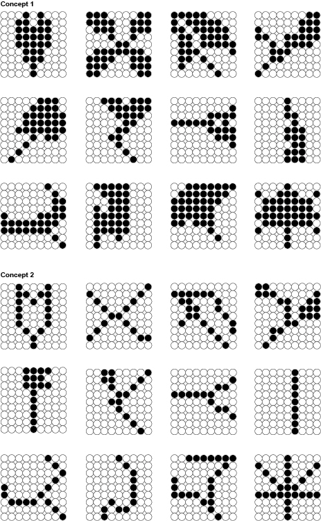
The square grid was easier, since placing one black square next to another created a seamless line. I again applied the same rule to this grid type, with the 2nd concept being the most simplified. For concept 2 I aimed to use the least dots possible to construct the shape.

This image has an empty alt attribute; its file name is Project-4-10x10-square-grid.jpg

Typography & meaning

Type is essential for effective communication.

Type can:

deliver a concept or express an opinion.

The way text is displayed will add meaning to the words themselves.

By changing layout, spacing, punctuation etc, we can portray a certain message. For example, the boldness of ‘Kindness’ in the sign below, suggests that kindness can be bold and robust. The height of the word ‘Strength’ illustrates strength itself.

design by Anthony Burrill

British graphic designer, Anthony Burrill is well known for his prints which often contain bold statements that are punchy and effective.

By repeating the word ‘Justice’, Burrill is making a statement about the importance of justice. When people are passionate and certain about something, they repeat the sentiment. This is further emphasised by the black and white. When something is in ‘black’ and ‘white’, metaphorically it means there are no doubts about it. Here Burrill is using this in the literal way.

Words are powerful.

They invoke emotion, feelings and ideas. They are powerful because of their ability to encapsulate a concept.

Words can be transmitted from person to person, often in an instant format. This is why memes are powerful. Because of the speed they can be shared and the way they need to be understood quickly, means they are also put together in a way that is simple and concise.

In a small space, a lot of meaning can be packed. This includes imagery and experiences. Stories can be packed into a few words.

Extinction Rebellion

Extinction Rebellion are a movement set up to tackle the climate change problem.

They use guerilla marketing strategies to get their message across, for example civil civil disobedience and demonstrations. They create a disruption, sometimes spreading flyers where they aren’t allowed to.

They use bold, big statements in uppercase type. The typeface they use is similar to Futura, but with rounded edges. Sometimes images function as letters, i.e. skulls.

Their symbol is an abstracted hourglass. This emphasizes time running out and the circle is a symbol of the Earth.

Black Lives Matter poster (left)

This poster was designed by the anti-racist advocate Sophie Williams. She puts her message outside in the street for the public to see.

She uses repetition, different angles and spacing to add emphasis to her message.

Climate Crisis font by Helsingin Sanomat. This is an example of variable font.

Helsingin Sanomat, abbreviated HS and colloquially known as Hesari, is the largest subscription newspaper in Finland and the Nordic countries, owned by Sanoma. 

Variable fonts are an evolution of the OpenType font specification that enables many different variations of a typeface to be incorporated into a single file, rather than having a separate font file for every width, weight, or style.

The typeface is based on real arctic sea ice data and gives us a visual representation of the loss of sea ice on Earth.

Typefaces tell stories. Sad, complex, pretentious…

Sa Soriano

‘For the Museo Morelense de Arte Contemporáneo Juan Soriano (MMAC), we designed a sans-serif typeface with a display character, inspired by features of the museum’s architecture. The specific reference is the windows and openings drawn on large-scale plans, gestures that were replicated in the typography through cuts and gaps, alluding to positive-negative, interior-exterior, window, landscape space.’ 

This is an example of form follows function.

The content can lead what the type looks like, or the type can follow the content of the project.

Incomplete without the T campaign, Grey London. With the aim of raising visibility of trans issues, Grey London came up with the idea of removing the letter “T” from a range of different texts to highlight the erasure of a letter from “any word, in any language”. This means reducing or removing both the comprehension and the unity behind it – “and the same is true when you remove the T from LGBTQ+,” states the magazine. 

Studio Dunbar

Erasing parts of the word ‘Alzheimer’, represents how the memory is erased in people with Alzheimer’s disease. It also simulates the frustration experienced by people with memory loss, by giving us the experience of reading the word with difficulty.

Pentagram- Maholy Nagy Foundation

This is an example of analogical techniques being used to create type.

Maholy Nagy was an artist from the Bauhaus. He worked with experimental photography and was one of the first people to experiment with photograms.

For this book cover design, Pentagram have used water to give the type a wavy effect.

Age of rage– The Guardian’s guide to anger. This is another example of design that uses analogical techniques.

Linguistic tricks

Linguistic tricks can make a phrase more memorable. They can be used when writing headlines.

Examples of Portmanteu:

Examples in English include chortle (from chuckle and snort), smog (from smoke and fog), brunch (from breakfast and lunch), mockumentary (from mock and documentary), and spork (from spoon and fork). A portmanteau is a suitcase that opens into halves.

(combining 2 words to create 1 new word)

A Palindrome is a word that reads the same backwards and forwards, for example:

Alliteration makes a phrase more memorable. It is often used in brands and advertising, for example:

Rhymes

Neologism are new phrases that have been recently made up because their use has become popular, for example:

‘Google it’

‘Tweet about it’

Acronym

Computer key – LOL

Denotation is the literal meaning for example, a cross.

Connotation is about our associations. In relation to a cross, it would be Christianity, hospitals. etc.

Project 2- Group work

Using the skills we learnt from this week’s lecture, we designed expressive type around an article about deforestation. We were placed into groups and needed to each design this heading. ‘We Need Trees’ works as a heading because it is snappy and uses rhyme.

I first read the article carefully, underlining key words. I then scribbled my ideas in my notebook, focusing on the key themes.

I sketched visual ideas for the heading:

I designed the heading in Illustrator. I typed the heading into a text box and changed the font to ‘Impact’ :

I used this photo of a tree canopy. (below) I bitmapped the photo by opening it in photoshop, converting it to greyscale and then selecting bitmap> diffusion dither.

I placed the group’s designs into InDesign and exported the document as a PDF. This would allow us to present it to the class easily in the next lecture.

Below designs by:

1)Ben 2) Ben 3) Ben 4) Holly 5) Demelza 6) Demelza 7) Demelza

Typographic design- Shipping forecast

Week 3

The Brief

Introduction
It is important to note that modern typographic design and modern
(‘concrete’) poetry evolved together in a synthetic relationship
that turned out to be a key development in design practice
during the Twentieth Century. Painters and writers, both looking
for new ways to transform their respective practices, would find
dynamic aspects in each others disciplines that would lead to new
innovative strategies that they could turn to.
During this period, writers became became aware of typography’s
authority over the shape of meaning; It can make light of
seriousness and visa versa by way of formal innovation; forcing
confrontation; reductive spacial designation and facilitating
contradiction. Indeed, there is no end to the ongoing cultural
innovation produced and provoked by a typographic designers
handling of type and language.

Task: The Shipping Forcast
The Shipping Forecast is a BBC Radio broadcast of weather
reports and forecasts for the seas around the coasts of the British
Isles. It is produced by the Met Office and broadcast by BBC
Radio 4 four times per day.

Using a combination of digital and/ or hand-crafted techniques,
typographically arrange the words to enhance their meaning.


I looked at some graphic design inspiration before working on my own design for the shipping forecast text.

Ian Miller

The California-based graphic designer’s posters and menus for boutique hotels draw on gig posters and book covers from the 1960s and 70s.

When you stumble across Ian Miller’s portfolio on Instagram, you’d be forgiven for thinking that you’d discovered a rather well-curated archive of vintage poster designs. In reality, the majority of these posters are commissions. Alongside a few personal projects, Ian regularly creates flyers, posters, menus and merchandise for a range of boutique hotels and their affiliated bars and restaurants.

erasing text randomly

Limited use of colour.

Bold and handwritten text, combined with a digital typeface. Diagonal type.

Analogical background texture. Lines of text placed at an angle.

image within a shape.

type grouped closely, overlapping.

I was assigned The Irish Sea. For Tuesday, this was the shipping forecast:

I pasted the data in a text box on adobe Illustrator. I then separated the text and grouped words according to what I thought sounded and looked the nicest. I repeated some phrases and increased some of the font size. This resulted in a scattered set of words I could then use in a composition:

Using grid paper as a guide, I sketched the letters for the words I wanted to stand out the most.

I scanned the page in several ways. 1) above, a simple scan 2) below, moving the paper up and down on the scanning bed. 3) sweeping the paper diagonally across the scanning bed. Techniques 2 and 3 created warped lettering.

I placed the page into Illustrator and cropped each letter out of the page separately. I worked gradually to build all the words to the phrases I had chosen to stand out.

When there were repeated letters, I simply copied and pasted the same drawing.

Using a combination of letters from the straight and wavy scans gives the composition a wavy look. This ties in with the theme of windy weather and a choppy sea.

I selected all the shapes, then switched the transparency to ‘multiply’ (see below). This allowed the lines of the graph paper to be seen through each layer.
I used differently types of Image Trace to turn the words into vectors. I used the eraser tool to remove lines from the word ‘Poor’.

I zoomed into the scan of the graph paper drawings. I then bitmapped this image in photoshop.

For the type, I used a combination of the graph paper drawings and the type tool on Illustrator. I changed the colour of the bitmap to purple, to allow the words in the foreground to stand out.

Wednesday 16th Feb

I wasn’t fully satisfied with the experiments from yesterday’s workshop. I thought there would be another way of working that’s more effective and less intricate/ time-consuming than drawing and cropping individual letters.

I re-thought the brief.

Accessing a different shipping forecast page, I mis-read that the Rockall 977 rock is in the Irish Sea. I therefore, chose this image of the rock for a background texture:

The second element I thought of, was using the outline of the Irish Sea within the design.

I cut this area out of the map by opening it in photoshop and using the quick selection tool. I then bitmapped the photo of the rock and placed it within the map outline by selecting both pictures on illustrator and creating a clipping mask. (below)

I added type to the image and created boxes around some of the type to make it readable.

I liked the grainy quality of this image as it nicely illustrates the issue of visibility and rain.

I then printed the image and chose to add handwritten type instead of digital type. (below). I used a red permanent marker pen to write across the page. I followed the curves of the rock photo. Writing some words bigger, helped to give some hierarchy.

I then opened the Rockall 977 photo in microsoft word and changed the colour to green, then another version in grey which I had flipped to a mirror image. I then printed the photos, tore the paper and stuck them onto a different piece of paper.

I wrote onto the page with 2 different pens/styles.

I chose to use the marker pen for the word ‘rough’, as the pen was starting to run out of ink and gave a rough texture. The fine liner handwriting adds a different texture again.

Opening the same photo in microsoft word, I copied and flipped the image upside down to give a mirror image. I printed this page to add handwritten words. The greyscale photo means that a coloured marker works well with the design.

I wrote the sentence at the top, to give the picture a kind-of-title.

I picked out the words ‘good’, ‘moderate’ and ‘poor’ from the text and wrote them on the right side. This gives the image some order and meaning to follow. I opened the scanned image in illustrator. I then transformed the image into an Image Trace vector. I used yellow for the background, as yellow is sometimes used for warning signs or instructional signs. The type at the bottom of the page balances the amount of white space in the design.

I transformed the image into an image trace vector image. This time I coloured the image orange. I drew rectangles around some phrases to pick them out of the composition. Using diagonal type adds energy to the picture.