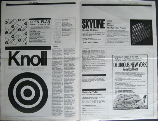
Grids help us shape systems, by giving us a structure. They help to manage content. When information is complex, a hierarchy puts the information in order and makes the data comprehensive.
The grid system is used for advertising and editorial design, where we can see typography, shapes and photography placed in a systematic way. Designers build this visual system using grids.
What are the advantages?
- helps with reading the content
- creates harmony across a publication for example, adding aesthetic value
- adding breathing space between content makes it less condensed.
- creating rational organisation is useful in brochure and magazine design. Planning a space for images and a space for content makes the reader’s work easier and the designer’s work easier.
Massimo Vignelli
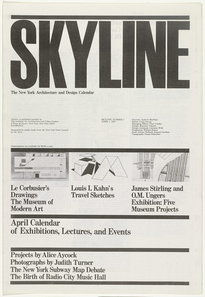
I looked at his work briefly last week, when talking about the design of the New York subway system. Below is the front cover of thr tabloid, designed by Vigneilli in 1978.
In this example, the grid is made obvious by the thick dividing lines across the page. These are known as flowlines (rules separating the page). These work as boundaries that divide the spread. We can clearly pick out the spatial zones in this layout. Spacial zones divide the information into separate zones, for example we can clearly see one area used for the heading, one section for images and so on.
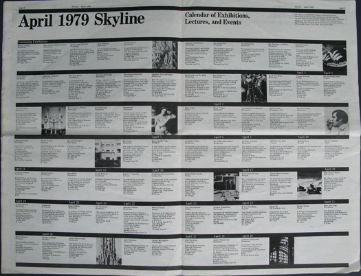
The calander uses the grid in an obvious way. The flowlines are placed evenly across the spread. This creates a sense of order. Placing the images randomly amongst the text helps keep the page intereseting to look at. This assymetry is important to balance out the evenly spaced rows of information.
In the below spread, the grid is used to structure the information. I can see an underlying grid where the page is divided into thirds. The white space on the bottom right allows the eye to rest and prevents the spread looking crowded.
Grids are a loose set of rules. They are not an absolute rigid guide. If a layout is too structural, people get tired/bored.
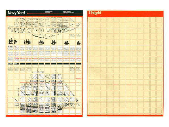
Vignelli’s Unigrid for America’s National Park system, gave him more flexibility.
Josef Muller-Brockmann
Muller Brockmann was a big fan of using the grid system.
The designer’s work should have the clearly intelligable objective, functional and aesthetic quality of mathmatical thinking.
The Typographic Grid, Josef Muller Brockmann
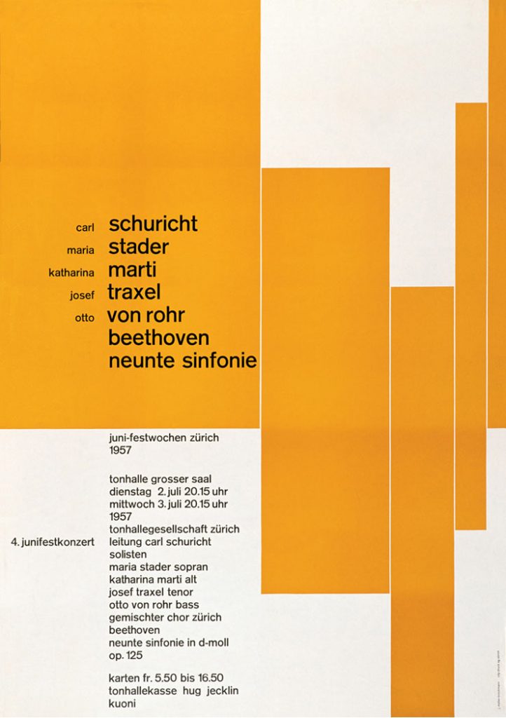
Muller Brockmann has carefully balanced the elements in this poster. The shapes on the right make the right side busy, but the text on the left means that both the left and right sides are balanced.
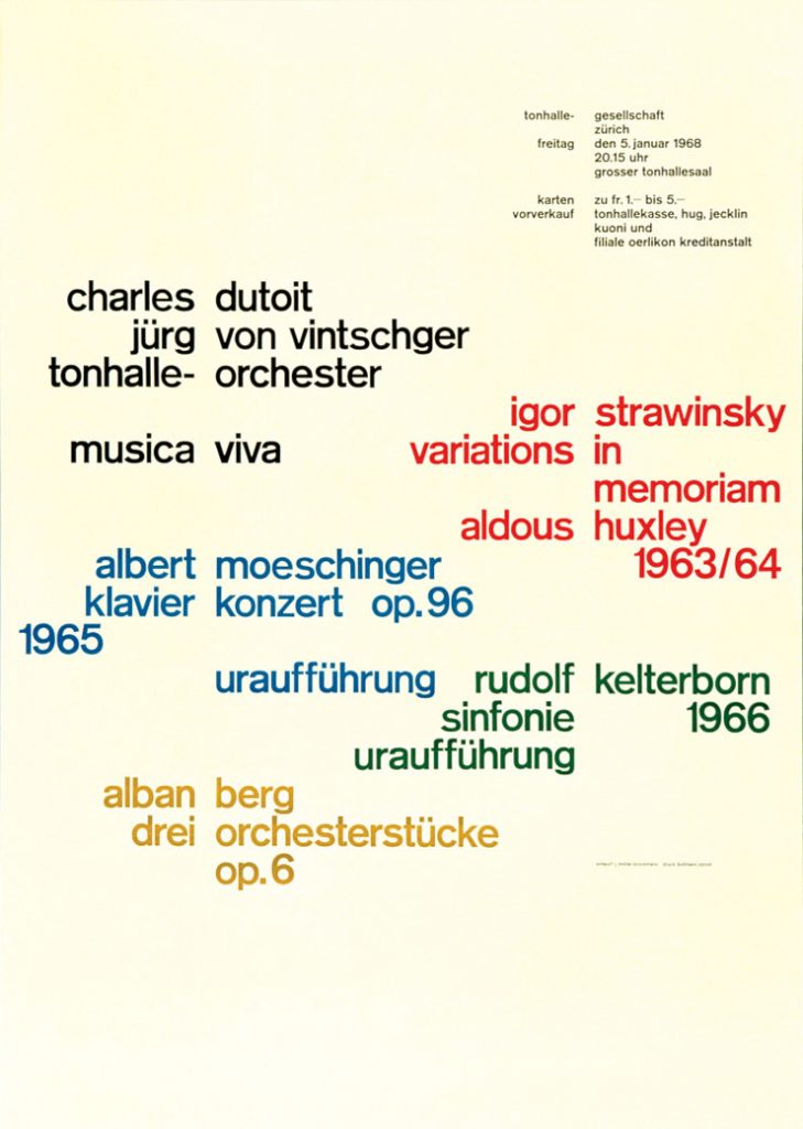
The gaps between the words align to show an underlying grid. This grid helps to unify the information, considering 5 different colours have been used.
Muller Brockmann’s Beethoven poster uses a more unusual grid. The edges of the shapes line up with the edges of text to draw the eye to one point of the poster.
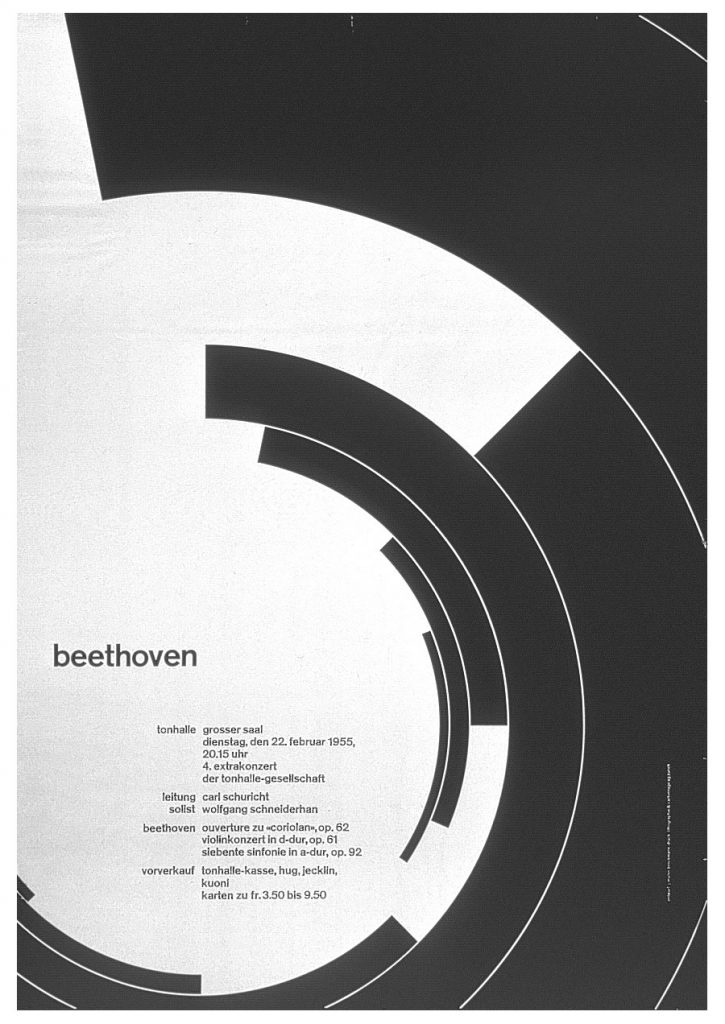
This centre point is shown in the image below:
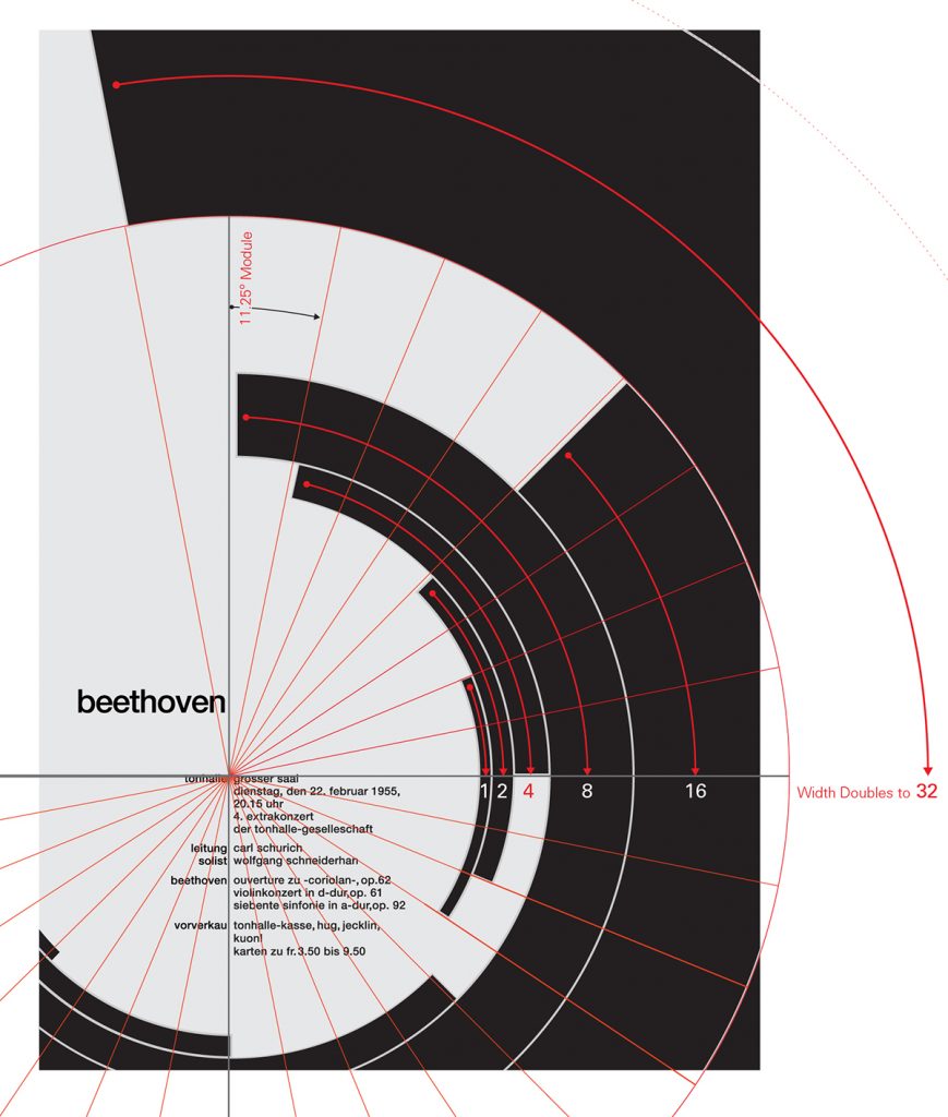
Efficiency-
Grids reduce a designer’s options, which saves time. You don’t need to make decisions at the start of every project if you use the grid system as guidance.
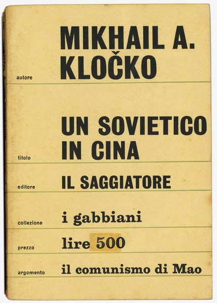
Mikhail A. Kločko, “Un Sovietico in Cina” I Gabbiani 9, July 1964 (1a edizione)
‘The whole dust jacket, in a light gray, is divided into bands of 6 silver colored rulers. Each band contains information about the book: on the cover author, title, publisher, collection (name of the series), price and “topic”; on the back a biographical note on the author, a summary of the book and a description of the I Gabbiani series in addition to the repetition of price and topic.’
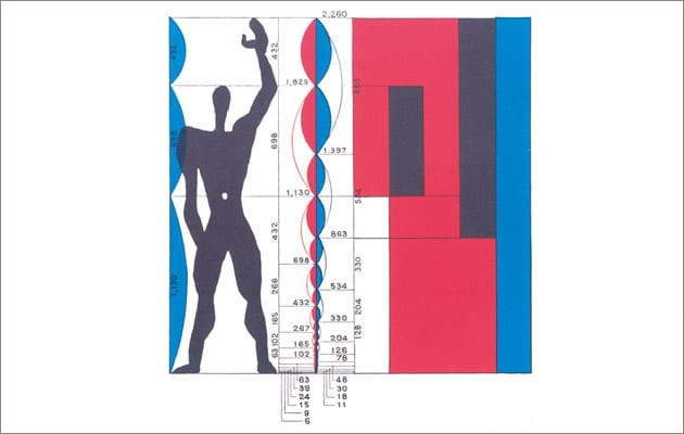
‘The Modulor was meant as a universal system of proportions. The ambition was vast: it was devised to reconcile maths, the human form, architecture and beauty into a single system.’
Le Corbusier used these proportions within his architecture. It is based on the golden ratio.
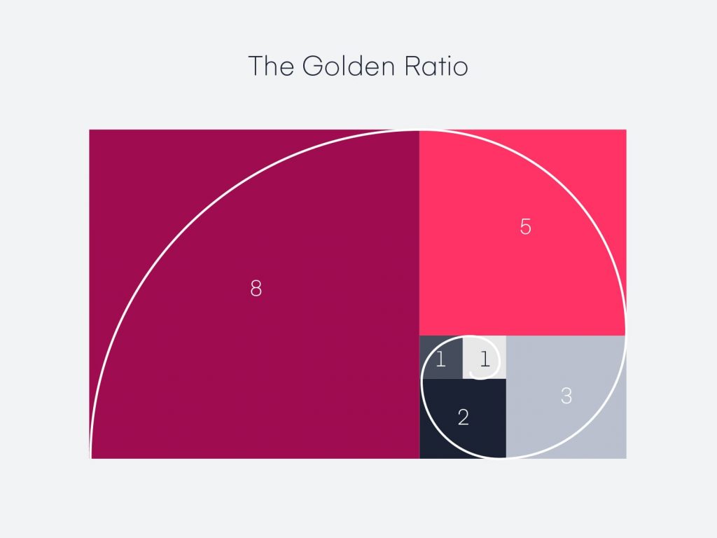
Golden ratio
The grid is one of the most helpful inventions in graphic design.
It follows universal law – since grids can be found all around us. One example is in honeycomb.
The golden ratio has been described as an equation that produces beauty in a design. It is found in famous artworks and in nature. The same principle can be applied in graphic design.

Rule of thirds
I know this grid from learning photography at college. By dividing the space into thirds, we are left with 9 equal sized areas. In photography, it is recommended to place the main subject at an intersection beteen 4 of the lines.
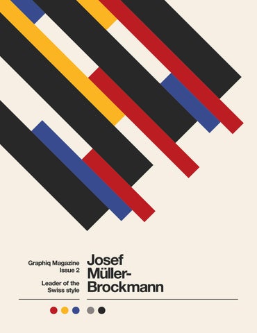
In graphic design, using the rule of thirds means directing the focus to a spot that would lie at an intersection on a rule of thirds grid. For example, the corner of the black rectangle on this poster leading to the text on a third.
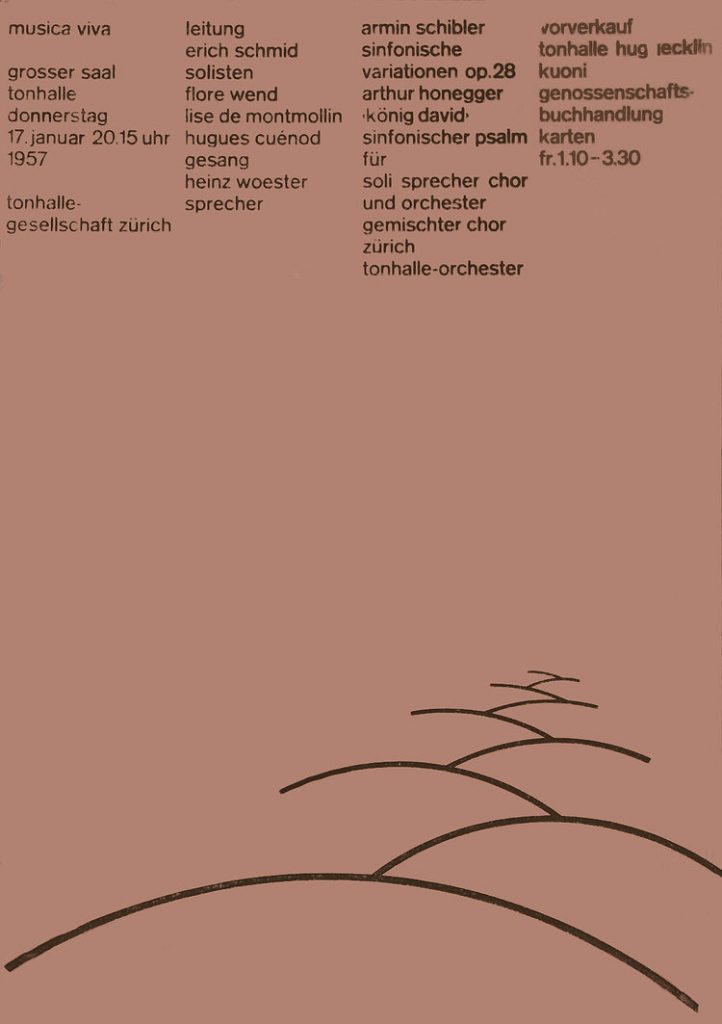
In this poster, Muller Brockmann has counter-balanced the position of the main content with the simple line drawing at the bottom of the poster.
Grid systems in typography
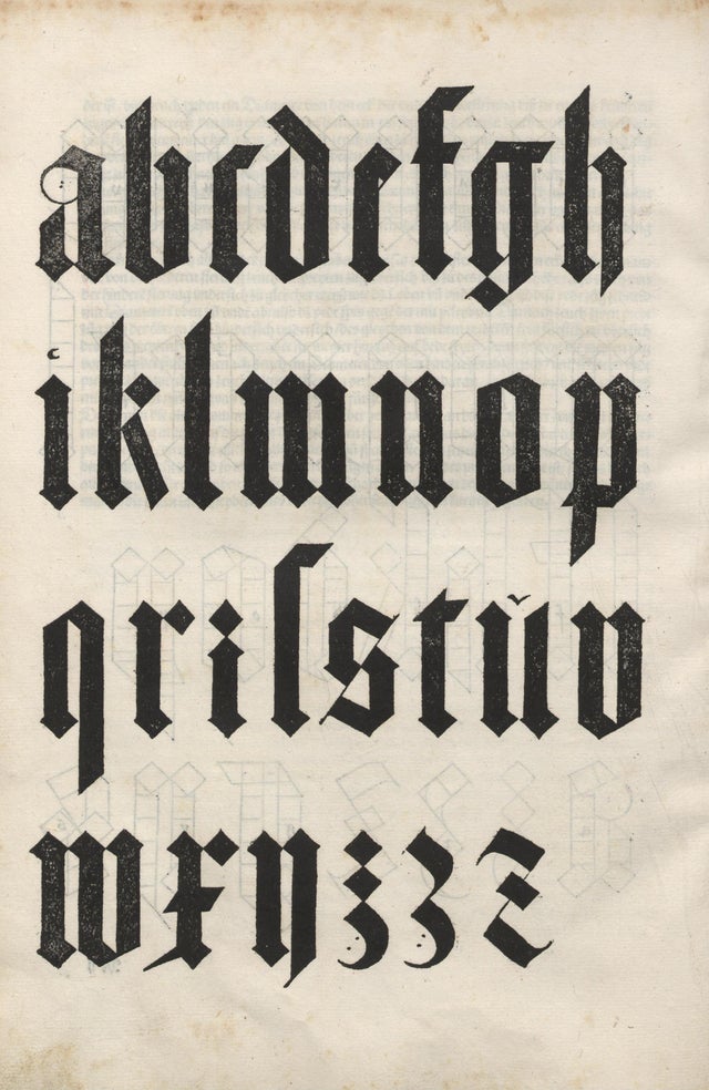
These letterforms designed by Albrecht Durer in 1525, were based on human proportions.
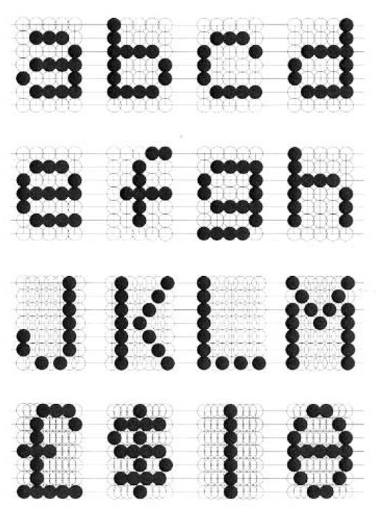
Olivetti took the structure of the grid and used it to create type, in a similar way that latin letters have been designed. Instead of straight lines and angles, Olivetti constructed his letterforms from a grid of circles. He was able to form each letter from the choice of circles he has included. The use of circles doesn’t interfere with our ability to understand the type. This may be due to the number and size of the circles.
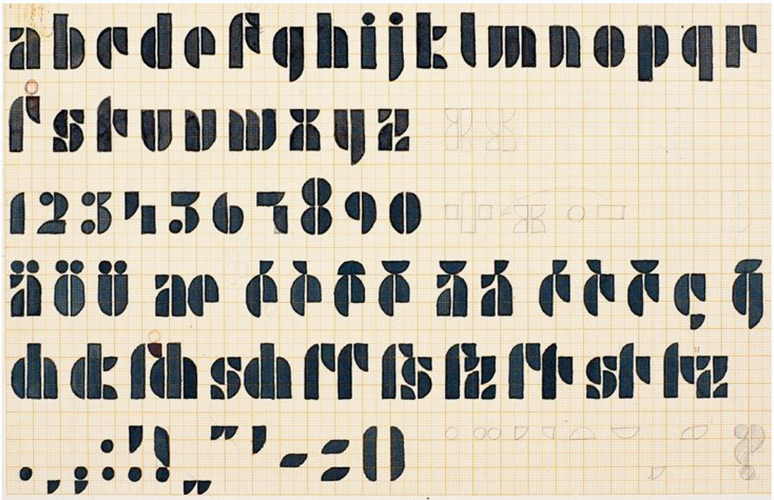
(Above) Josef Albers’ design for the Universal Typeface, known in the Bauhaus movement. As you can see from the grid paper he has used for the design, there is a system to this typeface. This alphabet has been constructed from rectangles, circles, semi-circles and quarter-circles. The same pieces have been used across the different letters.
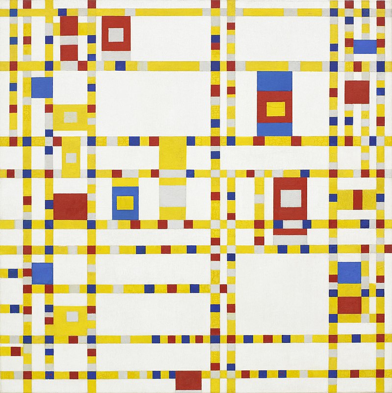
Mondrian used mathmatical structure within his paintings. The colour of the above painting makes the work fun and playful, which is enhanced by the contrast with this grid structure.
Workshop 2: Systems of Order
This afternoon’s digital workshop required us to use adobe Illustrator and we were invited to think outside the box. The task was to design a grid, using a given image.
Aim and brief-
‘The aim of this workshop is to familiarize yourself with
the idea of finding systems of order within different
subjects, not concerning communication design.
Nature as well as artificial structures could function as
an inspiration for the construction of layout systems.’
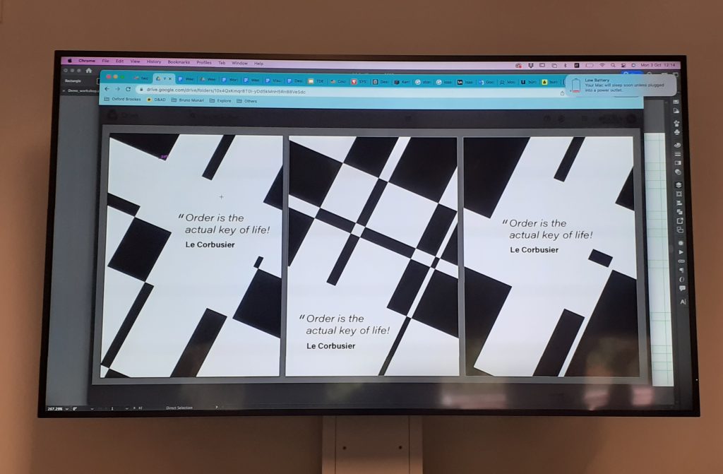
I chose the below image to base my grid on:

We based these designs around a given quote:
Order is the actual key of life!
Le Corbusier
Workshop steps:
- Smart guides on
- Import the photo (can use a section of the image) make image larger than the page.
- Select both shape and image – Command + 7 or Object > Clipping mask > make
- Layers. Bottom layer for the photo (layer 1), double click to rename. Press plus to add layers (layer 2 for guide/grid)
- Lock photo layer so its not in the way
- On the grid layer, draw over the picture – following the lines on the photo
- Option & Shift to duplicate lines
- Select lines > view guides > make guides
- Can change colour of guides, Illustrator preference > guide & grids
- Make sure guides are locked, View > guides > lock guides or right-click and lock guides
- Duplicate artboard- select it > artboard tool > press option + shift to the side (when guides are unlocked, otherwise the guides won’t transfer onto the duplicated artboard).
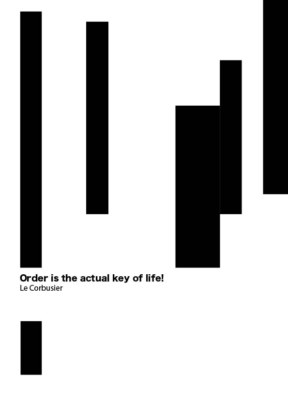
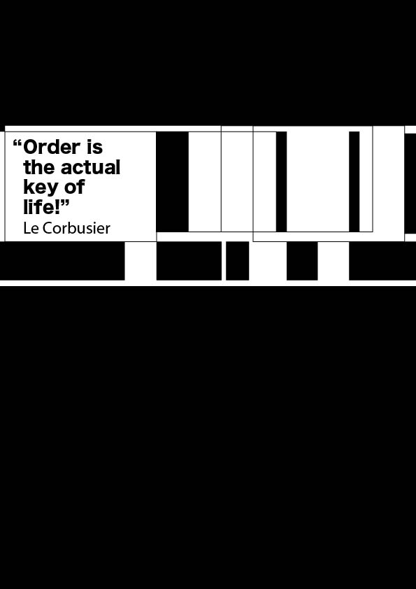
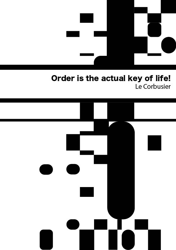
I made variations of this grid.
