The History of screen-printing
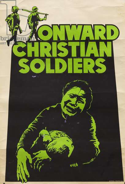
Screen printing has evolved over the ages. From prehistoric times, people have had a way of printing using stencils. Printing techniques have been used for decorating cloth for centuries. Screen-printing has we know it today started in the 20th century. Artists first used human hair for the screens, then silk was used. These have been replaced by synthetic materials, mainly nylon and polyester. Screen printing was useful to make posters during World War II, as this method allowed for posters to be mass produced.
Information sources from: A History of Screen Printing: Tracing Our Industry’s Roots – Anatol Equipment Manufacturing Co. Blog
I looked at artists and designers who use screen-printing in the present day
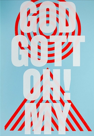
People of Print
I like the layering of colours in this print, from pale to bold to pale again. The use of white allows the bold red lines to come through. The typeface used is bold enough to be readable despite the transparency of the white ink. The red print is very effective in emphasising the text. The circles act as a target, drawing the viewer’s eye to the centre. The arrows point towards the centre of the image. The blue adds a sense of calm and nicely balances out the strong visual elements within the design.
Maze
(413) Pinterest
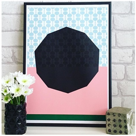
Against the black shape, the pattern is visible, but here it is subtle. It creates a look of texture. Pink is a fun and warm colour. Here it is needed to balance out the dominating black shape, as black can feel quite serious. The strip of green at the bottom, feels quite grounding and anchors the piece.
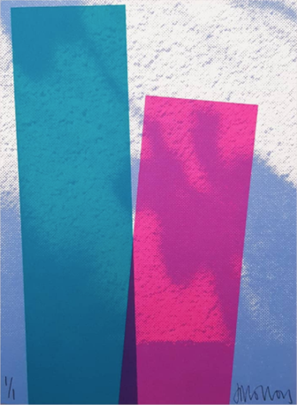
Josie Blue Molloy
The use of simple geometric shapes is balanced by the interesting background in this piece. The blue and white of the background are cloud-like, organic and random. The rectangles feel like they are tipping forwards, since the artist has printed them at an angle. They remind me of buildings that are looming against the sky. Where the rectangles meet, a dark area is created. Here, we see a merging of 3 colours: 2 rectangles and the background. This works well because the colours are next to each other on the colour wheel. This is known as analogous. Analogous colours create harmony within a design.
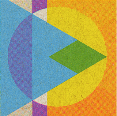
JP King
I really like the artists use of layers. The blue triangle would have been printed last. Where it merges with the circle, we see a green area. The artist may have used stencils to create the geometrical shapes in this design. He would have needed to ensure each layer would line up accurately. We can see areas where the prints were not lined up perfectly. Such as the outline around the white circle. This adds character to a print and shows it as being a hand-made product.
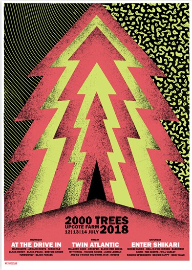
We Three Club
I like the visual ‘noise’ created in this print. This graininess could be seen as an error in some prints, but I think it works well here because the colours used are so bright that it helps to cool them down. In the poster, grittiness could indicate the style of the music the poster is advertising. This music is likely to be heavier or grungey. This is because of the ‘imperfect’ quality of the print. Black is a strong choice of colour within a design, but here it works really well. I would like to experiment with using black in a print.
French Fourch
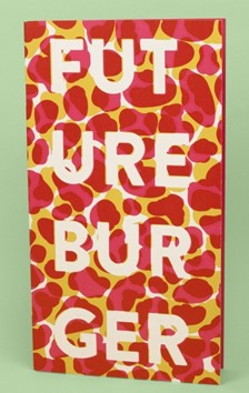
I like the way the designer has used the same pattern, or stencil, for the background. They have made the first print, let it dry, then rotated the stencil for the second layer. I think the choice of colour would be important for the effect to look effective.
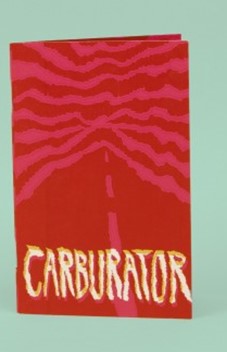
The use of pink and red together seems unusual, because the colours are so similar. However, I think it works nicely. This may be because the design is simple and therefore clear to read
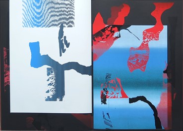
Here, a soft gradient effect works nicely against the strong black and red shapes printed over the top.
The Private Press
The Private Press (@theprivatepress) • Instagram photos and videos
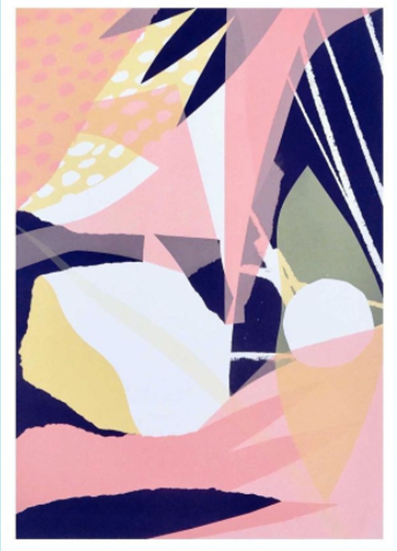
The use of torn looking edges gives the work an implied texture. The variety of organic shapes make the composition interesting and energetic. The designer has used a dotted pattern in the corner, but by restricting the use of repetitive patterns, the viewer can appreciate this pattern. The dark areas add depth. The white areas allow the viewer’s eye to rest.
