Literature Review Reflection

Time for reflection…

It’s week 4 of first year Graphic Design. The first written assignment has been submitted.

The writing of the literature review was not the hardest part for me. The struggle was sourcing the sources. I can’t help feeling I need to learn from this experience, or I’m destined to go through the same problems next time. 

What was the problem?

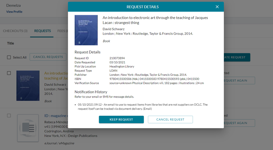
The library had 2 useful sources: 1 eJournal article entitled Rebeca Méndez by ID (The magazine of International Design) and a book called An introduction to electronic art through the teaching of Jacques Lacan: strangest thing by David Schwarz.

I ordered them as soon as I could (3rd October, 11 days before the assignment was due) only the library did not yet have them available. I returned to the library, I asked at the help desk where I was told that a physical book could take around 5 weeks to arrive. As for the eJournal, the librarian could not understand why it was not sent the same day as the other eJournal I had access to days before and had ordered on the same day.I then emailed Interlibrary loans. The reply I got was:
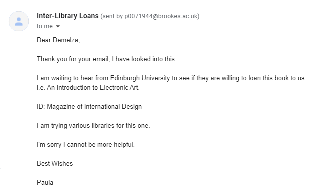
I emailed again the next day and still had no result. I was disappointed, because these sources were ideal for the assignment. They came from an academic, reliable source. At the last minute, I was forced to replace these sources with 2 from the internet. The positive/ useful thing was that I gained new knowledge about Rebeca Méndez through these 2 sources.

Because of this, I ended up with 9 sources where only 1 was a book, 4 were journals and 4 were online sources.
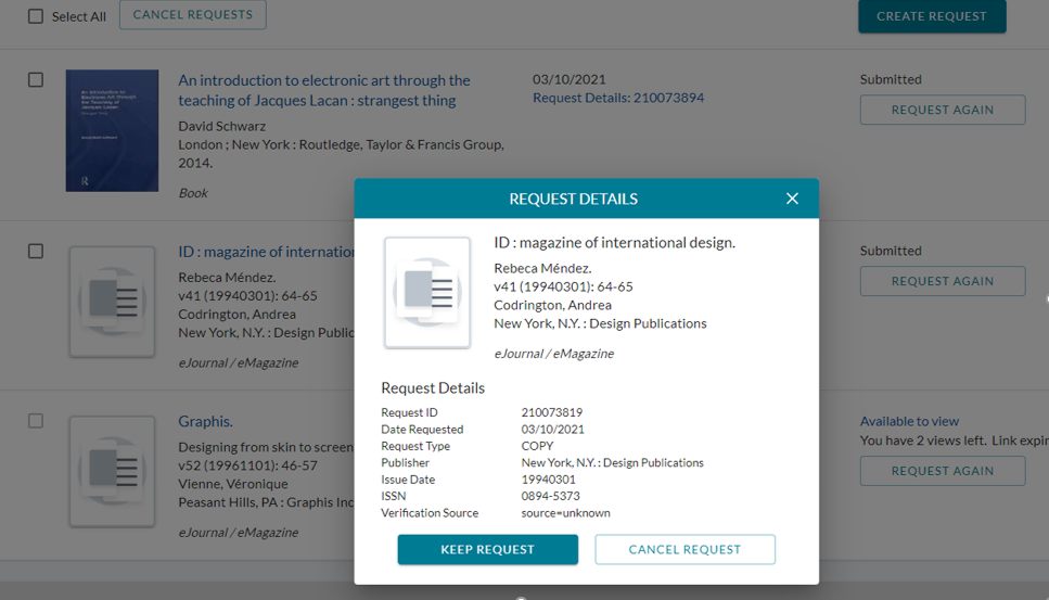
The eJournal I requested.
The book I requested.

What could I have done differently?

  • I have gone to the Bodleian library or tried the City Council library.
  • Possibly I could have emailed Interlibrary loans earlier. However, from speaking with my lecturer Luisa, I discovered that some books are quick to come through Interlibrary loans, and other books will take longer.
  • I could have asked the librarian Chris Fowler for help. I did email her only a day after we had been assigned the literature review. However, hearing no reply, I assumed she was busy and left it at that.

What did I do well?

  • I found it helpful to have used my notebook when getting down initial ideas.
  • I printed out every article which helped me to absorb the information and made it easy for me to refer to the article later on during the writing process. Highlighting certain areas also helped me to find the key points quickly.
  • I used Cite Them Right for referencing the articles.(I got to the site through the Brookes library web page.
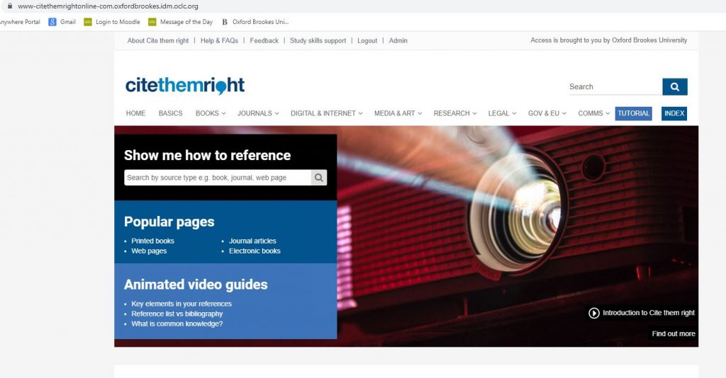
Cite Them Right was very easy to use and gave me templates for correct Harvard Referencing.
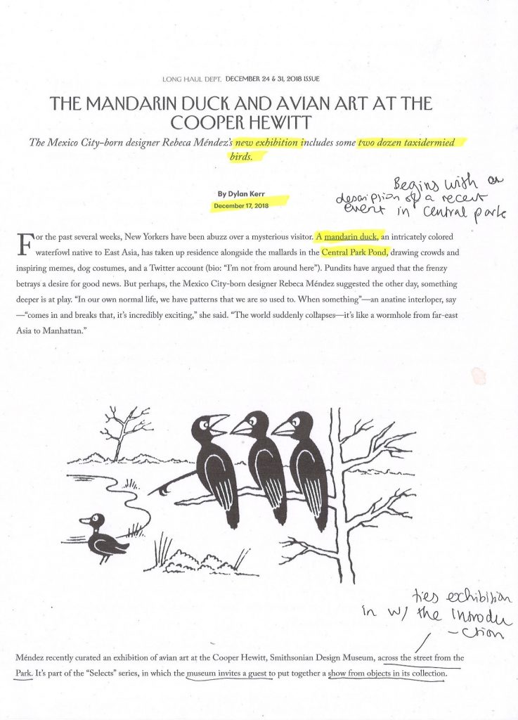
Printed and annotated article from The New Yorker.
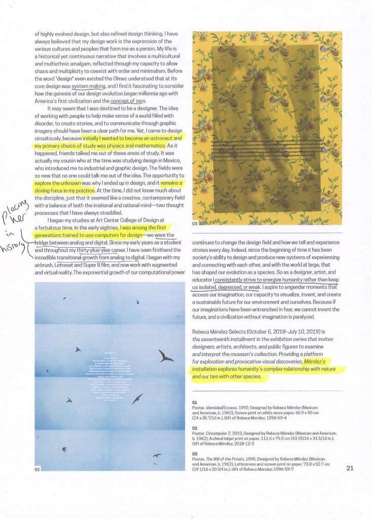
Practicing at the Boundaries article. Printed and annotated.
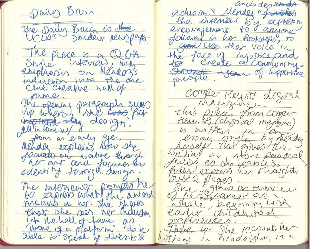
Notebook notes on article by the Daily Bruin.

In today’s lecture, we discussed why it may have been difficult to locate sources on our given designer. The main reason was that the designers we each looked at were female and mostly did not speak English.

Luisa explained how requesting a book at Brookes library is helping to add to the library’s collection. If a book exists out there, it is possible to ask for our library to buy the book for us.

My classmate brought up the fact that it is not always easy to tell the difference between an academic and non-academic article. I had to agree with this.

I discovered that an academic source is longer, has foot notes, is usually not open to everyone. You may need an academic affiliation to access the article. Academic articles are backed by research. They are also checked by an academic and approved before publication. It is possible to view a digital copy these days, but usually an academic journal will be in print.
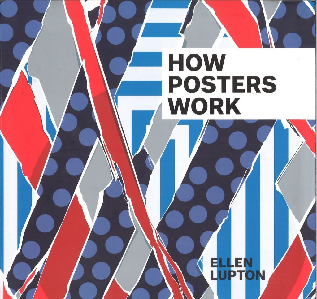
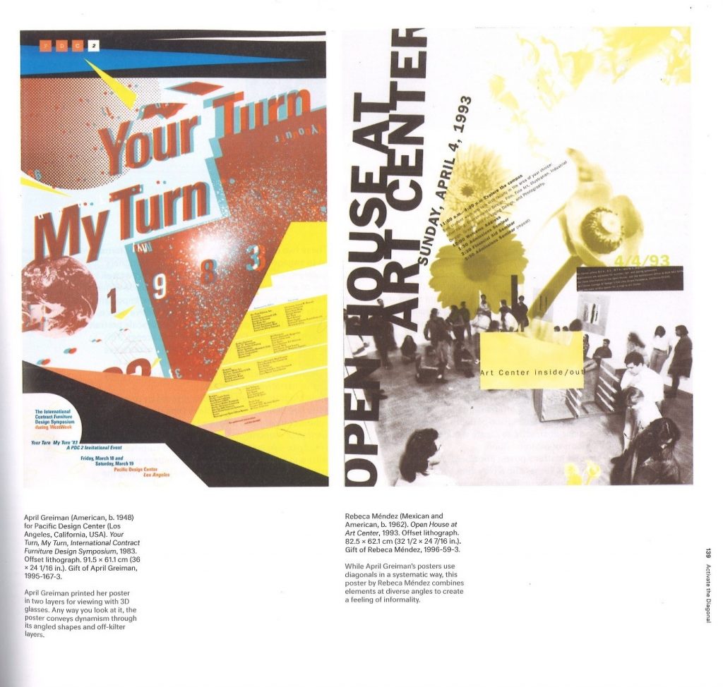
Book sourced from Brookes library with reference to Rebeca Mendez.
Page from How Posters Work by Ellie Lupton.

Bookbinding Workshop 2

In today’s bookbinding workshop, I made 2 kinds of book:

Stab-binding and a zig-zag/ concertina style book.

I also learned the foiling method of adding text to a book cover using a hot tool and coloured pieces of foil.

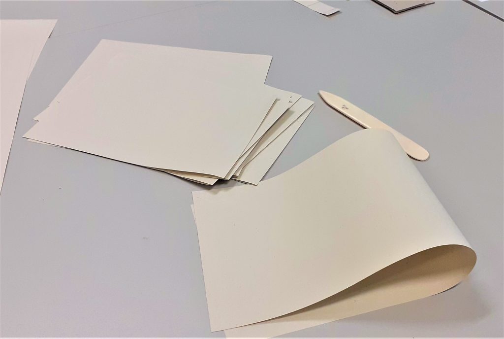
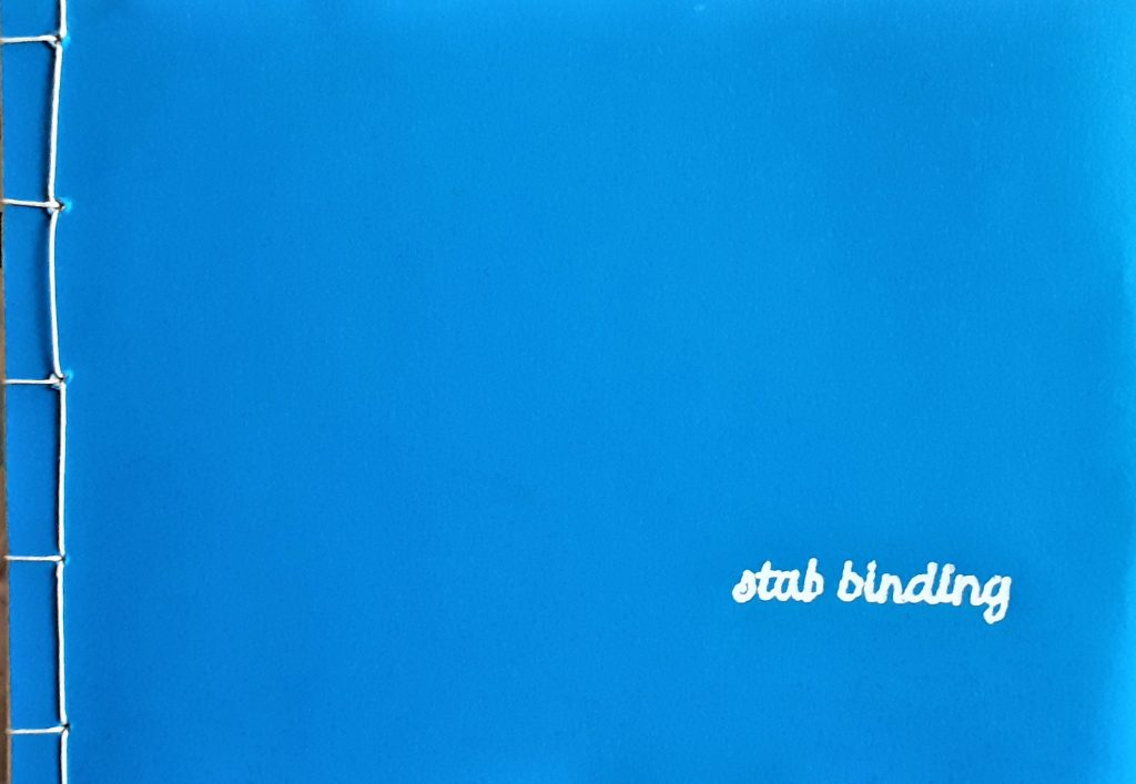
The first book we made in the workshop, used the stab-binding method. The folds of the pages were on the outside edge of the page. The advantage of these doubled-up pages, is that it makes it less likely for ink to seep through when you are writing on the page. The first task was to fold the pages, using the bone folder. We used 15 sheets in total.

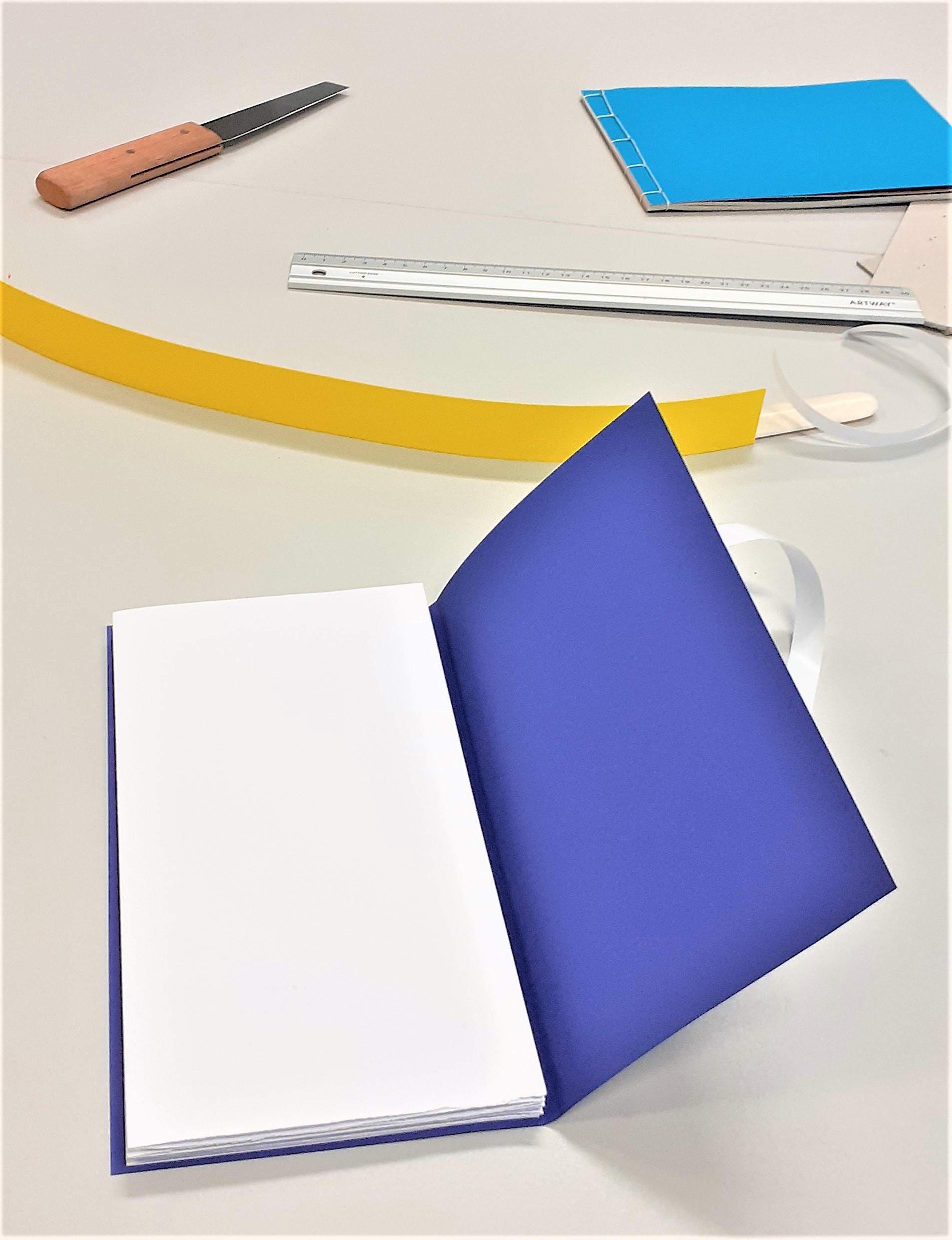
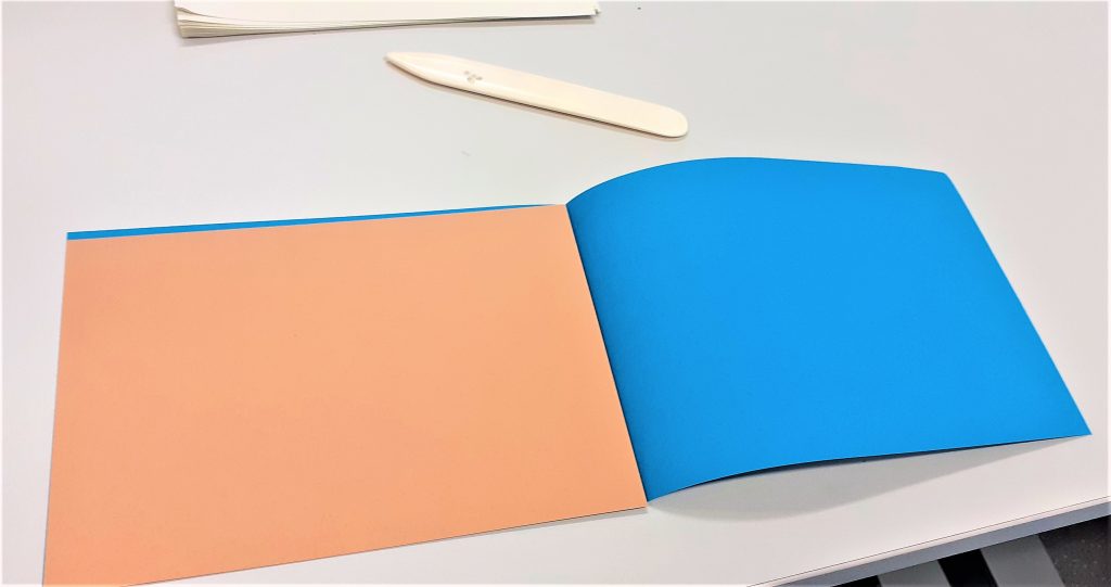
Using a thicker piece of card to re-enforce the cover means that the book may last longer. Here I folded the cover (blue) and ensured the (brown) card would fit nicely inside.

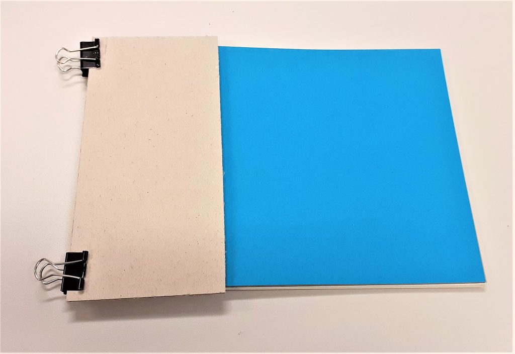
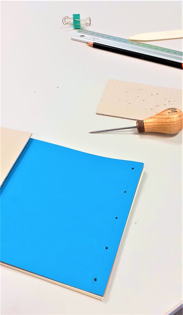
I assembled the pages together with the cover and used 2 bulldog clips to hold everything together. Using card between the clips and the cover means that I prevent marking the cover. I clamped the outside edge of the book, leaving the side free that would become the spine.

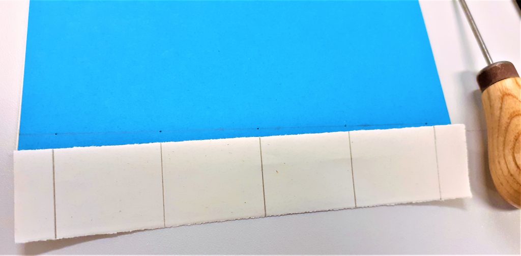
I measured 1cm from the edge of the cover. I marked 5 points on the cover where the holes needed to be placed. Using 5 holes makes the book hold together more strongly than if I made only 4 holes.

Making the holes was the most physically demanding part of the process. Using the awl, I pressed and twisted into the paper where I had made the pencil markings. I made sure to keep the awl straight. The number of pages and thickness of the card is what made the action tough. It was easier to make the holes whilst standing up. I placed card underneath the book to help hold it in place and prevent me marking the table. I made sure the awl was about 3mm through the other side. This meant the hole was big enough. Another way to check is to hold the book up to the light and see if I can see through to the other side.

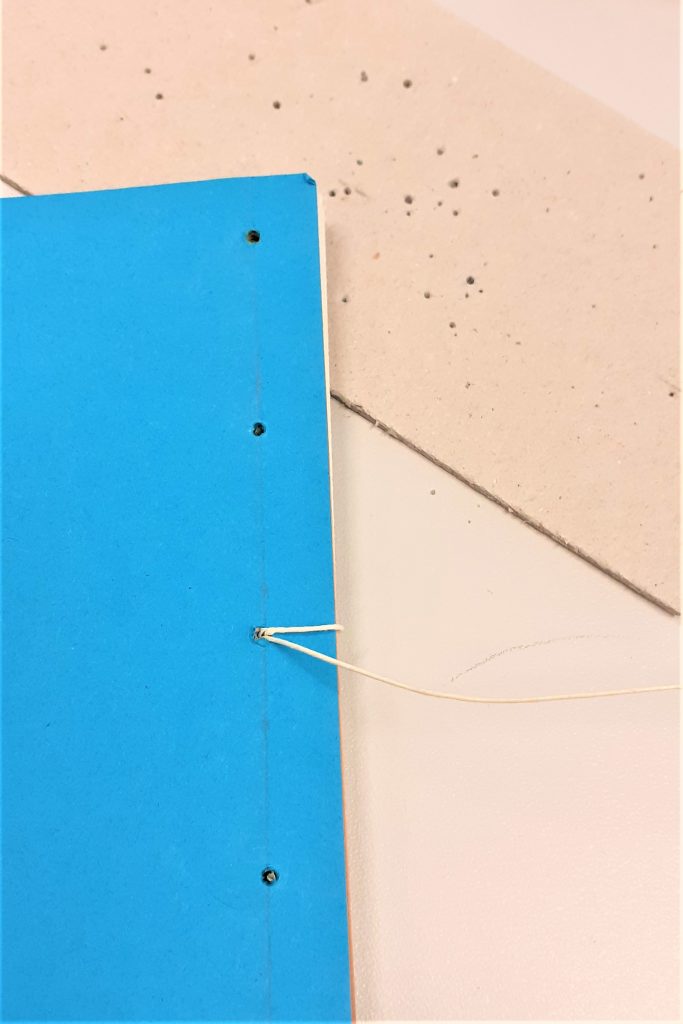
Using the needle and a strong thread, I began to stitch the book together. I started from the inside of the book and pushed the needle through the centre hole.

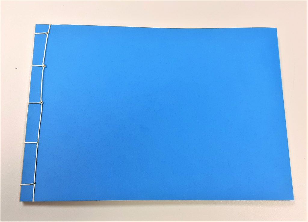
I found this stitching process easier than the previous books I have stitched. I think this is because the stab-binding stitching pattern works in right-angles. The main difference is that with this method, I needed to hook the thread around the outside of the cover.

I also needed to make sure I was pulling the thread tightly after each stitch.

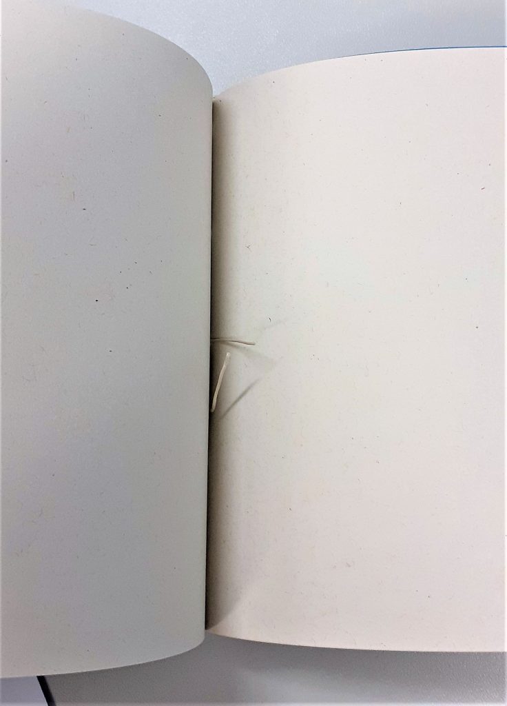
I did not need to tie a knot because the stab-binding holds the thread in place. The thread begins and ends at roughly the centre of the book.

The result: I felt that the line of stitching looked wonky. This is probably due to where I placed the holes.

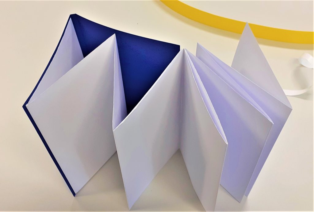
My next book was a zig-zag style book. My first thought when our lecturer Ruth showed us this kind of book, was how great this method would be for a photobook. This is because the book opens out to a long line of paper where the reader has the option of viewing every page together, or turning one page at a time.

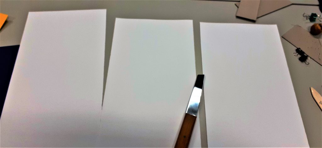
I began the process by cutting a large sheet of paper into 3 separate sheets. This makes up the pages of the book. I used the paper knife for this task.

After folding the paper into 4 pages per each piece of paper, I began working on the cover.

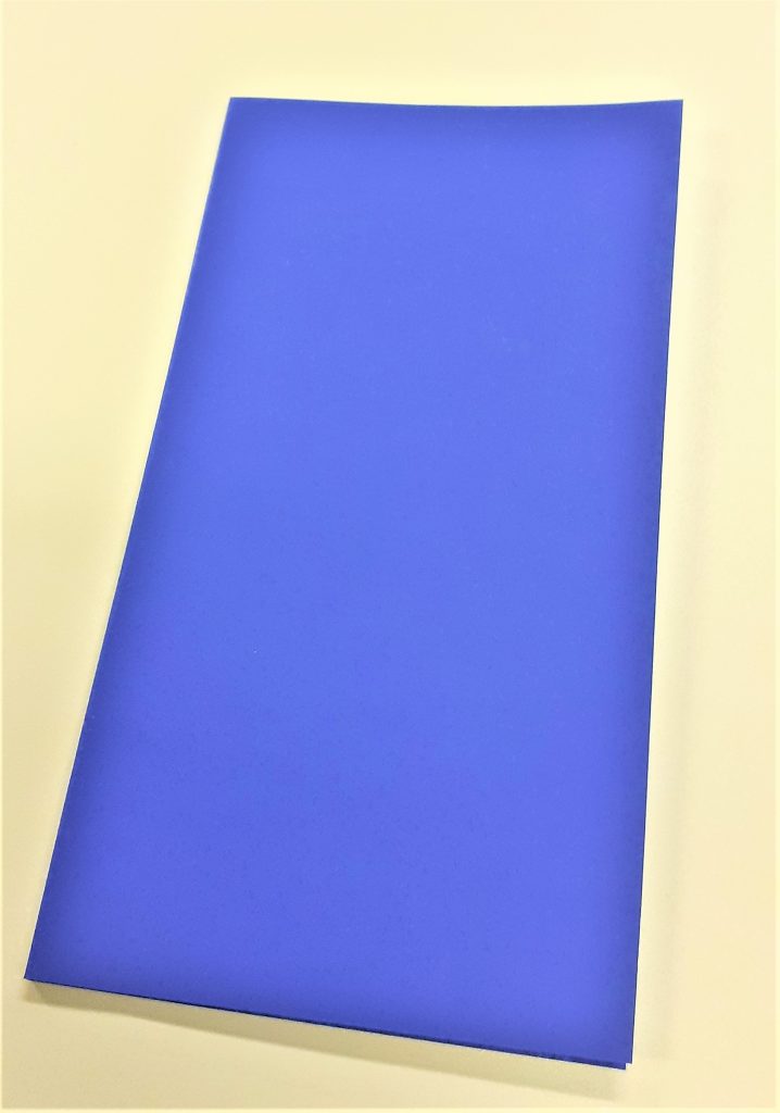
For the cover, I needed to fold the paper twice to create a flat spine. I worked out the width I wanted the spine to be by holding my pages together and measuring the thickness of the pages. I left a gap with this measurement at the edge of the card and folded up to this point. I turned the paper around and did the same in reverse.

I then attached my pages together using double-sided sticky tape. I then used the tape to attach the pages to the cover. This part of the process involved some decision making. I needed to think about how I wanted the book to be read. I had the option of attaching the pages to the back cover or the front cover. I needed to weigh up the procs and cons of each method.

zig-zag book.
Attaching the pages to the front cover means that the reader will open the pages out to the right.

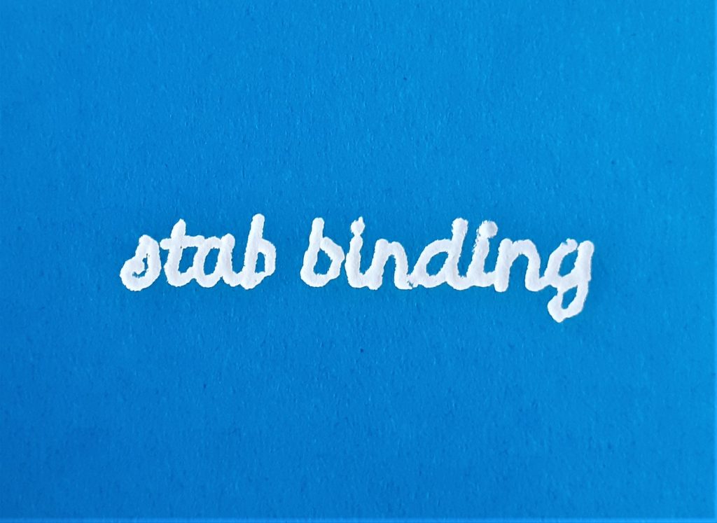
Using the foiling technique, I added the title to the book cover. I first practiced on a scrap piece of paper. It was important to use a template to trace the words, as this gave me a guide and ensured the word would look neater that working free-hand.

I needed to work slowly, to allow the heat to pass through the paper and the foil. I made sure the tool was switched to the lowest heat. A higher heat would have melted the foil and the result would not be effective. I considered health and safety during this process. I made sure the tool was not touching the table or any object while it was hot. I especially made sure the hot end of the tool would not touch the cable.

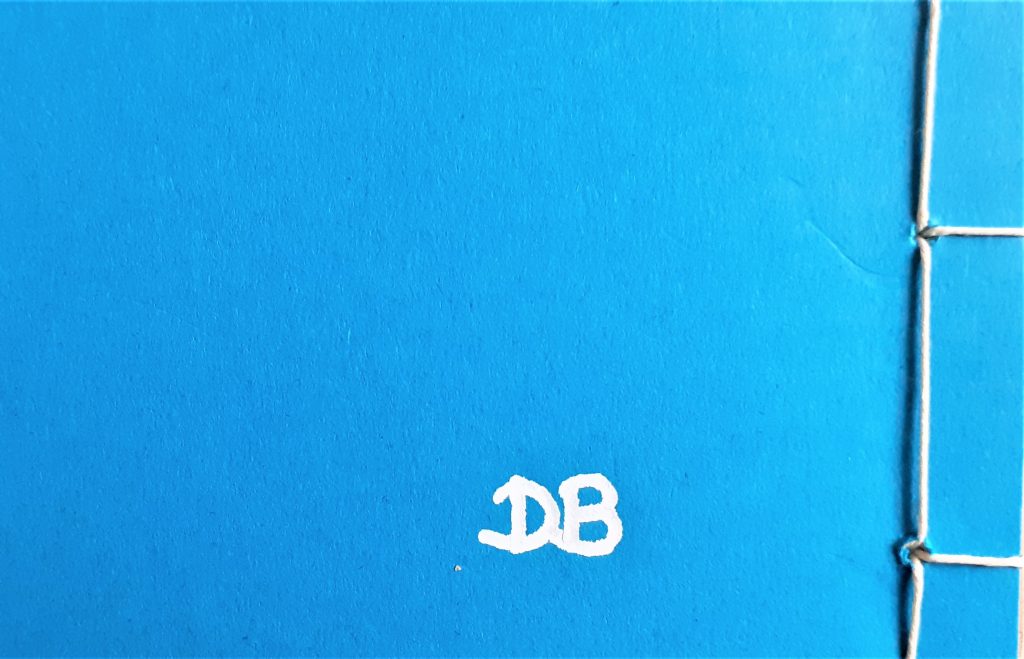
I added my initials to the back cover of the book. I had sketched the letters onto paper first, before using them as a template.

Collage Experiments

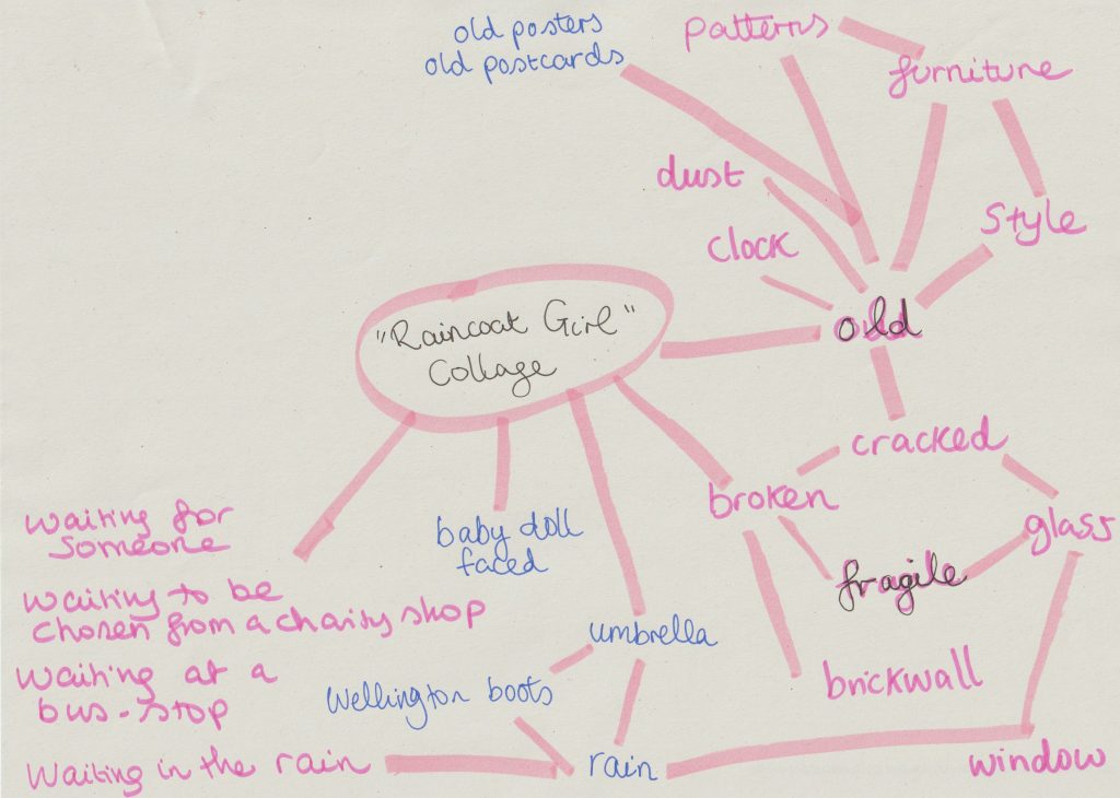
When faced with the task of collage-making, my mind was buzzing with ideas. The problem was, I had too many ideas. I decided it was time for a mind map.

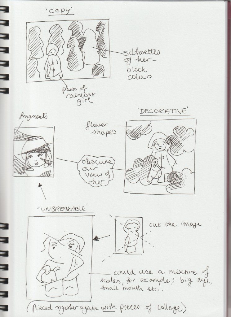
After looking at Jelle Martens collages, I thought about using shapes within my own collages. I thought about obscuring my object ‘The Raincoat Girl’. I drew quick sketches to get my ideas down onto paper:

From my artist research, I found I prefer the more simple collage designs. I didn’t want to over-complicate my collages and have them look visually noisy.

I used some magazine images but found it easier to source images from the internet and use my own photos.

Printing photos from my computer also meant I had the option of editing my pictures to suit the artwork and contribute to the message I wanted to create. I could also resize the images and therefore use more creativity. Magazine images can be restrictive but also trigger new ideas due to the spontaneous process of flicking through unknown pages.

All collages are A4 sized.

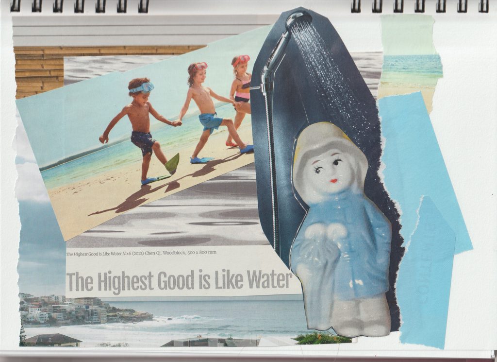
For this collage, I used images from magazines and my printed out photo of The Raincoat Girl. I tore the paper at the edges to create some texture.
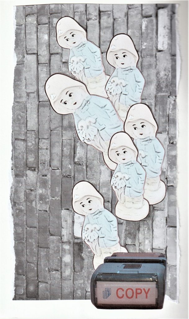
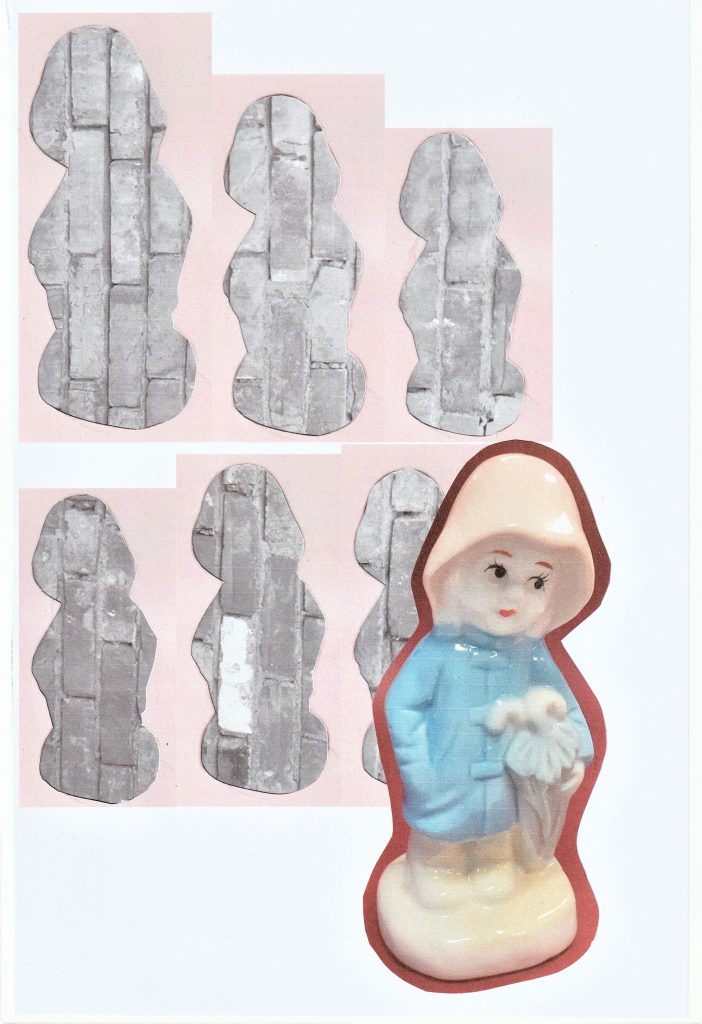
For this collage, I used a photo I took of a brick wall and converted into black and white. I edited the image of my object to make her look more 2D. My concept for this image was mass production of objects.

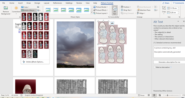
I used Microsoft Word to edit the photos. For the image of the repeated figure, I clicked ‘Picture Format’ > ‘Artistic Effects’.

I used the outlines of the figures in the previous collage, to give the impression of a mass of face-less figures. The Raincoat Girl stands apart from the others, facing in the opposite direction.

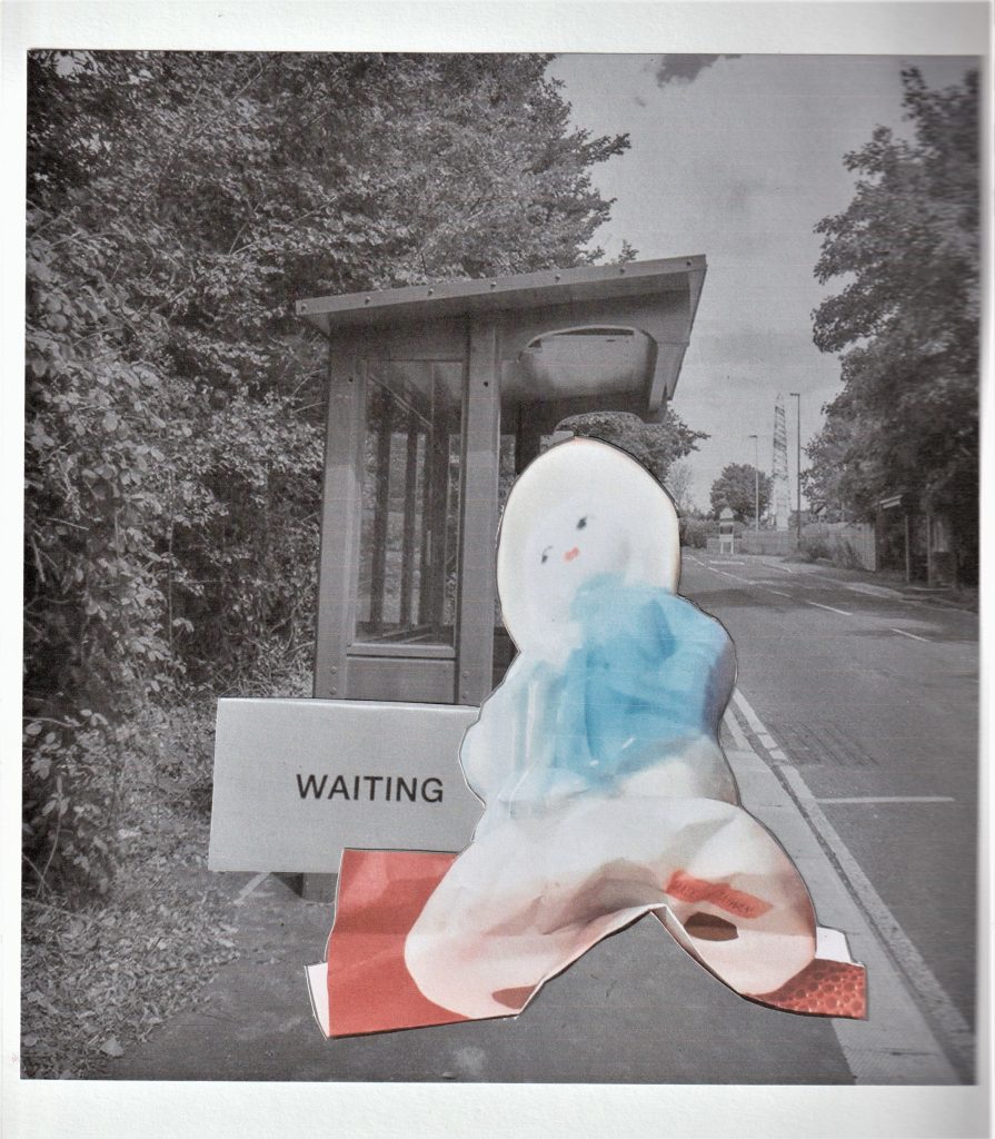
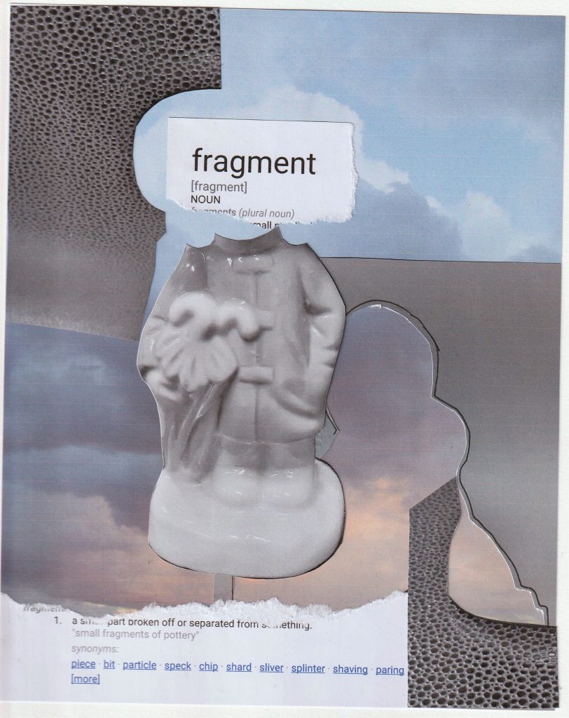
I wanted to use words within a couple of my collages. I wanted to see if words would strengthen the message, compared to a collage where I use no words.

For this collage based on waiting, I used the photo of the 3D collage I made in the previous week. The squashed effect makes her look deflated and bored. I used a photo from the internet of the bus stop. I edited the bus stop image to give it a softer feel and less colour. The red in this collage symbolises the anger that boils under the surface when you have to wait.

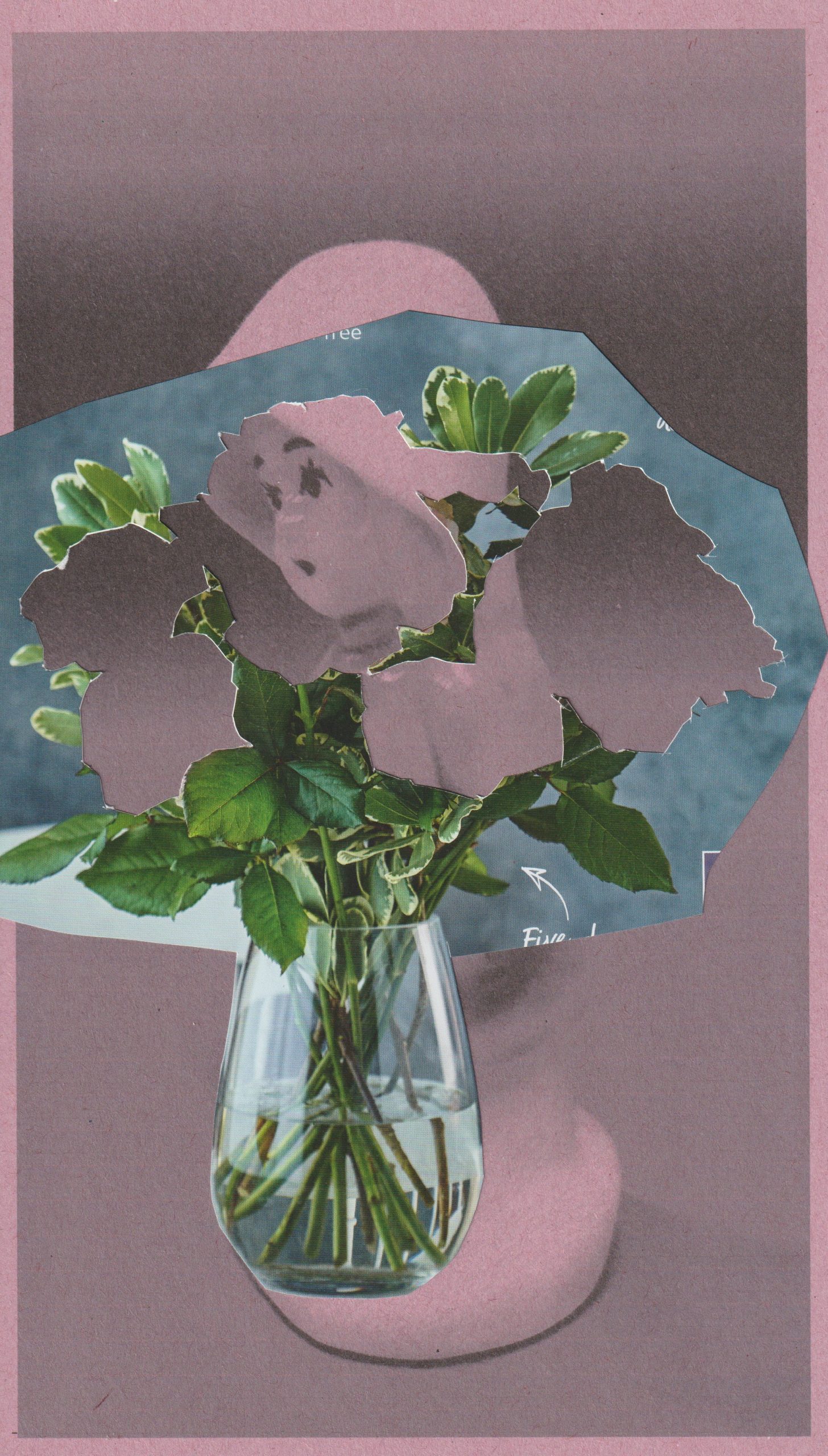
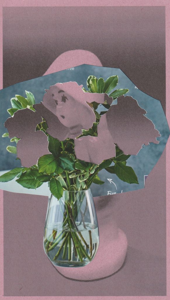
For the collage below, I experimented with printing onto sugar paper. I placed pink sugar paper in my printer and printed the black and white photo onto it. I think the sugar paper created a softer looking image. This was what I wanted for the subject of flowers, as petals are soft. In this collage, The Raincoat Girl echoes a flower.

Inspired by John Stezaker, I wanted to dry interesting layering within a collage. In this image, the flowers symbolise the nature of being decorative. This relates to my object, which was manufactured to function as a decoration only.

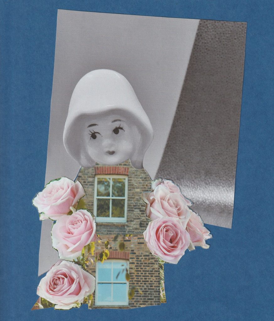
In my final collage of the day, I used blue card as a backdrop and magazine images in the foreground. The glossiness of the magazine paper complimented the mat quality of the blue card. I wanted to play with the idea of optical illusion. An image that can be viewed in more than 1 way.

Placing the window in place of her heart, symbolises her emotional openness. The brick walls are her emotional boundaries. On the other-hand, we could be looking at a house who has a personality. The feeling of arriving home and feeling like you are being hugged by your house.