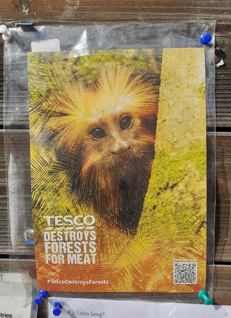
I walked past this poster on the way to campus this morning. The cute monkey image drew me into the poster. I followed the QR code to this webpage:
https://www.greenpeace.org.uk/take-action/forests/#:~:text=Forests%20are%20our%20life%20support,to%20burn%20them%20for%20profit.
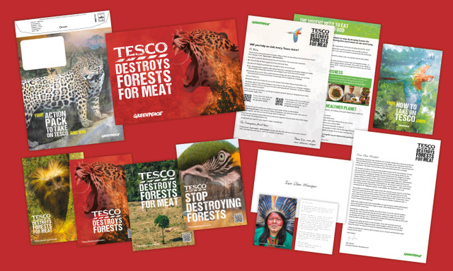
We met as a group to discuss the first task of the brief- the poster. Out of the 4 group members, only half of us could be on campus. We worked around this by setting up a zoom meeting and this worked just as well.
The main focus if thus meeting was the Project 4 brief.
The aims of the brief:
- Write 3 options for the tagline.
- Choose one of the headlines and put together a poster using this headline and an image. Use 2 colours, 1 for the text and 1 for the image. Could also use greyscale, bitmap or filters.
- For the 2nd poster, choose more than 1 image and create a photo montage. (Mixing bit and pieces of photos to make a new composition, similar to a collage) An example could be Dada or Constructivist compositions.
- The 3rd poster asks us to use illustration skills. We could use silhouettes, icons, or work with size/scale in a surrealist way. Can use metaphor, such as with (the global warming postyer). Can use up to 5 colours, for example, 1 colour for the background.
Meeting notes:
Colours
We decided that red should be used in our campaign, since this relates to danger AND the Tesco brand at the same time.
The other colours we considered were black, white, blue and green. Green relates to the nature that is being destroyed. White backgrounds are used often for Tesco posters.
A combination of red, pink and white could symbolise danger and meat.
Taglines
Tesco must go (rhyme), Tesco Kills Trees, Tell Tesco Trees Matter, Don’t Eat Tesco Meat, Tesco Meat Kills Trees
After sharing our ideas with our lecturer, she suggested:
Focus on the animals, not the meat or dairy (Be Wary Tesco Dairy)
Typeface
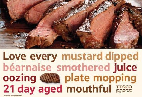
The typeface used by Tesco is an altered version of Newtext Bold and a humanist sans serif typeface. We want to use this in the poster. We could also include a destroyed text effect.
On the other hand, the poster doesn’t need to reflect the Tesco brand. This method of subverting the brand could be reserved for the guerilla strategy.
Guerilla Marketing Strategy
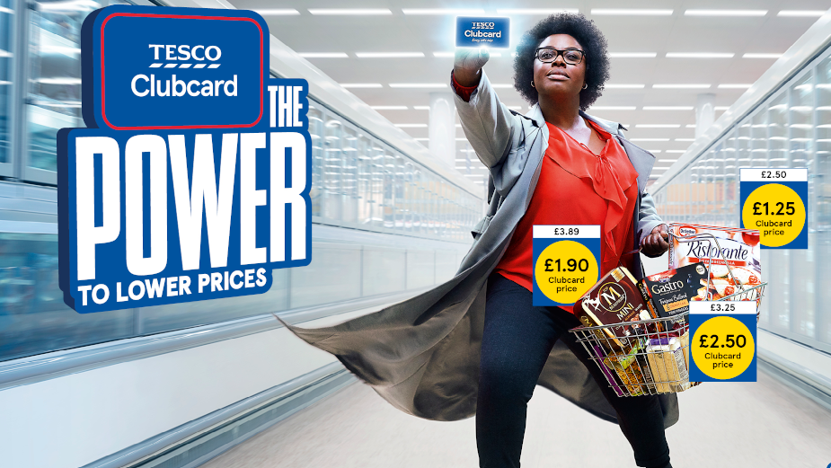
Clubcard tags. Where the price is placed:
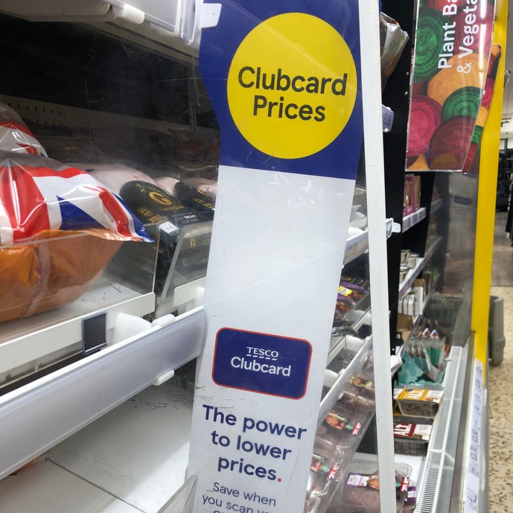
We could use the yellow icon. ‘The power to lower prices’ could be subverted to ‘The power to stop deforestation’. This could put a positive spin on the poster and ask consumers to do something good. The prices on the right could state the facts we want to get across to the consumer.
Every little helps> Every little consequence/ suffering.
Prices that take you back
‘Tesco Finest’ > not the finest way of producing meat.
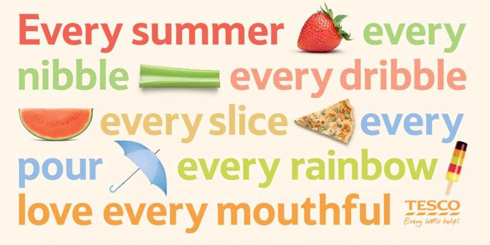
(Whatever you’re buying, the forest pays the price) Knock-on-effect damage (medicine comes from rainforest, effect on indigenous communities, animal habitat loss). These facts could be displayed as in the poster below. For example ‘Every tree killed, Every living forest…’
Posters
1 poster focusing on meat, 1 for dairy?
Poster 1: Red and white. Maybe using a white background and tagline written in ‘meat font’.
Poster 2: A Tesco in the forest
Poster 3: The tree and meat
The shape of the meat could reflect a geographical structure. For example, the shape of the Amazon.
Our plan for the week is to design at least 1 poster each. We will then meet up and discuss which we feel are more effective.
