Week 6: Building a portfolio website using Cargo
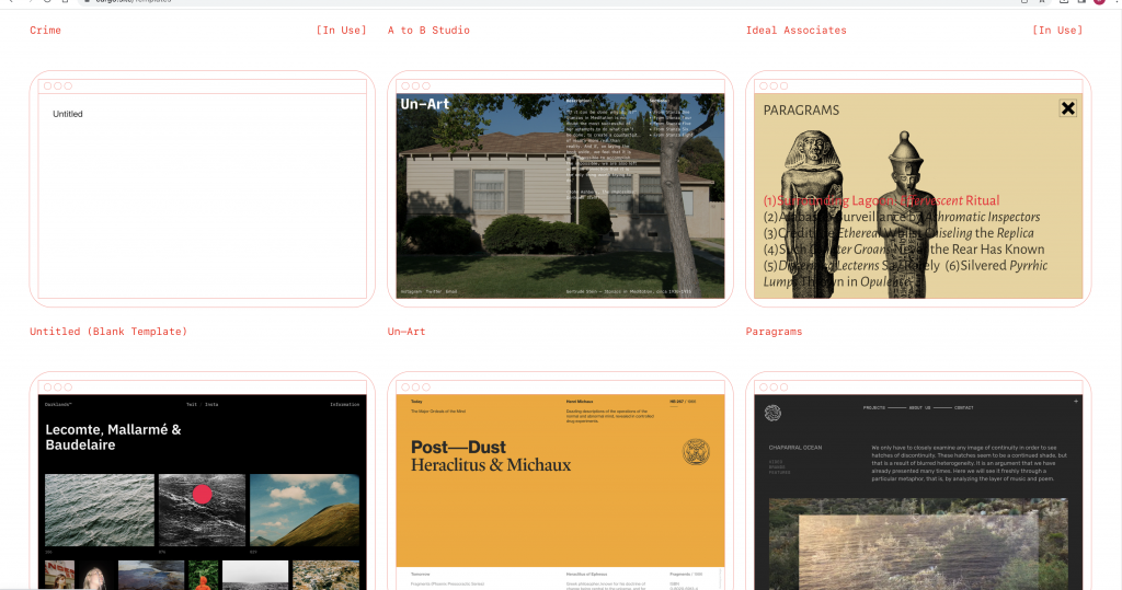
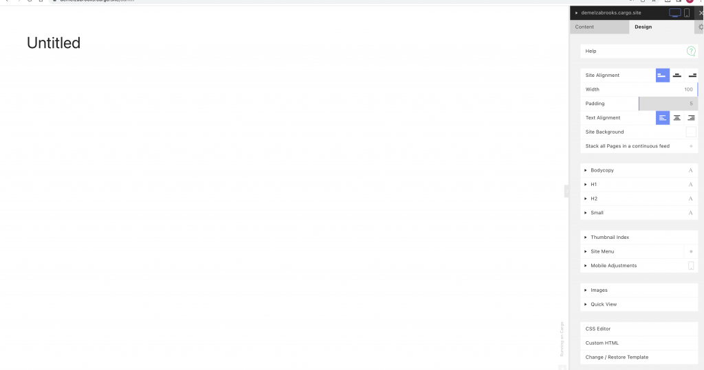
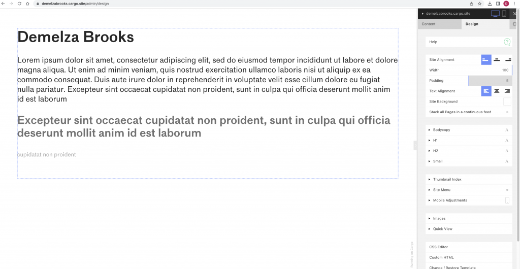
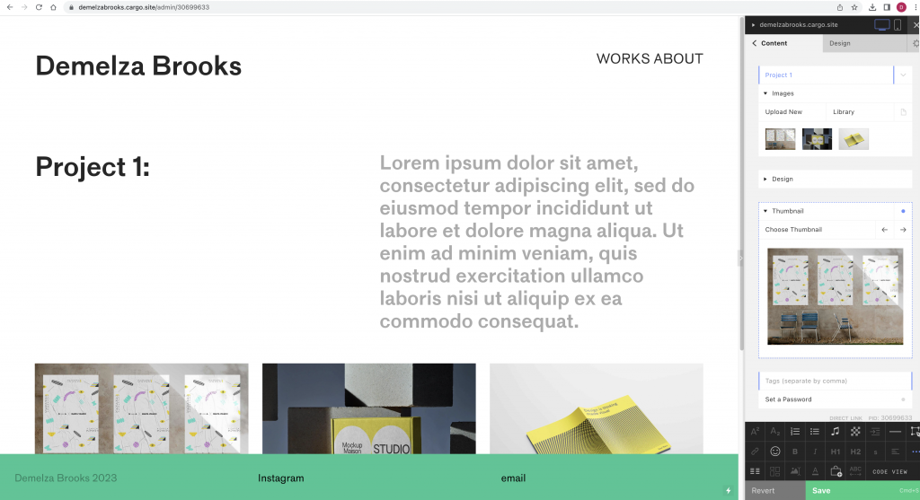
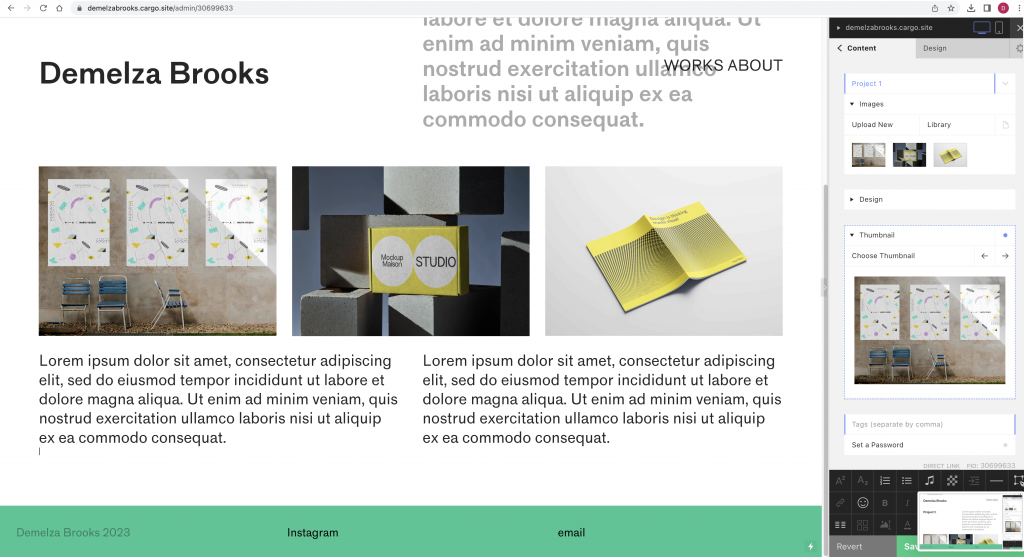
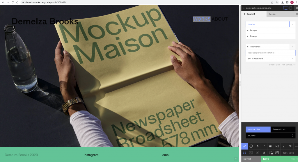
In the past, I have experimented with several website builders as well as coding a website with HTML coding on a previous college course. In today’s workshop, we started with the platform Cargo and followed our tutor’s instructions to start to get to grips with how the builder works. This would allow me to later customise this template and build a website that is bespoke to me.
Portfolio websites
Websites that showcase creative work can all be presented differently. It’s good to have a look at these examples to see what is possible to create. I can look at designers I admire, industries and agencies.
When thinking about this website, I see the website as a frame. The focus should be on the work itself and ought to be interesting to look at overall. It needs to be functional and user-friendly. It doesn’t need to be complicated.
HTML (the Hypertext Markup Language) and CSS (Cascading Style Sheets) are two of the core technologies for building Web pages.
https://www.w3.org/standards/webdesign/htmlcss
Websites are responding to codes, HTML being the structure of the sire and CSS is the way it looks, such as image, colour etc.
HTML contains all the content: files, writings etc. In the past, this was very tiring for web designers to stylise as they had to write the code again and again. A combination of the 2 are now used: HTML & CSS.
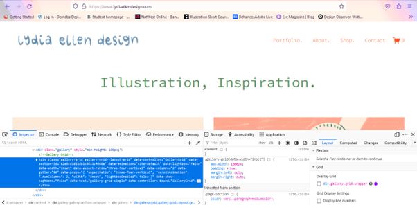
We can view this coding on any webpage by right clicking on the page and clicking ‘Inspect’. We can then alter elements of the page to see how it would look. Below, we can see the webpage once we have selected ‘inspect’. The HTML code is shown at the top and the style sheet is under this.
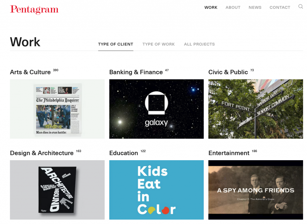
The structure can be simple and easy to navigate, such as Pentagram’s portfolio. Their grid shows the thumbnail images of the work.
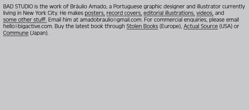
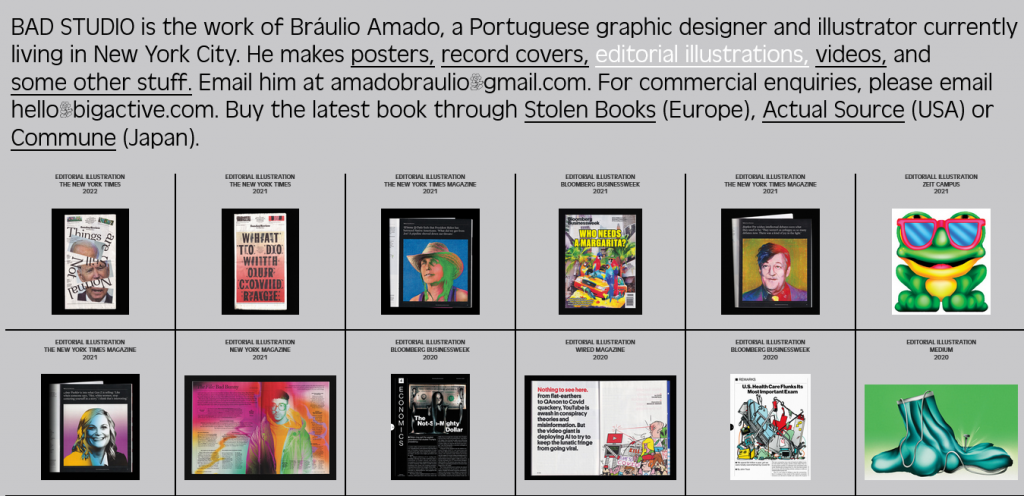
The website needs to say something about myself. The website’s call to action is to help people to make contact for work, Instagram, Behance, Linkdin.
Cargo
