Un-creative writing

There is text that is seen and text that is read. I will be exploring what text does, rather than what is says.

Dada artists:
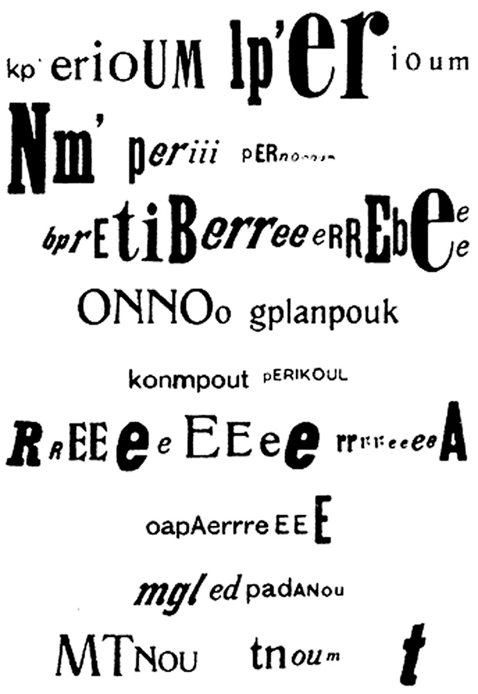
The optophonetic of poet Raoul Hausmann, presented by Cecile Bargues (Visual representation of sound poetry). http://www.diptyqueparis-memento.com/en/dada-optophonetic/

“I pasted words and sentences together into poems in such a way that their rhythmic composition created a kind of drawing. The other way around, I pasted together pictures and drawings containing sentences that demand to be read.” — Kurt Schwitters
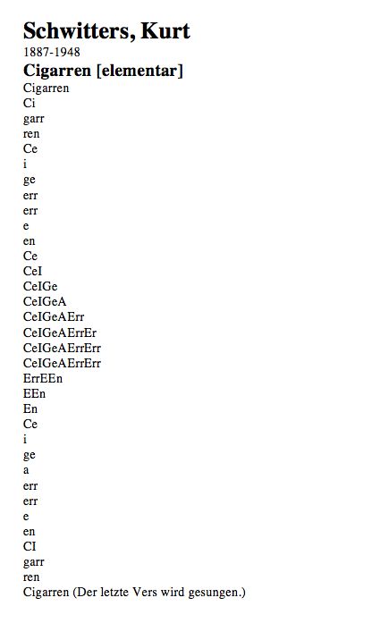
Schwitters’ also wrote sound poems. This is where phonemes are separated and recombined so they are no longer words.
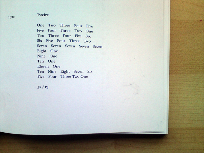
‘Twelve’ poem by Kurt Schwitters https://www.hamishandmartine.co.uk/hamish-martine-and-kurt/

Schwitters also produced drawings using letters. These cannot be read, but instead were to be viewed for their visual quality.

I really like the shapes he creates on the page, in the above poems. The ‘Cigarren’ poem has been designed to be displayed as a long thin line, imitating the cigarette shape.

Concrete poetry is poetry in which the poet’s intent is conveyed by graphic patterns of letters, words, or symbols rather than by the meaning of words in conventional arrangement.

https://www.britannica.com/art/concrete-poetry

Kenneth Goldsmith

Kenneth Goldsmith explores ‘Uncreative writing’ in his book with the same name. In this video, he is reading a newspaper article as a ‘contemporary poem’.

Lists

Being a reader myself, I have always been fascinated by the beauty of words. The mundane becomes interesting when frame it or combine it in new or random ways.

I particularly like a list. This is one kind of list, my housemate’s shopping receipt from the supermarket:

Sam Winston
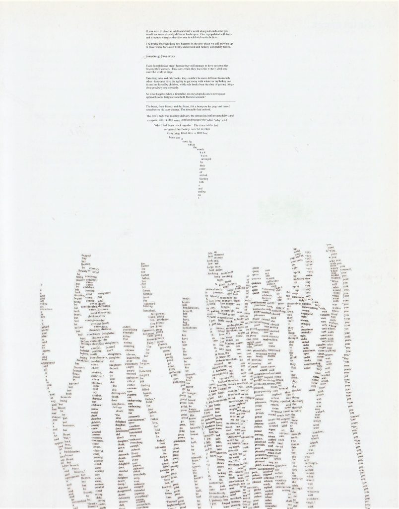
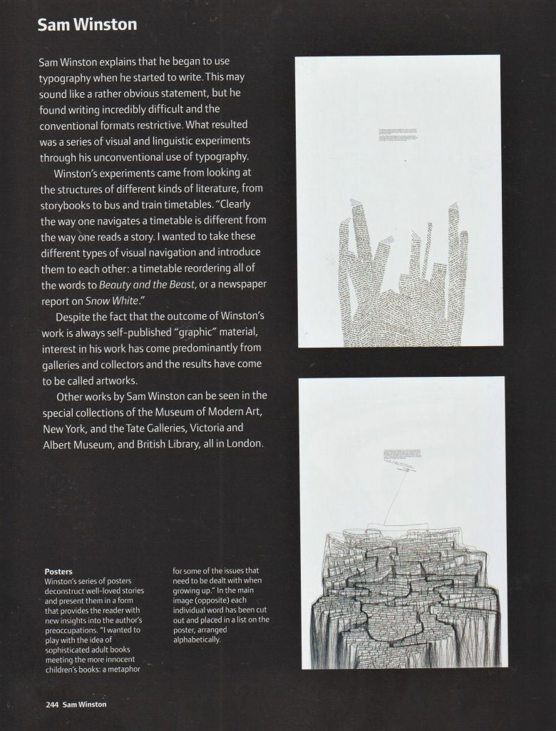
In this poster, Winston has cut the words of a story up, and arranged them in lists of alphabetical order.

Winston creates incredibly detailed and intricate artworks using words. In the piece Stolen Dictionary, he cut the words from the dictionary and pasted them in a formation that reflected his own narrative. I like this idea of re-purposing words that have been printed for another purpose.

My Experiments with un-creative writing

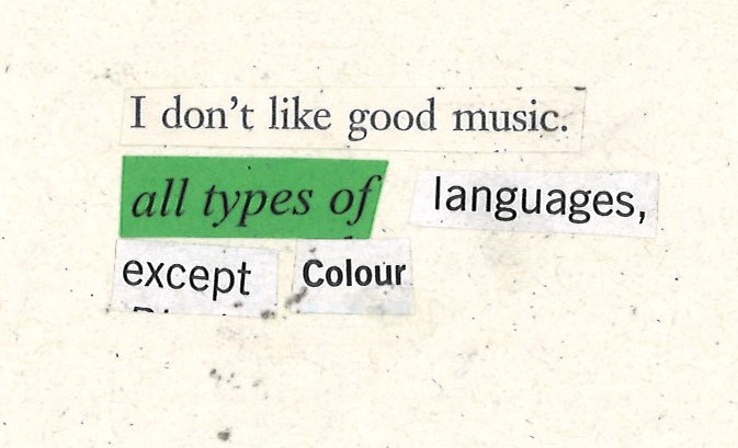
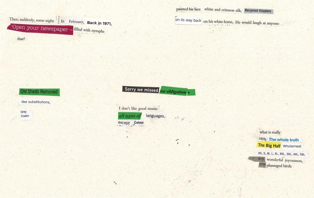
My first approach was to collect together random leaflets, flyers, catalogues and an unwanted novel. I then cut out words, but in a loose way. For example, I didn’t want to control the process too much. I wanted the sentences to be a bit random and not make sense completely.

I glued the sentences onto paper and scanned the page:
My second method came as an accident. I had earlier cut words from the green paper. This left rectangular gaps in the paper. When I laid it onto another page of text, certain words showed through. I then continued to cut into the paper, mostly at random, but I had to look at the page underneath to check the gap would show a line of text and not half a line.

I like this formation, because it is not a predictably (left-aligned) arranged text. It can be read in more than one day, decided by the viewer.
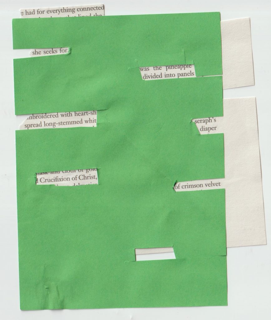
Words from The Picture of Dorian Gray by Oscar Wilde

My third method was to use the random word generator.

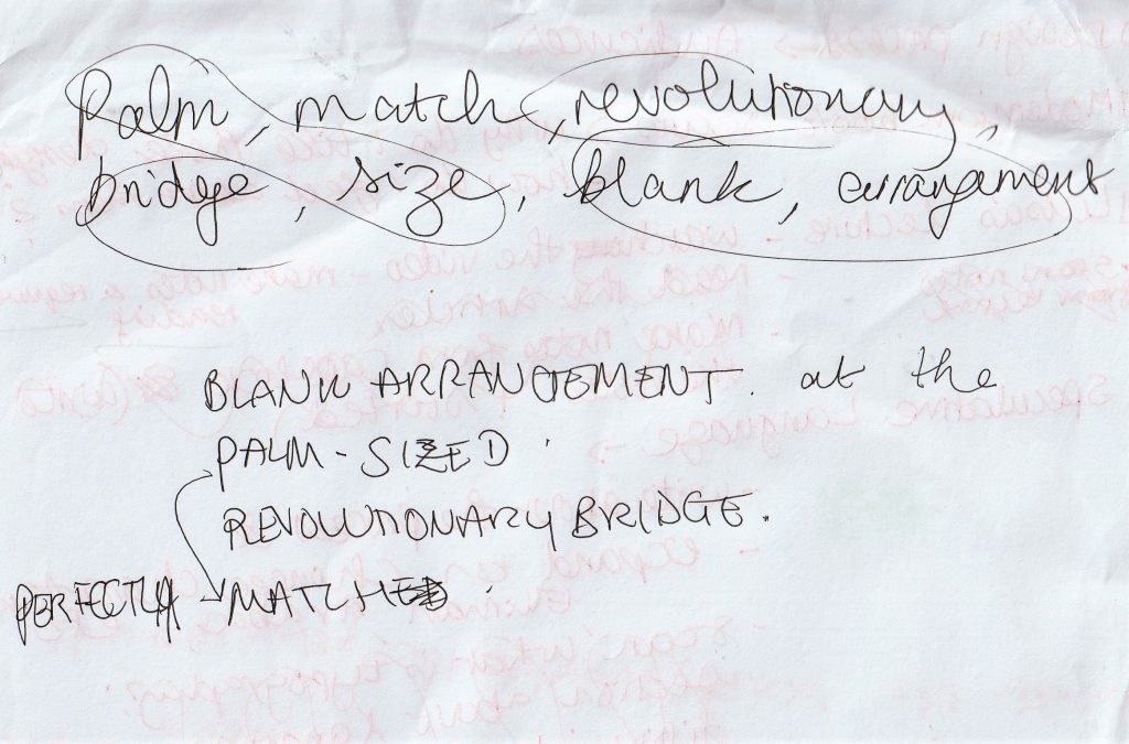
I used it to generate singular words, writing them on paper as I went. I then re-arranged the text to an order that made sense to me/ had a better flow:

Blank arrangement

at the revolutionary bridge.

A perfectly palm-sized match.
How to place the text?

How the designer chooses to arrange the text will have an impact on the overall message.

Alignment refers to the way individual elements of a design are arranged. This is commonly seen in text placement- for example, most lines of text in a Microsoft Word document are left-aligned by default, where the text forms a uniform line on the left-hand side.’ (quote found here)

I looked at Modernist design to see how text could be placed within a design.
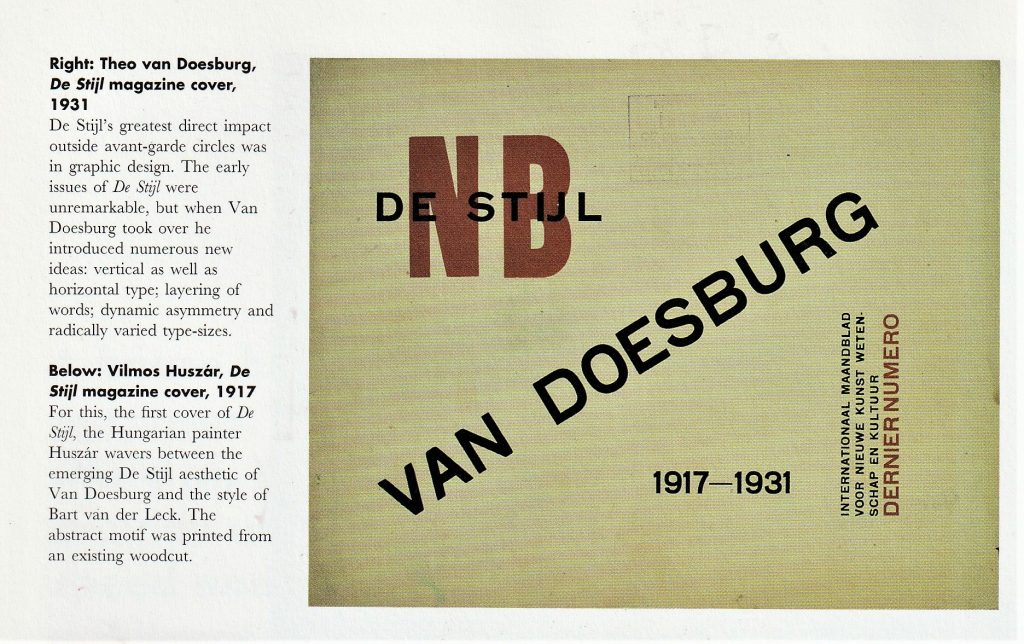
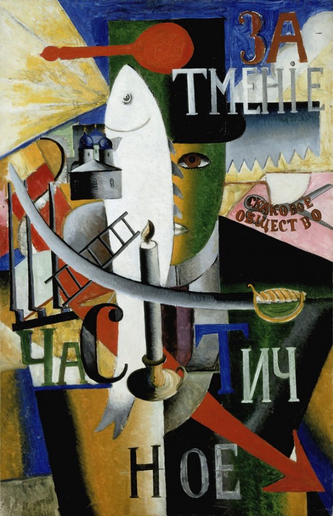
Kazimir Malevich, An Englishman in Moscow, 1913-14. Painted in what was known in Russia as a Cubo-Futurist style.’

The painting reflect the principles of Cubism. It has an underlying symmetry. The almost random placement of text in this piece, creates a feeling of freedom and playfulness. A more abstract alignment can add a dynamic quality.
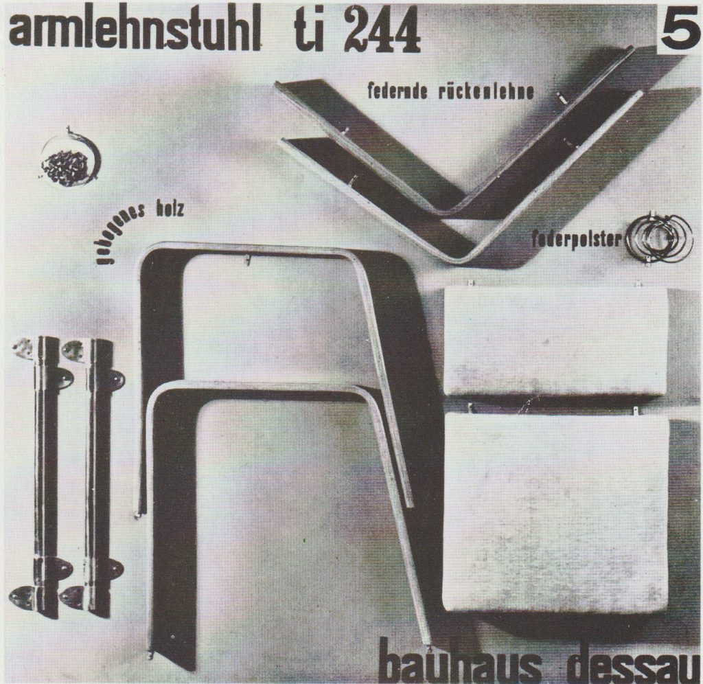
Bauhaus

A poster for Josef Albers’ Dismountable chair, 1929

The playful curving of text around the corner of the material echoes the curve of the furniture. The edge alignment of text at the top and bottom of the page act as a frame and focus the viewer’s attention to the central image.
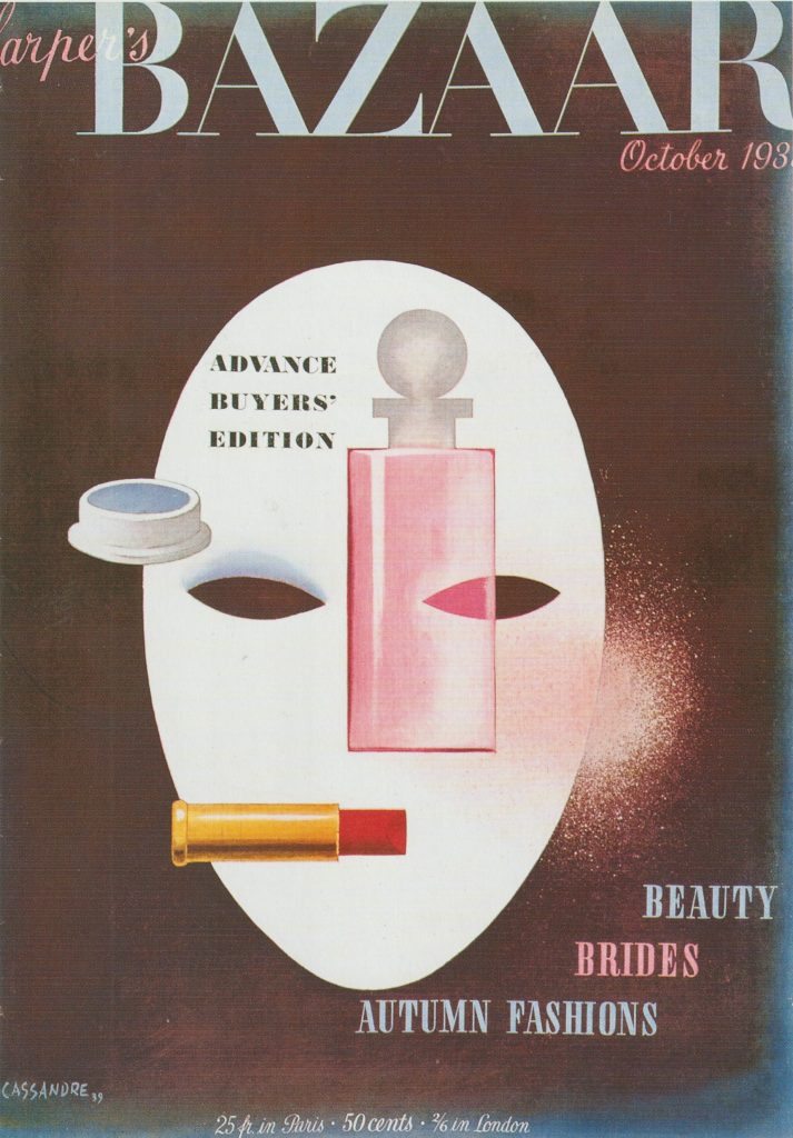
A. M. Cassandre, Harper’s Bazaar magazine cover, 1939. ‘This cover playfully exploits Cubism, Purism and Surrealism to create a memorable image of chic modernity.’

Here, the cover lines are aligned around the shape of the mask.

Cover Lines: These are lines of text on the front cover which allows the audience to see what sort of content is within the magazine.’ (Slideshare.net)

The way the text is tiered makes it ‘step up’ across the cover. This is more fun than if Cassandre chose a right alignment for example.

‘Cassandre’s imagery was so strange that his work looks psychedelic today (the chemical Surrealism of a later time). For an American magazine of this era, his work must have stood out like a big strange thumb.’ (quoted from here)

“During his brief tenure as cover artist for this high-end fashion publication, Cassandre both brought Surrealism into American editorial illustration and depicted the emotional and mental collapse of an entire world as it rapidly disappeared forever.” — Art Chantry
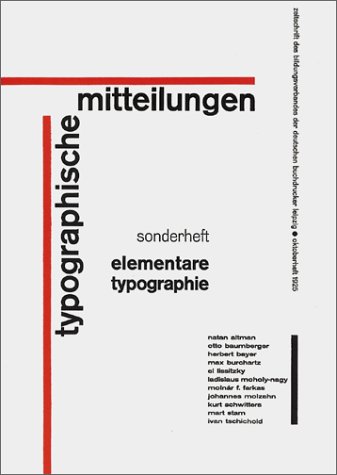
Jan Tschichold

‘In 1927, he joined a group formed by Kurt Schwitters, The Circle of New Advertising Designers. It was this group that formulated the principles of what was proclaimed The New Typography. Although the group had some dialogue with the Bauhaus they kept a distance, possibly for fear that either side might subsume the other’s identity. The New Typography was organised around these principles:

  • asymmetrical balance of elements
  • content designed by hierarchy
  • intentional white space utilisation
  • sans serif typography

(above) The cover of Typographic Mitteilungen: Elementare Typographie, 1925, a trade magazine in which Tschichold introduced the ideas of the Russian Constructivism and The New Typography to Germany’s printers. The content was met with great controversy but was widely adopted.’
(info sourced from)

Russian Constructivism

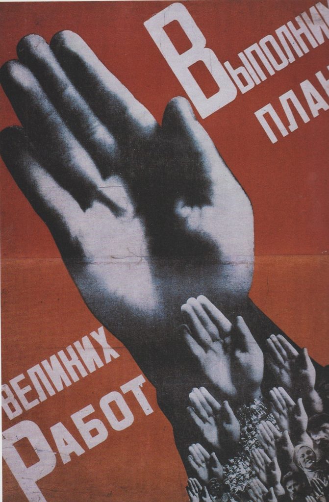
(right) Gustav Klutsis, ‘Workers, Everyone Must Vote in the Election of Soviets’ poster, 1930. For this memorable image Klutsis used his own hand, repeated many times.

The elements in this poster create diagonal movement. This gives the image a sense of instability and something in motion.

“Constructivism is early Soviet youth movement created by Vladimir Tatlin that was inspired by Cubism, Suprematism and Futurism. It flourished following the Russian Revolution of 1917 and sought to abolish the traditional artistic composition, and replace it with “construction.” Concerned with the use of “real materials in real space”, the movement sought to use art as a tool for the common good, much in line with the Communist principles of the new Russian regime.

The foundation of Constructivism was to express the experience of modern life and to develop a new form of art more appropriate to the democratic and modernizing goals of the Russian Revolution and build a new society.” (info sourced here)
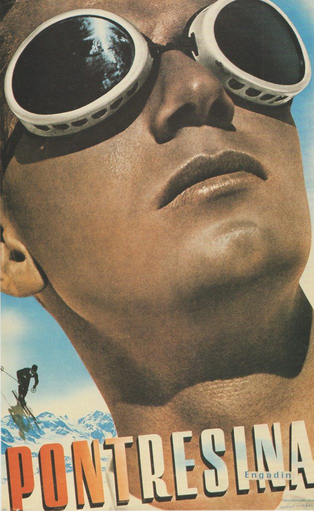
Herbert Matter, Travel poster, 1936

This poster is promoting the Swiss travel industry. Arranging the text at an angle reflects the slope of the mountains and action of the skier in the background. This text arrangement hints at the fun and adventure of the holiday.

Working with scans
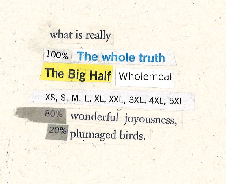
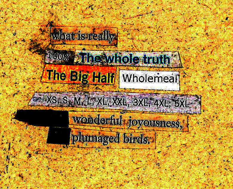
scan of the collage
To create this effect, I opened the scan in photoshop and played with the levels. These colours are disturbing. They distort the words and affect the readability of the text.
scan of the collage

When working from the scan, I can achieve many effects. The image is restricted in that the placement will remain the same as when I manually stuck the pieces on the paper. However, I have the option of moving each piece individually by turning the image into a vector on adobe illustrator.

I can then select ‘line art’ ‘technical drawing’ and other options to change the appearance of the line.
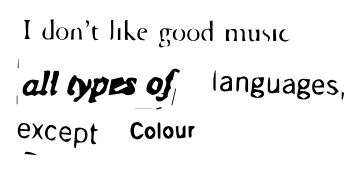
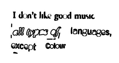
I opened the scan in adobe illustrator. I transformed the scan into a vector image, by clicking ‘Object’ > ‘Expand’. This was the result.
I then selected ‘pathfinder’ > ‘outline’ > stroke 2 pt.
Because the image is now a vector, I was able to ungroup it, take the letters apart, or distort each letter, as above. I stretched the ‘u’ and ‘a’.

I experimented with bitmapping the image. After opening the image in photoshop, I then converted it to greyscale >bitmap > diffusion dither. This was the result:
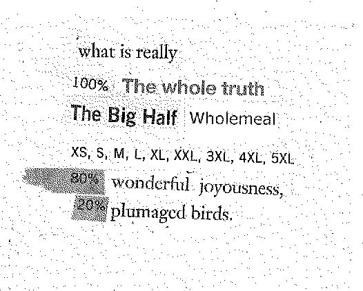
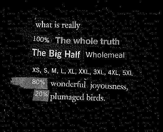
‘Diffusion dither’
Diffusion dither, then ‘invert’ flips the image to the negative version.

Some effects affect the readability of the text. I opened this scan in adobe illustrator and turned it into a vector.
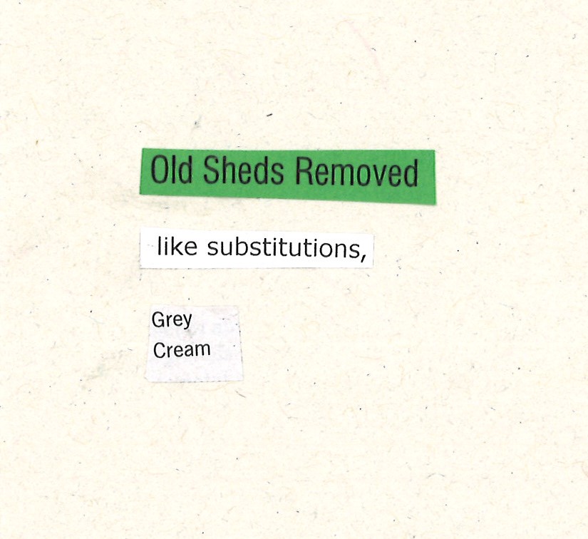
image trace > technical drawing> stroke increase> outline>
reversed the fill:
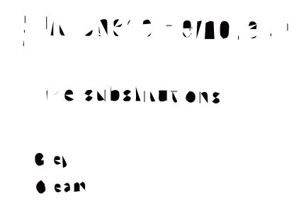
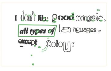
I liked the look of the word ‘substitutions’, but the other words are mostly unreadable.

The word ‘substitutions’ reminded me of this modernist style by the design duo Sawdust:
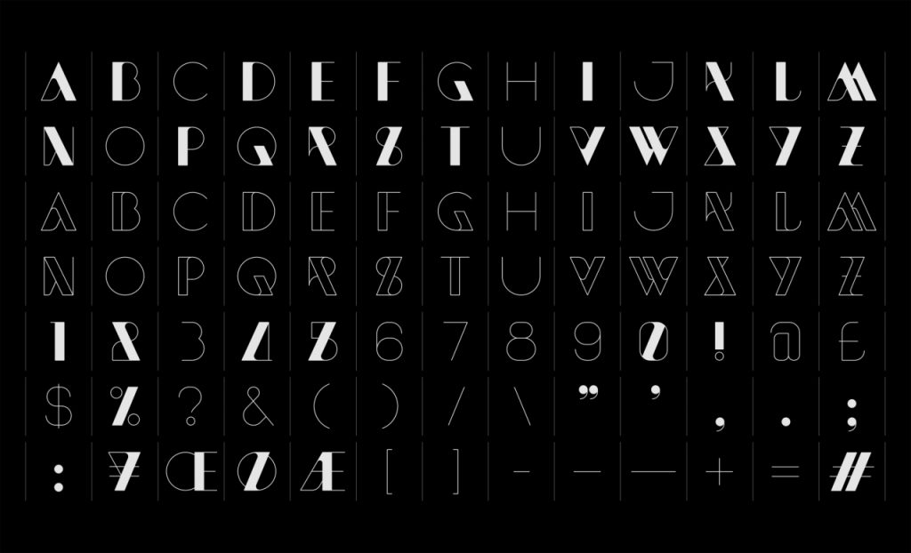
Legibility and readability are not the same thing. The degree to which a typeface is legible is entirely dependent on the designer of the typeface, whereas readability is largely the province of the typographer. Legibility is the degree to which individual letters can be distinguished from each other. Generally, the most legible typefaces are those with larger, open or closed inner spaces.’

Readability refers to the ease of reading text. ‘the reader should not normally be aware of the activity of reading at all.’

‘The ability to read quickly and to be able to select in order to use time efficiently depends very much on the order and arrangement of type being normal. Surprises are disruptive to the mechanics of reading.’
Speculative typography

A letter is a mark or glyph (symbol) used in an alphabetic writing system to indicate a sound.

Introduction
Unlike other writing systems from around the world, the English
alphabet (also known as the Latin-script alphabet) is a system
that consists primarily of a kit of parts that both directly informs the
shapes of sound (vowels and consonants) and signifies symbolic
values: for example, A, B, C, can have ‘symbolic’ meaning (think
of the phase ‘alphabetical order’), while a, b, c, (ah, bu, cu,) rather
instructs on how sound needs to be shaped to form a word.
Speculative, or ‘a-semic’ typography is a strategy that can be
applied to the study of writing systems to enable us to scrutinise
both the concept of writing itself, and typographic systems,
through formal speculation and experimentation; By developing a
‘speculative’ system of meaningful symbols or ‘parts’ – i.e. ones that are
not ‘semic’, meaning they are not [currently] readable – we can bring
the function of these graphic systems to the forefront of our attention.
We will also explore the subtle intersections of graphic information
that exist across all human artifacts, where ordinary manufactured
objects can often be found to exhibit residual typographic value
and relevant qualities.

What is Typography?, David Jury
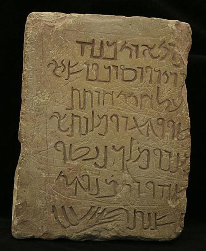
https://www.thenationalnews.com/arts/examining-the-origins-of-arabic-ahead-of-arabic-language-day-1.199916
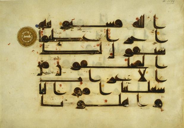
Folio from a 9th-century Quran written in ink and gold kufic script on parchment. https://www.middleeasteye.net/features/write-stuff-how-ancient-arabic-scripts-are-coming-back-life
https://www.researchgate.net/figure/Both-characters-in-the-figure-have-the-same-radical-ren-means-humans-at-the-left-hand_fig2_319151358
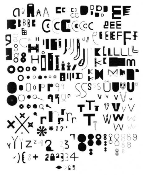
Bits, Paul Elliman
https://medium.com/fgd1-the-archive/found-font-1995-present-2328b96459fe
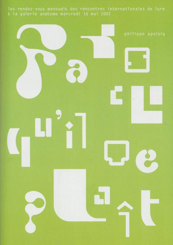
‘Abstract letterforms dissolve into pure form.’ Invitation cards by Philippe Apeloig

Week 1—2: Monoprinting
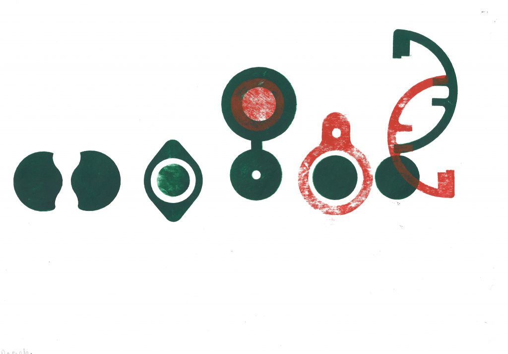
In these sessions you will be provided with a ‘kit of parts’ that have
been produced from various sources found within and from a variety
of manufactured items. You are asked to produce several prints with
these, forming a number of ‘sentences’. You must think about how
the use of repetition, accent glyphs and spacing can suggest or
appear to instruct a reader of variations and changes in the potential
sounds or meanings that may be ‘read’ from the type forms.

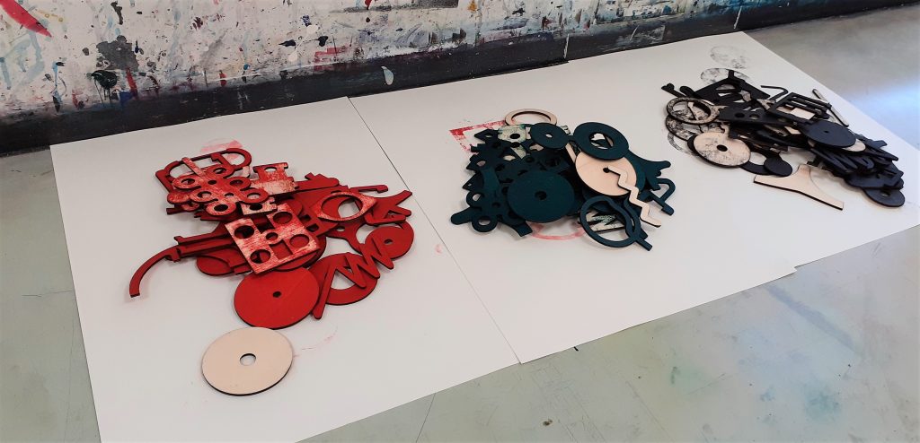
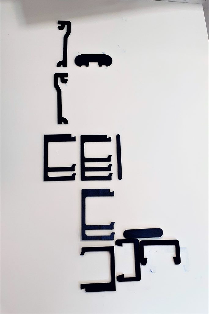
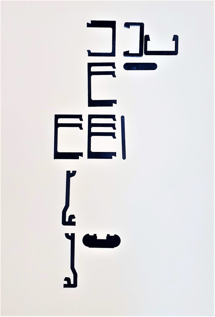
Wooden shapes to form into language.

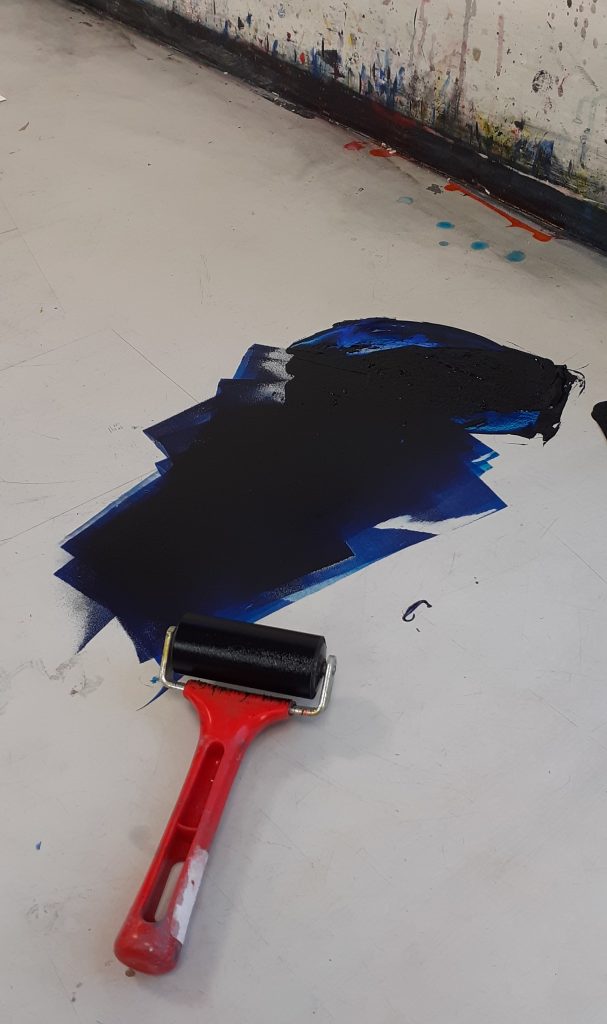
I used the roller to spread the printing ink across the surface of the table. I made sure to spread the ink evenly, to result in an even print.

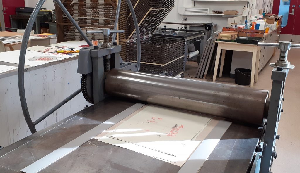
The printing press.

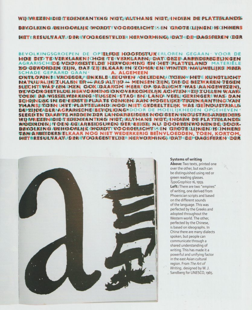
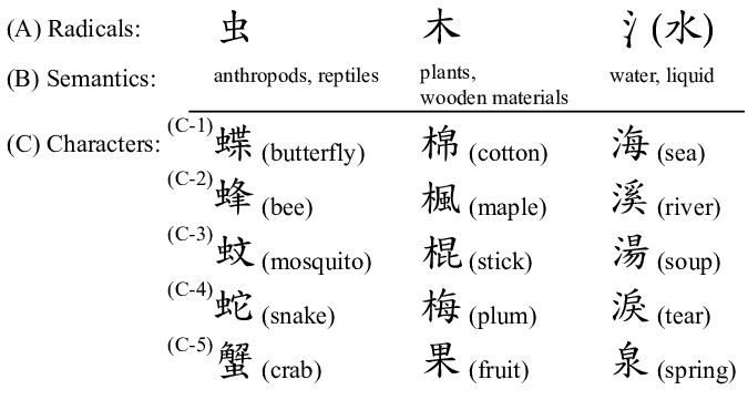
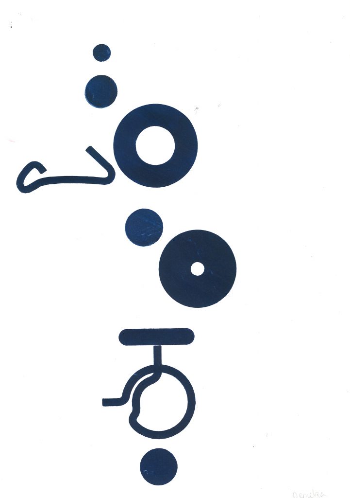
When approaching the task of forming a new language, it helped me to think of Chinese characters. I considered the direction of written language on the page. Chinese characters are read from top to bottom of the page. They have been formed with consideration to the physical form of objects. (Whereas English is written by spelling out the sounds in words.)

Chinese radicals are the part of a character that appear in multiple words. Depending on the other part of the character, we can read the meaning of the word.

I thought about using repeat shapes across my ‘sentence’ to unify the shapes as a language.

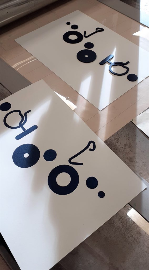
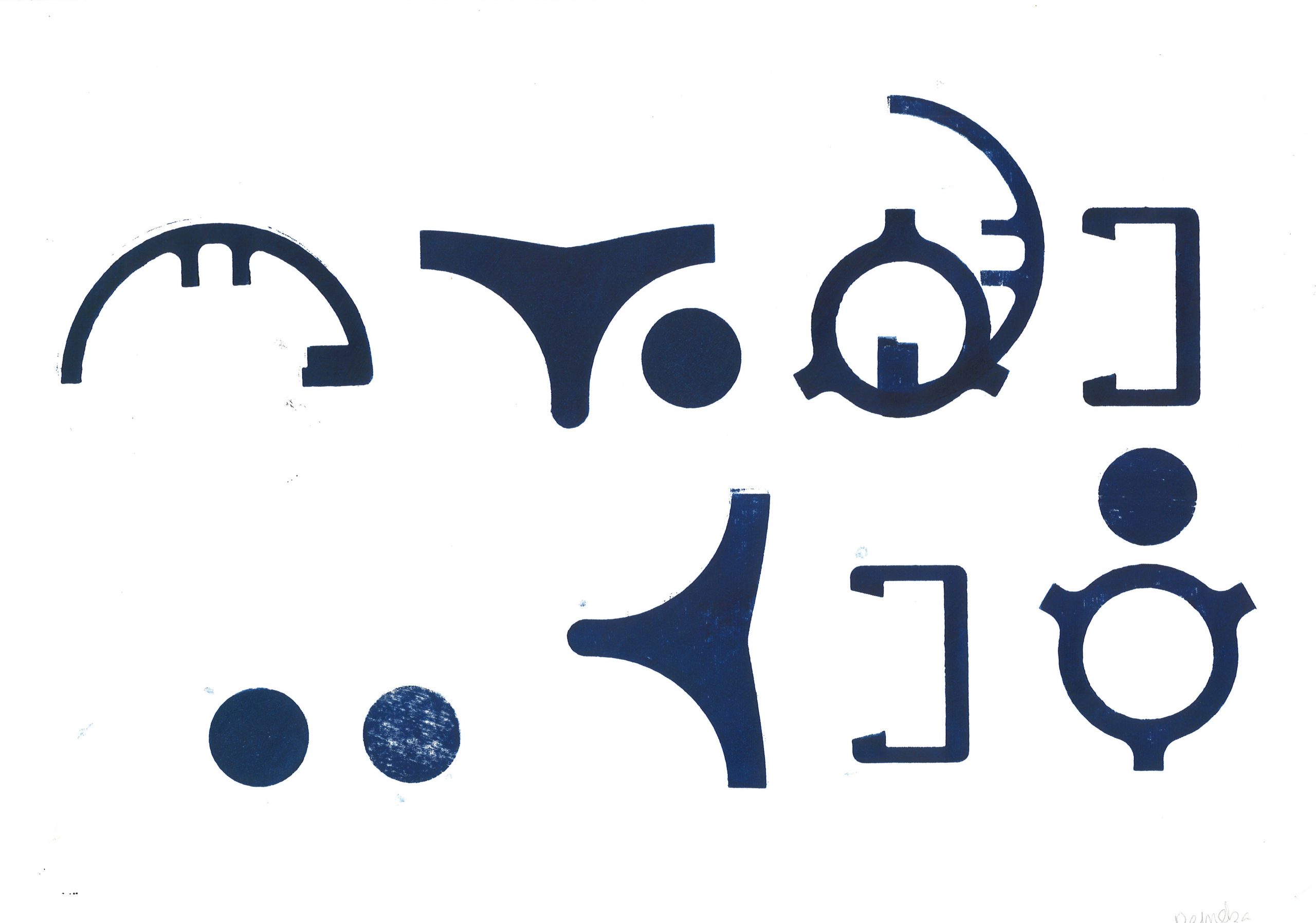
The results of the workshop:

I repeated shapes in this sequence, as I felt this brought the shapes together as a ‘language’. I spaced the glyphs to signify separate words in a sentence. However, looking at arabic texts, I can see that some written language can appear connected. I would like to experiment with connecting the shapes together to invent new ‘word’.
Paler red prints gives this experiment some variation and made me think about the change in meaning in connection with the quality of a mark on a page. Does it suggest age, wear and tear? Or does a paler mark weaken the message and suggest a subtler meaning? Could the use of 2 colours change the meaning of the ‘sentence’? In this experiment, I began to investigate connecting the shapes and creating new shapes from the pieces I had available.
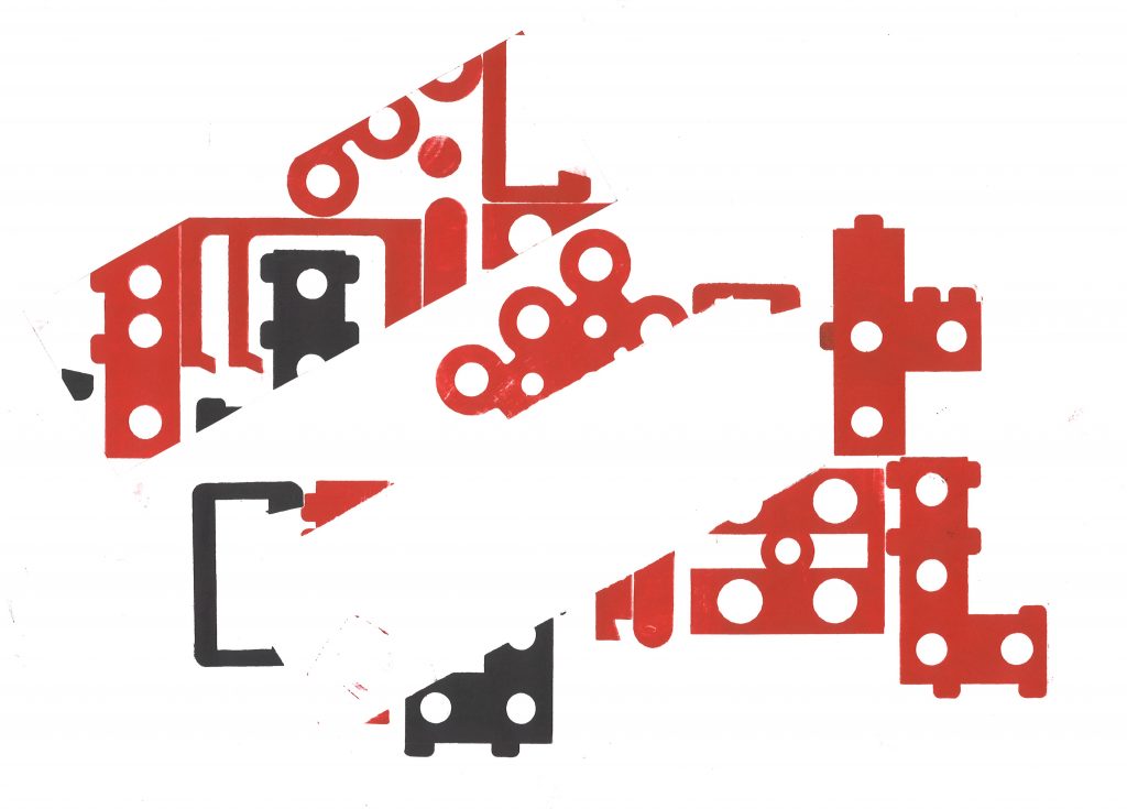
Experimenting with negative space. By cutting a separate piece of paper, I placed this on top of my paper and printed on both together. This masked a rectangular area in this case and left me with an empty space at the centre of the print. I could then move this piece around or remove it from the image.

Critical Thinking: Theory & Practice Part 2

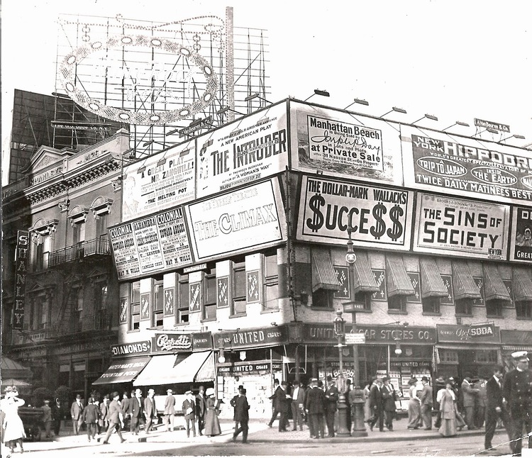
https://viewing.nyc/vintage-photograph-of-broadway-advertising-in-times-square-circa-1909/

In today’s lecture, we began by considering the themes for this new module.

  1. The history and theory of visual culture. How are images produced? How are images consumed? Visual artifacts: graphic design, poster, film, advertising.

2. Reflect on ethical & political implications of graphic design. What does graphic design have to say about race, gender and ecology? How does graphic design make these matters visible?

Blockbuster culture delivers mainstream ideas to the masses. This is found in the free press you find on the train. It is easily accessed everywhere. How can graphic design counter mainstream culture?

Novara Media are an organisation who challenge the mainstream media.

Ash Sarkar uses humour as a way of presenting the topic. She delivers the message with energy and the fast pace keeps the audience engaged. I like the way she uses rhetorical questions to include the audience and place them in a hypothetical experience.

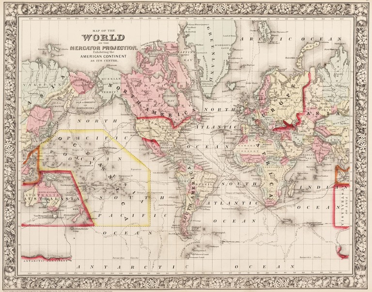
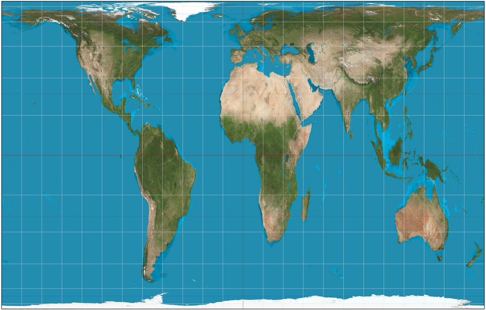
‘The Most Popular Map Of The World Is Highly Misleading’

The Mercator Projection, created by Flemish cartographer Gerardus Mercator in 1569, shows the northern hemisphere enlarged in size with North America and Europe larger than South America and Africa.

https://metro.co.uk/2017/03/21/heres-what-the-map-of-the-world-actually-looks-like-6523105/

Maps were designed from the point of view of the coloniser, according to their own parameters. They placed themselves at the centre of the world according to how they saw themselves (powerful). The global south became independent of the colonies.

Gall Peters projection, 1970 (How the world really is)

Are maps really objective?

They can be designed to deliberately mislead us. We need to look with a critical eye: Who made it? Why? What does it actually tell us?

Design & Politics

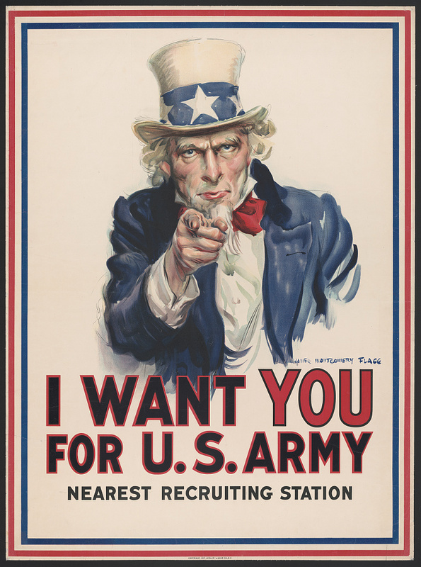
Propaganda such as this poster was produced during the 20th century. It was often used to recruit people in the army using bold and forceful language and imagery.

(image from:

https://library.ccsu.edu/dighistFall16/exhibits/show/music-as-propaganda-in-world-w/music-as-propaganda)

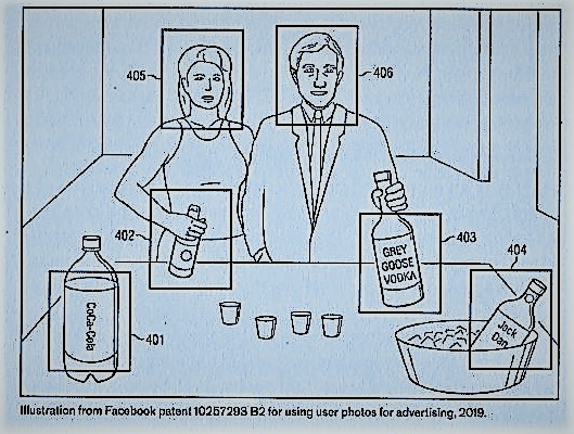
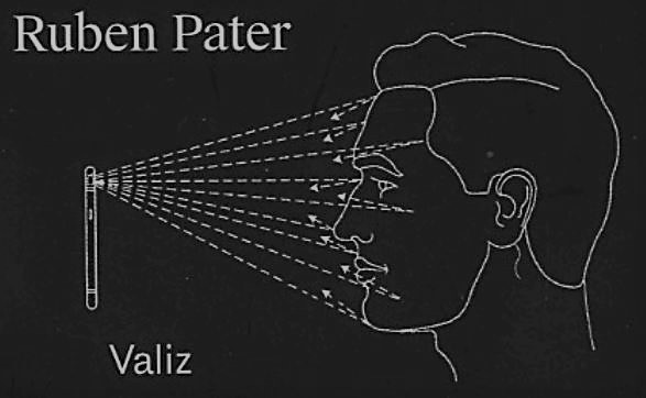
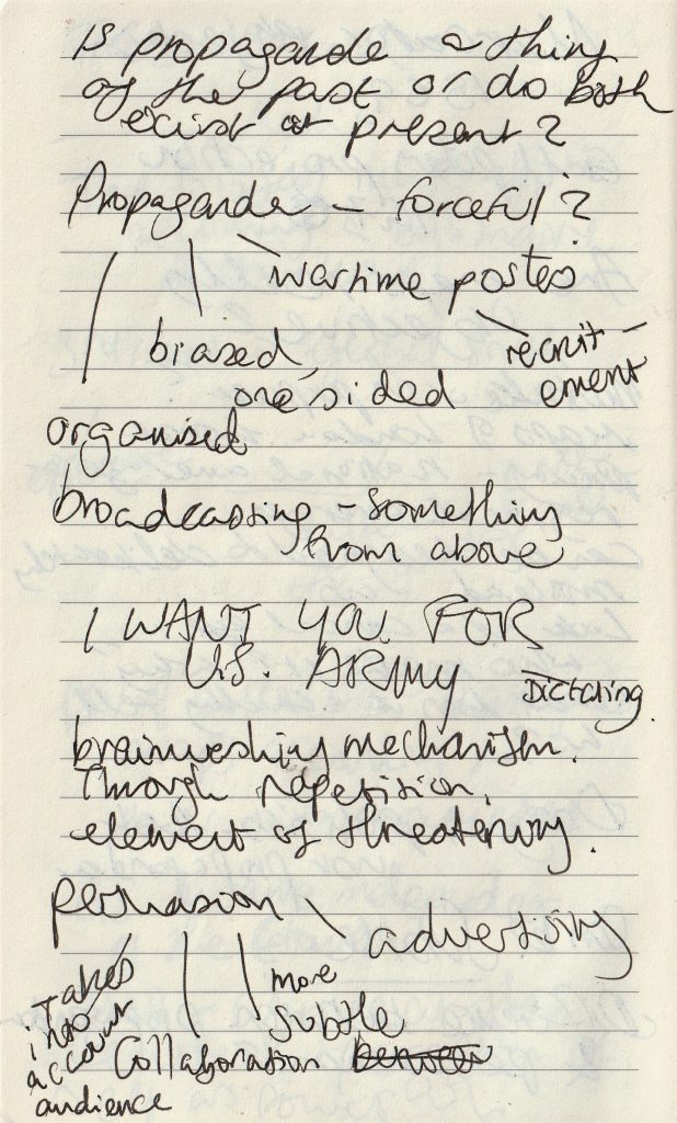
Politics in design can be subtle, not just propaganda. And persuasion can be sinister, even if it’s subtle. For example, surveillance advertising and micro targeting occur today. Companies collect data on us without our knowledge. By collecting this knowledge, they are able to profile and target ads to certain audiences. This can be subliminal and sent through social media.

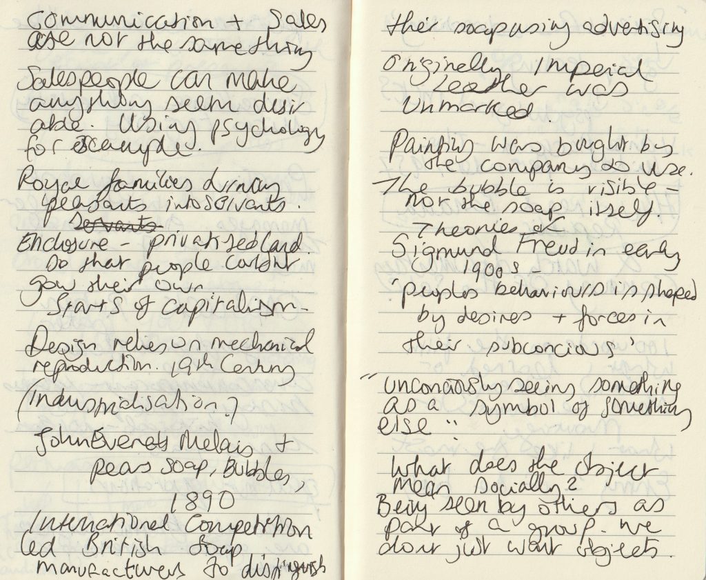
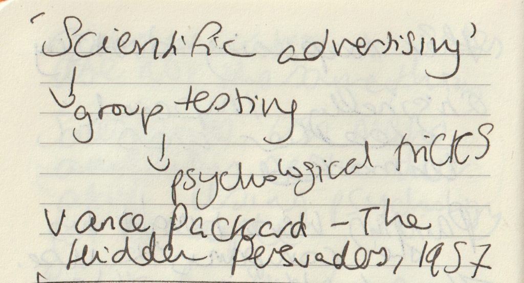
my lecture notes.

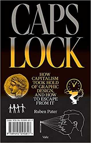
Caps Lock – Ruben Pater

The cover of this book is contemporary, by the images are historical. They are from several decades but no image newer than 5 years.

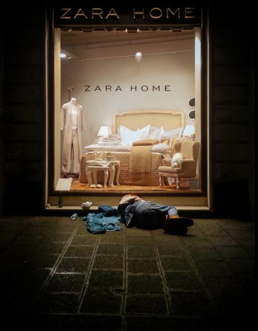
On skimming through the pages, the pull out quotations stand out to me. They do not look too different to the rest of the text, but are in a serif typeface and slightly larger. From reading them, I am given the basic theme of the book. There is a negative view of materialistic culture and the images support this view:

https://www.saatchiart.com/print/Photography-Zara-s-home/277628/1885457/view

Not all graphic designers are against advertising.

Banana Republic‘ from Caps Lock

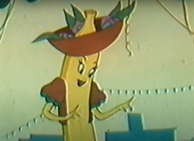
Chiquita Banana The Original Commercial

The example of United Fruit illustrates that cheap products cannot be produced ethically under capitalism, but require aggressive advertising, political meddling, dispossession of common lands, exploitation and violence.

Ruben Pater

This chapter of Caps Lock, explains how advertising can be used to ‘hide violence and exploitation in pursuit of profit.’ The Chiquita Banana advert was made to educate and persuade people to start buying bananas from the United Fruits company. At the time, in the 1940’s, bananas were a fruit growing in New Guinea and Malaysia and no one had heard of them. The company therefore needed to convince people to make bananas a new part of their diet.

They did this by using the symbol Chiquita Banana, a sexualised cartoon banana based on the Latino actress Carmen Miranda.

Land was stolen from indigenous people to grow bananas in Honduras, South America. The workers were exploited, paid in vouchers instead of money and killed when they demanded fair pay and working hours. (Which is the short version of events).

“If advertising would be banned from public space everywhere, it would certainly be a blow to a system of consumption that relies on constant seduction.”

“In a timespan of two centuries, society has been commodified bit by bit through enclosure of free and public spaces.”

Century of the Self

The words of Paul Mazur, a leading Wall Street banker working for Lehman Brothers in 1927, are cited: “We must shift America from a needs- to a desires-culture. People must be trained to desire, to want new things, even before the old have been entirely consumed. Man’s desires must overshadow his needs.”

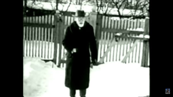
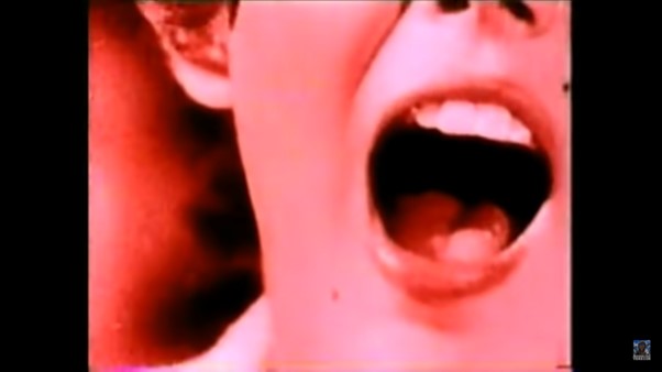
The film starts with a black and white image of Sigmund Freud. We hear playful and nostalgic music from a past era as the narrator talks about Freud’s theory of ‘primitive forces’ within humans. There is a sudden change to the red image of a woman screaming. The words ‘chaos and destruction’. There is horror-film organ music, all feels frantic. Then suddenly the footage returns to black and white with nostalgic old-fashioned singing, while we see footage of a man on a staircase, perhaps Freud’s nephew ‘Edward Bernays’ who we are introduced to.

The organ music again strikes us as the titles appear.

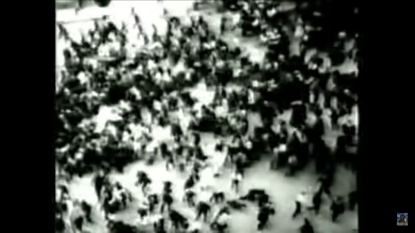
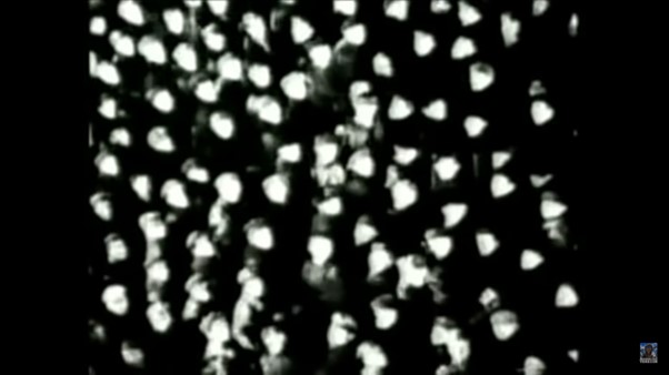
Images of advertisements appear dreamlike, between black and white images from real scenes of crowds, possibly from news footage- a harsh reality. Crowd footage appears throughout the film, possibly to signify the masses who were the focus of the advertising campaigns.

This introduction sets us up, much like a warning as to what is to come later. We may not know who Freud or Bernays is, but we have no doubt there is something sinister about to be revealed.

The pace and unexpected change in tone, keeps us on our toes. The theatrical pairing of images and music contribute to an atmosphere of dread.  Moments of quiet suspense are sandwiched between images of chaos. This expresses the emergence of Bernays and his work in mass manipulation. The change from buying to meet our needs and buying to fulfil endless desires.

Classical music is playing as we are shown footage of higher-class events. This sets up the world Bernays was a part of. Music plays with our emotions throughout the film, giving us an idea of how it is to be easily manipulated.

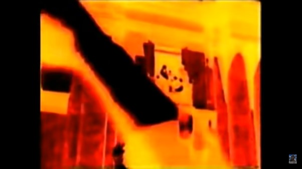
We are shown images of chandeliers whilst hearing about the necessity of civilisation and inevitability of dissatisfaction. This creates a contrast and makes us questions the worth of the finer things.

“Bernays was the first person to take Freud’s ideas about human beings and use them to manipulate the masses.”

Century of the Self

Today’s lecture introduced me to the sinister truth hidden beneath the shiny surface of everything we know.

Century of the self discussed the shift from smoking being unfashionable for women, to the way women were persuaded to smoke. This was a carefully calculated shift. Actresses were hired to pose with cigarettes. The companies knew they could double their customers by setting up this marketing strategy. That is something I had never considered before.

In the Banana Republic article, the way people have been treated to allow companies to increased profits, is shocking and appalling. The only thing worse is the way it has been covered up for decades.

This discussion has lead me to wonder, what else will I be discovering next?