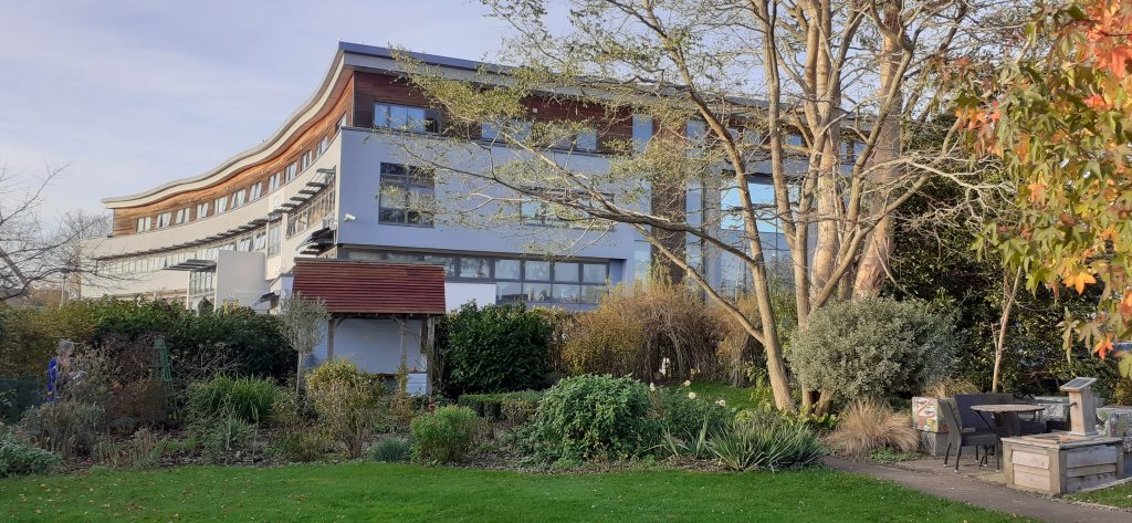
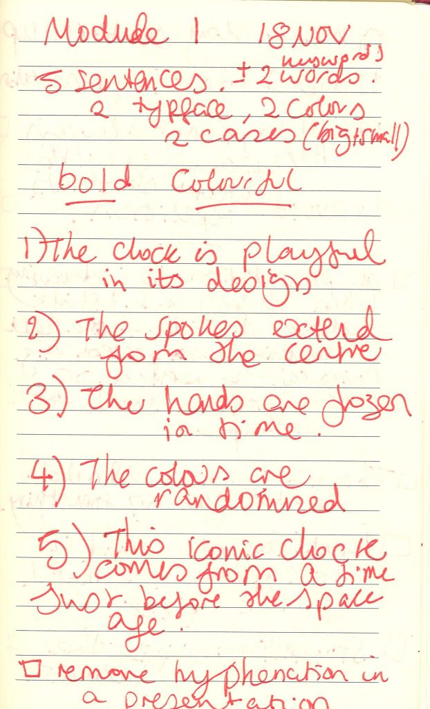
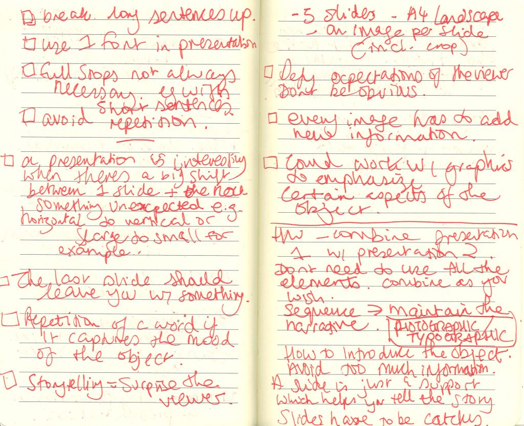
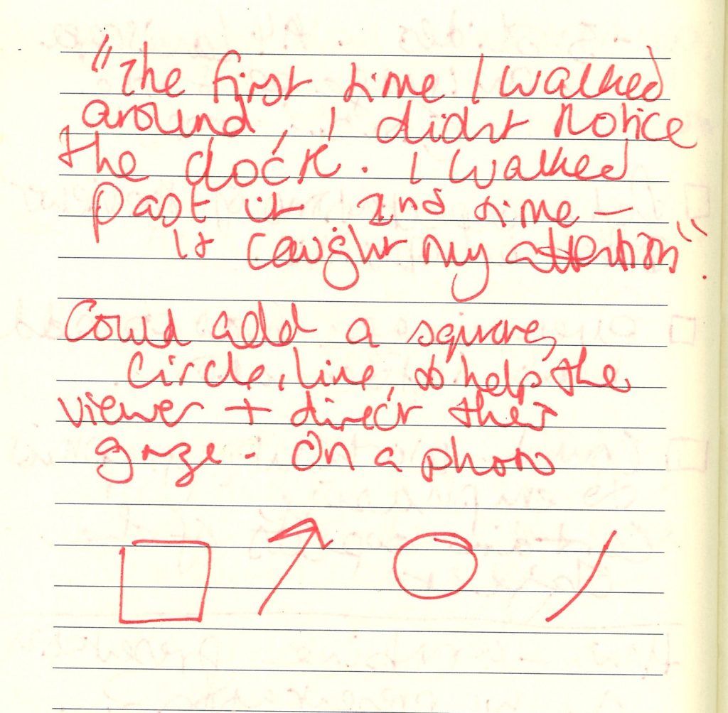
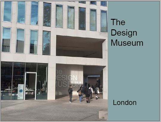
When putting the slides together, I wasn’t sure how to start. I began by placing this photo of the outside of the museum, however I later decided to remove this slide for 2 reasons. 1) The colour does not represent my object. 2) The second slide contains a photo of the museum.
Another thing I decided to change was the font. I later changed the font to ‘Minion Pro.’ I felt that this font was appropriate to reflect the 1940’s period in which the clock was designed.
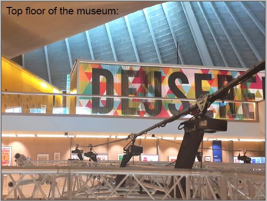
I liked this slide but thought I could enlarge and colour the text to emphasize the meaning. When I talk about being overwhelmed by the amount of objects, this can be illustrated in my choice of type.
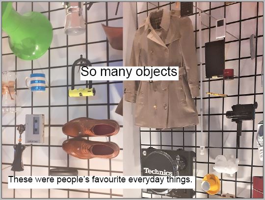
I added orange to this background to tie it in with the colour of the clock. However, I decided that this background was not necessary for this slide.
The slide below wasn’t working well. I included the picture on the left to demonstrate the way we can focus on one object and ignore the surroundings. However, the 2 images looked to be competing on the slide and they both showed the same subject.
I chose to keep the image on the right because of its clarity.
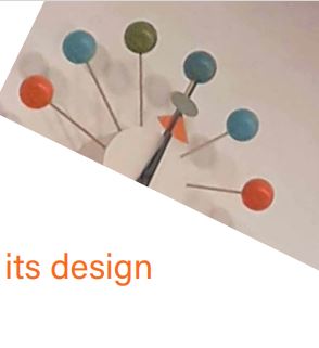
I liked the way I placed the photo to the edge of the slide. I also liked the placement of the lines of text, however, it felt premature to reference the atomic influence on the design, since the audience has not been introduced to the clock and first impressions.
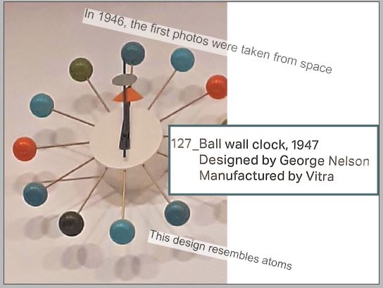
When editing the presentation, I brought this image up to the edges of the slide so that it follows the previous slides where I used photos to fill the page.
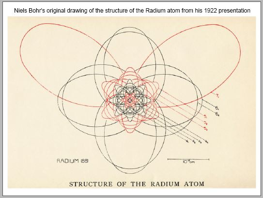
I wanted to include a slide about Modernism, as the audience may want to see examples of what Modernism is.
When recording the script to see how long it would take to give the presentation, I was recording for almost 10 minutes. I needed to cut down the length of the presentation. I chose to remove this slide as I could talk about Modernism during another slide.
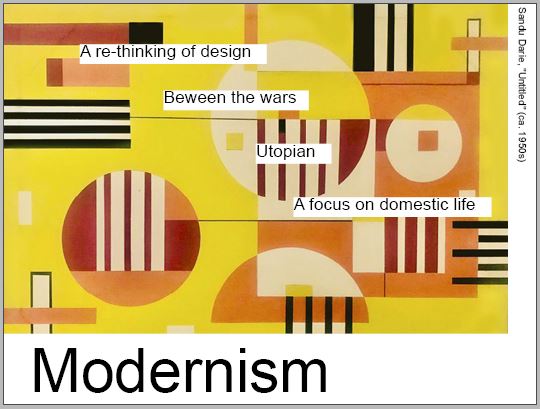
I was happy with the below slide. I like the way the object pop against the white background.
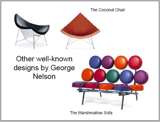
I moved the below slide further up because the information on it relates to earlier slides. I enlarged the text on the right side to make it more readable.
I placed the text on the left side around the clock in a circular formation.
I used green from the clock for this background. This background does look slightly out of place in the presentation. I therefore removed this green background from the slide.
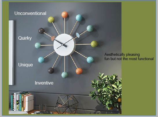
The images below are overlapping slightly. I needed to fix this for the final presentation.
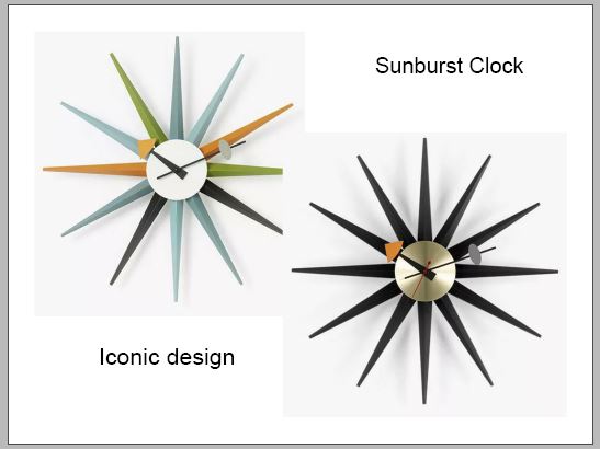
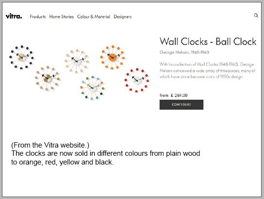
I may need to shorten the paragraph here so that I am displaying 1 or 2 bullet points of text. It is important that the slides only highlight key words and statistics.
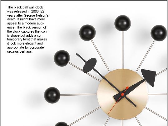
In the week before the presentation, I will practice delivering the presentation. I have learned from past presentations, that knowing the information by heart will help me when I need to talk about the subject.
Next I will make prompt cards to use as reminders when delivering the presentation.
I am working on final touches to improve the look of the presentation and ensure that the slides support what I will be talking about.
