Our first task was to describe our object using only words. We worked in InDesign to create practice presentations.
I needed to think about how the words would be presented in slides. I wanted the slides to be:
- easy to read
- eye catching
- interesting to the viewer
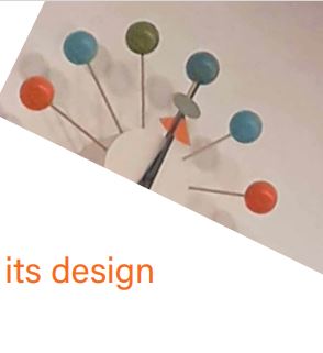
I wanted to reflect the object’s design in my choice of font, and colour and layout.
Luisa gave us some reflections on these slides, which I found helpful when thinking about my final presentation.
We then were asked to repeat the exercise, this time using images only.
I used different placements of the images to make the viewing more interesting. For example, placing the image at the centre of the slide, left, right or covering the slide completely.
I placed the pictures in this order to show me noticing the clock in the museum and then zooming in to get a closer look of it.
I then went for the opposite effect and began by focusing on the details before walking away. I showed this by ending the slides with a far away image of the clock placed on the wall. This puts the clock in the context of the collection.
I cropped and altered the rotation of the image on the first slide. I chose this to reflect the ‘playful’ aspect of the message, expressed in the text.
For the second slide, I placed the text and image centrally to reflect the message. I drew lines across the image to highlight the spokes of the clock.
I left the line of ‘the hands frozen in time’ to its own slide. I did this to give the viewer a chance to pause and feel the stillness of the clock hands.