Bookbinding Workshop 2

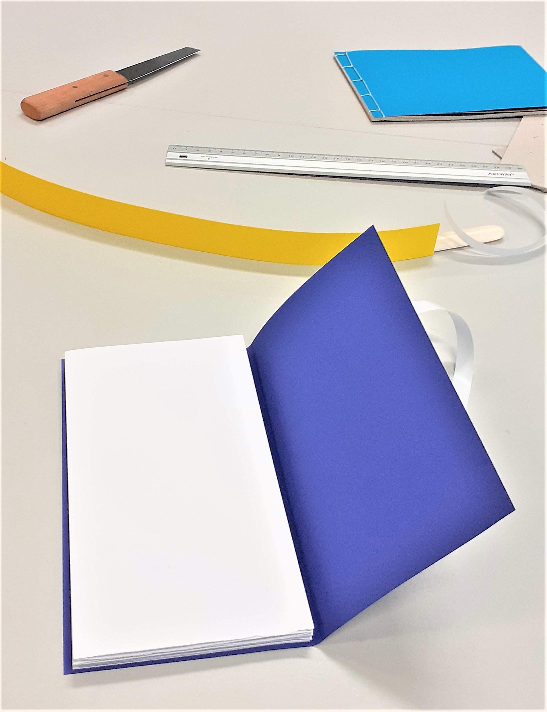
In today’s bookbinding workshop, I made 2 kinds of book:

Stab-binding and a zig-zag/ concertina style book.

I also learned the foiling method of adding text to a book cover using a hot tool and coloured pieces of foil.
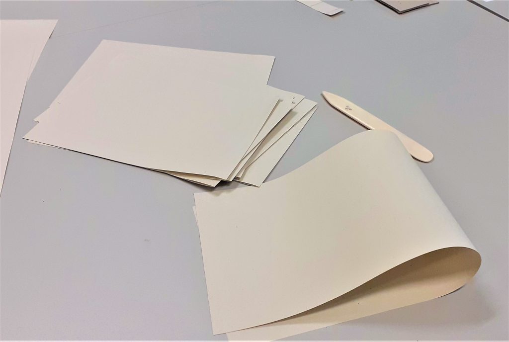
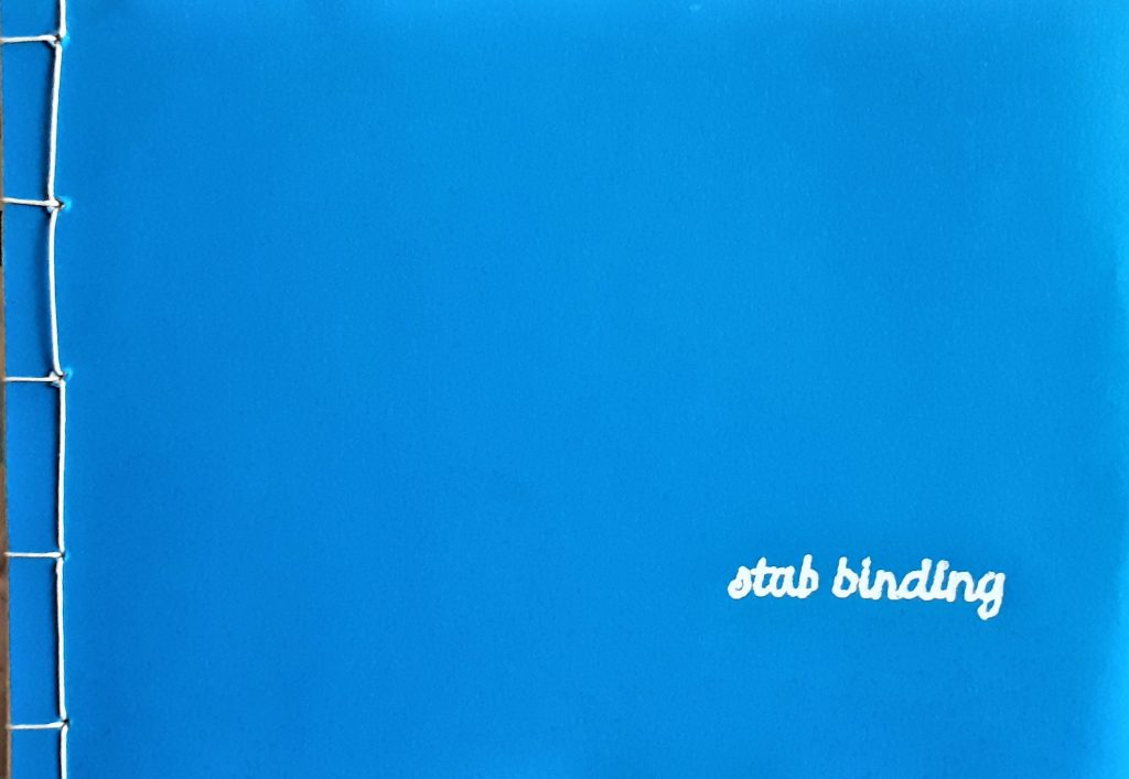
The first book we made in the workshop, used the stab-binding method. The folds of the pages were on the outside edge of the page. The advantage of these doubled-up pages, is that it makes it less likely for ink to seep through when you are writing on the page. The first task was to fold the pages, using the bone folder. We used 15 sheets in total.
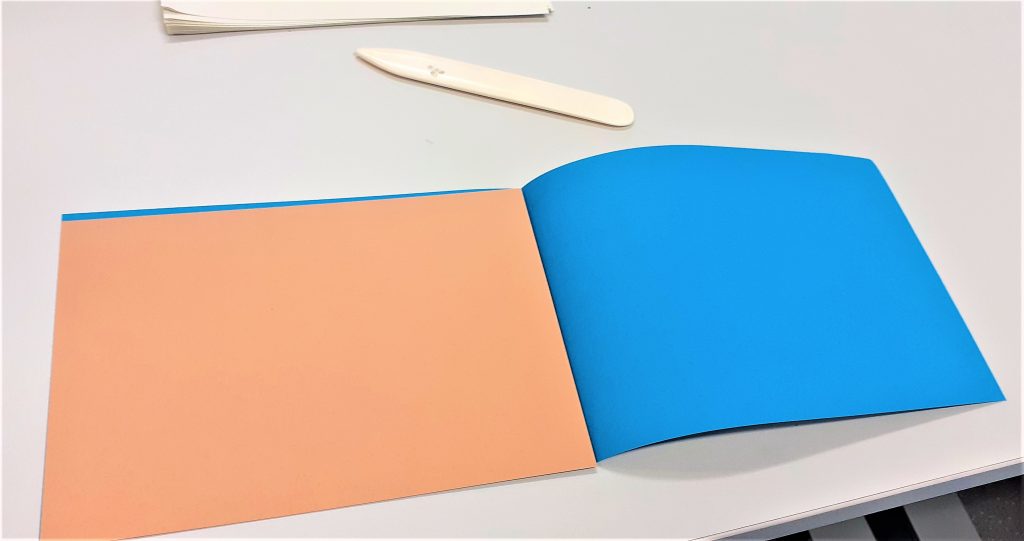
Using a thicker piece of card to re-enforce the cover means that the book may last longer. Here I folded the cover (blue) and ensured the (brown) card would fit nicely inside.
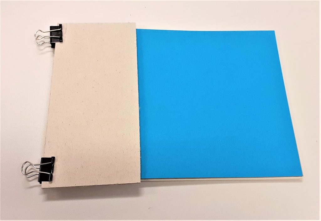
I assembled the pages together with the cover and used 2 bulldog clips to hold everything together. Using card between the clips and the cover means that I prevent marking the cover. I clamped the outside edge of the book, leaving the side free that would become the spine.

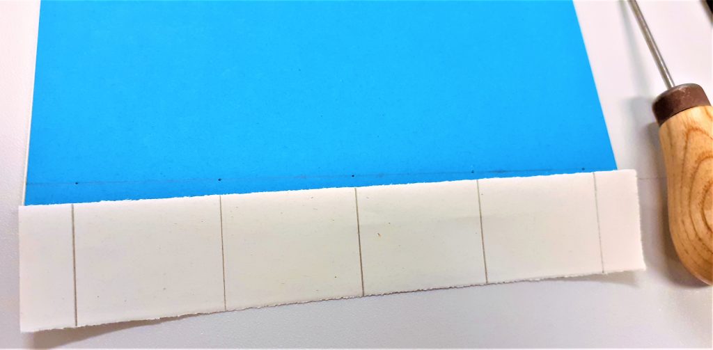
I measured 1cm from the edge of the cover. I marked 5 points on the cover where the holes needed to be placed. Using 5 holes makes the book hold together more strongly than if I made only 4 holes.
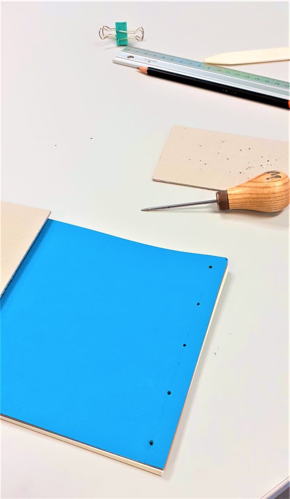
Making the holes was the most physically demanding part of the process. Using the awl, I pressed and twisted into the paper where I had made the pencil markings. I made sure to keep the awl straight. The number of pages and thickness of the card is what made the action tough. It was easier to make the holes whilst standing up. I placed card underneath the book to help hold it in place and prevent me marking the table. I made sure the awl was about 3mm through the other side. This meant the hole was big enough. Another way to check is to hold the book up to the light and see if I can see through to the other side.
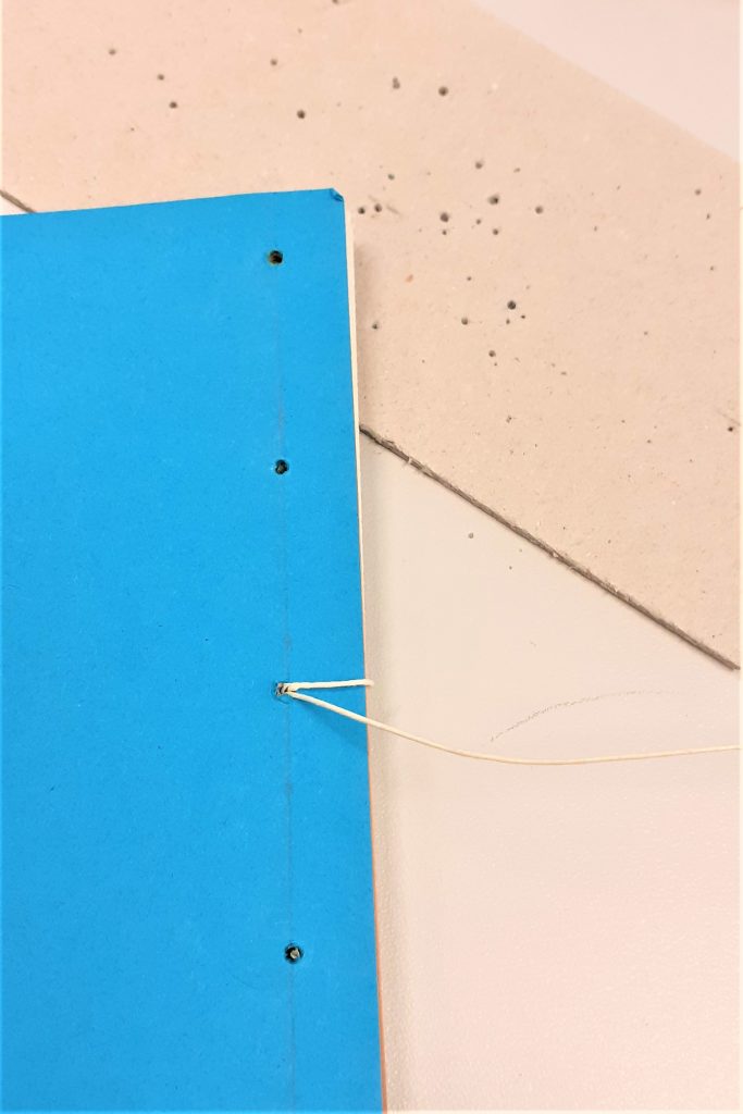
Using the needle and a strong thread, I began to stitch the book together. I started from the inside of the book and pushed the needle through the centre hole.

I found this stitching process easier than the previous books I have stitched. I think this is because the stab-binding stitching pattern works in right-angles. The main difference is that with this method, I needed to hook the thread around the outside of the cover.

I also needed to make sure I was pulling the thread tightly after each stitch.
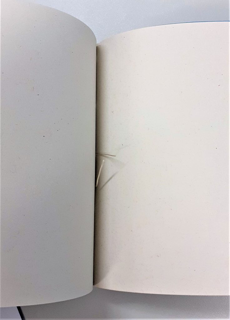
I did not need to tie a knot because the stab-binding holds the thread in place. The thread begins and ends at roughly the centre of the book.
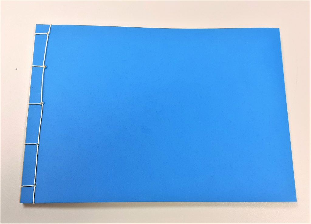
The result: I felt that the line of stitching looked wonky. This is probably due to where I placed the holes.

My next book was a zig-zag style book. My first thought when our lecturer Ruth showed us this kind of book, was how great this method would be for a photobook. This is because the book opens out to a long line of paper where the reader has the option of viewing every page together, or turning one page at a time.
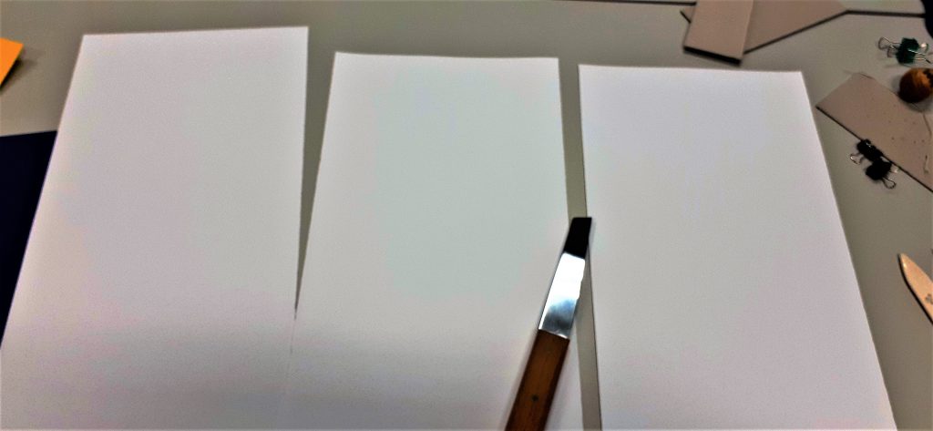
I began the process by cutting a large sheet of paper into 3 separate sheets. This makes up the pages of the book. I used the paper knife for this task.

After folding the paper into 4 pages per each piece of paper, I began working on the cover.
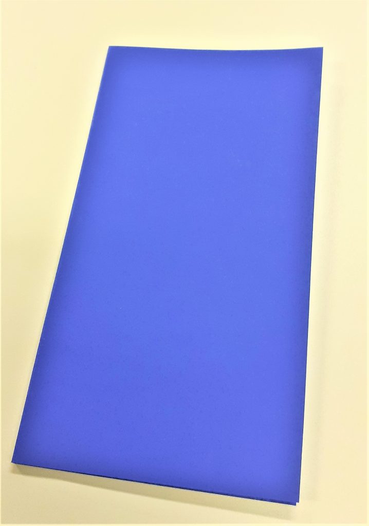
For the cover, I needed to fold the paper twice to create a flat spine. I worked out the width I wanted the spine to be by holding my pages together and measuring the thickness of the pages. I left a gap with this measurement at the edge of the card and folded up to this point. I turned the paper around and did the same in reverse.

I then attached my pages together using double-sided sticky tape. I then used the tape to attach the pages to the cover. This part of the process involved some decision making. I needed to think about how I wanted the book to be read. I had the option of attaching the pages to the back cover or the front cover. I needed to weigh up the procs and cons of each method.
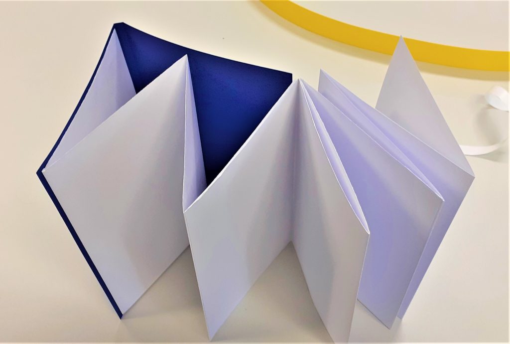
zig-zag book.
Attaching the pages to the front cover means that the reader will open the pages out to the right.

Using the foiling technique, I added the title to the book cover. I first practiced on a scrap piece of paper. It was important to use a template to trace the words, as this gave me a guide and ensured the word would look neater that working free-hand.

I needed to work slowly, to allow the heat to pass through the paper and the foil. I made sure the tool was switched to the lowest heat. A higher heat would have melted the foil and the result would not be effective. I considered health and safety during this process. I made sure the tool was not touching the table or any object while it was hot. I especially made sure the hot end of the tool would not touch the cable.
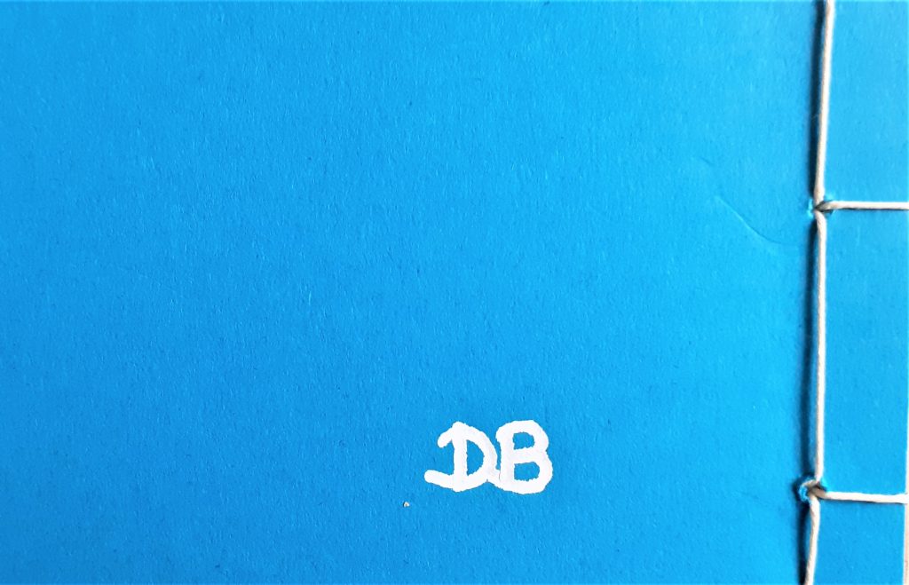
I added my initials to the back cover of the book. I had sketched the letters onto paper first, before using them as a template.

Collage Experiments

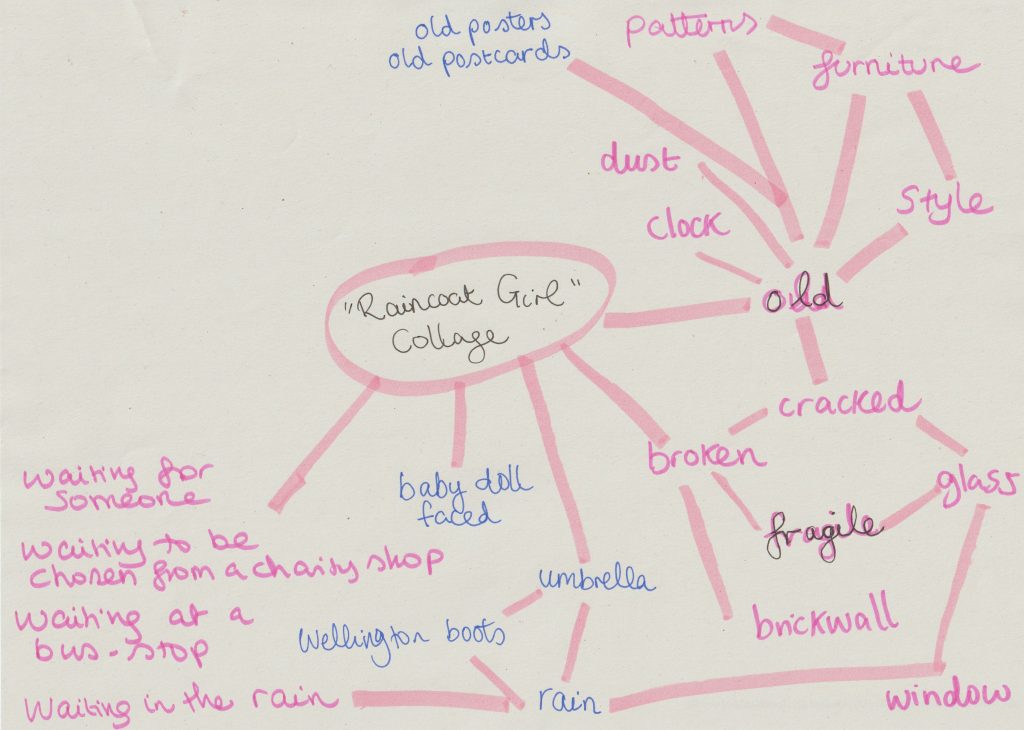
When faced with the task of collage-making, my mind was buzzing with ideas. The problem was, I had too many ideas. I decided it was time for a mind map.

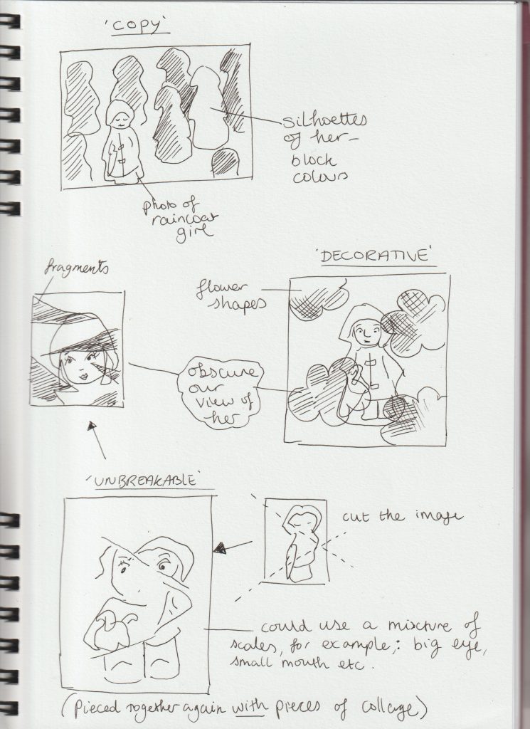
After looking at Jelle Martens collages, I thought about using shapes within my own collages. I thought about obscuring my object ‘The Raincoat Girl’. I drew quick sketches to get my ideas down onto paper:

From my artist research, I found I prefer the more simple collage designs. I didn’t want to over-complicate my collages and have them look visually noisy.

I used some magazine images but found it easier to source images from the internet and use my own photos.

Printing photos from my computer also meant I had the option of editing my pictures to suit the artwork and contribute to the message I wanted to create. I could also resize the images and therefore use more creativity. Magazine images can be restrictive but also trigger new ideas due to the spontaneous process of flicking through unknown pages.

All collages are A4 sized.

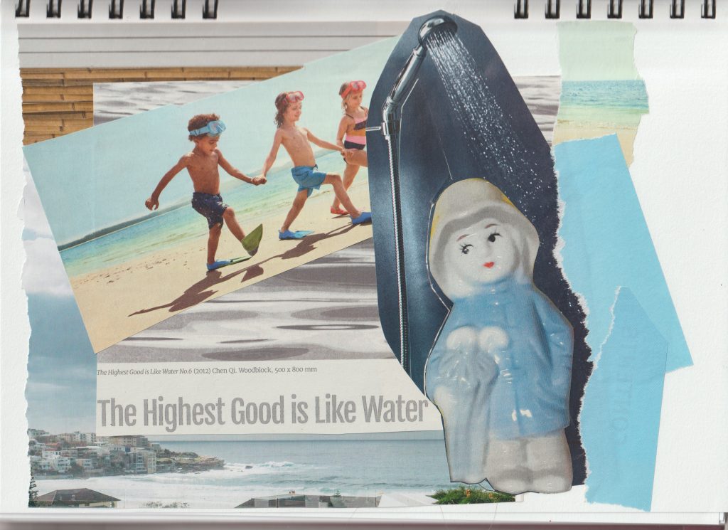
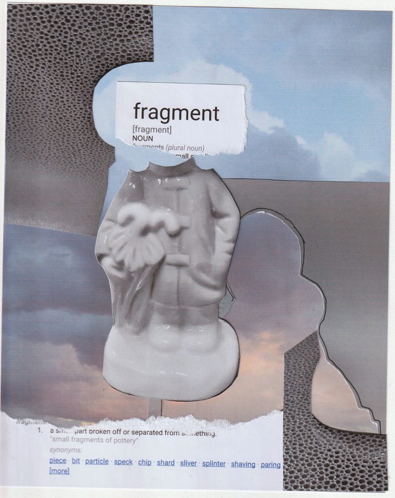
For this collage, I used images from magazines and my printed out photo of The Raincoat Girl. I tore the paper at the edges to create some texture.
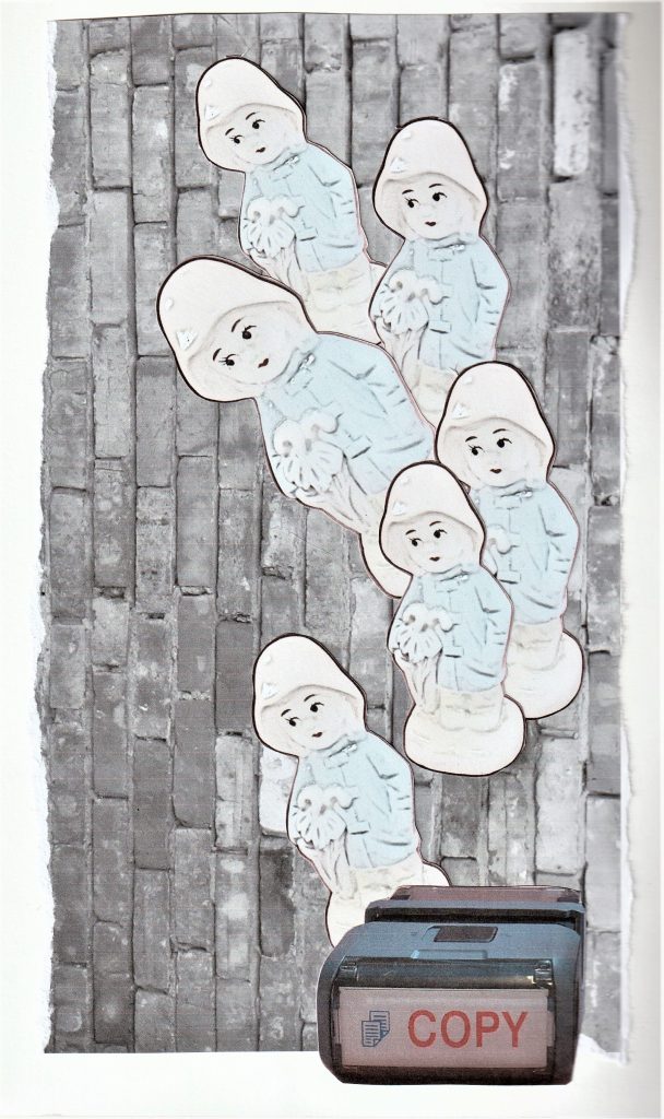
For this collage, I used a photo I took of a brick wall and converted into black and white. I edited the image of my object to make her look more 2D. My concept for this image was mass production of objects.

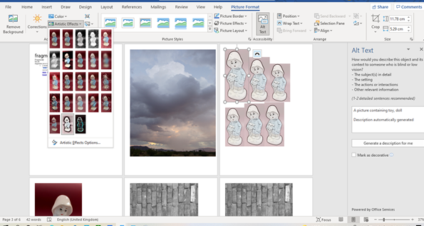
I used Microsoft Word to edit the photos. For the image of the repeated figure, I clicked ‘Picture Format’ > ‘Artistic Effects’.

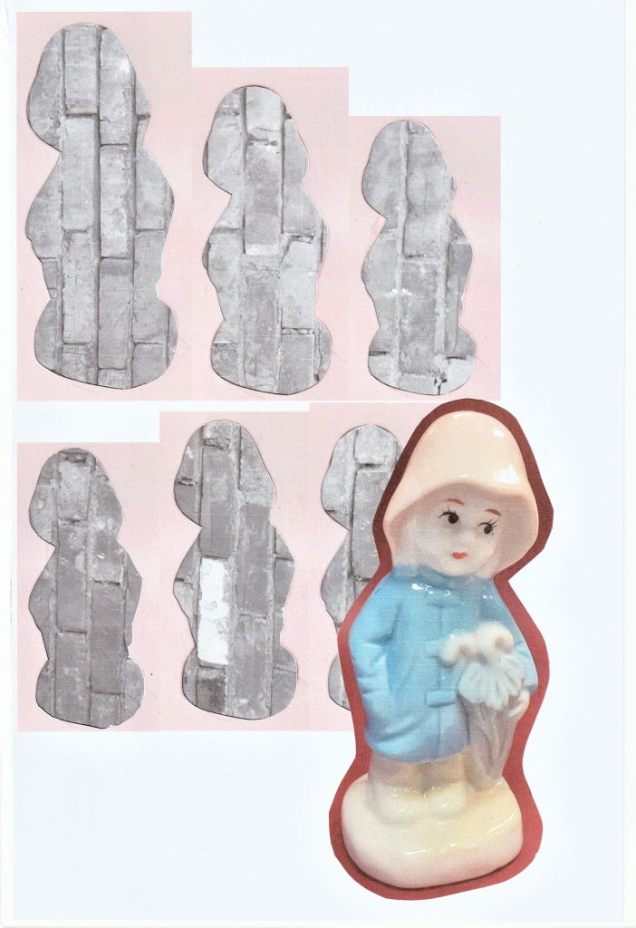
I used the outlines of the figures in the previous collage, to give the impression of a mass of face-less figures. The Raincoat Girl stands apart from the others, facing in the opposite direction.

I wanted to use words within a couple of my collages. I wanted to see if words would strengthen the message, compared to a collage where I use no words.

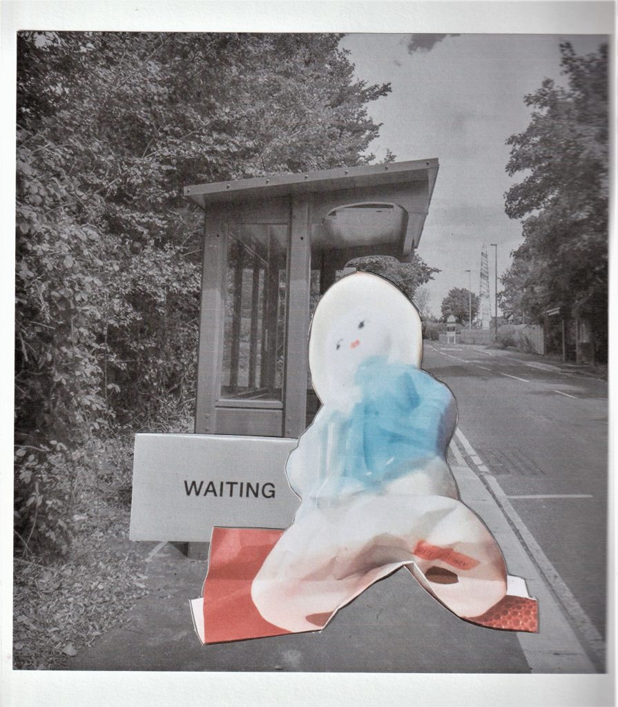
For this collage based on waiting, I used the photo of the 3D collage I made in the previous week. The squashed effect makes her look deflated and bored. I used a photo from the internet of the bus stop. I edited the bus stop image to give it a softer feel and less colour. The red in this collage symbolises the anger that boils under the surface when you have to wait.

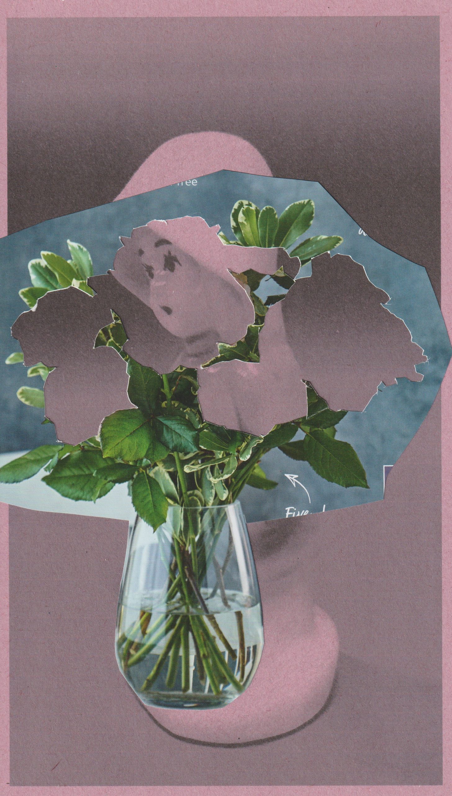
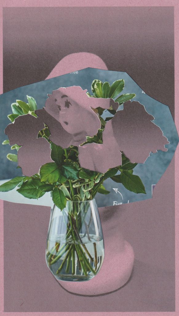
For the collage below, I experimented with printing onto sugar paper. I placed pink sugar paper in my printer and printed the black and white photo onto it. I think the sugar paper created a softer looking image. This was what I wanted for the subject of flowers, as petals are soft. In this collage, The Raincoat Girl echoes a flower.

Inspired by John Stezaker, I wanted to dry interesting layering within a collage. In this image, the flowers symbolise the nature of being decorative. This relates to my object, which was manufactured to function as a decoration only.

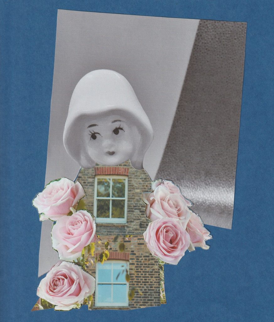
In my final collage of the day, I used blue card as a backdrop and magazine images in the foreground. The glossiness of the magazine paper complimented the mat quality of the blue card. I wanted to play with the idea of optical illusion. An image that can be viewed in more than 1 way.

Placing the window in place of her heart, symbolises her emotional openness. The brick walls are her emotional boundaries. On the other-hand, we could be looking at a house who has a personality. The feeling of arriving home and feeling like you are being hugged by your house.

Collage Inspiration

This week, I have been given the challenge of making a series of collages based around The Raincoat Girl. I needed to first find inspiration. I looked at collage work by both artists and designers, from past to contemporary. This opened my mind to the infinite possibilities of cutting and pasting.

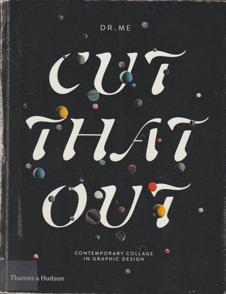
I’ve been wanting to read this book for a while and now I had the perfect excuse.

Cut That Out by Ryan Doyle
Jelle Martens

I looked at the artist Jelle Martens. He uses a mixture of traditional collage techniques and digital skills within his work. He is a fan of Collage with squares arranged according to the laws of chance, which is a series of work by Dadaist Jean Arp. In that series, Arp used cut-up pieces of paper, thrown into the air, he then glued them where they landed.

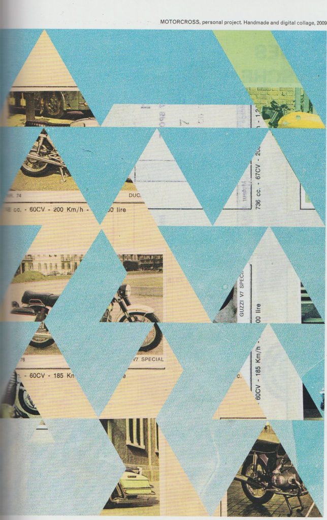
Martens takes images from a variety of sources. For instance, he used images from his father’s scrapbooks in the collage entitled Motocross.

I was drawn to the use of geometric shapes within his work. In Motocross, the background images are obscured from view. As the viewer, we see glimpses of photos and text. These act as visual clues. This ambiguity, I feel makes the work interesting. We can almost piece together our own stories of what is going on behind the triangular shapes in the foreground.

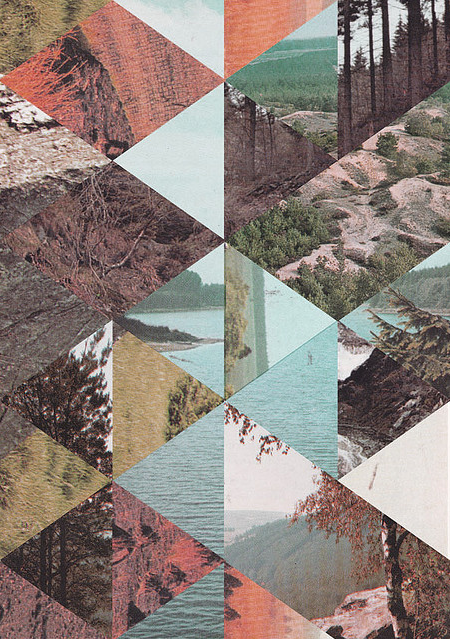
Another of Marten’s methods is to cut up several images into geometric shapes and re-arrange them into new compositions:

Ellery James Roberts

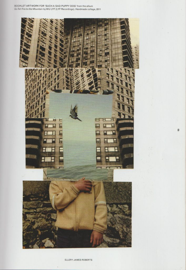
Another contemporary artist I looked at, is Ellery James Roberts. I particularly like his collage Booklet artwork for such sad puppy dog from the album go tell fire to the mountains by Wu life. I like the way he has combined three separate scenes and merged them to create one picture. The boy and the bird are surrounded by geometric, ugly looking grey skyscrapers. But within this environment, the boy finds freedom or sense of peace, symbolised by the third bird in flight at the centre of the collage.

The thing I love about collage is that artists create an image that is readable but at the same time impossible.  Collage allows us to use realistic images and merge them to create something surreal. This piece is arranged into thirds foreground section, midsection, and the backgrounds. This collage looks neat and tidy but also interesting and imaginative.

Damien Tran

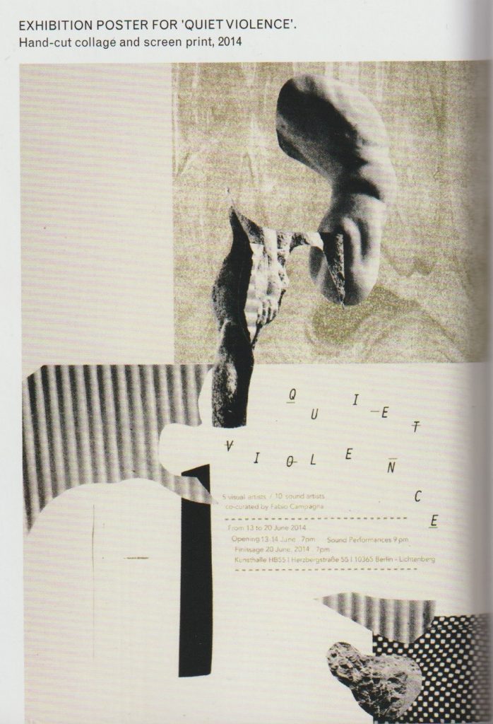
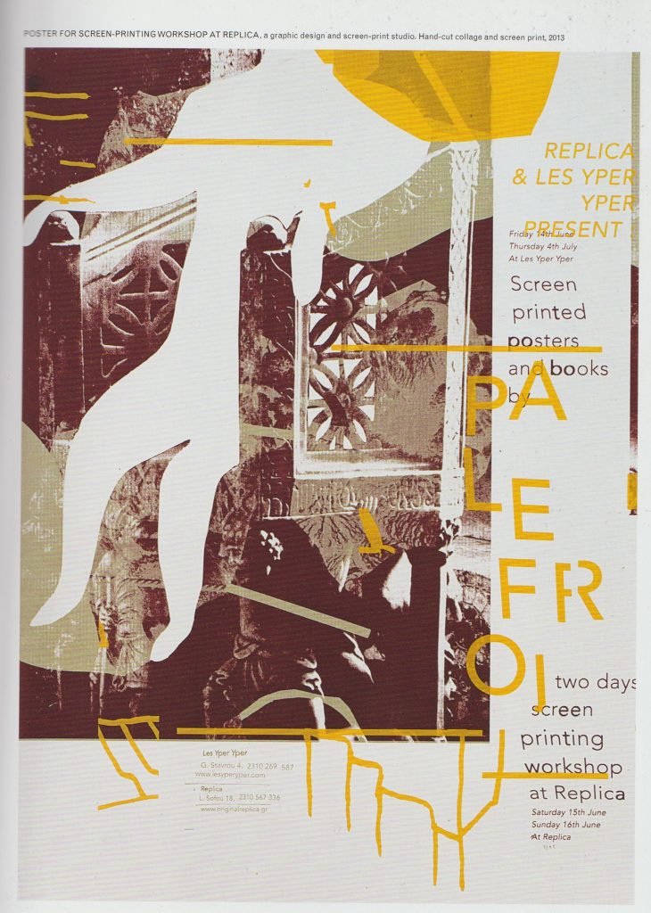
Damien Tran is a designer and printmaker based in Berlin. He combines collage with screen printing in his designs. He uses his own photographs within his work.

Images from Cut That Out by Ryan Doyle

I really like the collage pieces cut from around an image. The shapes are ambiguous and left to interpretation while creating a path for the eye to follow across the piece. I like text in the composition, used as a visual element. His limited use of colour makes his work easy to read and his use of white space is pleasing. In his Exhibition poster for Quiet Violence, there is a clear background and foreground. I like the variety of implied textures. Each collage piece is something abstract, he may have cut one piece out from a magazine, a pattern from somebody’s dress.

John Stezaker

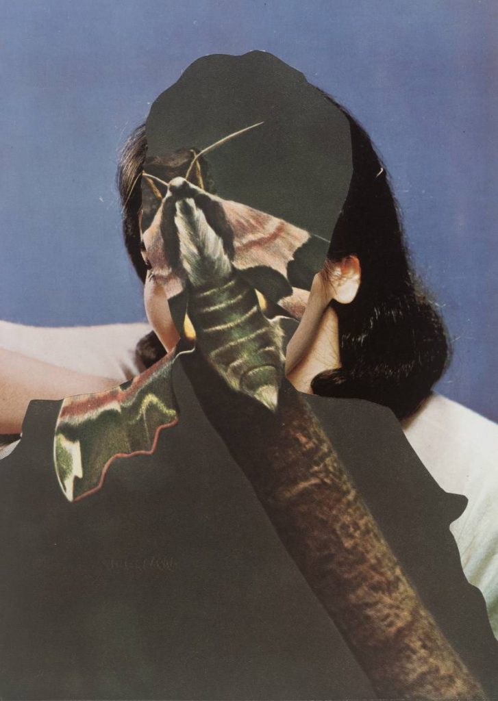
I looked at work by contemporary artist, John Stezaker. He uses old imagery in his collages, such as photos of film stars from a past era. This makes his work look like it was made in the early 20th century. He creates depth by layering collage pieces. Some pieces almost seem like optical illusions, where they can be viewed in several ways. He uses silhouettes and outlines. For example, in the piece Untitled, we see a moth, a woman, and a man simultaneously. By layering them in such a way, he creates a different meaning. Each element, being within each other, combines them together. Characteristics of a moth are within a man, characteristics of both are within a woman. Is this all taking place within the mind of the woman? These compositions lead the viewer to ask questions.

Untitled 1989 John Stezaker born 1949 Purchased 2007 http://www.tate.org.uk/art/work/T12344
Dada
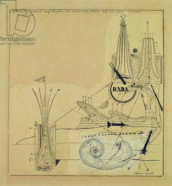
Max Ernst, Rechtzeitig erkannte Angriffsplane, c.1920 (collage, indian ink and pen) (bridgemanimages.com)

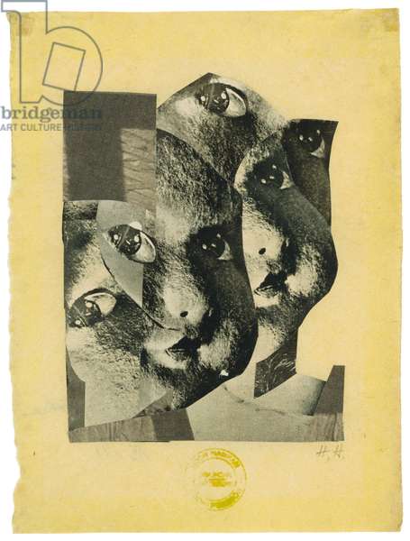
Hannah Höch Broken, 1925 (rotogravure on Japan paper) (bridgemanimages.com)

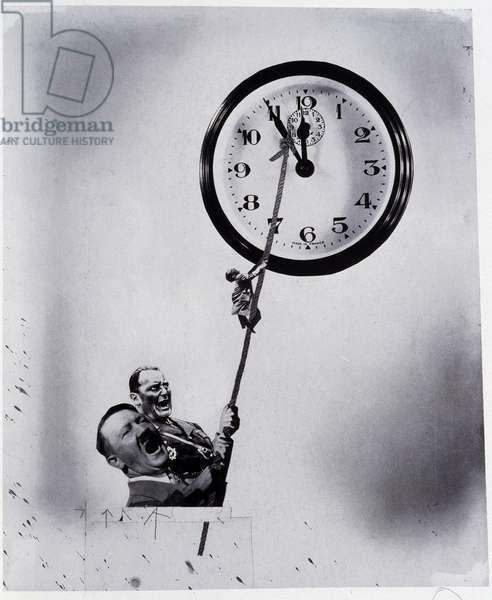
The conditions that gave rise to dadaism were a protest against the war. The Dadaists were the group of artists who revolutionised collage making in their artwork. This was in the time when photographs were just starting to be published in print. Hannah Höch worked for a newspaper company and had access to these images first hand. The movement began in 1920 in Berlin. Three artists present were Max Ernst, John Heartfield and Hannah Höch. The artists had a variety of motives. Some wanted to re-establish a sense of community in the aftermath of the war, some were activists and others wanted to develop their career. They each collaborated on exhibitions and publications. Dada was stage on the way to Surrealism.

Max Ernst combined images from medical books, catalogues for industrial equipment and botanical biological course books. His work invokes a sense of timelessness and a dreamlike quality.

This is different to the photomontage style of John heart field. John Heartfield was interested in getting across a political message within his collages. He was interested in creating a message that could communicate through mass media. His work was used to critique the abuse of power, which he felt passionate about. Both artists were not content to show images of the raw cut and paste style, for example, used by the Dadaist Kurt Schwitters. They used fragments of collage to create whole looking images, which are neat and believable. Ernst was interested in the world of the psyche, Heartfield, the political environment around him, and Hannah Höch liked to overlay elements of both within her work.

Höch used images from mass media, transforming them into images that conveyed personal meanings. She explored issues of gender roles, such as the image of the “new woman”. (This image created an expectation of women and was directly linked to consumerism and social agendas.)

I like Hannah Höch’s use of repetition and re-assemblage in this piece. By repeating elements of the baby doll face, she creates a visual rhythm across the picture that is almost pattern like. The shapes are flowing and organic each face or fragments moves into the next.

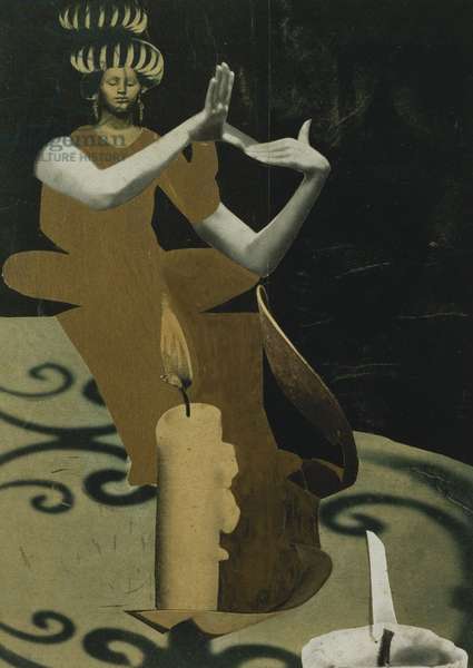
She has taken images from a variety of sources and piece them together into this figure of the priestess. She has played with scale, placing an ordinary candle side beside the figure of the women. This has dwarfed the women or enlarged the candle by its relative scale. This gives a playful feeling. The use of shadows and lights are what make this image convincing. We have a light source, and we have shadows, therefore it is believable. I like the abstract and flat form of the woman’s dress. It contrasts with the realistically formed arms.

Priestess; Priesterin, c.1930-1934 (collage with gold and wash heightening laid down on card) (bridgemanimages.com)

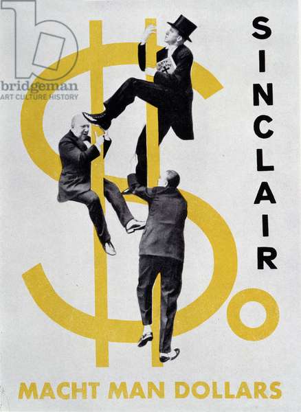
Heartfield has used something similar within his collage, where he combines a 2D dollar sign with realistically formed figures. The result is surprising and amusing.