Most days I will do something in my sketchbook. I’m using an A4 ring-bound book from Amazon and I would rate it average-good. It isn’t the best for wet/heavier work, but felt-tips won’t bleed through which is a plus. It meets my current needs but I wouldn’t stick with it forever. I used to draw solely from life, a habit I was taught at college. While I see the benefits of this, it isn’t always practical. Therefore, I’ve been trying new ways.
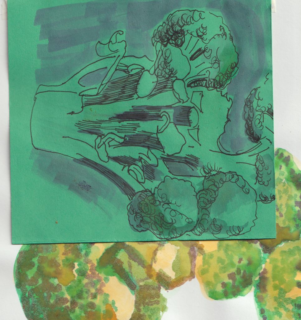
First of all, I will show you some sketching I did do from life. A still-life to be specific.
A broccoli.
One I had already cut-up for lunch and had parts left-over.
(An incomplete broccoli.)
Ink & drawing
Layer 1:
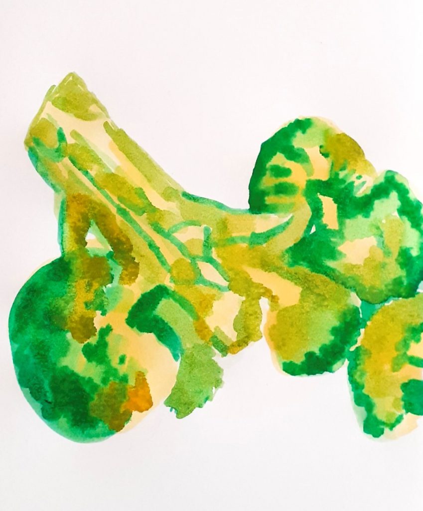
Using the wet-on-wet technique to achieve the splotchy effect. Being in-experienced with inks, I went in boldly!
Layer 2:
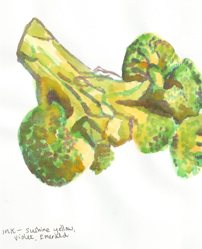
It is possible to see the separate colours I used, as I didn’t blend everywhere. This makes the painting punchy and bright, but is not how I would have approached the study, had I been using watercolours. I began to pre-mix colours in the palette wells half way through the painting.
I like the mixture of opacity throughout the layers.
Acrylic painting
Painting from photographs 1
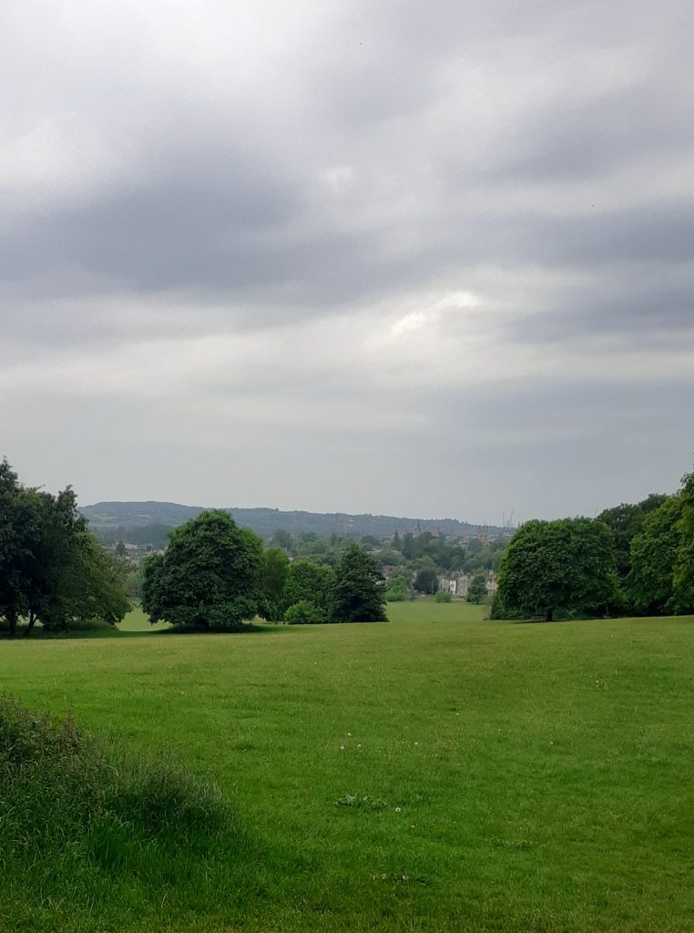
I took this photo on my phone, while walking through South Park. On my way to yoga class, for some reason I had decided to walk instead of taking the bus. I had just walked up the hill and enjoying my favourite view in Oxford. It was the start of a warm day and the start of June. This was at about 10am, before the clouds lifted. It looks moody but didn’t feel moody to me. Of course I wanted to paint it!
I don’t remember the last time I painted with acrylics, so I wanted to get back into it. I wanted to capture the mood rather than details. I began with this purple layer to establish the tones. (deep red and ultramarine from the cheap acrylic set I found under my bed).
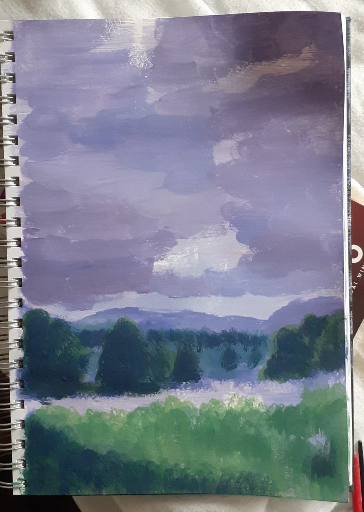
I honestly felt like I didn’t know what I was doing. Just making it up as I go along, I added the shady areas.
As much as I love the view of the spires in the distance, I didn’t add them to this painting. The painting became a thing of its own and not very Oxford at all! The hills became mountains instead. I dotted some flowers in the grass using the end of the paintbrush.
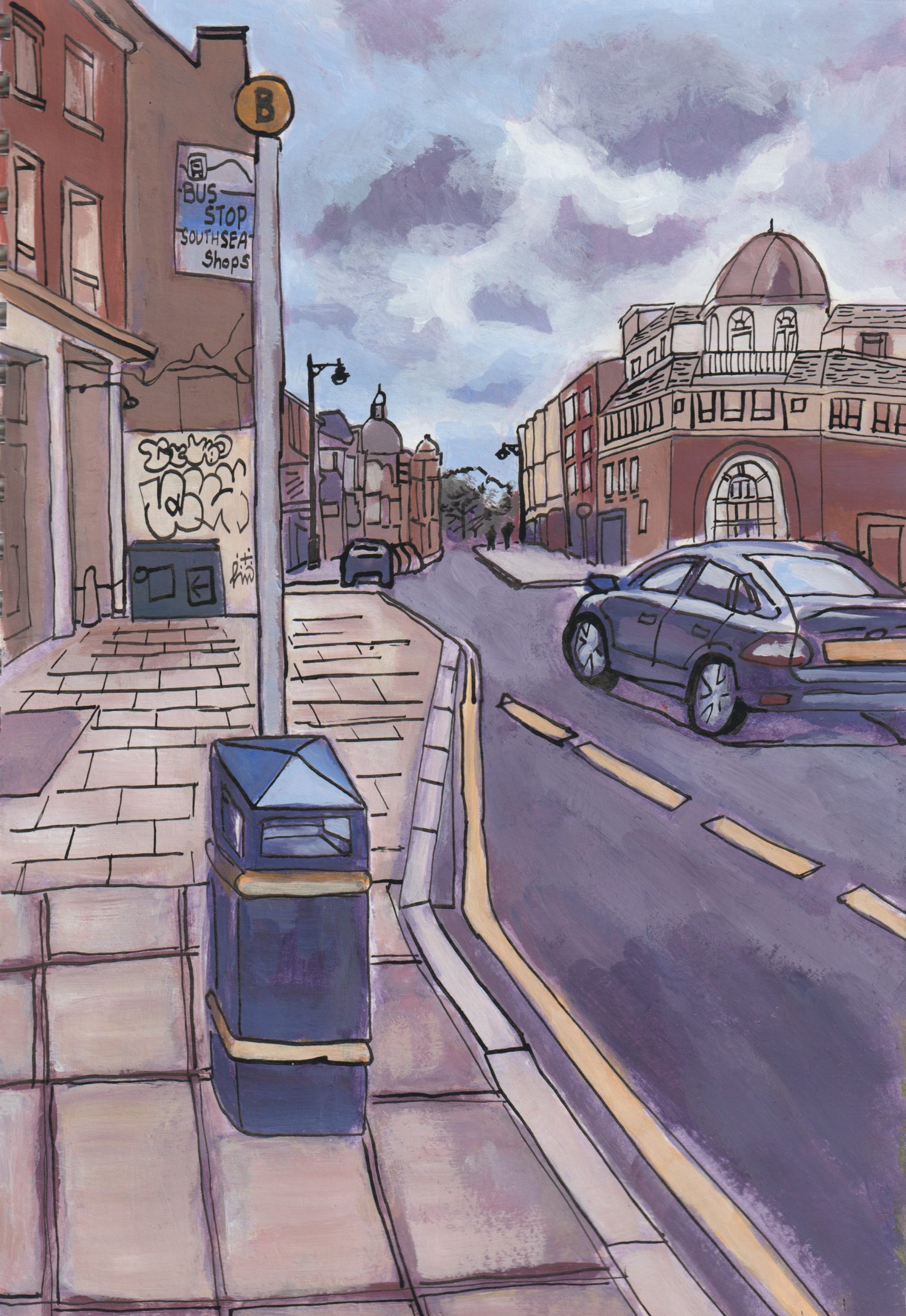
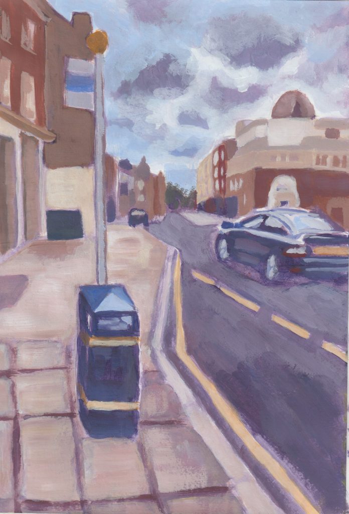
Painting from photographs 2
Again, I wanted to do things my way. I wouldn’t be representing the street perfectly, but I don’t feel the need to.
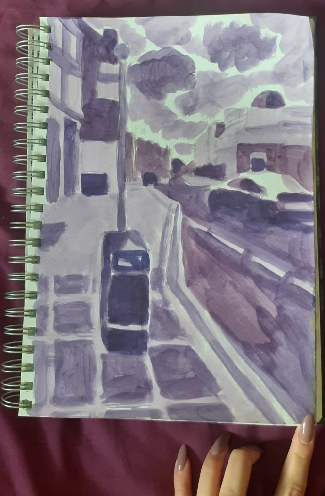
This time, the reference photo was one I had taken last month in Portsmouth. I again chose purple for the first layer because this colour suits the overall theme I was going for. I wouldn’t always choose purple, if I felt a different colour was more appropriate for the mood.
(check out the purple nails and bed sheet, I couldn’t help including here and no it’s not my favourite colour actually!)
A bit more progress…

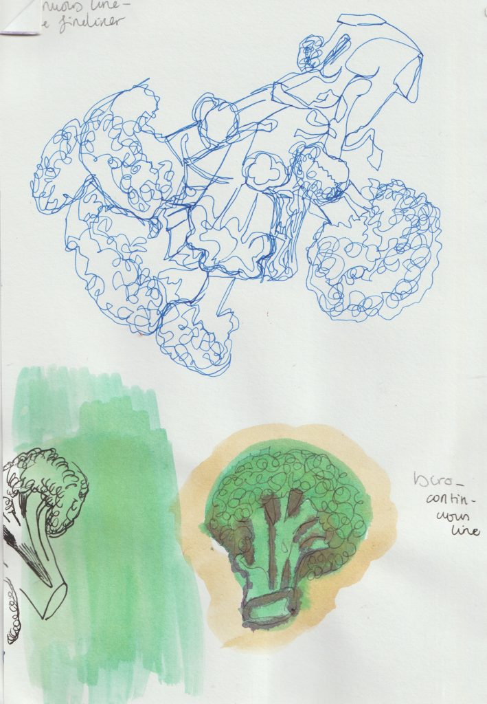
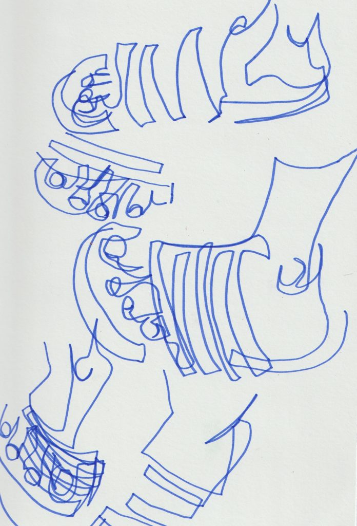
Painting from photographs 3
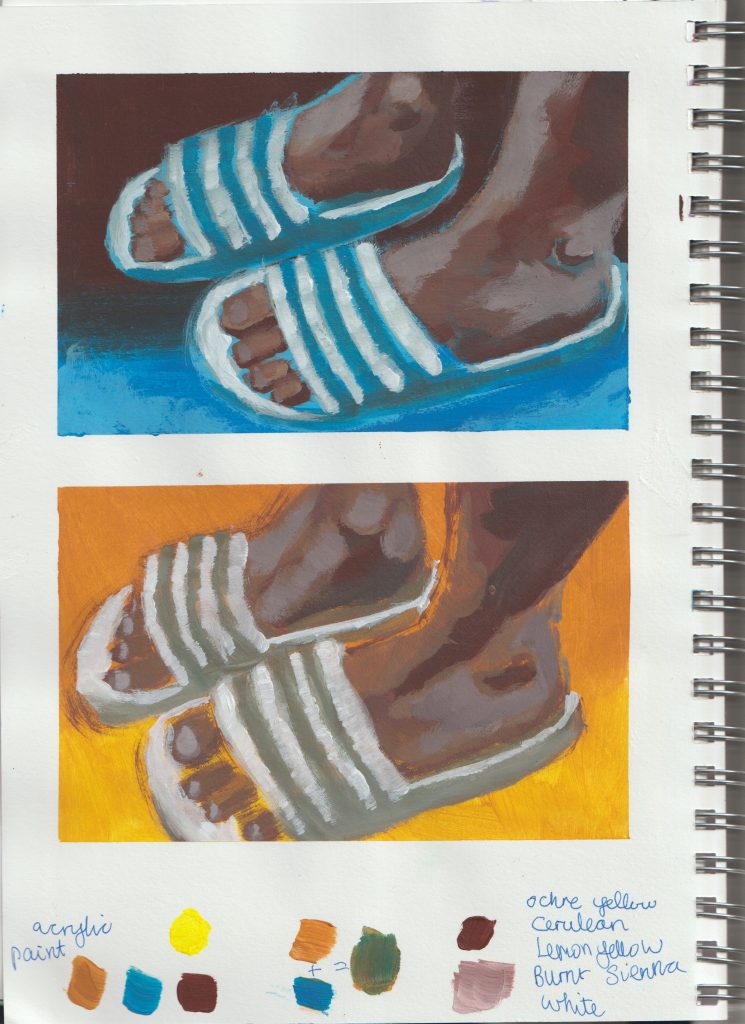
This time, I needed to paint my sliders. A recent purchase I don’t regret!
I worked from a reference photo of me wearing the shoes, purely because I wanted this angle.
I began by drawing them with a felt-pen and using the continuous, blind line drawing technique. If you don’t know what that is, it’s where I avoid lifting the pen off the paper and don’t look at the paper in the process of drawing. It gives the work a fun style and helps my hand/ eye to loosen up:
I used washi tape for this painting. I have never used washi tape and wanted to try it out after watching a video by Minnie Small, who swears by it. (Minnie Small is an amazing illustrator who I’ve followed on social media for years, check out her work if you’re curious)
I mainly wanted to play with colour for this study. I therefore taped off 2 small areas of my sketchbook page, so I could try 2 different ‘themes’.
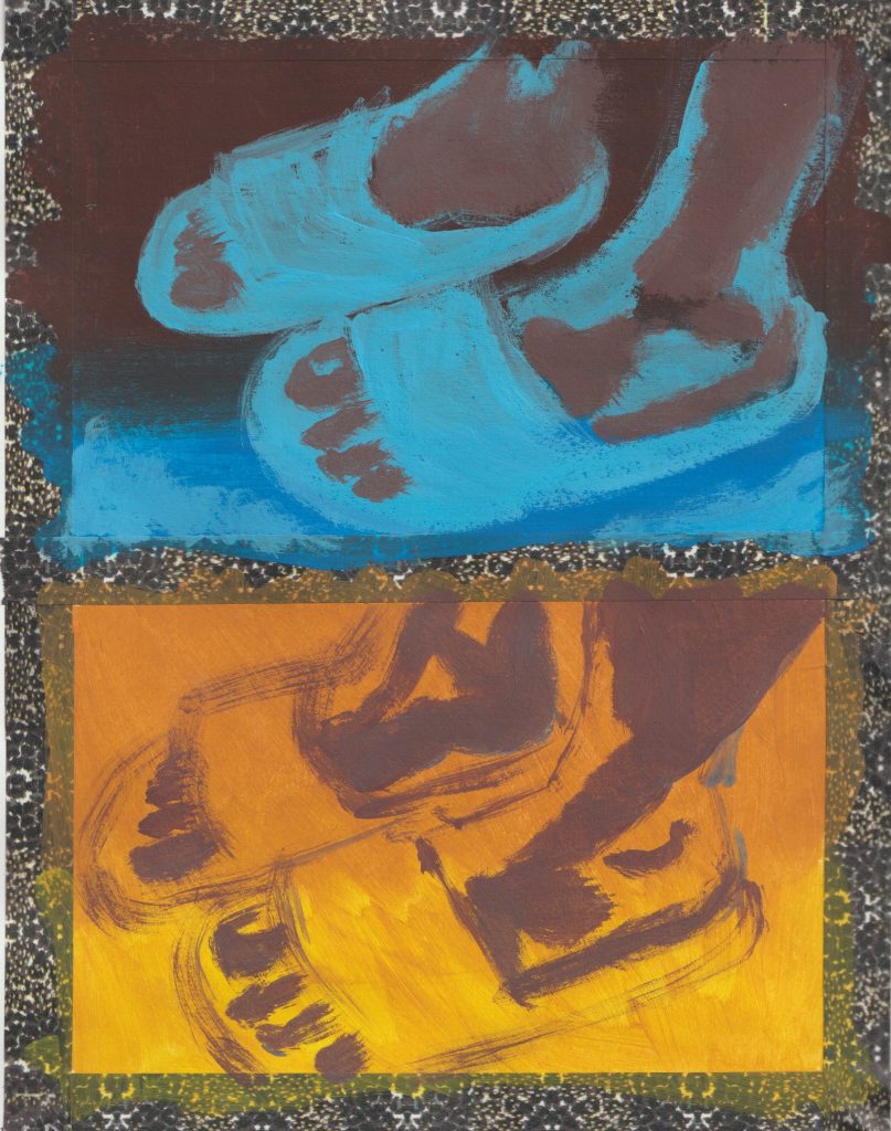
I used a square brush (is there a proper name for these square ended brushes?)
I worked loosely and had fun with it instead of being precise/neat.
Of course, the best bit is removing the tape, which only tore the paper a bit. (There’s a few reasons why this could be: good standard washi tape, weak paper, not sticking it to a surface before applying it to the paper, maybe I pulled it off to fast, maybe it was the weather?)