The last time I tried my hand at lino-printing, I was working on the FMP (final major project) of my Art & Design diploma. That was in summer 2021. One year later, I’m returning to lino. I missed the carving sensation and the satisfaction of building a work methodically- Something I only learnt to appreciate after working on screen-printing at Oxford Brookes.
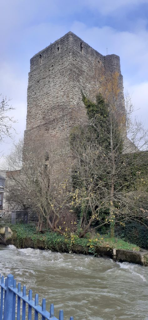
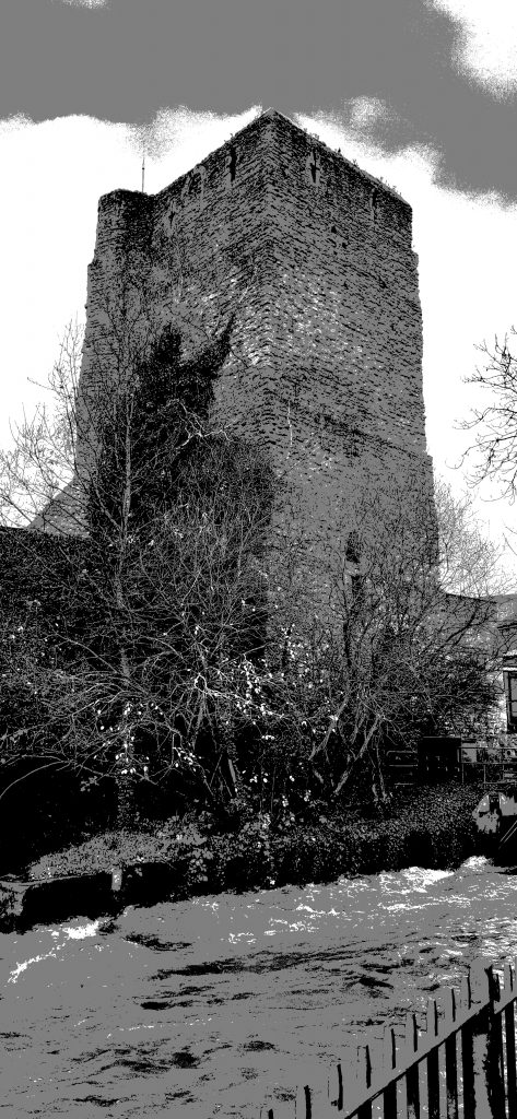
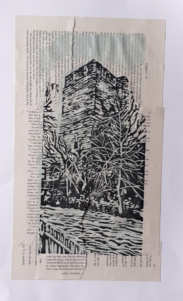
First I needed a subject. This wasn’t hard, I’ve had my mind on buildings recently. I found this photo I took of Oxford castle (below). I Like the variety of elements: soft sky, crumbling brick castle, rushing river.
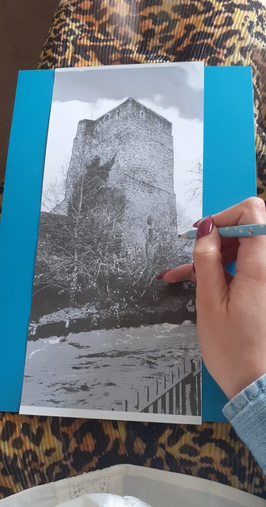
I reversed the image and posterised it using photoshop. Posterising the photo allowed me to view separate layers. Reversing it meant the print would end up the correct way around:
Then I got to work:
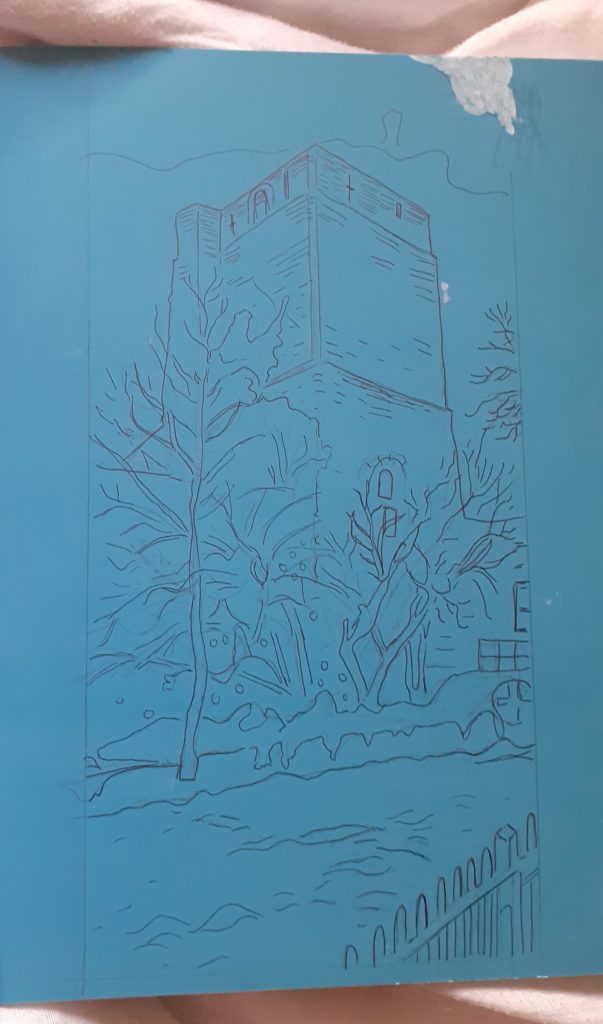
I chose the reduction technique to allow me to print more than one colour. I first carved the areas I wanted to stay white.
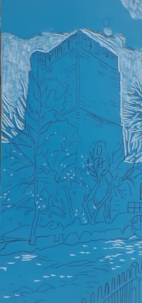
I then remembered to wash the lino with washing up liquid before printing with it.
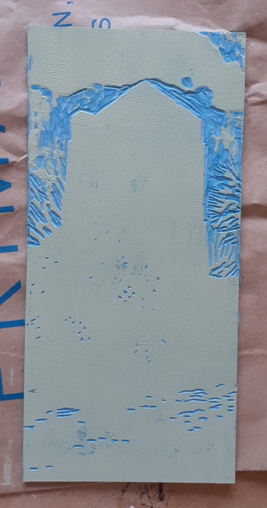
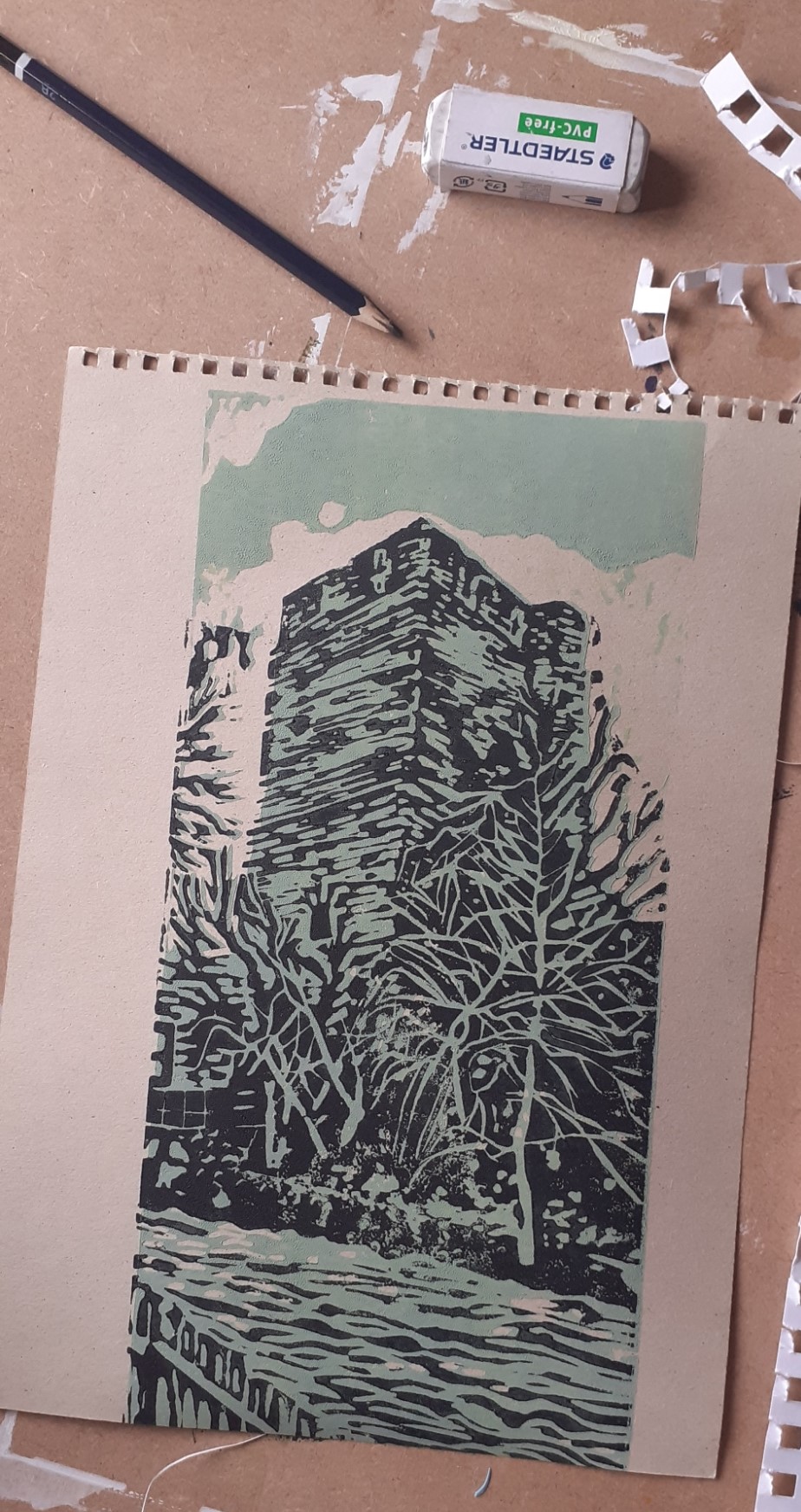
I mixed a cold-toned green for the castle and river. I kept the colour paler at this stage. I am using water-based block printing inks.
My first print. I can see I did not apply enough ink to the printing plate.
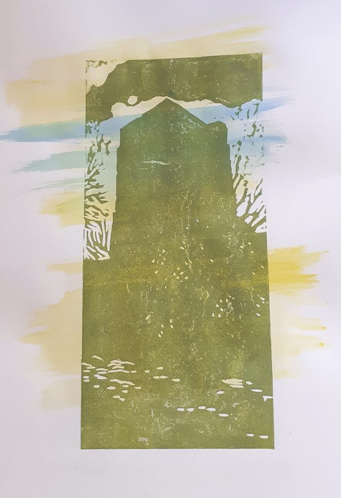
I left the first layers to dry for about 12 hours before printing the second layer.
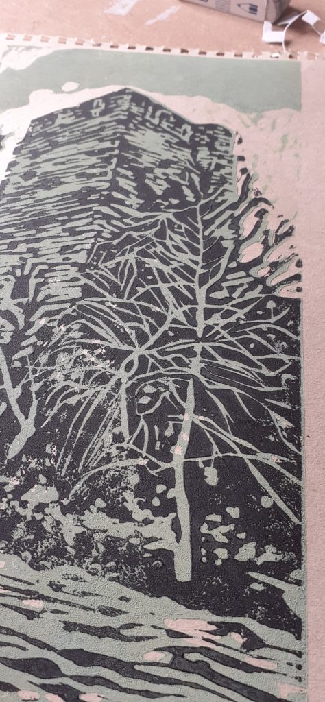
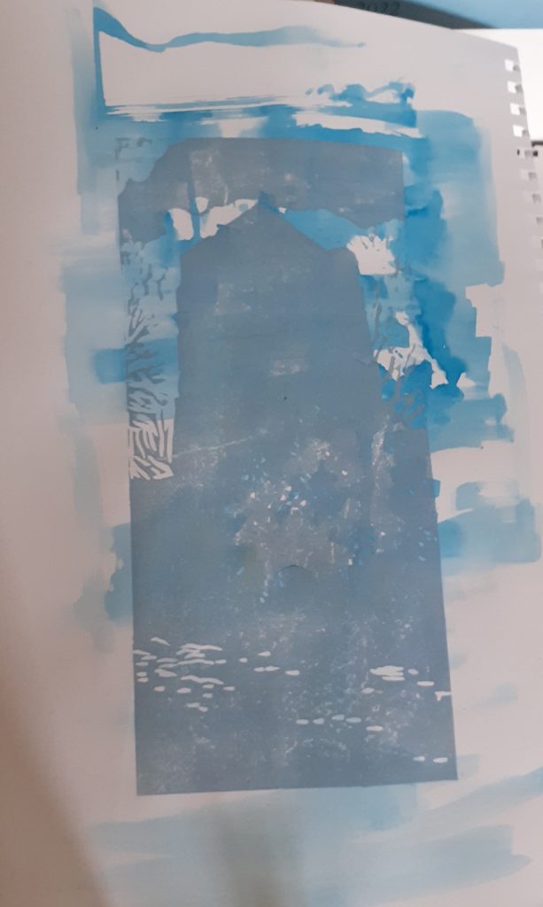
(below) I did not align the 2 layers accurately.
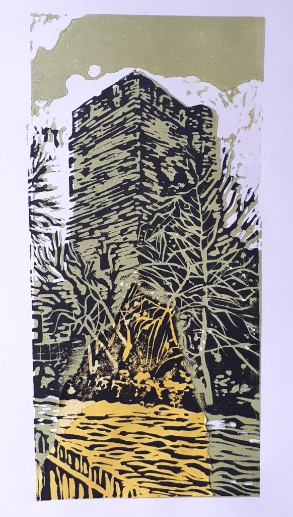
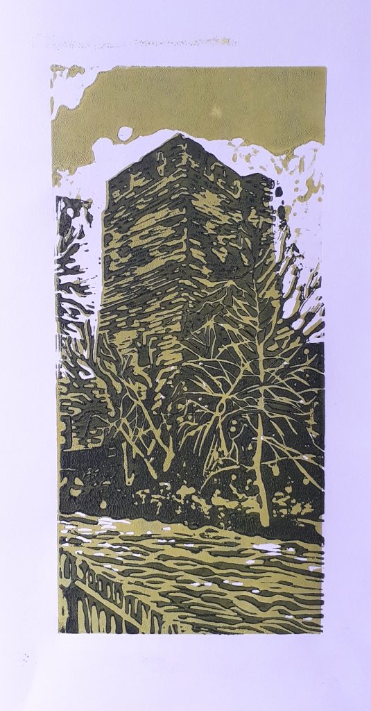
I mixed green into the ink for the darker layer, instead of the plain black used in other prints. I still wasn’t getting the alignment spot-on, and I could see the paper was shifting as I laid it down.
Applying less pressure onto the roller helped when transferring the ink from the plate to the lino.
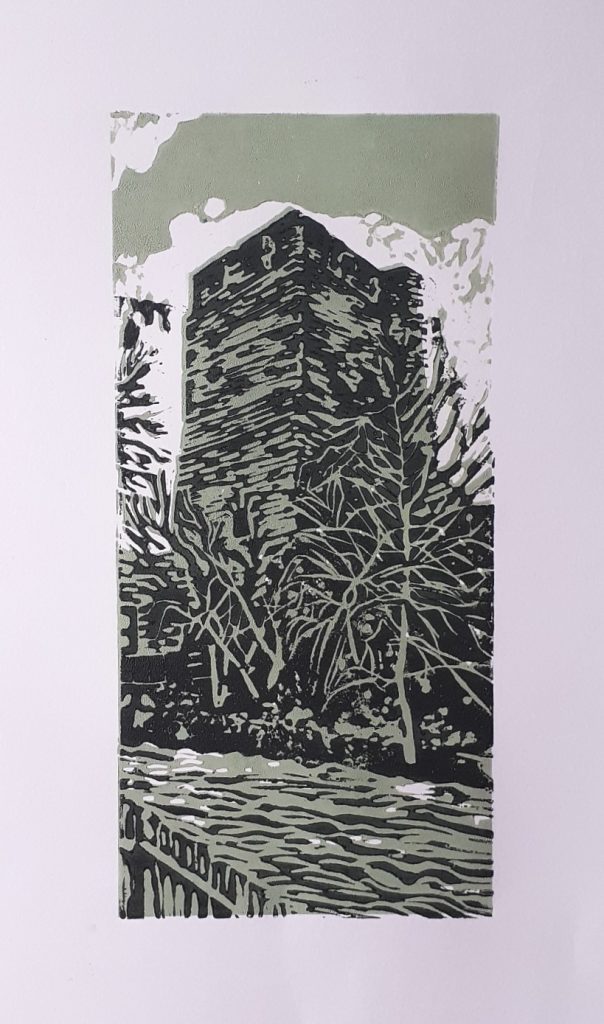
What worked and what didn’t?
- I need more practice/ a different method for aligning the paper.
- The colours expressed something earthly which I liked.
- The cartridge paper worked well.
- I don’t like the brick texture on the tower, I wasn’t careful enough with my mark-making.
- The watercolour background worked well.
- I could have glued the collage background a bit more carefully.
- I could work on simplifying/ improvising the design instead of including every detail from the photo.
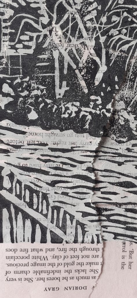
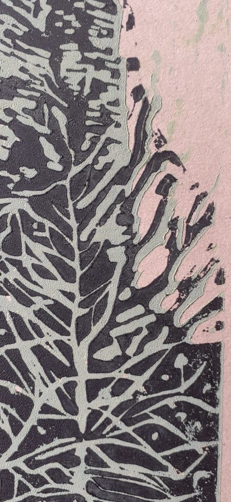
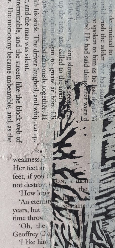
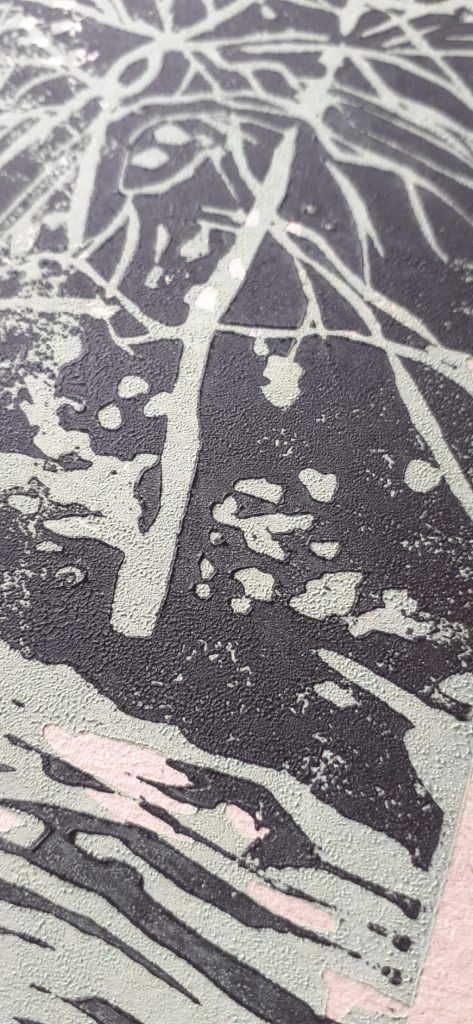
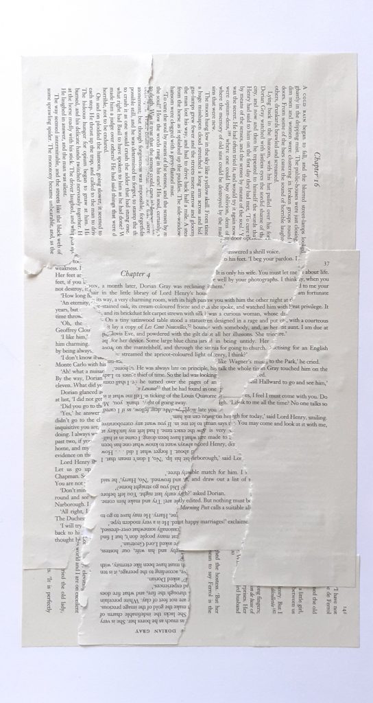
Some details from the novel-background print: