Maga-zine
Fan-zine
Zines have:
A DIY approach, cut and paste style, a chaotic design, hand lettering or computer generated lettering, like-minded fans.
Zines are:
self-made, independent, Immediate and informal, Very low cost, can be made collaboratively, Not slick like magazines, Outside the mainstream, anti establishment., usually Responding to a theme.
Zinesters are:
People who make zines, less concerned about spelling, grammar, punctuation.
An artist can share their work by replicating it.
You can break the rules.
https://muse.jhu.edu/article/378076/pdf
History of Fanzines
The first zines were science fiction based. They were called fanzines, first named this by Louis Russell Chauvenet, as they were made by the fans of science fiction. They allowed fans to communicate about subjects that the mainstream was not interested in. They were first printed in the 1930’s, there were no photocopiers back then but they had other means of copying the pages.
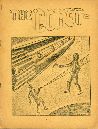
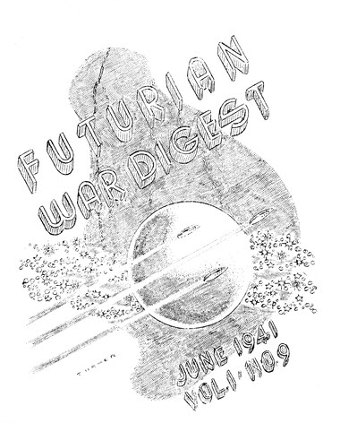
They contained poems, letters from fans, fan drawings and quirky stories. Some were based around Star Trek, which was popular at the time. The Comet was the first ever zine in the USA and Futurian was the first UK zine.
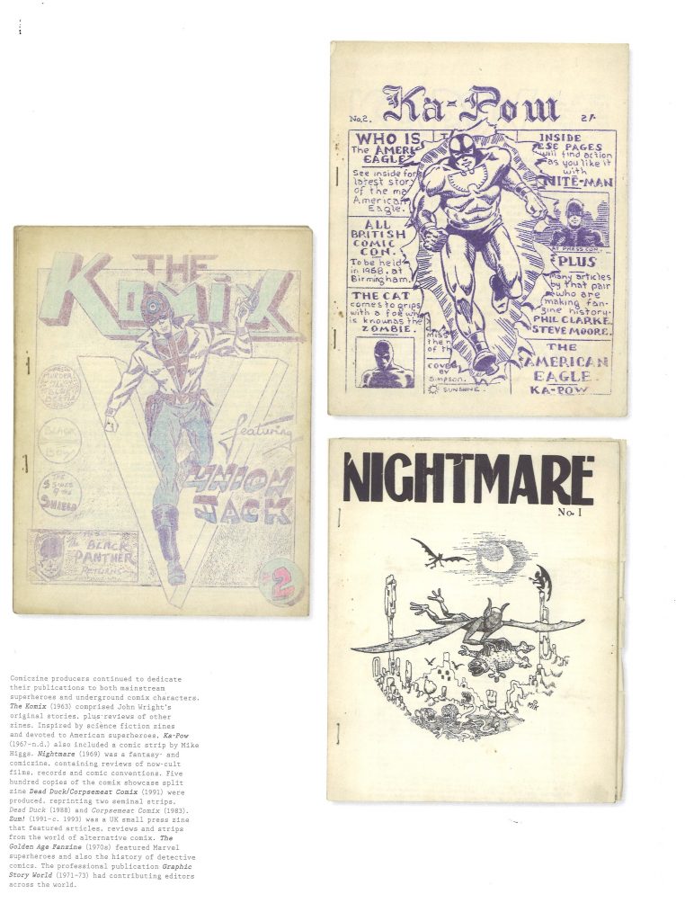
Next came the comic book zines:
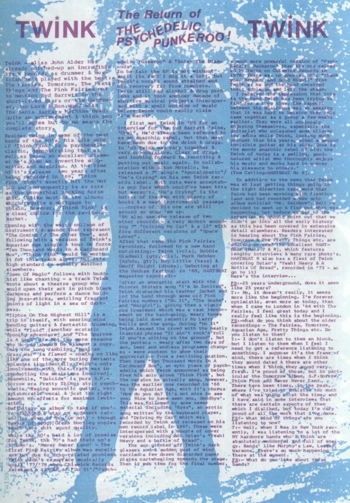
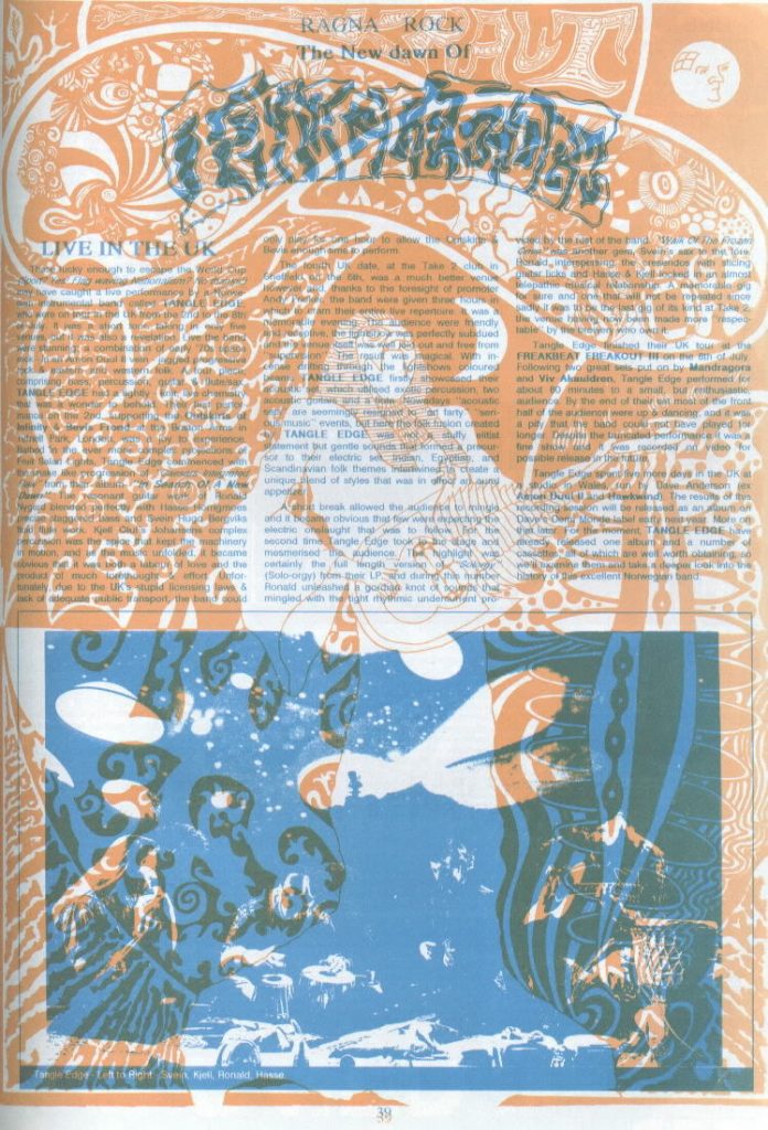
Music zines
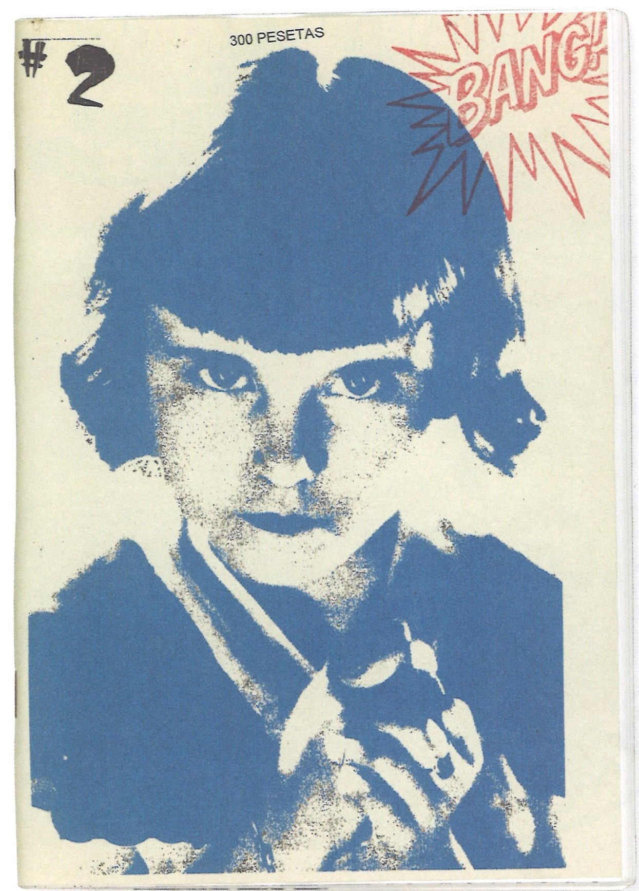
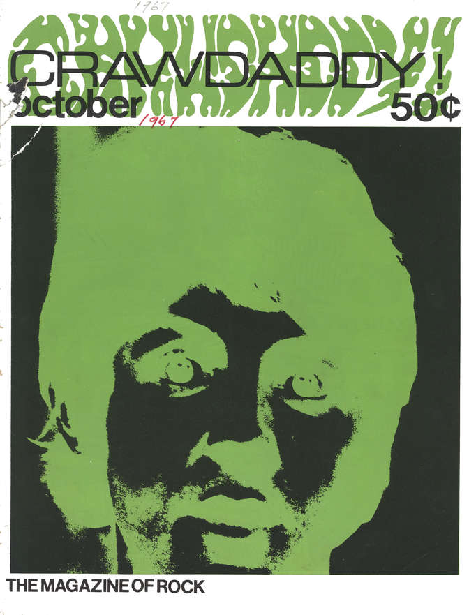
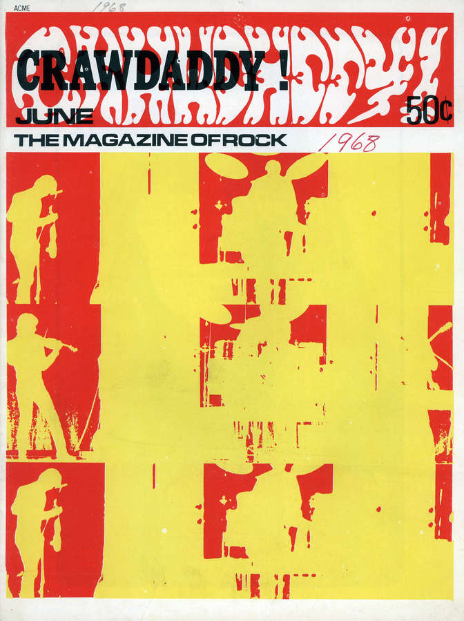
In the 1960’s, music zines emerged. These were mainly around rock and pop music of the time. They featured Elvis Presley, Bob Dylan, The Beatles, The Rolling Stones, The Doors. They used cut out photography and photocopiers. Music fans would cut out articles about their favourite bands from newspaper and collect them together into these zines. Crawdaddy! was an American zine and the most popular music zine of the time.
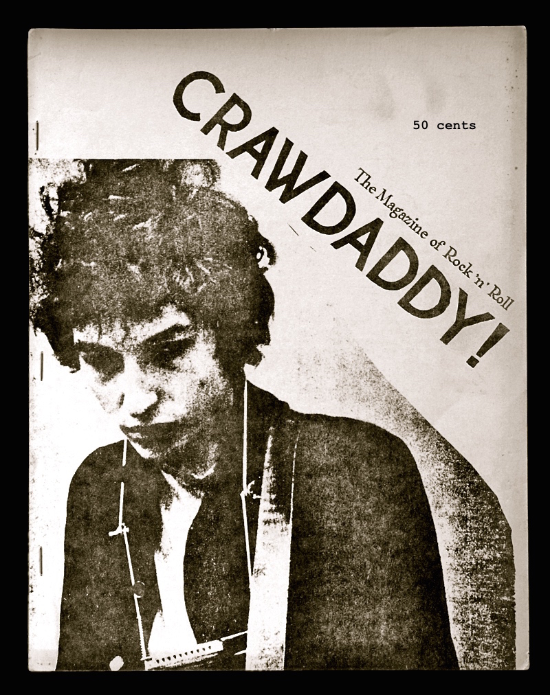
This article is from earlier this year (2021) and celebrates 55 years since the start of Crawdaddy!
1966-1978. A true legend among rock mags, the New York City-based Crawdaddy!‘s first 14 issues were printed on an old mimeograph machine. Crawdaddy! differed from other magazines of its era in that it took rock ‘n’ roll very seriously. In its first few years, it tended to focus on politics and the radical views of the time. Each issue contained a number of music articles and interviews, as well as many ads for new albums.
https://www.afka.net/Mags/Crawdaddy.htm
These are my favourite Crawdaddy! front covers. They are bold and inventive. I like the limited use of colour and flat texture:
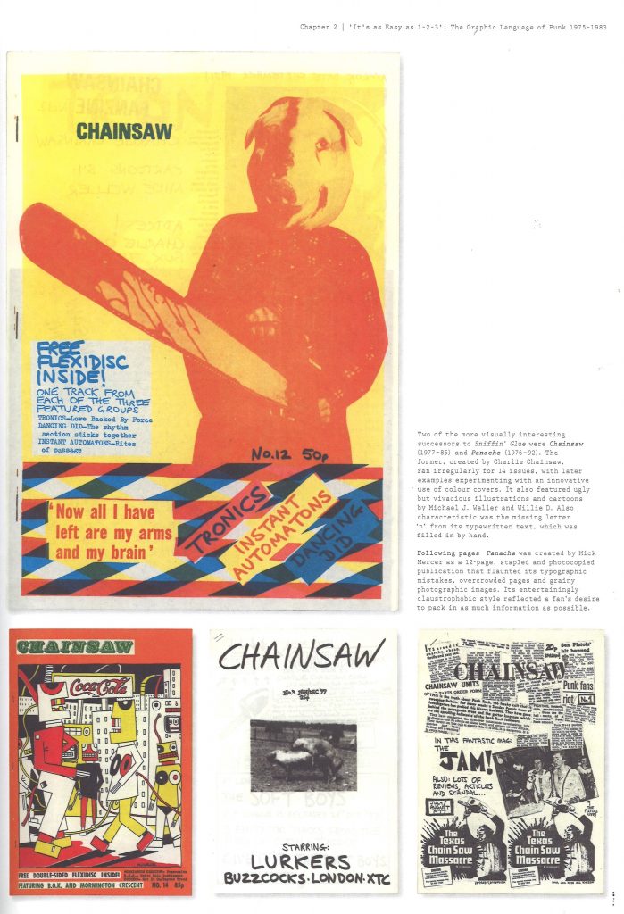
Punk zines
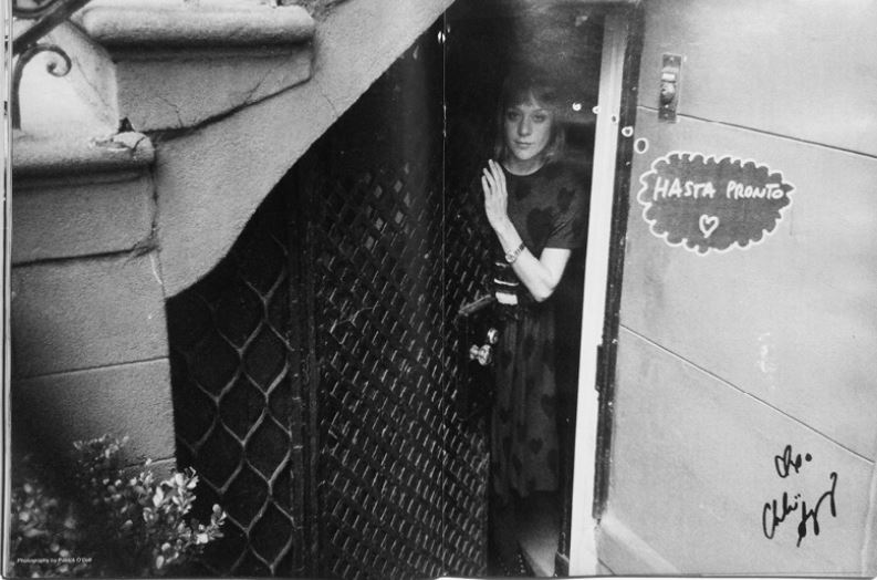
In the punk era Sniffin’ Glue was one of the most popular punk zines. Punk started in the 70s and carried on until late 80s. Punks were anti-establishment. Starting in Britain’s economic depression, people were angry and against the politics of that era.
They embraced any sort of anarchy. The way they were dressing and thinking about politics connected them. They generated the graphic language of resistance, rejecting what was mainstream.
“Fanzines embraced punk’s do-it-yourself attitude. As one member of the punk community reflected, ‘our fanzines were always clumsy, unprofessional, ungrammatical, where design was due to inadequacy rather than risk.'”
Fanzines by Teal Trigg
With the layout there was no rules, it was chaotic and they experimented. Each zine looked different from each other. Some used felt-tip hand writing. Every zine has its own identity but all shared the same approach/ attitude.
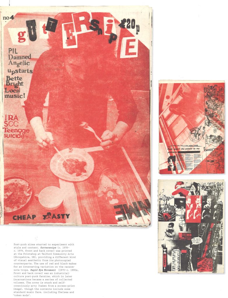
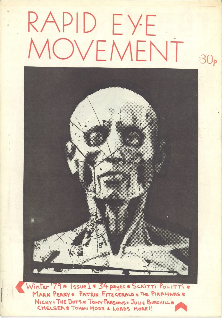
Post-Punk zines
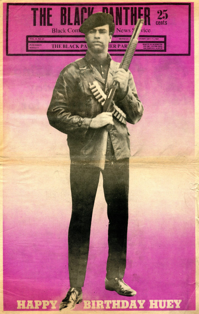
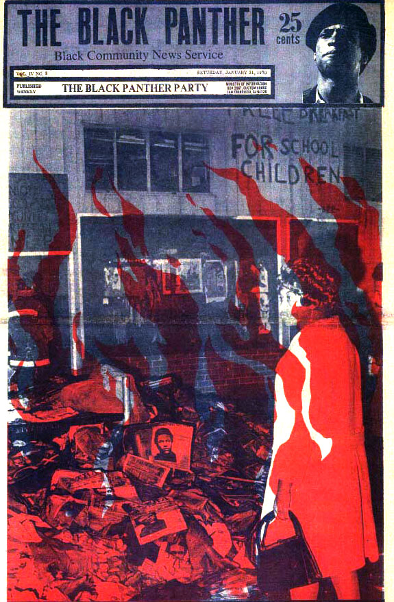
The Black Panther movement
Working for the rights and freedom of black people in America. To fight for justice, access to decent housing, better education and to fight against police brutality, free meals for children. The Black Panthers education people about their legal rights.
The weekly newsletter Black Panther was printed from 1967-1980. It was a way for the movement to spread their message and unite people across the country.
http://www.robertnewman.com/black-history-newspaper-the-black-panther/
Special notice must be paid to Douglas’s amazing facility to combine black plus one spot color on each cover to rich, diverse effect.
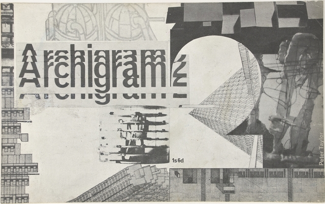
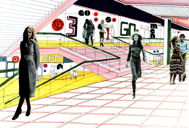
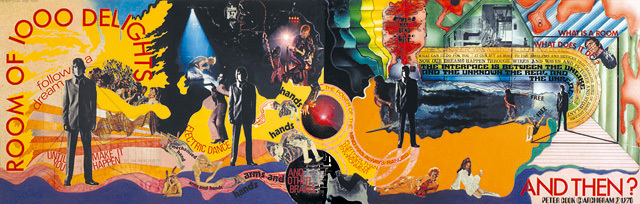
Archigram
Archigram was a Group of architects in the UK. The zine opened architecture to popular culture. They had a utopian way of designing buildings. The group were critical of modernism. They were Inspired by comic books and science fiction books of the time.
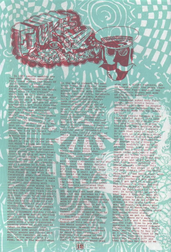
Freakbeat
Psychedelic and garage rock zine from the 1980’s. Introducing colours and a lot of patterns.
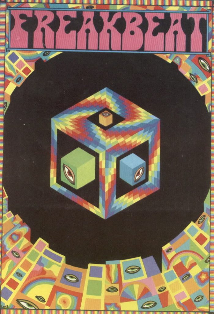
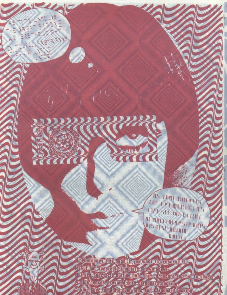
‘Freakbeat was not published in any regular intervals of time.
In the layout there was a generous use of Op-Art and psychedelic patterns, which is great, but it can also be annoying , as it makes reading quite difficult.’
words and images from:
http://dandyinaspic.blogspot.com/2012/11/the-new-psychedelics-pt-4-freakbeat.html
Contemporary Zines
Contemporary fanzines have re-emerged since the 1990s. The craft tradition re-emerged in this time and zines along with it. The world saw a re-fashioning of crafts. In the 21st century, people seek an escape from the digital world. I believe people will always want something that can be held and experienced ‘in the flesh.’
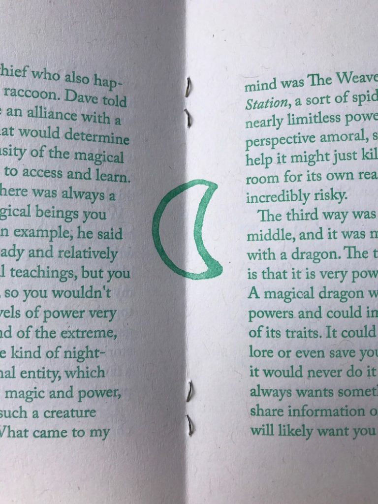
Ker-bloom!
Ker-bloom! is a contemporary zine created by graphic designer Artnoose. Their method is time-consuming, as they use a letter press and lino printing for their zines.
Artnoose began letterpress printing the zine Ker-bloom! in the summer of 1996 and has been making it every other month since then, never late, never missing one.
https://www.etsy.com/uk/people/artnoose
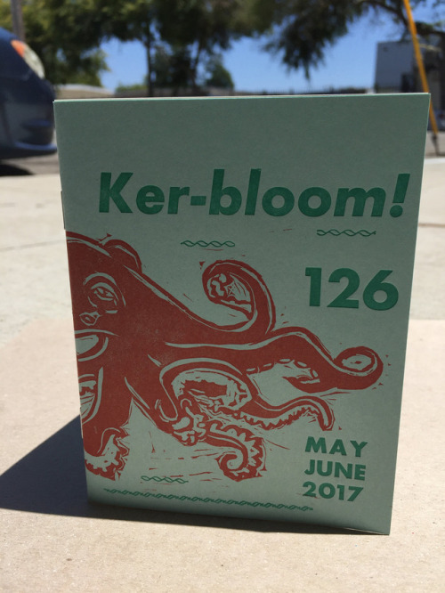
‘Issue number 126 of the letterpress zine Ker-bloom features a Giant Pacific Octopus linoblock on the front cover. It’s about the octopus, but it’s really about parenting and how exhausting it can be.’
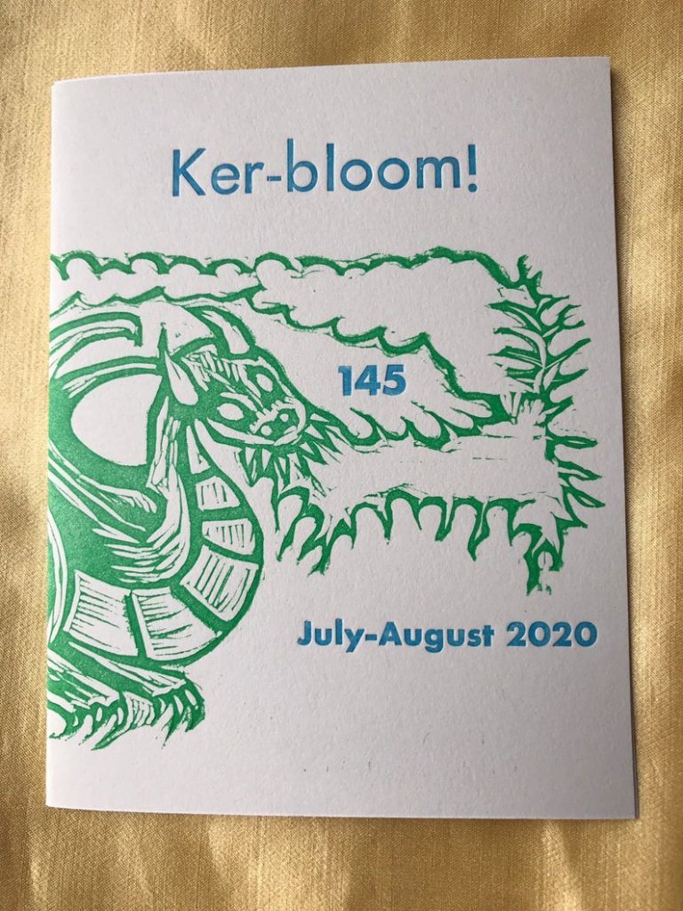
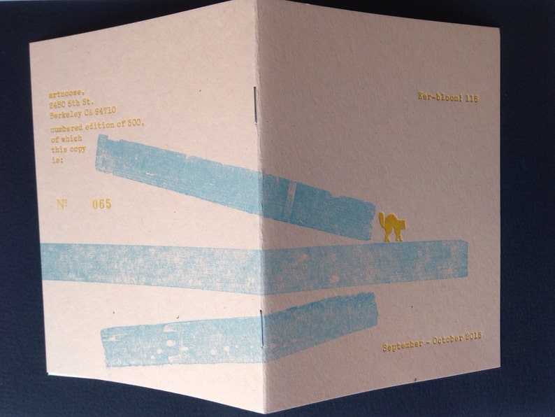
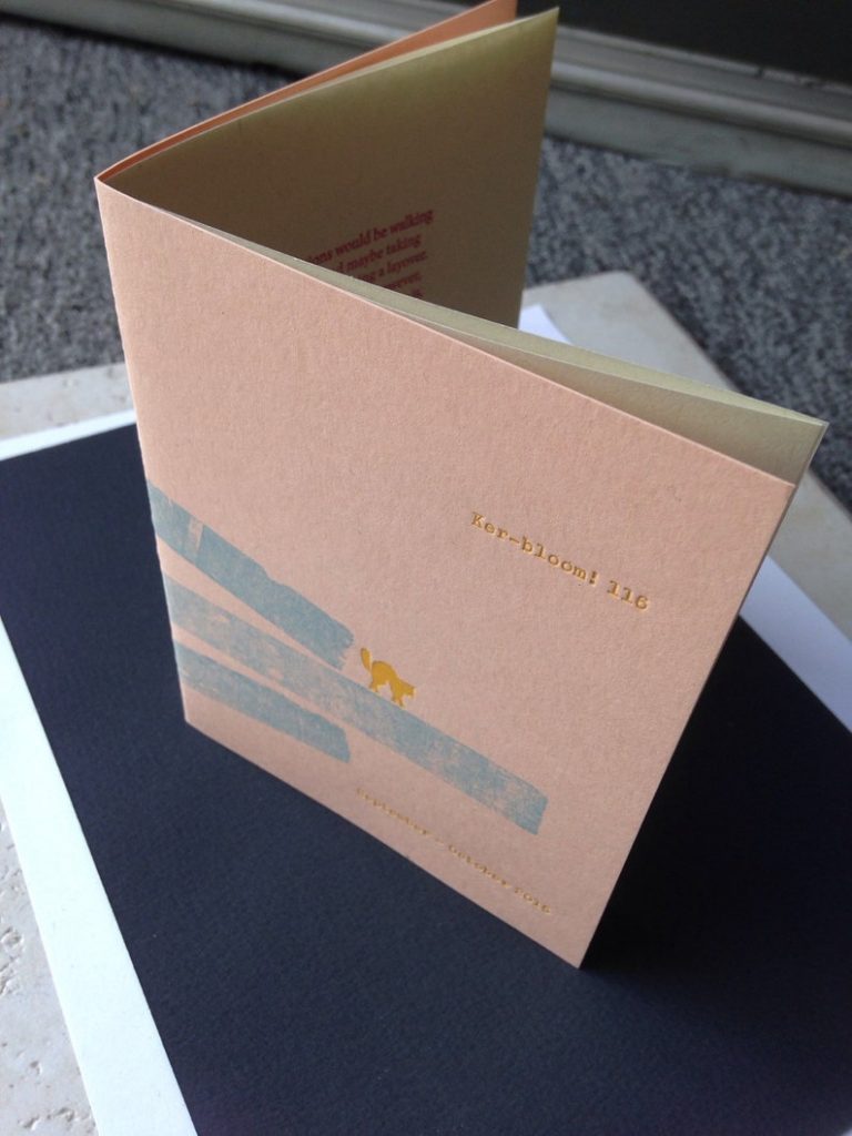
They have used a different type of paper for the cover than for the pages inside. 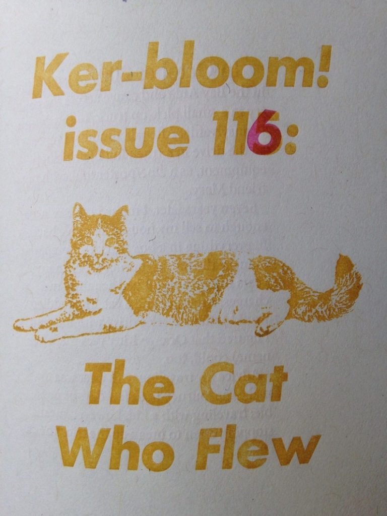
Buffalo
Buffalo is a fashion (non-fashion) zine. They use images from archives, re-purposing images from the past. The zine explores ways of seeing fashion and beauty.
Images from Issue #2 at https://buffalozine.com/no2/
Hato Press Zine Series
‘Café Deco Frieze by Artists Harry Darby & Anna Hodgson is the ninth zine in the Hato Press zine series.’ https://hato.store/collections/zines/products/no-9-cafe-deco-frieze-by-harry-darby-ana-hodgson
I really like the combination of photography with illustrations. Text is placed subtly on these pages:
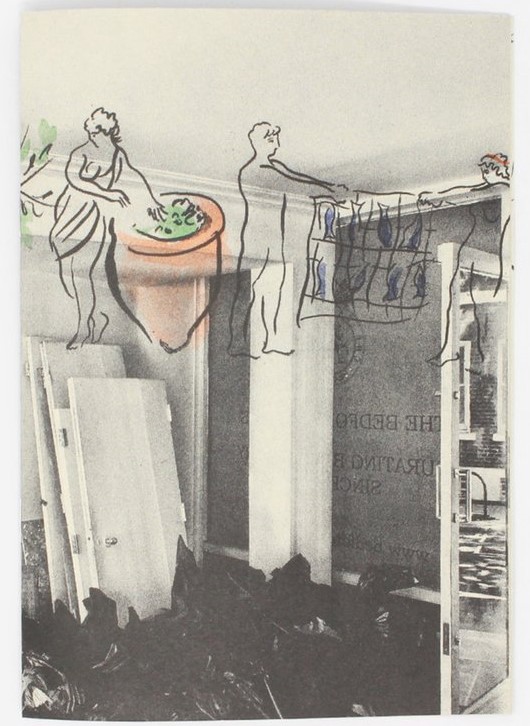
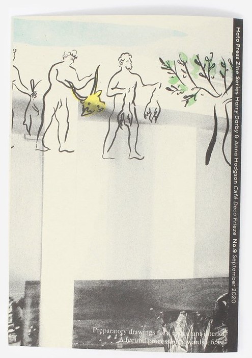
‘Based on paintings for a frieze in a restaurant interior located in Bloomsbury, this zine draws on Virgil’s The Georgics, a romantic poem about agriculture. With a playful approach and paying particular homage to Elisabeth Frinks illustrations of The Illiad for colour inspiration, the zine conveys Harry & Anna’s connection with the poem and restaurant space.
Published by Hato Press, London
Printed on Evercopy 80gsm
Pages: 16
Dimensions: 14 cm x 20 cm
Format: Softcover / Saddle stitch binding’
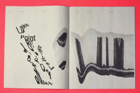
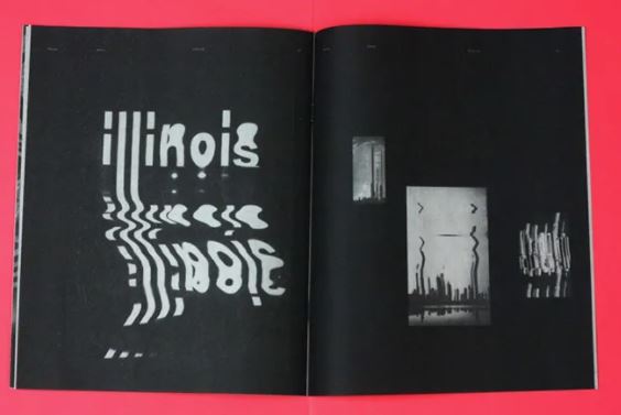
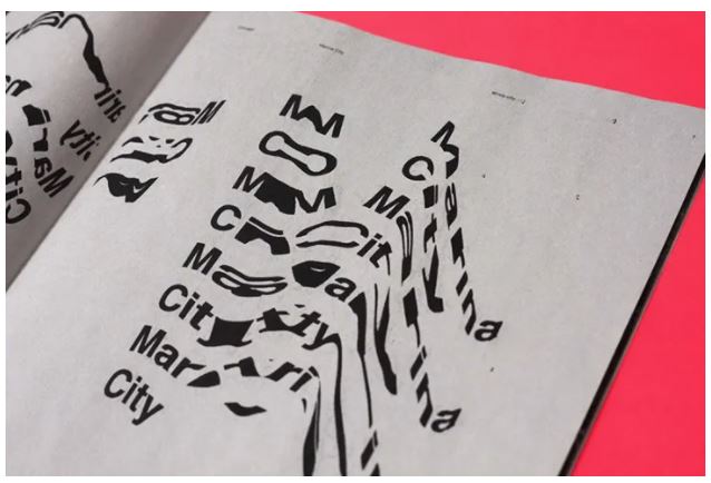
Sofia Clausse
‘Argentina-born, UK and US-educated, Portugal-based Sofia Clausse makes work as colourful and varied as her nomadic life, as her bright, bold website shows. But unusually for us, it wasn’t the vibrantly-hued projects that most impressed us, but a seemingly unassuming monochrome zine. Entitled The Windy City Zine, Sofia’s creation is an ode to her time spent in Chicago. “The distortion of the building windows and the Cloud Gate sculpture served as inspiration for the warped images and type,” Sofia explains.’