Image making

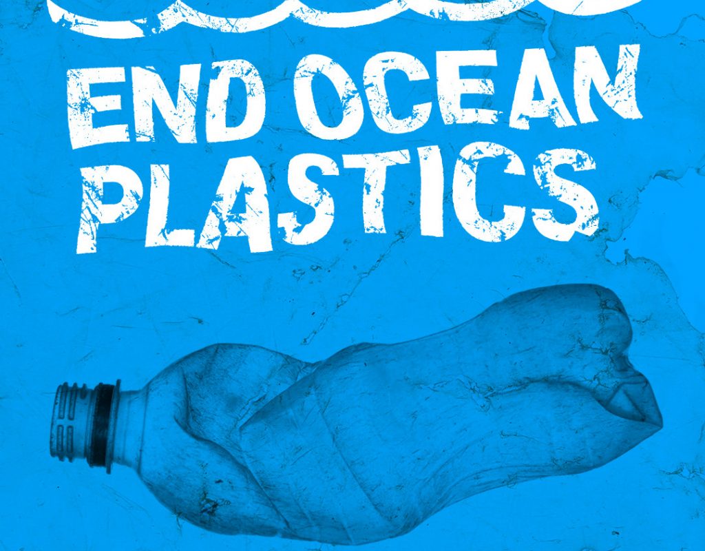
In week 7, we are starting to work on the Greenpeace- Tesco campaign. To prepare for this, we have been introduced to some principles we need to understand. Firstly, the brand toolkit.

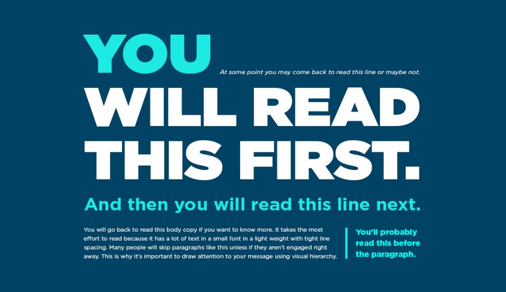
We then looked at posters in detail. Such as how the elements of a poster should work together to achieve straight-forward communication. This was followed by a digital workshop, allowing us to practice poster design.
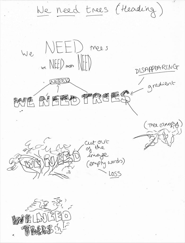
poster by Saul Bass

Brand toolkit

These are the basic elements of the campaign. When used consistently, these core visual components (such as headline and slogan), help us to identify a brand.

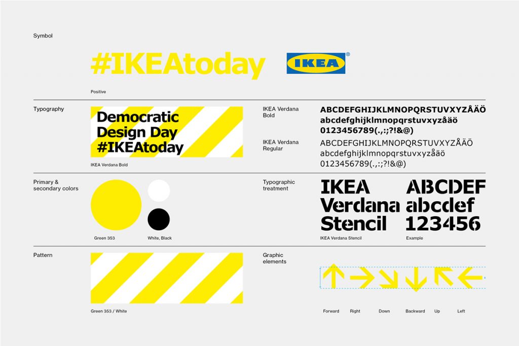
They make the brand recognisable, for example IKEA:

Bacardi brand toolkit

Brand guidelines– this is a document that defines the usage of the typeface, graphic elements, font, textures, headline font, body copy, type for tagline, colour palette and illustration style of a campaign or brand. This contains the essence of the brand. (see below)

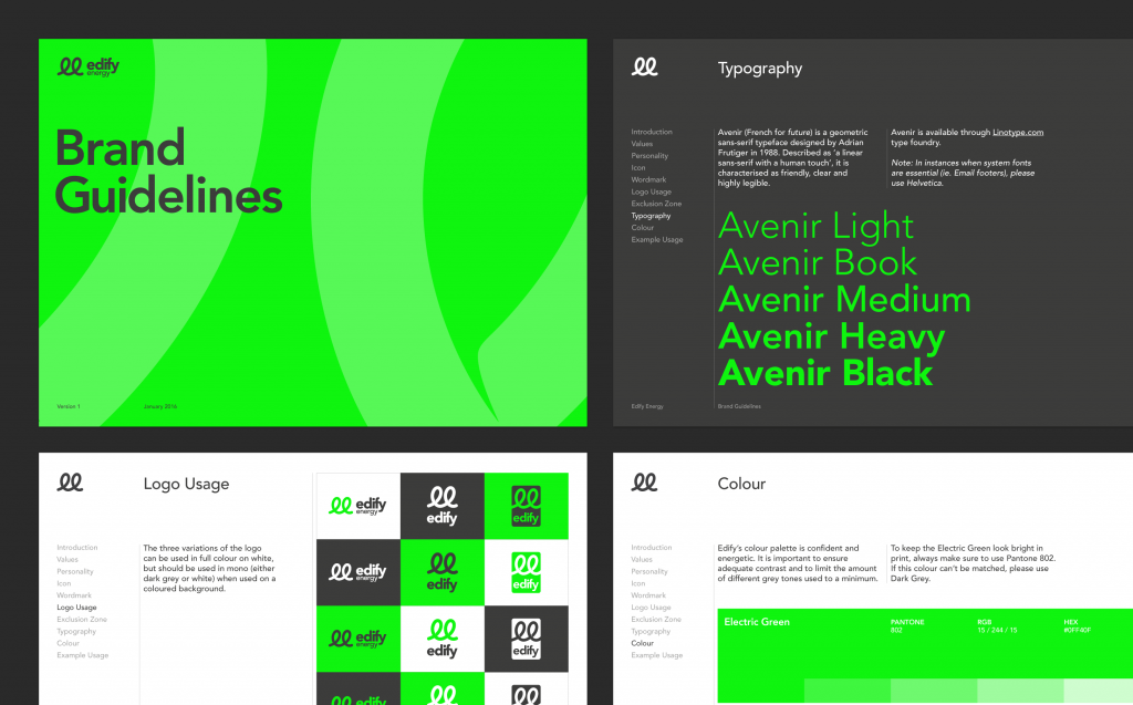
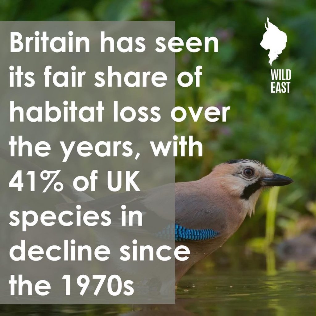
For our Greenpeace brief, we need to think about the main colour(s) and secondary colours.

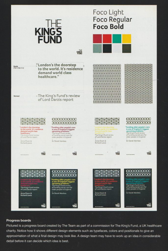
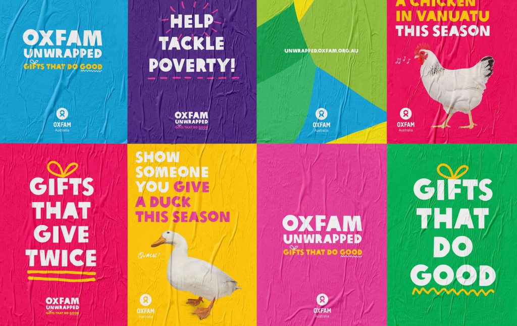
When looking at the brand guidelines of Oxfam, we can see that they have used the same positioning of the logo, same secondary typeface and choice of primary and secondary extended palette.

Oxfam’s brand guidelines

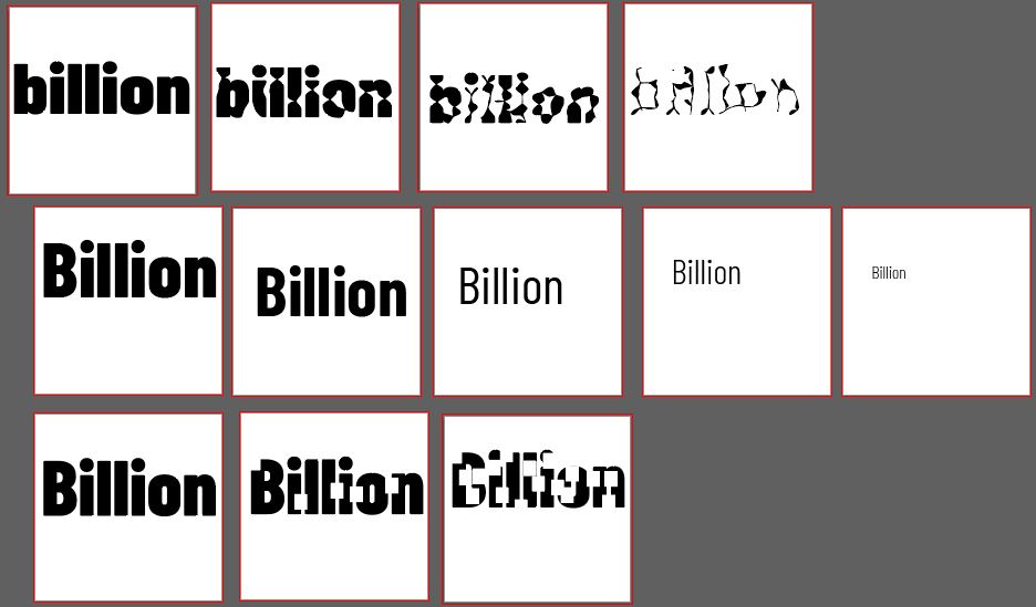
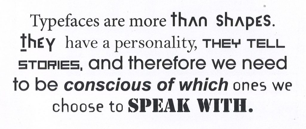
There can also be a variety within these typefaces, for example some might be more expressive/impactful and some more formal/informative. This means there the type will suit the purpose of the particular brief.

A display typeface is used in large settings. It is expressive and unsuitable for use as a body copy for example. The body copy is used for smaller, extended texts.

This Cadbury poster uses display type to express joy. This type would not be readable as a body copy typeface.

So for the campaign we are working on, we could consider 3 typefaces:

  1. Primary typeface- big, bold heading
  2. Subheading- Intro for the body copy
  3. Body copy

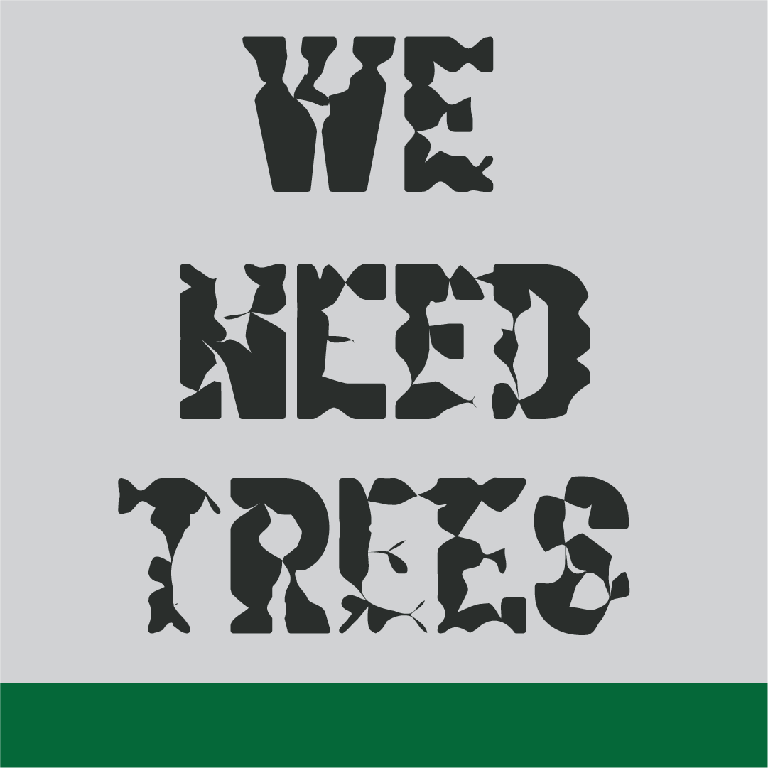
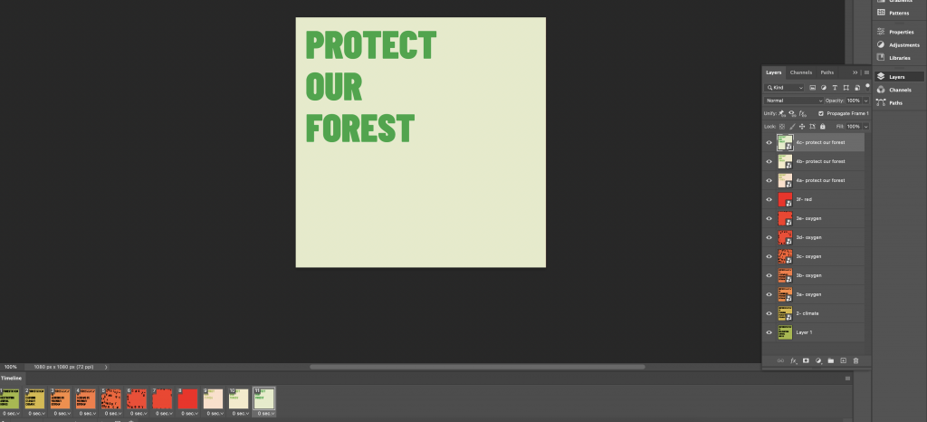
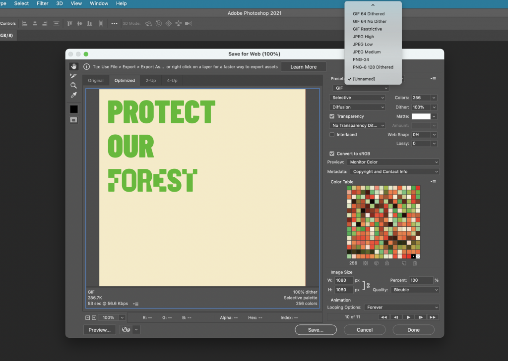
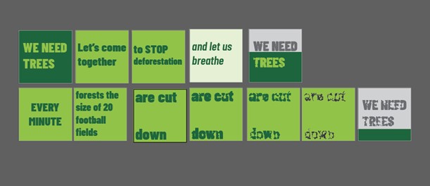
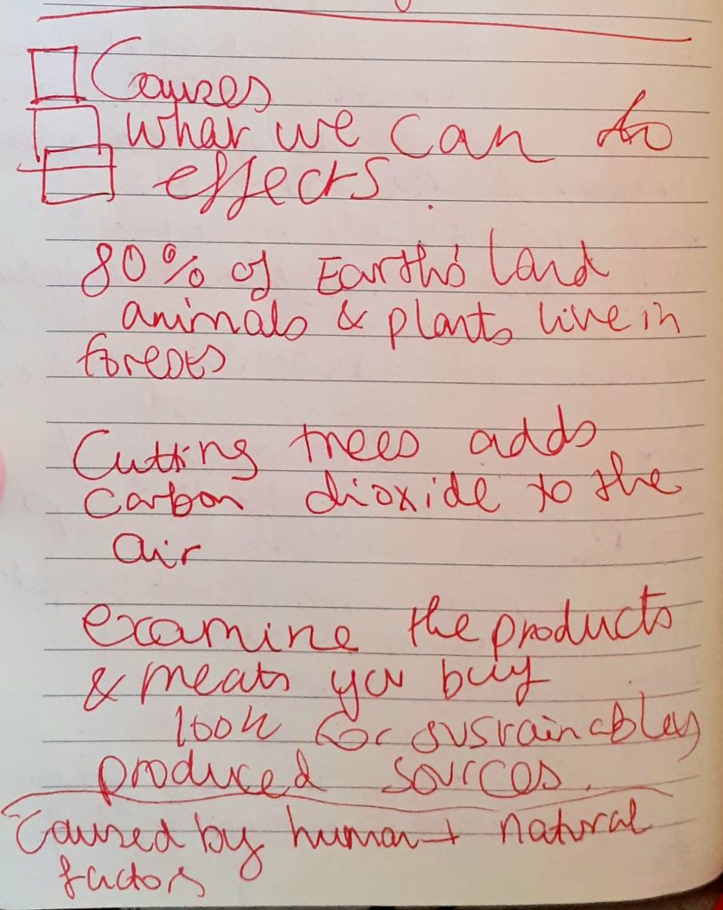
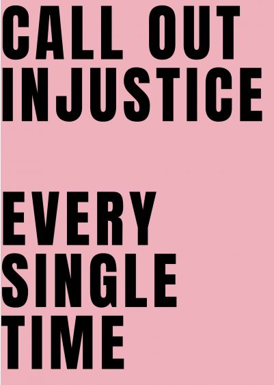
The tagline should be unique. This will appear on our poster. It could put pressure on Tesco to change their supplier, by relating Tesco to deforestation. It needs to be attention-grabbing. Some examples are:

Posters

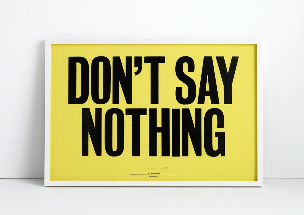
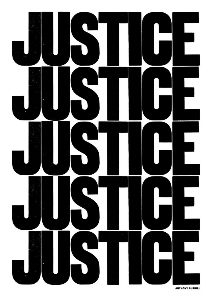
A poster needs to attract the attention of the passerby.

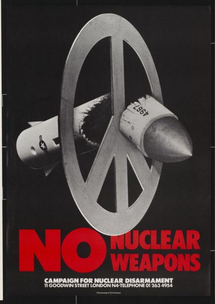
No Nuclear Weapons, 1980, Peter Kennard

Using a big headline and image presented as a metaphor, the message is immediately clear to the viewer.

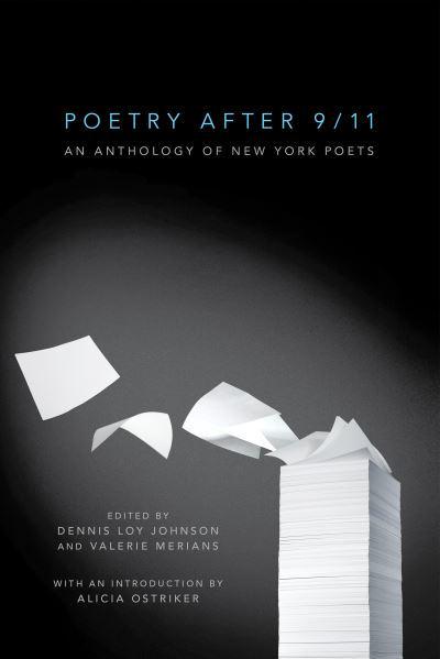
Poetry after 9/11, 2011, Christopher Brian King

This book cover design is another example of the use of metaphor used effectively. This image combines both elements of written poetry and the shape of the tower that was destroyed. The designer has used a spotlight to halo this image against the dark background.

The aim of the poster is to provoke, to make the viewer react or question something.

The poster needs to not only convey a message, but also to make the viewer act on the message. Emotional trigger and propaganda are therefore useful techniques to apply to a poster.

An example of this is the poster below, from 1978. The Labour isn’t working poster was designed by Saatchi and Saatchi. At the time, the Torie party was campaigning to win elections, which this poster helped them to do when Margaret Thatcher became Prime Minister in 1979. This poster tapped into the public’s frustration with the widespread unemployment across the UK.

The poster is simple, bold and punchy.
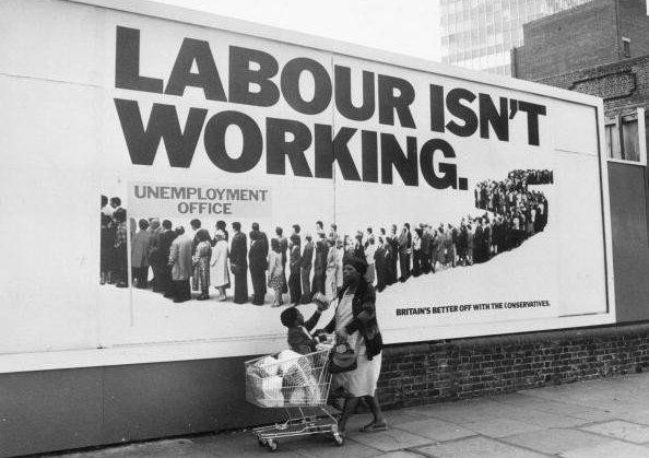
Image Making

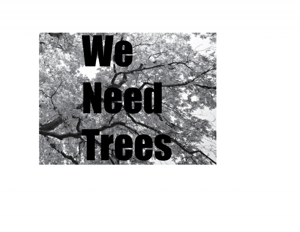
Creating an image to express the meaning of the campaign, is a skill we need to consider when starting the Greenpeace brief. This means thinking about the marriage of type and image. The central focus of the poster is the image.

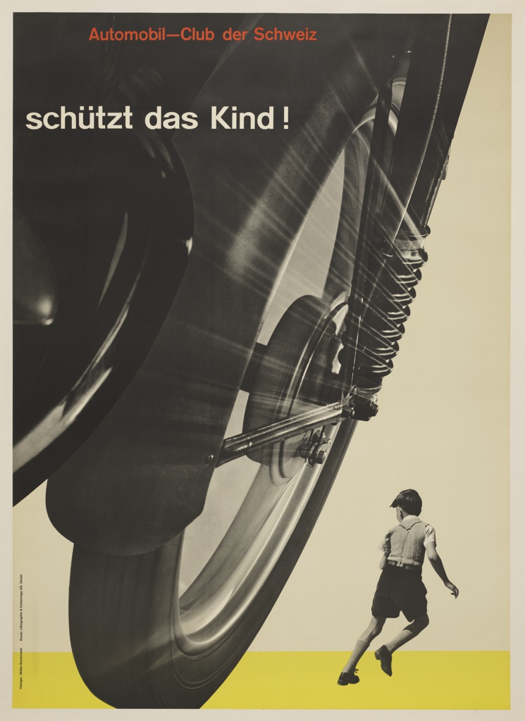
The poster below Schutzt das Kind! (Protect the child!) by Josef Muller-Brockmann was designed in 1953. This poster plays with scale and the size of the wheel is used to dwarf the child. This creates tension and gives the idea of danger approaching. The point of view is also important to create this effect.

(right) This poster by Muller-Brockmann, gives us the perspective of the pedestrian. This helps the viewer empathise with them.

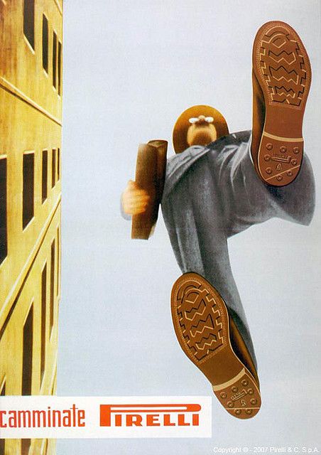
Camminate Pirelli, 1948

Designed by Ermanno Scopinich

This poster also plays with perspective. The ad is for rubber shoe soles by Pirelli. Due to perspective, these soles have the most detail in the whole image, as they are closer to the viewer.

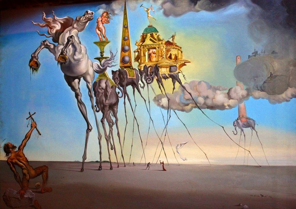
Another approach to poster design can be surrealism. Designers were inspired by the paintings by Salvador Dali and Rene Magritte. Surrealism and humour work well because they make you smile and stop to look at the poster. Designers also borrowed from Pop Art.

Surrealist painting by Salvador Dali

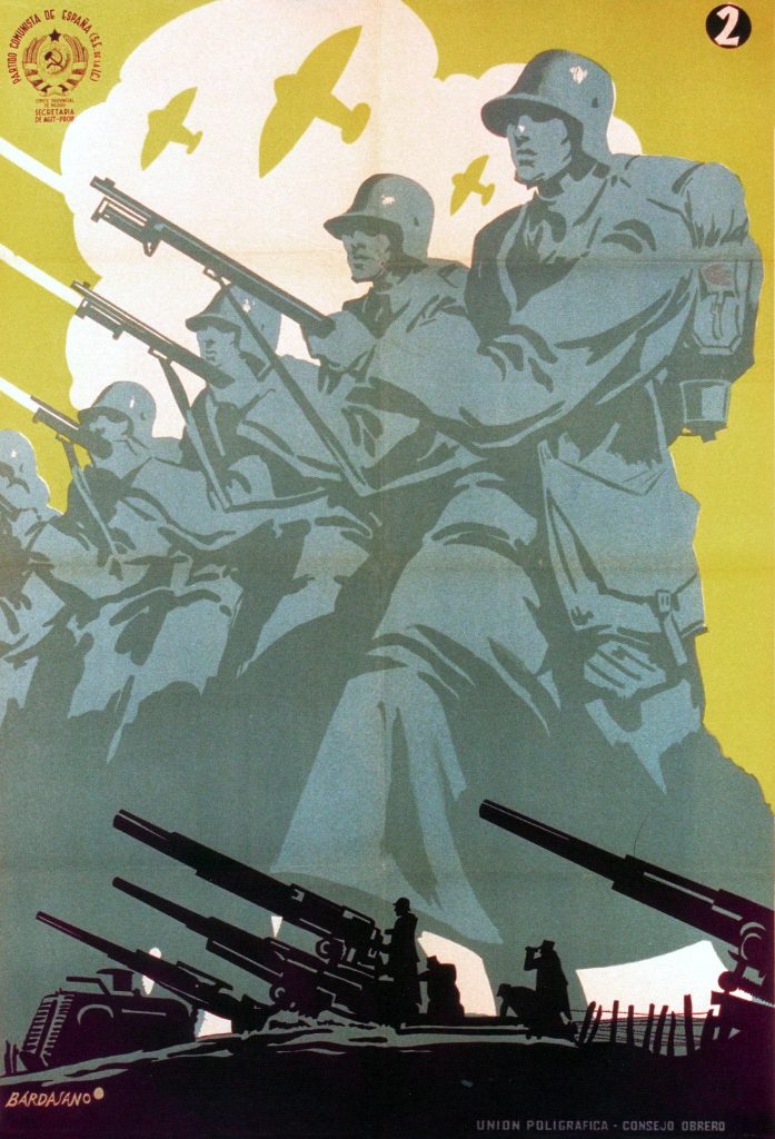
One example of this is this poster for the Spanish Civil War (1937) by Jose Bardasano :

This poster warns the viewer about the danger that can be found in water. Bardasano has combined the image of the glass with the impact of a bomb. He has played with size and made an image that is surreal and impossible.

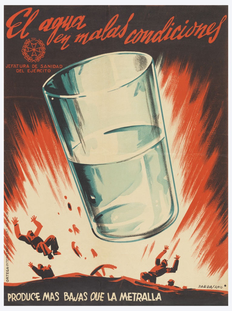
Size can be created by changing perspective, or it is created artificially such as in the poster above and below. Both ways are effective.

Storytelling-

Scale is also used to tell a story by layering images to create a small biography of events:

Jose Bardasano. Communist Propaganda. 1937

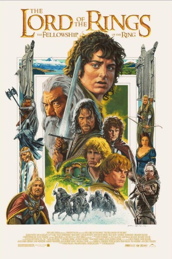
The Lord of the Rings posters often use this technique of scale and layering to show us the different characters and scenes which take place within the films.

An object is only big or small in comparison to its surroundings. In the poster below, Frodo, the main character, is shown as most important by making him larger than the other characters, despite the fact that he is physically one of the smallest characters in the story.

The Lord Of The Rings: The Fellowship Of The Ring by Paul Mann

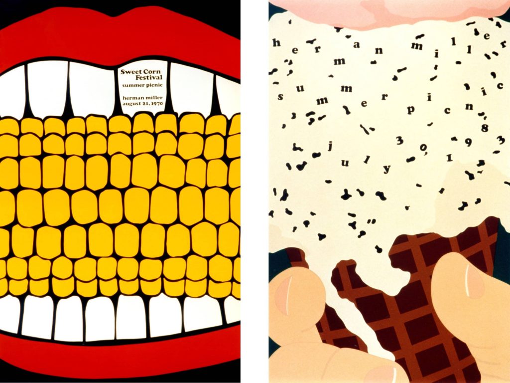
Zooming into details can also be attention-grabbing, because we try to figure out what the object is we are looking at. In the posters below, Steve Frykholm has designed these to advertise the company summer picnic. By zooming in this much, the image becomes quite surreal.

Steve Frykholm, Herman Miller Furniture Company Summer Picnic poster

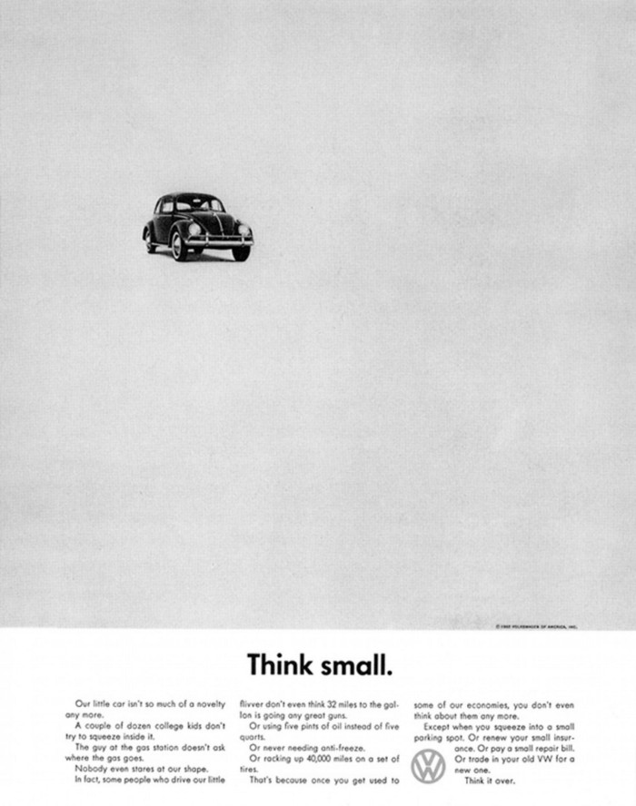
Helmut Krone, Think small, Volkswagen Beetle (1959)

Leaving a lot of blank space around the object, makes it look smaller.

Other posters at the time were doing the opposite, which made the Think small poster unique and attention grabbing for the period.

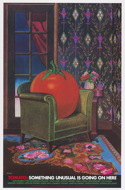
Tomato: Something Unusual is Going on Here (1978).

Milton Glaser designed this poster for the record label Tomato. The surrealism makes it attention grabbing, because we wouldn’t expect the tomato to be seated in a living room space and to be larger than life.

American designer Milton Glaser is most famous for designing the iconic I (heart) NY sign.
Rob en Robin, Graphic Matters (2019)

This series of designs by Rob en Robin considers how information design influences our life. For example, in the photo above, the pie chart is presented as an actual pie that’s be smashed in someone’s face. The result is simple-looking, humourous and uses metaphor.

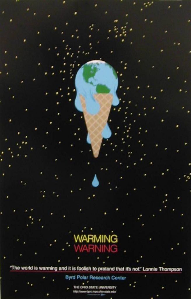
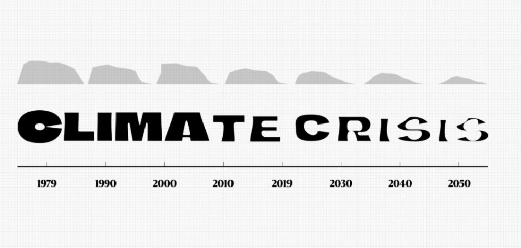
Charley Harper, Warming Warming

This design also uses metaphor. This time the subject is global warming. The designer has taken 2 elements and combined them into 1 image. This creates an easily remembered image out of an abstract concept.

Visual Rhetoric

Although visual rhetoric also involves typography and other texts, it concentrates mainly on the use of images or visual texts. Using images is central to visual rhetoric because these visuals help in either forming the case an image alone wants to convey, or arguing the point that a writer formulates

https://en.wikipedia.org/wiki/Visual_rhetoric
Albe Steiner, Peace poster. We immediately see the anti-war message behind this poster because the designer has combined the white roses (peace) with the soldier’s helmet (war)

The above poster is visually strong and is simplifying a complicated topic. Representation techniques include photography, photomontage, collage and illustration. The focus should be on simplicity, when wanting to convey a clear message.

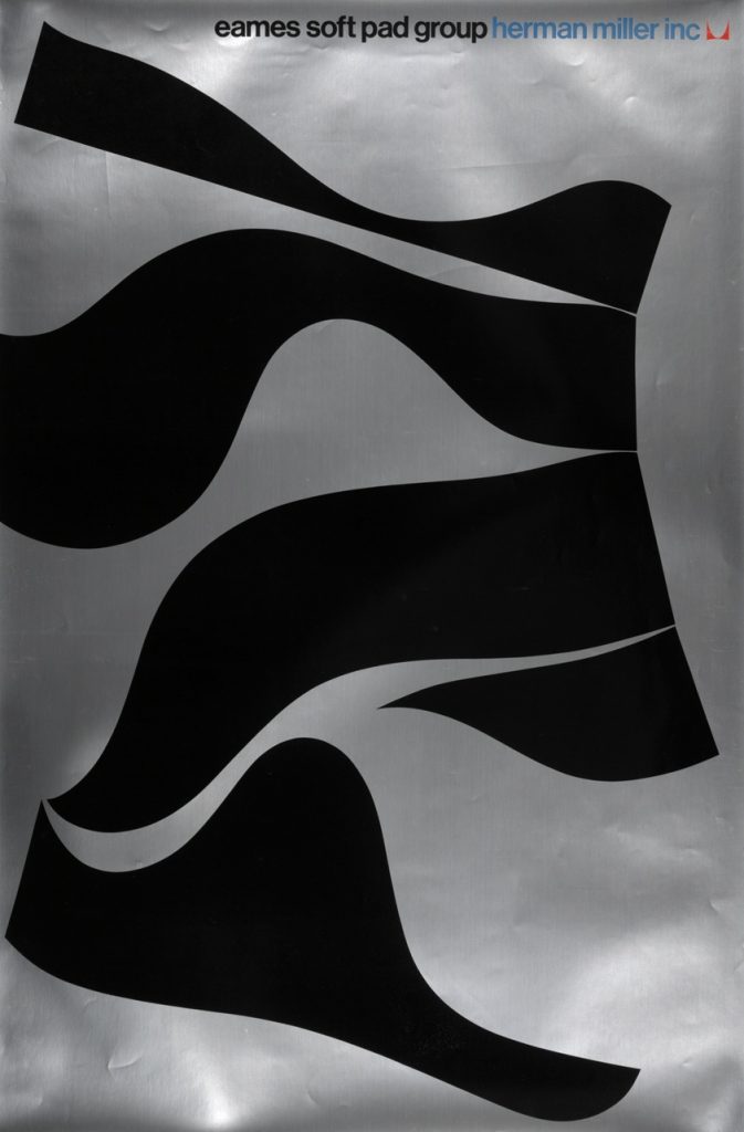
John Massey- Eames, Soft Pad Group (1970)

Using the profile of the chair to make something new and eye-catching: working with the silhouettes makes an abstract composition.

This is an interesting way to illustrate the flexible materials used for the chairs.

Malcolm Grecer, The Guggenheim museum
Albert Exergian, TV poster series. He takes the most recognisable and basic elements of a film or TV show and presents them in bold, simple posters. The poster above uses 4 colours and no texture to illustrate a coffee cup as seen from above. The coffee shop unites the characters across the series of F.R.I.E.N.D.S. and is therefore effective in making this image recognisable to the audience.

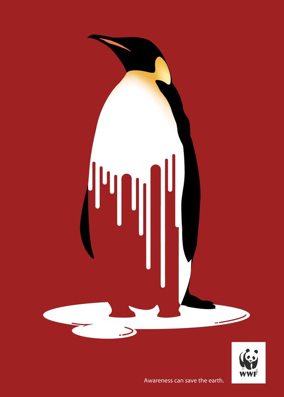
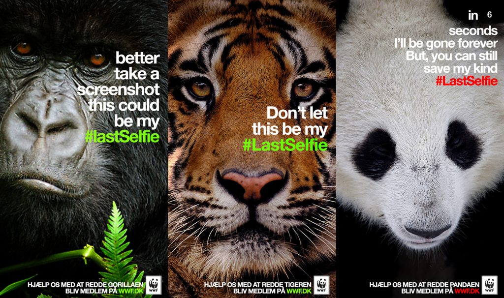
WWF- melting penguin, Fulvio Vignapiano

The use of red as a warning sign and the penguin melting, pieces together the habitat which is melting and the animal which suffers as a result of this catastrophe.

This poster is making the image into an icon form.

Combining 2 elements:

Some tips when designing posters:

  • Use a reduced colour palette
  • abstract graphic forms
  • represent complexity with reductive imagery
  • present an object as schematic icons
  • Don’t divide the poster into blocks of colour or texture, as this may blend too much with the posters placed around it- you want yours to stand out.
  • If the poster looks too separated, the viewer’s eye will wander around and the poster is no longer functional if the viewer doesn’t read it
  • Less is more, or else the poster looks too cluttered.
  • An example is the Japanese flag. This holds the viewer’s eye because the eye doesn’t escape the centre.

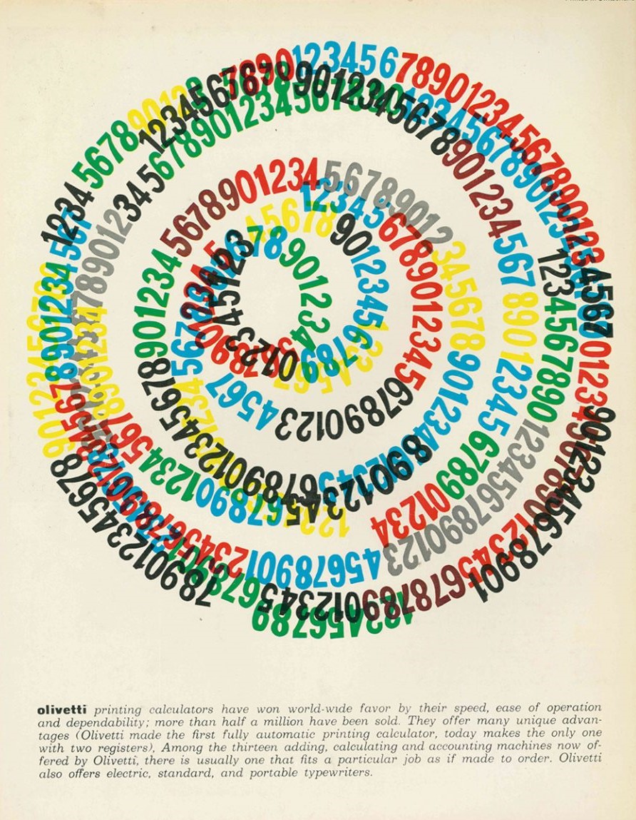
Another example of the focus being at the centre is this poster by Giovanni Pintori.

The way the numbers spiral around the centre pulls the viewer into the poster.

Our House is on fire, Owen Gildersleeve:

Taking inspiration from one of Greta Thunburg’s most powerful statements, “I want you to act as if the house was on fire, because it is.”

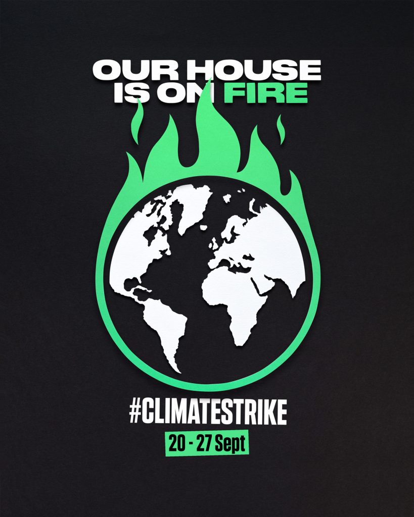
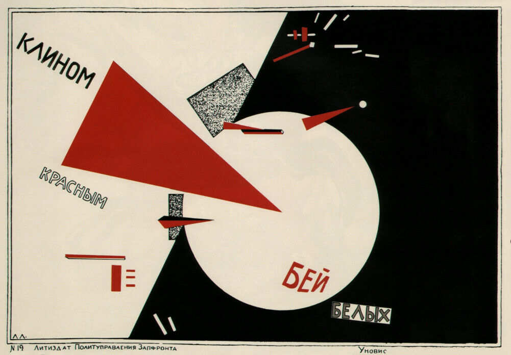
The above poster uses high contrast colours and symmetry. This creates a clear point of focus. However, sometimes the central focus can be quite dull. In order to break it up, it is possible to offset the symmetry. A good example of this is in the poster below by El Lissitzky (1920). This Soviet poster uses symbolism, hitting the white area with the red triangle represents the Russian Revolution. He works with shapes to break up the composition.

El Lissitzky, soviet poster (1920)

Diagonal movement

Our vision requires constant change. Eyes wonder around. Strong lines could make the viewer look where you want them to, like pointing to something. This can be seen in the Dancing on her Knees poster by Paula Scher.

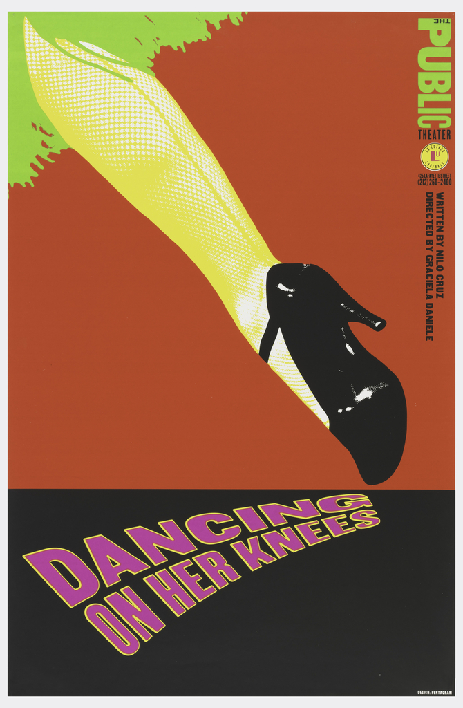
Paula Scher is one of the most influential graphic designers in the world. Described as the “master conjurer of the instantly familiar,” Scher straddles the line between pop culture and fine art in her work.

https://www.pentagram.com/about/paula-scher
Armando Milani- translating war into peace. The diagonal movement gives the image energy. Milani has chosen the metaphor of the dove to signify peace. The dove is bringing the ‘A’ from ‘war’ to ‘peace’.

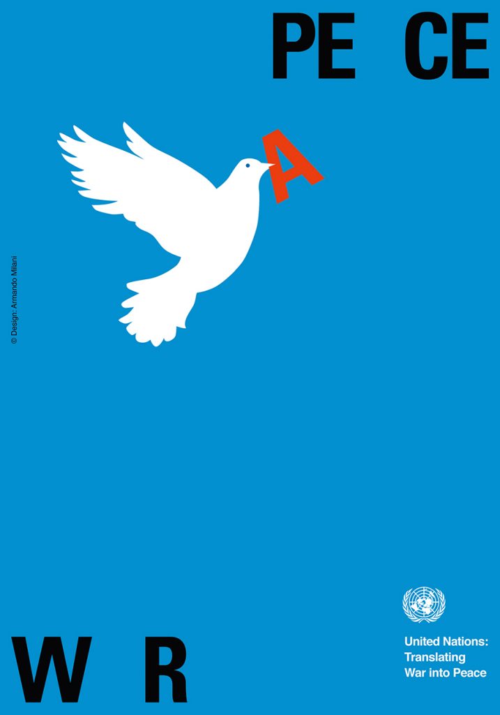
From the beginning of the 21st century he started to focus more and more on social communication, dedicating himself to the illustration of posters aimed to direct the attention of the public on social themes with an international impact. In 2003 he dedicated to the United Nations a poster for the world peace, that has already become a world classic.

http://www.designculture.it/interview/armando-milani.html

Sustainable campaigns & animated GIF

Sustainable campaigns- group presentations

Watching the class’ group presentations, gave me new ideas for how a sustainable campaign can be presented.

Notes:

  • Greenpeace- Detox (guerilla marketing) The use of props gets across the message instantly.
  • Mental health awareness week- get outdoors
  • WWF focuses on 4 animals. I noticed the importance of focusing onto specific aspects of an issue. If these posters tried to cover every animal affected, it would be less punchy.
  • Ocean agency- coral
  • Reimagine by Landrover- electric cars
  • ‘Tomorrow starts tonight’ IKEA – Mother London Creative group (healthy lifestyle)
  • Use of metaphor. Transform by swapping context:
  • ‘steps’ IKEA also Mother London
  • Use of icons- Kiehl’s- formulating a better future- use of colour (green for sustainability)
  • HS2 Rebellion – use of photos from the construction site! This sends a powerful message because we are seeing the actual site of the destruction with our eyes. In terms of the Tesco/Greenpeace campaign we could use this strategy to demonstrate the effect Tesco are having on rainforests.
  • They also use cartoon illustrations to represent the destruction taking place and its potential effect on communities.
  • Texture in the font. Illustration and handmade signs. Different designs for different audiences. Designed for the location or for online.
  • Wild East UK- bold letters:
  • Not looking at the whole problem- by zooming into specific animals
  • Find your way- mindgrowing.org
  • Use of sketches- play on words , colours blue and green relate to Earth. (taking into account the implications behind colour choices.)
  • Quirky/ chunky font=relaxed. Focusing on 1 word instead of the whole title.
  • Design company the lovers
  • Attacking the viewer- questioning their humanity ‘are you a robot?’ targeted at the digital era. (Greenpeace)
  • Nature is speaking- using a different voice for each aspect of nature e.g. ocean, ice, mountains.
  • Extinction Rebellion- photo of house submerged. House designed and built by them to suggest rising sea levels. Strategic placement.
  • Greenpeace and Extinction Rebellion both use shock factor.

Animated GIF workshop

Working in PNG is best for animated GIFs.

We would use Illustrator to create the slides and PhotoShop to animate the separate slides, exporting them into a GIF.

  1. Export for screens
  2. Window > timeline > create frame animation
  3. Clicking the plus adds new frames.
  4. Allow enough time to read the text. e.g. 2 seconds.
  5. Press play to see the animation.
  6. Mp4 file plays on Instagram- can’t upload a GIF on Instagram.
  7. GIF file> export > save for web
  8. Opening the GIF in a new tab, allowed me to view the GIF full page.
The timeline appears at the bottom of the photoshop screen. By clicking the small arrows, I can change the time each slide appears on the screen.
The layers can be viewed in this right-hand window. We needed to click on/off the eyes to hide the layers we didn’t need.
The play button allows me to see a preview of the animation.
The save for web window.
Opening the GIF in a new tab of the browser.

Project 3 – short animation- group work

  • The task for next week is to create a short animation. We are in the same groups as for the expressive type exercise. The aim of the project is to make the GIF extracting key points from the article on deforestation.
  • We must first define the problem (intro), highlight the causes and then conclude the issue. (The CTA of the article).
  • The type must be easy to read and understand, since the purpose is for it to be on social media.
  • We should refer to the demo to get an idea of what helps an animation to flow and be legible.
  • The animation could be longer than 11 frames e.g. 20 secs in total.
  • Don’t overcomplicate it! Stick to just 1 font. Use a font with high legibility- could be from google fonts. Typography style- use the type manipulation that we used in Project 2.
  • Simple, punchy is best.
  • Need to communicate the idea of deforestation. This can be done with the graphics as well as the actual words.
  • Stick to short phrases. Extract some data from the article. Could make the numbers bigger. Some slides could show just one word. Using colours to stress the message. 1080px x 1080px. (size of insta post)
  • present on 28 Feb
  • 1 GIF for the group.
  • Just typography- no images.

Ideas from group discussion:

  1. Ben- forming the script from the text
  2. Demelza- putting these into individual slides with Illustrator
  3. Holly- animating the slides

We considered the use of:

  • Bold to thinner type
  • Bright colours to dull
  • Last phrase blurs into blank page
  • Could disintegrate at the end
  • look at google fonts, send them the options
  • Barlow condensed
  • Could use 3 colours- bright green- to muddy green- to black
  • Keep it simple, use just 1 effect.
On Illustrator, I made a few examples of how we could animate the effect of disappearing or loss. I then consulted the group, to see which effect everyone liked the most. We all agreed on using the pucker tool (top line)

Ben sent his script for the animation.

I transformed the words into slides, on illustrator. (below) I liked the rhyme and rhythm he has used.

From reading the brief, I saw that the GIF needed to include the causes, effects and solution for deforestation.

I therefore, needed to script the rest of the GIF myself, because of time restrictions. (left)

I sent the PNG files of the slides to Holly and the illustrator file to the rest of the group. I invited the group members to change anything they didn’t like before the animation stage.

I shared with the group, the plan for the slides. This would allow Holly to be able to work from the plan with the PNG images.

Feedback for the animated GIF

  • The transitions are a bit too fast
  • The gap in ‘are cut down’ is not immediately obvious
  • Too many effects overall e.g. the black outlines on the word ‘Earth’s’

Typography & meaning

Type is essential for effective communication.

Type can:

deliver a concept or express an opinion.

The way text is displayed will add meaning to the words themselves.

By changing layout, spacing, punctuation etc, we can portray a certain message. For example, the boldness of ‘Kindness’ in the sign below, suggests that kindness can be bold and robust. The height of the word ‘Strength’ illustrates strength itself.

design by Anthony Burrill

British graphic designer, Anthony Burrill is well known for his prints which often contain bold statements that are punchy and effective.

By repeating the word ‘Justice’, Burrill is making a statement about the importance of justice. When people are passionate and certain about something, they repeat the sentiment. This is further emphasised by the black and white. When something is in ‘black’ and ‘white’, metaphorically it means there are no doubts about it. Here Burrill is using this in the literal way.

Words are powerful.

They invoke emotion, feelings and ideas. They are powerful because of their ability to encapsulate a concept.

Words can be transmitted from person to person, often in an instant format. This is why memes are powerful. Because of the speed they can be shared and the way they need to be understood quickly, means they are also put together in a way that is simple and concise.

In a small space, a lot of meaning can be packed. This includes imagery and experiences. Stories can be packed into a few words.

Extinction Rebellion

Extinction Rebellion are a movement set up to tackle the climate change problem.

They use guerilla marketing strategies to get their message across, for example civil civil disobedience and demonstrations. They create a disruption, sometimes spreading flyers where they aren’t allowed to.

They use bold, big statements in uppercase type. The typeface they use is similar to Futura, but with rounded edges. Sometimes images function as letters, i.e. skulls.

Their symbol is an abstracted hourglass. This emphasizes time running out and the circle is a symbol of the Earth.

Black Lives Matter poster (left)

This poster was designed by the anti-racist advocate Sophie Williams. She puts her message outside in the street for the public to see.

She uses repetition, different angles and spacing to add emphasis to her message.

Climate Crisis font by Helsingin Sanomat. This is an example of variable font.

Helsingin Sanomat, abbreviated HS and colloquially known as Hesari, is the largest subscription newspaper in Finland and the Nordic countries, owned by Sanoma. 

Variable fonts are an evolution of the OpenType font specification that enables many different variations of a typeface to be incorporated into a single file, rather than having a separate font file for every width, weight, or style.

The typeface is based on real arctic sea ice data and gives us a visual representation of the loss of sea ice on Earth.

Typefaces tell stories. Sad, complex, pretentious…

Sa Soriano

‘For the Museo Morelense de Arte Contemporáneo Juan Soriano (MMAC), we designed a sans-serif typeface with a display character, inspired by features of the museum’s architecture. The specific reference is the windows and openings drawn on large-scale plans, gestures that were replicated in the typography through cuts and gaps, alluding to positive-negative, interior-exterior, window, landscape space.’ 

This is an example of form follows function.

The content can lead what the type looks like, or the type can follow the content of the project.

Incomplete without the T campaign, Grey London. With the aim of raising visibility of trans issues, Grey London came up with the idea of removing the letter “T” from a range of different texts to highlight the erasure of a letter from “any word, in any language”. This means reducing or removing both the comprehension and the unity behind it – “and the same is true when you remove the T from LGBTQ+,” states the magazine. 

Studio Dunbar

Erasing parts of the word ‘Alzheimer’, represents how the memory is erased in people with Alzheimer’s disease. It also simulates the frustration experienced by people with memory loss, by giving us the experience of reading the word with difficulty.

Pentagram- Maholy Nagy Foundation

This is an example of analogical techniques being used to create type.

Maholy Nagy was an artist from the Bauhaus. He worked with experimental photography and was one of the first people to experiment with photograms.

For this book cover design, Pentagram have used water to give the type a wavy effect.

Age of rage– The Guardian’s guide to anger. This is another example of design that uses analogical techniques.

Linguistic tricks

Linguistic tricks can make a phrase more memorable. They can be used when writing headlines.

Examples of Portmanteu:

Examples in English include chortle (from chuckle and snort), smog (from smoke and fog), brunch (from breakfast and lunch), mockumentary (from mock and documentary), and spork (from spoon and fork). A portmanteau is a suitcase that opens into halves.

(combining 2 words to create 1 new word)

A Palindrome is a word that reads the same backwards and forwards, for example:

Alliteration makes a phrase more memorable. It is often used in brands and advertising, for example:

Rhymes

Neologism are new phrases that have been recently made up because their use has become popular, for example:

‘Google it’

‘Tweet about it’

Acronym

Computer key – LOL

Denotation is the literal meaning for example, a cross.

Connotation is about our associations. In relation to a cross, it would be Christianity, hospitals. etc.

Project 2- Group work

Using the skills we learnt from this week’s lecture, we designed expressive type around an article about deforestation. We were placed into groups and needed to each design this heading. ‘We Need Trees’ works as a heading because it is snappy and uses rhyme.

I first read the article carefully, underlining key words. I then scribbled my ideas in my notebook, focusing on the key themes.

I sketched visual ideas for the heading:

I designed the heading in Illustrator. I typed the heading into a text box and changed the font to ‘Impact’ :

I used this photo of a tree canopy. (below) I bitmapped the photo by opening it in photoshop, converting it to greyscale and then selecting bitmap> diffusion dither.

I placed the group’s designs into InDesign and exported the document as a PDF. This would allow us to present it to the class easily in the next lecture.

Below designs by:

1)Ben 2) Ben 3) Ben 4) Holly 5) Demelza 6) Demelza 7) Demelza