Greenpeace Brief: Tesco destroys forests

Rainbow Warrior crew holding banner “Save the Whales”, 1978.

Our fragile Earth deserves a voice.

Anna Jones, Greenpeace

In today’s lecture, we met with our client:

Anna Jones from Greenpeace

Step 1 Define:

(Who, What, When, Where, Why, How?)

Who: Greenpeace Uk- Forest & Food Campaign. Greenpeace are a Non-Governmental Organisation (NGO). The aim of the campaign is to stop environmental destruction.

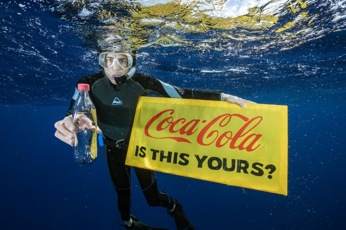
They were founded in 1971 and are a completely independent organisation. Their work is done by ordinary people alongside scientists.

Part of their work is:

  • Putting consumer pressure onto companies
  • Promoting solutions for a green and peaceful future.
  • Taking direct action to prevent greater crimes taking place against our planet. For example, sending ships to disrupt whaling taking place.

Communication is key for making change happen. This is why graphic design is an essential part of the process.

Their audience is both the general public (creating awareness) and governments (putting pressure on them to act).

Their message goes out to Greenpeace members and non-members, such as journalists. This message is found on social media and traditional media.

Their campaigns can be focused on a particular company specifically, to get them to change. By doing this, they are getting companies to take the lead and other companies then follow them.

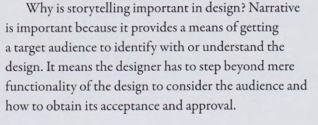
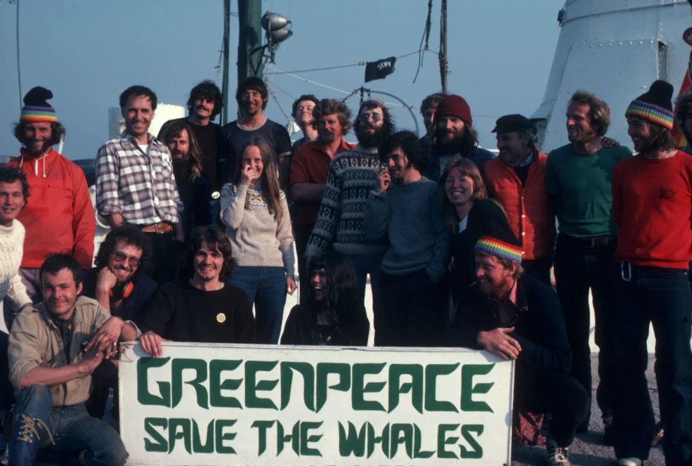
An example of this is with the campaign against Coca-Cola. (plastic bottles in oceans)

Subverting their brand to get consumer’s attention. The aim was to get Coca-Cola to reduce and use recycled materials. They achieved this through social media and guerilla marketing- directing communication at their head offices.- To bring home what is happening to our oceans.

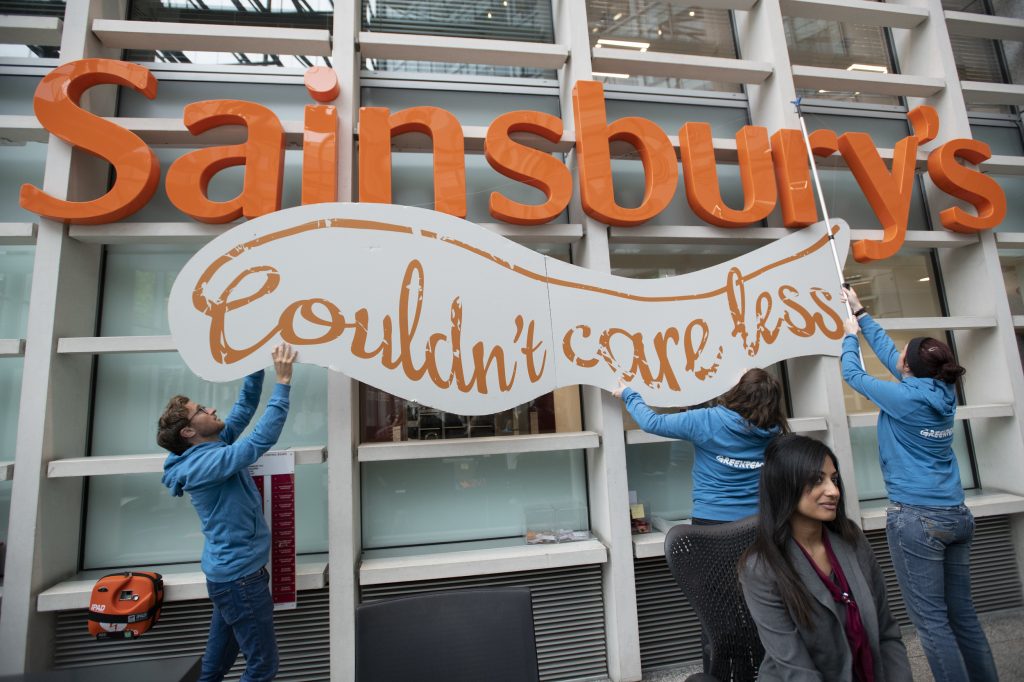
They took a similar approach to Sainsbury’s- subverting their brand. This was a successful campaign, getting them to reduce their plastic use over the next 50 years.

Greenpeace activists place a sign reading “Couldn’t care less” under Sainsbury’s logo during an action at the supermarket’s London HQ to deliver 4,724 Twitter complaints, as well as 2,309 more handwritten messages collected from customers, to urge the supermarket to tackle its plastic problem. Greenpeace is calling on Sainsbury’s to eliminate unnecessary and un-recyclable plastic by 2020.

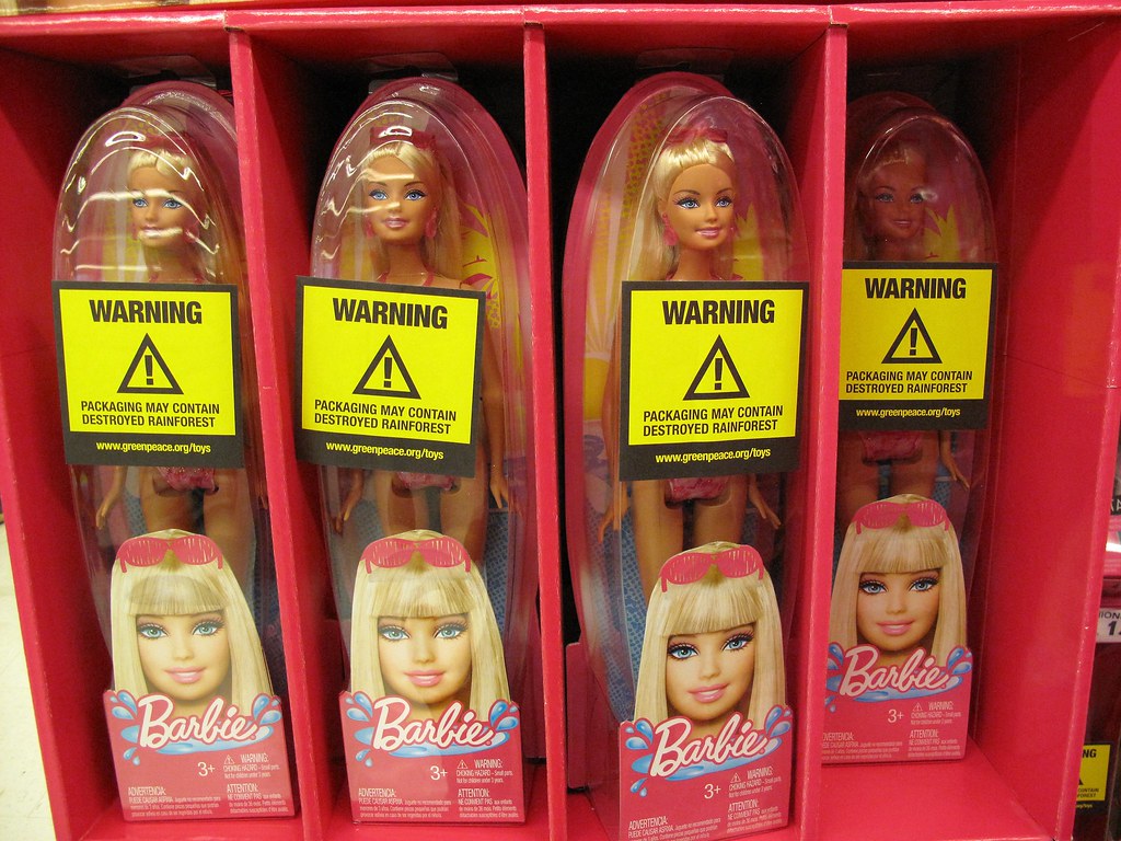
Mattel- dolls company- destruction of rainforest. Using a cheeky brand attack was a successful approach.

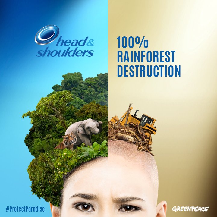
They campaigned against Head & Shoulders’ use of unsustainable palm oil.

Subvert= To undermine the power and authority of a system.

Flexitarian= Someone who is reducing their consumption of animal products.

Wasteminster- was aimed at the government, using animation to bring to life what’s happening by dumping plastic waste at Downing Street. This sent a clear message that they have the wrong policy by dumping waste in Turkey and other countries instead of dealing with it appropriately.

Getting the media coverage gets more people to sign the petition and write letters to the Prime Minister.

Visual storytelling moves people to show them what is happening.

Images speak much louder than words.

Anna Jones, Greenpeace

Barclay’s Bank- oil pipe lines.

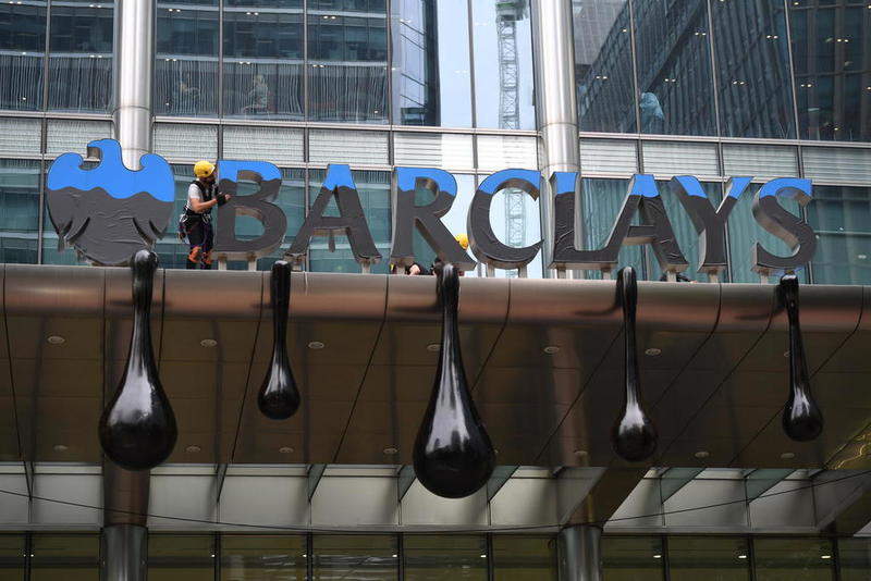
Greenpeace made bespoke oil globules at the head quarters of Barclays.

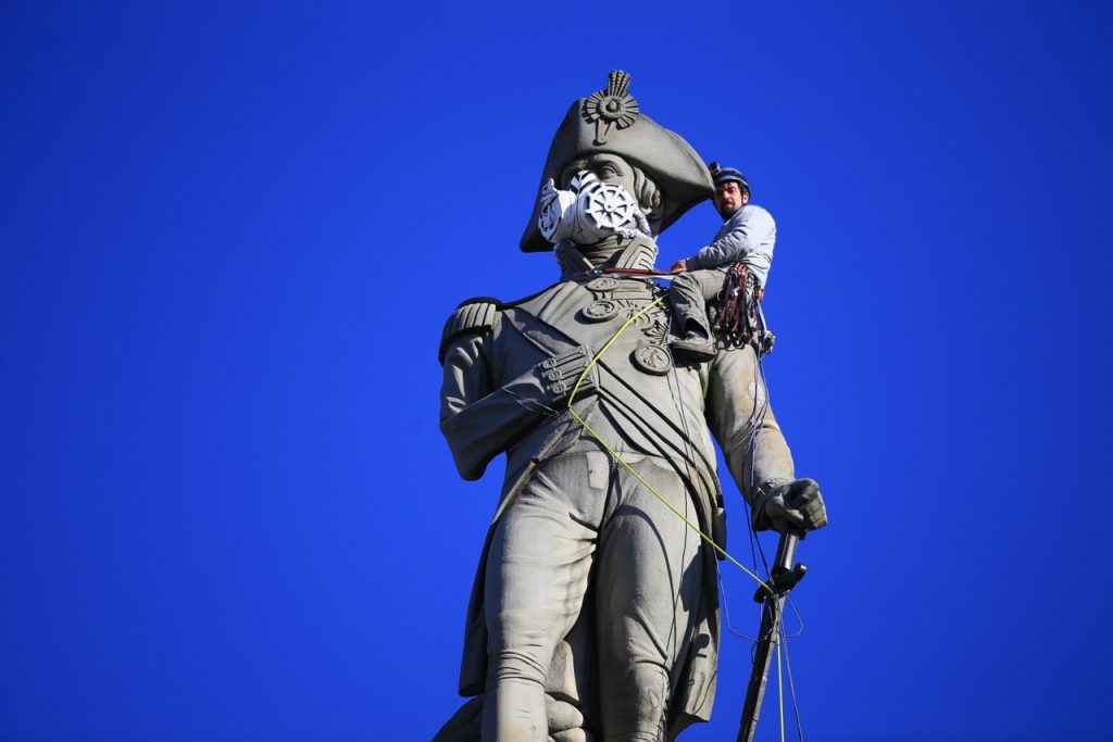
An activist climbed Nelson’s column in London- working with an artist to talk about air pollution. This was successful in its aims. Activists are also known to climb buildings, for example to display a message to decision makers.

‘Ditch Diesel’ used the example of a real child who suffers with asthma, to express the effect on human health.

Campaign against Oreo had an activist dress as an Orangutan outside the Oreo headquarters to reference forest destruction in Indonesia.

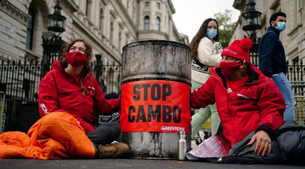
#Stopcambo oil well to send a message to Boris Johnson.

Online engagement highlighting Greta Thunburg.

Looking on Greenpeace’s Instagram can give some inspiration on past campaigns. Cheeky ways to subvert a message are effective. For example, using messages the government themselves made, but turning the messages against the people who made them originally.

The Brief

A campaign to end industrial meat and restore forests.

  • Forests are our life support system- they store carbon and draw down carbon from the atmosphere.
  • Destroying forests releases carbon, for example in Brazil.
  • We need more forests today if we are going to keep our climate in balance.
  • Industrial meat is the biggest driver for Amazon/ South American forests.
  • Soya beans are planted to feed animals and land is cleared to graze cows.
  • In the UK we eat twice as much meat and 3 times as much dairy as the global average.
  • UK imports tonnes of soya every year. Imported by Cargil- who are a huge forest destroyer. JBS is the global meat giant. They participate in land-grabbing and human rights abuses.
  • Tesco buy from JBS subsidiaries. It’s products directly link to deforestation. Tesco must drop JBS- ending sales of factory-farmed meat.
  • Tesco- our biggest supermarket- need to put the planet before profit.
  • They say they have not heard this demand from their customers. This is where customers need to speak- to put pressure on them. Greenpeace want Tesco to know that the public want them to change their suppliers.
  • The main message is ‘Tesco destroys forests.’
  • This campaign is to reach people who shop regularly at Tesco, or specifically to focus on young families and millennials. We can emphasise that this is the world their families are living in.
  • Restore the balance of what the planet can sustain.
  • Greenpeace might subvert the brand’s tagline or make a new one. There needs to be a CTA and the key message within the design.
  • We could come up with a campaign poster, short animation, social media post or guerilla style activity- attacking the brand and attracting media attention.

After delivering a fantastic and informative presentation, Anna allowed us some time to prepare questions about the brief. We worked in groups to think about what questions we wanted to ask. I was surprised that each group had very different questions in mind.

As a group, Zafri, Grace and myself came up with the question:

‘Given our intended audience, is a shocking campaign poster/ use of shocking imagery always effective? for example, to be viewed by young families.’

Anna explained that sometimes shocking imagery can have the opposite effect- and actually put people off. That there is a fine line to be recognised. If this type of imagery is used- it needs to be balanced with a positive message. On the Greenpeace website, we can find archives of previous campaign designs.

In answer to some of our classmates questions, Anna said the following:

We don’t need to give every part of the story. We could boil it down to Tesco doing business with JBS. There doesn’t need to be deep explanations- it’s OK to simply make the point that Tesco have made a promise that they aren’t keeping. (The promise being that they would get deforestation out of their supply chain.)

We can use the Tesco typeface, their logo and advertising phrases such as ‘Tesco food stories.’ Subverting the logo itself is so strong.

Using the Greenpeace logo is not essential.

The Wasteminster campaign video has been incredibly powerful because it allows Greenpeace to tell the whole story. Sometimes direct action really makes a difference.

‘It’s great to use hard-hitting storytelling.’

We need to distract people from buying meat. If you buy you are contributing to deforestation.

Belbin’s team role assessment

The Belbin team roles.

A behavioural test for how you behave in a team. for example, presenting, communication, bringing project to completion.

In our first session back on campus after the Christmas break, we were invited to think about what sort of team player we are. Our lecturer Noemi provided the Belbin forms to fill in.

When completing the form, I tried to imagine the kind of person I am on my best days:

The results identified me as a ‘Teamworker’. This feels accurate when placed with the picture I have of myself. However, I’m aware we don’t always see ourselves truthfully which is what made the task challenging.

In this session we were placed in small groups to put our group skills to the test.

I began brainstorming ideas, as we came up with a plan of action for the set project:

Kim set up a shared google drive, which allowed us to share documents easily. Fleur created a group on Instagram to allow us to quickly make contact.

shared drive
After re-reading the brief, I broke it down into questions and typed these into a shared document. This would allow each group member to focus on the essential points.

We decided on 1 company each, to go away and research. We felt it was a good idea to make these each different kinds of organisations, for example, looking at a human rights campaign, a campaign about poverty and one about the environment. We wanted to cover a few areas concerning sustainability, as we knew our final project would be able the environment. This way, we could gather information about a variety of movements.

We arranged to meet on campus over the weekend to discuss the work for the upcoming presentation. Only Kim and myself were able to make it. It was helpful to work in person, as we could quickly share ideas and help each other when necessary.

We felt that it would be best to focus on 2 campaigns for the presentation, as this would allow us to speak more in depth about the work. The research we had received from Fleur was slightly incohesive and her writing didn’t match the brief. Therefore, we decided to use the 2 campaigns we had each researched.

I wrote a basic script, covering the important points. This would then be rehearsed nearer to the time of presenting.

PDF of the finished presentation:

Working in a group was an enjoyable experience overall. This is for 2 reasons:

  1. Working in a group allows us to pool our skills together. (We don’t need to each be confident in every area. There is room for us to focus mainly on our strengths and still get the project completed, providing we work with the right people to balance each other).
  2. I found that morale boosting is real and positive. It felt encouraging to know that we’re in it together and that someone else understands the weight of the work set.

Working in a group was challenging because:

  1. Not everyone works in the same way. And other’s styles of working may not suit mine.
  2. It’s not always easy to know when I need to step forward or step back.
  3. There are more people compared to independent working, this should mean less overall work for the individual. This did not feel like the case.

Design Process: Context, Communication & Audience

At the start of this new module, new semester and new year, we are beginning to think about the design process from start to finish.

Before arriving at the finished product and after being presented with the brief, a designer follows a set of steps. These 7 Stages are: Define, research, ideate, prototype, select, implement, learn.

Stage 1 is to Define

  • Establish what is the problem. Who is the target audience? We need to ask many questions, in order to understand the brief. The designer’s job is to interpret the brief. ‘What, where, when, who, why?’
  • Who is the client? What design solution is the client thinking of? ie. print, web, video. Where? location, web etc. Why does the client think a design solution is required? How will you implement these ideas?
  • Define the context: Where will the design be? physical location or online? The context can be the starting point and suggest materials.
Talkdesk advert, London underground
Talkdesk ad, online
  • Understand the competition. What are they doing? (the USP). It could be that you don’t have one and need to bring one.
  • Define the audience.
  • CTA call to action: clear, concise message. prompting an immediate action. e.g. sign the petition: buy now, subscribe now.
The CTA of this billboard ad, is to use the Klarna app.
  • Provocative imagery may be used to shock, entertain, provoke with purpose.
The use of upsetting imagery grabs the viewer’s attention.

Unique Selling Point (USP) examples:

M&M’s

“Melts in your mouth, not in your hand.”

IKEA

“To create a better everyday life for the many people.”

DeBeers

“A diamond is forever.”

Stage 2 Research and investigation.

Who are the Audience?

‘It is vital to remember that everything you design will be seen by other people: designers are visual communicators and do not work in a vacuum. Therefore, it is part of your job to discover everything you can about the intended viewer. Before designing, think about the people who will be looking at your design work. What is the target market? What do you know about them? What can you/should you find out about them? Can you imagine how they might interpret a particular visual message? Think about the age of the viewer, their geographic and cultural influences, and the level of their education and experience. The more you discover about your audience, the better informed your work will be, increasing its potential effectiveness.’

  • Define gender, interests, lifestyle, experiences, education, where they are from, age. The more you know the better. What are their needs? what things are appealing to them?
  • How might you get this information? (Surveys, tests, questionnaires.)
  • What can you offer to them? a vision, a product, a promise. (USP).
  • Understand if there is something missing that you wouldn’t know about.

The success of visual communication depends on the ability to reach a targeted audience and elicit a desired response. Sometimes the response is an
immediate call to action and a clear, concise message with
little open to interpretation. Most often, visual imagery is
used to evoke an emotional state that will put the viewer
in the appropriately receptive frame of mind to receive the
message targeted at them.

In visual communication, the concept of visual rhetoric usually describes the visual tone of voice chosen for a given communication task.