Alice’s Day
Today is Alice’s Day. Well that’s something I never knew existed, despite always loving the books and having lived in Oxford for 2 years. (During the pandemic admittedly).
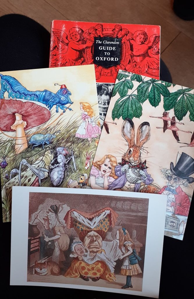
To mark the occasion, I found myself at a series of lectures in St Frideswide Church, Botley. I couldn’t resists a small purchase of a book about the Oxford Colleges (published 1963) and 3 postcards, all for £1. (above, left)
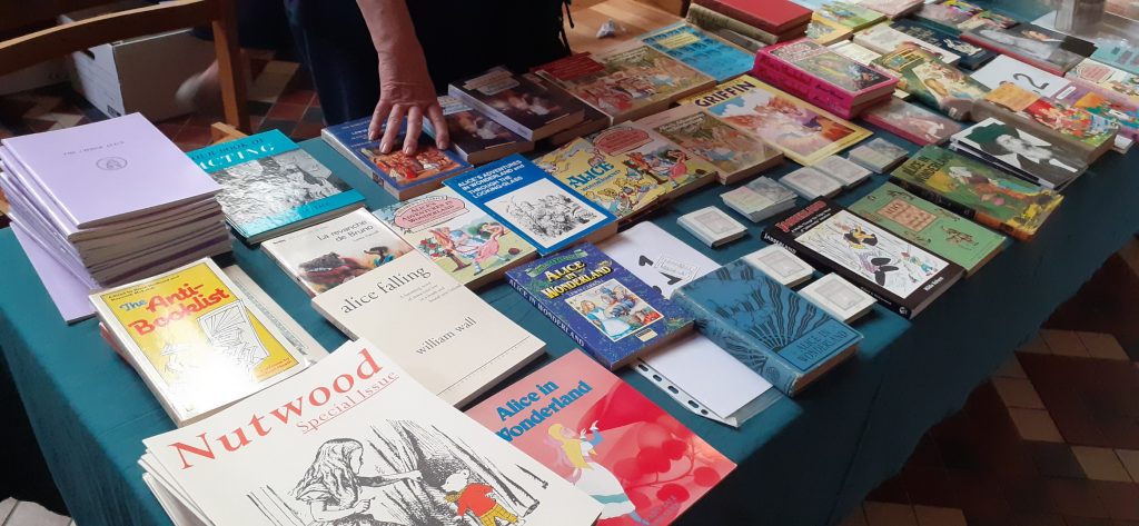
The book stall (below) was run by the Lewis Carroll Society. The photo doesn’t show it very well, but there were many different versions of Alice in Wonderland all with a different illustrated cover.
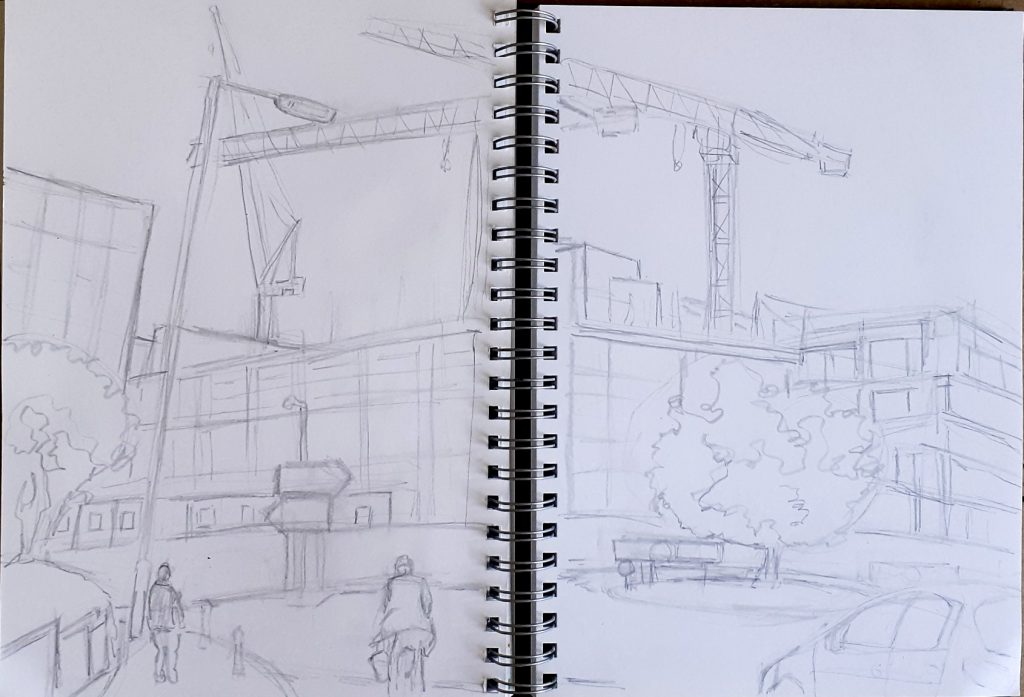
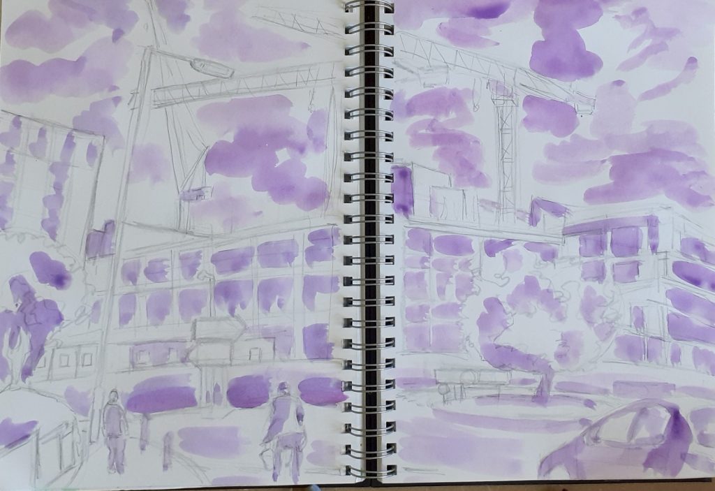
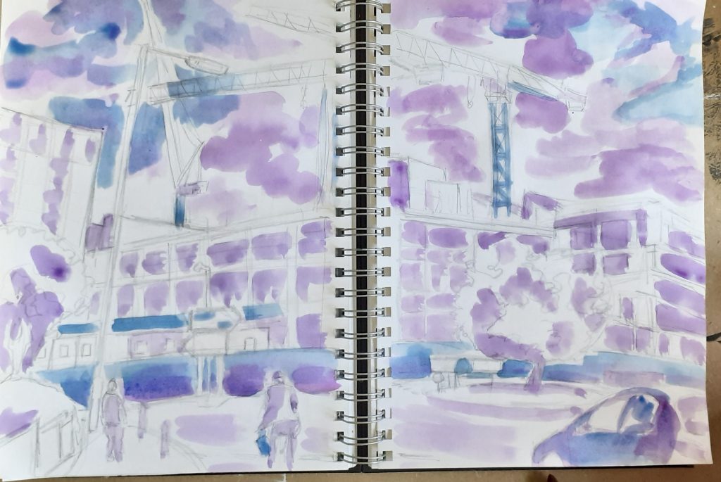
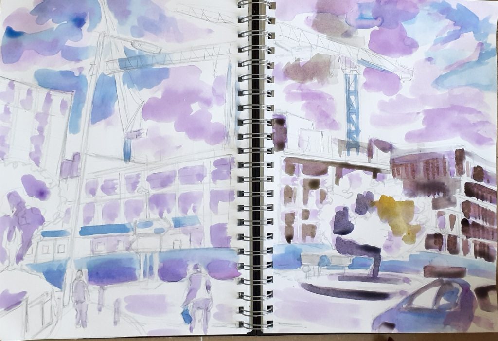
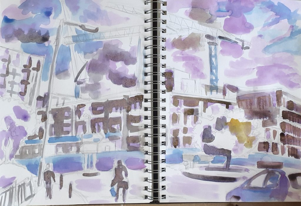
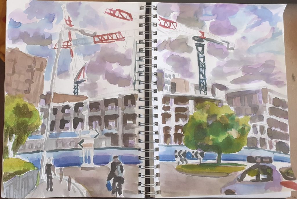
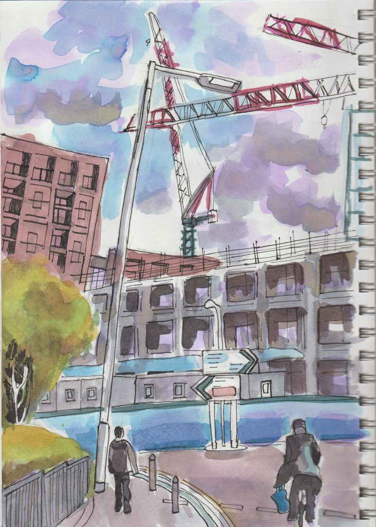
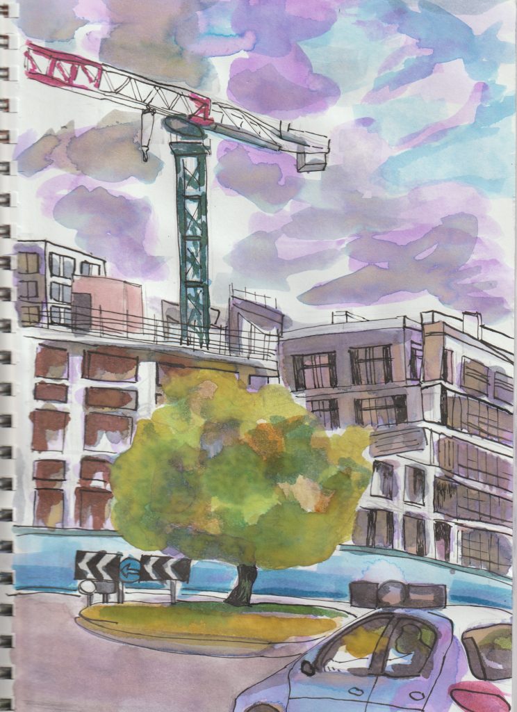
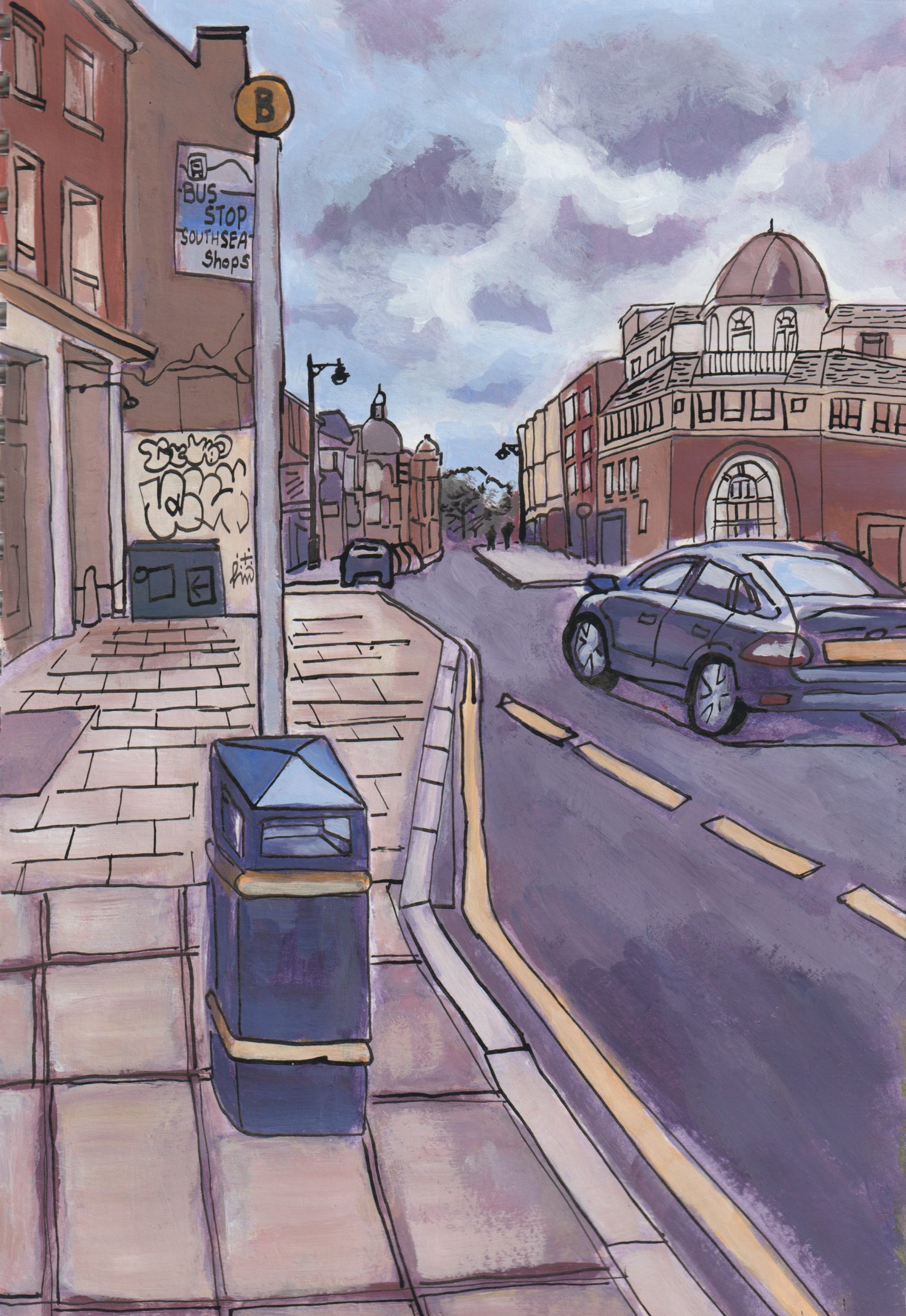
So what does my sketchbook look like this week?
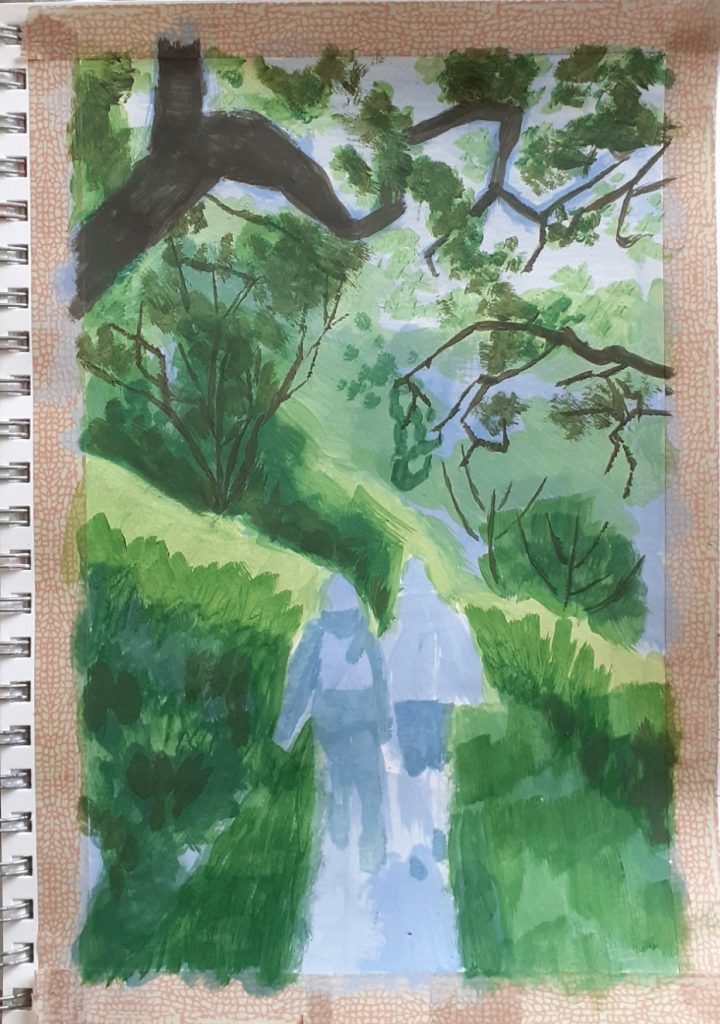
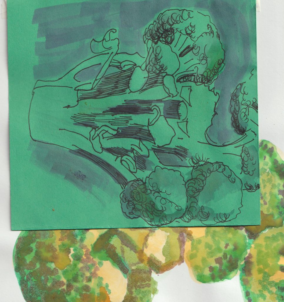
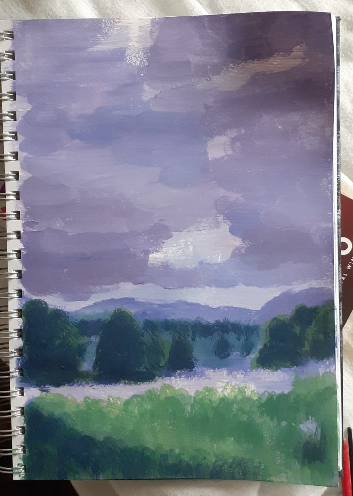
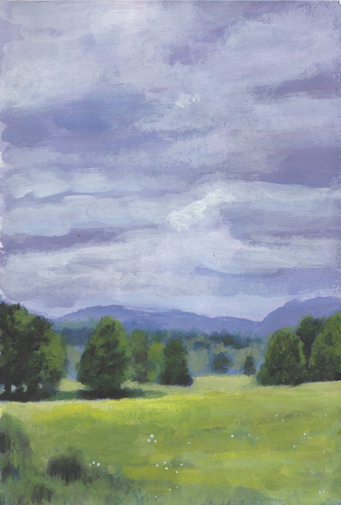
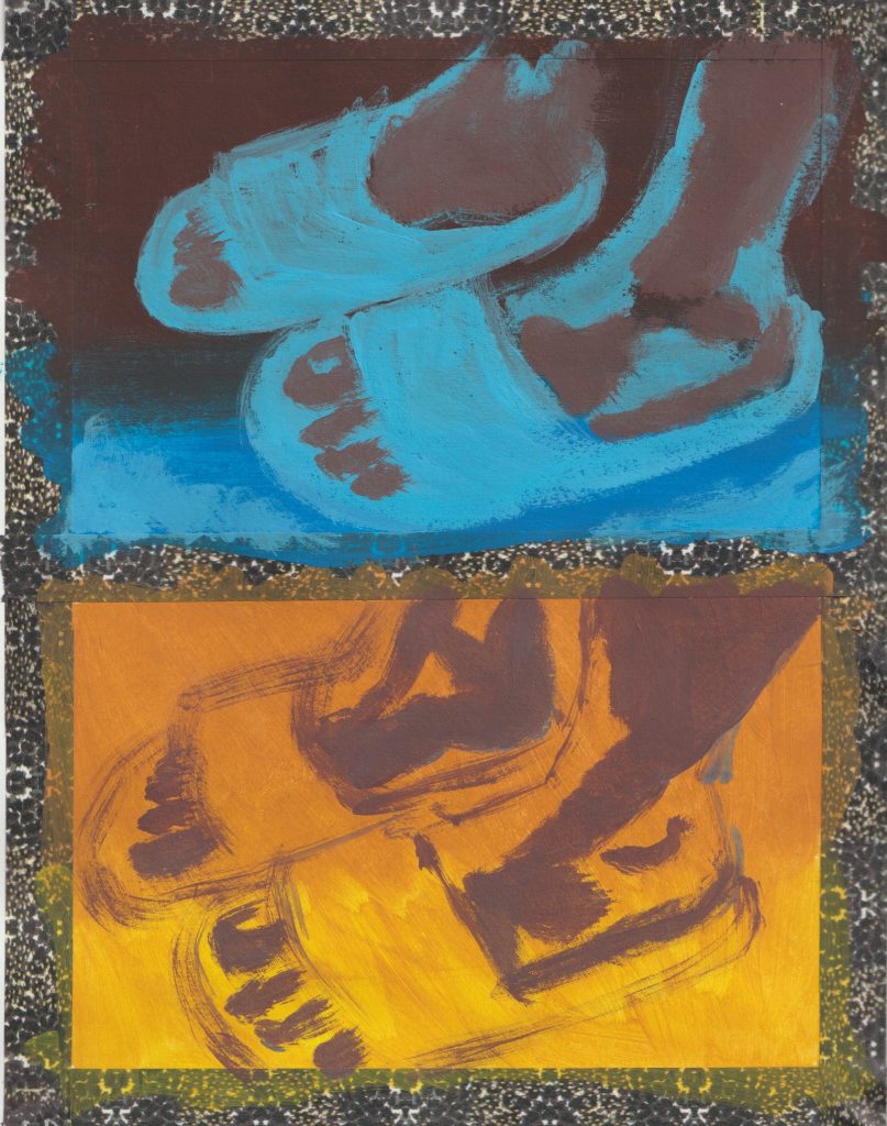
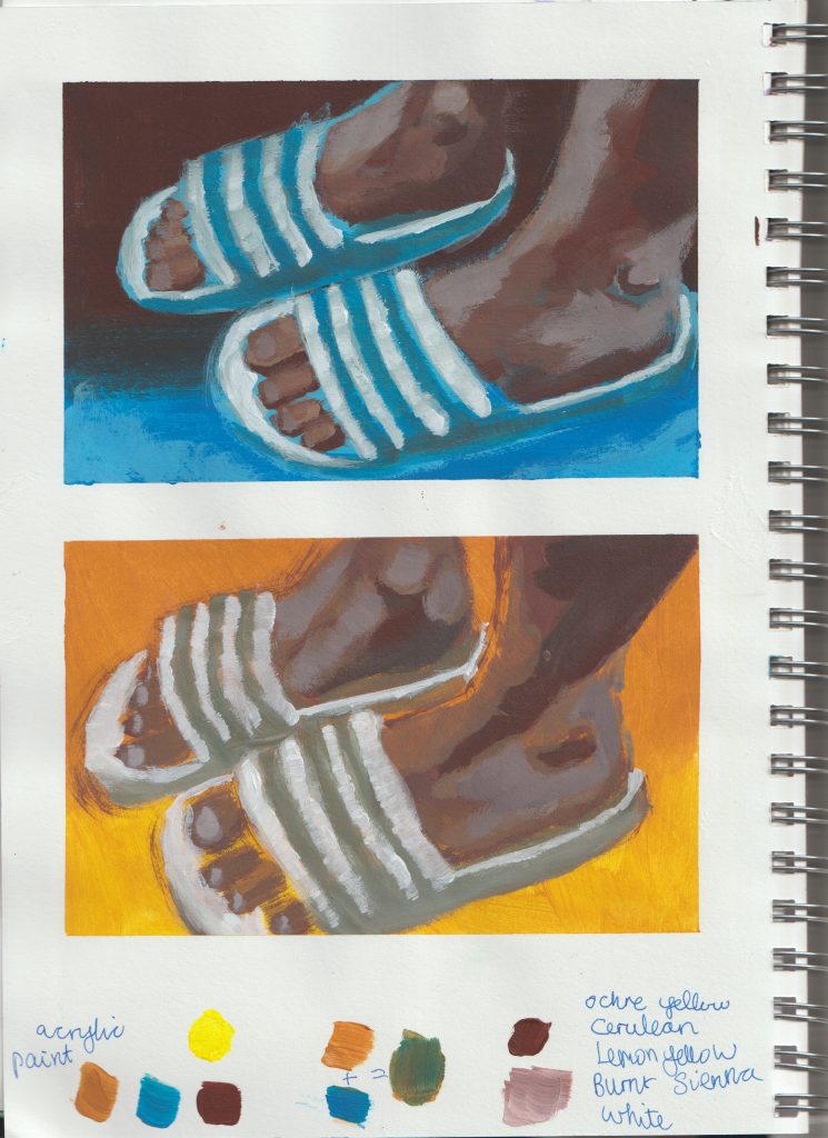
I continued to play about with gouache, using this photo from the retreat first of all. (see initial sketch in previous post) I don’t know what was happening with the face. This was the best I could achieve, believe it or not. This was down to the fact that the sketchbook is A4, so imagine how small the face is in reality. I had a tiny brush but it was still a very awkward process.
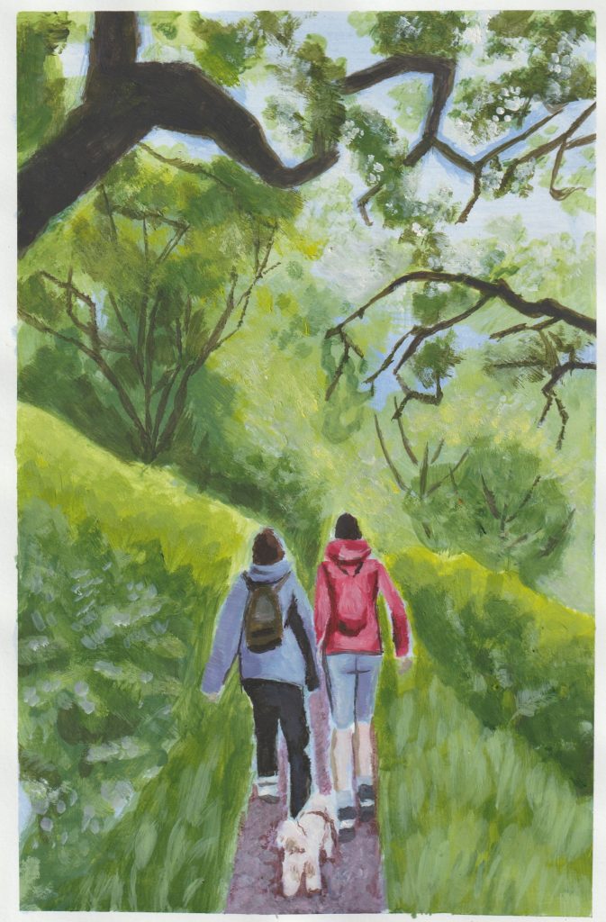
Another gouache study:
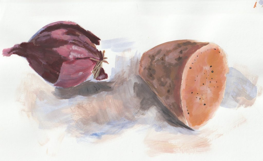
At this stage, I don’t really see a reason to go back to acrylics. Obviously there is the environmental issue to consider, acrylics are plastic. I can achieve similar results with gouache and actually I enjoy the process more. The only difference I might miss is the slight glossy texture of acrylic paint.
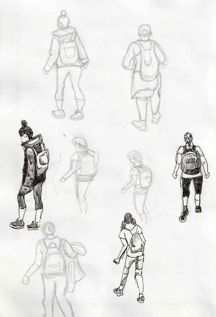
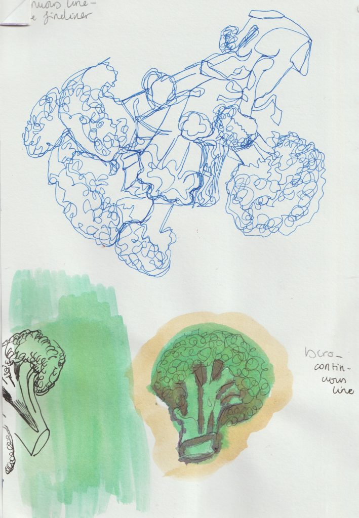
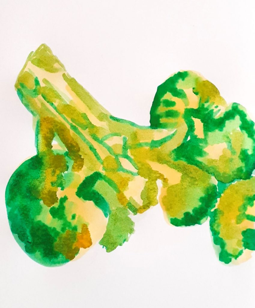
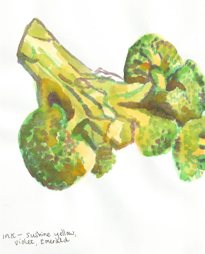
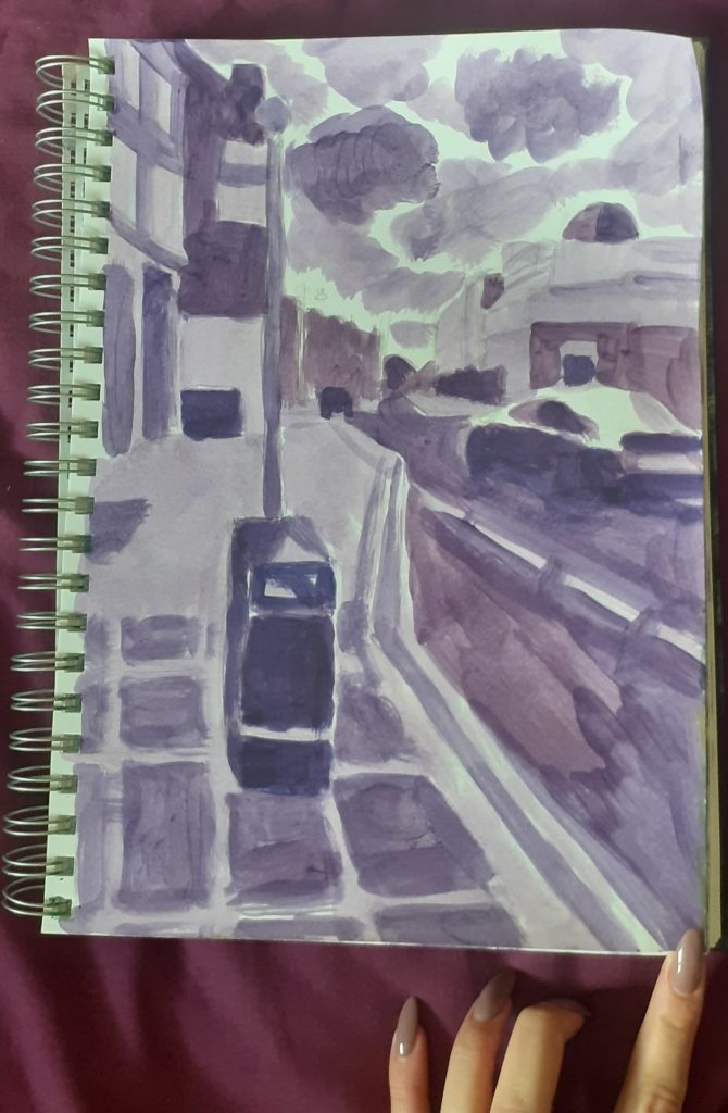
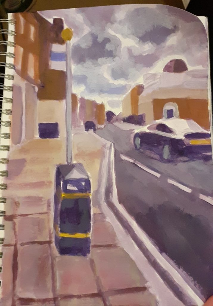
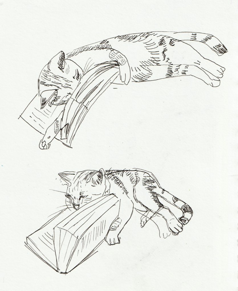
Next, I want to demonstrate a fact: sketchbooks are not necessarily for finished pieces. Mistakes will be made and that’s all part of the joy. I sketched the other reader of the house:
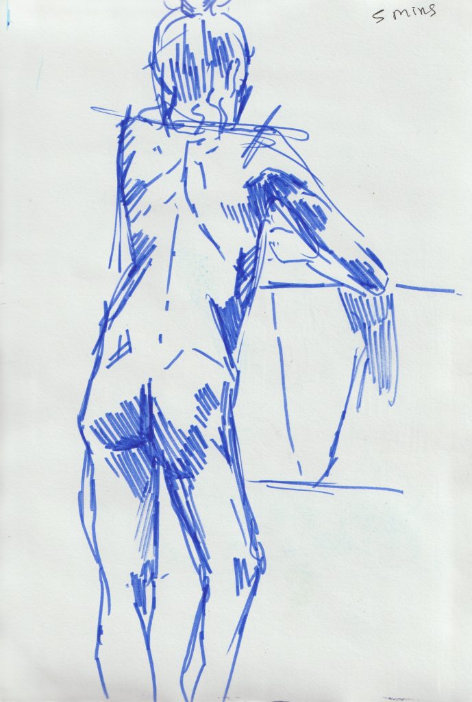
Life drawing
This week, I enjoyed a session of life drawing held at the Castle pub in Oxford.
It was a new venue for me and I was pleasantly surprised. The only life drawing I have taken part in, has been online. I went to college during the pandemic and so we were unable to have models come onto campus. Now that the world is opening up again, it was the perfect time to give this a go.
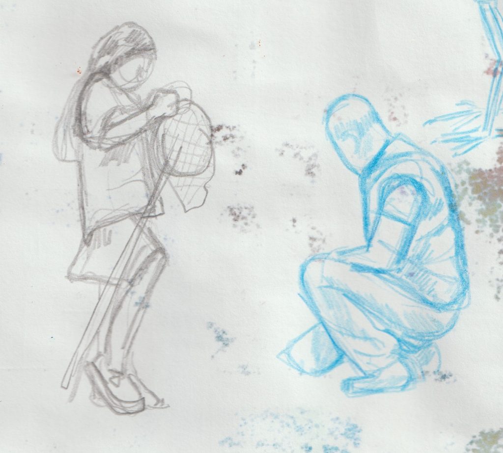
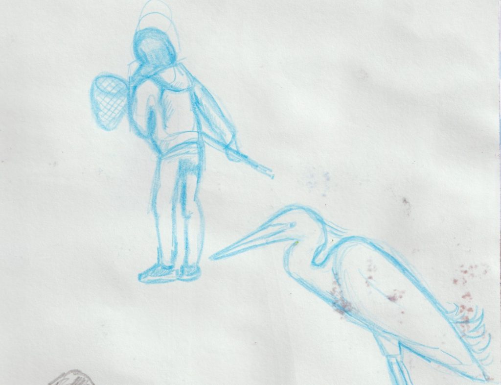
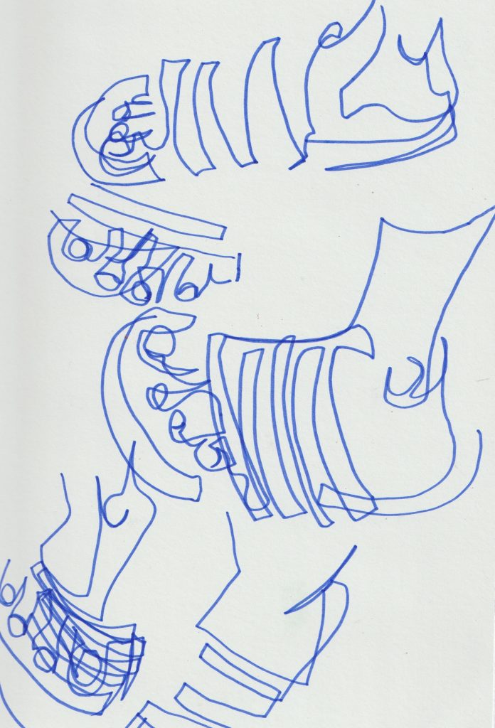
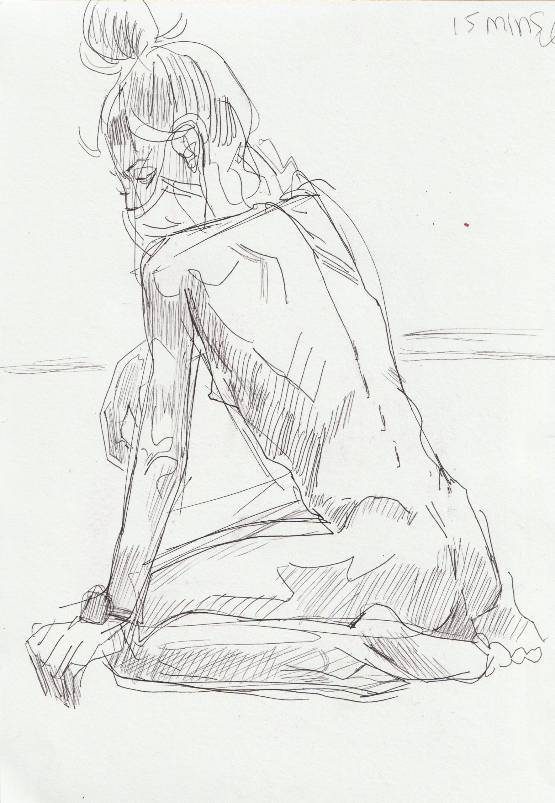
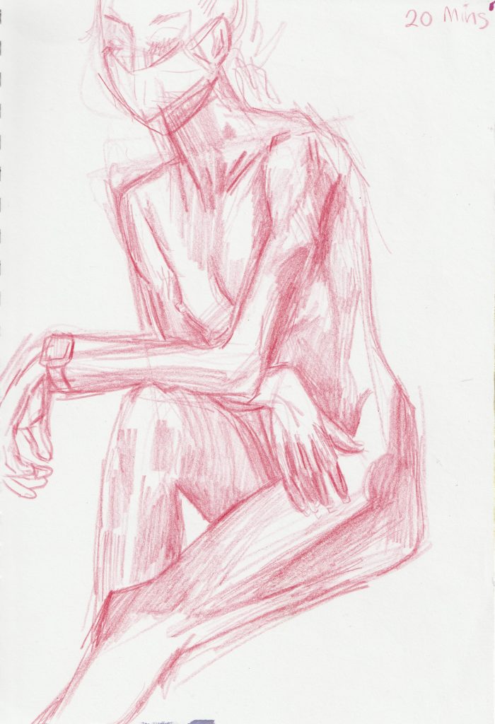
5 minute sketches
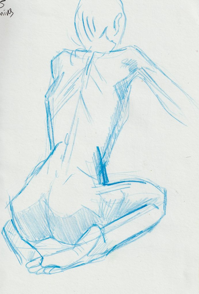
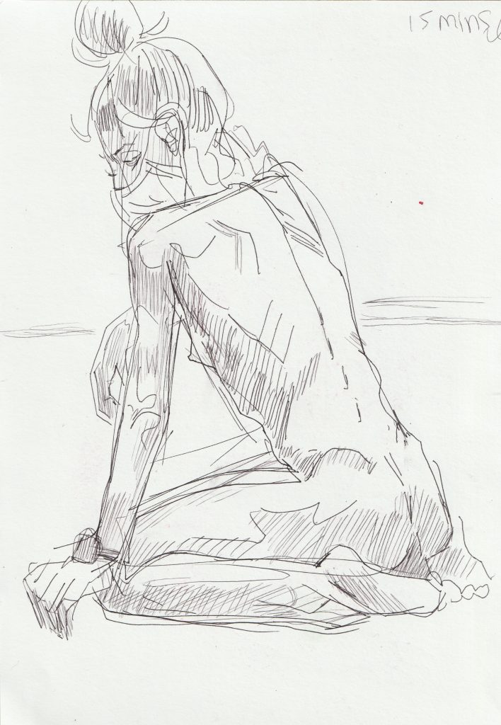
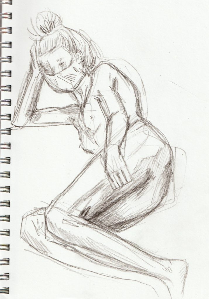
15-20 sketches
Book recommendation
(Could this be a new blog feature?)
I would like to mention a book I’ve been reading this week.
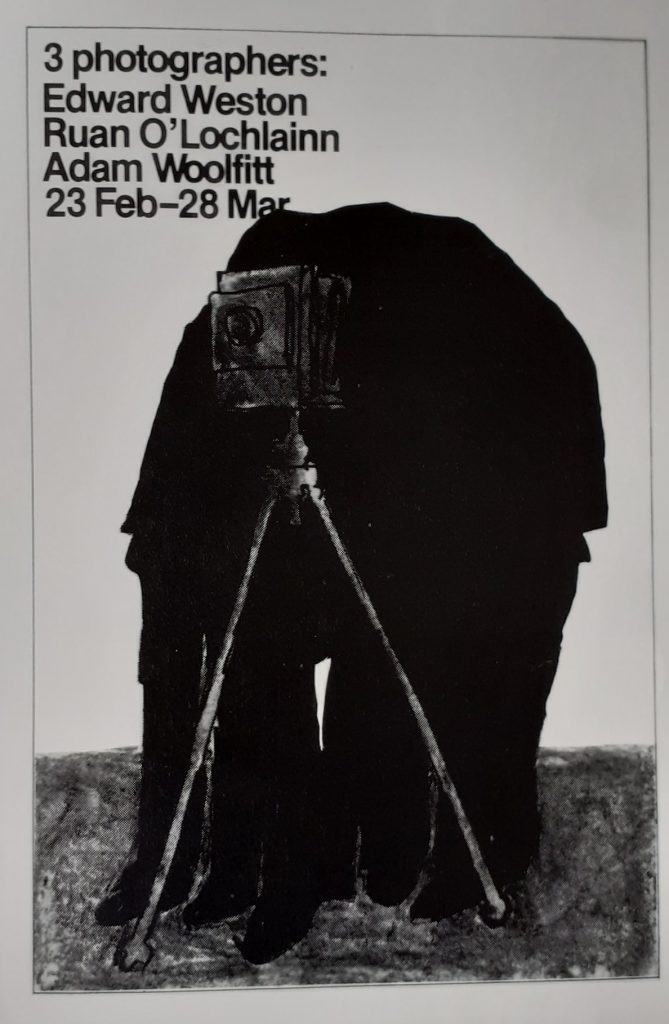
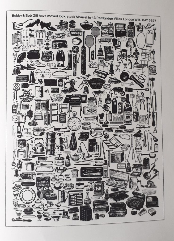
After reading an article about the death of Bob Gill (1931-2021), I was curious to learn about his work. I was lucky that the Brookes library had this book available. Published in 1981, Forget all the rules you ever learned about Graphic Design, feels as fresh as when it was new (I imagine!).
The man was clever, that much is obvious from these pages. It showed me the essence of graphic design: ideas.
And looking at a problem ‘outside of the box’ to use a much-disliked phrase.
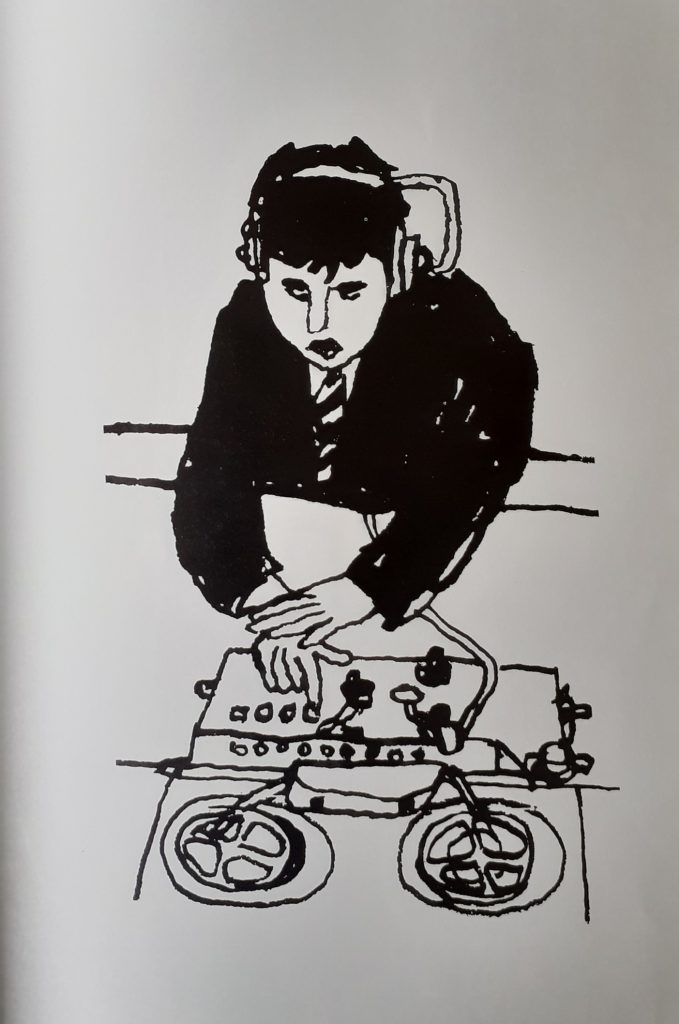
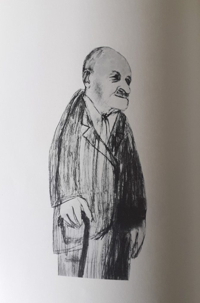
Gill was skilled in both design and illustration and I enjoy his work in both. At the top of each page, we are treated with a summary of the design.
1)What was the brief?
2)What was Gill’s solution?
He even goes as far as to critique his own work.
3) What would he have done differently? – This really helps me be a better critic of my own work.
I would recommend the book if you have about £200 to spare (the average second-hand price of the book), or certainly borrow it from a library…