Reduction lino: attempt II

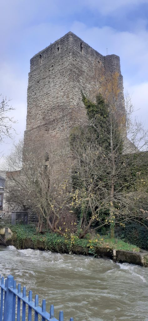
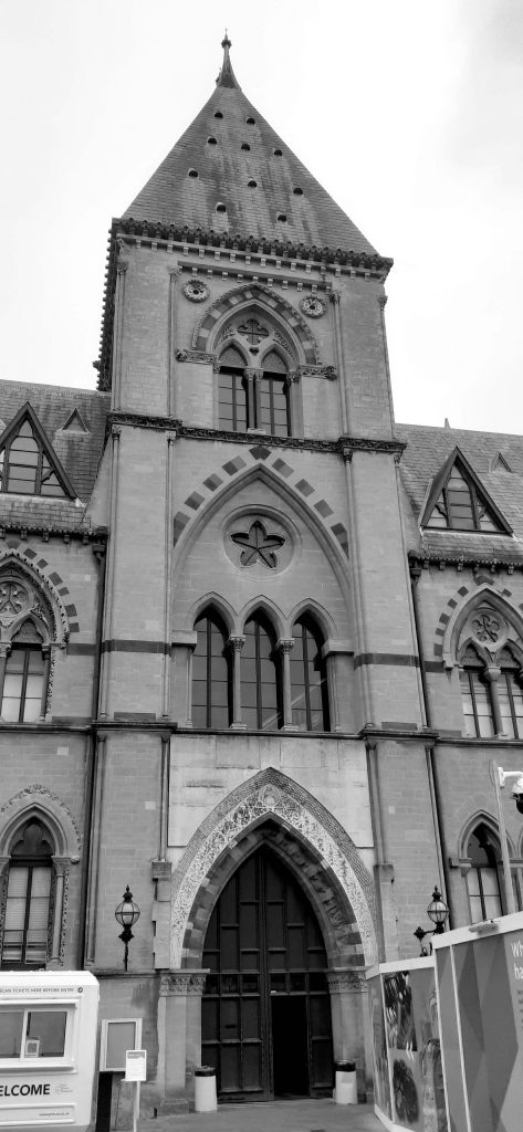
Oxford’s Bridge of Sighs

Mastering the art of printmaking means being able to produce several perfect prints in a row. (Perfect meaning identical and neat.) I think the reduction technique was a bit too challenging for a starting point, but here I am.

I am happy to share my mistakes in this blog, along with any successes. I want to learn from these mistakes and do something different next time. This is why I am including videos as well as photos of my process/progress. I will be uploading these videos onto my YouTube page.

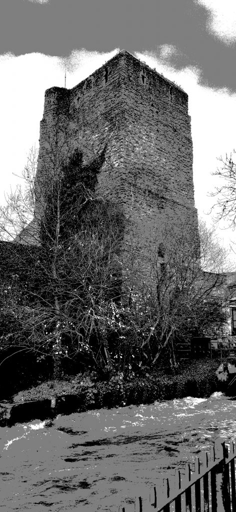
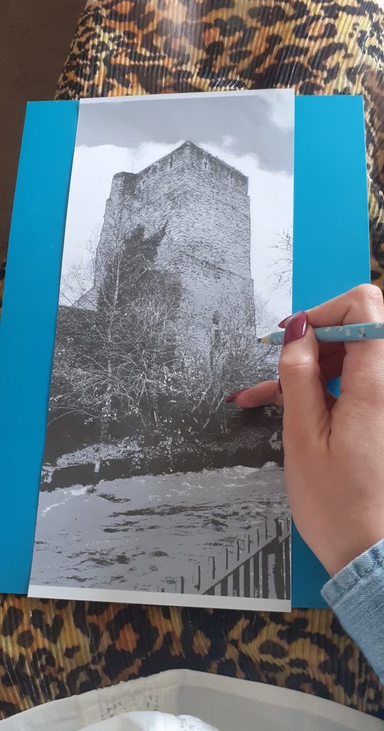
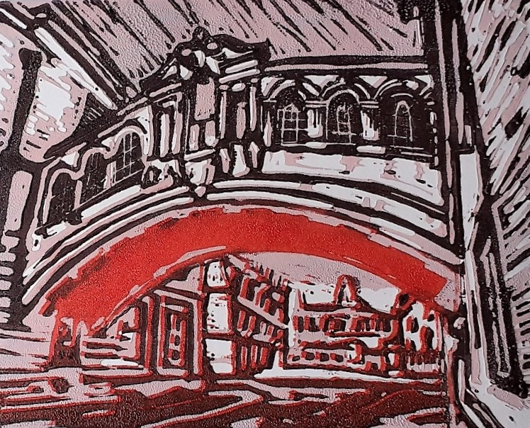
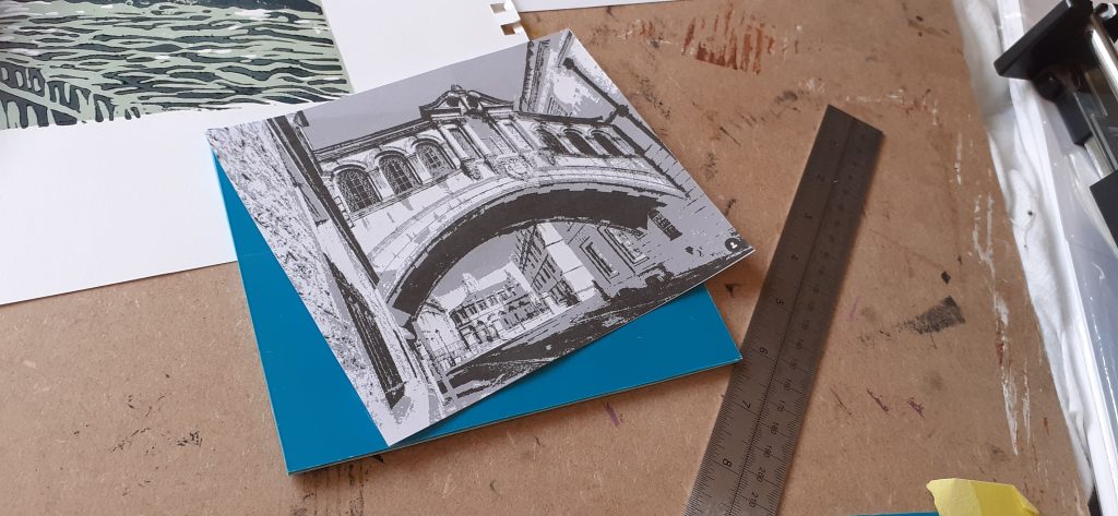
For my second lino experiment, keeping with the Oxford theme, I chose to work with this image of the Bridge of Sighs, from Instagram:

https://www.instagram.com/p/Cco-4ChIbKi/

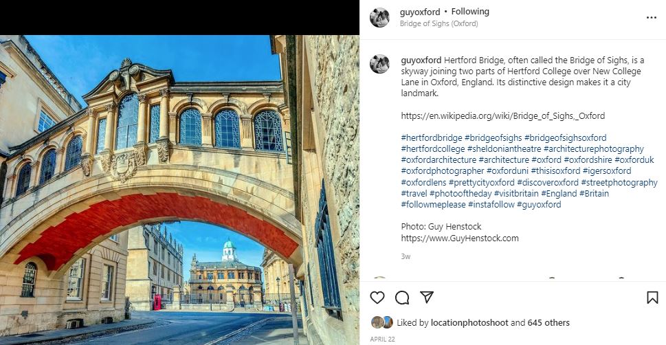
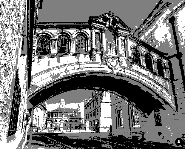
In order to work with this photo, I flipped the image and posterised it using photoshop.
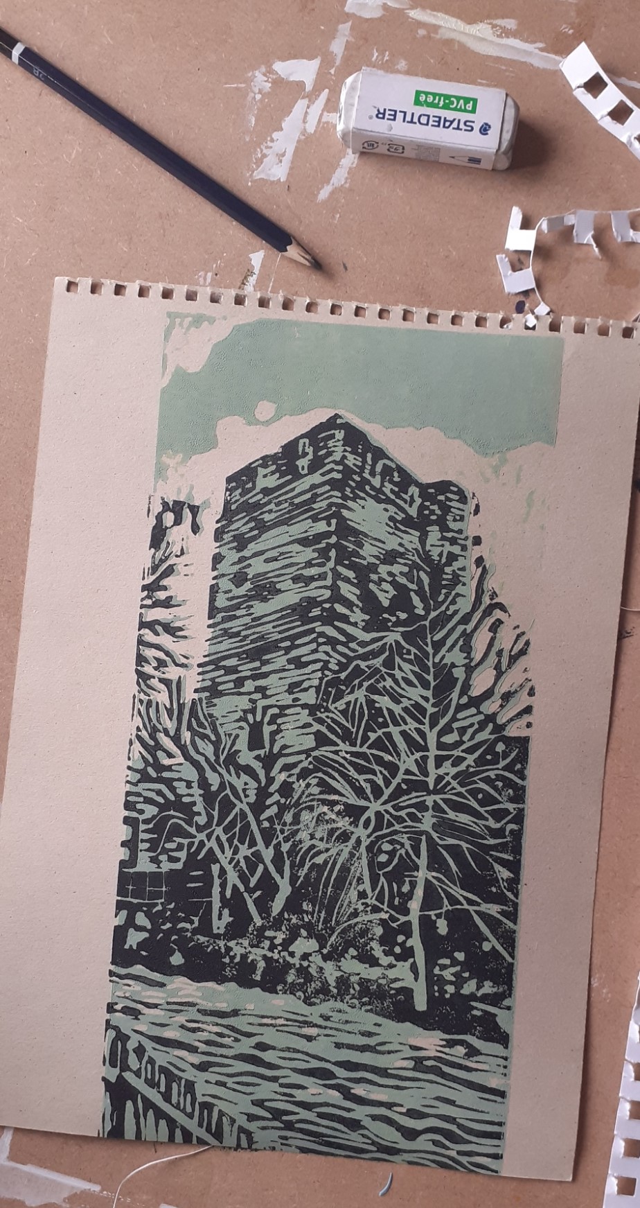
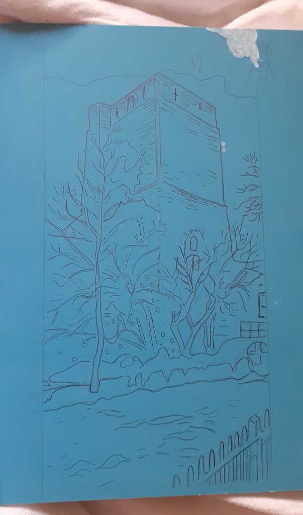
The Process

Tracing onto the lino, then cutting the design into the lino.

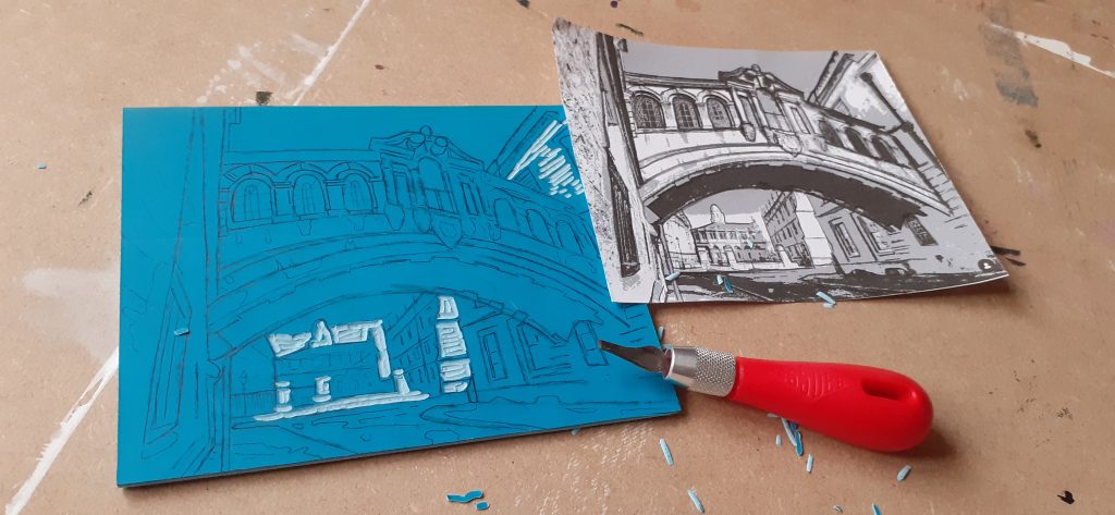
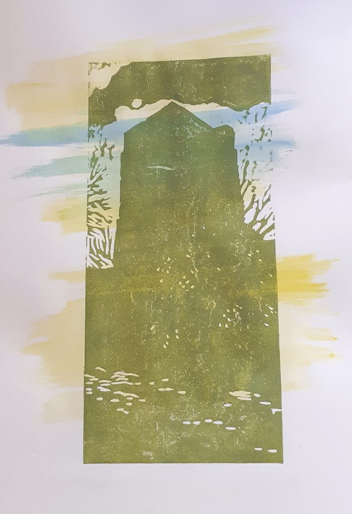
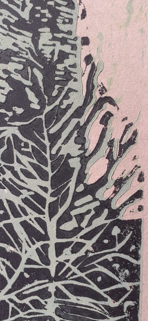
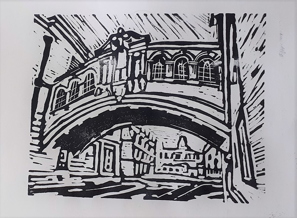
The first areas I removed would appear as the white of the paper:
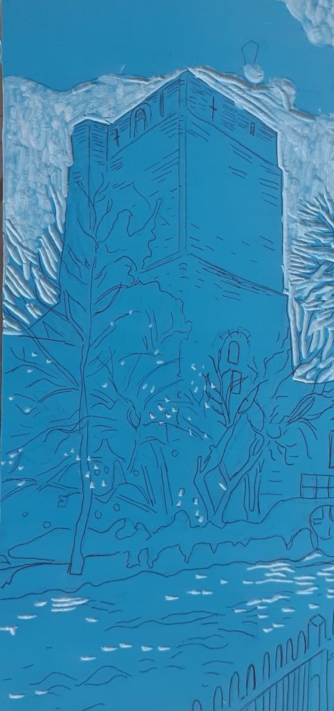
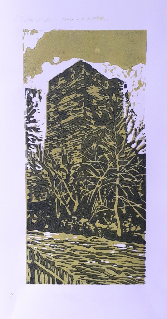
First layer.

Second layer

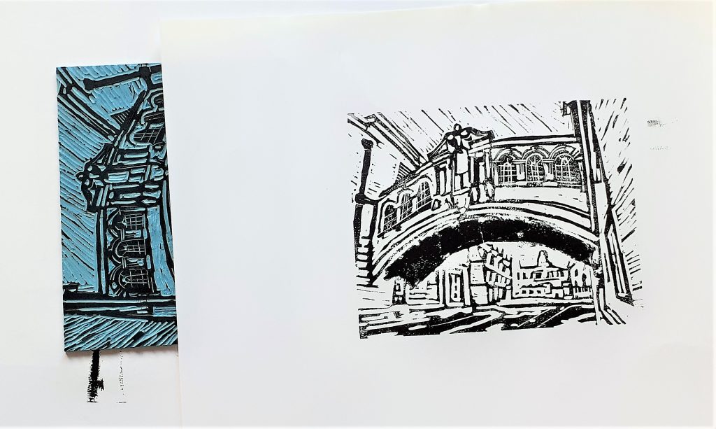
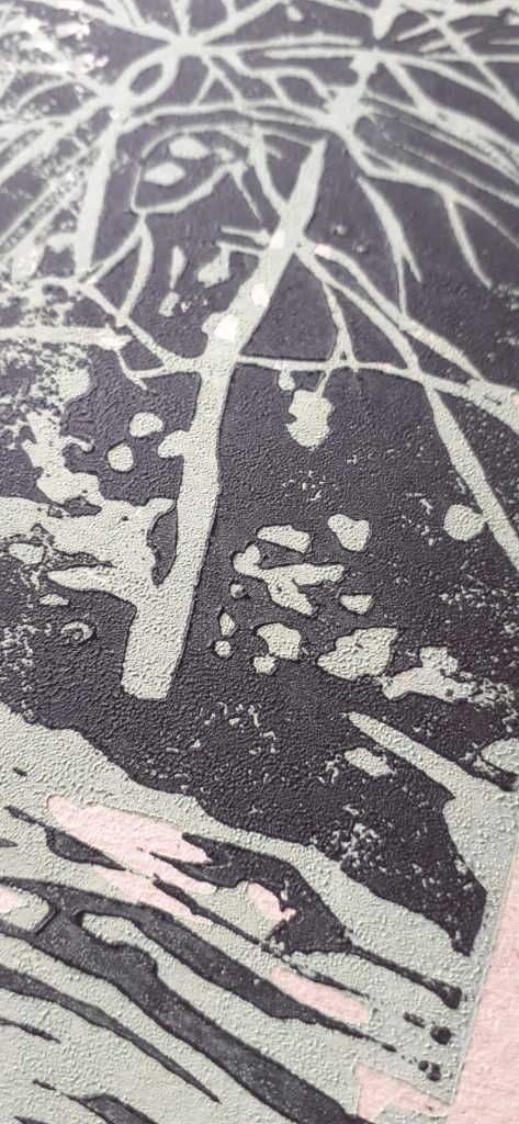
For the second layer, I removed the areas of the image where I wanted the first layer to show through.

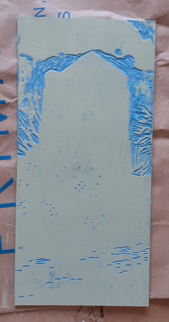
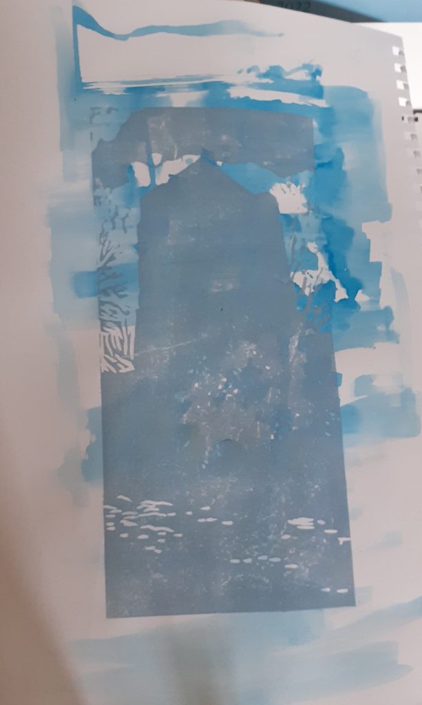
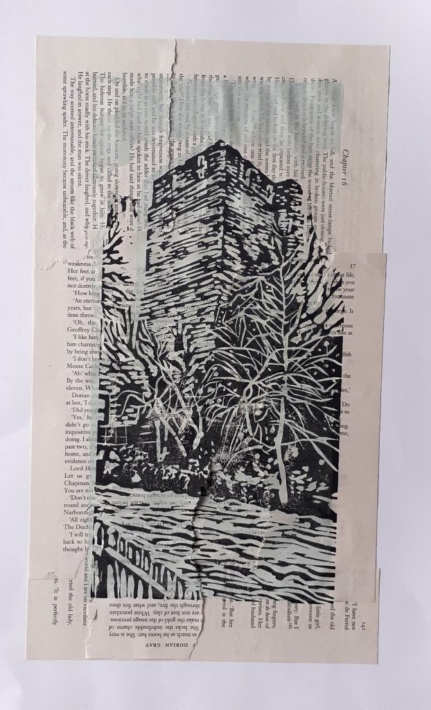
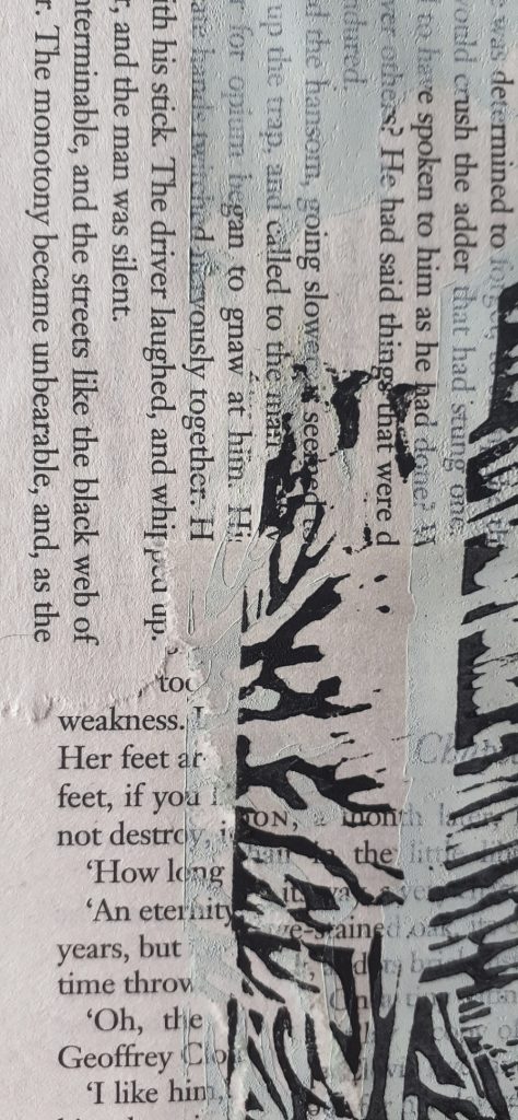
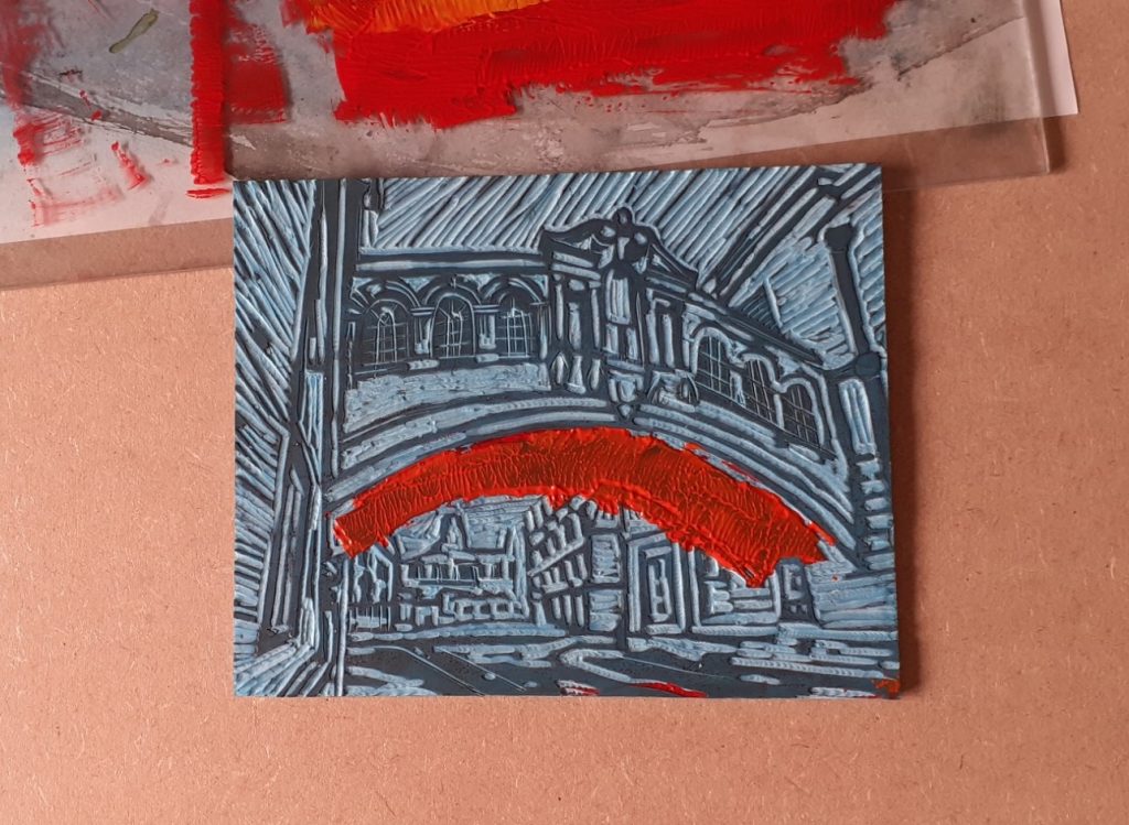
Using a cloth, I removed ink from the bridge area. This meant I could add red ink to print in a third layer later, (once the first 2 layers were dry). This left a blank area where the underside of the bridge is:
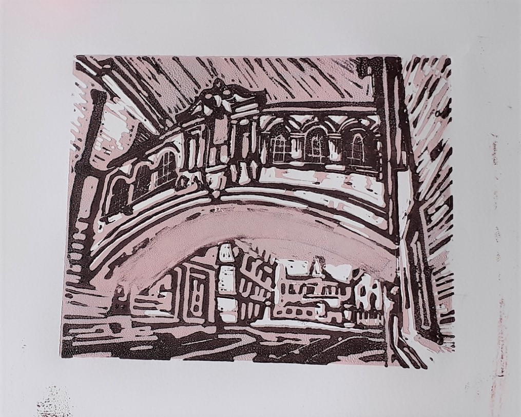
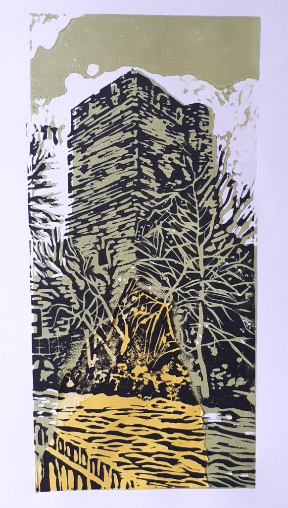
Third layer

I wanted to feature the red-orange of the underside of the bridge, as the colour looks striking in the photograph. I mixed yellow and red ink to achieve the bright colour:

Printing second layer with the orange ink as a test
I knew I wanted the bridge to be bright, so I masked the bride area of the print
After removing the tape, I had a neat area of red ink
I practiced on an imperfect print. The red bridge stands out but almost weakens the rest of the image.

WATCH Bridge of Sighs – applying ink

I then changed tactics. By applying ink to the bottom half of the lino plate, I was able to spread the bright colour across the print and therefore gives it more overall harmony.

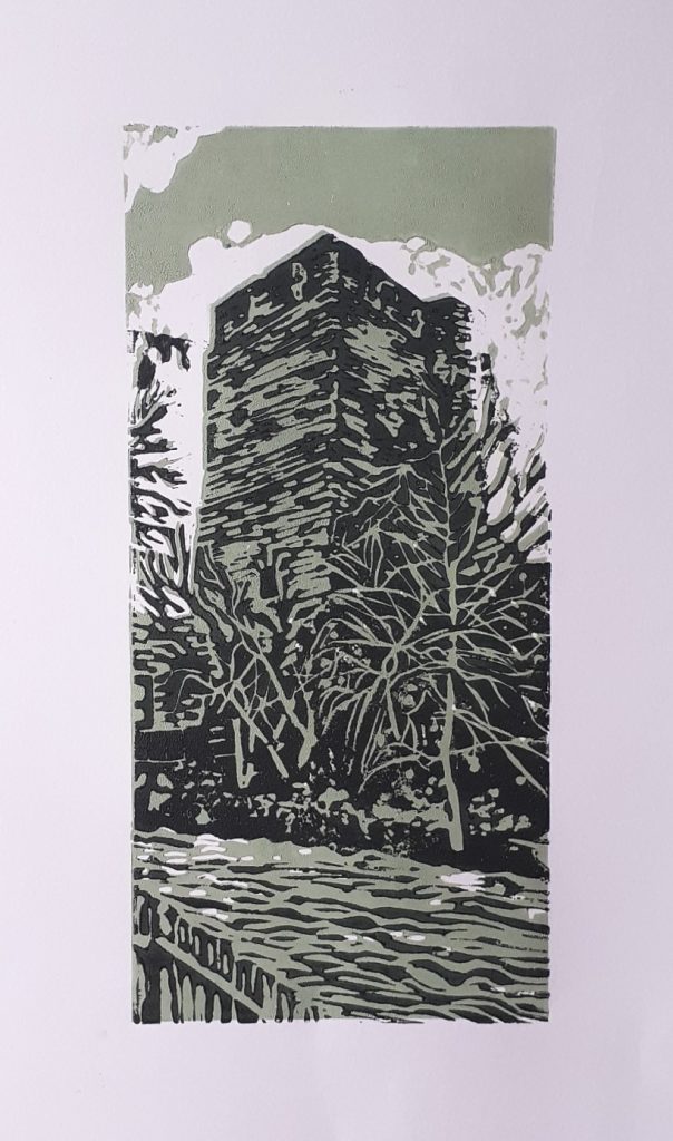
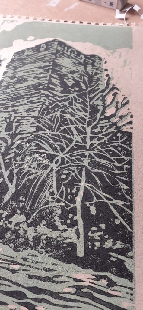
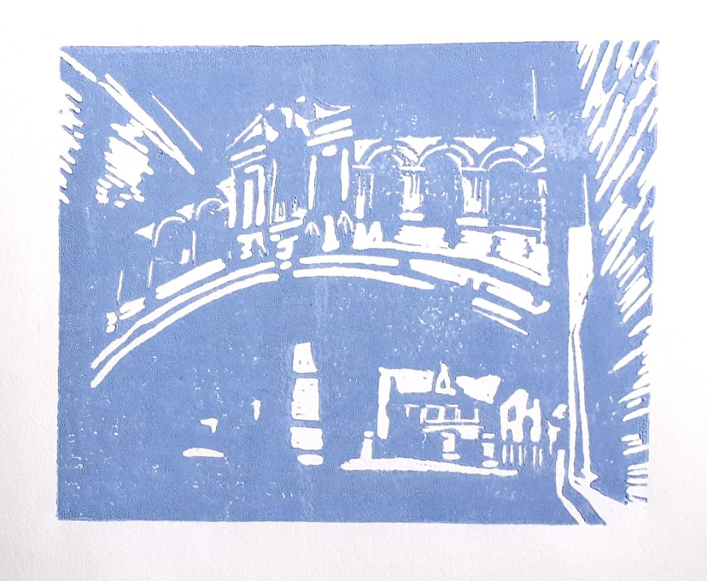
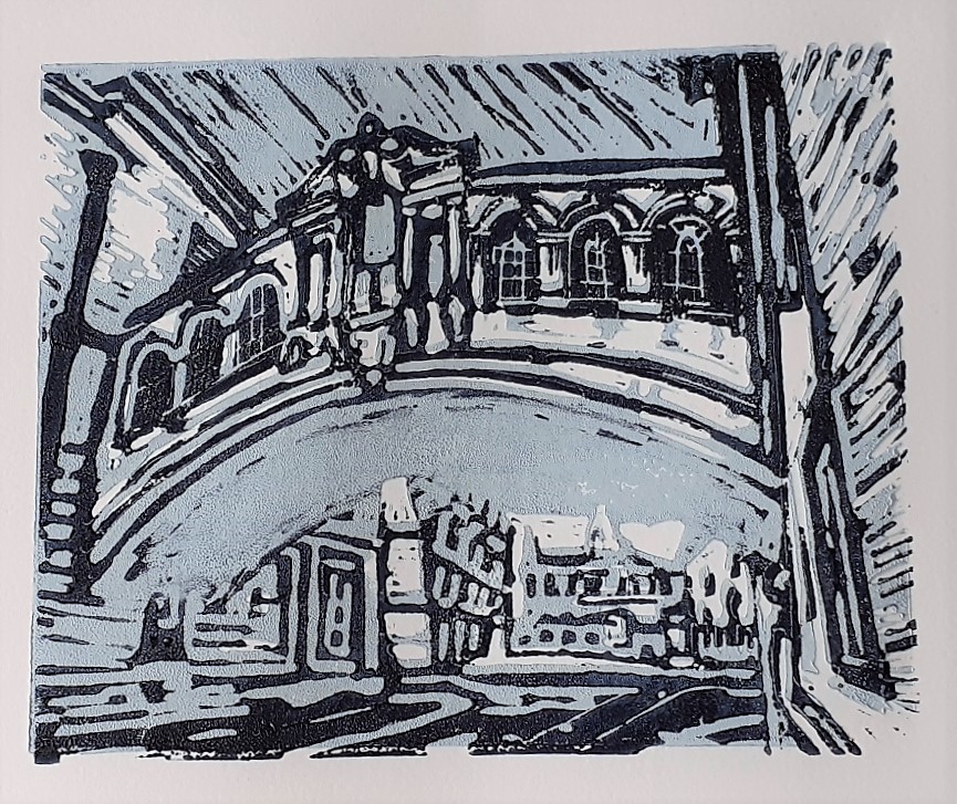
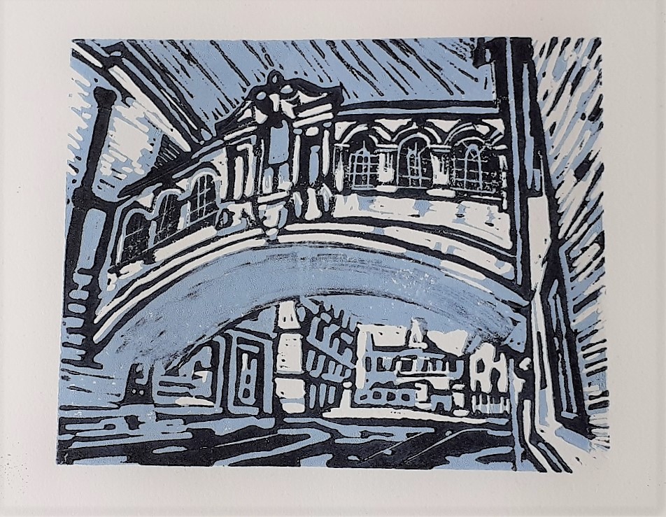
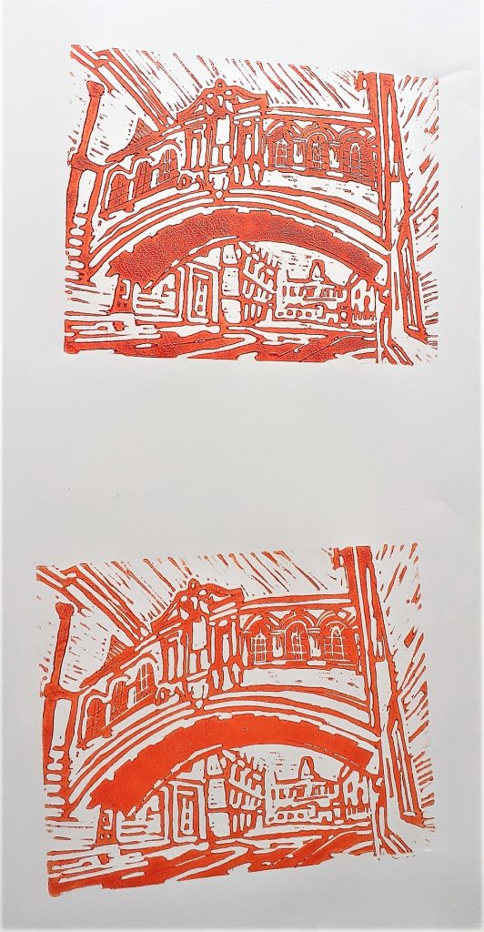
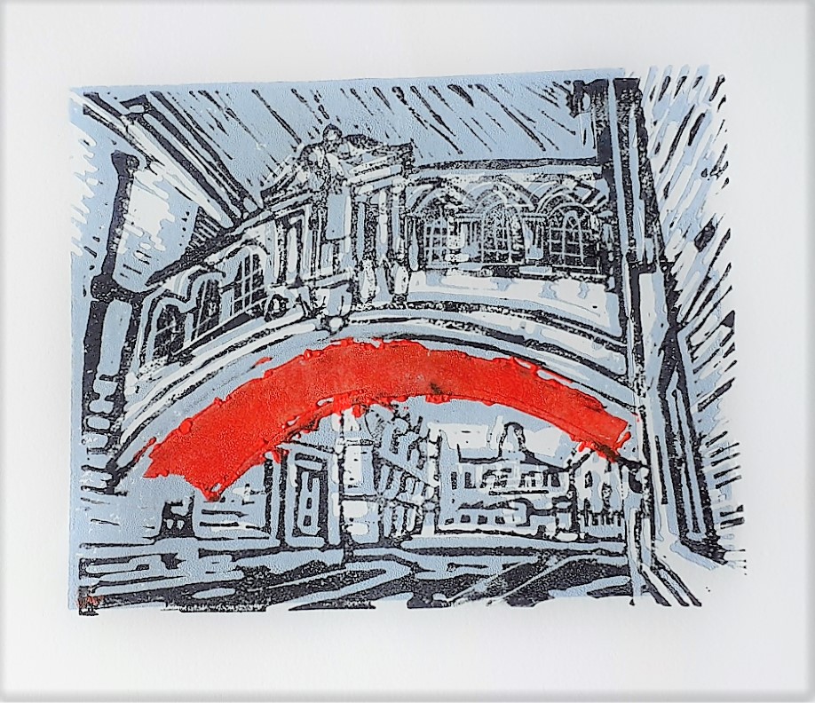
These were the results:

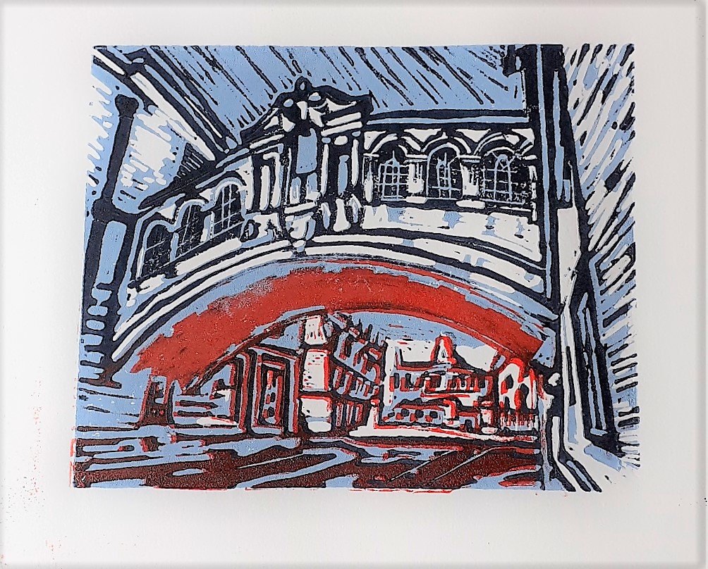
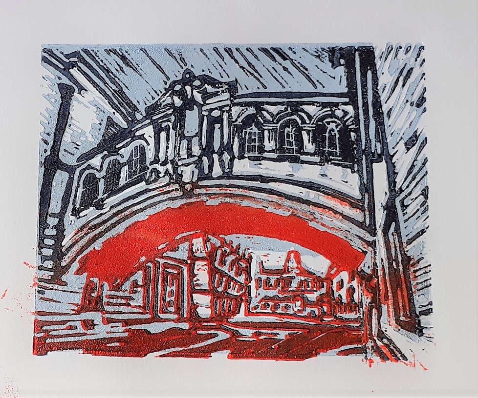
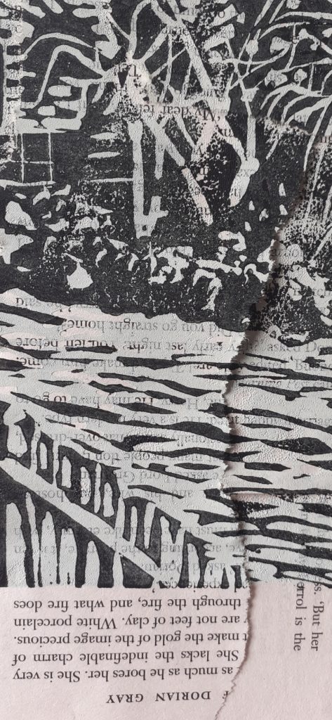
As you see, there were:

  • some slight misalignments
  • inky fingerprints at the edge of the paper
  • ink not sticking to the flat area of the bridge
  • uneven prints
Printing onto brown sugar-paper

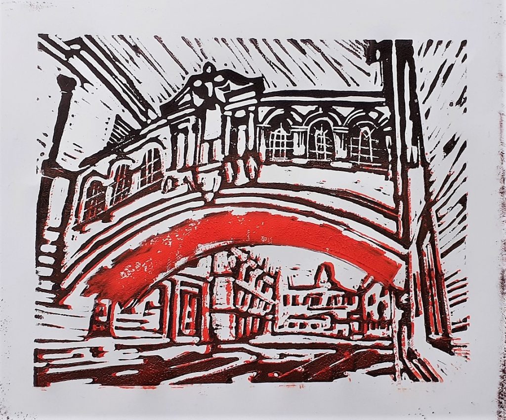
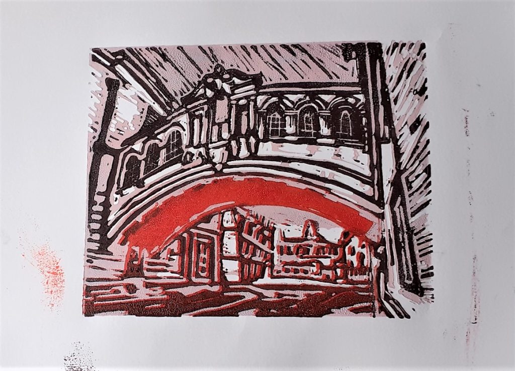
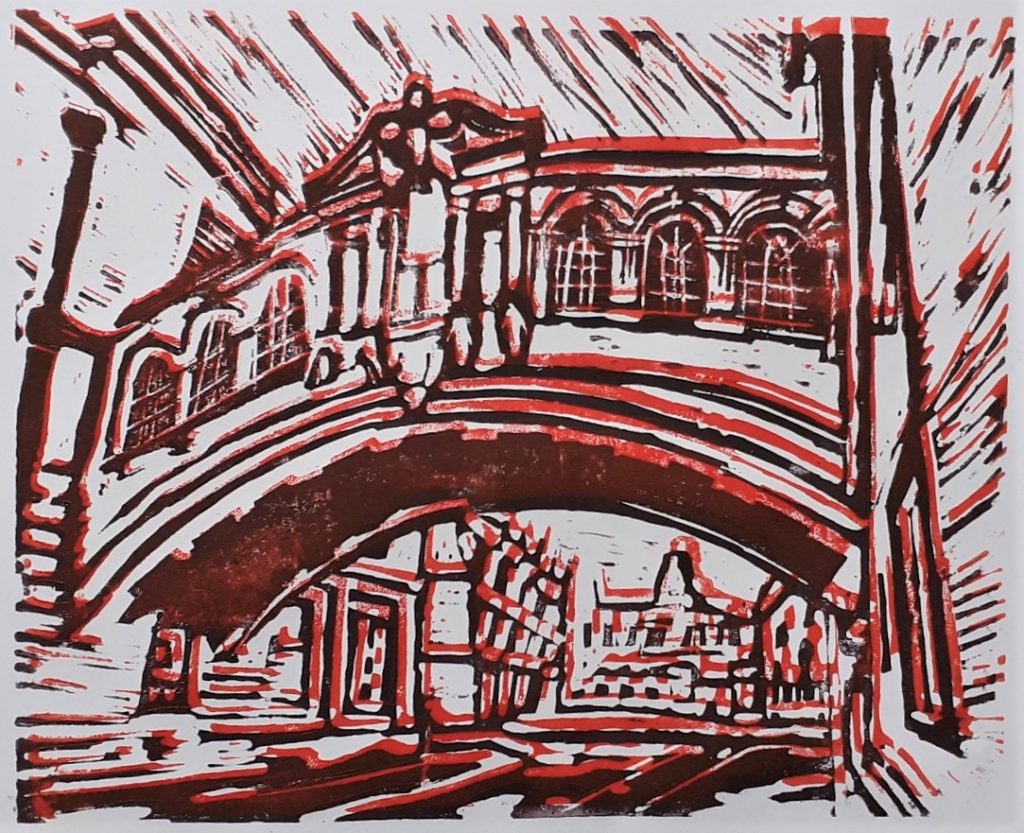
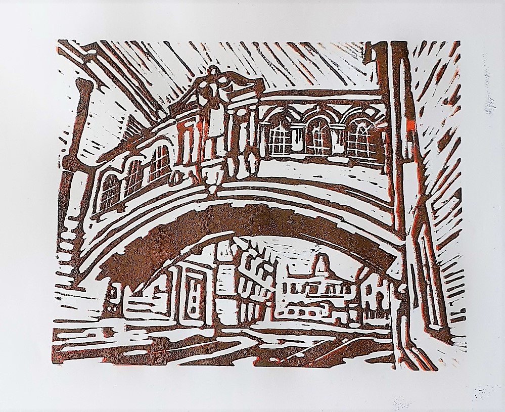
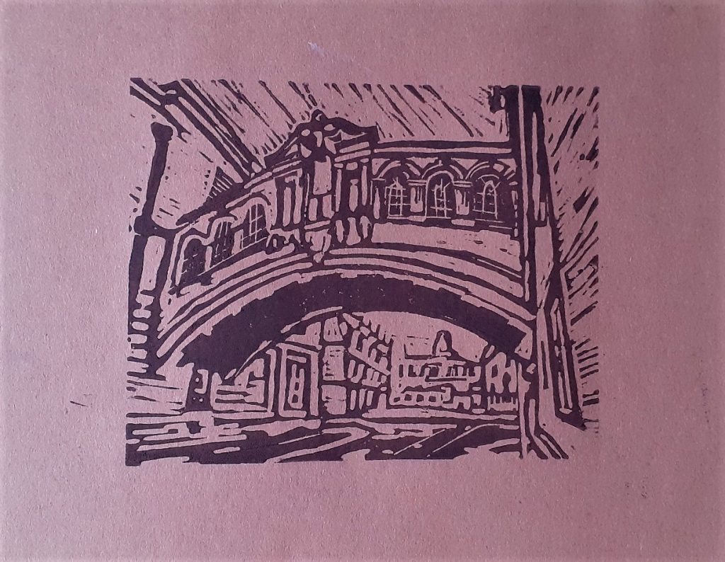
I wouldn’t call any of the prints successful. I liked some more than others, but it was frustrating to end up with messy results and to have made some silly mistakes that could have been avoided. I know this is part of learning.

Is it OK to say I like imperfection?

Learning Linocut

The last time I tried my hand at lino-printing, I was working on the FMP (final major project) of my Art & Design diploma. That was in summer 2021. One year later, I’m returning to lino. I missed the carving sensation and the satisfaction of building a work methodically- Something I only learnt to appreciate after working on screen-printing at Oxford Brookes.

My final piece for the exhibition ‘Metamorphosis’ at City of Oxford College, June 2021. I used lino-printing for the image of the fish. This method allowed me to reproduce many copies of the image.

First I needed a subject. This wasn’t hard, I’ve had my mind on buildings recently. I found this photo I took of Oxford castle (below). I Like the variety of elements: soft sky, crumbling brick castle, rushing river.

I reversed the image and posterised it using photoshop. Posterising the photo allowed me to view separate layers. Reversing it meant the print would end up the correct way around:

Then I got to work:

I chose the reduction technique to allow me to print more than one colour. I first carved the areas I wanted to stay white.

I then remembered to wash the lino with washing up liquid before printing with it.

I mixed a cold-toned green for the castle and river. I kept the colour paler at this stage. I am using water-based block printing inks.

My first print. I can see I did not apply enough ink to the printing plate.

I left the first layers to dry for about 12 hours before printing the second layer.

(below) I did not align the 2 layers accurately.

After printing the first layer, I glued a scrap of yellow card onto the print.

I mixed green into the ink for the darker layer, instead of the plain black used in other prints. I still wasn’t getting the alignment spot-on, and I could see the paper was shifting as I laid it down.

Applying less pressure onto the roller helped when transferring the ink from the plate to the lino.

What worked and what didn’t?

  • I need more practice/ a different method for aligning the paper.
  • The colours expressed something earthly which I liked.
  • The cartridge paper worked well.
  • I don’t like the brick texture on the tower, I wasn’t careful enough with my mark-making.
  • The watercolour background worked well.
  • I could have glued the collage background a bit more carefully.
  • I could work on simplifying/ improvising the design instead of including every detail from the photo.

Some details from the novel-background print:

Printing onto brown sugar-paper.

Natural History Museum

Today I visited the Natural History Museum, Oxford.

(left) The building from the outside.

I sketched the skeletons, which was surprisingly relaxing.

Whales and dolphins ‘swimming through the air’
Cain and Abel by Damien Hirst
Crocodile skeleton
6B pencil sketch of elephant skeleton
Kangaroo skeleton
6B pencil sketch of polar bear skull
Fine liner pen sketch of Hippopotamus skull
My favourite thing in the museum, the squirrel monkey
Beluga (White) whale