To start the year, I signed up for a 5 week printmaking course at City of Oxford college. It turned out to be 5 weeks of woodcut, which is a technique I have never tried before.
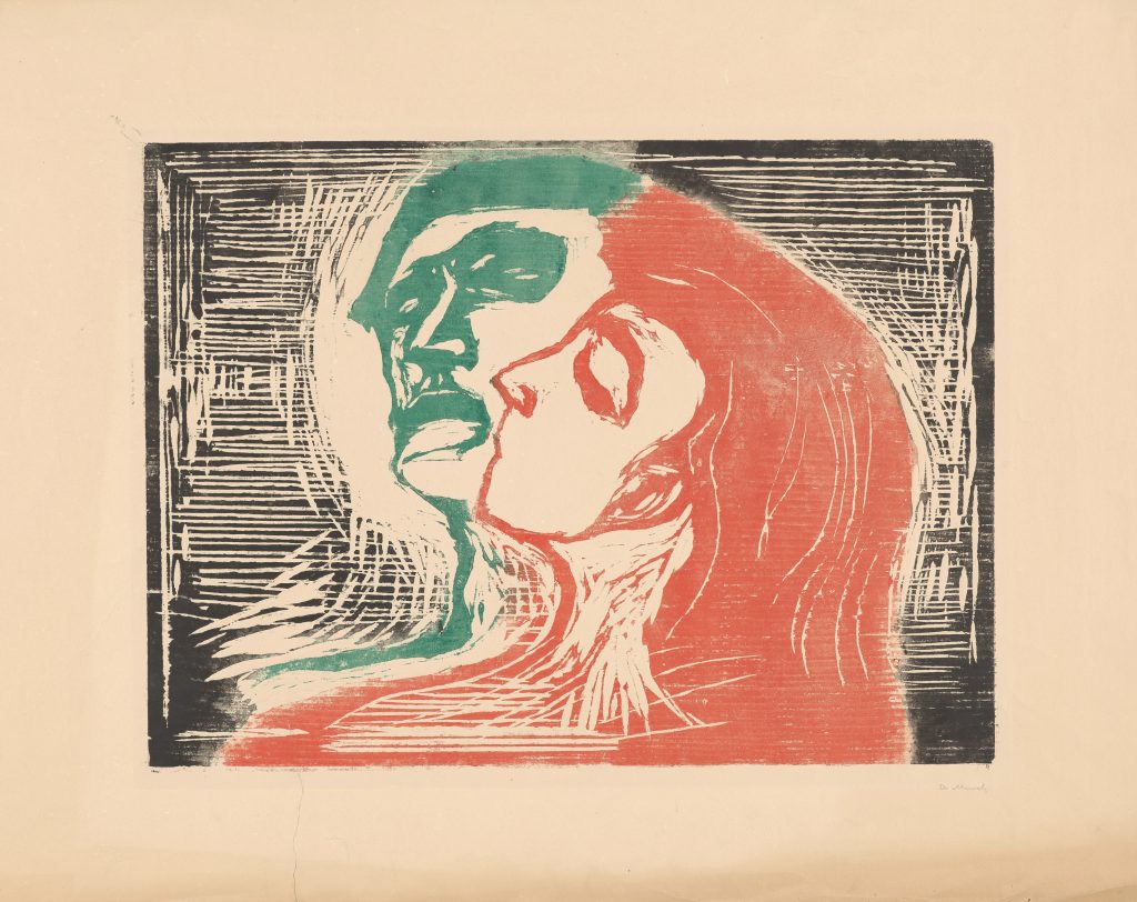
My first introduction to this printmaking technique was at the Scene Through Wood exhibition at The Ashmolean a few years ago:
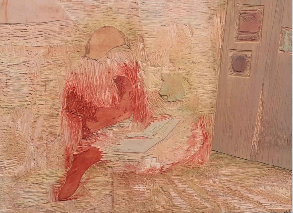
And the Interior Light exhibition last year at The North Wall Arts Centre, Oxford:
The artist included examples of her woodcutting technique on the plate itself.
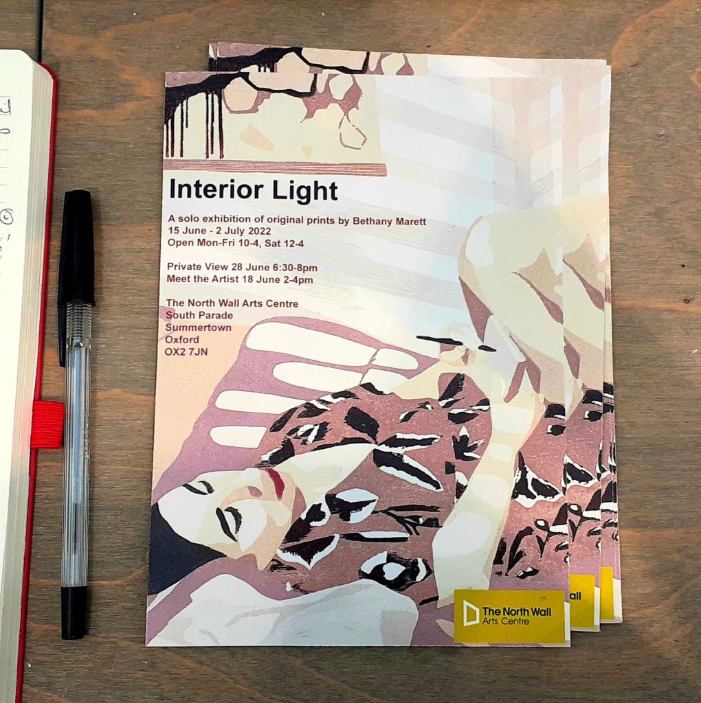
Leaflet of the exhibition.
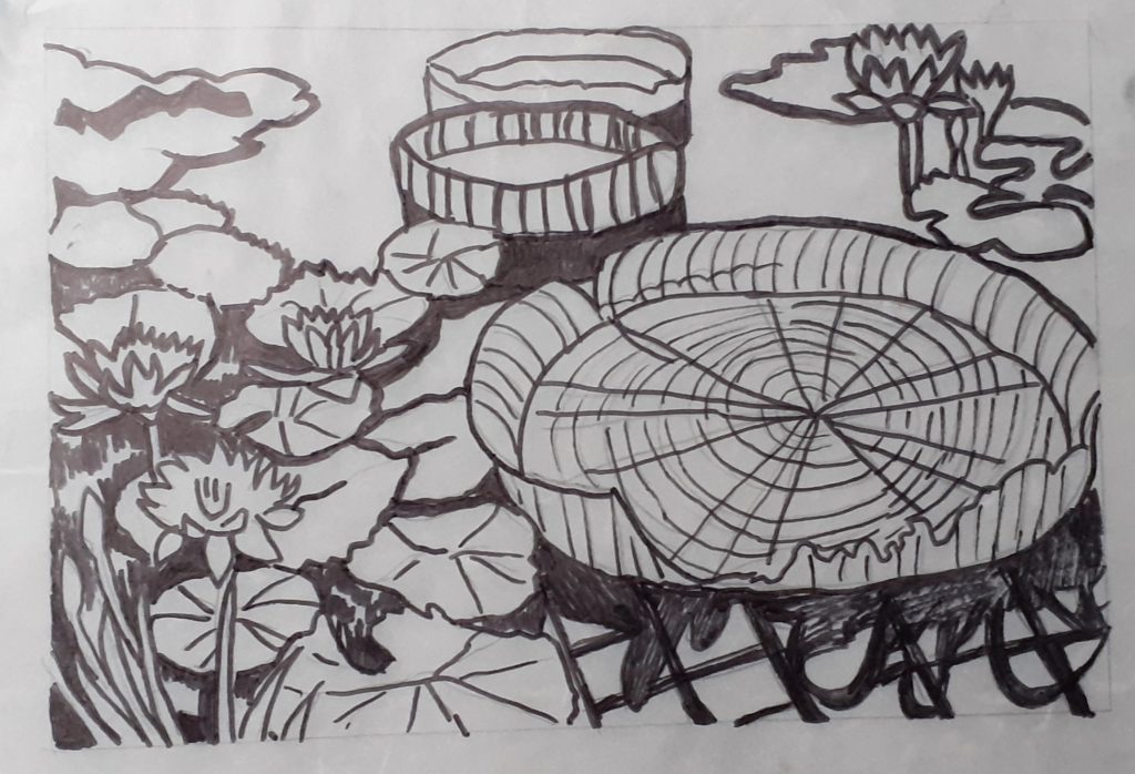
The begin our process, we needed to draw our designs onto tracing paper. I hadn’t come prepared, so I worked from a photo I had taken last year a the Botanical Gardens:
This turned out to be a bit too detailed and I also wanted to work on an abstract design, so I therefore changed my mind after the first session…
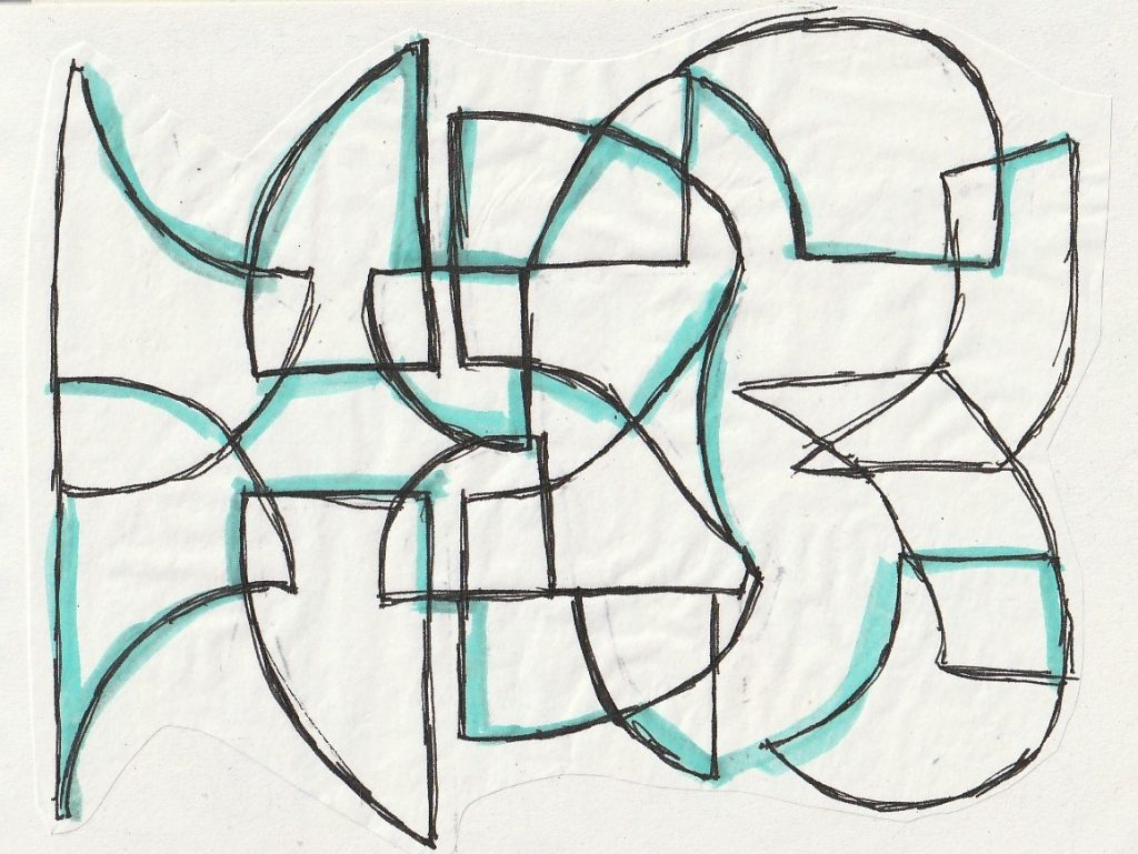
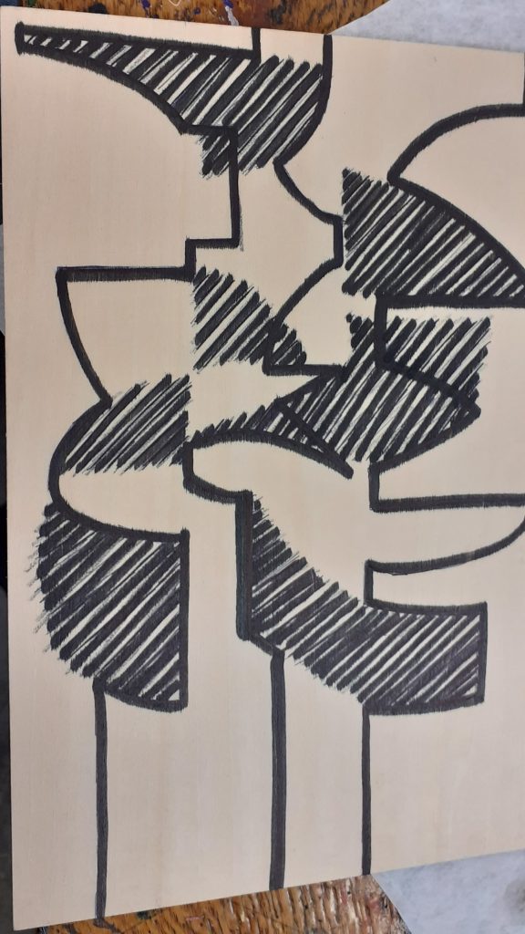
I sketched the lines I intended to carve (above).
I considered how overlapping the layers would create new hues.
I cut shapes from paper and used these to construct the drawing. I could place them on the page and play with the overall structure to test out different variations.
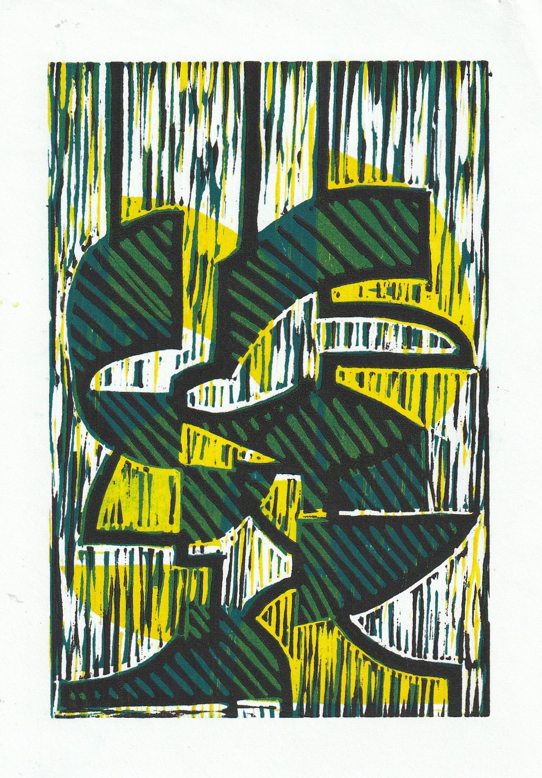
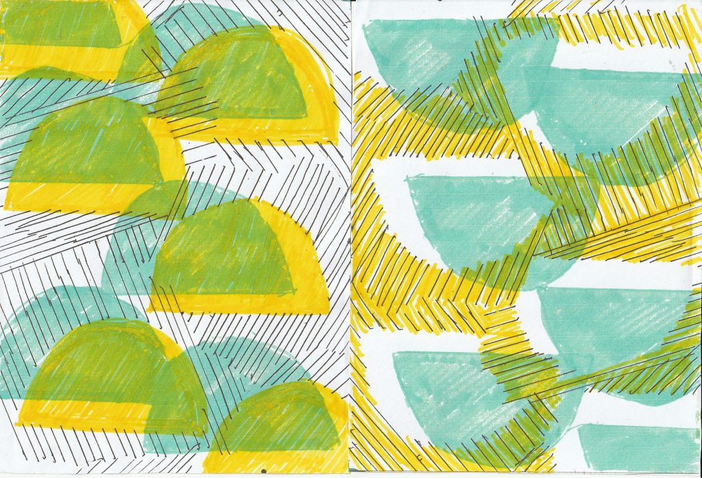
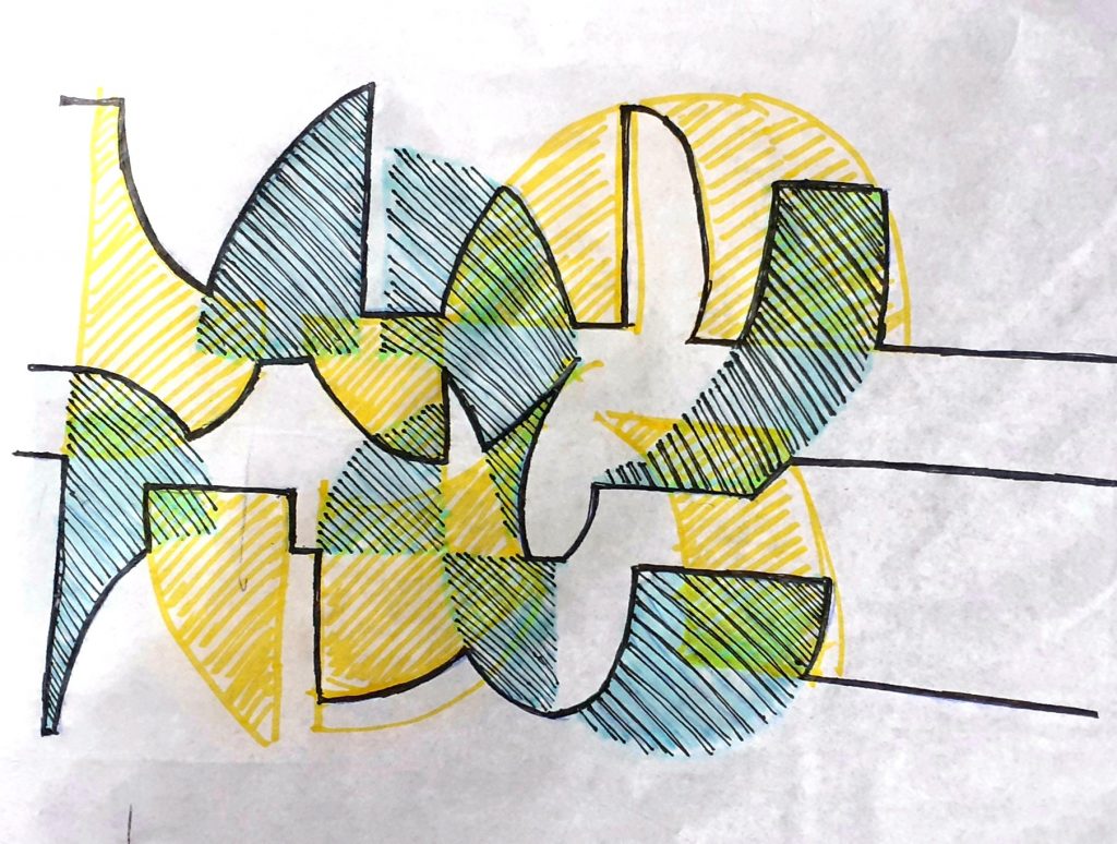
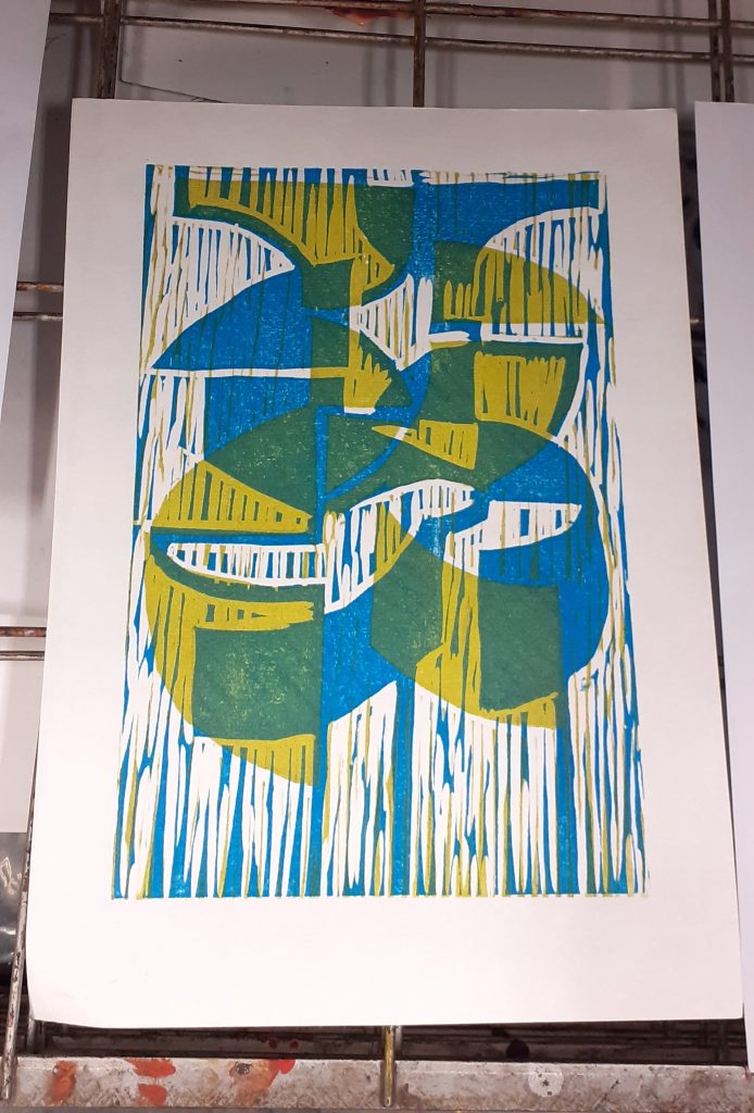
I planned to print 3 layers. One black (the key plate), one yellow and one blue.
Week 2
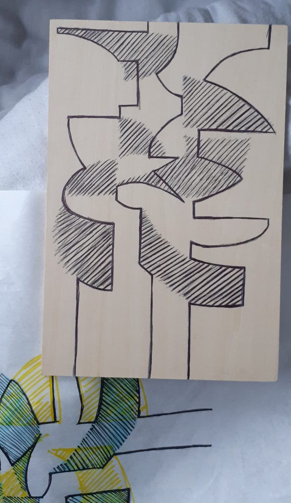
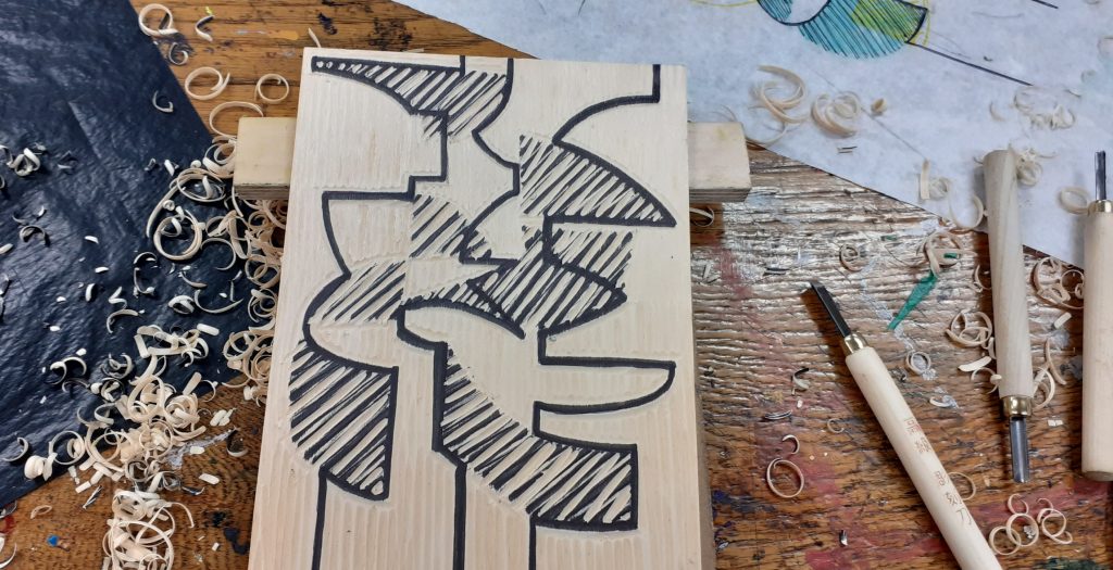
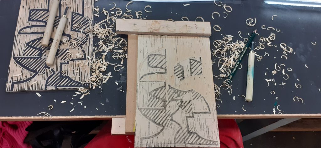
The black layer would need to be printed last. It would become the most detailed layer. I sketched the design onto the wood:
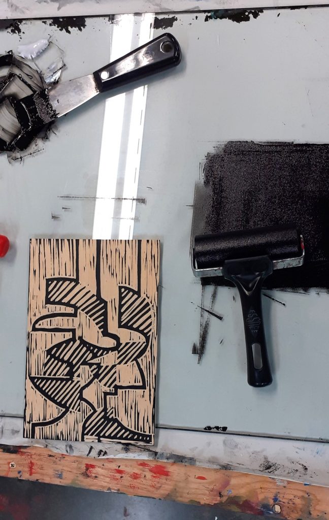
I then needed to remove every area that was not the black area. Carving was not as smooth as cutting lino, but I did get used to it. I found that I needed to keep the lines quite thick.
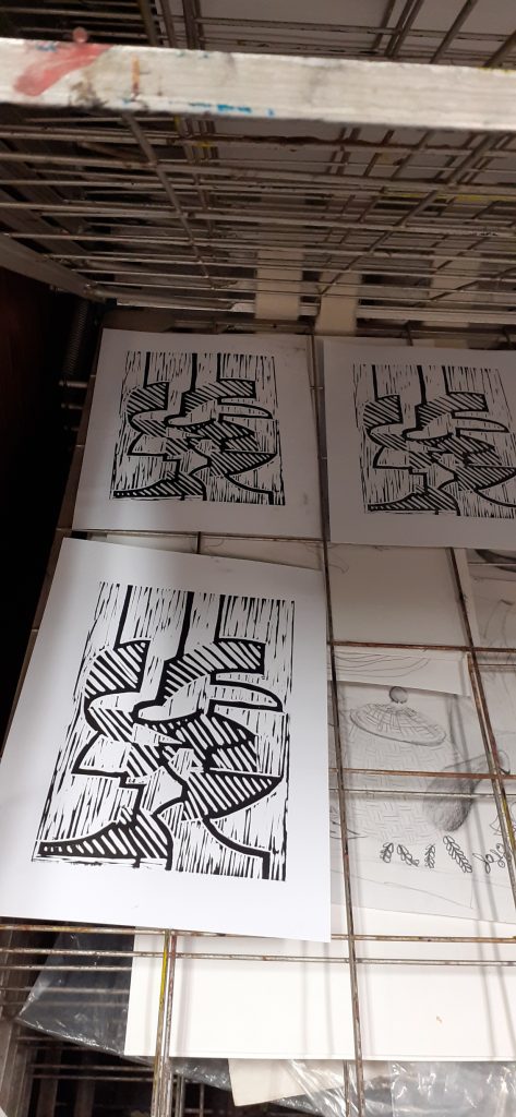
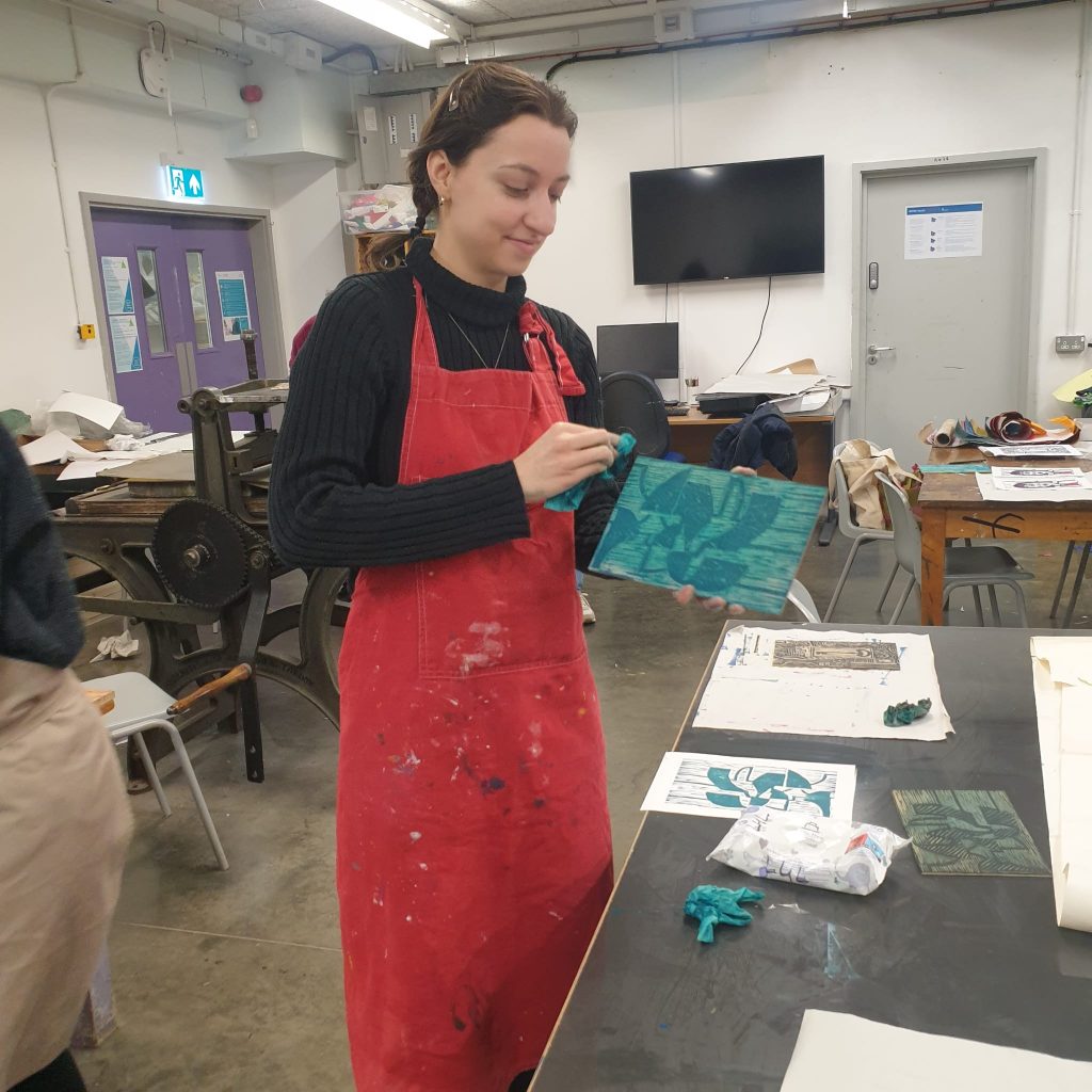
I printed this layer first. This allowed me to make any corrections had I needed to. It also allowed me to create the second plate using the back of the wood and another piece of wood.
Week 3
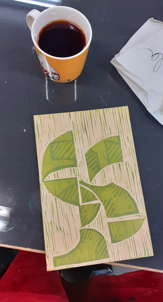
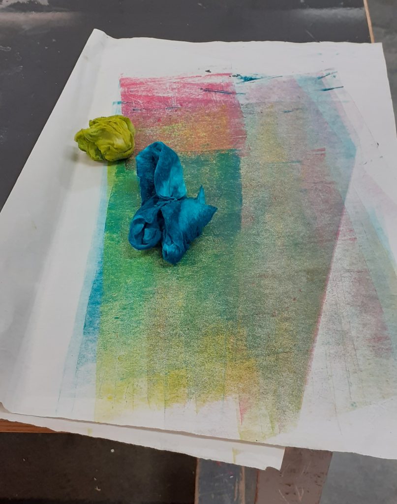
This session began with more carving, then I was able to print my first coloured layers:
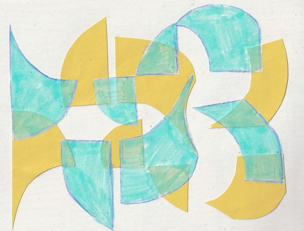
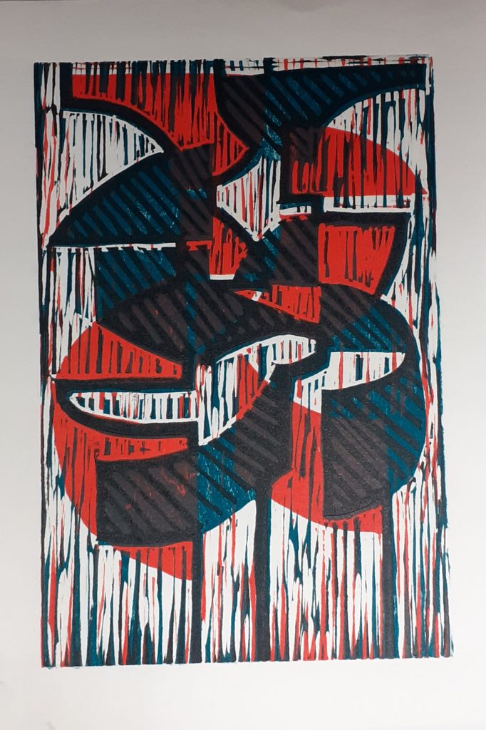
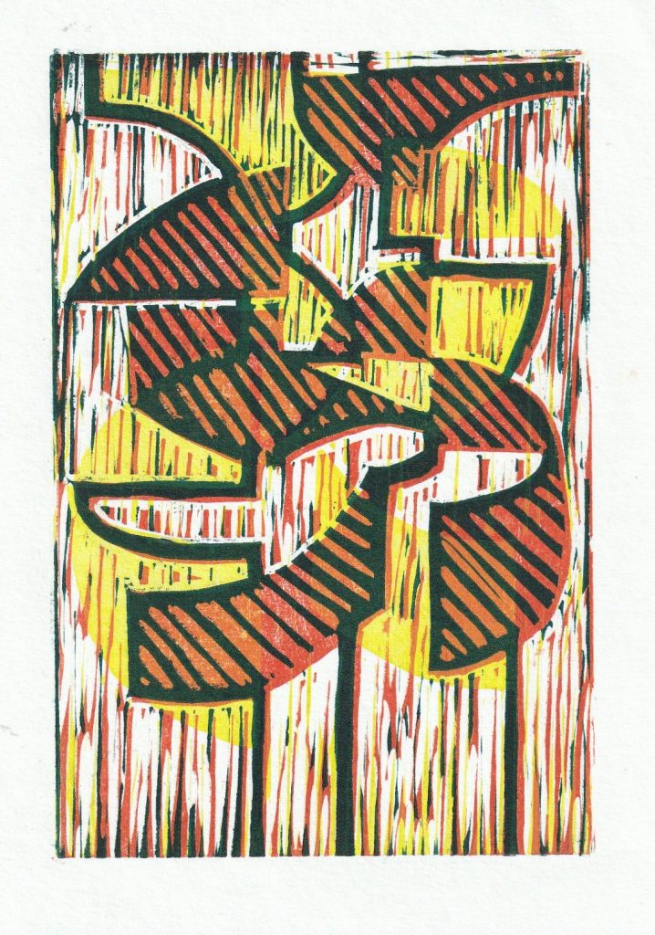
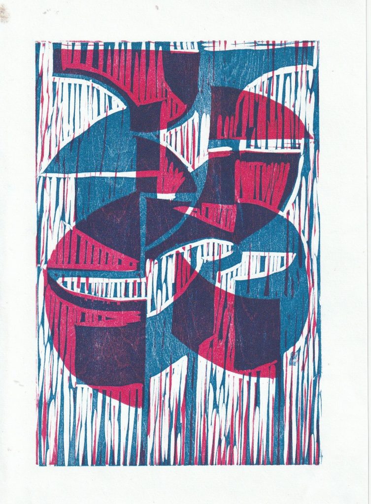
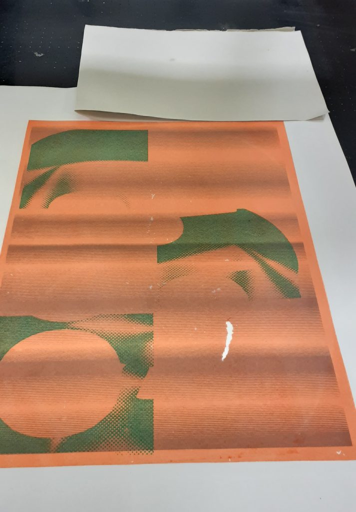
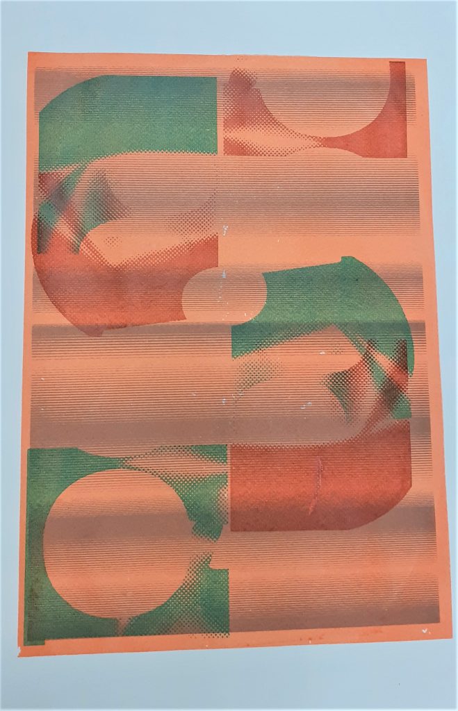
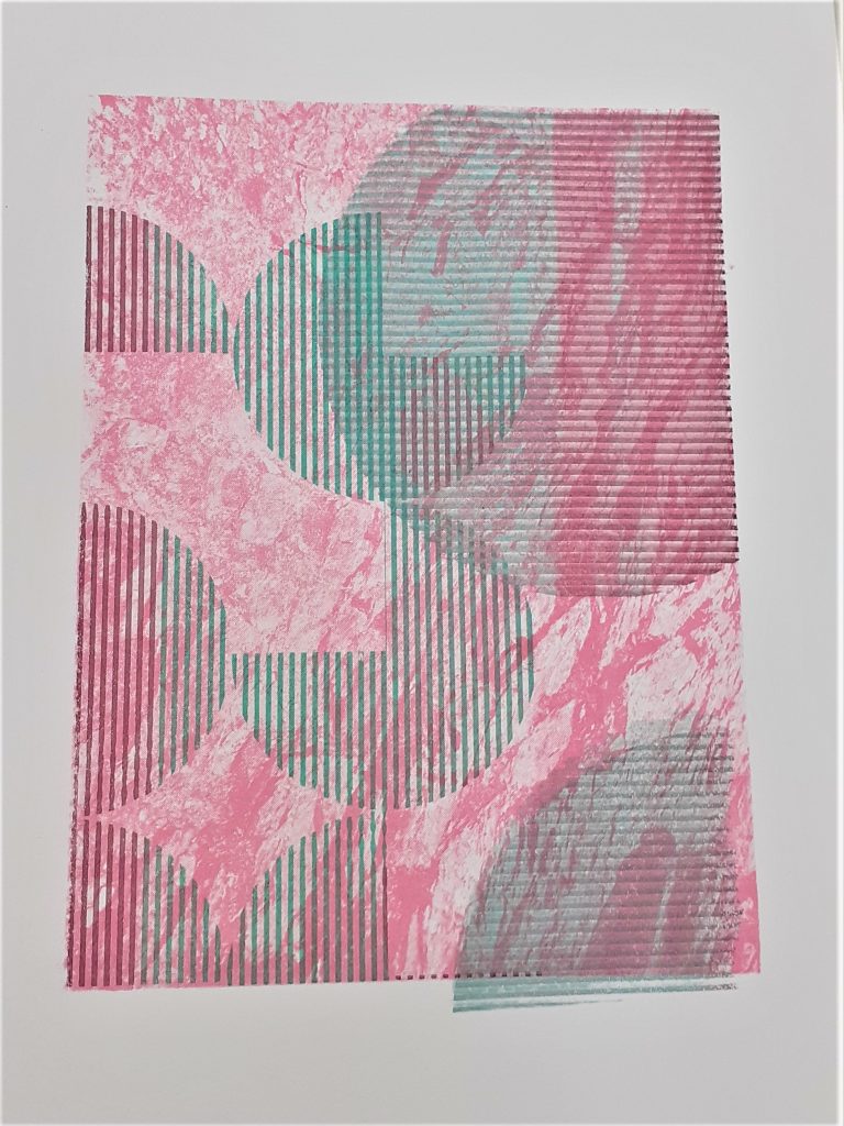
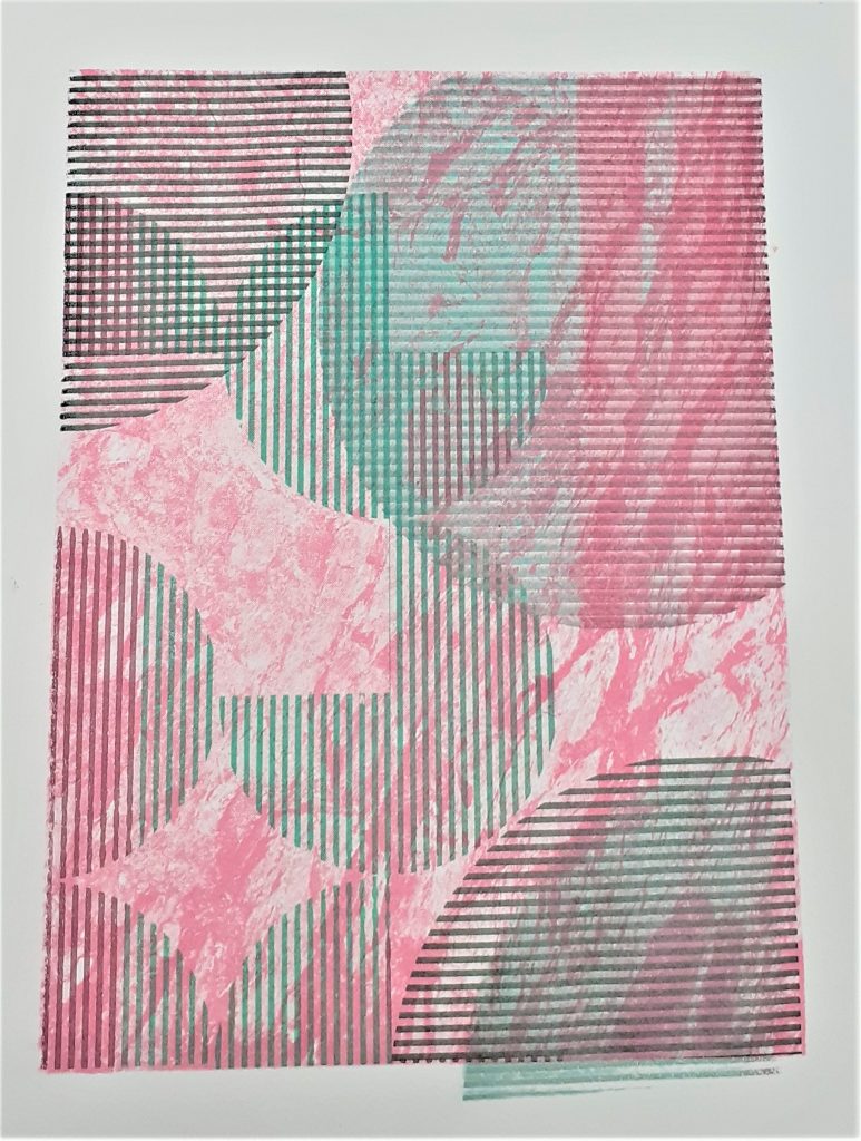
Layering the coloured layers produced green segments. I was surpised to see the amount of detail produced, since I wasn’t sure how clearly the carved strokes would appear.
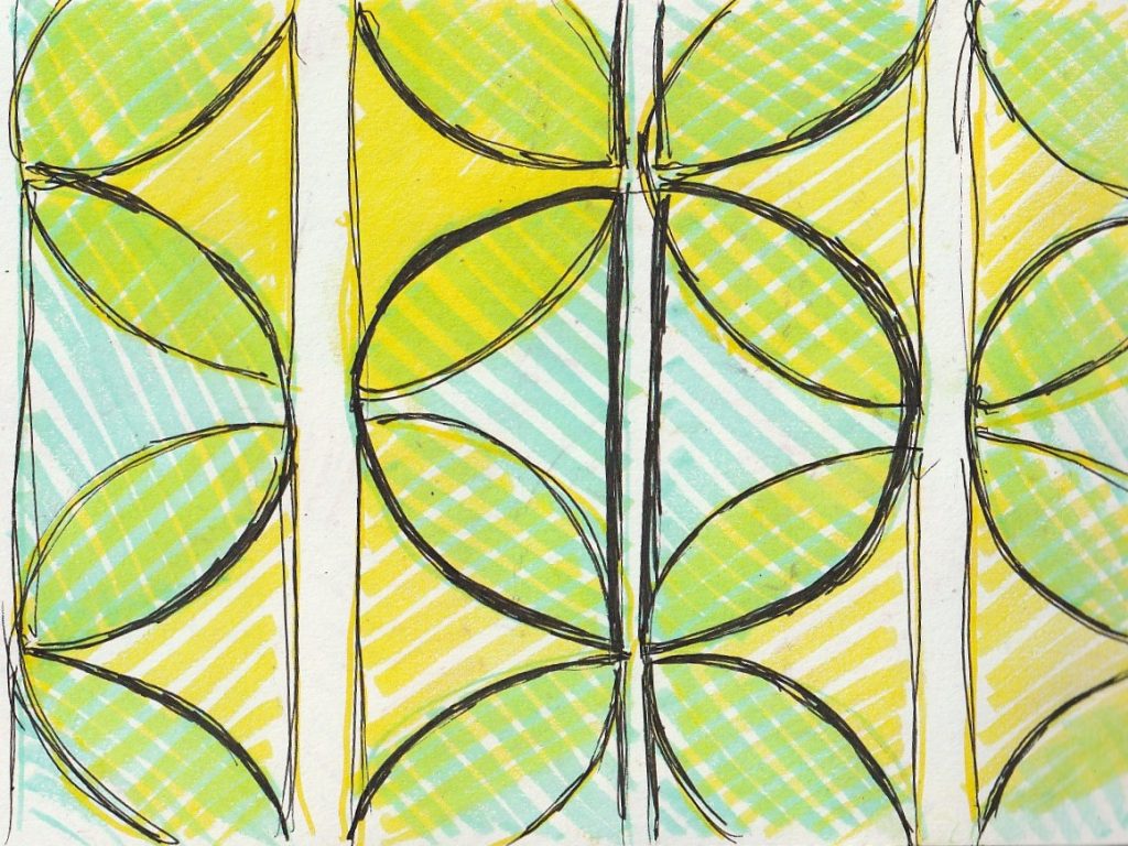
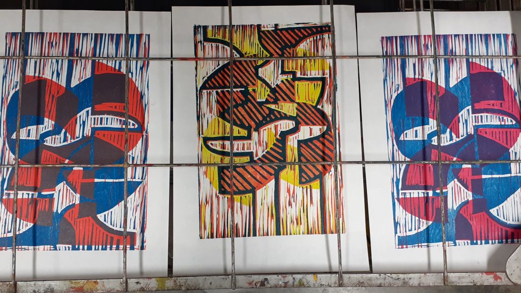
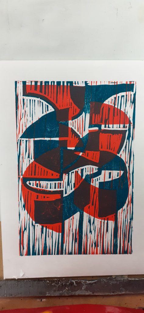
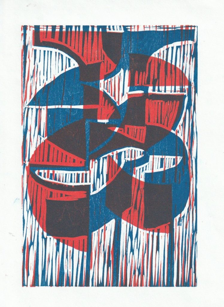
After printing 3 layers, I could see the areas of cross-overs. The overall effect is energetic.
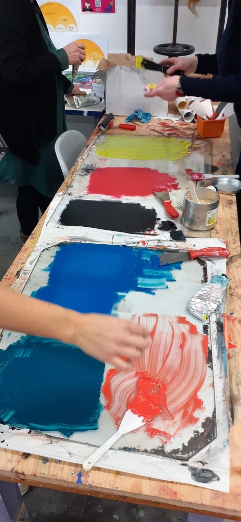
Week 4
The studio, colour mixing by the group.
My prints on the drying rack.
The texture of the wood became apparent after the wood had been inked and cleaned once. This is due to the moisture sinking into the wood and expanding the pattern of the grain.
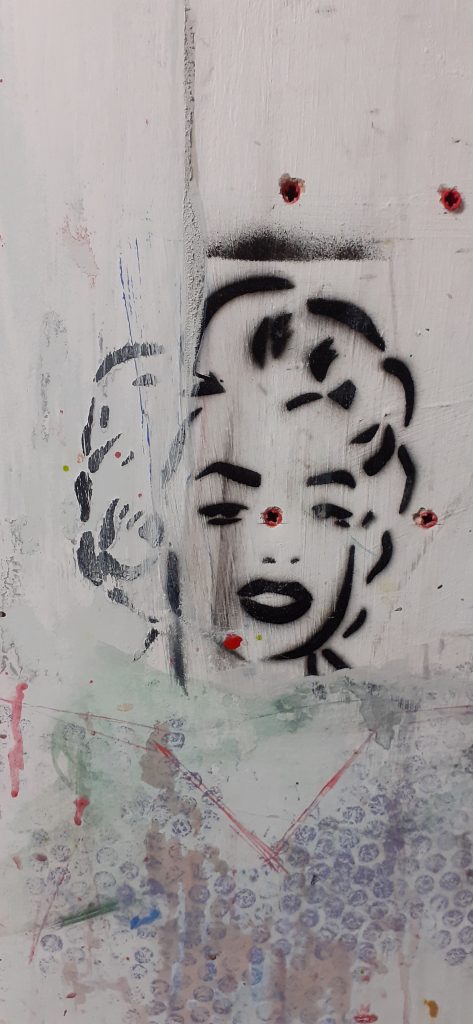
Me cleaning the plate.Stencil art on the studio wallUsed baby wipes on inky paper
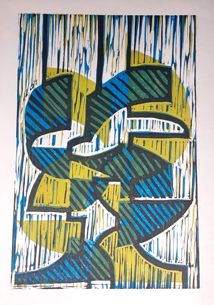
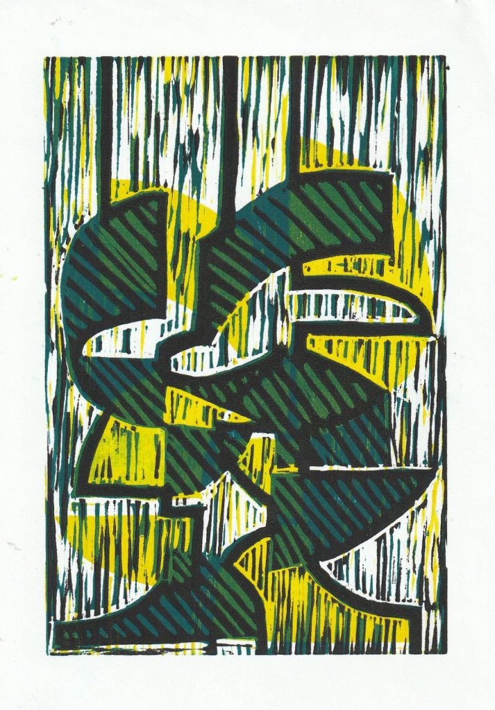
Yellow, orange and dark green layers.
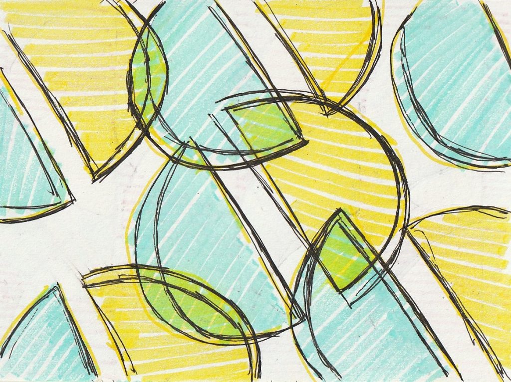
I felt that these prints didn’t need a black layer, as they already had enough contrast and brightness to make them interesting:
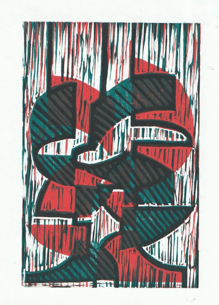
The abstract design meant that I couldn’t decide which way up the image should be viewed.
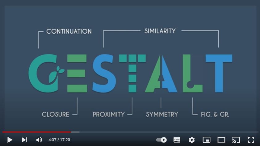
I was curious to learn about Gestalt theory, as I had heard of it but didn’t understand what it was about. This video from YouTube, was the most helpful resource I could find to explain the theory to me. In the video he explains how when we look at a picture, we perceive the elements as one image, even though a picture is made up of separate pieces.
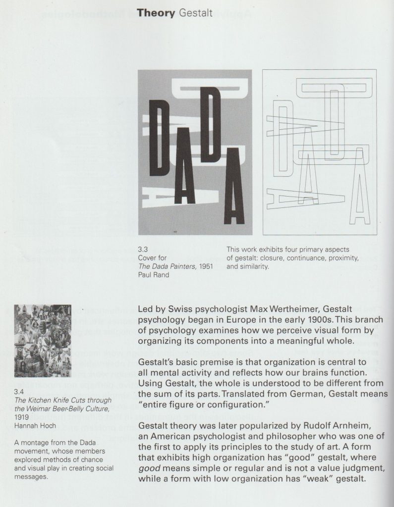
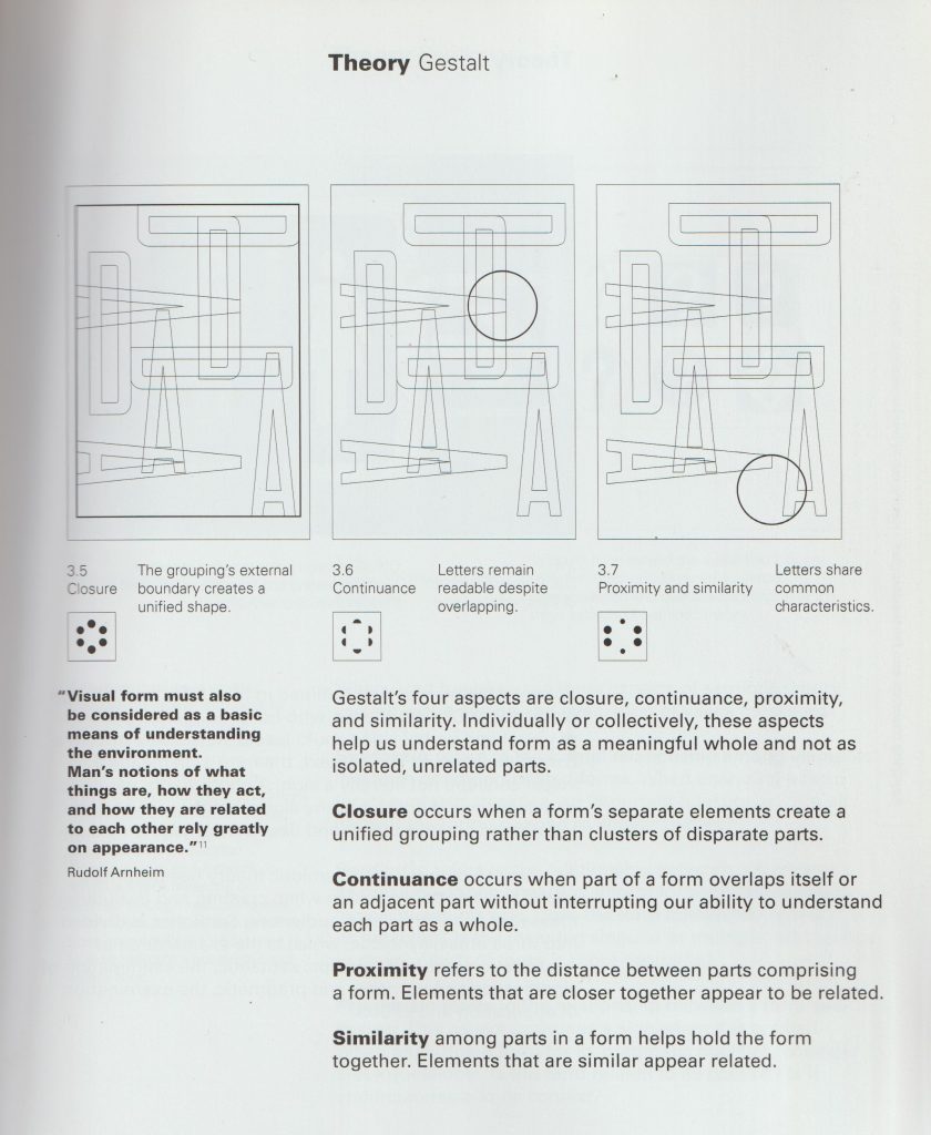
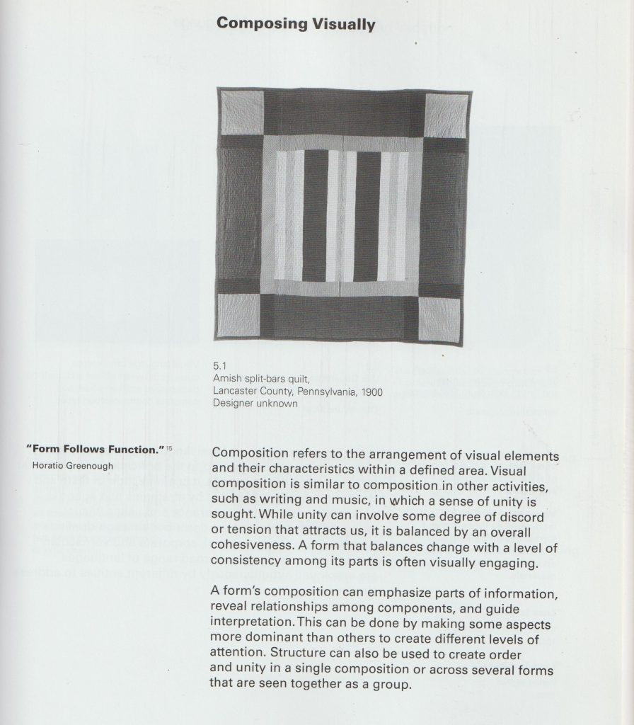
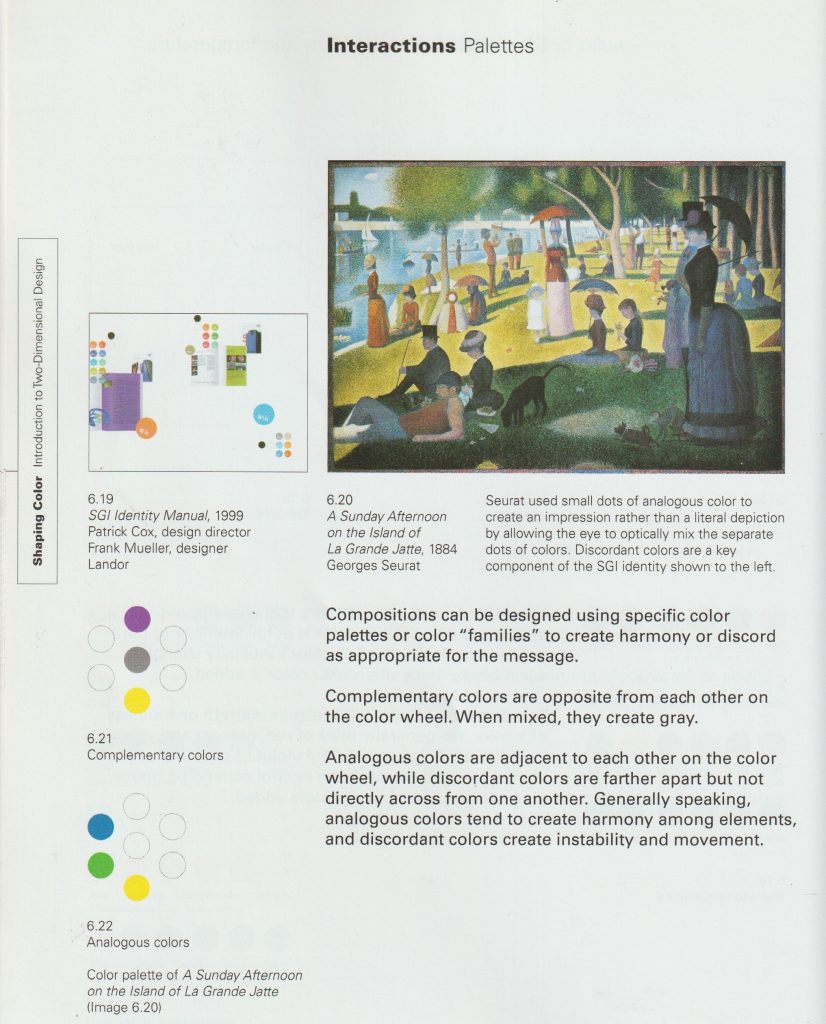
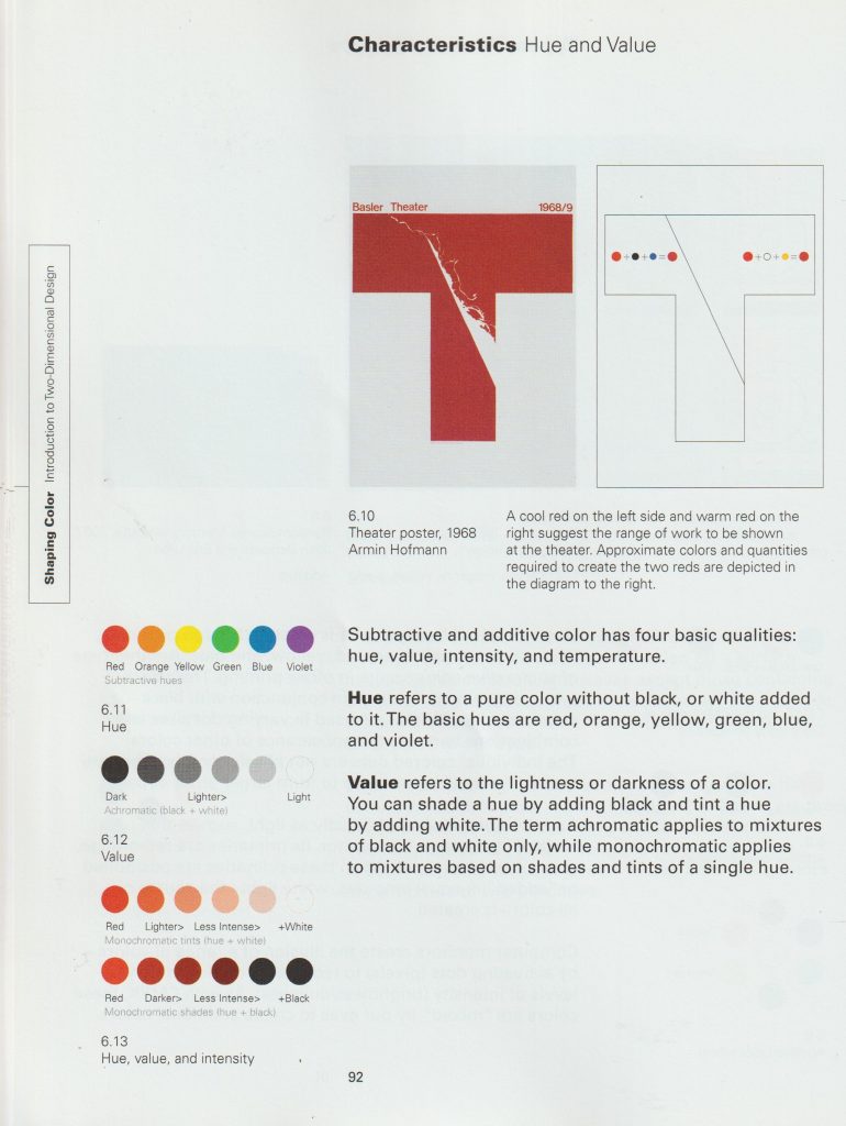
From the book Introduction to Two-Dimensional Design by John Bowers
From the book Introduction to Two-Dimensional Design by John Bowers
Some Examples:
Gestalt theory Proximity.
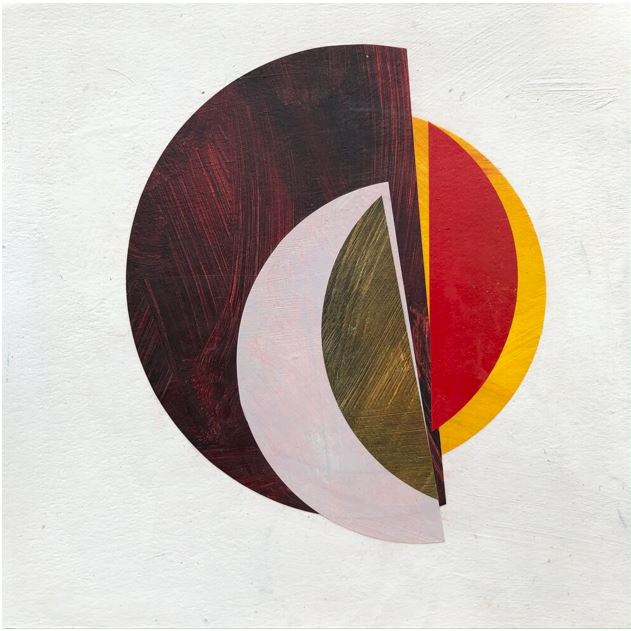
In this artwork by Emma Davis, the elements are placed closely together. This means they are perceived as a group:
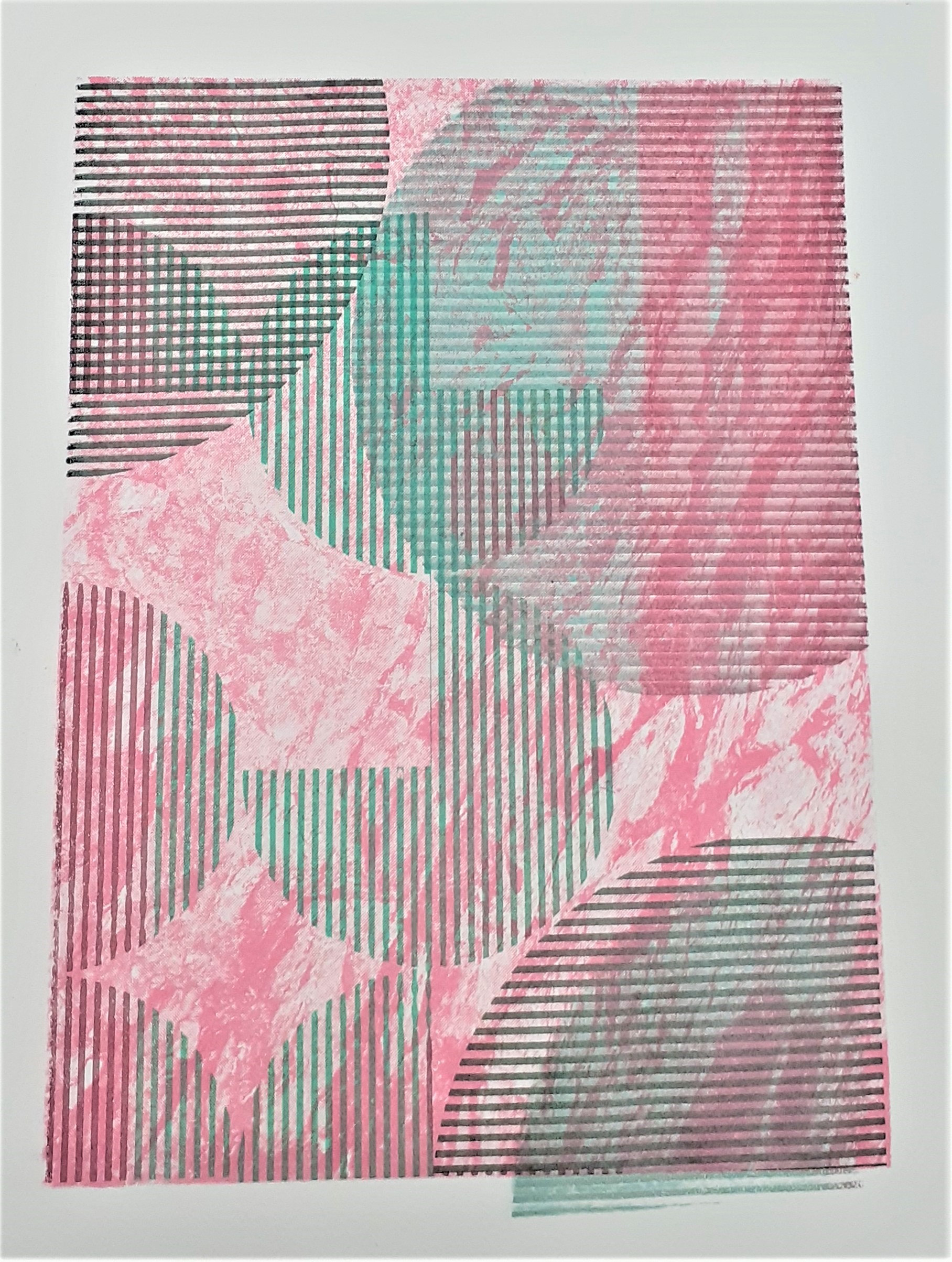
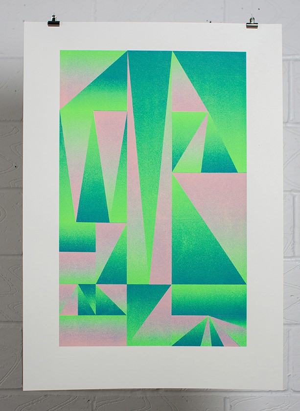
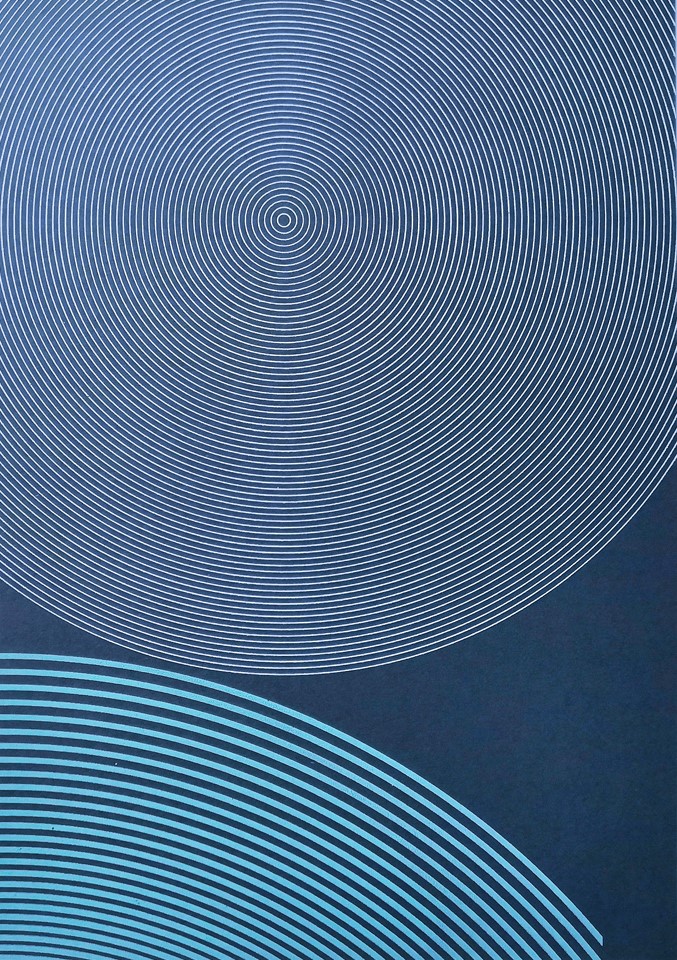
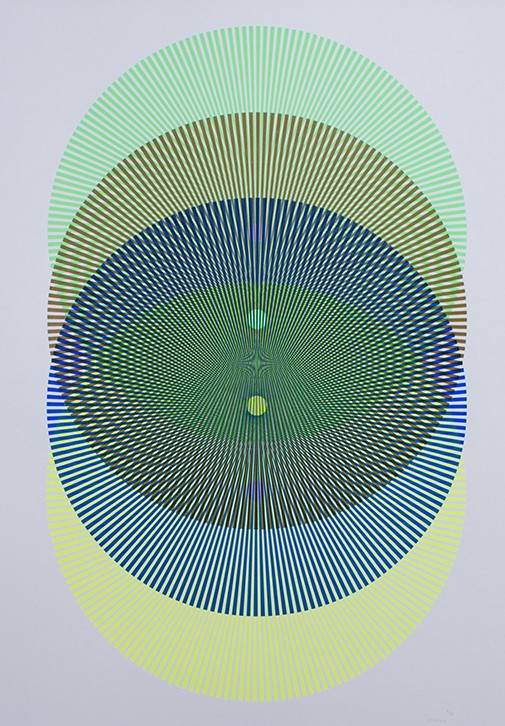
In this screen print by Heretic Spectral Nation, there is a play between the green and pink spaces. It is not obvious which is the figure and which is the ground. This is interesting because they could be interchangable.
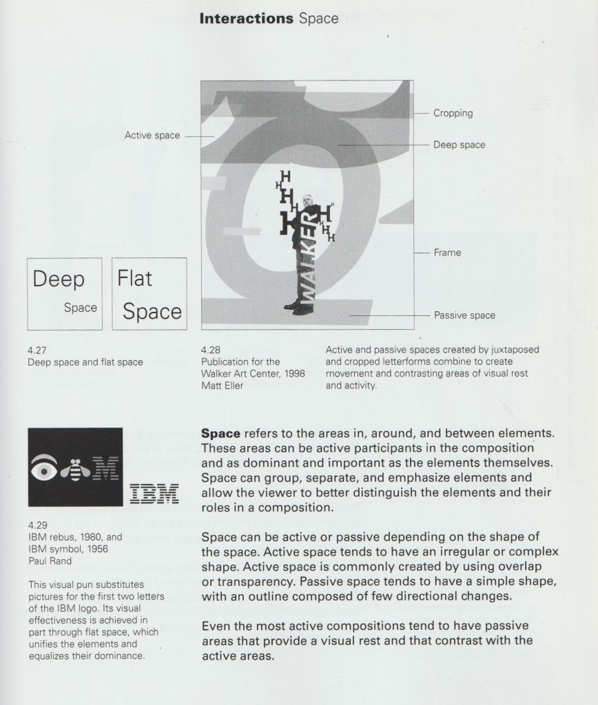
In this book, John Bowers talks about visual language. I found this theory helpful when considering my screen-printing designs.
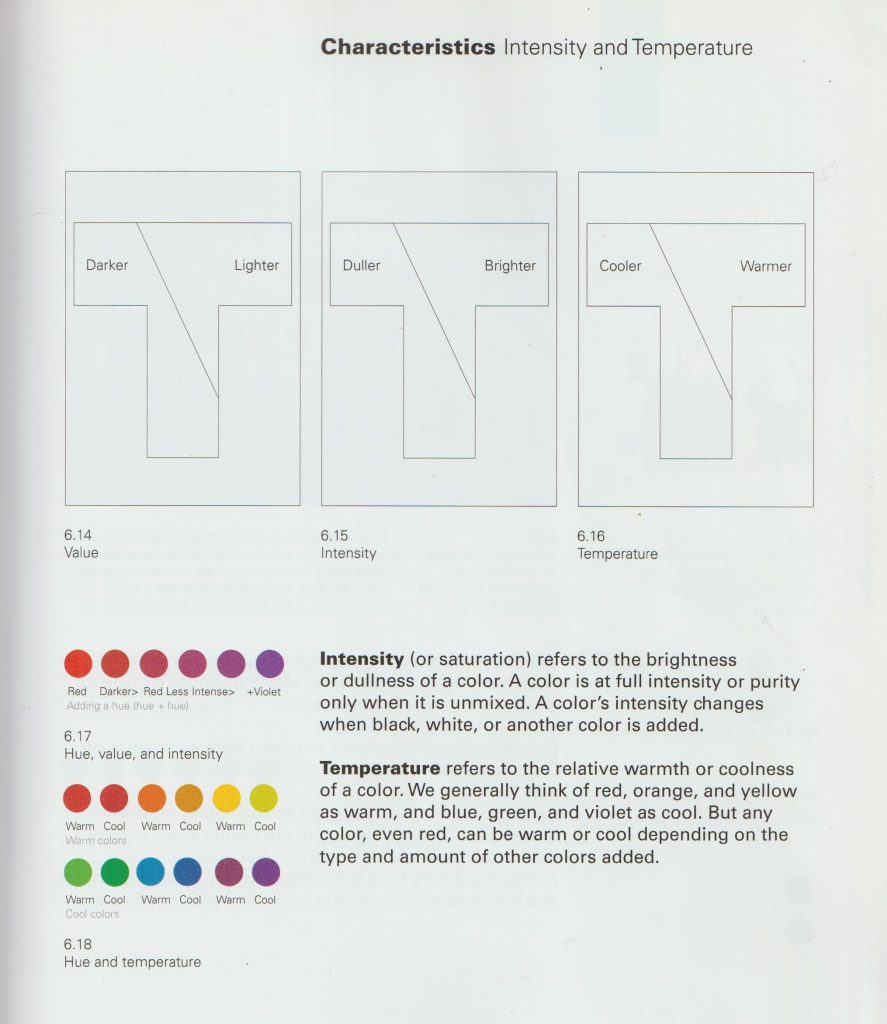
From the book Introduction to Two-Dimensional Design by John Bowers
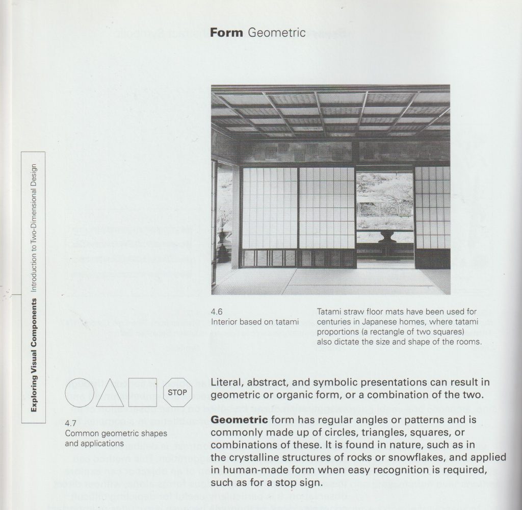
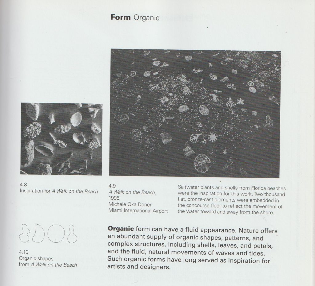
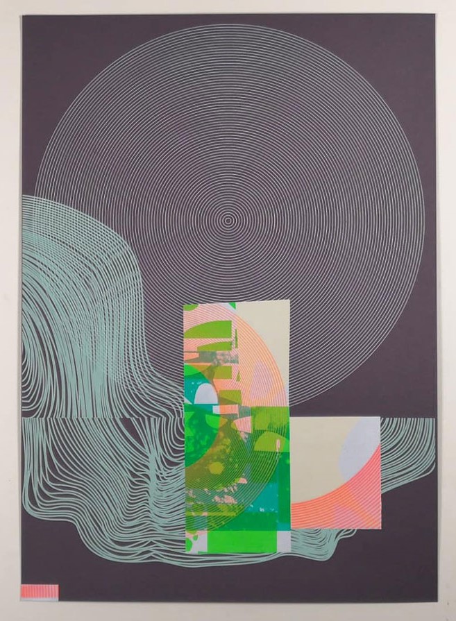
In the first half of semester 1, I have been experimenting with abstract geometric shapes.
From the book Introduction to Two-Dimensional Design by John Bowers From the book Introduction to Two-Dimensional Design by John Bowers
Yesterday, I spent my morning in the printing studio. (The perfect way to spend a Thursday morning). I felt a bit more comfortable with the technique and decided to take more control in this session. To take risks and try to create more of what is in my mind, onto paper. First, I wanted to cover the damage done to my print from the drying rack last week. My plan was to create a layered effect. I was happy for this design to look quite busy. In the photo below, the print has 3 layers.
I had the idea of using scrap paper to protect the border of my print. I had this idea because of my previous print where the grid design came off of the background square. This was due to poor planning.
I used a rusty-brown colour to cover the tear. I was happy with the result. I also chose this colour to mix nicely with the background and unify the print as a whole. I liked the areas where the layers have some cross over.
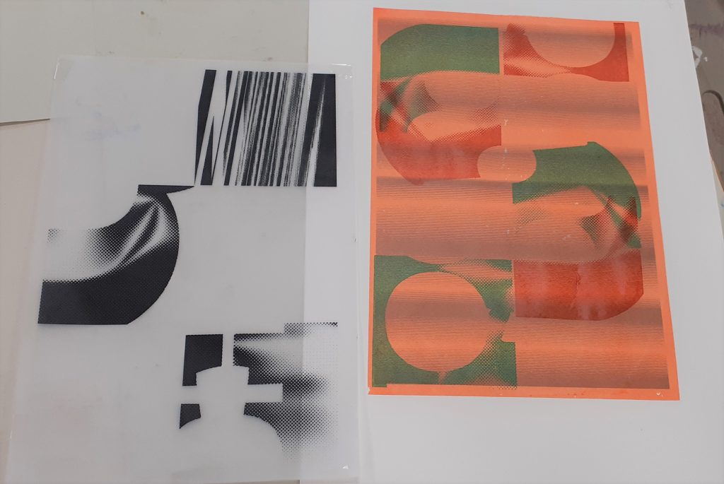
I placed the artwork I wanted to use, over the print. This allowed me to see how best I could include the shapes into the composition.
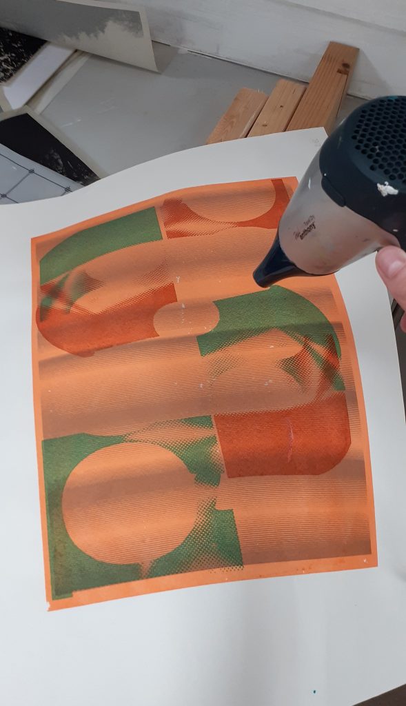
I used a hairdryer to speed up the drying process.
From the book Introduction to Two-Dimensional Design by John Bowers From the book Introduction to Two-Dimensional Design by John Bowers
In this piece, I have used harmonious colours for each layer, apart from the green layer. This helps to add interest to the image. For the darkest brown I used a mixture of orange and green, since orange and green make brown.
I can see active space within the design, because of the irregular shapes and transparency of the layers.
The values in this image are also quite similar.
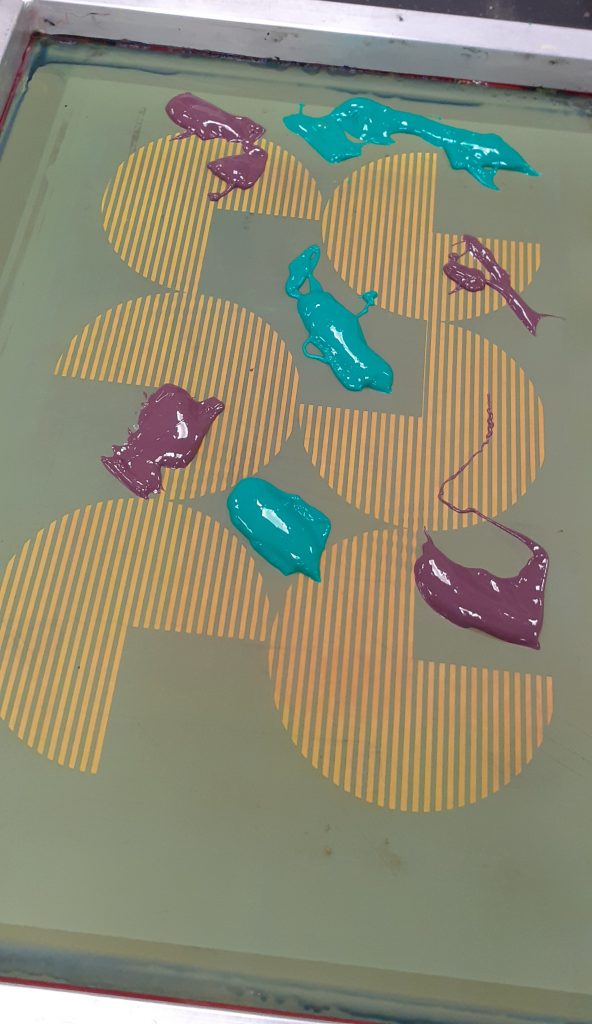
I again used masking to protect the areas of the background I want to avoid printing on.
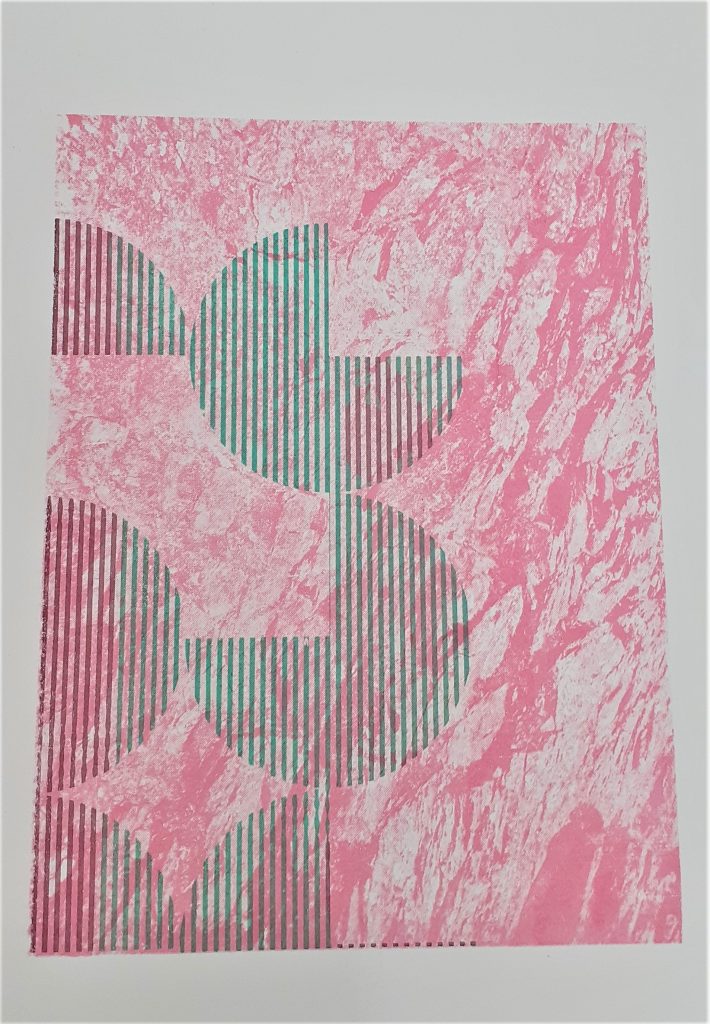
I chose purple and green for the second layer of this print. I wanted to create some variation, while sticking to the pink area of the colour wheel.
I placed blobs of ink onto the screen quite randomly. I flooded the screen before doing my first pull.
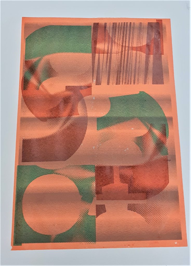
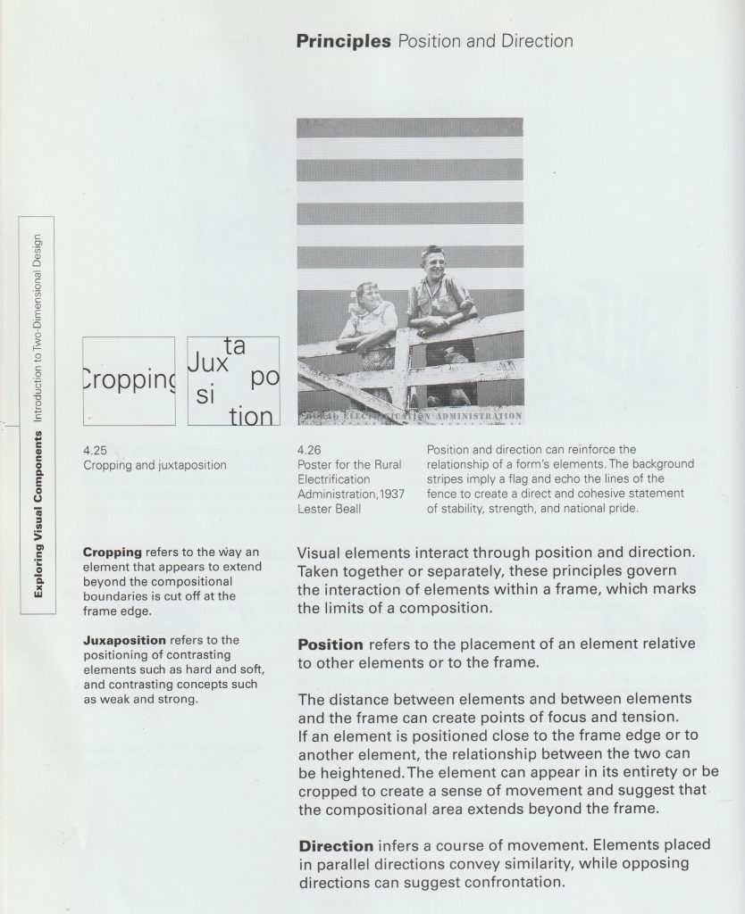
I positioned the print at the corner of the page. This position suggests that the design carries on beyond the frame, as explained below:
From the book Introduction to Two-Dimensional Design by John Bowers
I wanted to play with scale within this design. For my third print layer, I chose the large circle design. Positioning it in the opposite corner, creates asymmetrical balance within the work.
At this stage, I made the mistake of forgetting to tighten the bolts on the printing machine/vice. This meant that the frame shifted as I was pulling the ink through. This created blurred lines on my print. It also meant that my print went off the edge of the background. Because of this mistake, I decided to print a fourth layer using a darker green.
The lines within my print run vertically and horizontally. Where they cross over, there is an interesting gridded pattern.
In this artwork by Heretic Spectral Nation, we can see the crossing over of lines. This shows the interesting effects created by layering up striped prints. This gave me the idea to play with the direction of my lines when printing multiple layers.
I felt that there was something lacking in this print from last week. I thought about how I could unify the elements.
From the book Introduction to Two-Dimensional Design by John Bowers
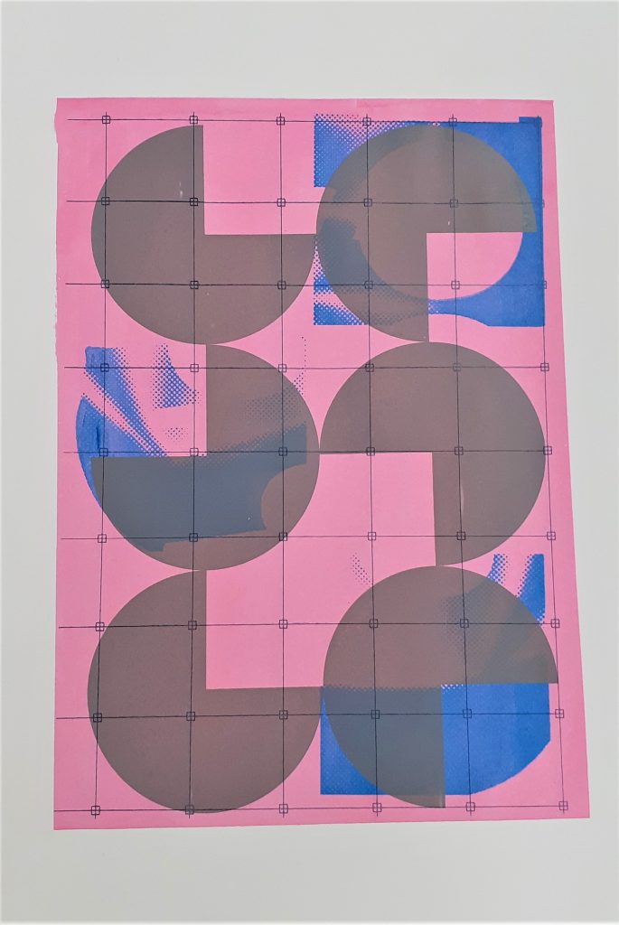
Because of the right-angles within my design, I chose to use the grid pattern for the fourth layer:
This print would be symmetrical if it wasn’t for the blue shapes.
Because the grey shapes are similar and they are of the same colour, they look as though they belong to a group. This is the Gestalt theory known as similarity.
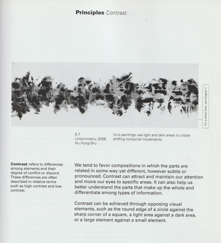
There is a contrast of sharp and round, and a contrast of light and dark within this piece.
From the book Introduction to Two-Dimensional Design by John Bowers From the book Introduction to Two-Dimensional Design by John Bowers From the book Introduction to Two-Dimensional Design by John Bowers
We use cookies on our website to give you the most relevant experience by remembering your preferences and repeat visits. By clicking “Accept All”, you consent to the use of ALL the cookies. However, you may visit "Cookie Settings" to provide a controlled consent.
This website uses cookies to improve your experience while you navigate through the website. Out of these, the cookies that are categorized as necessary are stored on your browser as they are essential for the working of basic functionalities of the website. We also use third-party cookies that help us analyze and understand how you use this website. These cookies will be stored in your browser only with your consent. You also have the option to opt-out of these cookies. But opting out of some of these cookies may affect your browsing experience.
Necessary cookies are absolutely essential for the website to function properly. These cookies ensure basic functionalities and security features of the website, anonymously.
Cookie
Duration
Description
cookielawinfo-checkbox-analytics
11 months
This cookie is set by GDPR Cookie Consent plugin. The cookie is used to store the user consent for the cookies in the category "Analytics".
cookielawinfo-checkbox-functional
11 months
The cookie is set by GDPR cookie consent to record the user consent for the cookies in the category "Functional".
cookielawinfo-checkbox-necessary
11 months
This cookie is set by GDPR Cookie Consent plugin. The cookies is used to store the user consent for the cookies in the category "Necessary".
cookielawinfo-checkbox-others
11 months
This cookie is set by GDPR Cookie Consent plugin. The cookie is used to store the user consent for the cookies in the category "Other.
cookielawinfo-checkbox-performance
11 months
This cookie is set by GDPR Cookie Consent plugin. The cookie is used to store the user consent for the cookies in the category "Performance".
viewed_cookie_policy
11 months
The cookie is set by the GDPR Cookie Consent plugin and is used to store whether or not user has consented to the use of cookies. It does not store any personal data.
Functional cookies help to perform certain functionalities like sharing the content of the website on social media platforms, collect feedbacks, and other third-party features.
Performance cookies are used to understand and analyze the key performance indexes of the website which helps in delivering a better user experience for the visitors.
Analytical cookies are used to understand how visitors interact with the website. These cookies help provide information on metrics the number of visitors, bounce rate, traffic source, etc.
Advertisement cookies are used to provide visitors with relevant ads and marketing campaigns. These cookies track visitors across websites and collect information to provide customized ads.