January 2023
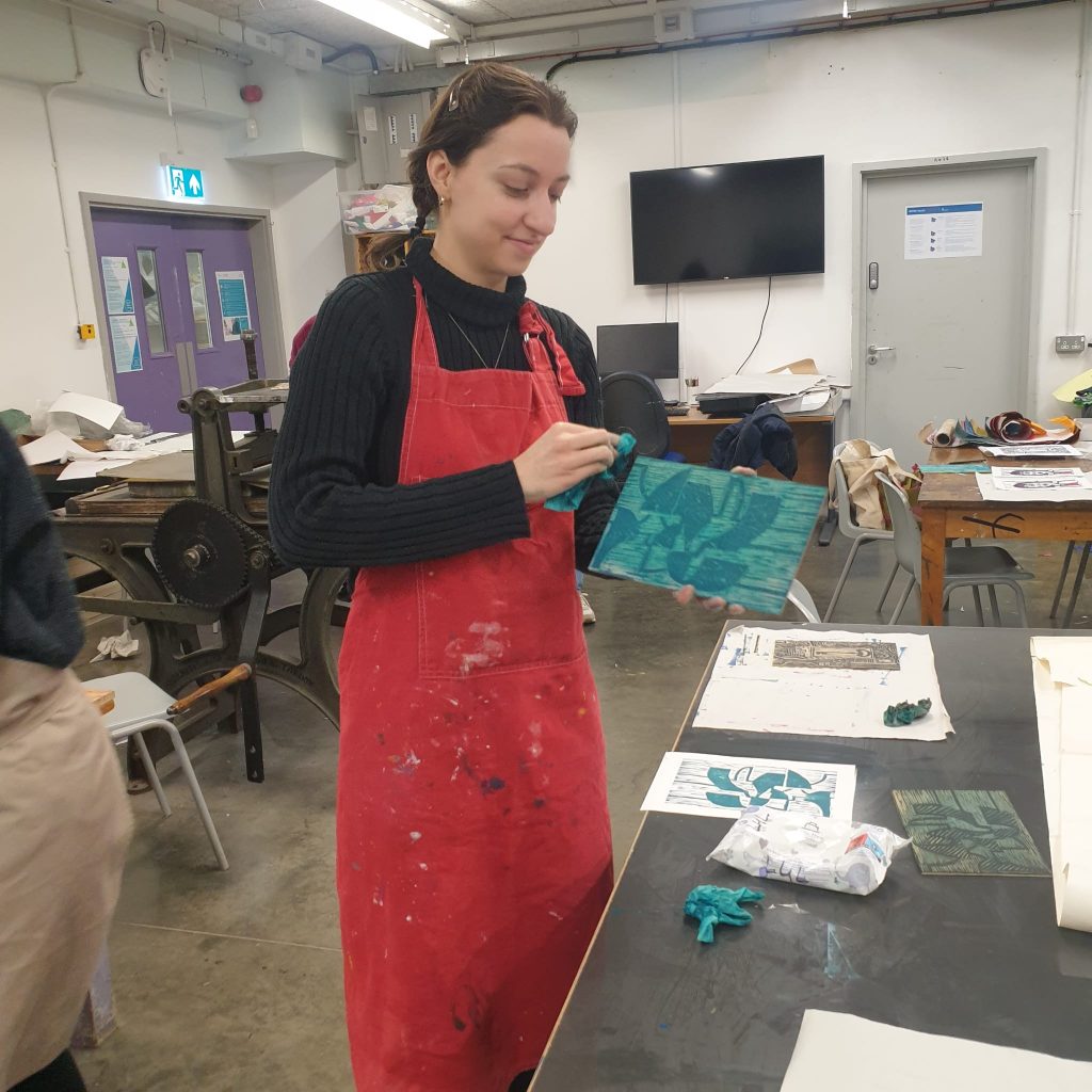
To start the year, I signed up for a 5 week printmaking course at City of Oxford college. It turned out to be 5 weeks of woodcut, which is a technique I have never tried before.
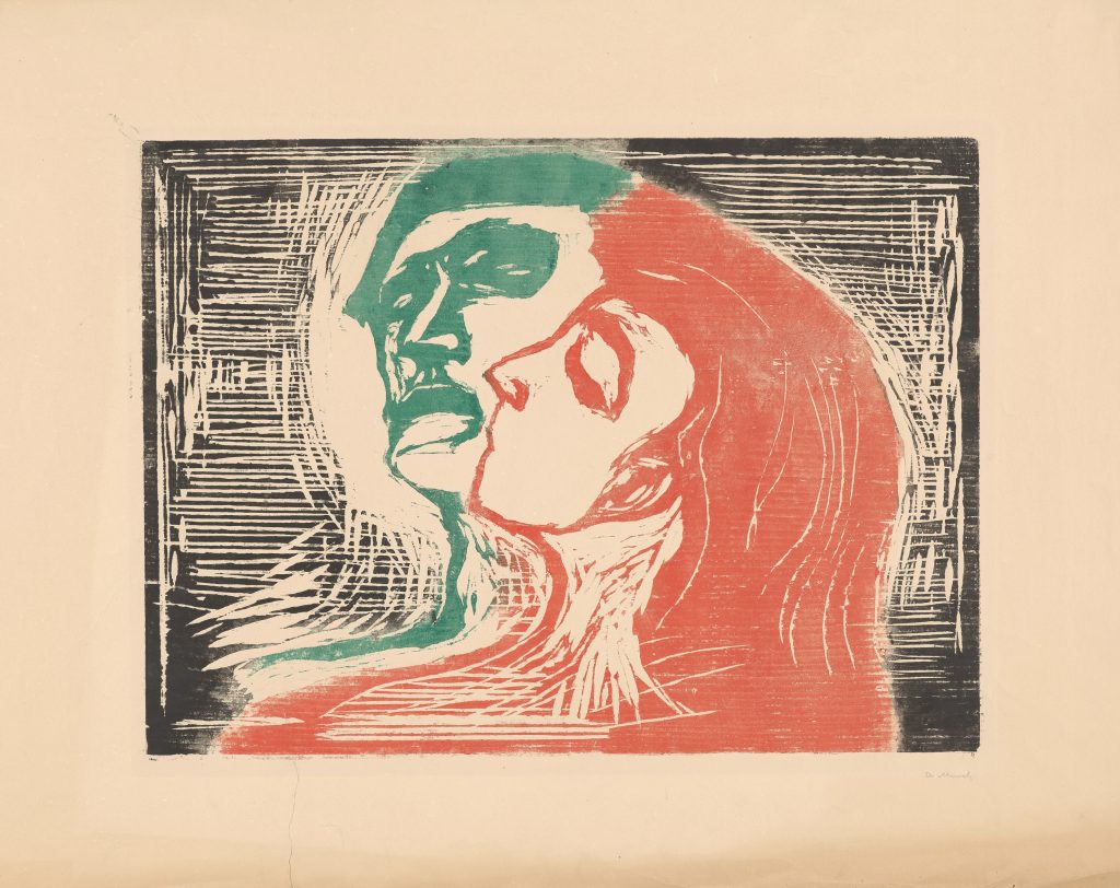
My first introduction to this printmaking technique was at the Scene Through Wood exhibition at The Ashmolean a few years ago:
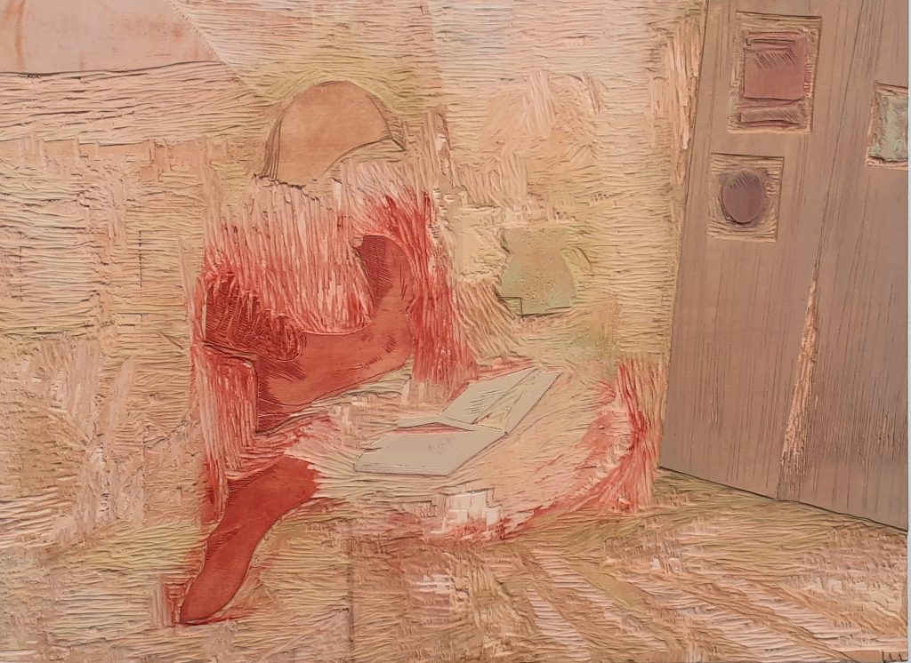
And the Interior Light exhibition last year at The North Wall Arts Centre, Oxford:
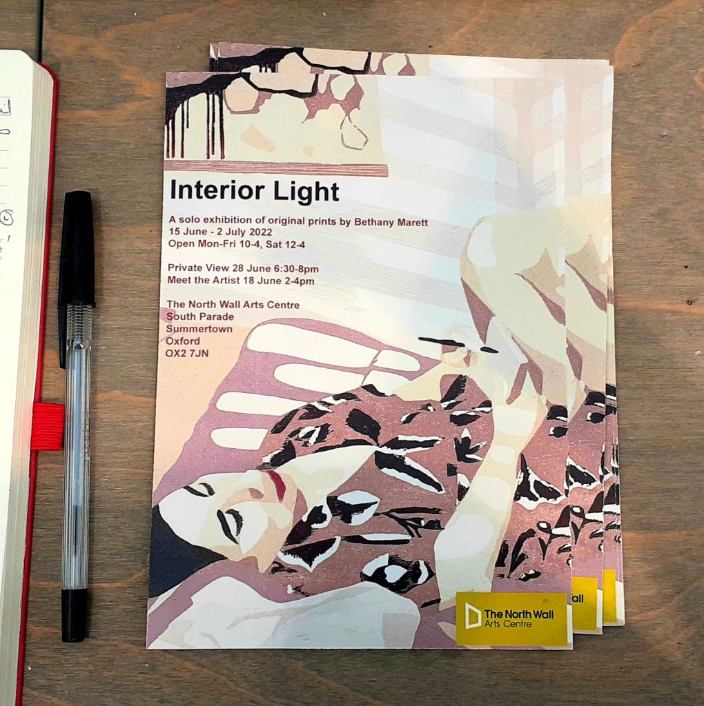
Leaflet of the exhibition.
The begin our process, we needed to draw our designs onto tracing paper. I hadn’t come prepared, so I worked from a photo I had taken last year a the Botanical Gardens:
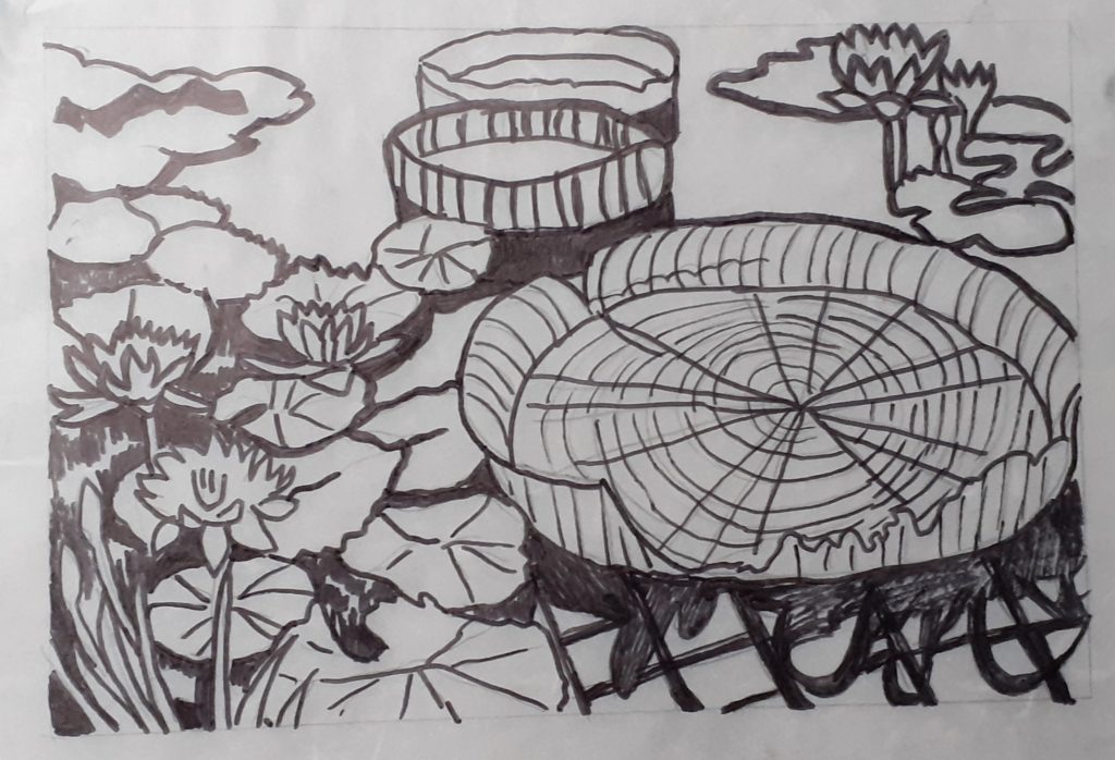
This turned out to be a bit too detailed and I also wanted to work on an abstract design, so I therefore changed my mind after the first session…
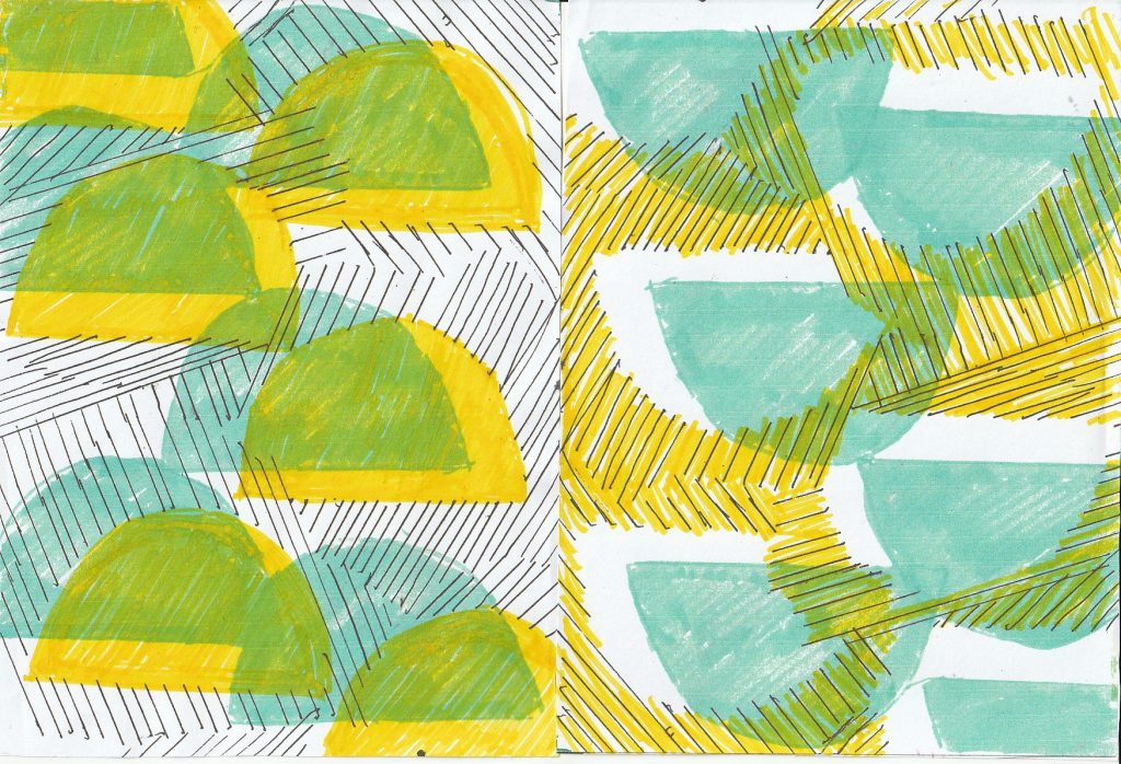
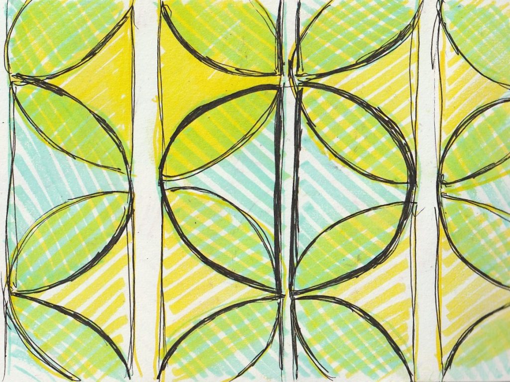
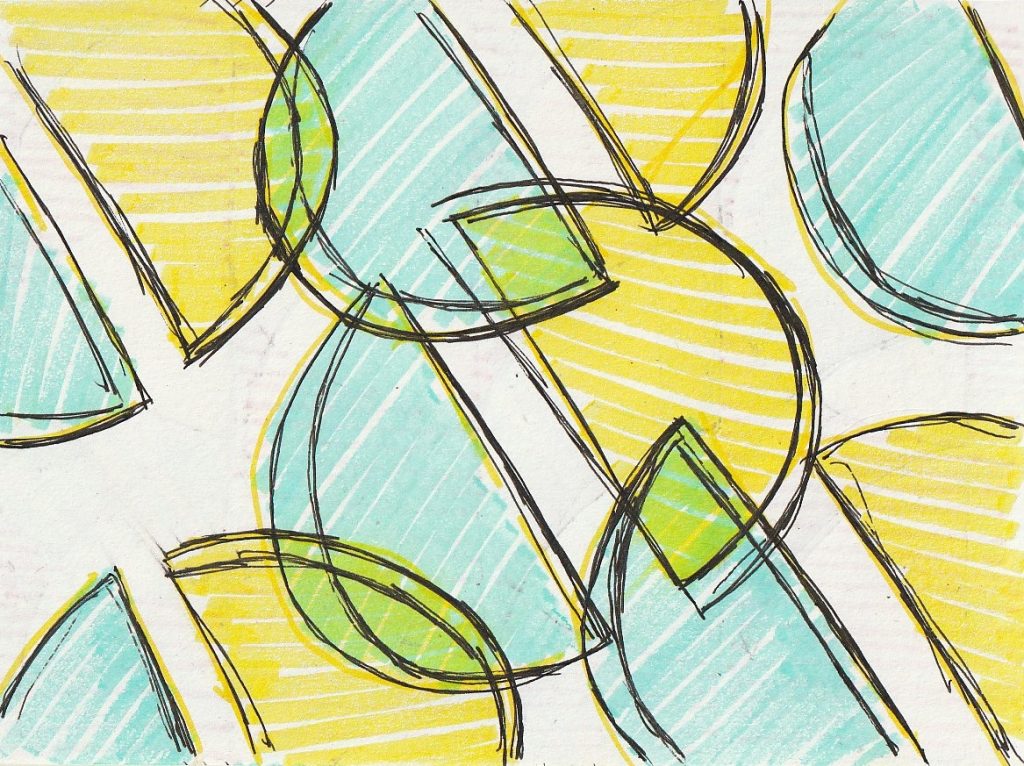
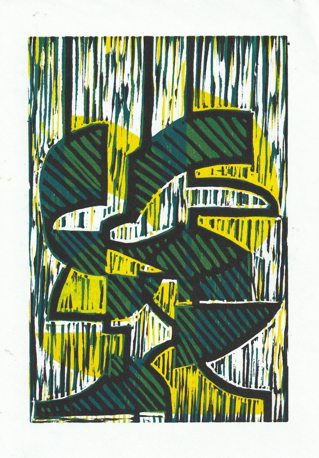
I considered how overlapping the layers would create new hues.
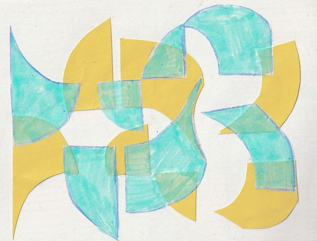
I cut shapes from paper and used these to construct the drawing. I could place them on the page and play with the overall structure to test out different variations.
Week 2
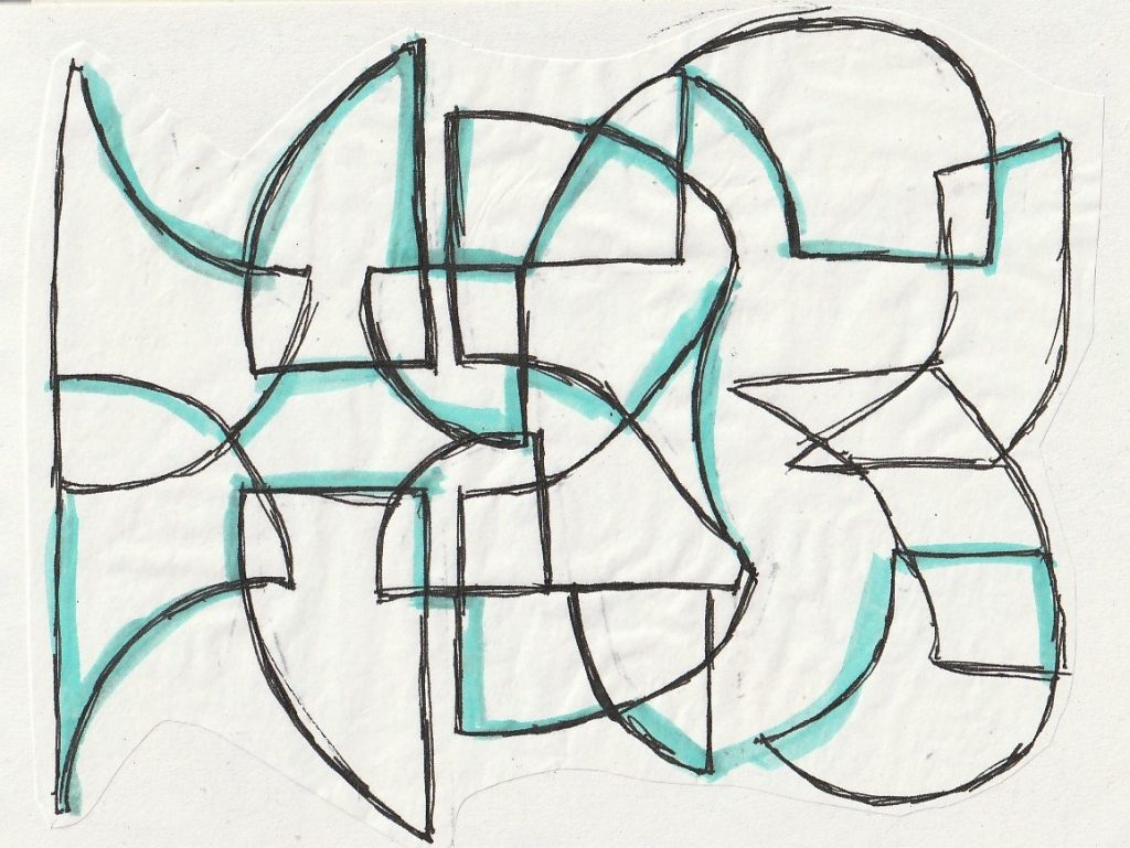
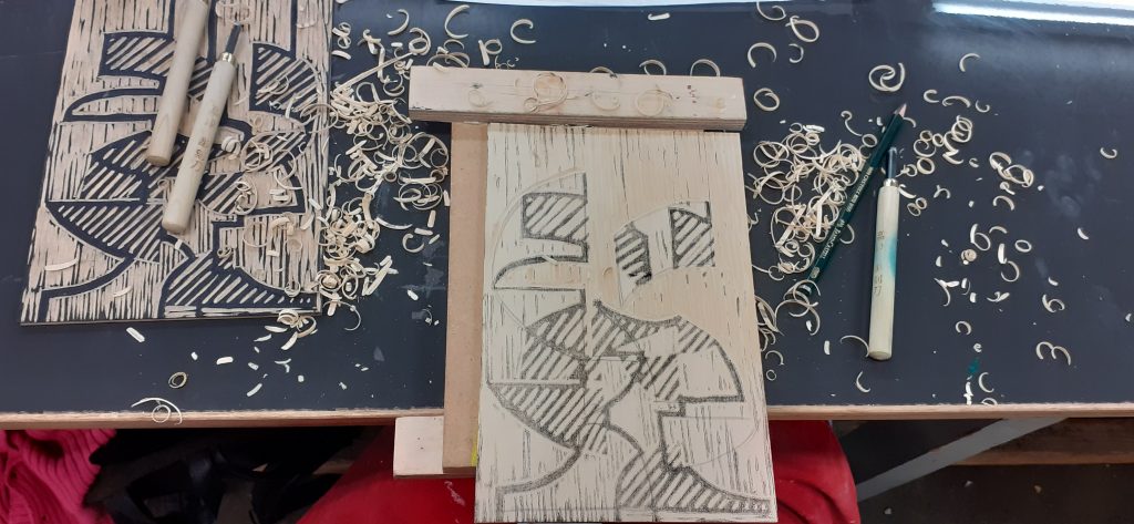
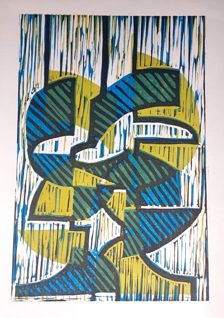
The black layer would need to be printed last. It would become the most detailed layer. I sketched the design onto the wood:
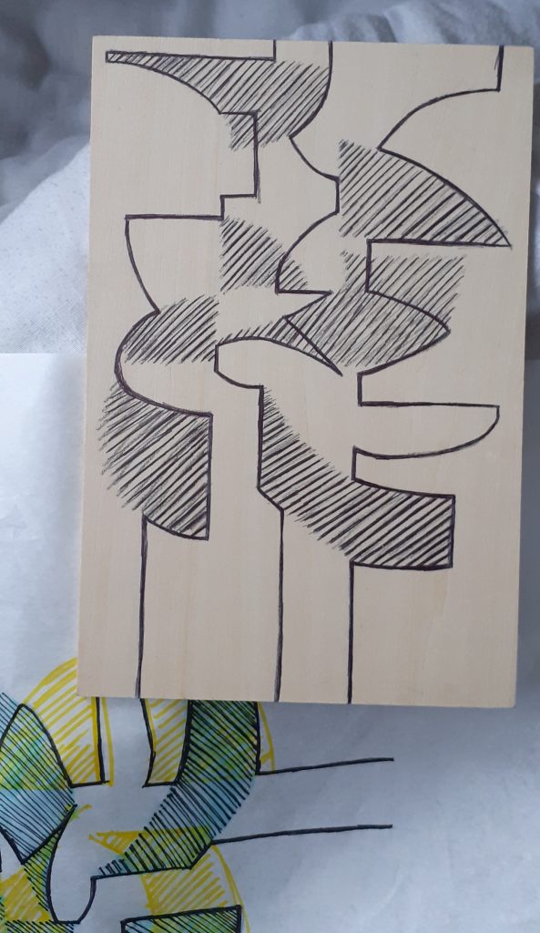
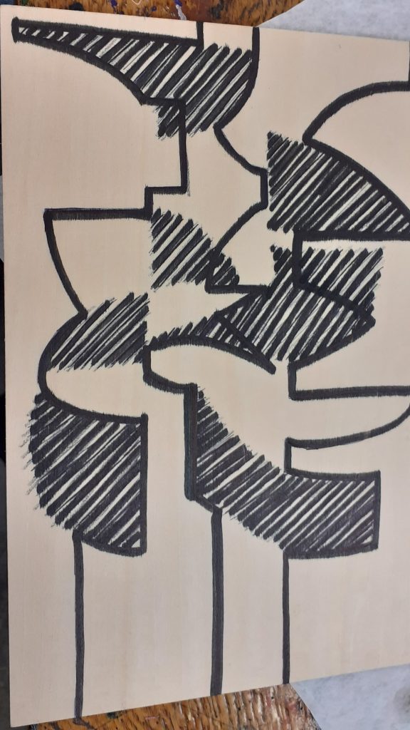
I then needed to remove every area that was not the black area. Carving was not as smooth as cutting lino, but I did get used to it. I found that I needed to keep the lines quite thick.
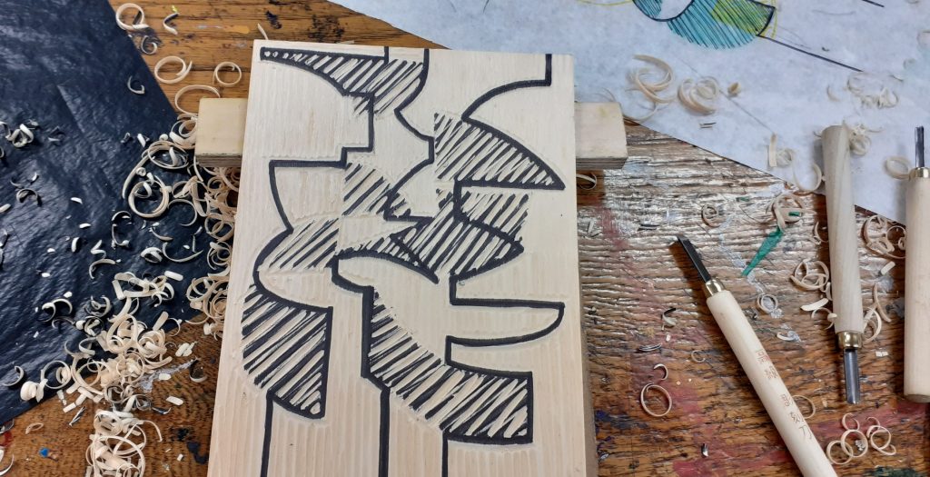
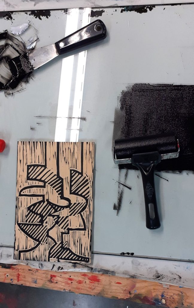
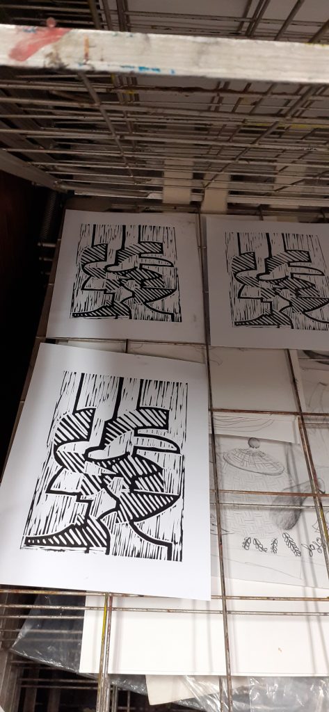
I printed this layer first. This allowed me to make any corrections had I needed to. It also allowed me to create the second plate using the back of the wood and another piece of wood.
Week 3
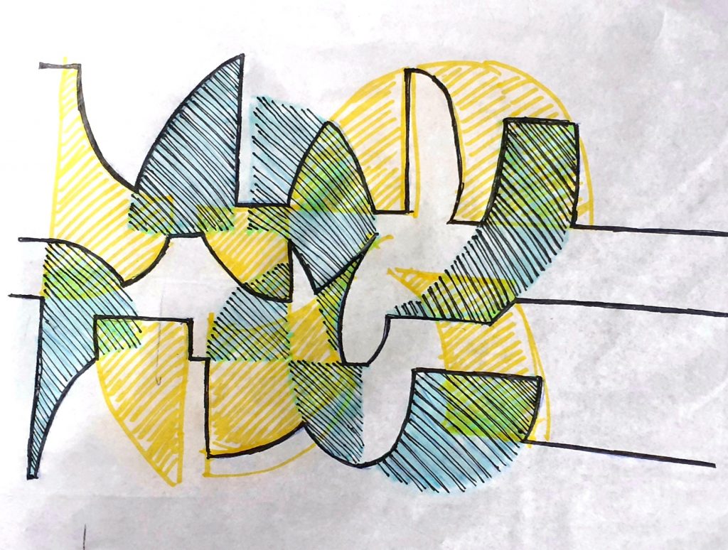
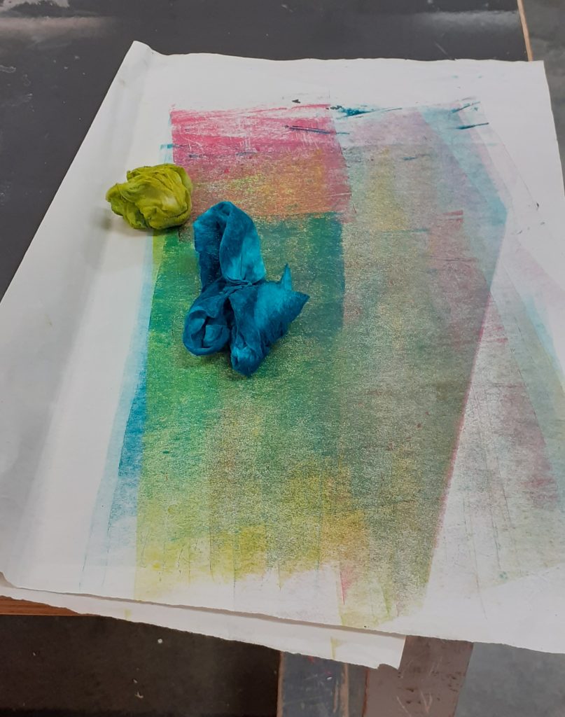
This session began with more carving, then I was able to print my first coloured layers:
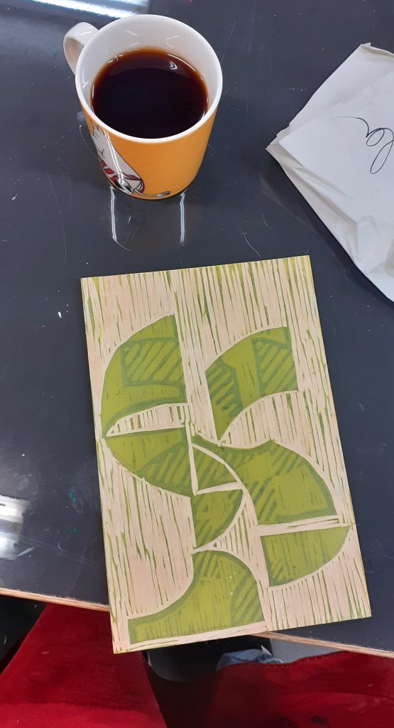
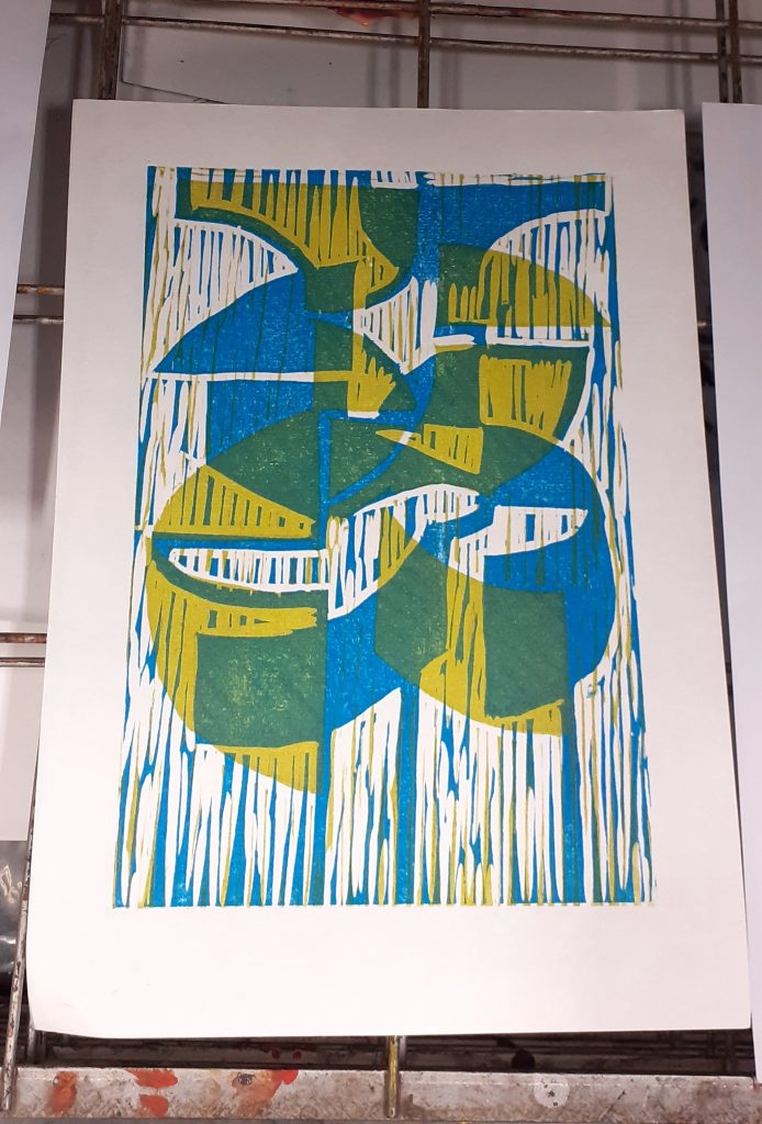
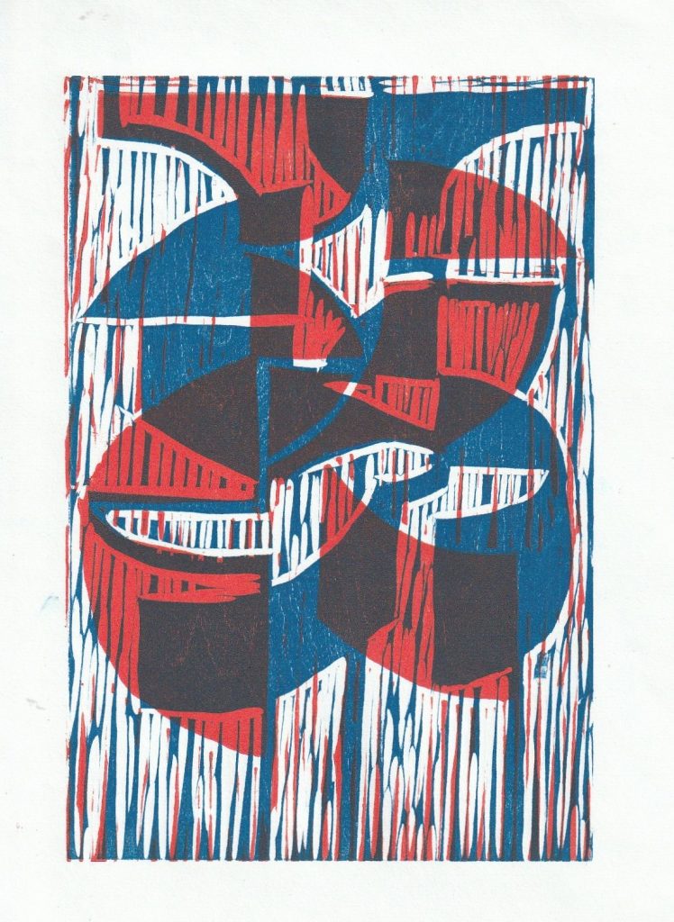
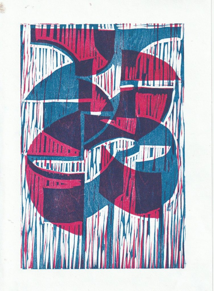
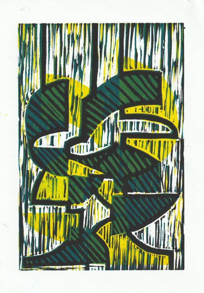
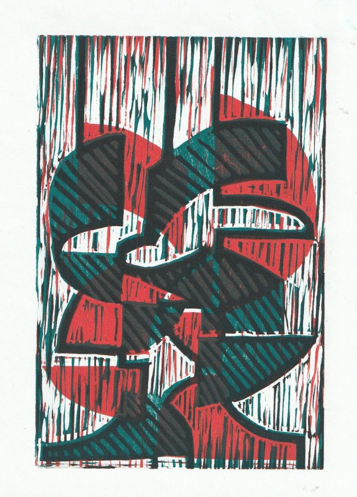
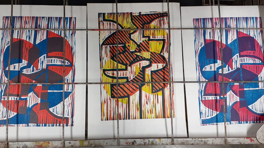
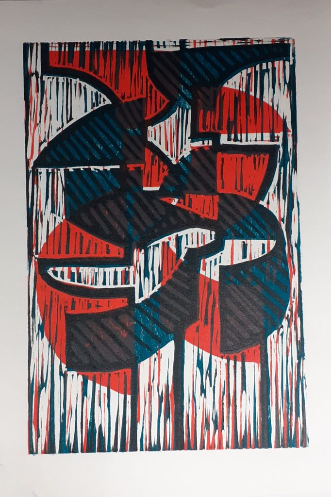
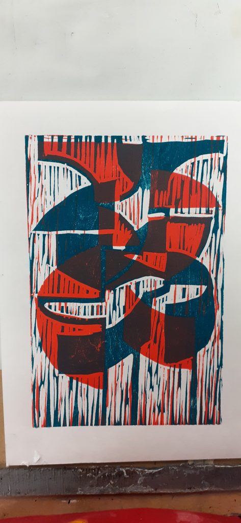
Layering the coloured layers produced green segments. I was surpised to see the amount of detail produced, since I wasn’t sure how clearly the carved strokes would appear.
Week 4
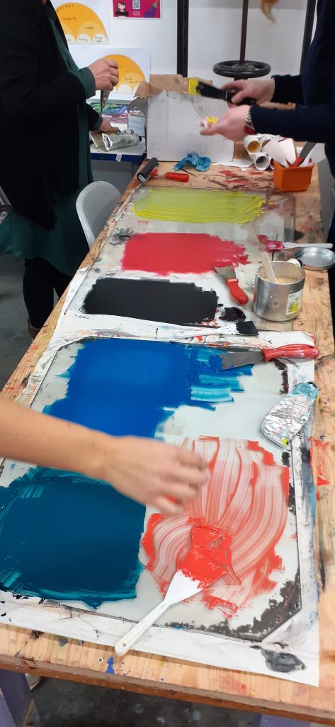
The texture of the wood became apparent after the wood had been inked and cleaned once. This is due to the moisture sinking into the wood and expanding the pattern of the grain.
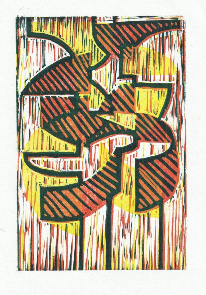
Yellow, orange and dark green layers.
I felt that these prints didn’t need a black layer, as they already had enough contrast and brightness to make them interesting: