This week, I have been given the challenge of making a series of collages based around The Raincoat Girl. I needed to first find inspiration. I looked at collage work by both artists and designers, from past to contemporary. This opened my mind to the infinite possibilities of cutting and pasting.
I’ve been wanting to read this book for a while and now I had the perfect excuse.
Jelle Martens
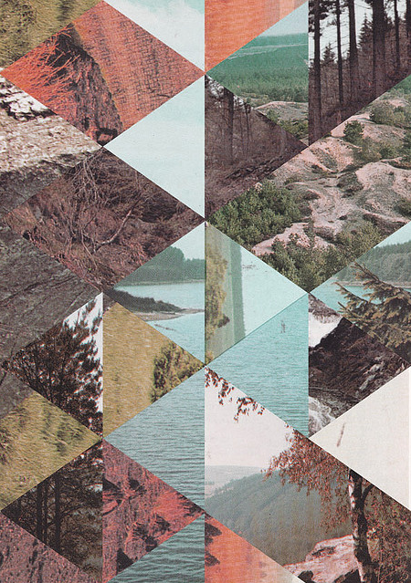
I looked at the artist Jelle Martens. He uses a mixture of traditional collage techniques and digital skills within his work. He is a fan of Collage with squares arranged according to the laws of chance, which is a series of work by Dadaist Jean Arp. In that series, Arp used cut-up pieces of paper, thrown into the air, he then glued them where they landed.
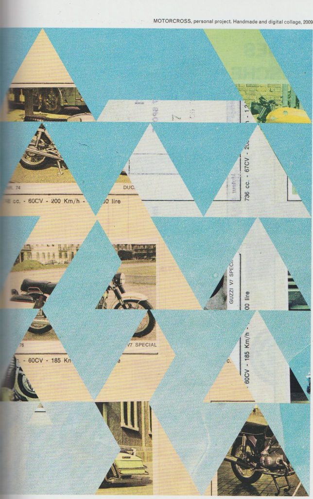
Martens takes images from a variety of sources. For instance, he used images from his father’s scrapbooks in the collage entitled Motocross.
I was drawn to the use of geometric shapes within his work. In Motocross, the background images are obscured from view. As the viewer, we see glimpses of photos and text. These act as visual clues. This ambiguity, I feel makes the work interesting. We can almost piece together our own stories of what is going on behind the triangular shapes in the foreground.
Another of Marten’s methods is to cut up several images into geometric shapes and re-arrange them into new compositions:

Ellery James Roberts
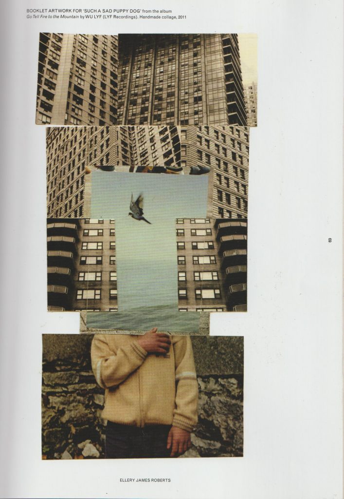
Another contemporary artist I looked at, is Ellery James Roberts. I particularly like his collage Booklet artwork for such sad puppy dog from the album go tell fire to the mountains by Wu life. I like the way he has combined three separate scenes and merged them to create one picture. The boy and the bird are surrounded by geometric, ugly looking grey skyscrapers. But within this environment, the boy finds freedom or sense of peace, symbolised by the third bird in flight at the centre of the collage.
The thing I love about collage is that artists create an image that is readable but at the same time impossible. Collage allows us to use realistic images and merge them to create something surreal. This piece is arranged into thirds foreground section, midsection, and the backgrounds. This collage looks neat and tidy but also interesting and imaginative.
Damien Tran
Damien Tran is a designer and printmaker based in Berlin. He combines collage with screen printing in his designs. He uses his own photographs within his work.
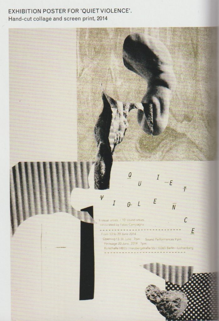
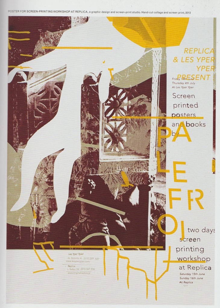
I really like the collage pieces cut from around an image. The shapes are ambiguous and left to interpretation while creating a path for the eye to follow across the piece. I like text in the composition, used as a visual element. His limited use of colour makes his work easy to read and his use of white space is pleasing. In his Exhibition poster for Quiet Violence, there is a clear background and foreground. I like the variety of implied textures. Each collage piece is something abstract, he may have cut one piece out from a magazine, a pattern from somebody’s dress.
John Stezaker
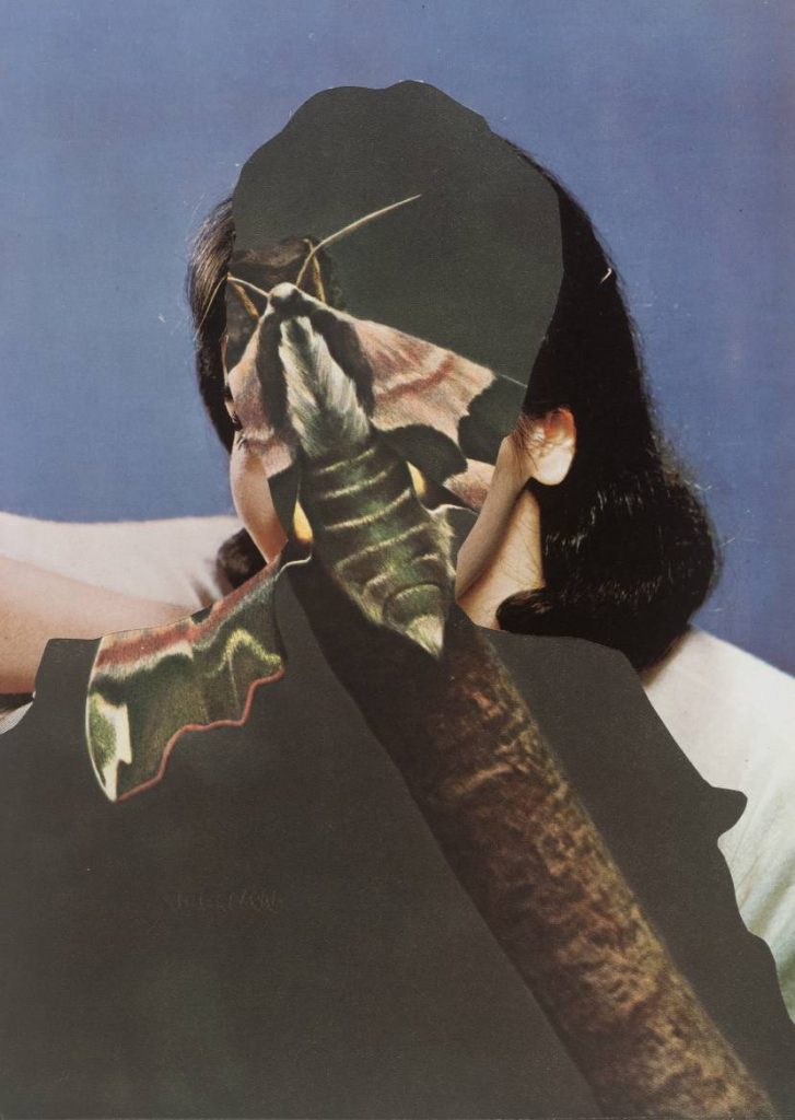
I looked at work by contemporary artist, John Stezaker. He uses old imagery in his collages, such as photos of film stars from a past era. This makes his work look like it was made in the early 20th century. He creates depth by layering collage pieces. Some pieces almost seem like optical illusions, where they can be viewed in several ways. He uses silhouettes and outlines. For example, in the piece Untitled, we see a moth, a woman, and a man simultaneously. By layering them in such a way, he creates a different meaning. Each element, being within each other, combines them together. Characteristics of a moth are within a man, characteristics of both are within a woman. Is this all taking place within the mind of the woman? These compositions lead the viewer to ask questions.
Dada

Hannah Höch Broken, 1925 (rotogravure on Japan paper) (bridgemanimages.com)
The conditions that gave rise to dadaism were a protest against the war. The Dadaists were the group of artists who revolutionised collage making in their artwork. This was in the time when photographs were just starting to be published in print. Hannah Höch worked for a newspaper company and had access to these images first hand. The movement began in 1920 in Berlin. Three artists present were Max Ernst, John Heartfield and Hannah Höch. The artists had a variety of motives. Some wanted to re-establish a sense of community in the aftermath of the war, some were activists and others wanted to develop their career. They each collaborated on exhibitions and publications. Dada was stage on the way to Surrealism.
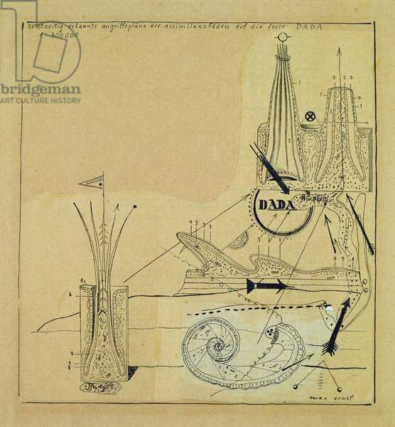
Max Ernst combined images from medical books, catalogues for industrial equipment and botanical biological course books. His work invokes a sense of timelessness and a dreamlike quality.
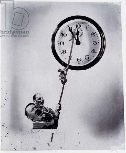
This is different to the photomontage style of John heart field. John Heartfield was interested in getting across a political message within his collages. He was interested in creating a message that could communicate through mass media. His work was used to critique the abuse of power, which he felt passionate about. Both artists were not content to show images of the raw cut and paste style, for example, used by the Dadaist Kurt Schwitters. They used fragments of collage to create whole looking images, which are neat and believable. Ernst was interested in the world of the psyche, Heartfield, the political environment around him, and Hannah Höch liked to overlay elements of both within her work.
Höch used images from mass media, transforming them into images that conveyed personal meanings. She explored issues of gender roles, such as the image of the “new woman”. (This image created an expectation of women and was directly linked to consumerism and social agendas.)
I like Hannah Höch’s use of repetition and re-assemblage in this piece. By repeating elements of the baby doll face, she creates a visual rhythm across the picture that is almost pattern like. The shapes are flowing and organic each face or fragments moves into the next.
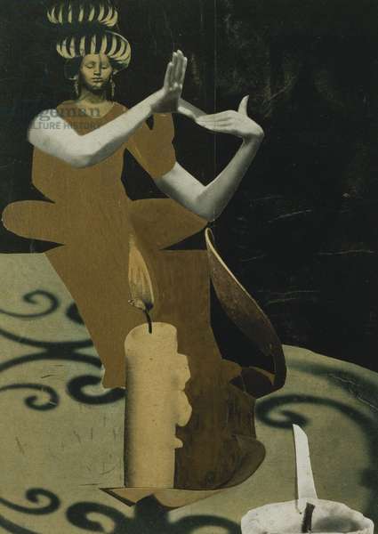
She has taken images from a variety of sources and piece them together into this figure of the priestess. She has played with scale, placing an ordinary candle side beside the figure of the women. This has dwarfed the women or enlarged the candle by its relative scale. This gives a playful feeling. The use of shadows and lights are what make this image convincing. We have a light source, and we have shadows, therefore it is believable. I like the abstract and flat form of the woman’s dress. It contrasts with the realistically formed arms.
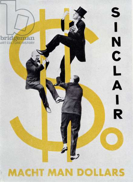
Heartfield has used something similar within his collage, where he combines a 2D dollar sign with realistically formed figures. The result is surprising and amusing.