This week in our digital workshop, we were introduced to Adobe Illustrator.
My understanding of the program, before we even opened it up, is that this is a very useful tool for illustrators. This immediately grabbed my interest as drawing was my first love even before I knew what graphic design was.
However, in this workshop I struggled. Maybe I was just tired? I felt confused at every step. However, seeing my classmates work, I am convinced that Illustrator has lots of creative potential!
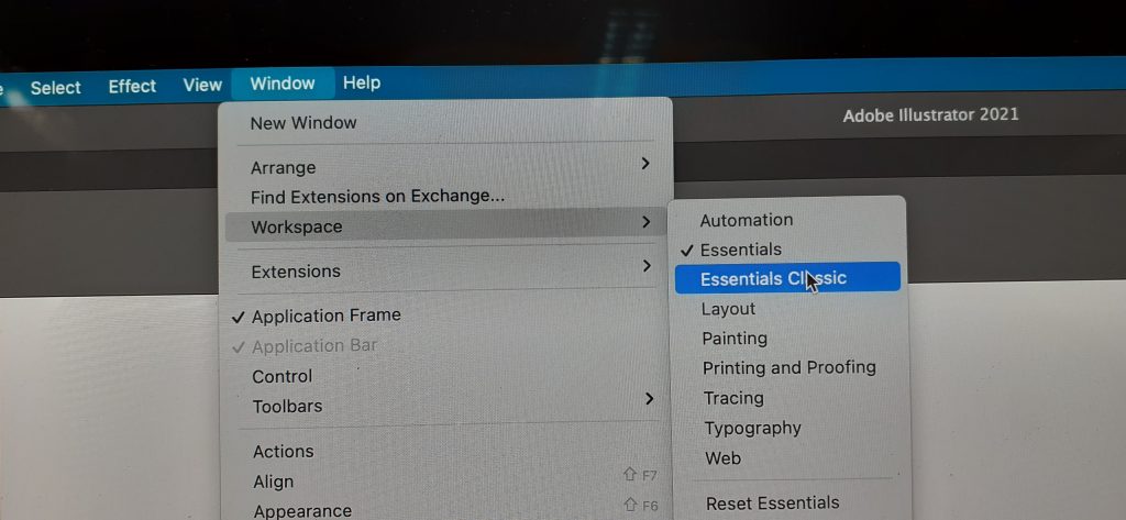
Our first step in Illustrator is the same as in InDesign. Make sure ‘Essentials Classic’ is switched on to make life easier:
We were introduced to the idea of vectors. A vectographic image is not restricted to a particular size. (It could be printed the size of a bus without effecting the quality of the image.) It uses a series of anchor points. Whereas a JPEG image is made up of a mosaic of pixels.
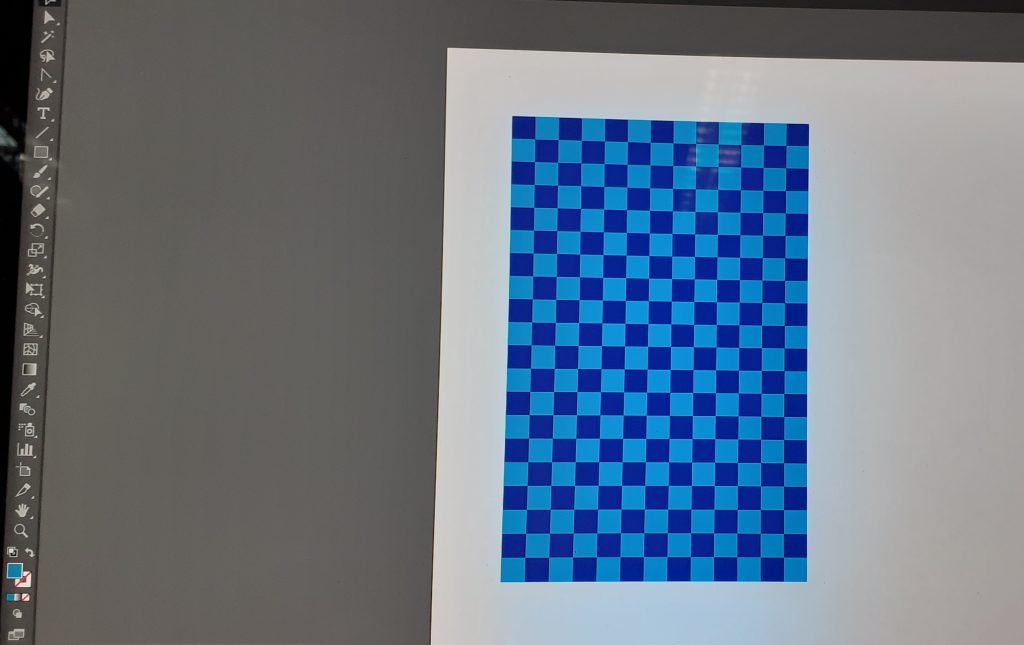
We began by drawing squares using the rectangle tool. Holding down shift kept the proportions from changing, which was familiar from InDesign.
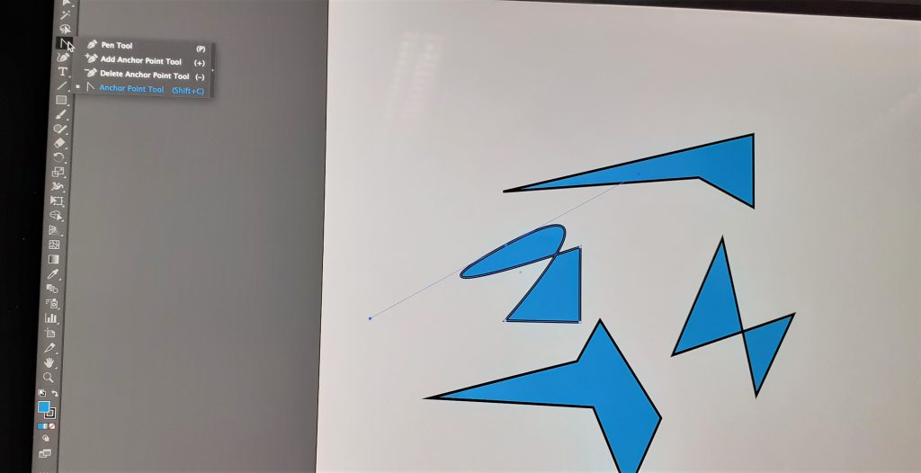
Selecting the direct selection tool and anchor option allowed me to stretch the shape and distort the rectangle into different shapes. I could add and delete anchor points.
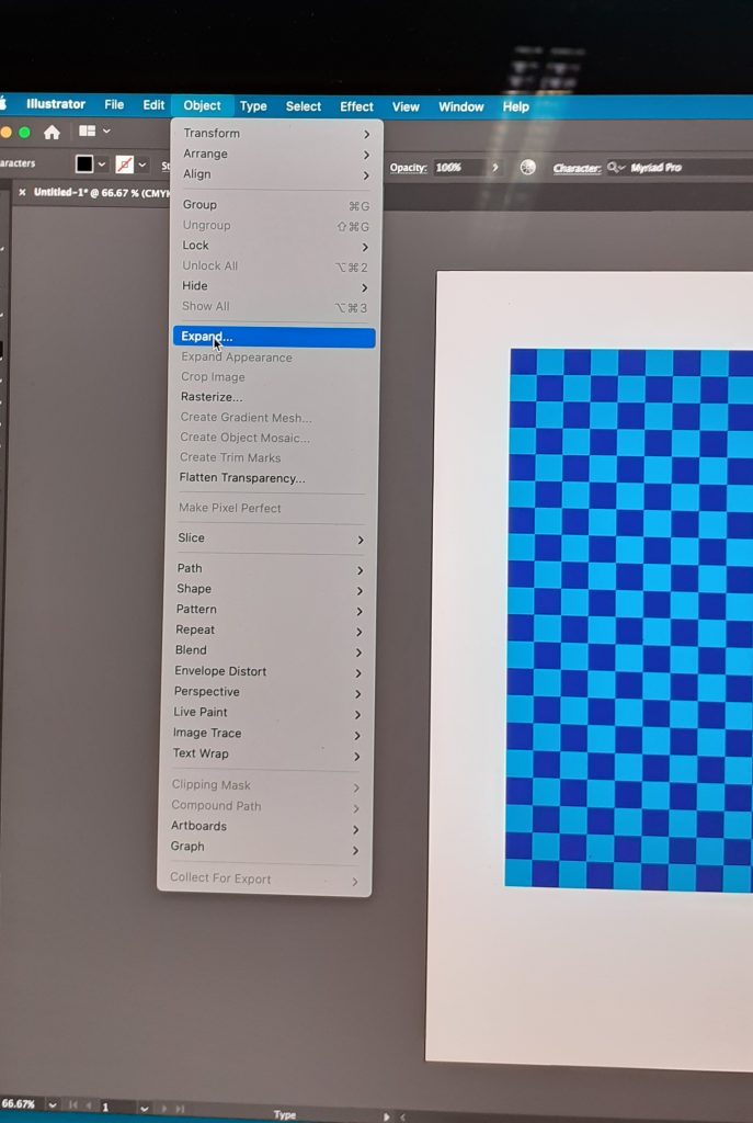
To make it a vector, I needed to click Object> Expand.
Object> Lock, locks the shapes.
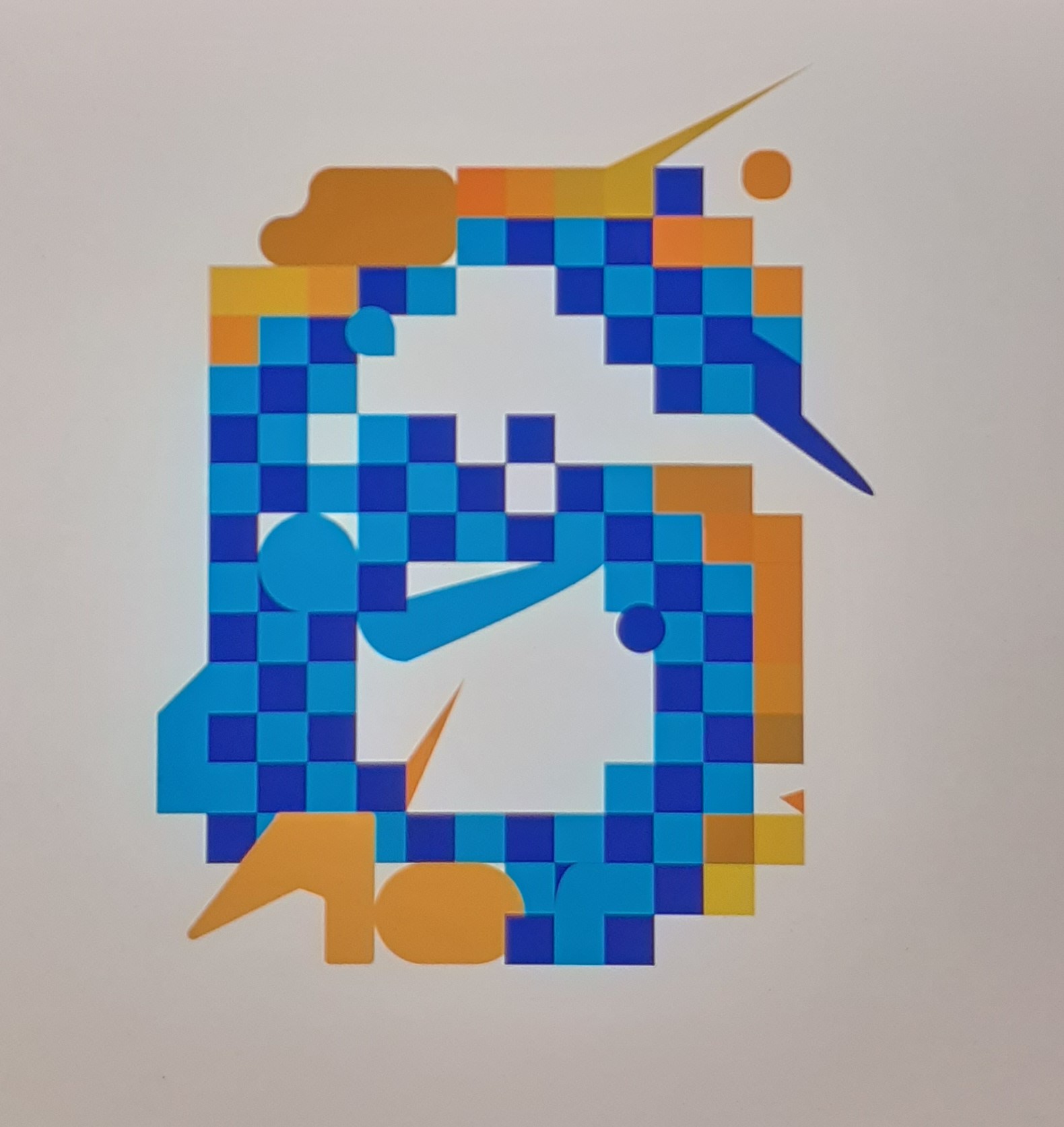
Today we were using Illustrator to re-design a number. We were using numbers because they are a widely recognised shape which indicates a sign. I chose the letter 6 and typed it on the page using the Type tool.
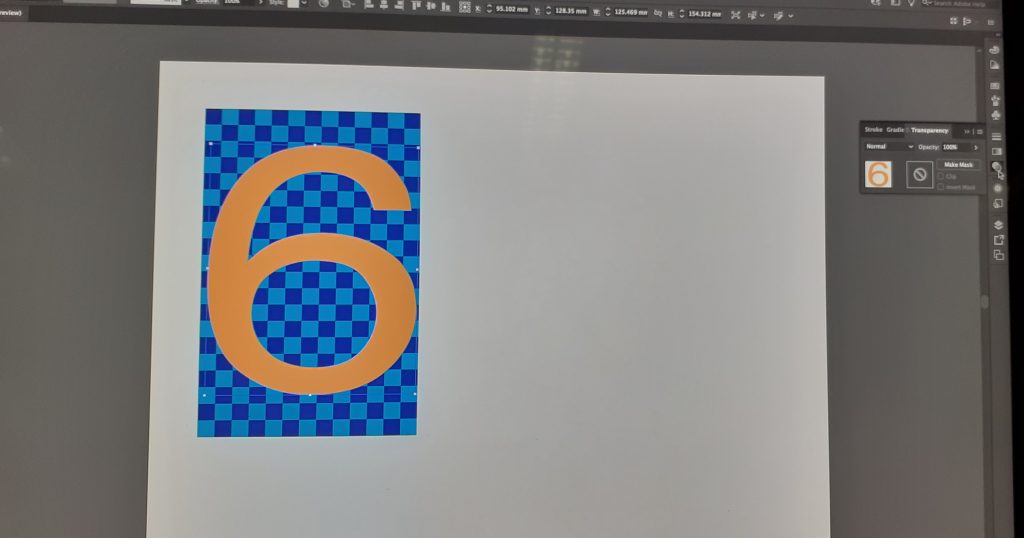
I changed the colour of the 6 to orange so that it would stand out against the background. I then had the option of choosing the opacity. Using transparency tool in the window on the right, I decreased the opacity so that I could see the outline of the 6 and the squares through it.
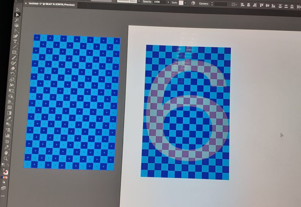
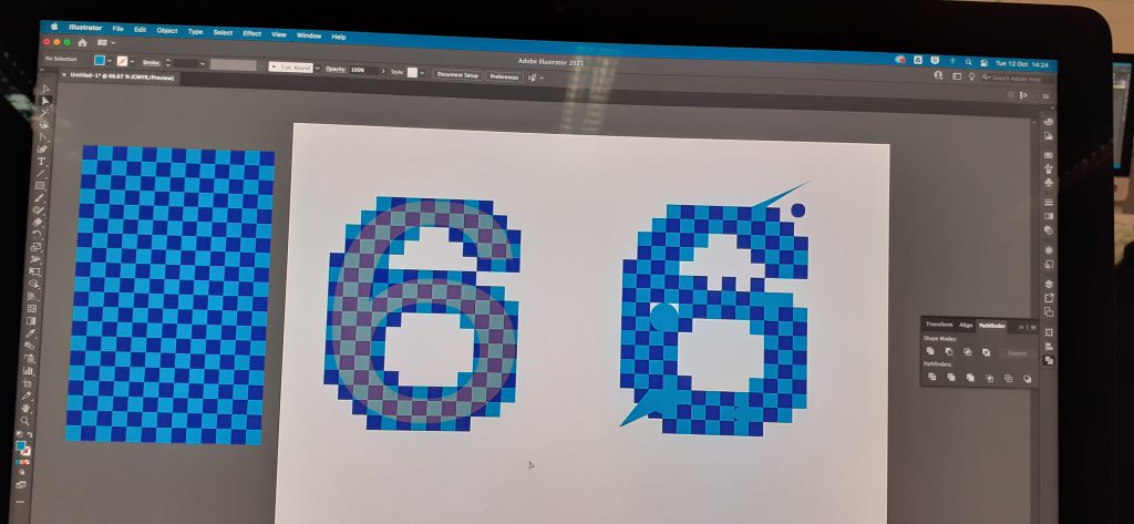
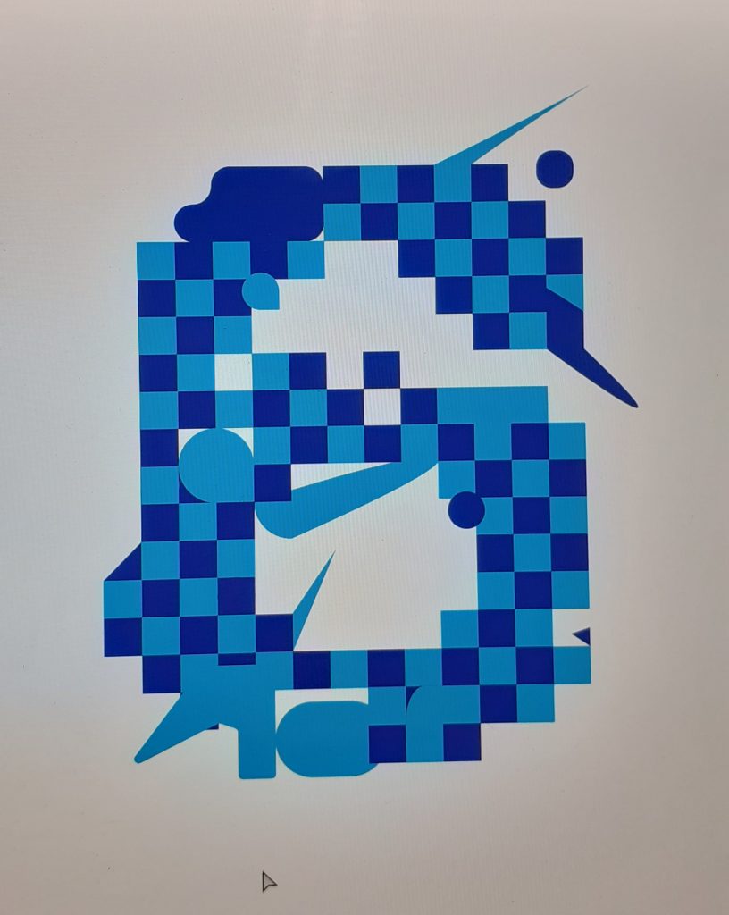
I added and removed sections of my ‘6’. I rounded edges as well.

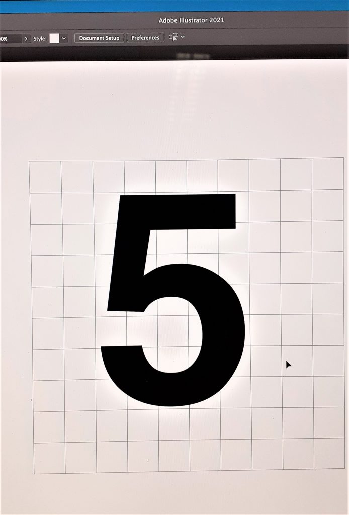
We then tried a different method of designing numbers. For this exercise I chose a ‘5’. I began by creating a second grid and placing the 5 on top. I made this letter into a vector and enlarged it in size to cover most of the grid.
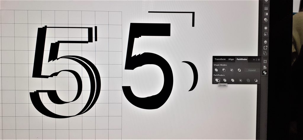
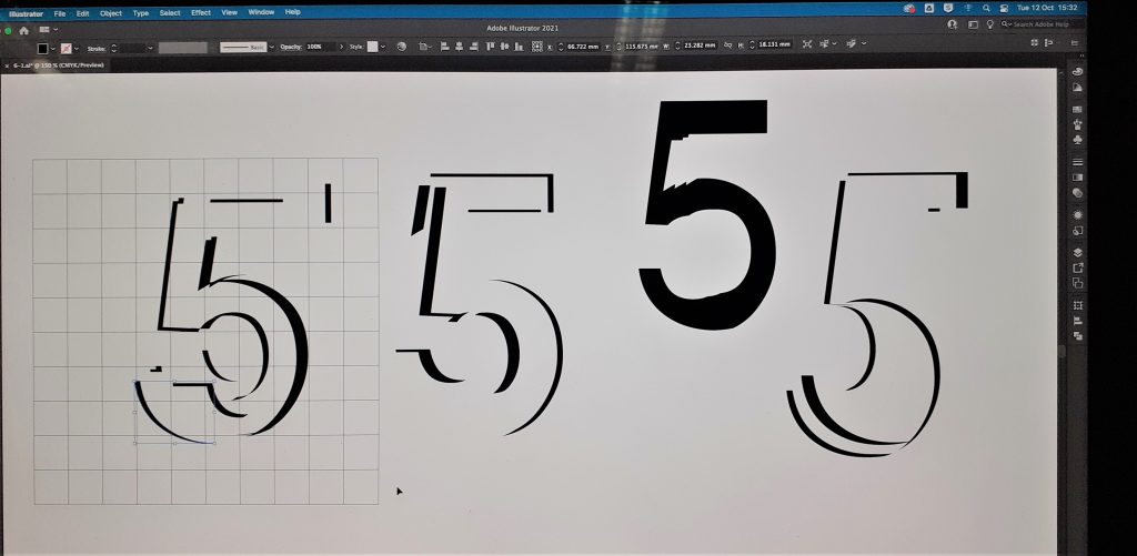
With the pathfinder tool, I could group the shapes together and ungroup them. To do this I selected Pathfinder>divide> (ungroup) = shift+ command+ G (see the window on the right in the above image)
After this workshop, I felt that I needed a lot more practice in Illustrator! I followed the steps we were told to do, but I didn’t always understand why I was clicking what I was clicking.