Presentation rejig

I wrote a script for the 1st draft of the presentation:

Script

Slide 1

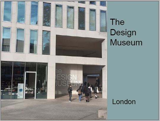
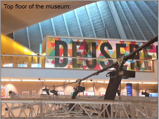
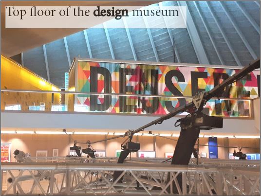
Arriving at the design museum, I had no idea what to expect because I’d never been to the museum before. To find the exhibition of designer maker user was easy because of this huge colourful sign and it was obvious to see where to go and it was on the top floor

Slide 2

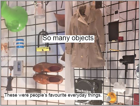
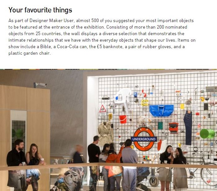
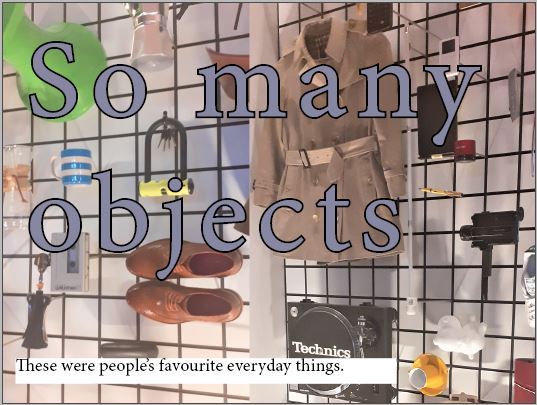
Walking into the exhibition, I was confronted by so many objects, and it was quite overwhelming because I was surrounded by lots of different objects, from different time periods, things I liked, things I didn’t like, things I recognised and things I didn’t recognise, and this is a picture of people’s favourite everyday things which the public voted on.

Slide 3

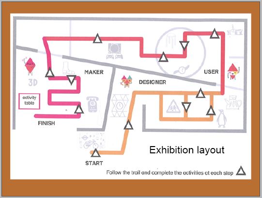
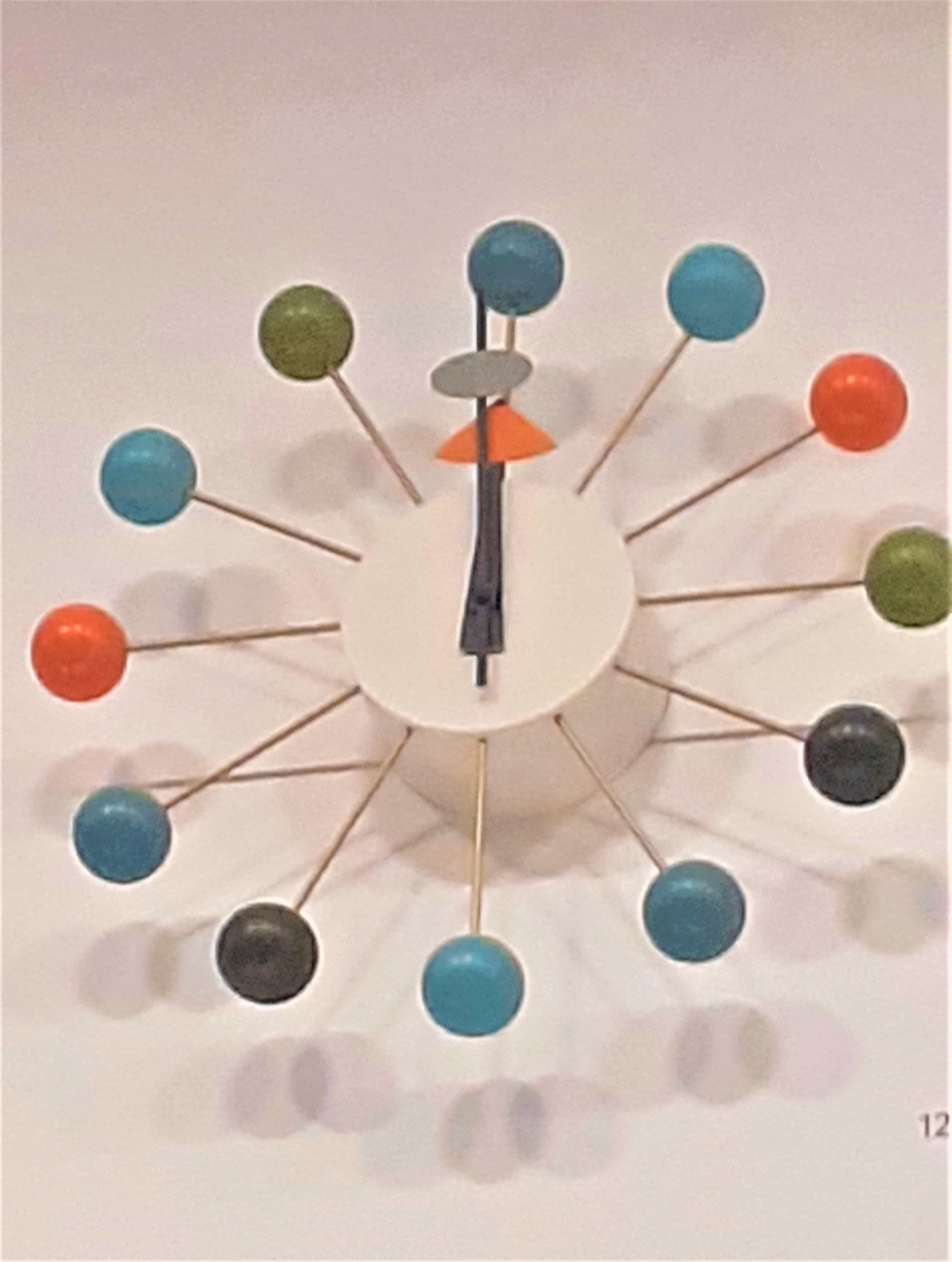
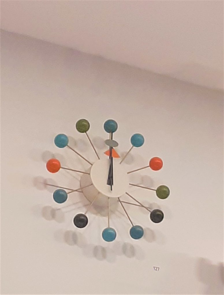
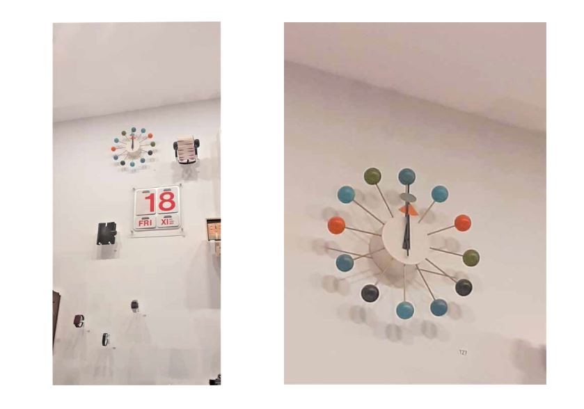
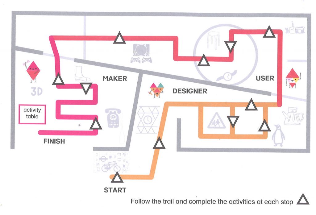
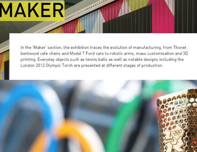
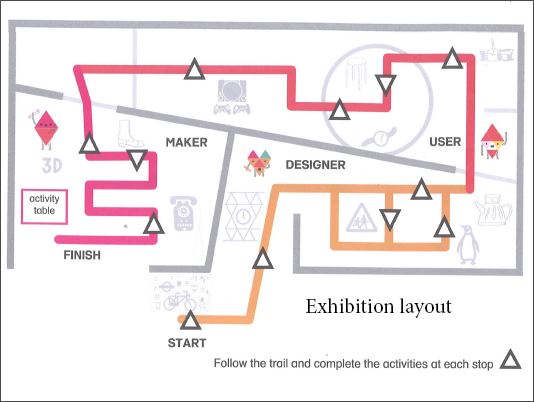
Here is a picture of the layout of the exhibition. This is the start, and this is the finish, but when I arrived there, I didn’t notice this was where the exhibition started, so I started at the finish point, meaning I first saw the ‘maker’ section, which focused on the production of the objects. I walked around once and then walked around a second time before I even noticed the ball wall clock, which was right at the top of the wall and easy to see because it’s just so bright and bold. Maybe this is why the museum placed it at the top because you don’t need to see any small details and it just stands out because it’s so loud and different. Straight away I knew, this is my object.

Slide 4

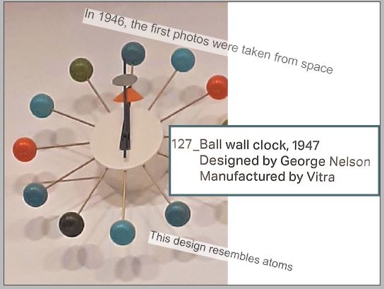
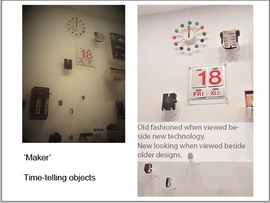
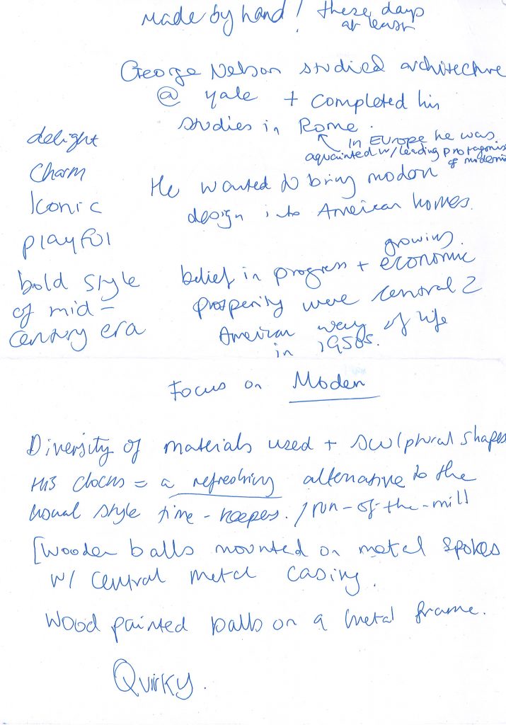
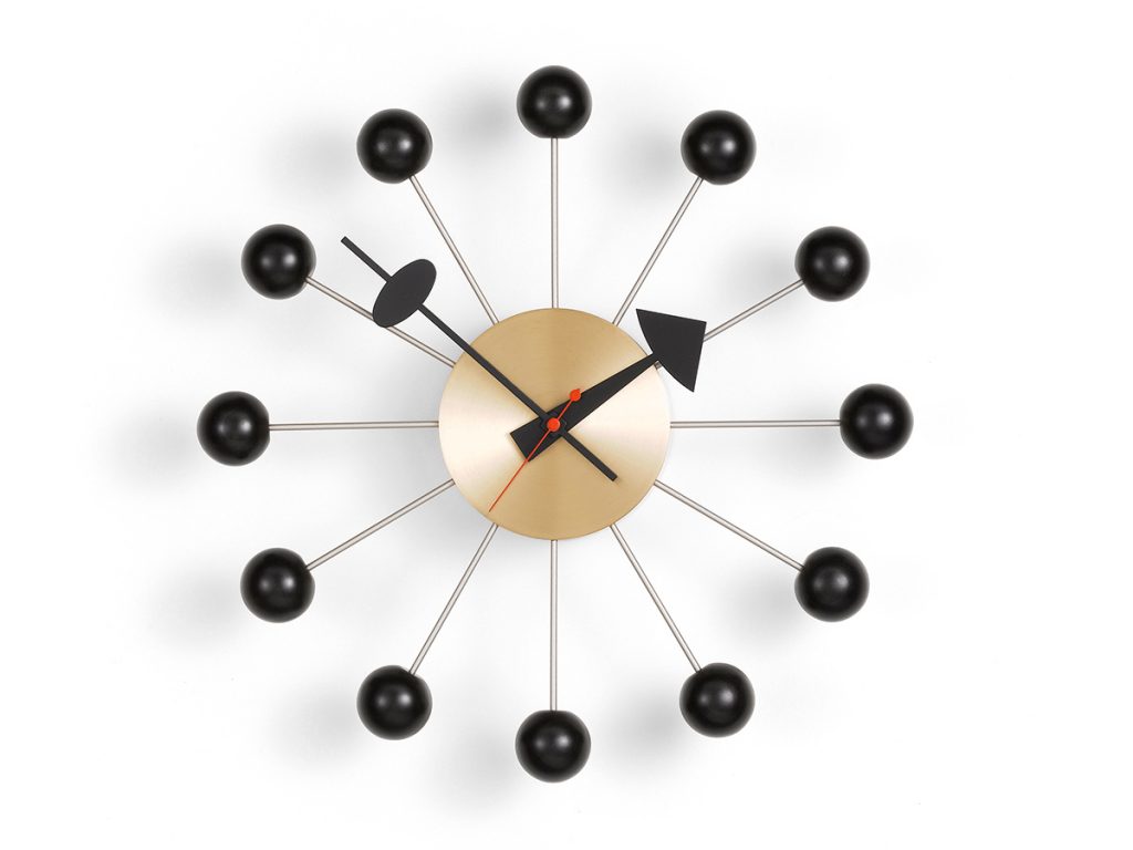
Being on the wall with other time-telling objects is really interesting because it’s on the wall with calendars, filafaxes, watches. But the modern digital watches make the ball wall clock look old fashioned. For this clock to be beside similar objects, helps me to place it in time by comparison. I kind of guessed that it was from the modernist period just based on what I already know about modernist design. The plaque told me the clock was made in 1947 and designed by a designer called George Nelson.

Slide 5

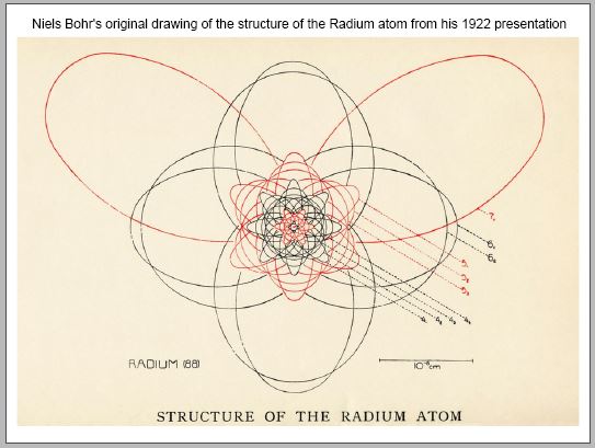
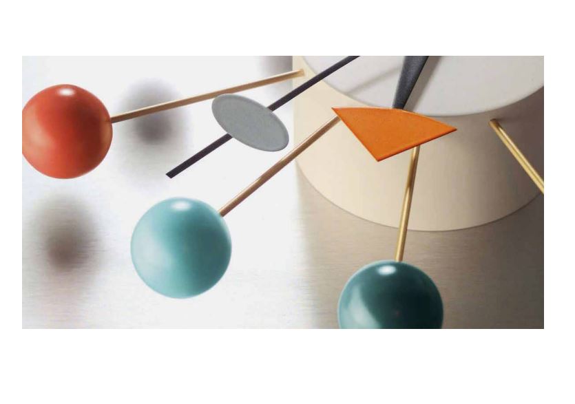
I think another aspect that indicates when this clock was designed, is that the structure of the clock is quite like an atom and this places it in history because in 1946, the first photos were taken from space and therefore people were starting to think about space travel and nuclear research.

Slide 6

This picture is the first drawing of the structure of an atom so you can see that with both there’s a centre and then spokes that extend outwards.

Slide 7

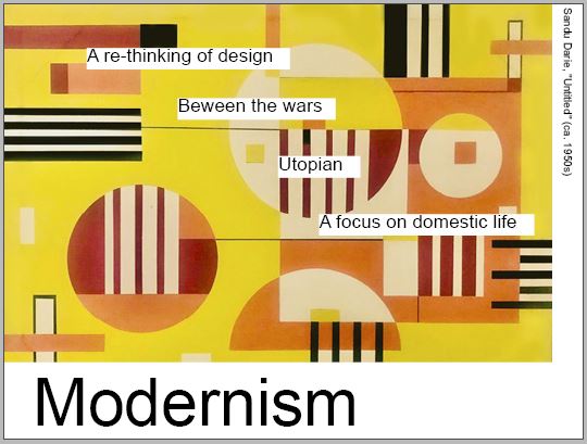
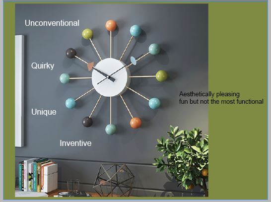
I’ve talked about the design being modernist in its style. the modernist period occurred in the western world between the 2 world wars. It was a philosophical and an art movement. People wanted to look forwards into a utopian future. Modernist designers were focused on reinventing the city after destruction and during the housing crisis. There was a focus on domestic design. After the war people wanted nice things around them in the home, so the design was quite uplifting and happy. Things didn’t have to be there just to serve as a function anymore, they could be aesthetically pleasing. This clock is aesthetically pleasing but I would say is not the most functional because there are no actual numbers, and this could be challenging for some people so it would probably be best in a home setting or somewhere where you didn’t need to know the precise time.

Slide 8

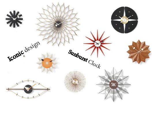
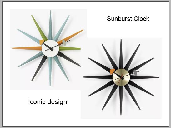
The sunburst clock is another clock designed by George nelson and they’re iconic clock designs because they are widely recognised and really represent people’s homes from that period. particularly American homes. The star shaped designs also reference space.

Slide 9

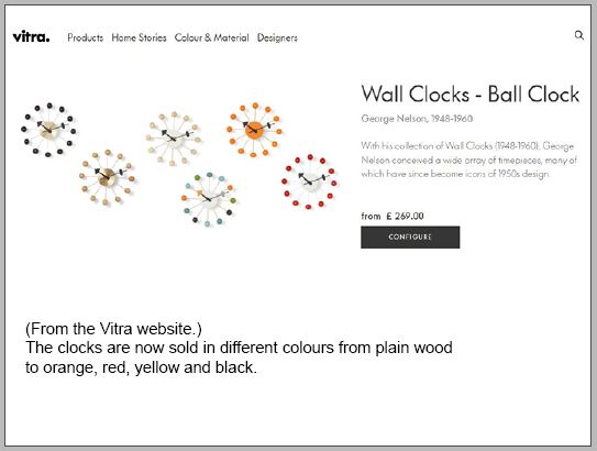
The ball wall clock that I saw in the museum is still being made today which I found quite amazing, and it just shows how popular and well-loved they are that they’re still being made all these years late r they are currently being sold for 269 pounds and I believe the reason why they’re worth so much is because they are handmade, so this shows really good quality. The choice of different colours now means that they are suitable for more of a variety of different rooms.

Slide 10

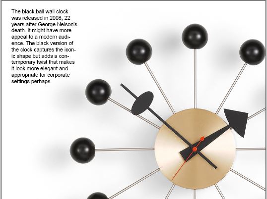
And finally, I really like this black version which was introduced after the designer’s death and marked what would have been his 100th birthday. Although the structure is the same, taking away the bright colours means that it looks more elegant and stylish, and I imagine it could be good for a corporate setting and it looks really contemporary compared to the original and therefore I think this version could have much more appeal in today’s world.


I turned the script into prompt cards to use during the presentation:

Prompt Cards

Slide 1

  • Arriving at the museum..
  • Designer Maker User
  • Easy to find

Slide 2

  • Walking into the exhibition..
  • overwhelmed

Slide 3

  • This is..
  • ball wall clock at top of wall
  • easy to see- bright and bold- don’t need to see small detail
  • knew it was my object

Slide 4

  • Being on the wall with other time-telling objects…comparison
  • I guessed it was from the modernist period
  • The plaque tells me…

Slide 5

  • Another aspect that indicates when…structure…first photos 1946…this places it in history…space travel & nuclear research

Slide 6

  • This is a picture of…You can see they both…spokes

Slide 7

  • I’ve spoken about the clock being modernist in design…in the western world between the 2 world wars.
  • Philosophical and art movement
  • Building back the city with a utopian view of the future
  • A focus on domestic design- uplifting
  • Somewhere you don’t need to know the precise time

Slide 8

  • The sunburst clocks…
  • Represents particularly American homes from the 1950’s
  • Star shapes also references space

Slide 9

  • The ball wall clock I saw in the museum is still being made today
  • Popular and well loved
  • Handmade= good quality

Slide 10

  • And finally, I really like the black version
  • Elegant stylish contemporary
  • More appeal in todays world

I recorded my voice delivering the presentation but it over-ran the time limit of 5 minutes. I re-recorded it but could not get the presentation to less than 7 minutes without rushing it. I therefore needed to re-consider and think about where I could cut 2 minutes out.

I thought of 3 possible areas to be cut:

  1. entering the museum
  2. about modernism
  3. about atoms/the space age

I timed the section about atoms and it was only 40 seconds.

I then decided to cut the beginning slides about entering the museum, as I felt it was less interesting than speaking about the origins of the design.

Slide 1
Slide 2
Slide 3

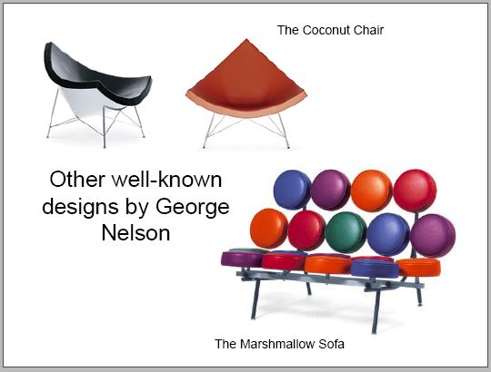
After needing to cut it down more, I removed this slide, as I felt I could mention his other designs in a sentence within another section:

Presentation 1st Draft

When putting the slides together, I wasn’t sure how to start. I began by placing this photo of the outside of the museum, however I later decided to remove this slide for 2 reasons. 1) The colour does not represent my object. 2) The second slide contains a photo of the museum.

Another thing I decided to change was the font. I later changed the font to ‘Minion Pro.’ I felt that this font was appropriate to reflect the 1940’s period in which the clock was designed.

I liked this slide but thought I could enlarge and colour the text to emphasize the meaning. When I talk about being overwhelmed by the amount of objects, this can be illustrated in my choice of type.

I added orange to this background to tie it in with the colour of the clock. However, I decided that this background was not necessary for this slide.

The slide below wasn’t working well. I included the picture on the left to demonstrate the way we can focus on one object and ignore the surroundings. However, the 2 images looked to be competing on the slide and they both showed the same subject.

I chose to keep the image on the right because of its clarity.

I liked the way I placed the photo to the edge of the slide. I also liked the placement of the lines of text, however, it felt premature to reference the atomic influence on the design, since the audience has not been introduced to the clock and first impressions.

When editing the presentation, I brought this image up to the edges of the slide so that it follows the previous slides where I used photos to fill the page.

I wanted to include a slide about Modernism, as the audience may want to see examples of what Modernism is.

When recording the script to see how long it would take to give the presentation, I was recording for almost 10 minutes. I needed to cut down the length of the presentation. I chose to remove this slide as I could talk about Modernism during another slide.

I was happy with the below slide. I like the way the object pop against the white background.

I moved the below slide further up because the information on it relates to earlier slides. I enlarged the text on the right side to make it more readable.

I placed the text on the left side around the clock in a circular formation.

I used green from the clock for this background. This background does look slightly out of place in the presentation. I therefore removed this green background from the slide.

The images below are overlapping slightly. I needed to fix this for the final presentation.

I may need to shorten the paragraph here so that I am displaying 1 or 2 bullet points of text. It is important that the slides only highlight key words and statistics.

In the week before the presentation, I will practice delivering the presentation. I have learned from past presentations, that knowing the information by heart will help me when I need to talk about the subject.

Next I will make prompt cards to use as reminders when delivering the presentation.

I am working on final touches to improve the look of the presentation and ensure that the slides support what I will be talking about.

Ball Wall Clock

Ball wall clock by George Nelson at The Design Museum in London

My chosen object from the museum’s Designer Maker User collection is the Ball wall clock. I chose it based on my initial feeling towards it, (delight, surprise, impressed), and the conflict with what I disliked about it. (functionality).


I wrote about the object in a stream of consciousness style:

Ball Wall Clock, 1947 designed by George Nelson manufactured by Vitra

The clock is on a white wall, surrounded by other elements of time. Watches, digital clocks, Filofaxs and other instruments to mark the time. Amongst these objects the clock stands out. At the highest point of the wall in the corner, somehow alone because it doesn’t blend in, because it is different, it is unique.

The shape is what first strikes you. It’s a clock but not in the way I’ve seen a clock before. The colours are fun, the shapes are unexpected. I immediately liked it, I was immediately impressed by it but I think I would be frustrated if I needed to use it to tell the time. My preferred method to tell the time is to ask Alexa because I get an immediate response. I hear a voice telling me without me needing to look at anything and interpret a number or code. For me, it feels like figuring out a puzzle, which seems long and unnecessary.

I’m aware that we all see things differently, experience life differently. Our abilities vary. Telling the time must vary as well. A digital 24-hour clock is another favourite of mine that I’ve got used to from using it repetitively. It’s reliable and if it’s connected to the Internet, even better because I don’t need to change batteries and I don’t need to question if the time is right because I know it’s right. I used to have a watch when I was 7, it had dolphins on it. I liked it because the strap was denim, I felt like that was quite different. It was round and this clock at the museum also follows the traditional design of being round, but it’s rounder than round because of the ball shapes. Circles are round and a globe is completely round, spherical and that’s what this clock has.

It relies on an understanding, as many clocks do, that the viewer will know what each mark stands for. I don’t like this it’s too clever it’s almost pretentious.

You say quarter to nine. These are words. They also represent numbers, the numbers look like something and they symbolise something. To add shape and position to the equation is a further complication I can’t see necessary. These clocks remind me of going back to the times with sundials. You don’t need those any more. Of course, when this clock came out, they didn’t have digital. Digital anything. Life was different then, but they still had beautiful things. I know that by looking at this piece. This object that I saw amongst lots of other objects. It doesn’t have just one association to me and it doesn’t have just one use. To look interesting is one use (that’s why I like it). To tell the time is another use and that is something it doesn’t do any more because it’s in the museum. You can buy these clocks at John Lewis. Obviously they are not original, but near enough. I believe they are even made from the same materials. Where would you hang a clock like this? As well as being bold it is quite big. It makes a statement.

It was difficult to take a photo of the clock, because it was too high up on the wall. In fact there was nothing above it but the ceiling. What I find really interesting, which I didn’t notice at first, is that the colours are random. This clock doesn’t want to indicate numbers at all. It doesn’t want to make it easy for us to tell the time by having a different coloured balls to represent each number. Though this could be an advantage in some ways. If you have had this clock for a while, you could get used to the fact that 3 is green, 11 is green, so a quick glance at the clock might mean that you are eventually taking notice of the colours and the associations might actually help.

The centre of the clock being white means that against the white wall, the middle seems to disappear and many walls do happen to be white. The average wall.

The shadows created give us a second ring of circles.

I didn’t notice the clock in my first walk around the museum because it was so high up. It wasn’t until my second walk around that I spotted it and it surprised me. Wouldn’t it surprise you?


I then used the pointers I wrote to prompt me when reflecting on the object. I searched the internet to find out a bit about the clock. This helped me to get a fuller picture of the object.

I prepared 2 slides for this week’s lecture. I included a full picture of the clock, the clock in context on the wall and a close-up photo of the clock that I found on the internet. I could not take a close-up photo of the clock due to its placement in the exhibition.

Slide 1
Slide 2

In this week’s lecture we had the opportunity to speak about our chosen object. I was surprised to see that only 2 people had chosen the same object.

We were prompted to consider where our object was placed within the exhibition and what effect this had.

The class shared that the exhibition was separated into 3 categories: Designer, Maker and User. I had to admit that I did not notice this when visiting the exhibition. I noticed the different areas divided by partitions but did not make any connection to designer maker or user in these areas. I did not feel I could read the plaques of information because of time restrictions. I looked again at the plan of the floor and realised that I had entered the exhibition from the ‘finish’ point:

This means my object belongs to the ‘Maker’ section.

https://designmuseum.org/exhibitions/designer-maker-user

(Designer Maker User wall designed by Studio Myerscough.)

Talking about my object

When introducing my object to the class, I spoke about:

  • The clock is not user friendly if people cannot read it.
  • The clock is most likely made for the home since it is aesthetically pleasing/fun but not the most functional.
  • The design resembles atoms. It was made in 1947, shortly before the space age. In 1946, the first photos were taken from space.
  • His other clocks are spikey/star-like which also tie in with this theme.
Image of an atom.
e835b00c2ef7093ecd0b470de7444e90fe76e6d019b0134296f7c2_640_atom-640×437.jpg (640×437) (gulpmatrix.com)

The Presentation

I want to approach my presentation as if I am introducing my object to the class for the first time, and as if they had not seen the exhibition for themselves.

Including my image of the clock in context is important because it places the viewer in my shoes. They then have the chance to see the object in the way I first saw it on the wall, which is part of my experience of perceiving the object. I can talk about the effect of seeing the clock amongst other time keeping objects.

I can start the presentation with a photo of the museum and then include photos of entering the building and the exhibition. This also adds context when presenting the clock. If I then zoom further into the object, I can start to talk about the materials used.

The idea is to build up layers of information. Talking about the history of the object is one layer. I want to bring out pieces of information that the audience would not be already aware of.

Production of ball wall clock

This video shows how the ball wall clock is made by hand. The video was posted this year, (2021) therefore we can assume the clocks are still made this way. The fact they are handmade would make them more valuable. They are currently being sold for £269.

See how the George Nelson Wall Clock Collection is made for Vitra – YouTube

The clocks are now sold in different colours from plain wood to orange, red, yellow and black. The black ball wall clock was released in 2008, 22 years after George Nelson’s death. It might have more appeal to a modern audience because the bright colours can be seen as quirky or even childish as one classmate commented. The black version of the clock captures the iconic shape but adds a contemporary twist that makes it look more elegant and appropriate for corporate settings perhaps.

Buy the Vitra Ball Wall Clock at nest.co.uk