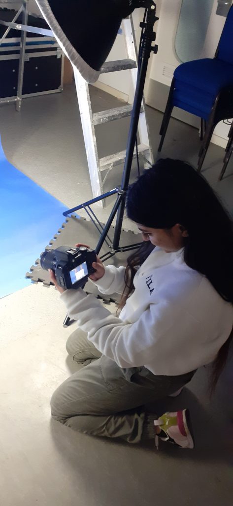
The purpose of today’s workshop was to explore using a DSLR camera to capture the physcial (printed) work we have made during this course. The focus was on how to be creative when taking the photos. I approached the images differently depending on the work in front of me. Working in pairs made the work easier as there was another mind to help problem solve, both with technical problems and creative ones.
We used an ISO of 100, as this is suitable for shooting indoors.
We shot in aperture priority (AV) mode, so that we could focus on the compositions rather than the technicality of a camera. This was useful to me since I have not used a DSLR camera in perhaps a year and needed to re-familiarise myself with it.
The aperture relates to the lens openeing being wider or smaller. A wider gap/lower aperture lets in more light, this is useful for portrait photography. It puts the focus on the foreground and gives a softer background.
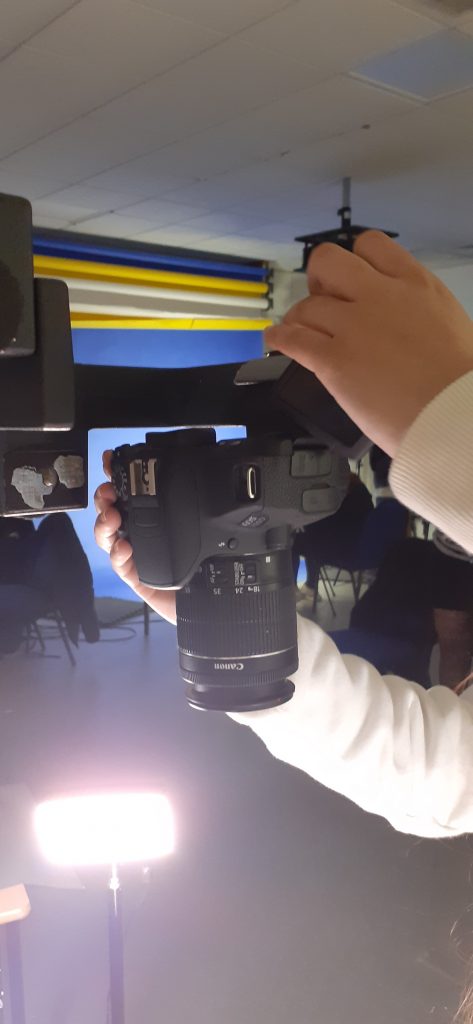
We used a Canon 600D camera.
The shutter button can be used to demi-press and take full shots. The demi-press allows us to check our focus.
Using the screen on the camera means we can take angle shots without needing to use the view finder.
We need to format the card before using the camera. This ensures connection between the SD card and camera. It also empties the card before you use it.
The ‘Q’ button allows us to navigate the screen to change the ISO settings for example.
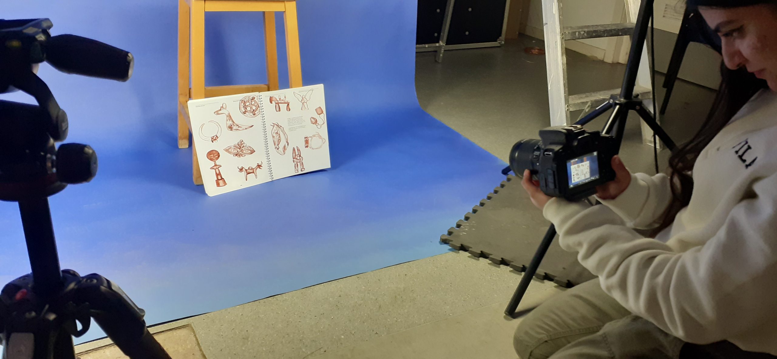
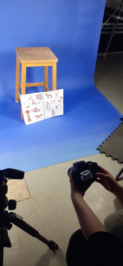
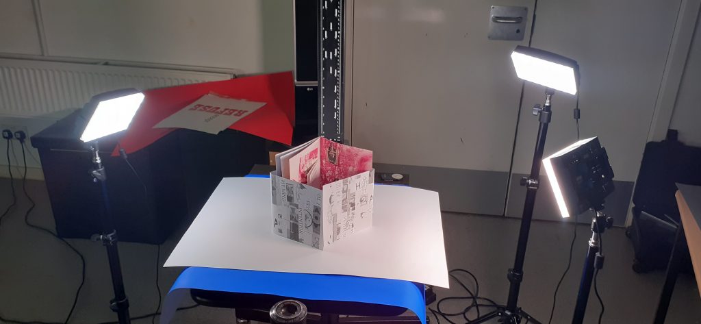
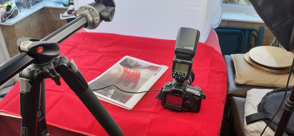
Working at the first set-up, I used objects to prop up my process book. This shows the spread at an interesting angle. Placing lights on one side gave the book an interesting shadow. This shows the book with a sculptural appearance. https://support.usa.canon.com/kb/index?page=content&id=ART101719
We selected ‘large quality image’ (not raw). The symbol for this (shown above) looks like a ‘DL’.
0 exposure compensation
Spinning the wheel changes the aperture
Shooting in raw is required when working with really big, high quality images. They are however, a slow doc to work with. The colouring is more precise than a jpeg.
A photo taken on a DSLR camera will always be a higher quality image than one taken on a smartphone.
AWB = automatic white balance. White balance helps to colour correct any temperatures you’re working with. We can change the settings to tell the camera you are working with sunlight for example. To correct yellow light tungsten for example.
We can create creative filters using just white balance.
AF = automatic focus
MF = manual focus
Live screen view mode allows you to see how your settings are applying.
Photos from the workshop:
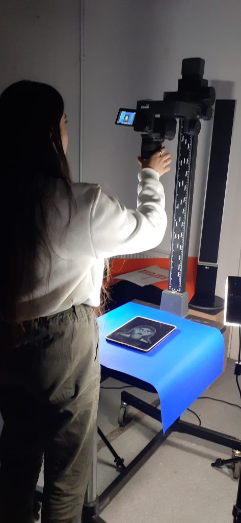
Using the stool as a prop and blue backgroundFinal set-up allowed us to taken photos from an angle directly above the work. Above is my manifesto from 2nd year, Semester 1.
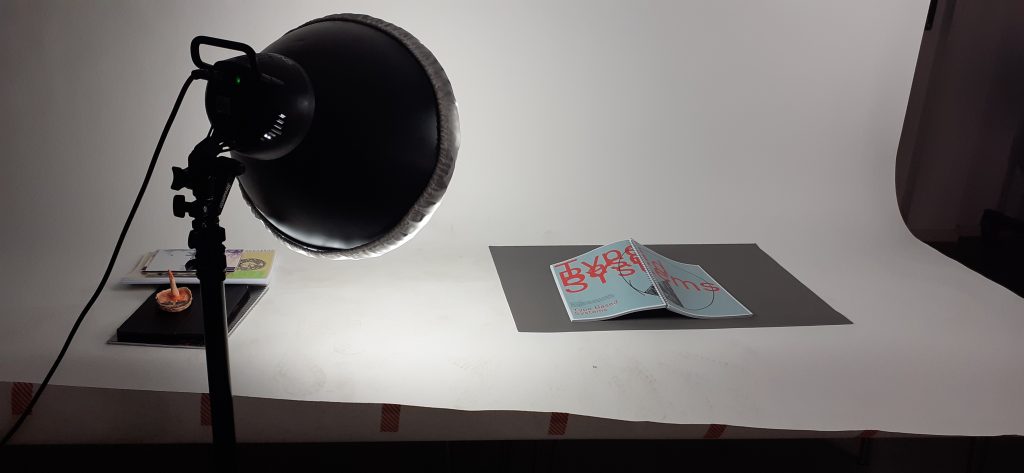
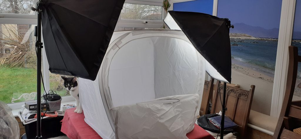
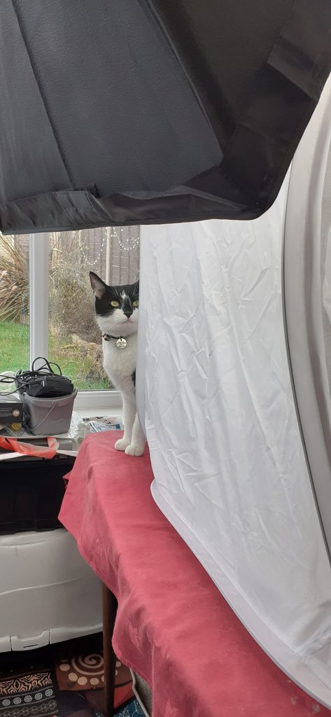
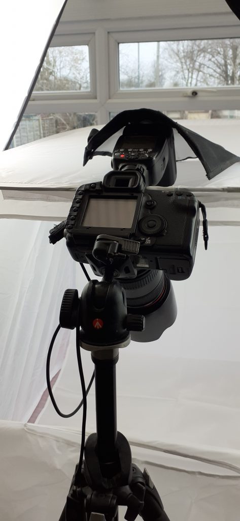
Continuing photography at home…
I experimented with different coloured groundsLighting and back-drop set-upMy assistantCamera with flash
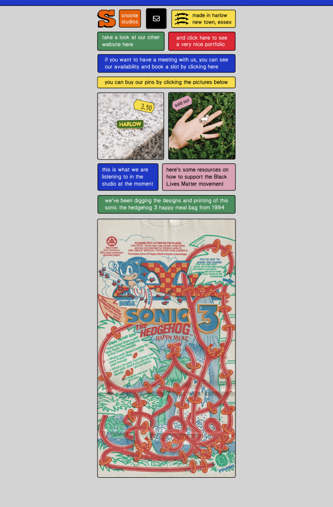
There is no set standard when it comes to a designer’s website. Avoid trends. Below is Snootie Studios website. The use of a grid makes the information easy to understand and navigate:
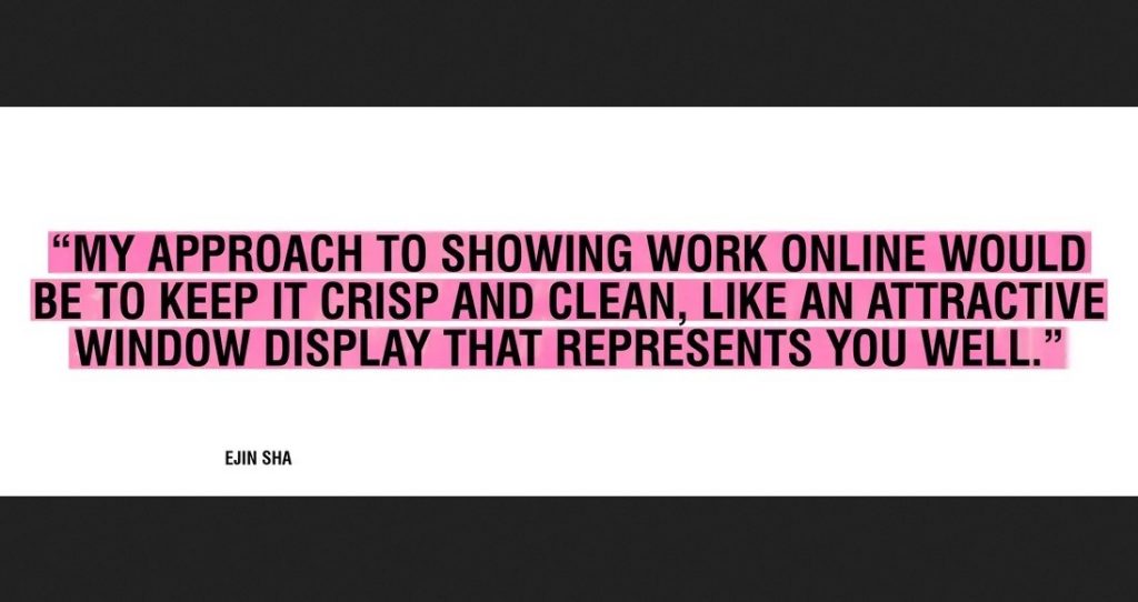
Your website is your presense, its the first point of contact people will have for you. We need to consider navigation- keeping it simple, nice and clean.
…And like a shop window, the content is changing constantly.
Make sure you present it in a clear way, use large images and make sure there’s not too much graphic noise around the work.
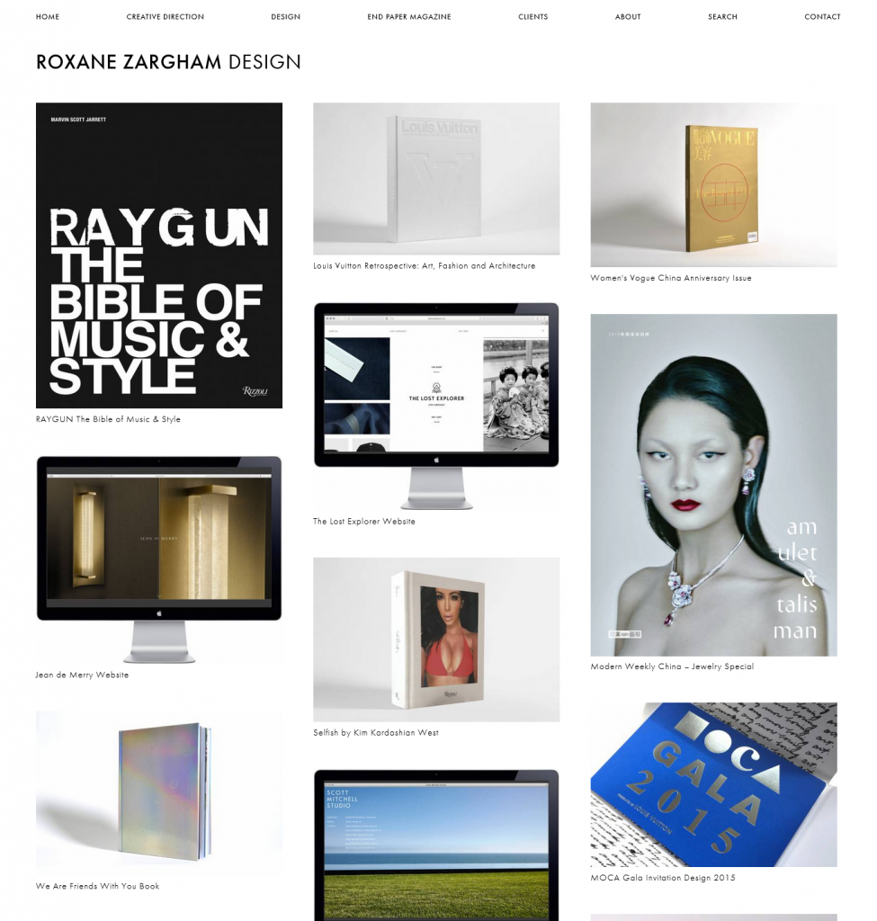
Roxane Zargham’s web portfolio is an example of a very clean layout. The absence of background colour/ unnecessary information helps the viewer navigate the work in this portfolio. Her work has also been photographed in a studio using a white background. Treating each piece in the same way unites the separate projects as being part of the same design identity.
She uses the rule of thirds to divide the work into 3 columns. This gives a sense of balance to the overall page layout:
Be selective- it needs to represent what you want to achieve, what you want to work with. This could mean working on a self initiated project. (You want to show you have experimented with different things- analogue, digital.) For example, on the website portfolio of Bounce (a graphic design studio in Oxford), they have included a variety of projects together. I like that I can view the scope of their work on one page:
It’s important to write a description, since work needs to tell a story. Where to start? Puting the work I want to showcase into 1 folder, allows me to be organised. If I write 200 words for each project, then I have this information ready for when I want to post the work to my website for example.
Art direction and image production (creating the content for your website) can be the most time-consuming part of putting together an online portfolio. (We will be exploring this in a photography workshop next week). We spoke about the things to consider when photographing work.
Photographing work
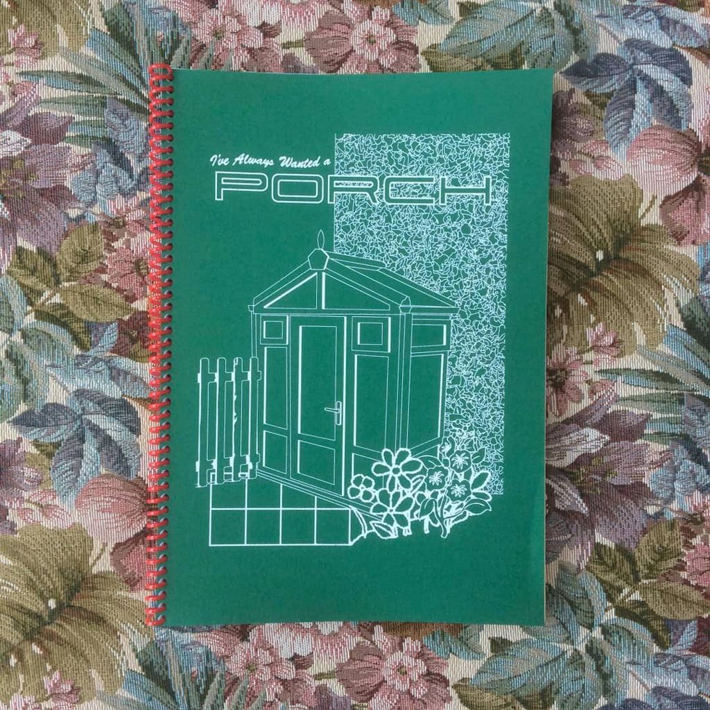
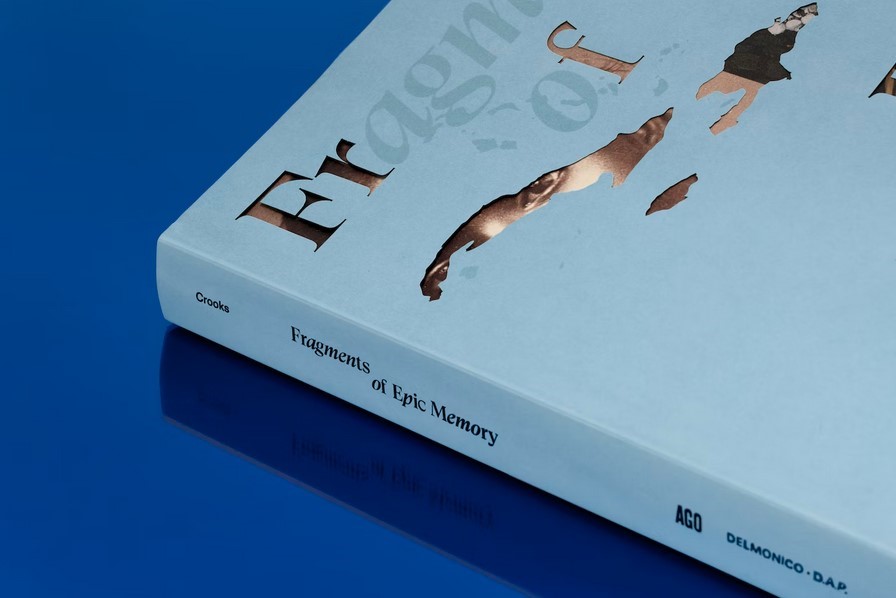
One possibility is to frame the work in a real life context. An example of this is this project from Tomo tomo Studio. They have decided to photograph the book in an old building, isince the subject reflects an antique theme. The work also constrasts with the blue in the background. It is a nice idea to contrast the colours of the work and its background, since this allows the work to stand out.
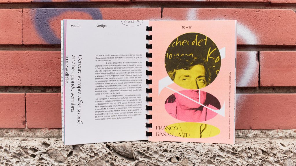
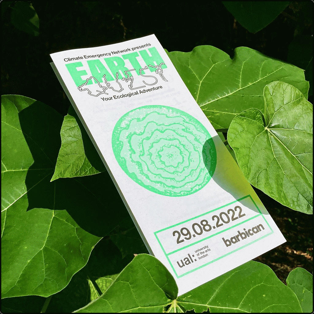
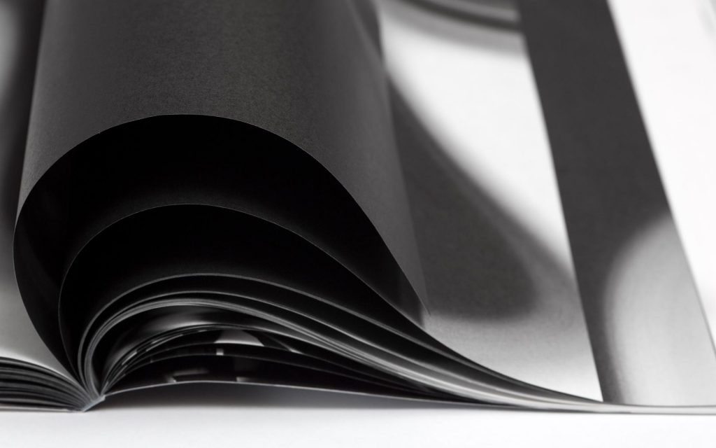
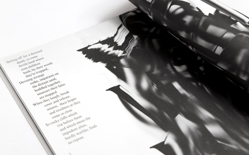
(Below) Another example of an interesting setting, is this fanzine that has been photographed in an urban landscape. Since the zine is about the city, it is appropriate to capture it outdoors against the brick wall backdrop. This is an alternative to photographing the work indoors and artificially lit. Both are appropraite for different works.
Spread from the issue ‘Vertigo’ by Orizzontale
Coloured paper has been placed in background and creates a sense of harmony in the overall image. The colour has been dictated by the work itself:
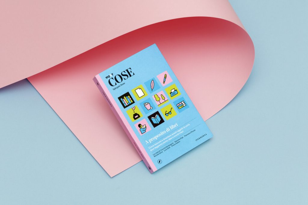
Cose. Spiegate bene from Tomo Tomo studio
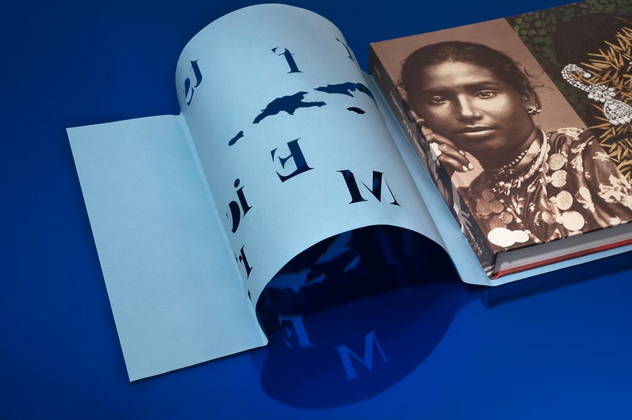
Including a wooden background places the book in a real world setting, allowing the viewer to picture the physicality of the book and to imagine it infront of them. Including the hands gives us a sense of the scale. (below)
We can also use props and other materials alongside the work. For example, if the project is about music, we could place cables in background. We could include props that feature within the work, and place them next to the work also.
Thinking creatively, we can use any material to add interesting background effect. For example, using coloured acetate in the background to filter the light through.
P.O.V.
We can play with different points of view when photographing our work. Choosing a different angle presents interesting aspects of the work and can even create surreal, abstract imagery of an everyday object. For a book that has complicated folding, we can use photography to show the complexity of the book binding.
Suspending the book with fishing wire and photographing it can be a fun way to display the work.
Details can be zoomed in on. Where there might be reflective materials for example, we can photograph the way the light catches the foil on a book cover. The tactile/print quality of the work can be showcased with photography. Use of shadows can emphasise the physicality of the piece.
We could even take a video of the work to show the handling of it. Stop motion can be a fun way to display the work.
An abundance of identities
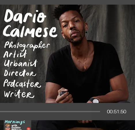
Listening to the Design Matters podcast, this episode features Dario Calmese. The discussion is based around the fact that ‘we all have multiple identities’ and that choosing 1 career path may be limiting ourselves. Calmese is described on his website as ‘sitting at the nexus of art, fashion and academia, Dario is an artist, urbanist, director and brand consultant currently based in New York City.’ His curiosity was encrouaged by his parents and he was able to explore many different skills from a young age.
‘Each medium allows for a certain type of communication’
‘Fascinated by what is possible’
About identity:
Identity isn’t necessarily who you are but the things you hold. You are the vessel that holds these identitys. identity is something that comes from the outside, people are telling you how you are seen vs you defining it for yourself.
We began the week by discussing with our tutors, what we hope for our future careers. This took the form of an informal presentation, where classmates were encouraged to get involved and think about specific design industries and studios.
This is an exciting time in the course. Suddenly the real world is on the horizon!
Reflections
I was happy to share my ideas with the group, however, what I realised is:
I don’t really have a clear idea yet.
I might know what I admire in other’s work, but I hope my path will become clearer as I continue to work on briefs and keep my eye open to new ideas.
I don’t have much confidence in my work. For example, I can look at a beautiful editoral layout that uses experimental elements, but to believe that I am capable of anything nearly as inspiring?
I know at least one thing. That the morals and ethics are number 1 for me. That art, healthcare and education are the topics I am most passionate about if I had to narrow it down.
The group was smaller in size today. I enjoyed this experience much more because I got to hear from every individual. I felt more involved and enjoyed participating in discussions. I like being able to offer advice to others and be supportive.
Researching studios could really be an endless task! I’m sure if I continued to research it would influence me further.
I realised afterwards that I never mentioned printmaking, but printmaking is normally used as part of an illustrators process, rather than a discipline in itself.
We discussed that what I may be more interested in is the concept itself, as in creative direction.
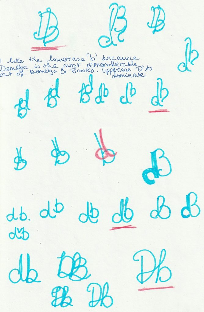
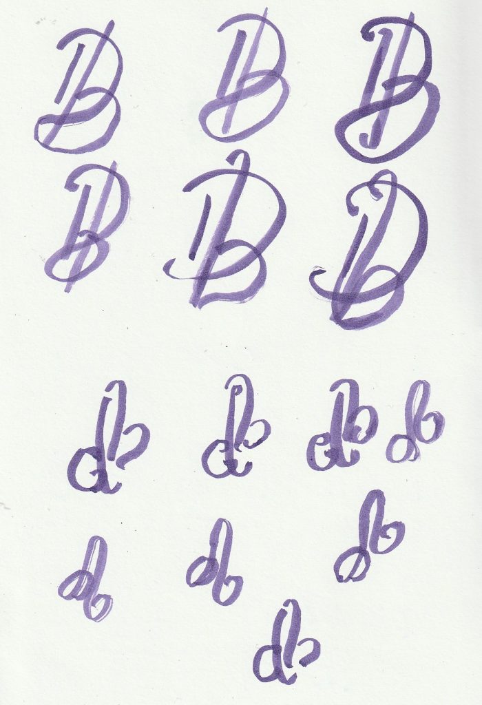
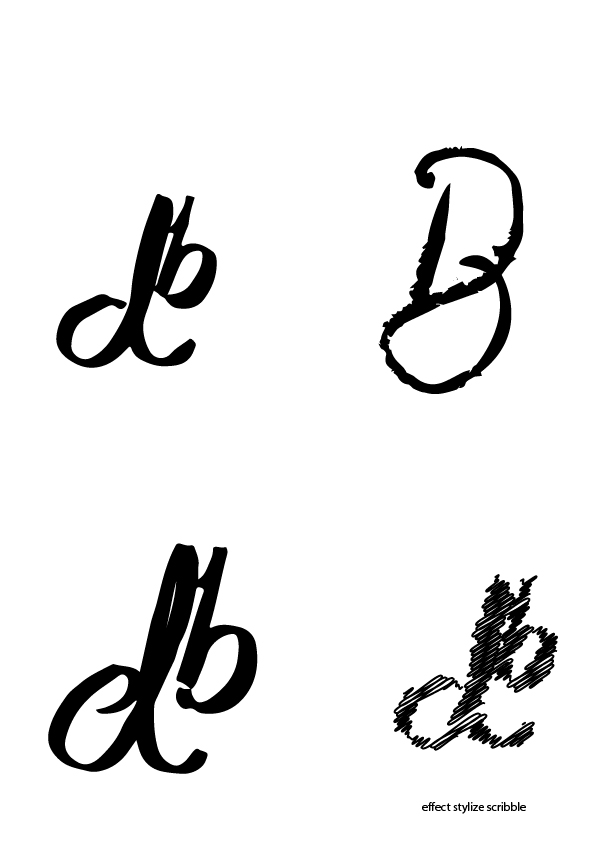
Sketchbook Logotype Experimentation
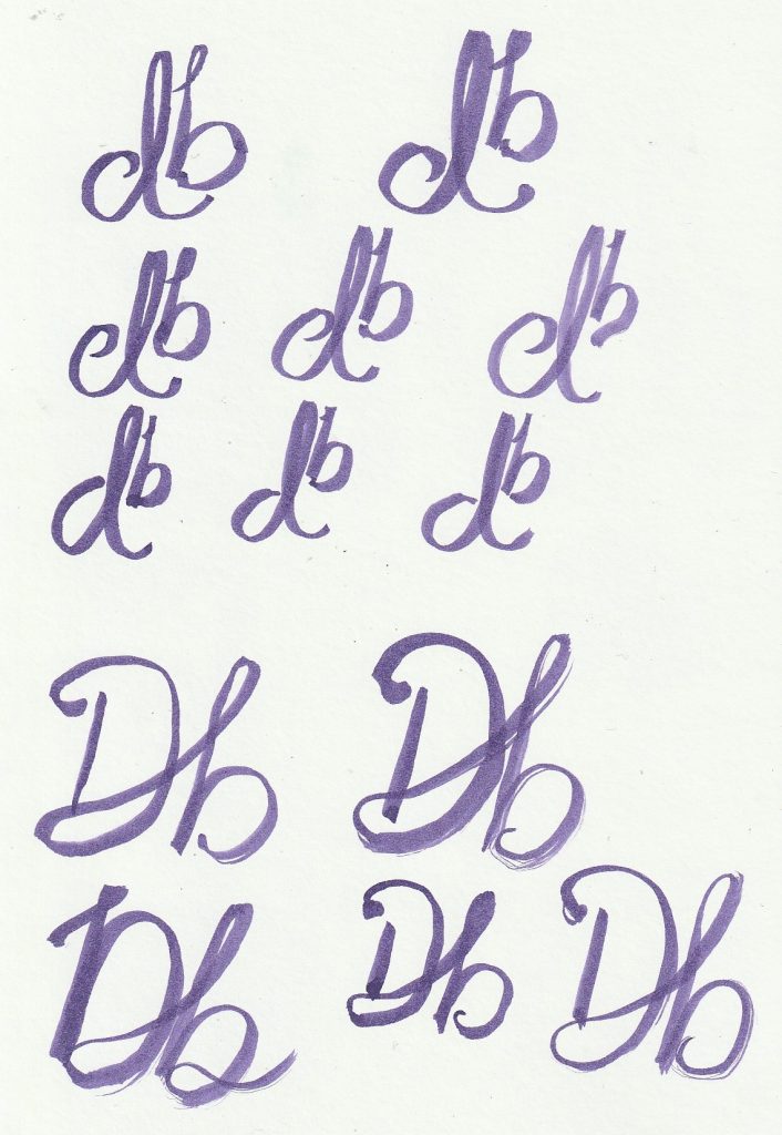
This week, I continued to experiment with monograms in my sketchbook. I used a felt tip pen to sketch these ideas. I then took 4 of these ideas forward and drew them using a paintbrush and purple ink. (The purple had no significance, I used it because I wanted a dark colour for contrast and couldn’t find the black ink at home.)
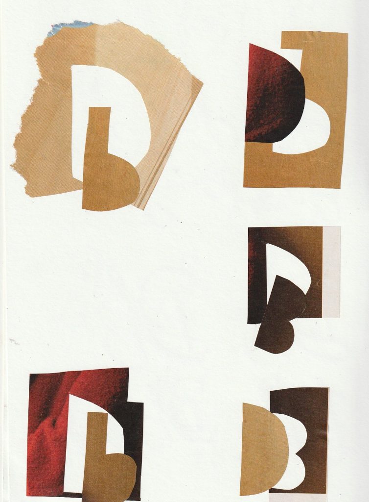
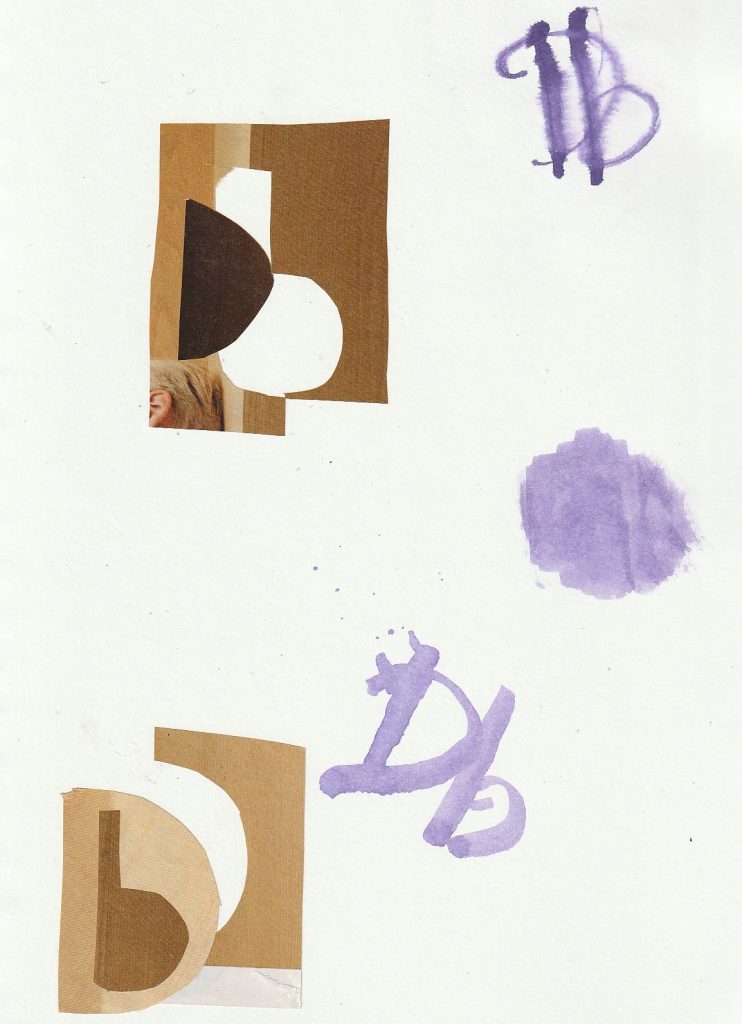
(below) I then used collage pieces to create the letterforms from paper, using scissors. I layered these on the page, considering the composition and negative space.
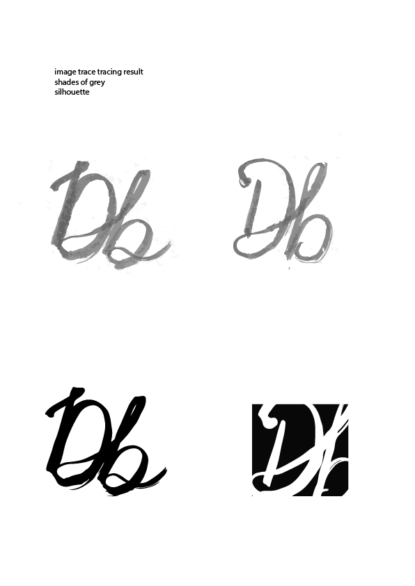
(Below, right) I wanted to see the effect water would have with the ink. I wet the page with water then drew the ‘DB’ with ink and the end of the paintbrush. Below this, I drew the Db with diluted ink. I like the softness of this.
Digital Iterations
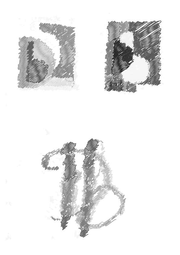
I scanned these experimentations and placed them into Adobe Illustrator.
I Image-traced them. For example, the grey monograms above were made by selecting ‘shades of grey’ and the darker monograms beneath were from selecting ‘silhouette’. I then played with Effect > Stylize > Scribble. This gave the letterforms a rougher appearance.
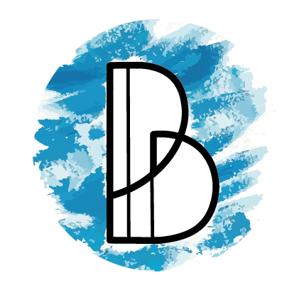
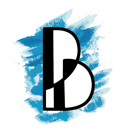
On one monogram, I used a box to place the initials in and crop the edges off. I chose a square because I feel I have the square characteristics (from last week’s workshop).
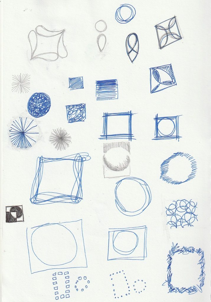
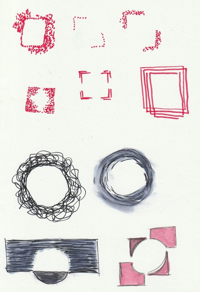
Sketchbook Logo shapes
Further experimentation with squares and circles.
Contextual References
I looked at how designers have used shapes within their logo designs.
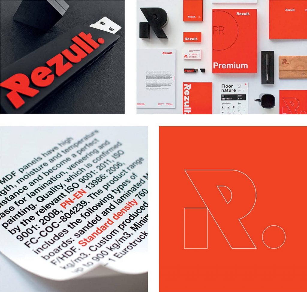
Fedoriv’s identity for Rezult
‘Korosten MDF Plant in Ukraine is an environmentally friendly factory producing laminate flooring and medium-density fiberboard (MDF) panels.‘ In this example, Fedoriv have formed the ‘R’ using a rectangle as a separate shape to the rest of the letterform. It looks as though it is holding up the rest of the ‘R’. This gives the impression of stability, reflecting the theme of construction.
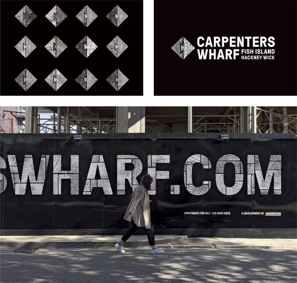
Development of dovetail joint symbol, logo, and signage. Jack Renwick Studio, Carpenters Wharf
(Above) The squares are rotated and divided by a wood joint line. The texture of wood is key in the identity and is used within the square shape.
The square pattern looks like a kind of rectangular puzzle grid and is placed within the letterforms.
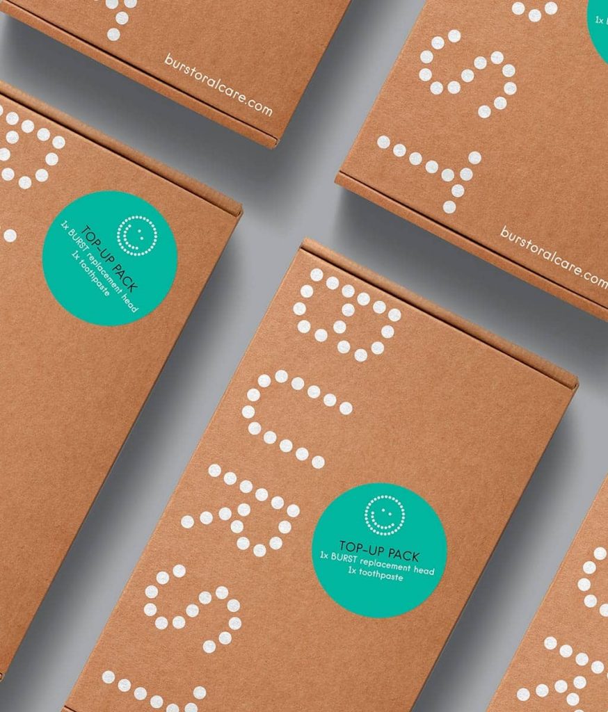
ico Design, Burst
For the identity for this oral care brand, ico Design have constructed the letterforms from a repetition of circles.
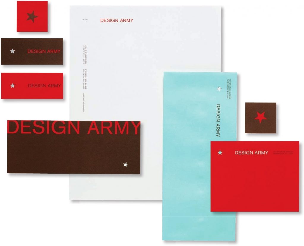
From Letterhead Logo Design II (Rockport) by Design Army:
‘We believe in simplicity. In fact, you could say that it’s part of our identity. Our logo is a star. Our colors are red, brown, and mint green We use one typeface. It’s simple, consistent, effective—all the things you’d expect from a powerful brand. Simplicity is perfection…Along the way, we confirmed what we already knew: It’s the little thoughts that have the biggest impact.’
Visual identity for Design Army
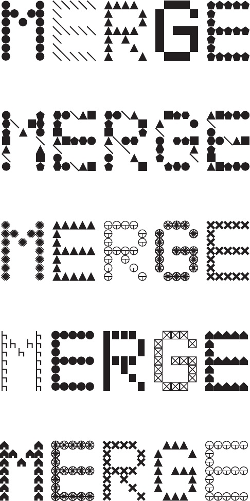
Default’s design for Merge Architectur
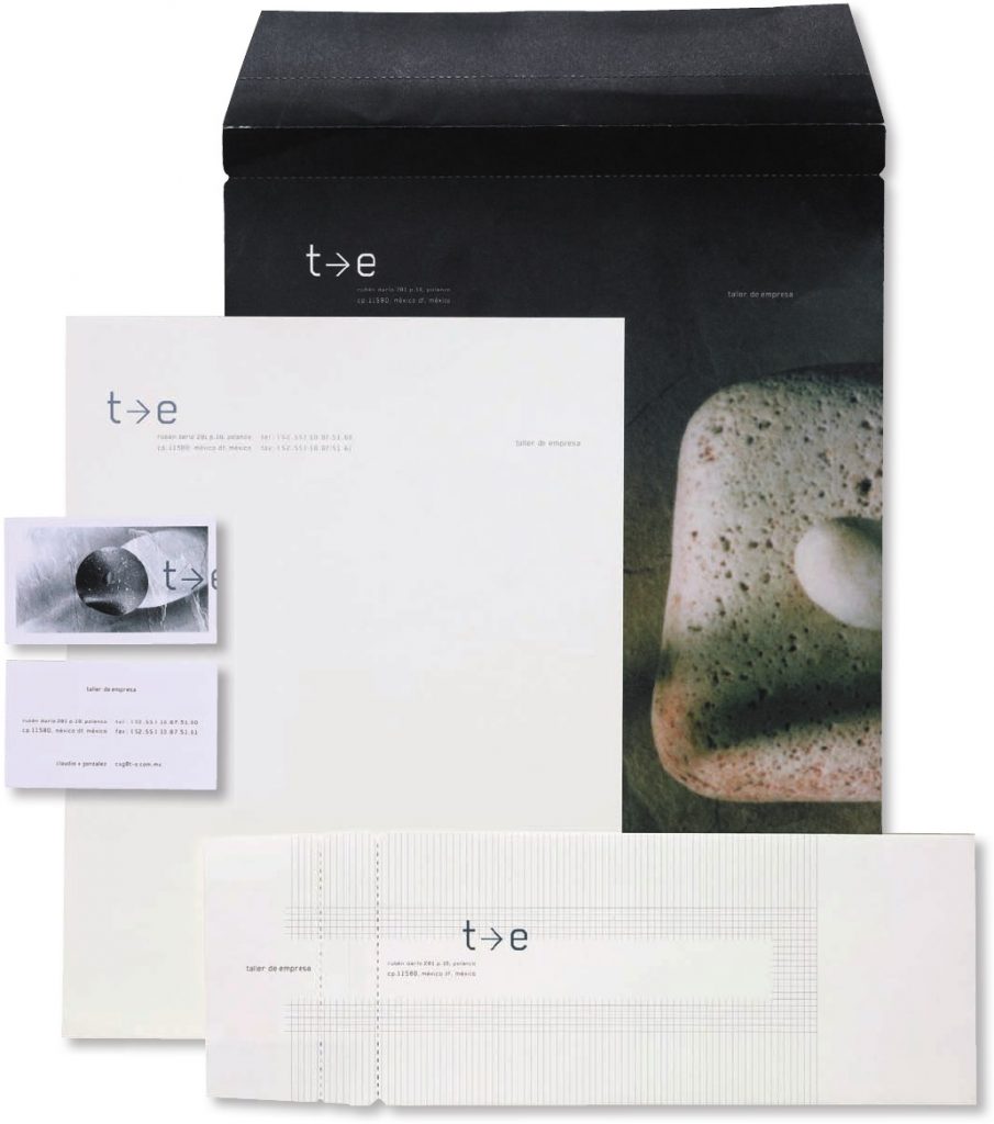
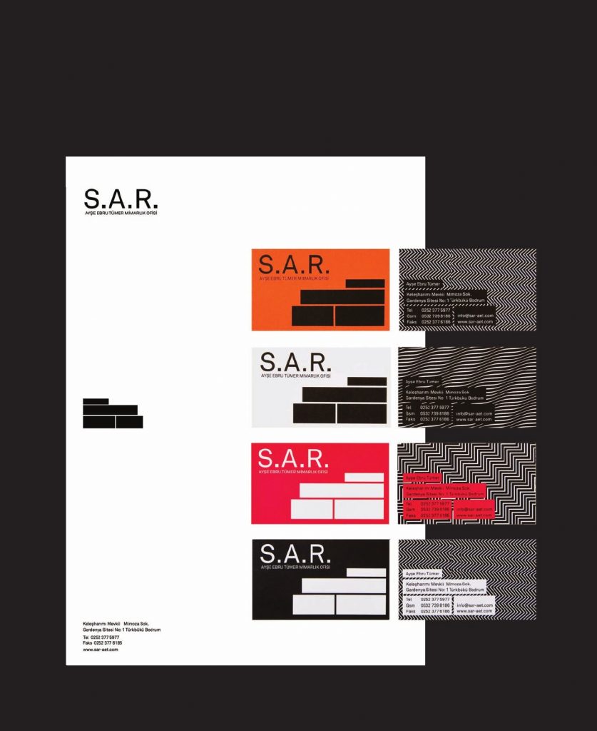
Blok Design’s identity for Taller De EmpresaAsli Kuris Design, for the client Ayse Ebru Tuner
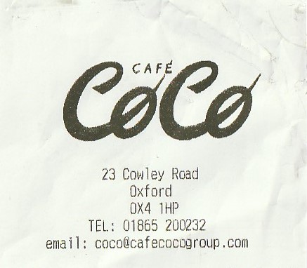
This receipt was from the cafe I ate at this week. I like the way the ‘c’ and ‘o’ have been entwined.
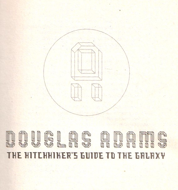
Below: The author’s initials are combined to create this geometric monogram. The monogram is appropriate for the theme, since Douglas Adams is a science fiction writer.
We use cookies on our website to give you the most relevant experience by remembering your preferences and repeat visits. By clicking “Accept All”, you consent to the use of ALL the cookies. However, you may visit "Cookie Settings" to provide a controlled consent.
This website uses cookies to improve your experience while you navigate through the website. Out of these, the cookies that are categorized as necessary are stored on your browser as they are essential for the working of basic functionalities of the website. We also use third-party cookies that help us analyze and understand how you use this website. These cookies will be stored in your browser only with your consent. You also have the option to opt-out of these cookies. But opting out of some of these cookies may affect your browsing experience.
Necessary cookies are absolutely essential for the website to function properly. These cookies ensure basic functionalities and security features of the website, anonymously.
Cookie
Duration
Description
cookielawinfo-checkbox-analytics
11 months
This cookie is set by GDPR Cookie Consent plugin. The cookie is used to store the user consent for the cookies in the category "Analytics".
cookielawinfo-checkbox-functional
11 months
The cookie is set by GDPR cookie consent to record the user consent for the cookies in the category "Functional".
cookielawinfo-checkbox-necessary
11 months
This cookie is set by GDPR Cookie Consent plugin. The cookies is used to store the user consent for the cookies in the category "Necessary".
cookielawinfo-checkbox-others
11 months
This cookie is set by GDPR Cookie Consent plugin. The cookie is used to store the user consent for the cookies in the category "Other.
cookielawinfo-checkbox-performance
11 months
This cookie is set by GDPR Cookie Consent plugin. The cookie is used to store the user consent for the cookies in the category "Performance".
viewed_cookie_policy
11 months
The cookie is set by the GDPR Cookie Consent plugin and is used to store whether or not user has consented to the use of cookies. It does not store any personal data.
Functional cookies help to perform certain functionalities like sharing the content of the website on social media platforms, collect feedbacks, and other third-party features.
Performance cookies are used to understand and analyze the key performance indexes of the website which helps in delivering a better user experience for the visitors.
Analytical cookies are used to understand how visitors interact with the website. These cookies help provide information on metrics the number of visitors, bounce rate, traffic source, etc.
Advertisement cookies are used to provide visitors with relevant ads and marketing campaigns. These cookies track visitors across websites and collect information to provide customized ads.