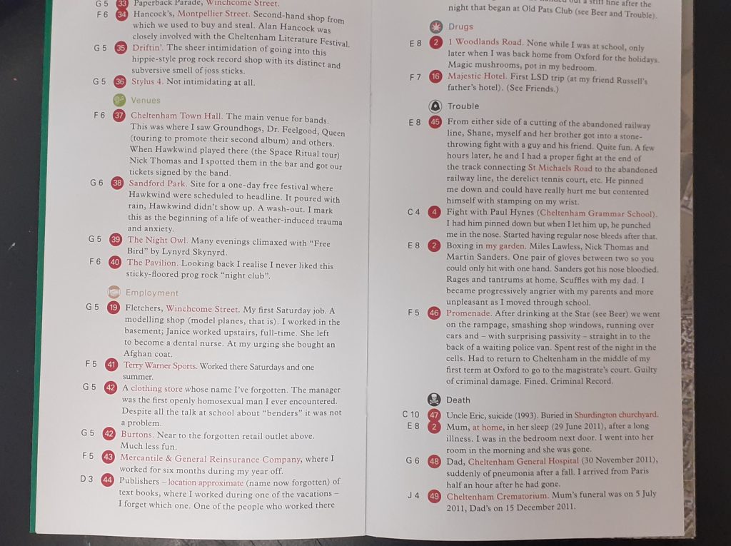
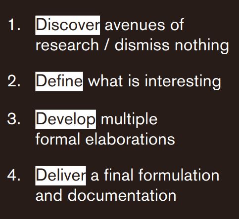
The ‘double diamond’ design cycle:
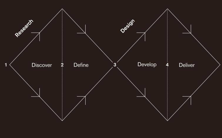
When working on a design, it is sometimes tempting to run ahead with an idea. The problem with this, is the idea never gets fully thought out and developed. By following the double diamond format, I can remember to stay within a certain stage of the process. For example, at the early stages of discover and define, this is about collecting together ideas and following those paths of research that I find interesting.
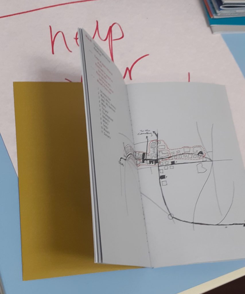
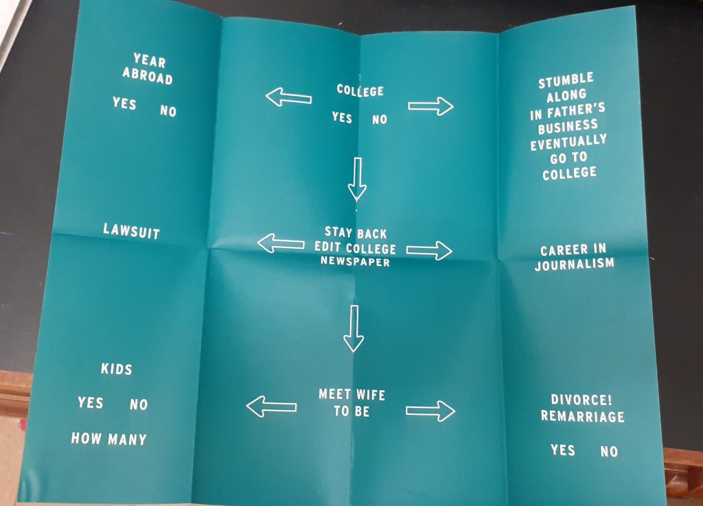
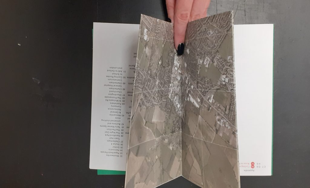
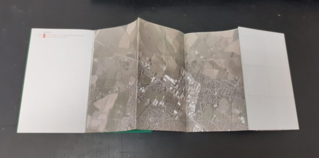
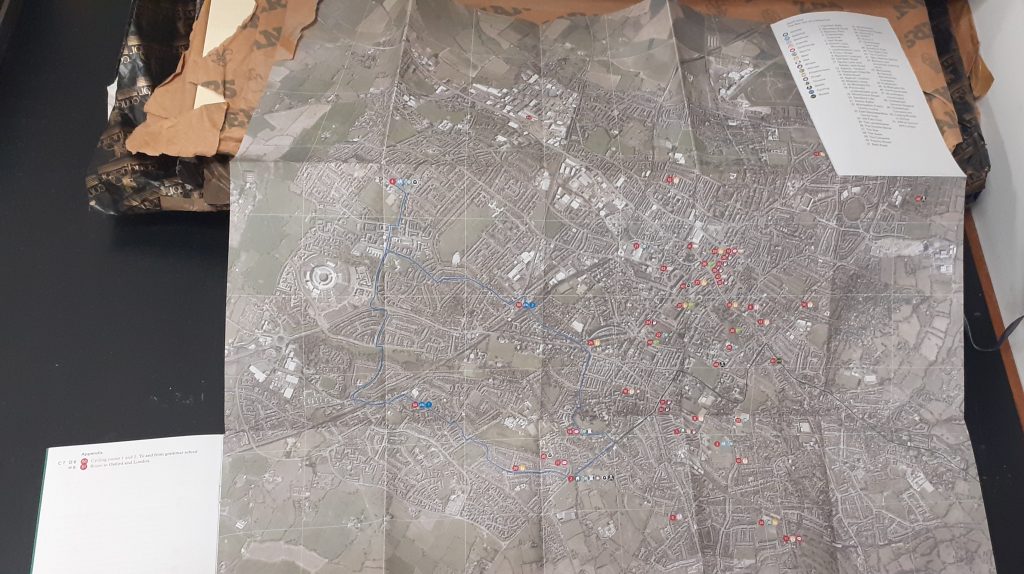
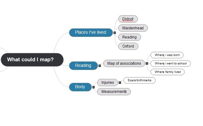
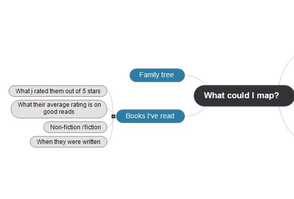
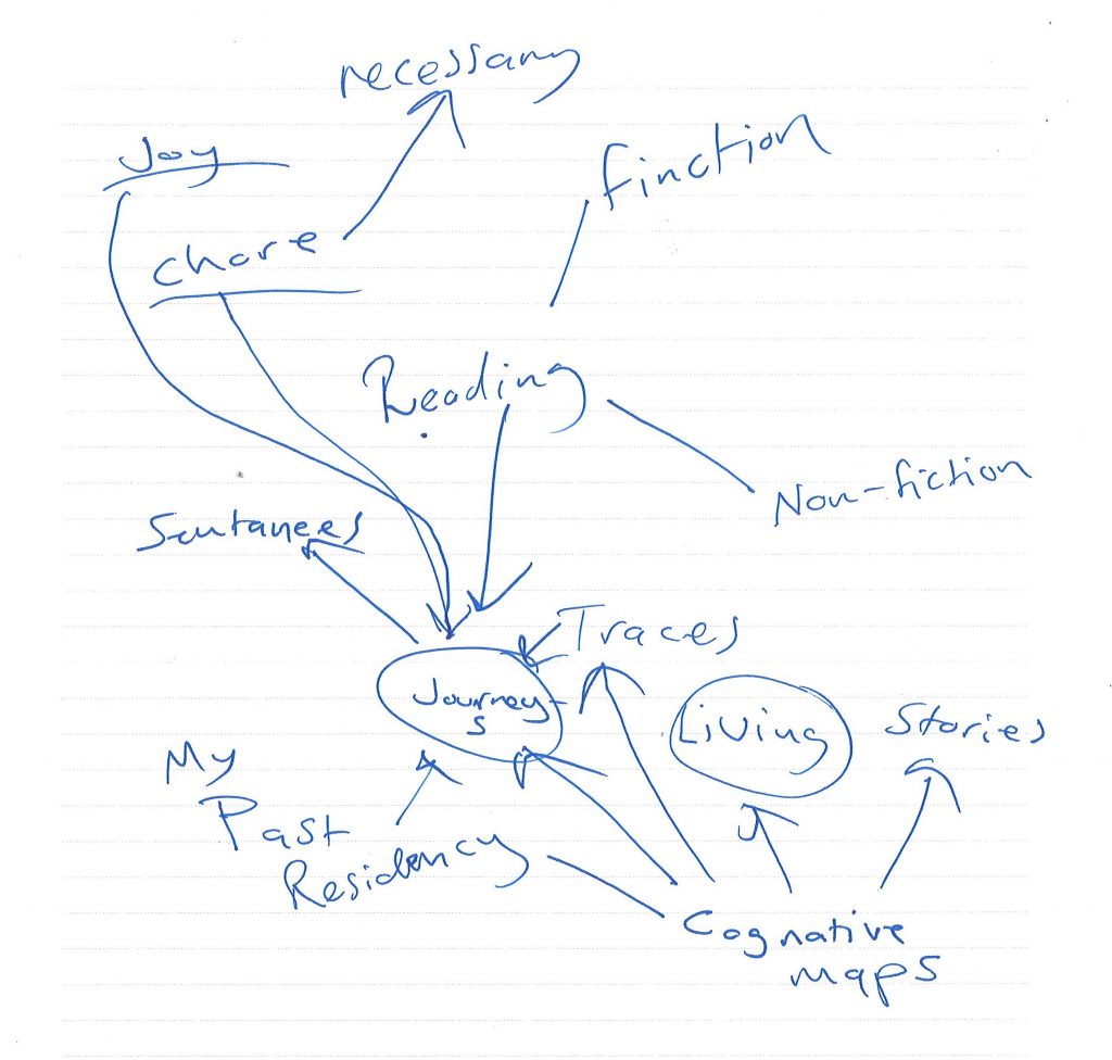
In this week’s lecture, we were in smaller groups and had the chance to discuss our in initial ideas. My initial idea was about reading, as I thought our map needed to be based on data. As we brainstormed this, I found that there was not a lot to explore here, other than creating a graph. I then considered my second idea, which was about places I have lived. I discovered this was a broader topic because it could be approached creatively. The focus could be on the experience of the journeys I have taken from place to place. I realised that not all journeys are the same in essence. We remember journeys through the landmarks or monuments we pass on the way.
Psychogeography
From The Tate website:
Psychogeography describes the effect of a geographical location on the emotions and behaviour of individuals.
How do different places make us feel and behave? The term psychogeography was invented by the Marxist theorist Guy Debord in 1955 in order to explore this. Inspired by the French nineteenth century poet and writer Charles Baudelaire’s concept of the flâneur – an urban wanderer – Debord suggested playful and inventive ways of navigating the urban environment in order to examine its architecture and spaces.
https://www.tate.org.uk/art/art-terms/p/psychogeography
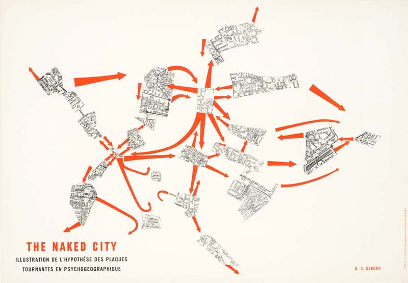
Guy Debord – The Naked City

‘The Naked City was initially meant to be exhibited alongside four other psychogeographical maps of Paris in the Taptoe Gallery in Brussels in 1957. In evoking the first ‘metagraphs’ (métagraphies) produced by Debord a few years earlier, this map is the result of appropriation, a seminal “propaganda method” used by the Lettrists and then the Situationnists” based on fragments cut out maps in a Guide Taride of Paris, the map borrows its title from the eponymous film made by Jules Dassin in 1948, itself titled in reference to the book by the photographer Weegee devoted to the streets of New York in 1945. Published in 1957 with the Psychogeographical Guide of Paris. ‘
I watched the video The Theory of A Derive — Guy Debord – YouTube by Cascadia Network.
In the video, they made the following points:
- Older cities are more suited to derive in e.g. Paris where Debord was, compared to newer cities in America.
- In America, people often live outside the cities and need to commute in for work. This is an hour or 2 out of your day that you are not paid for. It’s a journey you are forced to take because of the city’s infrastructure and the fact that houses are build away from the cities (urban sprawl) These journeys give you tunnel vision about a place because you are taking the same route everyday (the fastest, the most direct.)
- For the first time, we are more separated from our surroundings than we are connected to them. Separated by purposeful transportation: rise in cars and decline in public transit systems . people are now travelling with purpose, they are travelling to a place and back from a place and disregard the journey. This disconnection socialises us to believe the natural world isn’t as important. If people are to care more about environmental issues, then they need to be in touch with their surroundings.
- humans respond more favourably to natural curving spaces and negatively to straight lines and sharp contours. We are drawn to shapes and colours found in the natural world, which provide a sense of privacy and security.
- A derive = you have to go out with the intent of doing a derive. (We recognize our psychogeography to our environment and we want to do the opposite of it.) A social experience. Walking aimlessly is a component of a derive.
- Replenishing yourself from the capitalist structures, similar to when artists spend time away from society in the woods.
- If you walk about aimlessly and you don’t think about how your environment is affecting you, you are still being guided, you are still subconsciously being driven to a place by the design of the environment that surrounds you because it inherently wants to take you on a cycle of work, home and then maybe a bit of leisure.
- If you tracked the average person’s weekly movements, you would see a triangle shape on a map: home, school or work and something else e.g. piano lessons.
Psychogeography: Walking through strategy, nature and narrative James D Sidaway
Iain Sinclair
‘Interviewed in 2012, Sinclair described his work: to try, linguistically, to create maps: my purpose, my point, has always been to create a map of somewhere by which I would know not only myself but a landscape and a place. When I call it a ‘map’, it is a very generalized form of a scrapbook or a cabinet of curiosities that includes written texts and a lot of photographs… It’s not a sense of a map that wants to sell something or to present a particular agenda of any kind; it’s a series of structures that don’t really take on any other form of description. (Cooper and Roberts, 2012: 85)
Elsewhere, Sinclair (2015:14) has noted that his own: preferred nature studies were abandoned mine works, landfill quarries, feeder pipes, slag heaps, rust-red streams, overgrown railway embankments and not the approved catalogue of rabbits, hawks, herons, butterflies, beetles, spiders, mallow, rock spurrey and gentian.
Mabey and Sinclair, however, are particularly mindful of language – struggling to find the words and arrange them in ways that summon place. On reading Sinclair, Alex Murray (2007: 59) declares: ‘the narrative starts everywhere because sensory experience starts everywhere … every piece of information has a place, every fragment can, and indeed must have some significance’. For Mabey (2010: 117, 119): [‘urban wastelands’ and ‘fringes’] had been a revelation, a testament to the tenacity of living things. I’d hike along derelict canals, watch sandpipers bobbing on floating car tyres, find scraps of medieval hedge caught the between the mobilehome parks [ … ] the language we use about these places does us no favours. ‘Brownfield’ suggests deadness and sterility, the precise opposite of the riotous growth that characterises them.
Paul Farley and Michael Symmons Roberts
Their Edgelands: Journeys in England’s True Wilderness wants ‘to break out of the duality of rural and urban landscape writing, to explore these unobserved parts of our shared landscape as places of possibility, mystery, beauty’. Adopting the term edgelands, developed by Marion Shoard (2000) to refer to landscapes between town and country (see too Kabo, 2015), 28 short chapters follow, with one-word titles: ‘Cars’, ‘Paths’, ‘Dens’, ‘Containers’, ‘Landfill’, ‘Water’, ‘Sewage’, ‘Wire’, ‘Gardens’, ‘Lofts’, ‘Canals’, ‘Bridges’, ‘Masts’, ‘Wasteland’, ‘Ruins’, ‘Woodlands’, ‘Venues’, ‘Mines’, ‘Power’, ‘Pallets’, ‘Hotels’, ‘Retail’, ‘Business’, ‘Ranges’, ‘Lights’, ‘Airports’, ‘Weather’, ‘Piers’.
Farley and Roberts (2011: 11) are dismissive of nature writers who set out in search only of solitude and wilderness, noting that, like cities, urban fringes and ‘remote’ places all ‘have our political, economic and social history written all over them’. Farley and Roberts (2011: 9) are also wary of psychogeography: At other times – as in the work of some so-called psychogeographers – they are merely a backdrop for bleak observations on the mess we humans have made of our lives, landscapes, politics and each other. In our view, both these ‘schools’ run the same risk – using the edgelands as a short cut to misanthropy.’
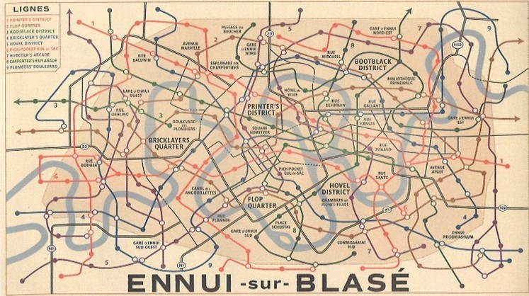
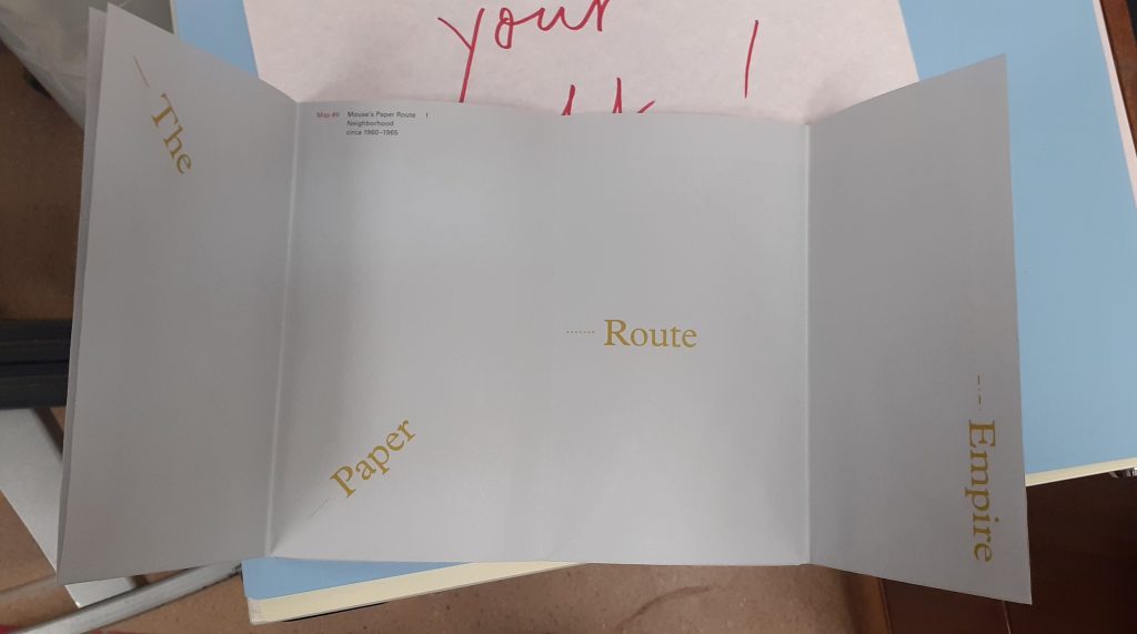
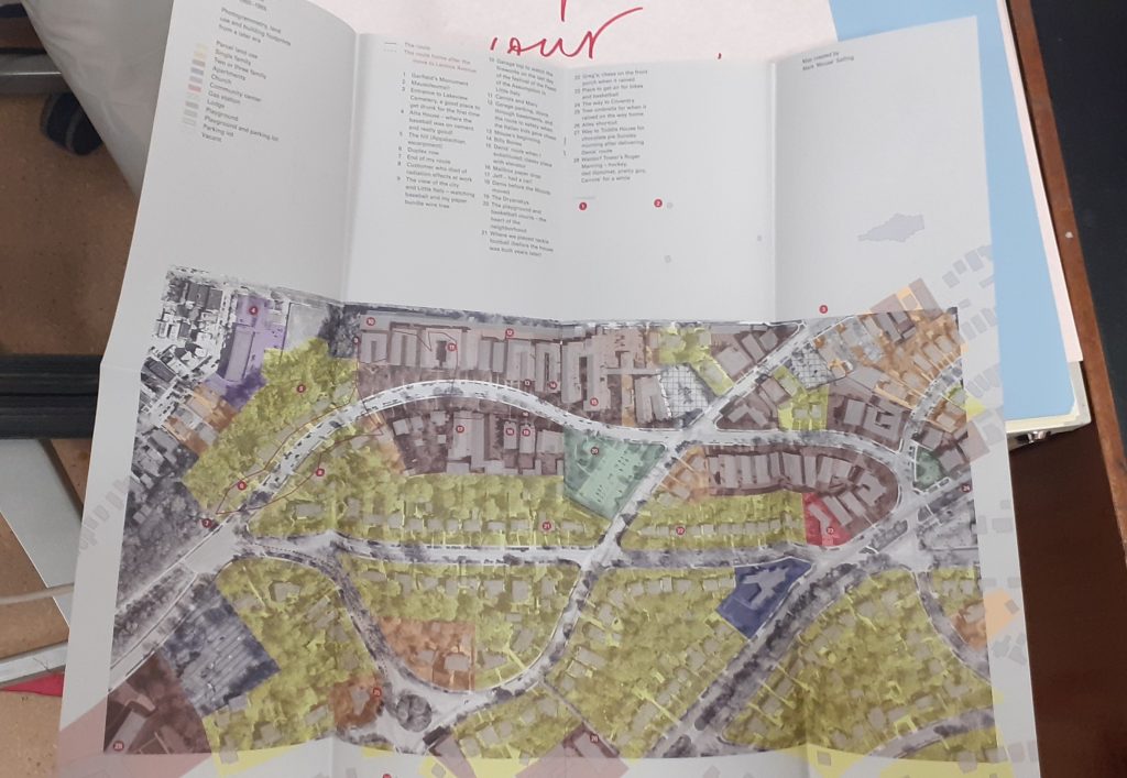
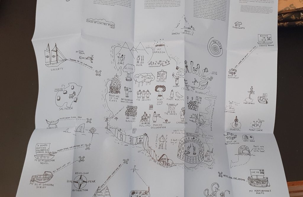
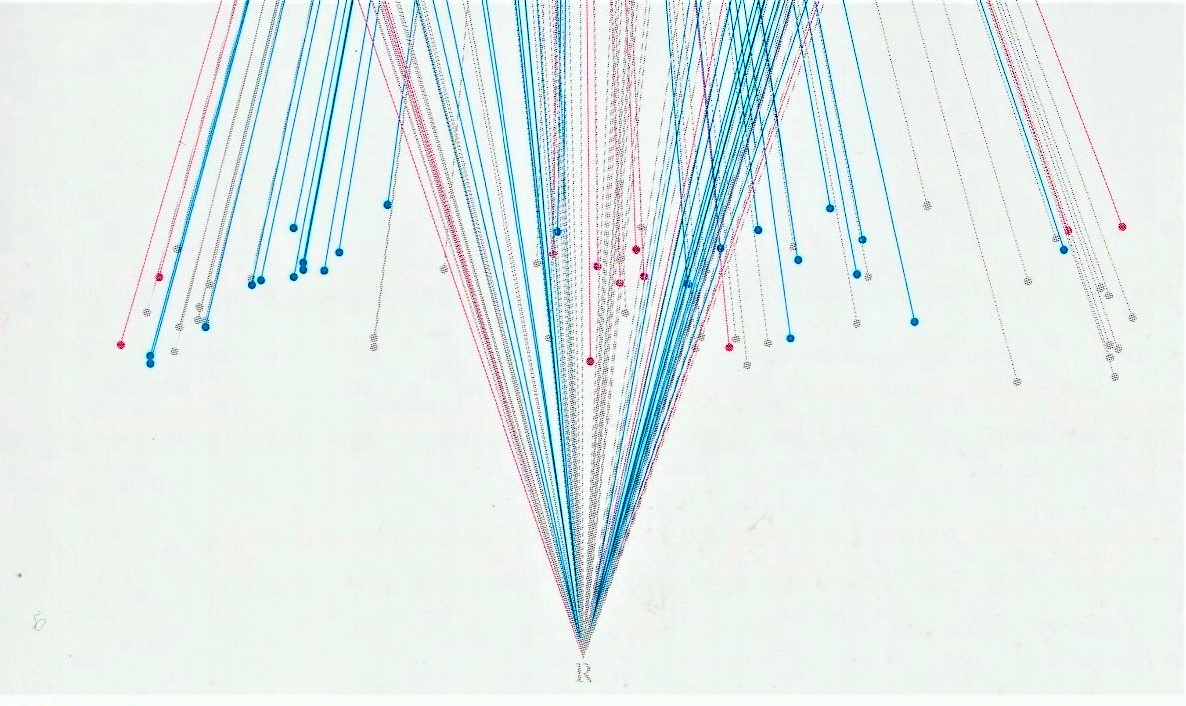
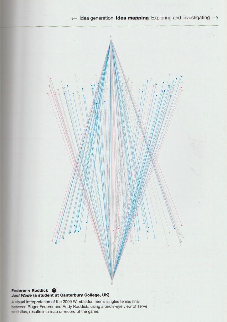
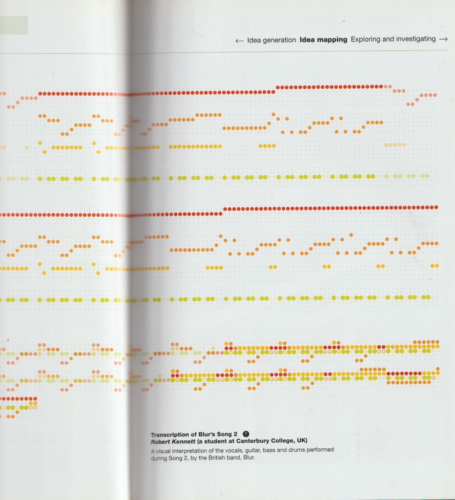
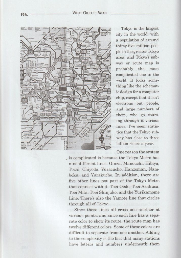
I found this image in the journal Creative Review (October/November5 2021 Issue). I was drawn to this map as it reminded me of the map we made in last week’s group project. In this map, we can choose to follow a different journey with our eyes and the colours help us differentiate the separate journeys.
Susan Hiller
From the book Susan Hiller edited by Ann Galagher:
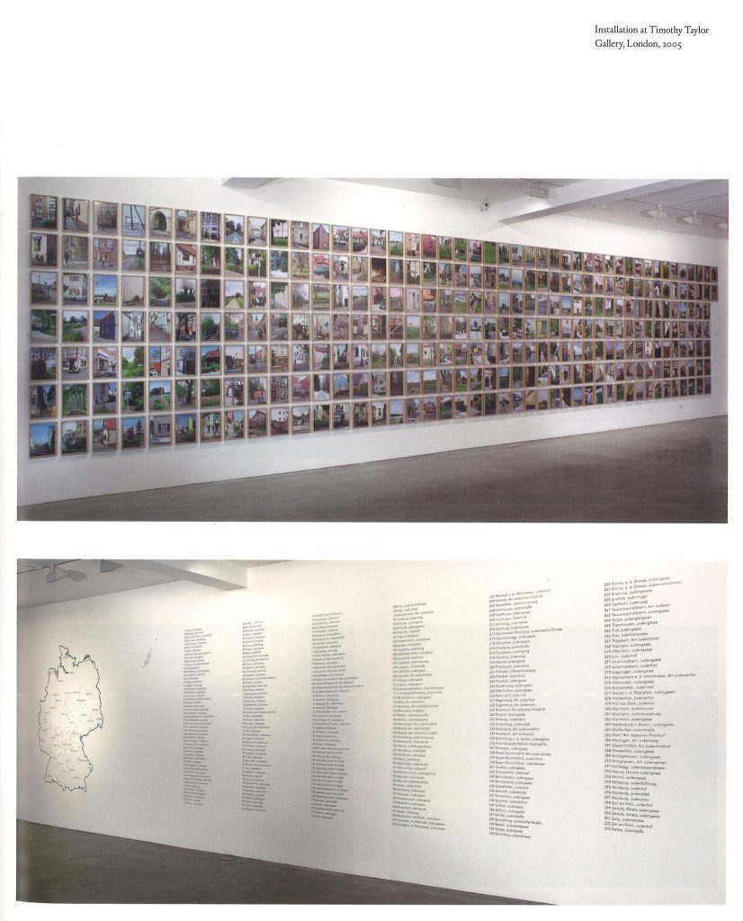
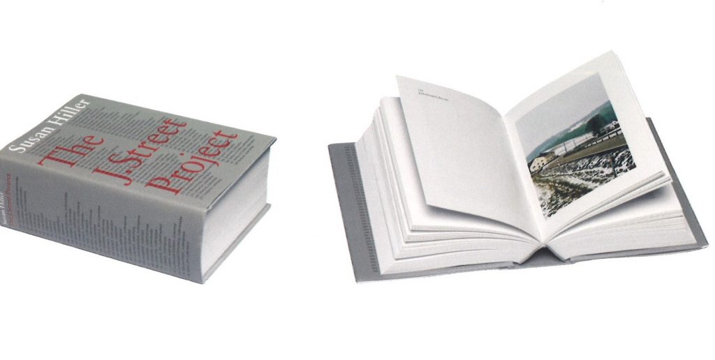
In The J.Street Project, Hiller’s assiduous charting of every street sign in Germany bearing the prefix Juden (Jew) expands the referent of each of these markers from a local geography to the more encompassing territory of history. The 303 signs, dispersed throughout Germany on city streets, pathways, lanes and country roads, bespoke, to uncanny effect, the very absence of what they announce. The work sharply focuses the dissonance between these everyday un remarked signs and the emotion and memories embedded within the genocidal history they at once reiterate and occlude.
The J.Street Project comprises an index of 303 photographs of the signs, presented in a monumental grid; a large scale outline map of Germany pinpointing each of these sites, shown with a listing of the resonant location names (the Juden-alleys, walkways, avenues, roads, groves, ways); a 67-minute film situating each sign amid the movement of daily life in settings from urban and suburban to countryside and village; and a 644-page full-colour book presenting and identifying each of the 303 street signs. (Renee Baert, 2006)