Final presentation: Deciding on an image & starting to plan

This week, we began to think about the final presentation. We looked at some videos for inspiration on presenting and thought a bit further about what the presentation could contain.

I wondered what image could be controversial concerning the environment. Luisa explained that this might be an image from the 1980’s, where designs had no concern for the environment:
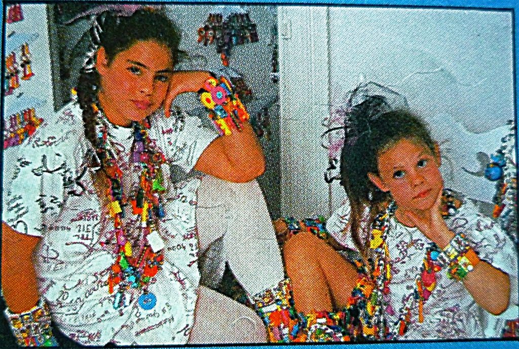
https://cliqueypizza.files.wordpress.com/2009/07/girls-modeling-80s-plastic-bracelets-necklaces1.jpg

Including different images within the presentation may be useful because they help the audience with being able to compare and contrast with other images.

We considered how we could involve the audience: printing and distributing information or sending the presentation to classmates phones, for example.

The number of slides are not important.

A difficult task for me was to decide on the image. This means being selective and decisive, which is not one of my strong points. I began by collecting a series of images which are each problematic, though in different ways.

I searched the internet using these queries:

  • Offensive childrens books
  • Racial stereotyping in media
  • Controversial illustrations
  • Controversial artworks
  • Racism in art
  • Racism in adverts
  • Class distinction
  • Class biases in advertising
  • Cultural bias in advertising
  • Racial bias in media/the arts

which provided me with a few results which I saved.

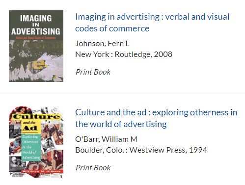
I then took a trip to Brookes library to search for books about race, the media, advertising, culture and any other relevant topic.

I came across a few books that were helpful:
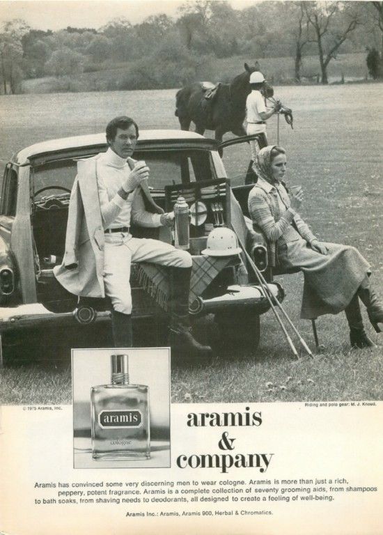
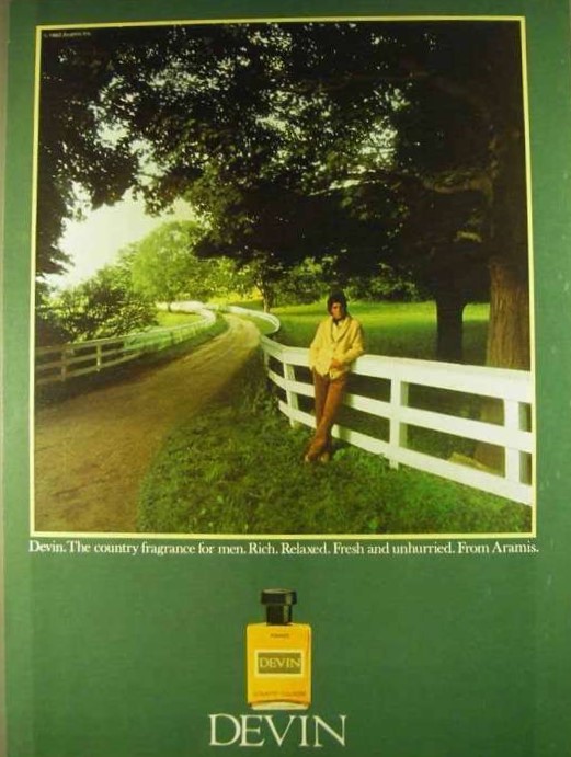
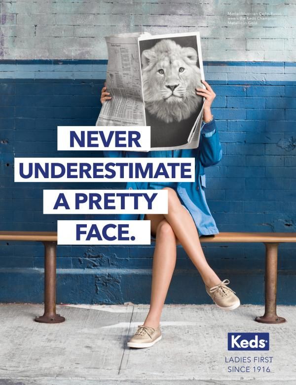
I decided to focus on advertising, for no reason other than I needed to narrow down my options. These images are all from advertising:

race issues
gender issues: why does a woman need the face/head of a male lion to be considered powerful?
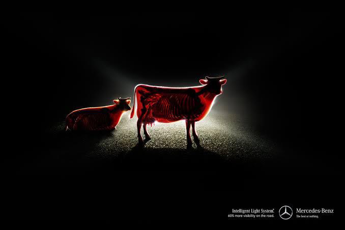
environmental issues: are the brightest lights necessary? The image feels like machine vs nature.
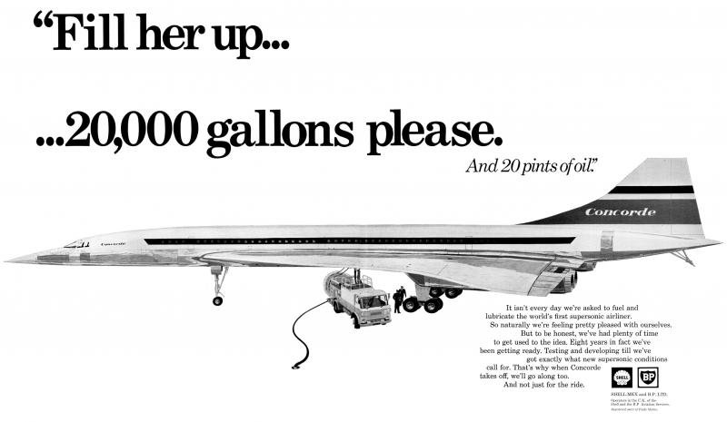
Environmental issues: the ad is boasting about the amount of fuel it needs.
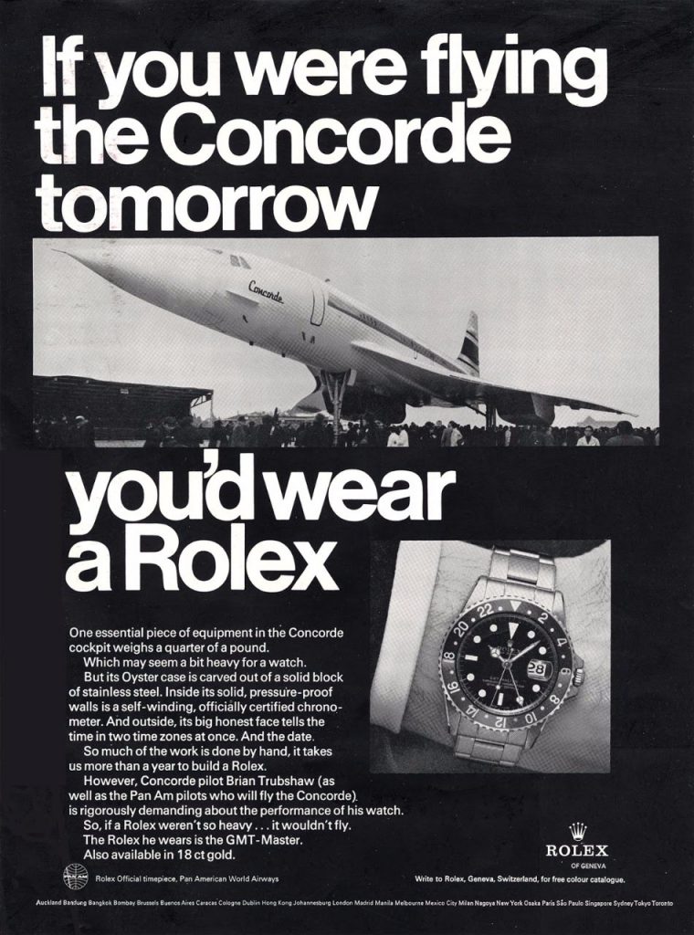
Environmental and class issues: the ad encourages people to strive to achieve material wealth, regardless of impact on the environment.
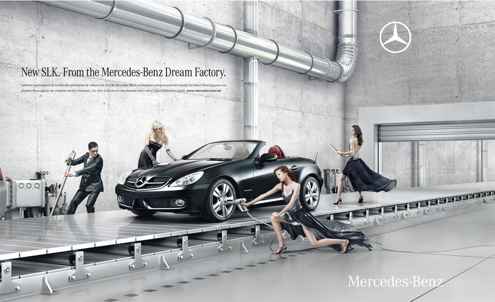
Gender and race and class issues: the beautiful white people, mostly women, are posed beside the car to promote the car by association. Their dress associates them with the wealthier classes. They also present beauty standards that are unrealistic for anyone to achieve. They are also treated as objects just to promote the car.

The ad below has a similar image to the Mercedes-Benz ad. It makes light of religious beliefs, by presenting caricatures of angels.
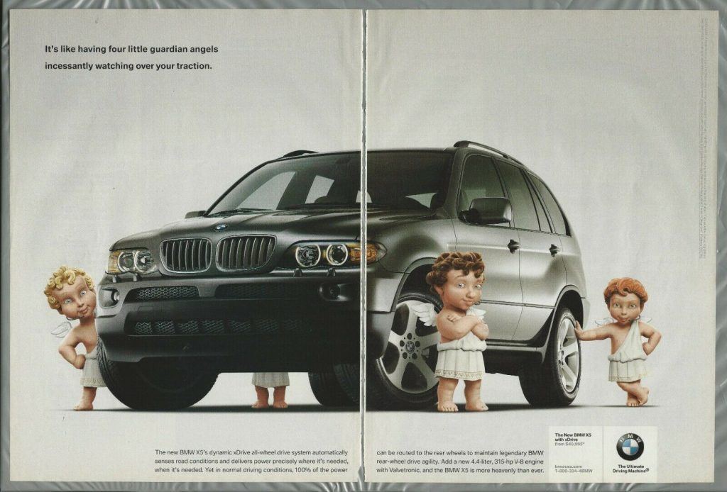
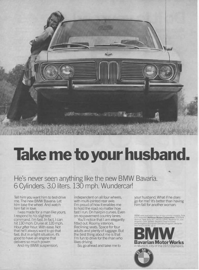
gender issues
class, gender and race issues

I then looked at 3 videos on youtube of TV adverts from the last century:

To help me decide, I asked myself the question: ‘What can I talk about for 7 minutes?’

I decided this was the Barbie advert, for a few reasons:

  1. I have personal associations to this product, as was a child at the time it was out and can remember very similar adverts. Personal anecdotes work well when giving a talk.
  2. This ad brings up questions from all the categories we have discussed over this semester.
  3. I felt strongly about all 3 adverts, but perhaps mostly about the Barbie ad because it is aimed at children.
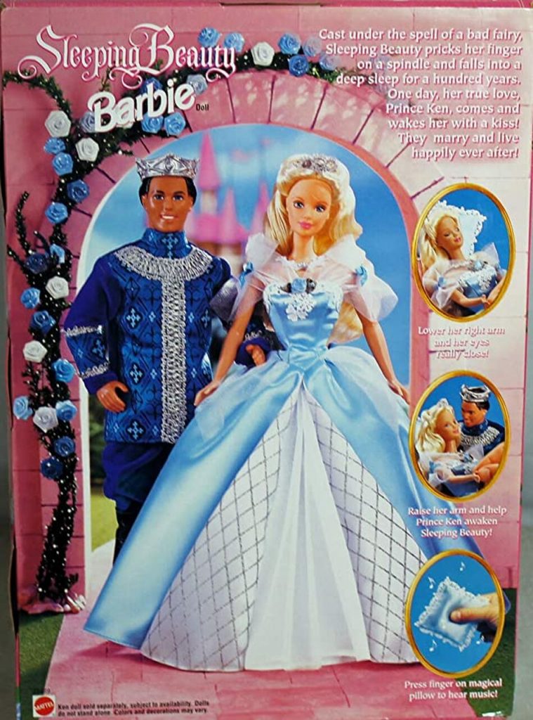
I began making notes and collecting images about this image, the subject and the product itself.
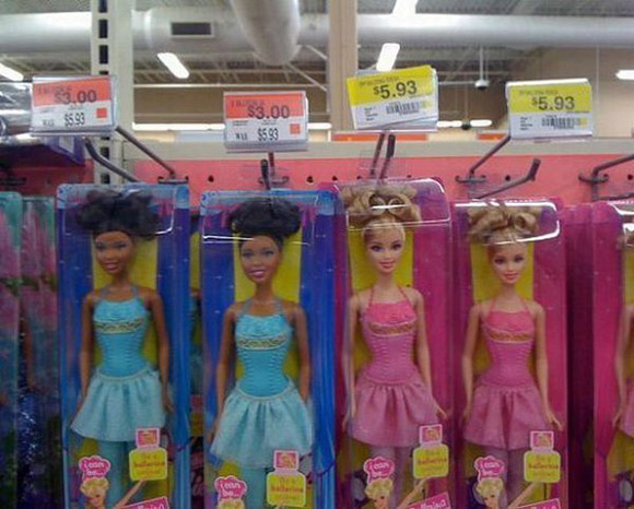
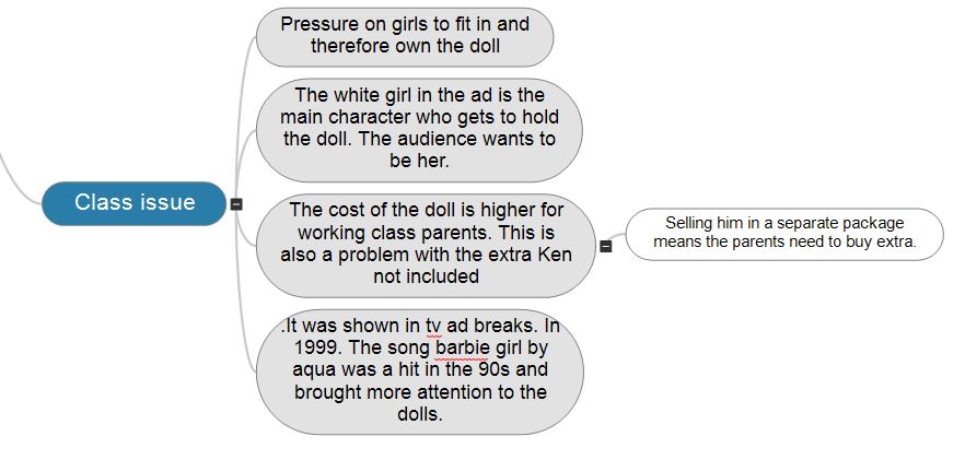
I then made a digital mind map of these ideas:
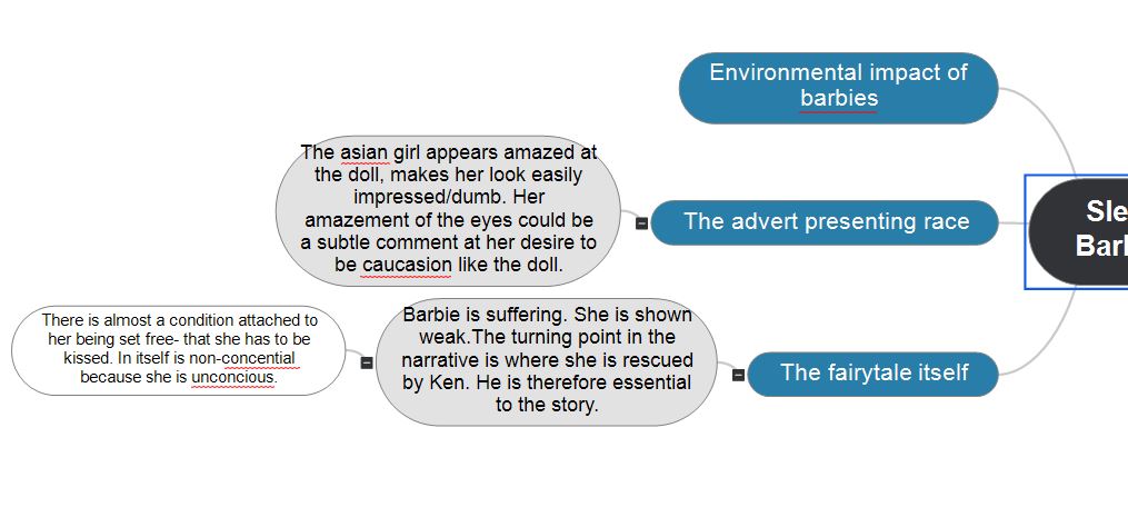
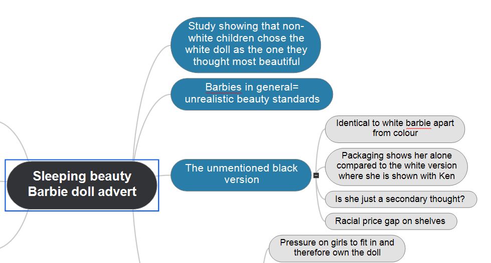
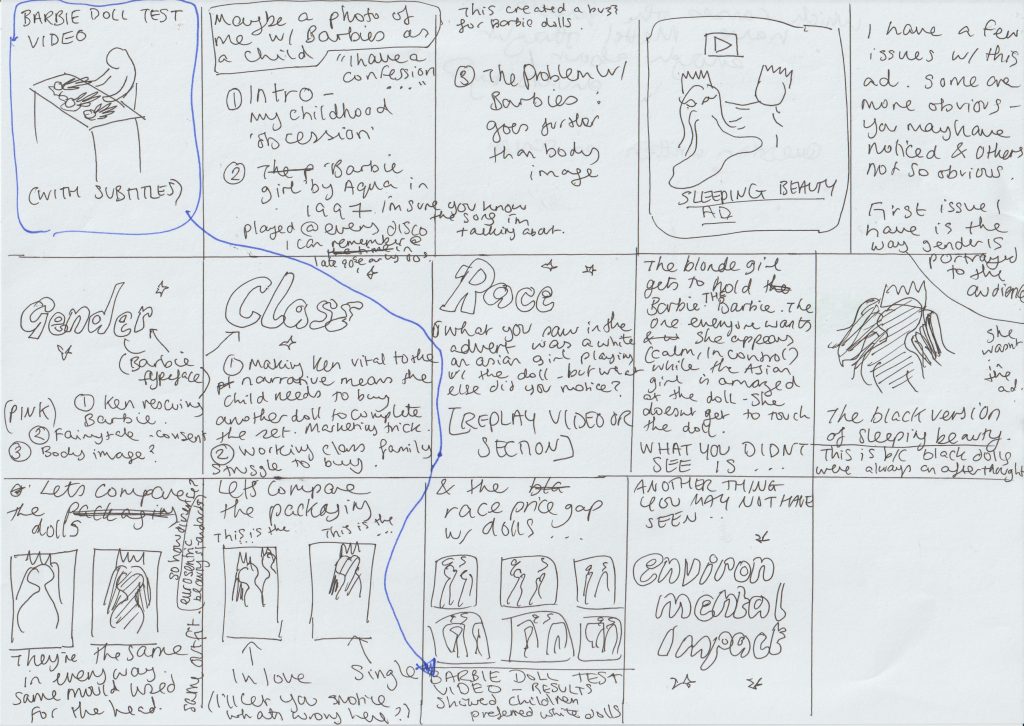
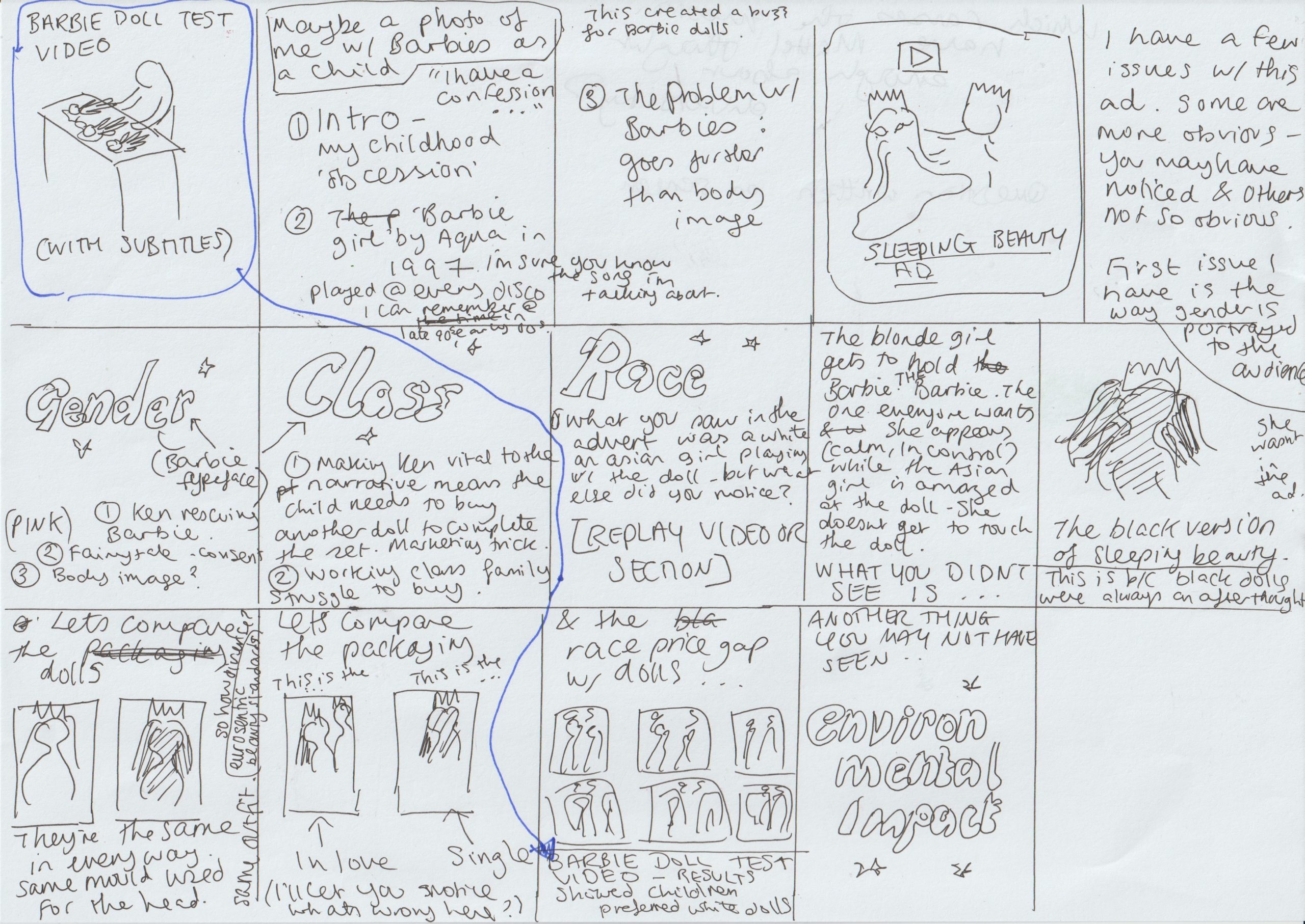
I started to write a drawing board for the presentation, starting with just words.
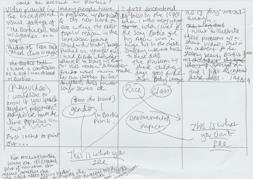
How to present?

Looking at a few examples of people’s presenting styles is good inspiration because people have different styles and approaching that are effective for different reasons.

Irma Boom video-

  • Book designer, based in Netherlands
  • How she presents
  • She is filming her desk and presenting her books using the live camera
  • Her tone is performative, personal “Can you imagine?”

Metahaven-

  • Utopian design. (Art and design combined)
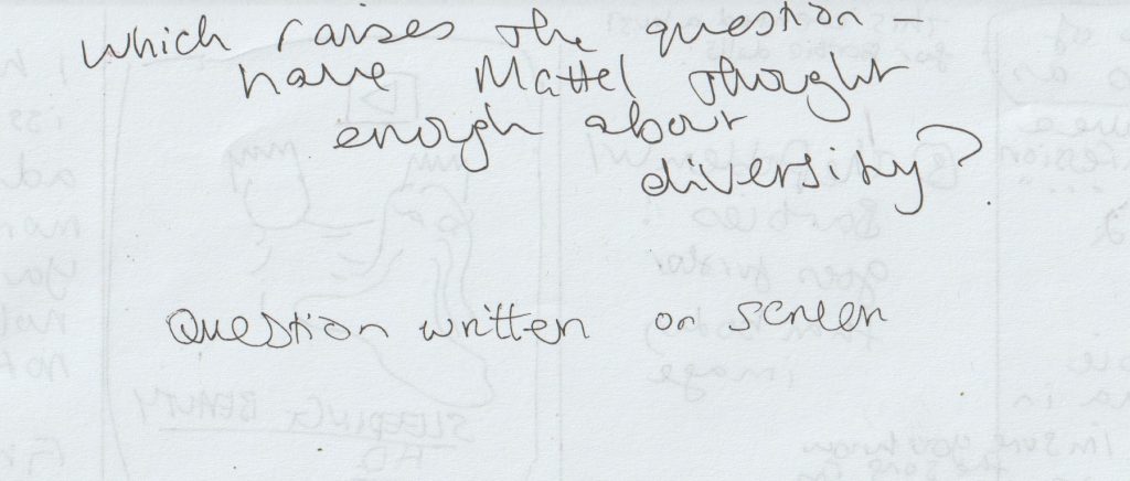
  • They work together to question each other. A way we could do this in our presentation: displaying the question on the screen or getting a classmate to participate with questions
  • Their presentation becomes more personal and opinionated.
  • They are reading the book with the audience.

We could make the journey apparent that lead us to choose an image.

Can be speculative- an alternative to what the ad could be.

What about white working class? (Novara Media)-

  • Humourous tone
  • How to show your artifact? Zooming in and out, photomontage
  • Presenting the object as it was seen originally e.g. in a shop.
  • How to shift from a to b. Using a sound or a rhythm.
  • Voice over or a sound played over if its relevant.
  • Poll if the public agree with your point?
  • Words pop up on the screen
  • Presents a problem, explains, then conclusion (narrative curve)
Critical Thinking: Theory & Practice Part 2

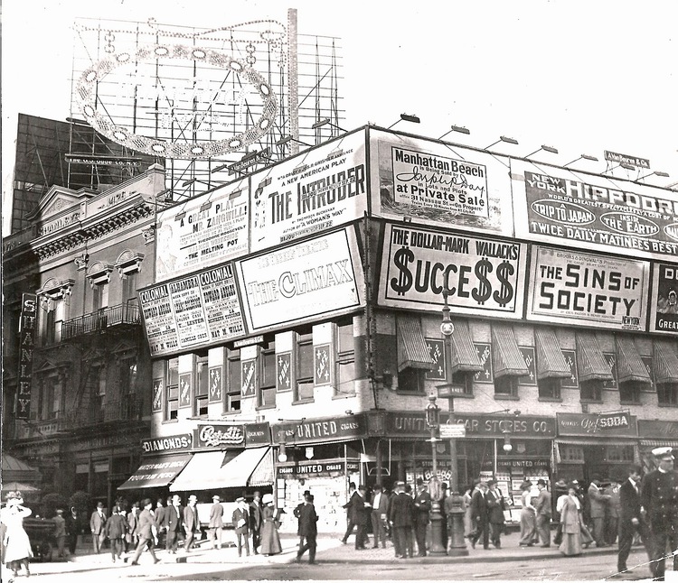
https://viewing.nyc/vintage-photograph-of-broadway-advertising-in-times-square-circa-1909/

In today’s lecture, we began by considering the themes for this new module.

  1. The history and theory of visual culture. How are images produced? How are images consumed? Visual artifacts: graphic design, poster, film, advertising.

2. Reflect on ethical & political implications of graphic design. What does graphic design have to say about race, gender and ecology? How does graphic design make these matters visible?

Blockbuster culture delivers mainstream ideas to the masses. This is found in the free press you find on the train. It is easily accessed everywhere. How can graphic design counter mainstream culture?

Novara Media are an organisation who challenge the mainstream media.

Ash Sarkar uses humour as a way of presenting the topic. She delivers the message with energy and the fast pace keeps the audience engaged. I like the way she uses rhetorical questions to include the audience and place them in a hypothetical experience.

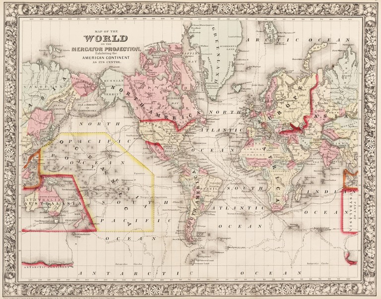
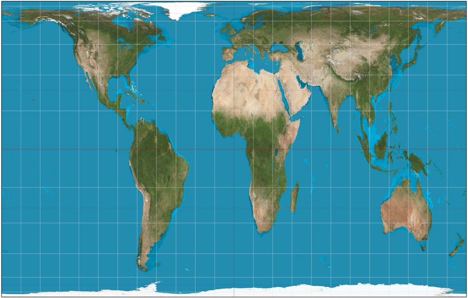
‘The Most Popular Map Of The World Is Highly Misleading’

The Mercator Projection, created by Flemish cartographer Gerardus Mercator in 1569, shows the northern hemisphere enlarged in size with North America and Europe larger than South America and Africa.

https://metro.co.uk/2017/03/21/heres-what-the-map-of-the-world-actually-looks-like-6523105/

Maps were designed from the point of view of the coloniser, according to their own parameters. They placed themselves at the centre of the world according to how they saw themselves (powerful). The global south became independent of the colonies.

Gall Peters projection, 1970 (How the world really is)

Are maps really objective?

They can be designed to deliberately mislead us. We need to look with a critical eye: Who made it? Why? What does it actually tell us?

Design & Politics

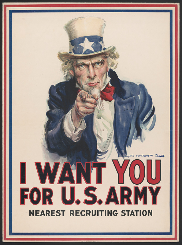
Propaganda such as this poster was produced during the 20th century. It was often used to recruit people in the army using bold and forceful language and imagery.

(image from:

https://library.ccsu.edu/dighistFall16/exhibits/show/music-as-propaganda-in-world-w/music-as-propaganda)

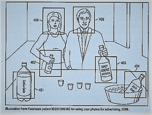
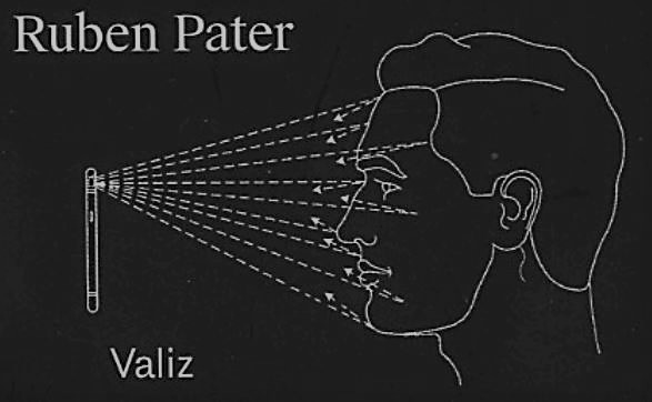
Politics in design can be subtle, not just propaganda. And persuasion can be sinister, even if it’s subtle. For example, surveillance advertising and micro targeting occur today. Companies collect data on us without our knowledge. By collecting this knowledge, they are able to profile and target ads to certain audiences. This can be subliminal and sent through social media.

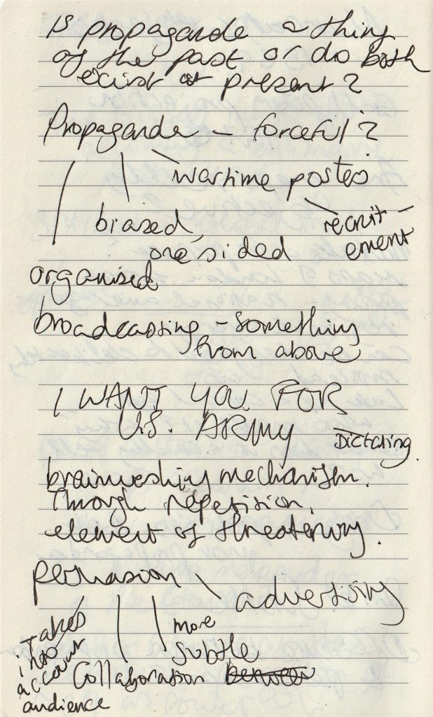
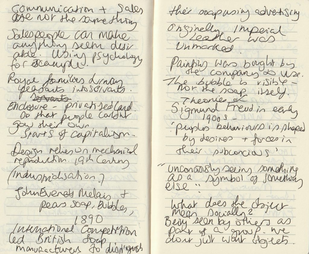
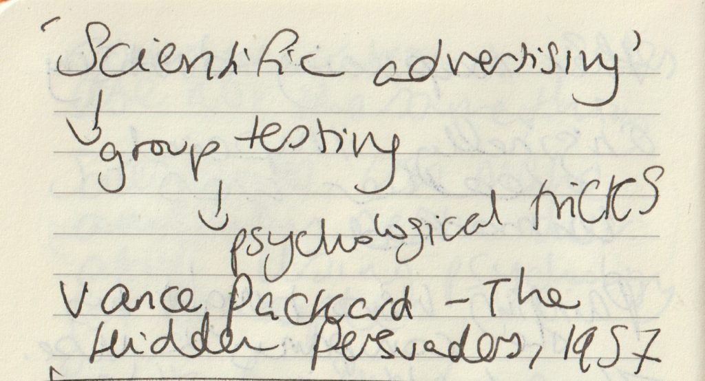
my lecture notes.

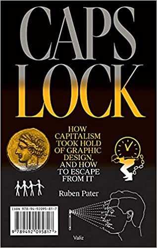
Caps Lock – Ruben Pater

The cover of this book is contemporary, by the images are historical. They are from several decades but no image newer than 5 years.

On skimming through the pages, the pull out quotations stand out to me. They do not look too different to the rest of the text, but are in a serif typeface and slightly larger. From reading them, I am given the basic theme of the book. There is a negative view of materialistic culture and the images support this view:

https://www.saatchiart.com/print/Photography-Zara-s-home/277628/1885457/view

Not all graphic designers are against advertising.

Banana Republic‘ from Caps Lock

Chiquita Banana The Original Commercial

The example of United Fruit illustrates that cheap products cannot be produced ethically under capitalism, but require aggressive advertising, political meddling, dispossession of common lands, exploitation and violence.

Ruben Pater

This chapter of Caps Lock, explains how advertising can be used to ‘hide violence and exploitation in pursuit of profit.’ The Chiquita Banana advert was made to educate and persuade people to start buying bananas from the United Fruits company. At the time, in the 1940’s, bananas were a fruit growing in New Guinea and Malaysia and no one had heard of them. The company therefore needed to convince people to make bananas a new part of their diet.

They did this by using the symbol Chiquita Banana, a sexualised cartoon banana based on the Latino actress Carmen Miranda.

Land was stolen from indigenous people to grow bananas in Honduras, South America. The workers were exploited, paid in vouchers instead of money and killed when they demanded fair pay and working hours. (Which is the short version of events).

“If advertising would be banned from public space everywhere, it would certainly be a blow to a system of consumption that relies on constant seduction.”

“In a timespan of two centuries, society has been commodified bit by bit through enclosure of free and public spaces.”

Century of the Self

The words of Paul Mazur, a leading Wall Street banker working for Lehman Brothers in 1927, are cited: “We must shift America from a needs- to a desires-culture. People must be trained to desire, to want new things, even before the old have been entirely consumed. Man’s desires must overshadow his needs.”

The film starts with a black and white image of Sigmund Freud. We hear playful and nostalgic music from a past era as the narrator talks about Freud’s theory of ‘primitive forces’ within humans. There is a sudden change to the red image of a woman screaming. The words ‘chaos and destruction’. There is horror-film organ music, all feels frantic. Then suddenly the footage returns to black and white with nostalgic old-fashioned singing, while we see footage of a man on a staircase, perhaps Freud’s nephew ‘Edward Bernays’ who we are introduced to.

The organ music again strikes us as the titles appear.

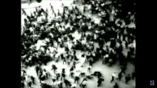
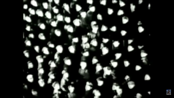
Images of advertisements appear dreamlike, between black and white images from real scenes of crowds, possibly from news footage- a harsh reality. Crowd footage appears throughout the film, possibly to signify the masses who were the focus of the advertising campaigns.

This introduction sets us up, much like a warning as to what is to come later. We may not know who Freud or Bernays is, but we have no doubt there is something sinister about to be revealed.

The pace and unexpected change in tone, keeps us on our toes. The theatrical pairing of images and music contribute to an atmosphere of dread.  Moments of quiet suspense are sandwiched between images of chaos. This expresses the emergence of Bernays and his work in mass manipulation. The change from buying to meet our needs and buying to fulfil endless desires.

Classical music is playing as we are shown footage of higher-class events. This sets up the world Bernays was a part of. Music plays with our emotions throughout the film, giving us an idea of how it is to be easily manipulated.

We are shown images of chandeliers whilst hearing about the necessity of civilisation and inevitability of dissatisfaction. This creates a contrast and makes us questions the worth of the finer things.

“Bernays was the first person to take Freud’s ideas about human beings and use them to manipulate the masses.”

Century of the Self

Today’s lecture introduced me to the sinister truth hidden beneath the shiny surface of everything we know.

Century of the self discussed the shift from smoking being unfashionable for women, to the way women were persuaded to smoke. This was a carefully calculated shift. Actresses were hired to pose with cigarettes. The companies knew they could double their customers by setting up this marketing strategy. That is something I had never considered before.

In the Banana Republic article, the way people have been treated to allow companies to increased profits, is shocking and appalling. The only thing worse is the way it has been covered up for decades.

This discussion has lead me to wonder, what else will I be discovering next?