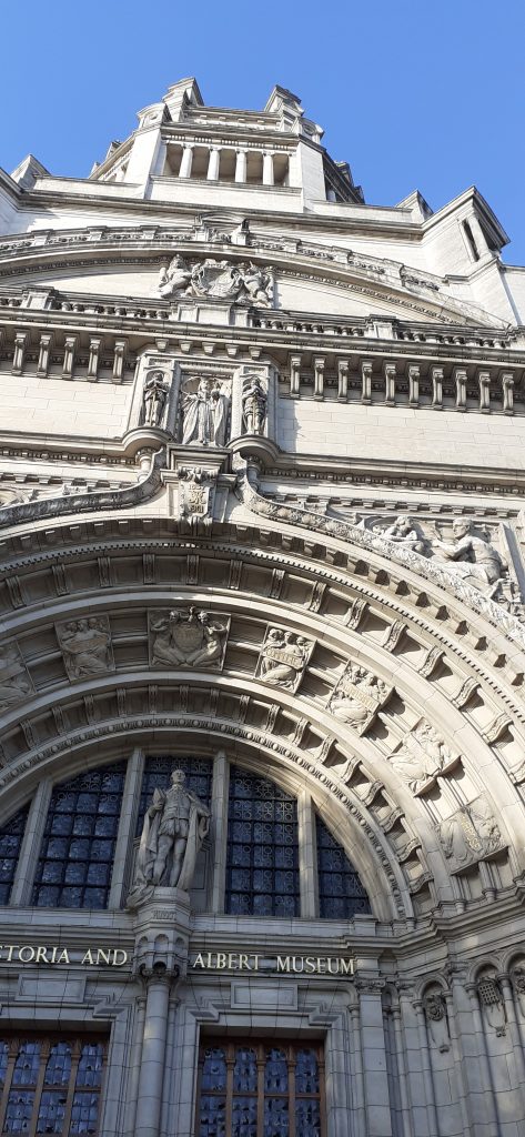
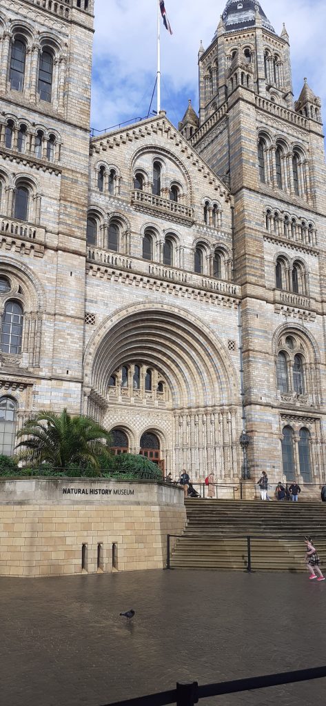
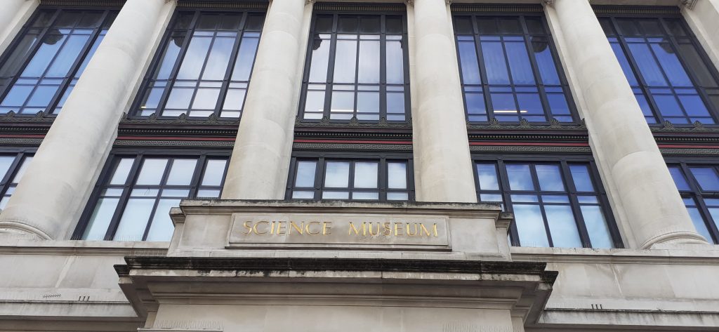
Looking at Gothic architecture in Kensington. These elaborate buildings are based in the same area of London. The architecture makes me want to explore the inside of the buildings.
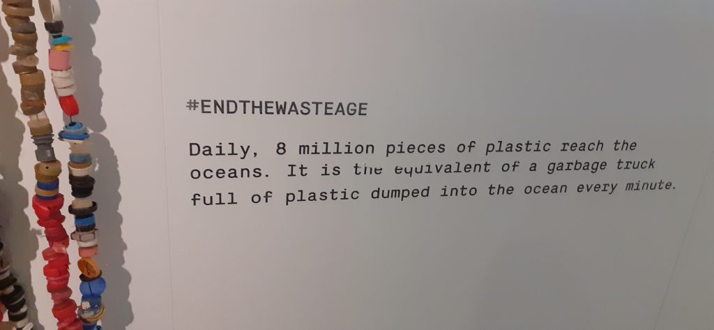
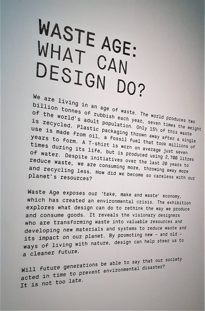
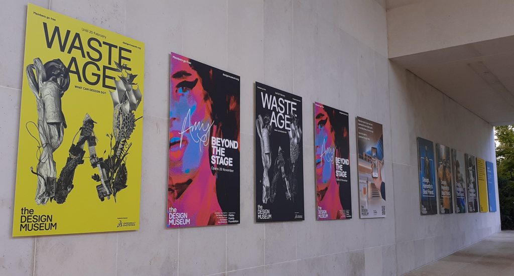
Downstairs in the design museum, I found the exhibition Waste Age: What can design do? At first, I was not sure what connection the exhibition would make between the climate crisis and design. I was not disappointed.
It was an emotional experience, but equally insightful. This exhibition forced me to think about the origins of the objects we see around us everyday and what happens to them after they are thrown away.
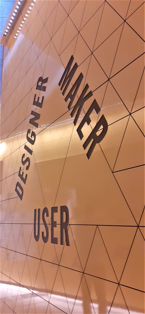
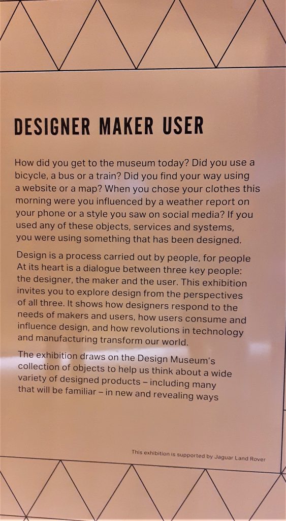
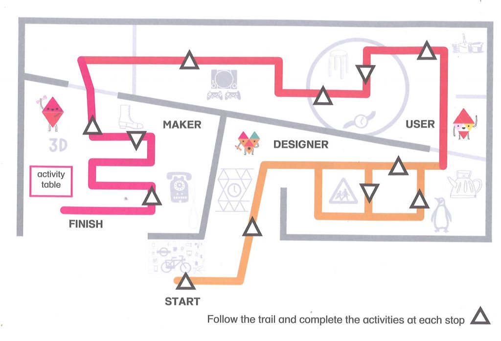
I was happy that I had seen Designer Maker User before Waste Age because I first was focusing on the designs rather than the affect of the materials on the planet. If I had seen Waste Age first, these ideas would have influenced the way I looked at the objects upstairs.
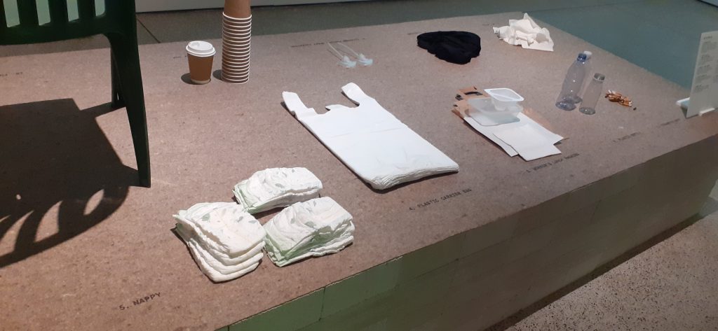
Everyday objects were placed on a plinth in the centre of the room, upon entering the exhibition.
It was overwhelming to be surrounding by so many familiar objects that are made of plastic.
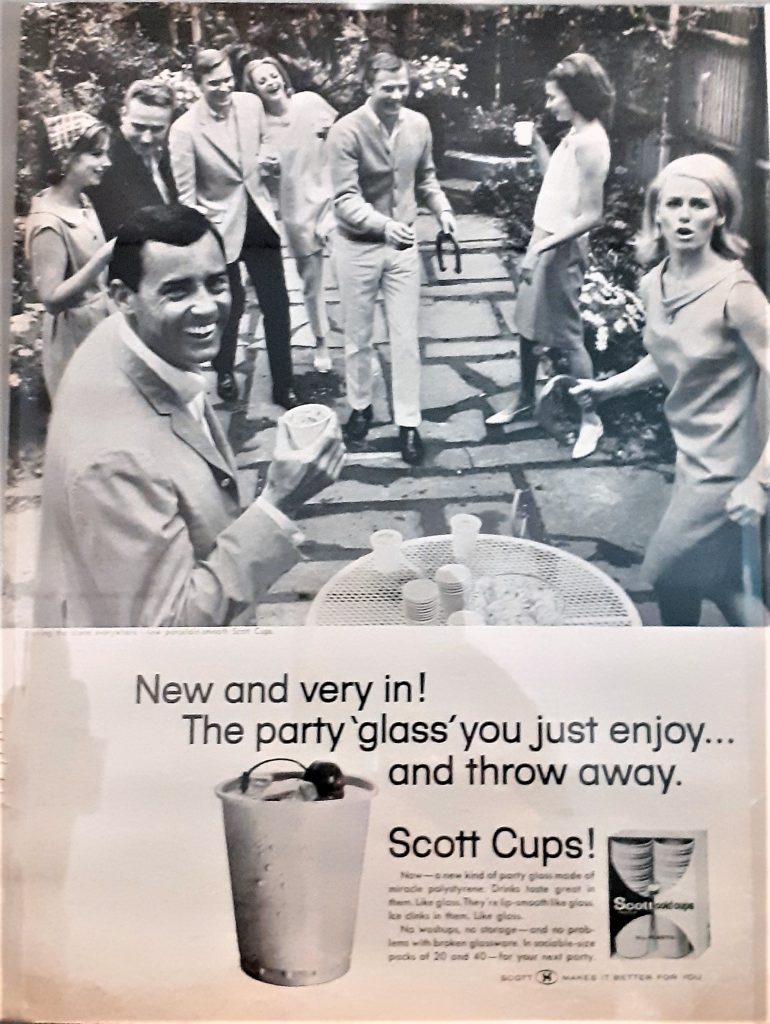
This poster was originally in a magazine, advertising polystyrene cups. It was shocking to see that their disposable quality was their selling point.
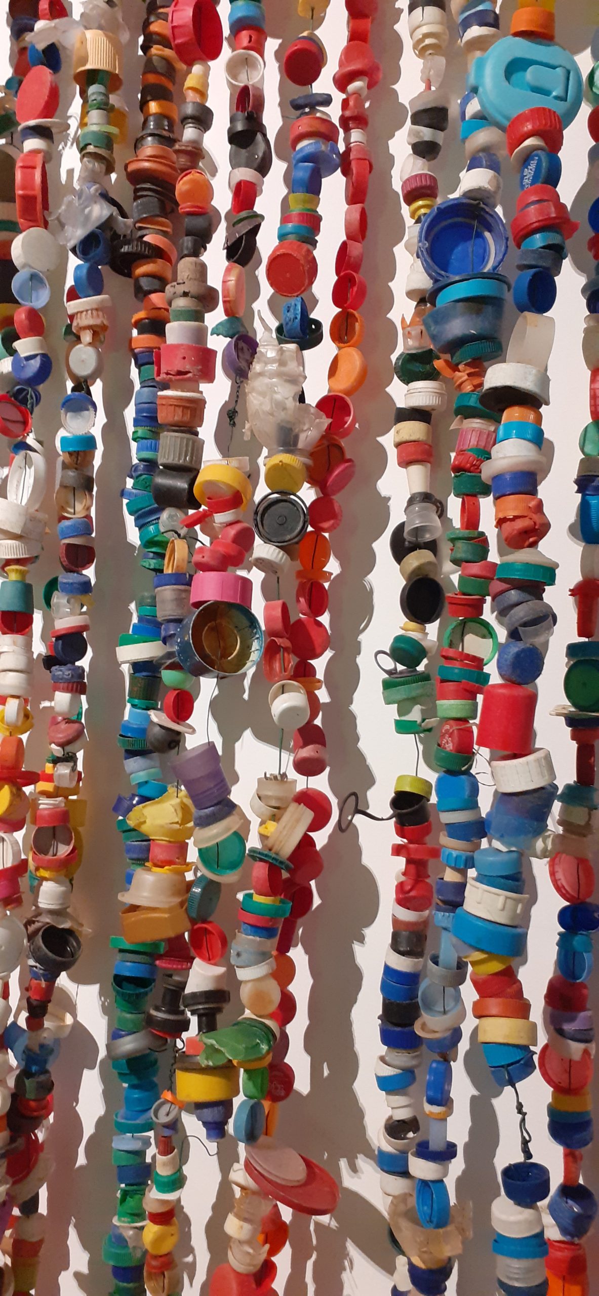
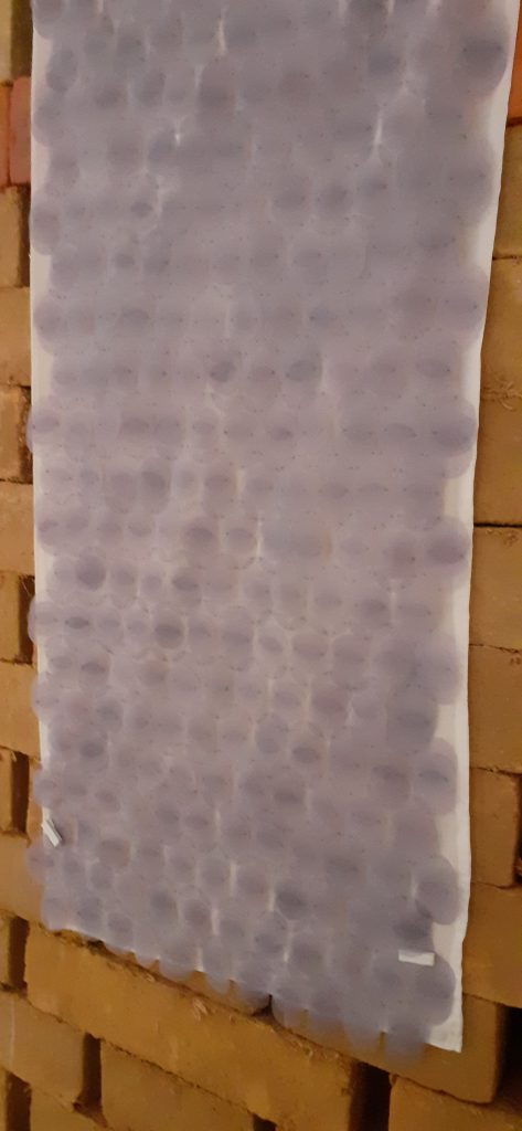
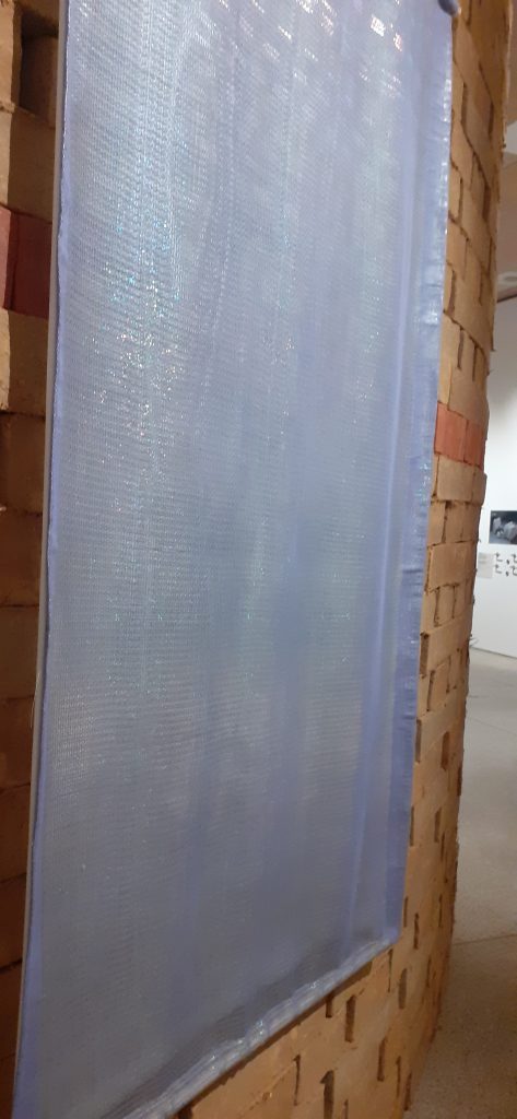
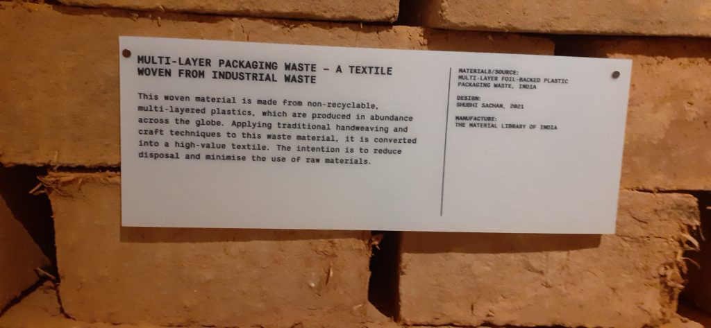
Textile woven from industrial waste. (above and below)
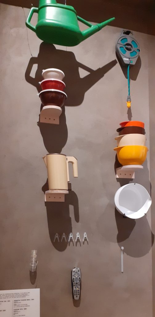
One section of the exhibition displayed many objects made from recycled materials. Also on display were designs which aim to lower our impact on the planet. The exhibition is about re-thinking how we design, then make and use objects. A video showed us interviews with people in the design industry, discussing changes we could make. One person commented on the fact that human’s behaviour goes against nature. Where other animals do not leave behind waste that can’t be broken down or re-used, we do.
My first response when seeing so many objects made from recycling materials, is ‘why isn’t this done everywhere, since we know it is possible?’
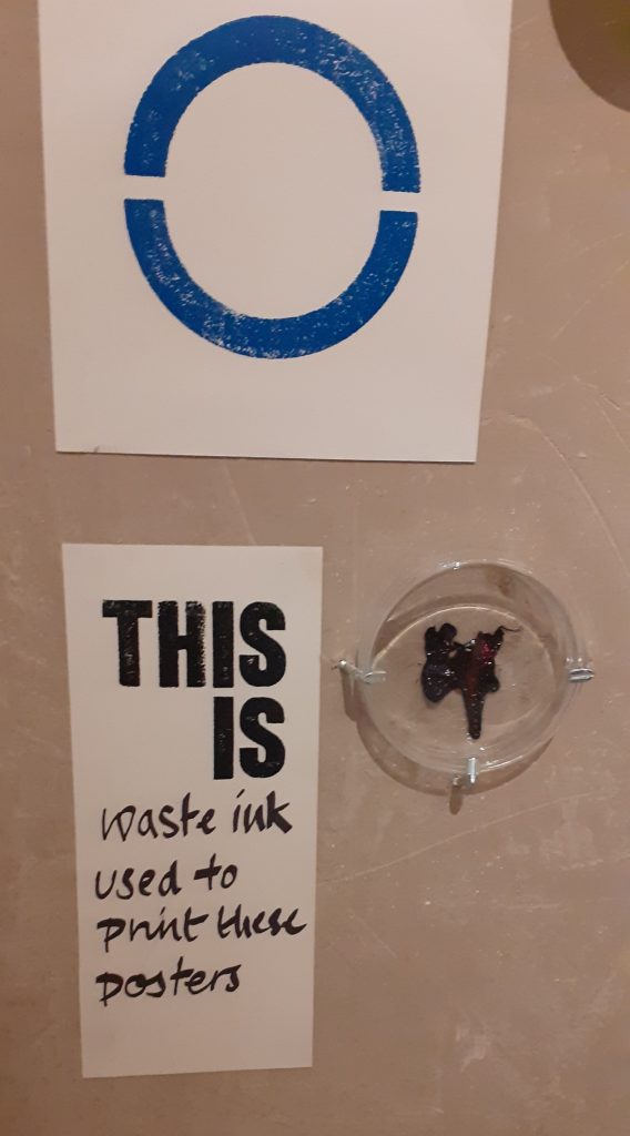
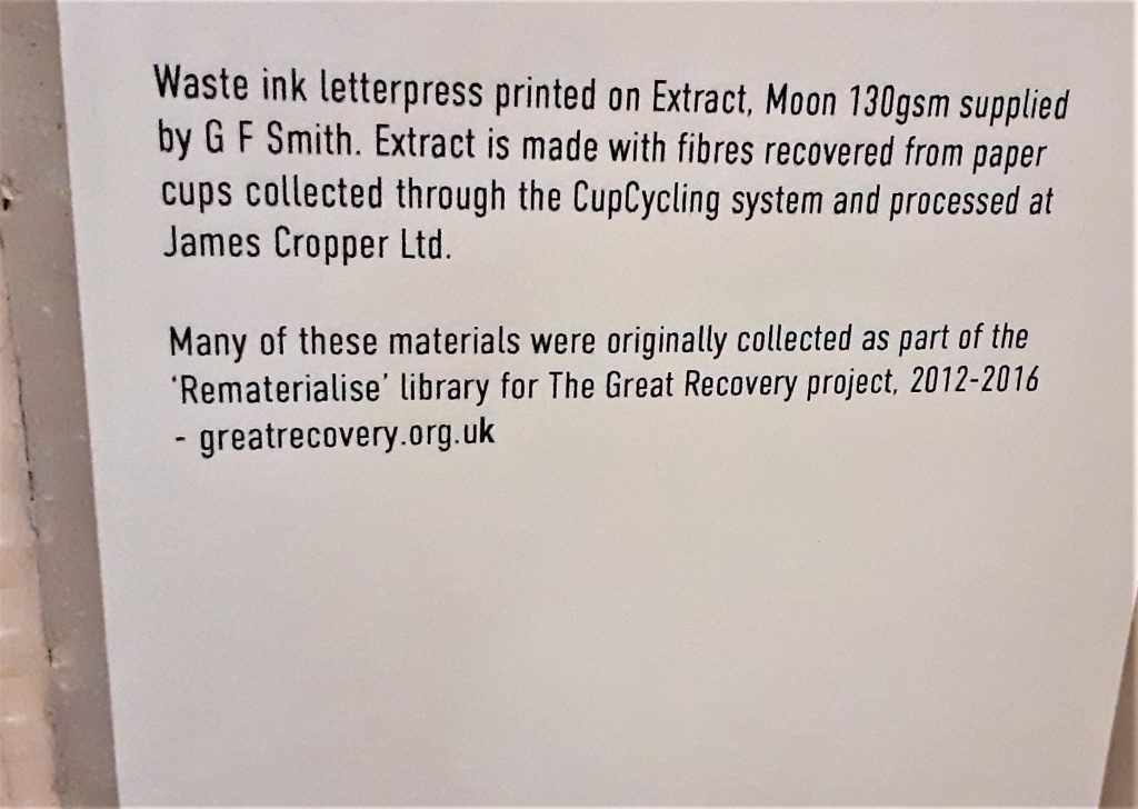
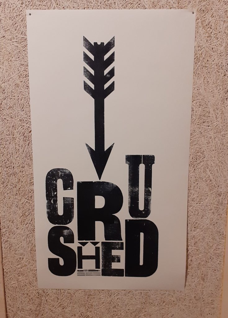
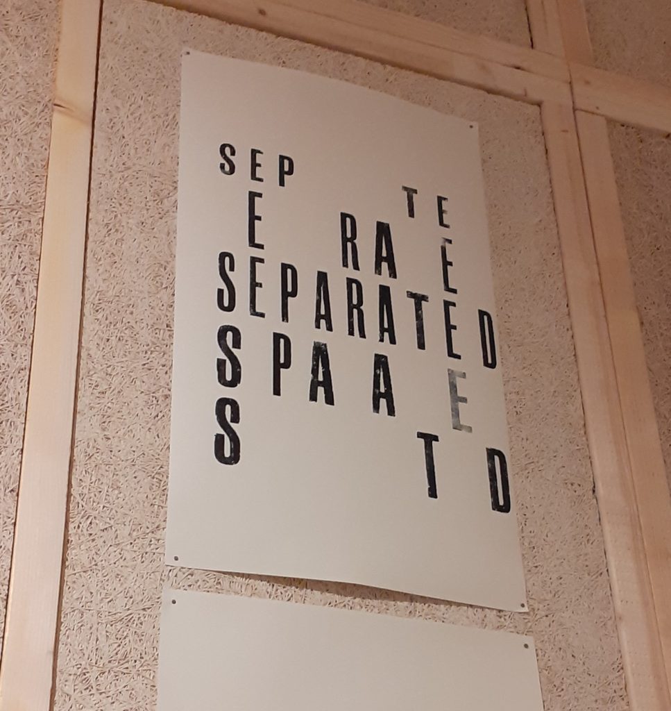
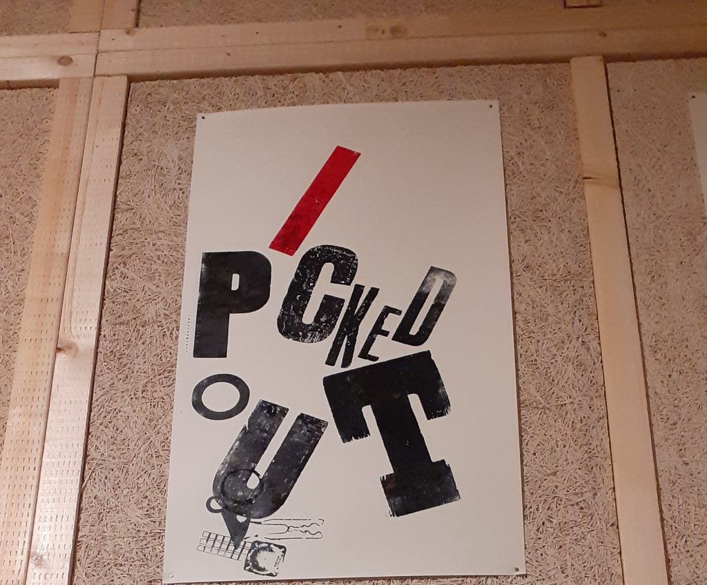
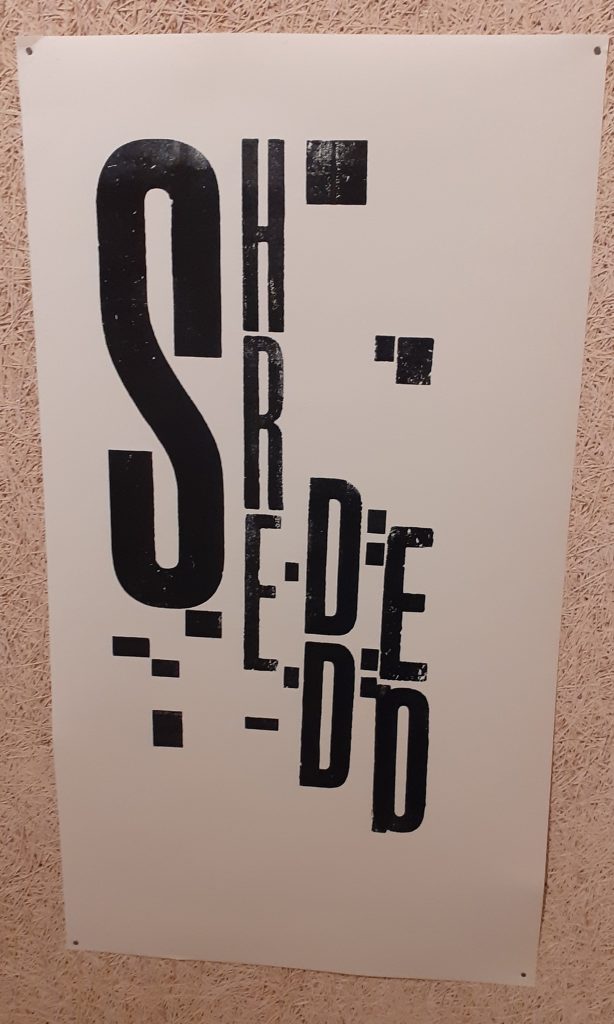
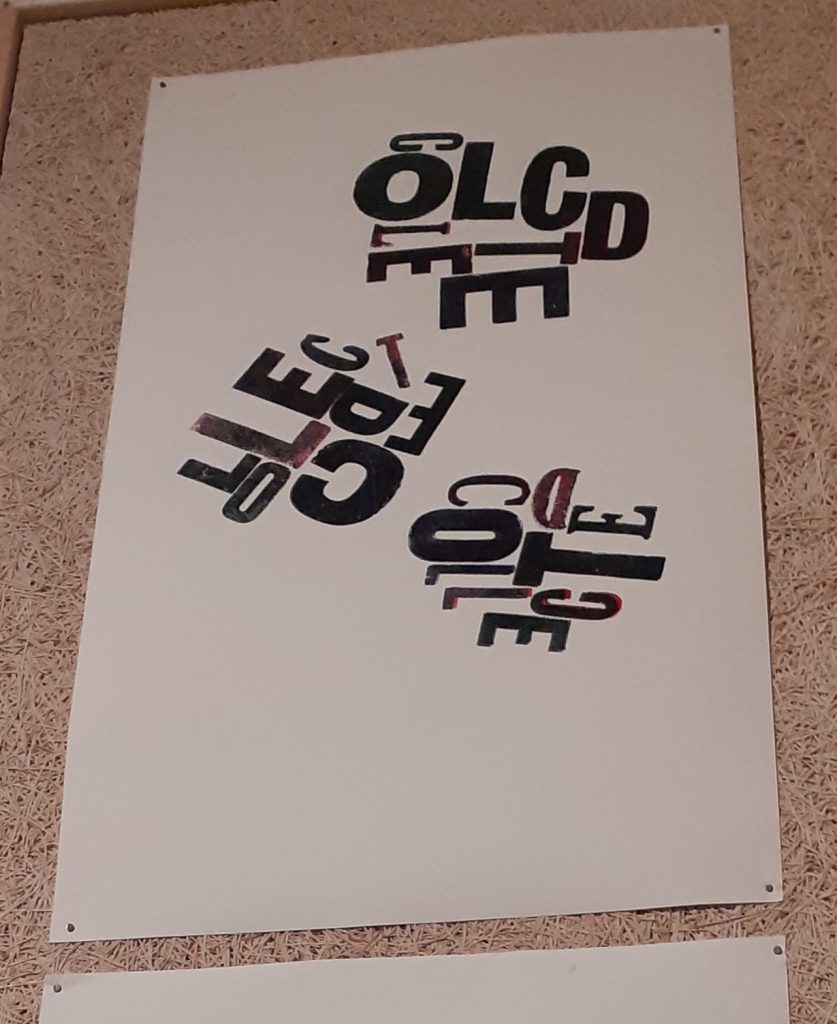
These prints are made using waste ink. I really like the designs. They are clever and eye-catching. The words visually get across the meaning by the way they are laid out on the page.
One thought I was left with after the exhibition:
Plastic has only come into use during my mum’s lifetime. In such as short period we have done so much harm. But people are working on the solutions every day. For the short amount of time plastics have been in use, an even shorter amount of time has been spent researching technologies and designs to help us undo the mess we are in. We may need to go back to some of the old ways. People turned to throw-away design solutions for convenience. During the Covid-19 pandemic, public health and hygiene has been the reason for creating even more waste. We have something to overcome which is a mental attitude of how we approach the problem. It is the responsibility of designers and users. But we also need data. The data to figure out which is worse: throwing away a plastic cup or producing recycled cups which takes energy to manufacture.
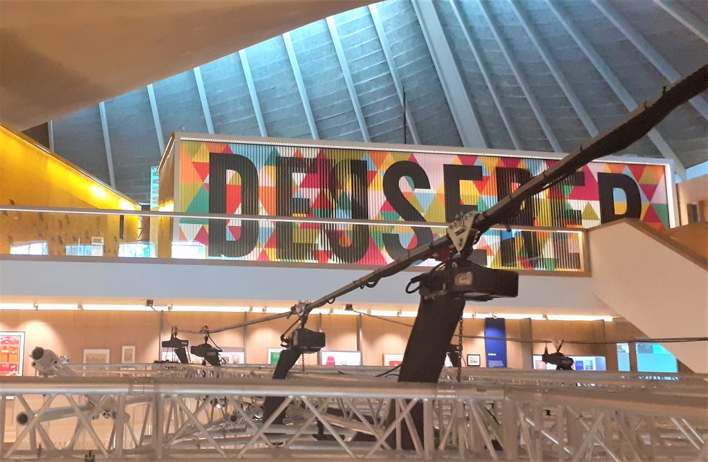
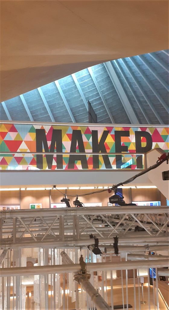
The name of the exhibition is displayed on a large board. The letters are written on slats which rotate to display the next word. I first thought this was a digital screen, but seeing it closer up I saw that the words were printed on a material like plywood.
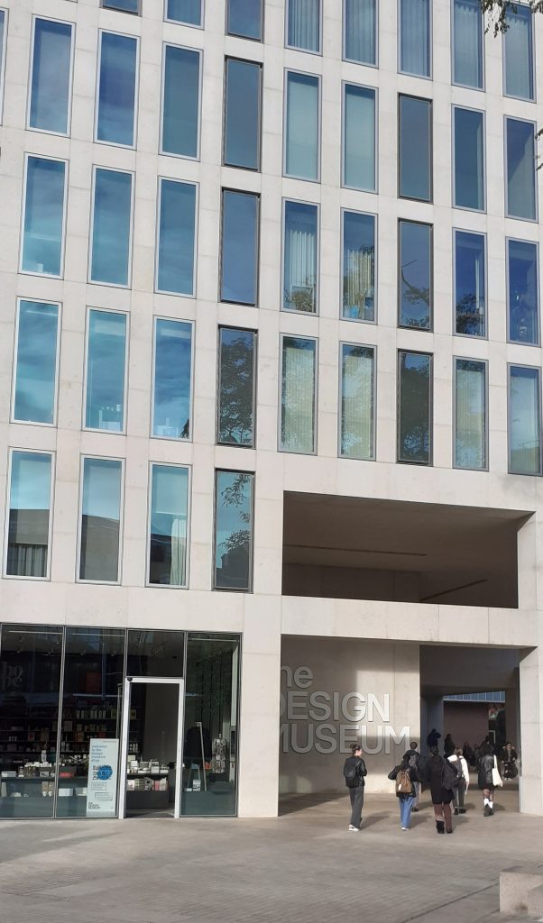
The soft lighting and wood interior within the design museum creates a friendly warmth throughout the building. After the rush of London, I felt relaxed.
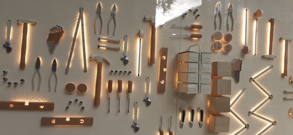
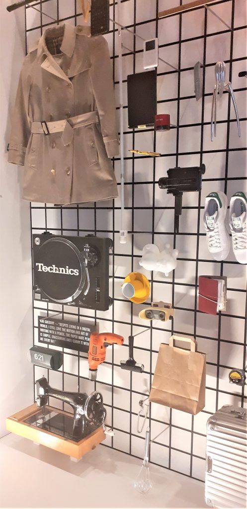
The first objects I came across on the top floor of the museum.
I was surprised at the arrangement of objects and the assortment on display. The objects were placed quite closely together which felt slightly disconcerting because there appeared to be no connection between each object. My first thought is that these objects have come from many different people and places. Perhaps there was no other way to introduce this exhibition that shows us such a wide variety of design.
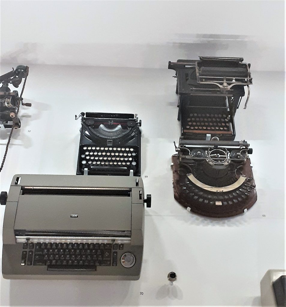
The typewriters hanging on the wall was an interesting sight. I have never seen a typewriter displayed from a wall in this way. The way they were shown as a collection was satisfying to see. I found them beautiful. As a child, I was always drawn to my mum’s blue typewriter and wanted one myself. Seeing these typewriters brought that feeling back.
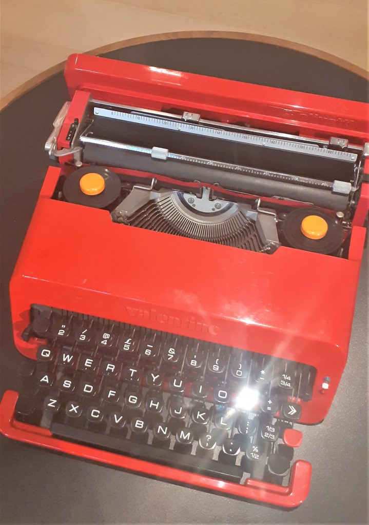
Valentine typewriter, 1970. Designed by Ettore Sottsass and Perry King.
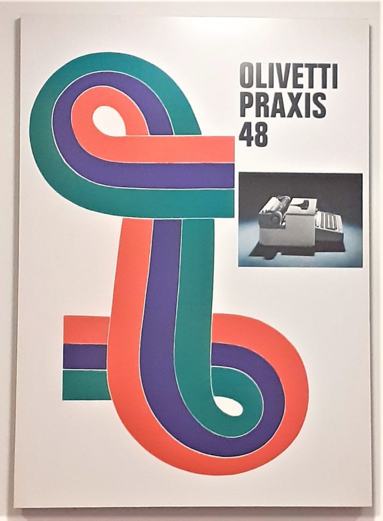
Olivetti Praxis 48 typewriter poster, 1967, Designed by Giovanni Pintori.
It was really nice to see the poster behind the physical object of the typewriter. In my head I could put the 2 together and imagine the time they came from.
Olivetti Lettera 32 typewriter poster, 1968-69. Designed by Walter Ballmer.
Here the designer has played with scale to created a surprising image where the egg is as large as the typewriter. Seeing the typewriter at this angle is another unusual element to this poster.
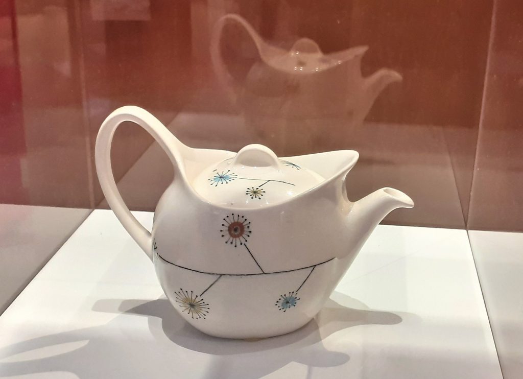
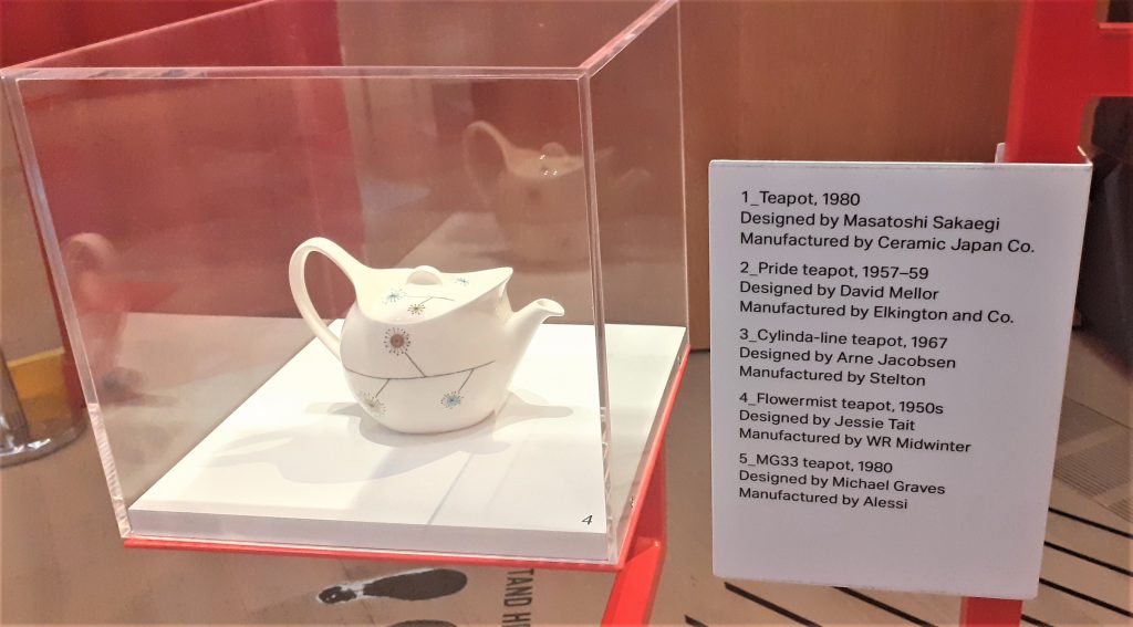
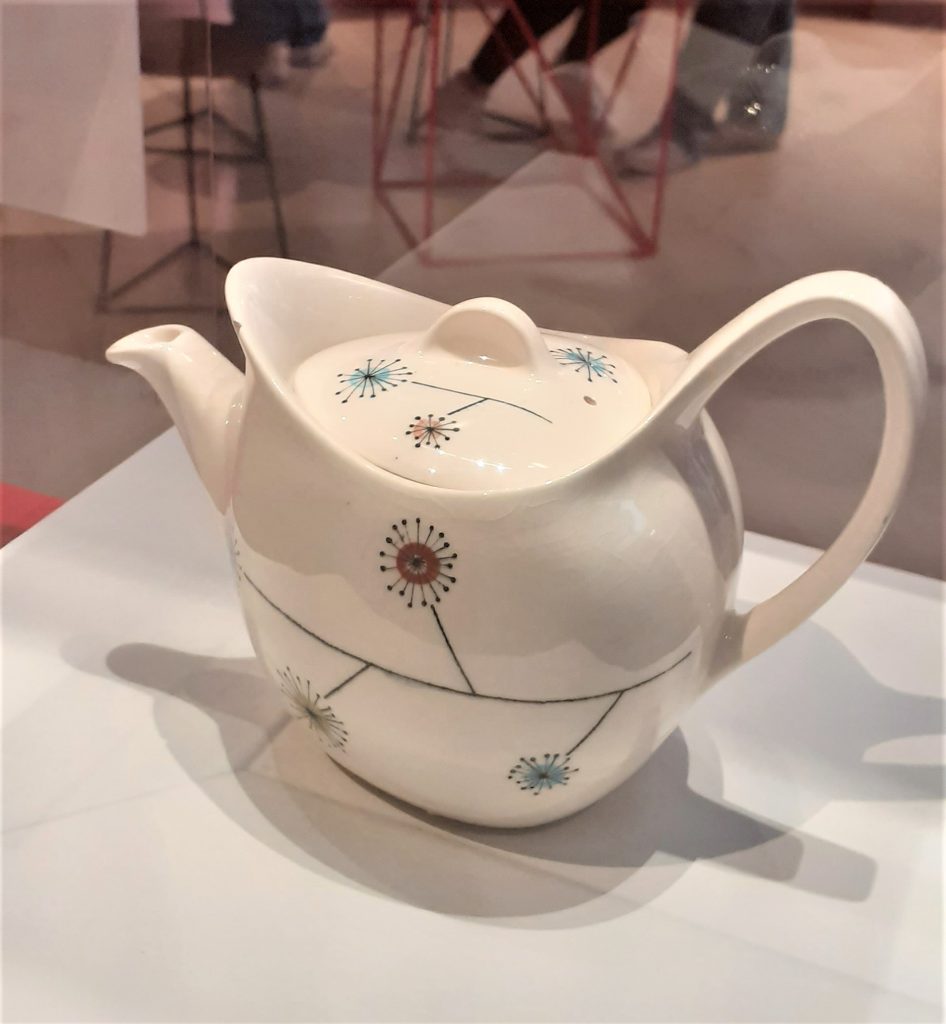
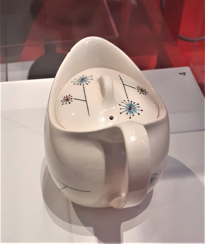
One classmate made the point that the older technology was new to our parent’s generation.Flowermist teapot, 1950’s, designed by Jessie Tait.
I loved this unique teapot as soon as I saw it. This is the kind of item I would be tempted to buy. It is delicate, pretty and functional. The way the teapot was displayed allowed me to view it from all angles. The light directed onto it acted as a spotlight, drawing me to the object. The shadow created on the side of the pot highlighted the shape of the design.
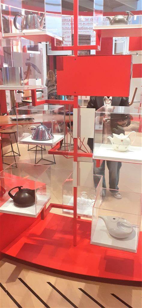
The way the teapots are displayed together is interesting. The frame they sit on is asymmetrical. It reminded me of a teapot tree out of a fantasy story. They appear to be floating due to the transparent cases.
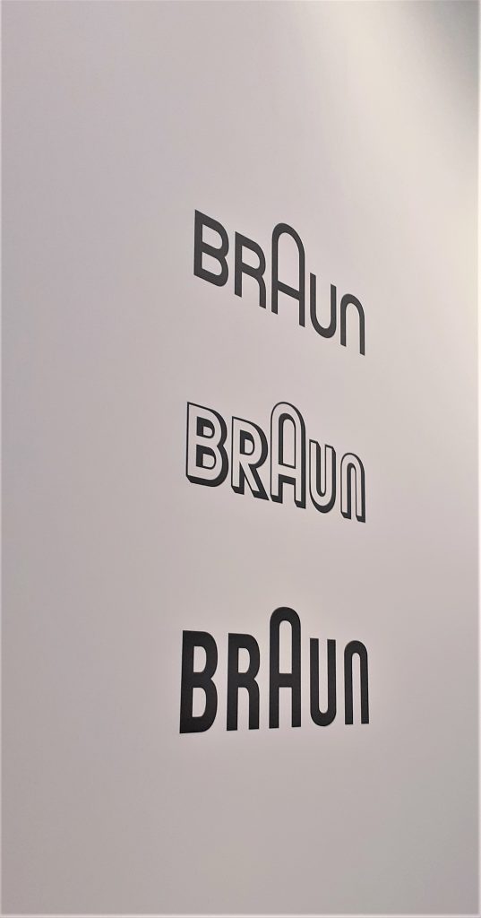
Logos on the wall of the exhibition, showing us how the design has changed over the years.
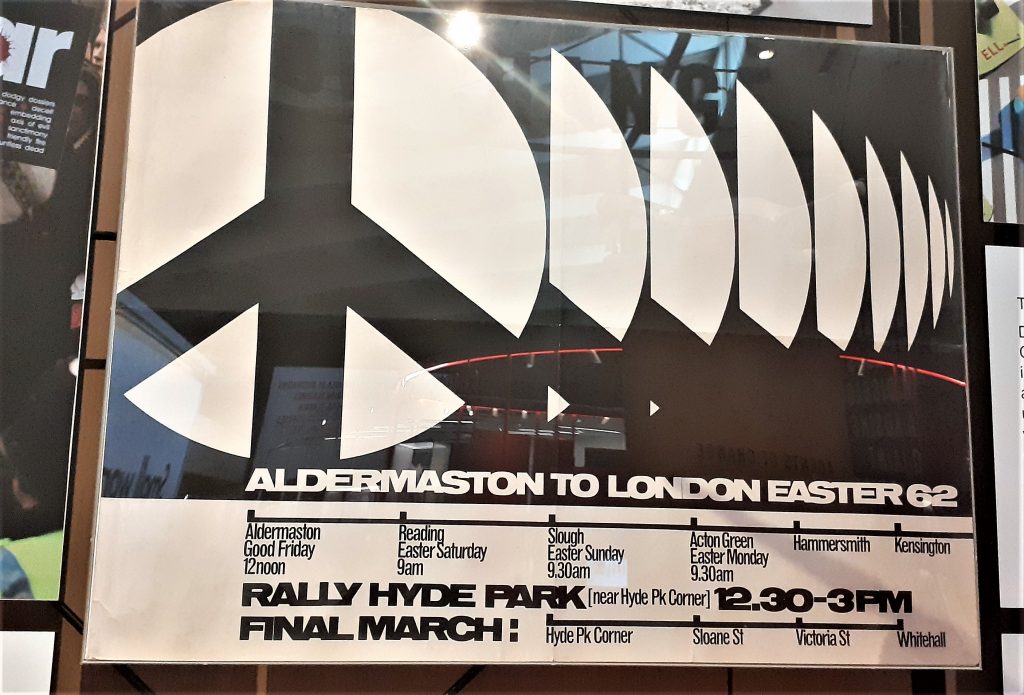
Seeing my hometown of Reading on the poster made this historical object feel more real to me. I could imagine the people marching in the street, rather than if the poster had been about somewhere I do not know.
I really like the use of repetition in this poster and the black and white design. The lack of colour helps the shapes to stand out. The line at the bottom of the poster gives us a visual representation of the route of the march.
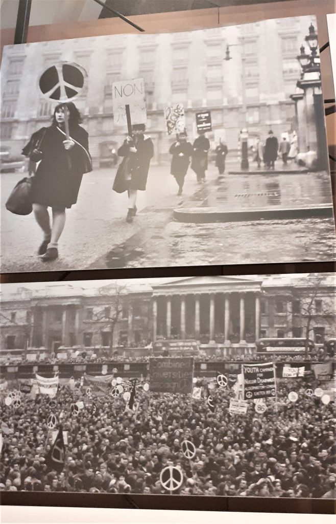
Displaying photos of the protests next to the poster gives us context for the object.
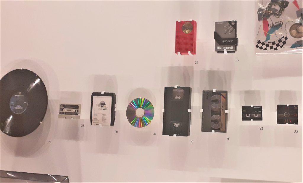
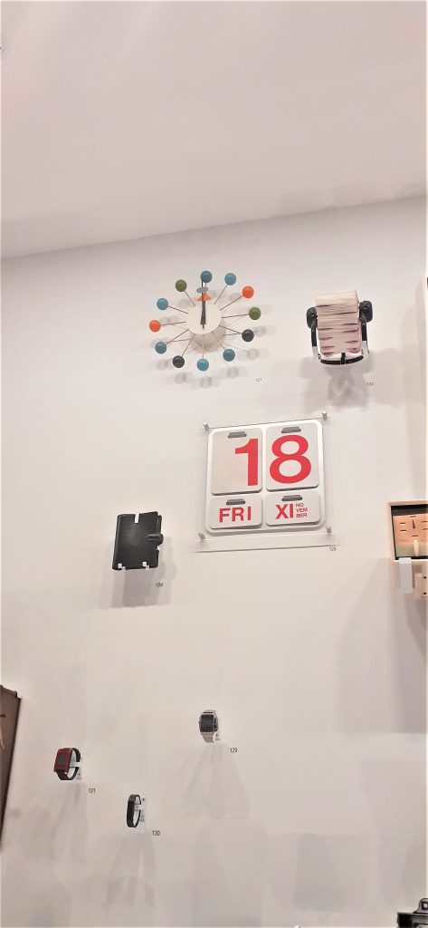
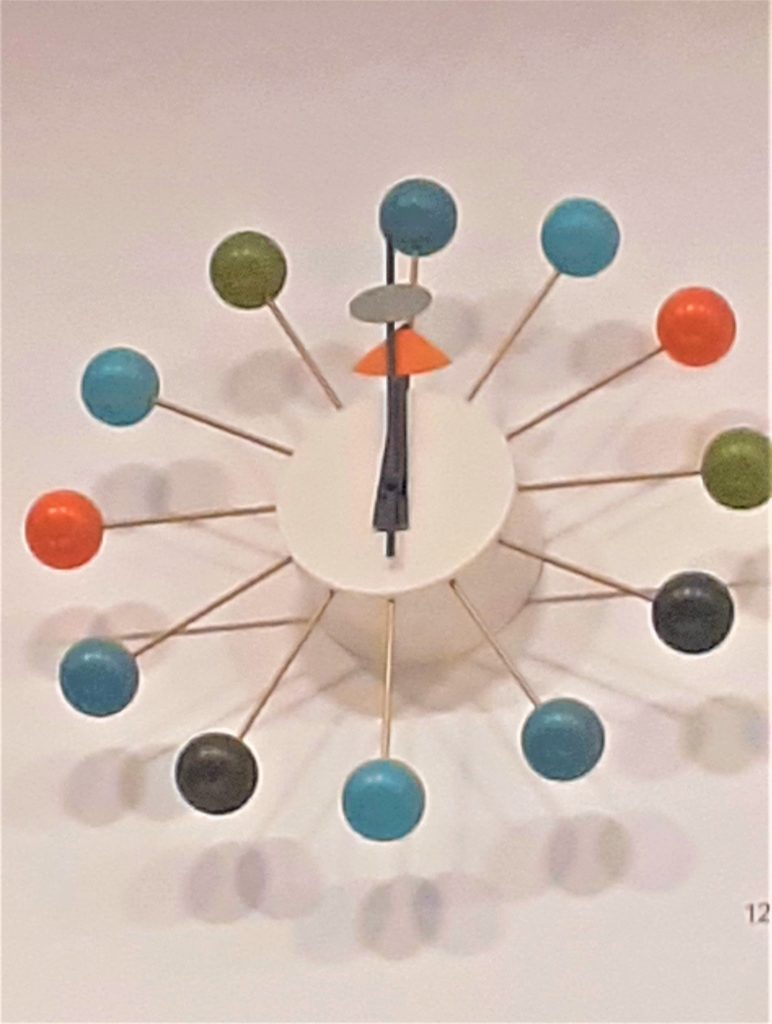
Wall of time. This wall displayed clocks, watches, a filafax, and other objects to organise a person and mark time. In the top right-hand side, I saw the Ball Wall Clock. This object immediately intrigued me.
I first felt awestruck. Then joyfully impressed. I could not relate this design to anything I have seen before. I guessed that the object was old. I have always struggled to read clock faces and numbers in general. I usually dislike any clock that does not have numbers on it. I like I would struggle to use this clock if it were mine. But the cheerful quality of the design overrides this for me.
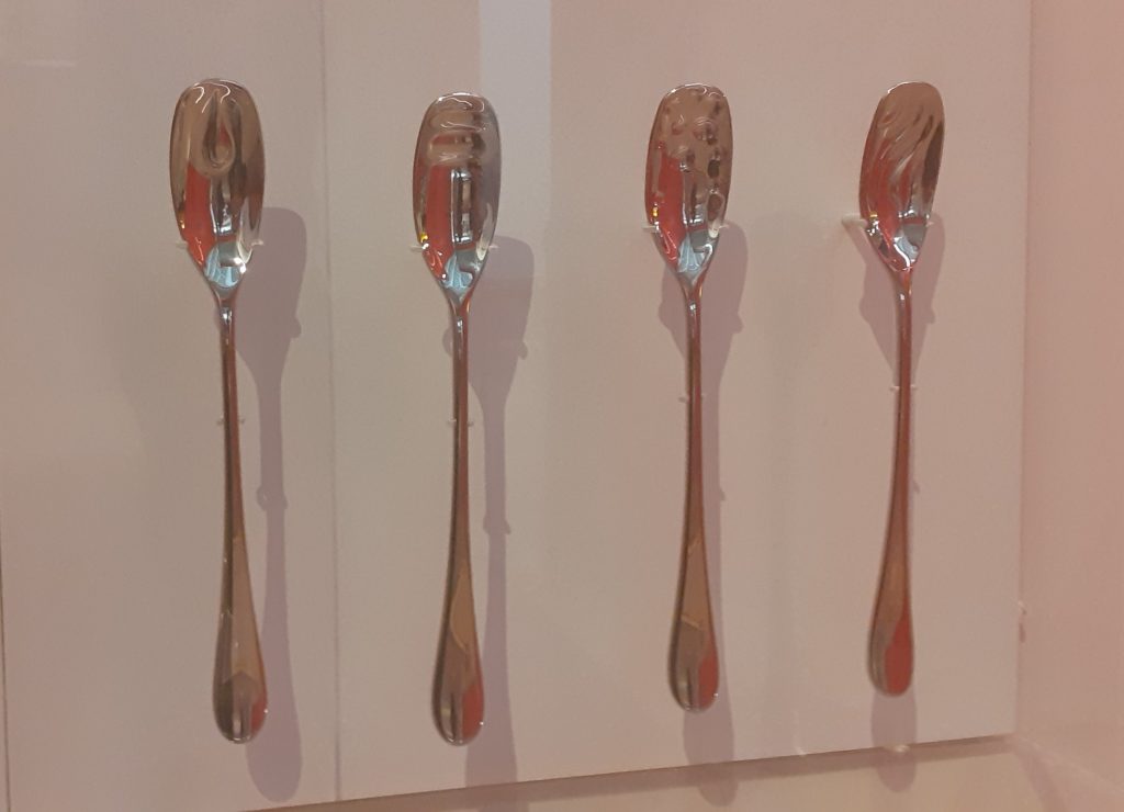
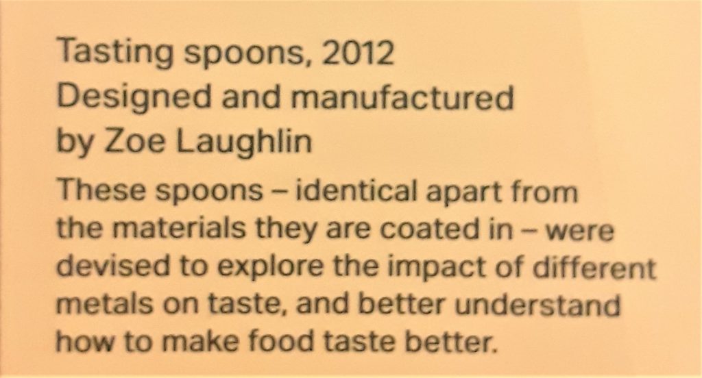
The story behind these tasting spoons interested me. At first they appear to be identical. The design looks the same in all four spoons, except they function slightly differently because they give a person a slightly different experience depending on the material used.
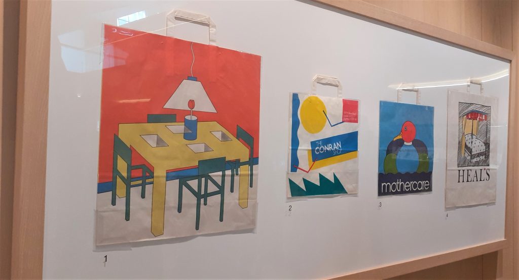
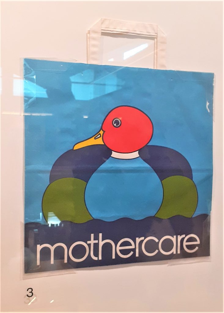
Shopping bag for Mothercare, 1980’s.
I was surprised to see the thickness of the plastic bag. The colours are bold and bright. Plastic bags are no longer made in this way. Because of the thickness of the material, I imagine that this bag is durable. The simplicity of this design is very effective and the red of the duck’s head is eye-catching.
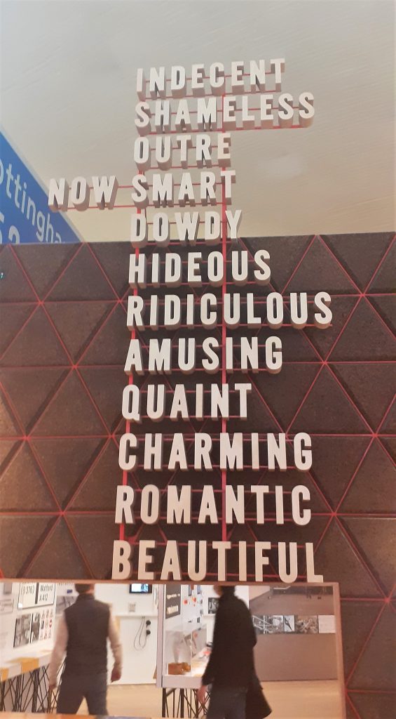
The list of words at the centre of the exhibition could describe design or objects.
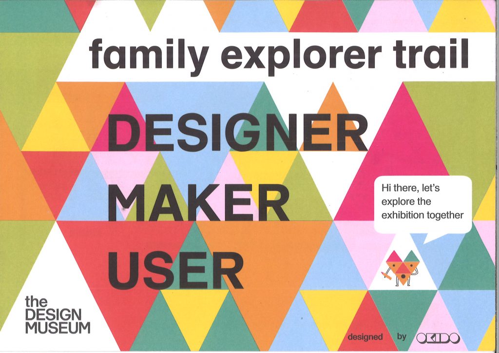
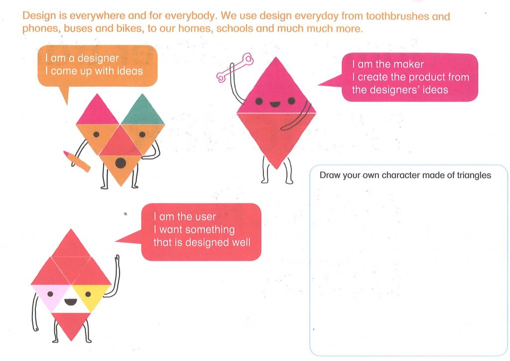
I picked up this pamphlet for families at the exhibition:
The study of Semiotics suggests that who is reading the image, is important in determining the message. Semiosis is the process of How we take meaning from a sign. Roland Barthes was a French literary critic and philosopher. He felt that the meaning of words as well as images are dependent on the viewer.
Denotation= The literal or primary meaning of an image.
Connotation= This is the meaning of a sign depending on our interpretations. This means the connotation is something that always changes.
Ways of Seeing- John Berger
As mentioned in a previous blog post, Writing & Research Skills. John Berger wrote a book and BBC documentary entitled Ways of Seeing, in which he discusses semiotics:
‘We never look at just one thing; we are always looking at the relation between things and ourselves.’
‘The way we see things is affected by what we know or what we believe.’
John Berger, Ways of Seeing
‘The photographer’s way of seeing is reflected in his choice of subject. The painter’s way of seeing is reconstituted by the marks he makes on the canvas or paper.’
In this quote, he is saying that a photographer is selecting and bringing attention to an element. He/she is showing something about their perception within this photo. A photo cannot be objective if a person is behind the lens.
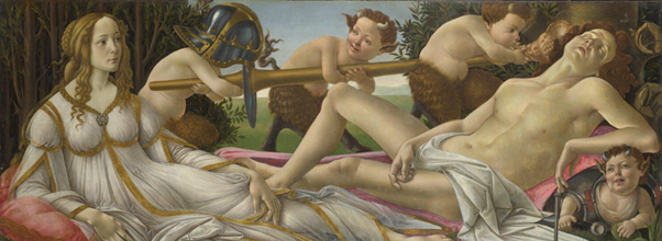
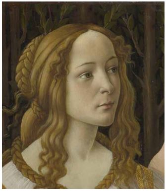
An example Berger gives in his book is the painting Venus and Mars by Boticelli.
Isolating a part of the image means you see something differently by the way it is framed.
If we frame just Venus’ face, the image looks like a portrait painting of a young lady. We need to see the painting as a whole to understand the context.
Open work- Umberto Eco
Umberto Eco Was an Italian philosopher, social commentator, and novelist. In his work, he speaks about the Ideal reader. This is someone who is aware of the possibilities of interpretation in a work.
From Visual Signs by David Crow:
‘Eco prefers the term “encyclopedia,” rather than the more common term “code,” to describe the transfer of meaning through the use of signs. For Eco, a code implies a one-to-one transfer of meaning like a dictionary definition, whereas encyclopedia suggests that there are a number of interrelated interpretations and readers must negotiate their own path through the network of possibilities.’
‘It is important to note that he sees information as something different from meaning or message. He suggests that the amount of information contained in a message depends on the probability of the reader’s already knowing the content of the message before it is received.’
‘Eco argues that contemporary art contains much higher amounts of information, though not necessarily more meaning, by virtue of its radical nature. More conventional forms of communication—such as the road sign, for example, or figurative painting— may carry more distinct meaning but much less information.’
‘If a newsflash tells me that tomorrow the sun will rise, I have been given very little information as I could have worked this out for myself. If, however, the newsflash tells me that the sun will not rise, then I have a lot of information as this is a highly improbable event.’
‘Eco also points out that the amount of information contained in a message is affected by another factor: our confidence in the source of the message.’
‘If a landlord were to tell me an apartment had damp problems before I rented it, I would be more inclined to believe him because he has nothing to gain by fabricating this message.’
‘The amount of information is greater when the content or the source is improbable.’
‘”Christmas is an annual festival.” This has a very clear and direct meaning with no ambiguity, yet it doesn’t add to our existing knowledge. In other words, although the communicative value is high, the amount of information is low.’
A piece of discarded material can become an artifact once it has been framed.
Umberto Eco
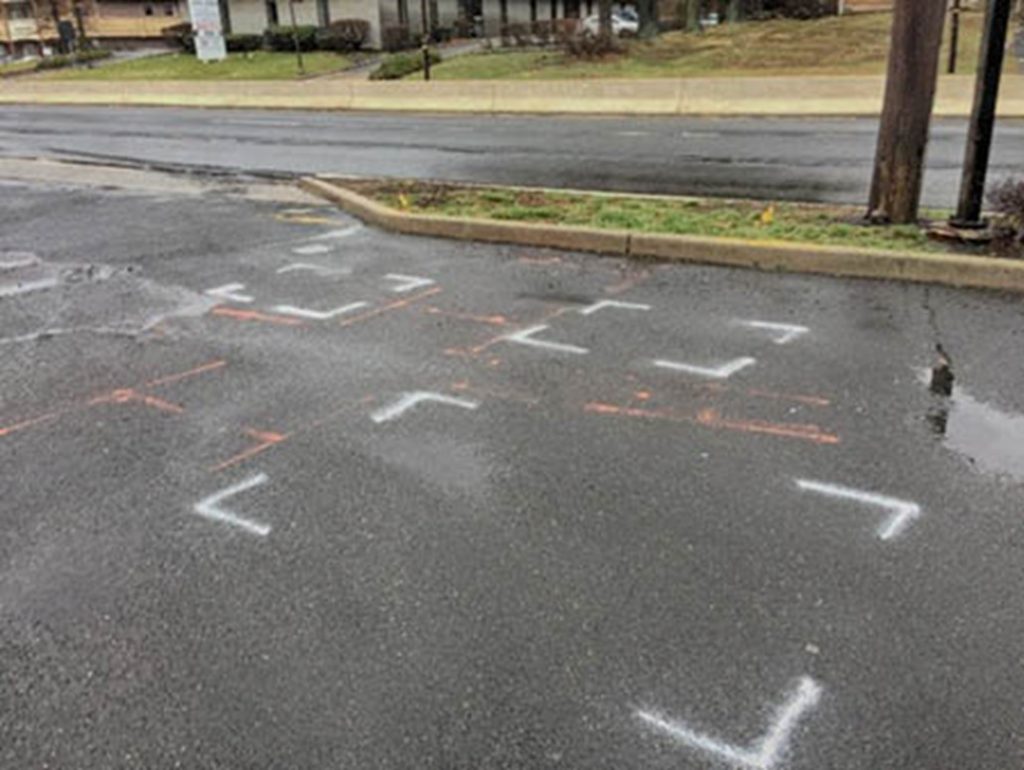
Framing brings attention to something e.g. cracks in the road spray painted to mark for repair. At this location, they have marked areas for drilling into, on the asphalt. This makes us aware of areas and focus on areas we otherwise would not notice.
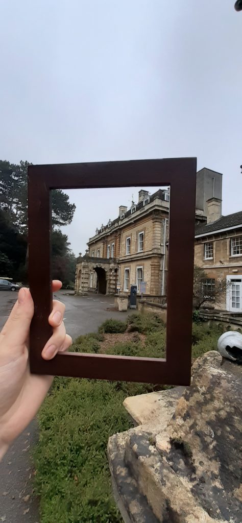
In this week’s workshop, we were taking photographs around campus. I experimented with using a photo frame to draw attention to certain areas and then taking a picture of the same area without the use of a frame. I wanted to see what difference the frame would make.
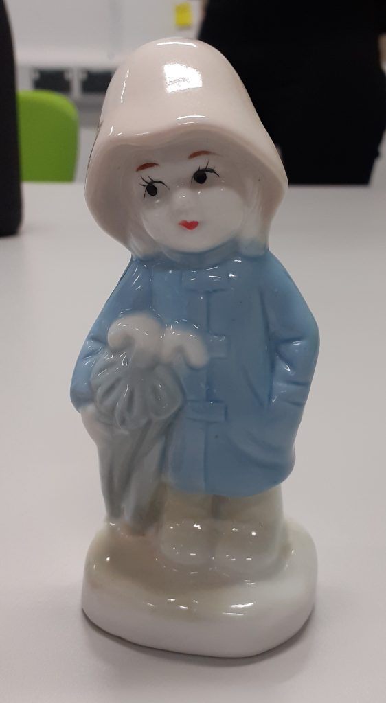
Before the workshop, I wrote down a collection of words that related to my object, The Raincoat Girl. I then wrote words that did not describe the object.
I used these words as inspiration when taking photos around campus. It was challenging to find subjects and locations in a short space of time. (We had around 40 minutes for this task.) It was harder than I thought to find objects I was happy with.
I used the frame to draw the focus to the entrance of the building.
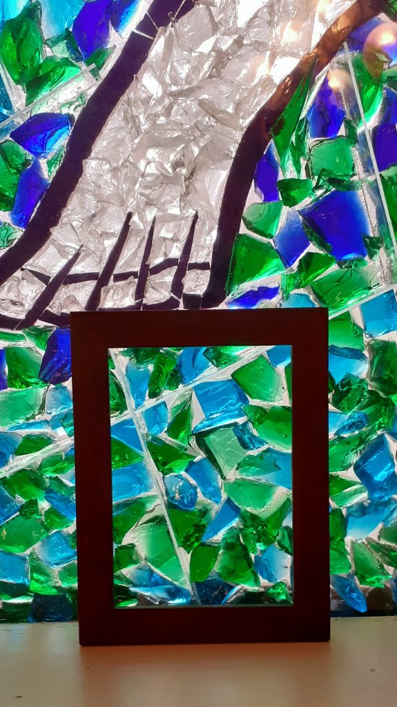
I placed the frame in a place that highlighted the fragmentation of the pieces of glass. I was relating this subject to the word ‘fragile’, since my object is fragile. I chose the blue and green area because my object is blue and green was one of the words I wrote to describe what my object was not.
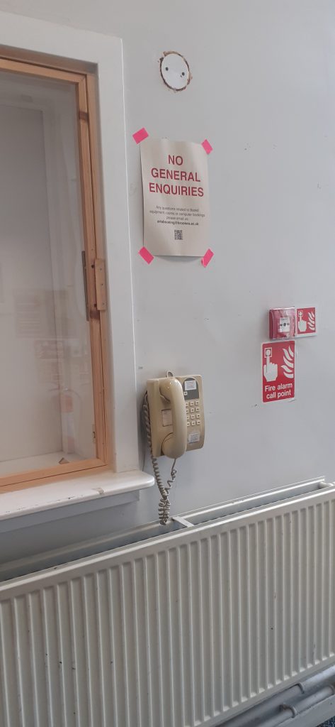
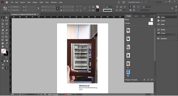
I took this photo in the Richard Hamilton Building on campus. Two objects here are used for communication: a telephone and a fire alarm. Both objects are useful and even essential. I found that this contrasted with my object which is purely decorative and does not serve any vital or important purpose.
I chose to focus in on one object. I found it interesting that the phone looks old fashioned and would look at home beside my object. even though their functions are very different.
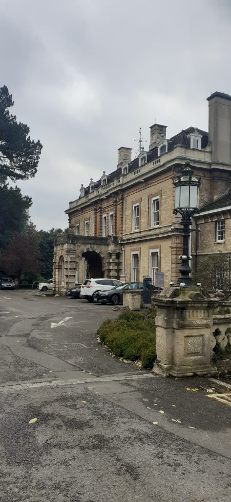
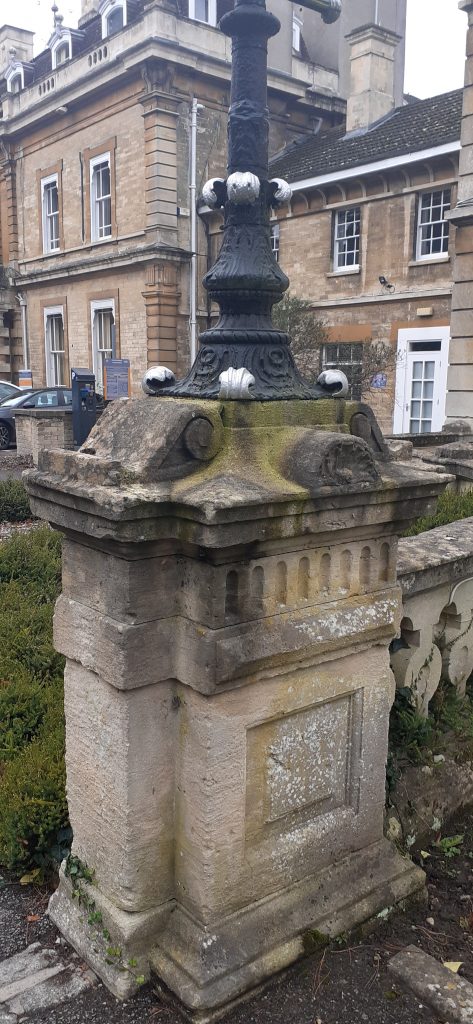
There is a lot going on in the design of this post at the exterior of Headington Hill Hall. It is old fashioned and decorative, like my object.
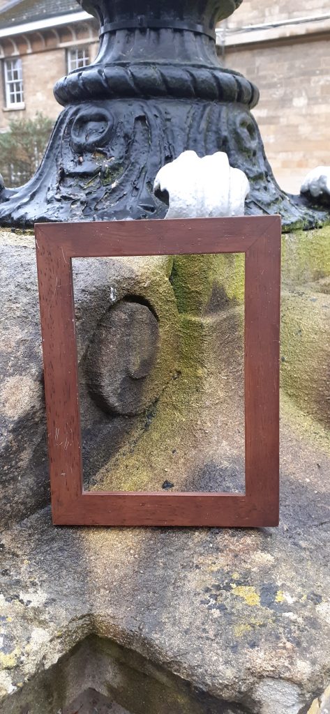
Framing one area of the pillar helps to focus in one one element of the design.
After taking the photos, we needed to place the photos in an InDesign document. InDesign was suitable because we needed to then add labels next to each photo. The label resembled the caption placed next to an artwork in a museum or gallery. It was fun to see the photos presented in this way. I liked the addition of the word next to the image as a title because it added more meaning to the image and helped present the message I had in mind when taking the photo.
InDesign process
I selected File>document set up. This gave me the option of choosing the number of pages in the document. In the same window, I could also unselect facing pages. This meant that I could view one page at a time.
I could use the page tool to change the page’s orientation, if one of my photos happened to be in a landscape orientation for example. This option is located at top of the page.
(The document needs to be on essentials classics for me to complete these steps.)
If this is not switched on, I can change this by selecting Window>workspace>essentials classic.
File> place to place an image in InDesign.
We use cookies on our website to give you the most relevant experience by remembering your preferences and repeat visits. By clicking “Accept All”, you consent to the use of ALL the cookies. However, you may visit "Cookie Settings" to provide a controlled consent.
This website uses cookies to improve your experience while you navigate through the website. Out of these, the cookies that are categorized as necessary are stored on your browser as they are essential for the working of basic functionalities of the website. We also use third-party cookies that help us analyze and understand how you use this website. These cookies will be stored in your browser only with your consent. You also have the option to opt-out of these cookies. But opting out of some of these cookies may affect your browsing experience.
Necessary cookies are absolutely essential for the website to function properly. These cookies ensure basic functionalities and security features of the website, anonymously.
Cookie
Duration
Description
cookielawinfo-checkbox-analytics
11 months
This cookie is set by GDPR Cookie Consent plugin. The cookie is used to store the user consent for the cookies in the category "Analytics".
cookielawinfo-checkbox-functional
11 months
The cookie is set by GDPR cookie consent to record the user consent for the cookies in the category "Functional".
cookielawinfo-checkbox-necessary
11 months
This cookie is set by GDPR Cookie Consent plugin. The cookies is used to store the user consent for the cookies in the category "Necessary".
cookielawinfo-checkbox-others
11 months
This cookie is set by GDPR Cookie Consent plugin. The cookie is used to store the user consent for the cookies in the category "Other.
cookielawinfo-checkbox-performance
11 months
This cookie is set by GDPR Cookie Consent plugin. The cookie is used to store the user consent for the cookies in the category "Performance".
viewed_cookie_policy
11 months
The cookie is set by the GDPR Cookie Consent plugin and is used to store whether or not user has consented to the use of cookies. It does not store any personal data.
Functional cookies help to perform certain functionalities like sharing the content of the website on social media platforms, collect feedbacks, and other third-party features.
Performance cookies are used to understand and analyze the key performance indexes of the website which helps in delivering a better user experience for the visitors.
Analytical cookies are used to understand how visitors interact with the website. These cookies help provide information on metrics the number of visitors, bounce rate, traffic source, etc.
Advertisement cookies are used to provide visitors with relevant ads and marketing campaigns. These cookies track visitors across websites and collect information to provide customized ads.