3D Collage

As nouns the difference between assemblage and collage is that assemblage is a collection of things which have been gathered together or assembled while collage is a picture made by sticking other pictures onto a surface.
As a verb collage is to make into a collage.

What is the difference between assemblage and collage? | WikiDiff

I have always thought of collage as a 2D craft- Working on a flat piece of card or paper.

When researching collage artists, I discovered the artists’ ability to use paper in a different way. Today’s workshop encouraged me to think of paper as a 3D material. How could I get it to stand up? How could I layer the paper or break it apart?

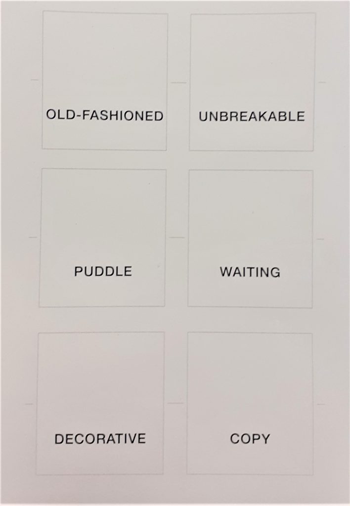
I used last week’s photos and my labels, to inspire the way I treated the paper. For example, the photo that mentions ‘old’, guided me to tear up the paper and give it an aged look. This helps to communicate a message to the viewer.

Collage Artists

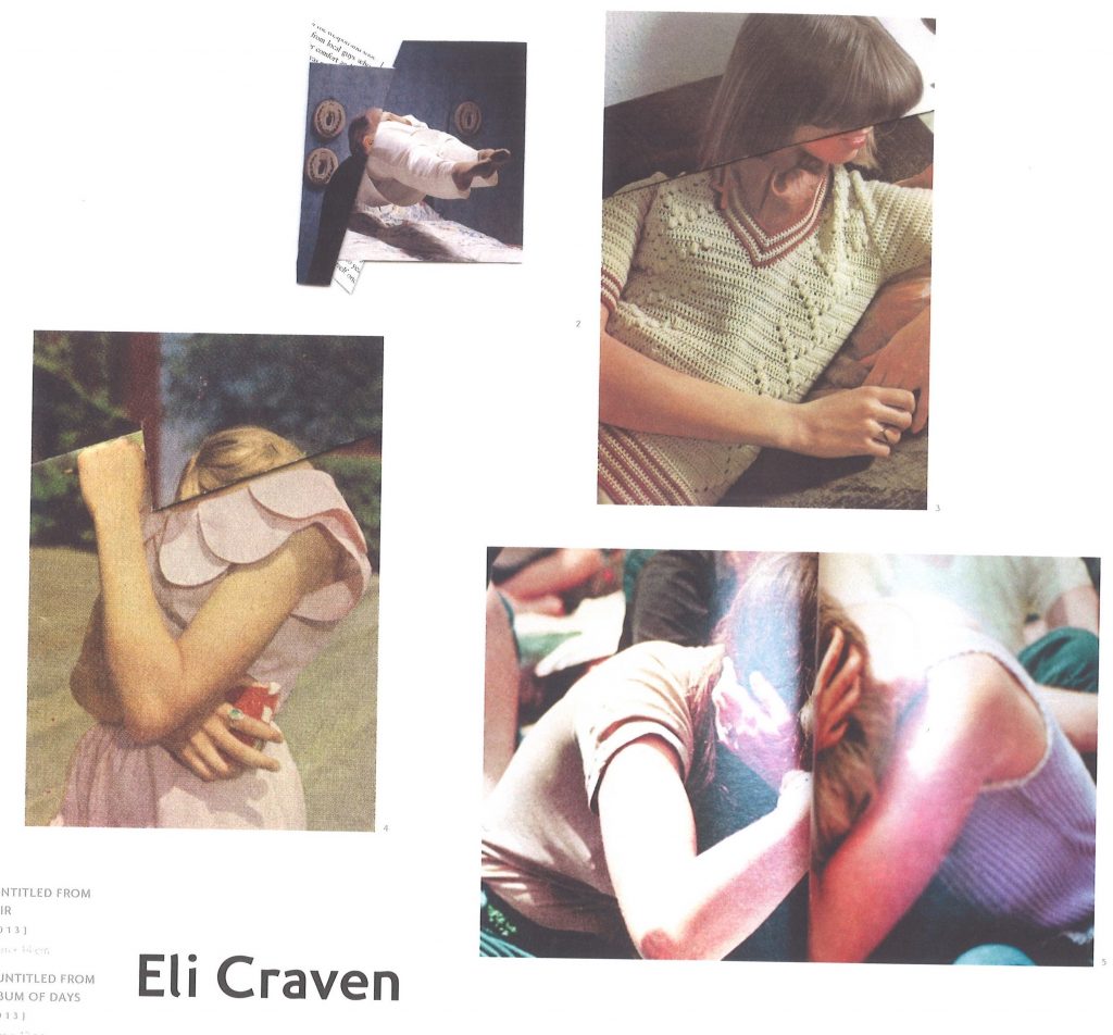
Craven uses different methods of manipulating paper. I was interested by the way he uses paper folding to alter the compositions. Using one image for the collage means that the result looks harmonious. The edges blend softly.

This folding method means that areas are hidden and are missing from the picture. This takes away visual clues and makes it slightly confusing for the viewer. For example, hiding the person’s facial expression means that we don’t know how the person is feeling. Instead, the viewer needs to make guesses, such as about the identity of the person. The image is then up to interpretation.

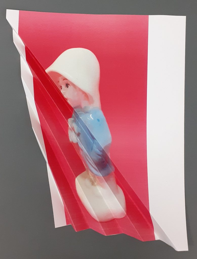
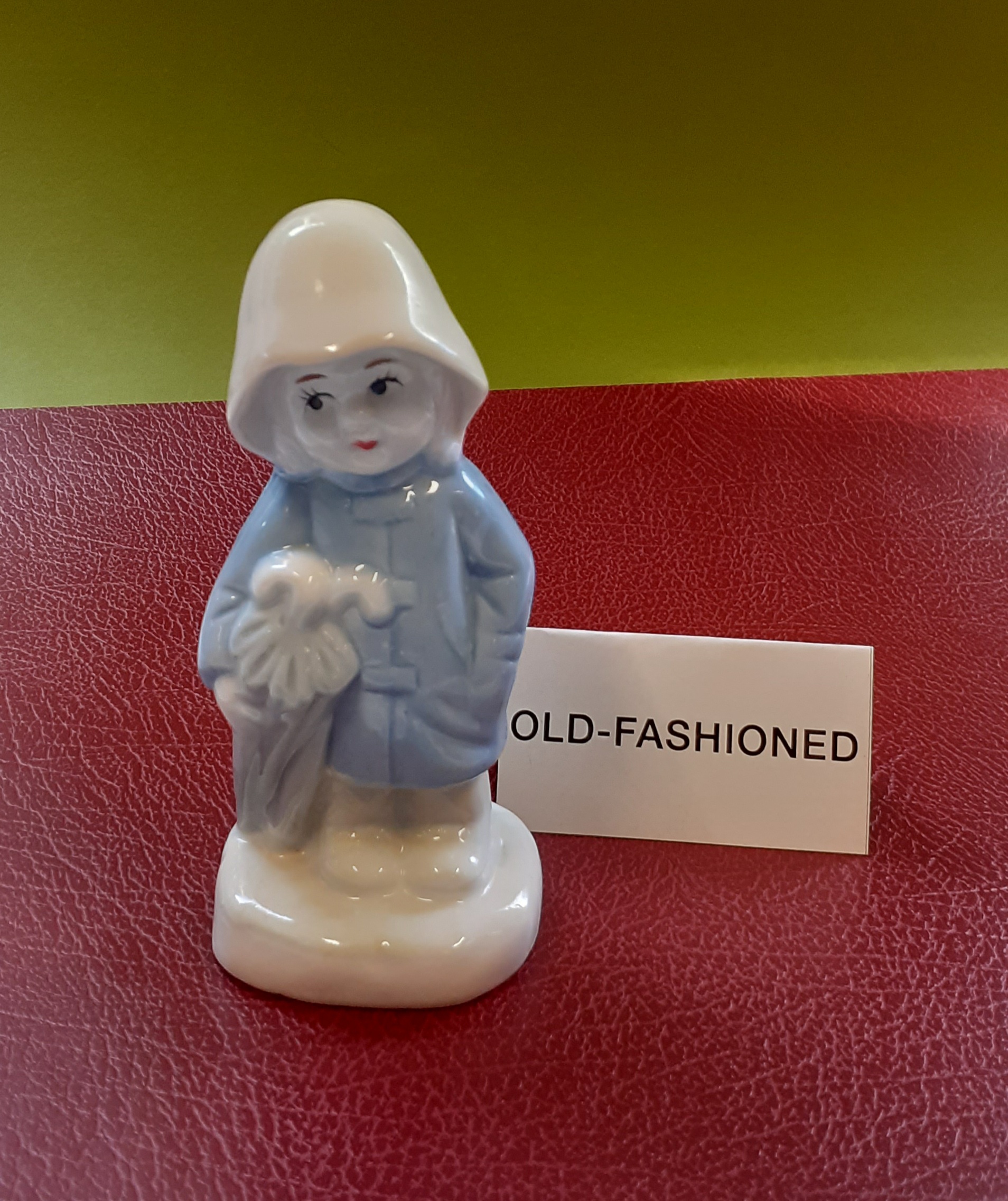
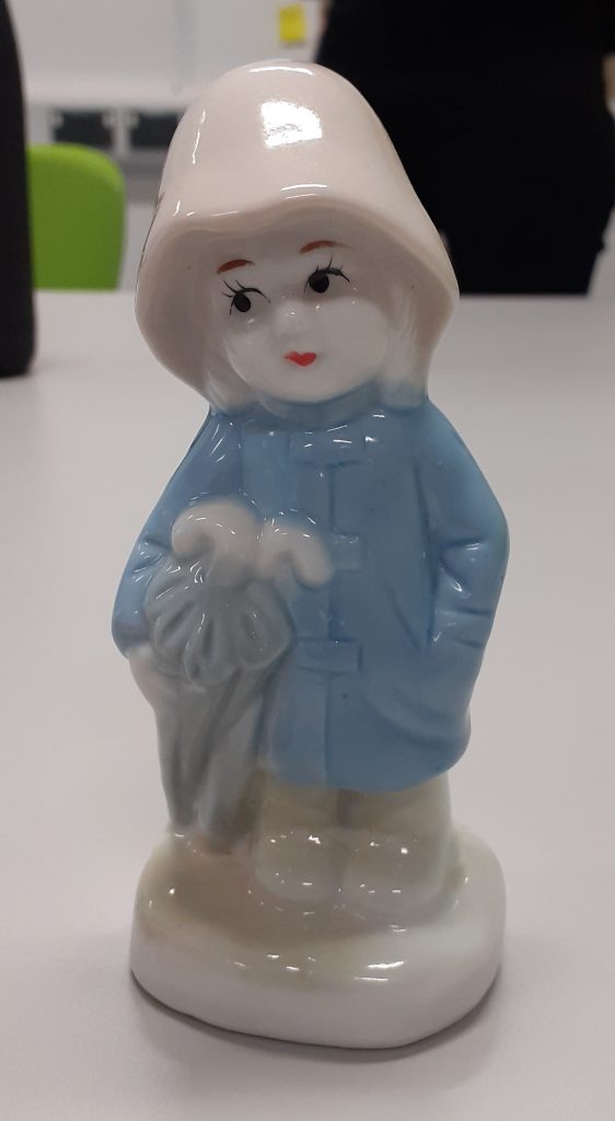
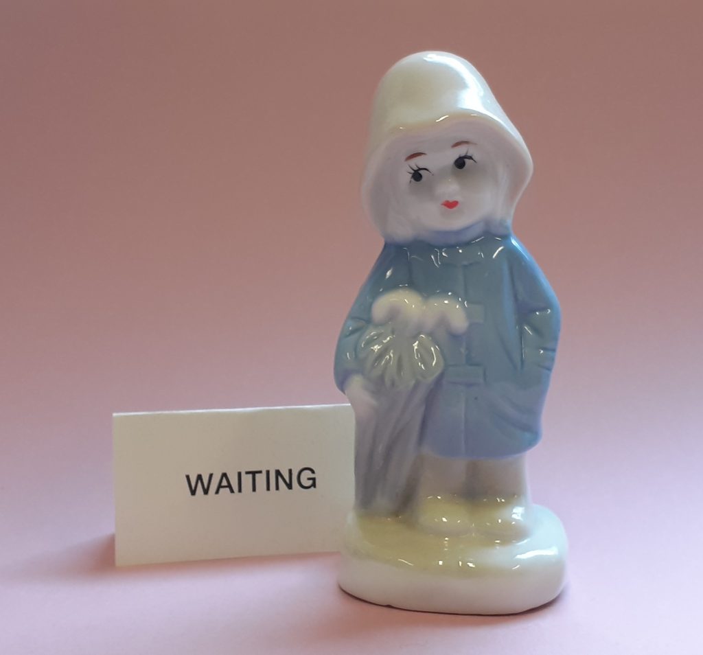
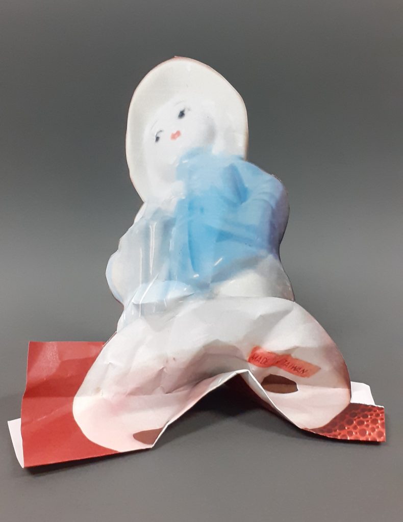
Inspired by the technique of paper folding, I took one photo of The Raincoat Girl figurine, and folded the paper diagonally. I left one side of the paper flat and folded the other half into a fan. This method distorted the shape of the figure. The image looked different depending on the angle I then viewed it from. The choice of photo was effective because the background is bold compared to the object. This highlighted the figure’s outline.

Phillipe Jusforgues

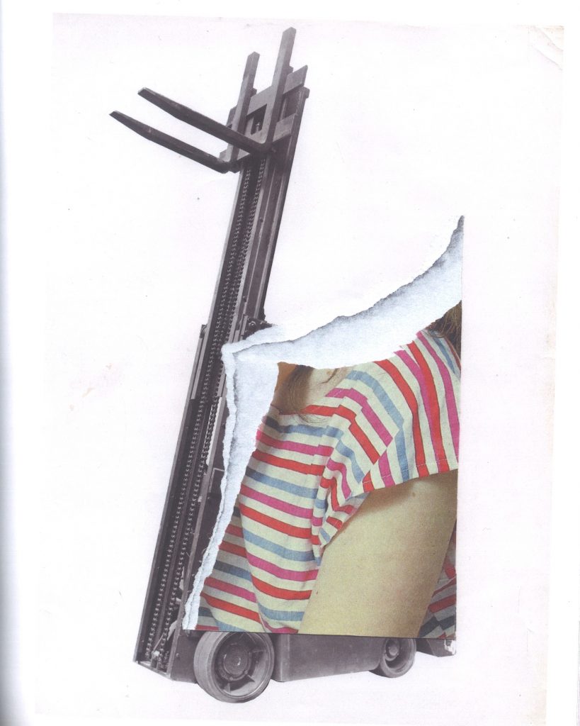
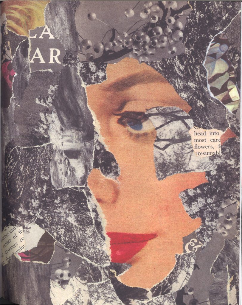
By tearing out a section of the collage, the artist brings the image forward into the 3D world. In this case, he draws more attention to the image of the girl by having the section raised off of the surface. The use of a coloured image against a black and white image, also helps to separate the two subjects of human and machine.

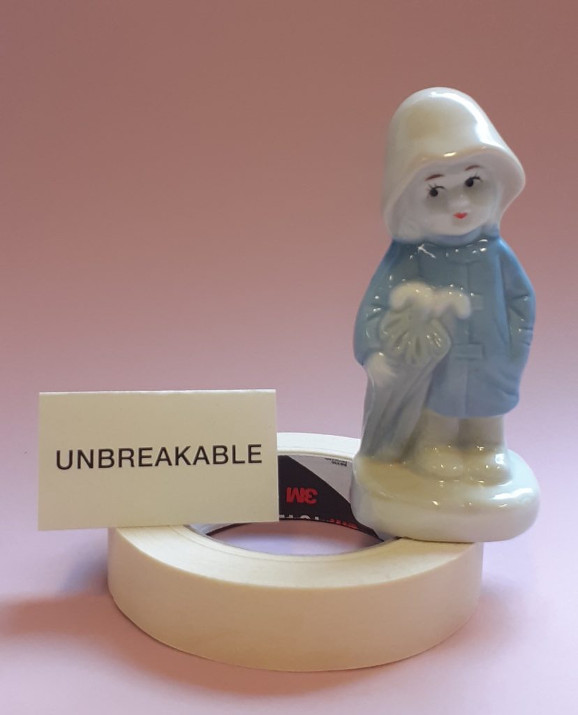
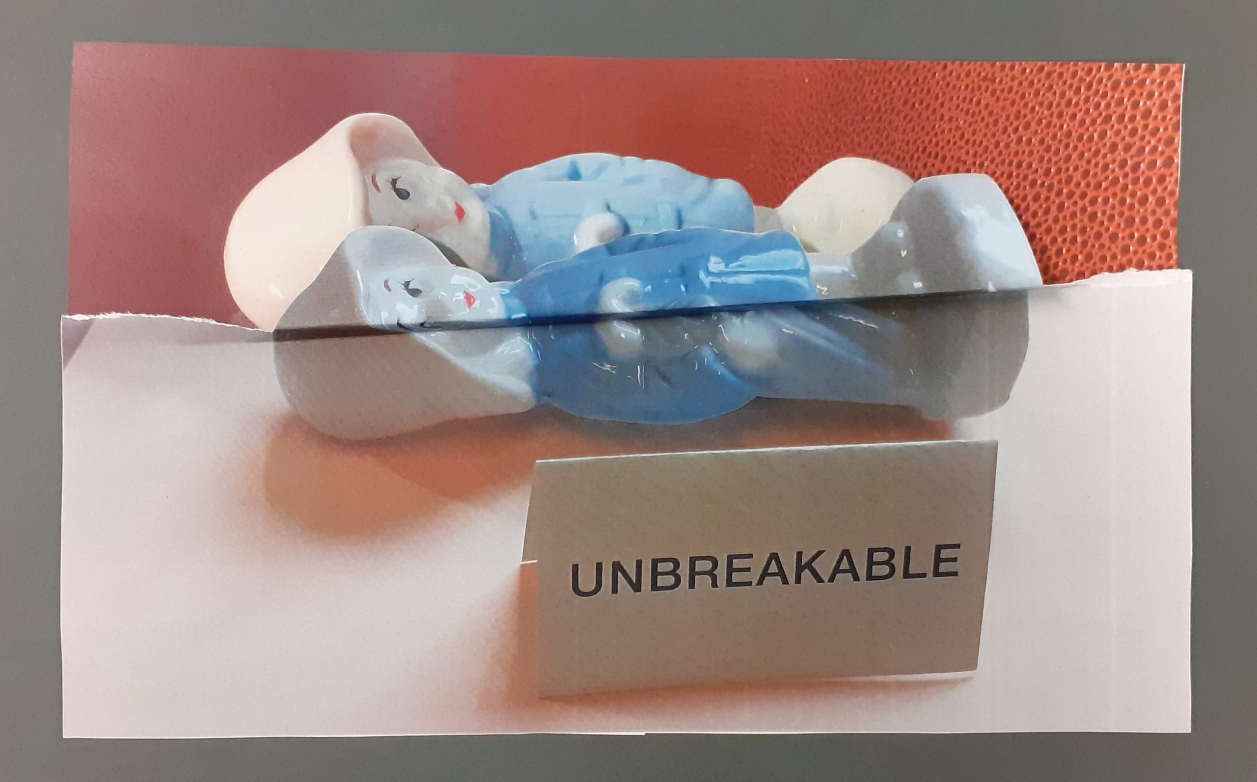
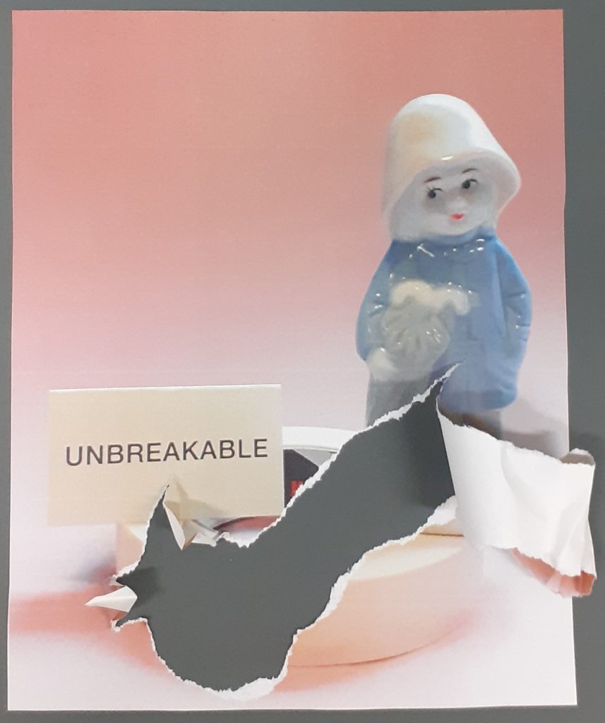
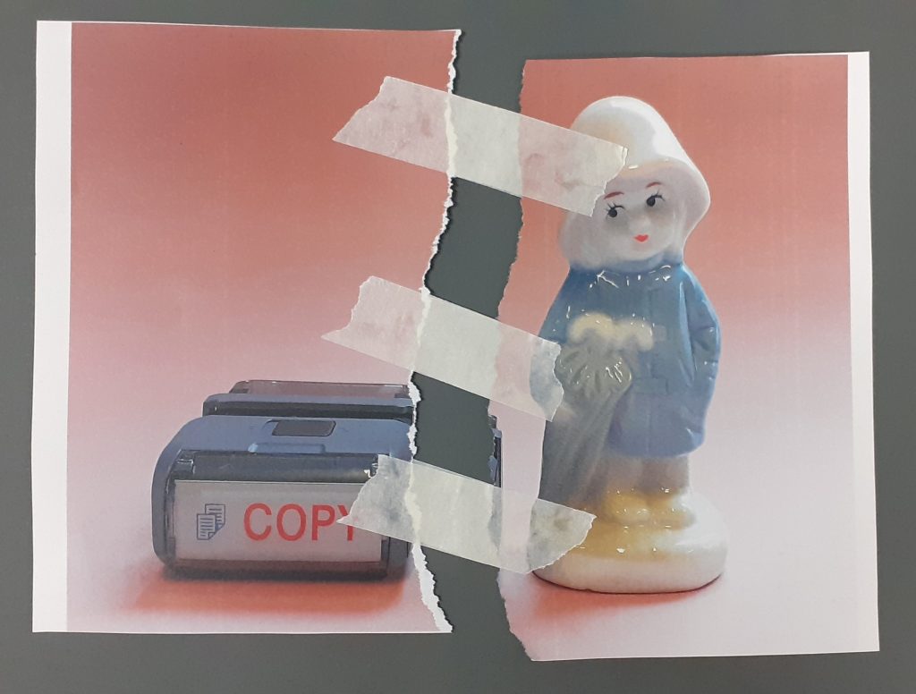
I was inspired by the idea of having part of the image come forwards away from the background. The concept for this collage came from the word ‘unbreakable’ and the angle of the figure laying down. I wanted to create a visual break in the image. I chose to do this by doubling up the figure and having half of her slightly mis-aligned and therefore break away from the original girl.

I used a scalpel and cutting mat to carefully cut around the edge of the figure in the lower image. I tore the remaining paper off, to give the ripped effect seen on the left and right of the picture. I used a photo with a dark background to help the outline of the figure show up. I stuck the 2 photos together, allowing a gap for the upper figure to lift off slightly. I then folded this part forward and then made another fold backwards, to ensure the figure was lifted slightly.

Vanessa Lamounier de Assis
Image from The Age of Collage
http://www.anyonegirl.com/vanessa-lamounier-de-assis/?posts-page=3#more-posts

Vanessa Lamounier de Assis creates paper models of semi- abstracted body parts. Her art talks about sexuality, consumer culture and beauty standards. Her pieces stand alone and have a solid look to them, despite being made from a light-weight material. She combines separate images within a single collage to create new meanings.

Phillipe Jusforgues and Vanessa Lamounier de Assis use tearing when manipulating paper for their collage. I took this idea further by allowing a section of paper to curl outwards. The tear creates an emotional impact because it disrupts the peaceful balance of the original photograph. The rough edge of the torn paper is in contrast to the pastel colours in the original photo, as pastel colours give a sense of calm within an image.

I was interested in playing with paper to create a solid-looking structure. This photo of the raincoat girl has a statuesque quality. For this reason, I wanted to emphasise this impression using paper. I cut around the figure, leaving the background attached at the bottom of the page, for added weight and therefore stability.

I folded the base of the paper figure, but it was not standing up. I then scrunched the paper to add more weight to it. This helped. I bent the bottom section upwards and pinched the upper half of the sculpture. This method brings the subject to life by creating an imitation of a statue or ornament. But made from paper, it looks more delicate.

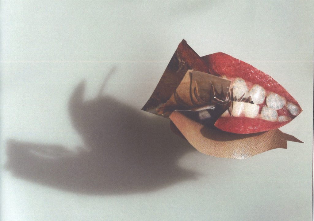
Another collage technique used by artists such as Bobby Neel Adams, is to tear or cut and image in half and piece is back with a separate image, therefore creating imaginary faces and scenarios. For this piece, I reassembled the paper using masking tape. The result is harsh looking and signifies repairing a broken object.

Andrew Lundwell

Lundwell’s use of tearing paper gives this composition an organic appearance. This is suitable for the natural themes within the photographs.

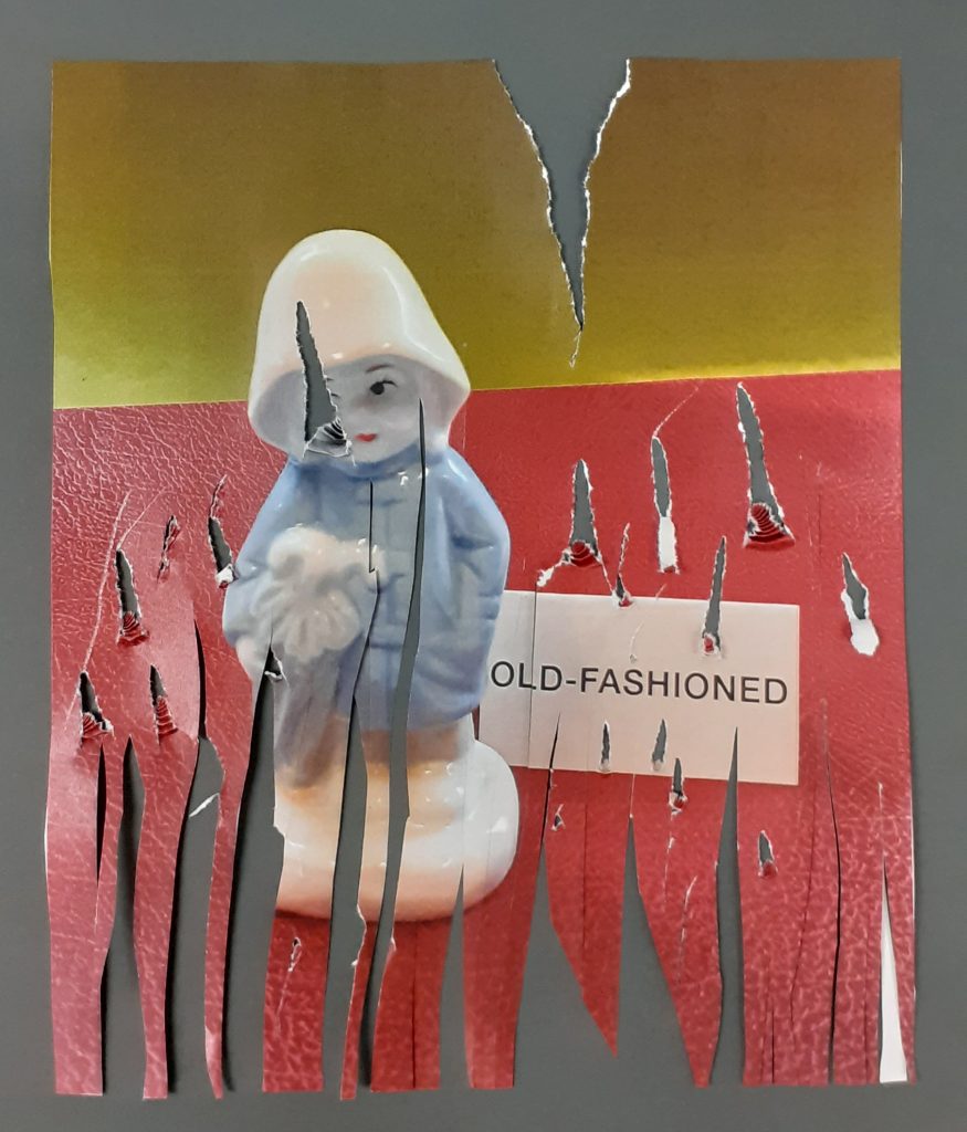
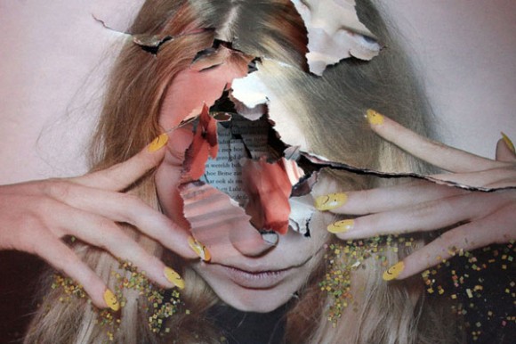
I wanted to create a worn, old look to this picture, to reference the phrase ‘old-fashioned’. I avoided making the words unreadable, because the word is a part of the meaning of the composition. I used scissors to drag and cut through the paper. Obscuring her face has the effect of making her appear damaged or affected. It has more of an emotional impact that if I had damaged only the background and avoided the figurine.

Artists’ work (unless stated otherwise) from The Age of Collage – Contemporary Collage in Modern Art by Silke Krohn

003 Artists & Words

I was interested in looking at how words can affect the meaning of an image or sign. Words are signs in themselves. To combine them with images can change the meaning completely, emphasise the meaning, or create a sense of irony and humour.

First, I looked at They Key of Dreams by Rene Magritte:

First, I looked at They Key of Dreams by Rene Magritte. In this painting he presents the viewer with a selection of different objects, divided by frames. The division gives us a sense that the artist doesn’t want us to connect the meanings between objects. The painted representations are detailed and realistic. Because of this, they could be considered icons.

A bag, a penknife, a leaf and a sponge are all common items. A sponge and leaf are natural, and the bag and knife are man-made. He then gives them inaccurate labels: Le ciel is the sky. L’oiseau is a bird. La table is a table. However, L’eponge is the sponge, which he labels correctly. In giving these objects different names, the viewer is led to question the use of the object and whether there may be some resemblance between the object being named and the object pictured.

Is a bag open like the open sky? Is a bird’s beak sharp like a knife? Could a leaf possibly be used as a table? Or are tables made from the same tree as a leaf comes from? The contradictions make for an interesting piece. They make the viewer think, and I really like that.

Brian Rea

Brian Rea is an illustrator based in Los Angeles. His drawings and animations are playful and easy to understand. His style can be decorative but not overworked or garish. I like his restricted colour palette and hand-drawn lines. Several of his illustrations incorporate words. With few words he is able to say a lot. And this is because of how he has used the words.

(All images from BrianRea.com)

In this first example, there is the element of needing to know some background knowledge. A symbol is a sign that communicates a concept. In this instance, Rea is referring to social media likes. He signifies this without needing to draw a phone or computer screen. The words and the thumbs up icon are enough to reference the social media structure to an audience who has knowledge of social media programmes.


With this image, you would need to understand written English to be able to understand the message.

When viewing this piece, the viewer is putting together the meaning in their mind. The words and images here are of equal importance to communicate the meaning.

I then thought of words I could associate with my chosen object, The Raincoat Girl:

I cut out the labels and placed them next to the figurine. I wanted to see the effect of adding words and what I could be signifying, with the addition of these words.

The sign ‘Waiting’ suggests a narrative. The figurine is holding 2 umbrellas. The viewer can add together these 2 signs and decide that The Raincoat Girl is waiting for somebody to arrive.

I noticed that I saw the figurine in a different light depending on these captions. For instance, her expression looked more bored when she was placed next to the ‘Waiting’ sign and looked defiant when placed next to the sign that says ‘Unbreakable’. Am I imagining this? What do you think?

003 Artists & Objects

In our minds, objects have associations. Some we may not consciously be aware of.

From the book What Objects Mean by Arthur Asa Berger (above image):

“From a semiotic perspective, nothing has meaning in itself; an object’s meaning always derives from the network of relations in which it is embedded.”

“We always have to determine what an artifact signifies and cannot find a “rule” book that explains the significance of every artifact, just as we cannot find a dream book that explains the meaning of every dream.”

Artist Research

After reading about the significance of objects as signs, I wanted to explore a bit about how artists use objects within their art. How do they use objects to convey a message to the viewer? Can 1 object signify more than one thing? How about combining objects?

I came across these artists in my research:

Pawel Bownik

https://fotoblogia.pl/703,fotograficzna-roku-wyniki

Pawel Bownik is a visual artist from Poland. He combines materials, playing with a contrast of plants (organic matter) and man-made adhesive materials. First, he breaks the plants apart. He then uses different objects to glue them back together. He appears to be ‘correcting’ nature. Taking a plant that is whole and perfect and re-assembling it using objects that humans have created.

These photographs are from his book ‘Disassembly’.

The photos demonstrate the potential of objects, in this case, rubber bands. He also uses wire, plasticine, sticky tape, and thread. By contrasting them with nature, he leads us to consider the use of objects we see every day.

In this composition, the plastic could be protecting the plant or choking it. This type of packaging is used to protect the objects we order to our house, but once we have discarded the object, it becomes the opposite and is a burden to the environment.

Diana Lelonek

Diana Lelonek | Sapporo International Art Festival 2020 (siaf.jp)

Diana Lelonek is an artist also from Poland. She looks at the environment, but in a more straight -forward way.

Her project A Center for Living Things, is a cross between art and scientific research, which grabbed my attention. The work is a collection of found objects, from shoes to plastic and electrical items. The objects were found at illegal dumping sites. She then displayed them, (naturally covered in plants and moss), to explore the idea of  what happens to an object after it has been discarded.

In this example, the circuit board is no longer useable to us. Instead, it has become a small ecosystem and is home to plant life. The work made me think about the life-cycle of an inanimate object.

Kitsch Nitsch

https://trendland.com/kitsch-nitsch-digital-illustrations/

Kitsch Nitsch is a creative partnerships of two artists. They explore style and decoration within design.  

Artwork by Kitsch Nitsch

In this piece, they have assembled a group of objects into a composition. The objects placed together, are given a new meaning. They become part of a paradigm that is the outfit; In this case, of an imaginary person. The shoes suggest this character is male and an adult. The keyboard bag tells us this is a man whose work involves using a computer. The gloved lady’s hand looks like an assistant handing him his bag. This signifies his importance. The use of bulldog clips signifies an office environment. The artist uses these visual clues to build up a picture for the viewer. Each object on its own would still be a sign, but I am interested in the way these objects together combine into a picture and message. 

Marcel Duchamp

Marcel Duchamp | IMAGE OBJECT TEXT

Marcel Duchamp was one of the key Dada artists of the early 20th century. The readymade artworks of the Dadaists were new and revolutionary at the time. The audience were not sure what message to take from these pieces.

Bicycle Wheel, 1913 Marcel Duchamp (authorised reproduction 1951, original lost)
 
To me, the kitchen stool acts as a stand to display the wheel. Being displayed as such, might allow a viewer to appreciate the object itself. In this context, we consider the wheel apart from its bike.

Duchamp’s intention with Bicycle wheel was to express an idea using objects. He felt that the importance was the idea and not what a piece of art looked like. This contrasted with the fine art paintings he studied, where the importance was on aesthetics. Bicycle wheel was something fresh in the art world. It was interactive. Duchamp kept the piece in his studio and would occasionally turn the wheel.

Erik Kessels

The Clock Tower — ERIK KESSELS

Erik Kessels is a Dutch artist and designer. The Clock Tower is a collection of 2800 clocks, displayed in a former clock tower in Amsterdam. Here we have multiple objects displayed together. In my opinion, they look beautiful. By creating the clock tower, Kessels has made a space where the viewer can spend time immersed in the world of clocks.

Clock Tower, Erik Kessels

Kessels brings the clock to our attention. From this photo, we can see the combination of styles he has found. The clocks on the right-hand side remind me of an old-fashioned and serious character who would have this kind of clock in their home. The clocks on the left-hand side suggest the opposite character, people who are young and bright. Each clock would belong to an individual. (We only need one clock to a room) This piece sparks my imagination and leads me to wonder about the many different personalities on display.