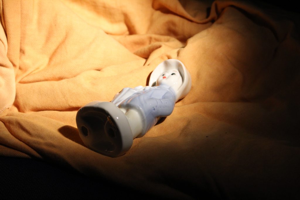
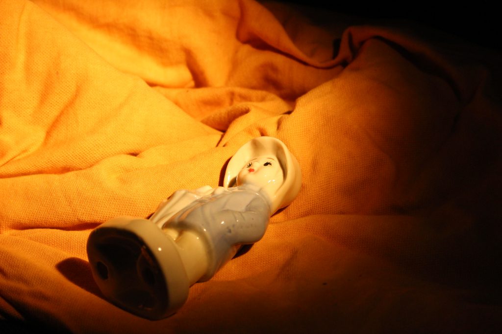
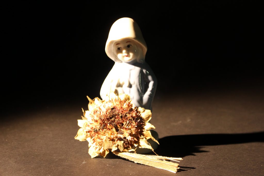
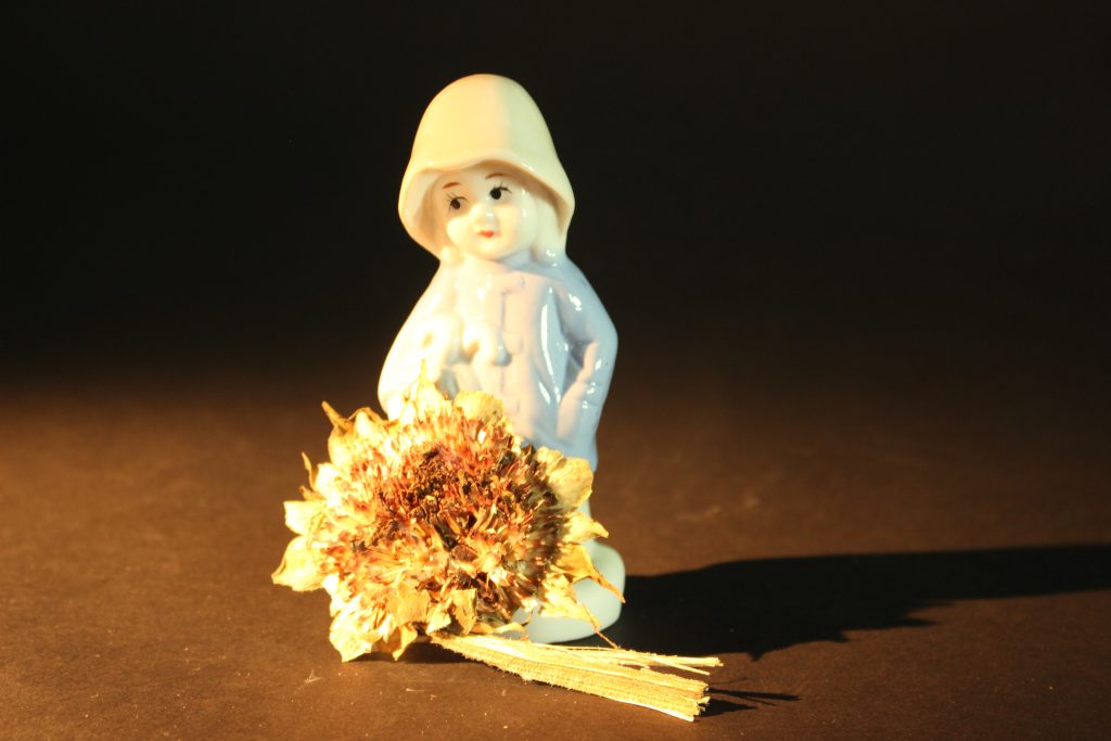
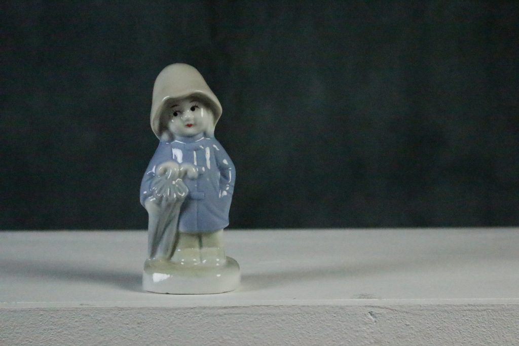
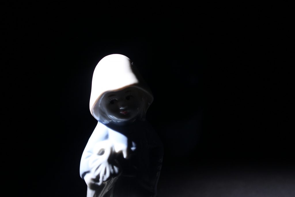
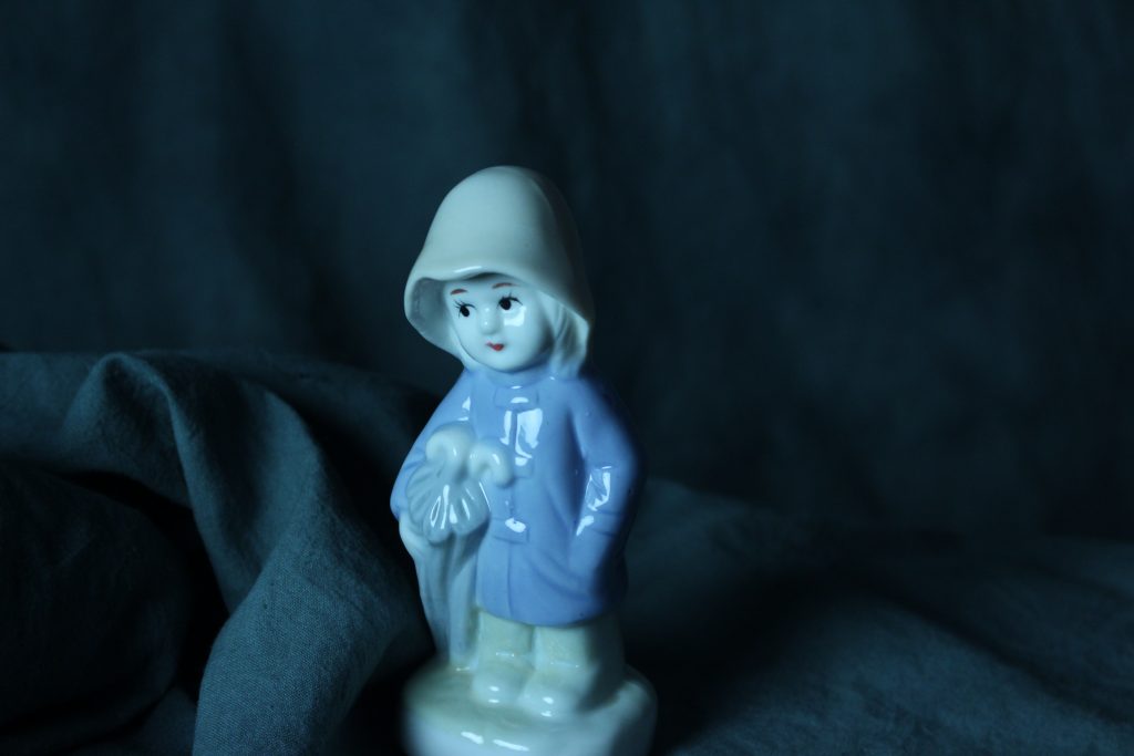
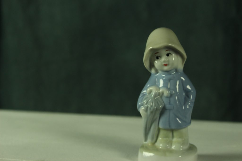
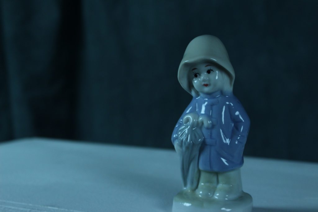
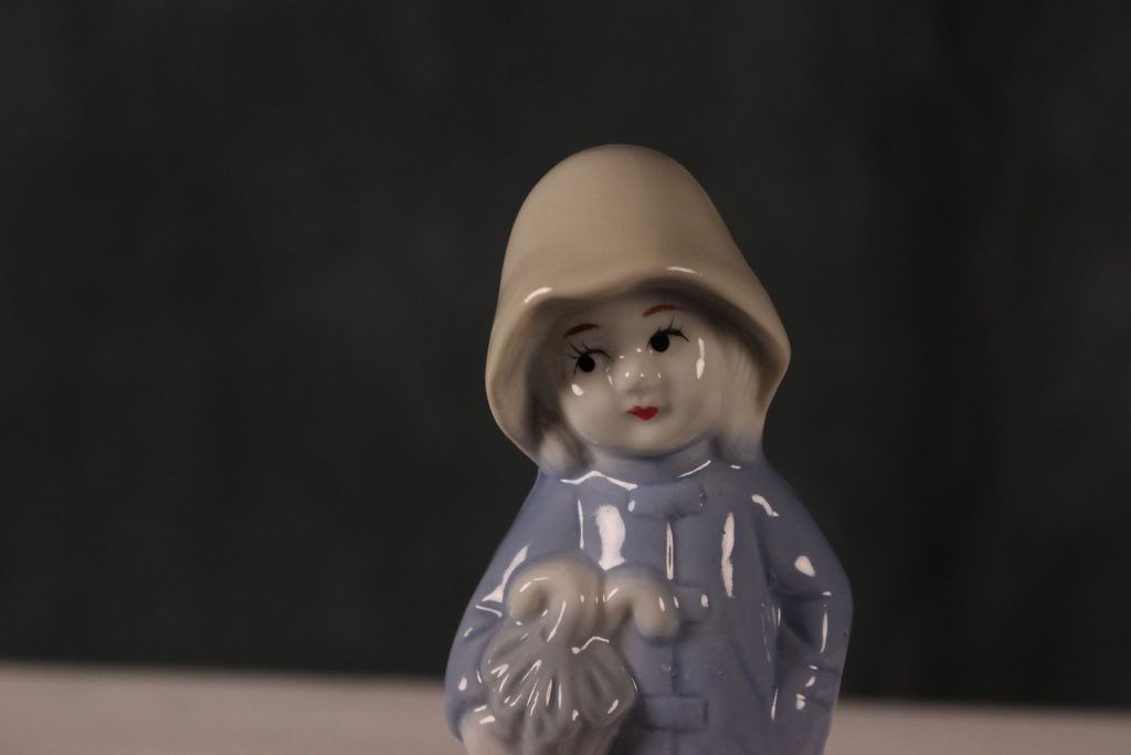
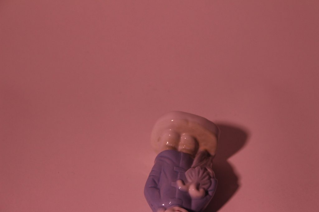
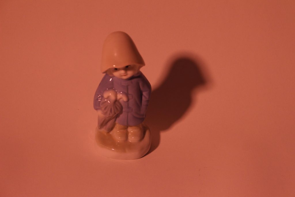
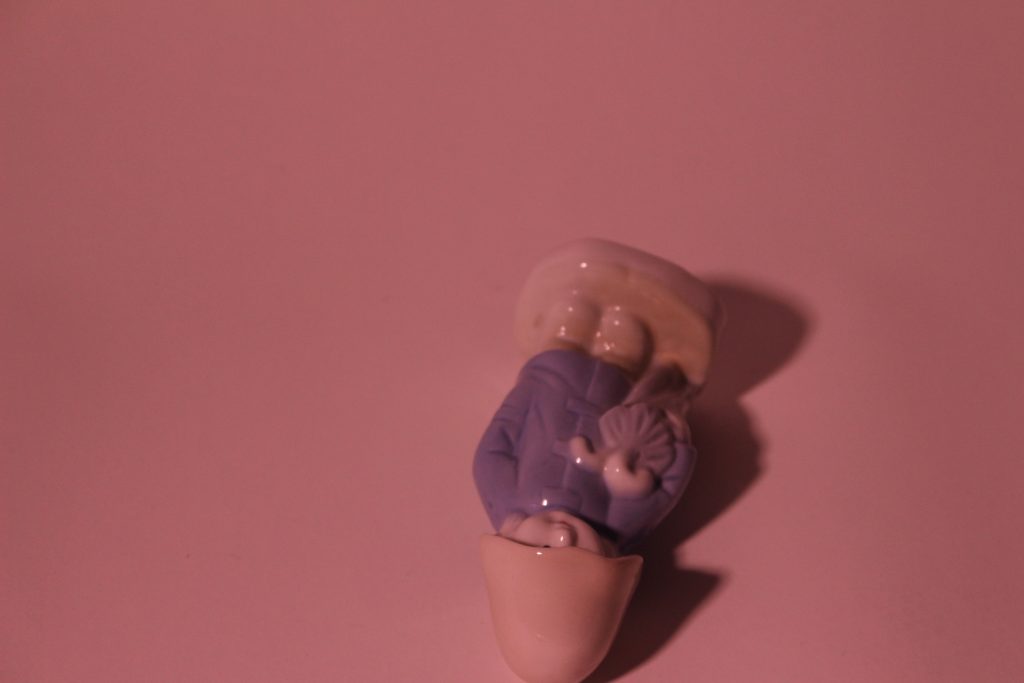
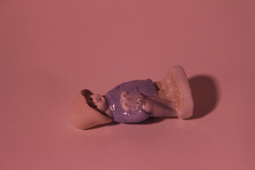
Part 2 of the photography workshop blog is , of course, the photos!
These were all taken on the Canon 600D digital camera. I have not edited any of these. My next step will be to edit them in PhotoShop and see how I can improve them and in some cases, maybe create a different effect to give them a new meaning.
I was pleasantly surprised with the difference in quality between my phone camera and the DSLR camera. These photos need to be edited to get the best out of them, but already I can see a depth that just is not possible with a phone camera.
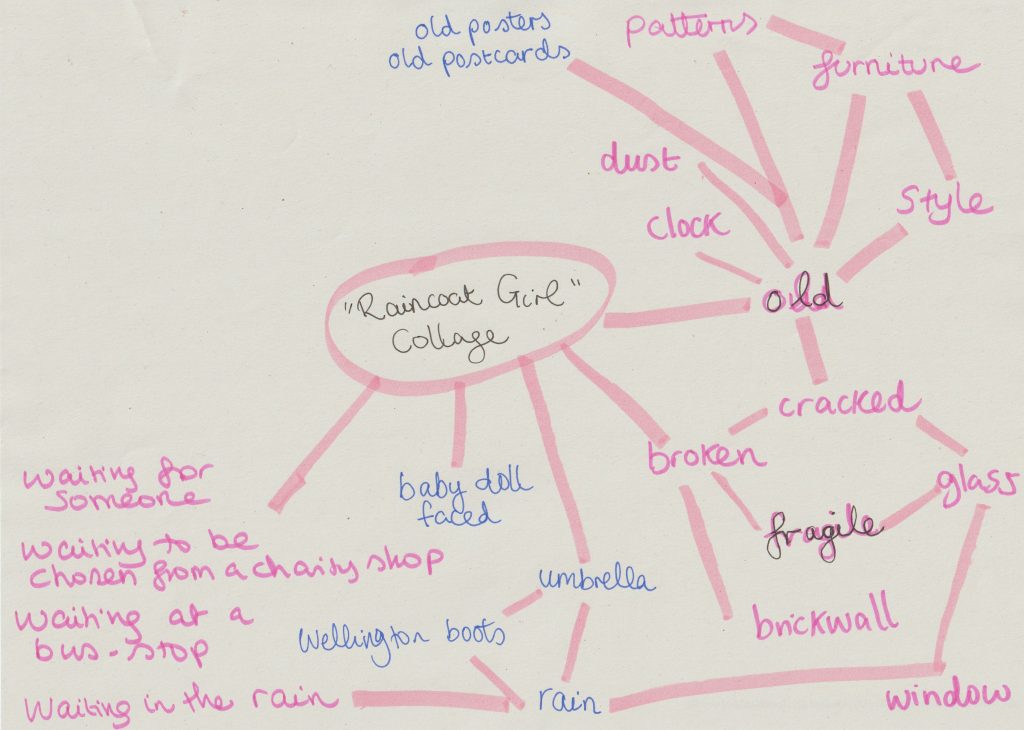
When faced with the task of collage-making, my mind was buzzing with ideas. The problem was, I had too many ideas. I decided it was time for a mind map.
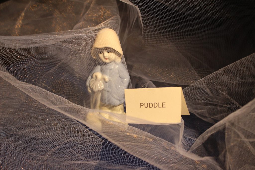
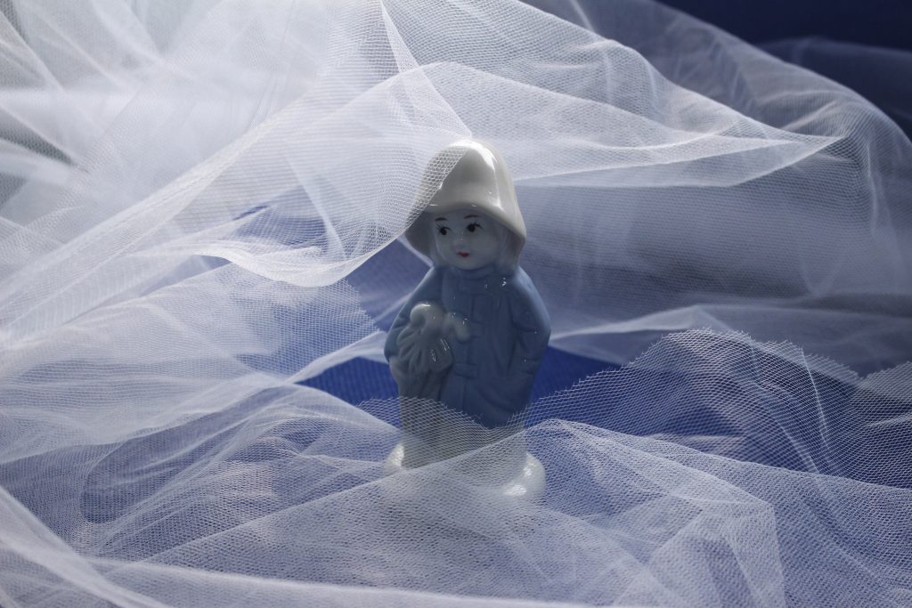
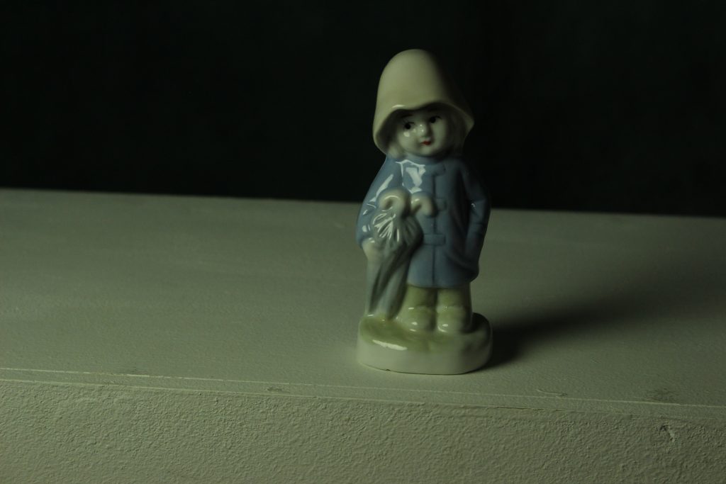
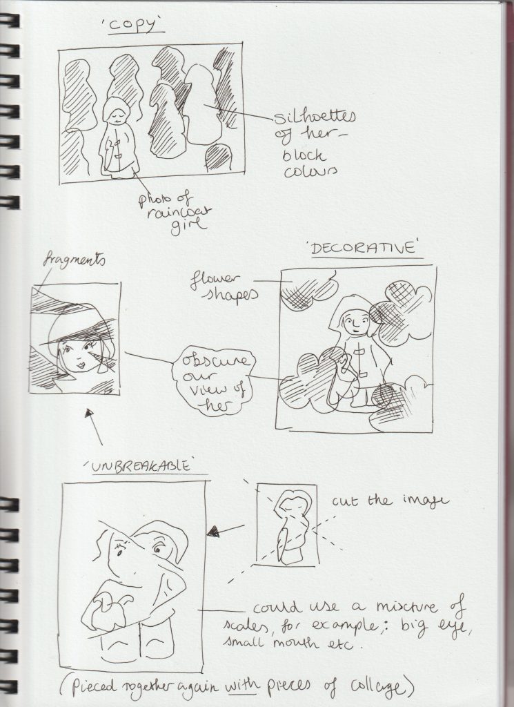
After looking at Jelle Martens collages, I thought about using shapes within my own collages. I thought about obscuring my object ‘The Raincoat Girl’. I drew quick sketches to get my ideas down onto paper:
From my artist research, I found I prefer the more simple collage designs. I didn’t want to over-complicate my collages and have them look visually noisy.
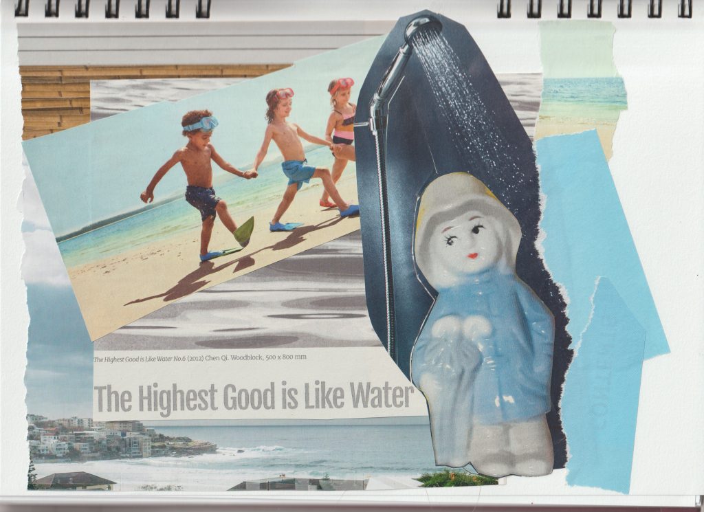
I used some magazine images but found it easier to source images from the internet and use my own photos.
Printing photos from my computer also meant I had the option of editing my pictures to suit the artwork and contribute to the message I wanted to create. I could also resize the images and therefore use more creativity. Magazine images can be restrictive but also trigger new ideas due to the spontaneous process of flicking through unknown pages.
All collages are A4 sized.
For this collage, I used images from magazines and my printed out photo of The Raincoat Girl. I tore the paper at the edges to create some texture.
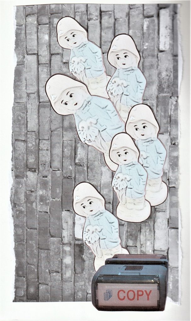
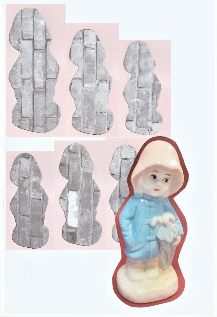
For this collage, I used a photo I took of a brick wall and converted into black and white. I edited the image of my object to make her look more 2D. My concept for this image was mass production of objects.
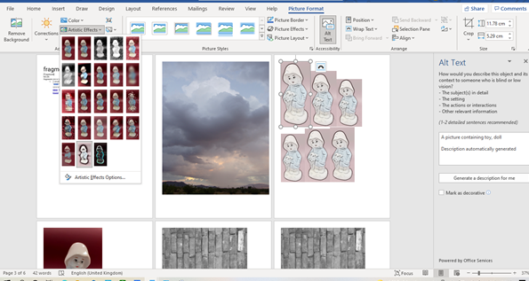
I used Microsoft Word to edit the photos. For the image of the repeated figure, I clicked ‘Picture Format’ > ‘Artistic Effects’.
I used the outlines of the figures in the previous collage, to give the impression of a mass of face-less figures. The Raincoat Girl stands apart from the others, facing in the opposite direction.
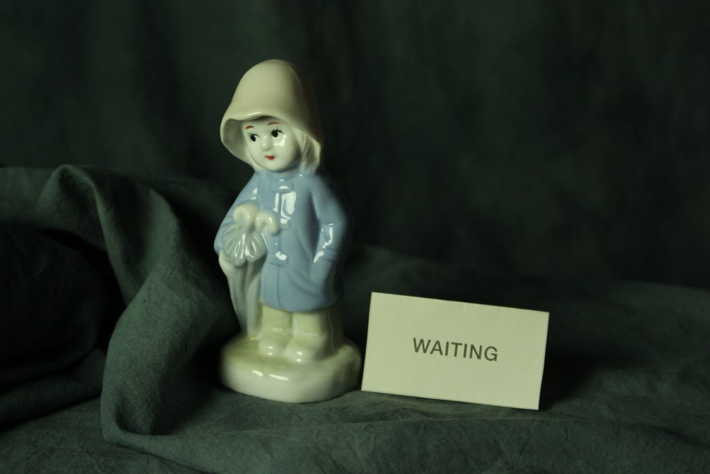
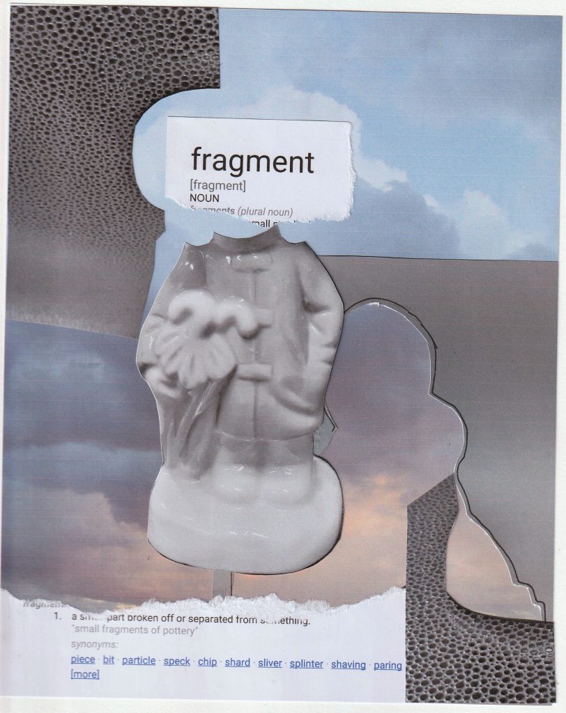
I wanted to use words within a couple of my collages. I wanted to see if words would strengthen the message, compared to a collage where I use no words.
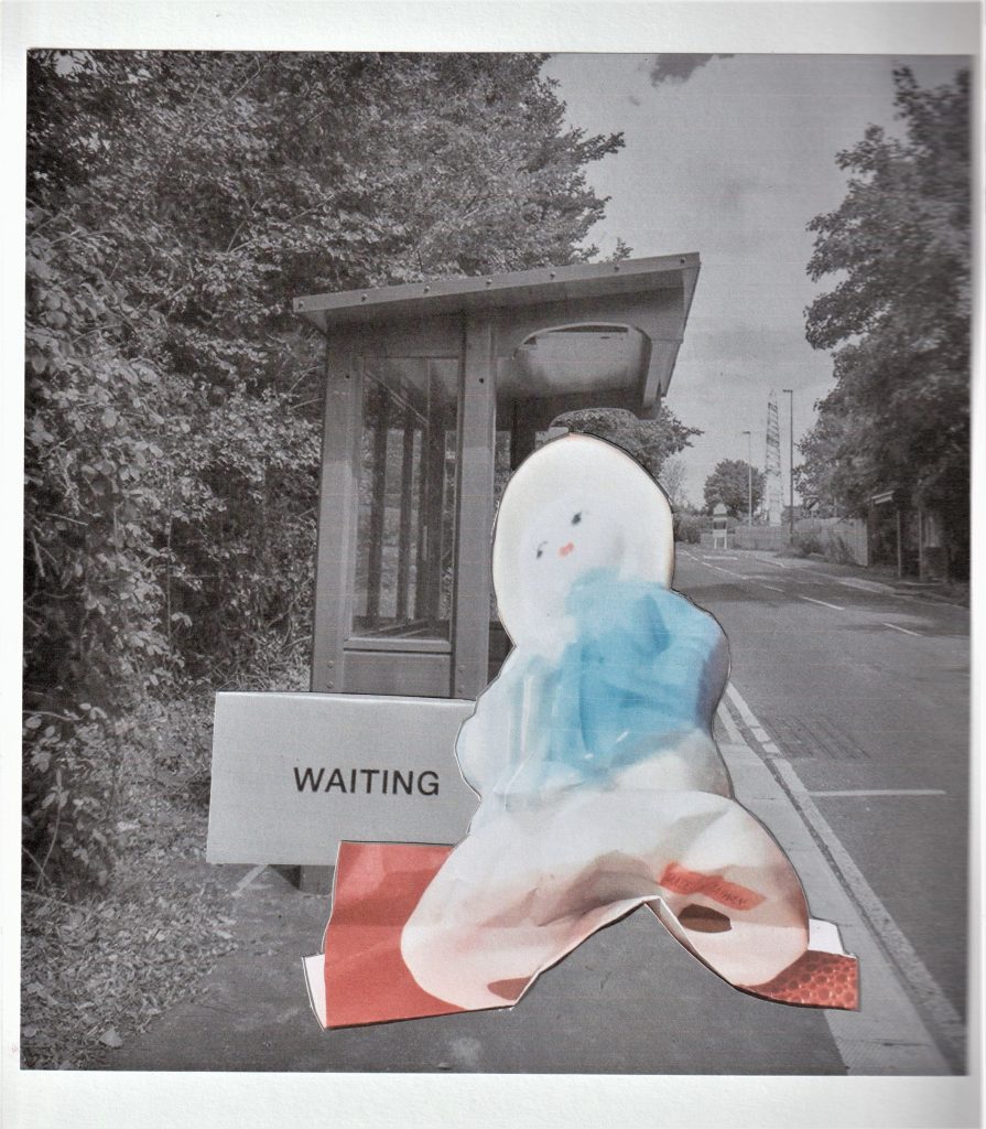
For this collage based on waiting, I used the photo of the 3D collage I made in the previous week. The squashed effect makes her look deflated and bored. I used a photo from the internet of the bus stop. I edited the bus stop image to give it a softer feel and less colour. The red in this collage symbolises the anger that boils under the surface when you have to wait.
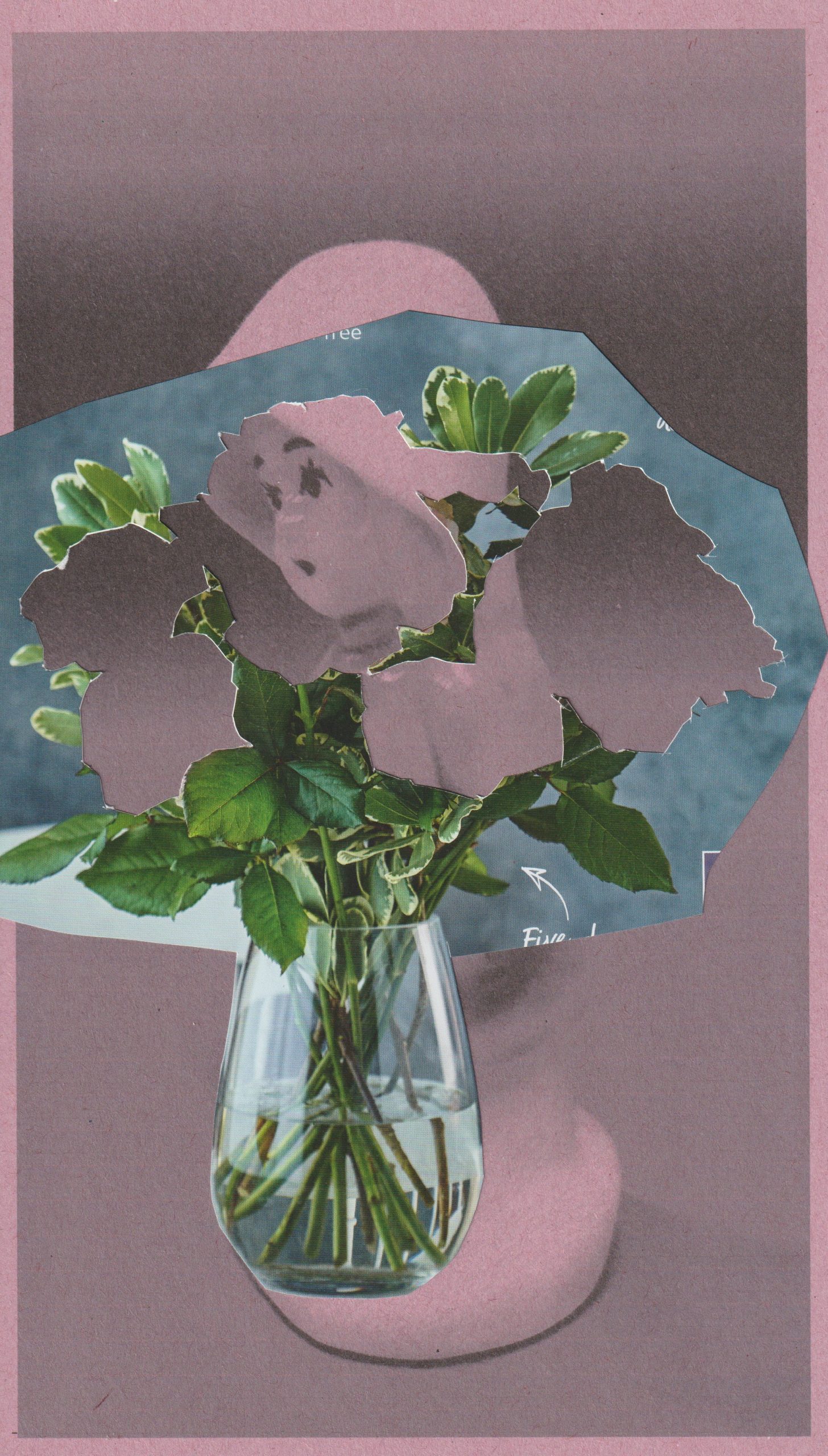
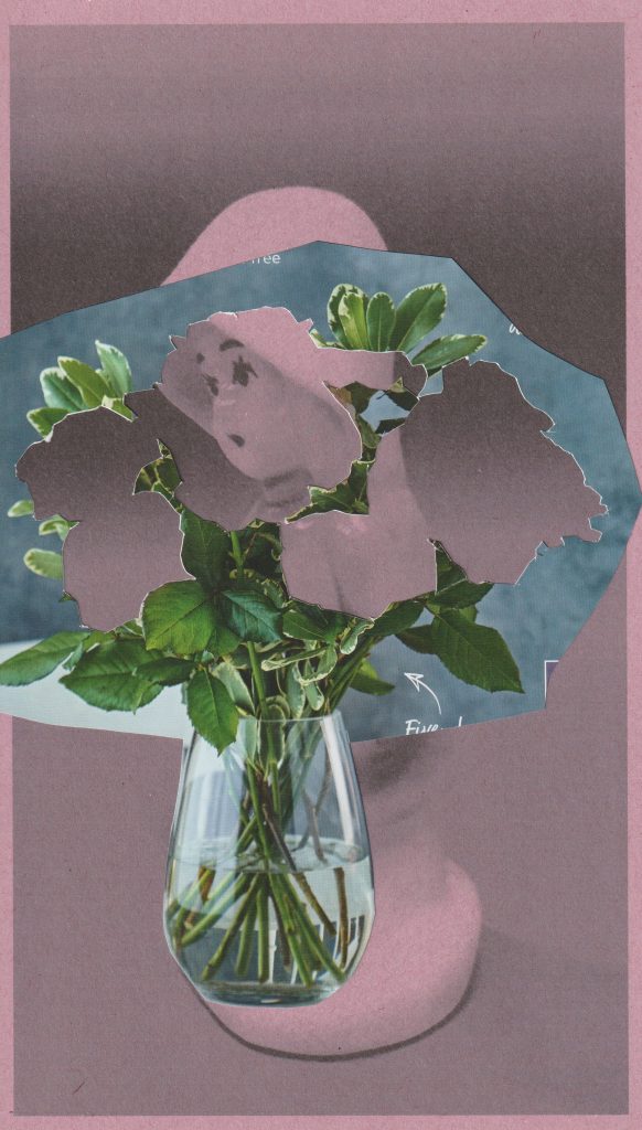
For the collage below, I experimented with printing onto sugar paper. I placed pink sugar paper in my printer and printed the black and white photo onto it. I think the sugar paper created a softer looking image. This was what I wanted for the subject of flowers, as petals are soft. In this collage, The Raincoat Girl echoes a flower.
Inspired by John Stezaker, I wanted to dry interesting layering within a collage. In this image, the flowers symbolise the nature of being decorative. This relates to my object, which was manufactured to function as a decoration only.
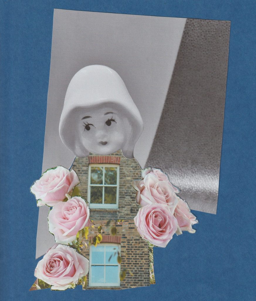
In my final collage of the day, I used blue card as a backdrop and magazine images in the foreground. The glossiness of the magazine paper complimented the mat quality of the blue card. I wanted to play with the idea of optical illusion. An image that can be viewed in more than 1 way.
Placing the window in place of her heart, symbolises her emotional openness. The brick walls are her emotional boundaries. On the other-hand, we could be looking at a house who has a personality. The feeling of arriving home and feeling like you are being hugged by your house.
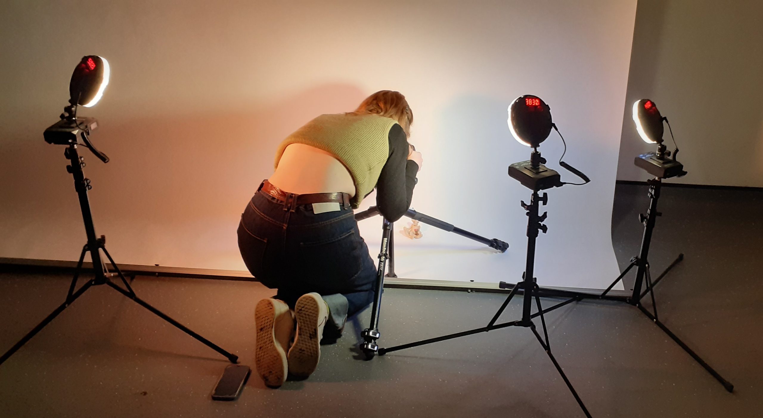
Having studied photography briefly in college, I had a basic understanding of DSLR cameras. Today we had 3 hours to be introduced to photography and capture our objects using a variety of set-ups. This was a fast-paced session, packed with lots of information.
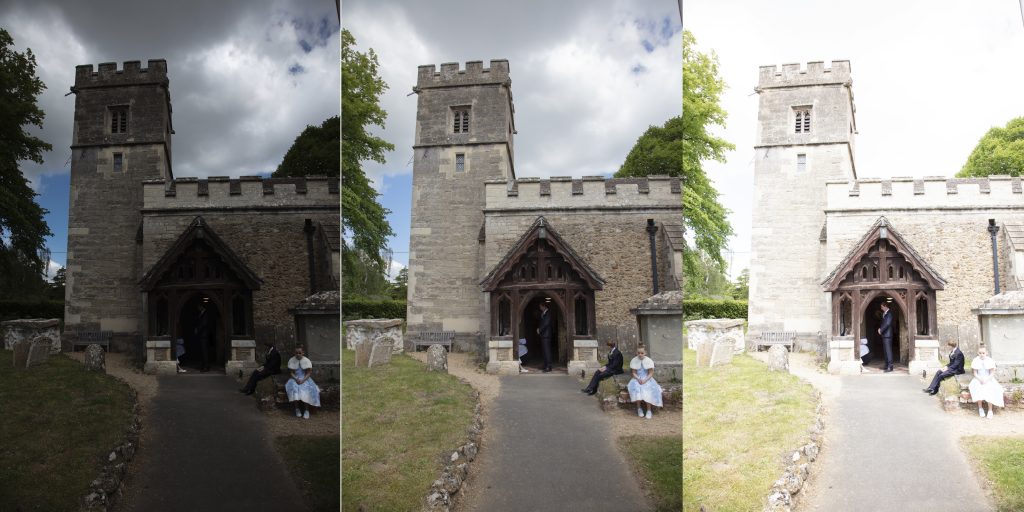
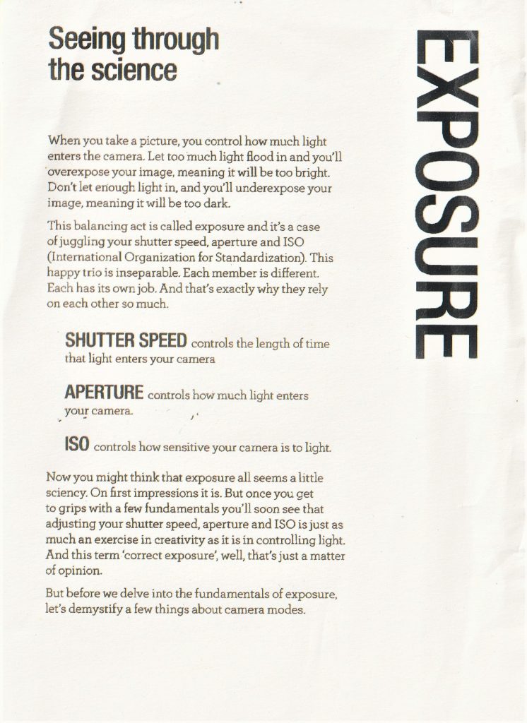
Our lecturer Hannah explained that the camera is a machine that takes in light. As a photographer, our job is to control the light going into the camera. This is done using shutter speed, ISO and aperture. When you alter one of these, it affects the other 2 settings.
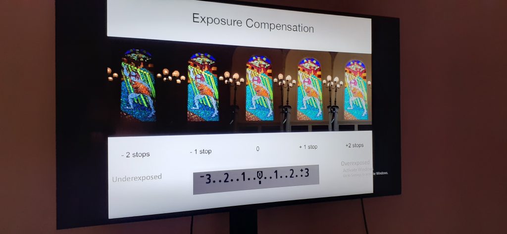
Letting in too much light makes an image over-exposed and too little light creates an under-exposed image:
We learnt about a camera feature I had never heard of, called exposure compensation. This is used to balance the light in an image when a scene has very dark and very light areas, for example, when a scene is lit from behind.
With analogue cameras, the ISO can only be changed by changing the whole film to one with a different ISO rating, but digital cameras allow you to change the ISO from shot to shot. A good ISO for a cloudy day would be 800 and for a sunny day would be 100. A low ISO gives a smooth grain, as the camera is letting in less light. Using a high ISO will give you more noise, though you need to use a higher ISO when shooting in a really dark room for example.
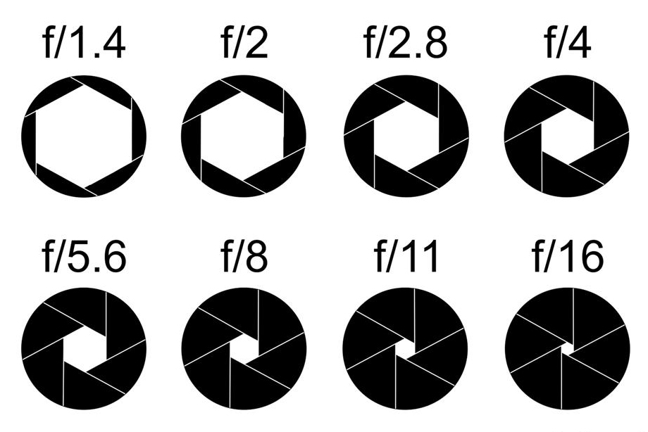
Aperture refers to the size of the opening of the camera. A smaller opening = a high aperture, for example f/22. This would be suitable for photographing landscapes. This gives a larger depth of field, meaning that the camera is able to focus on foreground, mid-ground and background. A larger opening, and therefore low aperture, such as f/4.5, is best for portrait photography. A low aperture focuses on the foreground and these photos will have slightly blurry background.
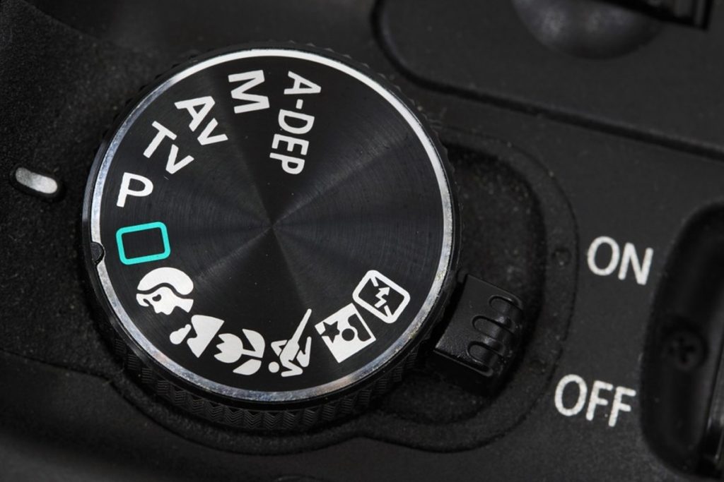
Hannah explained features of the Canon cameras we use at Brookes:
Tulip symbol = macro (to capture tiny details)
Running person symbol = shutter speed
Flash symbol = night time/ low light shooting
M=manual function
AV= aperture priority
TV=shutter priority
MF/AF= manual focus/automatic focus
RAW for very large photos, e.g. the side of a building. They take up a lot of memory and you cannot process RAW images inside photoshop. You would instead need to use a RAW converter, such as Adobe camera RAW.
We learnt to work with tripods, which is something I had never done before. Using a tripod is an important technique in photography. When holding a camera by hand, we have a natural shake that can cause blurring in photos, especially when using a long shutter speed.
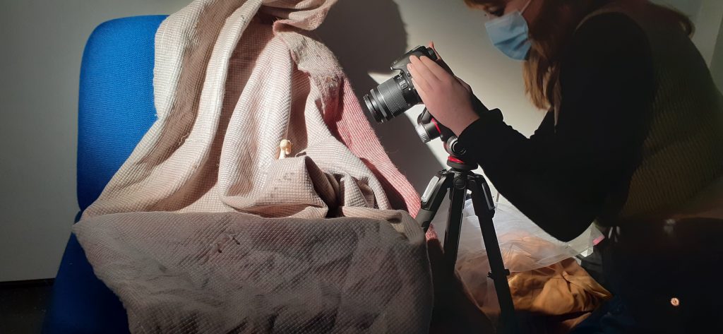
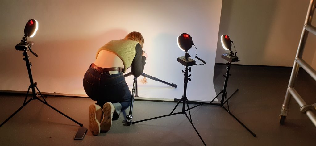
We used 4 different set-ups to photograph our objects. Working in pairs, we took several photos in 1 area, then moved to the next. For example, in 1 set-up we were using a chair draped in fabric and metal studio lights. These lights get very hot, so we used heat protective gloves to handle them. We had the choice of using one or both lights for a photo. Moving the bulb back and forth gave a spot-light effect or a more balanced light. We had the option to light part of all of the object.
My classmate photographing her object.
Another set up had a plinth and sheet hanging as a background. For this set-up we used studio lights with diffusers attached to the front. This set-up reminded me of a school photo shoot.
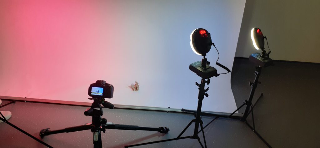
The 4th set-up allowed us to add colour gels to filter the light through. These were LED lights. They were the easiest to use, as the switches were the same on the back to 1) change the warmth of the light and b) change the brightness to lighter or darker.
LED light set-up gave us the option of using colour filters.
Classmate using the set-up.
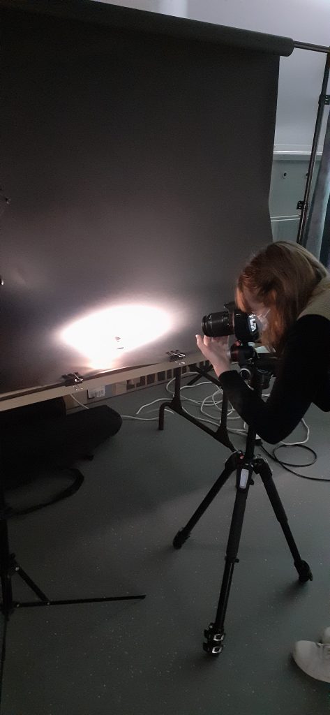
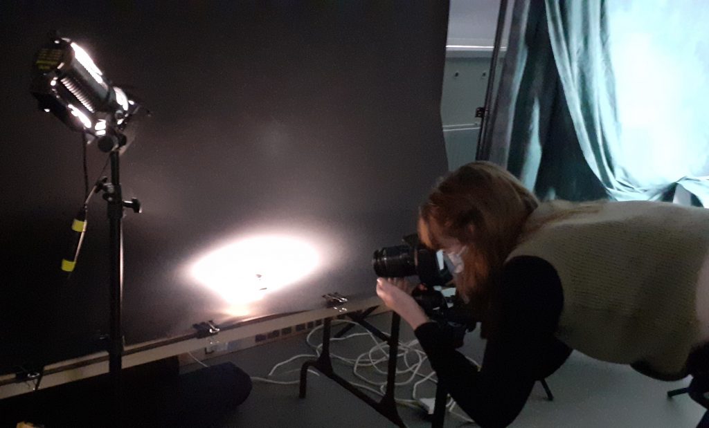
It was interesting to experiment with shining light onto the background and seeing the effect compared to shining the light directly onto the subject. The black background created a theater look and made dramatic photos.
Class hand-out
We use cookies on our website to give you the most relevant experience by remembering your preferences and repeat visits. By clicking “Accept All”, you consent to the use of ALL the cookies. However, you may visit "Cookie Settings" to provide a controlled consent.
This website uses cookies to improve your experience while you navigate through the website. Out of these, the cookies that are categorized as necessary are stored on your browser as they are essential for the working of basic functionalities of the website. We also use third-party cookies that help us analyze and understand how you use this website. These cookies will be stored in your browser only with your consent. You also have the option to opt-out of these cookies. But opting out of some of these cookies may affect your browsing experience.
Necessary cookies are absolutely essential for the website to function properly. These cookies ensure basic functionalities and security features of the website, anonymously.
Cookie
Duration
Description
cookielawinfo-checkbox-analytics
11 months
This cookie is set by GDPR Cookie Consent plugin. The cookie is used to store the user consent for the cookies in the category "Analytics".
cookielawinfo-checkbox-functional
11 months
The cookie is set by GDPR cookie consent to record the user consent for the cookies in the category "Functional".
cookielawinfo-checkbox-necessary
11 months
This cookie is set by GDPR Cookie Consent plugin. The cookies is used to store the user consent for the cookies in the category "Necessary".
cookielawinfo-checkbox-others
11 months
This cookie is set by GDPR Cookie Consent plugin. The cookie is used to store the user consent for the cookies in the category "Other.
cookielawinfo-checkbox-performance
11 months
This cookie is set by GDPR Cookie Consent plugin. The cookie is used to store the user consent for the cookies in the category "Performance".
viewed_cookie_policy
11 months
The cookie is set by the GDPR Cookie Consent plugin and is used to store whether or not user has consented to the use of cookies. It does not store any personal data.
Functional cookies help to perform certain functionalities like sharing the content of the website on social media platforms, collect feedbacks, and other third-party features.
Performance cookies are used to understand and analyze the key performance indexes of the website which helps in delivering a better user experience for the visitors.
Analytical cookies are used to understand how visitors interact with the website. These cookies help provide information on metrics the number of visitors, bounce rate, traffic source, etc.
Advertisement cookies are used to provide visitors with relevant ads and marketing campaigns. These cookies track visitors across websites and collect information to provide customized ads.