To start the year, I signed up for a 5 week printmaking course at City of Oxford college. It turned out to be 5 weeks of woodcut, which is a technique I have never tried before.
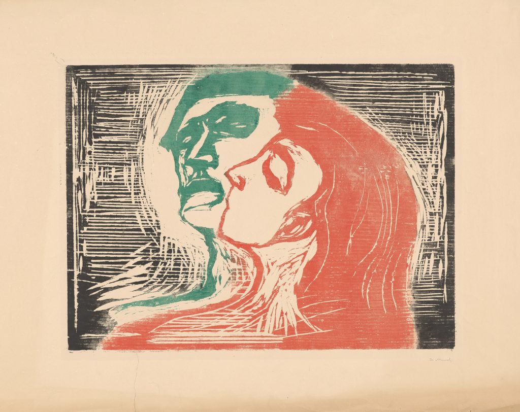
My first introduction to this printmaking technique was at the Scene Through Wood exhibition at The Ashmolean a few years ago:
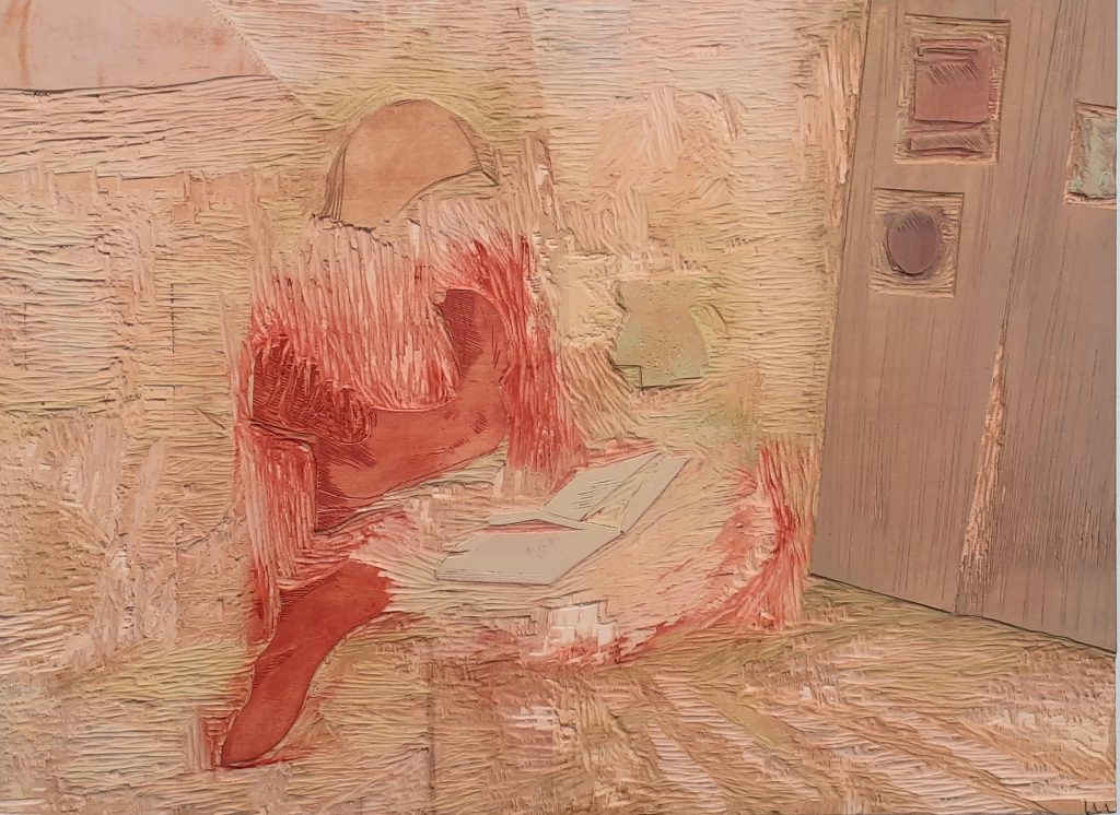
And the Interior Light exhibition last year at The North Wall Arts Centre, Oxford:
The artist included examples of her woodcutting technique on the plate itself.
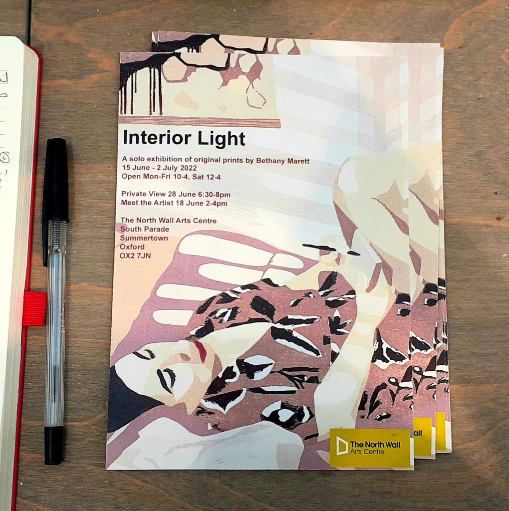
Leaflet of the exhibition.
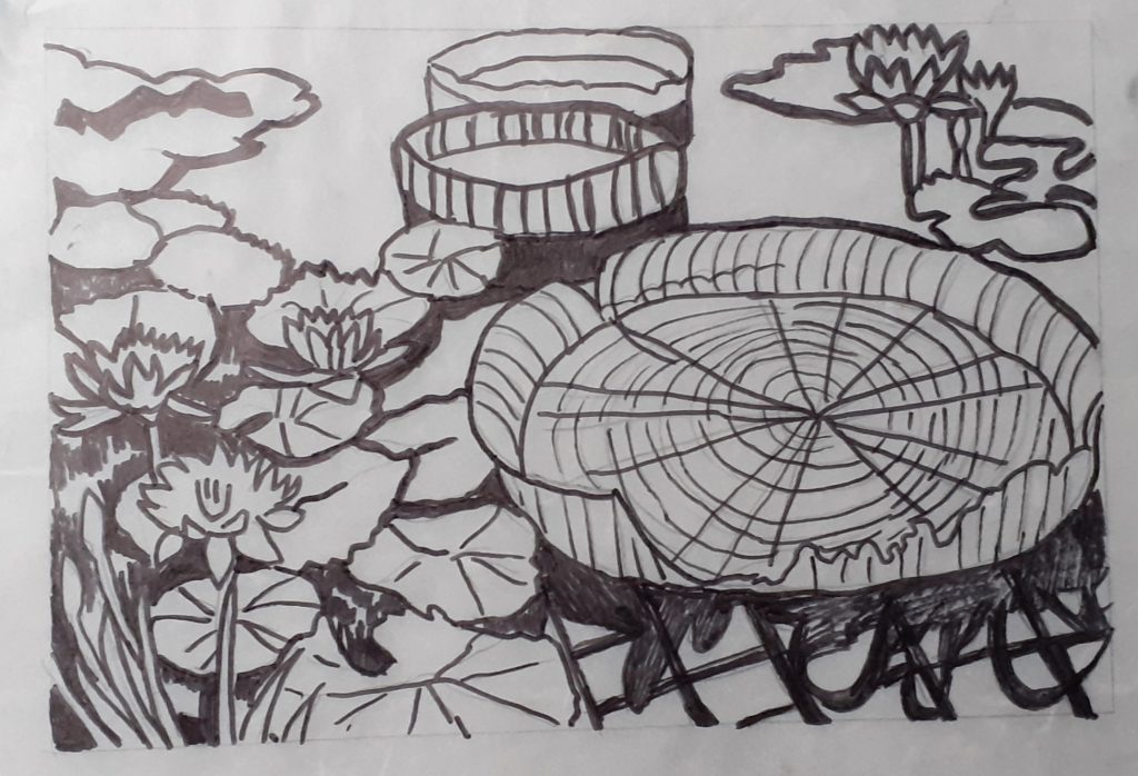
The begin our process, we needed to draw our designs onto tracing paper. I hadn’t come prepared, so I worked from a photo I had taken last year a the Botanical Gardens:
This turned out to be a bit too detailed and I also wanted to work on an abstract design, so I therefore changed my mind after the first session…
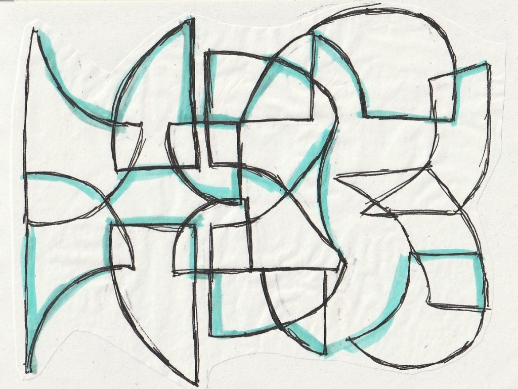
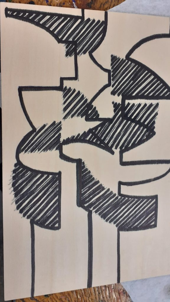
I sketched the lines I intended to carve (above).
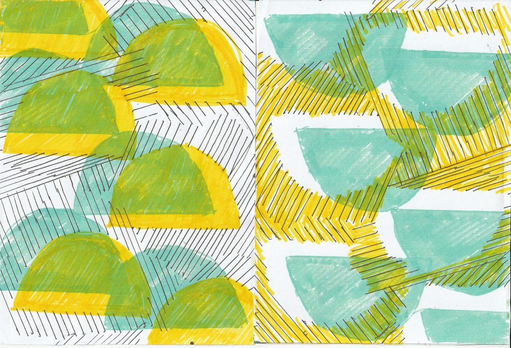
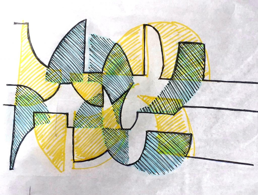
I considered how overlapping the layers would create new hues.
I cut shapes from paper and used these to construct the drawing. I could place them on the page and play with the overall structure to test out different variations.
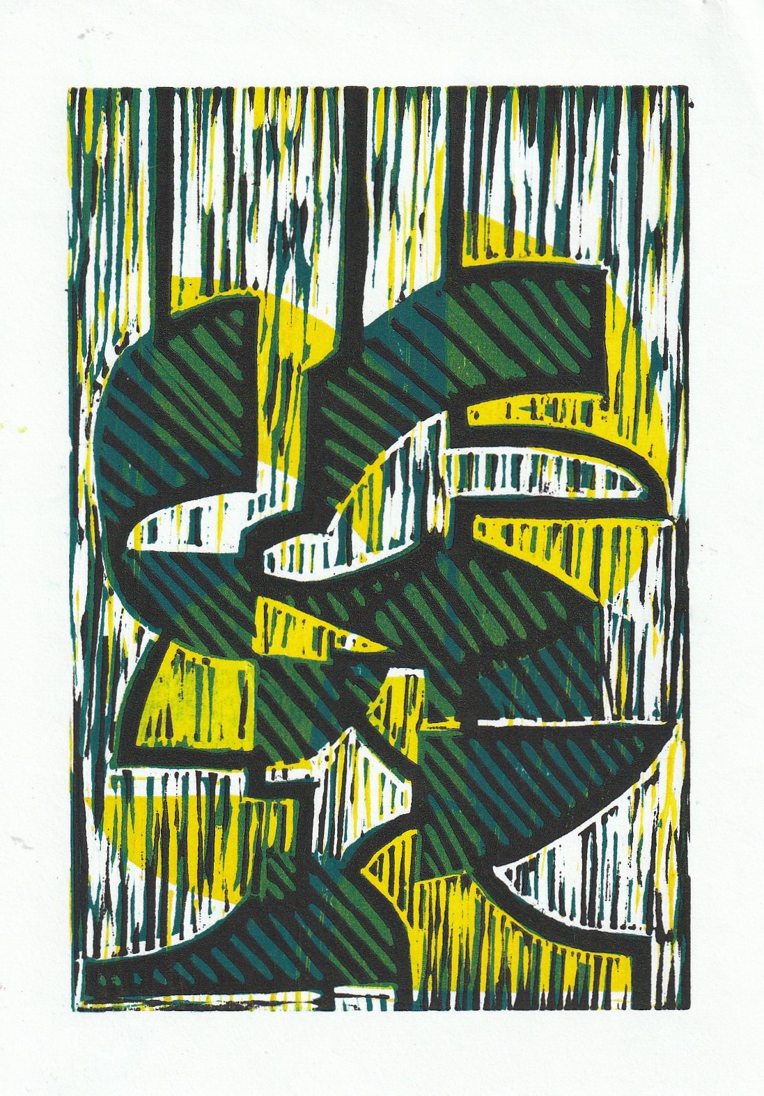
I planned to print 3 layers. One black (the key plate), one yellow and one blue.
Week 2
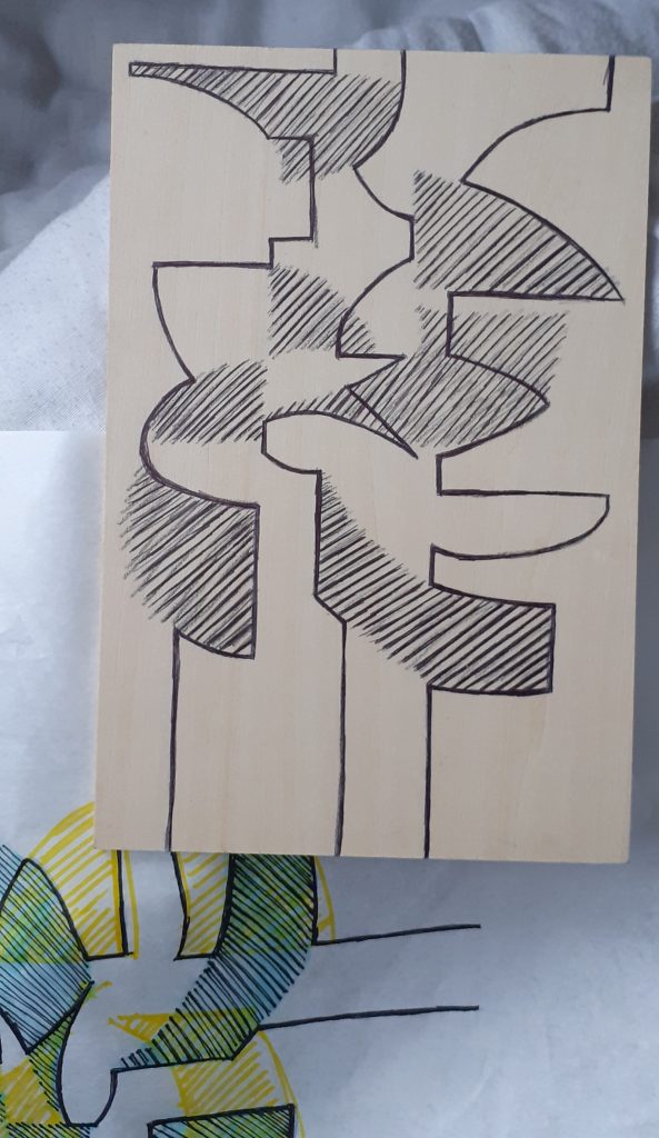
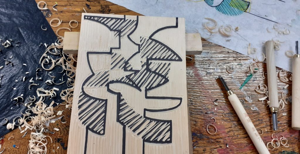
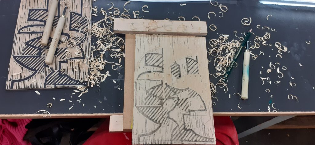
The black layer would need to be printed last. It would become the most detailed layer. I sketched the design onto the wood:
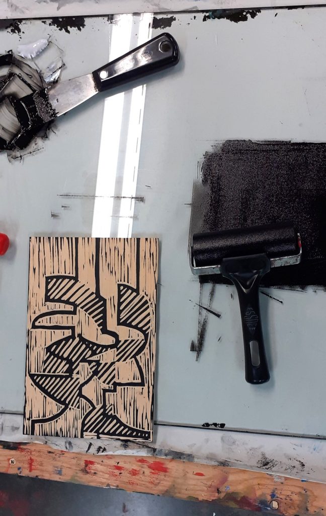
I then needed to remove every area that was not the black area. Carving was not as smooth as cutting lino, but I did get used to it. I found that I needed to keep the lines quite thick.
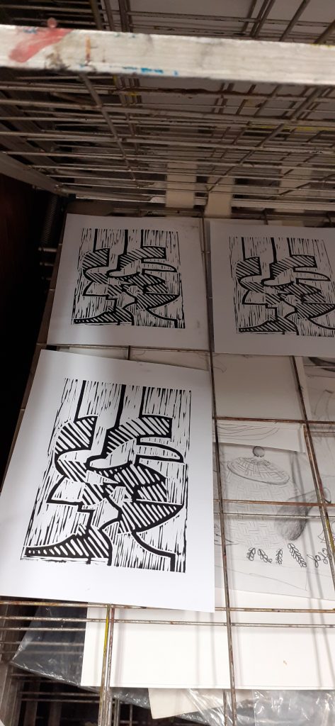
I printed this layer first. This allowed me to make any corrections had I needed to. It also allowed me to create the second plate using the back of the wood and another piece of wood.
Week 3
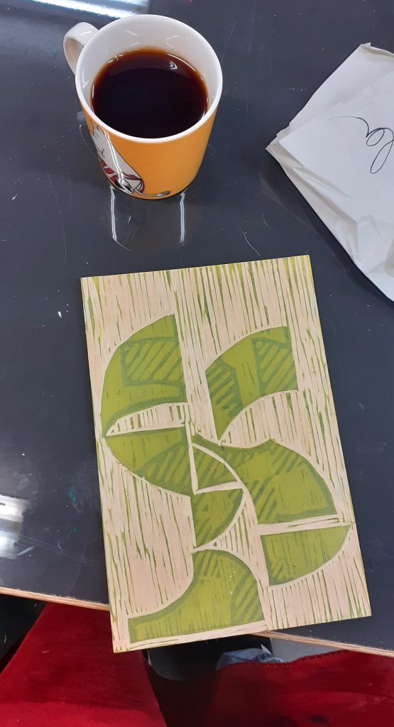
This session began with more carving, then I was able to print my first coloured layers:
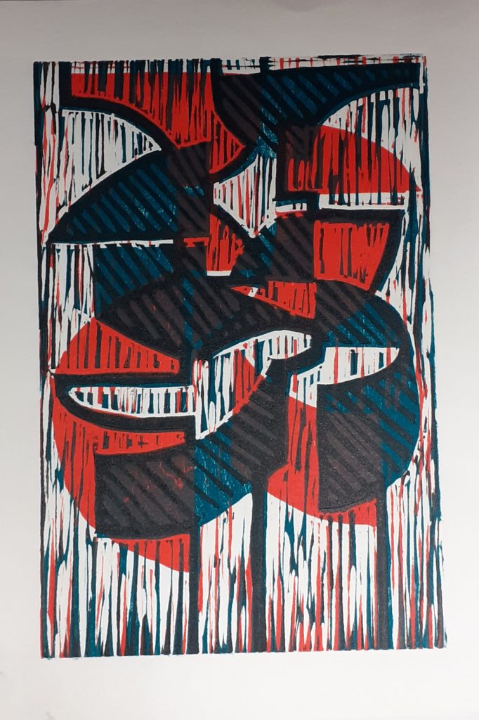
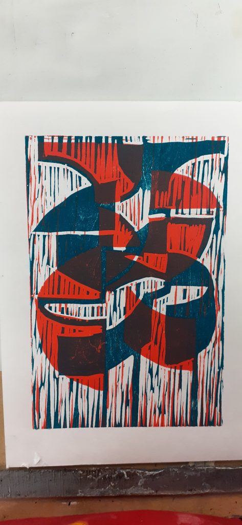
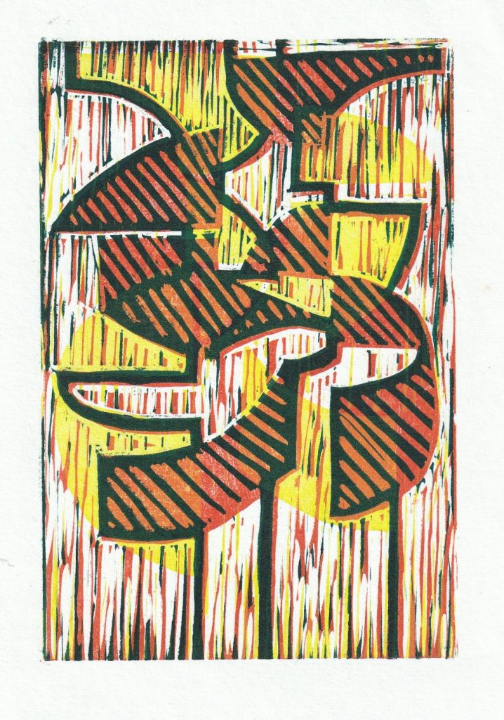
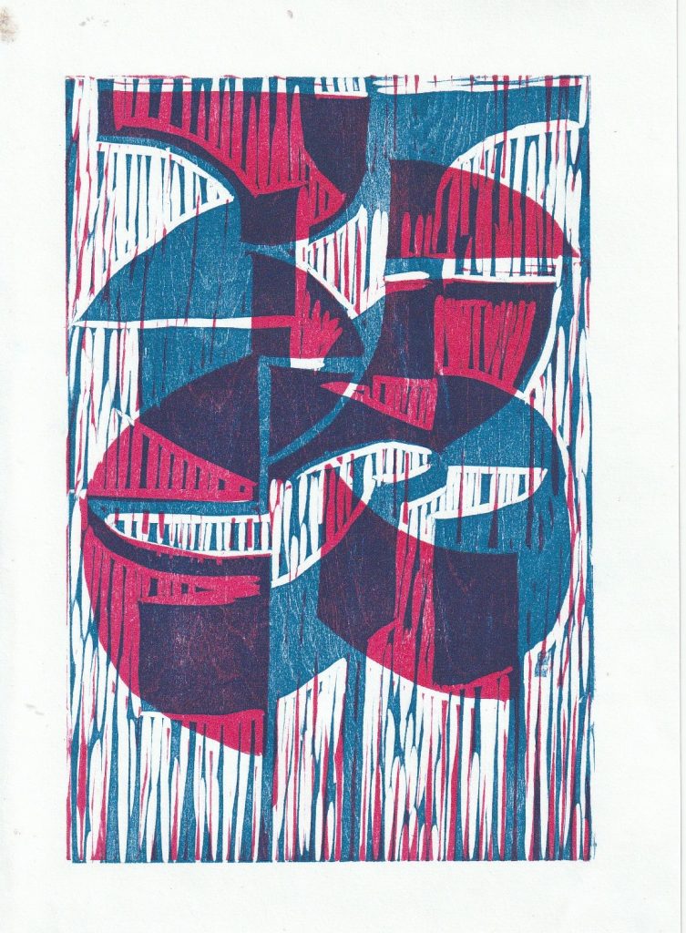
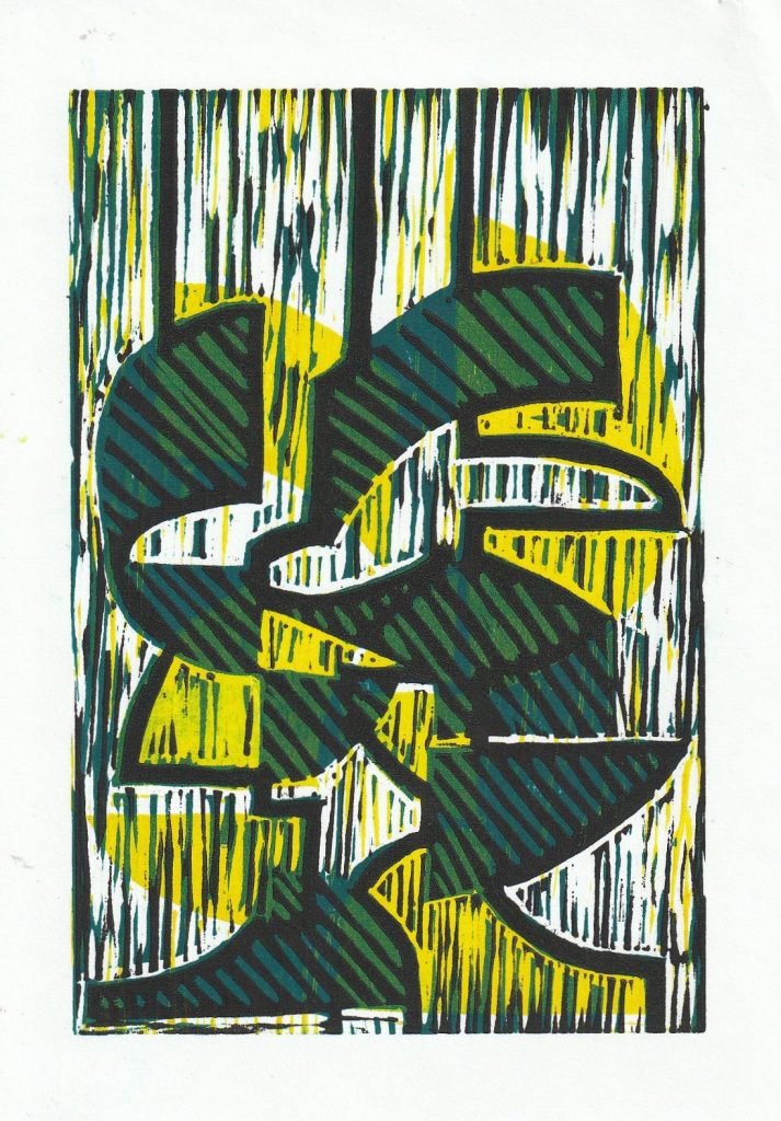
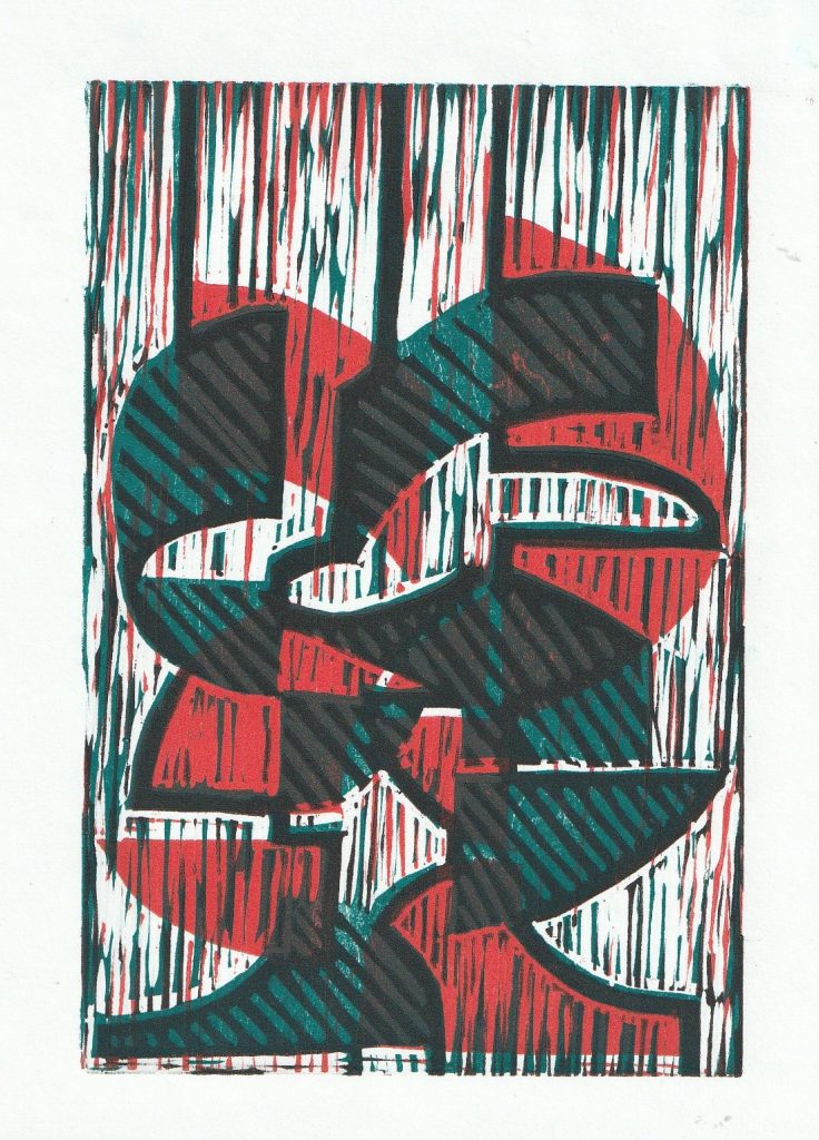
Layering the coloured layers produced green segments. I was surpised to see the amount of detail produced, since I wasn’t sure how clearly the carved strokes would appear.
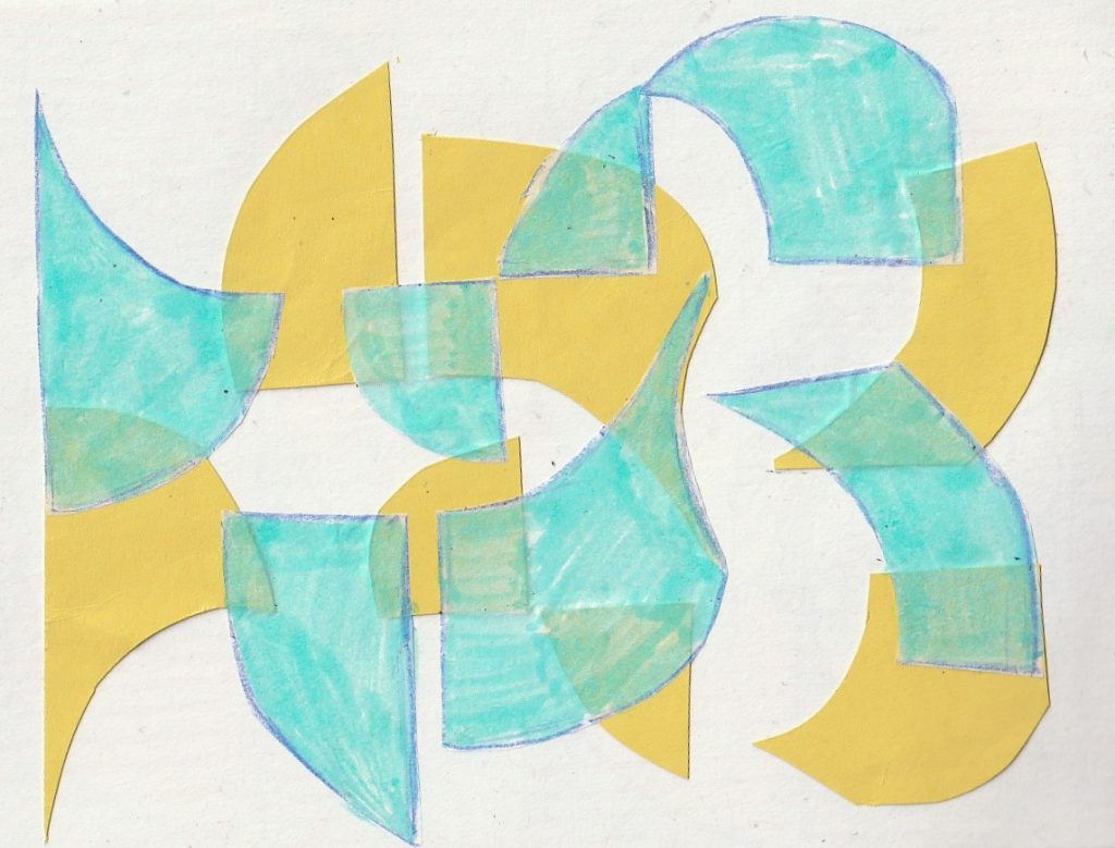
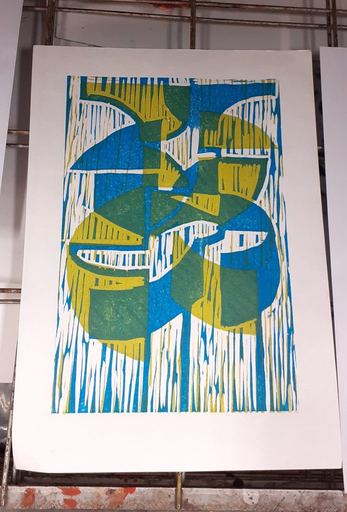
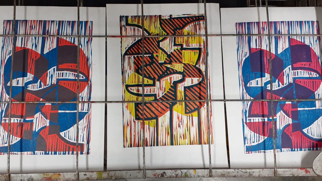
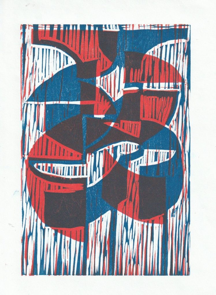
After printing 3 layers, I could see the areas of cross-overs. The overall effect is energetic.
Week 4
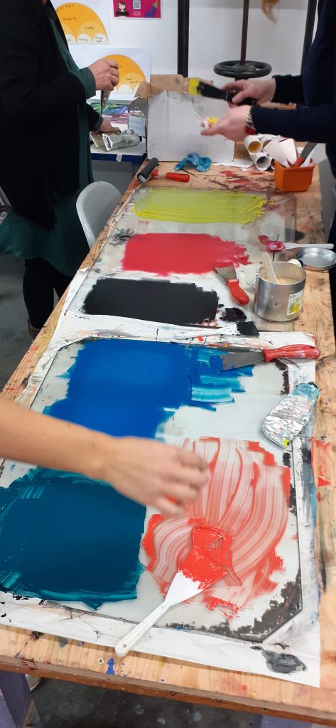
The studio, colour mixing by the group.
My prints on the drying rack.
The texture of the wood became apparent after the wood had been inked and cleaned once. This is due to the moisture sinking into the wood and expanding the pattern of the grain.
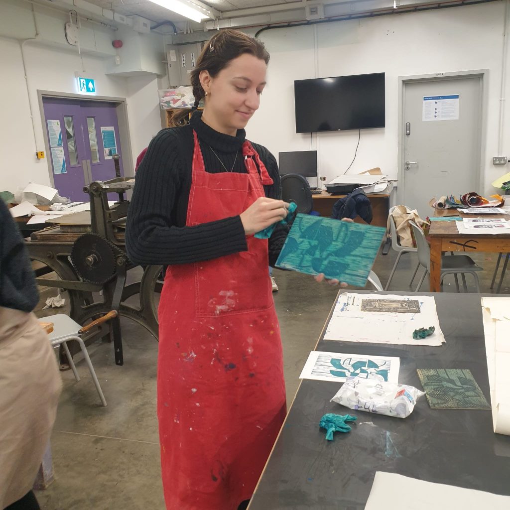
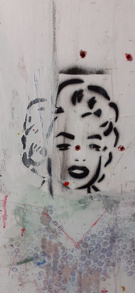
Me cleaning the plate.Stencil art on the studio wallUsed baby wipes on inky paper
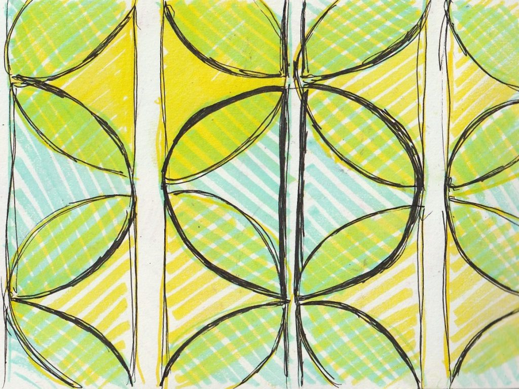
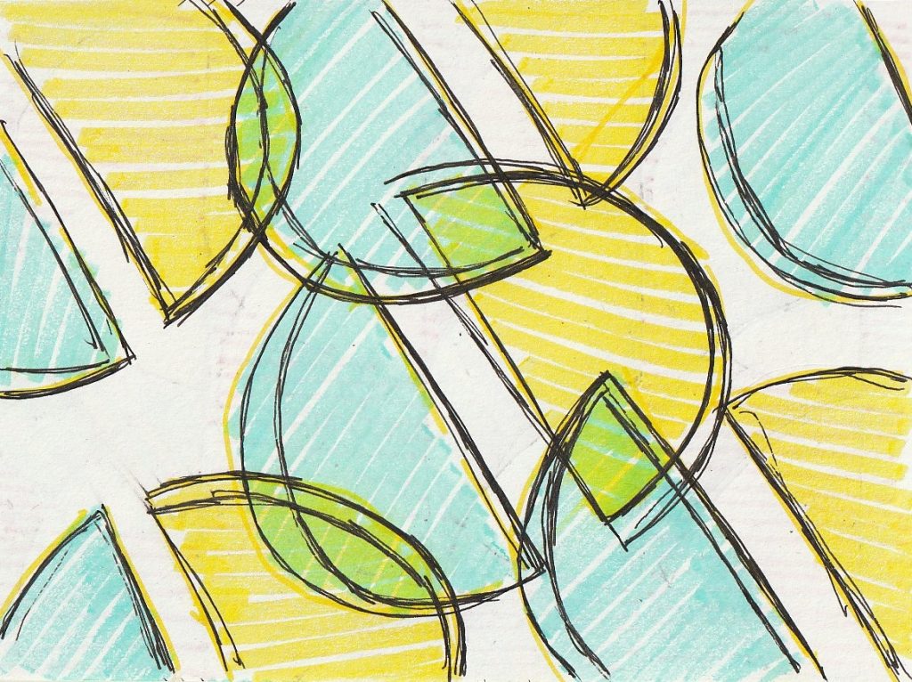
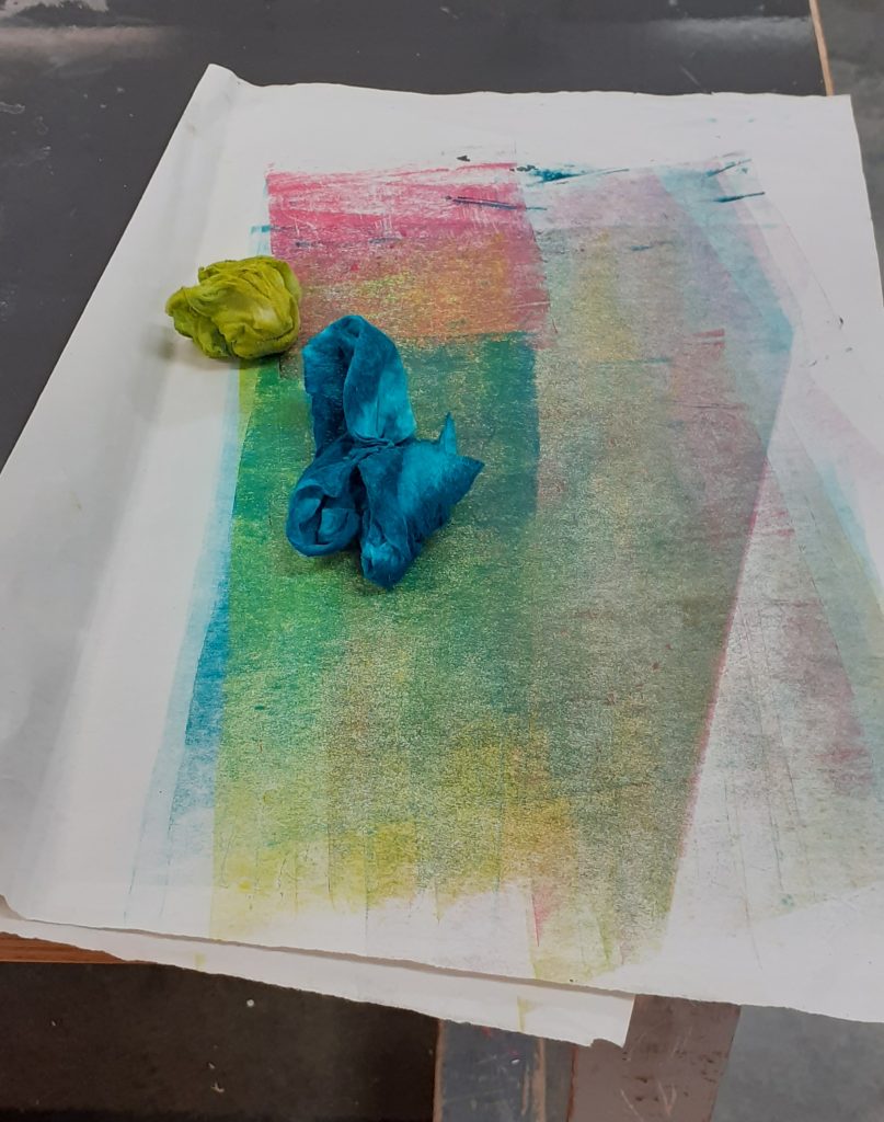
Yellow, orange and dark green layers.
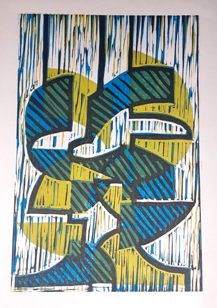
I felt that these prints didn’t need a black layer, as they already had enough contrast and brightness to make them interesting:
The abstract design meant that I couldn’t decide which way up the image should be viewed.
A letter is a mark or glyph (symbol) used in an alphabetic writing system to indicate a sound.
Introduction Unlike other writing systems from around the world, the English alphabet (also known as the Latin-script alphabet) is a system that consists primarily of a kit of parts that both directly informs the shapes of sound (vowels and consonants) and signifies symbolic values: for example, A, B, C, can have ‘symbolic’ meaning (think of the phase ‘alphabetical order’), while a, b, c, (ah, bu, cu,) rather instructs on how sound needs to be shaped to form a word. Speculative, or ‘a-semic’ typography is a strategy that can be applied to the study of writing systems to enable us to scrutinise both the concept of writing itself, and typographic systems, through formal speculation and experimentation; By developing a ‘speculative’ system of meaningful symbols or ‘parts’ – i.e. ones that are not ‘semic’, meaning they are not [currently] readable – we can bring the function of these graphic systems to the forefront of our attention. We will also explore the subtle intersections of graphic information that exist across all human artifacts, where ordinary manufactured objects can often be found to exhibit residual typographic value and relevant qualities.
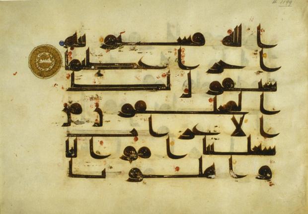
Folio from a 9th-century Quran written in ink and gold kufic script on parchment. https://www.middleeasteye.net/features/write-stuff-how-ancient-arabic-scripts-are-coming-back-lifehttps://www.researchgate.net/figure/Both-characters-in-the-figure-have-the-same-radical-ren-means-humans-at-the-left-hand_fig2_319151358
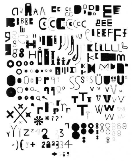
Bits, Paul Elliman https://medium.com/fgd1-the-archive/found-font-1995-present-2328b96459fe
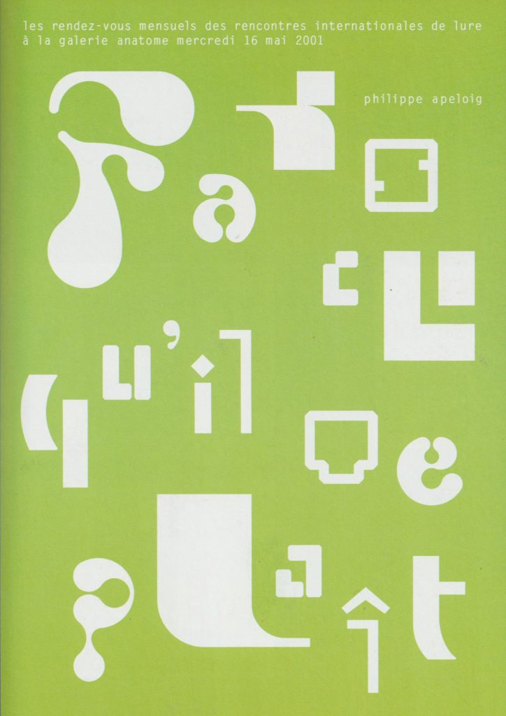
‘Abstract letterforms dissolve into pure form.’ Invitation cards by Philippe Apeloig
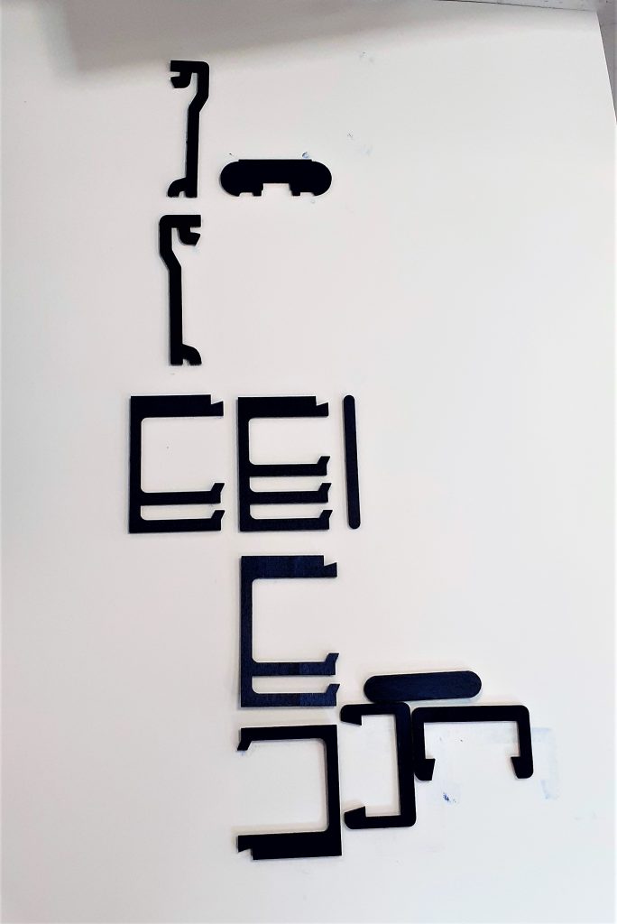
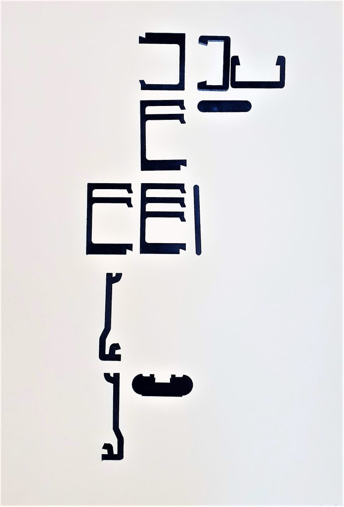
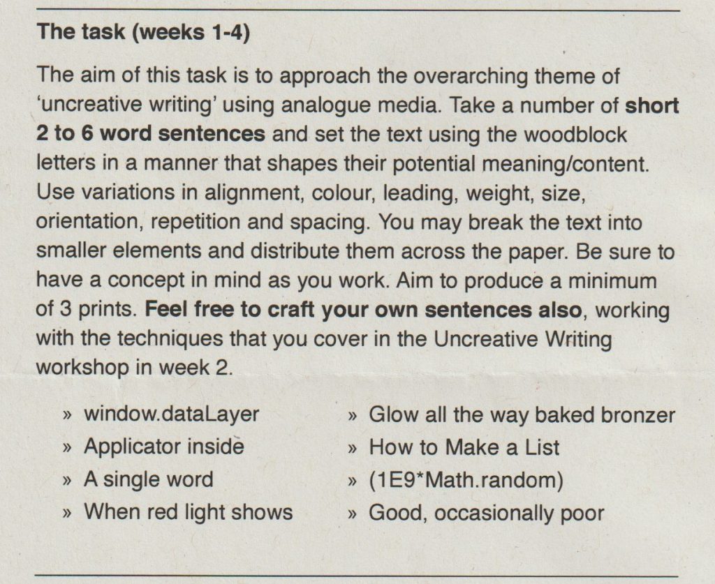
Week 1—2: Monoprinting In these sessions you will be provided with a ‘kit of parts’ that have been produced from various sources found within and from a variety of manufactured items. You are asked to produce several prints with these, forming a number of ‘sentences’. You must think about how the use of repetition, accent glyphs and spacing can suggest or appear to instruct a reader of variations and changes in the potential sounds or meanings that may be ‘read’ from the type forms.
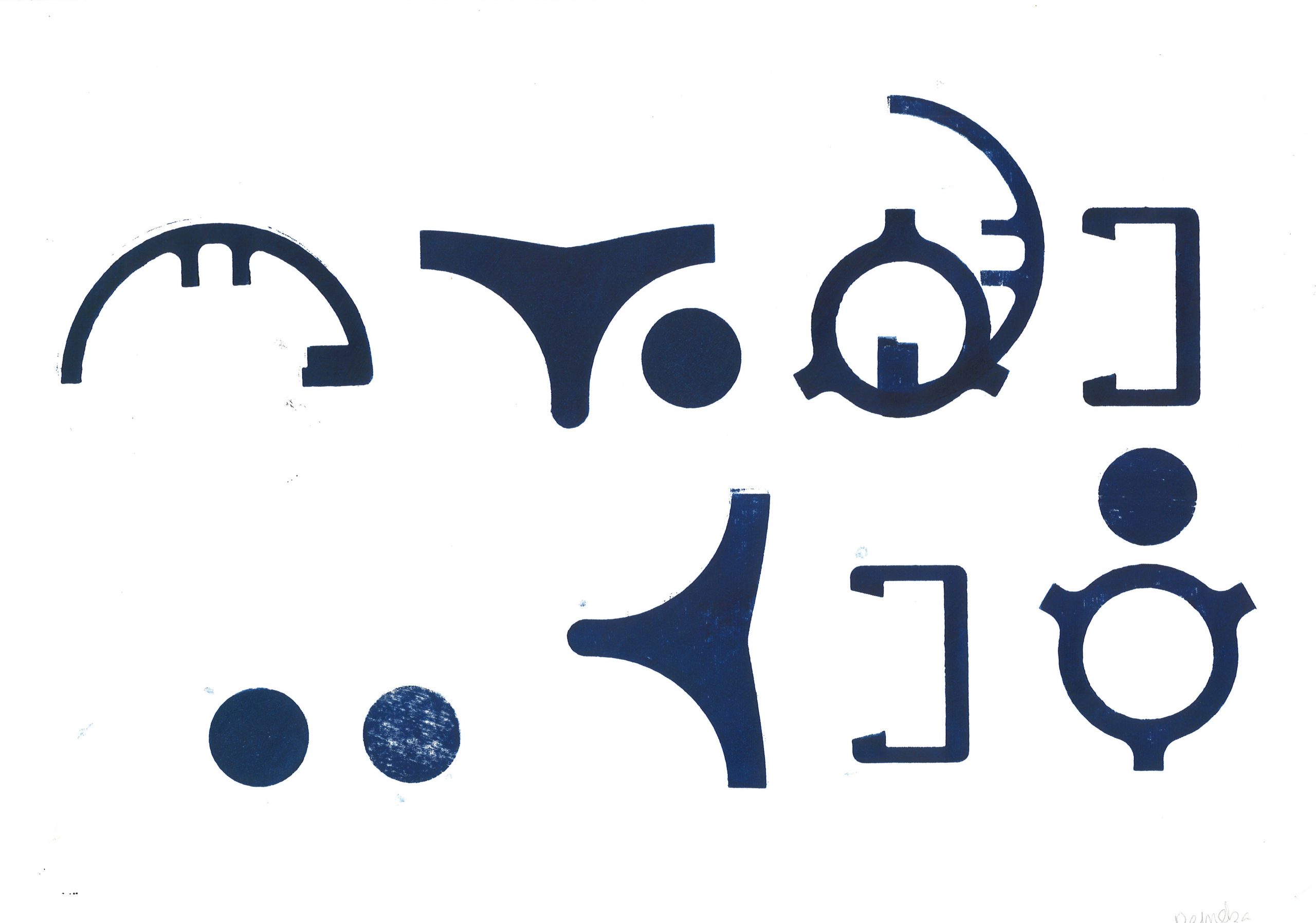
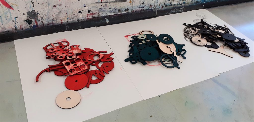
Wooden shapes to form into language.
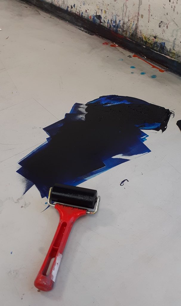
I used the roller to spread the printing ink across the surface of the table. I made sure to spread the ink evenly, to result in an even print.
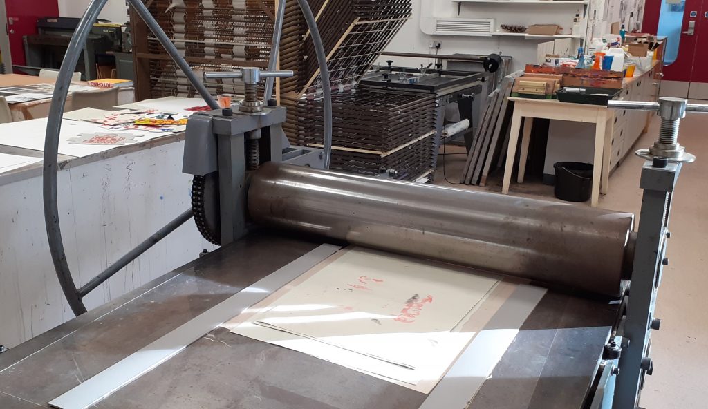
The printing press.
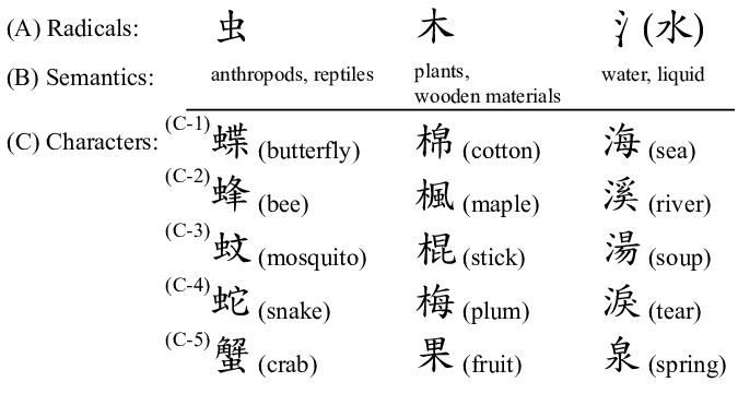
When approaching the task of forming a new language, it helped me to think of Chinese characters. I considered the direction of written language on the page. Chinese characters are read from top to bottom of the page. They have been formed with consideration to the physical form of objects. (Whereas English is written by spelling out the sounds in words.)
Chinese radicals are the part of a character that appear in multiple words. Depending on the other part of the character, we can read the meaning of the word.
I thought about using repeat shapes across my ‘sentence’ to unify the shapes as a language.
Placing the pieces on a sheet of paper, I carried the composition to the printing press.
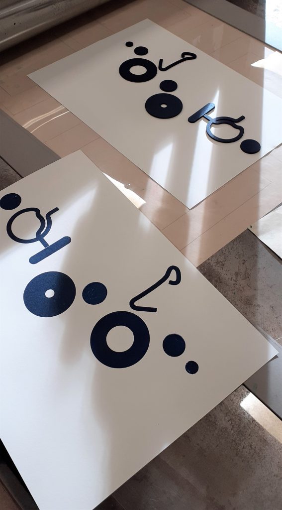
The results of the workshop:
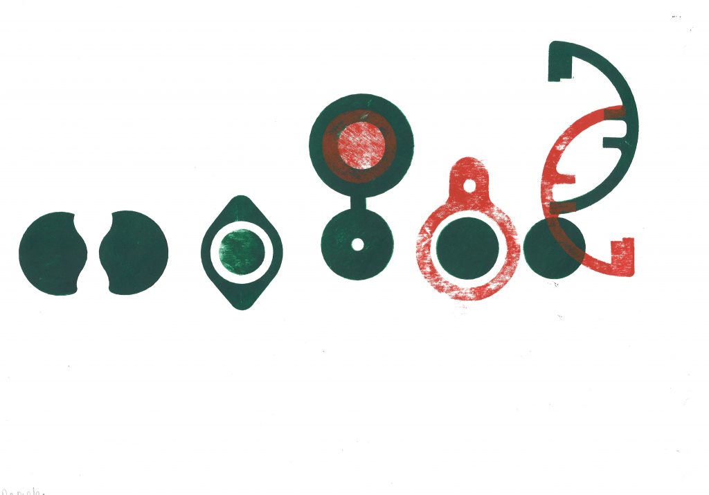
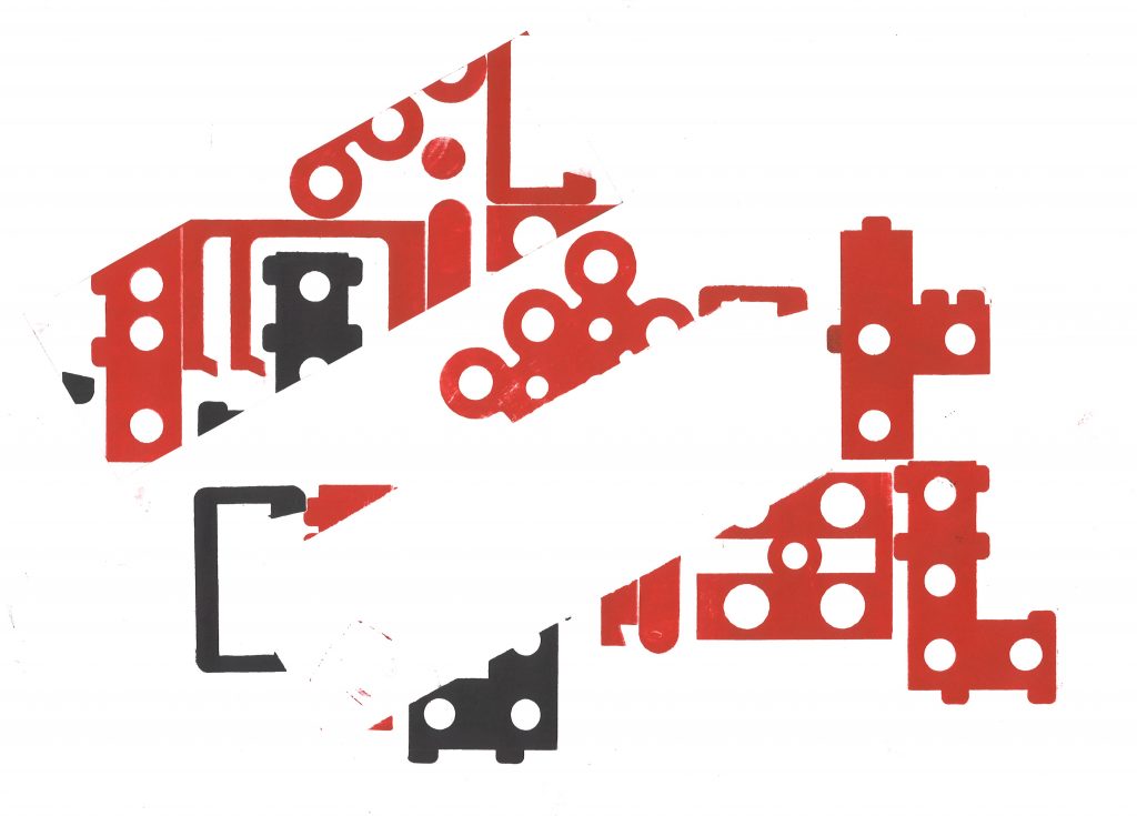
I repeated shapes in this sequence, as I felt this brought the shapes together as a ‘language’. I spaced the glyphs to signify separate words in a sentence. However, looking at arabic texts, I can see that some written language can appear connected. I would like to experiment with connecting the shapes together to invent new ‘word’.Paler red prints gives this experiment some variation and made me think about the change in meaning in connection with the quality of a mark on a page. Does it suggest age, wear and tear? Or does a paler mark weaken the message and suggest a subtler meaning? Could the use of 2 colours change the meaning of the ‘sentence’? In this experiment, I began to investigate connecting the shapes and creating new shapes from the pieces I had available.
Vertical sentences.Experimenting with negative space. By cutting a separate piece of paper, I placed this on top of my paper and printed on both together. This masked a rectangular area in this case and left me with an empty space at the centre of the print. I could then move this piece around or remove it from the image.
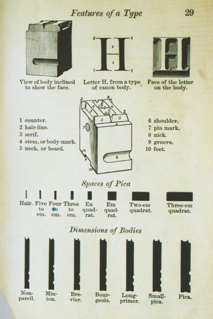
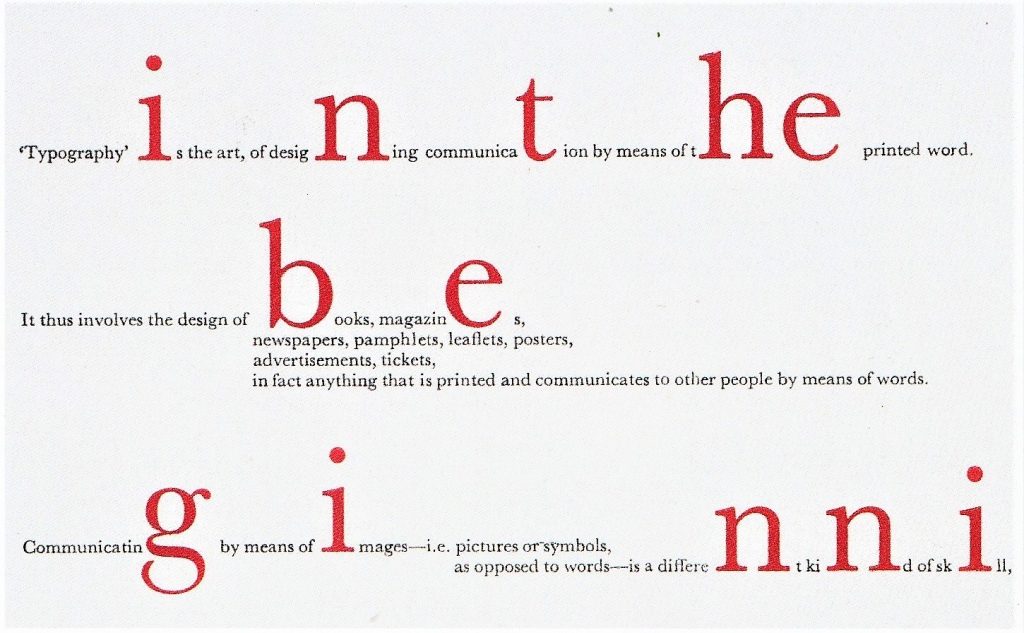
Page from a book by Theodore Low De Vinne, describing the physical nature of typography, circa 1900.
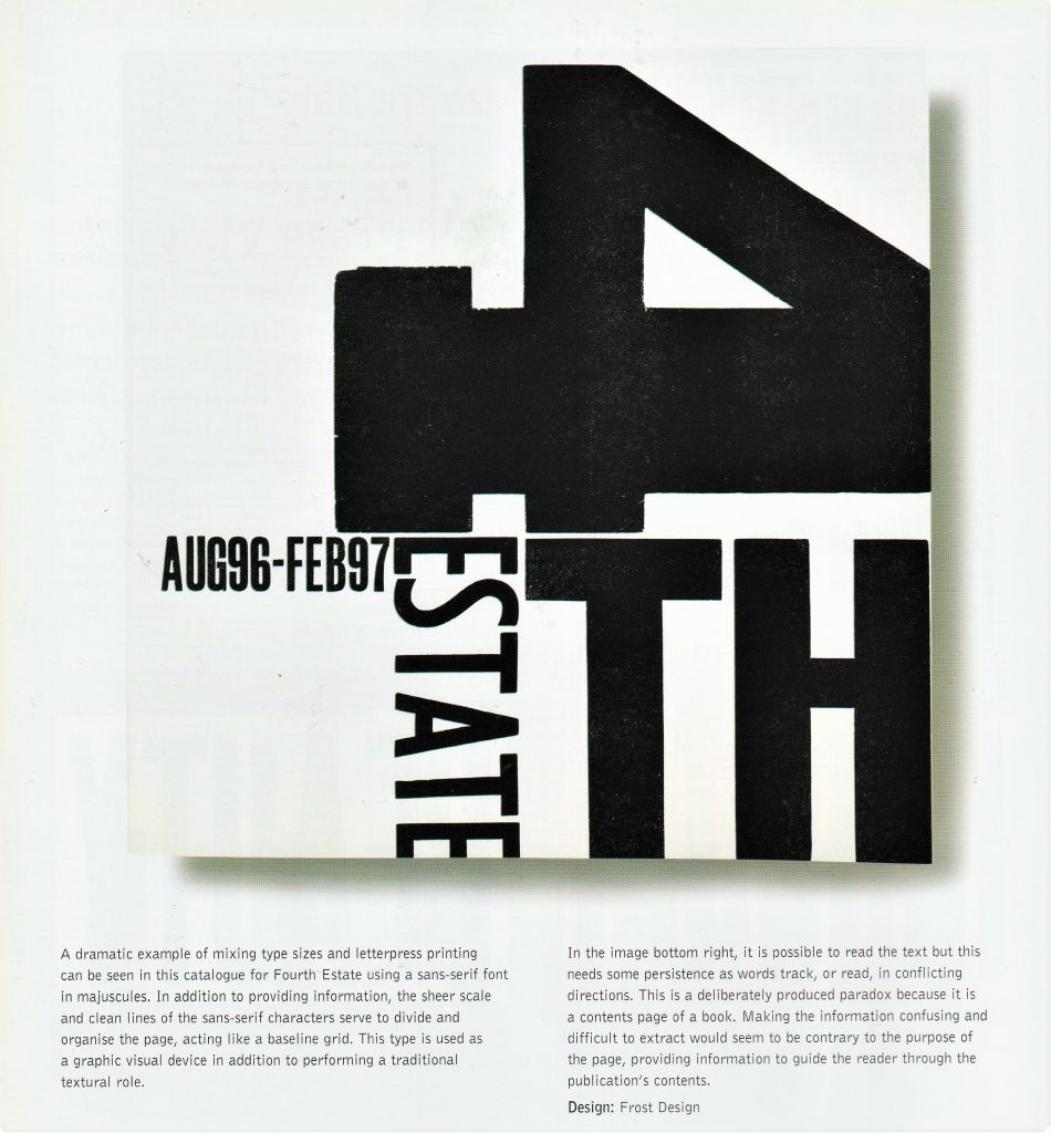
(below) ‘Nineteenth-century advertising typography, in stark contrast to book design, featured all the display types at a printer’s disposal.’ Type & Typography by Phil Baines & Andrew Haslam
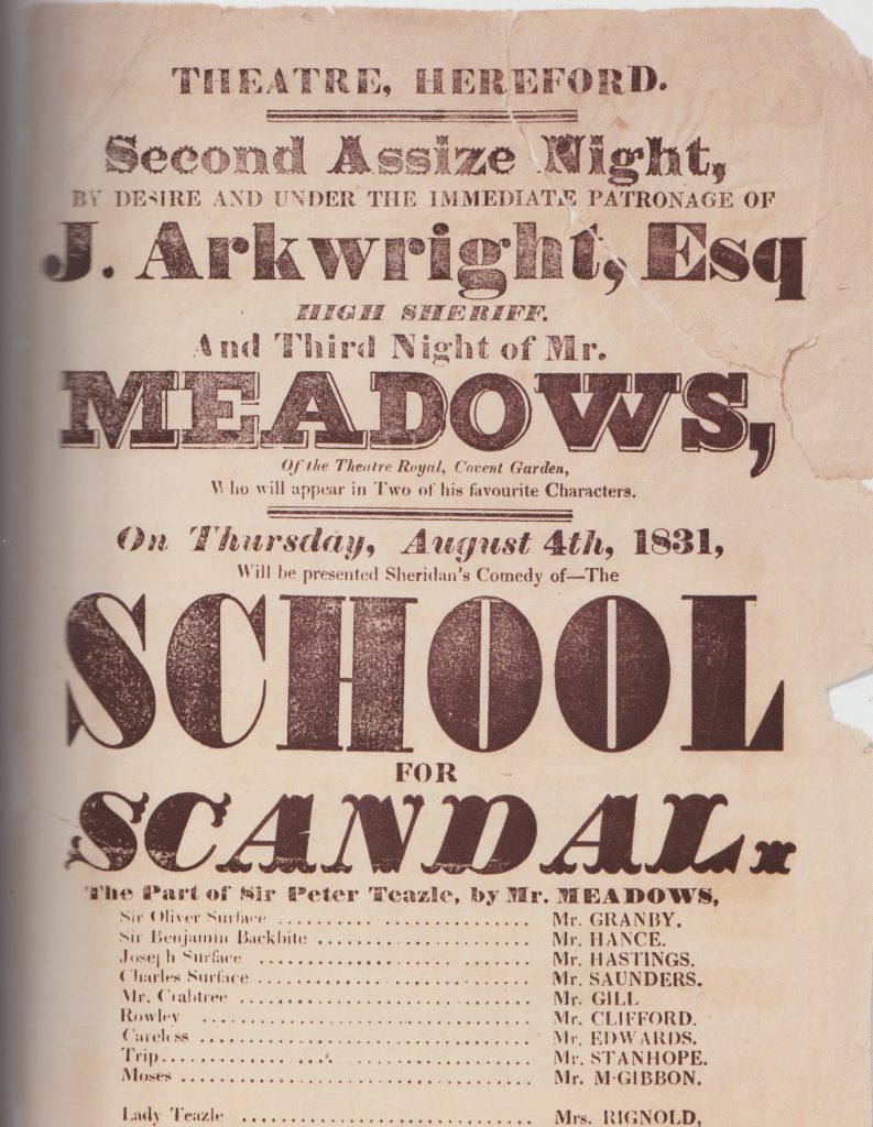
Hereford printer’s work from 1831.
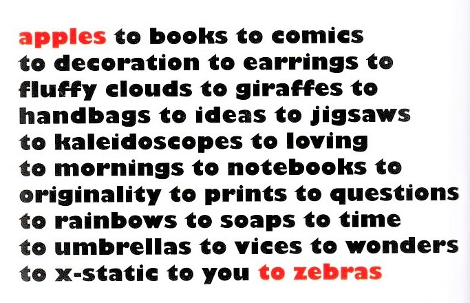
Apples to Zebras is a shop that sell a variety of items. The Design Shop added texture by choosing the right words. The selective choice of red ink acts as bookmarks at the start and finish of the text. The impression given is that the items are held within the ‘apples’ and ‘zebras’. Monotype’s hot metal Baskerville in a design by Catherine Dixon.
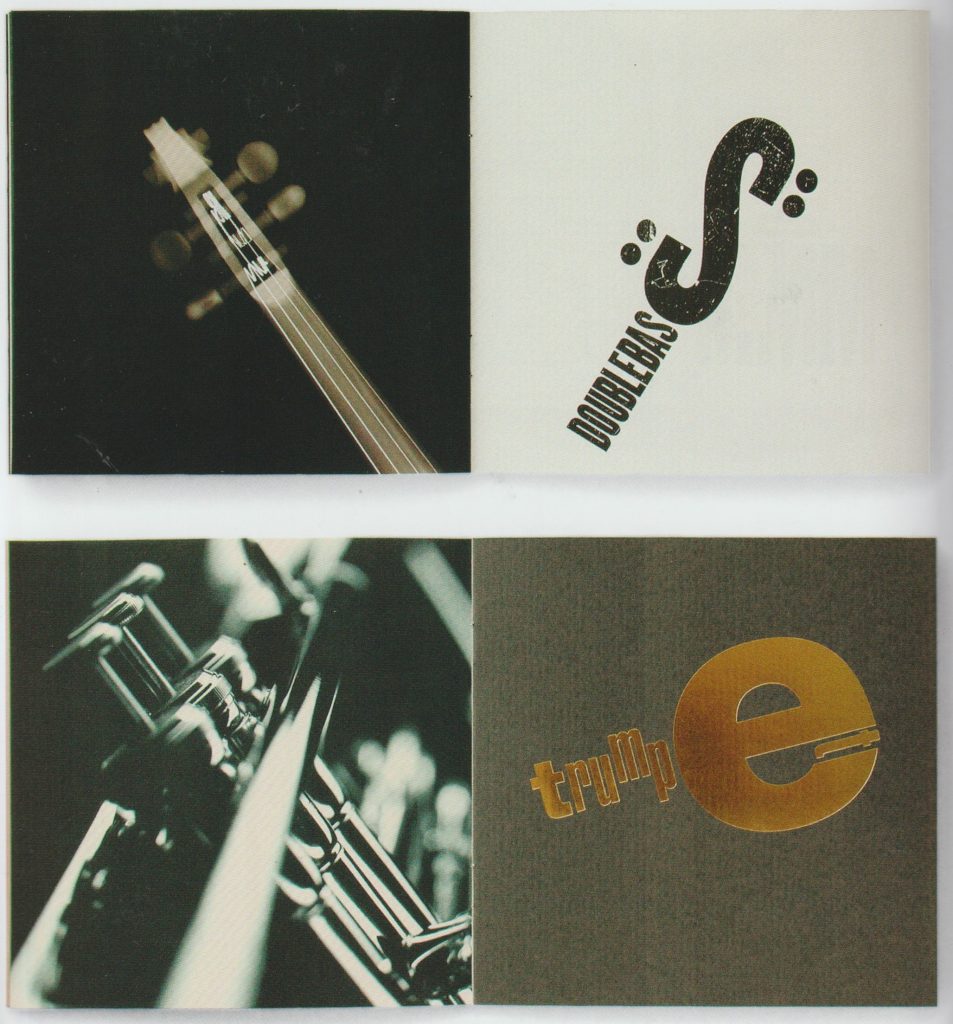
‘Yearling Jazz & Classics direct mailer created for Arjo Wiggins by Thomas Manss & Co. design studio. The qualities of the paper are articulated through a series of specialist printing techniques. Here they have used letterpress and a bronze foil. Typographical elements are used in images to mimic details of musical instruments.’ The Fundamentals of Typography 3rd edition, Bloomsbury
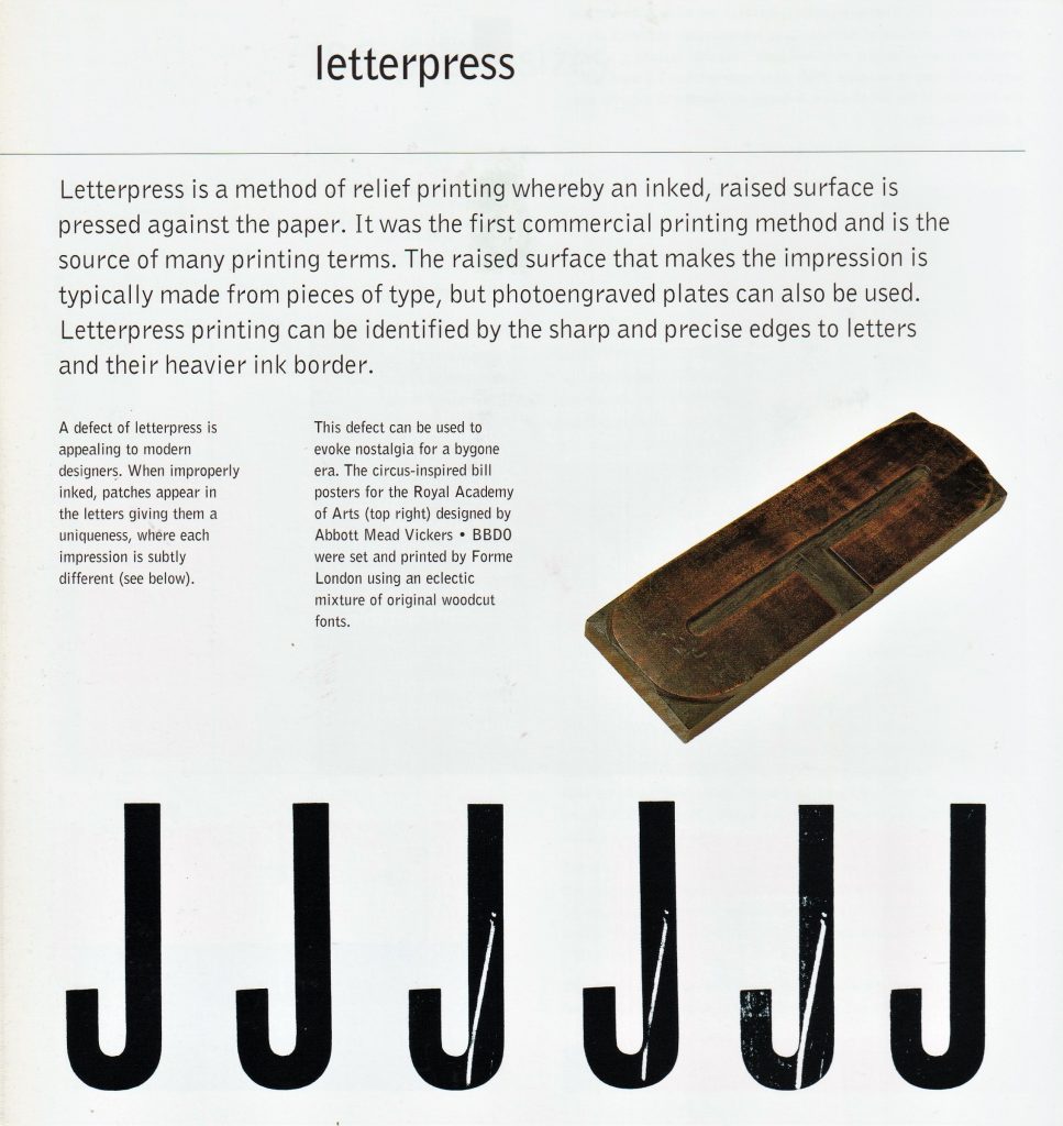
‘In this poster by English designer Phil Baines, printed using letterpress type, the relationships and patterns that typography creates are laid bare. It is easy to see how the grid- central to most graphic design- is a natural outcome of modular typography.’ What is Graphic Design? RotoVision
Cards to promote an art club, Rabia Gupta
By placing the text in a chaotic way, the designer is able to express the company’s taste in art.
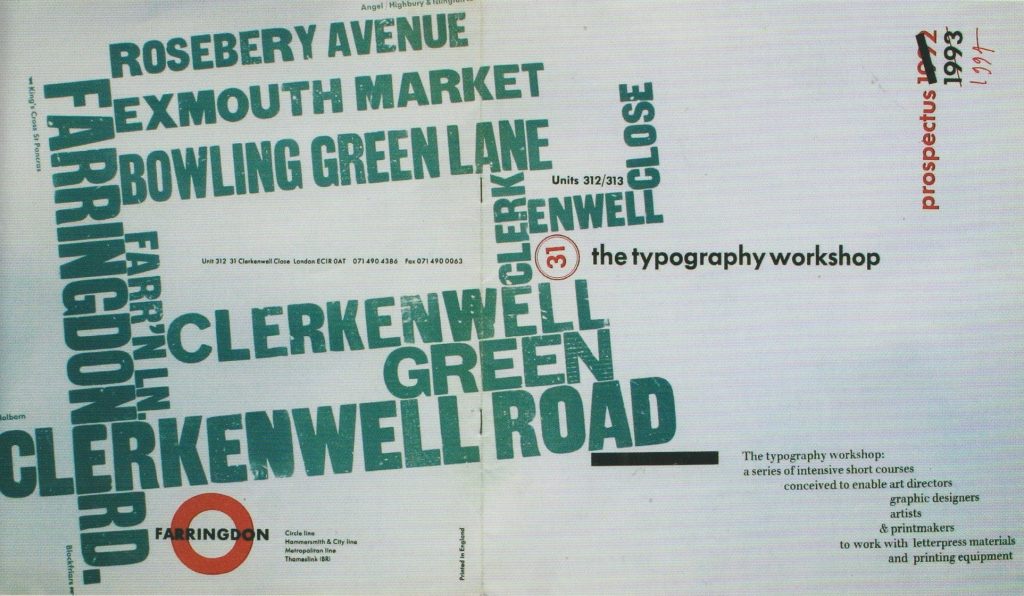
Prospectus for the Typography Workshop, Alan Kitching, printed letterpress, London, 1992. ‘Vibrant information that describes not only the location of the studio, but also the reason for going there in the first place.’ What is Typography?, David Jury
The letterpress workshop in week 1 introduced us to the printing press.
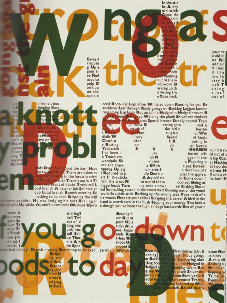
The aim of the workshop was to work with woodblock type to explore composition and the potential of uncreative writing. We were instructed to reflect the meanings of the phrases in these prints.
I loaded the tray with the wooden letter blocks and filled them with the metal furniture to secure the pieces.
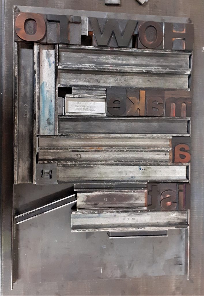
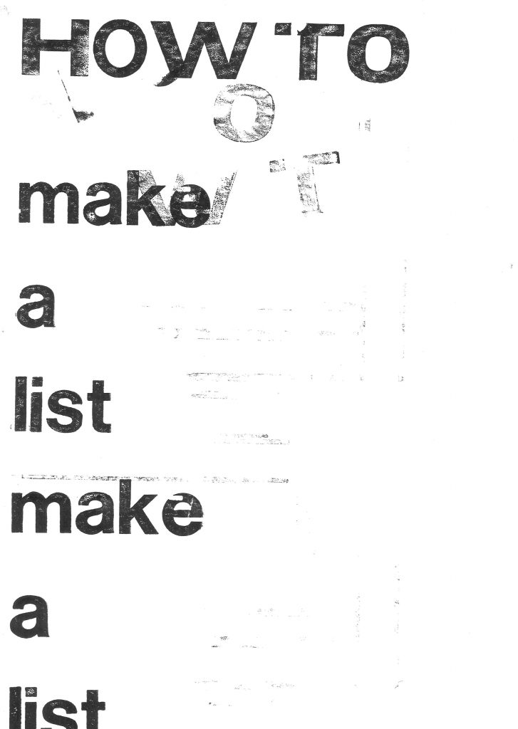
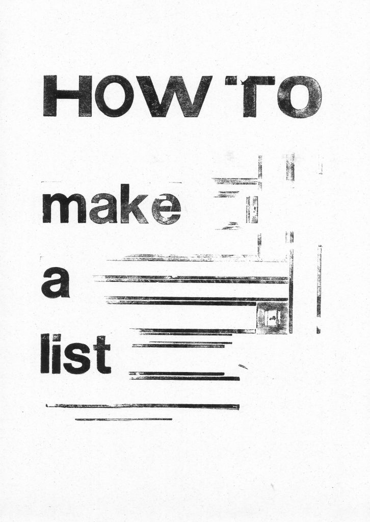
I selected the phrase ‘How to Make a List’ from the workshop brief. This first made me think of the typical list format that you might use for a shopping list. Vertically aligned left down the page. I selected the letter blocks from a sans-serif font. I chose the ‘How to’ in larger, capital letters to suggest an instructing voice.
I placed the metal furniture to place gaps between the words. The spacing highlights the separate words. I used magnets to hold the metal in place so that it would not slip when printing.
I then applied the ink onto edges of the metal. I placed the paper onto the letters and press the paper down to transfer the ink. I paid attention to the individual letters and to the horizontal lines. When I lifted the paper off, I had created parallel lines. These lines suggest to me, the lines found on note paper.
I used the roller to evenly spread the printing ink on the flat surface. Since the ink is oil based, I needed to use white spirit to remove the ink when cleaning up the roller. Applying ink too thickly onto the letters could result in imperfect edges.
applying ink to the woodblock letters
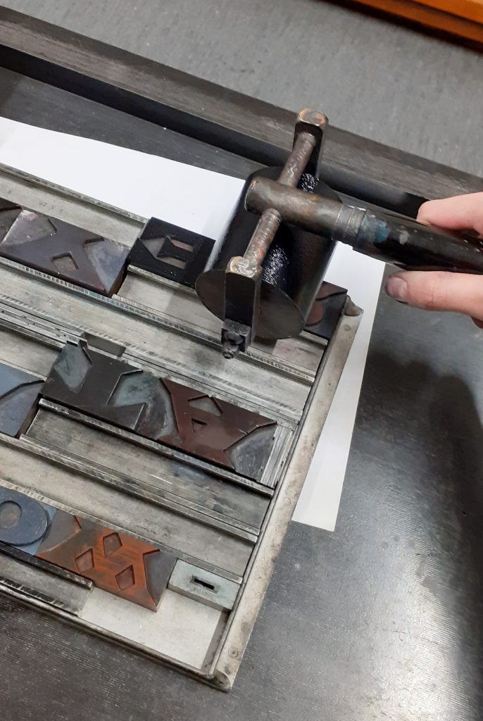
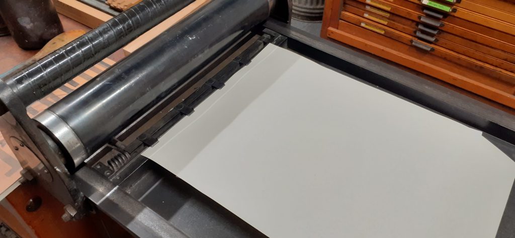
The letterpress. Using the foot pedal lifts up the 4 metal points. I placed the paper under these points to hold it into place, releasing the pedal.
I printed the first print by hand (without using the press).
I used repetition with the left alignment to exaggerate the classic list format. There is also a hint of sarcasm to the message by repeating the words. ‘How to make a list: make a list.’ I accidently printed the extra letters at the top of the page. They look faded and although this was accidental, I like the effect. The letters spell ‘WOT’, which when sounded out, sounds like ‘What?’ The paler markings appear to be from a second voice.
I used the lines of the metal furniture. The square was accidental and I don’t think it adds anything to the composition.
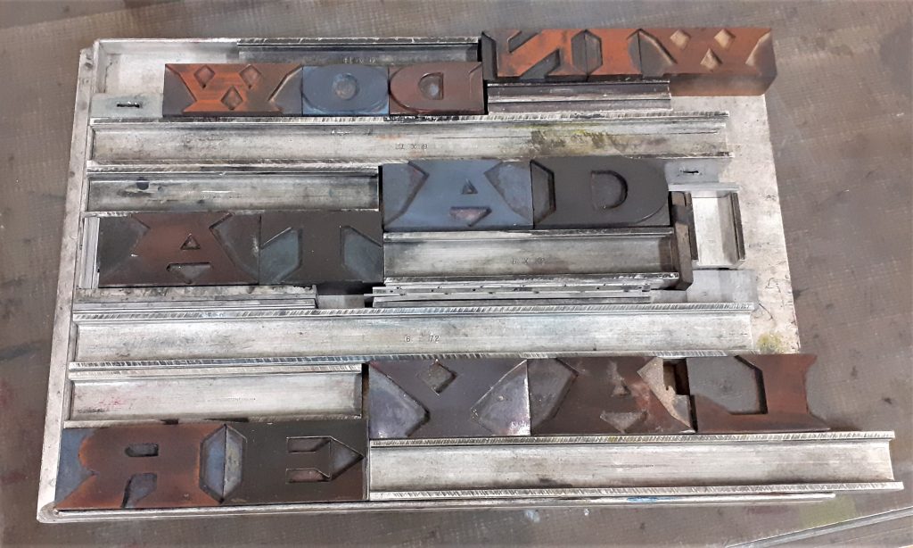
I used the printing press to print these letters:
On my first attempt with these letters, I accidently placed 2 of the letters backwards.
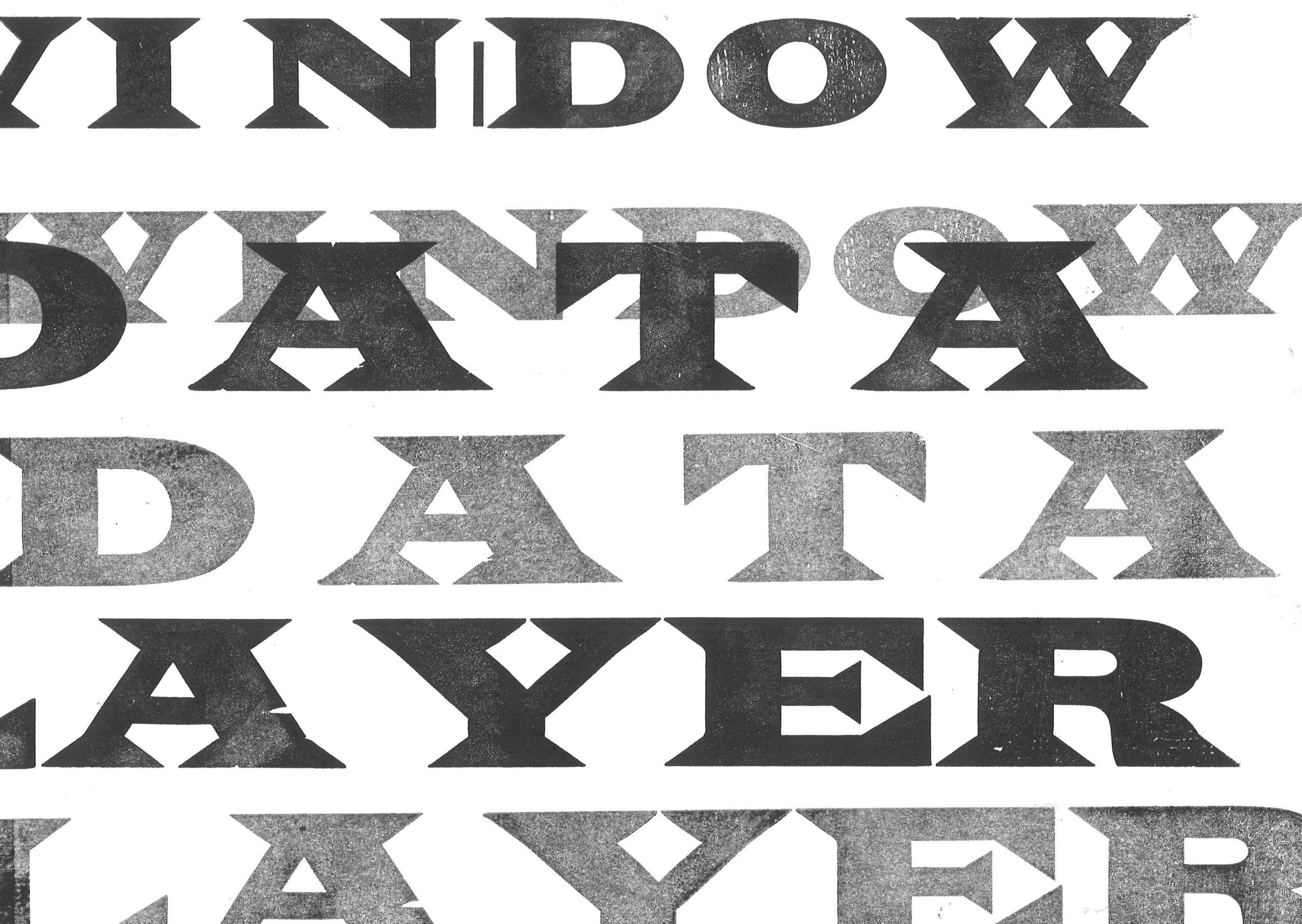
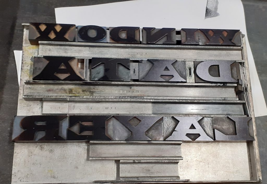
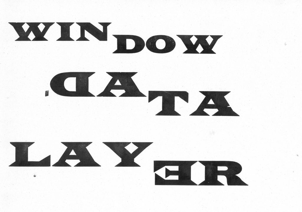
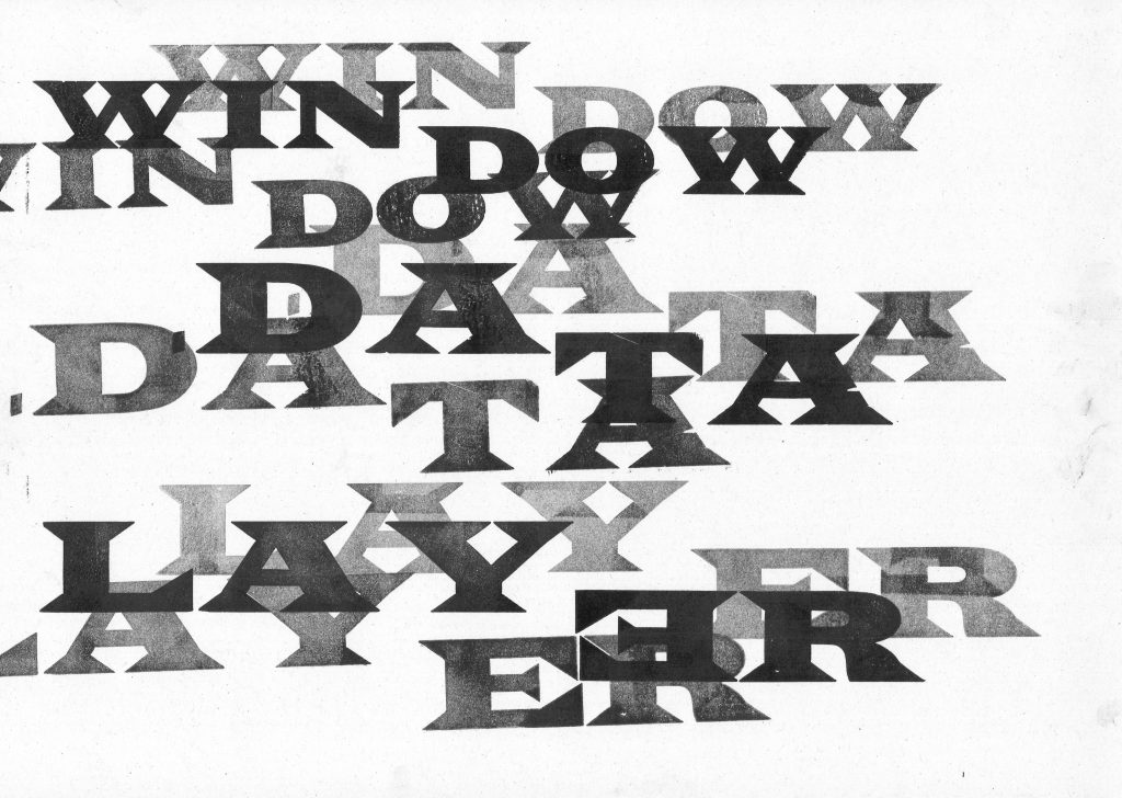
I broke the words into 2’s, as I noticed the words are similar in length. I wanted to highlight the fact that some words are made up of smaller words. For example in this print, ‘(Lay)er’, ‘(Win)dow’, ‘Da(ta)’. I used the same typeface across the print to make the words blend visually and therefore layer effectively.
Because of the word ‘layer’, I chose to layer the text.
By making several prints from one ink application, I was able to achieve different weights, some more transparent than others. This gives the letters shadow and depth across the print.
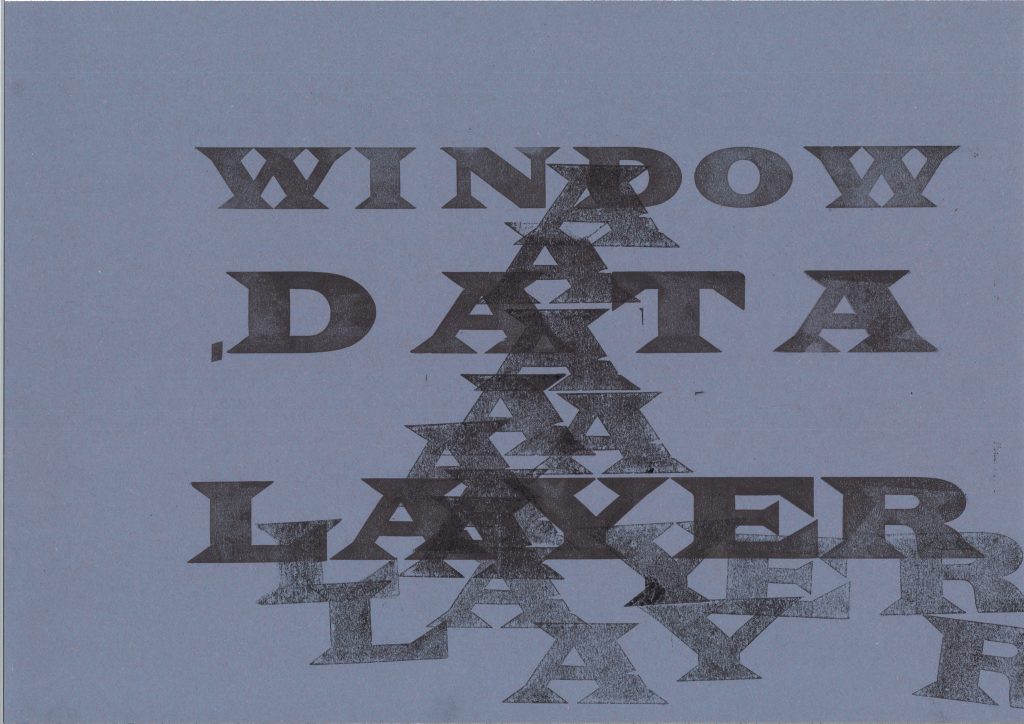
I printed these letters onto A4 paper. I placed the text so the words are running off the edge of the page. This creates a disorientating effect.I experimented on sugar paper and used repetition to create texture, using the letter ‘A’.
I noticed the ‘A’ in ‘Layer’ and ‘Data’ and connected them visually across the page. The words become slightly hidden, particularly ‘Layer’ which helps to illustrate the meaning of the word ‘layer’.
We use cookies on our website to give you the most relevant experience by remembering your preferences and repeat visits. By clicking “Accept All”, you consent to the use of ALL the cookies. However, you may visit "Cookie Settings" to provide a controlled consent.
This website uses cookies to improve your experience while you navigate through the website. Out of these, the cookies that are categorized as necessary are stored on your browser as they are essential for the working of basic functionalities of the website. We also use third-party cookies that help us analyze and understand how you use this website. These cookies will be stored in your browser only with your consent. You also have the option to opt-out of these cookies. But opting out of some of these cookies may affect your browsing experience.
Necessary cookies are absolutely essential for the website to function properly. These cookies ensure basic functionalities and security features of the website, anonymously.
Cookie
Duration
Description
cookielawinfo-checkbox-analytics
11 months
This cookie is set by GDPR Cookie Consent plugin. The cookie is used to store the user consent for the cookies in the category "Analytics".
cookielawinfo-checkbox-functional
11 months
The cookie is set by GDPR cookie consent to record the user consent for the cookies in the category "Functional".
cookielawinfo-checkbox-necessary
11 months
This cookie is set by GDPR Cookie Consent plugin. The cookies is used to store the user consent for the cookies in the category "Necessary".
cookielawinfo-checkbox-others
11 months
This cookie is set by GDPR Cookie Consent plugin. The cookie is used to store the user consent for the cookies in the category "Other.
cookielawinfo-checkbox-performance
11 months
This cookie is set by GDPR Cookie Consent plugin. The cookie is used to store the user consent for the cookies in the category "Performance".
viewed_cookie_policy
11 months
The cookie is set by the GDPR Cookie Consent plugin and is used to store whether or not user has consented to the use of cookies. It does not store any personal data.
Functional cookies help to perform certain functionalities like sharing the content of the website on social media platforms, collect feedbacks, and other third-party features.
Performance cookies are used to understand and analyze the key performance indexes of the website which helps in delivering a better user experience for the visitors.
Analytical cookies are used to understand how visitors interact with the website. These cookies help provide information on metrics the number of visitors, bounce rate, traffic source, etc.
Advertisement cookies are used to provide visitors with relevant ads and marketing campaigns. These cookies track visitors across websites and collect information to provide customized ads.