002 Screen-printing

The History of screen-printing

OUC4366391 Poster May 1968 – Poster, May 68: Vietnam War: Onward Christian Soldiers (GIs are moving away, leaving behind an eploree Vietnamese mother holding her inanimate baby). Screen Prints, New York, USA); Photo © Collection Michael Lellouche; .

Screen printing has evolved over the ages. From prehistoric times, people have had a way of printing using stencils. Printing techniques have been used for decorating cloth for centuries. Screen-printing has we know it today started in the 20th century. Artists first used human hair for the screens, then silk was used. These have been replaced by synthetic materials, mainly nylon and polyester. Screen printing was useful to make posters during World War II, as this method allowed for posters to be mass produced.

Information sources from: A History of Screen Printing: Tracing Our Industry’s Roots – Anatol Equipment Manufacturing Co. Blog

I looked at artists and designers who use screen-printing in the present day

People of Print

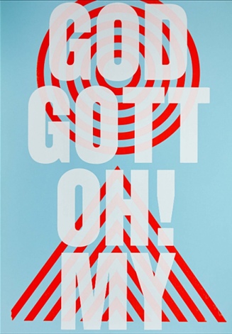
I like the layering of colours in this print, from pale to bold to pale again. The use of white allows the bold red lines to come through. The typeface used is bold enough to be readable despite the transparency of the white ink. The red print is very effective in emphasising the text. The circles act as a target, drawing the viewer’s eye to the centre. The arrows point towards the centre of the image. The blue adds a sense of calm and nicely balances out the strong visual elements within the design.

Maze

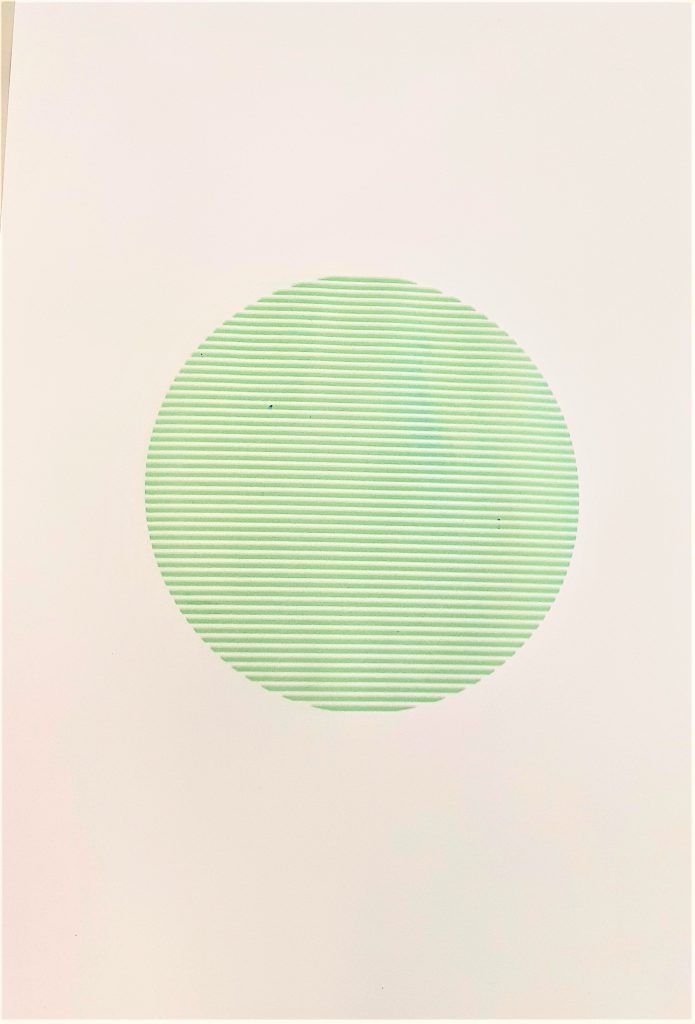
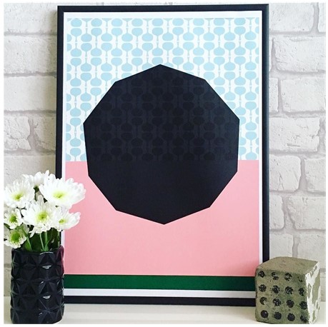
Against the black shape, the pattern is visible, but here it is subtle. It creates a look of texture. Pink is a fun and warm colour. Here it is needed to balance out the dominating black shape, as black can feel quite serious. The strip of green at the bottom, feels quite grounding and anchors the piece.

Josie Blue Molloy

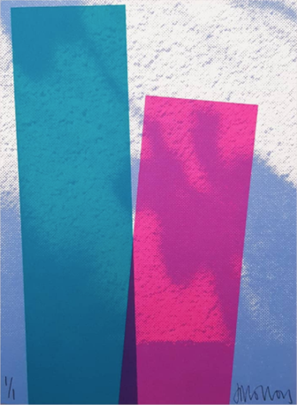
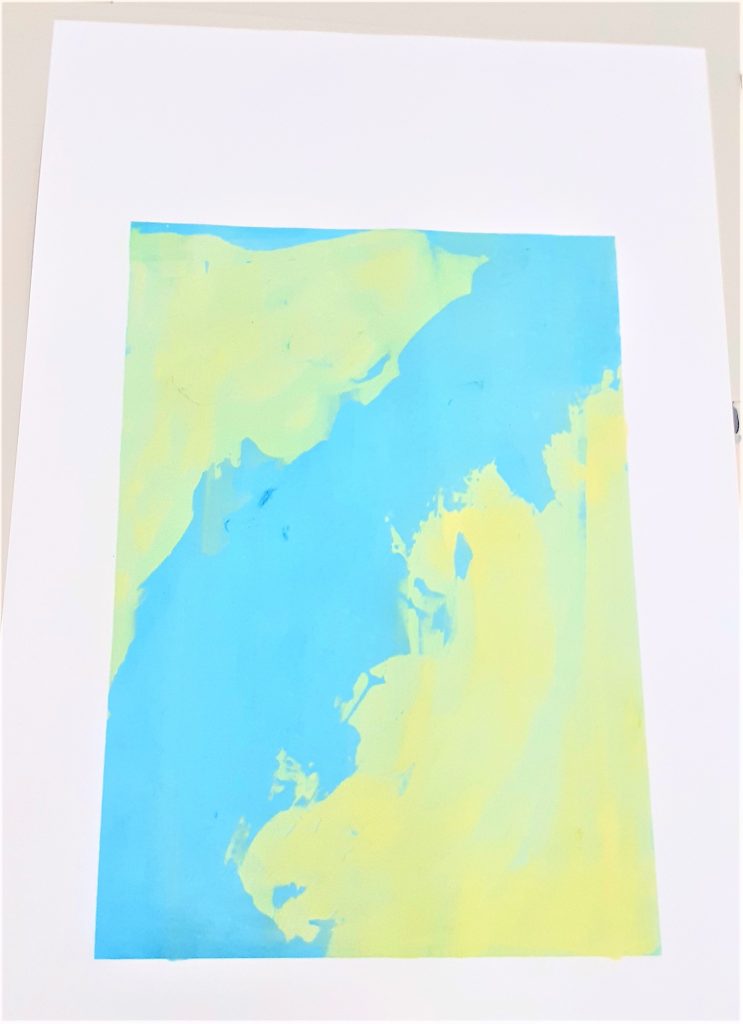
The use of simple geometric shapes is balanced by the interesting background in this piece.  The blue and white of the background are cloud-like, organic and random. The rectangles feel like they are tipping forwards, since the artist has printed them at an angle. They remind me of buildings that are looming against the sky. Where the rectangles meet, a dark area is created. Here, we see a merging of 3 colours: 2 rectangles and the background. This works well because the colours are next to each other on the colour wheel. This is known as analogous. Analogous colours create harmony within a design.
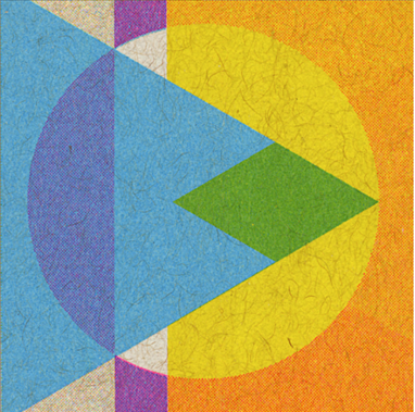
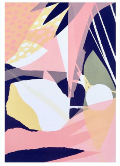
JP King

I really like the artists use of layers. The blue triangle would have been printed last. Where it merges with the circle, we see a green area. The artist may have used stencils to create the geometrical shapes in this design. He would have needed to ensure each layer would line up accurately. We can see areas where the prints were not lined up perfectly. Such as the outline around the white circle. This adds character to a print and shows it as being a hand-made product.
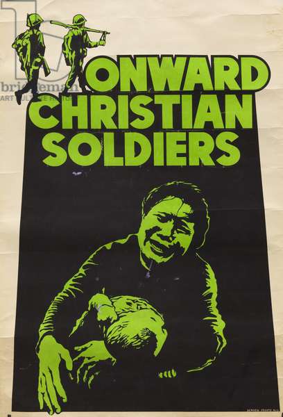
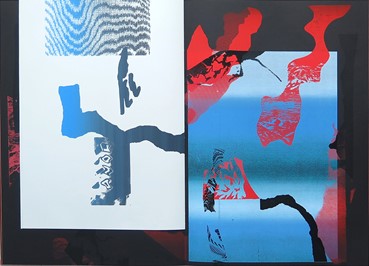
We Three Club

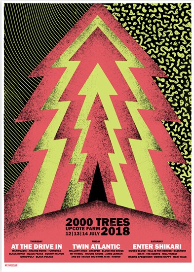
I like the visual ‘noise’ created in this print. This graininess could be seen as an error in some prints, but I think it works well here because the colours used are so bright that it helps to cool them down. In the poster, grittiness could indicate the style of the music the poster is advertising. This music is likely to be heavier or grungey. This is because of the ‘imperfect’ quality of the print. Black is a strong choice of colour within a design, but here it works really well. I would like to experiment with using black in a print.

French Fourch


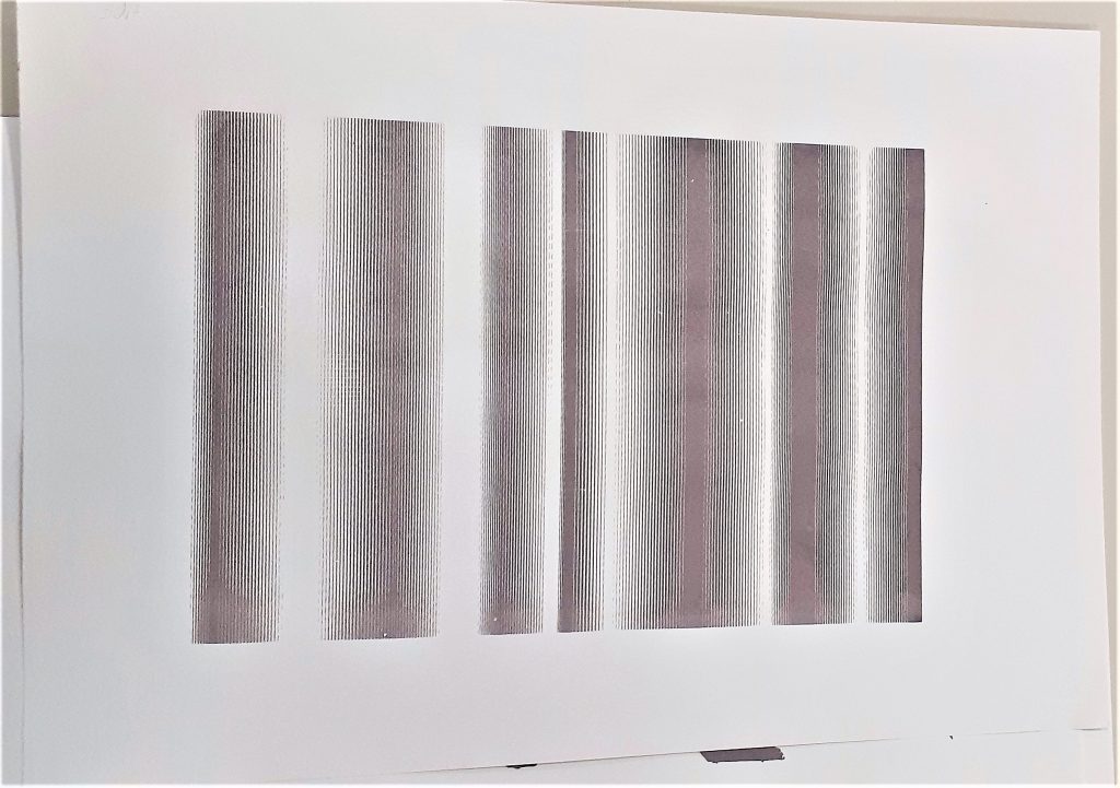
I like the way the designer has used the same pattern, or stencil, for the background. They have made the first print, let it dry,  then rotated the stencil for the second layer. I think the choice of colour would be important for the effect to look effective.

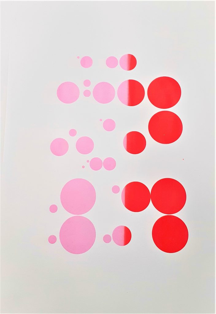
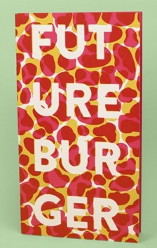
The use of pink and red together seems unusual, because the colours are so similar. However, I think it works nicely. This may be because the design is simple and therefore clear to read

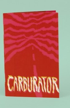
Here, a soft gradient effect works nicely against the strong black and red shapes printed over the top.

The Private Press

The Private Press (@theprivatepress) • Instagram photos and videos

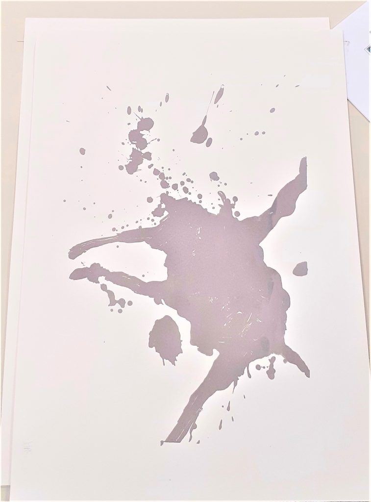
The use of torn looking edges gives the work an implied texture. The variety of organic shapes make the composition interesting and energetic. The designer has used a dotted pattern in the corner, but by restricting the use of repetitive patterns, the viewer can appreciate this pattern. The dark areas add depth. The white areas allow the viewer’s eye to rest.

002 Intro to Screen-printing

I first learned printmaking during my diploma at college. This was during the Covid-19 pandemic. Being unable to teach in-person workshops, the college was forced to ask us to complete the unit from home. This meant no access to screen-printing equipment or a printing press for etching/intaglio. We made do. I remember my bedroom being full of the many experiments needing to dry. I practiced linocut, mono-printing and collagraphs.

Now in week 1 of university, I was finally introduced to the art of screen-printing. The only thing I had previously been told about screen-printing, was that you needed to use your muscles and that the end result would be something flat in block colours. They were wrong about the work looking flat. Our lecturer Caroline showed us some examples of screen-prints and I was surprised to see the delicate lines and layers of the work.

Taping around the edges of the screen ensures you get clean edges and stops ink leaking through where you don’t want ink.

We used acrylic paint mixed with a binder. Adding more binder makes the paint more transparent. This is useful if you want to create a subtle layer.
When screen-printing, you need the screen to be held still when pulling the ink through. This machine is useful if you are working by yourself, as the vice is holding the screen. There is a sucking mechanism within the table that pulls the paper tight and holds it in place. A flat surface is also essential when screen-printing onto paper.

I came across several challenges in this first workshop. These challenges helped me to learn what to do next time. For example:

  • It was better to use too much ink on the screen. Excess ink could be removed, but too little ink meant that the screen would not be covered.
  • Using a clean, dry squeegee after the initial pull made sure that excess ink was removed and helped to push the ink through to get a better print. I noticed that the prints where I didn’t do this, were paler.
  • I found it difficult to print at the centre of the page. I later learned how to solve this issue.
  • Ink can gather at the edges of the print. If left to sit there, It can seep through and smudge the edges.
  • When using the vice machine, I needed to lift the screen and ‘flood’ the screen with ink, before setting it down to do the actual printing. When I failed to flood the screen first, the print did not turn out well.

In this first workshop, we were printing the backgrounds for future compositions.

My initial attempts:

When making this print, I did not flood the screen first, which is why the ink did not come out as a perfect rectangle.

The following week I went back to the workshop to get some more practice. There was a lot to learn in the first session and I finished the session with just 3 workable prints. I wanted more backgrounds to work on in our next session with Caroline. I was happier with my prints the second time around. They were not perfect, but I learnt how I could improve.

This print has a double-line effect. This is where I lifted up the screen and must have placed it slightly out of line before pulling more ink through.

For this print, I used a paintbrush to apply yellow and blue paint onto the screen. As the ink was pulled through the screen, the colour merged.

I wanted to make a plain background. I am happy with the neatness of the print overall. However, there are some spots of dark blue. This is where the paint was not mixed properly.

I used 2 colours in this print. I wanted to see how the colours would merge together. There were a couple of spots of dust that had landed on the print. When I removed the paper, the dust moved and therefore moved some of the paint across the page. This is something I could not have avoided. There is dust in a workshop and there is little we can do to avoid this.

In this session, I learned to align the print at the centre of the paper. To do this, I used print-outs of the original digital designs.

The design is the size of the screen. I placed the design onto my paper. The gives me an idea of where I want the design to be printed.
When I place the frame into the vice, I can see the design underneath and therefore use this as a guide to align the screen accurately.
Seeing my prints together, I am reminded of a globe, a country from above, and the ocean.