Waste Age: What can design do?

Thursday 3rd Feb

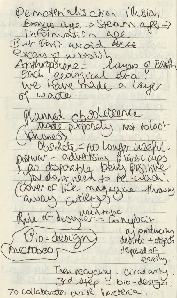
Lecture notes:
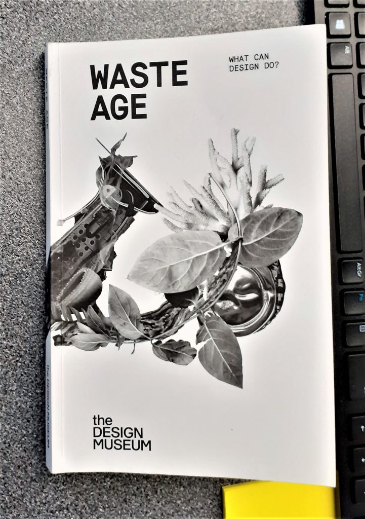
We then read as a group: Waste age: What can design do? This is the catalogue for the exhibition we went to see at The Design Museum, in last October.

(below) Waste Age banner from the Design Museum shop webpage. The designer has interspersed images of plastic waste with leaves. The effect is subtle and elegant.

https://designmuseumshop.com/collections/waste-age-what-can-design-do

The copy of the catalogue, our lecturer brought to class.

Photos I took at the exhibition: (Read the original blog here.)

Posters outside the museum
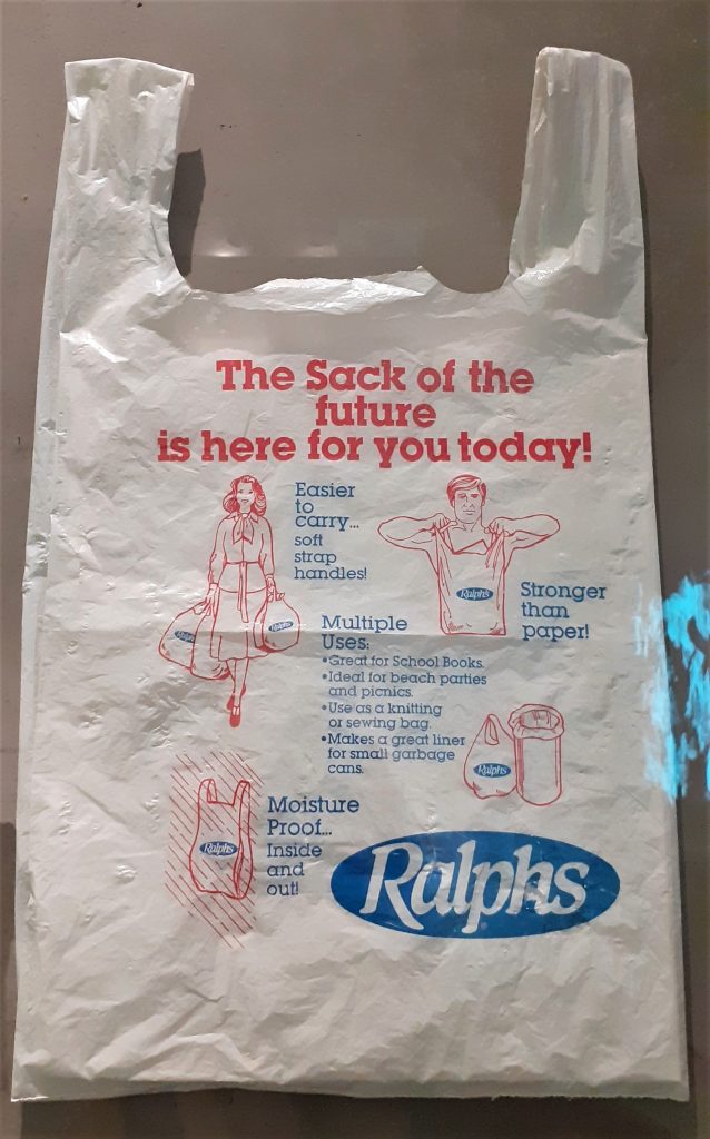
(above) I was shocked and surprised to see this vintage bag in the exhibition. Printed on the bag is a list of the pro’s for using plastic carrier bags. ‘Great for school books’, ‘Ideal for beach parties and picnics.’ While these selling points might be true, I wonder if people at the time questioned the environmental impact of plastic.

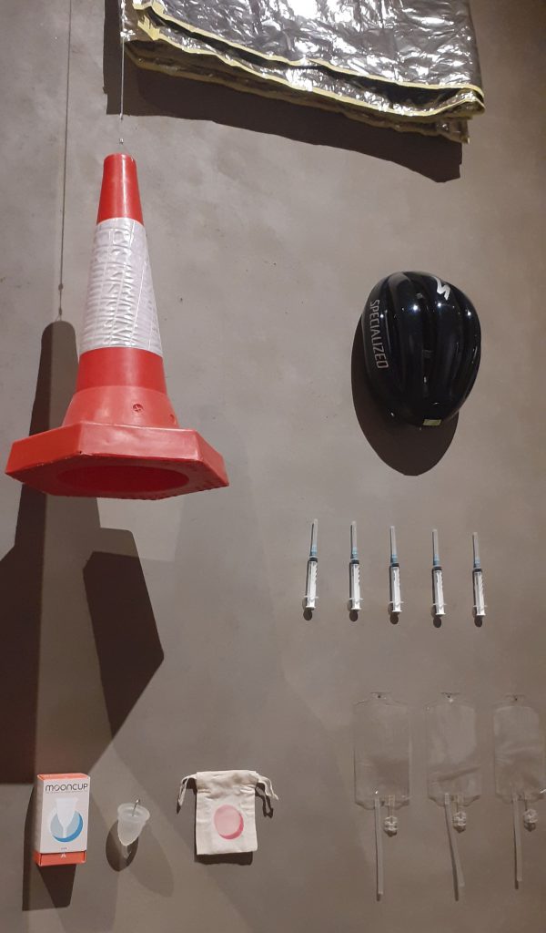
There were several displays like this one at the start of the exhibition. These displays demonstrate the multiple uses of plastic in the present day. The shocking point was that I have never been aware of the amount of everyday objects we interact with that are currently made of plastic.
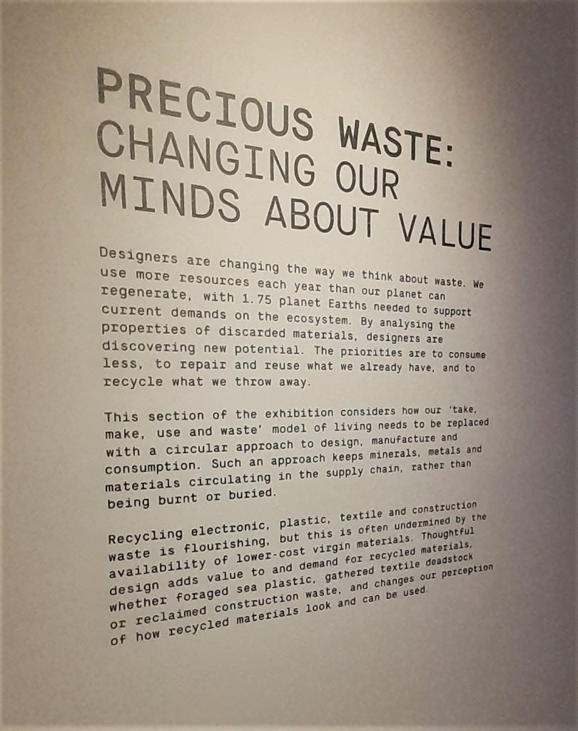
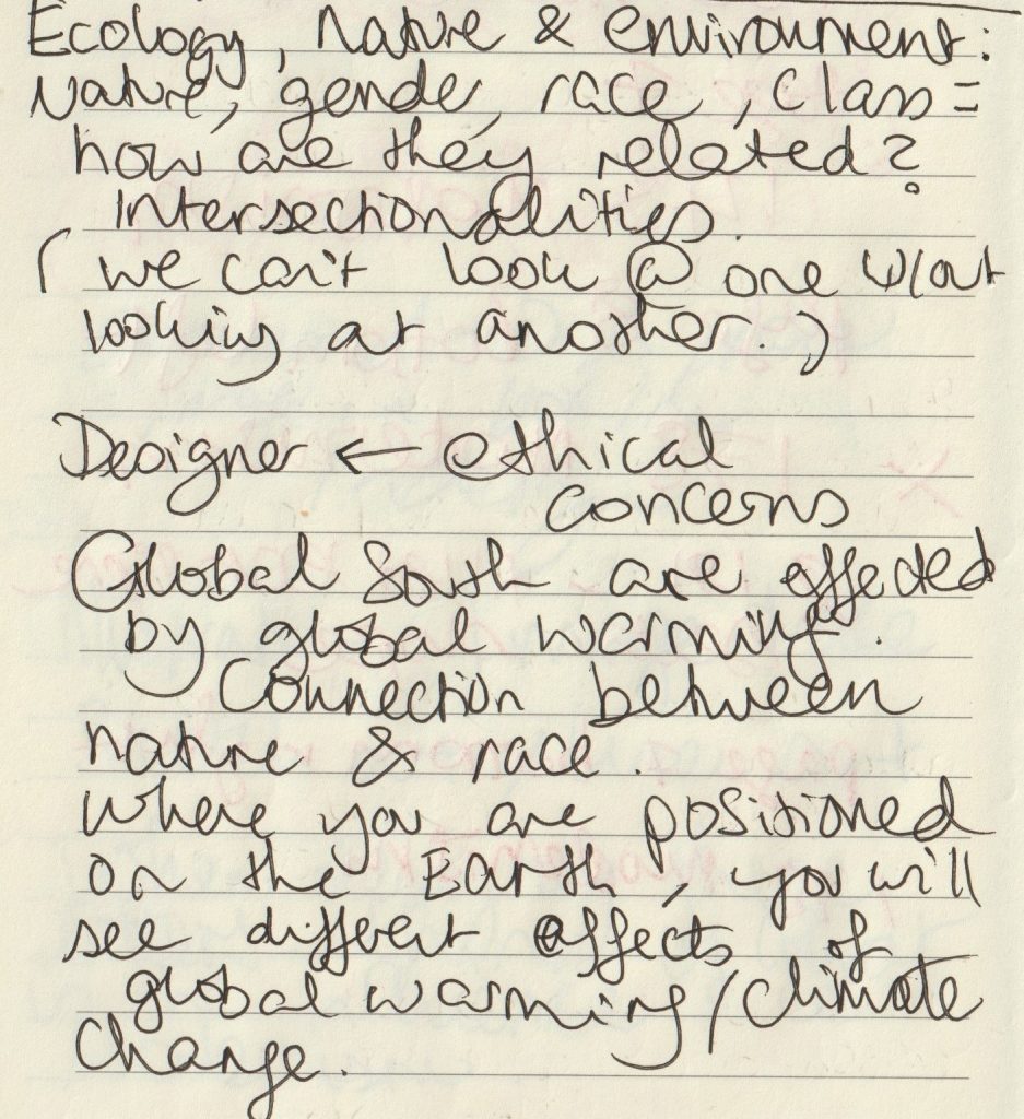
Paragraph #1 Covering the problem of nature vs culture

This paragraph talks about the blurred lines between nature and culture. We are introduced to the problem of waste.

Bombs in the DMZ Vietnam War https://www.divergenttravelers.com/immersion-vietnam-war/

Paragraph #2 Dominated by waste

This paragraph introduces us to the idea of our current culture of waste. The fact that waste is not just around us, but in our digestive tract as well for example. This made me think of the microplastics presented at the exhibition. The display showed the particles of car/bus tyres in our atmosphere. (‘The Tyre Collective’)
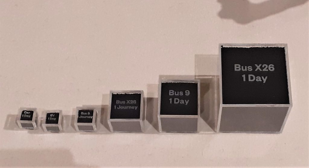
photo taken at the exhibition shows us pollution from vehicle tyres being in contact with the road surface.
https://www.dawn.com/news/1505436

#3 Illusion of dematerialisation

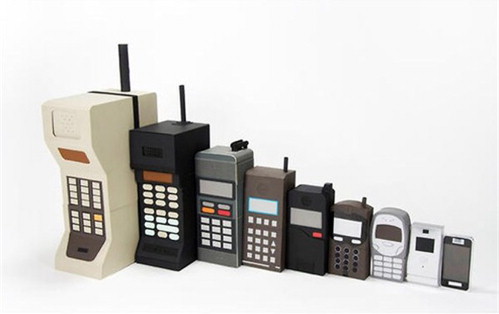
Here we are made aware of the sheer amount of rubbish created by humans. The 500 billion tonnes of plastic bags consumed per year and how easy it is to ignore this fact.

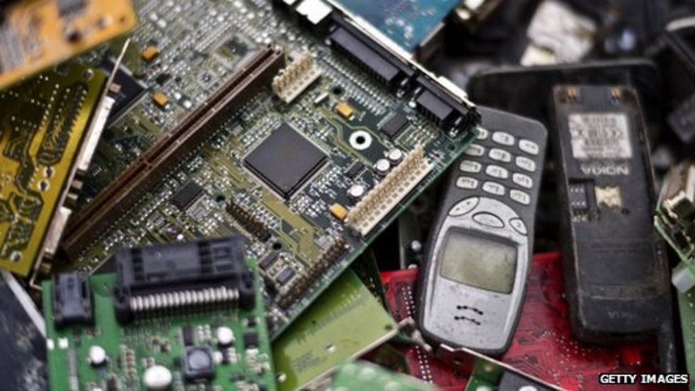
The image below illustrates the change in phone designs over the years. As technology looks lighter and more elegant we could be fooled into thinking that we are producing less waste than before. The opposite has been proven to be true.
https://www.sciencedirect.com/topics/computer-science/dematerialization

#4 Anthropocene

‘Anthropocene’ refers to the new layer of earth we are contributing to as humans.

https://www.chemistryworld.com/features/marking-the-anthropocene/4012969.article

#5 From need to desire

The capitalist culture created a shift from consumers buying just what they needed, to desire objects they have no need for. This allowed companies to make big money, but has had a detrimental effect on our Earth.
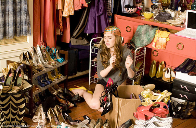
(A scene from the movie ‘Shopperholic’) http://www.koreaherald.com/view.php?ud=20140407001361

#6 Planned obsolescence

The role of the designer has been to make products look desirable to the consumer. The iPhone has been particularly criticised for its low repairability. Products that break earlier, mean more sales.
https://www.bbc.co.uk/news/technology-32353659
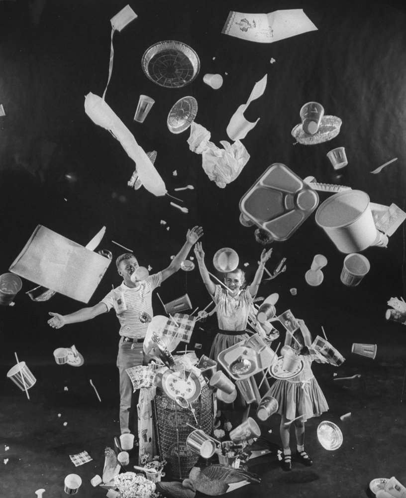
Three children tossing paper cups, plates, aluminum foil pans, lunch trays, straws and napkins through the air illustrating the usefulness of disposable dishes. https://thedieline.com/blog/2020/3/10/the-history-of-plastic-the-invention-of-throwaway-living?

#7 Design the possibility of repair

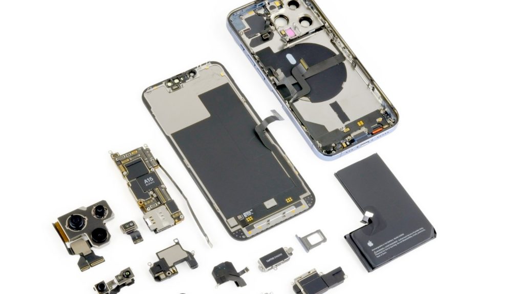
The designer has a role within the product cycle. They can focus on designing repairable products. (below) The iPhone 13 Pro is less repairable than its predecessors.
https://techunwrapped.com/why-the-iphone-13-pro-is-less-repairable-than-its-predecessors/

The article then goes on to suggest practical solutions.

  • Electronics can be designed with modular parts
  • Stop fusing plastics and metals together, this will be more can be recycled
  • adapt and re-use good buildings instead of demolishing and replacing
  • reducing carbon-heavy steel and concrete

#8 The consequences on reality

Consumers need to demand these sustainable products/ methods. The designer could blindly follow what they are told to do by their paymasters, but then nothing would change.

The metaphor of fungus is mentioned here. An organism that survives and thrives.

The article mentions Bio-design, which is a new phrase for me. We then watched a short student-made video about the possibilities of bio design in the future, including the dyeing of fabrics in a sustainable way. We have only just begun to explore the possibilities of bacteria.

https://www.dh.umu.se/en/stories/?id=45080

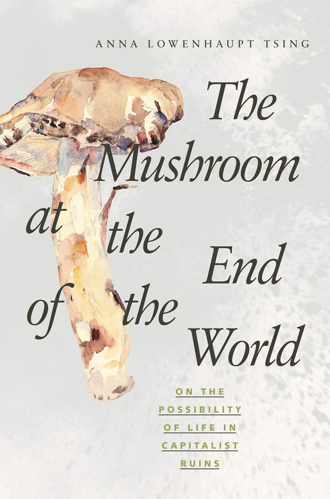
Anna Tsing is mentioned within the catalogue. Her book (left) explores the story of the Matsutake mushroom. Amazon.com says about the book- ‘In all its contradictions, matsutake offers insights into areas far beyond just mushrooms and addresses a crucial question: what manages to live in the ruins we have made?’ 

Within the article, we also see mention of the famous architect, Cedric Price.
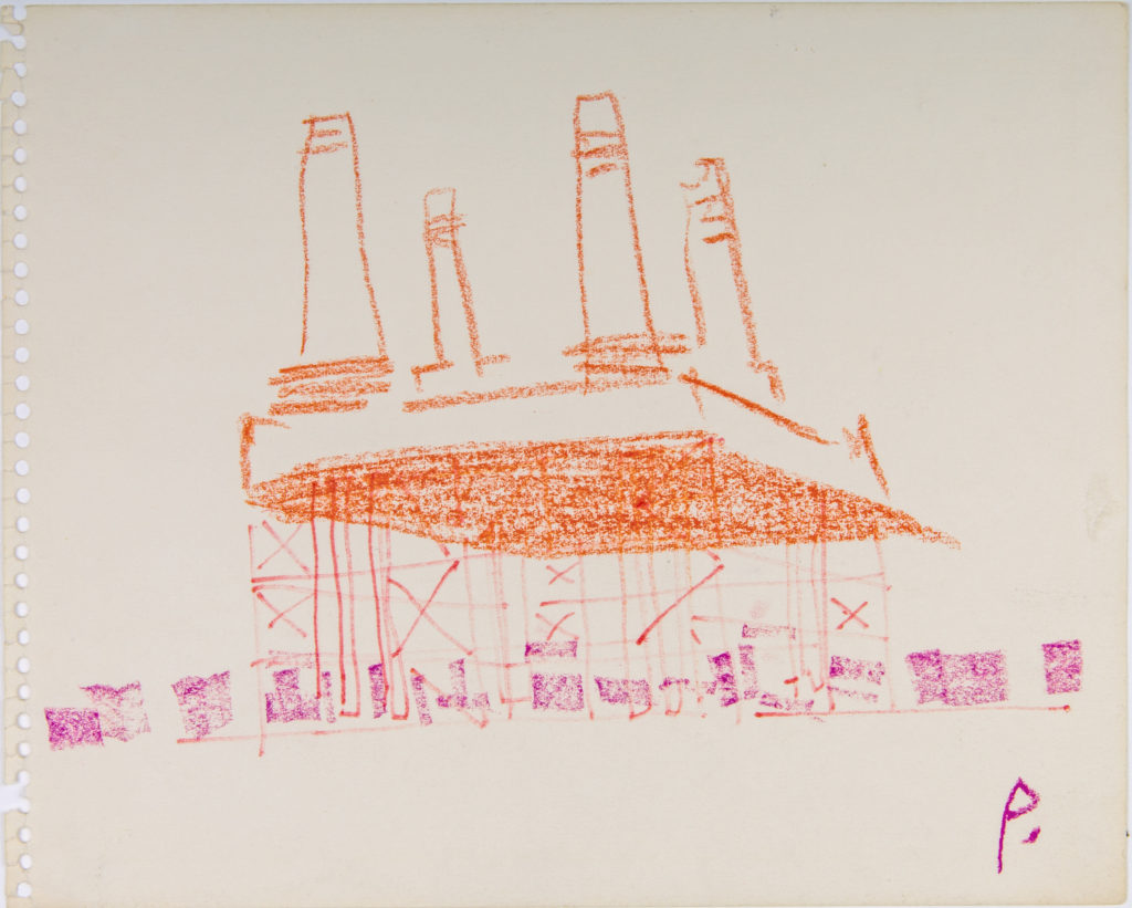
https://drawingmatter.org/cedric-price-2/

‘Price’s architectural style came from his belief that buildings should serve the needs of the people, and be radically transformed or demolished if they no longer served their purpose. A life-long socialist, Price was deeply skeptical of political institutions and their tendency to use grand, monumental buildings as a means of consolidating power. Instead, Price proposed building temporary and mutable structures which would be open and accessible to all.’

Karl Marx is also mentioned within the text.
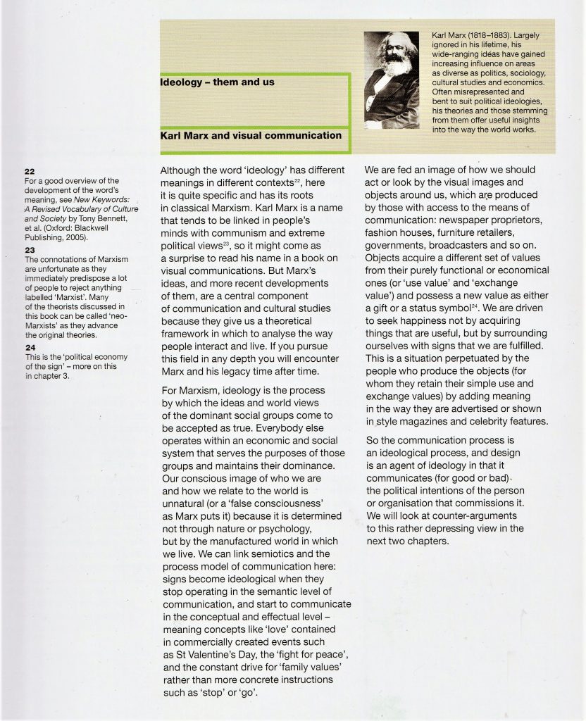
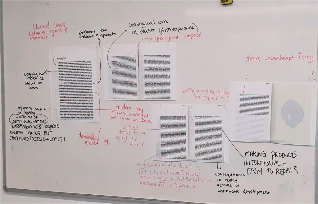
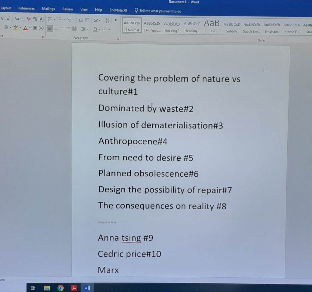
The board from today’s lecture. We annotated the text as a group. This was particularly helpful, as it allowed us to see each other’s interpretations.

We condensed down the topics within each paragraph. It was helpful to write them as short phrases. This exercise helped me to understand what I had read, and I will be using this method when looking at articles in my future research.
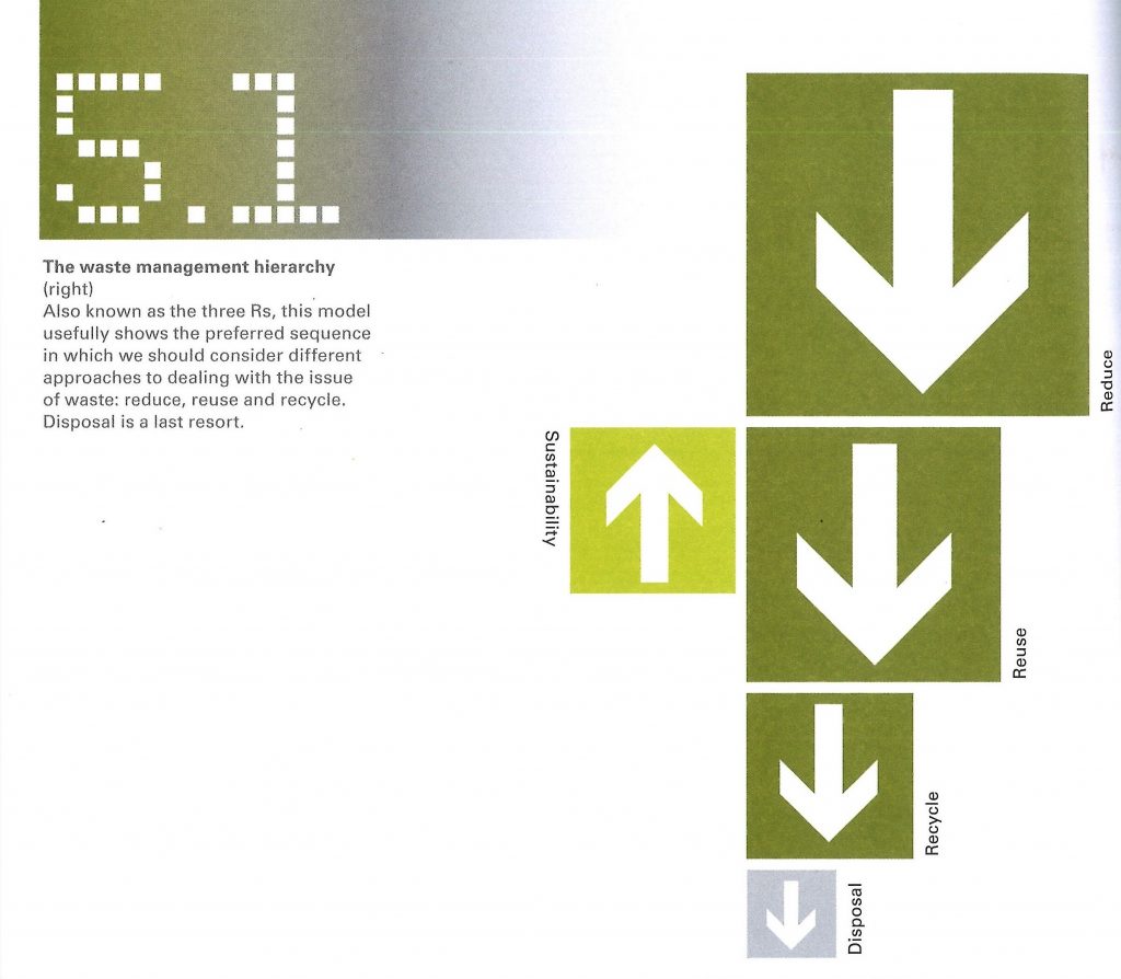
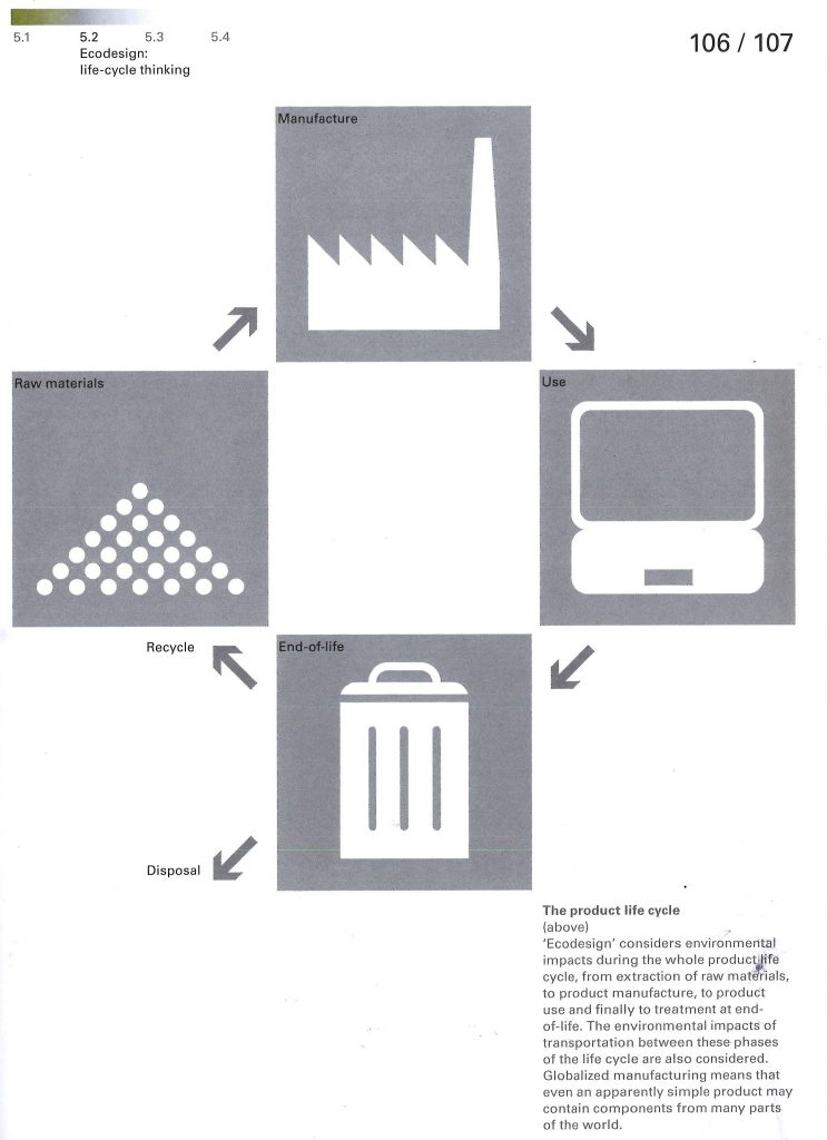
Presentation rejig

I wrote a script for the 1st draft of the presentation:

Script

Slide 1

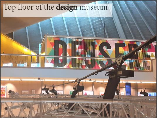
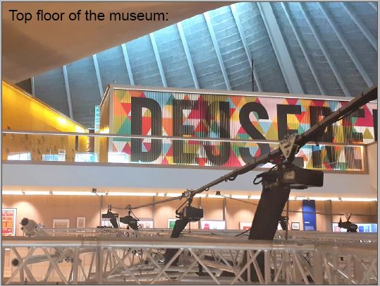
Arriving at the design museum, I had no idea what to expect because I’d never been to the museum before. To find the exhibition of designer maker user was easy because of this huge colourful sign and it was obvious to see where to go and it was on the top floor

Slide 2

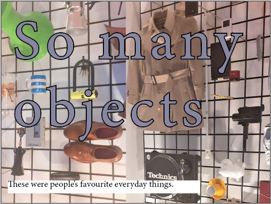
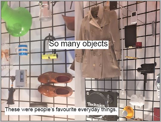
Walking into the exhibition, I was confronted by so many objects, and it was quite overwhelming because I was surrounded by lots of different objects, from different time periods, things I liked, things I didn’t like, things I recognised and things I didn’t recognise, and this is a picture of people’s favourite everyday things which the public voted on.

Slide 3

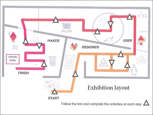
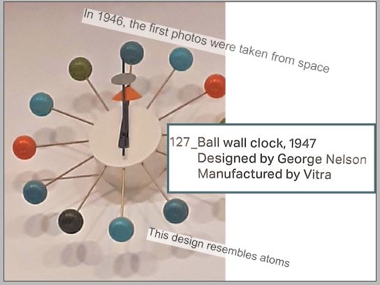
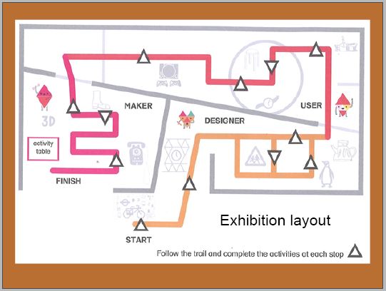
Here is a picture of the layout of the exhibition. This is the start, and this is the finish, but when I arrived there, I didn’t notice this was where the exhibition started, so I started at the finish point, meaning I first saw the ‘maker’ section, which focused on the production of the objects. I walked around once and then walked around a second time before I even noticed the ball wall clock, which was right at the top of the wall and easy to see because it’s just so bright and bold. Maybe this is why the museum placed it at the top because you don’t need to see any small details and it just stands out because it’s so loud and different. Straight away I knew, this is my object.

Slide 4

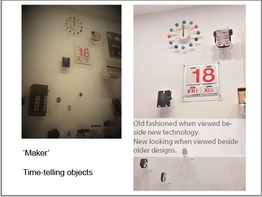
Being on the wall with other time-telling objects is really interesting because it’s on the wall with calendars, filafaxes, watches. But the modern digital watches make the ball wall clock look old fashioned. For this clock to be beside similar objects, helps me to place it in time by comparison. I kind of guessed that it was from the modernist period just based on what I already know about modernist design. The plaque told me the clock was made in 1947 and designed by a designer called George Nelson.

Slide 5

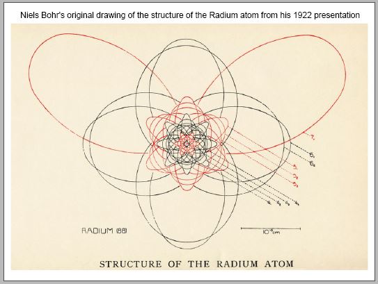
I think another aspect that indicates when this clock was designed, is that the structure of the clock is quite like an atom and this places it in history because in 1946, the first photos were taken from space and therefore people were starting to think about space travel and nuclear research.

Slide 6

This picture is the first drawing of the structure of an atom so you can see that with both there’s a centre and then spokes that extend outwards.

Slide 7

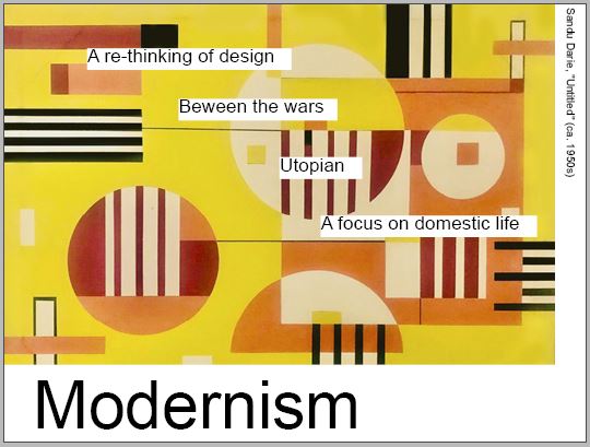
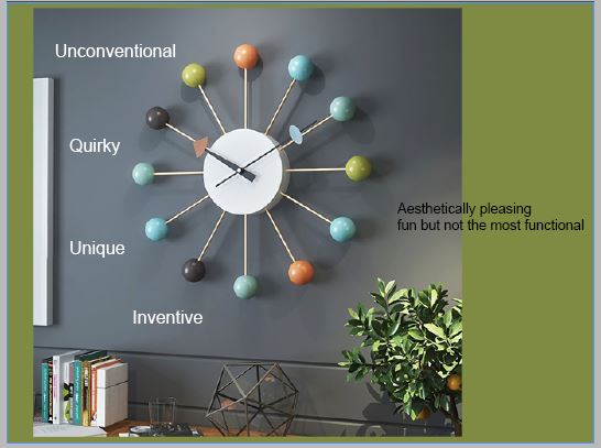
I’ve talked about the design being modernist in its style. the modernist period occurred in the western world between the 2 world wars. It was a philosophical and an art movement. People wanted to look forwards into a utopian future. Modernist designers were focused on reinventing the city after destruction and during the housing crisis. There was a focus on domestic design. After the war people wanted nice things around them in the home, so the design was quite uplifting and happy. Things didn’t have to be there just to serve as a function anymore, they could be aesthetically pleasing. This clock is aesthetically pleasing but I would say is not the most functional because there are no actual numbers, and this could be challenging for some people so it would probably be best in a home setting or somewhere where you didn’t need to know the precise time.

Slide 8

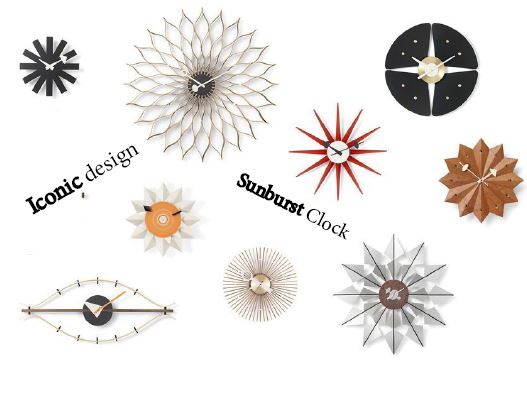
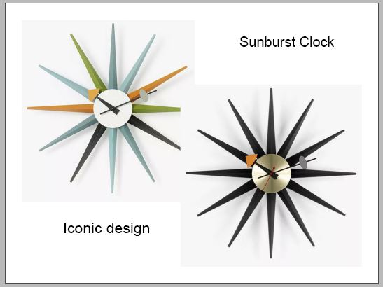
The sunburst clock is another clock designed by George nelson and they’re iconic clock designs because they are widely recognised and really represent people’s homes from that period. particularly American homes. The star shaped designs also reference space.

Slide 9

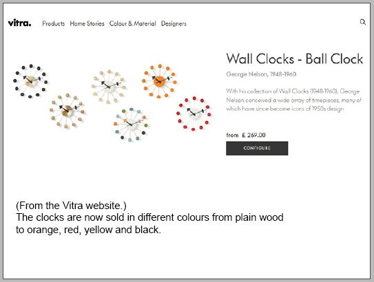
The ball wall clock that I saw in the museum is still being made today which I found quite amazing, and it just shows how popular and well-loved they are that they’re still being made all these years late r they are currently being sold for 269 pounds and I believe the reason why they’re worth so much is because they are handmade, so this shows really good quality. The choice of different colours now means that they are suitable for more of a variety of different rooms.

Slide 10

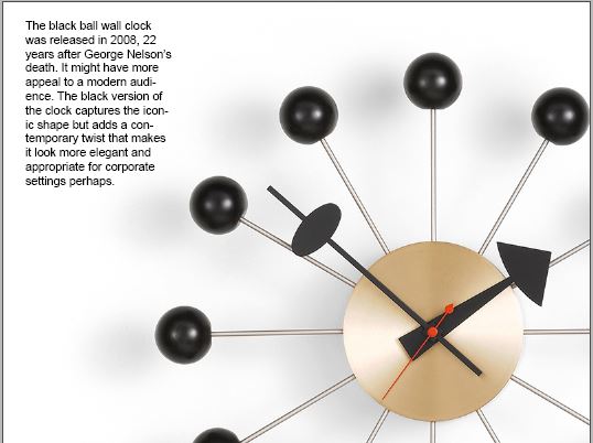
And finally, I really like this black version which was introduced after the designer’s death and marked what would have been his 100th birthday. Although the structure is the same, taking away the bright colours means that it looks more elegant and stylish, and I imagine it could be good for a corporate setting and it looks really contemporary compared to the original and therefore I think this version could have much more appeal in today’s world.


I turned the script into prompt cards to use during the presentation:

Prompt Cards

Slide 1

  • Arriving at the museum..
  • Designer Maker User
  • Easy to find

Slide 2

  • Walking into the exhibition..
  • overwhelmed

Slide 3

  • This is..
  • ball wall clock at top of wall
  • easy to see- bright and bold- don’t need to see small detail
  • knew it was my object

Slide 4

  • Being on the wall with other time-telling objects…comparison
  • I guessed it was from the modernist period
  • The plaque tells me…

Slide 5

  • Another aspect that indicates when…structure…first photos 1946…this places it in history…space travel & nuclear research

Slide 6

  • This is a picture of…You can see they both…spokes

Slide 7

  • I’ve spoken about the clock being modernist in design…in the western world between the 2 world wars.
  • Philosophical and art movement
  • Building back the city with a utopian view of the future
  • A focus on domestic design- uplifting
  • Somewhere you don’t need to know the precise time

Slide 8

  • The sunburst clocks…
  • Represents particularly American homes from the 1950’s
  • Star shapes also references space

Slide 9

  • The ball wall clock I saw in the museum is still being made today
  • Popular and well loved
  • Handmade= good quality

Slide 10

  • And finally, I really like the black version
  • Elegant stylish contemporary
  • More appeal in todays world

I recorded my voice delivering the presentation but it over-ran the time limit of 5 minutes. I re-recorded it but could not get the presentation to less than 7 minutes without rushing it. I therefore needed to re-consider and think about where I could cut 2 minutes out.

I thought of 3 possible areas to be cut:

  1. entering the museum
  2. about modernism
  3. about atoms/the space age

I timed the section about atoms and it was only 40 seconds.

I then decided to cut the beginning slides about entering the museum, as I felt it was less interesting than speaking about the origins of the design.

Slide 1
Slide 2
Slide 3

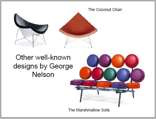
After needing to cut it down more, I removed this slide, as I felt I could mention his other designs in a sentence within another section:

Presentation 1st Draft

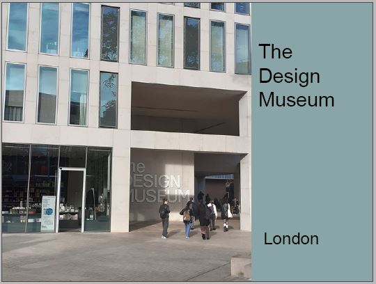
When putting the slides together, I wasn’t sure how to start. I began by placing this photo of the outside of the museum, however I later decided to remove this slide for 2 reasons. 1) The colour does not represent my object. 2) The second slide contains a photo of the museum.

Another thing I decided to change was the font. I later changed the font to ‘Minion Pro.’ I felt that this font was appropriate to reflect the 1940’s period in which the clock was designed.

I liked this slide but thought I could enlarge and colour the text to emphasize the meaning. When I talk about being overwhelmed by the amount of objects, this can be illustrated in my choice of type.

I added orange to this background to tie it in with the colour of the clock. However, I decided that this background was not necessary for this slide.

The slide below wasn’t working well. I included the picture on the left to demonstrate the way we can focus on one object and ignore the surroundings. However, the 2 images looked to be competing on the slide and they both showed the same subject.

I chose to keep the image on the right because of its clarity.

I liked the way I placed the photo to the edge of the slide. I also liked the placement of the lines of text, however, it felt premature to reference the atomic influence on the design, since the audience has not been introduced to the clock and first impressions.

When editing the presentation, I brought this image up to the edges of the slide so that it follows the previous slides where I used photos to fill the page.

I wanted to include a slide about Modernism, as the audience may want to see examples of what Modernism is.

When recording the script to see how long it would take to give the presentation, I was recording for almost 10 minutes. I needed to cut down the length of the presentation. I chose to remove this slide as I could talk about Modernism during another slide.

I was happy with the below slide. I like the way the object pop against the white background.

I moved the below slide further up because the information on it relates to earlier slides. I enlarged the text on the right side to make it more readable.

I placed the text on the left side around the clock in a circular formation.

I used green from the clock for this background. This background does look slightly out of place in the presentation. I therefore removed this green background from the slide.

The images below are overlapping slightly. I needed to fix this for the final presentation.

I may need to shorten the paragraph here so that I am displaying 1 or 2 bullet points of text. It is important that the slides only highlight key words and statistics.

In the week before the presentation, I will practice delivering the presentation. I have learned from past presentations, that knowing the information by heart will help me when I need to talk about the subject.

Next I will make prompt cards to use as reminders when delivering the presentation.

I am working on final touches to improve the look of the presentation and ensure that the slides support what I will be talking about.