Intro to Photography (Workshop part 1)

Having studied photography briefly in college, I had a basic understanding of DSLR cameras. Today we had 3 hours to be introduced to photography and capture our objects using a variety of set-ups. This was a fast-paced session, packed with lots of information.

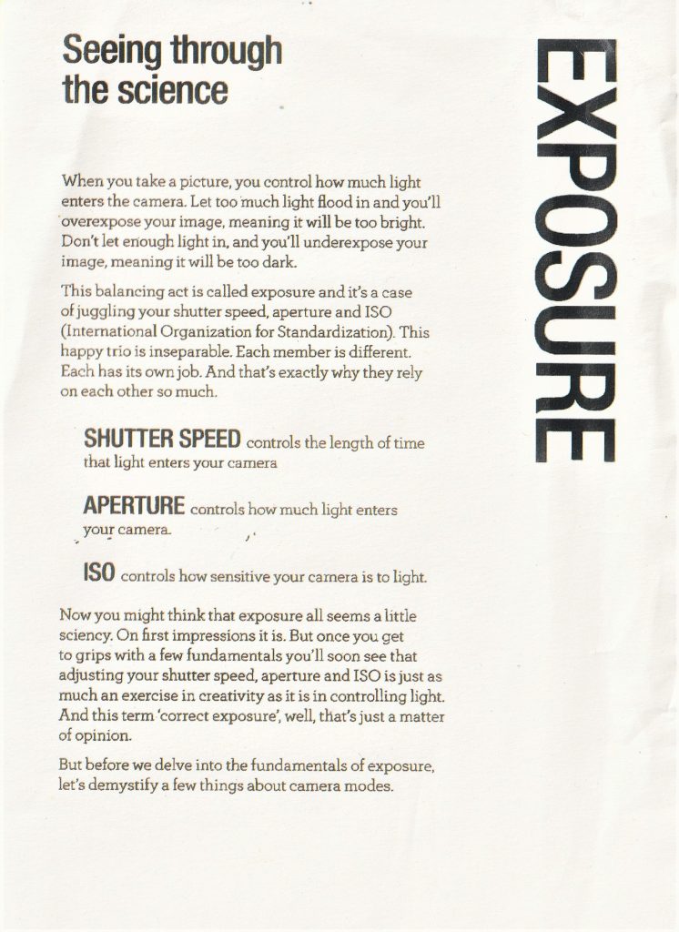
Our lecturer Hannah explained that the camera is a machine that takes in light. As a photographer, our job is to control the light going into the camera. This is done using shutter speed, ISO and aperture. When you alter one of these, it affects the other 2 settings.

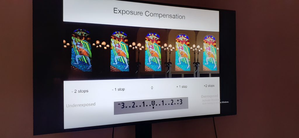
Letting in too much light makes an image over-exposed and too little light creates an under-exposed image:

(Left to right: Under-exposed, correctly exposed, over-exposed) photos by Guy Henstock | Photographer Oxford

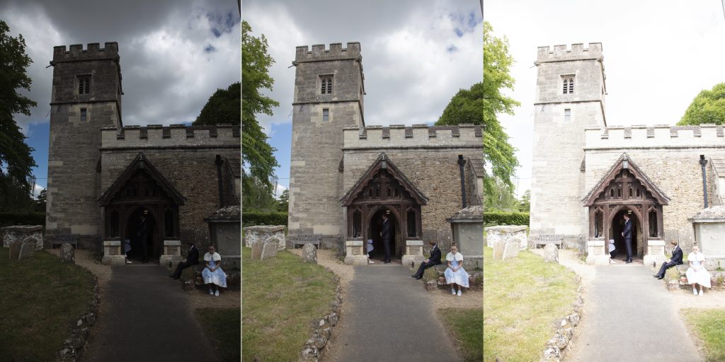
We learnt about a camera feature I had never heard of, called exposure compensation. This is used to balance the light in an image when a scene has very dark and very light areas, for example, when a scene is lit from behind.

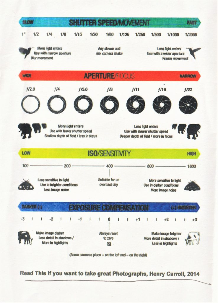
With analogue cameras, the ISO can only be changed by changing the whole film to one with a different ISO rating, but digital cameras allow you to change the ISO from shot to shot. A good ISO for a cloudy day would be 800 and for a sunny day would be 100. A low ISO gives a smooth grain, as the camera is letting in less light. Using a high ISO will give you more noise, though you need to use a higher ISO when shooting in a really dark room for example.

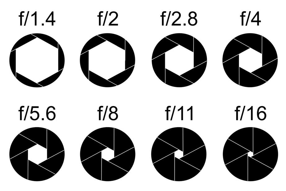
Aperture refers to the size of the opening of the camera. A smaller opening = a high aperture, for example f/22. This would be suitable for photographing landscapes. This gives a larger depth of field, meaning that the camera is able to focus on foreground, mid-ground and background. A larger opening, and therefore low aperture, such as f/4.5, is best for portrait photography. A low aperture focuses on the foreground and these photos will have slightly blurry background.
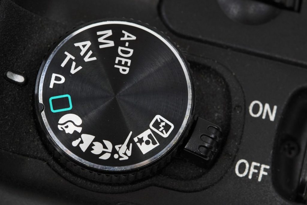
Hannah explained features of the Canon cameras we use at Brookes:

Tulip symbol = macro (to capture tiny details)

Running person symbol = shutter speed

Flash symbol = night time/ low light shooting

M=manual function

AV= aperture priority

TV=shutter priority

MF/AF= manual focus/automatic focus

RAW for very large photos, e.g. the side of a building. They take up a lot of memory and you cannot process RAW images inside photoshop. You would instead need to use a RAW converter, such as Adobe camera RAW.

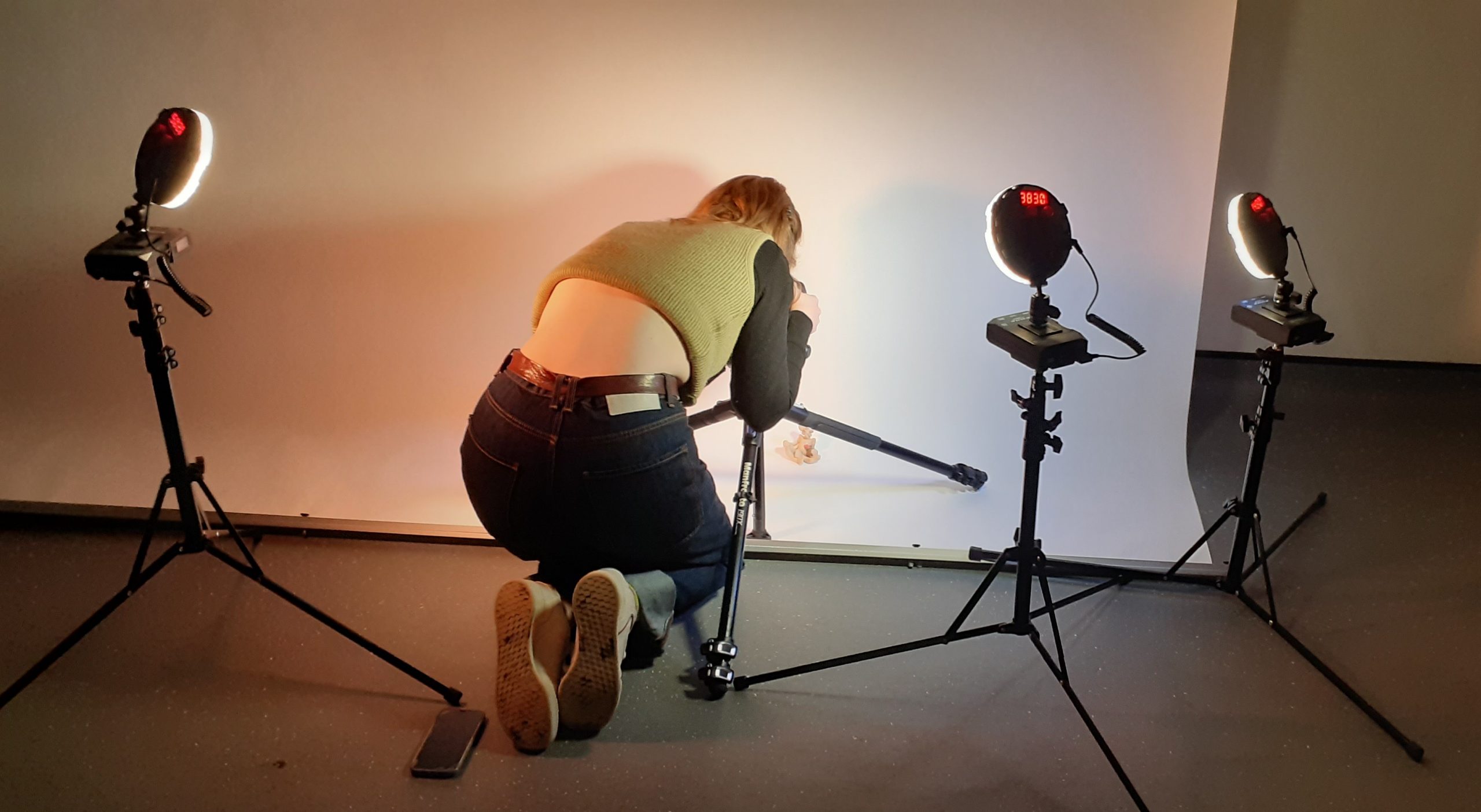
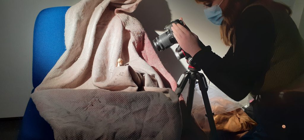
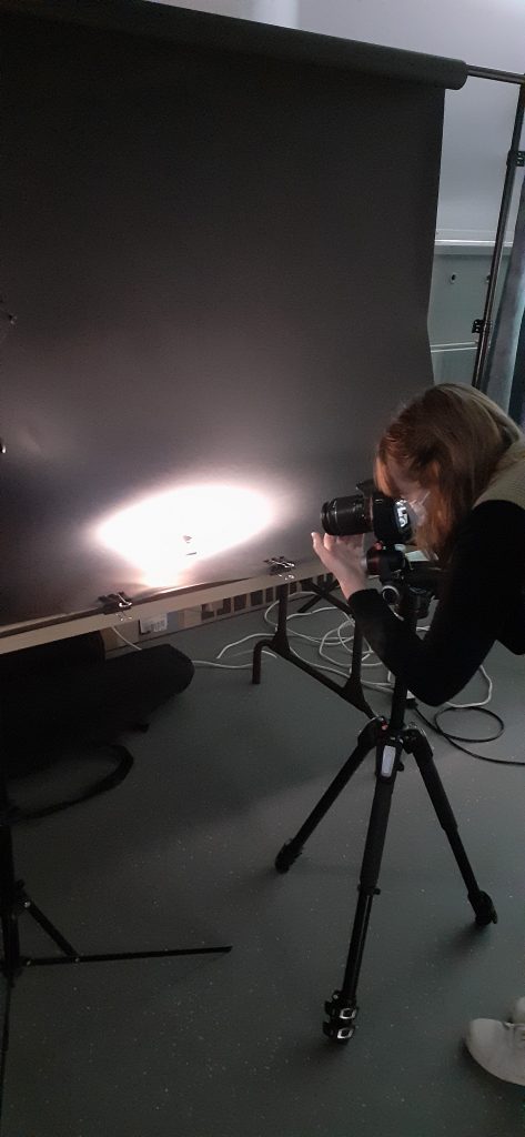
We learnt to work with tripods, which is something I had never done before. Using a tripod is an important technique in photography. When holding a camera by hand, we have a natural shake that can cause blurring in photos, especially when using a long shutter speed.

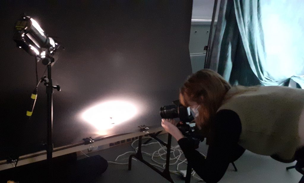
We used 4 different set-ups to photograph our objects. Working in pairs, we took several photos in 1 area, then moved to the next. For example, in 1 set-up we were using a chair draped in fabric and metal studio lights. These lights get very hot, so we used heat protective gloves to handle them. We had the choice of using one or both lights for a photo. Moving the bulb back and forth gave a spot-light effect or a more balanced light. We had the option to light part of all of the object.

My classmate photographing her object.

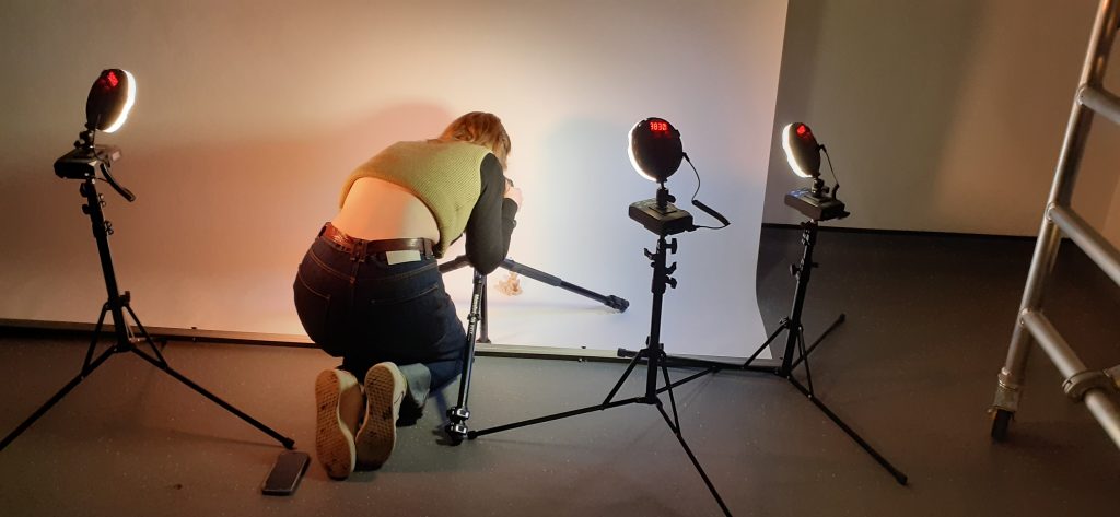
Another set up had a plinth and sheet hanging as a background. For this set-up we used studio lights with diffusers attached to the front. This set-up reminded me of a school photo shoot.

The 4th set-up allowed us to add colour gels to filter the light through. These were LED lights. They were the easiest to use, as the switches were the same on the back to 1) change the warmth of the light and b) change the brightness to lighter or darker.

LED light set-up gave us the option of using colour filters.
Classmate using the set-up.

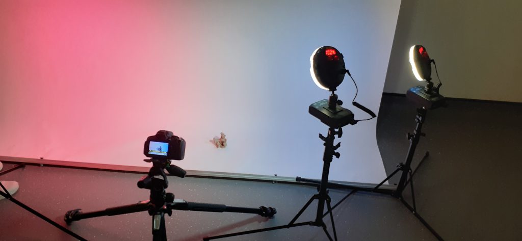
It was interesting to experiment with shining light onto the background and seeing the effect compared to shining the light directly onto the subject. The black background created a theater look and made dramatic photos.

Class hand-out

Screen-printing Workshop 2

Our second screen-printing workshop was focused on building another layer onto our previous prints. The first prints would become backgrounds and the second layer would need to add something to the composition. For this step, I needed to consider colour, line, pattern and balance. (known as the formal elements of art)

I looked at A Primer for Visual Literacy by Donis A. Dondis, to help me learn tips for composing my prints. Some key quotes from this book:

Line

“Line can take many different forms to express many different moods. It can be very loose and undisciplined, as in the sketch as illustrated, to take advantage of the spontaneity of expression. It can be very delicate and undulating or bold and course, even in the hands of the same artist.” “Line really exists in nature. But line does appear in the environment: the crack in the sidewalk, telephone wires against the sky, bare branches in winter, a cable bridge. The visual element of line is used mostly to express the juxtaposition of two tones. Light is utilized most often to describe juxtaposition, and in this, it’s an artificial device.”

Shape

“Line describes shape. In the parlance of the visual arts, line articulates the complexity of shape. There are three basic shapes, square, circle, and equilateral triangle. Each of the basic shapes has its own unique character and characteristics and each is attached a great deal of meaning, some through association, some through our victory, and some through our own psychological and physiological perceptions. Sky has associations to it dullness, honesty, straightness, and workmanlike meaning; the triangle, action, conflict, tension; the circle, endless nurse, warmth, protection.”

Colour

“Since perception of colour is the single most strongly emotional part of the visual process, it has great force and can be utilised to express and reinforce visual information to great advantage. Colour not only has universally shared meaning of their experience, but it also has separate worth information leaked through Sim. In addition to the highly negotiable colour meaning, each of us has our own personal and subjective colour preferences. We choose our own colour statements and settings.” “Colour has three dimensions which can be defined and measured. Here is of the colour itself of which there are more than a hundred stop the second dimension of colour saturation, which is the relative purity of the colour from the cuter grey. The third, and last dimension of colour is achromatic. It is the relative brightness, from light to dark, of value or tonal gradations.”

Whilst including detail in the second layer, I wanted to reserve using the finest details for the top layer.

I started with this print from my last session. Securing it to the table using the suction switch. I like the simplicity of this print and combined with the colour, it resembles the Earth.

I didn’t want to take away from Earthly aspect of the image. Therefore, I used rounded shapes as my second layer to blend into this theme.

The use of green for the second layer meant that this layer was harmonious with the background. Choosing a darker green meant that the shapes stood out against the circle.

I found the orange ink to be fairly transparent. This meant it worked well as a flat layer, since it blended in visually. The grey lines of the background became brown when mixed with the colour of the second layer. I am not sure why there are white speckles across the page. I assume the markings were on the screen. I like the overall warmth of the image.

I chose blue ink for the second layer.

I thought the blue would blend with the pink and create a purple image. This was not the case, as the blue paint sat on top and looked purely blue. Using a purple paint for the final layer may help to unify the colour in the image.

Adding binder to the blue would have helped to create the effect I had in mind.

For my second layer, I used 2 colours. There was not a perfect merge in the middle, but I was happy with the effect I achieved. I wanted my second layer to be translucent, as I wanted the grey of the background to be tinged different colours. Knowing that yellow is a transparent colour, I didn’t add any binder to the paint. I did, however, mix binder with the purple paint, to make sure I could see the design clearly through it.

The theme of this print was always going to be about the Earth. I was hesitant to add a second layer, as I was happy with how the first layer turned out and I didn’t want to obscure the delicate brushstrokes. I chose to use the grid pattern, as I felt it fit with the theme of mapping. I chose grey, so that the lines would not be too harsh.

When printing, I did not use the vice, but instead worked with a classmate. Human error meant that the screen was jolted, this left blurred lines. To correct this, I plan to add another grid print, although in a darker colour, for example dark blue. This will help to define the print and anchor the design.

I used a paintbrush for creating this effect on the second layer.

The blue of the background mixes with the yellow to create a greenish hue. The orange appears more brown. I have learnt that mixing complementary colours dulls down or neutralizes the colour. It cancels out the vibrancy, which might be used intentionally in future prints.

002 Intro to Screen-printing

I first learned printmaking during my diploma at college. This was during the Covid-19 pandemic. Being unable to teach in-person workshops, the college was forced to ask us to complete the unit from home. This meant no access to screen-printing equipment or a printing press for etching/intaglio. We made do. I remember my bedroom being full of the many experiments needing to dry. I practiced linocut, mono-printing and collagraphs.

Now in week 1 of university, I was finally introduced to the art of screen-printing. The only thing I had previously been told about screen-printing, was that you needed to use your muscles and that the end result would be something flat in block colours. They were wrong about the work looking flat. Our lecturer Caroline showed us some examples of screen-prints and I was surprised to see the delicate lines and layers of the work.

Taping around the edges of the screen ensures you get clean edges and stops ink leaking through where you don’t want ink.

We used acrylic paint mixed with a binder. Adding more binder makes the paint more transparent. This is useful if you want to create a subtle layer.
When screen-printing, you need the screen to be held still when pulling the ink through. This machine is useful if you are working by yourself, as the vice is holding the screen. There is a sucking mechanism within the table that pulls the paper tight and holds it in place. A flat surface is also essential when screen-printing onto paper.

I came across several challenges in this first workshop. These challenges helped me to learn what to do next time. For example:

  • It was better to use too much ink on the screen. Excess ink could be removed, but too little ink meant that the screen would not be covered.
  • Using a clean, dry squeegee after the initial pull made sure that excess ink was removed and helped to push the ink through to get a better print. I noticed that the prints where I didn’t do this, were paler.
  • I found it difficult to print at the centre of the page. I later learned how to solve this issue.
  • Ink can gather at the edges of the print. If left to sit there, It can seep through and smudge the edges.
  • When using the vice machine, I needed to lift the screen and ‘flood’ the screen with ink, before setting it down to do the actual printing. When I failed to flood the screen first, the print did not turn out well.

In this first workshop, we were printing the backgrounds for future compositions.

My initial attempts:

When making this print, I did not flood the screen first, which is why the ink did not come out as a perfect rectangle.

The following week I went back to the workshop to get some more practice. There was a lot to learn in the first session and I finished the session with just 3 workable prints. I wanted more backgrounds to work on in our next session with Caroline. I was happier with my prints the second time around. They were not perfect, but I learnt how I could improve.

This print has a double-line effect. This is where I lifted up the screen and must have placed it slightly out of line before pulling more ink through.

For this print, I used a paintbrush to apply yellow and blue paint onto the screen. As the ink was pulled through the screen, the colour merged.

I wanted to make a plain background. I am happy with the neatness of the print overall. However, there are some spots of dark blue. This is where the paint was not mixed properly.

I used 2 colours in this print. I wanted to see how the colours would merge together. There were a couple of spots of dust that had landed on the print. When I removed the paper, the dust moved and therefore moved some of the paint across the page. This is something I could not have avoided. There is dust in a workshop and there is little we can do to avoid this.

In this session, I learned to align the print at the centre of the paper. To do this, I used print-outs of the original digital designs.

The design is the size of the screen. I placed the design onto my paper. The gives me an idea of where I want the design to be printed.
When I place the frame into the vice, I can see the design underneath and therefore use this as a guide to align the screen accurately.
Seeing my prints together, I am reminded of a globe, a country from above, and the ocean.