Intro to PhotoShop

In this week’s workshop, we learned how to use Adobe PhotoShop to edit photographs. We practiced by editing the photos we took of our objects in last week’s photography workshop.

The Process:

First, I opened my photograph in photoshop. An easy way to do this on a MAC, is to save the image to the desktop then drag and drop the image from the desktop into photoshop. You can also drag and drop several images into photoshop at the same time.

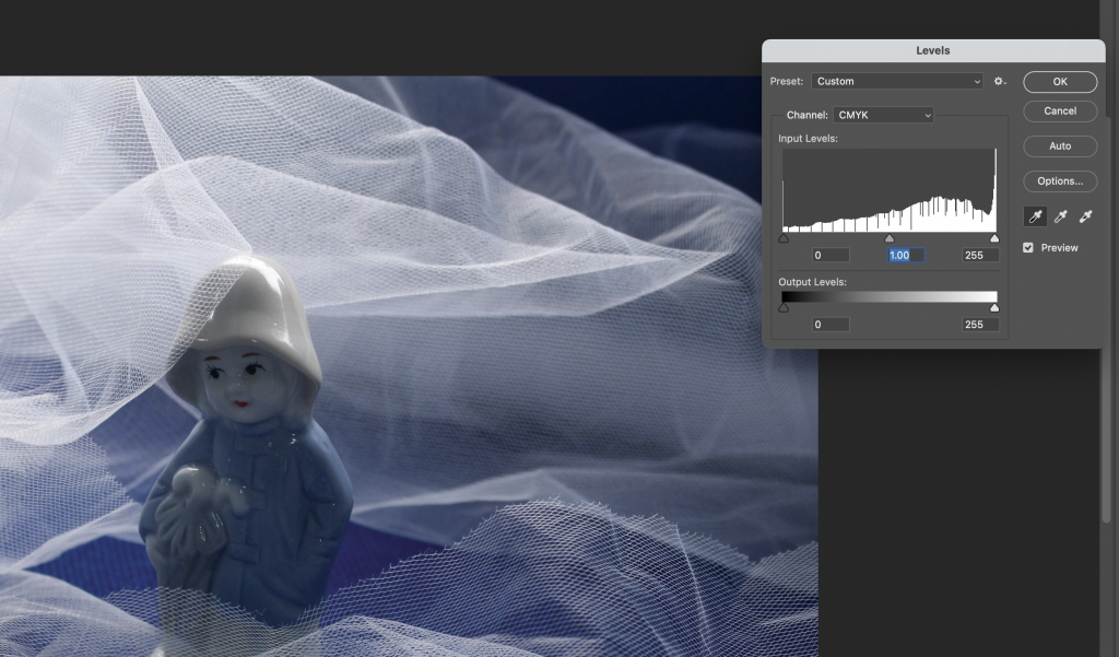
Selecting Image> adjustments> levels, brings up a histogram. It shows us what colour the pixels are. The shortcut for levels is Command + L.

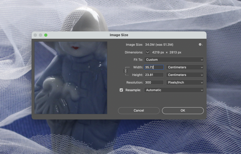
The resolution is the pixels per inch, known as DPI.

  • The lowest resolution is 72 DPI. This is good for images to be uploaded quickly, but they would be of a lower quality. The image could be suitable for images to be viewed on a phone- 72 is good for internet images.
  • 180 DPI is suitable for a good print quality. Increasing the DPI to 180 means that the size of the image needs to be changed, otherwise you are stretching the image.
  • 300 DPI would have a very good quality, but you would need to half the width of the image.

Selecting Image> mode> RGB (Red, Green,Blue) would be the option you would choose for screen production.

For an image that you want to print, CMYK (Cyan, Magenta, Yellow and Black) might be a better option. CMYK could correlate more with InDesign, as InDesign works in CMYK.

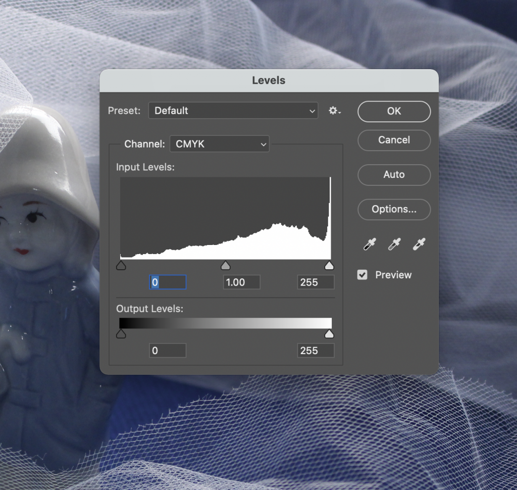
The 3 areas describe black on the left, mid-tones at the centre and highlights on the right. You might need to move the markers inwards to say where the histogram starts and ends. This would probably be the case if you had an image that was very light or very light. You can use these pointers to brighten or darken an image and make slight adjustments. Taking note of the slider number is useful.

You can use the pipette to show where you want the darkest dark or whitest white to be. The middle pipette can be used to unify the colours on a series of photos.

Holding down alt to brings up the option for reset. This can be used on the levels window to undo anything you have done to the image. (This works on any menu and replaces the ‘cancel’ option.)

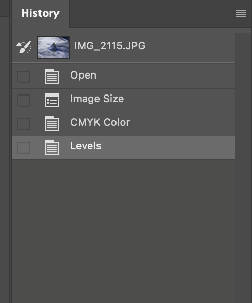
The history toolbar shows a record of your previous adjustments step-by-step. To bring up this tool, you can select Window> history to open it up.


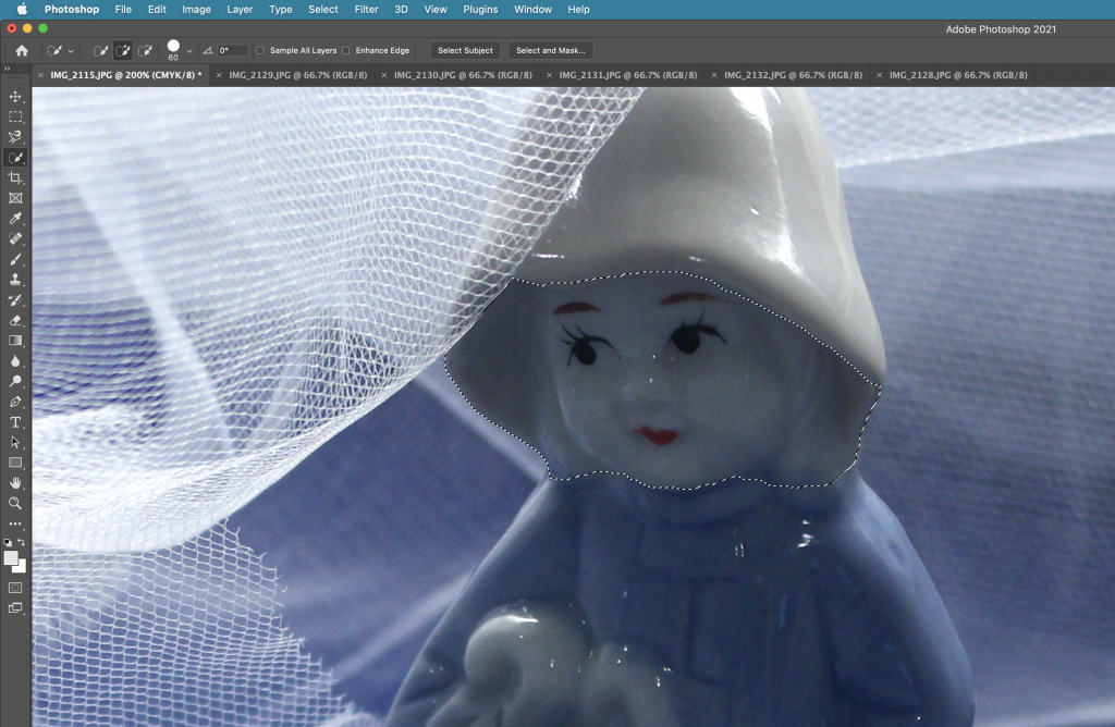
The magnetic lasso tool is used to select certain areas of your image. You can use the back space key to remove an anchor point, for instance if you have accidently gone out of the way.

The brightness/ contrast tool can be used to make adjustments. Using contrast can define the shadows. Our lecturer Hannah advised us not to use the brightness tool here, because the more refined way of brightening an image looks better.

The quick selection tool is another useful tool for selecting an area. It is used like a brush and like with a brush, the size can be increased and decreased. The easiest way to do this is to use the bracket keys make the brush bigger or smaller.

  • Select> deselect. This deselects the area you have selected.
  • Pressing V gets the curser back to an arrow.
  • Command +0 brings the image back to full screen.
  • Space bar, click and drag moves your focus around the page.
  • Command +/ Command- zooms in and out.
  • Selecting Helps > hands on tutorials brings up tutorials.
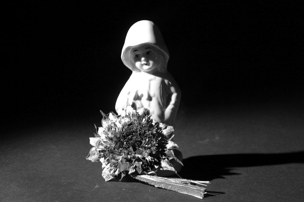
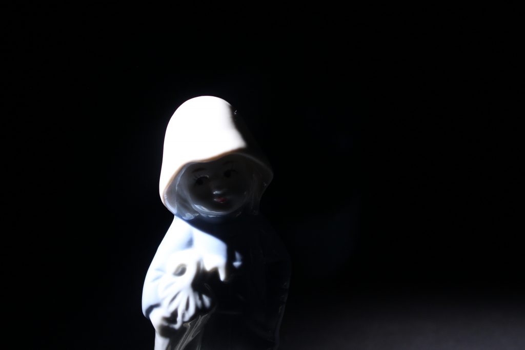
  • To convert your image to black and white, I can select Image> adjustments> black and white.

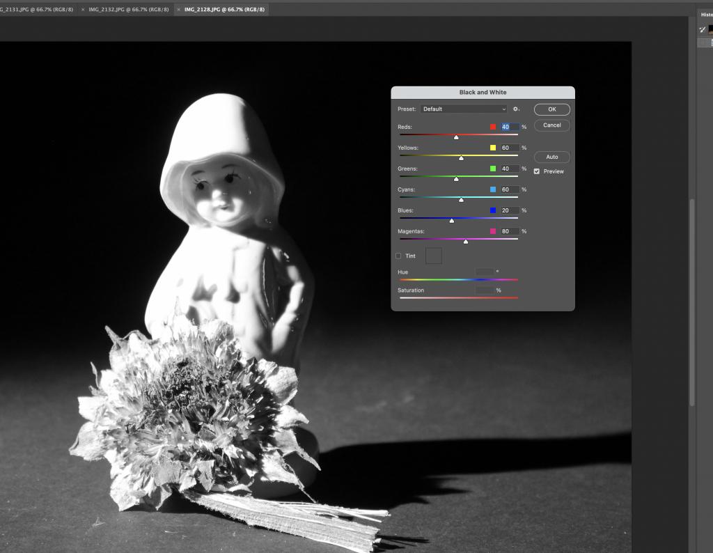
The colours of the sliders correspond to the colours in your original images. Changing these has an effect on your black and white image.

Green is more defined by the yellow channel than the green channel e.g. grass in an image.

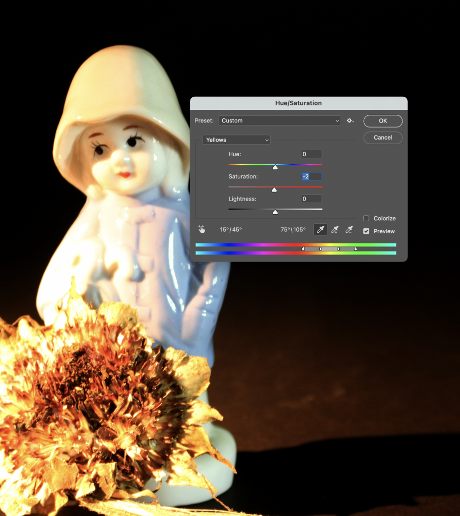
I chose ‘full black’ then lowered the contrast on the contrast and brighten tool for the above image.

When working with layers, clicking the eye switches the layer on and off. Meaning that you are able to see the image with and without that layer with the click of a button.

Only at the end of the process would you sharpen your photo. This can be good for an image that is very slightly out of focus, or ‘blurry’. To do this , I can select  filter> sharpen > unsharp mask, and use the following numbers:

Radius 1.0

Amount 100

Threshold 8

The Hue/Saturation window allows you to alter the hue and saturation of a group of colours within the image.

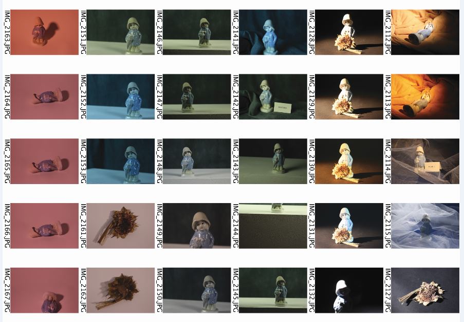
To create a contact sheet of all my photos from the workshop, I selected File> automate>contact sheet II. The photos will appear on the contact sheet in the alphabetical order they were in within the folder. Choosing the measurements means I can tell the computer whether I want the contact sheet to be landscape or portrait. I needed to know the measurements of A4 paper to do this.
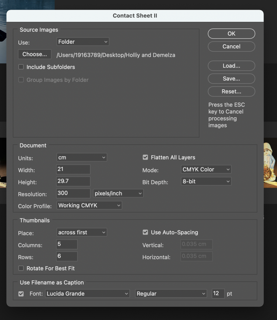
Contact Sheet

A contact sheet is useful to be able to view all your photos together. (In this case, all the photos from one workshop.)

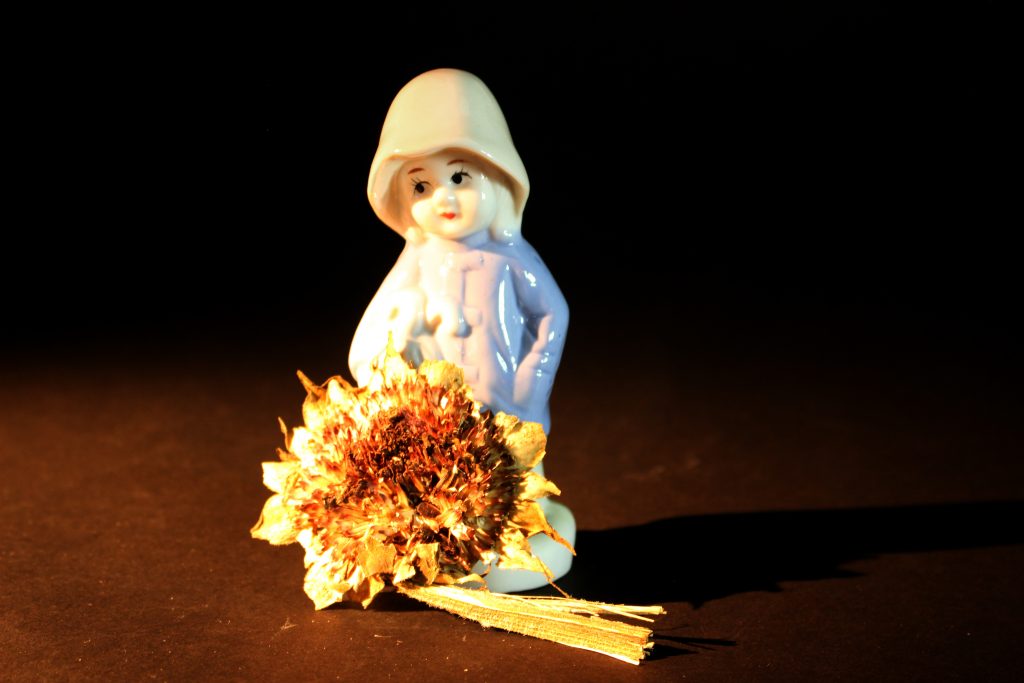
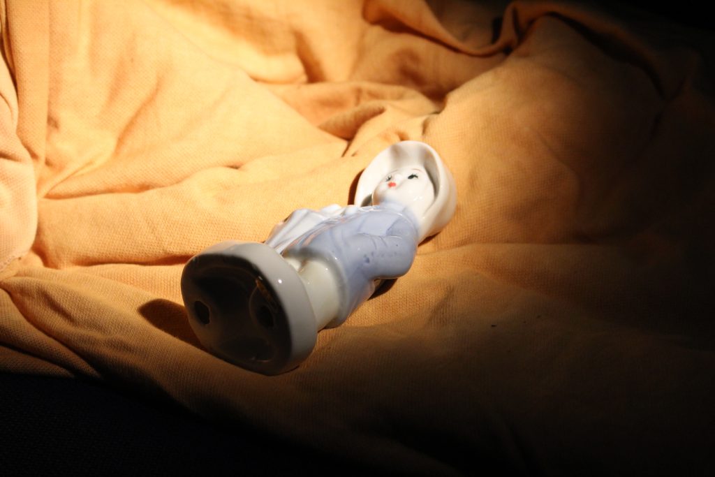
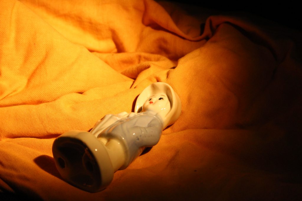
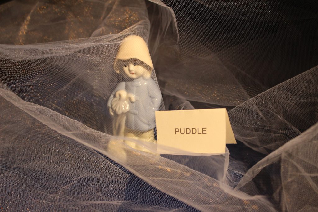
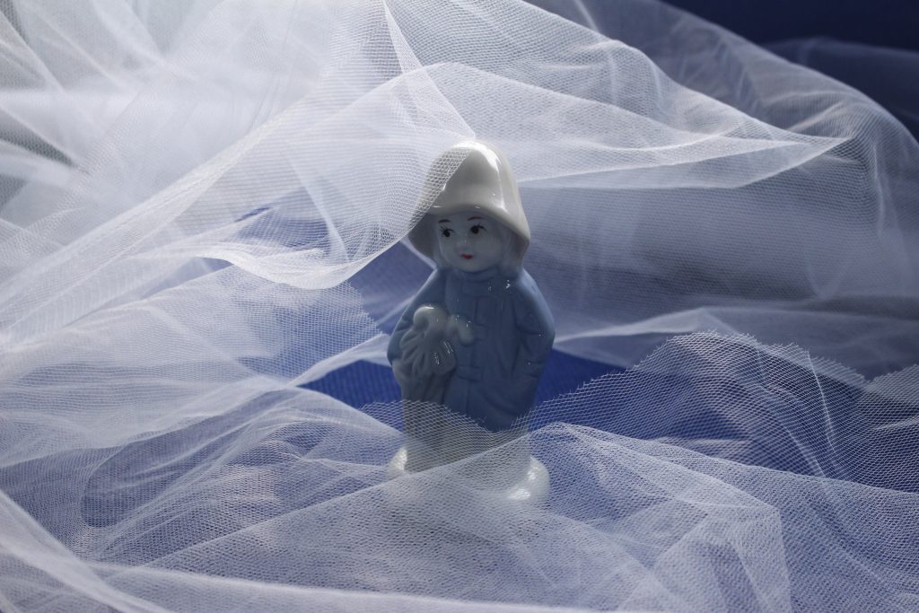
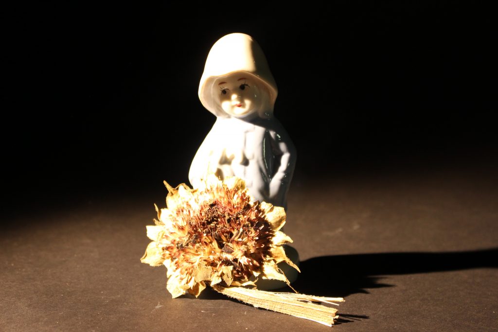
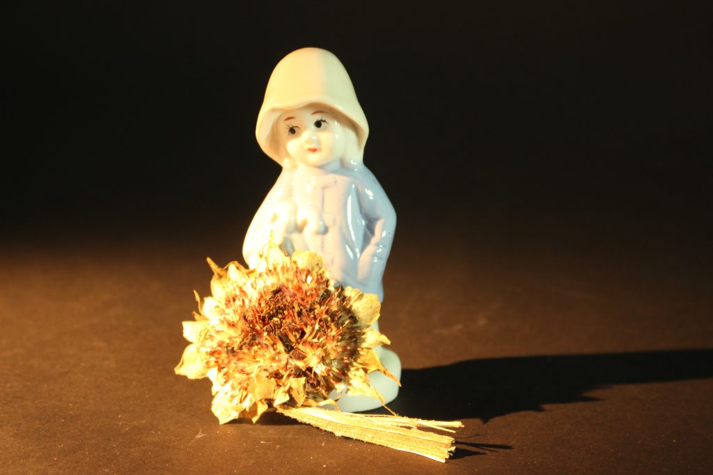
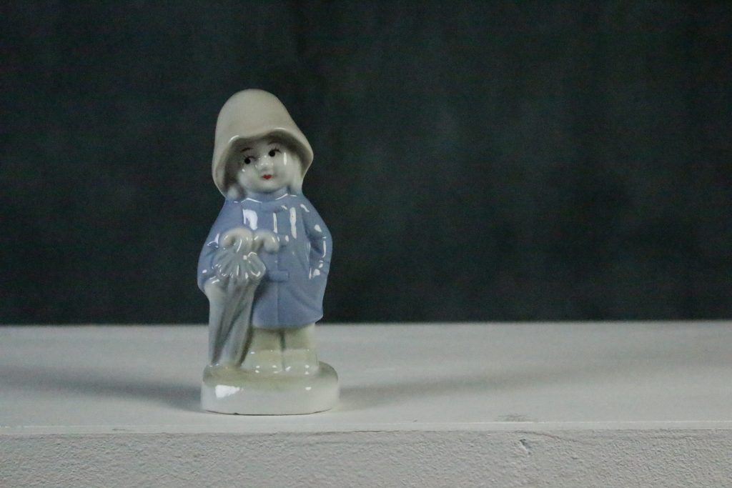
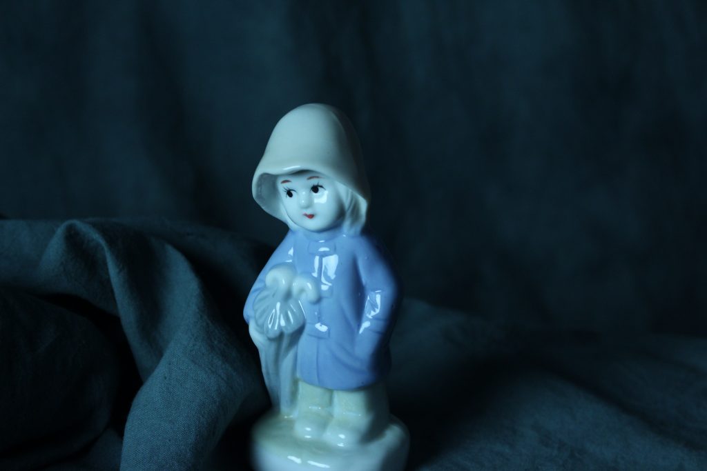
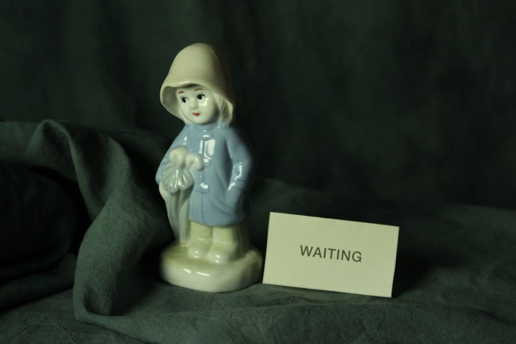
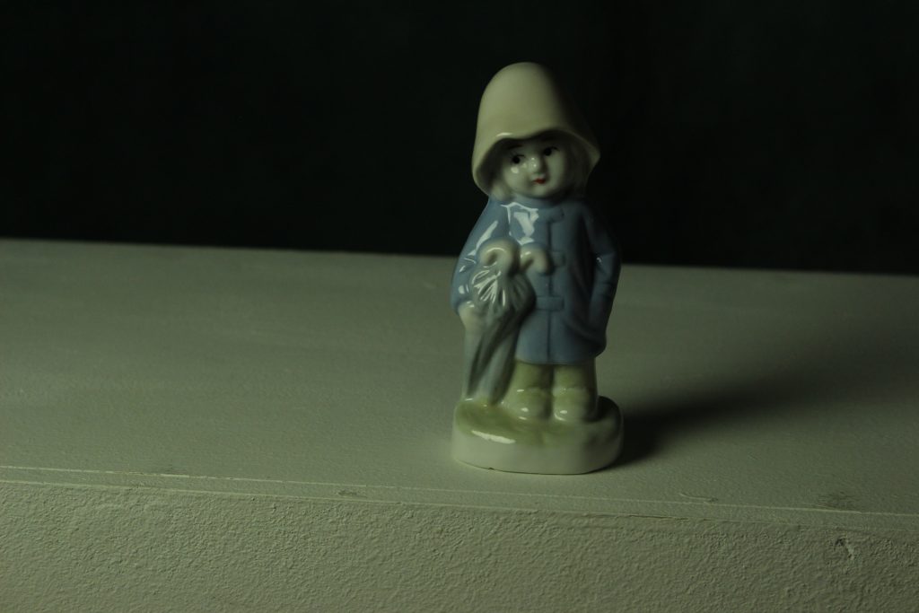
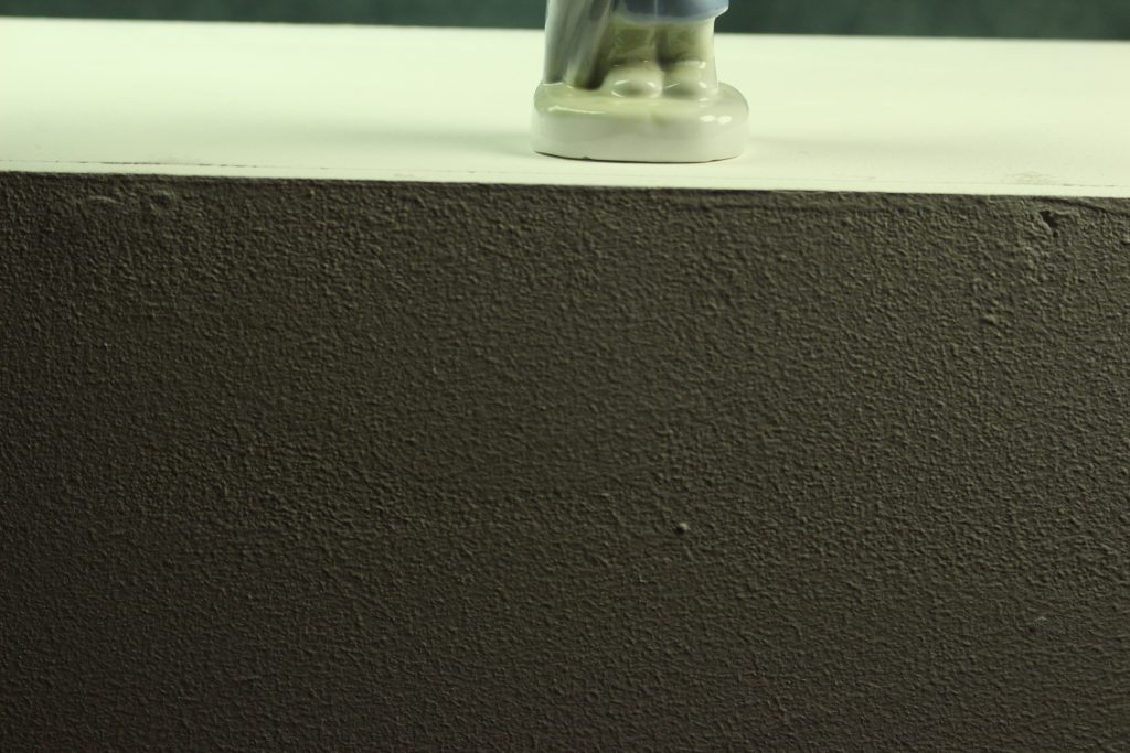
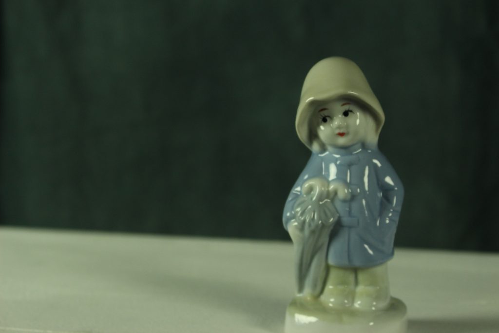
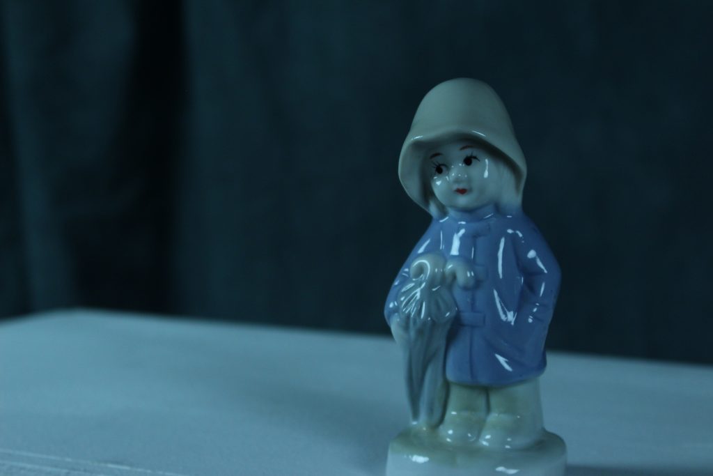
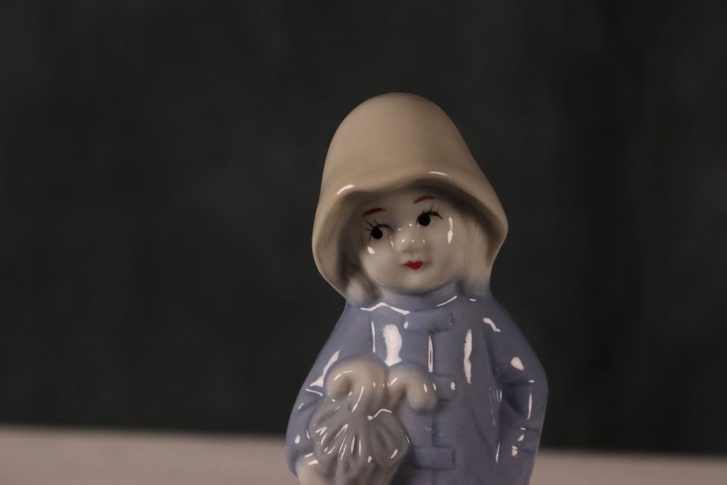
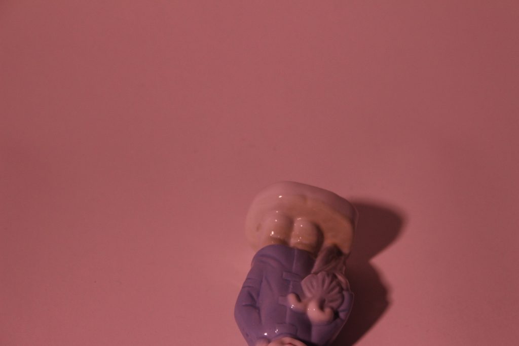
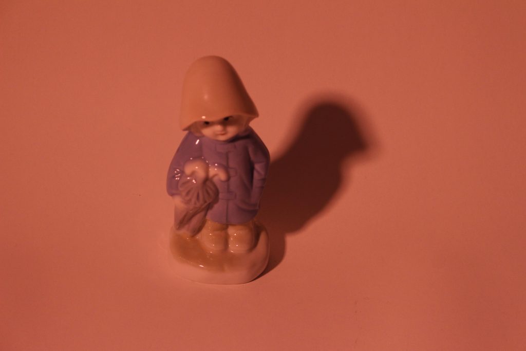
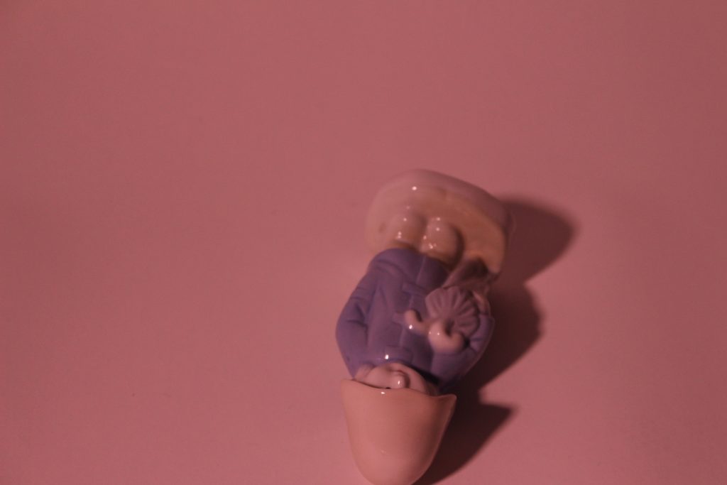
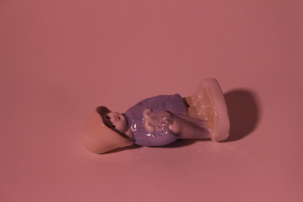
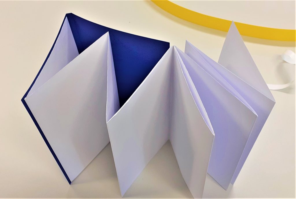
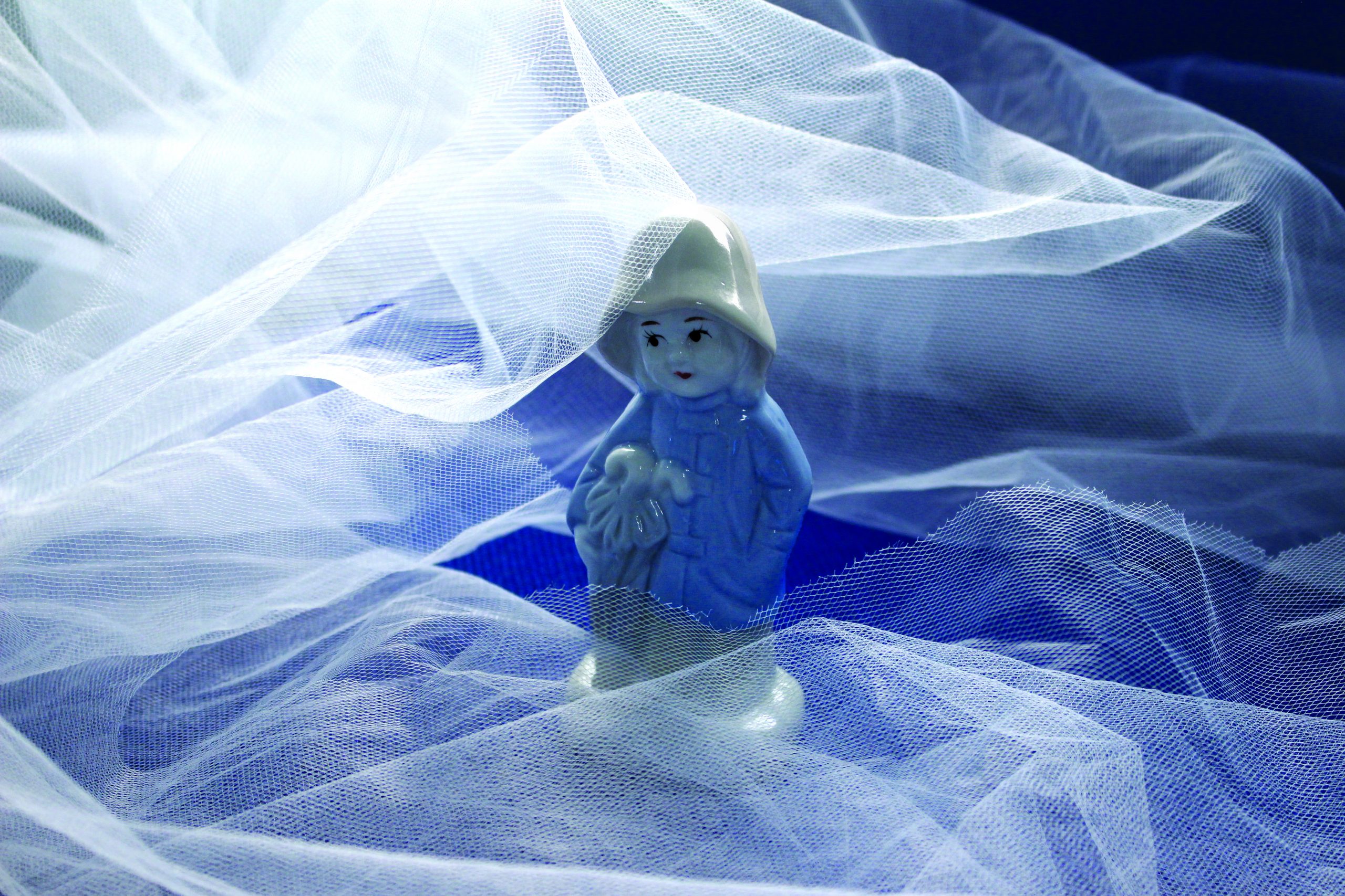
These were the 3 images I was able to edit during our PhotoShop workshop:

Intro to photography (Workshop Part 2)

Part 2 of the photography workshop blog is , of course, the photos!

These were all taken on the Canon 600D digital camera. I have not edited any of these. My next step will be to edit them in PhotoShop and see how I can improve them and in some cases, maybe create a different effect to give them a new meaning.

I was pleasantly surprised with the difference in quality between my phone camera and the DSLR camera. These photos need to be edited to get the best out of them, but already I can see a depth that just is not possible with a phone camera.

Bookbinding Workshop 2

In today’s bookbinding workshop, I made 2 kinds of book:

Stab-binding and a zig-zag/ concertina style book.

I also learned the foiling method of adding text to a book cover using a hot tool and coloured pieces of foil.

The first book we made in the workshop, used the stab-binding method. The folds of the pages were on the outside edge of the page. The advantage of these doubled-up pages, is that it makes it less likely for ink to seep through when you are writing on the page. The first task was to fold the pages, using the bone folder. We used 15 sheets in total.

Using a thicker piece of card to re-enforce the cover means that the book may last longer. Here I folded the cover (blue) and ensured the (brown) card would fit nicely inside.

I assembled the pages together with the cover and used 2 bulldog clips to hold everything together. Using card between the clips and the cover means that I prevent marking the cover. I clamped the outside edge of the book, leaving the side free that would become the spine.

I measured 1cm from the edge of the cover. I marked 5 points on the cover where the holes needed to be placed. Using 5 holes makes the book hold together more strongly than if I made only 4 holes.

Making the holes was the most physically demanding part of the process. Using the awl, I pressed and twisted into the paper where I had made the pencil markings. I made sure to keep the awl straight. The number of pages and thickness of the card is what made the action tough. It was easier to make the holes whilst standing up. I placed card underneath the book to help hold it in place and prevent me marking the table. I made sure the awl was about 3mm through the other side. This meant the hole was big enough. Another way to check is to hold the book up to the light and see if I can see through to the other side.

Using the needle and a strong thread, I began to stitch the book together. I started from the inside of the book and pushed the needle through the centre hole.

I found this stitching process easier than the previous books I have stitched. I think this is because the stab-binding stitching pattern works in right-angles. The main difference is that with this method, I needed to hook the thread around the outside of the cover.

I also needed to make sure I was pulling the thread tightly after each stitch.

I did not need to tie a knot because the stab-binding holds the thread in place. The thread begins and ends at roughly the centre of the book.

The result: I felt that the line of stitching looked wonky. This is probably due to where I placed the holes.

My next book was a zig-zag style book. My first thought when our lecturer Ruth showed us this kind of book, was how great this method would be for a photobook. This is because the book opens out to a long line of paper where the reader has the option of viewing every page together, or turning one page at a time.

I began the process by cutting a large sheet of paper into 3 separate sheets. This makes up the pages of the book. I used the paper knife for this task.

After folding the paper into 4 pages per each piece of paper, I began working on the cover.

For the cover, I needed to fold the paper twice to create a flat spine. I worked out the width I wanted the spine to be by holding my pages together and measuring the thickness of the pages. I left a gap with this measurement at the edge of the card and folded up to this point. I turned the paper around and did the same in reverse.

I then attached my pages together using double-sided sticky tape. I then used the tape to attach the pages to the cover. This part of the process involved some decision making. I needed to think about how I wanted the book to be read. I had the option of attaching the pages to the back cover or the front cover. I needed to weigh up the procs and cons of each method.

zig-zag book.
Attaching the pages to the front cover means that the reader will open the pages out to the right.

Using the foiling technique, I added the title to the book cover. I first practiced on a scrap piece of paper. It was important to use a template to trace the words, as this gave me a guide and ensured the word would look neater that working free-hand.

I needed to work slowly, to allow the heat to pass through the paper and the foil. I made sure the tool was switched to the lowest heat. A higher heat would have melted the foil and the result would not be effective. I considered health and safety during this process. I made sure the tool was not touching the table or any object while it was hot. I especially made sure the hot end of the tool would not touch the cable.

I added my initials to the back cover of the book. I had sketched the letters onto paper first, before using them as a template.