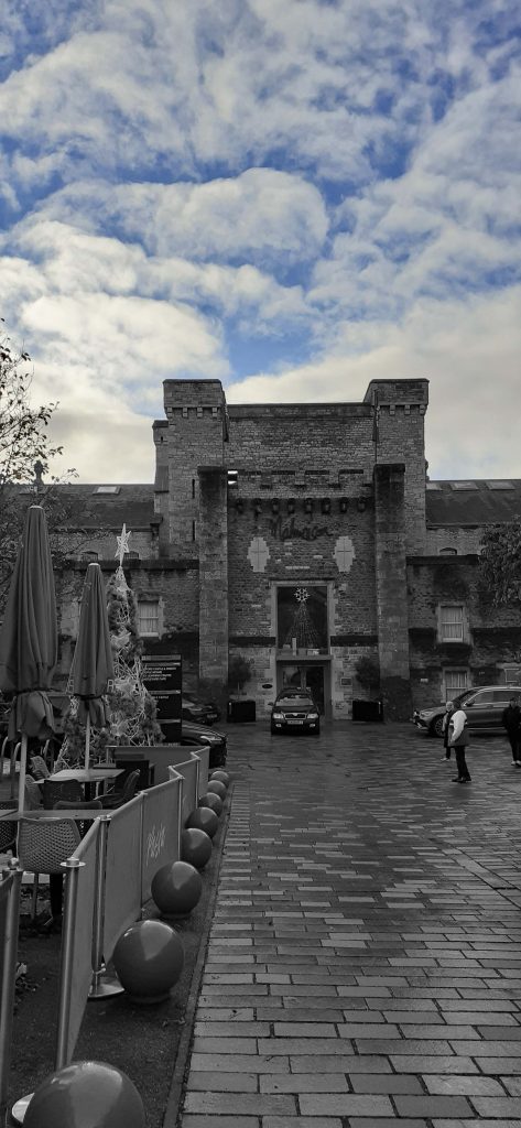
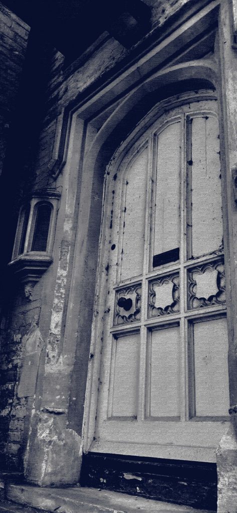
One nice way to spend a Sunday: strolling around town and visiting an exhibition. After a year of living in Oxford, I had never seen the castle. I thought there were maybe a few ruins but I didn’t expect to see the full building (below left) in all its ancient glory.
Why have I just discovered the castle? I was on my way to the OVADA art gallery. My only visit to the gallery previously was to see it empty between exhibitions. This time the building was full of art, how good this was to see.
The fact that it was so hard to find, only made it more of an adventure.
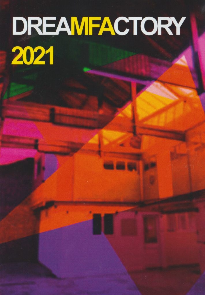
I caught the end of the 3-day exhibition, Dream Factory. This exhibition presented work by BROOKES MFA students. While I may not be able to credit each artist individually, here is a list of the artists involved (below right).
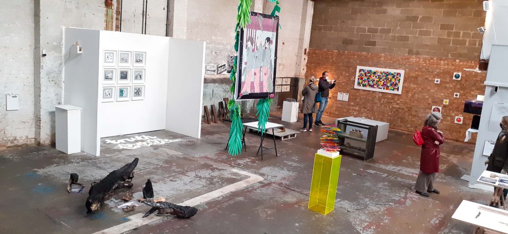
(below image) The OVADA warehouse is a unique space. It’s interesting to see the work in these surroundings. It gives a totally different feel to art that’s presented in a plain white gallery space. Sometimes the art blended into the roughness of the warehouse and with other pieces there was a bold contrast that I really liked.
I loved the way the type moved across the page, just long enough to grasp.
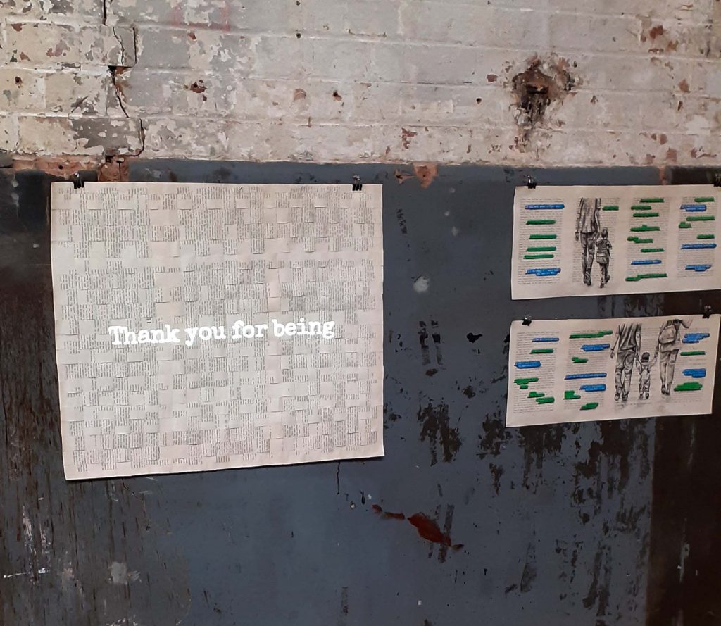
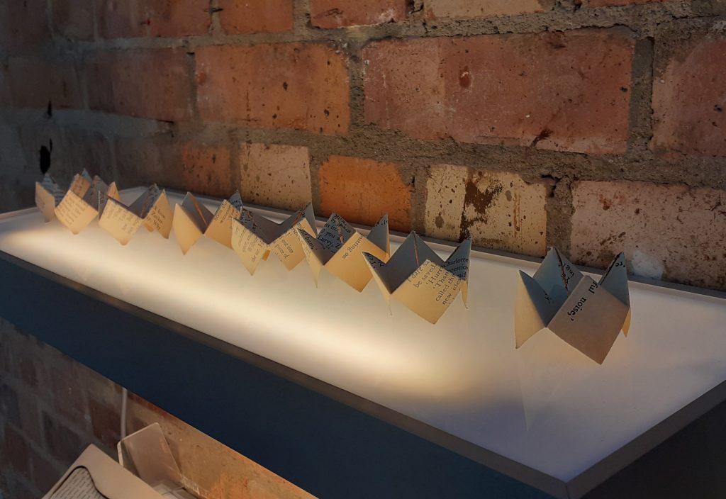
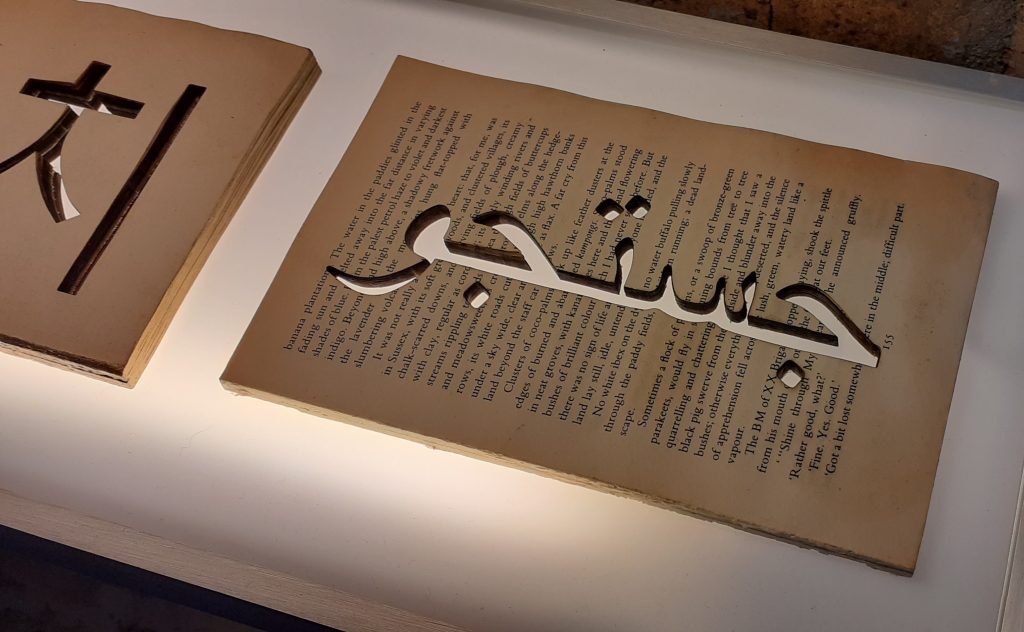
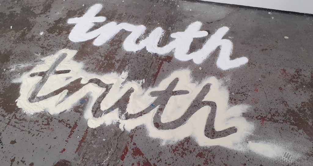
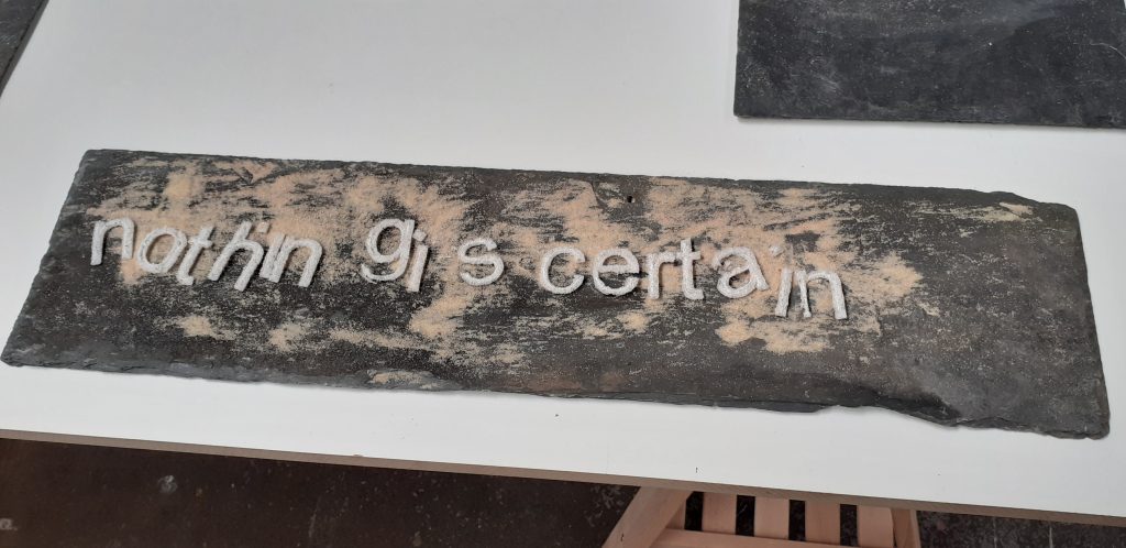
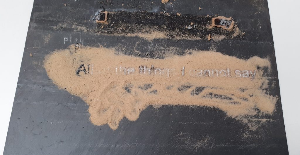
I felt these slates represent us. ‘The blank slate’ being the possibilities of everything we could be. Deborah has used sand to represent the things that happen to us. The shifting things we have no control over. The life changes we all face, but more recently the covid pandemic.
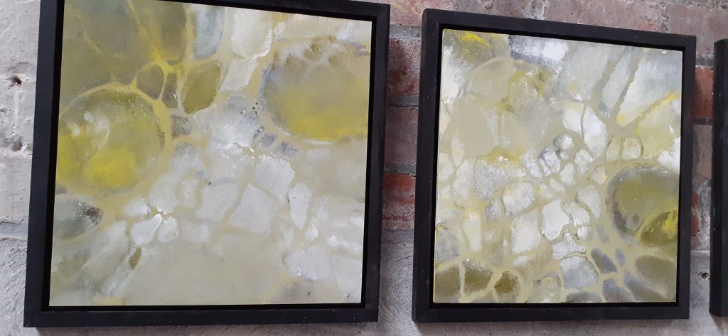
I found Yolande’s paintings amazingly light and delicate. This impressed me because I can see the patience and gentleness needed to paint them, which is the opposite to how I approach drawings. The way the light shines through the cellular structures is so beautiful to me.
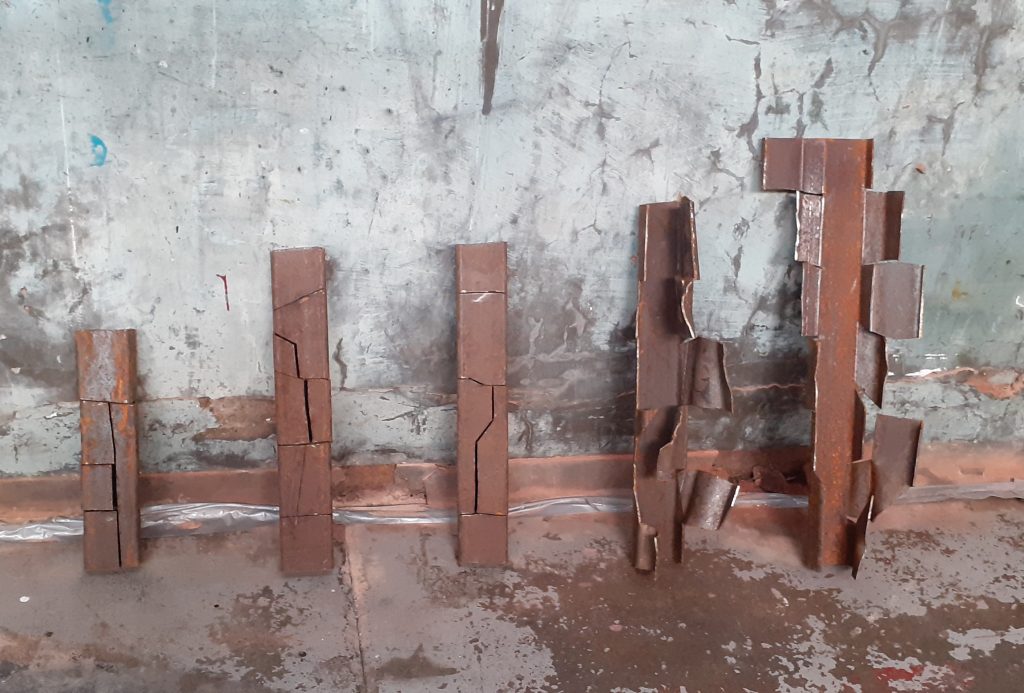
(above) Don’t they look so at home in OVADA? Emmett is inspired by the weathering of forms over time. I was drawn to the strength of the material and the colour of rust which is one of my favourite colours. I saw this piece as a representation of a person growing from a small child into an adult and the effect of that journey emotionally and mentally.
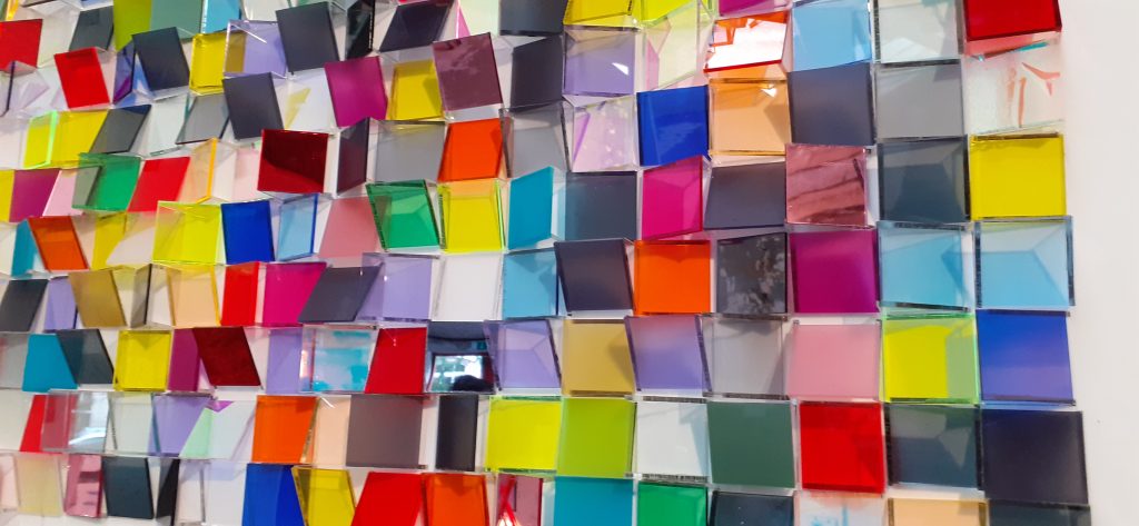
Lastly, these colourful squares were beautiful. The artist used a combination of reflective, iridescent, transparent and matt surfaces within the work. I loved how each tile was tilted at a different angle, creating chaos. I wanted to be in a room full of them.
I didn’t photograph every artwork, but the rest were equally impressive. Every work felt like it belonged, even though they came from different minds.

