Bookbinding- Maps

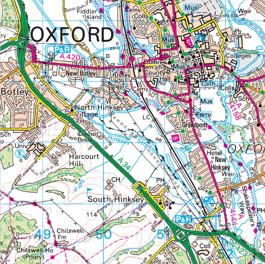
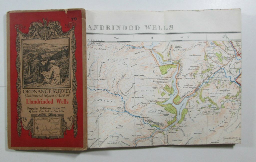
We looked at the way maps are put together. For example, Ordnance survey maps are made up of one large piece of paper, folded multiple times with a cover glued to 1 of the folded sections.

1922 Old OS Ordnance Survey Popular Edition One-Inch Map 79 Llandrindod Wells | eBay

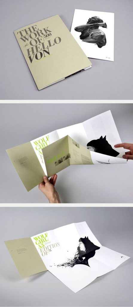
We also thought about being creative with our book designs. Our lecturer Ruth showed us examples. One collection I was really impressed by, was by a designer who had made a series of small pamphlet-like books and collected them together into a box which held them together. I like the way the designer chose a different colour for each book. The theme for the collection was around mapping. One of the books was about places he had nearly been to, one contained pixelated image of the UK, each square was a different colour and given a different name to each, which corresponded to the place on the map. I thought this was really creative and inventive.

2016 Work – Annwyn Dean

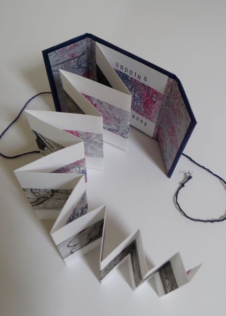
Concertina style book by Annwyn Dean. (embroiderer, book artist and printmaker based in Yorkshire).

The concertina style is appropriate for showing a series of photos, or a long print that is printed across the pages. She adds string to tie the book together.

The main method we focused on was creating a book using folds instead of stitching, gluing, or any other method of binding. The advantage of this is that you could include one large picture within smaller packaging. These large pictures when folded up into these books, could be read as a book by turning each page or could be folded out to show the full image.

A design by Madebysix, who are a design studio based in Leicester. Image from Six (madebysix.com)

How to make books by Esther K. Smith

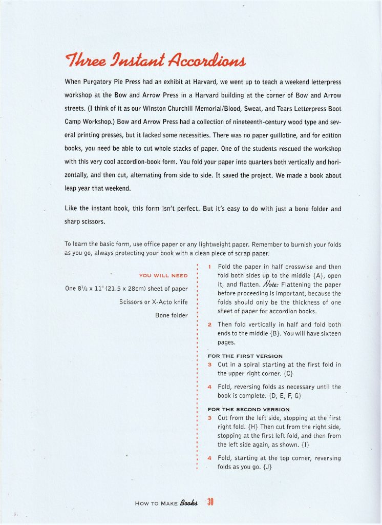
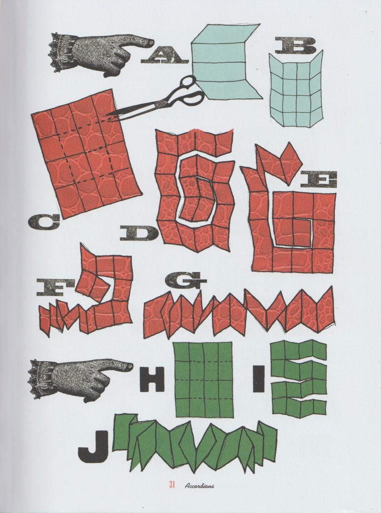
I had a go at making the ‘Three instant accordions’ style book. I first folded the paper in half.

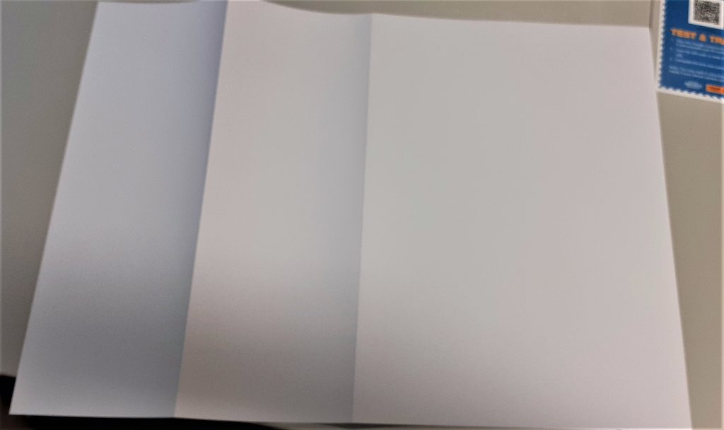
I folded it in half again. I kept folding until I had 8 equal sized rectangles.

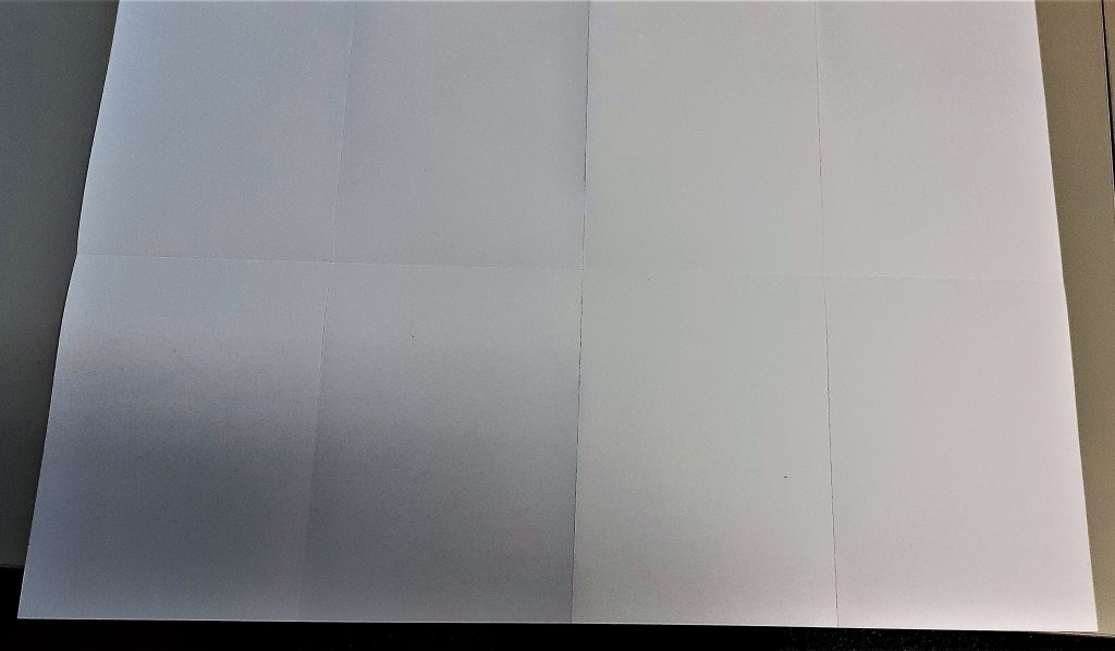
When folding thick paper, it is sometimes necessary to re-fold back in the opposite direction. Here, I aligned the centre folds together. The centre fold acted as a marker, so I did not have to check along the edge to see if the paper was lined up.

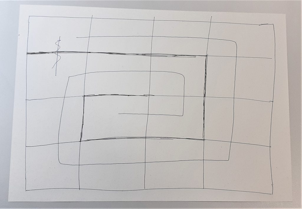
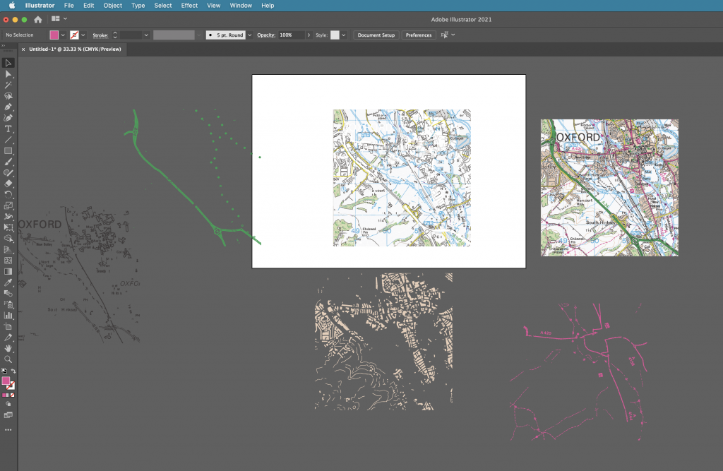
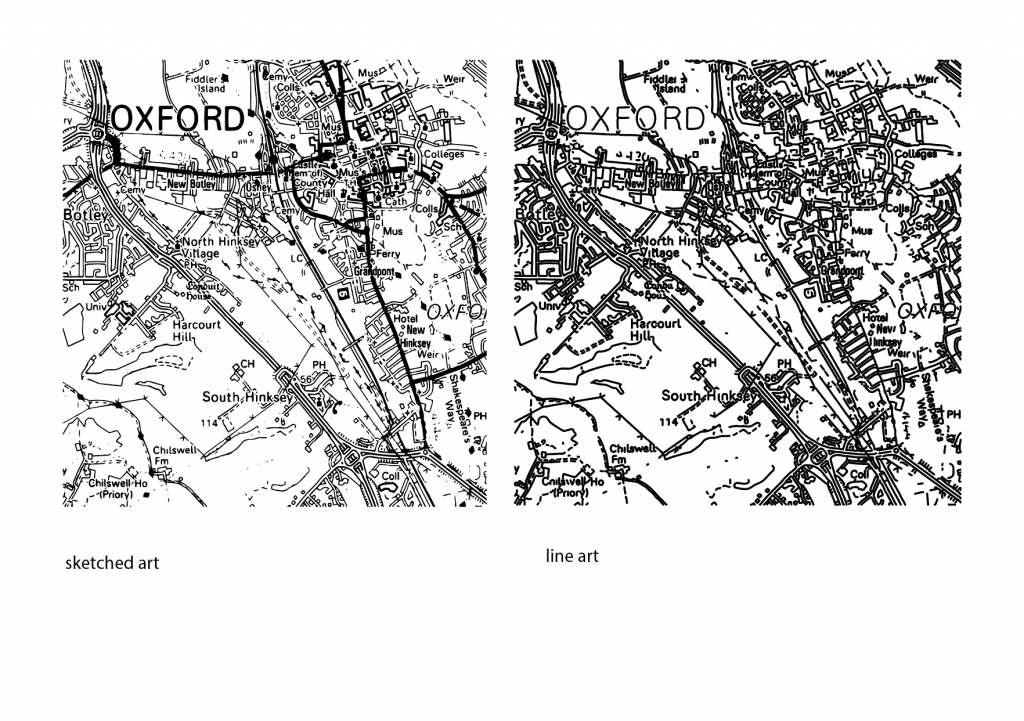
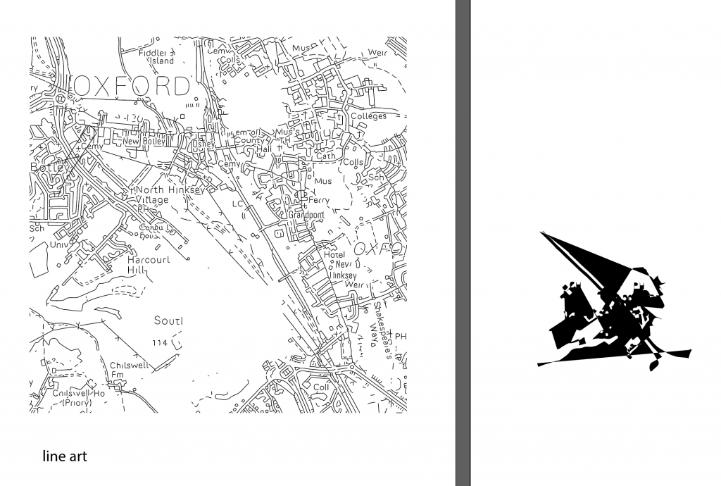
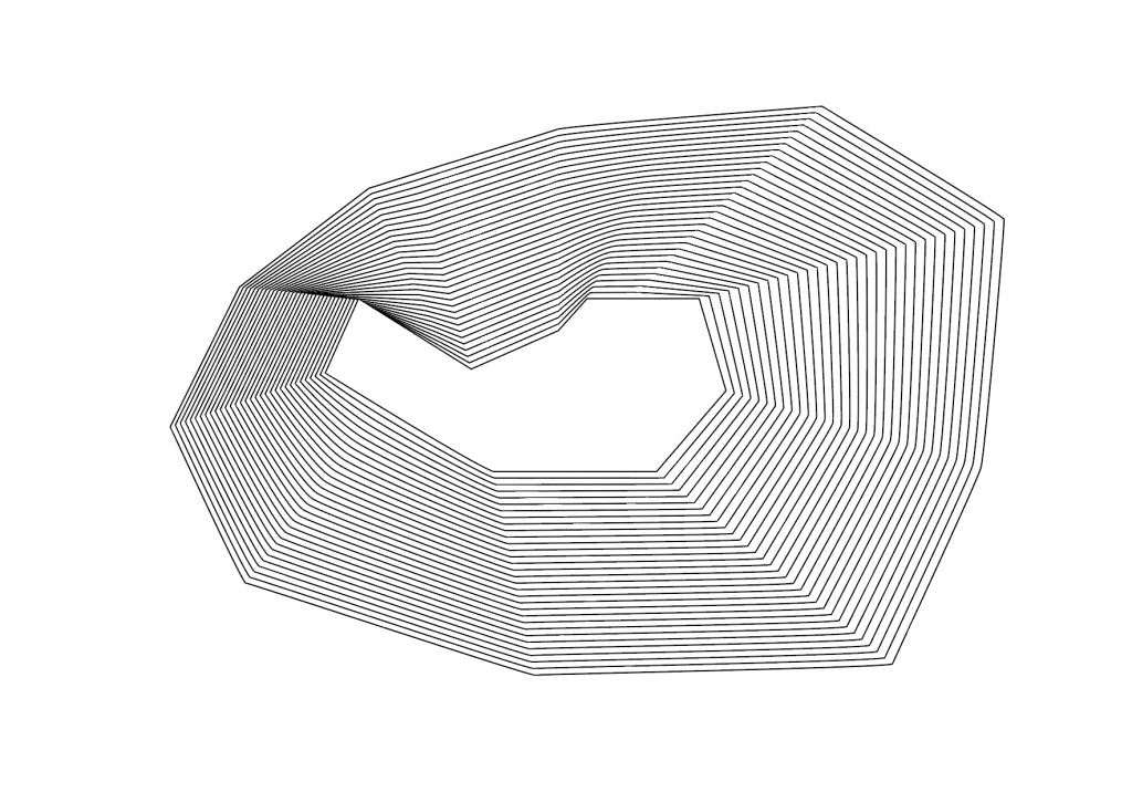
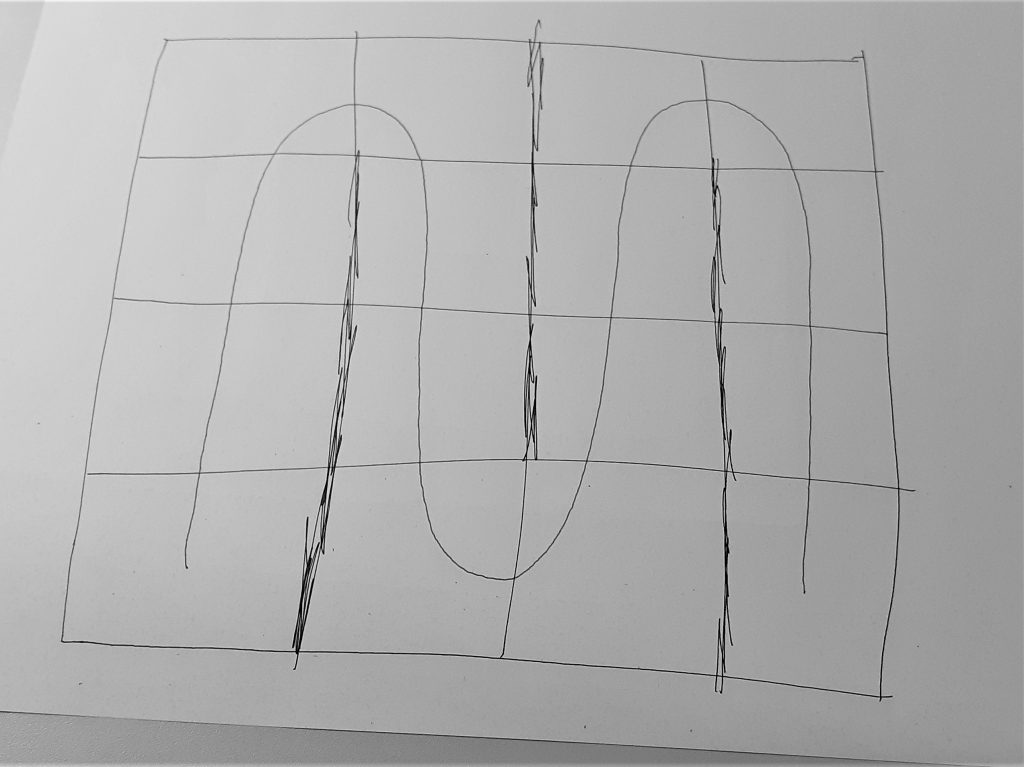
I then needed to plan out where to cut the paper. I decided on a pattern that would spiral inwards. This felt logical, but meant that I ended up with an asymmetrical piece of paper. I used scrap paper to draw the above plan for my work. The black pen indicates the cuts and the blue spiral represents the direction I wanted the pages to run in. I used the paper knife to cut the paper. The challenge was to avoid cutting off sections that need to remain intact. I found the knife was quite sharp and hard to control when to stop the cut. It was challenging to create a neat cut and avoid tearing the paper.

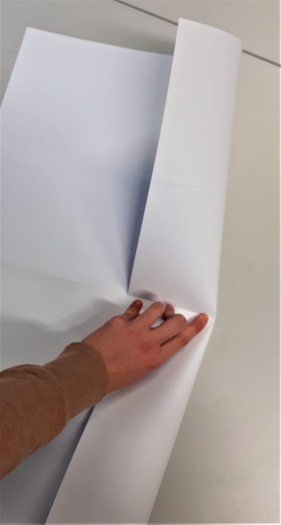
The second thing I needed to be mindful of is the folding after the paper had been cut. I needed to alternate between folding one way and then the other way. I thought of it as folding under then over, under then over and so on.

How to make books by Esther K. Smith

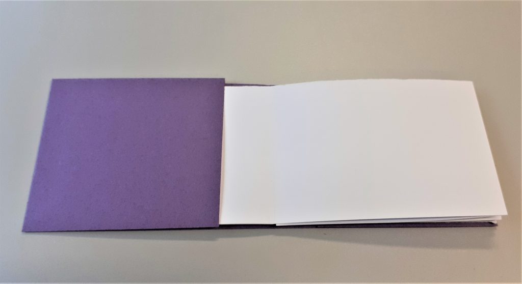
The next task was to make a cover for my book. This helps to protect the book, maybe not from water but from general use. To start, I created the spine by folding the paper twice. I looked at the thickness of my book first to see how wide I needed the spine to be.

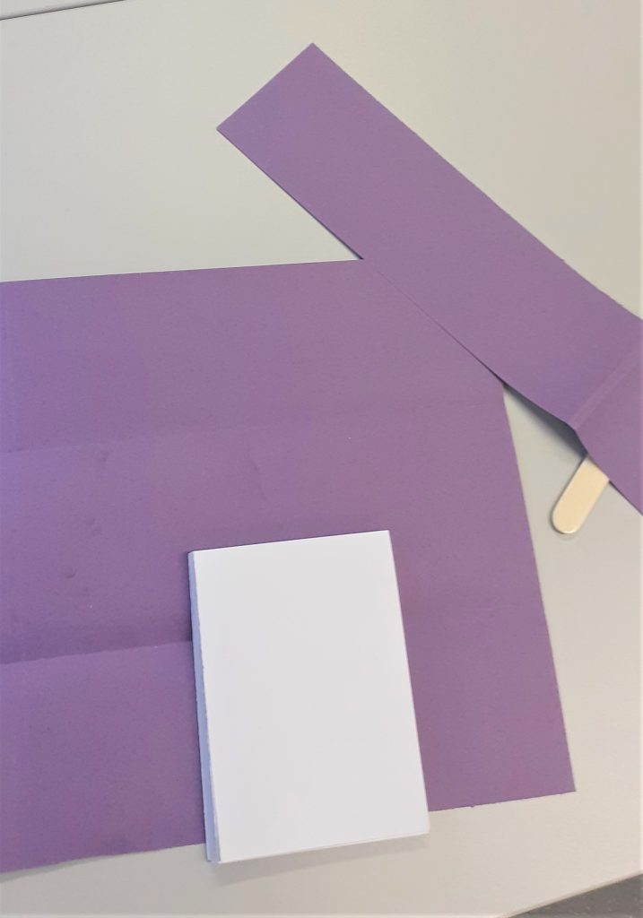
My book ended up with a landscape page at the front and back of the book. I needed to cut off a section of the cover to make it fit best. I found this part of the workshop the most complicated and difficult part. I understood the steps when they were explained to me, but to make one myself is a different thing.

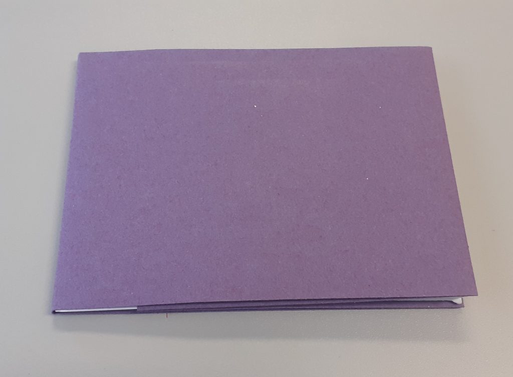
The first and last page slip into the cover without the use of glue or any binding. This means I can easily remove the cover and replace it.

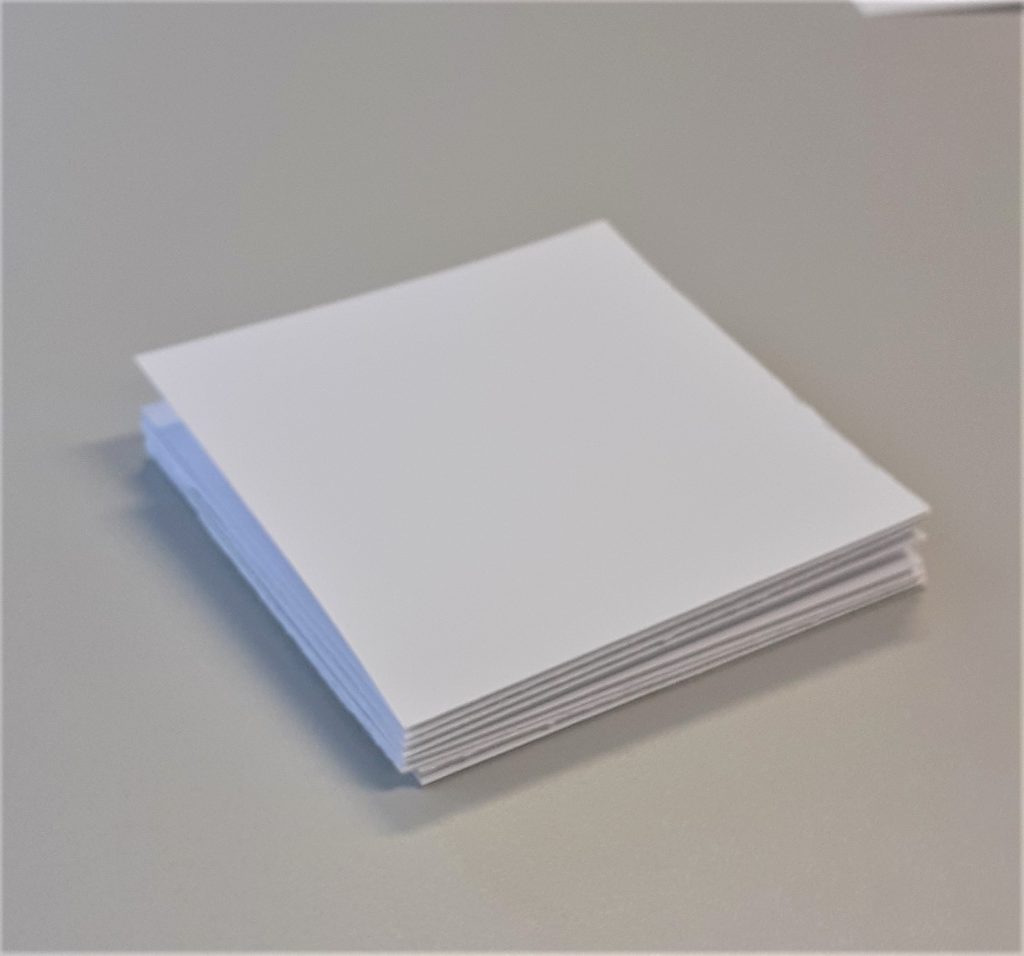
I then made a smaller book with the same kind of paper. The paper felt tougher because I was folding smaller areas. This book has square pages instead of rectangle. I made a second plan. This time. I planned a symmetrical pattern to cut.

This square book became a sampler of bookmaking techniques:

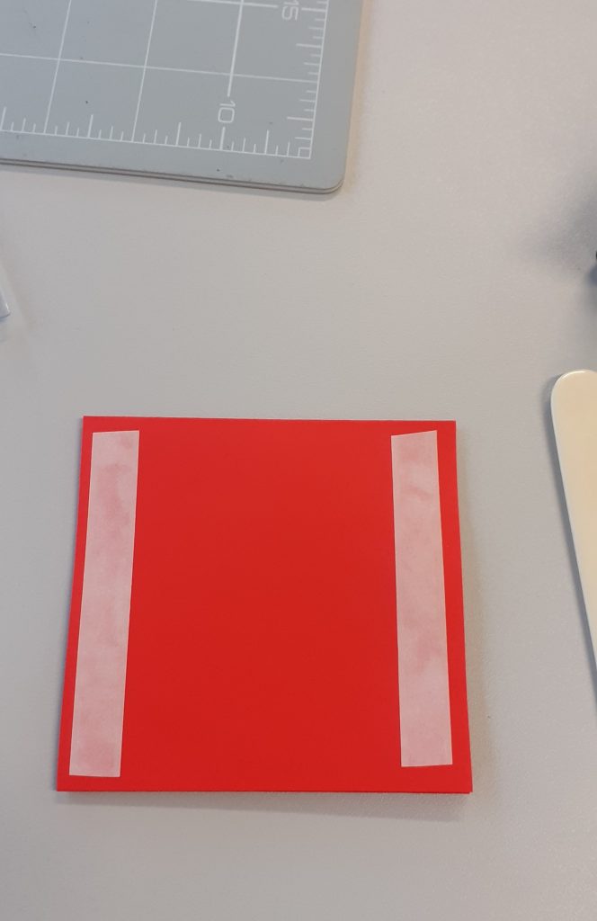
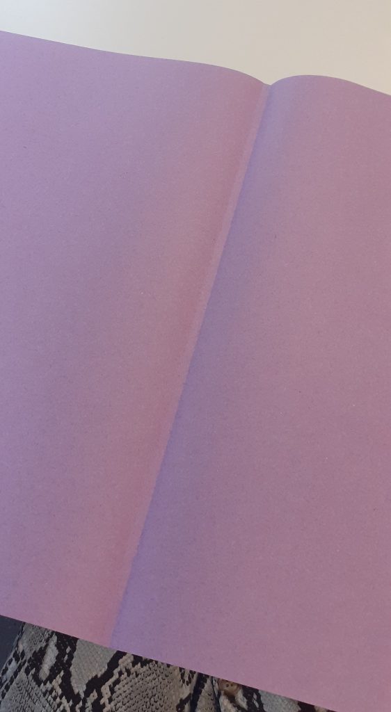
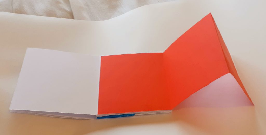
I added a section using thin red paper. I cut the paper to the same height as the page of my book. I then folded it into thirds so that it would be a concertina style pull-out piece. I used double-sided tape to attach it to the book.

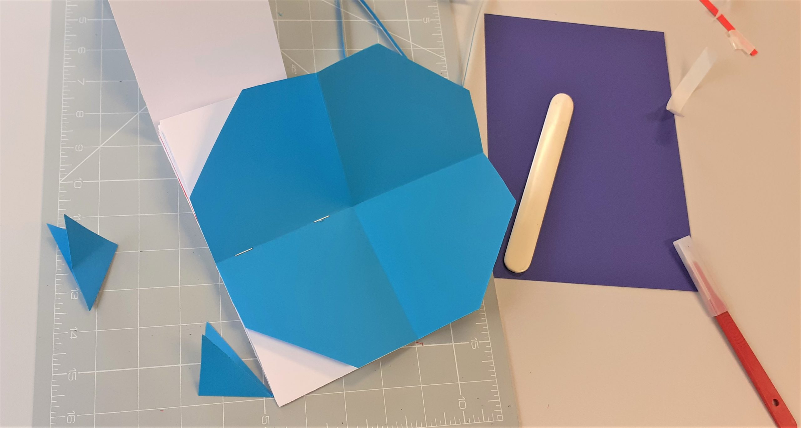
I used thin blue paper to attach a sheet that I can open out and tuck away. I cut it into a perfect square, larger than a page of the book. I folded it into triangles and stapled it to the spine of the book. Using thin paper meant that I would be able to fold it into the book without it causing the book to buckle.

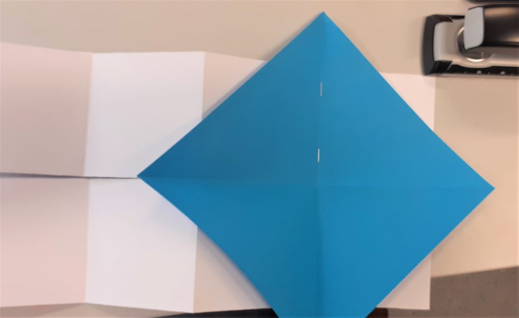
When I folded the paper into the book, there were triangular corners that stuck out.

I cut the corners off with the scalpel. This created an octagon.

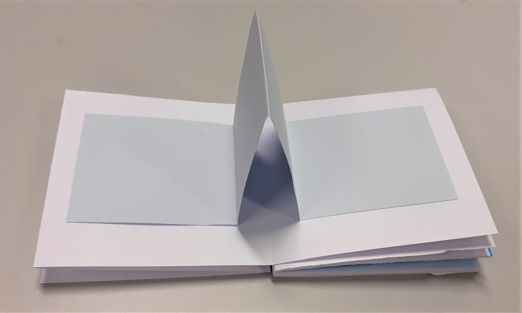
I then stuck a strip of grey paper into the book. I allowed the middle to fold inwards. This meant that the paper sticks out when the book is opened.

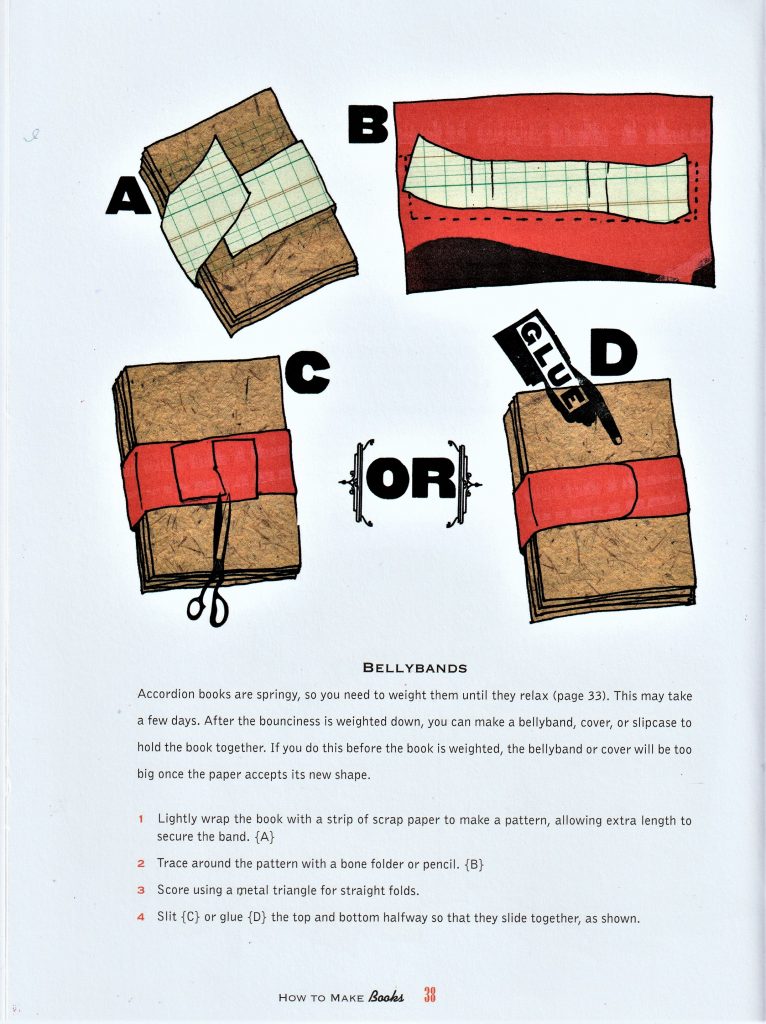
Another technique I did not have time to add is the bellyband. There are easier and more complicated ways to make a bellyband. They hold the pages closed and can be removed as a book cover can be.

How to make books by Esther K. Smith

I read this book as part of my bookbinding research.

Digital Workshop- Mapping

Workshop: ‘Topographics’

From Idea Generation by Neil Leonard
What is a map?

It is an image. But not just an image. A map is an informative graphic. Something you need to interpret. How can we map something? How could we map our thoughts? How about a physical landscape?

A straight line says nothing, but adding an arrowhead to one end says something. It is suddenly a map. Something to read. It indicates something to us.

An image that isn’t a map, is abstract.

Opening this image of a map of Oxford in adobe illustrator, allowed me to explore different manipulations and ways of drawing a map.

I began by pulling different areas from the map. To do this, I first selected Image trace> 16 colours. This turned the map into a vector image instead of an image made from pixels. All the lines appeared smooth when I zoomed into the image.

Expand completes the action of turning it into a vector. This also allowed me to move the different pieces separately.

Command + shift + G ungroups the image.

To be able to grab all the areas of 1 colour, I needed to select:

Select > same> fill colour

I could then click and drag to take out these separate pieces of colour.

I then played with the other image options:

Converting the image into line art gave me new options for experimentation. I clicked and drag on small areas of the image to separate the lines, lifting areas out of the map. The gaps in the map below left are areas I had taken out of the image:

The shape on the right was created from taking the small area from the map. I pressed Command + J to join the lines together. I then clicked the small arrow beside the stroke and fill colour squares. This inverted the colour and filled my shape with black instead of the black outline.

I then copied and pasted the shape into adobe photoshop. This allowed me to work on it further and turn the image into a bitmap. I needed to make sure the pieces were in a formation I liked before pasting it into photoshop. This is because it is very difficult to rearrange the pieces once the shape is pasted into photoshop.

pathfinder> divide takes the shape apart.

pathfinder> unite sticks the shapes together like glue.

pathfinder> group allows you to move the shapes around together but they do not become the same object.

My first step was to bevel/emboss the shape. I selected Layer> layer style> bevel & emboss, as shown in the screenshot below:

This allowed me to play with the height and texture of the shape. I chose the leaf pattern as I liked the rough texture it produced.

The image needs to be in greyscale before you can bitmap it. I bitmapped the image and chose ‘diffusion dither’ to create the grainy filter. I saved the image as a TIFF file.

Back into Illustrator, I took another shape from within the line art of the Oxford map. I used this for my outline. I repeated the previous process of joining the lines and filling the shape with colour. This time, I removed the fill and the outline, so the shape was transparent. I selected ‘draw inside’ and Command+ shift+ p, to place an image inside the shape. (this is the shortcut within illustrator, in InDesign, we would use command+shift+D)

In this case, I wanted to place my bitmapped image inside this new shape. I selected the TIFF file and clicked to place it inside. Because this image is a bitmap, I was able to change the colour of it. I also tried rotating and enlarging the image from within the shape.

Another technique for image producing. I drew a shape using the pen tool on Illustrator. I then drew another shape within this shape. I selected object> blend> make. I needed to change the stroke colour to black, to be able to see another shape appear between the 2 I had drawn. By then selecting object> blend>blend options>specified stops and increasing the number, I could create multiple identical lines within my image as shown here:

The image looks quite 3D and could be describing a gradient.

I duplicated the shape by holding down ‘option’, clicking and dragging. I changed the colour of this second shape and rotated it so that it was upside down. I placed the shape so that they intersect. I increased the transparency so that it is possible to see through the lines to the other shape:

I printed the image of the shape that had multiple lines. I used this print to scan onto the computer. Instead of doing a simple scan of the drawing, I wanted to make it interesting.

I moved the image around on the scanning bed as the scanner moved across it. This created a wavy image where the lines moved in different directions. From this scan, (I saved it as a TIFF file) I could manipulate the image further in Illustrator.

This image was made from the scan.

I remove lines from my scan by grouping the image, so that it was a vector image. I added arrowheads using the arrowhead tools on the right hand side of the page. To create the above effect, I selected object> blend> make. By selecting blend options, again I could alter the number of linen repetitions.

arrowhead options

Aliyah Hussain

Aliyah Hussain is a UK based design whos work is multi disciplinary.

Her work is focused on collage but also incorporates screen-printing techniques, painting, photography and performance.

Her work unites futuristic utopian elements with a retro and hand-made aesthetic. Her use of line is bold and directional. In the above piece, I can see the pressure she has used on the pencil. The lines coming from the centre mask image implies to me a kind of mind map, where the ideas are directly linked to the face in the middle. Who might this face be representing? Is it a signifier of a collection of people in general?

There are areas of business and action, combined with white space where the eye can rest. I like the hand-made feeling that this has been jotted down in a notebook to record something important that the artist needed to remember. It has that rushed and urgent sense to it that we might find in a journal.

Form & Space

Geometric graphic design

From the brief ‘Form & Space’:

Composition refers to the visual structure and organisation of elements within a design. Designers organise images and text – each with their own shapes, sizes, colours and textures. Through the control and placement of simple geometric forms this workshop explores the dynamics of composition: the relationship between positive and negative space, variations in scale and the space between the shapes – the basics in visual language, a designer’s ‘design vocabulary’.’

Paul Rand

Exploring form & space, I looked at the designer Paul Rand. I looked at the book Paul Rand: A Designer’s Art (1985). I was surprised at the modern look of his designs, since the book spanned his career from the 1940’s to the publication of the book.

Image from Paul Rand: A Designer’s Art

Rand was known for his typography and designs for advertising. Influenced by Modern art, particularly the Bauhaus movement. He was one of the world’s leading graphic designers. He learnt design by looking at the work of others such as Cassandre. His poster designs have been called timeless. He approached ad design in a radically different way that had not been done before: Ads used to be very text heavy, and if they did include images, they all looked very cluttered. Rand minimized the text to only what was necessary to breathe space into the design. He saw image and text as a continuum to be used together. Graphics and type act as one unit to convey the message of the ad and inject some art and beauty into the design. He and his wife published children’s books and he was also an accomplished painter, painting the book covers.

Information sourced from: Celebrating The Life Of The Greatest Graphic Designer-Paul Rand – YouTube

For this announcement card, Rand has used symmetry and order by the even-sized circles he has placed across the page. This simple design is eye-catching while also portraying a sense of order and efficiency. Since the card was probably small, the design is suitable with its lack of detail. A detailed design would be difficult to see on a small scale.

This is a magazine advertisement from 1961. The page is informing the viewer about a traffic light system being set up using the new technology of the time. The black background allows the colours at the centre to stand out in comparison. This is the effect actual traffic lights have on a dark night. The central placement of the column of circles makes the composition symmetrical and therefore balanced.

For this newspaper advertisement, Rand has taken apart the logo for Westinghouse Electric Corporation, and scattered the pieces in the upper right corner of the page. The scattered pieces follow no pattern and they appear chaotic. If the logo was familiar to you, you would be piecing it together in your mind. In this way, the viewer would be engaging with the design.


In this poster, Rand again uses chaos within the design. This time he is placing identical pieces of bread at different rotations across the poster. This has created a sense of movement throughout.

For this magazine cover, the letters have been scattered and cut up. Because the alphabet is placed in order, we are able to see which letters are missing. This is a way of engaging the viewer into the design, almost like showing the viewer a puzzle. The background is quite noisy and helps the white ground behind the letters to show clearly.

Magazine cover for Direction in 1941

Here, Rand uses visual noise to distort what we are seeing. It is not possible for me to see what the image is of. This confusion makes the clear ‘v’ stand out even more clearly. There is a shape below the ‘v’, that looks like a distorted ‘v’. it emphasizes the ‘v’ above it, creating repetition. I like the areas of negative space and the clean rectangle shape that appears to be cut from the design.