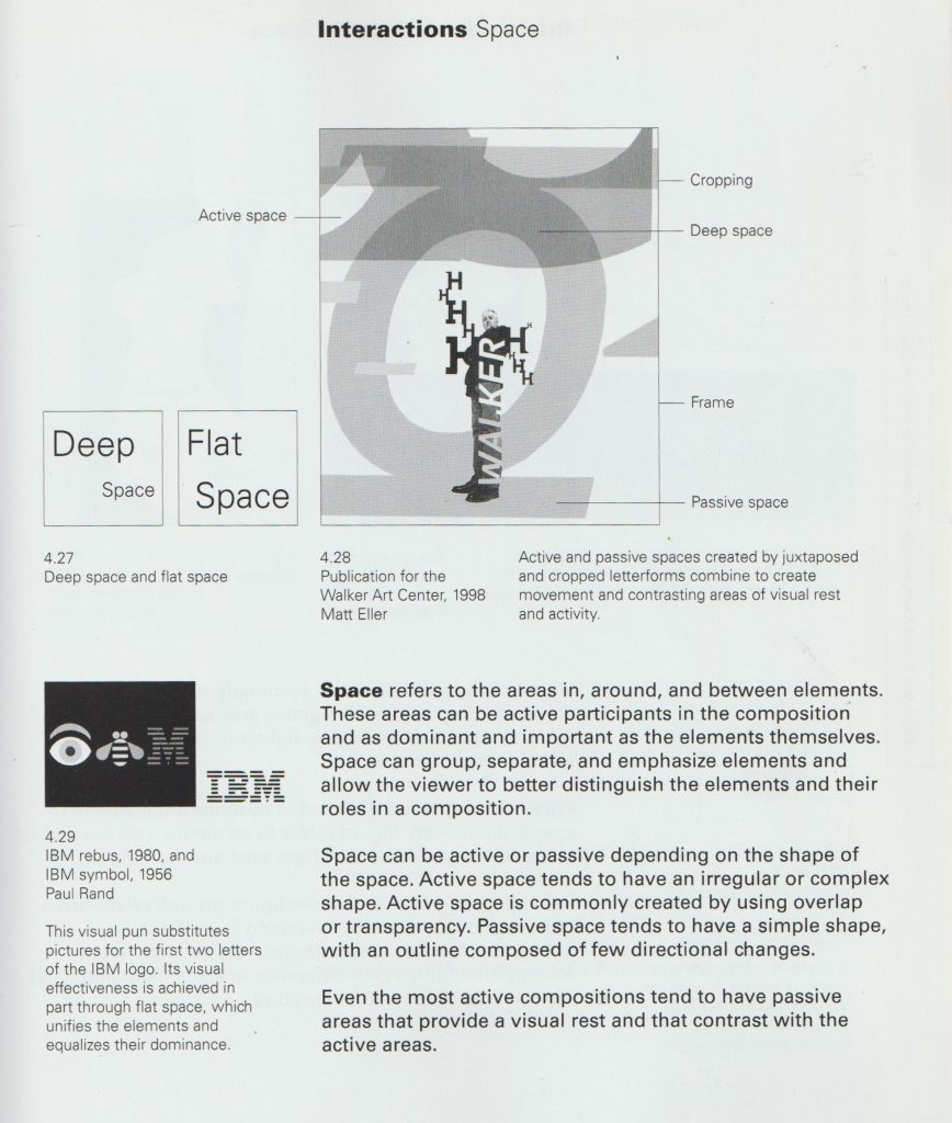
Mapping & Diagramming

Making Sense

Maps and diagrams are not pictures but are appreciated aesthetically. Maps and diagrams ‘make’ sense. Making sense means producing sensibility. They are devices that enable us to act. We can map dreams, ideas, and thoughts. Maps are closed systems. They are representative. Maps write a place onto our consciousness. We cannot conceive of the ‘world’ without the use of maps.

Contextual Research

Kim Dingle


The U.S., Drawn from Memory – Big Think

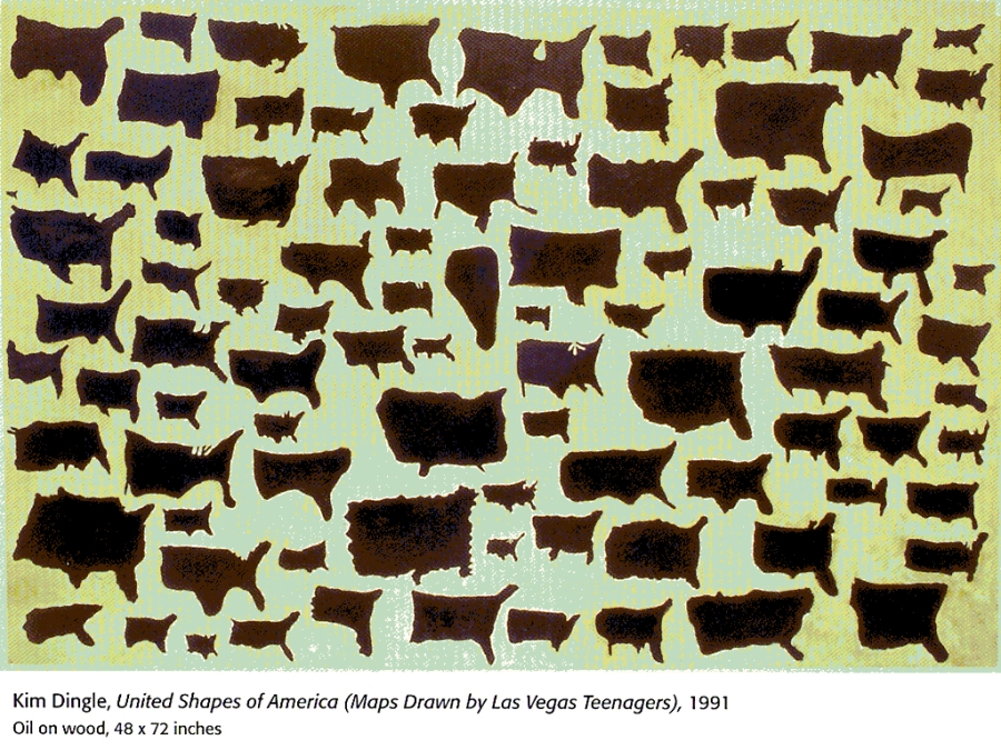
This work is about someone’s understanding of the country they live in. Kim Dingle asked American participants to draw USA from memory. The drawings were on tracing paper so the artist could trace them onto a panel and paint them with oil paints.

I really liked this work. I felt inspired to approach today’s group project in a similar way where each person’s perspective is represented in the mapping process.

Adam suggested plotting a journey from memory and overlaying it with the real map.

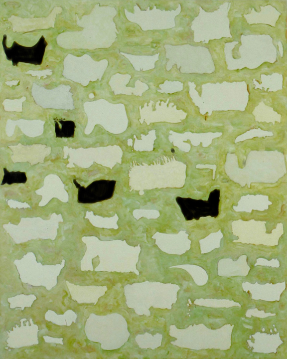
Maps of Canada drawn from memory by American citizens
Oil on Canvas, 1990

These maps of Canada are less accurate than the maps of USA because the students were drawing another country.
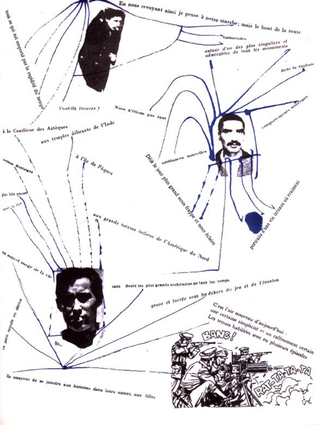
Kim Dingle | “Maps”

Guy Debord

The way somewhere is mapped makes you see a place differently.

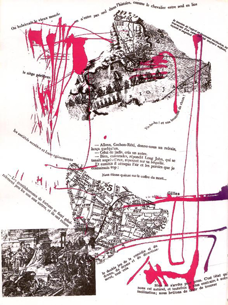
Memoires is a book published in 1959. It was made in collaboration between 2 Situationist artists: Guy Debord and Asger Jorn. The book cover was made with sandpaper, so that when it is placed on a shelf, it destroys the books on either side.

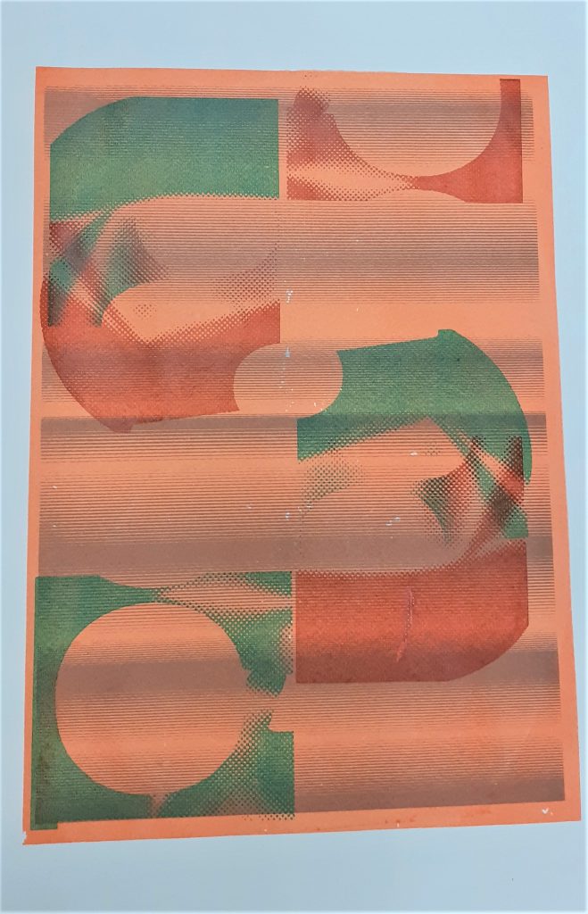
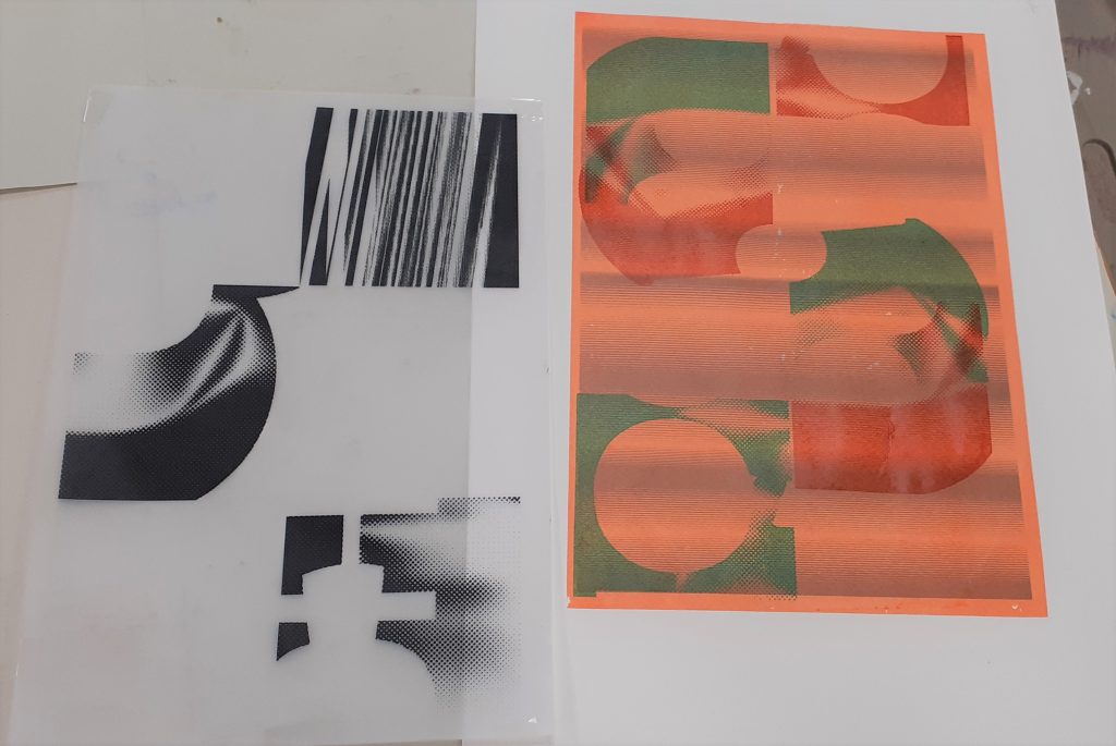
I like the position of elements within the pages, for example the rotation of the text and images. This gives the work energy, helped by the splashes of colour. In this page, we see sections of maps and images of places. I like the combinations of these perspectives. They add to a sense of place.
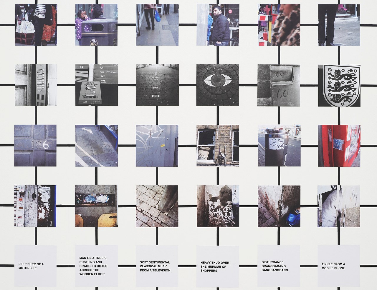
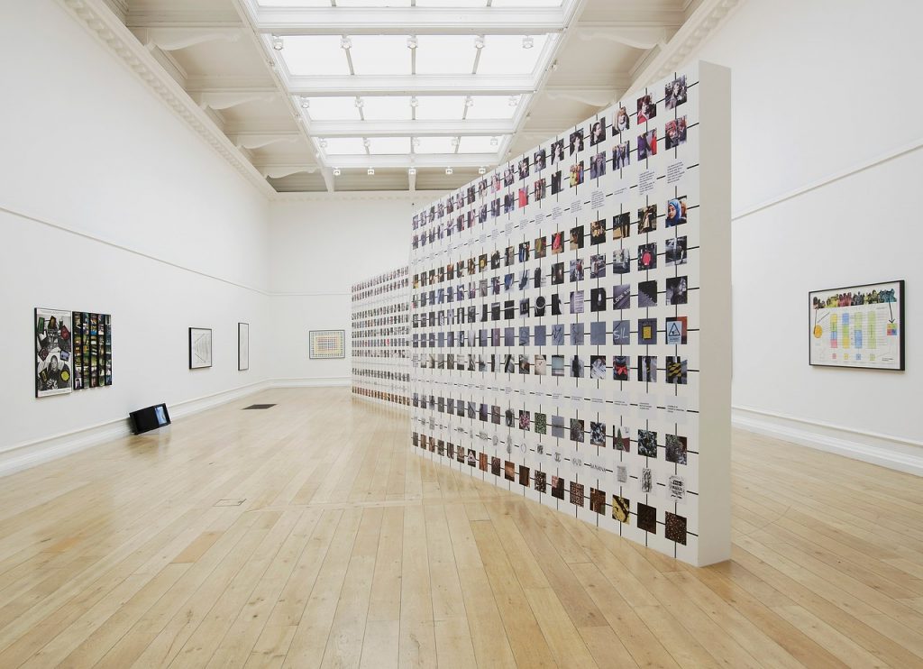
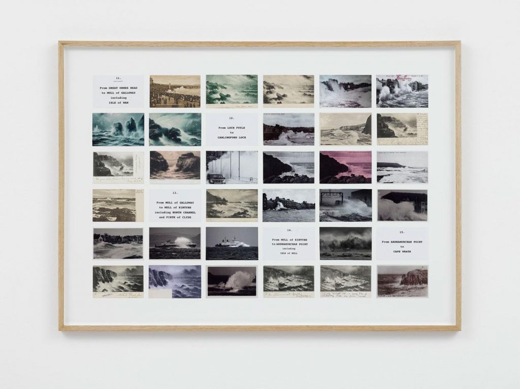
both image from: http://drainmag.com/index_psy.htm?http://drainmag.com/ContentPSYCHOGEOGRAPHY/Essays/Haladyn.html
The lines of text act as directional lines, connecting one element to another.

Susan Hiller

Susan Hiller was an American conceptual artist. I was drawn to 2 of her artworks in particular. Monument is an art installation containing 41 photos of memorial plaques that the artist came across in one location in London. The memorials are for civilians who died from acts of heroism. The fact that she has enlarged the images could say that she is drawing focus to the importance of these people so they are not forgotten.

Hiller has arranged the photos into an diamond formation and placed a park bench in front of them where the viewer listens to a soundtrack of the artist speaking about heroism and death. I see the diamond shape as a cross which symbolises death in itself.

Monument 1980-1 Susan Hiller born 1940 Purchased 1994 http://www.tate.org.uk/art/work/T06902

“Dedicated to the Unknown Artists 1972–6 consists of fourteen panels containing over three hundred original postcards depicting waves crashing onto shores around Britain. A large map annotated with each of the locations featured in the postcards is included in the first panel. The remaining panels have been subjected to what the artist has described as her ‘methodical-methodological approach’ (quoted in ‘Second Sight’ 2007, accessed 14 June 2018) and are organised into grids of postcards and tabulated details such as location, caption, legend, in vertical or horizontal format.”

https://www.tate.org.uk/art/artworks/hiller-dedicated-to-the-unknown-artists-t13531
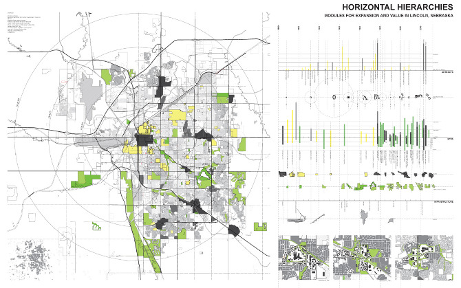
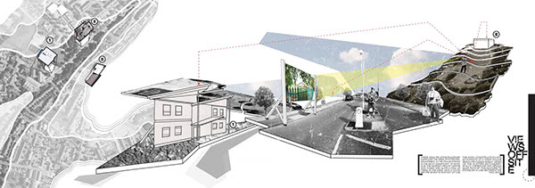
Daniel Masterman

University of Lincoln, Third Year Design Project. May 2012

“The proposed scheme is centred around creating new and exciting routes for people to travel along, whether it be through walking or cycling. The introduction of a bridge means this flow of movement is more continuous and links in with the Robin Hood Chase; which is the most commonly travelled route in St Anns. The buildings themselves offer bicycles that can be rented and used for travelling into the city, as well as workshop spaces where local people can drop in and learn how to repair common issues such as puntures.”
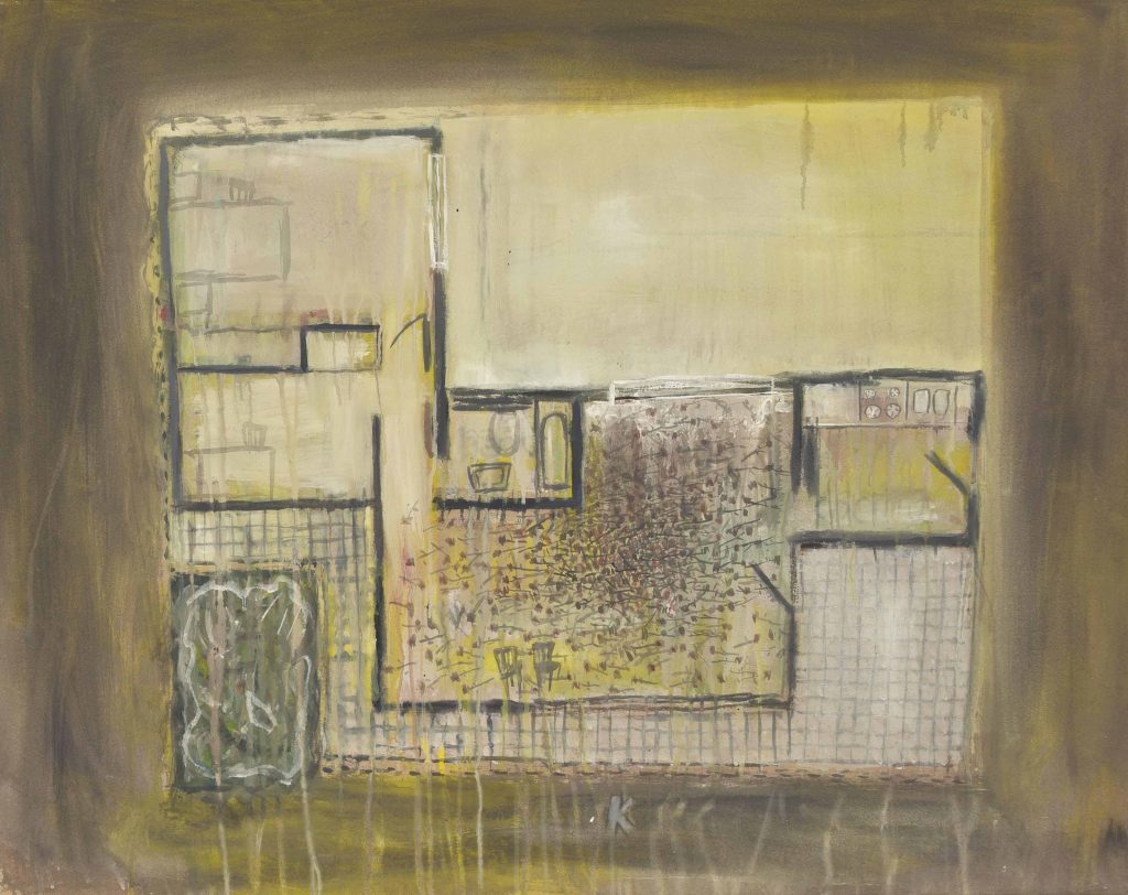
https://www.behance.net/gallery/10225393/Fractured-Cities-A-Cyclists-Retreat

Guillermo Kuitca

Guillermo Kuitca is a contemporary Argentine artist best known for his paintings of geographical maps and architectural plans. Although Kuitca’s works are not overtly political, their theatrical nature seems to reference themes of loss and migration.”
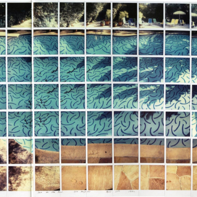
https://www.latinamericanart.com/wp-content/uploads/legacy_images/artworksimages/88801/1be08a23-cc32-4591-9ed0-1e651839104b.jpg
https://www.christies.com/lot/lot-guillermo-kuitca-untitled-5897330/?
https://www.pinterest.es/pin/312507661621968485/

David Hockney

Drawing with the camera. It is possible to utilise the camera in an interesting way to draw maps. David Hockney uses the camera is a tool, a medium. The accidental grid form is uncannily diagrammatic.

https://vertufineart.com/aim-shoot-repeat-photography-david-hockney/

Group work

We were given until 3pm to produce a map, as a group of 4. Faced with the question: ‘How could you produce a map?’ Each of us was given a different medium that could be interchanged depending on our preference. The categories were: Line drawing, colour, words, photography.

Walking around campus, we had the task of mapping the area. This could mean capturing the details (the small) or the big areas you would find on a traditional map. Playing with scale. I really like this idea of focusing on the details and showing their importance in our surroundings/ environment. We were asked to think big and to think weird. We did this by drawing onto an A2 piece of paper and approaching the map with looseness. Our lecturer Adam made a grid template on illustrator that we had the choice of using or rejecting.

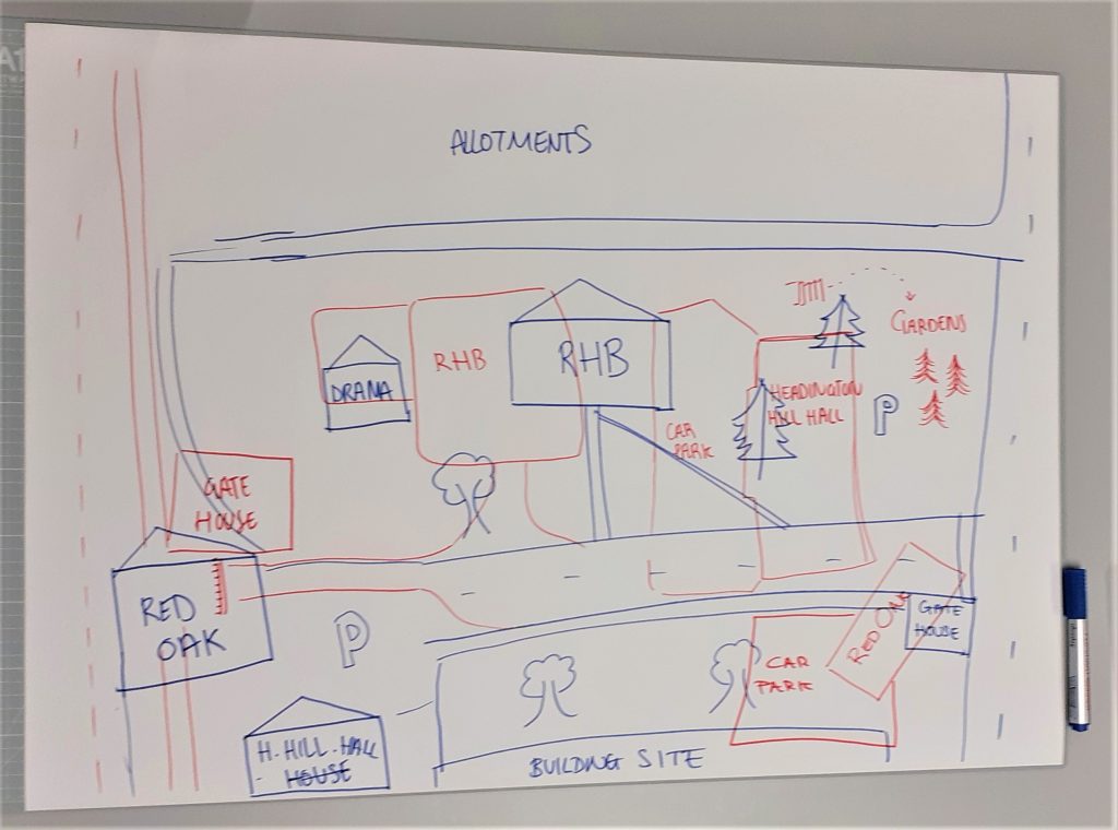
We had the option of merging the medium, for example:  words with photography or colour and photography. Our first ideas were to make line drawings of campus from memory. We thought of layering these with the actual map of the campus. Photographing words and colours were a way of capturing the smaller details around us. We thought about combining the words and colours together and pairing them up like with the museum of the ordinary framing task in module 003.

We each drew our interpretations of the campus from memory. We used a different colour marker for each group member. This meant that the viewer could differentiate the separate maps and follow one of their choice. The basis of this idea came from the United Shapes of America project by Kim Dingle, where people were asked to draw a map outline of their country from memory. People’s interpretations were all different but my map made sense to me because it came from my own perspective.

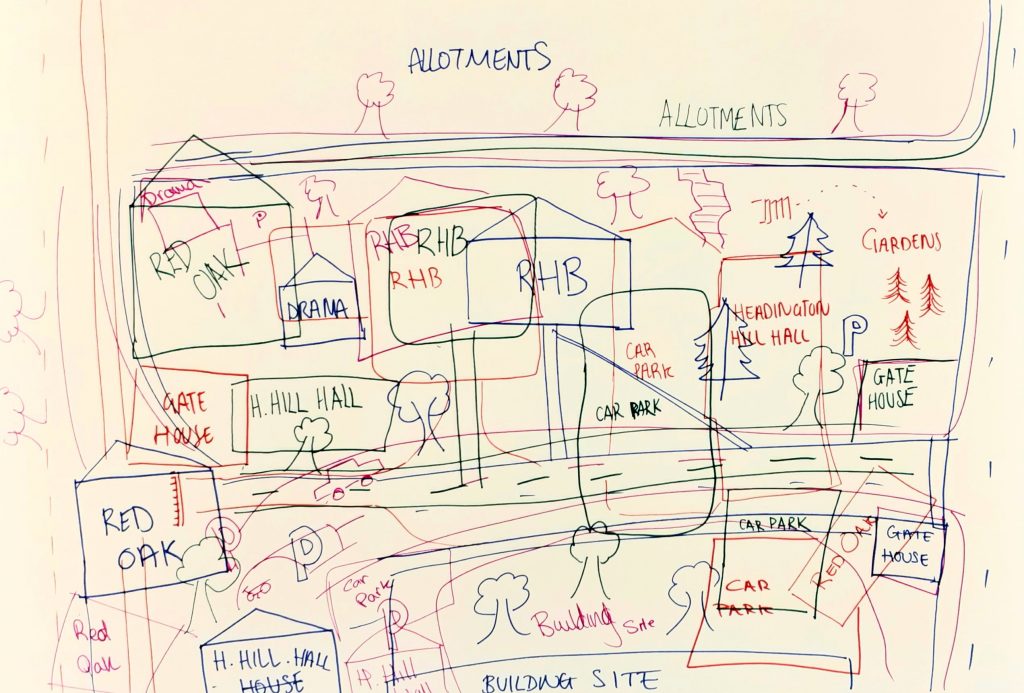
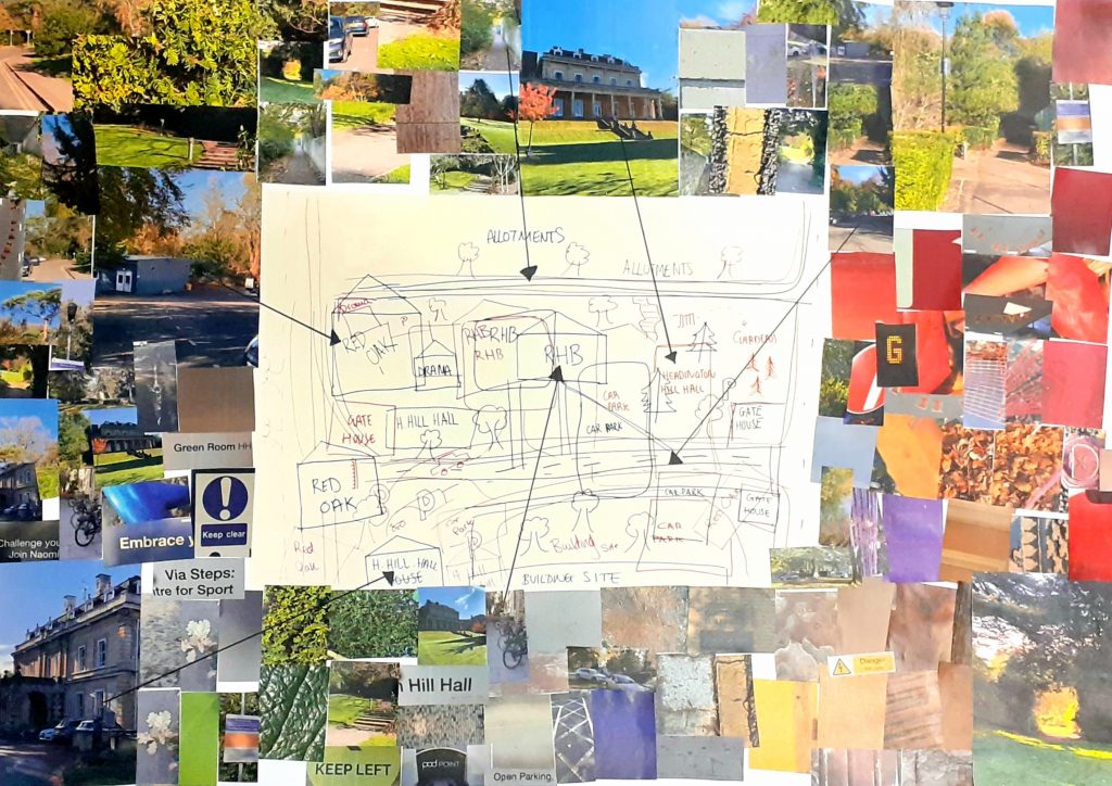
I photographed the drawings and printed the page at A3 size. This meant that there was space around the image to paste the photographs. We decided on having a few larger images and most of them smaller. The larger images stood out and would be more helpful to a viewer, as a map because the photos were of larger areas and paths around campus, compared to the smaller details that would not help you find your way.

Placing the images around the outside of the line drawings, served as a visual representation of each area of the campus. The use of arrows suggests to the viewer where they can find the photographed locations on campus.

I think maybe we tried to do too much in one place. My understanding of the task was that we needed to include all the mediums in one map. I think this is why the map looked busy.

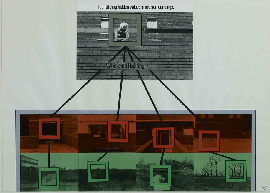
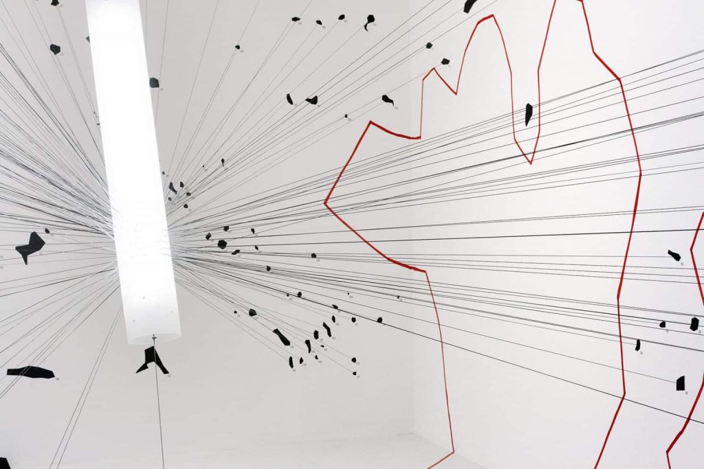
Our feedback from Adam was that he would have preferred us to use a digital approach. He also wanted us to be bolder in our design decisions. The example he gave was Stephen Willats work, where he presents photographs with connecting lines to represent relationships between the images. His work is readable as a map and yet it looks nothing like a traditional map.

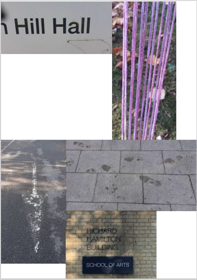
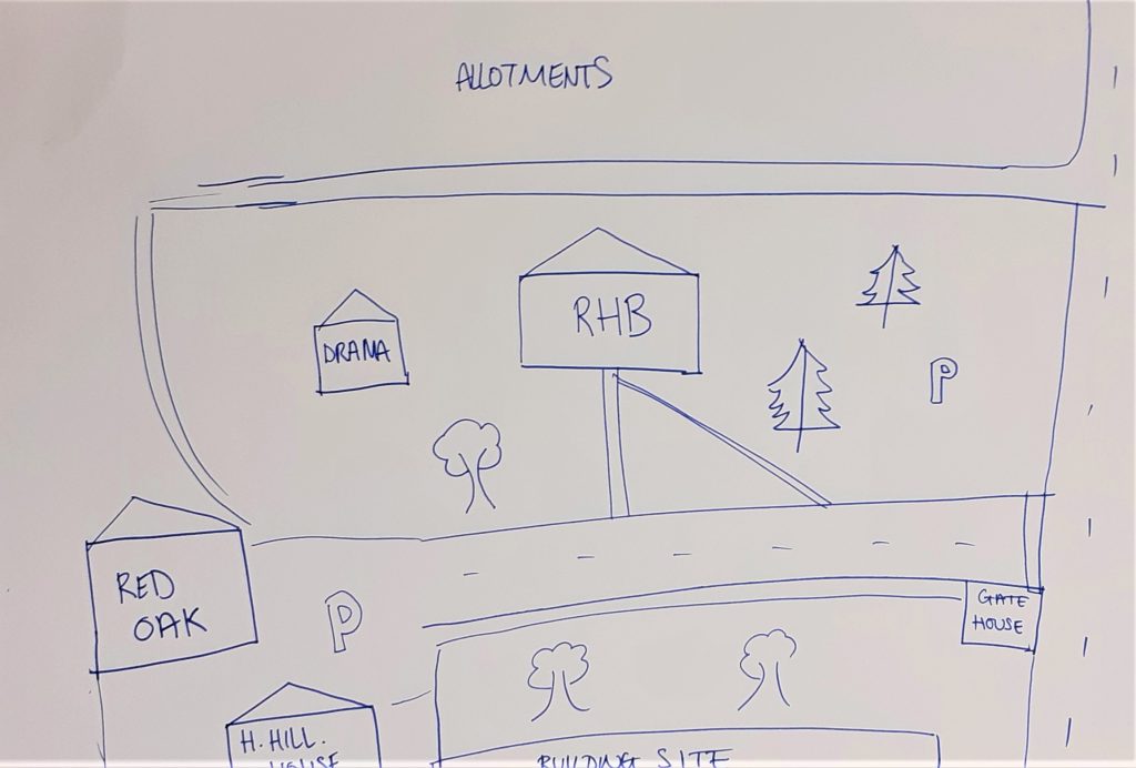
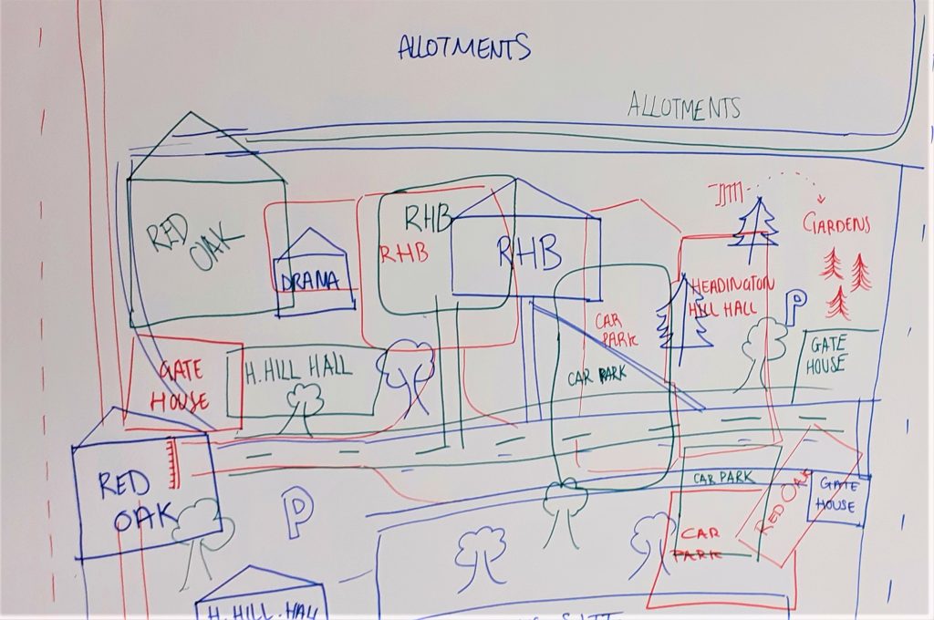
After the workshop, I placed a selection of the photos I had taken into an illustrator document. I re-arranged them into an images that ‘made sense’. Both images explain the journey from Headington Hill Hall on campus, to the Richard Hamilton Building.

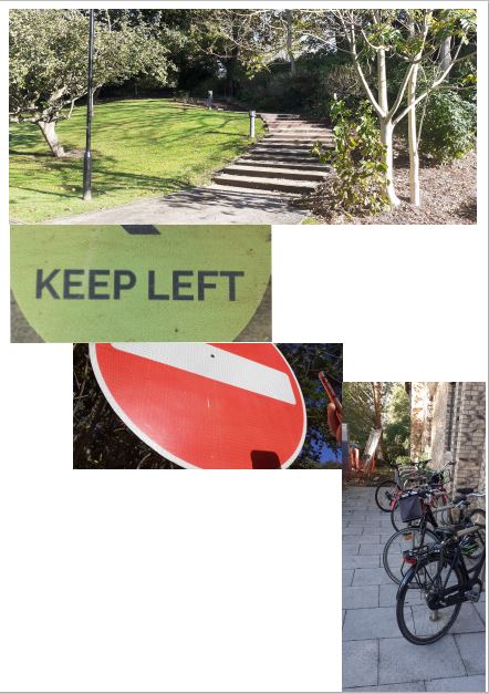
This map starts with the starting destination at the top of the page. The instruction is then to turn left then stop. The bikes show where you will arrive.

The text at the top tells the viewer where to start. The lines leads the viewer down the page while also illustrating the next object you would need to find on the journey to know you are heading in the right direction.

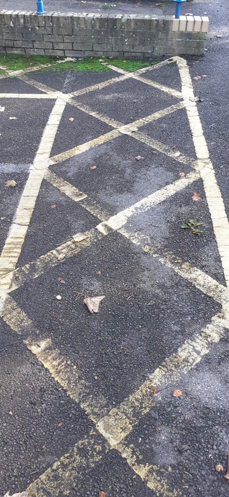
The third image shows wet footsteps on the floor. They ‘walk’ to the left and the fourth image. This is a photo I took of a faded arrow painted onto the car park tarmac. The final photo was taken by my classmate and shows the destination to reach using this map.

We were introduced to the brief for the rest of the semester.

  • Produce a map
  • Think about conventional uses of maps and diagrams then think about how you can be innovative.
  • Think about how forensic architecture does it
  • Plan before you start. Know when to stop
  • Designate time to work on it around your other commitments e.g. do 3 hours of experimentation in the studio on Thursdays. Then move onto the next stage of the plan.
  • Brainstorm
  • Then define what is more interesting e.g. screenprinting or using photography etc
  • Develop multiple formal elaborations.
  • Then deliver
  • Document all in the process book– keep your progression contained within these spreads
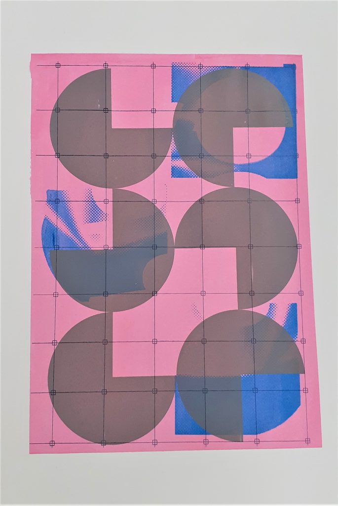
  • Mindmapping– free association, there are no bad ideas. Keep this mind map as it is visually already a map.
  • Make the map large. Could do the bookbinding maps.
  • Most important that you try stuff out and research first to show it is informing your work

Mapping – Research

I looked at the way designers approach mapping, to help me understand how I might approach mapping in my work.

I look at this webpage about creative mapping & visualisation techniques.

Why do we present data in a visual way?

When we display our data visually it is much easier to extract meaningful patterns and information that would otherwise be indecipherable in numbers, and this in turn allows us to develop conclusions and make informed design decisions. Not only does this display of data help us with our designs, it can also demonstrate information to a client more clearly, helping them to understand the root of our design decisions and allowing them to engage with the design process from an early stage.”

Graphing where people run
Organised crime in Northern Italy
https://www.behance.net/gallery/22230729/Crime-in-Northern-Italy-A-visual-exploration

Stephen Willats

http://stephenwillats.com/work/where-do-i-belong/

Stephen Willats is a British artist. His work explores the role of art in society.

His work has involved interdisciplinary processes and theory from sociology, systems analysis, cybernetics, semiotics and philosophy.

https://www.tate.org.uk/art/artists/stephen-willats-2147

His use of framing in the above image, draws the viewer’s attention to elements of a scene.

The zig-zagging line in the image below connects the 4 photos. It takes the viewer on a journey of place or time or both. The layout makes the map easy to read because the images are stacked one on top of the other in 2 layers.

http://stephenwillats.com/work/four-pressures-four-freedoms/

This piece looks like a diagram. The black and white adds to the work’s readability. The symmetrical layout gives the piece a sense of order.

Living with Practical Realities 1978 Stephen Willats born 1943 Purchased 1981 http://www.tate.org.uk/art/work/T03296

Across three panels, Stephen Willats explores the realities of living in a 1970s British tower block. The work centres on Mrs Moran, an elderly woman who lived at Skeffington Court in Hayes, West London. Willats photographed and interviewed Mrs Moran over the course of six months. The text in the work is based on these interviews. In his composition, Willats highlights the physical, social, and economic constraints that Mrs Moran experienced. Each panel also features a question. These invite the viewer to participate directly in Mrs Moran’s lived experiences.

https://www.tate.org.uk/art/artworks/willats-living-with-practical-realities-t03296
https://www.youtube.com/watch?v=iAevvRYc8Yo

‘Created by a group of artists and group of actors and expresses transience and fluidity. The idea of complexity, of relativity and authorship.’

In this work, he uses line to connect ideas visually. The separate moments would otherwise not be connected. The order of the images is then important to the meaning of the sign. Changing the order would change the connections between these visual thoughts. We could be looking at a narrative mapped out like in a storyboard. It is up to the viewer to piece together what the map is signifying.

The labels at the bottom of the artwork describe different sounds. We can then connect this upwards. The labels are indicators but do not tell the whole story.

https://www.contemporaryartdaily.com/project/stephen-willats-at-south-london-gallery-london-7246

Forensic Architecture

Foresenic Architecture is an interdisciplinary team that includes architects, filmmakers, lawyers and scientists. Their work uses the built environment as a starting point for explorations into human rights violations. Forensic Architecture | Tate

Forensic Architecture has worked closely with communities affected by acts of social and political violence, alongside NGOs, human rights groups, activists, and media organisations. Their investigations have provided decisive evidence in a number of legal cases, and contested accounts given by state authorities, leading to military, parliamentary and UN inquiries.

(https://www.ica.art/exhibitions/forensic-architecture-counter-investigations)

Their work illustrates crimes that have taken place. The agency open investigations and work from these investigations are presented in their exhibitions. Their work raises questions about technology, political issues and history. They take advantage of digital methods such as satellite imaging and digital recording. Through their work, they share truths with the world that people have a right to know.

They transform data into large expressive imagery:

Counter Investigations, 2018
https://www.ica.art/exhibitions/forensic-architecture-counter-investigations

They read buildings to understand what has taken place. For example, reading the ruins of a building that has been destroyed. They examine these events from multiple perspectives. This image maps out the events from one of their investigations:

https://www.macba.cat/en/exhibitions-activities/exhibitions/forensic-architecture
https://www.youtube.com/watch?v=_-yQ__UKsAQ&t=313s

Reporting from the front was an exhibition displaying accounts from people who were sharing their experiences of different events.

Reporting from the front, 2016
https://forensic-architecture.org/programme/exhibitions/reporting-front

Screen-printing & Gestalt Theory

The Gestalt Principles | Basics for Beginners – YouTube

I was curious to learn about Gestalt theory, as I had heard of it but didn’t understand what it was about. This video from YouTube, was the most helpful resource I could find to explain the theory to me. In the video he explains how when we look at a picture, we perceive the elements as one image, even though a picture is made up of separate pieces.

From the book Introduction to Two-Dimensional Design by John Bowers

Some Examples:

Gestalt theory Proximity.

In this artwork by Emma Davis, the elements are placed closely together. This means they are perceived as a group:

Gestalt theory Figure & Ground.

In this screen print by Heretic Spectral Nation, there is a play between the green and pink spaces. It is not obvious which is the figure and which is the ground. This is interesting because they could be interchangable.

In this book, John Bowers talks about visual language. I found this theory helpful when considering my screen-printing designs.
From the book Introduction to Two-Dimensional Design by John Bowers

In the first half of semester 1, I have been experimenting with abstract geometric shapes.

From the book Introduction to Two-Dimensional Design by John Bowers

Yesterday, I spent my morning in the printing studio. (The perfect way to spend a Thursday morning). I felt a bit more comfortable with the technique and decided to take more control in this session. To take risks and try to create more of what is in my mind, onto paper. First, I wanted to cover the damage done to my print from the drying rack last week. My plan was to create a layered effect. I was happy for this design to look quite busy. In the photo below, the print has 3 layers.

I had the idea of using scrap paper to protect the border of my print. I had this idea because of my previous print where the grid design came off of the background square. This was due to poor planning.

I used a rusty-brown colour to cover the tear. I was happy with the result. I also chose this colour to mix nicely with the background and unify the print as a whole. I liked the areas where the layers have some cross over.

I placed the artwork I wanted to use, over the print. This allowed me to see how best I could include the shapes into the composition.
I used a hairdryer to speed up the drying process.
From the book Introduction to Two-Dimensional Design by John Bowers

In this piece, I have used harmonious colours for each layer, apart from the green layer. This helps to add interest to the image. For the darkest brown I used a mixture of orange and green, since orange and green make brown.

I can see active space within the design, because of the irregular shapes and transparency of the layers.

The values in this image are also quite similar.

I again used masking to protect the areas of the background I want to avoid printing on.

I chose purple and green for the second layer of this print. I wanted to create some variation, while sticking to the pink area of the colour wheel.

I placed blobs of ink onto the screen quite randomly. I flooded the screen before doing my first pull.

I positioned the print at the corner of the page. This position suggests that the design carries on beyond the frame, as explained below:

From the book Introduction to Two-Dimensional Design by John Bowers

Another example of this effect:


 Print Garage: Concentricity i
From the book Introduction to Two-Dimensional Design by John Bowers

I wanted to play with scale within this design. For my third print layer, I chose the large circle design. Positioning it in the opposite corner, creates asymmetrical balance within the work.

At this stage, I made the mistake of forgetting to tighten the bolts on the printing machine/vice. This meant that the frame shifted as I was pulling the ink through. This created blurred lines on my print. It also meant that my print went off the edge of the background. Because of this mistake, I decided to print a fourth layer using a darker green.

The lines within my print run vertically and horizontally. Where they cross over, there is an interesting gridded pattern.

Example of playing with scale:


Print Garage: Mystic Brew

Here, the designer has placed a large circle that dominates the space. The other elements are dwarfed by it in comparison.

http://www.hereticheretic.co.uk/spectral-nation/artworks/cosmic-doughnut-2

In this artwork by Heretic Spectral Nation, we can see the crossing over of lines. This shows the interesting effects created by layering up striped prints. This gave me the idea to play with the direction of my lines when printing multiple layers.

I felt that there was something lacking in this print from last week. I thought about how I could unify the elements.

From the book Introduction to Two-Dimensional Design by John Bowers

Example of a grid unifying an image:

Because of the right-angles within my design, I chose to use the grid pattern for the fourth layer:

This print would be symmetrical if it wasn’t for the blue shapes.

Because the grey shapes are similar and they are of the same colour, they look as though they belong to a group. This is the Gestalt theory known as similarity.

There is a contrast of sharp and round, and a contrast of light and dark within this piece.

From the book Introduction to Two-Dimensional Design by John Bowers