Screen-printing Workshop 2

Our second screen-printing workshop was focused on building another layer onto our previous prints. The first prints would become backgrounds and the second layer would need to add something to the composition. For this step, I needed to consider colour, line, pattern and balance. (known as the formal elements of art)

I looked at A Primer for Visual Literacy by Donis A. Dondis, to help me learn tips for composing my prints. Some key quotes from this book:

Line

“Line can take many different forms to express many different moods. It can be very loose and undisciplined, as in the sketch as illustrated, to take advantage of the spontaneity of expression. It can be very delicate and undulating or bold and course, even in the hands of the same artist.” “Line really exists in nature. But line does appear in the environment: the crack in the sidewalk, telephone wires against the sky, bare branches in winter, a cable bridge. The visual element of line is used mostly to express the juxtaposition of two tones. Light is utilized most often to describe juxtaposition, and in this, it’s an artificial device.”

Shape

“Line describes shape. In the parlance of the visual arts, line articulates the complexity of shape. There are three basic shapes, square, circle, and equilateral triangle. Each of the basic shapes has its own unique character and characteristics and each is attached a great deal of meaning, some through association, some through our victory, and some through our own psychological and physiological perceptions. Sky has associations to it dullness, honesty, straightness, and workmanlike meaning; the triangle, action, conflict, tension; the circle, endless nurse, warmth, protection.”

Colour

“Since perception of colour is the single most strongly emotional part of the visual process, it has great force and can be utilised to express and reinforce visual information to great advantage. Colour not only has universally shared meaning of their experience, but it also has separate worth information leaked through Sim. In addition to the highly negotiable colour meaning, each of us has our own personal and subjective colour preferences. We choose our own colour statements and settings.” “Colour has three dimensions which can be defined and measured. Here is of the colour itself of which there are more than a hundred stop the second dimension of colour saturation, which is the relative purity of the colour from the cuter grey. The third, and last dimension of colour is achromatic. It is the relative brightness, from light to dark, of value or tonal gradations.”

Whilst including detail in the second layer, I wanted to reserve using the finest details for the top layer.

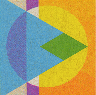
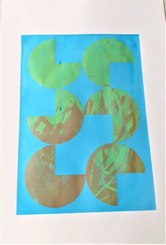
I started with this print from my last session. Securing it to the table using the suction switch. I like the simplicity of this print and combined with the colour, it resembles the Earth.

I didn’t want to take away from Earthly aspect of the image. Therefore, I used rounded shapes as my second layer to blend into this theme.

The use of green for the second layer meant that this layer was harmonious with the background. Choosing a darker green meant that the shapes stood out against the circle.

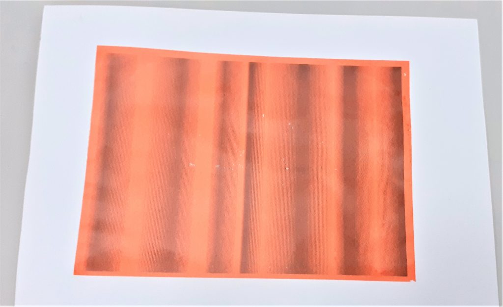
I found the orange ink to be fairly transparent. This meant it worked well as a flat layer, since it blended in visually. The grey lines of the background became brown when mixed with the colour of the second layer. I am not sure why there are white speckles across the page. I assume the markings were on the screen. I like the overall warmth of the image.

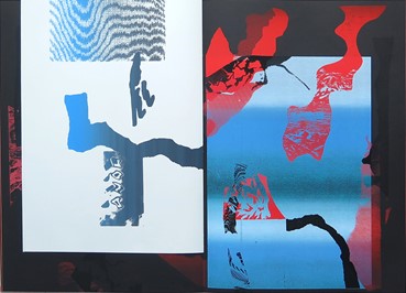
I chose blue ink for the second layer.

I thought the blue would blend with the pink and create a purple image. This was not the case, as the blue paint sat on top and looked purely blue. Using a purple paint for the final layer may help to unify the colour in the image.

Adding binder to the blue would have helped to create the effect I had in mind.

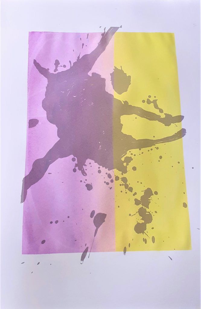
For my second layer, I used 2 colours. There was not a perfect merge in the middle, but I was happy with the effect I achieved. I wanted my second layer to be translucent, as I wanted the grey of the background to be tinged different colours. Knowing that yellow is a transparent colour, I didn’t add any binder to the paint. I did, however, mix binder with the purple paint, to make sure I could see the design clearly through it.

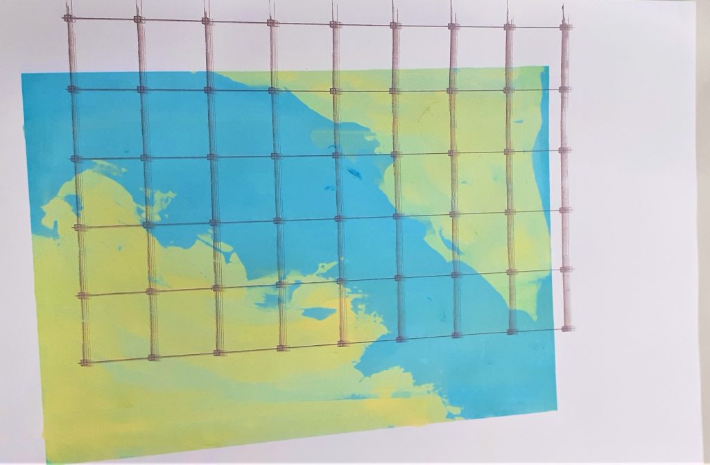
The theme of this print was always going to be about the Earth. I was hesitant to add a second layer, as I was happy with how the first layer turned out and I didn’t want to obscure the delicate brushstrokes. I chose to use the grid pattern, as I felt it fit with the theme of mapping. I chose grey, so that the lines would not be too harsh.

When printing, I did not use the vice, but instead worked with a classmate. Human error meant that the screen was jolted, this left blurred lines. To correct this, I plan to add another grid print, although in a darker colour, for example dark blue. This will help to define the print and anchor the design.

I used a paintbrush for creating this effect on the second layer.

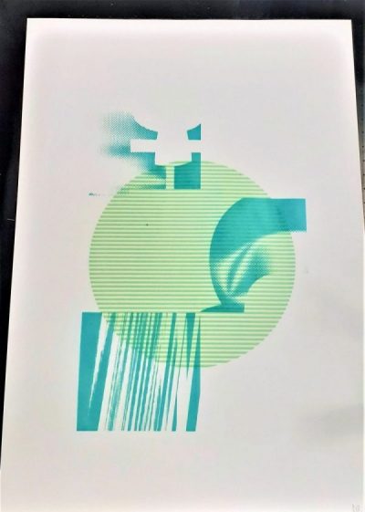
The blue of the background mixes with the yellow to create a greenish hue. The orange appears more brown. I have learnt that mixing complementary colours dulls down or neutralizes the colour. It cancels out the vibrancy, which might be used intentionally in future prints.

002 Intro to Bookbinding


From the book: How to Use Images by Lindsay Marshall and Lester Meachem
Bookbinding instruments
Left to right:
1.       Cutting mat with grid
2.       Needle
3.       Awl
4.       Bone folder
5.       Carboard
6.       Metal ruler
7.       Bulldog clips
8.       Upholstery thread
9.       (not pictured) paper knife

Last year at college, I came across the art of zine making. I used mainly folding techniques and a stapler. Bookbinding has always been a mystery to me.

In week two at Brookes, we were introduced to bookbinding. This is what I got up to in the three-hour workshop…


We can feel the grain of paper by gently bending it and feeling the resistance.

First, we were introduced to the idea of paper grain, paper can be called short grain or long grain this refers to the direction in which the fibres run within a piece of paper.

Our lecturer Ruth gave the example of the way in which newspaper tears better one way than the other. This is because all the fibres are lying in one direction. If you try to tear the paper against the fibres, your torn edge might not be straight.

In a book, the grain should run panel parallel with the spine. Paperbacks usually have the grain going the other way, as his is a cheaper option for production. Paperbacks are not made to last, and therefore the function of the book is considered when making these decisions.

In book making, a section is where you fold a number of pages together in half. We began by using four sheets of paper to make a section. After making sure the pages are correctly aligned, I used a bone folder on the crease to create a tight fold. I found that the bone folder was a very useful tool, and I can imagine myself using it for my work generally.


To start the first book, I folded the sheets of paper into half.

I folded the section within a piece of paper to be used for the cover.

I measured quarter along the inside of the spine and made three marks one at the centre and to either side this. I used the awl to puncture holes into the fold, placing it on a piece of cardboard.

I threaded the needle, using a technique that was new to me. We used upholstery thread because it is stronger. I threaded the needle as I normally would, then used the needle to go back over myself and puncture the thread. When I pulled this through, it ensured that the thread would stay on.

I then threaded the paper together using the holes I had created. In bookmaking, the knot can be on the outside or the inside of the spine. It depends on the look you are trying to achieve. Sometimes it is nicer to have the knot on the inside of the book, so that you can’t see it when the book is being displayed. In this case I wanted the knot to be on the inside. Therefore, I began the stitching inside the book, running the needle through the middle hole first. Then I threaded the needle back through the right-hand hole, then over to the left hole, then back through the middle hole and was then able to pull it tight. I knotted the thread twice for strength, making sure that I was creating the knots around the threads that had been pulled through, as this makes it stronger.

When my book was laying on its side, it naturally wanted to open out.

I could flatten it by using the bone folder. Using the bone folder directly onto the cover of the book, would create some shine. As the paper is soft, the pressure of the bone folder would polish the book. I didn’t want this, therefore I placed a piece of paper onto my book first and used the bone folder over the paper to flatten the spine of my book.

The finished book

For my second book, I practiced making a hidden spine. The piece of paper I used for the cover needed to be longer than the paper I used for the cover of my standard stitching book.

For this method of bookmaking, I needed to make two folds for the cover.

These folds gave me a flat area where the spine of the book was going to be. I then needed to carefully bend this section in words to be able to create a crease at the centre.

This gave me a ‘W’ shape at the spine.

The most tricky part was then to add two sections.

I used 2 bulldog clips to hold the sections in place. I needed to repeat the stitching process that I used on my first book, but this time it was slightly more tricky because of having two sections to place around the inner fold.


The stitching is hidden!

I then needed to fold in the front and back cover. I marked where the fold would be and repeated the process for both covers. However, the two covers were not even. I had to correct this.

Ruth then taught us the best way to trim down the edge of the book. I use the metal ruler and my scalpel. Because of the layers of paper, it took a few attempts to cut all the way through the pages. The answer to this was using repetition and not force.

For the final book of the workshop, we made a style of book known as a Dos a Dos. (In French meaning ‘back to back’). I really liked this style of books, it’s fun and I can imagine making a zine in this style. This style of book has two covers and opens in two ways, it is almost like two books glued together. A zine could be based around this format and be used to display work of contrasting ideas.

We used a paper knife, also known as a clock knife. This kind of knife is used for many different crafts. Ruth showed us the correct way to use it for cutting paper. It would be tempting to drag the knife through the paper, but this could tear the paper. Instead we folded the paper, place the knife on the inside of the crease, and pulled the knife outwards at an angle. We repeated this technique to cut the paper in half.

For the cover I used a long piece of card. First, I folded it into a zigzag format. This book needed two sections, one for each spine. I attached the sections to each side of the spine, using the same stitching technique we had been practicing. This time I left the knots on the outside of the spine, just to see the difference aesthetically.


My three books together 1) standard stitching, one section 2) hidden stitching three) Dos a Dos

I really enjoyed this bookbinding session. The second book was the most difficult to make for me. Aligning the paper was also something I found tricky but I think this will improve with practice.

002 Screen-printing

The History of screen-printing

OUC4366391 Poster May 1968 – Poster, May 68: Vietnam War: Onward Christian Soldiers (GIs are moving away, leaving behind an eploree Vietnamese mother holding her inanimate baby). Screen Prints, New York, USA); Photo © Collection Michael Lellouche; .

Screen printing has evolved over the ages. From prehistoric times, people have had a way of printing using stencils. Printing techniques have been used for decorating cloth for centuries. Screen-printing has we know it today started in the 20th century. Artists first used human hair for the screens, then silk was used. These have been replaced by synthetic materials, mainly nylon and polyester. Screen printing was useful to make posters during World War II, as this method allowed for posters to be mass produced.

Information sources from: A History of Screen Printing: Tracing Our Industry’s Roots – Anatol Equipment Manufacturing Co. Blog

I looked at artists and designers who use screen-printing in the present day

People of Print

I like the layering of colours in this print, from pale to bold to pale again. The use of white allows the bold red lines to come through. The typeface used is bold enough to be readable despite the transparency of the white ink. The red print is very effective in emphasising the text. The circles act as a target, drawing the viewer’s eye to the centre. The arrows point towards the centre of the image. The blue adds a sense of calm and nicely balances out the strong visual elements within the design.

Maze

Against the black shape, the pattern is visible, but here it is subtle. It creates a look of texture. Pink is a fun and warm colour. Here it is needed to balance out the dominating black shape, as black can feel quite serious. The strip of green at the bottom, feels quite grounding and anchors the piece.

Josie Blue Molloy

The use of simple geometric shapes is balanced by the interesting background in this piece.  The blue and white of the background are cloud-like, organic and random. The rectangles feel like they are tipping forwards, since the artist has printed them at an angle. They remind me of buildings that are looming against the sky. Where the rectangles meet, a dark area is created. Here, we see a merging of 3 colours: 2 rectangles and the background. This works well because the colours are next to each other on the colour wheel. This is known as analogous. Analogous colours create harmony within a design.

JP King

I really like the artists use of layers. The blue triangle would have been printed last. Where it merges with the circle, we see a green area. The artist may have used stencils to create the geometrical shapes in this design. He would have needed to ensure each layer would line up accurately. We can see areas where the prints were not lined up perfectly. Such as the outline around the white circle. This adds character to a print and shows it as being a hand-made product.

We Three Club

I like the visual ‘noise’ created in this print. This graininess could be seen as an error in some prints, but I think it works well here because the colours used are so bright that it helps to cool them down. In the poster, grittiness could indicate the style of the music the poster is advertising. This music is likely to be heavier or grungey. This is because of the ‘imperfect’ quality of the print. Black is a strong choice of colour within a design, but here it works really well. I would like to experiment with using black in a print.

French Fourch


I like the way the designer has used the same pattern, or stencil, for the background. They have made the first print, let it dry,  then rotated the stencil for the second layer. I think the choice of colour would be important for the effect to look effective.

The use of pink and red together seems unusual, because the colours are so similar. However, I think it works nicely. This may be because the design is simple and therefore clear to read

Here, a soft gradient effect works nicely against the strong black and red shapes printed over the top.

The Private Press

The Private Press (@theprivatepress) • Instagram photos and videos

The use of torn looking edges gives the work an implied texture. The variety of organic shapes make the composition interesting and energetic. The designer has used a dotted pattern in the corner, but by restricting the use of repetitive patterns, the viewer can appreciate this pattern. The dark areas add depth. The white areas allow the viewer’s eye to rest.