I researched the physical formats for map making by looking at maps in the flesh.
I remembered the collection Ruth showed us in our bookbinding workshop about maps. I visited the collection in the Richard Hamilton Building this week and took a few photos of some interesting aspects.
I didn’t photograph one map where the designer included graffiti and dog poo on their map of an area. It is the designer’s choice what they include in the map and what they want to direct the reader to.
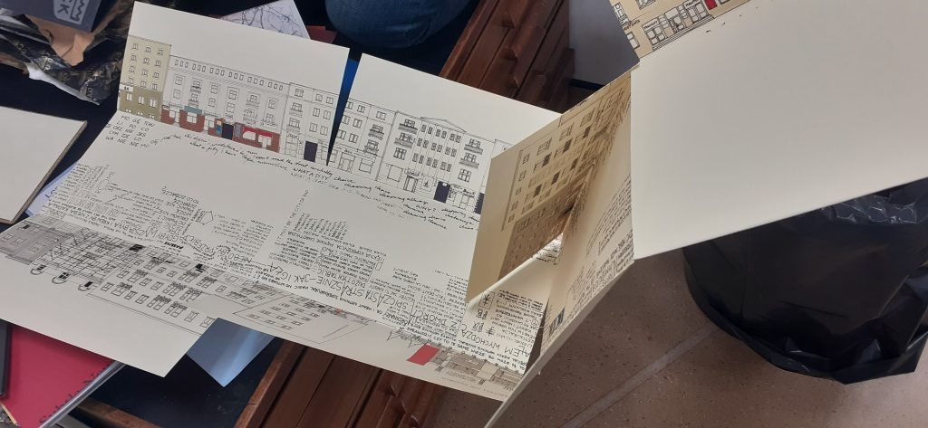
This map opens out lengthways and shows us 2 sides of a street. The centre of the map represents the road itself. They have used words to tell us information such as who lives in the building and events that have happened. The map was not in English, so I could not understand exactly what it was telling me, but even so, I could guess a lot from the way it is visually expressed. As the reader, it feels like you are walking down the road.
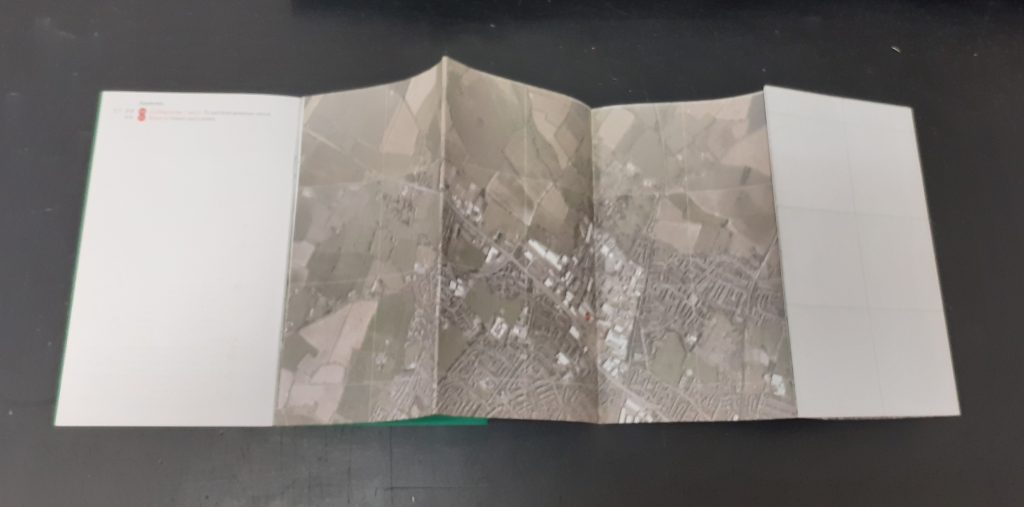
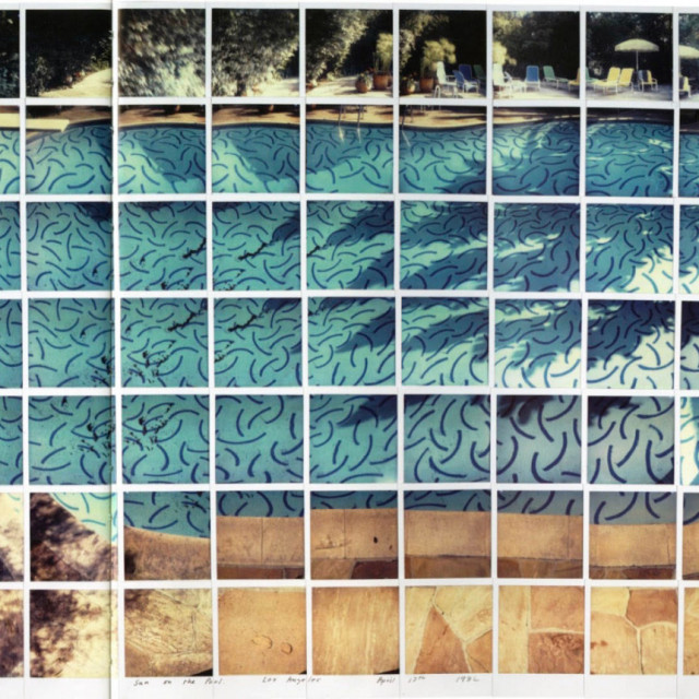
Another map that caught my attention is one made up purely of photos. The designer has taken a series of photos at one location and pieces the images together to create a picture of the place. This reminded me of David Hockney’s approach, but the photos here are made to look seamless. This technique means that we are given more information than could be captured in a single photo of a place.
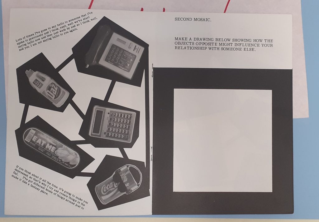
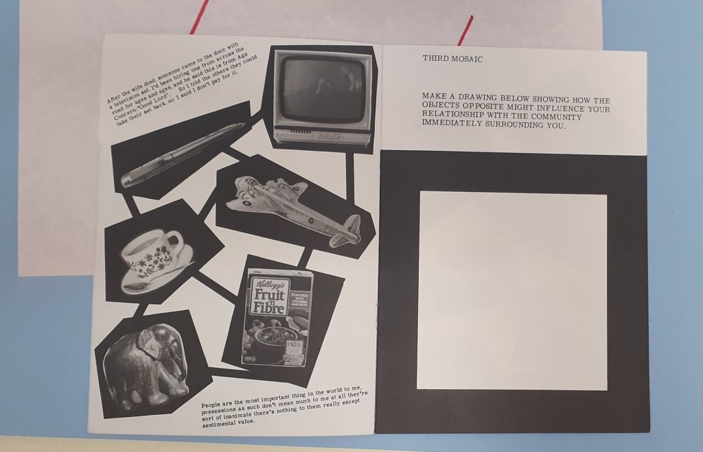
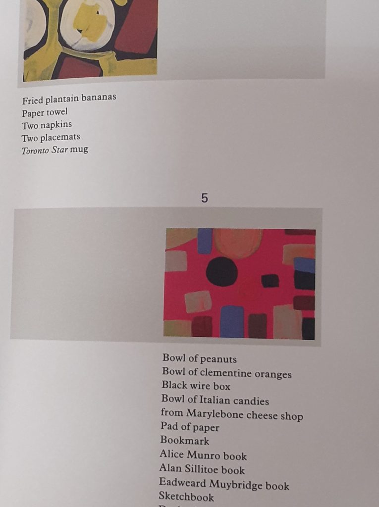
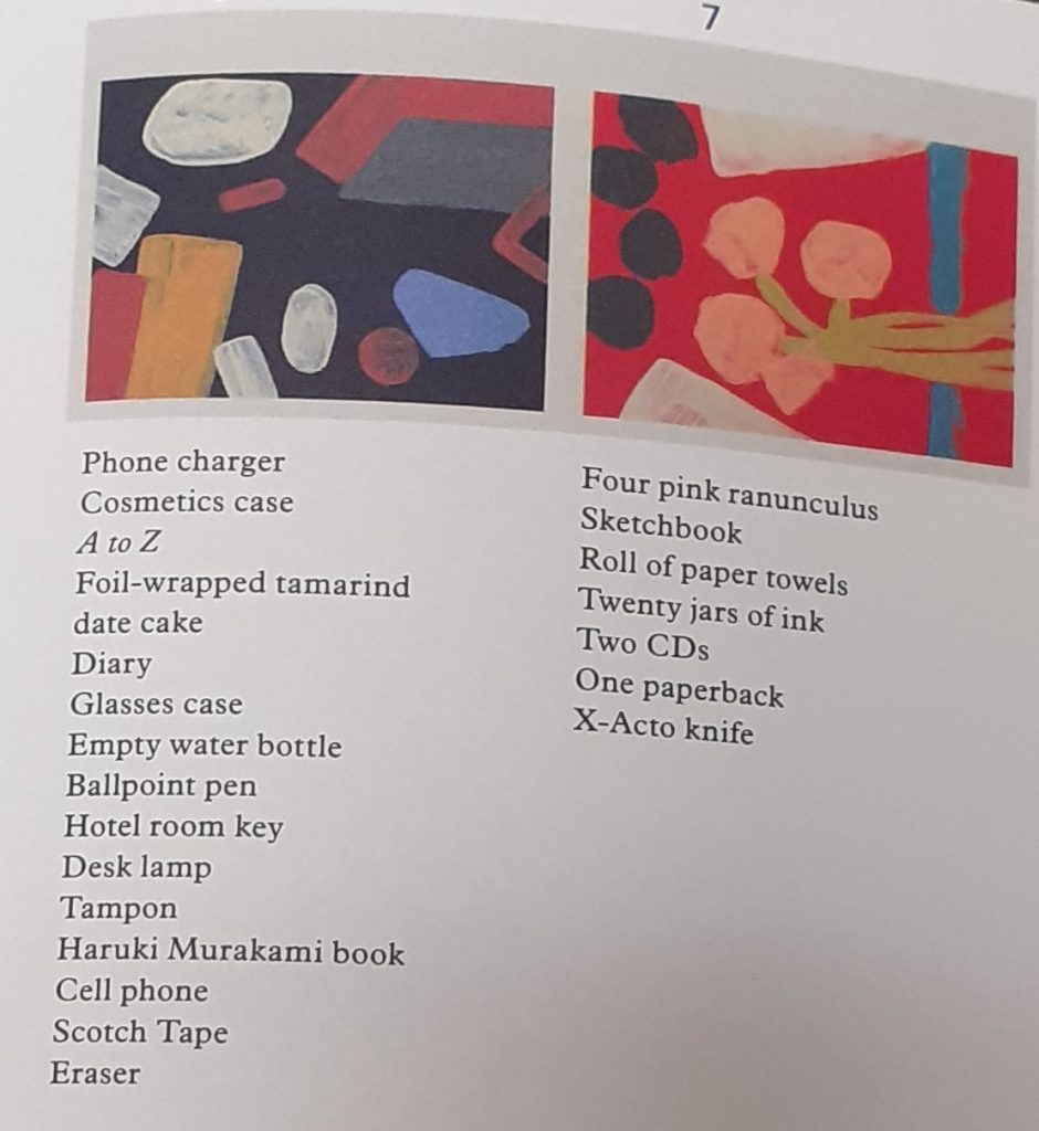
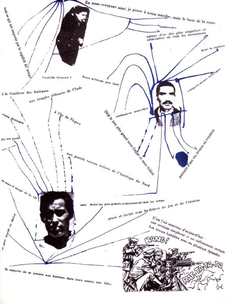
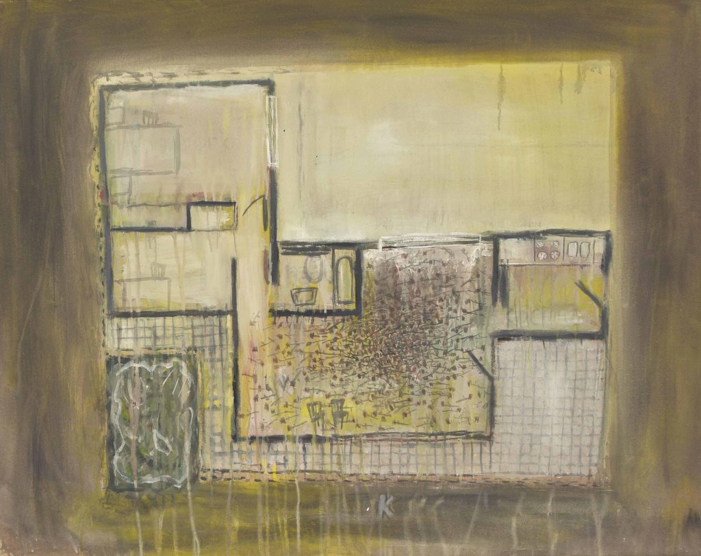
Stephen Willats
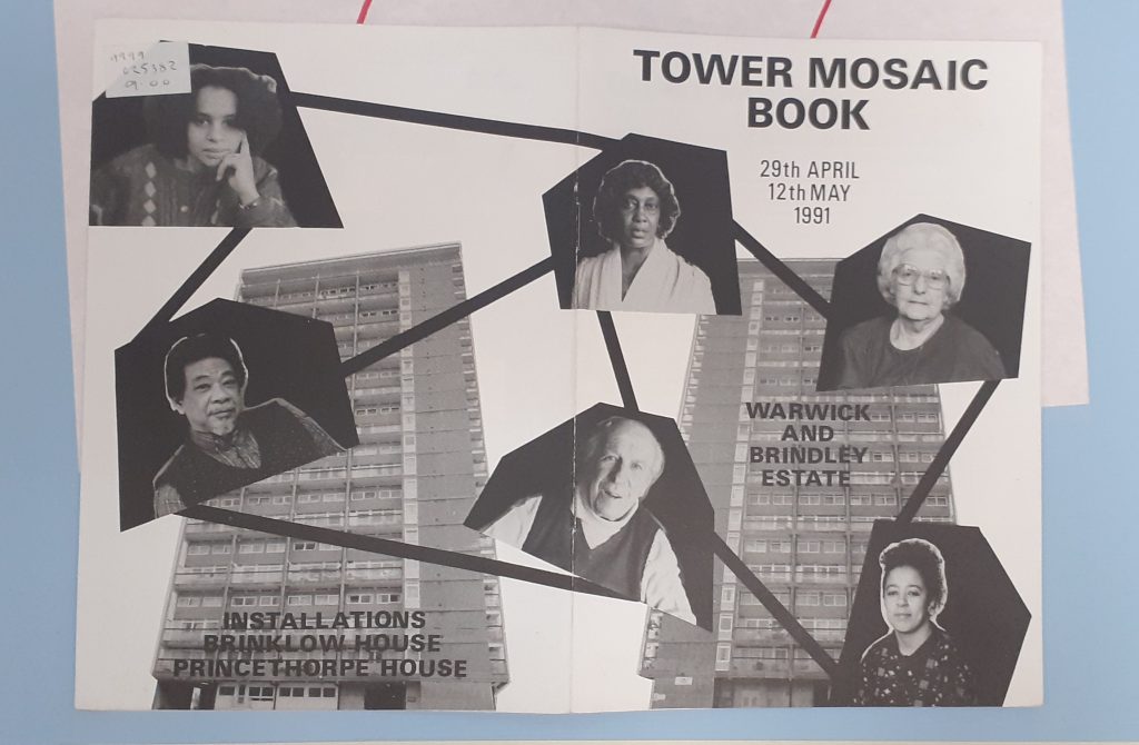
Amongst the collection of maps, I found this booklet by Stephen Willats, whose work I have looked at previously. The Tower Mosaic Book maps together the residents of the building. Because of the boldness, the map is easy to read.
The quotes on the left page above, have distinctive voices, without needing to change the typeface.He presents different objects from the building. As a viewer, I wonder about the choice of objects. I can see they are the people’s possessions because they are everyday objects.
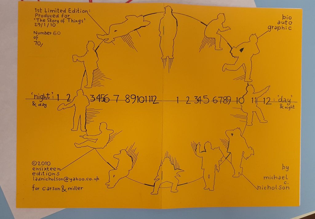
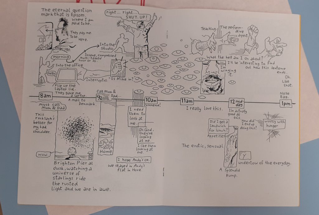
Michael C. Nicholson
Nicholson maps his day in this booklet. The horizontal line represents the hours in the day and the silhouettes signify different activities. The way they are positioned remind me of a clock face and therefore the viewer sees a clock even before reading the text.
The horizontal line continues across the booklet. This helps the work to look cohesive and part of the same narrative.
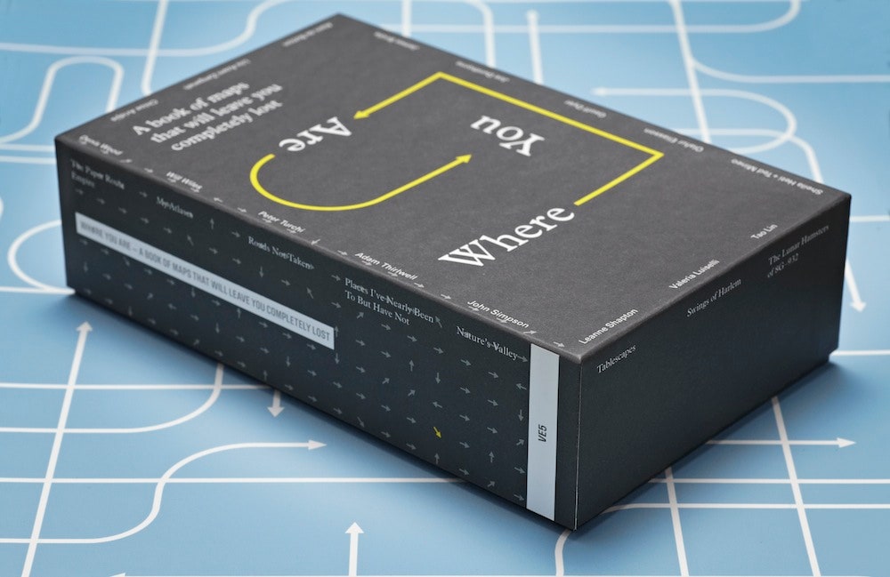
‘Where You Are is a book of 16 maps created by writers, artists and thinkers.’
‘We’re constantly mapping our lives, even if we don’t realize it. The emails we send, the restaurants we Google, the buses we take, the status updates we post —all of this is a way to track where we’ve been, what we’ve done and what’s important to us. ‘
I looked at this collection and include some of the maps here:
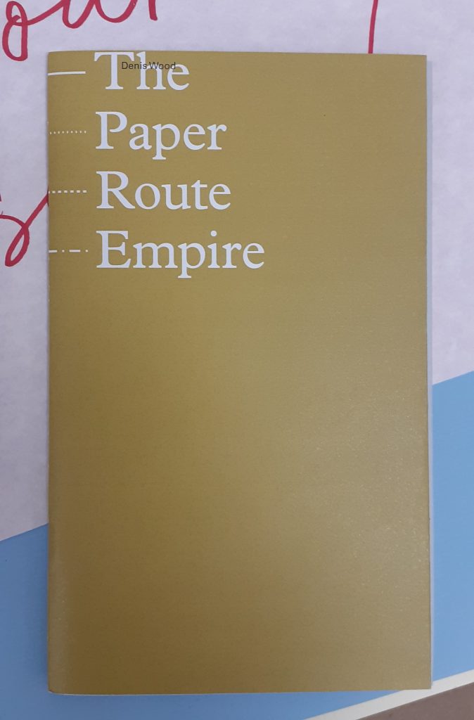
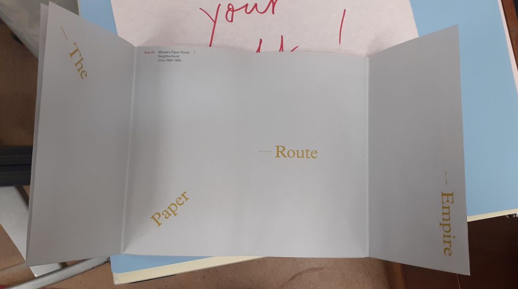
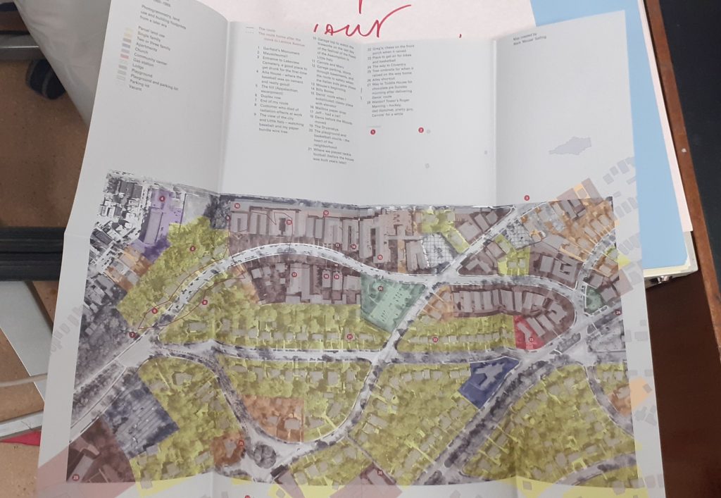
Denis Wood
front cover
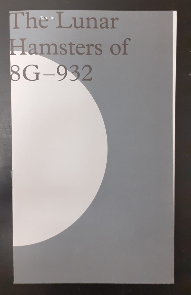
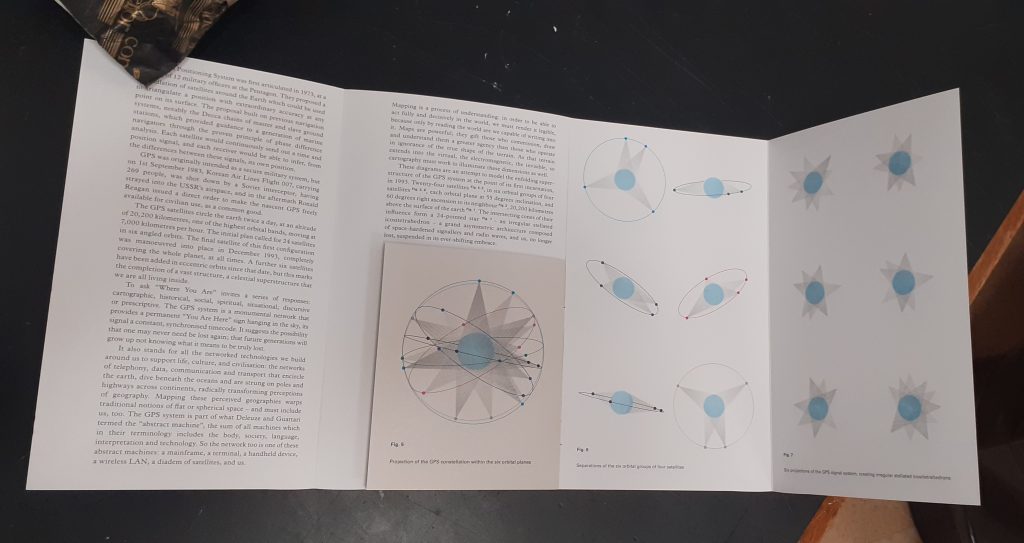
Tao Lin
front cover
Tao Lin maps outer space in answer to the question ‘Where are you?’
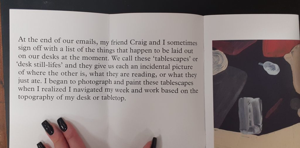
Leanne Shapton
front cover
Tablescapes is about the literal space around you in your day to day living. A desk is multi-functional. It’s a table you sometimes work at, sometimes eat at and use to store objects you may need to use in the near future.
The artist has interpreted her surroundings in the medium of paint. This key translates the shapes we see in her paintings, making it a map. Without this key, they would simply be paintings.
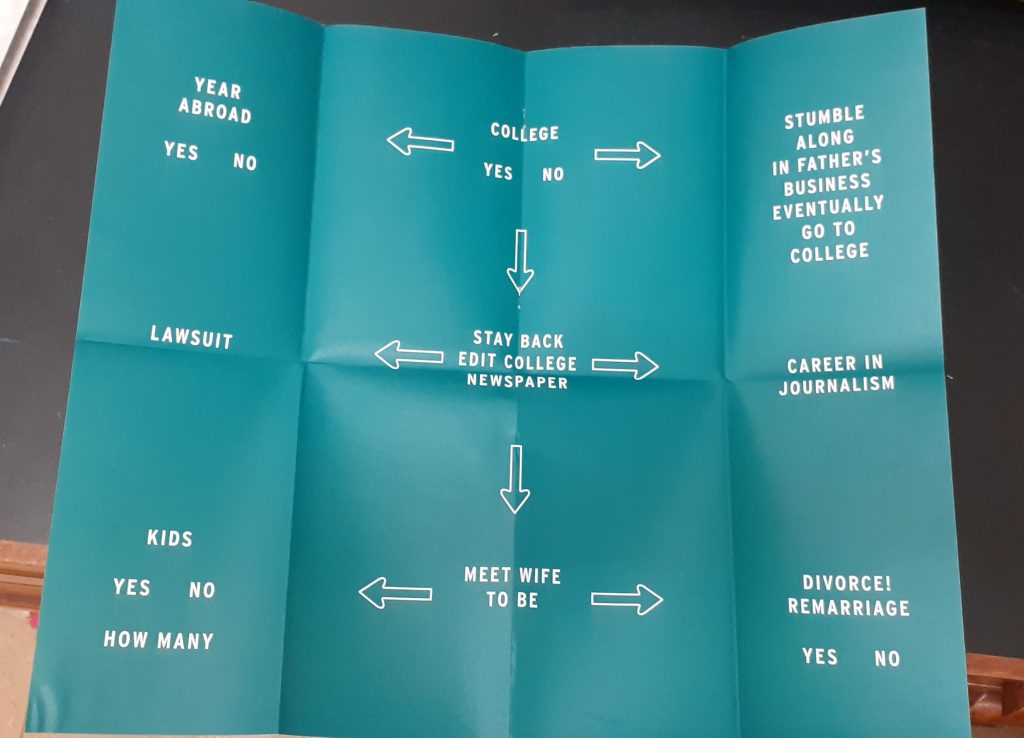
Peter Turchi
front cover
This designer thinks about different paths he could have taken in his life. The flow chart style reminds me of the quizzes found in magazines when I was a child.
He uses road signs that are recognisable to the viewer.
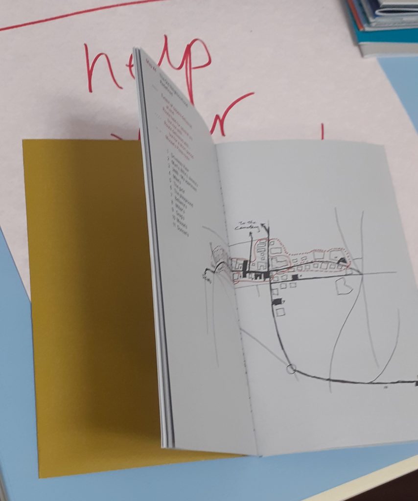
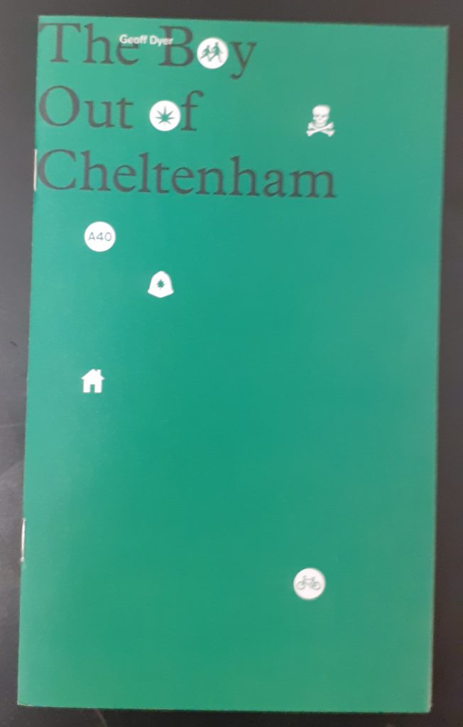
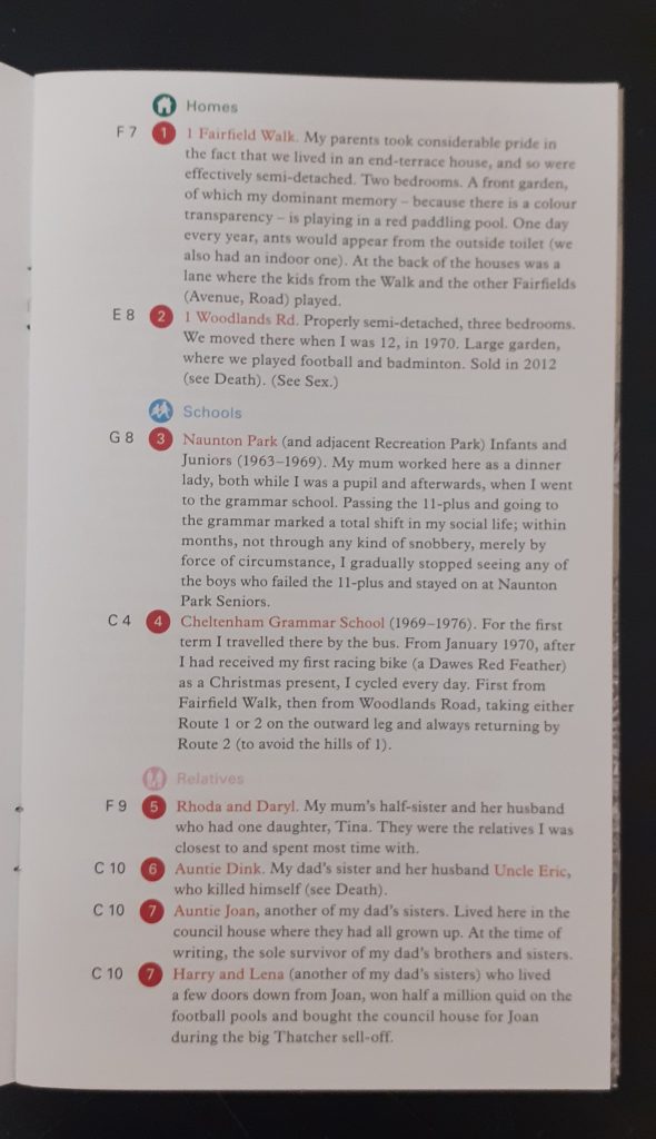
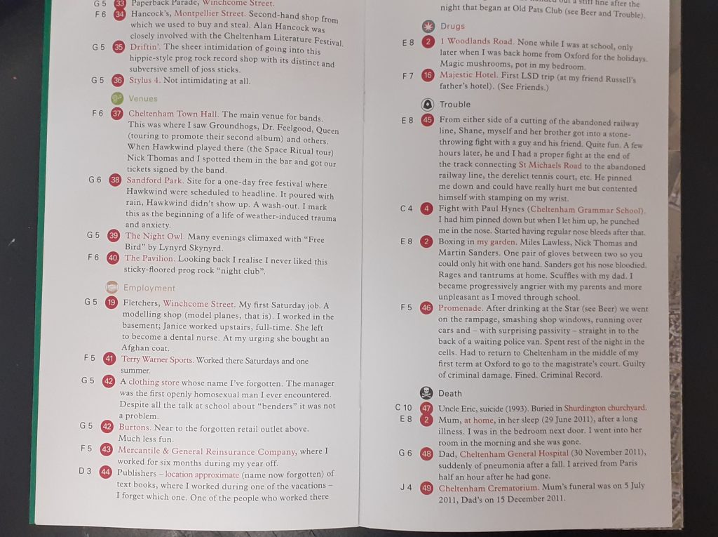
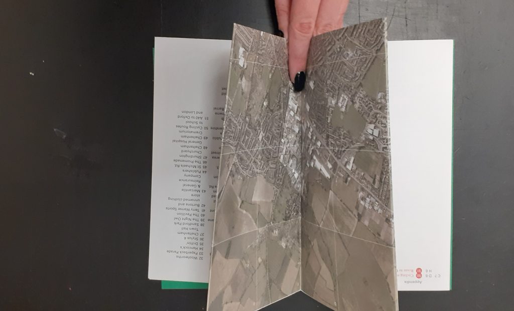
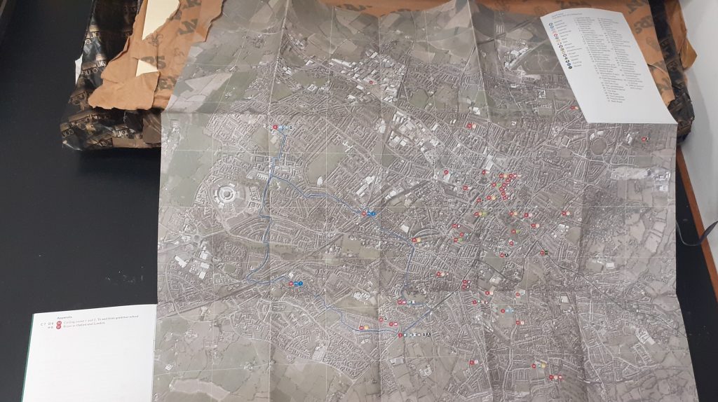
Geoff Dyer
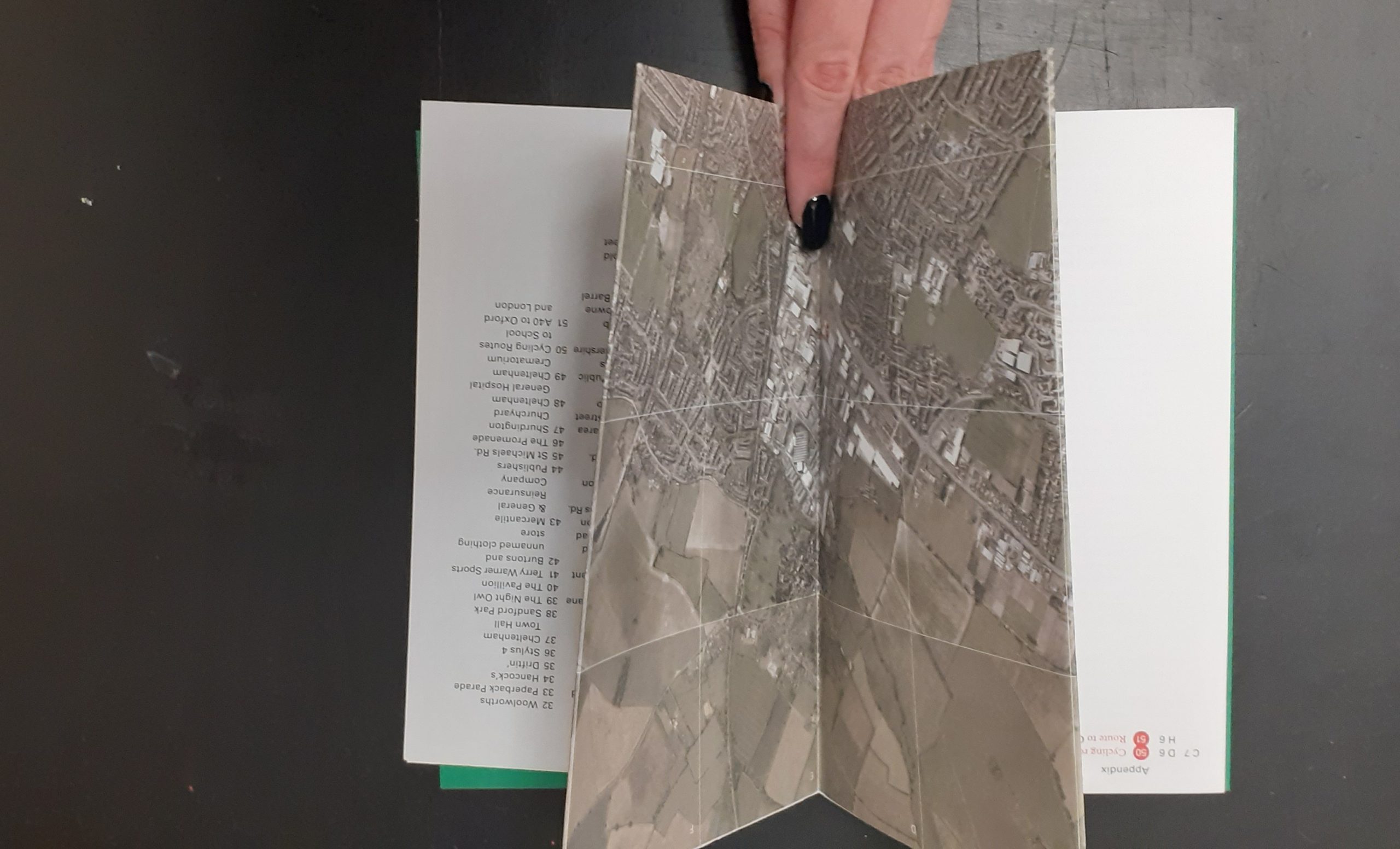
This map folds out to show the designer’s home town. He has marked areas that have personal significance to him. I like the depth of detail in this map and the way it is possible to get lost amongst it.
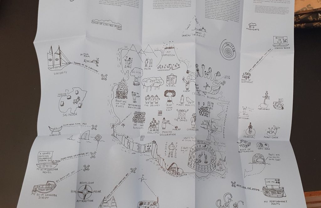
Joe Dunthorne
Ghost Pots relates to his experience as a writer.
Here, the designer uses illustrations to draw a map of an imaginary place. ‘A literary landscape.’
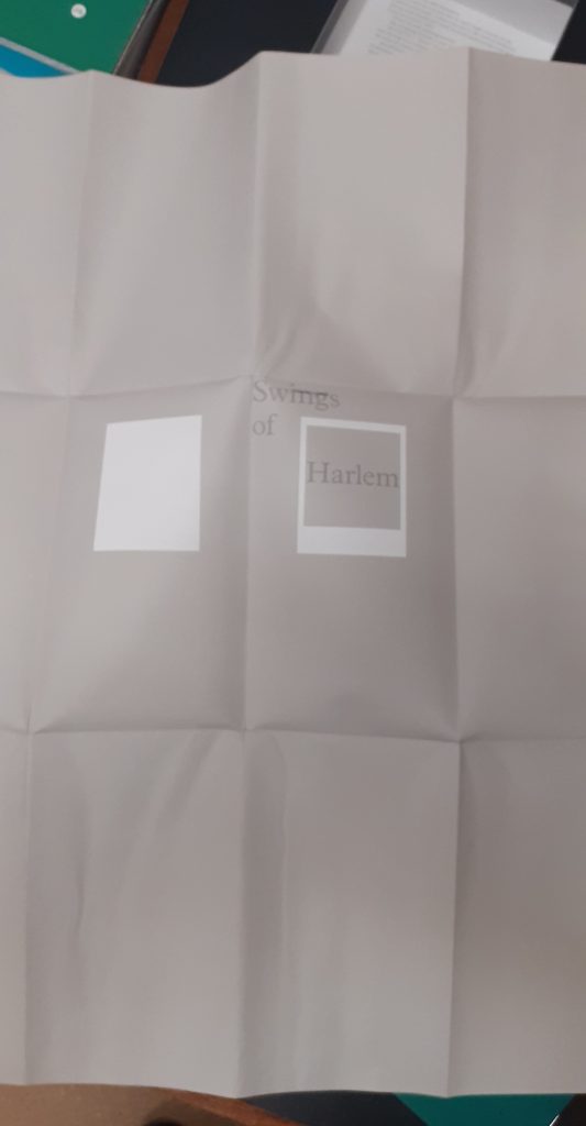
Valeria Luiselli
Swings of Harlem marks the swings the author remembers from childhood.
The map folds into the front cover. Her map was unique in the way that she made a large folded map separate to the rest of the work. There is a booklet that comes with the map to add context to the images.
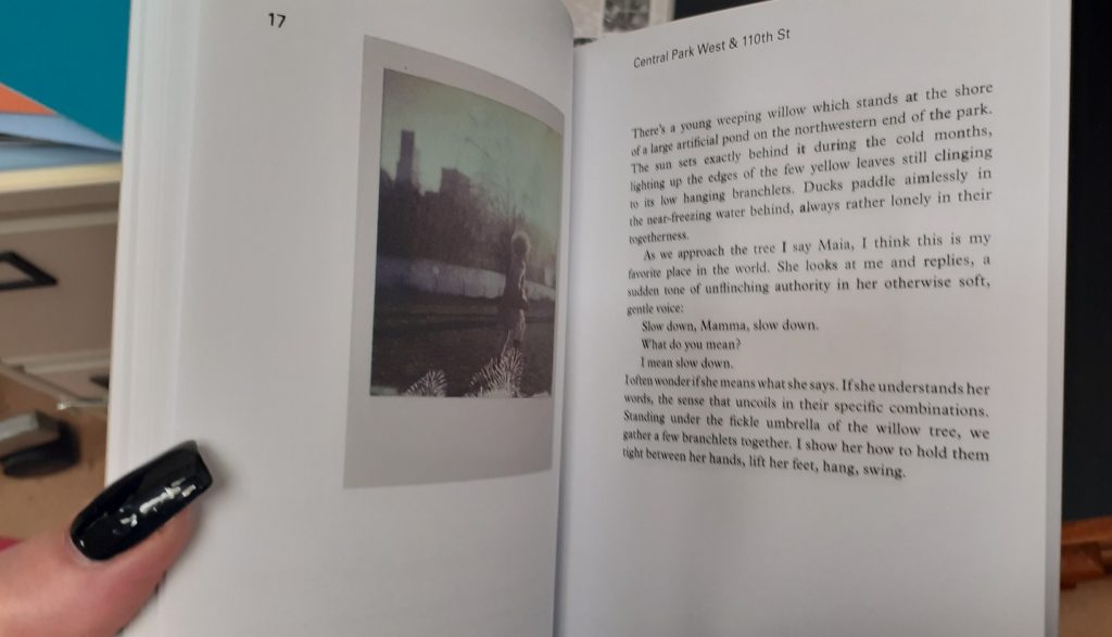
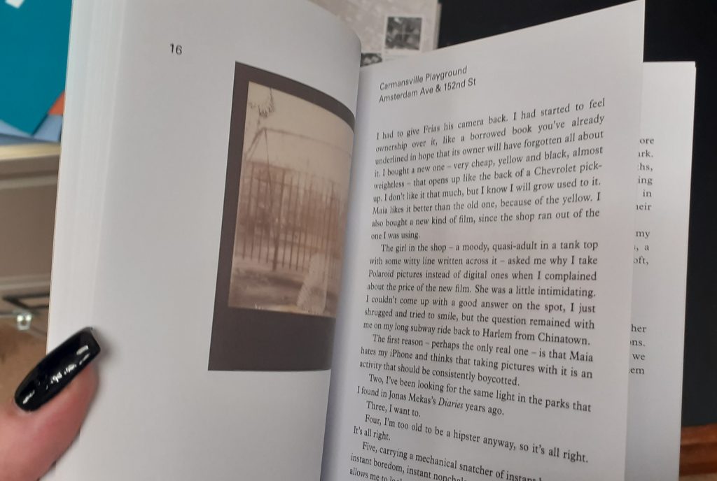
In the booklet, she shares her memories and thoughts about each swing. She includes photos from her personal collection. This gives the map an authentic feeling.
After being given the brief, I wanted to learn more about how information can be mapped and exactly what a map is. I wanted inspiration for my final map and looked at the following books.
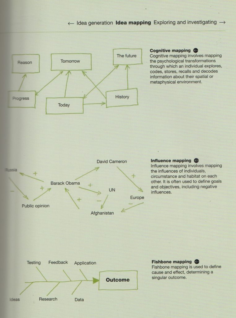
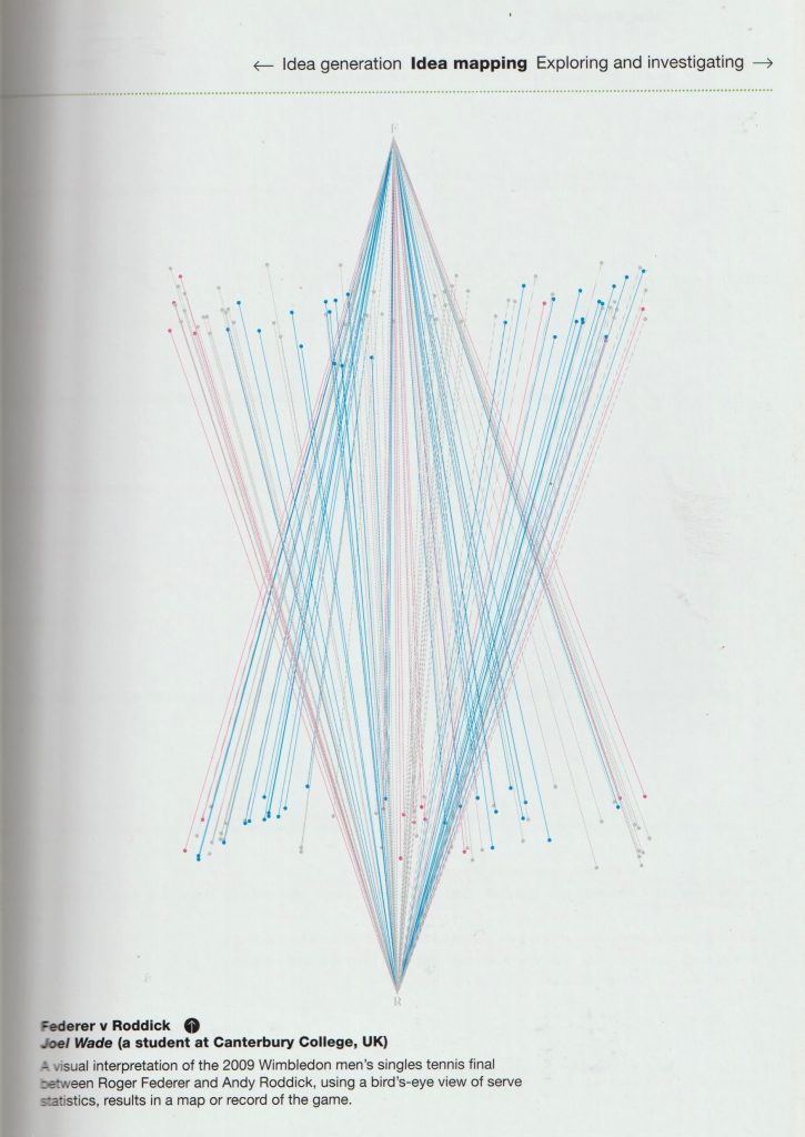
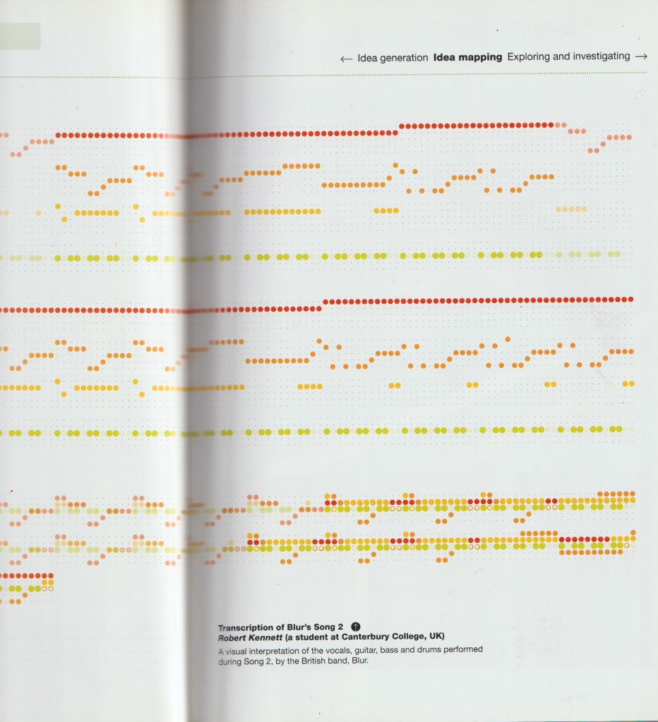
Idea Generation by Neil Leonard
mapping physical space and movements.
mapping instruments in a song.
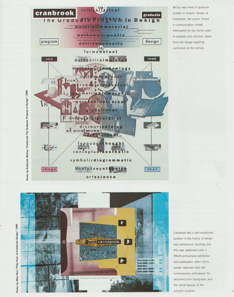
A Century of Graphic Design by Jeremy Aynsley
self portrait that maps information about the person.words, symbols and connecting lines.the position and order of the words creates a map in this poster. The boxes and lines help direct the reader.
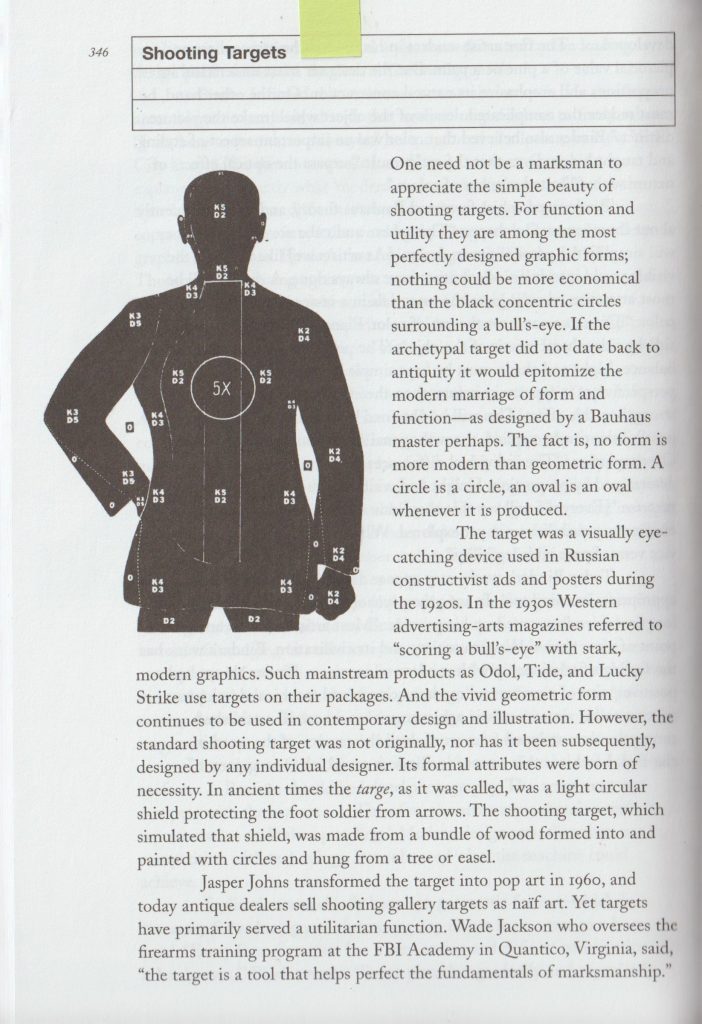
Design Literacy by Steven Heller
Shooting targets are a map of a body for the person to aim at.arrows are a strong directional symbol. What they point at tells us the meaning.
When creating a map of a place, the designer has the challenge of condensing information into a clear and readable format.
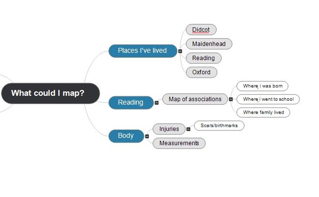
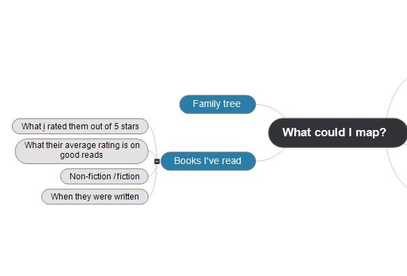
I drew up a mind-map to help me generate ideas for my final map. (A map about mapping). I used the ‘MindView’ program to create this map:
Maps and diagrams are not pictures but are appreciated aesthetically. Maps and diagrams ‘make’ sense. Making sense means producing sensibility. They are devices that enable us to act. We can map dreams, ideas, and thoughts. Maps are closed systems. They are representative. Maps write a place onto our consciousness. We cannot conceive of the ‘world’ without the use of maps.
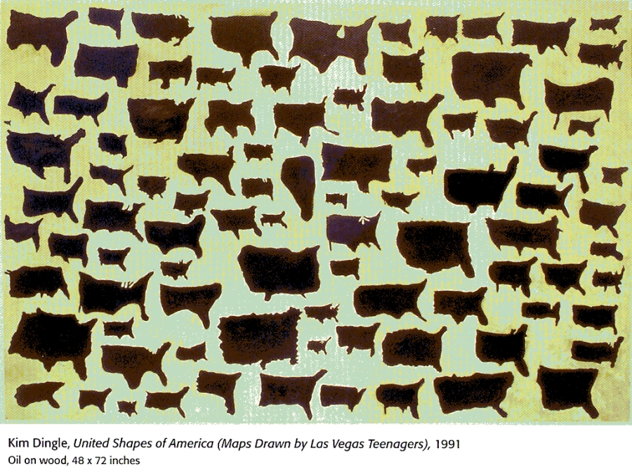
This work is about someone’s understanding of the country they live in. Kim Dingle asked American participants to draw USA from memory. The drawings were on tracing paper so the artist could trace them onto a panel and paint them with oil paints.
I really liked this work. I felt inspired to approach today’s group project in a similar way where each person’s perspective is represented in the mapping process.
Adam suggested plotting a journey from memory and overlaying it with the real map.
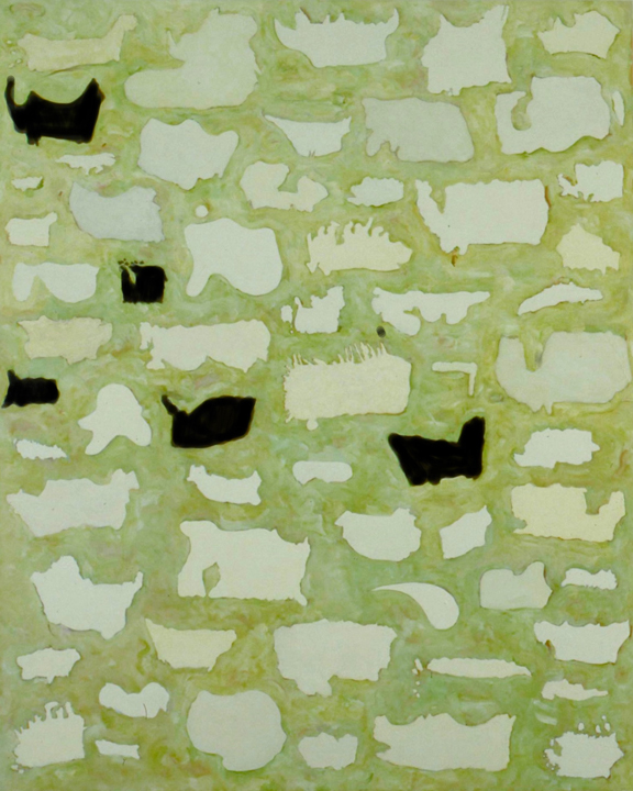
Maps of Canada drawn from memory by American citizens Oil on Canvas, 1990
These maps of Canada are less accurate than the maps of USA because the students were drawing another country.
The way somewhere is mapped makes you see a place differently.
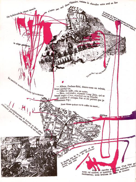
Memoires is a book published in 1959. It was made in collaboration between 2 Situationist artists: Guy Debord and Asger Jorn. The book cover was made with sandpaper, so that when it is placed on a shelf, it destroys the books on either side.
I like the position of elements within the pages, for example the rotation of the text and images. This gives the work energy, helped by the splashes of colour. In this page, we see sections of maps and images of places. I like the combinations of these perspectives. They add to a sense of place.
both image from: http://drainmag.com/index_psy.htm?http://drainmag.com/ContentPSYCHOGEOGRAPHY/Essays/Haladyn.html
The lines of text act as directional lines, connecting one element to another.
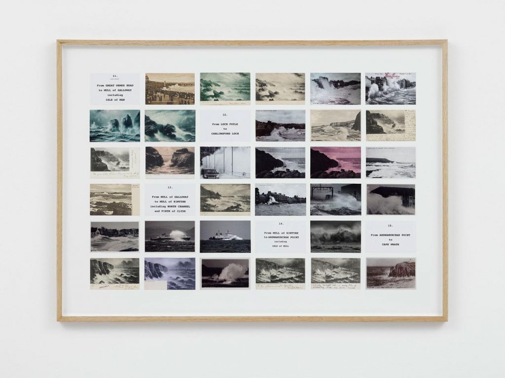
Susan Hiller
Susan Hiller was an American conceptual artist. I was drawn to 2 of her artworks in particular. Monument is an art installation containing 41 photos of memorial plaques that the artist came across in one location in London. The memorials are for civilians who died from acts of heroism. The fact that she has enlarged the images could say that she is drawing focus to the importance of these people so they are not forgotten.
Hiller has arranged the photos into an diamond formation and placed a park bench in front of them where the viewer listens to a soundtrack of the artist speaking about heroism and death. I see the diamond shape as a cross which symbolises death in itself.
Monument 1980-1 Susan Hiller born 1940 Purchased 1994 http://www.tate.org.uk/art/work/T06902
“Dedicated to the Unknown Artists 1972–6 consists of fourteen panels containing over three hundred original postcards depicting waves crashing onto shores around Britain. A large map annotated with each of the locations featured in the postcards is included in the first panel. The remaining panels have been subjected to what the artist has described as her ‘methodical-methodological approach’ (quoted in ‘Second Sight’ 2007, accessed 14 June 2018) and are organised into grids of postcards and tabulated details such as location, caption, legend, in vertical or horizontal format.”
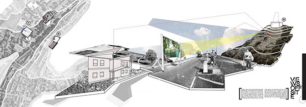
University of Lincoln, Third Year Design Project. May 2012
“The proposed scheme is centred around creating new and exciting routes for people to travel along, whether it be through walking or cycling. The introduction of a bridge means this flow of movement is more continuous and links in with the Robin Hood Chase; which is the most commonly travelled route in St Anns. The buildings themselves offer bicycles that can be rented and used for travelling into the city, as well as workshop spaces where local people can drop in and learn how to repair common issues such as puntures.”
“Guillermo Kuitca is a contemporary Argentine artist best known for his paintings of geographical maps and architectural plans. Although Kuitca’s works are not overtly political, their theatrical nature seems to reference themes of loss and migration.”
Drawing with the camera. It is possible to utilise the camera in an interesting way to draw maps. David Hockney uses the camera is a tool, a medium. The accidental grid form is uncannily diagrammatic.
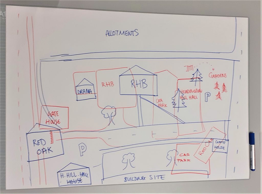
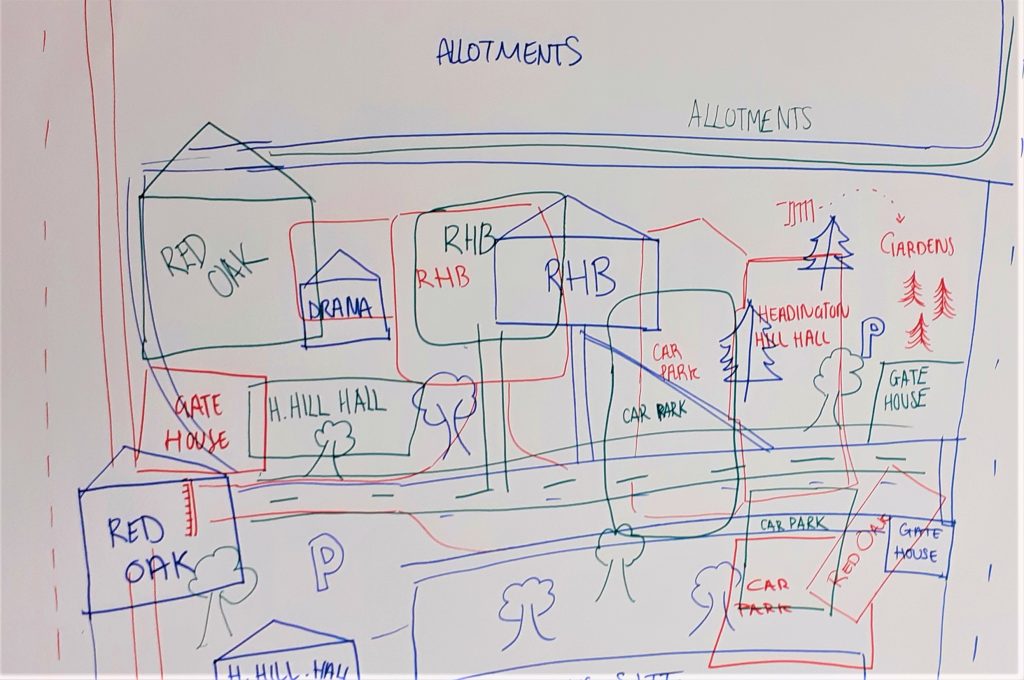
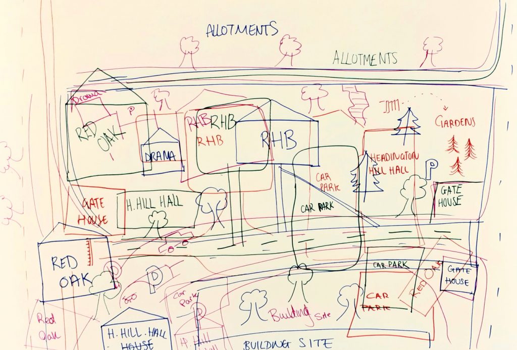
We were given until 3pm to produce a map, as a group of 4. Faced with the question: ‘How could you produce a map?’ Each of us was given a different medium that could be interchanged depending on our preference. The categories were: Line drawing, colour, words, photography.
Walking around campus, we had the task of mapping the area. This could mean capturing the details (the small) or the big areas you would find on a traditional map. Playing with scale. I really like this idea of focusing on the details and showing their importance in our surroundings/ environment. We were asked to think big and to think weird. We did this by drawing onto an A2 piece of paper and approaching the map with looseness. Our lecturer Adam made a grid template on illustrator that we had the choice of using or rejecting.
We had the option of merging the medium, for example: words with photography or colour and photography. Our first ideas were to make line drawings of campus from memory. We thought of layering these with the actual map of the campus. Photographing words and colours were a way of capturing the smaller details around us. We thought about combining the words and colours together and pairing them up like with the museum of the ordinary framing task in module 003.
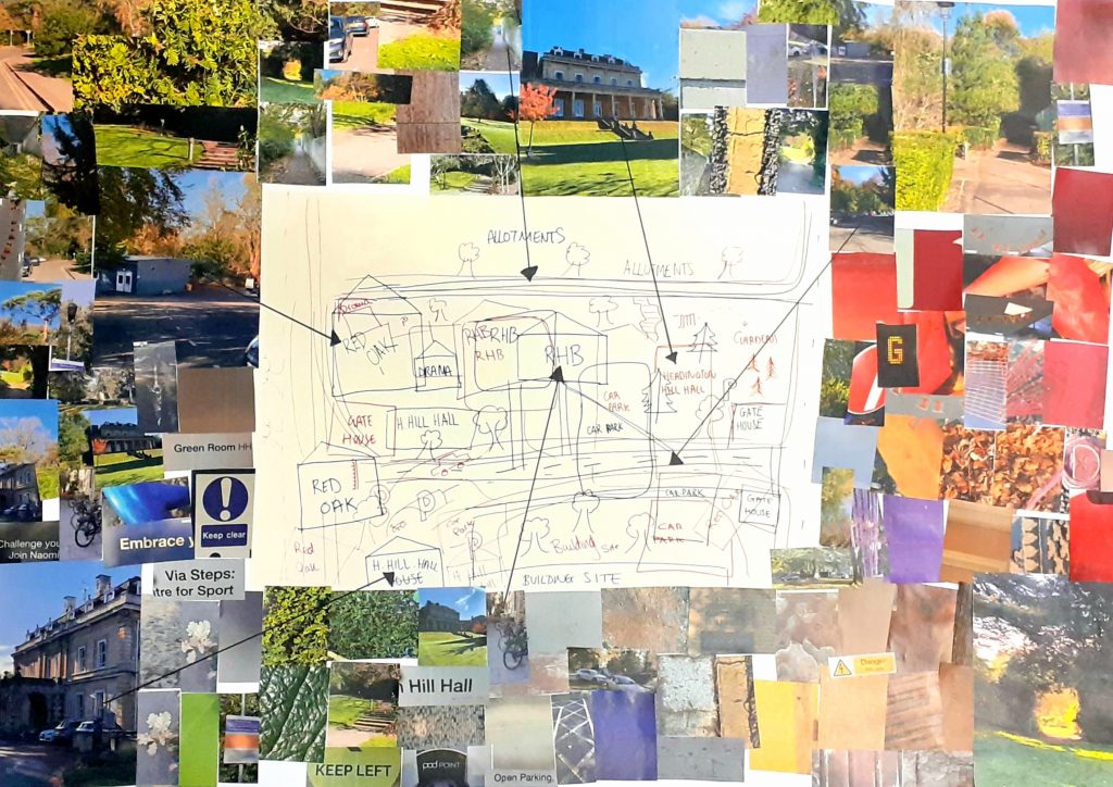
Photos I took around campus.
We each drew our interpretations of the campus from memory. We used a different colour marker for each group member. This meant that the viewer could differentiate the separate maps and follow one of their choice. The basis of this idea came from the United Shapes of America project by Kim Dingle, where people were asked to draw a map outline of their country from memory. People’s interpretations were all different but my map made sense to me because it came from my own perspective.
I photographed the drawings and printed the page at A3 size. This meant that there was space around the image to paste the photographs. We decided on having a few larger images and most of them smaller. The larger images stood out and would be more helpful to a viewer, as a map because the photos were of larger areas and paths around campus, compared to the smaller details that would not help you find your way.
Placing the images around the outside of the line drawings, served as a visual representation of each area of the campus. The use of arrows suggests to the viewer where they can find the photographed locations on campus.
I think maybe we tried to do too much in one place. My understanding of the task was that we needed to include all the mediums in one map. I think this is why the map looked busy.
Our feedback from Adam was that he would have preferred us to use a digital approach. He also wanted us to be bolder in our design decisions. The example he gave was Stephen Willats work, where he presents photographs with connecting lines to represent relationships between the images. His work is readable as a map and yet it looks nothing like a traditional map.
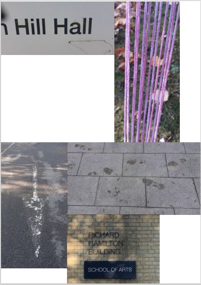
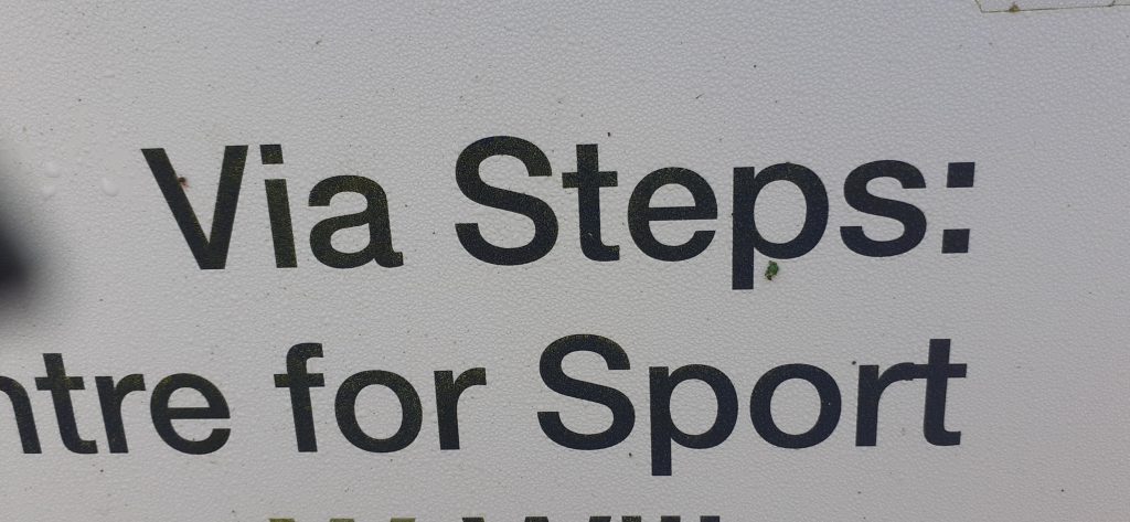
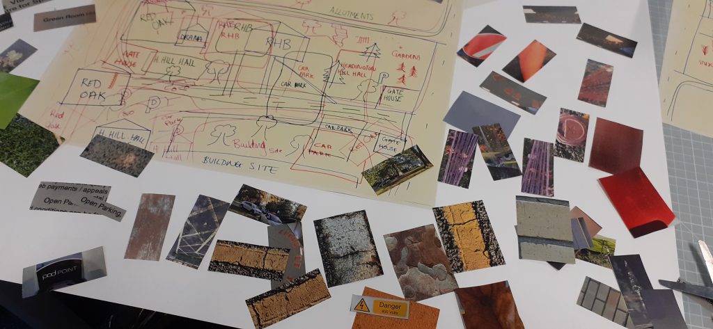
After the workshop, I placed a selection of the photos I had taken into an illustrator document. I re-arranged them into an images that ‘made sense’. Both images explain the journey from Headington Hill Hall on campus, to the Richard Hamilton Building.
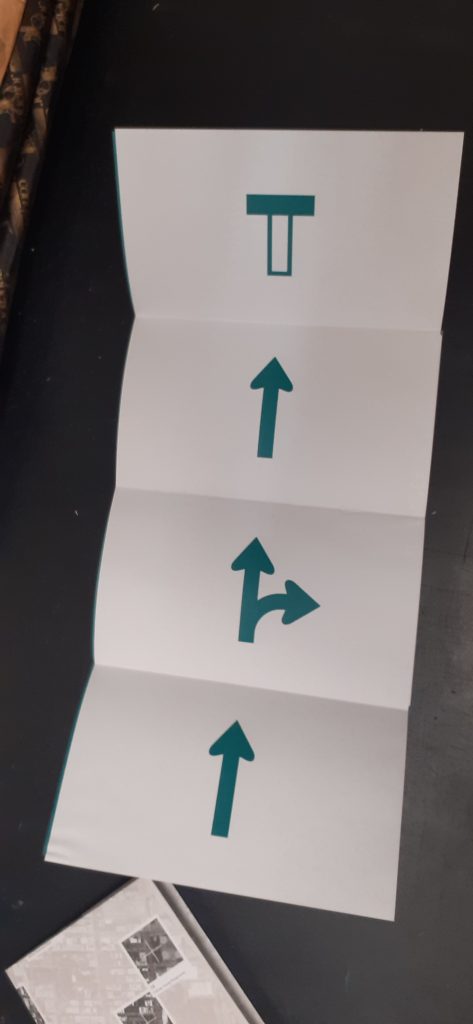
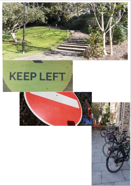
This map starts with the starting destination at the top of the page. The instruction is then to turn left then stop. The bikes show where you will arrive.
The text at the top tells the viewer where to start. The lines leads the viewer down the page while also illustrating the next object you would need to find on the journey to know you are heading in the right direction.
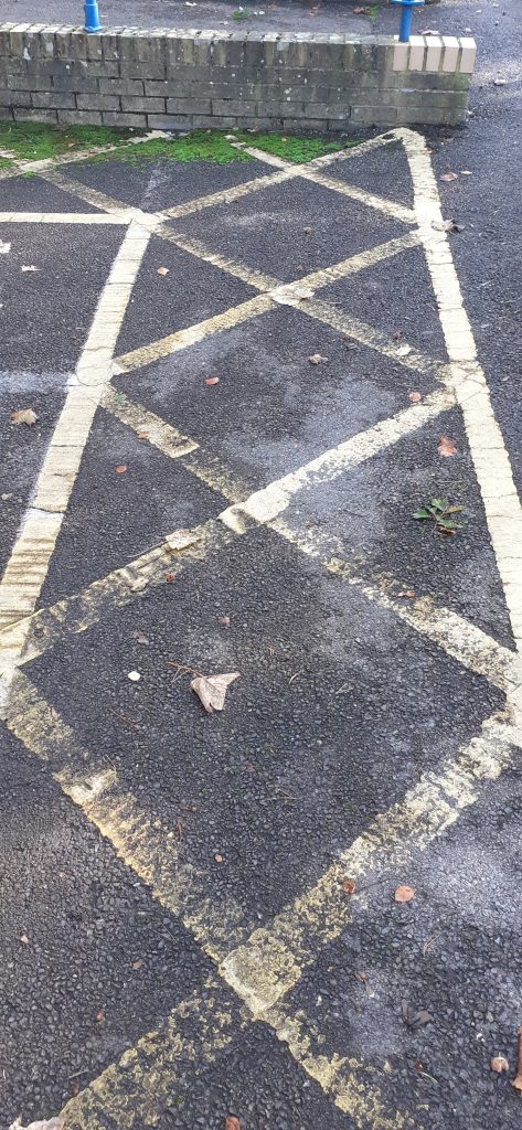
The third image shows wet footsteps on the floor. They ‘walk’ to the left and the fourth image. This is a photo I took of a faded arrow painted onto the car park tarmac. The final photo was taken by my classmate and shows the destination to reach using this map.
We were introduced to the brief for the rest of the semester.
Produce a map
Think about conventional uses of maps and diagrams then think about how you can be innovative.
Think about how forensic architecture does it
Plan before you start. Know when to stop
Designate time to work on it around your other commitments e.g. do 3 hours of experimentation in the studio on Thursdays. Then move onto the next stage of the plan.
Brainstorm
Then define what is more interesting e.g. screenprinting or using photography etc
Develop multiple formal elaborations.
Then deliver
Document all in the process book– keep your progression contained within these spreads
Mindmapping– free association, there are no bad ideas. Keep this mind map as it is visually already a map.
Make the map large. Could do the bookbinding maps.
Most important that you try stuff out and research first to show it is informing your work
We use cookies on our website to give you the most relevant experience by remembering your preferences and repeat visits. By clicking “Accept All”, you consent to the use of ALL the cookies. However, you may visit "Cookie Settings" to provide a controlled consent.
This website uses cookies to improve your experience while you navigate through the website. Out of these, the cookies that are categorized as necessary are stored on your browser as they are essential for the working of basic functionalities of the website. We also use third-party cookies that help us analyze and understand how you use this website. These cookies will be stored in your browser only with your consent. You also have the option to opt-out of these cookies. But opting out of some of these cookies may affect your browsing experience.
Necessary cookies are absolutely essential for the website to function properly. These cookies ensure basic functionalities and security features of the website, anonymously.
Cookie
Duration
Description
cookielawinfo-checkbox-analytics
11 months
This cookie is set by GDPR Cookie Consent plugin. The cookie is used to store the user consent for the cookies in the category "Analytics".
cookielawinfo-checkbox-functional
11 months
The cookie is set by GDPR cookie consent to record the user consent for the cookies in the category "Functional".
cookielawinfo-checkbox-necessary
11 months
This cookie is set by GDPR Cookie Consent plugin. The cookies is used to store the user consent for the cookies in the category "Necessary".
cookielawinfo-checkbox-others
11 months
This cookie is set by GDPR Cookie Consent plugin. The cookie is used to store the user consent for the cookies in the category "Other.
cookielawinfo-checkbox-performance
11 months
This cookie is set by GDPR Cookie Consent plugin. The cookie is used to store the user consent for the cookies in the category "Performance".
viewed_cookie_policy
11 months
The cookie is set by the GDPR Cookie Consent plugin and is used to store whether or not user has consented to the use of cookies. It does not store any personal data.
Functional cookies help to perform certain functionalities like sharing the content of the website on social media platforms, collect feedbacks, and other third-party features.
Performance cookies are used to understand and analyze the key performance indexes of the website which helps in delivering a better user experience for the visitors.
Analytical cookies are used to understand how visitors interact with the website. These cookies help provide information on metrics the number of visitors, bounce rate, traffic source, etc.
Advertisement cookies are used to provide visitors with relevant ads and marketing campaigns. These cookies track visitors across websites and collect information to provide customized ads.