4004: Barbie Presentation

In the final week of the semester, I had the slides prepared to deliver on Thursday. I used InDesign for the slides and exported it to PDF for the presentation. I included links to 2 videos within the slides, therefore needed to select ‘include hyperlinks’ when exporting the document.

I needed to ensure the presentation had a narrative arc that makes sense. I did this by opening with the mention of Barbie being controversial and their influence on me as a child, moving on to explaining other controversial elements of the dolls, then ending with the same mention of the issue with Barbie and the effect on children.

Barbie presentation full script

Slide 1

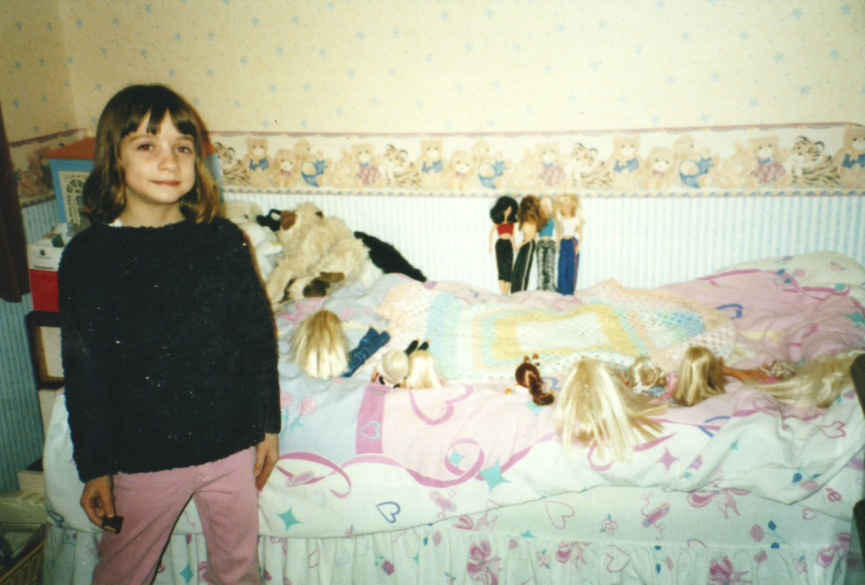
This is me when I was 6, as you can see I loved Barbie dolls and anything with Barbie on it.
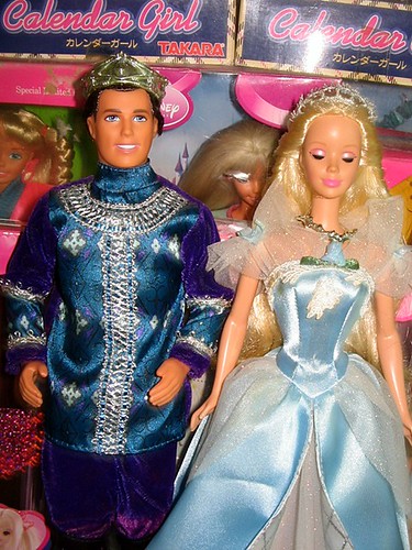
Slide 2

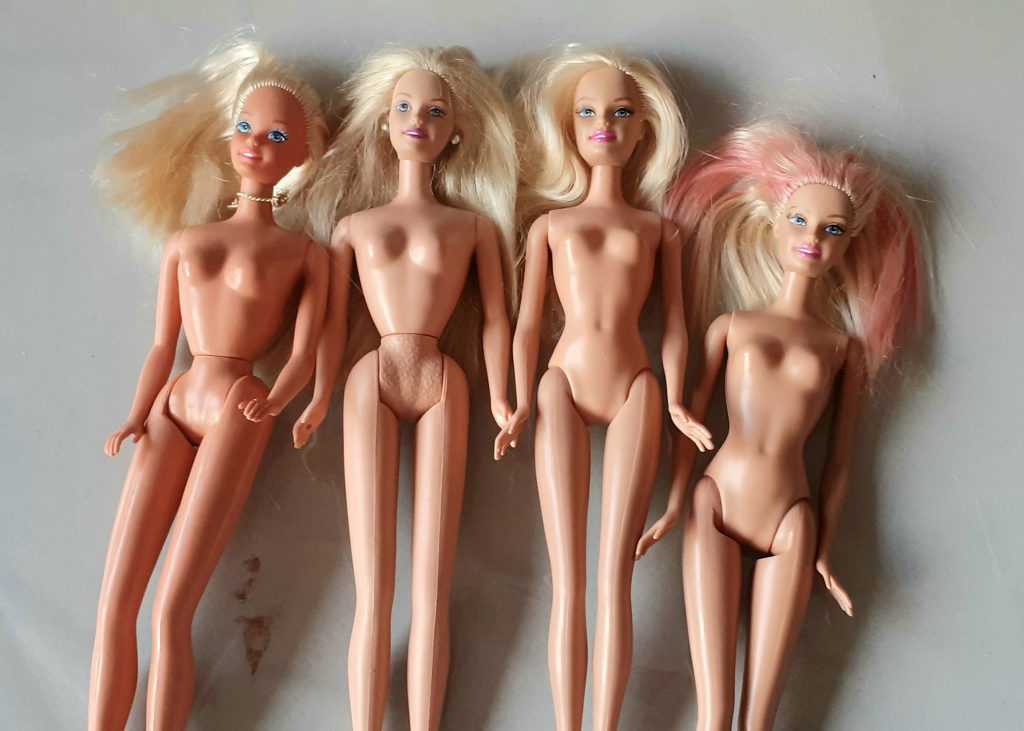
Barbies have always been controversial, This has mainly been because of their unrealistic body shape that has a negative influence on young girls especially. The body shape actually changed in the early 00’s. From this to this.

*Hand around the dolls so people can see the difference for themselves*

Slide 3

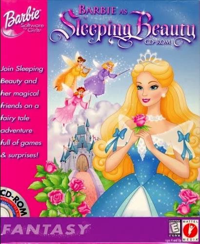
To demonstrate how Barbie was at the time and some of the issues I have, I want to show you this advert for Sleeping Beauty Barbie, from 1999.

Slide 4

I have an issue with how gender is portrayed in this advert. I feel like the advert re-enforces negative gender stereotypes where we see barbie as the helpless princess and Ken is the strong rescuer. And this can normalise unhealthy relationship dynamics, especially to this younger audience.

Slide 5

Another issue that  can be seen in the advert, is , as you heard at the end of the advert, the ken is sold separately. So when the child sees the advert, and sees that ken is an important part of the story, that both characters are sort of, needed, they’re gonna ask their parents for both. But because they are sold separately, this strategy gets people to pay twice the price, which can be an issue for working class families who struggle to, especially at Christmas, to afford these presents that these children are asking them for.

Slide 6

I also saw this class issue in the advert, with the actors. We have this blonde girl who’s at the front of the frame and she gets to hold Barbie, and her attitude is calm and entitled. Then we have the Asian girl who seems impressed and amazed at the doll and she never gets to hold Barbie herself, and Barbie is the one everyone wants to be. There’s a bit of inequality there and this girl physically resembles Barbie with her blonde hair.

Slide 7

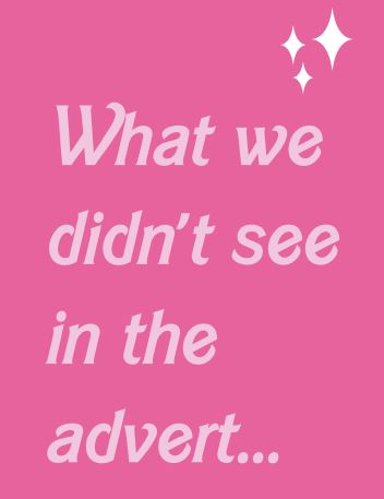
What we didn’t see in the advert was the black sleeping beauty barbie, who was also sold at the time.

Slide 8

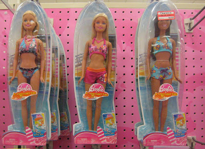
And if you look at both the dolls together, they’re the same in every way, as in they have the same dress, the same type of hair, the same body shape and the same mold was used for the head , meaning that their facial features are identical and the only difference is the colour and so this doesn’t represent much diversity and means the company is still angled towards the Eurocentric beauty standards. Mattel is the company who makes Barbies and they designed her in the 1950’s, based on a German doll, which explains why the blonde hair and the blue eyes became Barbie’s classic look.

Slide 9

If we compare the back of the box, this is the back of the box of the white sleeping beauty barbie and the back of the box of the black sleeping beauty barbie  What do you notice?

Slide 10 & 11­­

You might say ‘that was the 1990’s, that was a different time.’ But I was shocked to find this blog post from 2010, where the blogger was in the shop target in America, she walked down the toy aisle and  she took many photos, showing the same thing. What can you see in these pictures?

Slide 12

And finally, this video shows a psychological experiment that has been repeated several times in history. It addresses the issue of racial prejudice in children

Slide 13

You might say ‘It’s just a doll’, ’it’s just a plastic toy.’ but to a child these are representations of women and in a girl’s eyes, who they are expected to be as a woman. For a boy, how they can expect women to look.  Barbie’s are modelled on perfection. Something that is unachievable. This doesn’t need to be the case. Mattel have addressed this and are now producing wider representation in their designs. This is a good start.

Optional ending:

To give an example, in 1999, the same year as the advert, I remember being at school and being asked what I want to be when I grow up. Me and my friend both said ‘super lady’ since that covers all bases. We drew the same picture: a blonde woman wearing a pink suit.

The 2 videos I included, to support the presentation:

I was able to buy vintage Barbie dolls fairly cheaply on eBay. I bought 2 of each body shape (newer and older) to demonstrate the change of shape to the audience. I plan to pass the dolls around in the room. Being able to see them physically adds an interactive element to the presentation. Buying dolls from when I was a child also tied in how I relate to the topic and made the presentation more personal. I find speakers who can speak from experience, more interesting to listen to. This is why I chose to include the photo in the opening slide.

vintage barbie dolls to be used as props in the presentation.

I typed out the script into shorter notes so I could easily read them as bullet-points when presenting. I glued these onto pink card to go with the theme of Barbies.

For the slides, I included the Barbie font, downloaded from the internet, named simply ‘Barbie’. I also downloaded the ‘sparkle’ vector to add to the theme:

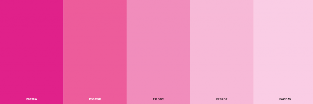
I included the Barbie colours in my slides also. I did this by placing the colour scheme into InDesign, then making colour swatches from the image:

On top of using pink in the slides, I added a gradient to the pink, as this was the style in the 1990’s, and looks out-dated now.

(To add to the pink theme, I wore a pink Barbie-esque jumpsuit when presenting.)

Narrative structure

My presentation has 4 main parts to it. I chose to stick the notes onto 4 cards, so that the points are grouped into their section of narrative.

  1. Introduction- What I will be discussing and why, handing around the physical example- showing the first video
  2. Discussing this video- What issues have we come across by watching the ad (mainly class and gender)
  3. Discussing race- where the company are coming from- the black sleeping beauty doll
  4. The effect on children- the evidence of racial prejudice around us – the future of the dolls

I needed to cut down the amount of slides I included in the presentation, as I needed to make sure I stayed around the 7 minute mark. I dropped the slide about the song Barbie Girl by Aqua:

I also chose to remove the mention of the video game that accompanied the sale of the sleeping beauty Barbie doll:

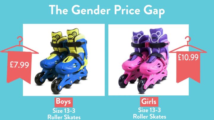
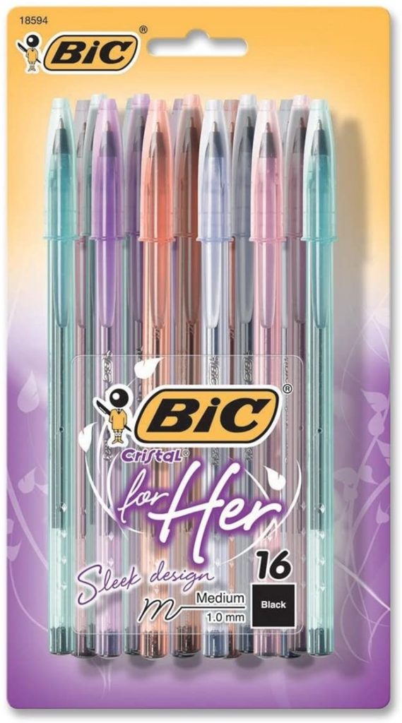
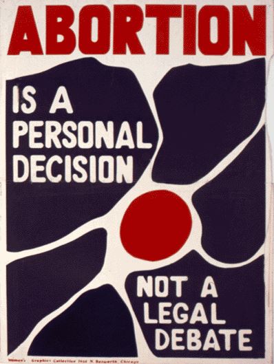
I only needed 1 slide when talking about gender. I therefore removed the slide with this photo:

I already included 2 photos from this blog post. I therefore removed the third photo:

Gender & design

Week 4- Gender

All categories we have explored are connected! (race, class, nature and gender) The issues don’t exist as separate experiences. This has become clear in our 4th week of exploring these categories. We should touch on this fact in our final presentations.

We first looked at the difference between sex and gender:

https://www.thenewsminute.com/article/understanding-sex-and-gender-they-are-connected-not-interdependent-44437

sex, being the biological difference between men and women. and

gender being a social construct, in people’s perception, people’s experience of themselves. These are the accepted rules and traditions; social norms.

I then read this article about social norms, from ICON magazine:

How does gender relate to design?

  • design has been a male dominated industry
  • semiotics of objects: products are designed with masculine and feminine qualities in mind. Packaging colour for example, is targeted to males or females, for example children’s toys and clothing. Baby dolls and ovens for girls and cars for boys.

Over-determination = adding an extra layer/ forcibly attributing meaning to an object.

Commodities = objects bought and sold as part of the global, capitalist system. Has a price/ an exchange value.

Gender branding

Toys “used to police the training of the young into assuming the ‘correct’ gender.”

(Not natural but historical.)

“patriarchal society benefits greatly from encouraging gender roles.”

This perpetuates a divided and rigid society. It might be profitable to keep things divided?

Gender price gap

Pink objects or women’s jeans cost more than men’s objects. It’s not rational- it doesn’t cost more to colour something pink.(It’s not to do with the quality of the object.)

Gender division = profitable. It allows them to over-price objects- particularly pink e.g. Bic biros for women. Not natural but social. (not just about colours)

The Fawcett Society is a membership charity in the United Kingdom which campaigns for women’s rights. The organisation dates back to 1866, when Millicent Garrett Fawcett dedicated her life to the peaceful campaign for women’s suffrage.

De-gendering and Re-gendering

There are now gender neutral collections from different companies, this wasn’t around 5 years ago for example.

What does De gendering mean?verb (used with object), de·gen·der·ized, de·gen·der·iz·ing. to free from any association with or dependence on gender: to degenderize employment policies. to rid of unnecessary reference to gender or of prejudice toward a specific sex: to degenderize textbooks; to degenderize one’s vocabulary.

regender (third-person singular simple present regenderspresent participle regenderingsimple past and past participle regendered)

  1. To gender anew (and differently).
    1. To cause (a person) to be seen to have a (new, different) gender identity or role. quotations ▼
    2. To cause (a thing or subject) to be gendered in a new or different way; to be associated with a new gender or with new genders. 
Pacsun launched its first kids label, Pacsun Kids, with a gender neutral collection. 

Last week, JCPenney became the latest retailer to debut an inclusive apparel line that features gender neutral options.

JCPenney is joining the ranks of other retailers, including Gap and Pacsun, in building out more inclusive fashion lines. The growing trend among major retailers shows the category is becoming more mainstream.

Similarly, Eric Archibald, creative director of streetwear brand Diplomacy, told Modern Retail that major apparel retailers launching gender neutral lines was a long time coming. Brands are launching these new lines because more consumers are expecting these types of items. At the end of the day, he said, “it’s all about the money.”

Beyond joining a global style trend, Archibald said there were “obvious benefits” to developing gender neutral lines. “For instance, you’re only creating one collection, so development costs are going to be lower than if you were designing multiple, more gender-specific collections.” 

Pointlessly gendered products

Explain why and how the objects bear a gender connotation. (Not only colour, but other features too.)

Object 1: the bicycle

Looking at women’s bikes, they are mainly pastel coloured, sometimes with white wheels, have a lowered cross bar and are sold with an attached basket. Men’s bikes are bolder in colour, have black wheels, a straight across cross bar and no baskets in sight.

The designers expect the woman to need a basket. Perhaps for shopping, a handbag or a small dog (as seen in one advert).Maybe a woman would want the colours of the bike to match her outfit. The implication is that women are expected to be fashion- conscious and men to be practical.

As for the crossbar, something I’ve often wondered about, a quick google search gave me this explanation. The crossbar provides extra strength to the bike’s structure. Why would only men need this extra structure? Does this imply that men are heavier than women? This isn’t always the case. The lowered cross bar historically was made for women, due to the wearing of skirts and dresses. Women wouldn’t need to raise their leg as high and so risk being indecent.

The question is, why does the women’s style of bike remain the norm in the present day when women often wear trousers? How high you can comfortably raise your leg is not dependent on your gender but on the individual’s flexibility. To me, it seems like tradition and accepted norms keeps these designs in place.

Object 2: the razor

men’s razors, gillette

Razors do the same job: remove hair. But the designs for men’s and women’s razors are noticeably different. The men’s razor looks more robust and stronger physically. The colours reflect masculinity. The part you hold is heavier, but this isn’t necessary for the shaving process The shape and metallic colour of the razor overall,  implies sharpness and strength in tackling hair. This is to appeal to a masculine straight-forward approach. The women’s razor has a light-weight handle and rounder, curved shape. The pastel colours express a pleasant shaving process that is gentle for the skin.

Other objects our classmates thought of: pens/ stationary, football shirts (lower neckline, tighter fit), kinder surprise chocolate, perfume and aftershave, Kleenex man size tissues, Yorkie bars, clothing (men’s jumpers are warmer).

1st wave feminism

Suffragettes were the first feminists. They were fighting for the women’s right to vote. This was in the 19th century. The suffragettes were middle class, white and educated. Because of this, their movement did not include all women.

Switzerland was the last European country to allow women to vote.

The Missouri Woman from June 1916, the Suffrage issue Poster

2nd wave feminism

Occurred between the 1960’s and 1980’s. (although this is debated).

The issues they were campaigning about was :

  • pay equality
  • reproductive rights
  • female sexuality
  • domestic violence

Class-wise, this movement included women from a different demographic. (Broader groups of women not only well dressed bourgeois women.)

In the 1970s, feminists began to fight for the right to abortion.

They were questioning housework for the first time. Linocut illustrations were used for these campaigns. In this era, women didn’t get pensions or help from welfare. They were dependent on their husbands, so in a way, marriage for a woman, could be seen as a form of slavery.

3rd wave feminism

In the mid 1990’s, the movement was explosive. They celebrated the differences across race, class and sexual orientation. It wasn’t a mass/widespread movement, but an academic discourse, involving artists and underground scenes- transgressing traditional representations. The feminists expressed androgynous femininity and gender bending, as seen in the photography by Nan Goldin.

“Trixie on the Ladder, NYC” (1979): Goldin “showed life as it was happening.”Photograph by Nan Goldin / Courtesy Matthew Marks Gallery

Nan Goldin’s “The Ballad of Sexual Dependency” (1986) was Goldin’s first book and remains her best known, a benchmark for photographers who believe, as she does, in the narrative of the self, the private and public exhibition we call “being.” In the hundred and twenty-seven images that make up the volume proper, we watch as relationships between men and women, men and men, women and women, and women and themselves play out in bedrooms, bars, pensiones, bordellos, automobiles, and beaches in Provincetown, Boston, New York, Berlin, and Mexico—the places where Goldin, who left home at fourteen, lived as she recorded her life and the lives of her friends.

4th wave feminism

Modern day-

Concerned with:

  • trans inclusivity
  • body positivity
  • me too movement
  • trans black lives matter group
  • identity blending
  • interest in ecological issues (more than in the past)

Feminist Interrupted, Lola Olufemi

“Separating feminist history into waves, ignores the invisible struggles that haven’t been recorded.” e.g. the women from Suffragette movement had slaves who would have been women of colour. This history must also be written.

Women living under colonial rule had different struggles than the 1st wave feminists had.

OWAAD -London- 1970’s

Black women in Britain: Organisation of Women of Asian and African Descent

‘The rise of Black feminism in the UK can be traced to Black women migrants from the Caribbean, Africa and the Indian subcontinent, who came to Britain after World War II. The emergence of the Black Women’s movement had its roots in post-colonial activism and the Civil Rights struggles of the 1960s and 1970s. It sought to give voice to the specific issues that affected them including race, gender, class and sexuality, and how they intersect.’

3 kinds of type: handwritten, sans serif, green serif type.

FOWAAD!

Organised activities, produced printed matters.

‘The focus of OWAAD’s campaigns centred around health, education, employment, immigration policy and the police. Their newsletter, FOWAAD!, was used to communicate with larger numbers of Black women across the UK.’

cutting around image silhouettes, underlining type, interesting title of publication using arrows.

Intersectionality

Methodology to address social problems. (Kimberle Crenshaw coined the phrase in 1989)

‘Kimberlé W. Crenshaw is a pioneering scholar and writer on civil rights, critical race theory, Black feminist legal theory, and race, racism and the law. In addition to her position at Columbia Law School, she is a Distinguished Professor of Law at the University of California, Los Angeles.’ 

Identifies multiple factors of advantage and disadvantage e.g. one category not represented in the workplace. Black women not treated as well as white women or black men. Look at cases through the lens of more than one category e.g. caste, disability, gender, class, when we judge cases of discrimination.

Movements are not all good or bad. They can have progressive elements and problematic elements.

Neo-liberal feminism

Neo-liberal= last phase of capital development.

Models that question the welfare state. Hyper capitalistic economic model. Low taxes, support of private investment.

Defunding of the welfare state. Benefits some demographics.

Neo-liberal feminism-

‘inequality’ is a state that can be overcome (a matter of will) without overhauling the system.

Ivanka Trump Women who work is an example of this. (being an entrepreneur- ideology of self-empowering.)

Queer, trans, drag and gender neutral

Travis Alabanza TED Talk

artist, performer, writer

  • Different kinds of warrior
  • acceptance of self- compassionate. Reassuring others who feel the same (transgender or gender non-conforming).
  • We’ve each been told what we are at birth ‘you’re a boy or girl’. Trans people declare ‘that’s not who I am, that doesn’t fit.’
  • Can look many ways
  • ‘going outside, we experience this differently- public transport. Being thrown objects at, called names. 150 people saw this and no one did a thing. Violence in silence. Active choice to say nothing. Normalised attacks on gender non-conforming and trans people.
  • Every time they step outside!
  • Difference in how violence is perceived, whether it’s towards cis or trans gender people.
  • Delivery- poetic to listen to. Change in rhythm = enjoyable.
  • Storytelling rather than lecturing, asking audience to respond.

Exercise 2: Cultural jamming

Identify a contemporary ad which is gender biased. How would I amend it?

Print it and use a pen to indicate where I would intervene.

For example, Jill Posener: erase, ridicule, interrupt. (Image or the text)

It could be a still from a video or a poster image.

Jill Posener
Jill Posener

My response:

Speculative typography

A letter is a mark or glyph (symbol) used in an alphabetic writing system to indicate a sound.

Introduction
Unlike other writing systems from around the world, the English
alphabet (also known as the Latin-script alphabet) is a system
that consists primarily of a kit of parts that both directly informs the
shapes of sound (vowels and consonants) and signifies symbolic
values: for example, A, B, C, can have ‘symbolic’ meaning (think
of the phase ‘alphabetical order’), while a, b, c, (ah, bu, cu,) rather
instructs on how sound needs to be shaped to form a word.
Speculative, or ‘a-semic’ typography is a strategy that can be
applied to the study of writing systems to enable us to scrutinise
both the concept of writing itself, and typographic systems,
through formal speculation and experimentation; By developing a
‘speculative’ system of meaningful symbols or ‘parts’ – i.e. ones that are
not ‘semic’, meaning they are not [currently] readable – we can bring
the function of these graphic systems to the forefront of our attention.
We will also explore the subtle intersections of graphic information
that exist across all human artifacts, where ordinary manufactured
objects can often be found to exhibit residual typographic value
and relevant qualities.

What is Typography?, David Jury
https://www.thenationalnews.com/arts/examining-the-origins-of-arabic-ahead-of-arabic-language-day-1.199916
Folio from a 9th-century Quran written in ink and gold kufic script on parchment. https://www.middleeasteye.net/features/write-stuff-how-ancient-arabic-scripts-are-coming-back-life
https://www.researchgate.net/figure/Both-characters-in-the-figure-have-the-same-radical-ren-means-humans-at-the-left-hand_fig2_319151358
Bits, Paul Elliman
https://medium.com/fgd1-the-archive/found-font-1995-present-2328b96459fe
‘Abstract letterforms dissolve into pure form.’ Invitation cards by Philippe Apeloig

Week 1—2: Monoprinting
In these sessions you will be provided with a ‘kit of parts’ that have
been produced from various sources found within and from a variety
of manufactured items. You are asked to produce several prints with
these, forming a number of ‘sentences’. You must think about how
the use of repetition, accent glyphs and spacing can suggest or
appear to instruct a reader of variations and changes in the potential
sounds or meanings that may be ‘read’ from the type forms.

Wooden shapes to form into language.

I used the roller to spread the printing ink across the surface of the table. I made sure to spread the ink evenly, to result in an even print.

The printing press.

When approaching the task of forming a new language, it helped me to think of Chinese characters. I considered the direction of written language on the page. Chinese characters are read from top to bottom of the page. They have been formed with consideration to the physical form of objects. (Whereas English is written by spelling out the sounds in words.)

Chinese radicals are the part of a character that appear in multiple words. Depending on the other part of the character, we can read the meaning of the word.

I thought about using repeat shapes across my ‘sentence’ to unify the shapes as a language.

The results of the workshop:

I repeated shapes in this sequence, as I felt this brought the shapes together as a ‘language’. I spaced the glyphs to signify separate words in a sentence. However, looking at arabic texts, I can see that some written language can appear connected. I would like to experiment with connecting the shapes together to invent new ‘word’.
Paler red prints gives this experiment some variation and made me think about the change in meaning in connection with the quality of a mark on a page. Does it suggest age, wear and tear? Or does a paler mark weaken the message and suggest a subtler meaning? Could the use of 2 colours change the meaning of the ‘sentence’? In this experiment, I began to investigate connecting the shapes and creating new shapes from the pieces I had available.
Experimenting with negative space. By cutting a separate piece of paper, I placed this on top of my paper and printed on both together. This masked a rectangular area in this case and left me with an empty space at the centre of the print. I could then move this piece around or remove it from the image.