A letter is a mark or glyph (symbol) used in an alphabetic writing system to indicate a sound.
Introduction Unlike other writing systems from around the world, the English alphabet (also known as the Latin-script alphabet) is a system that consists primarily of a kit of parts that both directly informs the shapes of sound (vowels and consonants) and signifies symbolic values: for example, A, B, C, can have ‘symbolic’ meaning (think of the phase ‘alphabetical order’), while a, b, c, (ah, bu, cu,) rather instructs on how sound needs to be shaped to form a word. Speculative, or ‘a-semic’ typography is a strategy that can be applied to the study of writing systems to enable us to scrutinise both the concept of writing itself, and typographic systems, through formal speculation and experimentation; By developing a ‘speculative’ system of meaningful symbols or ‘parts’ – i.e. ones that are not ‘semic’, meaning they are not [currently] readable – we can bring the function of these graphic systems to the forefront of our attention. We will also explore the subtle intersections of graphic information that exist across all human artifacts, where ordinary manufactured objects can often be found to exhibit residual typographic value and relevant qualities.
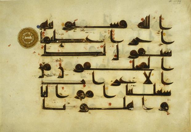
Folio from a 9th-century Quran written in ink and gold kufic script on parchment. https://www.middleeasteye.net/features/write-stuff-how-ancient-arabic-scripts-are-coming-back-lifehttps://www.researchgate.net/figure/Both-characters-in-the-figure-have-the-same-radical-ren-means-humans-at-the-left-hand_fig2_319151358
Bits, Paul Elliman https://medium.com/fgd1-the-archive/found-font-1995-present-2328b96459fe
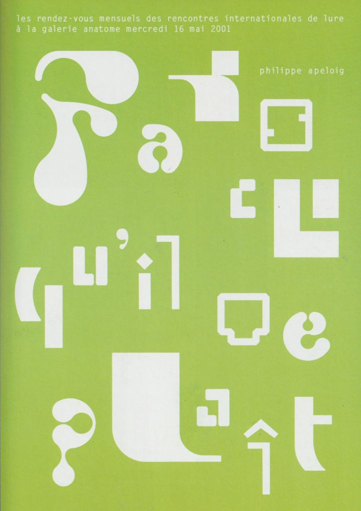
‘Abstract letterforms dissolve into pure form.’ Invitation cards by Philippe Apeloig
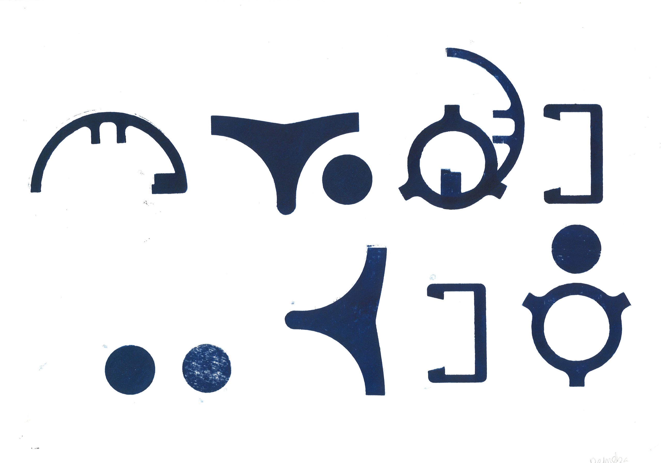
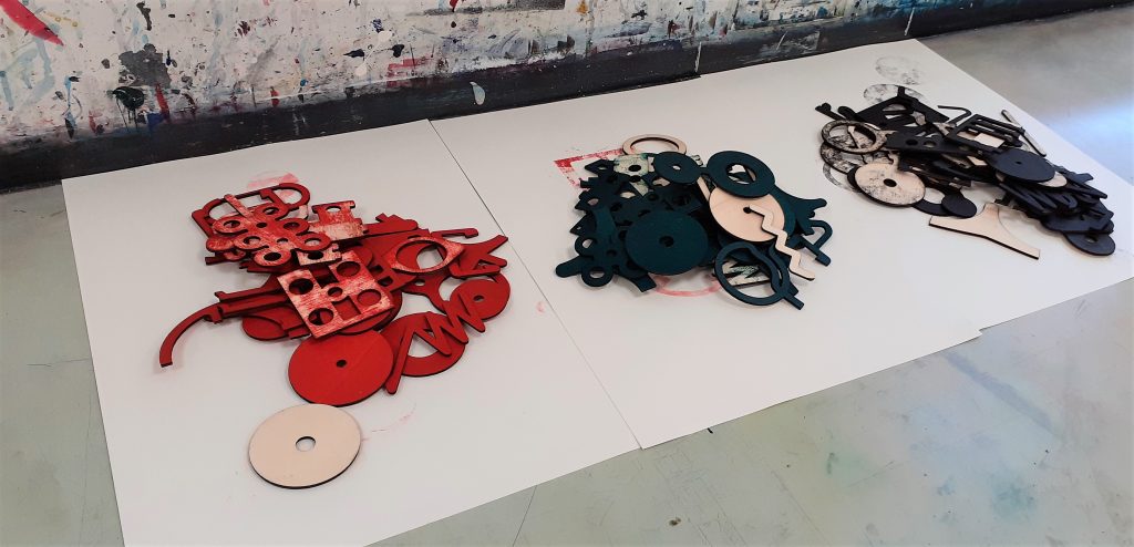
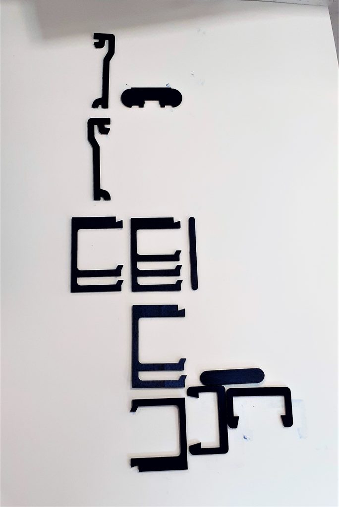
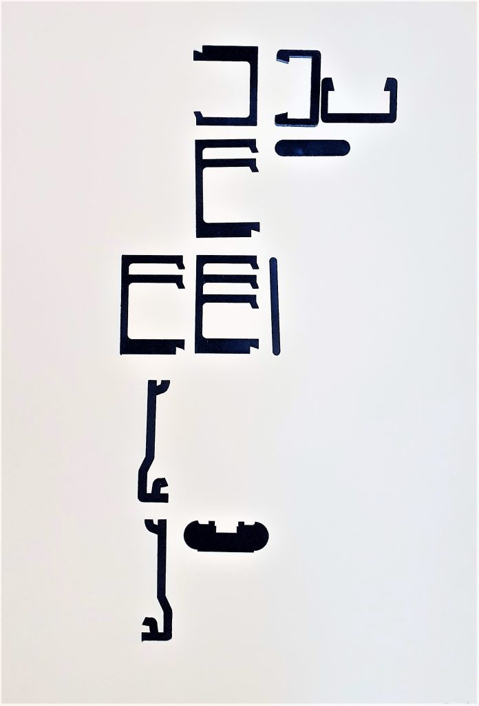
Week 1—2: Monoprinting In these sessions you will be provided with a ‘kit of parts’ that have been produced from various sources found within and from a variety of manufactured items. You are asked to produce several prints with these, forming a number of ‘sentences’. You must think about how the use of repetition, accent glyphs and spacing can suggest or appear to instruct a reader of variations and changes in the potential sounds or meanings that may be ‘read’ from the type forms.
Wooden shapes to form into language.
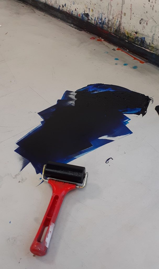
I used the roller to spread the printing ink across the surface of the table. I made sure to spread the ink evenly, to result in an even print.
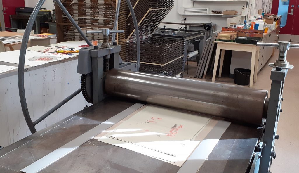
The printing press.
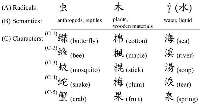
When approaching the task of forming a new language, it helped me to think of Chinese characters. I considered the direction of written language on the page. Chinese characters are read from top to bottom of the page. They have been formed with consideration to the physical form of objects. (Whereas English is written by spelling out the sounds in words.)
Chinese radicals are the part of a character that appear in multiple words. Depending on the other part of the character, we can read the meaning of the word.
I thought about using repeat shapes across my ‘sentence’ to unify the shapes as a language.
Placing the pieces on a sheet of paper, I carried the composition to the printing press.
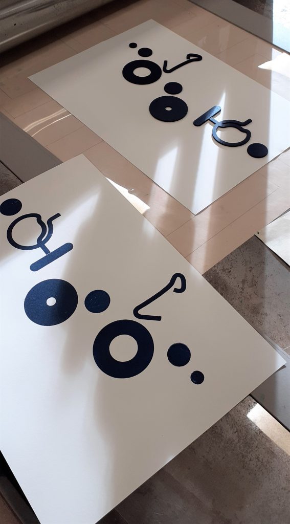
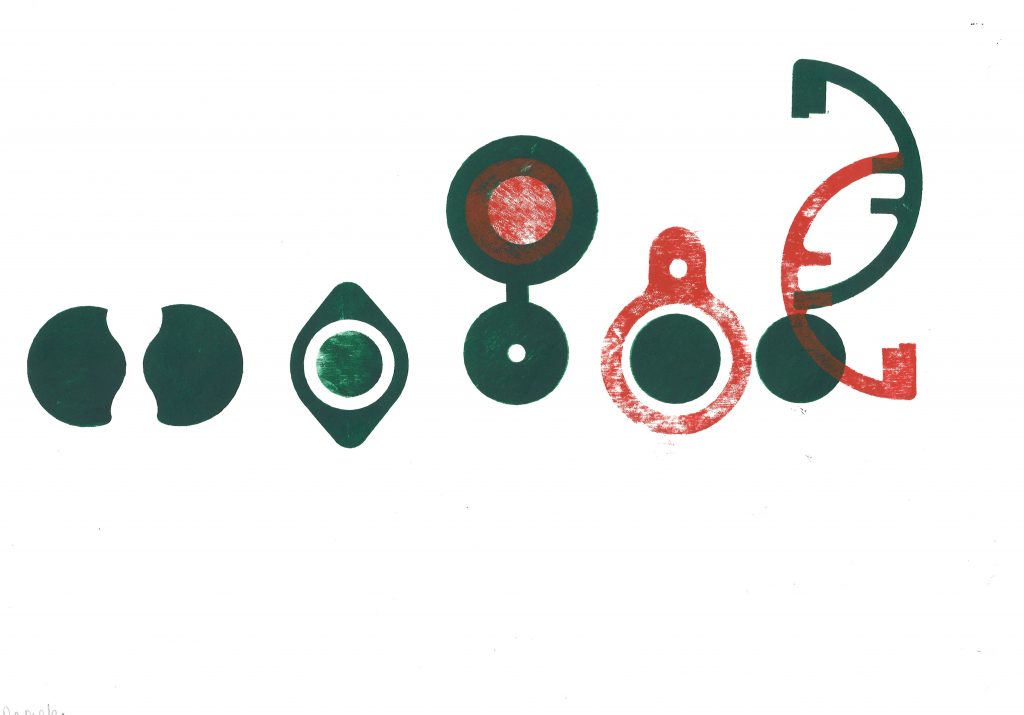
The results of the workshop:
I repeated shapes in this sequence, as I felt this brought the shapes together as a ‘language’. I spaced the glyphs to signify separate words in a sentence. However, looking at arabic texts, I can see that some written language can appear connected. I would like to experiment with connecting the shapes together to invent new ‘word’.Paler red prints gives this experiment some variation and made me think about the change in meaning in connection with the quality of a mark on a page. Does it suggest age, wear and tear? Or does a paler mark weaken the message and suggest a subtler meaning? Could the use of 2 colours change the meaning of the ‘sentence’? In this experiment, I began to investigate connecting the shapes and creating new shapes from the pieces I had available.
Vertical sentences.Experimenting with negative space. By cutting a separate piece of paper, I placed this on top of my paper and printed on both together. This masked a rectangular area in this case and left me with an empty space at the centre of the print. I could then move this piece around or remove it from the image.
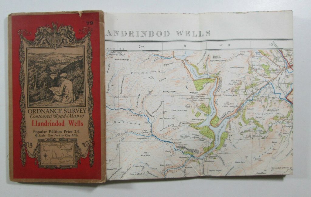
We looked at the way maps are put together. For example, Ordnance survey maps are made up of one large piece of paper, folded multiple times with a cover glued to 1 of the folded sections.
We also thought about being creative with our book designs. Our lecturer Ruth showed us examples. One collection I was really impressed by, was by a designer who had made a series of small pamphlet-like books and collected them together into a box which held them together. I like the way the designer chose a different colour for each book. The theme for the collection was around mapping. One of the books was about places he had nearly been to, one contained pixelated image of the UK, each square was a different colour and given a different name to each, which corresponded to the place on the map. I thought this was really creative and inventive.
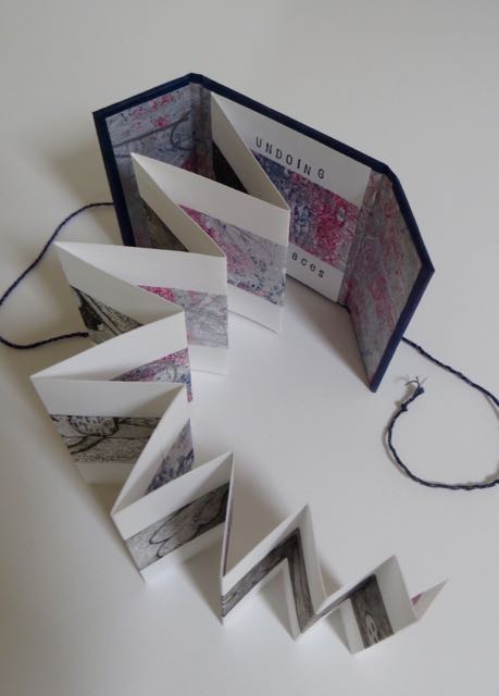
Concertina style book by Annwyn Dean. (embroiderer, book artist and printmaker based in Yorkshire).
The concertina style is appropriate for showing a series of photos, or a long print that is printed across the pages. She adds string to tie the book together.
The main method we focused on was creating a book using folds instead of stitching, gluing, or any other method of binding. The advantage of this is that you could include one large picture within smaller packaging. These large pictures when folded up into these books, could be read as a book by turning each page or could be folded out to show the full image.
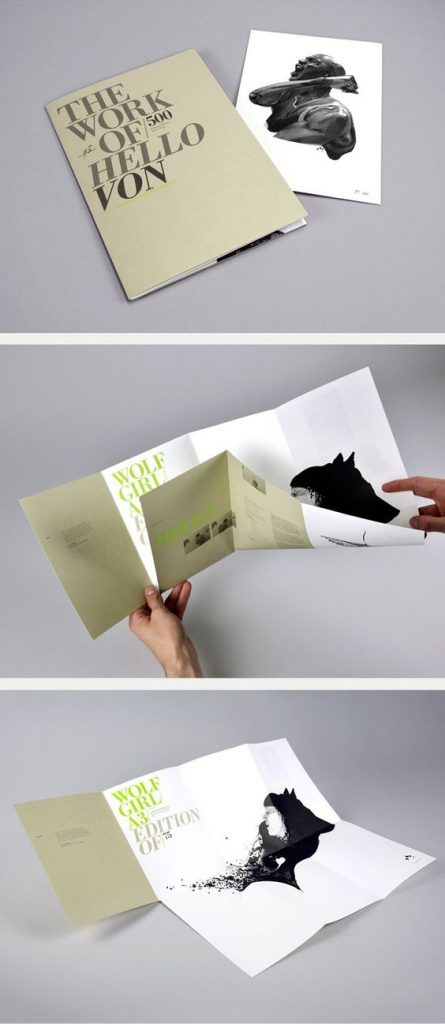
A design by Madebysix, who are a design studio based in Leicester. Image from Six (madebysix.com)
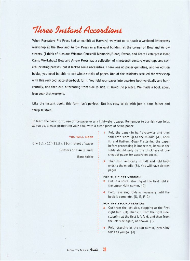
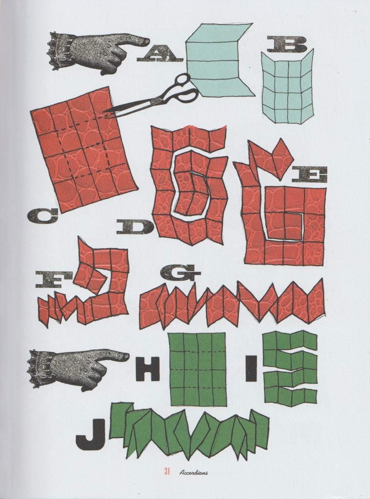
How to make books by Esther K. Smith
How to make books by Esther K. Smith
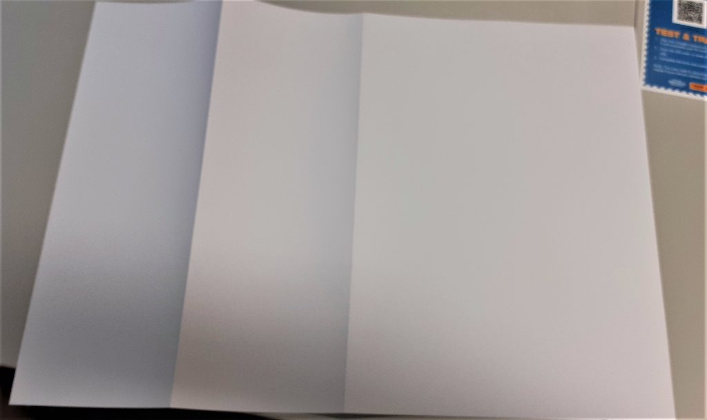
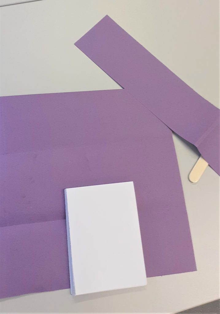
I had a go at making the ‘Three instant accordions’ style book. I first folded the paper in half.
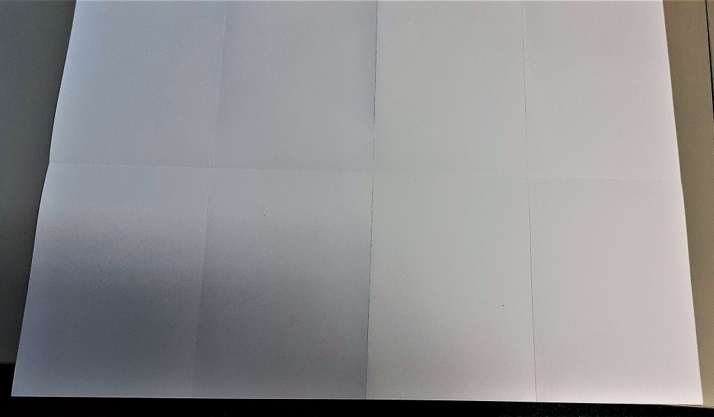
I folded it in half again. I kept folding until I had 8 equal sized rectangles.
When folding thick paper, it is sometimes necessary to re-fold back in the opposite direction. Here, I aligned the centre folds together. The centre fold acted as a marker, so I did not have to check along the edge to see if the paper was lined up.
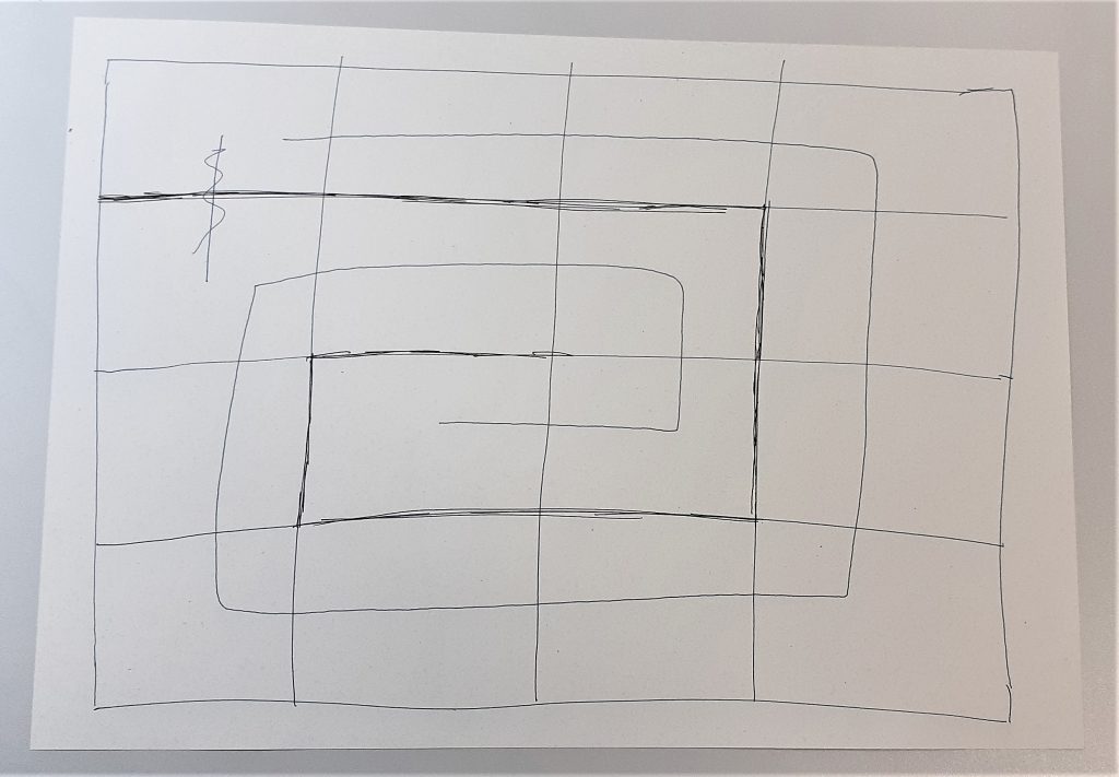
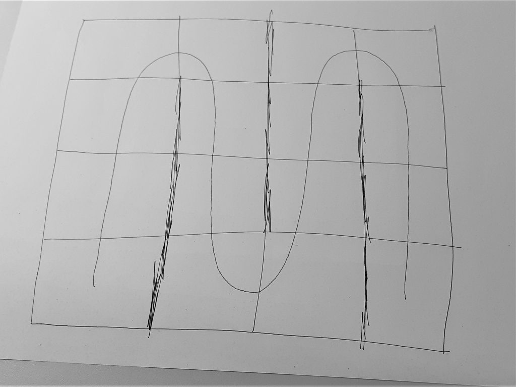
I then needed to plan out where to cut the paper. I decided on a pattern that would spiral inwards. This felt logical, but meant that I ended up with an asymmetrical piece of paper. I used scrap paper to draw the above plan for my work. The black pen indicates the cuts and the blue spiral represents the direction I wanted the pages to run in. I used the paper knife to cut the paper. The challenge was to avoid cutting off sections that need to remain intact. I found the knife was quite sharp and hard to control when to stop the cut. It was challenging to create a neat cut and avoid tearing the paper.
The second thing I needed to be mindful of is the folding after the paper had been cut. I needed to alternate between folding one way and then the other way. I thought of it as folding under then over, under then over and so on.
How to make books by Esther K. Smith
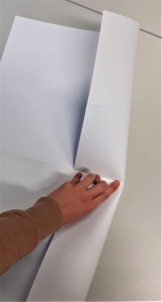
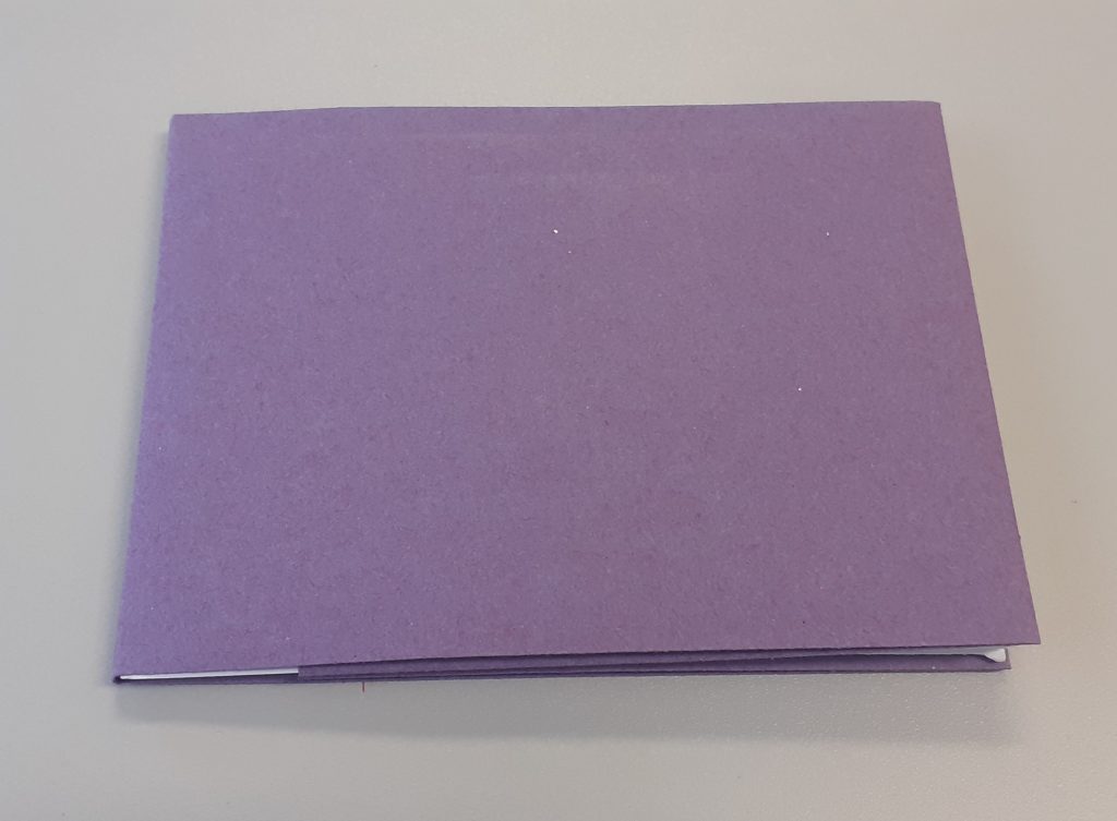
The next task was to make a cover for my book. This helps to protect the book, maybe not from water but from general use. To start, I created the spine by folding the paper twice. I looked at the thickness of my book first to see how wide I needed the spine to be.
My book ended up with a landscape page at the front and back of the book. I needed to cut off a section of the cover to make it fit best. I found this part of the workshop the most complicated and difficult part. I understood the steps when they were explained to me, but to make one myself is a different thing.
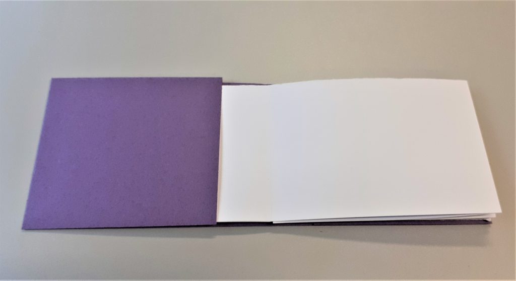
The first and last page slip into the cover without the use of glue or any binding. This means I can easily remove the cover and replace it.
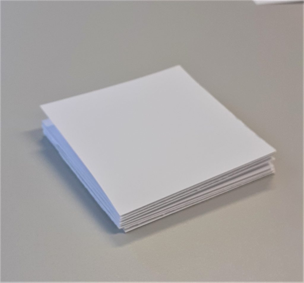
I then made a smaller book with the same kind of paper. The paper felt tougher because I was folding smaller areas. This book has square pages instead of rectangle. I made a second plan. This time. I planned a symmetrical pattern to cut.
This square book became a sampler of bookmaking techniques:
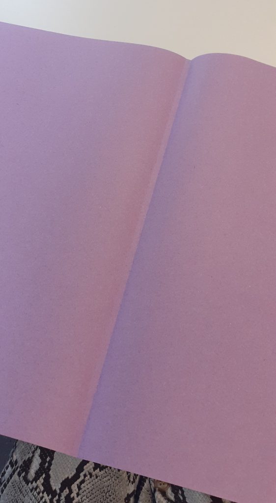
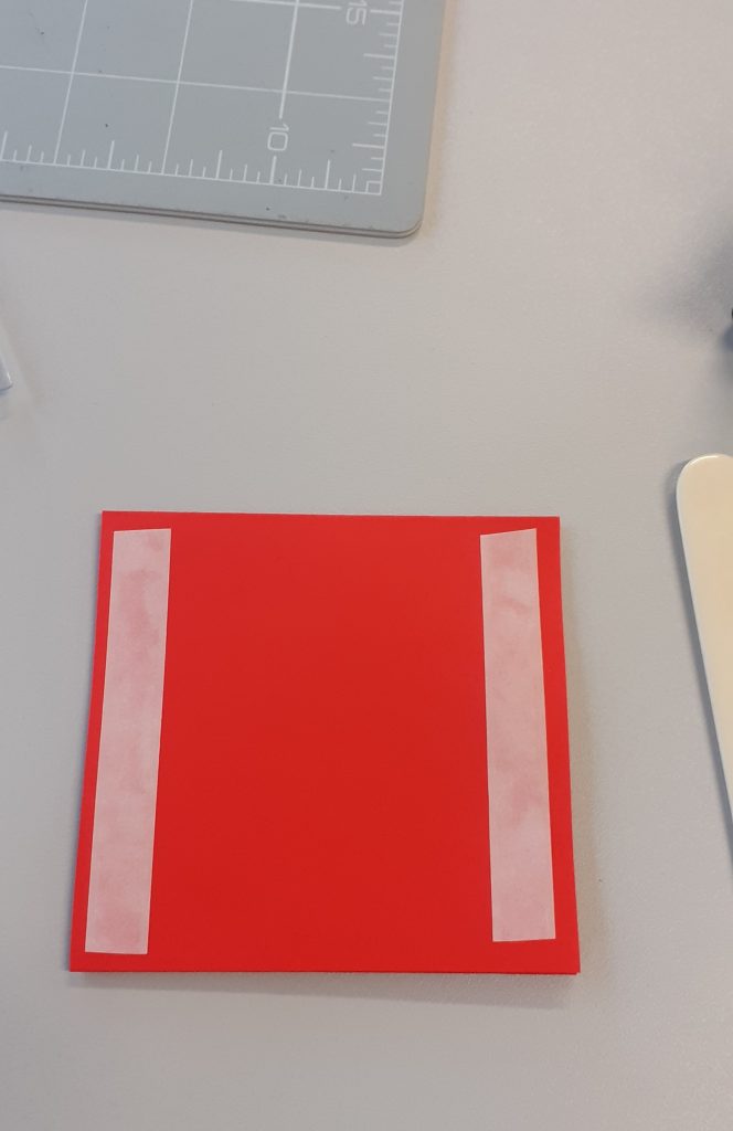
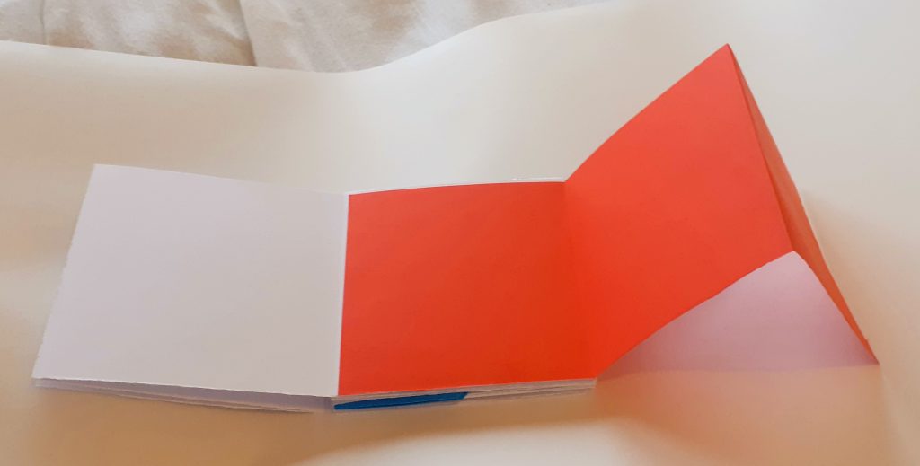
I added a section using thin red paper. I cut the paper to the same height as the page of my book. I then folded it into thirds so that it would be a concertina style pull-out piece. I used double-sided tape to attach it to the book.
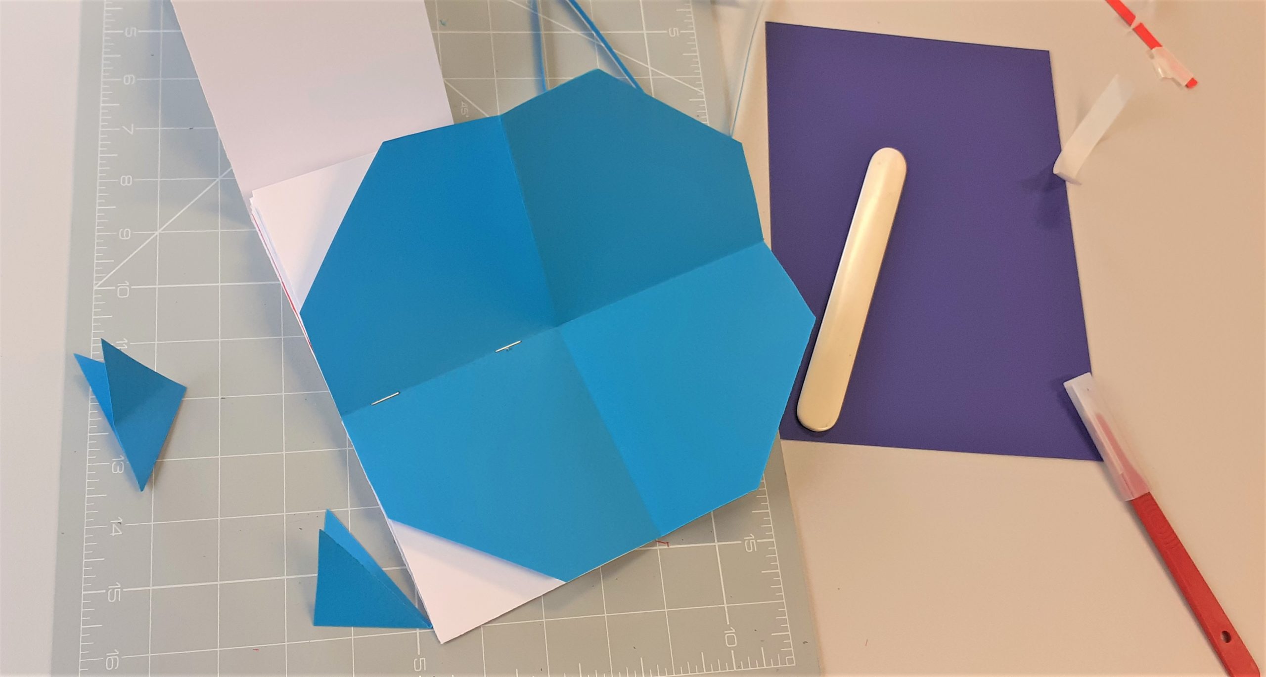
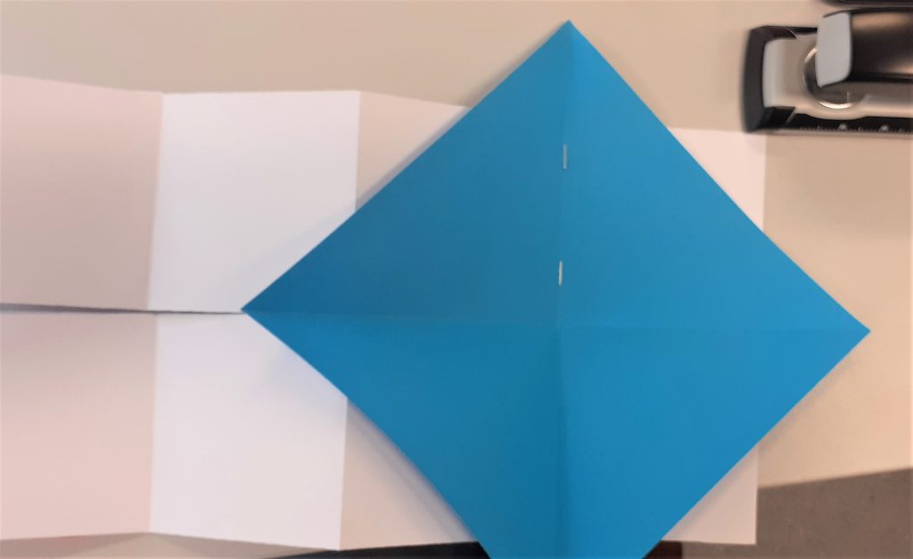
I used thin blue paper to attach a sheet that I can open out and tuck away. I cut it into a perfect square, larger than a page of the book. I folded it into triangles and stapled it to the spine of the book. Using thin paper meant that I would be able to fold it into the book without it causing the book to buckle.
When I folded the paper into the book, there were triangular corners that stuck out.
I cut the corners off with the scalpel. This created an octagon.
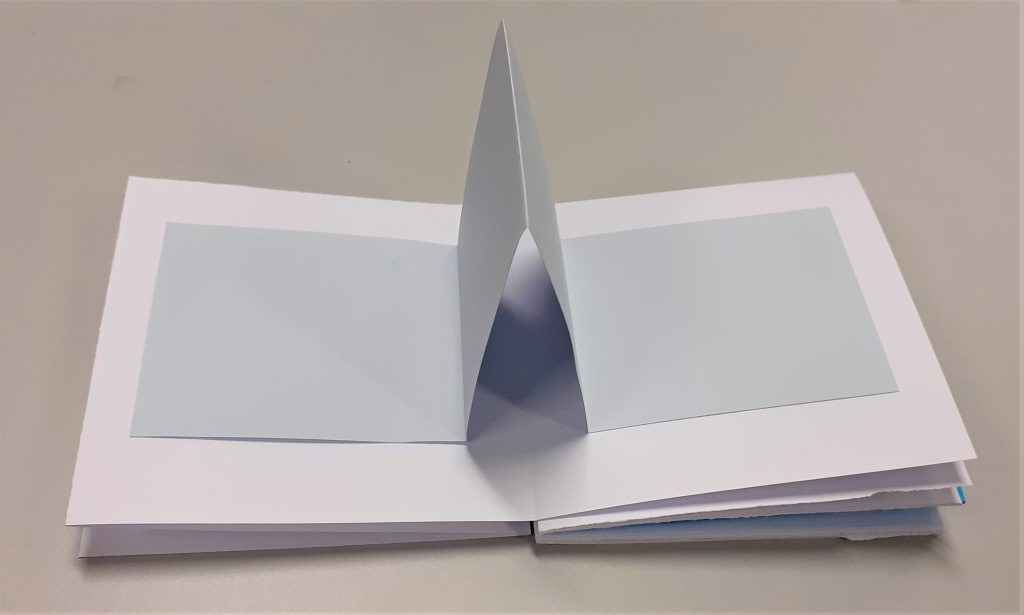
I then stuck a strip of grey paper into the book. I allowed the middle to fold inwards. This meant that the paper sticks out when the book is opened.
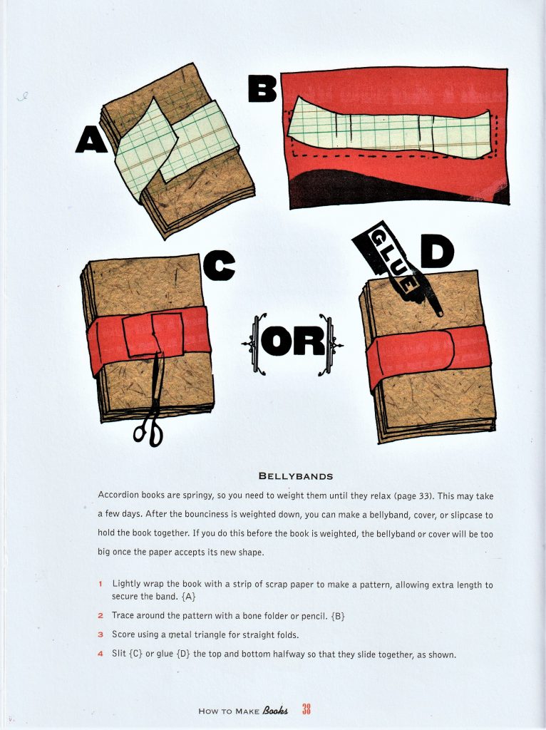
Another technique I did not have time to add is the bellyband. There are easier and more complicated ways to make a bellyband. They hold the pages closed and can be removed as a book cover can be.
How to make books by Esther K. Smith
I read this book as part of my bookbinding research.
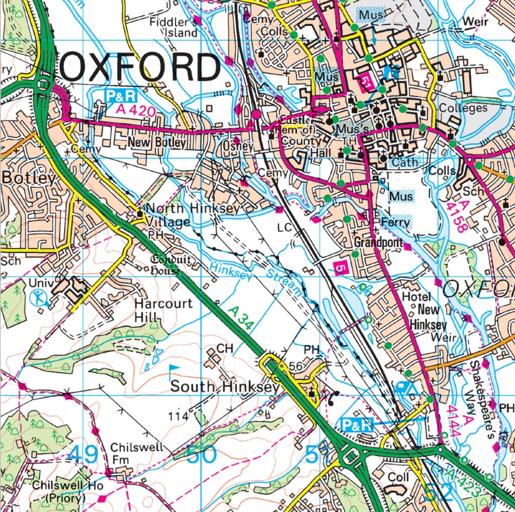
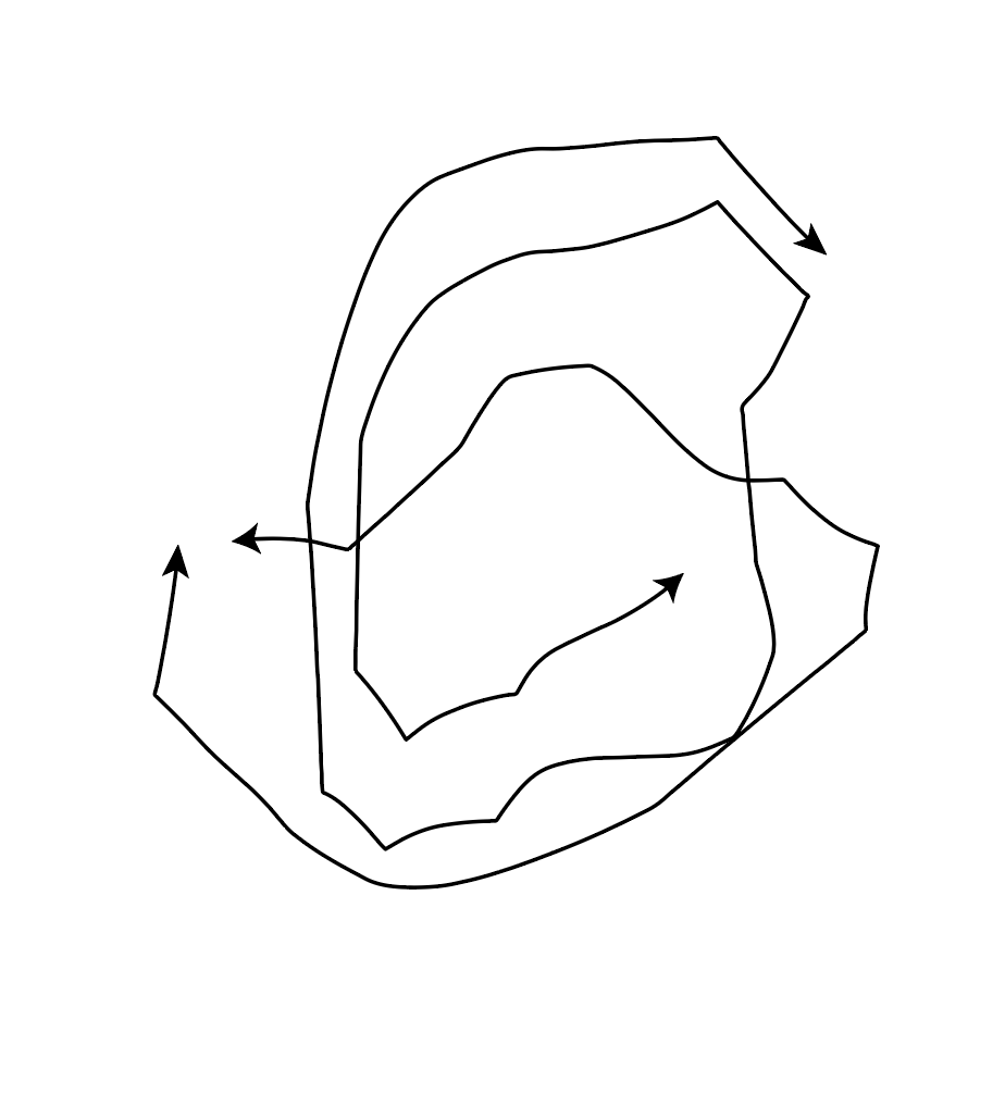
It is an image. But not just an image. A map is an informative graphic. Something you need to interpret. How can we map something? How could we map our thoughts? How about a physical landscape?
A straight line says nothing, but adding an arrowhead to one end says something. It is suddenly a map. Something to read. It indicates something to us.
An image that isn’t a map, is abstract.
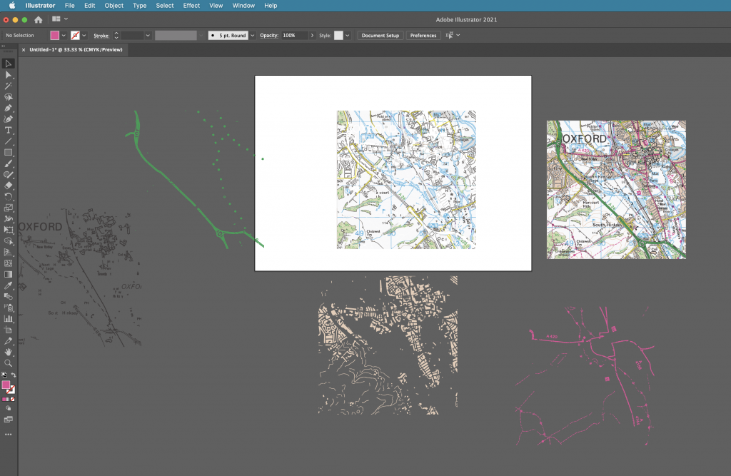
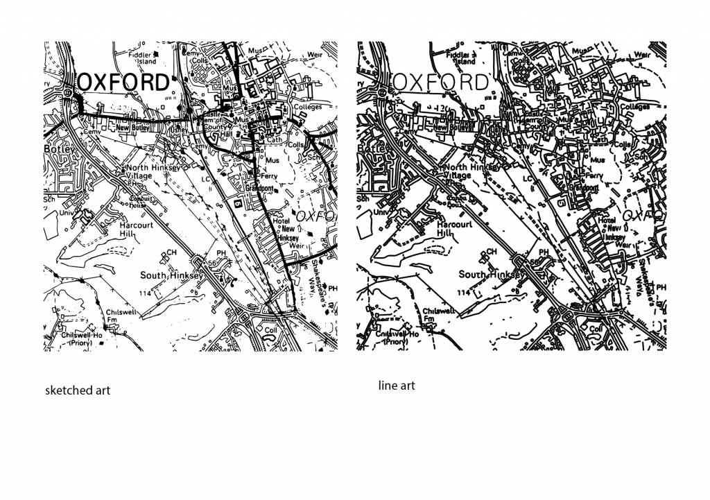
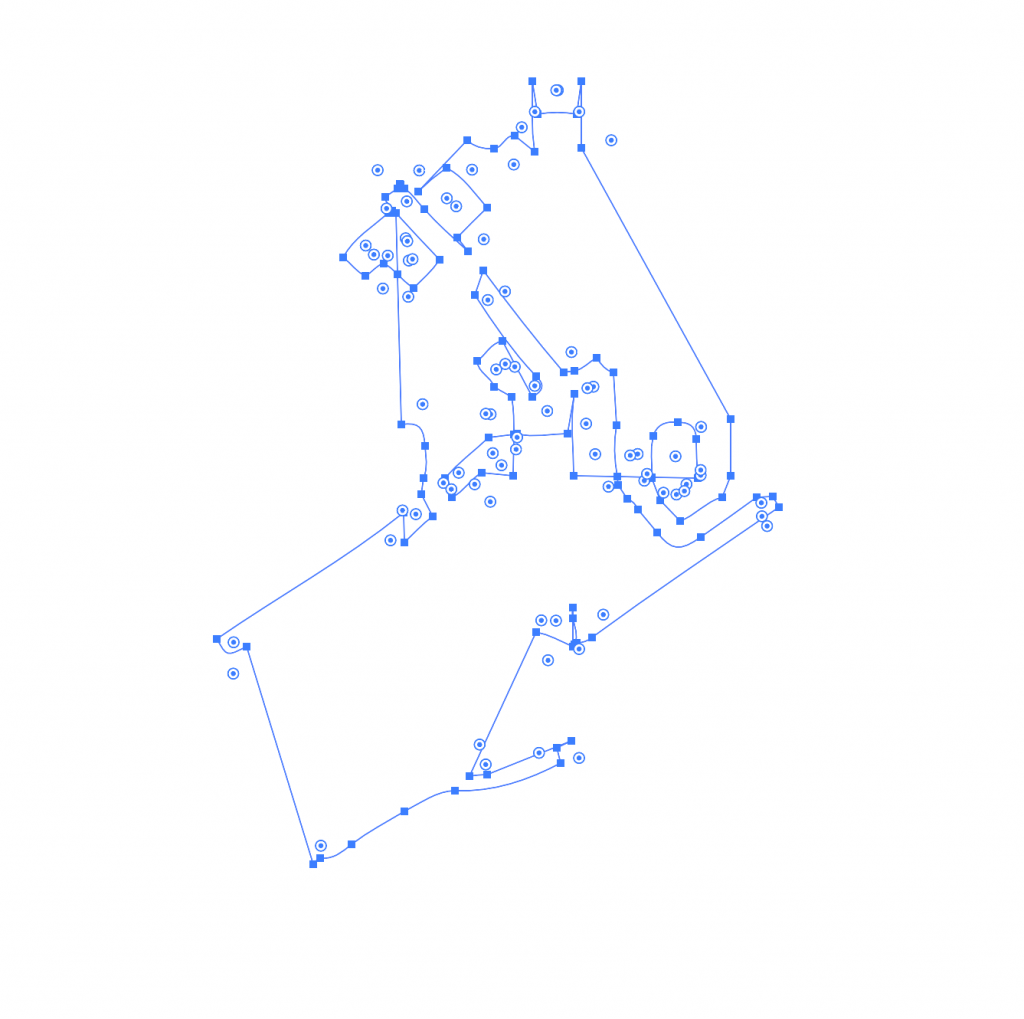
Opening this image of a map of Oxford in adobe illustrator, allowed me to explore different manipulations and ways of drawing a map.
I began by pulling different areas from the map. To do this, I first selected Image trace> 16 colours. This turned the map into a vector image instead of an image made from pixels. All the lines appeared smooth when I zoomed into the image.
Expand completes the action of turning it into a vector. This also allowed me to move the different pieces separately.
Command + shift + G ungroups the image.
To be able to grab all the areas of 1 colour, I needed to select:
Select > same> fill colour
I could then click and drag to take out these separate pieces of colour.
I then played with the other image options:
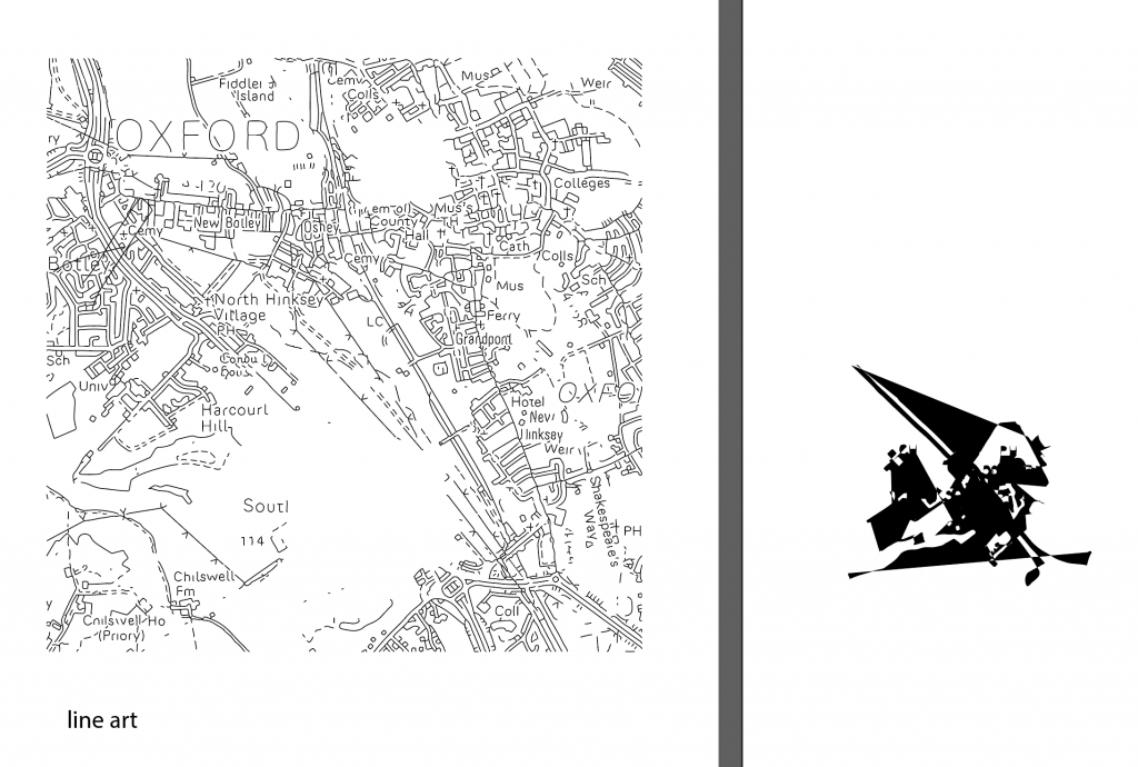
Converting the image into line art gave me new options for experimentation. I clicked and drag on small areas of the image to separate the lines, lifting areas out of the map. The gaps in the map below left are areas I had taken out of the image:
The shape on the right was created from taking the small area from the map. I pressed Command + J to join the lines together. I then clicked the small arrow beside the stroke and fill colour squares. This inverted the colour and filled my shape with black instead of the black outline.
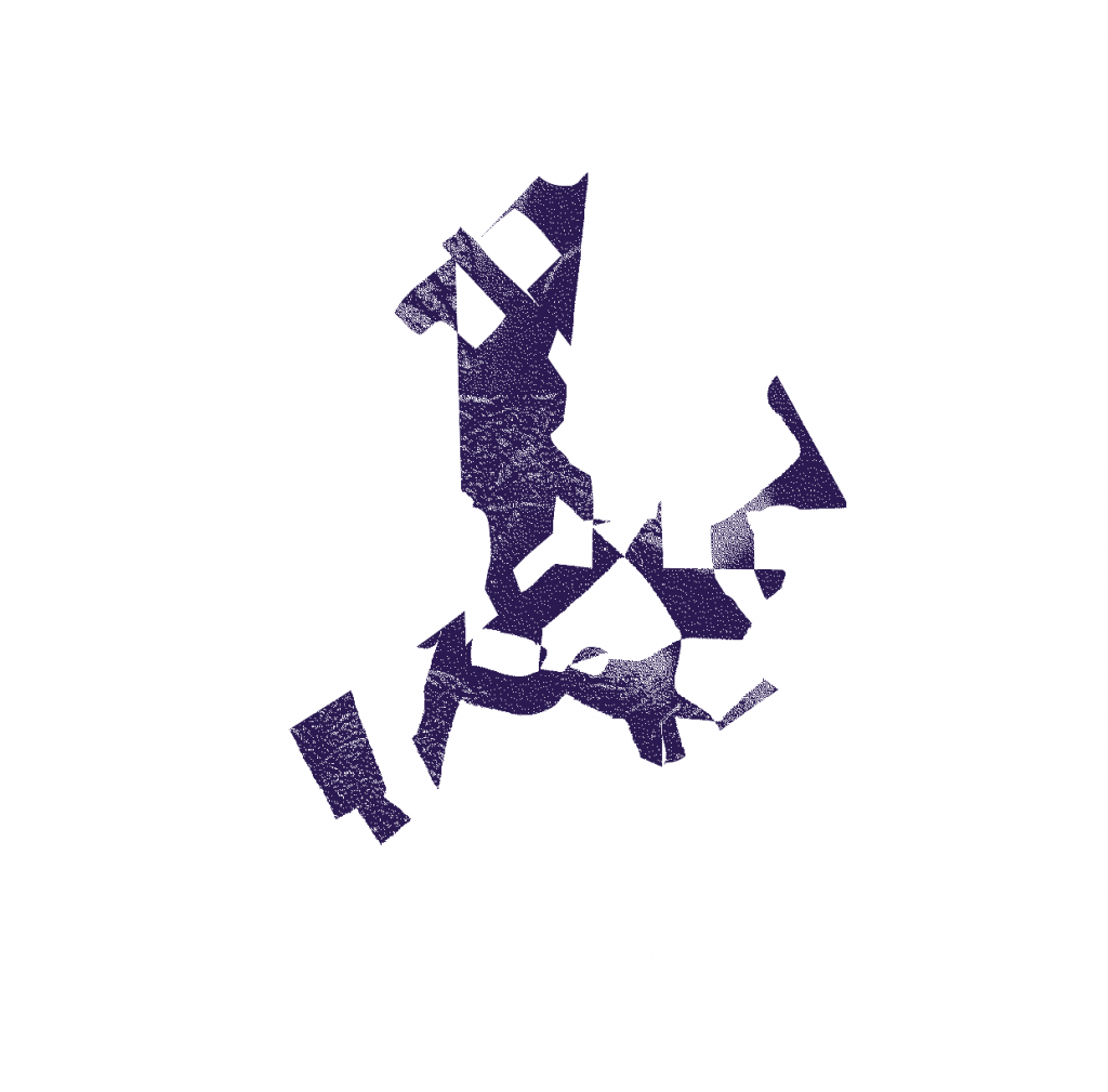
I then copied and pasted the shape into adobe photoshop. This allowed me to work on it further and turn the image into a bitmap. I needed to make sure the pieces were in a formation I liked before pasting it into photoshop. This is because it is very difficult to rearrange the pieces once the shape is pasted into photoshop.
pathfinder> divide takes the shape apart.
pathfinder> unite sticks the shapes together like glue.
pathfinder> group allows you to move the shapes around together but they do not become the same object.
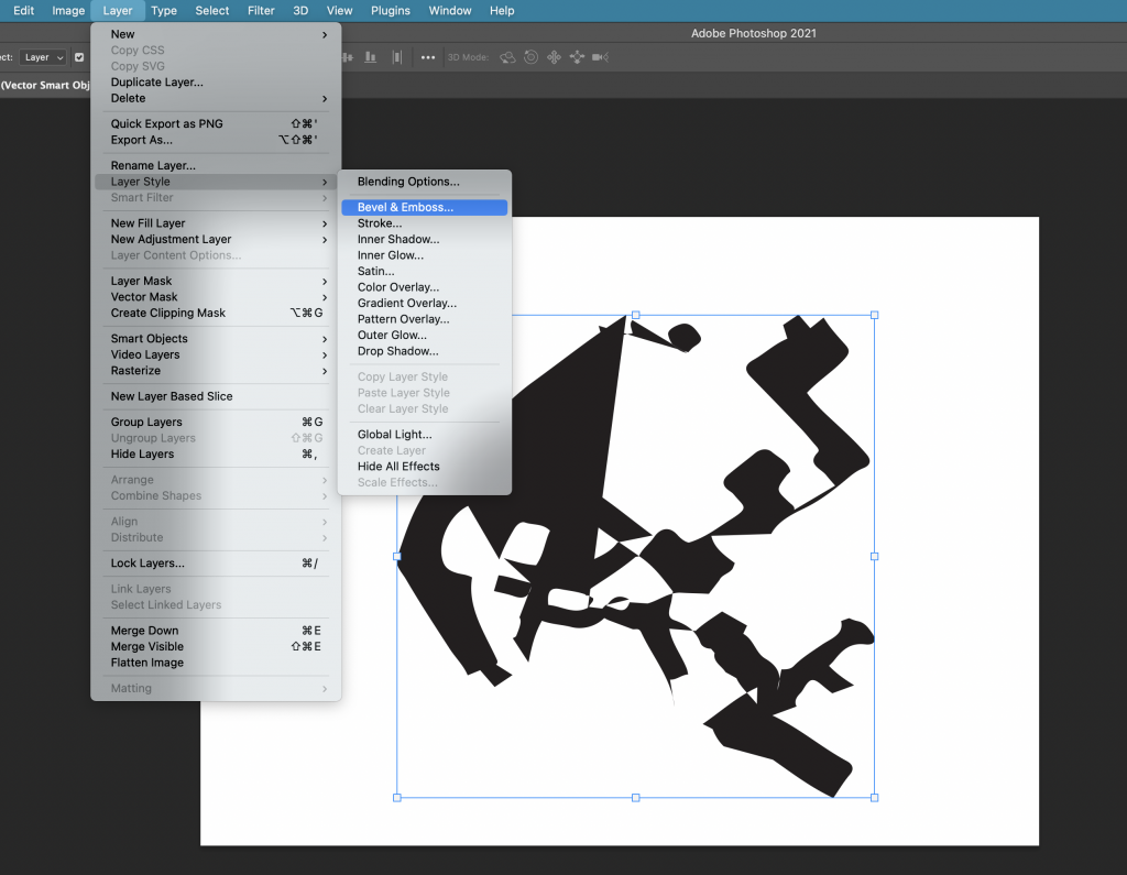
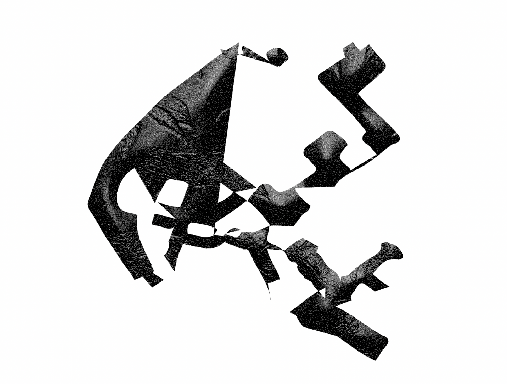
My first step was to bevel/emboss the shape. I selected Layer> layer style> bevel & emboss, as shown in the screenshot below:
This allowed me to play with the height and texture of the shape. I chose the leaf pattern as I liked the rough texture it produced.
The image needs to be in greyscale before you can bitmap it. I bitmapped the image and chose ‘diffusion dither’ to create the grainy filter. I saved the image as a TIFF file.
Back into Illustrator, I took another shape from within the line art of the Oxford map. I used this for my outline. I repeated the previous process of joining the lines and filling the shape with colour. This time, I removed the fill and the outline, so the shape was transparent. I selected ‘draw inside’ and Command+ shift+ p, to place an image inside the shape. (this is the shortcut within illustrator, in InDesign, we would use command+shift+D)
In this case, I wanted to place my bitmapped image inside this new shape. I selected the TIFF file and clicked to place it inside. Because this image is a bitmap, I was able to change the colour of it. I also tried rotating and enlarging the image from within the shape.
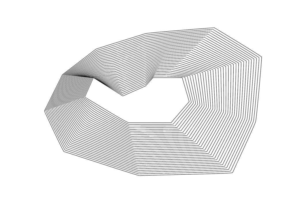
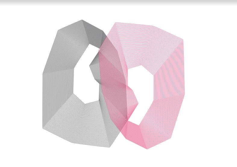
Another technique for image producing. I drew a shape using the pen tool on Illustrator. I then drew another shape within this shape. I selected object> blend> make. I needed to change the stroke colour to black, to be able to see another shape appear between the 2 I had drawn. By then selecting object> blend>blend options>specified stops and increasing the number, I could create multiple identical lines within my image as shown here:
The image looks quite 3D and could be describing a gradient.
I duplicated the shape by holding down ‘option’, clicking and dragging. I changed the colour of this second shape and rotated it so that it was upside down. I placed the shape so that they intersect. I increased the transparency so that it is possible to see through the lines to the other shape:
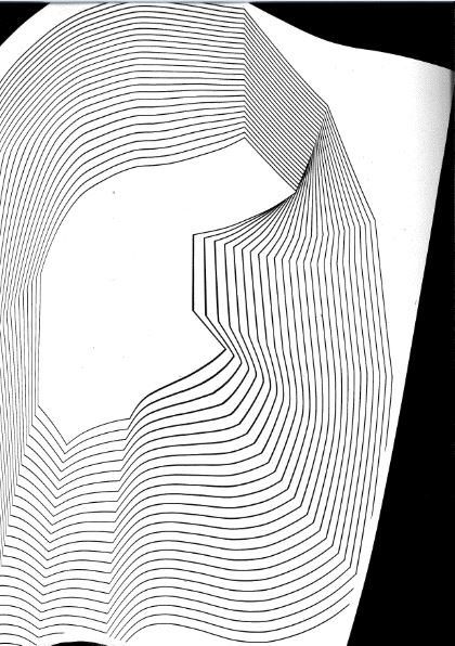
I printed the image of the shape that had multiple lines. I used this print to scan onto the computer. Instead of doing a simple scan of the drawing, I wanted to make it interesting.
I moved the image around on the scanning bed as the scanner moved across it. This created a wavy image where the lines moved in different directions. From this scan, (I saved it as a TIFF file) I could manipulate the image further in Illustrator.
This image was made from the scan.
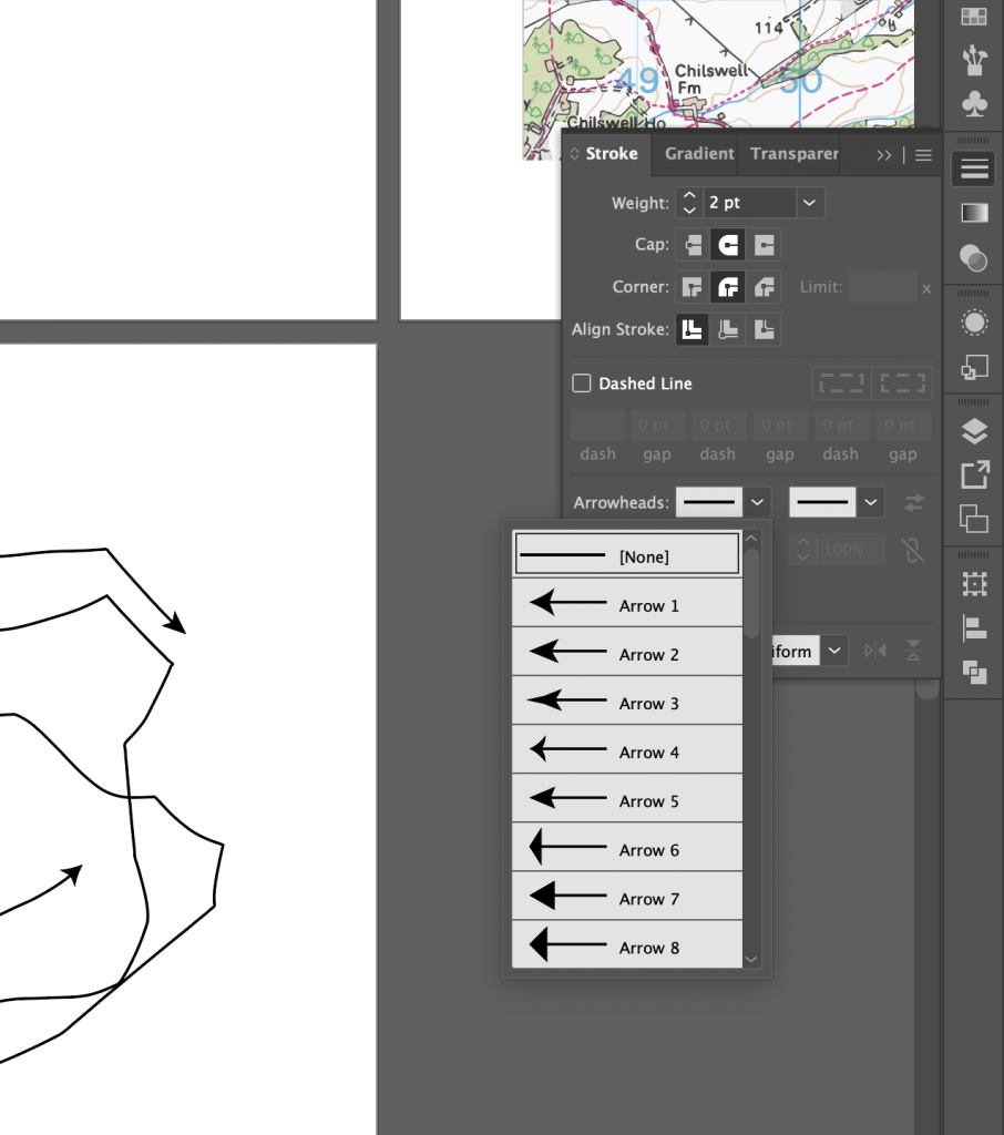
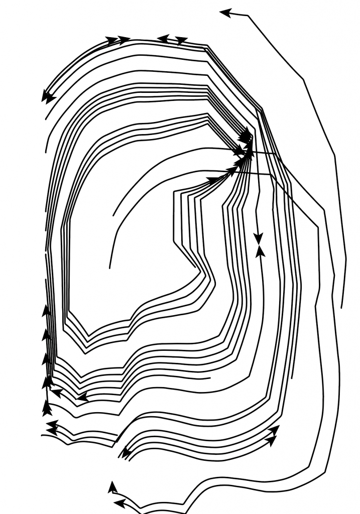
I remove lines from my scan by grouping the image, so that it was a vector image. I added arrowheads using the arrowhead tools on the right hand side of the page. To create the above effect, I selected object> blend> make. By selecting blend options, again I could alter the number of linen repetitions.
arrowhead options
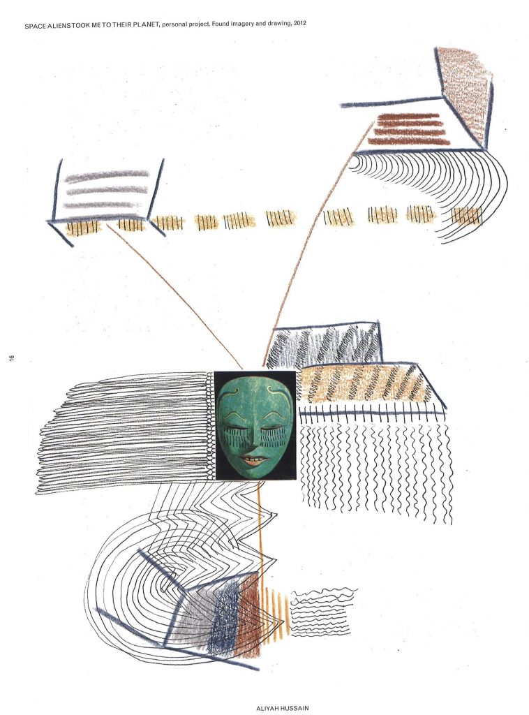
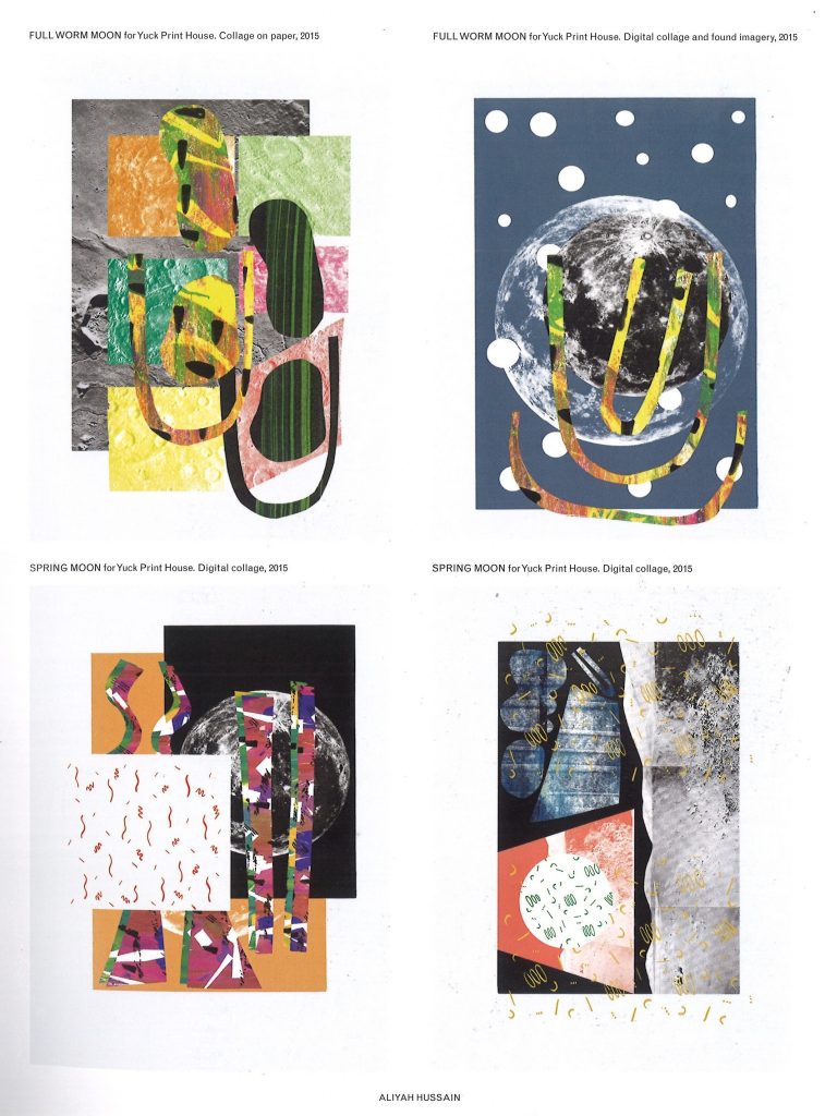
Aliyah Hussain
Aliyah Hussain is a UK based design whos work is multi disciplinary.
Her work is focused on collage but also incorporates screen-printing techniques, painting, photography and performance.
Her work unites futuristic utopian elements with a retro and hand-made aesthetic. Her use of line is bold and directional. In the above piece, I can see the pressure she has used on the pencil. The lines coming from the centre mask image implies to me a kind of mind map, where the ideas are directly linked to the face in the middle. Who might this face be representing? Is it a signifier of a collection of people in general?
There are areas of business and action, combined with white space where the eye can rest. I like the hand-made feeling that this has been jotted down in a notebook to record something important that the artist needed to remember. It has that rushed and urgent sense to it that we might find in a journal.
We use cookies on our website to give you the most relevant experience by remembering your preferences and repeat visits. By clicking “Accept All”, you consent to the use of ALL the cookies. However, you may visit "Cookie Settings" to provide a controlled consent.
This website uses cookies to improve your experience while you navigate through the website. Out of these, the cookies that are categorized as necessary are stored on your browser as they are essential for the working of basic functionalities of the website. We also use third-party cookies that help us analyze and understand how you use this website. These cookies will be stored in your browser only with your consent. You also have the option to opt-out of these cookies. But opting out of some of these cookies may affect your browsing experience.
Necessary cookies are absolutely essential for the website to function properly. These cookies ensure basic functionalities and security features of the website, anonymously.
Cookie
Duration
Description
cookielawinfo-checkbox-analytics
11 months
This cookie is set by GDPR Cookie Consent plugin. The cookie is used to store the user consent for the cookies in the category "Analytics".
cookielawinfo-checkbox-functional
11 months
The cookie is set by GDPR cookie consent to record the user consent for the cookies in the category "Functional".
cookielawinfo-checkbox-necessary
11 months
This cookie is set by GDPR Cookie Consent plugin. The cookies is used to store the user consent for the cookies in the category "Necessary".
cookielawinfo-checkbox-others
11 months
This cookie is set by GDPR Cookie Consent plugin. The cookie is used to store the user consent for the cookies in the category "Other.
cookielawinfo-checkbox-performance
11 months
This cookie is set by GDPR Cookie Consent plugin. The cookie is used to store the user consent for the cookies in the category "Performance".
viewed_cookie_policy
11 months
The cookie is set by the GDPR Cookie Consent plugin and is used to store whether or not user has consented to the use of cookies. It does not store any personal data.
Functional cookies help to perform certain functionalities like sharing the content of the website on social media platforms, collect feedbacks, and other third-party features.
Performance cookies are used to understand and analyze the key performance indexes of the website which helps in delivering a better user experience for the visitors.
Analytical cookies are used to understand how visitors interact with the website. These cookies help provide information on metrics the number of visitors, bounce rate, traffic source, etc.
Advertisement cookies are used to provide visitors with relevant ads and marketing campaigns. These cookies track visitors across websites and collect information to provide customized ads.