Performance art- Workshop

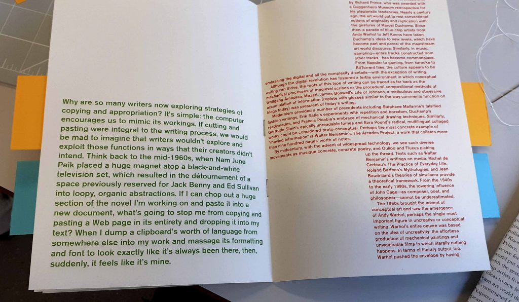
Today we were introduced to the concept of performance art. I knew a bit about performance art from the 1960’s, but was under the impression it was a movement that has passed. Kate Mahony showed us otherwise.

Presentation

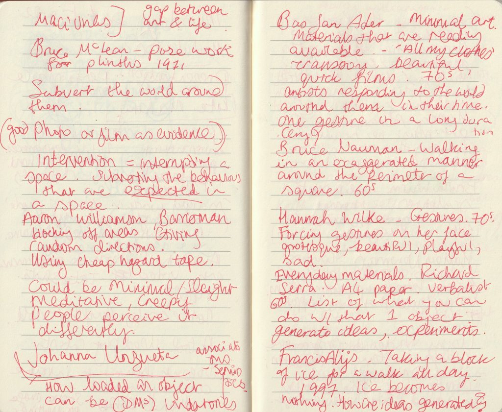
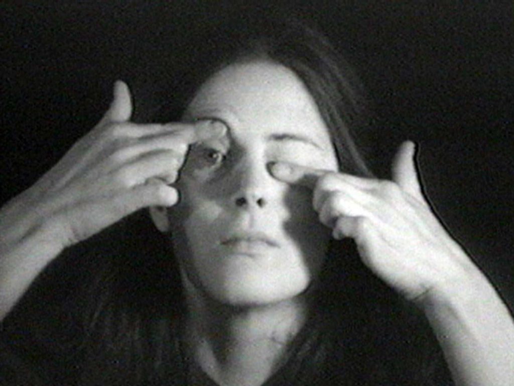
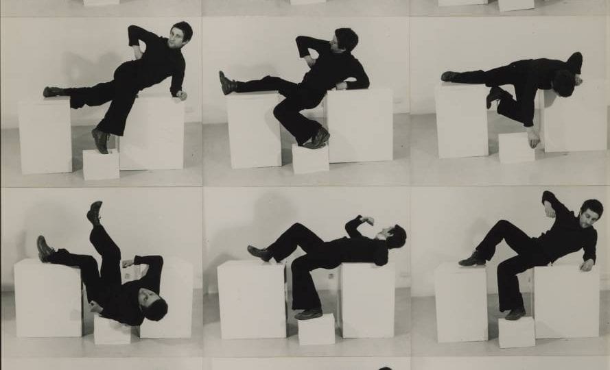
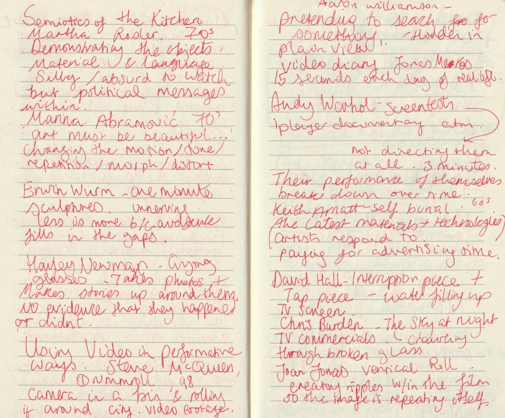
In the first half of the session, Kate spoke about what performance art is and showed us examples of the many ways it can be approached. In particular, she did focus on artists from the 1960’s and 1970’s, because this is the era she favours.

‘Why performance art?’ Kate’s answer was:

‘Performance art is always in flux. Something is constantly moving and changing. Making work in front of people means that the audience fills in the gaps with their own interpretations. Performance art is not easily bought or sold, it’s more of a tool used by artists.’

We watched ‘An introduction to performance art’ which was a video by the Tate.

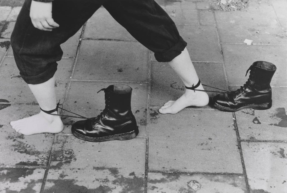
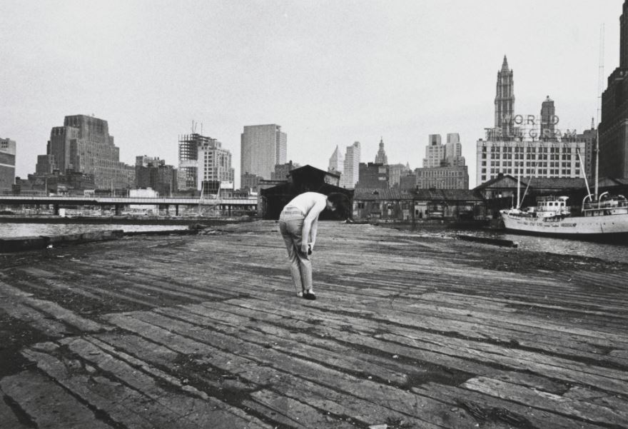
I learned that it doesn’t have to involve an audience, because we can use photography and video to capture a performance instead, such as Mona Hatoum who produced a static image to document her performance of walking through the city, dragging the Doc Martins boots.

This works as a piece, because the object she has chosen has a lot of associations culturally.
Hannah Wilke, Gestures (1974)
Bruce McLean, Plinths (1971)
Erwin Wurm’s one minute sculptures

Workshop

We then moved onto the workshop. The focus for the workshop was P.O.V. & site. It was about using our environment to create D.I.Y. performances. This idea was inspired by Pier, (1971) by Dan Graham, Harry Skunk and Janos Kender, in which the artists recorded the same instance but from multiple angles.

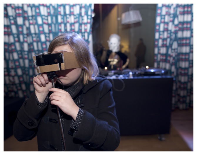
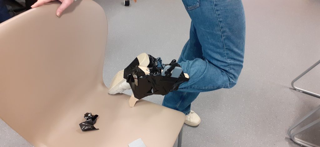
When filming with smartphones, it was suggested that we film horizontally, to avoid the black lines at the side of the video.

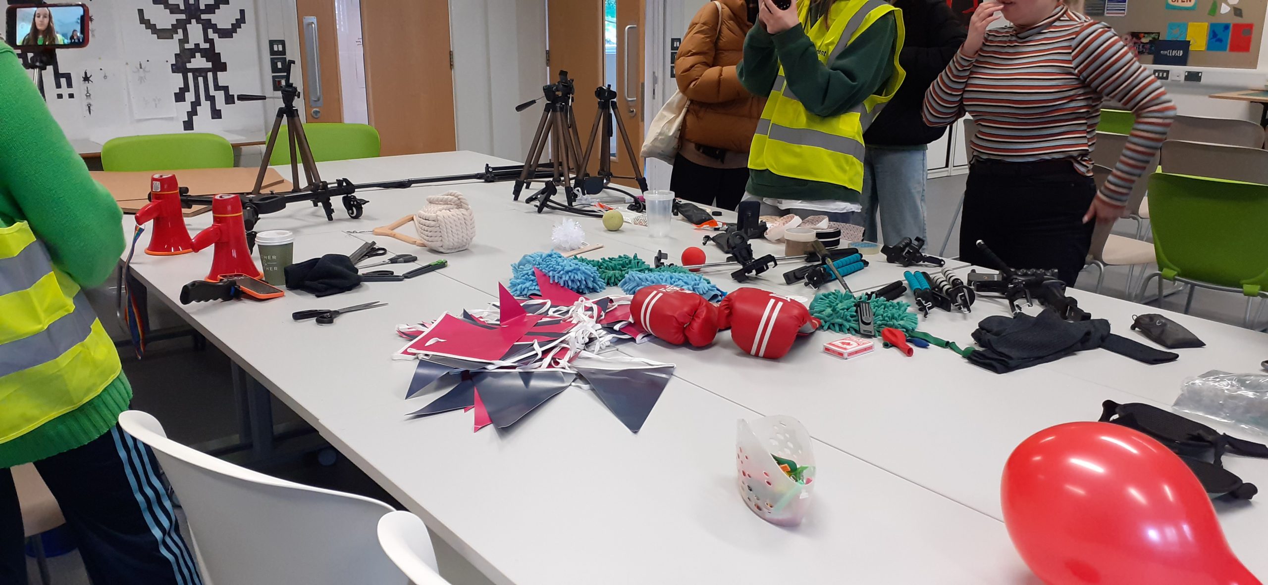
We were presented with a series of different objects and asked to use them to attach the phone to our bodies. Working in groups, we would be attaching the phone to a different body part, to record multiple perspectives.

Our group chose arm, foot and chest.

using tape and piece of wood.

The footage I recorded:

Placing our phones together after the workshop, allowed us to see the different perspectives, together. (above)

Using a mirror in the video, gives the impression of being in 2 places. You can see in the bottom phone above, my classmate placed a mirror in front of the camera to reflect elements of the world around her. Including the sky, ceiling, trees and architectural features.

I felt that my footage looked dreamlike due to the distortion of the clear plastic and the motion of walking. This fits with the position of the phone on my heart.

The movement in the videos are all organic, they come from the body.

What did I gain from this workshop?

Inspiration!

When presenting information to an audience, I normally think of what I will say. But more information can be given the viewer using different modes of communication.

Video can be subtle or loud. Audio can create atmosphere and help to emphasise the subject. The technology available to us today makes this even easier. The artists on the 1960’s had heavy equipment to carry with them. We have little excuse.

I thought ‘performance’, meant being loud and exaggerated. This just isn’t the case.

Speculative Typography: Relief printing

Produce your own speculative or ‘a-semic’ writing system –
consisting of 10-20 pieces – using the skills that you have
developed so far. You must then produce a series of prints using
your writing system, which you are asked to cut out of found
manufactured items such as cardboard packaging, instruction
pamphlets, small and large manufactured objects found on
campus or around the studio or at home. Think about how
manufactured objects effectively lend partly ‘semic’ information
that you can appropriate for your writing system.

Abstract compositions:

https://www.instagram.com/heyporterposter/
Karel Martens

Where the prints overlap, the colour is darker and this gives the image some solidity.

Week 4

In today’s lecture, we were working with the prints from the previous ‘Speculative typography’ workshop. I printed the scans of these prints onto art paper. I had the option of printing these designs in different colours than the originals, by using the colour settings on the printer.

For example, in the below image I printed the design in its original colour (blue). I then replaced the paper into the paper tray, rotating it around. I placed the original print into the scanning bed and selected the 2 colour option, then selected yellow and black. This came out on the paper as a shade of green. I also resized the print by changing the percentage, and photocopied this onto the previous print.

I selected blue and yellow for these prints as I liked the way these colours merged when overlapping:

I creating this image from 2 photocopies. (green and magenta). I like the fine lines created by the edge of the paper.

The main part of this workshop, was the relief printing technique.

I was not happy with most of the prints from this half of the workshop. I think this is because the method was new to me, I didn’t have the chance to practice and plan the pieces because of time restrictions. I found that my classmates took to the process and got on well with it, whereas I struggled. (This was also the case when I first screen-printed, at the beginning of semester 1. But with time and practice, I got more confident.)

I maybe rushed the process and didn’t anticipate what the outcome would be when I chose certain colours and placements. I could have slowed down and really thought about what would compliment the composition.

Step 1- Was to soak the paper in water, for about 5 minutes. This made the paper softer, more pliant so that it bends to the shapes of the materials used for printing on top. After soaking the paper, it needed to be sandwiched between blotting paper. This removes the excess water.

Step 2- was to ink up the materials used for printing. We used mainly carboard packaging for this purpose. The ink were rolled onto the worktop and I used a roller to transfer the ink onto the cardboard.

Step 3- I then carried the damp paper and inked up pieces over to the printing press. I arranged the pieces onto the paper, after placing these pieces, I did not have the option of removing and replacing the pieces. When I was satisfied, I laid a few sheets of paper over the top, followed by a couple of blankets.

Step 4- It was important that the blanket wouldn’t crease or fold. Therefore, we worked in pairs for the printing process. One person, held onto the blanket, pulling it straight and the other person turned the wheel. A swift action is best for this.

Step 5- After removing the blanket and paper, we could start removing the shapes from the print to see our results. Sometimes it was enough for the work to be pulled under the press once. It was at this point that I saw the paper had ripped in some parts. This is because the paper was too wet.

my work, right
my first print was unsuccessful because there was no harmony or balance.

I tried to use the striped cardboard markings to unify the composition with blue ink. However, I felt the print still looked too busy:

I liked this print because the peach colour was very different in tone and temperature to the mossy green. The circle in the cardboard worked well with the circles in the underlying print. I allowed white space.

Experimental bookbinding

After being introduced to the extended project brief, this was fresh in my mind when approaching this bookbinding workshop.

From the brief-

Create a mini-monograph magazine anthology of concrete
poems (a minimum of x5 poems chosen from a collection
provided for you) with the accompanying 2,000 word
introductory essay consisting of at least 8 printed-pages.

If I were to decided on 16 pages for the magazine/newspaper, this would mean using 4 sheets of paper.

We were given a selection of printed pages, some double-sided and others not. The paragraphs were printed with red, blue, green and black text, in a variety of weights, pt size and placement. We were then challenged to put them together into books, using experimental techniques.

Things to consider in the workshop:

  • The middle page will show double spread as the page is printed
  • Think about how to place the pages together. How will the different colours and textures match across a spread?
  • The cover could be shorter than pages.
  • Staggered pages
  • Cut areas out
  • The thickness of the coloured paper we use for the cover may influence the method want to use for binding.
  • We could use letterpress onto a coloured paper cover for our final magazines. Most papers can be printed on digitally, but the thicker papers might be more appropriate to letter press on instead.
  • We could make pockets for 4 separate pieces.
  • Stitch or staple pieces onto the folds
  • Loose covers
  • Different sizes paper
  • Mini books inside
  • Concertina
  • Shapes and colours of the type, what textures etc to consider

I looked at this book in the workshop. The brown paper cover intrigued me because it is unusual for a book cover.

I really like the peach-coloured narrow pages within the book.

The first book I made was based around the idea of staggering the width of the pages. This is the book as seen from the front. I cut the outside page so that it is narrower all the way around the cover. It wouldn’t be readable, because half of the page is around the back of the book. I have used the grey card as a tougher cover for the book, with the very outside page functioning as a decoration rather than a page to read. The words here might function as a taster as to the theme of the book.

I have cut the edge of grey cover, on the front side, to reveal the contents of the book.

I have left the other page of grey cover at its full width. I cut the edge of the paper within the book, to create the staggered page effect.

The bolder text peeking out from the grey cover is effective, as it is in between the darker tone of the cover.

I placed the pages of red text in the second half of the book and pages of black text in the first half.

To bind this book, I chose to use a needle and tough thread. I held the sheets of paper together with bulldog clips. After punching 3 holes into the spine, I stitched the pages using the basic bookbinding stitch.

The last stage of stitching the book.

The second book I made. The colours of the book markers complement the black text on the cover.

The markers can be seen at the edge of the book.

Centre of the book. The staples can be seen here at the centre. I used 2 staples to keep it simple. 1 staple for each bookmark.
I aligned the top of the marker with the top of the paragraph on the opposite page.
This is where the marker appeared on the other side of the book.
Orange marker. I like the neatness of attaching markers in this way, as the staples are not visible here.
I aligned the orange marker with the start and end of these paragraphs.

The third book I made:

I used a pair of compasses to draw a semi-circle on the front cover. I then used scissors to cut along this line.

Trimming the last pages of text, allowed the coloured card to be visible from the front when the book is closed.

I used a scalpel and ruler to trim the edges of the paper.

However, this snagged at the paper. I thought this might have been due to the angle of me sitting down. I stood up to redo the cut, but this had the same effect. I then figured out that pressing on the scalpel harder and using a swifter motion, was enough to make a clean cut.

For the fourth book of the workshop, I made a smaller cover with blue card that acted like a belly band.

I feel that the colours work well together (red text and turquoise-blue cover)

The cover wraps around the pages and so the pages fit within the folds. (see below)

The blue text can still be read, with the band folded in.

Centre staples. The page on the right folds in from the edge of the page. I used double-sided tape to attach it.
I placed this half page within the book to allow the information to be read alone of as part of the page behind it.

I can see the potential of binding my own book. It allows more creativity and imagination, also inspiring the content as much as the content could inspire the format.