Guerilla marketing strategies are designed to work as a brand attack. Usually they subvert the meaning of a brand, hijacking the brand negatively. They are destructive to a brand because they point out that the brand is doing something bad.
Greenpeace use guerilla marketing in most of their campaigns because this strategy is so effective.
Guerilla marketing is performative. Often the action is performed in a significant place, such as a company’s HQ. The strategies aim to involve people. By taking place on the street, the consumer is engaged. The activists dress up, use props, banners or a combination of these. The street space is used in inventive ways to get the message across and amplify the message.
Direct interaction triggers emotion with the customers. The action can be entertaining, interruptive, and usually both. A buzz is created around the topic.
The term ‘guerilla marketing’ was first introduced in 1984. The word comes from guerilla warfare, where people were strategic and inventive.
guerrilla warfare, also spelled guerilla warfare, type of warfare fought by irregulars in fast-moving, small-scale actions against orthodox military and police forces and, on occasion, against rival insurgent forces, either independently or in conjunction with a larger political-military strategy. The word guerrilla (the diminutive of Spanish guerra, “war”) stems from the duke of Wellington’s campaigns during the Peninsular War (1808–14)
Regardless of terminology, the importance of guerrilla warfare has varied considerably throughout history. Traditionally, it has been a weapon of protest employed to rectify real or imagined wrongs levied on a people either by a ruling government or by a foreign invader.
https://www.britannica.com/topic/guerrilla-warfare
Physical interaction has greater power over consumer. Making the message clear to the viewer. These strategies are also used in advertising as well!
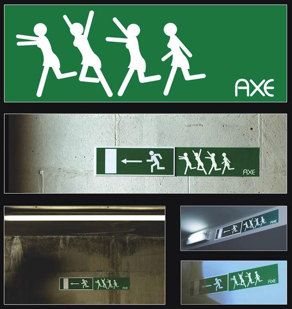
The stickers subvert the original meaning of the exit sign, which is of a man running from a fire. Adding the sticker of the women running towards the man creates a playful and creative image. The familiar image adds the urgency we associate with the sign in normal use. The new image implies the women are attracted to the smell of the body spray. The use of stickers make use of the public environment around us to get the message to the audience. The unexpected appearance of the stickers makes people take notice of them.

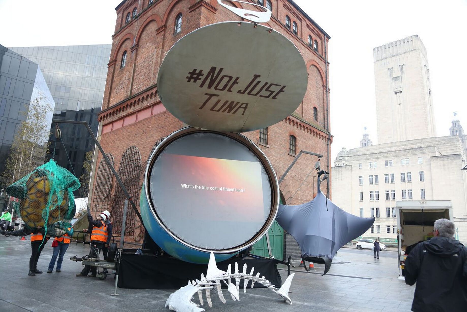
John West Greenpeace campaign
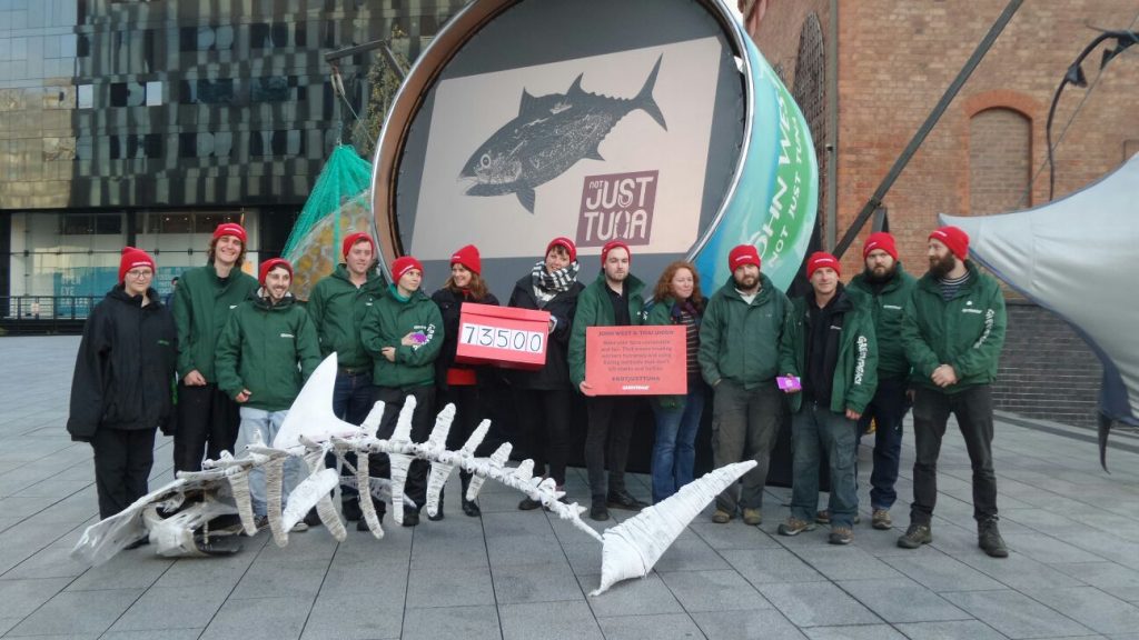
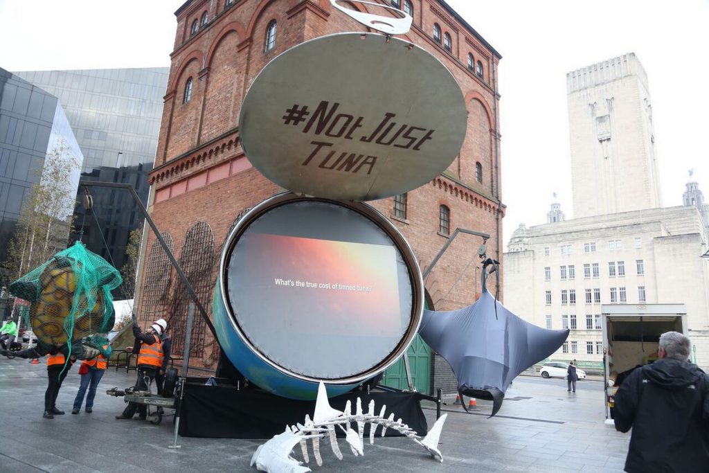
A big tuna tin installation was made to point out unsustainable fishing and civil rights abuses/ child labour. Sculptures of the endangered animals that are caught as well as tuna.e.g. turtle in a net, gives the audience a visual and physical representation of the wildlife. This brings the issue to life more than photographs or words would.
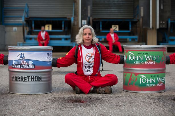
Greenpeace activists showed a video on the surface of this opened tin sculpture. The video showed interviews. An activist also chained herself to the tuna tin model in front of the John West facility.
They made a tin shaped as a turtle to visually represent what the consumer is really paying for when they purchased from John West tuna. In addition to this, they also printed labels and placed them on shelves in supermarket in place of where people would normally find tuna tins. This also ensures the message gets to the right audience. The tags they left on the shelves acted as a kit to educate people. This helped to make the message word of mouth and meant that people who were in a rush could pick up the information and take it away with them, where it could essentially travel between more people between homes for example.
Nestle’s KitKat Greenpeace campaign
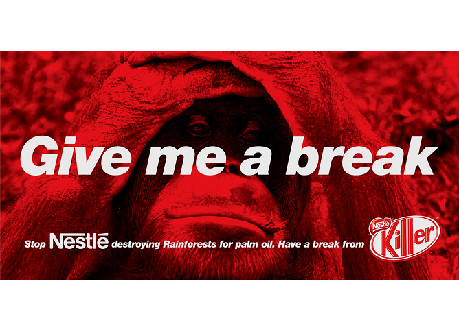
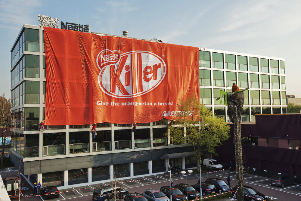
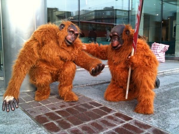
Nestle’s KitKat were attacked by Greenpeace for using palm oil from destroyed forests. The symbol of the Orangutan was given focus, as the forests affected are home to these animals.
The KitKat logo was subverted using the word ‘Killer’. The orangutan image was used in a big banner that Greenpeace activists used to cover the Nestle HQ building in Amsterdam, wrapping the building in the way a KitKat is wrapped.
They worked on the tagline ‘Have a break’, changing it to ‘Give me a break’.
This campaign went worldwide and different guerilla strategies took place across the globe.
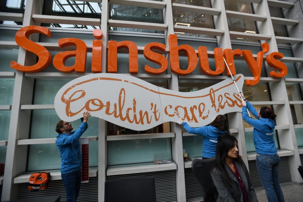
Sainsbury’s ‘Live well for less’ > ‘Couldn’t care less’:
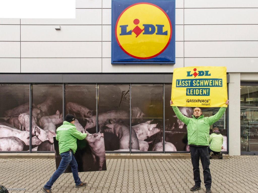
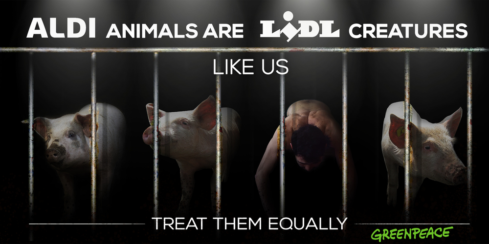
Pigs suffer for Lidl- in Germany Lasst Scheweine Leiden! Stickers placed on packaging ‘with animal suffering’ and leaflets using graphic from Lidl.
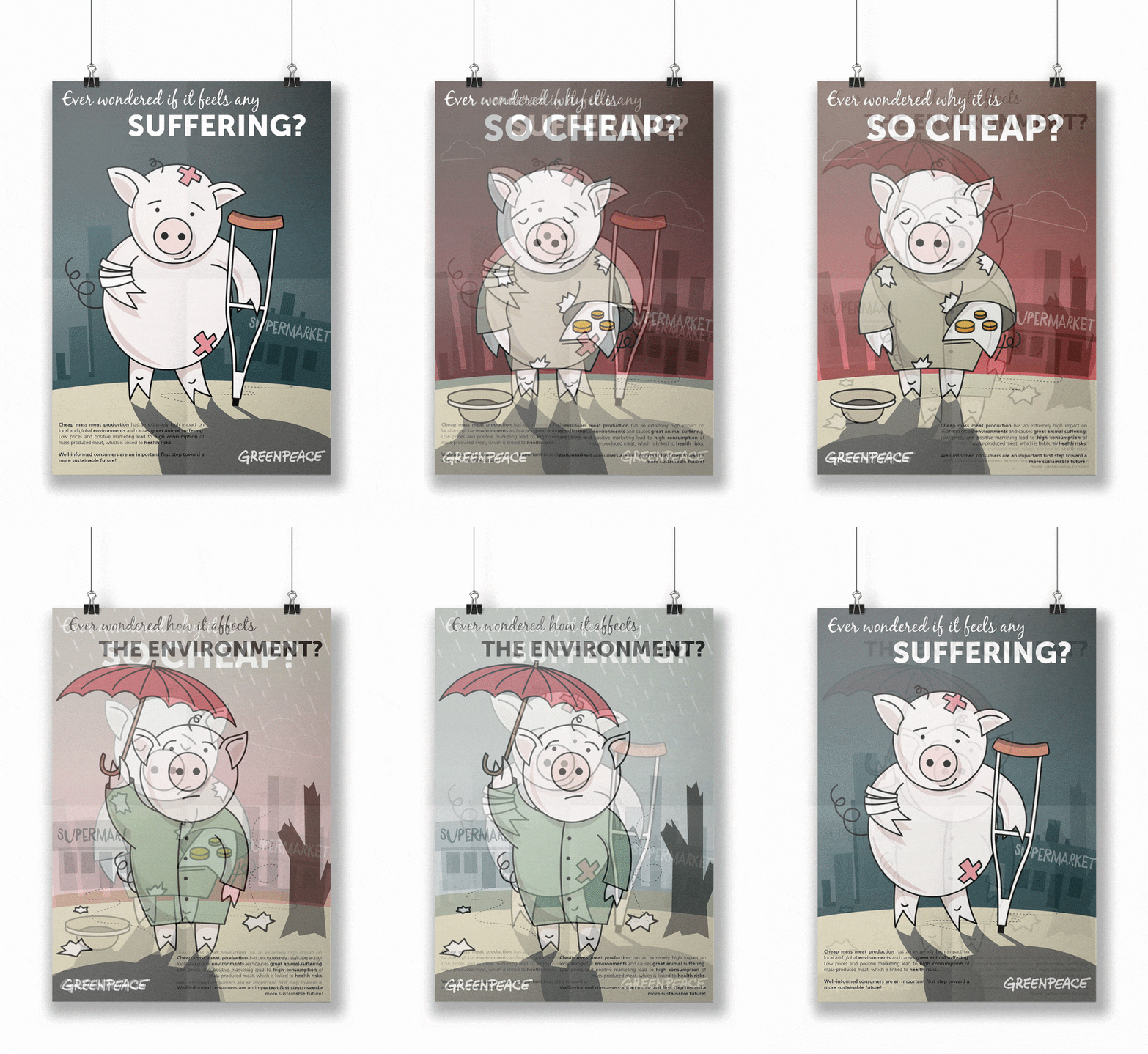
I then looked at a poster and animation about the same Greenpeace campaign.
I really liked both of these designs. The questions asked in the GIF involve the consumer in the issue. I found myself nodding in response.
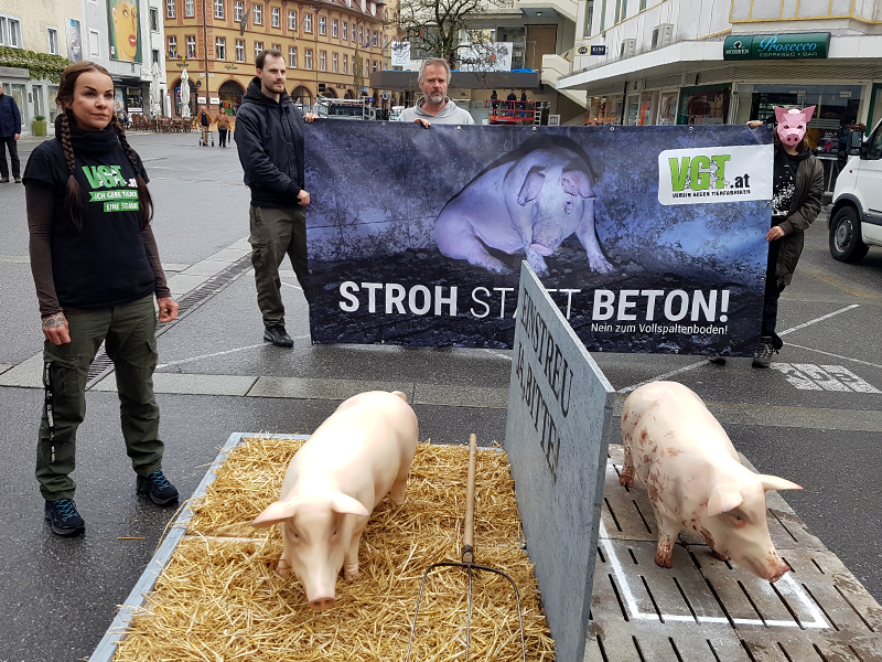
This Austrian group have set up physical models of pigs and placed them in on different flooring to demonstrate the conditions factory pigs live in. (below)
Brand attack Greenpeace brief
How can we attack Tesco brand?
As a group, we searched for images of famous Tesco campaigns.
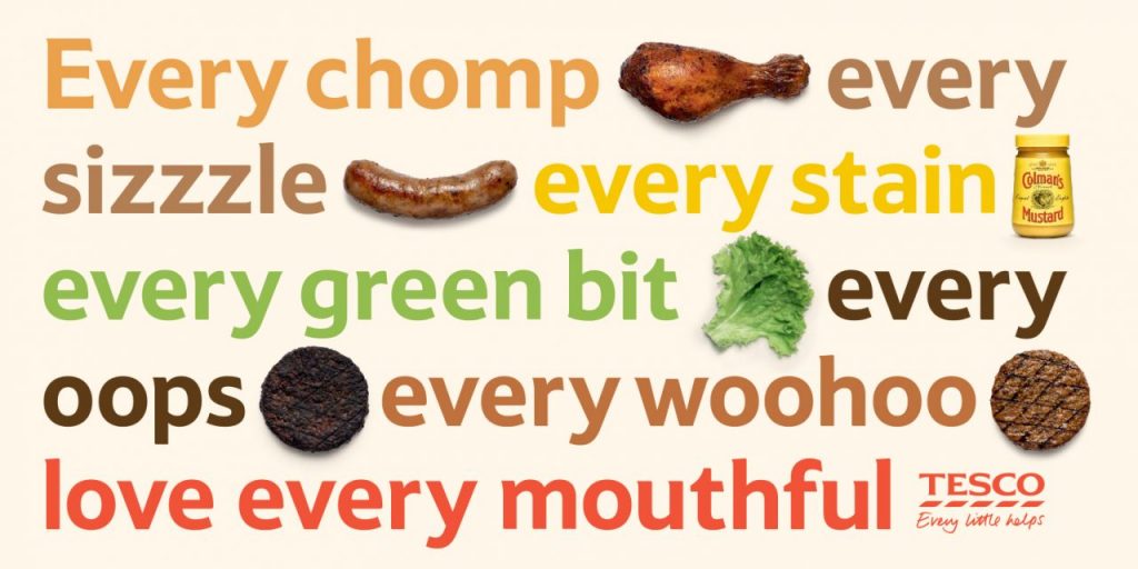
Some are ‘Food Love Stories’, ‘Love Every mouthful’, ‘Aldi price match’, ‘Prices that take you back’.
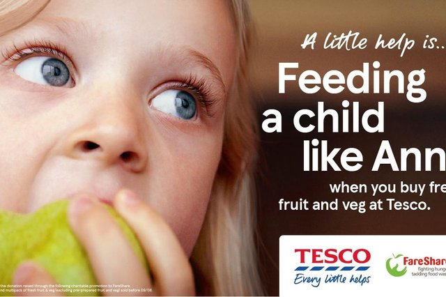
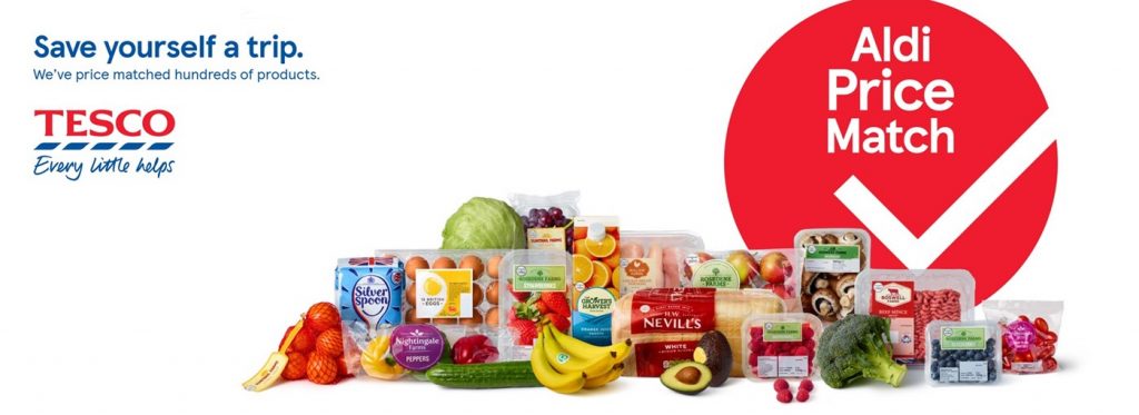
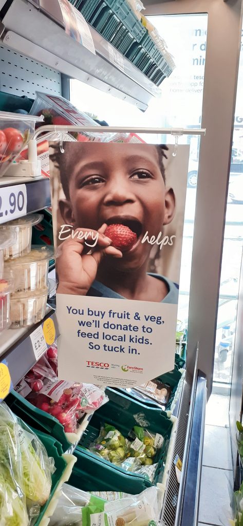
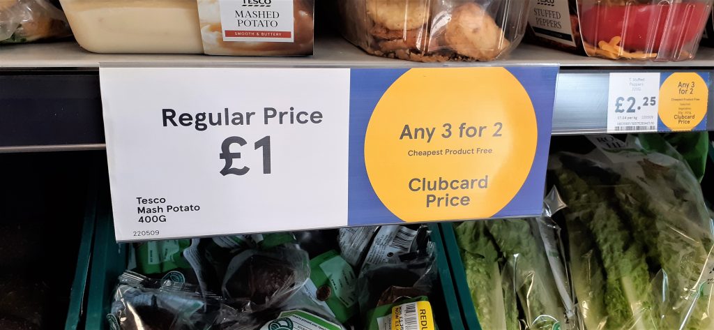
I went into the Tesco store in Headington, Oxford. This image was in the fruit and veg section.
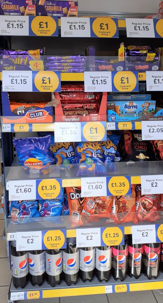
This is the first thing I was faced with when entering the shop: the shelf of snack foods and large yellow price tags. The prices are bold.
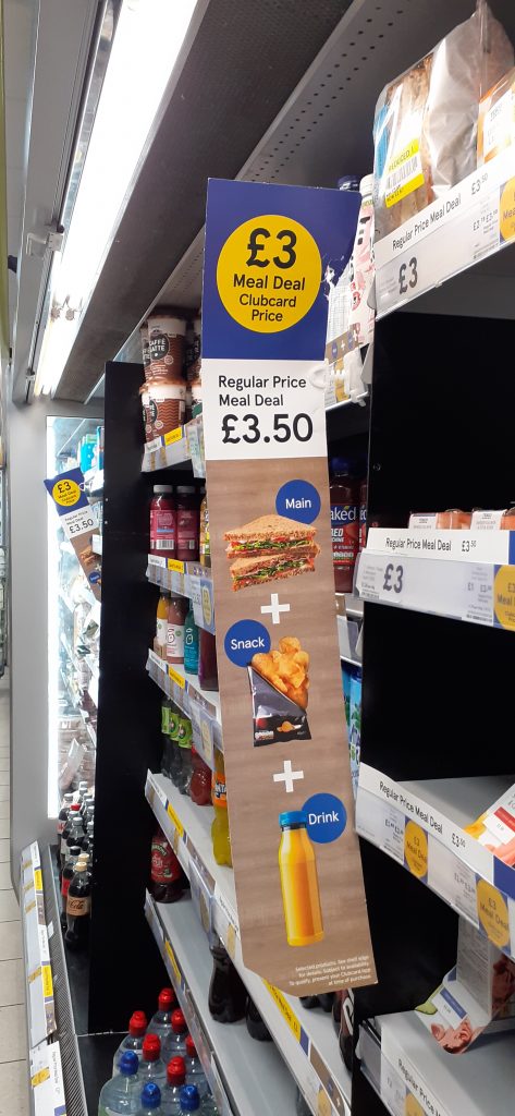
Clubcard price banner beside the meal deal fridge.
Since I went to a small Tesco store, there was not many banners in the shop.
Our idea for guerilla marketing is based around the clubcard prices. We had the initial idea of placing banners where banners would usually be found. These banners could tell the viewer some statistics. Instead of the price they are paying in terms of currency, we can talk about the impact the meat products are having on wildlife, farm animals, forests, indigenous communities and the planet as a whole.
We could place these in the meat section. The designs could be stuck onto the packaging as stickers, or on the shelves where we would normally see the prices.
